Ciao Monogram
1. Choosing a Word
It took me a while to come up with my monogram word of choice, but I knew I wanted it to be somewhat generic and short in length (about 3–5 letters long). At first, I considered choosing a word like ‘join’ or ‘unite’ as a nod to the intertwining nature of monograms, but I wasn’t super excited by this concept, so I scrapped it. (Feel free to use either of these for your project if you’re struggling with choosing a word!)
I liked Kelly’s idea of using a greeting because they allow a single word to work as a full sentence. Lettering a greeting also seemed like a good way to introduce myself on a new platform (hi, y’all). Instead of using the word ‘hello’ and being a blatant copycat, I chose to use ‘ciao’ (the Italian word for hello) and be a more subtle copycat.
Learning Italian is a fairly new venture of mine and I’ve been meaning to explore the language more through lettering. This project gave me the perfect excuse to start doing so.
2. Finding Inspiration
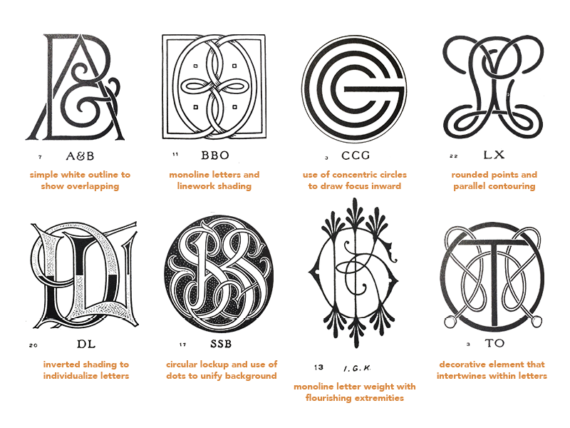
I went ahead and ordered a copy of The Encyclopedia of Monograms after watching Kelly’s video on resource material. Although I’d prefer the highly ornate samples to be printed larger, this book offers a huge variety of stylistically diverse monograms. It’s mostly filled with initials, but I was surprised to find a few word monograms in there too.
Below are some samples from The Encyclopedia of Monograms. I had trouble laying the thick book flat enough to scan it well, so I took photos with my phone and edited them together instead—because of this, they may look slightly warped. I also added some notes to highlight the specific characteristics I planned to experiment with in my own monogram.
In addition to typographic inspiration, I wanted to explore the roles that color and shape might take in my final piece. Choosing an Italian word gave me a strong place to start because Italy has such a rich visual history to pull from. I knew I wanted to reference Italian graphic artists and create something bold, geometric, and playful. With these ideas in mind, I rifled through the internet and scrounged up these examples:
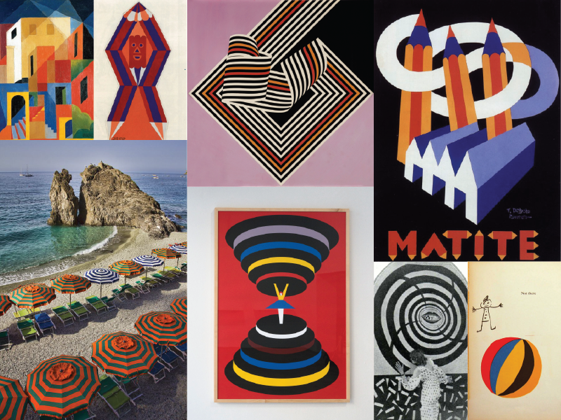
Top, left to right: Enrico Prampolini, Fortunato Depero, Franco Grignani, Fortunato Depero
Bottom, left to right: Cinque Terre, Italy, Olimpia Zagnoli, Thaïs (1917 movie), Bruno Munari
3. Thumbnails and Sketches
At this point in the process, I quickly explored many different directions, trying not to be too precious about any of them. These are just thumbnails, intentionally small and imperfect:
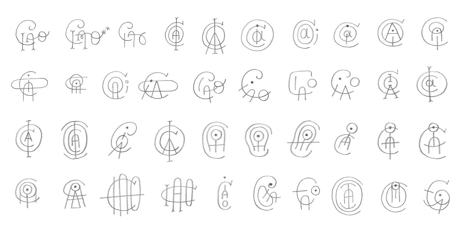
Once I found a direction I liked (middle of the third row above), I did some digital sketching in procreate to push the idea further.
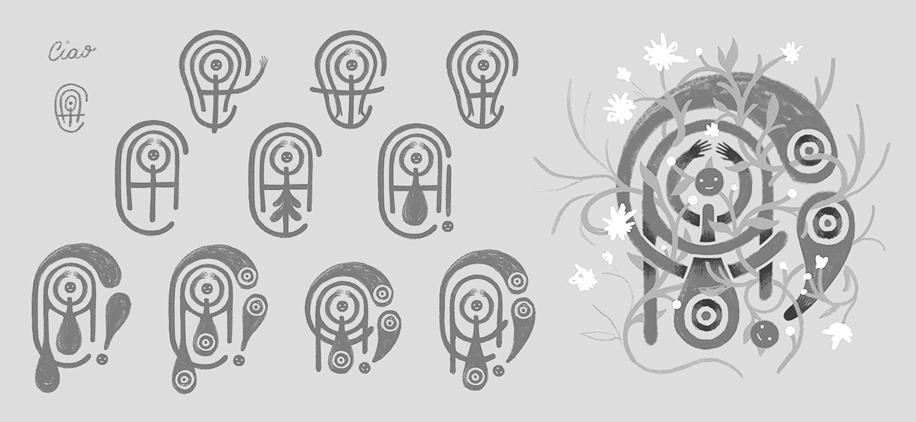
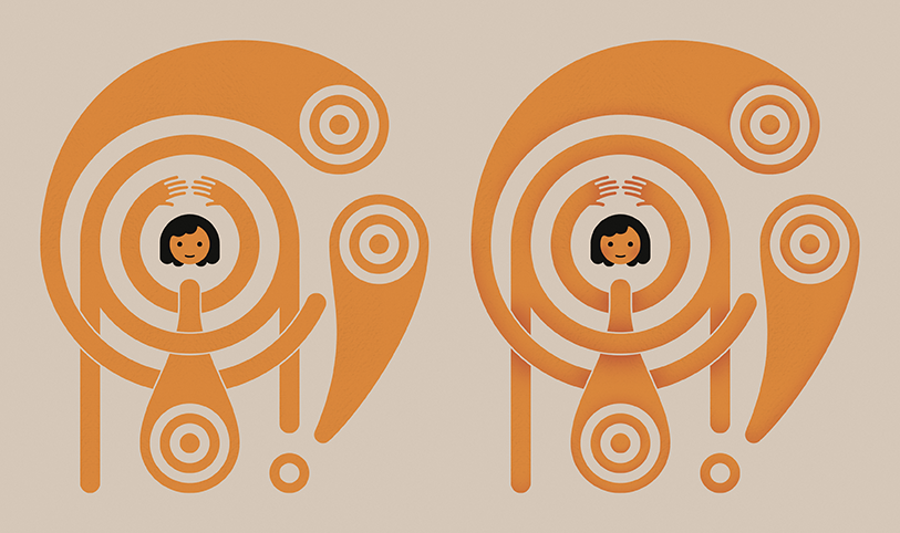
The direction I chose to explore creates a nesting effect with the letters and draws the eye inward toward the dot of the “i”. Turning that dot into a smiley face was a random impulse that happened to make the natural focal point feel more playful and purposeful, so I kept it.
From there, I explored how the other letterforms might become arms, legs, and a body. When I settled on a lockup that felt balanced, I did a rough foliage study to see how organic plants might intertwine with the geometric letters.
4. Vectoring the Monogram
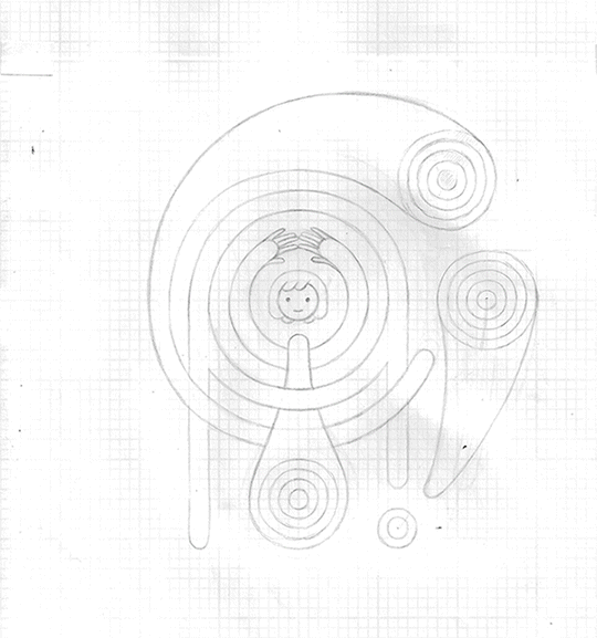
Whenever possible, I like to make a refined sketch before jumping into the digital work. Iterating on paper comes more naturally to me and I find that taking the time for this extra step makes the eventual vectoring quicker and more seamless.
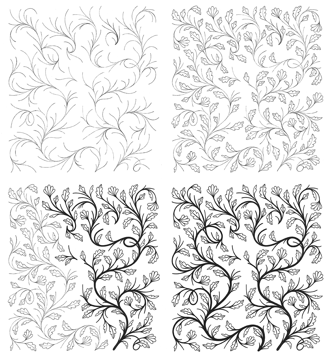
After penciling the letters onto graph paper (left image below), I taped a piece of tracing paper on top to flesh out the foliage that weaves around the letters (right image below). Using this layering method gives me the freedom to sketch and erase on the tracing paper without undoing any of the lettering underneath.
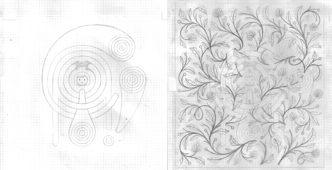
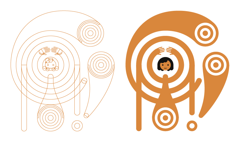
Next, I vectored the letters using the scanned pencil sketch as a guide. To emphasize the geometry of my design, I started with perfect circles/rectangles, then connected and filled them to form the letters.
Here's the process from basic shapes to detailed outline to colored fill:
5. Inking the Foliage
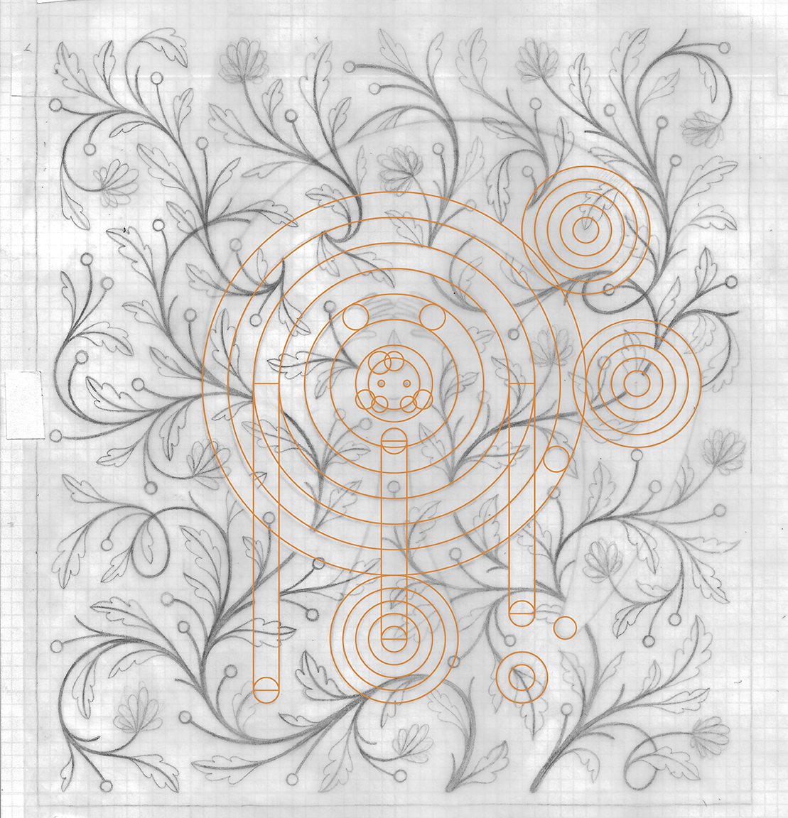
The digitized monogram changed slightly from the original sketch, so I printed it out, taped my tracing paper from step 4 on top, and refined the foliage sketch to better align with the new letters. In doing so, I also cleaned up the flowers and connected the foliage where it was hidden behind the letters to make the inking process easier.
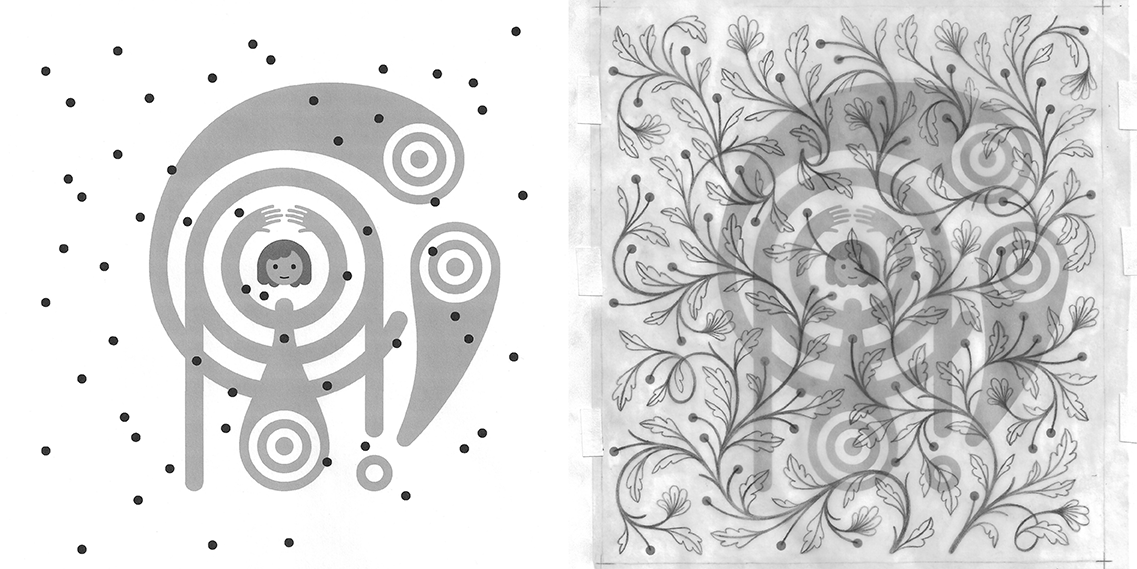
A quick note on the small circles above:
The circles in the print-out above are a reference for where each branch needed to end when inking. Instead of drawing the bulbs in ink with the rest of the foliage, I decided I would add them digitally over the ink drawing. This way, the bulbs are perfectly circular to match the geometry of the monogram and the line between digital and analog is blurred a little more.
_____
Below is a glimpse into my inking process. Using a lightbox to see my refined sketch, I started with an outline of all the stems and gradually built them up, adding leaves and tapering the line weight from top to bottom.
6. Collaging in Photoshop
Marrying the vector letters with the hand-drawn foliage was the most tedious part of my process. I’ve shown the main steps below with captions detailing what I did from step to step (since they all sort of look alike at a glance).
Left: Vector imported from Illustrator to Photoshop. Background color is chosen. Noise added overall. Watercolor texture and slight tooth added to letterforms. Negative-space outline created around letters to show overlapping.
Right: Shadow added under letter overlaps. Subtle contouring added to letterforms. A bit of blush breathes life into the otherwise soulless smiley face.
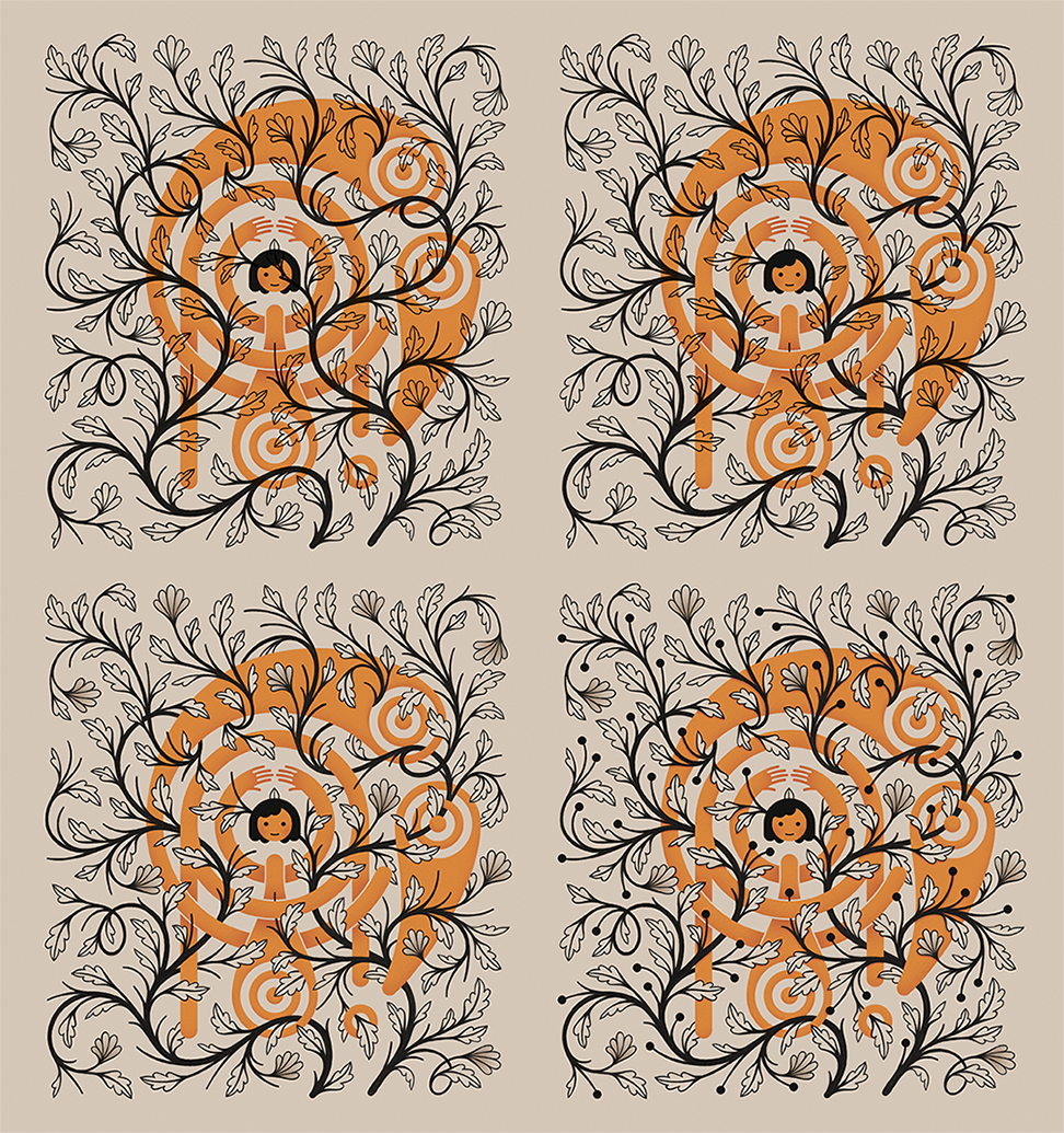
Top Left: Foliage is aligned over the letterforms.
Top Right: Foliage is masked to intertwine below the letterforms.
Bottom Left: Leaves that overlap letters are filled with the taupe background color. Shading is added in the flower petals to add dimension and distinguish them from the leaves.
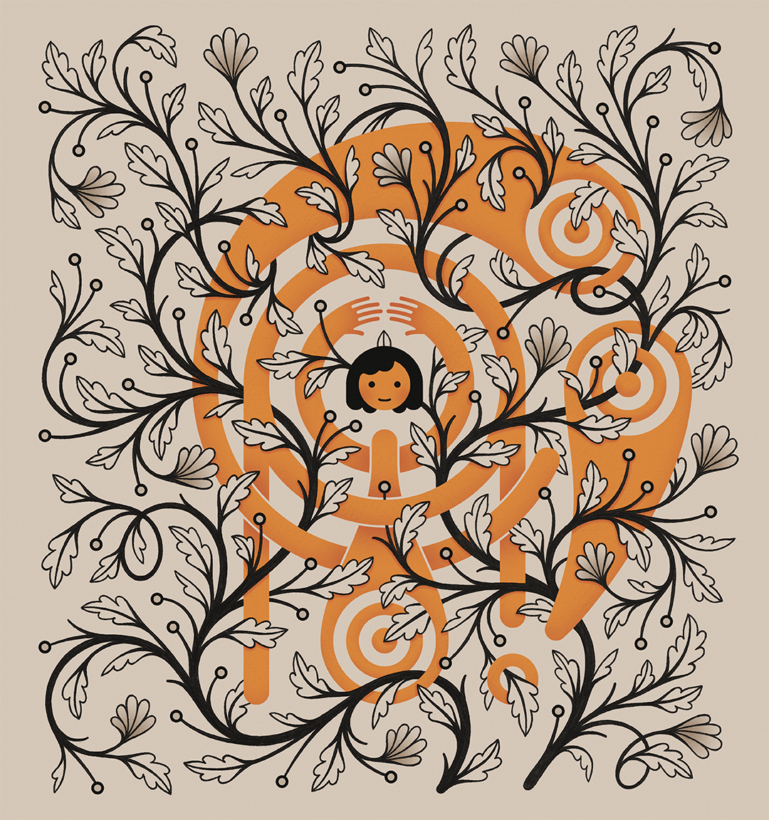
Bottom Right: Bulbs are added. I experiment with making them different colors, but settle on black so that the colored monogram remains the focal point. Subtle shadow is added everywhere the foliage overlaps the letters (see closeup below).
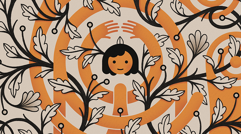
7. Final Output
After many hours of meticulous inking and pixel-pushing, here's my final monogram:
And a gif of how it all came together:
Kelly—Thank you for the recommendations, process insight, and inspiration.
Everyone else—Thank you for checking out my monogram and the process behind it.
Hopefully this is only the first of many Skillshare experiments to come! In the meantime, take a peek at my website or find me on Instagram to see what else I’m creating.
Ciao!