Black Licorice Mascot Character Design
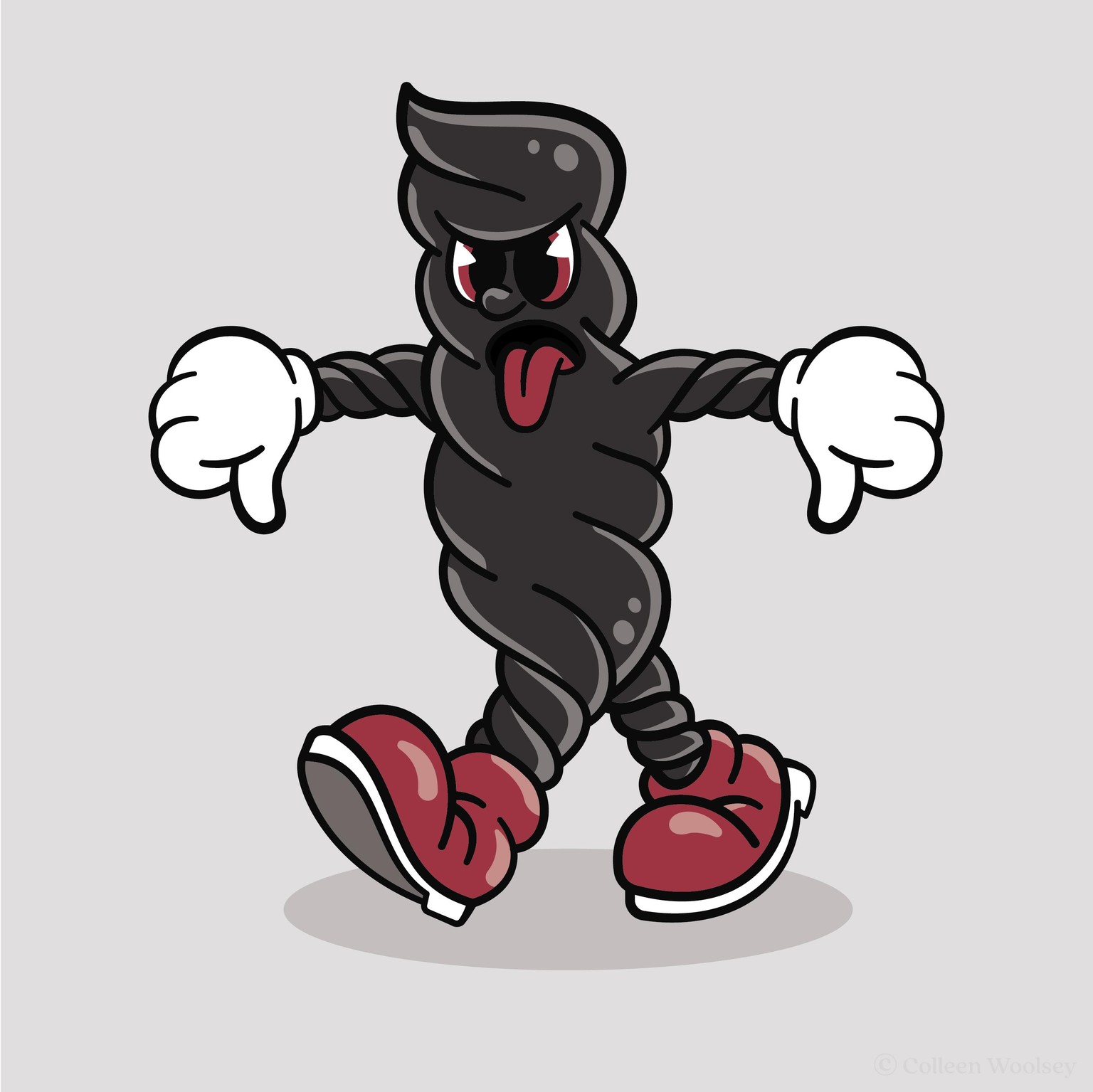
In my Illustration class, I have students create a mascot logo of their favorite or least favorite food and was so inspired by the 1930's styles of Jon's videos that I combined the two concepts together. I followed Jon's videos on the pie-eye design, with a bit of a change by adding an iris, as well as the white gloves. I opted for red shoes, tongue, and eyes to bring in a hint of red licorice. I wanted to capture the twisted feel of licorice in the body, arms, and legs which is the most common way I have experienced black licorice. The expression, body language, and hand gesture all come together to convey my absolute hatred of black licorice.
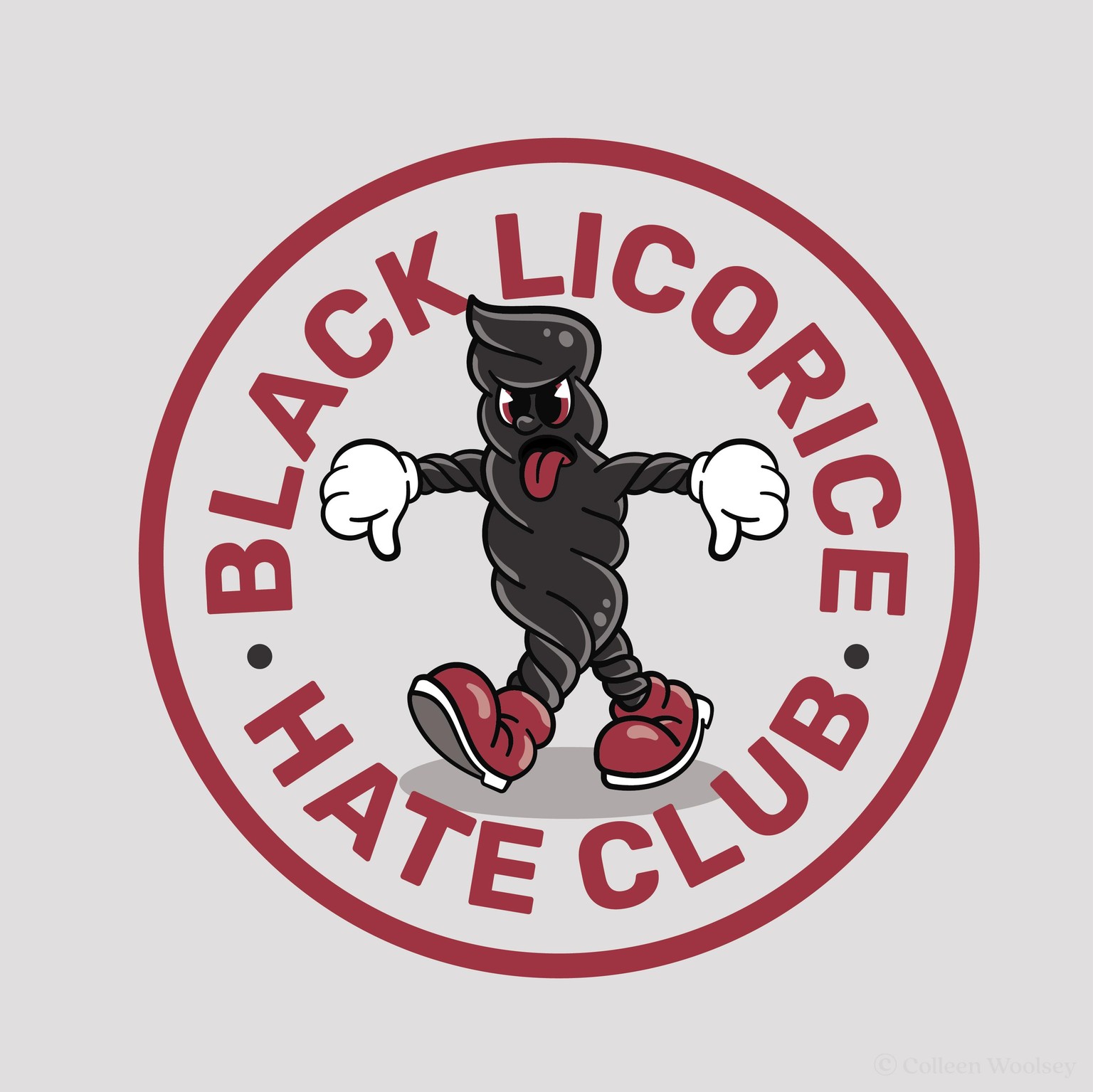
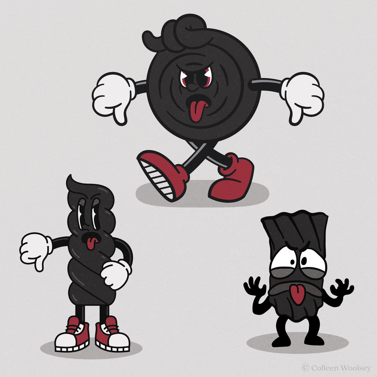
I did a version of some patches for a club as an application for my character, instead of animating it (which I have zero skill for currently). I also threw in a few different variations I explored.