Anniversary Monogram JKD
August 6, 2015
Hello Everyone!
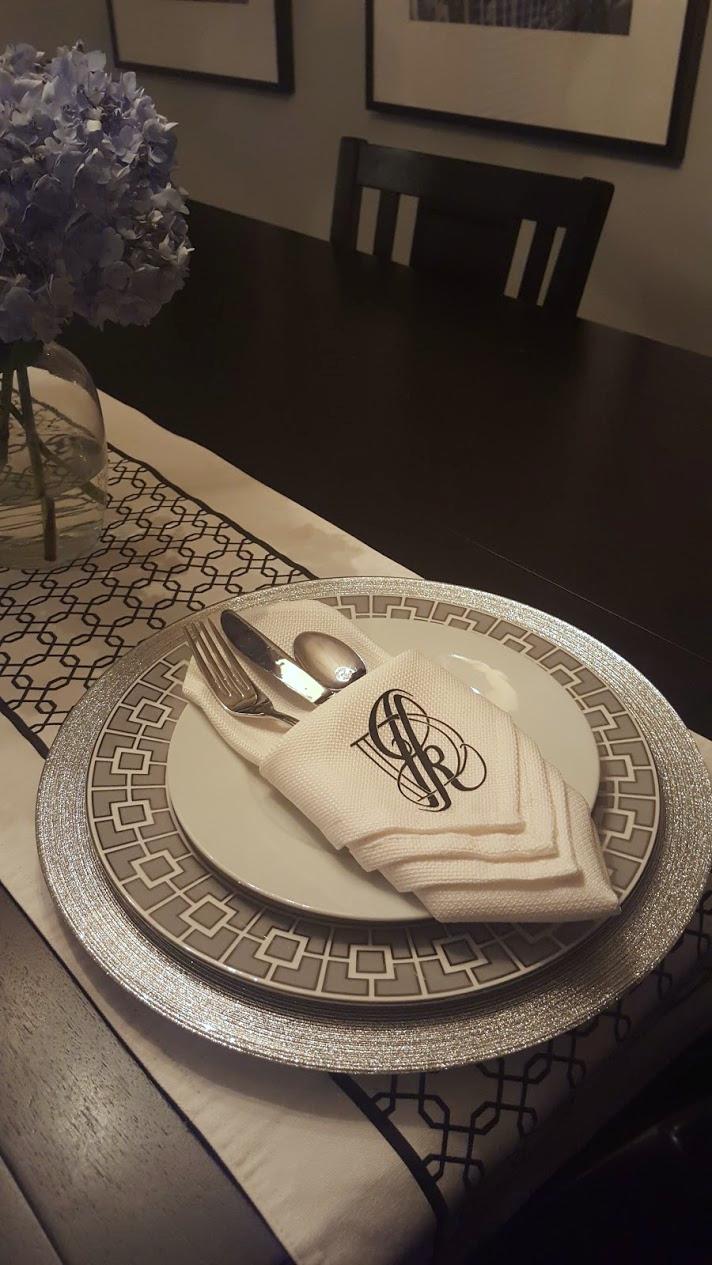
I'm working my way through Will's class as part of his monogram challenge. The timing of the challenge inspired my choice of letters used in my project. On August 15th of this year, my boyfriend and I will be celebrating our tenth anniversary together so in honour of that milestone I decided to do a monogram representing us as a couple. Rather than a formal wedding-style monogram, I invision something a little more modern and playful- something that we could use on envelopes or stationary (or even dinner napkins if we want to get fancy).
I will be using the first initial from both of our names- J and K and also the letter D to represent our "team name". Somehow when we'd first started dating we became collectively known as "Team Drohask" with Drohask being a mashup of both of our last names (we blame Bennifer and it being the mid 00's for this). This moniker has stuck with us throughout the years and works out conveniently for monogram purposes.
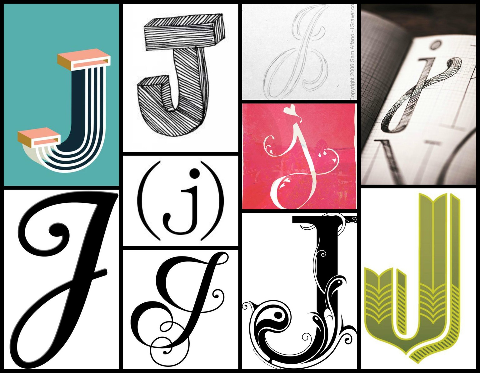
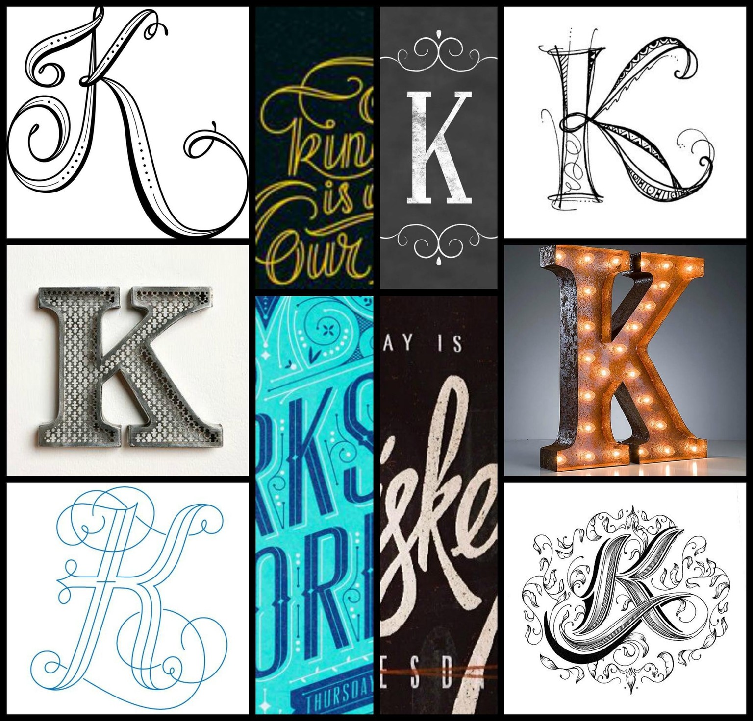
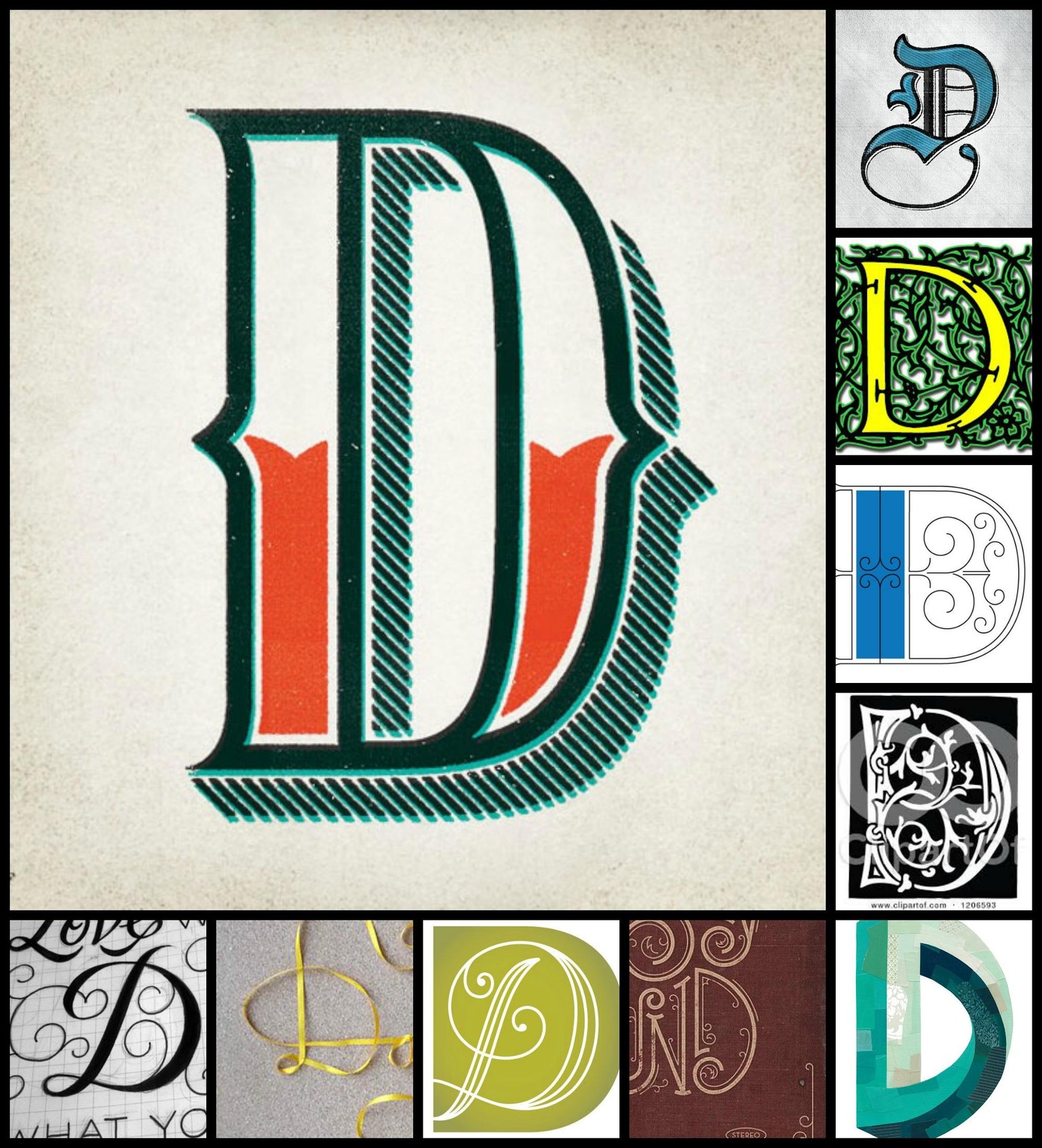
Let's get on to some visuals! I created some initial moodboards for my letters by trolling around the 'net.
Next up I'm going on a hunt for some found letters for additional inspiration.
**********
August 7, 2015
In honour of the theme of my monogram, I decided to mix up my inspiration for found letters. One of our favourite things to do together is travel, so rather than look to the streets for ideas, I searched through some of my personal travel photos. Thankfully, there was plenty of good material to choose from so I chose a photo for each letter I'm working with as follows.
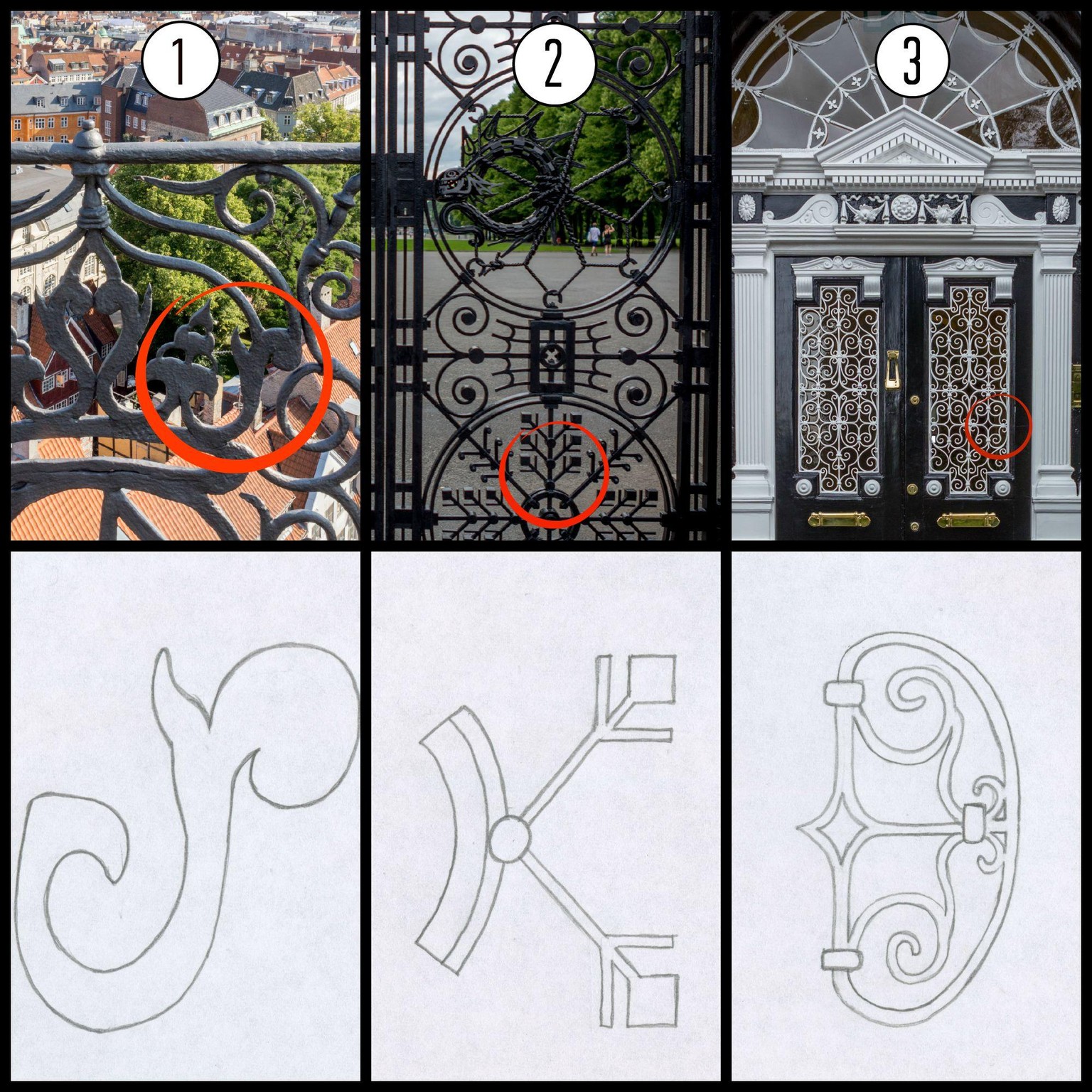
1) The railing at the top of The Round Tower in Copenhagen, Denmark.
2) The entry gate to Frogner Park in Oslo, Norway. You'll have to tilt your head for this one!
3) The ornate Georgian door at 46 Fitzwilliam Square in Dublin, Ireland
**********
August 10, 2015
I've been sketching!
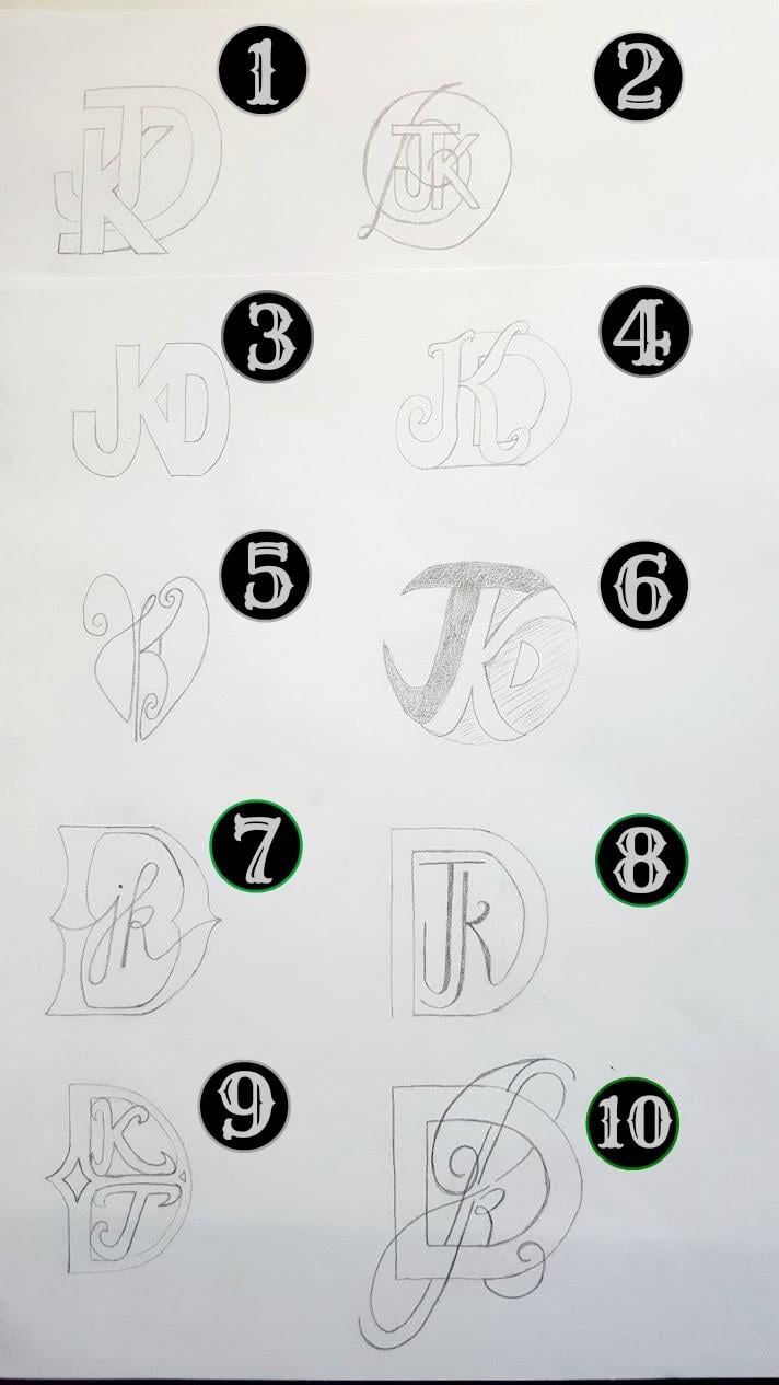
Of these initial sketches, I'm definitely liking 7, 8, and 10 the best.
7) I like the mix of structure in the D with the playful lowercase cursive to keep a modern vibe
8) I like the clean esthetic. I think the lack of ornamentation keeps it from feeling too feminine which I like, but overall I think it's not quite "soft" enough to represent us
10) This is my favourite and the design that I think I'll be developing further. I was able to cram a lot of symbolism into this design, with the intention that it would be subtle but meaningful for our anniversary. I chose an uppercase J and lowercase k to symbolize the physical difference between us that is often the first thing people comment on when meeting us together- my boyfriend is 6'6" and I'm 5'3". Meanwhile, the loops were inspired by the infinity symbol and the top of the J appears to protect the k while the stem of the k supports the J. In its present state I'm not liking the D. I will have to keep it fairly plain so as to not be overwhelming with the copperplate-inpired other letters, but I'm open to suggestions there. I think I'll definitely try other angles of the letters too (the copperplate inspiration dictated this early rendering with the J and k forward leaning).
I'm open to any feedback or insights that anyone would like to offer.
August 15, 2015
Well, today is both my anniversary as well as the challenge deadline so this will be short and sweet. I have next to zero skills in Illustrator (I sense my next Skillshare course coming on) so I decided to keep the digitization process super simple. I was also comforted by Will's lesson that a monogram should always work in black and white so I decided to run with that. I simply traced my drawing into a vector and filled with black.
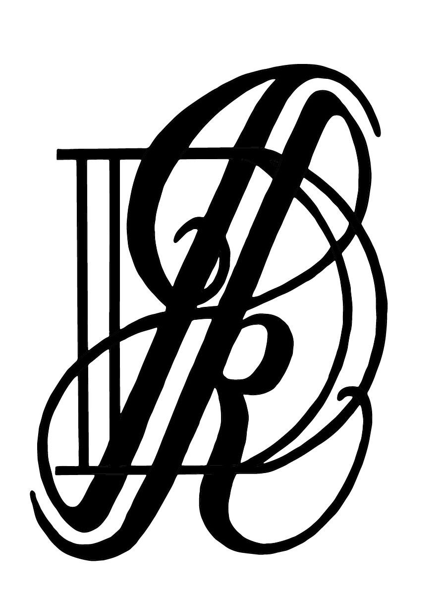
Then I touched up some of those wobbly lines in another program that I then used to cut iron-on vinyl to make my final project. I had joked in my very first project update that if I was feeling fancy I could use the monogram for napkins, and that's precisely what I did. Here's the finished product!
Once I can figure out Illustrator, I'd love to go back and play some different effects and colour options, but I'm pretty pleased with this first attempt. If anyone has any feedback or even just a good recommendation for a good beginner Illustrator course, I'd love to hear from you.