Abstracts using Acrylics Inks & Mineral Paper
I very much enjoyed using the mineral paper with the acrylic inks--it is amazing how they run and bleed on this "stone" paper! I also tried some samples using Dr. P.H. Martin's India Ink. 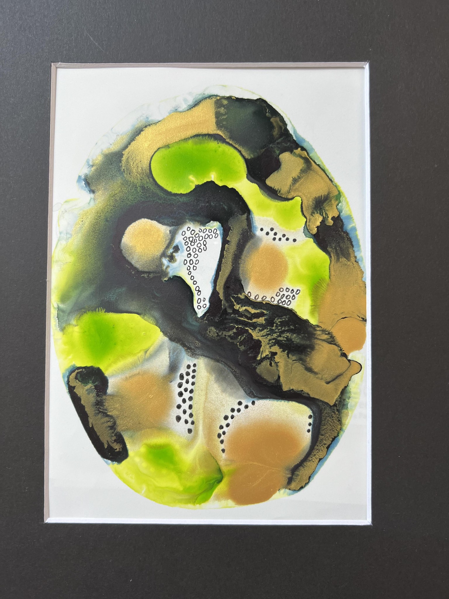
I used yellow green and Payne's Gray Daler & Rowney acrylic inks and Amsterdam's Light Gold Metallic Ink on this one (above).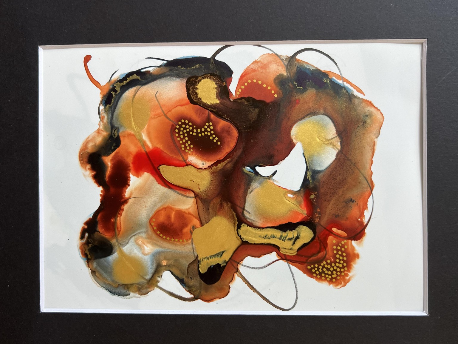
I used Burnt Sienna, Scarlet and Payne's Gray Daler & Rowney acrylics inks as well as Amsterdam's Light Gold Metallic Ink--I used the end of my brush for the wispy marks drawing the tip through the wet paint. This one should be in portrait mode rather than landscape. 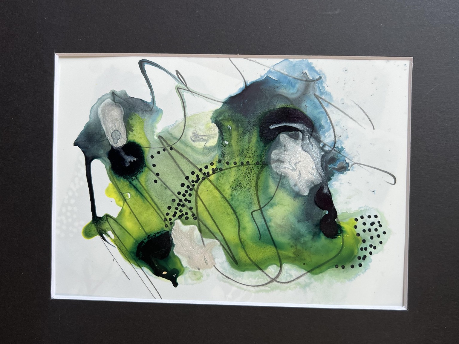 On this one, I used Lemon Yellow and Payne's Gray (hence the green color) Daler & Rowney acrylic inks with a silver paint by Peerless. The silver didn't move very well; but when it did spread on the wet paint, it had a lovely sheen on the painting that can't be seen in the photograph. This time, I used a graphite pencil to run through the wet paint.
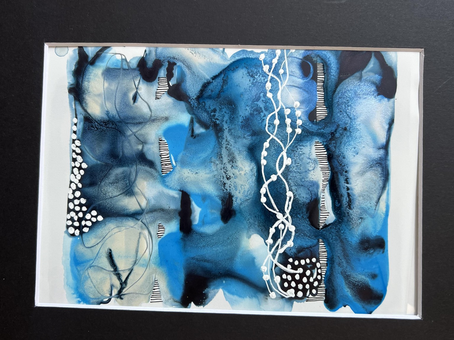
I used Denise's method for making stripes of color one line at a time using Shimmery Blue, Cyan and Payne's Gray Daler & Rowney inks with Posca pen white accent marks. I am not sure which ink caused the lovely granulation of the Payne's Gray that I hadn't noticed with any other example (maybe the Shimmery Blue).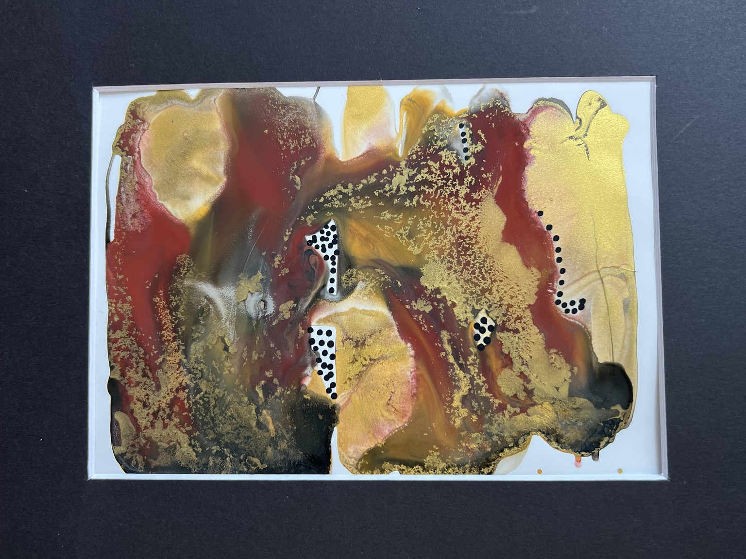
This was another line-by-line painting; but this time, I used Dr. P.H. Martin's India ink for this experiment. I also used the same Light Gold acrylic ink by Amsterdam which behaved a little differently on India ink--notice how it broke up into small particles!
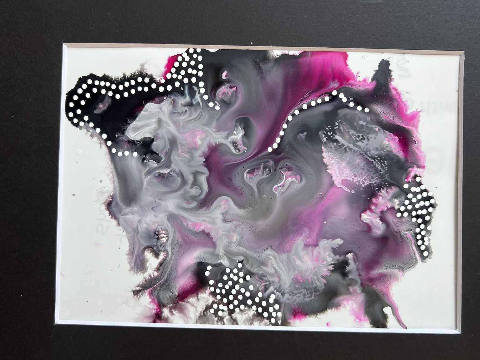
This one was also done with India ink by Dr. P.H. Martin - the colors are: Magenta, black and white. The white ink fell to the bottom and would only show after I blotted some of the black ink away. This too produced different effects in the paint. I also used a white Posca pen for dots. It was so much fun discovering the differences in the various paints on mineral paints--thank you, Denise!