A Study in Scarlet
Another editor who offers print and e-book design services recommended this class to me. I'm glad I took it—I have so many helpful notes! While I had a basic understanding of the design software I use, the instructor's guidance significantly deepened my understanding of design.
I used the file the instructor recommended. As an editor, I'm very comfortable in Microsoft Word, so I cleaned up the file and styles there. Instead of Adobe InDesign, I'm working in Affinity 3. I took the principles the instructor taught and applied them there.
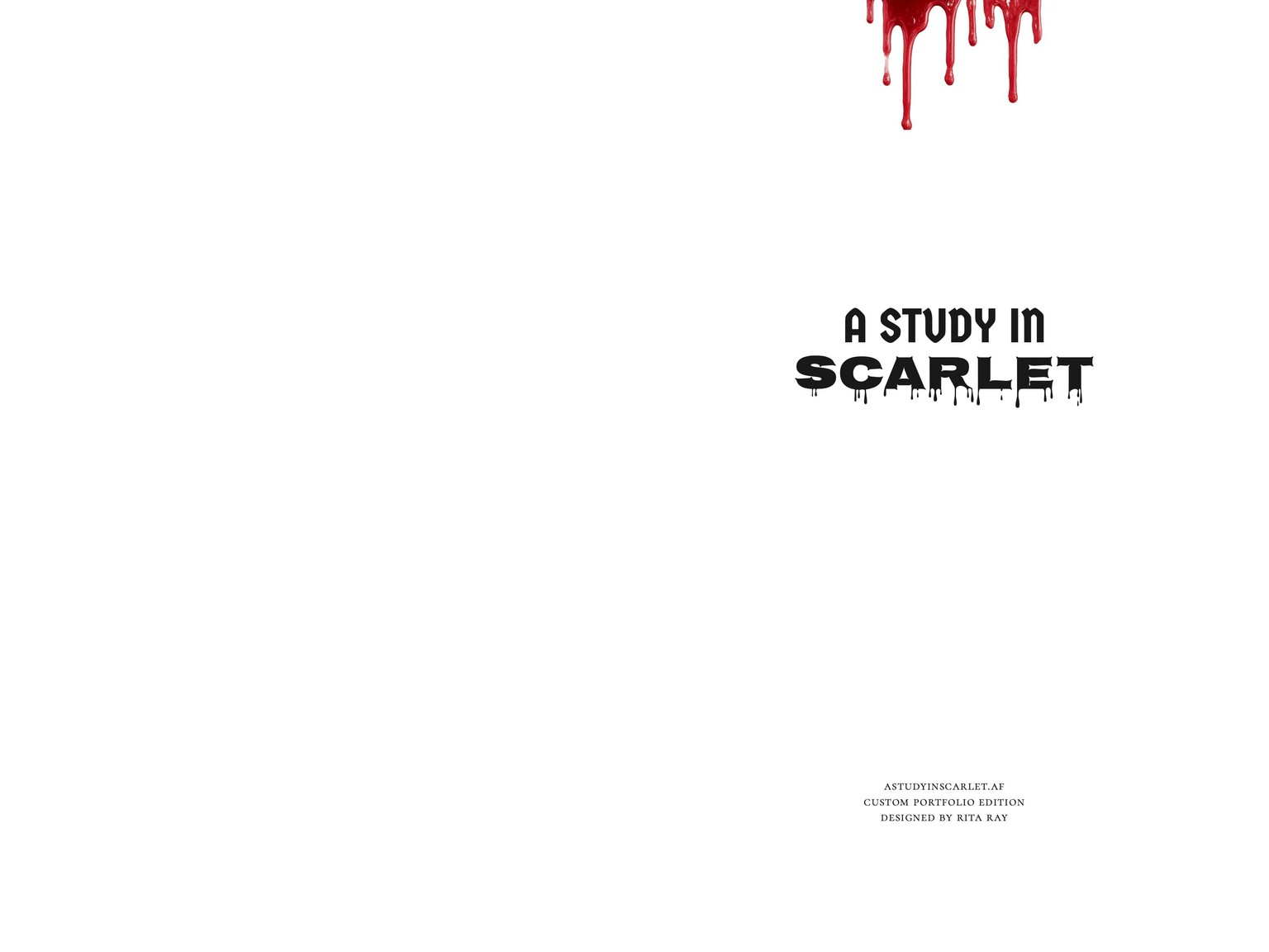
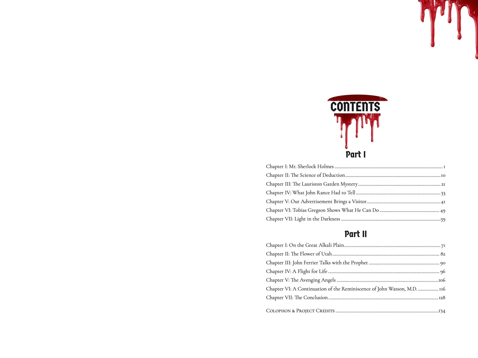
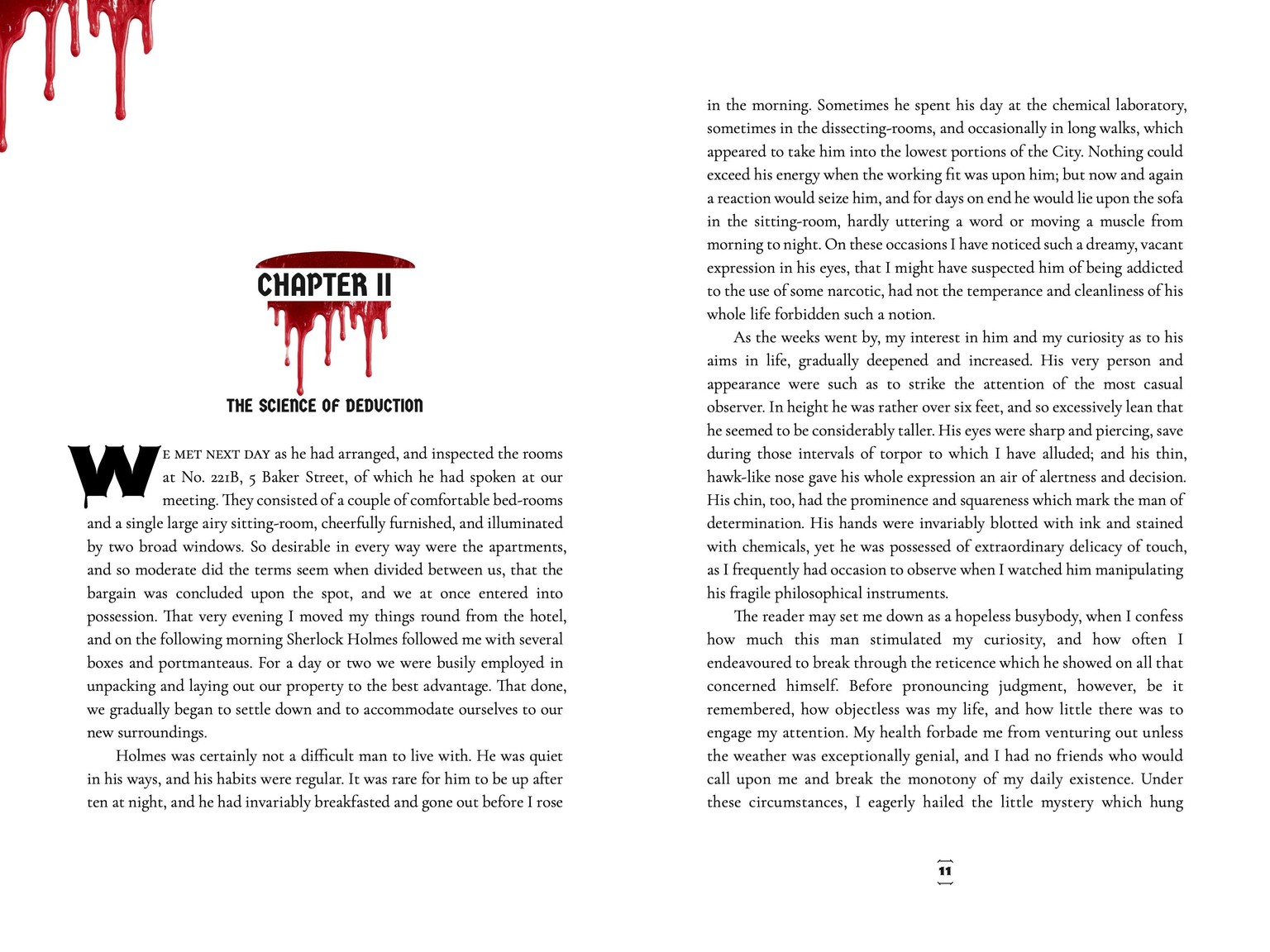
Since blood was found at the scene, I wanted to weave in thematic imagery. I placed these graphic elements on the margins of the decorative pages to capture the grim atmosphere without overwhelming the reader's eye.
For the typefaces, I chose Nosifer, a display font, for the drop caps, page numbers, and some titles because of how each letter seems to drip with blood, much like I imagine the word "rache" may have looked. I paired this with Germania One, an additional display font, to add contrast. For the body text, I selected Cormorant Garamond, a serif font. For internal letters and diary entries, I used Kalam to mimic real handwriting. I know I am breaking a design rule by using four fonts. However, I chose each with the intention of creating an image on the page.
Below, you can see how all of these elements came together in the final layout spreads.