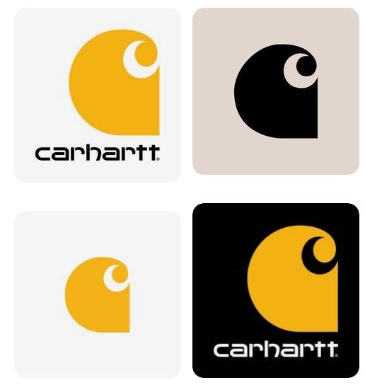
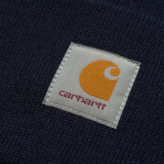
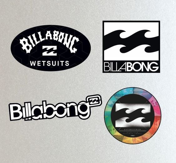
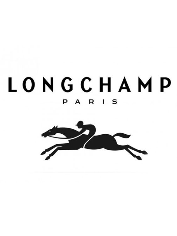
3 great logos
I got a little obsessed with clothing brand logos. I believe that the icons I chose stand out really well on the clothes, e.g., as opposed to PRADA. The simple but intricate shapes give off the brand's personality, while the icons can stand with or without typography.
They are memorable and appropriate for the target audiences. Time will show how they evolve, maybe the Longchamp logo could seem a little more accessible, but as it stands it matches the typography in a great way.