Transcripts
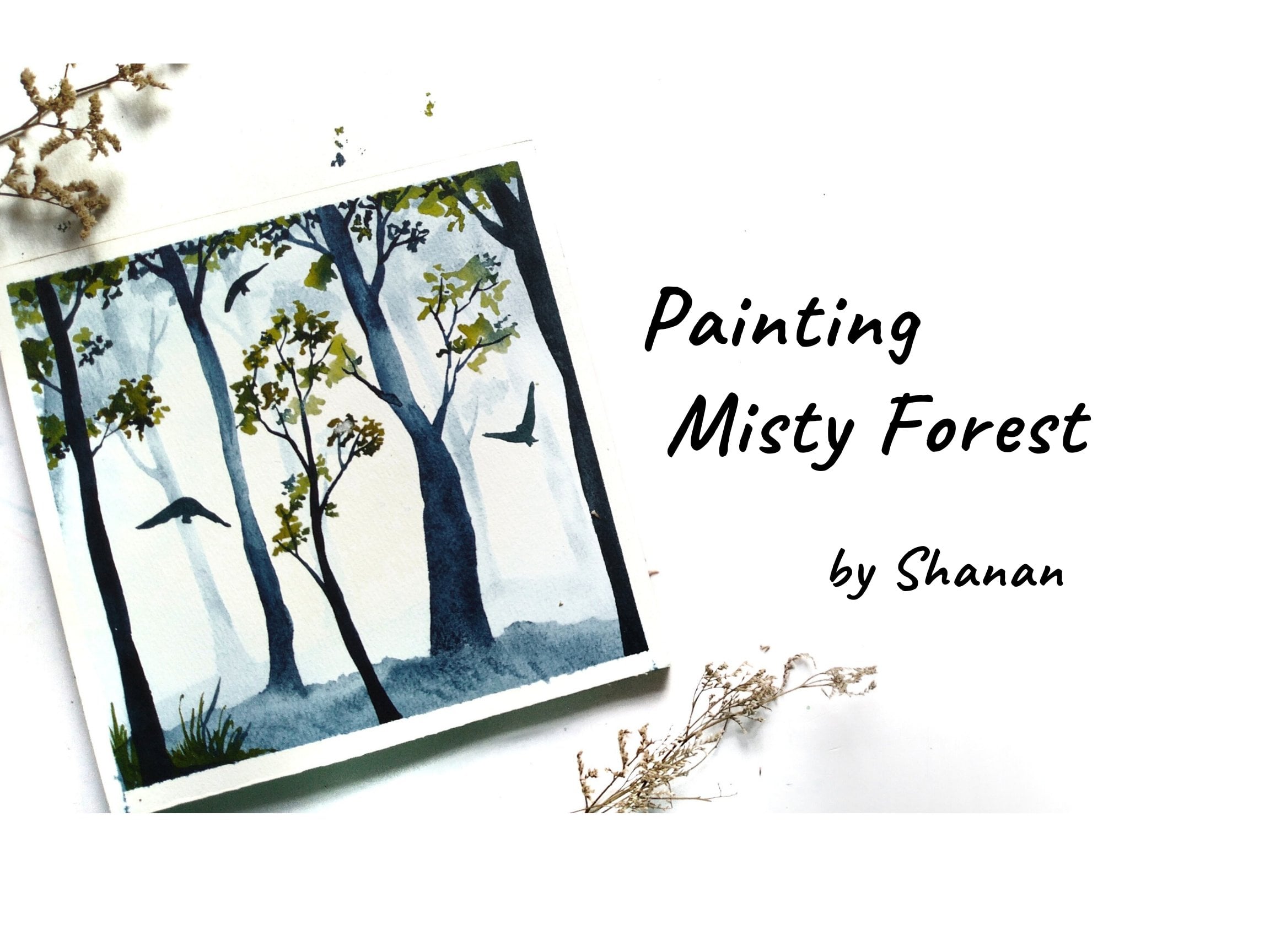
1. Sunrise and Sunset - Introduction: Sunsets are proof
that no matter what happens every day
can end beautifully. I love watching
sunset and sunrise. It makes me feel at peace. I just wish that the
sun stays forever. Hi, I am Shanan Subhan
an artist and an art educator based
in Bangalore, India. Welcome to my
Skillshare class on painting sunrise and
sunset landscapes. Did you ever imagine
how amazing it would be to capture the beauty of
sunset through your paintings. and just paint your heart out. The feeling in itself
brings utmost joy. In this class, we
will be painting 15 different sunset paintings. The class is rightly
paced so that you can paint one painting at a
time for the next 15 days. I explain each and
every step and, colors that goes
into the painting. You don't have to
worry about that. This class is just right for you to brush up your
watercolor skills. I hope you're as
excited as I am. So without any further delay, let's get started
with the class.
2. Art Supplies Needed: Before we start, let
us have a look at all the art supplies that I
will be using in this class. However, you can go with any alternatives applies that is already available with you. Talking about the papers, I have Saunders, 300
GSM watercolor paper. It is cold press in texture, and a 100% cotton. Using a good quality
paper which is a 100% Cotton and 300 GSM. It helps me achieving a better outcome as
it remains wet for a longer duration and lets us work on layers of the painting. I would definitely recommend you to go with good quality paper. It could be from any brand. All right, moving on to colors. I'll be using this
airtight palette. I have these basic
colors over here. I have int from various
brands like Mijello, mission, art philosophy,
many other brands. You can go with any similar
shades that you have. So these are all
the basic shades. I'll be mentioning about
the colors before I paint. For mixing the colors, we'll be using separate palette. This has several wells in this, so it is easier for
me to mix the colors. Now let's talk about the brushes that I'll be using
in this class. I'll be mainly using
these four brushes. This is a mop brush, 3 fourth inch round mop
brush by Daler Rowney. This has this huge
belly and results. It helps me. Being the basic where two washes and to wet the
surface of the paper. You can even go with a
hotkey brush if you have. Next is this. Psi is 12 round brush. I use it for covering
the larger areas. Next is size eight round brush. So these are for the
mediums I use strokes. And it also has a pointed tip, which is ideal for a, a little bit of detailing. And then I have this
size two round brush, which acts as a fine liner
brush in my paintings. And lastly, I'll also keep a flat brush ready just
in case if I need. You can go with any alternative
brushes that you have. Some of the other supplies
that I would need r. I will be using cardboard. Place the paper. I'm taping the paper on this. This is an essential tool. You can either place
it on a clipboard or any hard surface. The paper on. I'm using this because I mostly
the paper while painting. It helps me achieve certain
results in the ending. Now, we would mean
the masking tape for taping down the paper. I have this pencil. It is spray bought. These extra supplies. Then we would need,
I'm Joseph water. Often in watercolors, the water gets dirty
while painting. So it's good idea to
have two jars of water. One to clean dirty
brushes and other one, pick the clean water
for the clean washes. Have two jars ready. Next I would need
tissues and napkins or old rags because I use issues
for lifting the paint. Cans or old rags are
helpful to wipe off the extra paint or
water of the brushes. If you need a damn brush, you're going to just
wipe the brush. This will absorb all the water. You can do it with tissue also, but I do not want to
waste a lot of it, so I just prefer
having a napkin handy. The tissues are for
watercolor techniques. Keep it handy
during the process. Next is an air dryer for
faster drying of paint. Drying time of the paints depend on the temperature
of your area. If you live in a dry area, then though paints dry faster. But if it's a humid area, it dries very slow. You can have a blow
dryer handy so that you can on bright fast and
continue with the painting. You might have to
wait for some time for the paint to dry and then
come back to the painting. That is also fine. These are the supplies
that I will use. You can use any alternatives applies that's already
available. We do.
3. Before we begin...: This challenge
is for everyone who wants to refine
their watercolors skills and dive deeper into painting
the beauty of sunset landscapes, Like I said earlier, we
will be painting 15 different paintings
one at a time. I'll be incorporating several
techniques in this class. If you're a complete beginner, I would recommend
you to go through my previous classes
where I have explained the watercolor techniques
and also included some practice sessions so that you get confident
with medium. However, if you still
wish to continue, you can join along
and paint with me. I will be explaining each
and every step as I paint. Before we begin this challenge, I really want you all to
let go the fewer around this medium and
allow yourself to experience the joy of
watercolor painting. What happens is when you set the expectation before
starting the painting, you are operating from
for your mindset, which in turn, or blocks all the possibilities
of the painting. Just learned golf, all
those expectations and just be playful
with the colors. Just explore, see all
the possibilities. It okay if you fail, you can do it again. At least you will know
where you went wrong. Just enjoy and have
fun with the class. Let's get started.
4. Setting up the Paper: Let me show you how
I set up my paper. Here. I have my paper
cardboard and I'm asking, I am using one
inch masking tape. You can go with any size
of masking tape that you have. Down the paper. Here I'm applying a
thicker border this time, almost like half inch of
water to the painting. You can apply a thickness
of your choice. Thin or thick, doesn't matter. Once you have tape down the
paper on all the sides. Run your finger
over the edges and the sides to make sure
it is tightly sealed. Right? We are ready
to paint now.
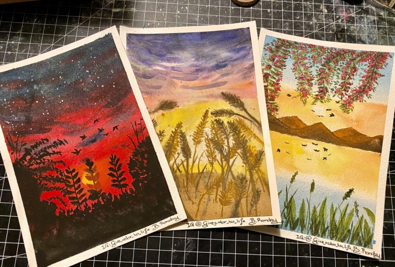
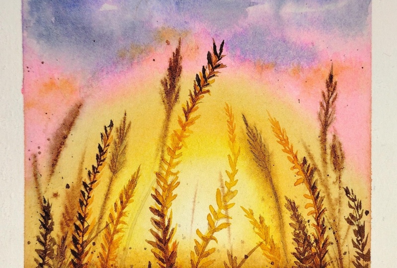
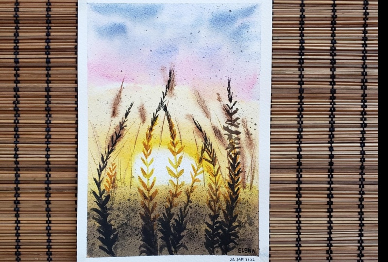
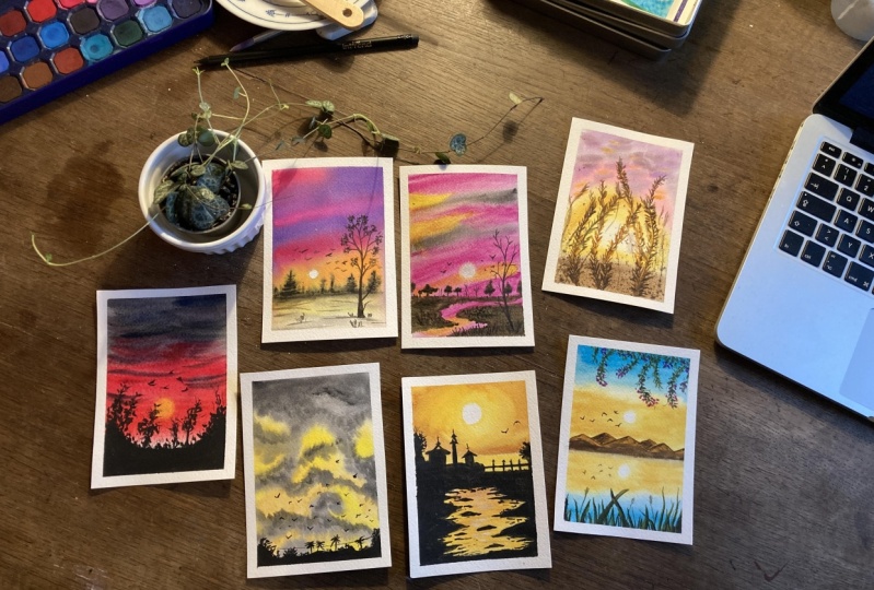
5. Day 1 - Sunset Through The Fields (Part 1): Welcome to day one of sunrise
and sunset landscapes. Today we will learn to paint this gorgeous sunset
view through the fields. This includes a very simple
composition of fields. Some of the grass blades are sunlit due to the
brights. Andres. So grab your supplies
and let's get started. Here are the list of colors
that you would need. I have also mentioned the alternate colors
that you can use. Hunter. Dominant,
yellow, orange, Payne's gray, opera pink, ultramarine blue,
sienna, burnt umber. That's it. Let us begin. Our paintings. Have
the horizon line. Market very gently. Apply clean water. I'm using my round
Nemo brochure, which is 3 fourth
inch granule brush in horizontal and vertical motion to make sure that
the water is spread evenly and there are no puddles of water
in the same area. Let's take size 12. You can go with any
alternative size. Of course, I saw a low LOD. So these two are shades of yellow and I have stored
them in the same battle. So do not get confused
when I refer to the same. Well in the palette, I'm going to have the sun or I'll make this
semicircular shape your. Next we will take
our diluted yellow. I add more water to it. This is for the inner part, gradual blue in the sun. We'll apply this for the
brown level as well. Let's take orange. Mix it with the deep. Apply on the altar area
of this semicircle. Apply this in a single screw. Stopping the
brushstroke in-between my create some blooms. Glen it with the background
using clean water. I hope you have achieved this
beautiful effect already. I think opera pink. Mix this opera pink in
a medium consistency. Apply in the mid part
of the painting. You can either use so crimson or rows motto
as an alternate color. Mix. Ultramarine blue with
the opera guy have here. This will create Euler chaired. Leave some white
spaces in-between. Applied the same mix or
the pink area. In screen. Apply this darker shade on. I'll put areas. This depicts the darker
clouds in the sky. Next, I'll just
glide my brush urine there to create these
tiny brush strokes. Moving on, burnt sienna
and mix it with orange. Apply on the lower part. Shouldn't get blended well
with the yellow shade. It should have a sunlit APRN. The upper area
here we will apply some permanent yellow deep. So this will create a
nice sunlit effect. Next we will apply some more
yellowish orange shade. On the pink areas of the sky. This will create some
orange Santa Cruz in the upper part as well. Take a thinner brush, and we'll take ultramarine, sorry, which candidates,
this burnt umber. Let's add some grass
plates in the painting. I'll be using this
darker brown mix to paint the grasses on
sites of the painting frame. The belly of the brush to
create this impression. Around the center area, we want a sunlit effect. Let's use orange for this circular area where we have white color. We will keep the colors minimal. I'm using wet on wet
technique because this will be portrait as
the blurry grasses, the detailed one we will
paint in the next layer. Payne's gray and
sprinkle the paint. Let me take some more paint. It will be easy for
me to sprinkle, then we will let this dry. I'm using a blow dryer
to dry the paint. Your you can either use blow dryer or let
it dry naturally, it is totally up to you. Whichever way you want, you can go ahead with that. Paper has dried. Now, we will take a
very diluted tone of burnt umber and Payne's gray. This is like a
really dull color. Now let's add this diluted color as the stem of these grasses. Let me explain it to you guys. The grasses we've painted
already are at a distance, and hence they are blurry. Out-of-focus. I'm adding
these diluted colored stems because it wasn't possible to add those
lines on a wet surface. I'm adding them know, on a dry surface, this is wet on dry technique. Now I'll add these tiny
lines on the grasses you see here with the same
diluted yellow, I'll add in some random
lines to add a sense of depth in the distant
bloody grasses. Remember the colors
your should not be too dark as we are going to lose
the blurriness of the gas. Distant grasses. Just dabbing my finger to spread the orange and mix it in
a medium consistency.
6. Day1 - Sunset Through The Fields (Part 2): Now to give you a brief idea, can just mark it with up until it is a simple
grass like shape. You can draw any
shape that you want. These are going to be
the foreground grasses. It will look
something like this. Can you see this drawing? We are going to
fill in that area. Some of the grass blades I will paint or my, my brush itself. I'll also take some aloe leaf. For the sunlit area here. Use value of this color. We will first paint
with a yellow shirt because that is the sunlit area. We will later gradually
add the darker colors. Keep this yellow color a
little watery inconsistency. And that will create
a transparent effect. Just dab your brush. My brush is you can
use any similar sizes. For the site. I'll use orange sheet. When it reaches this part, we will add in studio. Next, we need to bring
a gradual transition from yellow to orange
and then to brown. Mix orange and brown to
create that transition. Now we will apply
this orange shade on the upper and lower
part of this grass. You need not paint the
exact same thing here. Your glasses would have
their own shape and sizes. Now let's add some more darker
shared with brown color. These darker colors to the
rest of the glasses here, and hence is the beauty
of the sunlit part. It adds a sense of
contrast to the painting. The brushstrokes are
very loose and random. I'm not following any
strict pattern as such. So you need to make sure
that you are creating a nice gradients between
this brown and yellow. You can add some
orange in-between. The grasses that
are on the sides of the painting named not
have the sunlight effect. Only for the ones that are in the same area will
have satellite effort. No, I didn't summed up Bogota authors here
on the upper part. Not paint these grasses
in a symmetric manner. Let it be a little wonky. And after symmetry. That's one way to add inorganic
shapes in the glasses. If you'll notice, I do not
have a symmetrical pattern. It's all in different direction. All different sizes raid. You do have to do the
same thing in order to achieve the organic
looking grasses. Next we will take or burnt
umber and Payne's gray. This will create a
very darker brown mix. You can also take CPR if
you weren't already made. We will add the darker shadows
in the grass is known. Again, add another
layer of paint. Now if we have
overlapping grass blades, it will add a sense of depth. And I mentioned in the grasses. Next I'll take a diluted
version of orangeish brown. And I'm going to apply it on the grasses near
the sunlit area. This will act as the
shadows of the sunlit part. Next I'm adding in some
more grasses here. Next, stylistic splattered of beams on the lower
half of the paper. This is a very nice muted tone, so you can apply it over
the sunlit area as well. Next, we will take
darker brown shade. Since this is a darker in color, if we do not want this area
to be affected by this cell, cover those with a paper
on the sunlit part. Least black dirt
on the lower area. Flattering helps us achieve
a sense of texture. Again on the corner. The side of the painting. Resolving the same
bird sunlit area. Just wiping of all the paints that's outside the
painting area. That is it with this painting. Let us remove the masking tape. Okay, So this is how the
painting looks like. Beautiful late. Hope you enjoyed and had a fun learning session
with me today. Feel free to reach out to
me in case of any doubt. Please share your class project and the project's gallery. I'll see you in the
DTU of the challenge. Until then, bye bye.
7. Day 2 - Sunset & Temple Silhouettes (Part 1): Hello and welcome back to
day two of the challenge, sunrise and sunset landscapes. David will learn to paint
this gorgeous sunset will house the lower parts
of the temporal structure. Rich and some trees. In the foreground we have
free flowing water stream, which reflects the
color of the sky. It's a very simple painting. Let's get started. Alright, though paper is masked. Now we will start the painting. Some video, we will
have the horizon line. Next we will draw or temple-like structure with curved roof, giving a hint of
definite architecture. Next to this we will draw an adult building,
maybe a tower. You can just follow along and draw the similar
composition. We have green foliage on the
left side of the painting. Adding some smaller
buildings around this area. Adding in some filler
elements as well. And then connecting it to a
bridge towards the right. The bridge has the offenses. These are basically
the silhouette. So we need not focus
on the detailing part. On the light edge, we will add a tree foliage. Towards the foreground. We will have a stream of water. Let's draw some zigzaggy lines. This water is reflected
by this guy colors. So this will be
painted separately. These are partly so most
drugs in the water. We will leave it and move
on to the painting part. Let's keep the supplies ready. Size 12, round brush
and clean water. Load your brush with clean water and make a circular outline. Gba, innermost part, dry. Apply clean water
only on the outside. Now let's mix the colors. I'll be using hansa yellow, and now they consider a low, medium consistency will make this color mix and apply
around the circular area. Leave a bit of
space around that. So cool. I love the paint
to flow on its own. This creates a soft APRNs and avoid having a
sharp edged effect. This was like a partial
wet on wet technique. Now tape permanent yellow deep color apply around
this hansa. Yellow. Permanent L0 is a
bit darker, yellow. If you do not have this color, then you can mix a bit
of orange to yellow. You'll see we have a nice
gradients in the sky, starting from white to yellow, and then it ends in
a darker yellow. The sun looks very
bright and white. We will apply the same color
on the water stream as well. This is the reflection
of sky on water. Now we will take some
orange Apply over here. Also a bit of burnt sienna. To perform this step, your paper needs to be
damp or a little weird. You might end up
getting patchy effect. Clean your brush, wipe
off all the water. Spread this orangeish
brown with loose sheets. Here it is good to have a larger round brush so
that it is easier to blend. Moving on, I'll apply
the same mix on the reflection part
in the water stream. Gently apply some
horizontal strokes creating ripple effect. I weren't keeping
this area flat. Have some variation with
different tonal values. Next we will paint
the water body, which is on the other
side of the bridge. I'll go with a diluted yellow. This helps me create a separation between
the sky and the water. Right? So we will allow
the paint to dry. I'm using a blow dryer to
speed up the drying process. Alright, the paper has dried. Next I'm going to use a
golden watercolor Shema. Apply this for the water body. Because when the sun
reflects on the water, we see a kind of sheen
shimmery effect. I'm going to create that. However, this is
an optional step. You can go ahead with this
or skip it if you want. Totally up to you. I will apply this mix
onto the order area. Also on the foreground. Water stream Applies some
simple horizontal brushstrokes. If we reload the painting
at a certain angle, we can see the shimmery
effect of the paint.
8. Day 2 - Sunset & Temple Silhouettes (Part 2): Next I'm going to need black. I'll be using the paint
directly from the tube. Know if you do not have black, what the new probability? Cpi and Payne's gray or burnt
umber and Payne's gray. You can even mix your own shade. Since we are painting the
silhouettes and darker area. So we would need or a
lot of black color. I'm mixing the paints that I don't run out
of colors in-between. Now we will apply this black
mix on the inner area. Do not paint the details now, we will be adding them
using a fine brush. Now I'll switch to my size eight brush here and I'm just carefully
applying the paint. Apply the details. Know. I'm trying to achieve a zigzaggy pattern
in the water stream. I'm adding some tiny
rocks, stones, structure. I'm going to slide my brush to create this kind of
external effect. This technique is called
dry brush technique, where we use a dry brush to
achieve a certain texture. I had some partly
so most drugs here, I didn't rocks of
different sizes and gives no organic APRNs to
the water stream. Just dab your brush and create this impression of tiny rocks. The opening thing need not
be exactly same as mine. Now, I'm filling in the
lighter areas here. Now let's paint the upper
part of the silhouette. I will start with the bridge. Fully apply the paint. Next, I loosely paint
the tree silhouette. No, I'm filling in the color for the
temporal structure here. Use a fine liner
brush if needed. Next, we're painting this tree on the left side of the brain. We will first feel
the inner space. For the outer area. We will add these tiny shapes, such as the leaves
off the trees. Next I'll paint this
Gabi roof of the temple. Leave it empty space
on the ballpark. For the B failure. Using my size two round brush. Small dome-like structure,
painting the peak of the building by adding some
simple straight lines. Going back to the stream area, I'm adding some tiny rocks, adding in some texture by applying some loose
brush strokes. This will create a sense
of noise in the stream. Makes it a pure narrow destined. Now it's time to be in some
free flying birds in the sky. You can paint as many
boards as you want. Lastly, I'll paint
some tiny tweaks popping out of the
three silhouettes. I had some tiny dots near the bridge area to depict
some tiny grasses. Alright, so we are done
with this painting. Now let us remove
the masking tape. There you go. This is how the painting looks. Once we remove the masking tape. Just beautiful, right? I hope you are painting
has turned out the same. Negotiate your class
project with me are under the projects gallery. I would love to see
your class works. All right, then I'll see you tomorrow in day
three of this class. Until then, bye bye.
9. Day 3 - Sunrise and Bougainvilleas (Part 1): Hello and welcome back to
day three of the challenge. Today we will learn
to paint this serine Sandra is views by the lakeside. The bottom part of
the foreground, we have green succulents. And at the top part there are Bogan video vines
hanging from the top. It's a beautiful composition. Let's get started
with a painting. Here are the colors required. Hansa, yellow, orange,
blue, burnt umber. Payne's gray,
green, rose madder. Permanent yellow deep. That's it. Let's sketch the composition. Mark the horizon
line first about this area is the sky and
below is the lake water. Then we will draw the
distant mountains. That will be layer of mountains. These mountains are far
from the viewpoint. They appear smaller in size. Rest of the elements we
shall add as we paint. All right, so let's get
started with the painting. Apply clean water
throughout the surface. I'm using my mop brush of three-fourths inch plywood
or throughout the surface. We will be performing
wet on wet technique. Applying wet paint on
the wet surface helps the color flow very easily
and create these soft effect. Now let's mix the colors first, yellow and mix it in
medium consistency. Then we'll take orange and
mix it in medium consistency. Again. We have these two
colors already in the palette. I'm using my size
12 round brush. Now take L0 and apply it in a circular motion
about the horizon line. We are leaving this blank
circular space in the center. And this depicts the sun. The paint spread well
on the wet surface, leaving a softer effect. If you notice I'm applying a low or linear the horizon area. The upper area is still white. Next we will repeat
the same thing for the reflection part, create the same effect. The blank circle
looks a bit smaller. So I'll use another
technique for fixed this, which is the lifting technique. I use this special paper to lift the paint that
I have applied. In order to attain
circular shape. We will try to keep
both the actual sun and the reflection
of the same size. Next, I'm applying a low color
on the lower part as well. This being the
reflection, your shirt, how a similar APRNs
as that of the sky. Next we will apply
orange around this area. This is called
layering technique, where we apply paint to
create depth in the painting. The paints randomly to create
orange use often rise. Sunrises are usually refreshing, so we will avoid darker colors. Moving on, we will
paint the upper part, so apply clean water to blend this Andres use also to make sure that the
upper part is still wet. Repeat the same on the
lower part as well. Next, we will take
surrealism blue and mix it in
medium consistency, meaning equal parts
of water and paint. Mix and start applying
from the top. And as we move downwards, we will try to achieve
a gradient effect. As you can see, I
did not want to mix the yellow and blue cause it would have resulted
in a greenish shade. To avoid mixing up of paint, I kept a layer of
lighter blue in-between, which is almost like white. This is basically
creating a gradient. You'll see veins
getting mixed up. You can use a damp brush
to lift all the beams. Alright, so we will
allow the paint to dry. We are drying the paint
here because we need to dry layer to paint the next
elements in the painting. This is the base layer. Alright, the colors have dried. Now let us move on to paint the further
elements of the painting. First, let's mix the
colors for the same. I'll use burnt umber and orange. Let's take orange Your, we will be creating
a sunlit effect on the area closer to the sun. Apply darker shared
on the other side. So you'll see how it adds a sense of dimension
to the mountain. This is bond amber
that I'm using here. I'll quickly let this layer dry because I do not want the two layers
will get mixed up. So I'm allowing this to dry. Your paper takes longer to dry. Then you can pause the video and wait for the paper
to completely dry.
10. Day 3 - Sunrise and Bougainvilleas (Part 2): Okay, So this is tray. Next we will paint the
preceding mountains. First, apply orange on the upper part of
the mountain range. Once we have this, then we will add
the brown shirts. Blend the two colors together. It shouldn't look like
two different colors. We should have a
gradual transition between the brown
and orange shade. We will apply another layer
of Albert darker brown. You can take concentrated, burnt umber, bit of
Payne's gray to it. According to me, for any element to appear
organic and natural, it needs to have right,
contrasting values. So here we are
adding darker value. So it stands out and creates an appealing
look in the painting. Right now to create separation between the
two mountain range, I'll add a darker shade
on the previous one. You can see the
difference, right? A bit darker shade. Who the mountain in the front? I didn't outline on
the mountain peaks. I have applied
this darker paint, but it looks very sharp, right? To soften that, I'll
take a clean brush. Remember not to take too
much water in the brush. Just right amount of water and run it along the line
that we have painted. This helps to soften
the sharp edges. That is it for the lake. Now let us move on to paint
the foreground elements. Let us paint the
bougainvillea vines. Hanging from the top. You'll see these wines are routed somewhere
outside the frame. So we can only see
the winds your. Now with the help of a pencil, I will gently mark
some curved lines. You can go with any shapes, no strict shape as
such to follow. Alright, so I'll mix the colors required to paint the
Bogan video binds. First, I'll take sap green
and mix it with one number. Why mixing it with one term? Because we want a natural
looking in green color. Using sap green alone look very vibrant
and the unnatural. I'm muting down the vibrancy of the green color by adding
a bit of brown to it. Alright, let's print the
bougainvillea leaves first. Just dab the brush
at random angles. You need not create
perfect shape of leaves. Ignore paints in
medium consistency. Let it have a bit of
transparency to it. Here we have our first
Bogan, really a wine. Let's paint another wine now. You can draw a line for the reference and then add
the leaves if you want. I avoid having symmetry
in the Lias you paint because symmetrical looks
very artificial though. So try to have a little. Randomness. We will add
few more lines on the top. Adding some filler
leaves at the top part. Just stopped, just
dab the tip of the brush and let it form
its own shape and size. You all wines could have
its own shape and size. It need not be same as mine, like I always say. Alright, so we have
the leaf spot. Now, let us mix the
colors for the flowers. I'm going to use. Rosemary. Really, I could be off any
color. You can go with. Orange or white, or any
other color of your choice. It's totally up to you. I have this rose madder
mix in medium consistency. I'll start adding the
flowers from bottom to top. Applies smaller shapes, something like a
triangular shape. You just have to dab your brush. The shape will be
formed on its own. Moving millions are
usually found in bunches. We're just going to
adapt the paints and electric a PR like bunches. Here. I am nowhere intending to paint them
in a realistic way. That's not the approach
I did for paintings. I usually prefer a loose and semi realistic
style of painting. The flowers and
the random places in and around the leaves. Next really big
concentrated Rosemary and applied on the petals
that we have painted. It is red, so it creates
a nice graded effect. Also looping them on
the upper part as well. This is the first layer. We are done with
the first layer of the bougainvillea he used. Now let us allow it to dry.
11. Day 3 - Sunrise and Bougainvilleas (Part 3): All right, the paper looks dry. Now we shall add another
layer to add a sense of depth and our 3D look to
the bougainvillea wind. I'm going to mix a
darker green color, probably by taking
sap green bond, tambor, and a tiny
bit of Payne's gray. I have a very dark green mix. I'm going to partly
apply it on the leaves. Creates a mix of both
light and dark colors and also enhances the
essence of the wind. It basically acts as the shadows on the leaves
captured by itself. Can add these tiny tweaks
using a fine liner brush. I didn't darker colors on the stems as well
as on the leaves. Then I'm adding some tiny leaves on the Greeks that I
have been told earlier. Next we will repeat the same
process for the flowers. I'm going to mix a
darker pink shade. I will be adding Payne's gray
to the pink color I have. You can even add
or black or sepia. This gives me a maroon niche, are a plum like shared. Not sure what the shade is, caldo, but you can
mix a similar shade. Anyway. Let's apply this
mix partly on the flowers to do you already see the flowers getting
a sense of depth. It's APRNs. That's how important is the
shadow part in the paintings. Adding darker and
lighter colors to the painting gives a
three-dimensional look, overall, appearance for the rest of the flowers as well. So we are done
painting the wind. Moving on. Let's paint
the foreground element. I'm going to paint some
simple, spiky succulent, not any specific
kind word agentic, one, sap green plus
permanent yellow. A bit of burnt umber. This gives o warm green color. This mix, I'm painting some
curvy shaped, succulent. Start with the tip of
the brush and slowly apply pressure to
get thicker strokes. It's okay if you did
not achieve or dried. First, dR. Dy, again, you'll get it right. Avoid painting same
shapes and angles. How a mix of different
shapes and sizes. Because that's equally
important to look organic. Something of the
topic your I recall my school days where I would
paint a lot of these shapes. It was my favorite kind to paint in my drawing books
using post-hoc colors. I love painting this overlapping shops way
back to the painting. Keep adding as many
overlapping shapes you want. Once we are done with this, we will add the shadow part. Let's take darker green color. I'll be mixing sap green plus and burnt umber to
make a darker shade. Apply on one of the sides
of these succulents. It acts as the darker sides and enhances dimension and adds depth to the saccular and succulents are fleshy
and went in foreground. It demands these details. I had some tiny lines
depicting some tiny stems. We will add some wild
grasses in-between. Next, we will go ahead and
add some more darker shade, mixed sap green
plus burnt umber, then a bit of paint
gray or black. This time it's the
darkest green shade. Apply this on the
sides of the leaves. Them, on all of the leaves. We have a right
balance of contrast. We will add more of this darker
green in the bottom part. All right, that is it
for the succulent. Now let's add some
birds in the sky. I'm using darker shade yo
as many boards as you want. For the sunlit effect
in the boards, I lose orangeish brown. Using this orangeish
brown creates a sunlit effect in
the flying birds. In case you have
applied darker colors, then you can just
dab your tissue and lift off the excess paint. Now for the reflection
of boats in the water, we will add some simple lines, just giving a touch
off the reflection, not create exact team ship. That's about it. We are
done with the painting. Let us remove the
masking tape and reveal the final look. There you go. Here is our sunrise
painting when bobbin really are and the
succulents in the foreground. I hope you enjoyed watching and had a fun learning
session with me. I'll see you tomorrow in the
day four of the challenge. Until then, bye-bye.
12. Day 4 - Sunset and Tree Silhouettes: Welcome to day four
of the challenge, sunrise and sunset landscapes. In today's session, we
will learn to paint this sunset sky and
the silhouette. So let us have a
look at the colors that are required for the class. Scarlet red, crimson,
Payne's gray and indigo, black, orange, Hansa yellow, or any other ILO
and burnt umber. Let's get started
with the painting. I'm not going to
draw anything here. Just straight away.
Get into the painting. I'm applying water
with my mop brush. You can use any similar brush. Apply genders amount
of water throughout the paper in it to make sure there are no extra
pool or puddles of water. So just let it flow.
This is perfect. I'm going to take my size two, round brush, go scarlet, red. A bit of crimson. Mixing the colors
before hand makes the process much
easier and smoother. Next, I'm going to
mix paints gray. This red mix. I apply the paint in
thicker consistency. We are applying wet
paint on a wet surface, so it is called wet
on wet technique. Next, we will apply
Clemson alone. Blend these two
colors together by running your brush in
to and fro motion. We'll apply paint scraped
on the upper part. Blend crimson and paints gray. Next we would need
or tissue paper. I'm using this to
lift the colors from the paper in order to suggest
the sun in the painting. We have achieved
or so glad shape. We will later fill in the
yellow color in this space. Right on the pink area. Also on the upper
part of the sky. In some Payne's gray. On the lower part. This adds a sense of
dramatic effect to the sky. Mixture very thick indigo apply on the upper
part of the sky, which is on the
Payne's gray area. Applying some tiny brush strokes
in the lower right area. So here I am using a
size two round brush. The size of my
brushstrokes are thicker. If you're using a thinner brush, then it depends on that. Stake, some concentrated
Payne's gray and apply on the upper
part of the sky. I didn't multiple layers your
creates a sense of depth. Here I go, clean brush. I'll go with my size two. And now I'm going to apply this yellow color inside the blank circular space. This clearly depicts
the bright yellow sun. We will allow this to dry. The paper has dried. Next we will paint
the silhouettes. For that. I'll be mixing black color in
thicker consistency. If you denote have black color, then you can make
spin scrape plus CPR, one number that will
give us similar shade. I'm going to apply the
paint starting from the lower part. Here. Our initial intention is to, just to fill in
this blank space. We will later add the details using the data below brushes. For now, just apply the paint and Willendorf area
with black color. Style switch to my size eight. We're going to create
the tree silhouette. Just try to create the impression of Greece
by dabbing the brush. Your DRI need not be affect. Our theme as mine. In mine is not perfect here. You can leave some
tiny spaces like this. Be mindful of pressure
you apply on the brush. Because the pressure, besides the size of
the brush strokes. Now let's paint some
loose foliage here. Leaving some spaces in-between creates an organic
looking silhouette. You can look up on internet and find some
references if you want. Next, we have an interesting
shape of a blind or a shrub. I'm going to paint its leaves. Just loosely apply
the news and avoid having a symmetry
that's not required. Next, I'll use my size two
round brush for fine lines. Using a thicker brush or make
it look like giant tree. So I wanted it to have
a very tiny stem. This fine liner brush on
random area to create an impression of some
leaves and filler element. Then we will add
some tiny stems and all the weeks at this ADL absorb how tiny these lines are. Just applying mild pressure
to create such strokes. Now, on the right side, we will add some
smaller leafy shapes. In the center we have sun. So we will just orange. A number, a little bit of crimson because this
whole team is red in color. I apply this orangeish mix. It creates a lovely
sunlit effect. Then we will add this same mix on couple
of other leaves as well. To enhance the sunlit effect, we are going to add
some darker shade on the top and bottom
part of the plant. Then I lied somewhere
tree branches. Lastly, we will add some free
flying birds in the sky. Again using black
color for this. You can try to harness unlit
effect in the board says We'll keep it simple,
black in color. Okay, So we're done
with the painting. Let's remove the masking tape. This was a really
simple painting. I hope you enjoyed it and had a fun learning
session today. Let's just take a minute
to admire this beauty. Isn't this gorgeous? I am really looking forward
to see your class projects. Do share them under
Projects gallery. I'll see you tomorrow in the next chapter
of this challenge. Bye bye. Happy painting.
13. Day 5 - A Pink Sunset (Part1): Hello and welcome back to
the five of the challenge, sunrise and sunset landscapes. Today we will paint this
sunset painting with soft and beautiful sky and water stream in the foreground
surrounded by green grassy land. There are some trees
in the distance, as well as in the
foreground area. Yeah, that's all
about the painting. Let's have a look at
the colors needed. We would need Rose, Maddow, or any other pink
color, fulminant. Payne's gray, umbo,
sap green. That is it. Let's get started
with the class. I don't need any drawing or
marketing the composition, we will start the
painting directly. Paper is already taped
on a hard board. I want you all to
keep the paper on some hard surface and
not on your table or desk because I'd be doing some breathing exercises
in today's painting. So pause the video if needed. All right, let's get started. I'm going to wet the paper using clean water to perform
wet on wet technique. I'm using my 3 fourth inch
mop brush to apply water. As you can see, it
covers a larger area. So it is easier for
me to apply water. Be sure that there is no
extra water on the paper. Now, let's mix the color. I'm going to take
Rosemary doping, mix it in a thicker consistency. This color is
similar to Clemson. Any bank. We have the alert and
thicker consistency. Now before we begin, we need to make sure that
the paper is wet enough. Just check before
you apply the paint. Paper should be wet. My
paper is wet enough. We will go ahead and
apply this pink mix. I'll apply the paint fully in the lower part I
have applied here. And then when it comes
to the upper part, I'll be applying some
diagonals strokes, leaving some blank
areas in-between the paper and allow the colors to flow in its own direction. Some water if needed to
keep the colors flowing. You can see how the
colors are flowing on their own and
creating these soft galoshes overlap some
concentrating rose madder. Next we will be
using Payne's gray. Payne's gray, and apply the
darker colors in the sky. Apply some diagonal strokes. You can even go with the
indigo or any darker color. Next I'm going to apply
permanent and low. Since the paper is already wet. So if we take diluted paints, then it is going to
create a very light wash. So you need to make sure
the audio is thicker paint. I'm mostly tilting the paper
towards the left side. Keep the board tilted
for some time. Let the colors
from its own chip. And wipe off all the extra
paint on the masking tape. Next, with the help of a tissue, I'm going to lift a pain
somewhere in the center. Wrap a thick layer
of tissue around your thumb or finger and
then dab it on the paper. This will lift off
all the paint. This is going to suggest
the sun in the painting. I'm so sorry that the
view is getting blocked. But I hope you are
getting the point. The aim here is to live the
paints in circular shape. There you go. We have achieved that circular shape depicting
the sun in the painting. Moving on, we will mix the colors for the
ground elements. Let's mix a darker green color. I'm going to take
Payne's gray plus sap, green plus burnt umber. We will mix these three colors
in a thicker consistency. You can use colors
of your choice, but the end result should be
very darker green in color. Note that the paper
is 50 to 60% damp. The paint consistency
is thicker. So we'll take this
darker green mix and apply the mix in
horizontal brushstrokes, follow along and apply
the similar strokes. This is to suggest that
green grassy area. We will leave some
zigzaggy space for the stream and then apply the green color
on the left side. Now we have a green grassy area on either side of the stream. Apply another layer of
darker green paint. Next we will apply some bushy
trees on this damp area. Again, use thicker paint. If you're applying
water the paint, then you will get bigger
blooms in the painting. So avoid doing that. Though. Thick paint
spread very nicely. We have some trees painted. We will add a trunk later
on once the paper dries. Going back to the sun, I'll use a damp brush to
soften the heart edges here are the colors will blend with
the dampness of the brush, leaving behind us off
though APRNs in the sun. Next, let us give some
depth to the water stream. So take a clean brush. It should be damp, wipe
off all the water. Now I'm going to lift the paint. I'm Gil defined shape first. You'll see we have this
white spaces right there. We will add some pink color, which is Rose motto. This gives a sense of depth and definition to
the water stream. All right, let's
allow it to dry now.
14. Day 5 - A Pink Sunset (Part 2): All right, though
veins have bright. Now let's take burnt umber or you can take any brown color. With this brown color, I'm going to paint the tree
trunks, the distant area. Use a pointed tip, fine liner brush to paint the branches and
parts of the tree. I'll also paint some bare trees. You can also add some
simple straight lines to depict though
street tree trunks. This looks fine. Let's move on to
the grassy area. Now with the darker
green color we have, we will add some lines, adding some definition
to the grasses. In the middle ground area, we will add some
medium tiny strokes. Apply the brushstrokes
irregularly. Not trying to achieve
any uniform look TO this randomly
apply some lines. Near the foreground. We shall paint some
taller grasses. Because it is closer
to the viewpoint. We can see the details and
it appears larger as well. When we paint the
distinct grasses, it doesn't have to
be detailed ones. I apply the paint randomly
and you can even slide your brush and create some brushstrokes
that will also do. Moving on. We will add
some foliage on the trees. So this adds a sense of
depth in the trees as well. Ab your finger to
smudge the paint. Add some tiny lines
near the horizon. Adding some more grass blades
in the foreground area. Here, we have painted the trees, but we need to add the
shadows as I'm adding some darker Payne's gray and merging
it again using my finger. Now let's paint
the world's first. I'll use a diluted payne's
gray to mount board shapes. I'm painting them
in different sizes. Adding some tiny dots as well to depict the distinct birds. Darker color on the same shapes. So we have the boards, your painting boards
is an optional step. You can choose to
add or skip it. It's totally up to you. Here. I'm adding a darker
color on the distinct tree. Lastly, we will paint
the foreground. This mercury will have
no foliage in it. Okay, so I'm going to use a size two round brush for
painting the finer details. This is a very tiny tree
with the thinner ranches. I'll paint the branches irregularly at all
different angles. Branches are spread in
various directions. We will add some tiny tweaks at the outer ends of the branches. You can paint some
foliage if you want. But I would prefer keeping it
bear to enhance the beauty of the background sky light. So we are done
with the painting. Let us gently remove
the masking tape and reveal the final
look of the beam. In. There you go. This is the beautiful painting
with a soft sunsets guy. I hope you enjoyed
today's session. Bouchard, your class projects, and feel free to ask your doubts regarding
this challenge. I would be happy
to assist you all. Thank you. Bye bye. And I'll see you tomorrow.
15. Day 6 - Sunset and Drama of the clouds: Hello and welcome to the
sixth of the challenge, sunrise and sunset landscapes. Today we will learn to
paint a cloudy sky. The sun light is
being reflected on the clouds from some other site, so we can see the
clouds very late. Now let's talk about
the colors needed. We would need Naples, Yellow, Hansa, yellow
paints, gray, and black. That is it. Let's get
started with the painting. I have aimed down the
paper using masking tape. Lot be sketching anything today. Let's actually begin painting
by applying clean water. I'm using a small brush to
cover the area with water. This is to perform
wet on wet technique. Let's mix the colors needed. We will be using three
shades of yellow. One is Naples, yellow, and the other one
is a lot of good. And then we will make
so hansa yellow. We're mixing all of these
colors in medium consistency. If we consider the final
painting as reference image, we will be using all
the three shirts for painting the clouds here. Again, that is no
particular shape as such. Then don't end up adding
lots of potatoes. Some white spaces in-between. Moving on, we will use
another shade of yellow, which is a yellow ocher. We are doing it in
the lower half of the paper and keeping the upper part for
the darker colors. Now let us add Hansa yellow. Until now, we have
only used the shades of yellow representing
the sunset. On we will be painting the
clouds with insecurity, which depicts the soap performing wet on wet
colors to spread well. And we will also get
soft background washes. I'm allowing the
colors to overlap. It adds a sense of
depth and gives a feeling that there are multiple layers of
clouds in the sky. We are trying to fill up the empty white areas,
but not completely. Notice the brush movement. It is not flat. Next, I'm applying the
paint on the upper area. This will depict the
darker colors in the sky. I'm applying concentrated
Payne's gray on the upper part. The upper areas, we are
applying darker colors. Using flat wash. It's we will be
revisiting later. The area where it
touches the low part. We are creating the
shape of the clot. Also mixing a bit of black
for enhanced contrast. As you can see, that it
is a plane area here. So we're getting rid of that
by adding darker clouds. Overall idea here is to achieve the shape of the
clouds in the sky. In your painting, you
might have flat surfaces. Or different areas. Cover them up with
patches of clouds. I'm adding darker shade
wherever I feel it is missing. I remember some of the beautiful sunset
spent at the beaches. Horizon was lit
with bright colors. But at the same time they were darker clouds right
above my head. I feel there could be
darker clouds in the sky. So I'm adding them
up at random areas. Moving on, we will add some tiny darker clouds
in the lower area. You just have to use
concentrated paint over the existing
paint we applied. Next with the help
of a damp brush, I'm going to lift the
paint from the upper part, creating a sense of depth
in the darker plots. We can do that on the
lower area as well. If you see any sharp edges, lift the paint, give
them a soft touch. I still feel that
should have been more darker clouds around here. I know I'm going back and forth adding and removing the colors. That is because with
the expedience, I know that once it dries, it is going to appear flat. Paper you use might
be different. So check further deafness. Then apply the
colors. It has dried. You can stop adding the colors. Only if the paper
is damp enough, then you'll get
the right effect. So we will let it dry. I'm using a blow dryer to
speed up the drying process. Write a paper looks and dry. Now, let's take black and mix
it in thicker consistency. We will be using
this black to add the silhouettes in the painting. Now let's apply the
background for the syllabus. I'll be adding some palm trees. You need not paint the
exact same silhouette. Be adding an electric wire parsing along this horizon line. Then we will add some
foliage in the lower part. Just nap no poster brush to
create the foliage effect. Lastly, we will add some free
flying birds in the sky. I'm painting a lot of birds. Yeah, we are done
with the painting. Now, let us remove
the masking tape. I hope you had fun
learning session per day, negotiate your
class projects with me under the projects gallery. I'm really looking forward
to see your class projects. This is how the painting looks. I'll see you tomorrow
in the next class. Until then, bye bye.
16. Day 7 - Vibrant Winter Sunset: Hello and welcome back to
day seven of the challenge, sunrise and sunset landscapes. In today's session, we
will learn to paint a winter sun set landscape
with a very vibrant sky. The pelvis that we would need. More lead paint, gray, black, burnt, umber, orange. Let's get started
with the painting. I have master paper on board and not
directly on the table. That is because we
will be building the board to allow the colors to flow in
different direction. Alright, let's apply clean water throughout the paper
to perform wet on wet. Here I'm using my
default inch mop brush to spread the water
throughout the paper. Sir, apply horizontal and
vertical brushstrokes to make sure it is
evenly distributed. Wipe off all the water
particles from the sites around the masking tape because we
do not want any backgrounds. While we tilt the paper. We will apply water
only within this area. Now let's take our palette and rush for mixing the colors. First, I'll be mixing violet
in medium consistency. Next I'll take opera pink, mixing it in medium
consistency again. The next color is orange. So before applying paint, I'm going to just check if
the paper is still wet. I have these three colors
ready in my palette. The clipboard in a
tilted position. I'll start with the wireless
mics on the upper area. Now I'm applying
some opera pink. This is going to depict the bright and vibrant
colors in the sky. Keeping the board helps him achieving a natural flow and
transparency in the colors, which in turn will result in a soft and effortless
looking sky. Next, I'm going to apply some centered use
near the horizon. I'm going with orange, the board and play
around with the colors. I'm building the board
in different direction. I'm going to apply another
coat off wallet and opera pink to create an illusion
of depth in this guy. Let the paint dry
run on its own. You cannot control
the outcome when you allow the pins to do its thing. That's the beauty
of watercolors. I drink some orange
juice as well. Now in the lower half
near the horizon, we will add some yellow, suggesting the
sunset use pattern. Your end result might look
completely different from mine based on the way you tilt
or rotate your cardboard. Now take a piece of
tissue and dab it on the paper in a
circular shape. This is to suggest the
sun in the painting. This is a really effective
way to paint the sun. Make sure you're doing it while the paper is still damp or wet. The paper has dried, then you won't be able to
lift off the paints from the people. Moving on. We will take Payne's gray
in thicker consistency. Now on the same wet surface, we will apply this pain, suggesting though background
distant treeline. Makes sure that the
paper is still wet. This is going to represent
the blurry trees. Hence, I'm going with
wet on wet technique. Wet on wet creates
soft backgrounds. It is ideal to achieve
the background effect. Next we will take black and
apply along the horizon line. This is to GW or darker
effort on a tree line. With the help of
this black color, I'll be painting
the tree shapes. This will act as the blurry
trees in the distance area. This is going to appear
much lighter and blurrier. Once it dries. No blank white space
in the foreground, it'll be represented
as this node. Does no need some dimensions. I'm applying diluted
paints gray. The big steam. Adding this diluted color
has given a sense of separation and a layered
appearance in the snow. Since we have a sunset
in the horizon, we need to reflect some
sunlight on the snow as well. Let's apply some it a low share diluted because we want the background white that we've
seen through this layer. Because watercolors are
transparent, right? Alright, so we will
allow the paints to dry. I'm using a blow dryer
to speed up the rate. No panes have dried now. As we can see, the wet on
wet has served its purpose. We have achieved the
blurry background because of the wet
on wet technique. Moving on, let's paint
the foreground element. I'm going to mix burnt umber and black booklet or
darker brown color. I'll also makes a diluted
version of the same color. I'll start painting a tree using this diluted shade blender tree trunk with the ground level, that is the snow. Adding in some branches, right? We have the tree skeleton ready, which is this burglary. If you want, you can
keep this as it is. You can follow along and add
some foliage on this tree. I'm dabbing off the brush to create the impression of leaves. Just a diluted ONE often
born number plus black. Paints have to be very diluted. Again, no strict shape
or pattern or such. Once we are done with
this diluted tone, we will leave a hint of darker color on some
of the foliage, allowing it to match
with the diluted colors. Alright, so we're done
with this tree. Ring on. Let's add some grasses. I'm adding in some tiny strokes
suggesting these grasses. Then with the
diluted brown shade, I'll be adding some strokes
randomly on the snow. This creates a sense of
dimension in the snow. Now with the help
of a clean brush, we will soften these lines. Lastly, we will add
some birds in the sky. Use a smaller brush to
paint the fine lines. These words are away
from the viewpoint, so they appear smaller
and lighter in color. Boards that are darker in color are closer
to the viewpoint. I felt the need to add some more tiny tweaks and
some branches in the tree. I'm going to add them
using my fine liner brush. Also adding in some darker
shadow on the tree trunk. Adding some tiny tweaks
on the outer end of the foliage will make
it look more organic. These details like shadows, and I need weeks and only be added once all the colors dry. We cannot add the details
when the colors are wet. Alright, so we are done
with this painting. Now let us remove
the masking tape and reveal its final look. There you go. This is how our
painting looks. Beautiful. I hope you enjoyed this class and had fun learning
session today. I'm really looking forward
to see your class projects. Share them on the
projects gallery.
17. Day 8 - Sunrise and the Lake: Hello and welcome back
to the challenge, sunrise and sunset landscapes. In today's session, we
will learn to paint the sunrise and
or late painting. The colors that you
would need a minute. Ultramarine blue. Payne's gray. Let's get started. As always though, paper
is taped on a board. And with the pencil, I'm going to mark
the horizon line. Somewhere in the center. Below the horizon line, we have a water body. Now let us apply clean water
above the horizon line. This is going to be wet
on wet for the sky. Next I'm going to take
permanent yellow. This is a slight
darker yellow mix, the color in thicker
consistency. We are going to
apply this thick mix right above the horizon line. Dragging the same paints upwards to create
a graded effect. This is because I do not want Apache yellow stripe in the sky. So trying to create
a transition. Next, I have ultramarine blue. I'm going to apply a concentrated mix on the
upper part of the paper. This being a sunrise painting, we will use refreshing colors, also applying the same color on the center area where we
had this lighter shades. So we have a nice
base for the sky. We will come back
to this later on. Moving on, we will paint
the leaf below the horizon. I'm going to use the
same ultramarine blue in medium consistency. Apply paint along the
horizon line will leave or inhibit of space so that the colors don't get
merged into each other. I apply this ultramarine mix
the bottom of the paper. All right, so we have this as
the base layer of the lake. Now let's go back
to the sky part. We will add some clouds
using Payne's gray. My paper is almost 60, 70% dry. It is ideal stage to add
these fluffy clouds. Now if your paper has dried up, then you can dry it completely and then re-wet it
again to perform this step. This is why a 100% cotton
is very important. It stays wet for a
longer duration, adding in some clouds on
the aloe part as well. The shape of the clouds in the sky need not be
exactly same as mine. Just go with your own flow. Moving on, we will add
some depth in the water. We will use Payne's gray in thicker consistency and apply some horizontal
brushstrokes, depicting good repulse and
movement in the water. Going back to the leg, I'm applying darker
paint near the horizon. Towards the viewpoint
that is much lighter. I think some more tiny
clouds in the sky. Alright, we will leave it. I loved the paints to dry. The veins have completely dried. Now let's mix Payne's gray
in paper consistently. Applying the veins
on the left board. This will depict the
line by the lakeside. Mix the paints in
thicker consistency so that we create a kind of texture
when applying the paint. If it is too watery, we won't achieve that effect. Apply the paint unevenly
where it touches the line. As you can see, I have
this crisscross shapes. I have chosen paints
gray to keep it a little unique and go
with the blue color. You can even use brown color. Next, I'll paint some tiny rocks which are partly
submerged in the water. Apply some more Payne's
gray on the land part. Paint as many tiny
rocks you want. There is no fixed
number as such. I'm just trying to humbly
painting the rocks here. The overall engine is
to add a slight extra. Llc is going to
appear very flat. Moreover, it is closer
to the viewpoint, so we need to add
some details as well. No, the upper part
of the painting so that we can splatter the
paint on the lower area. I'm using Payne's gray
mix for the splattering. This has turned out
really pretty light. We can see these tiny makes sure I noise in the foreground. Moving on, we will add some
free flying birds in the sky. I am visualizing these boards
shopping in the morning, symbolizing refreshing
and energetic wipe. I'm painting Lord of birds. If you know me, then
you might also know how I love adding boards
in all my paintings. Boards is like my go-to thing. I just cannot stop myself
from adding words. If you're someone who doesn't like board in your painting, you can totally skip it. I'm using my size. They stood on brush. You precision in the painting. You can also use a fine
liner or a rigger brush. We are almost done
with the painting, just adding some final
touches here and there. We are done with the painting. Now let's remove
the masking tape. Gently peel off the tape
in the opposite direction. There you go. This is
how our painting looks. Isn't this gorgeous? I would love to see
your painting as well. Bu shattered under
Projects gallery. I'll see you tomorrow
in the next session. Until then, bye bye.
18. Day 9 - Winter Sunrise: Hello and welcome back to
the nine of the challenge, sunrise and sunset landscapes. Today we will learn
to paint a winter. Sandra is painting with a pathway and the offense
in the foreground. Let us look into
the colors needed. We would need a dominant
white watercolor or gouache. Thompson, ultramarine blue,
burnt umber, paint cream. Let us get started
with the painting. I have my stupid
but already know, Let's month the composition
of the painting. Pick up a pencil and draw lines. This is going to depict
the pathway mixed. We will draw the horizon line. This is just a rough sketch. We will add all the
details as we paint. Now let us apply clean
water with the help of a mop brush or
any large brush. Apply even coat of
water and make sure that our no pull-up adults
anywhere in the paper. Next, I'm going to take
size two, round brush. We will take permanent. We will mix this color in
a very watery consistency. Load your brush with
this color mix and apply it above the horizon line. This acts as the base layer. Next I'm going to apply
some darker strokes of same color depicting
the sundries. This is going to be the
sunlight behind the bushes. Next, I'm going to
mix a beach color. So for that, I'll take
white watercolor. Mix it with a low iron crimson. This gives me alone, which is similar to pitch. Know, we will apply this shared on the upper
part of the sky. Apply some simple
horizontal brushstrokes. Apply some brushstrokes
on a low part as well. We're done painting the sky. Moving on. We will
paint the district. Was she trees? Next? Let us mix burnt umber
or tiny bit of Payne's gray. Next we will apply
this brown mix along the horizon line in
the shape of trees. This will act as the
distance bushy trees. We are applying wet on
wet technique and paper is almost 60 to 70% dry. Below the horizon line, the paper is completely dry. Now I'm going to apply
some paint that really, really wet on dry technique. Paint, some horizontal
brush strokes, leaving some tiny
space in-between. We add, adding this to
create a snowy texture. Next we will take Payne's gray and applied over the same layer. Next we will paint another layer of tree
using this paint. This will create a
new layer of trees. You can paint any
tree of your choice. It's up to you. So I'll be painting. I'll make software. She trees and some pine trees as well. Painting some pine trees here. Since the paper is damp. So we will get nice
soft pine trees. After drying. These are going to
appear slightly blurry. It will be out of
focus in the painting. Now let's apply clean water
below the horizon line. We really be adding some
diluted blue color, which will act as the shadow. And I mentioned in those notes. Ultramarine blue in
diluted consistency. Apply the paint at random areas. Next, we will mix
Payne's gray with burnt umber to create
a darker shade. We will apply this darker mix on the edges of the pathway. So we have this
line right there. We will apply the paint. Also in the middle
of the pathway. We are doing this to the big batches of
line around the snow. It will also apply on either
sides of the pathway. Here we will be painting
the foreground tree. This is like go for the tree. Adding some more brown
shirts in the pathway. We believe it York and I
love the paints to dry. Alright, the paper is dry. Now let us begin the
foreground element. We will start by
painting the fence. Let us make some
darker brown color by mixing burnt umber
and Payne's gray. I'm painting the fence now. We will start from
the distance area. This is far from new point
as it appears smaller. As it comes towards
the viewpoint, it gradually Up yours. Regarding sites. If you'll notice the height of the wooden log increases
as it gets closer to us. It creates a sense of distance. We are working on perspective. It's not the actual size of
the wooden logs or smaller. It is the perspective that
makes it a PR smaller mixed. I'm painting these logs
on the right side. Now let's connect all
these logs with a wire. We'll make it up.
You're like offense. Adding in some darker brown mix. A bit of character to the
ground that's appearing. So I apply some random lines. This also adds a sense of
dimension to the ground area. Applying the same texture
on the mid area as well. You can slide your
brush and create this dry brush effect. I'll repeat the same
dry brush effect on the area near the horizon. This will create an impression of partially snow filled area. Moving on, we will
paint some trees in the distance area as well
as the foreground area. Let's start with painting the
tree in the district area. I'll paint a tree. Start with a thicker line as the trunk of the
tree and then fork. The ranches can paint
as many trees you want. It is up to you. Moving on to the
foreground area, there will be a tree. So around this area, I'll add some grasses
using a diluted color. Now let's paint a
tree you to the spec. If it is going to
appear bigger in size when compared to
the the strength trees. I'm using a darker color. You can go with any darker, brown or Payne's gray, whatever is available with you. Here I'm painting a
slightly curved tree. Again, no compulsion to
follow the same step. You can form your
own shape of tree. Now let's add another
tree on the right side. I'm using a darker brown color by mixing burnt umber
and Payne's Gray. Who can go with CPR? Black, Payne's gray.
Any other color? This is slightly bigger
than the previous tree. This tree is partially visible
in the painting frame. Outer end of the tree
is outside this frame. He ought in the pathway. I'm going to add some
details using this docker alone will apply a
coat of paint gray. Any other shared who
suggest sense of depth and make it a
PR, a bit cylindrical. Now let us add some
birds in the sky. Went back to the fence. We will add some tiny dots on the wire depicted
like ABAB or Dwyer. Let us add some more
birds in the sky. I'm using a fine liner brush
to achieve, or fine line. I think some tiny birds or
depict a sense of distance. All right, So we are
done with this painting. Now let us remove
the masking tape. There you go. This is how
the painting looks like. Gorgeous, right? I hope you enjoyed and had a fun
learning session today. Lucia, your class projects
and the project gallery. I would love to see your works. I'll see you tomorrow. Until then. Bye-bye.
19. Day 10 - Sunrise by the Riverside: Hello and welcome back to
gate end of the challenge, sunset and sunrise landscape. Today we will paint this beautiful sunrise
by the lake side, along with some lovely pine
trees in the foreground. The colors we would need a low cobalt blue
paints, gray, black. All right, let's get
started with the class. I'm marking a horizon line
somewhere in the lower half. Let's take size 12, round brush, permanent yellow and mix
it in thicker consistency. Next few really big
cobalt blue and mix it in thicker consistency. We will apply the paints
starting from the horizon. Apply board about and
below the horizon. The horizon we have the sky. Below that is the reflection
of the sky on the river. This is wet on dry technique. I'm applying wet paint
on a dry surface. Leave some blank space for
the blue color in the sky. Along with the background. Using clean water. We're not applying the
blue at this stage because it will get mixed up with a
low resulting in green shirt. We will apply it
in the next layer. Now let us allow this
low layer to dry. I'm going to use the blow dryer to speed up the drying process. Alright, the paper
has dried now. Next we will apply clean water to go with
wet on wet technique, which means we will apply wet
paint on this wet surface. Gently apply clean water
using a larger brush, as it will be very easy
to cover the larger area. Gentle as you might live,
the existing paint. Now take cobalt blue and
apply it on the upper area. Hold on paper in a
tilted position. And I loved the paint
to flow downwards. I'm drinking the board around
and letting the colors flow to create its
own lovely shape. Leaves some aloe gap in-between Our at some tiny brush
strokes off cobalt blue. The lower areas of the horizon will act as the
darker clouds in the sky. Sunrises, it is mostly near the horizon and upper
areas are still blue. Moving on, we will paint the reflection of the
sky in the water. I'm going to apply
this ripple in the reward by applying some
horizontal brushstrokes. Use the appointed
tip of the brush. You can even go with
your fine liner brush. Since our paper is wet. So we will learn
guarantees, crispy lines. Due to the wetness of the paper. Brushstrokes are going to
fail to certain extent. Alright, So they will
keep tilting it in different direction so that
the colors from its own chip. Also adding some
definition to the Cloud. We will allow the paint to dry. The paints have dried. Moving on, we will paint the distant mountains using
the same color, cobalt blue. There will be two
layers of mountain. The mountain which
is farther away from the brown mountain. This is a diluted cobalt blue. I'm painting this
mountain range. All right, we're done
painting this layer. Now let us allow
the paint to dry. The paint has dried. Now let's paint the
second mountain range. We will be using a
bit darker color. By mixing cobalt
blue and paint gray. You can even mix
cobalt blue and brown. Let's been mountains now. We can see the distinction between the two mountain range. You would do the usage
of different colors. Alright, we will write
this layer again. Okay, so the paints have dried, dried the Leo's so that the colors don't interfere
with each other. Moving on, we will add the
shadows of the mountain, in the river, the horizon. Here we will use the dry brush technique to create the texture
in the water. As you can see, we have
this nice texture. I didn't some ripples
in diluted. Hello. You just have to add some horizontal lines, right? So we will leave
it here and more on looping foreground elements. Using Payne's gray. I'm going to apply a ground-level
New York foreground. This is the ground. On this we will paint
some more pine trees. I'm mixing black and
paint with this.com mix. We will paint the trees. So first we will start by painting the
trunk of the trees. I'm using my size
eight round brush. The bottom bar should be thicker than the upper
part of the trunk. So here I have drawn for trees, feel One more or less. You can address that
according to you. Once we have painted this
layout for the trees, we will add the shadows
using darker color. Now let's start
adding the branches. From the crown part. I'm adding these branches in
different sizes and angles. We will add the
leaves off the trees. The branches in
an irregular way. Try to create a kind
of symmetry by having. The branches equal
on both sides. Some smaller
branches in-between. And then in different direction. We are going to do the
same with all these trees. Painting them in
an irregular way to make it look more organic. You need not follow
the same steps. I'd see him style of pine tree. If you have any favorite
kind of fine tree, then feel free to
go ahead with that. Make sure you're not filling
up the area and covering the sunset part. Here. I'm painting the tree branches, which are outside
the painting frame. He already have the branches
or the skeleton of the tree. Now let's add some leaves
are needles on the branches. It is not mandatory to fill in. Just your you can
keep it as well. I would prefer to add
these tiny needles. I let you absorb
while I bring this. Alright, so we will
leave their trees, your screens have gone out. Raleigh beautiful, isn't it? No. Let us move on to paint
the foreground grasses. I'm going to add some tiny
shops in the foreground. You can add any kind of grasses. I'm just randomly applying some brush strokes to make
it appear like glasses. Alright, so we are done
with this painting. Remove the masking tape and
the Louisville, it's fine. And look. This is how
the painting looks like. Lovely sunrise view
by the riverside. With these beautiful pine trees. Hope you loved this
session today. Negotiate your
class projects with me under projects gallery. I would love to see your works. Feel free to ask your doubts or any question regarding
this whole class. Then I'll see you tomorrow. Until then. Bye bye.
20. Day 11 - Sunset along the Coastal line: Hello and welcome to
11 of the challenge, sunrise and sunset
landscapes per day live alone to paint this sunset
view along the coastal line. Let us have a look at
the colors needed. We will use orange in the goal, scarlet, red, and black. Let's get started with painting. We have master paper. We are going to use it in, in landscape mode until we have been painting
on a portrait mode. Now, let's mark the horizon line somewhere in the lower half. This area we have this guy. And below this is the coastal
area that is the ocean. Now take our color palette
and size 12, round brush. On any large brush, depending on the
size of your paper, will make colors directly from the tube because we would
need concentrated color. I'm baking and orange. First I'll mix diluted tone of indigo applied near the horizon. So this is a very lighter color. I'm applying the paint
using wet on dry technique. The paper is completely dry. So we can see these
sharp edges here. Next we are going
to apply orange right above this diluted area. Blend the two colors and do
not leave any sharp edges. As I paint upwards, I'm going to reduce the
size of this orange area. Okay, So we will stop
applying the orange shade and try to soften the sharp
edges using clean water. When we apply clean water, color fades into the
background, white color. Moving on, we will apply in
the code on the blank area. He was a very concentrated tone. We want our dark shade
on the upper part and try to blend it
with the audience. We will apply the same indigo
shade near the horizon. No paper is still wet. So I'm getting this soft edges, you know, apply some tiny
lines on the orange area. Next we will increase the
saturation in the orange area. So I'm going to add
scarlet red sided be applying some simple
brushstrokes in a slant motion. Remember that the
paper is still wet. We're going to get
I've painted surface. Next we will also add
some orange juice. Create a nice balance. Okay, moving on, we will
paint the ocean water. We will be using the
dry brush technique. So we need to pick our damp brush and
Lord some thick paint. Light the brush onto the paper to attain
or textured effect. This creates a sparkling
effect in the ocean water. I'm going to glide my brush
drought this bottom area. If your brush is what, you will not get this effect, make sure you have
very damp brush. Keep lighting until
you fill this area. If you'll feel your
brushes very dry, then you can add a bit of water on the sides and the bottom area. I'm going to smudge the paint. Leave this texture
only in the mid area, also near the horizon area. Now I'll allow the paint
to dry and once it dries, we will add some orange
shades on ocean water. Alright, the beans
have dried now. Now I'm switching to my
size eight round brush. I load some orange shared
and thicker consistency. I'll be applying this
shared on the blank areas. Also along the horizon line
whitespace that we have here. So it'll fill in that area. That is the reflection
of the sky on water. Not completely fill
up the blank spaces. Leave some tiny bit
of spaces you are in there so that it creates those sparkling effect
in the painting. Next, I'm going to take concentrated in
the goal and apply some horizontal lines depicting the repos or a sense of
movement in the water. Apply some tiny strokes
near the horizon as well. Using concentrated indigo. I'm going to apply
some distant mountains behind the mountains, and that is this
white and blue layer. This will suggest a
foggy atmosphere. Adding some darker reports
in the foreground. Since it is closer to w point. So it demands a bit more details than in the best scenario. Moving on, I'll mix black with indigo to paint the
award in the ocean. Here I'm switching to my size two round brush for
painting the finer details. All right, Let's
paint a board now. We will first begin the
bass part of the board. Then we will add the upper
areas and some word aligned. No need of adding
any minute details. We are just trying to create
the impression of board. It is okay for this not perfect. We are not trying to paint
any realistic kind of boat. Now let's add the reflection
of the boat in the water. You just have to paint
the inverter chips. Extending these vertical lines to make it more impressive. Okay, so the board is done. Now let us move on to art board. I'm painting some simple
birds in the sky. If you are interested to learn more about painting boards, then I have a dedicated
class for the same. You can check that out on
my Skillshare profile. Lastly, we will add some black alert ripples in the water to add some
contrast in the painting. Alright, so we are done
with this painting. Now let us remove
the masking tape. There you go. This is how
the painting looks like. I just loved this orange
stripe in the sky. Sparkling water effect in ocean. Blue. Give it a try and shattered under the
projects gallery, I would love to
see your outcome. I will see you tomorrow in the next chapter of this class. Until then, bye-bye.
21. Day 12 - Sunrise and Grassland: Welcome to the 12th
of the challenge, sunrise and sunset landscapes. In today's session,
we will paint this beautiful grassland and stream painting with
us Andres view. We would need our orange, ultramarine blue, green, burnt umber,
and Payne's gray. Okay, so let's get started. I have master paper
on all the sides. Now I'm going to mark
the horizon line. Somewhere in the upper half. This is the horizon line. About this. We have
this guy below. This is the stream
and the grassland. Now I'm going to mark
the area for the stream. And I just off the grassland zigzaggy line suggesting a stream flowing
towards the foreground. It looks something like this. Okay, Let's get started. I'm making my mop brush. I'm applying the water
throughout the paper. When we have a wet surface, we can go with wet
on wet technique. Apply even strokes of water. Make sure that I know pull
up articles in the paper. Let us make staplers. I'm going to take
orange and we are using this shared
medium consistency. Now let's paint the
sun near the horizon. We will apply the paint
in circular manner. Apply the same shared
along the horizon line. Leave some blank space
on the upper part. We are painting or
Sandra is view of. The shuttle will
lead paint using the bright colors and
avoid using darker colors. Moving on, we will paint the blue shirts in the
upper part of the sky. I'm going to mix ultramarine
blue and boilers. We will apply this mix. Sort of diagonal strokes. The sky colors will be
reflected and the water stream. Let's pin that as well. Words w point. We will paint the
blue shirts and closer to the horizon,
it is orange. Next we will add
the same paints in darker consistency who
suggest a sense of movement. A friend of rippled
effect in the water. So we will simply apply this
horizontal brushstrokes. I'm defining the
shape of the Sun. I want the sun to be
in circular shape. I'm adjusting this year, applying some
concentrated shades on the sky on the stream as well. So we have defined
the shape of the sun. Direct reflection of
the sun in the water. Clean and damp brush. And we will lift the
paint from this mid area. Right? The reflection
has been formed. Now we will allow the
paint to dry completely. I'll write the paper
has dried completely. Moving on, we will
apply another layer of clean water to perform
wet on wet technique. If we had applied the paint
on the previous layer, it would have interfered with the sky and the scream colors. In order to keep the
layers separate. I'm applying the paints
in separate layers. We will let the paper absorbed
the water for some time. Meanwhile, we will mix the
colors required, except green. Mix it with bond on board. Then we will add
some yellow ocher. Mix these three colors
in thicker consistency because the paper is already wet so it will get more diluted. Now apply the paint on
the grassland area. The green color
remixed looks very real and natural in appearance. How do we use direct
colors like sap, green or green color? It would appear very unreal and it would look
unappealing for sure. This green color adds a sense
of harmony to the painting. More variation of green color. Paint the edges of
the stream carefully. Next, we will add paints
gray to the same mix, creating our darker green color. This will act as the
shadows in the grassland. I'll be painting or I don't, I just say TO along
the horizon line, apply some brushstrokes
are randomly. Like I said, it will
create a sense of shadow. Moving on. I'll be
mixing muddy shade, probably by adding
brown and Payne's gray. It could be any color, but it should look very muddy. Brownish black color. Alright, I'll apply
this in the horizon. This will act as the base
for the district trees. Apply this paint along
the horizon line. Since it is very far
from the viewpoint. So we won't be able to see
the details accurately. Now take any darker brown color. I'm painting the base layers
for the mid ground trees. Aren't Payne's gray
along the horizon line. Marks as the end of the horizon. Adding some darker
colors on some of the elements to add
a sense of depth. Alright, right, we
will leave it pure. And I loved the paints to dry. The paper looks dry. And now you can absorb that
the paints have very lighter. That's one of the
property of watercolors, where it looks
lighter after drying. Now let's paint the trunk of the trees that are in
the midground area. The strongest mid part
of the Greenland. Not near the horizon. Nobody will try to add some more extra in the tree foliage. We will use the same color and pinch to create the
impression of leaves. Then in-between we will add
some darker color as well. Next we will be
painting the details in the painting who
enhanced its APRNs. So we're going to mix
a darker green color by mixing sap green, burnt umber, and Payne's gray. This will create a
darker green mix. Now we will apply
this darker mix where the gras status
TO stream water. We will apply it on the edges and blend the
lower area with water. Our chart wedges. I had some tiny grasses. I don't go there three
area and near the horizon. This creates a kind of
picture in the painting. Now add some tiny grass blades. The brush. It will create this
textured effect. It doesn't have to be perfect. Do not want the
grassland to be flat. So we will try adding some
texture as much as possible. In the foreground, we will
add some longer grass blades. If you feel it is very
sharp and then you can smudge it out using
your fingertip. Gliding the brush
using the technique, my taking thicker paint, this creates a nice texture. These aren't all
unplanned things. I'm randomly adding some
elements you are in there. Again, gliding the brush
to create this texture. You need not create
the exact same thing. The aim here is to avoid the grassland area
to appear flat. You can add whatever
texture you want. Nowadays go black. And we will paint some
birds in the sky. Also adding some definition
to the mid ground trees. After drying it looks faded. Some more details. In watercolors. You need to go back and forth to the elements and
check your fitness. Looking right. Now let us add some ripples
in the water. I'm going to use orange
for the orange areas, and blue for the blue areas. Some horizontal lines
creating a ripple effect. This arts sense of movement
and it ripples in the water. Use our fine liner brush to
get you a nice precision. Lastly, we will add some darker colored
foliage in the trees. Also some darker grasses
in the foreground. And some tiny damps, adding some character
to the grasses. So we are done
with the painting. Now let us remove
the masking tape. Genki. There you go. This is how our
painting looks like. Isn't it? Give it a try and share your projects under
project gallery. I would love to see your works. I'll see you in
tomorrow's project. Until then, bye-bye.
22. Day 13 - Sunset, Seashore and Birds: Hello and welcome back to
the class. Today is data. We will be learning to paint this sunset and I'll
say short review with some boards in the
foreground. Colors needed. Dominant, solo. Opera, pink, toilet, indigo, black. We will also need some
white gouache paint. Now let us get started
with the painting. Paper is taped down neatly, and we are using this
in landscape mode. Let us begin the sketching part. I'm going to draw two
horizontal lines. One in the upper
half and other one. We will have the sky, the ocean. In the foreground.
It is the seashore. Okay, Let's begin with
the painting part. We will first start by applying clean water about first-line. This is going to be our
sky high and we are going to perform wet on wet
technique for the same, apply clean water evenly. I'm taking my size
eight round brush. Applying this
fulminant low ideas, those Andres in the sky. The sky appears. A low near the horizon. Upper part will be
pinkish in color. Next we will be applying or wrapping in thicker consistency. I'm mixing this color and I'll apply this
on either sides. If you notice, when the
pin gets mixed with a low, it gives us an orange shared, which really enhances
the sunset view. Next we will add wallet
over the pink area. This suggest kind of
narco clouds in the sky. Leave some space in-between. I'll add some pink strokes
over the yellow part. This will appear as bold
orange stripes in this guy. Moving on, we will paint the
foreground seashore area. We will be painting the reflection of
the sky on wet sand, since the sine or
the ground is wet, so we can see the
reflection of the sky. We are not painting
it any brown color. Here. We will perform
wet on wet technique. I'm wetting the paper here. Now let us apply the paint. The horizon we
have a low shades. So we will start
with a low itself. Then continue adding
something sheds. Blend the two colors,
yellow and pink. Apply some brushstrokes of
opera pink words w point. We have a nice blend from a
low to pink on the sides. Just like this guy, we will apply the pink. Now let's add some violet. Now let's add some violet
towards the viewpoint. I'll apply some
clean water towards the ocean part so that we
don't have any sharp edges. Now we are going to
paint the ocean. Take indigo and mix it
in medium consistency. I'll apply this. Allow mix on the mid part. This is going to be an ocean. Gently apply the paint
near the horizon line. Here. This is the base layer. We will add the ripples and
other details later on. On a dry surface. We have applied partial
low-weight and drag. Now we will allow
the paint to dry. I'm using a blow dryer to
speed up the drying time. Moving on, let us mix bond on board and in vivo in a
thicker consistency. With the help of a damp brush, which means no
water in the brush. We will load this color mix. A brush, creating a
beautiful texture. It creates some texture suggesting storms and
February in the foreground. The not completely
fill in this area. Do you have some tiny
pink spaces in-between? Next, we will move on to pin boards in the foreground area. I'm mixing indigo and born
in Dhaka, consistency. I'm using my size eight. Painting some boards
in the seashore area. When you paint the birds, you need to add the reflection
as well on the wet sand. We will create exactly
inverted image. To depict the reflection. Carefully note the
brushstrokes I'm making here. If you find it difficult to are these words you can practice
on a piece of paper. Maybe we'll leaping
a few of them. Right now. I'm just
painting their body. We will later and their limbs. Here's something that I
want to tell you all. Do not be scared of painting something challenging
Muslim new subject. Earlier, I would
always be scared of painting or animals or boards
on a difficult subject. That fewer kept me from growing. I was happy in my
own comfort zone. You need to challenge
yourself and allow the growth to happen
and keep learning. So I really interest you all
to at least give it a try. If it doesn't come
out that grid. I let you absorb and
follow along with me while I paint these boards. I think I did enough
for some birds. Now let me add the limbs
using a fine liner brush. Just add some simple
parallel lines. Along with limbs. I'll also RX a minute details like any detail that
I feel is needed. Next, I'll add some
texture on the sign. Some tiny stones
and February ships. Springfield of paint. This creates kind of texture. The upper area so that it doesn't interfere
with no ocean colors. Just stopped up on the brush. And you will have these tiny
sprinkles on the seashore. Mixed style be sprinkling
with a darker color that is a mix of burnt
umber and indigo. All we will leave it here. And now, let us move
on to paint the ocean. We have the base layer
with the midtone indigo. Now let us add some
details there. I'm going to make so
concentrated indigo. Apply some horizontal lines. So distinct sense of movement or rippled effect in the ocean. Keep adding these
horizontal lines. What is the kind of depth we achieved once we added
this darker lines? Thanks Ms. Hall, for your
brushstrokes and depend on the size of
brush you're using. If you're using a brush, you'll get thinner
brush strokes. If you want an extra
darkness in your negotiate, then you can mix a bit of
Payne's gray or black, dark and stuff enhancers stuck
on trust of the painting. Now let us take whitewash paint. We have been cleared the ocean. Now we need to add some
white forms as well. I'll be using white gouache paint to create these
white highlights. White paint. The shore somewhere randomly
in the media areas. Next, I'll be adding some indigo just to authenticate
shadow of the form. Okay, so we will
leave this field, will move on to paint
some books in flight. I'm using this a darker color to these three flying
birds in the sky. I'm adding boards
of different sizes. And some smaller. You can paint as many
boards you want. Extraordinary up to you. Okay, So we will stop with your, I guess we have enough
boards in the painting. We are done with the painting. Now let us remove
the masking tape. There you go. This
is our painting. How beautiful is this sunset
with these gorgeous boards? I really hope you love
painting this with me. If you have painted this, then do share your
class projects under the project gallery. I would love to see them. I'll see you in
the next session. Until then. Bye bye.
23. Day 14 - Moody Sunset: Welcome to day 14
of the challenge, sunrise and sunset landscapes. Let us begin this lovely Moody's answered with some trees and
birds in the background. The colors we would need
Naples, Yellow, Maroon, toilet, Dumbo, black, white, gouache or watercolor paints. That's all about the colors. Now let us get started. I've already matched the paper. First we will sketch the
sun circular object, probably a coin or
about cap brother, son. You can even draw it by hand. Now I'm using the darker lines. I'm keeping it minimal. Next, pick a mop brush
and apply clean water. I don't do circular area. I believe this
circular area dry. And across the paper, we will apply clean water, apply even coat of water, and make sure that I know extra pull-up adults
anywhere in the paper. Right now, let us
mix the colors. I'm going to need. Naples, yellow. If you do not have this color, then you can maybe mix
yellow ocher and white. Mix this in thicker consistency. The next color that
we're going to mix is so maroon color can be easily
mixed by mixing scarlet, red, crimson, and black. The next color is why lead? I have these three
colors in the palette. Now before applying the paint, I just wanted to make sure
that the paper is still wet. I'll just run another coat
of water. Let us begin. I'm using a size
eight round brush to apply this Naples
yellow around the sun. Gently apply the paint. I don't do circular area. Next, we will also
apply the shade on the upper and lower part. It doesn't have to be
exactly same areas. Moving on, we will apply
this maroon chair. Just randomly apply the paint. This should depict like
colorful cloudy sky. We are following wet
on wet technique. You can see that the
colors appear very soft and blends with
each other very well. Not completely
fill in this area. Lulu some spaces as well. I'm going to apply
boiler it over the pink areas and yellow areas. There's arts, a nice contrast between the yellow and violet, because we know these two are complimentary colors
in the palette. We'll apply some crisscross,
random brushstrokes. Brushstrokes, you are
not defined as such. I'm just randomly
applying the paint. Since the paper is wet, we can tilt the board around whichever
direction you tilt, the colors are going to
flow in that direction. Next time we're going
to take Payne's gray. Apply on this guy.co clouds. So it is a concentrated shade. Applying some maroon. Now at this stage it
might look really dark. But when it dries, it is
going to look just fine. Some more paints gray
apply in the bottom part. This is going to depict
the student forest. I'm going to fill
this lower part with the concentrated Payne's gray. You can use any similar
adding some pine tree shapes, you're just some
zigzaggy brush strokes. Moving on, I will tilt the
paper at different angles. As you can see,
I'm keeping it in different angle and
allowing the paint to flow. Going to create its
own beautiful shape. Trust the process, and
repeat the same with me. Now I'm using a blow dryer. The drying process. Observe the angle at which
I'm holding the paper. If you keep it straight
on the flat surface, you might get some dark patches. I want the colors to flow
in different direction and form its own
beautiful shape. I'll write, the paper has dried. Moving on, let us paint the sun. I'm going to mix orange. Mix some red to it. It looks like a darker orange. I'm thinking, or diluted
mix off this color and applying inside
the circular area. Now apply, some scholars read in the lower
half of the sun, some more horizontal
brushstrokes in the mid areas. Outlining this circular
area with the red color. Moving on, we will paint the
trees in the foreground. I'm going to make so
onboard with paints gray. And this forms a color
similar to black. You can even use black as well. With ties eight. I'm painting the
trunk of the tree. Switching to size two round
brush for fine details. I play some downward
brushstrokes to depict the branches and forward
them in multiple branches. Look around part of this tree is narrow and as i ne, branches. Painting the branches is
one of my favorite subject. I can keep focusing these
branches all day long. That's the most enjoyable part. Dab your brush to create an
impression of tree foliage. You can either do this step or you can literally add
the leaves one-by-one. Whichever it is feasible to, you, always keep the trunk than the other parts. Now let's add another
similar tree, the trunk first and then
adding the branches. Moving on to the next tree. The tree branches
are facing upwards, unlike the previous tree. Now let's add some filler
elements in the foreground. I'm adding some
vertical lines to create a sense of noise
in the foreground area. I didn't. R3, which is
spatially outside the frame. You can paint as
many trees you want. There's no strict
number or prescription. You're extending the branches and adding some tiny
tweaks industry. Moving on, we will
paint the board. I'm using white gouache being pure and mixing it in
thicker consistency. Make this thicker paint. Some white boards
in the painting. Here I'm adding some tiny birds. I could have added
Blackboard as well, but then I wanted these boards to stand
out in the painting. I'm using these whiteboards as a contrasting element because the overall painting is dark. Now if we use black, if it's going to
appear monotonous. So I decided to use this white. You can even use Jelly
Roll pen or white fellow, whichever it is
available with you. Now with the same white paint. I'm sprinkling some stars in the sky only on the upper part. Because as the sun sets, we can see the stars
in the sky. Moving on. Let's add some final
details on the sun. Here I'm using
scholar dread to add these horizontal
stripes in the sun, a mix of brown with red. I did in the lower
part of the sun. To give it over depth. I'm adding this darker
red in the lower half. Adding some more darker color. You can mix brown as well. Blended with clean water. I won't go upper area
to be very lighter. I'm lifting the colors
from the upper area. We are done with the painting. Let us remove the masking tape. Now. There you go. This is how our painting looks. Isn't this gorgeous
with these whiteboards and fuels the sun in the sky. I hope you enjoyed
watching this with me. And I'm really looking forward
to see your class project. Do share them under
Projects gallery. I'll see you soon. Bye bye.
24. Day 15 - Serene Sunrise: Hello and welcome to day
15 of the challenge, sunrise and sunset landscapes. Today is the last day here. We are going to
paint this beautiful sunrise painting
by the lakeside. Let us talk about
the colors required. Ultramarine blue, hansa,
yellow, Payne's gray, and burnt sienna. Born Dumbo. So let us get started
with the painting. We'll plot the
basic composition. So I'll start with
the horizon line, marking it somewhere in the
upper half of the paper. But not apply more
pressure like this. Just very gently. Straight line. This is the horizon line. Above this we have
the sky and trees. This is a ground or
the water level. I apply water generously
throughout the paper. I apply horizontal and
vertical strokes to make sure that the water is spread
evenly on the paper. The paper is wet. I'll take ultramarine blue. I'll be mixing the paints
in medium consistency. We'll apply this. I'm leaving some
spaces in the sky. This is the blue sky and
these are the white clouds. As we reach towards the horizon, we will apply smaller
strokes of ultramarine blue. Mixed I'll take or in script. So applying this Payne's gray
right under the blue area, we know create the
shadow effect of these. Next I'll did Hansa yellow. So this is a warm yellow. Apply this mix near
the horizon area. Already. Read one of this color. Apply in-between, not
enough upper part, the mid part, it will
apply this yellowish tone. Okay, So we have
painted the sky. Now let's paint the
reflection of the sky. The same reflection. Apply ultramarine blue in
the lower half of the lake. Know Payne's gray. Randomly apply paints
gray on the yellow part. Not apply this ultramarine
blue on yellow because yellow and blue when mixed together it
gives us a green color. We will avoid that for now. I didn't ripples in the lake
using Payne's gray Palo. Switching blue,
ultramarine blue for some additional repulsing the lake. Take some more darker
ultramarine blue. Apply on the blue cloud. Note that my paper
is still damp. I'm able to add this
darker color here. If your paper has died, then just skip this step. Alright, so I'll dry the
paper using a blow dryer. You need to completely
dry the paper. All right, so the
paper has dried. Now let's add some ultramarine
blue, some burnt umber. When you mix these two colors. Get all that color. Does, okay, you can mix
any brown with blue. What I'm doing here is first I'm applying paint
along the horizon line. Leave this phase for the tree. I'm applying. The paint
along the horizon line. This is the distant treeline. I've taken clean brush. And with this, I just smashed the upper part that we don't have any gonna
spend focused area here. This step is to blur
out the sharpness. I did a stint video, creating a slightly
darker mix of ultramarine and burnt umber. We will apply this on the bottom part of
the student area. This step helps in achieving a sense of depth
in the tree line. They go fine liner brush. We will add some tiny lines, list a big star trees. Breaks the symmetry. Your next study, which is slightly darker
than Hansa yellow. Draw a small circle. Fill it in with this. This is the sun, the painting. Now same thing we added
in the reflection part. Are adding some sundries
in the water part. Just apply some
horizontal strokes. Using a fine brush. Moving on, let us add the repulse in the
blue part of the leg. I'll take ultramarine blue in
a very diluted consistency. Apply these horizontal strokes depicting the ripples
in the water. The lines in different sizes
have a mix of all sizes. Glycine paints near
the horizon line. I'll just spray some water that the paints in this course. We don't have these sharp lines. If you don't have
one, it's okay. I'll use burnt sienna. Flight. Know foreground area. This is the ground area. I lived in some other colors like marine blue
and burnt umber. This will help us create our
texture on the ground area. I loved the paints to dry again. Now let's in the tree, sorry. Born Dumbo. Blue. Blue will work. Ultramarine blue. So I'll start. The tree trunk here. Looks a little darker, so I just take brown color. You'll need not paint the
exact same tree shape. Him being in a Gobi tree
with multiple branches. Remember this
junction be thicker than the branches
that we are painting. Bile extend this trunk all the way till the
bottom of the paper. I do branches in
different direction. Angles. Try to avoid a
symmetrical shape. So I'm mixing blue earned. Born dropped this color mix on the sides of the tree
trunk and the branches. This art or sense of shadow. Now let us allow it to
dry, dried this tree. Next we will mix
ultramarine blue and burnt umber, thicker
consistency. I'm using my size
eight round brush. It also has a pointed tip. We're going to just add the
darker parts of the trees. Just add some Coby
and wobbly lines. On the left part. I think some darker shades
on the branches as well. Later we will add the
tiny tweaks on the I think these simple tiny
strokes on the tree trunk. I had a sense of definition and gather over the tree trunk. Next I'll take Payne's gray and extend these
branches. Yeah. This would like those data
I need weeks in the tree. Here already covered
the upper part. Splatter, some brown veins procreate or texture
on the ground area. Let me add some grasses. Narco brown color. I'm painting the grasses in already asymmetrical
and a loose style. Apply some random brush strokes. It doesn't have to be perfect. Adding some tiny branches again, with my size two round brush. This is an optional step. You need not to have
a detailed tree. I'm just adding a little
character to the tree here. Just like the brush
and create texture. Right, so we're done
with this painting. Now let's remove
the masking tape. James Lee, this is how our painting looks. I hope you enjoyed
creating this with me. This officially marks as
the end of the challenge. I'm really looking forward for all your class projects
under the projects gallery. That is going to be a
bonus chapter where we are going to paint
a pastel sunrise. Thank you for
joining this talent. Your support really
means a lot to me. I'll see you in the
next class of mine. Until then, bye,
bye. Happy painting.
 Shanan Subhan, Watercolor/Gouache | Art Educator