Transcripts
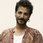
1. Introduction: Have you ever wondered how you could improve your lighting? My name is Jose Carvajal. I'm a beauty, fashion, and still life photographer, and also an occasional 3D designer based in Seville, Spain. I've been working as a professional photographer for the past four years, publishing in magazines such as TUSH, Nylon, L’Officiel, or Neo2. I've also worked for big companies such as Mango and Adobe. In this class, Studio Photography: Lighting Setups for Beauty, Fashion, and Still Life, I'm going to take you through all the steps to enhance your photography by understanding how light works in different environments. With the help of some exercises and assignments I made, you're going to learn how to use lighting and creativity in a clever way to reach the most interesting concepts, and how to filter them to create an outstanding piece of work. Also, I will show you my process to get the sharpest and most refined pictures to build an incredible portfolio and get commercial jobs with it. We will work on a mood board, use different light modifiers, learn how to work with models and makeup artists, and how to edit our pictures to perfection. Whether you're a beginner or a pro, if you want to improve your creativity in lighting techniques, this class is for you. I hope you all enjoy this class. See you around.
2. Class Orientation: Today we're going to learn how to use light strobes to make our shots more moody, dramatic, and give them a more professional look. This is absolutely essential if you want to build your career as a photographer, whether you want to center your work around fashion industry, still life, portrait, or beauty photography. First of all, we will work through some of my main artistic references, as well as books that I considered essential. After that, I will show you some creative exercises to train your eye and enhance your productivity when it comes to creating new projects. I will also explain, how I understand creativity and how we can apply our lighting knowledge to that area. The second assignment will be the making of a mood board. How do we look for references? How do we organise all of our ideas? I will also teach you how to use apps like Shot Designer, to build schematic lighting setups and including them into our moodboards. Then I will explain how light works. We will deep dive explaining hard and diffuse light, different artificial light sources, the basic equipment, the Inverse-Square Law, and the basics of a strobe light. I will take you through all the essential setups for beauty, fashion, and still life, such as the clamshell, the key light and rim light, the tricks behind product photography or how to use a light meter. Everything you need to step up. If you're ready, let's get into it. See you!
3. Equipment: In this lesson, we are going to cover the equipment needs we will have for our shooting project. The main piece of equipment that is going to allow us to express our creativity is the camera. If you are a beginner, don't worry about megapixels or secondary specifications. Pick up the camera which you feel more comfortable with. The most accessible option is a reflex camera, and you can find really nice cameras even in the second-hand market, if you need to save up a little. For the lenses, the most common for fashion photography are telephoto lenses like this 100mm from Canon, which I absolutely love, because I can use its macro feature in my beauty jobs. Anyway, if you want to get a bit more creative and experimental, you can always try wider lenses, such as the Nifty Fifty, the 40mm, or even a 28mm. For studio shootings and the lighting setups where you're going to make, the strobes will be indispensable. There are lots of affordable options, being my favorite and most used, the SK400 from Godox. What you should look at is the power of the strobe being 400, the minimum required for what we are going to do. And please, don't forget to use a nice and sturdy tripod to hold your strobes. People tend to pass by this, but having a good tripod is one of the best ways to care about our strobes. Also, you should have a couple memory cards and a 5-in-1 reflector, which will allow you to bounce the light with different textures and colors. As some optional equipment, you can have a tethering cable to shoot and watch your pictures on an external monitor or your laptop. You can have also a lightmeter to do some on-field corrections faster. Always have in mind that for starters, you don't need the most expensive equipment. With affordable stuff and combining that with the understanding of light and how it works, you'll already have great results. For the next lesson, I will tell you which are my main references and we will analyze how they use lights. Let's go!
4. Searching for Inspiration: In this lesson, we are going to explore the work of the creative people I admire, as well as photographers, 3D artists, graphic designers, and conceptual artists. It is absolutely necessary to have referents in the creative sector and not just photographers. Because this will be the starting point of knowing ourselves, what do we want to do, and who we'll be looking up to, so we can start developing our career. I think the concept is a very important aspect to start telling stories through our pictures and to evolve as artists. For example, I love how Eugenio Recuenco creates a unique world and a whole story in every picture, and the painterly eye he has provides his concepts a powerful vision. He tends to use continuous light and compositions with a lot of set design, which keeps every picture interesting and will have you looking at every part of it for hours. His Fine Arts background is quite noticeable as well as his particular way to tell stories. In his 365 Project, he shot an image for each day of the year, keeping a basic concept but changing the story inside of it. This time, he just use one specific set for every photograph. Three walls and a window. Look how he changes everything by setting up new ideas and trying new lights, new colors, camera positions, or even working with negative space. To me, he is the perfect example of having a basic idea as a starting point and taking it really far away. As for portrait and beauty artists, I could mention icons like Peter Lindbergh or Helmut Newton. But to me, Cecil Beaton is an absolute must-see. Beaton used to shoot famous people, but in a more intimate and sensitive way. He wanted to normalize them with these stunning portraits. You also should follow new talents like Agata Serge, Cho Gi Seok, Zhong Lin, Elizaveta Porodina, and Anna Rudzit to see what's trending right now and how fashion, beauty, and creativity have evolved in time. Elizaveta creates new situations full of color, saturation, props, and mixing different materials to make a dreamy and powerful imagery, which remains a lot to Man Ray. Also, on a little note for still life, check out the work of Roberto Greco, an amazing and sensitive photographer who cares immensely about composition, color, and delicacy. I'm always looking for new mediums of artistic expression, such as 3D and graphic design. One of my favorites is Peter Tarka, who develops beautiful conceptual compositions with the cleanest color palettes. Also, this book was a revelation for me in terms of texture and the use of color. It features a lot of amazing artists with unique creative perspectives. Check it out, if you're interested on seeing new shapes and beautiful ideas. As a pro tip, I would say to stay out of your comfort zone, especially if you're not a beginner. This will help you to train your eye in other disciplines and maybe this will make you try new visual situations. To me, creativity is the filter of our ideas and we have to work nonstop on it. In addition to that, changing your main referents and being in a constant searching process will keep you awake with a lot of ideas flowing. Now for this lesson, I want to add a little assignment, defining a concept through creativity. You have to choose between the ideas of pain, happiness, and hope, and shoot a picture of each, avoiding black and white for pain, people laughing for happiness, or the usage of green for hope. Avoiding cliches will make you put more effort on getting the best results. In the next lesson, we will define the moodboard for our final project. Follow me!
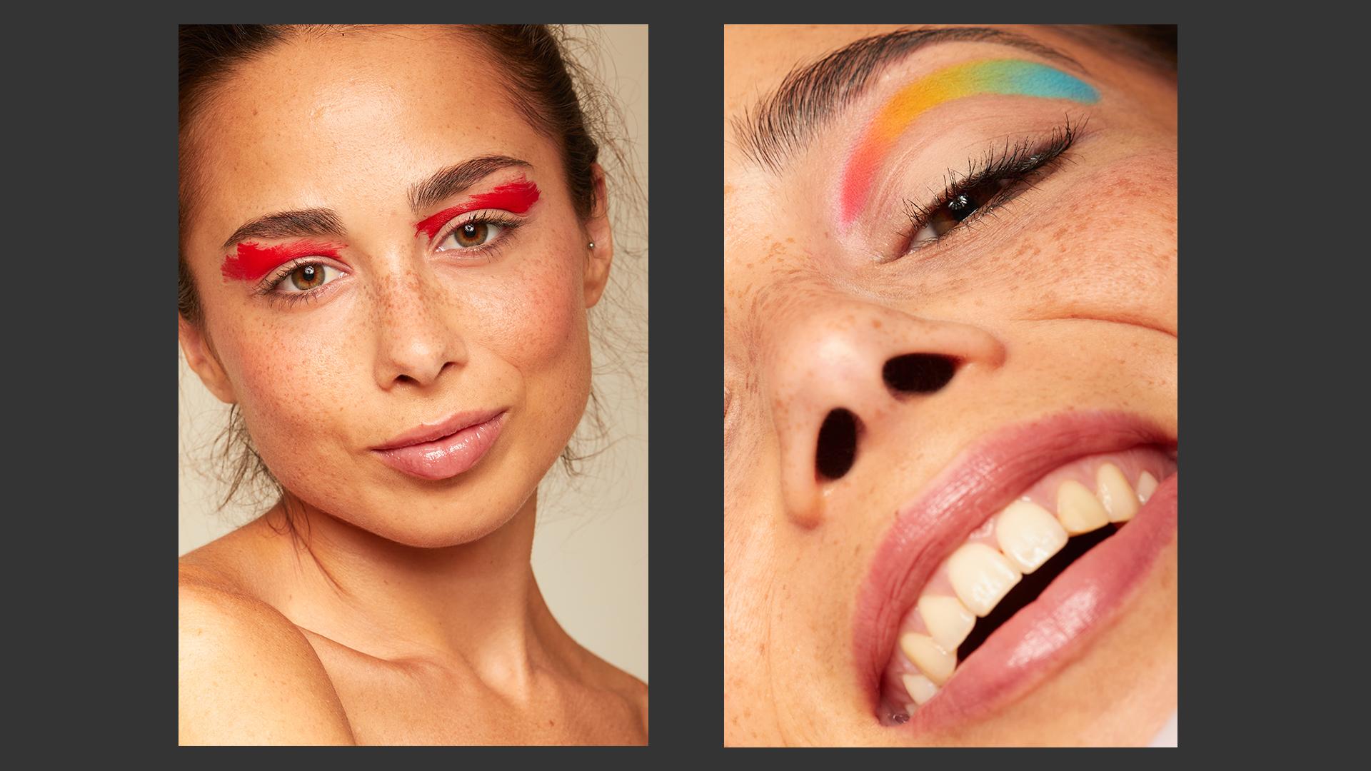
5. Making our Moodboard: In this lesson, I will walk you through the process of making a consistent moodboard. Having all references in mind, it's time to check out Pinterest and look for the kind of images we would like to shoot for our final project. A moodboard is a document or guide where we will be adding every idea we consider interesting for our shoot, so we have everything more clear. It is a fundamental part of the pre-production process and I would recommend you getting used to do it for each shoot. I'm going to be picking some images and doing my own mood board for the fashion shoot, and the beauty shoot, and the still-life shoot. The pro tip about using Pinterest is making our search as specific as possible so we can filter the results and obtain the images as close as we have in mind. In my case, I wanted to shoot some colourful and playful makeup, which contrasts with freckled skin, and also placed a couple of portraits and fashion references. Furthermore, you can see the mood board I created for the still-life shoot for this class. For the fashion shoot, I wanted to go for a contrasted look, with close black and white portraits and play more with different poses rather than focusing on eccentric clothing. That said, for the portrait references, I went to the "Freckles Series" from Agata Serge, which work as a great pose study and it is ideal to learn some model direction and color processing. In her case, she mostly uses natural light. But remember, these are just references for poses and shots. Try looking for interesting poses by searching for that specific topic and open your mind. Variety is what will make you stand out. The thing he like the most about Pinterest is that you can look for related content in every picture you choose and it is quite easy to organise with boards and pins, which you can set to private in case you don't want anyone to see them. The best piece of advice I can give you here is to look for contact sheets with different posing and acting. This is going to create a mental library of options to choose when you're in a shoot. Believe me, that's really useful if you run out of ideas or if the model is not too experienced. As photographers, it's our responsibility to know how to direct someone. It will be better for the mood of the shoot if you replicate the poses you have in mind, or if you show the reference to the model. This was my final mood board for the fashion shoot. As I mentioned earlier, my idea for the beauty shoot was playing with the contrast between some pastel palettes and the freckles of the model we had. The makeup artist and I worked together to get easier to the final result before the day of the shoot. Make sure you organise properly the different looks. They don't need to be done in the same order you set on your moodboard because some makeup products could be more difficult to take off, and those should be applied the last. You don't want to spend hours and hours in Photoshop! Get used to make your beauty moodboards with your makeup artist. There will solve any doubts you have. If you want to follow the beauty photography path, you have to learn about products, textures, and applications on the skin and hair. This was my moodboard for the beauty shoot. For my still-life shots, I wanted to go to a classic product image with a bottle of perfume. I wanted to get a moody shot with a nice backlight to add some extra color tones, which could add more spice and dimension. Try to set you're still-life tone before you are in the actual shoot because as you will see later on, it is a very technical photography genre, which doesn't accept too many changes because a little move can make you start all over again. Also, look for interesting references and try to write down the lighting setup once you've learned a little bit about it, and find out new ways of setting up your lights. This was my mood board for the still-life shoot. This is an example of a professional mood board I made to shoot with a model. As you can see, I prepared an external document to send to the team and the agency to plan it all. and I've started explaining my concept for the shoot, which was about birth marks, scars, and whatever that makes us unique and special. Then I did a color palette in the Coolors website, which allows you to explore possibilities and to define everything better. Of course, here we have some shots and acting references. I wanted to go playful since the model is also an excellent actress and she could get into any mood I told her. This was the model we shot with, Cecilia. In this case, since I knew who the model was going to be, I painted over a portrait of her with watercolour pencils and designed some looks to send them over to the makeup artist, so we could have our creative direction clear. Two of my three proposals made it for the final shoot, as you can see in these examples. The editorial got published on L'Officiel. Planning everything will make you successful. As an assignment, you will have to prepare a moodboard with a briefly explained concept of your own, 3-4 lines, a maximum of 10 images to visually describe your idea, and a description of yourself with your portfolio or background. Now you're ready to learn the types of lighting we will use. Come on!
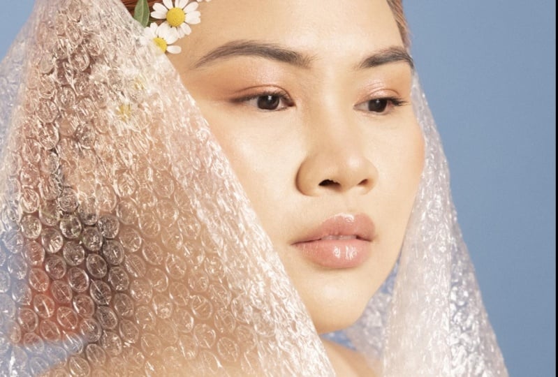
6. Knowing our Light: In this lesson, you will understand the differences between natural and artificial light. We will keep our attention on artificial light and we will see continuous and strobe lights. Though it may sound obvious, artificial light sources are all that don't come from a natural environment such as the Sun or whatever reflecting its light. A strobe is a light source which contains the energy in a flash tube. Whenever we trigger the remote, it releases all of this energy in a single discharge, and that's what we commonly refer to as "the flash". We can limit the amount of power on the flash panel of our light so we can use them with variable F-stops. To mark the main differences between strobes and continuous light is that strobes power is condensed on a single flash discharge while its modelling light just works as an orientation of the position. But it's not just as powerful as a dedicated continuous source. On the other hand, continuous lights have a constant beam of light which is sometimes modified by dimmers. Examples of these last ones can be HMI, Fluorescents, LED's, or Fresnel lamps. Independently, all of these light sources can be harsh or diffuse, which is determined by the softness of the transition between the highlights and the shadows. When the transition doesn't show midlights and a lot of contrast, we are talking about a harsh light. For example, look at the highest points of light here in Laura. The highlights are going to be concentrated on the forehead, the nose, and the chin. If you watch how light falls over this point, you will find the harsh shadows that make this a really contrasted picture. But if we see a gradient with highlights, midlights, and softer shadows, we have a diffuse light. Here in Kayla, we see a totally different thing. The transition is much softer, although we have a hard rim light on her jaw. Look again at the shadows and midtones under her nose and her cheek, and compare that softness with the harshest impact of the rim light I mentioned before. This can affect the result of our pictures, making them really contrasty or really softer. It will depend on what do we want to achieve. We have to add to this the Inverse-Square Law, which is a physical law which determines the fall-off or the difference in illumination if we move the source closer or further from the object. If we move it away from the subject, we will get a better transition between highlights and shadows, while if we move it closer, we will get a harsher light, increasing the contrast. Remember to adjust the aperture, each time you move the light further or closer to the subjects. We can modify the perception and the effect of light moving it around the horizontal or the vertical axis. This way, we can achieve more intense and dramatic results, and most importantly, with volume and tridimensionality. This is an example of a rim light, which consists of moving the source in the horizontal axis to backlit the edges of the subject. It is used as a kicker, a thin line of a highlight in a deep shadow to give volume. If we move the light to a lateral position, we will obtain a sidelight, which has more presence than a kicker but creates beautiful contrast for the shapes. This one paired with another on the opposite side is very used for sports photography. Placing the light overhead will create a mysterious and suspenseful effect, which is quite cool for some darker fashion photography or to add it to light hair if you're shooting beauty. If you said your light totally in front of your subjects, you will lose contrast, but you will have a softer look, and if you pick the right modifier, for example, a big umbrella, you can light the whole scene with just this light. It is perfect for fashion photography or test shoots. A low angle position is certainly not very common as a one-light setup due to its harsher look. But you can combine it with the basic beauty setup to make the clamshell effect, which will fill with light the eye bags and other unwanted shadows. Now, I'm going to show you some examples from my own portfolio. Here, you can see in Amanda's eyes, the frontal position of the light. As you can see, it is not too contrasted because I like the soft look and wanted to feel the makeup work consistently. Here, I combine two frontal light sources, but one of them is a little bit above Axinia's head, enough to light her beautiful hair and not losing a clean look for her stunning skin. With Jasmijn, I mixed three basic setups. The frontal, but a little bit above her head, the kicker, by bouncing two lights against the background to have a powerful rim light on both sides, and the low angle setup with a reflector. She looks lovely, doesn't she? In this editorial, I wanted a lot of contrast by using just one light. It was a dark vibe shoot so I placed a strobe overhead the models. You have to study what mood do you want to give to your shootings so you can solve the situation of not knowing which setup is better for you. This is a bit of a trial and error process, but practice and you will make it easier each time you shoot. Next up, I will show you what are light modifiers, and which of them are most useful for fashion, beauty, and still-life photography. See you there!
7. Light Modifiers: Light modifiers will be the spice we will add to our light to define the intention and mood that we want to give to our pictures. The essentials will be softboxes and octaboxes, which cast a soft and diffuse light, similar to the natural light filtered through a window. It is really useful for portraits or a more painterly still life shot. The strip box is a modifier that looks like a regular softbox, but it's narrower. So its main purpose is using it to define a nice rim light and adding that line of highlight in a pure shadow. We can have a similar effect by bouncing light against the background, for example, with the next modifier, the parabolic reflector. It will give us a harsh beam of light, and well used, it can mimic the effect of sunlight. It produces high contrast, which can decrease by using diffusion materials. Now one of my absolute favourites, the umbrellas. Umbrellas are one of the most affordable, polyvalent, and easy to carry and mount modifiers that you will ever find in a market. They are used for fashion, beauty, commercial, and some still life photography, except product photography with very reflective products. These can have silver or white reflective material, which will make the light harsher or softer respectively. You can find the biggest ones for really cheap, and you can use them as a most resolutive modifier for almost any kind of job. It distributes light in a very consistent and beautiful way. This is the main reason why I love this one so much. If you want to go a little bit more specific about beauty photography, the Beauty Dish is going to be your best friend. It is a quite difficult modifier to tame, but when you know how to use it, it looks amazing. It is a full circled modifier which contains a little metal dish inside of it that is placed in front of the light source. So it works as a light bouncer, distributing the light beautifully and giving that a beauty commercial look that we all want in these pictures. It is harsher than the umbrella, but softer than the parabolic reflectors. And my personal recommendation is to use a 70cm one with white cover inside. A little curious modifier is this snoot. It has a tubular build which makes light concentrate on a specific point of an object. The snoot produces a harsh beam of light, which can be even more focused with a grid. And it is commonly used for product and in still life photography. For a more commercial note, it is impossible not to mention scrims, which are big squared surfaces with diffusing material, and they are perfect to maintain a soft but contrast-y light without losing consistency. Finally, the most common accessories are honeycomb grids, which concentrate the light casted over the subject, diffusing materials, bouncers in different versions, or color filters. They can be used cleverly to be creative and experimental, and they will make easier to define our lighting intention, or even have a signature light on our work. When we want to design our setups, the best tool for it is the Shot Designer app. We're going to make all our setups with it from now on. Shot Designer is an app mostly used by cinematographers and Directors of Photography to lead their teams easily and having everything organised in terms of equipment and lighting. I highly recommend the use of it because it will make your work faster since you've already planned everything before going to the shoot, and you can develop alternatives if a set up doesn't work. Whenever we set a new scene, we will have two models by default, and you can delete them or add more by clicking the Add Character option. You can also create as many cameras as you need on the Add Camera tab. You can Add Props if you're going to have some set design and you want to make up your mind quicker, or if you have to shoot inside of a room where you are not able to move anything inside of it. You can create your own spaces by Adding Sets. Complementary to the Props tab, this will help you to place the lights more precisely and even define the modifiers you want to use depending on the size of the set. The most important tab, Add Lighting. Here you will see a great variety of modifiers which can be renamed and resized as any other element from Shot Designer. You can set it all close to perfection. I suggest you adding annotations and labels to tell the difference between modifiers, sets, or characters. Having clear our references and light modifiers, now it's time to check the lighting setups. Let's go!
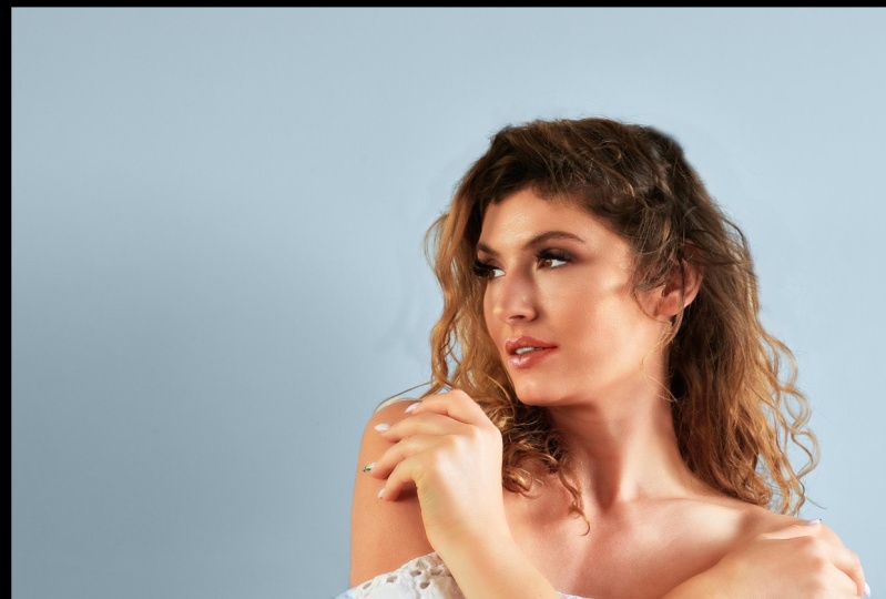
8. Lighting for Fashion Photography: In this lesson, we will cover the main setups for Fashion Photography. First of all, you will see how I did my pre-production on Shot Designer. I will show you two setups. I will start adding the model. Who should be around two meters away from the backdrop. This is important, especially for the next setup. Then I will add an Octabox as my key light in a 45-degree angle from the model and a little bit above her head, with the strobe pointing at her. Use a big Octabox if you have one around and this will cover all your necessities, whether you're shooting close portraits or doing a test shoot, which will require wider shots. Of course, put a diffuser in the Octabox because we want to make contrast, but at the same time, we don't want a really harsh light. On the opposite side of the Octa, place another strobe but change the modifier to a strip box to define the silhouette of the model. This is a very common light setup because you can add volume easily and it's a type of portrait that could be used by agencies to have their models' books more complete. Your work won't be just focused on lighting the scene, you have to direct a model and use your references to obtain the best results as possible. Don't be afraid of asking the model to replicate certain poses, but make sure she's comfortable with the job you both are doing. There is always a chance to change everything in case someone from the team doesn't like the pictures and it's preferable doing it instead of being uncomfortable or with tense situations. Always listen to your team! When it comes to direct a model, our visual references will help us to go in a more interesting direction and we can replicate those poses by ourselves so the model can understand what we want. Hands positioning and making the look more intense by lowering the chin is key to have the best shots for this. We could try putting up the chin so we will have a most defiant attitude, and that's very common in fashion photography. To do a recap, work with the Octabox as the key light and place it in a 45-degree angle from the model. Use a strip box to have a beautiful rim light. Don't forget about directing and working as a team. For the second setup, we will just use one light and one modifier, my lovely white umbrella. Place it behind you and above the model's head, but not doing an overhead setup and feel free to shoot. It will be the easiest setup we will make up today. If you experiment with it, you can apply the knowledge from previous lessons. Remember the Inverse-Square Law, if you want to gain contrast with this soft modifier, place the light closer to the model. But if you also want to lit the background, place it further. If you're working in a studio and it's provided with a boom light stand, use it to move the light around easily. If you have the chance use a light meter to learn how to do quick measurements on-field to change your camera settings if there's anything wrong or to adjust the strobe's power. A light meter is a tool which receives light and depending on the settings you have on your camera, it will calculate the correct exposure, giving you an aperture value. My recommendation is that you set it up to flash mode if you're working in a studio, set your camera to 1/200 and 160 ISO and try to achieve around f/8 to f/16, which will be perfect for the fashion and beauty setups. Remember, a white umbrella is the best and most affordable option to start shooting fashion photography. Use a light meter to make sure you're using the proper power and settings. Set everything to at least to 1/160 and 160 ISO. For fashion and beauty, try to shoot between f/8 and f/16. Here you have some examples of the results from my shoot. The first part of the main class project starts here. You have to do a fashion shoot, trying one of the two setups I taught. And then deliver one picture in JPEG. Practice these setups and whenever you feel ready, start the next lesson where I'll be covering a couple of setups for beauty photography. See you there!
9. Lighting for Beauty Photography: In this lesson, we will cover the main setups for Beauty Photography. This is my scene in Shot Designer for the first beauty look. We start building it by creating the model and the camera, my 7D with the 100mm macro lens. After that, we will go to the lighting tab and select the Softbox, which will be renamed as Beauty Dish. We will escalate it and specify the dimension of the modifier, in this case, 40cm. I will add a PAR light, which will be renamed as parabolic reflector. It will cast the light against the background. The purpose of this parabolic reflector is to blow out the backdrop with light, obtaining a beautiful and soft rim light and a clean background. You can add another one to fill the scene a bit more. I also added a couple of V-Flats, just in case I would like to have more contrast with its black sides or fill with more light using the white sides. Remember: the Beauty Dish should be always above the model and photographer's head. We could have one or two strobes blowing out the background at almost full power to create a rim light on the model's head and body. We can have optional V-Flats to generate more contrast or bouncing a bit more light. Finally, the camera should be a little bit under the model's look. The first shot of every look is our guide to see if there's anything to correct. We have to be extremely careful with every detail. We have to trust our team and be confident enough to say or ask if they need to take a second look at the makeup, which will reduce the amount of post-production work a lot. In terms of model direction and, camera positioning, we have to be a little bit below the model's eyes. While she should be always looking straight to the camera or telling her to chin up. When using the Beauty Dish, try positioning it as close as the diameter of the modifier marks. Because if we set it up too far, we won't have the beauty look. You can put a silver or a white reflector under the model's body, which will fill with light, the eye bags and we'll have the classic beauty commercial look. This is also known as the clamshell. These were my results for this first look, as you can see, the left one was shot just with the hard light of the beauty dish and the right one with the parabolic and the beauty combined. I also used my silver reflector, to do that clamshell effect on this one. The perfect way to lead a team in a beauty shoot is having clear eye visual references and different makeup looks. The next one is one of my favourite setups using the silver umbrella. This time you have to care with the distance between the model, the background, and the light. If the model is too close to the background, we could generate a flat result with almost no contrast. We want volume, so we will separate the model and the background. We'll put the umbrella not just above our heads, but also pointing at the model's body like if you were trying to cover it. This will make a more enveloping light with a very consistent result. To do a bit of a recap, use your umbrella pointing at the model to cover the whole set with light. Set the proper distance between the background, model, and strobe. You can also add a reflector or another strobe to do the clamshell effect, as well as V-Flats. Tell the model to chin up and try to crop with your lens to do a powerful close-up. These were my results using the umbrella and teaming up with a creative makeup artist to develop a beautiful result, and using just one light source with a big umbrella. Impressive, right? You have to train your eye a lot to be capable of doing these extreme close-ups. But remember, practice makes a master. If the model has her head too low, you will have too much general contrast and she won't have the light reflected on her eyes. Telling her to chin up is going to be a frequent direction if you start shooting beauty photography. Now it's your turn to try shooting a beauty look. Work with a makeup artist and a model and experiment with one of the setups I covered. Whenever you feel ready, follow me on to the next lesson, we will build a lighting setup for a Still Life. Come on!
10. Lighting for Still Life Photography: This lesson is going to be about how we can create a shot with 7-8 light sources, but just with one or two strobes. Follow me and you will see the trick of it. This is the result I got from my still life picture, and this is the setup. As you can see, there are a lot of light sources, but we don't actually need these many strobes. The trick is having clear the look that we want, and start finding the position for our product. After that we have to shoot a picture with almost no light, as dark as we can. Then we will start adding different sources, key lights, rim lights, detail enhancers, subtle beams, a light for the backdrop... We will have around 5-7 pictures, depending on how many lights we want, and we will get them all into Photoshop. So there's going to be a little stacking retouch to mix all of these lights in just one picture. Clearly, this is the hardest of all the setups we're covering today. This requires to be precise and careful, so let's get into it! First of all, I'd recommend you setting up your bottle and a reflective board on a sturdy tripod. Find the height and the final placement of the bottle, and then use a little bit of an adhesive material like Blu-Tack to stick the object to the board. We don't want it to move at all. Once we've done this place the camera, try to set it at the same height as the bottle, at least for starters, and fix your position on a tripod. Be careful with moving it once is set up as well, as I mentioned that we're going to stack some pictures in post. Now the fun part, lighting the scene. Set a background with a black cardboard and behind it set up a strobe with a rectangular Softbox. The cardboard isn't going to work just as the backdrop but it's also going to work as a flag. In photography and cinematography a flag is an object that blocks light and that's precisely what we're going to do with the strobe behind it. Why? Because this way we will divide this back light into two beautiful rim lights. I recommend you using a remote shutter control or the internal timer of the camera to avoid every possible movement or shaking you could make accidentally. Once you've shot this one, move away the black cardboard and shoot again. Have you ever done a mask in Photoshop? This is the manual way to do it and this will make it easier the retouching, and stacking process because we will process the image without compromising the rest of it. Once we've solved this, let's move to the other sources. The next one would be our key light, which is a strobe with the Softbox we used earlier but in a 45-degree angle from the object, covering its height, try to shoot covering part of the Softbox with another flag if you want to get an even light depending on the bottle. In this case, I needed that, so I covered different areas to see which one works best. We already have three pictures, let's go for the next. Place another strobe to the opposite side of the key light and using a Strip box, we are going to light a little bit more of the bottle and especially the cap. As you can see, we're lighting the objects individually and we can do this with just one light but remember always to be precise so our trick will work better. Four pictures done, let's go with the fifth. As you can see, we cannot see the logo, but using the same strobe with a snoot we're going to solve this problem. A snoot is a modifier that concentrates light on a specific part, and we will point it directly to the brand logo. But as you can see, we don't get everything covered the same way. How do we fix this then? Take a piece of white cardboard and place it underneath the logo. Shoot as many times as you need moving the cardboard up and down to obtain these whole part covered with light, be patient and you will have it. And the sixth and final picture: Place a strobe underneath the tripod, that holds the bottle, and using the parabolic reflector pointing it to the background. This will create a beam like the ones we got on our references and we can turn it into any color we want. Maybe we should try a nice purple in it! I used a grid on it to concentrate the light a bit more but this is not totally necessary. To do a bit of a recap, first of all, be patient and don't rush. This is very technical, but I'm sure you will be capable of getting an amazing result. Be delicate moving around the camera or the object base. Try different modifiers, experiment with camera angles, and most importantly, don't be afraid of the strobes! Flags and bounce boards are going to be your best friends here. For the retouching process, I selected my favourite shots, exported them and got them into Photoshop. The key for this is using the masks, inverting them and painting over the base image you want. So step-by-step, you will be adding more light sources to your picture. For the logo I've replaced, the one that was lit with the snoot by creating a mask with the Pen Tool (P). I did a clipping mask as refined as I could just by selecting it, inverting it, and instantly obtaining the logo that I wanted. Remember the manual mask picture? Here it comes. Once we've solved the logo lighting, we can select and refine our picture using the Quick Selection tool in Photoshop by pressing "W". Create a mask from it and replace the inverted masks on the rest of the pictures. With the Brush tool, clean some edges and details you want to erase. By the way, when masking the bottle don't forget about doing the same work on its reflection. Last but not least, I want to turn to purple the light beam on the background. I think it can create a beautiful contrast. With the Selective Color Adjustment we can turn this gray into a powerful purple by masking the light beam. Here you have again the results. As you can see, I also shot one with a different camera angle. I hope you like them a lot! Now it's your turn, practice this set up with something you have around and create a beautiful scene by composing layers of light. In the next lesson, we will see how to work in color and enhance the look of our work. Let's go!
11. Coloring our Shots: This lesson will cover my process of preparing the pictures in Capture One to have the closest color editing for the final result. What I prefer adjusting at first are the Exposure parameters. You can find these in the Exposure Tab in Capture One. Inside of it, we will see a lot of controls such as Exposure, Contrast, Brightness, and Saturation. With the Exposure, we will overexpose or underexpose our image if we need to compensate our initial shot. The contrast will increase or decrease the transition between highlights and shadows. If we pull it down, we will obtain more mid lights and wash the shadows a little. But if we pull it up, we will have stronger highlights and shadows. The Brightness will increase the power of the highlights, but be careful, increasing the Brightness is not the same as increasing the Exposure. When we increase the Exposure, we're modifying the general lighting intensity, but with the Brightness, we're just adjusting the highlights. A bright image is not the same as an overexposed one. Saturation will define the final color signal of our picture. If we decrease it below zero, the picture will lose color. If we reach values higher than zero, our color signal will be a stronger, more vivid. All of these controls should be modified lightly. Capture One has the advantage of letting you change anything by doing subtle corrections, so try not to over edit. We have to take care of our lighting techniques, but also we must do the same with our colouring process. In the High Dynamic Range Tab, we will be able to edit the intensity of the highlights and shadows of a specific part of our image, as well as the black and white tones. With the Clarity, you can soften the texture of the skin when using a negative value. Well, it will enhance some details if you give it a positive value. It is especially useful for freckles, eyebrows, hair, and other interesting textures. We will find below it the Structure parameter, which will define a little bit more the lines of the shapes inside our picture. It works similar to a High-Pass Filter. To modify light and color tones, we will have the Curves and the Levels. But the one I prefer to use is the curve control. I'm used to it and I find it easier. You can diminish dominant color tones to correct their general image. If, for example, it looks greener or reddish than it should be, then modify the exposure in Color and Luma controls. Experiment with it and find your way to work with them. I suggest to start by doing these classic S-shaped correction, which usually works quite nice. On the Color tab, we will find White Balance Adjustments in case you want to refine it a bit more, and the Color Wheels, which can affect you in a general way with the Master Control, but also can be divided into three wheels; Shadows, Mid tones, and Highlights. This way you can tint with color the different types of light of your picture. One of my preferred color setups is the black and white control, which allows you to change the intensity of each color tone individually, lowering, or increasing its light power. You can create heavy contrast of black and whites with these, and it is real fun doing it. Also, you can split tones on the top next to it. Which change the color of the highlights and shadows with the hue and saturation panels. Finally, a fun trick I always like to show. You can change colours by using a selective mask, and believe me, this is quite impressive. Go to the Layers tab and create a New Empty Adjustment Layer. Then press "B" to select the brush and paint wherever you want to change the color. If you are not able to see anything, press "M" to show the mask you've painted. As you will see, we don't need to paint the same exact shape, but we can ask Capture One to do it. Go to the layer you're working on, right-click on it and select "Refine Mask", and it will adapt to the shape you have painted over. Then, you're ready to play with any color or light changes. Cool, isn't it? Now, to export the picture, make sure you have selected the right recipe, setting the output on TIFF, 16 bit, and 300 PPI. Right-click on the images we want to export, press, "Export variants" and voilà. With some little touches, we will have our image ready to export. When using Photoshop for beauty and fashion, we can find ourselves in a couple of situations we need to fix. For beauty, maybe we will need to erase a couple of pimples or some hair that shouldn't be there. For pimples, I like to use the Patch Tool. You can find it by pressing "J." If you alternate the options of this tool, you will find my first choice when it comes to erasing thin stuff. The Spot Healing Brush Tool. Remember, don't over-retouch. The best thing to do is just erasing the temporary stuff and not modifying the model to an exaggerated point. For situations like the one we see in this picture, we can erase the modifiers of the background with the same Patch Tool and add the pieces of background we need with the clone stamp tool. If you want to have a perfect cloning process, use the Pen Tool to select where do you want to work. Each time you use the Clone Stamp Tool, it will only affect that area. Experiment with color and share your edits here with us. In the next lesson, we will be wrapping up and doing a little recap before you start doing your project. Come with me!
12. Final Thoughts: Congratulations on finishing the class! I hope you found it interesting and learned a lot. To do a little recap, we covered on how to search for the best artistic references, how to create a mood board, and how to light different scenes, having in mind the essential differences between harsh and diffuse light, continuous and strobe lights, and how modifiers work. Also, we created three pictures; one for fashion, one for beauty, and the last one, a still life composition. I'm really excited to see what you've done. Don't forget to share your work here and on social media, and tag me so I can go through what you did, and let you know what I think. Photography is a little bit of a hit and miss, but I'm sure you will find your way if you have everything clear. Anyway, if you have any questions, feel free to leave them down below. Thanks for attending this class, and I hope to see you all again soon! Bye!
 Jose Carvajal, Beauty photographer from Spain.