Transcripts
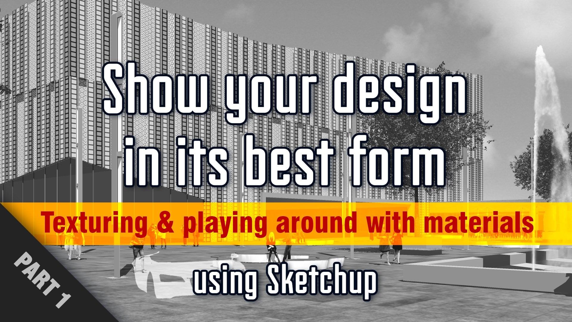
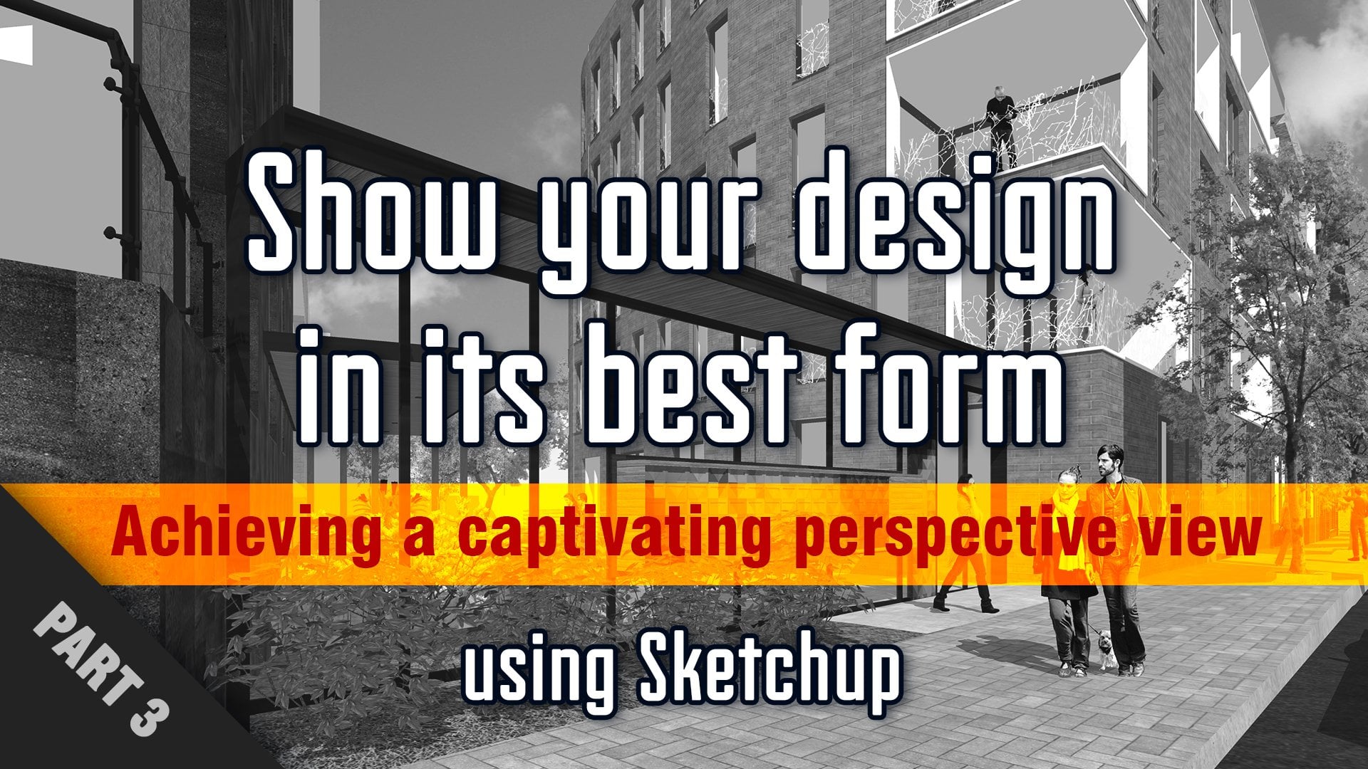
1. Intro - Show your design in its best form using Sketchup: showing your design professionally, proudly and persuasively. Does that sound like something you want to achieve? Maybe you're kind of frustrated with the gap between what you have in mind versus how your mother looks like or maybe wanna learn how to really optimize your seen at its best before jumping into your Regnery process. Or you might not be totally aware of schedules potential and your couriers about it. Poor. You just want to put your skills. You're awesome. Hi, I'm These are then I'm an architect and I've been using sketch up for a decade, so you could say I manipulated like my favorite video game. This course is a complete, comprehensive course about the exciting topic off the visual aspect. First thing I have a question for you. In your opinion, where would you find the best references for showcasing an architecture project? Well, the answer is an architectural photography. Just think about it for a second. The essence off architectural photography is precisely to show architectures in the most appealing way and in its best form. And here's the thing. Besides being an architect, I just happened to be a photographer as well, and I've been practicing our protection photography for so many years. So I'm going to share with you the most valuable substance of my experience in sketch of and in photography combined, I would be going through simple photographic notions that we will apply directly inside of sketch, and you learn how to get into the mindset of a photographer to choose the best angle of view for showing your brother. And to make this combo even more powerful, I'm going to dive into how you can create your own personal visual style for presenting your projects, from conceptual styles to diagrams to more realistic styles. There are many ways to showcase your model, each one with a different purpose and character. You'll also learn how to create much more believable models on how to make your projects more convincing by adding life to them and using components in very specific ways Way and I'm also going to show you how you can literally play with textures and add that to your design exactly as you wish. And if you're a designer, I think you're gonna love the part where I show you how you can get creative. Put it and I'll be going through all this easy to follow. Step by step videos that would be organized on the three main chapters. One text churning and playing around with materials to adding life to your model. Three. Achieving the captivating perspective if you so staging with me this unique and exciting course where you gonna learn how to have fun, making your projects more professional, precise and impact enroll and see you in a minute.
2. 2D People components overview: Hi. And welcome to the first video off adding life to your model. Thank you for joining. You are awesome. In this first video, we're going to have an overview off different types off two D components for people. Okay, so everything that you were going to see our components coming from the three d warehouse that is right there, three d warehouse. And basically I just typed two D people or to any realistic people or whatever. Everything's coming from there. All right, so the first tile is this cartoonish style and the default guy coming when inside of sketch up by now, he's so famous. His ah, in this style. So basically, there are faces that are making the cold component. So you can basically just choose whatever color you want for all this. Now, look that he's so much younger. Yeah, so, yeah, you can play around with us and there are quite a few with this same style and even, like, totally blank ones. And you can Yeah, you can paint and go back to your childhood anyway. So that's the first style. Then you have more stylized components, and this one is just an image basically. So as you can see, I just picked the material and it's just an image. Basically, if you change the color here, it wouldn't work the same when it does work here. But then you have strange boundaries. Anyway, it's not done for that. So if it's an image, you probably won't have much control over what's happening in the tones and colors. Then you have this silhouette. This is just very basically silhouette, and you can change the color of it. Uh, also. And yeah, you can change the opacity as well. So yeah, this style may be very useful if you're looking for kind of a conceptual scene, you know? So, yeah, I like to use these tires as well. Then you have very interesting drawn and painted styles, and this can really add something unique to your scene. If you're into this kind of mood, you know, personally, I don't use them very often, but some of them are really nice and can really fit in side of your style. After that, we have the photo realistic people for basically they're just pictures, okay, and these are the kind that I personally like to use a lot. But there are a few problems with them, and I'm going to cover them in the next video
3. Realistic 2D people problems: So you have three key things to pay attention to when choosing photo realistic people. The first thing is quality, the quality off the image. So as you can see this one, if you put such a component in a view and it's that close, it really messes up with the whole scene. Basically. So, yeah, just pay attention to the quality of the picture. Next thing, as you can see here, the quality is really nice. However, what's happening is that this is a photo with the perspective effect. So what happens is that when you take like an elevation mode, then you see that the guy here is hanging in the air, and if you activate the shadows, it's even more visible. So now you can see clearly. So, yeah, that's the second thing to pay attention to. You don't want that unless it's very far away and the shadows are not activated, then it's all right. But otherwise this might look very weird in your scene. Next thing Okay, this the quality is really good and she's standing on the ground, which is perfect. But if you activate the shadows, as you can see, the projected shadow is just a rectangle. And the reason why is if you enter inside of your component and selected, you see that it is a rectangle. The outline is not the silhouette such as this one here. If you select, you see that the outline is perfectly aligned to the silhouettes. Okay, so if you're looking for a, uh, photo realistic style and you're going to activate the shadows, this is something you have to pay attention to. Okay, So the best example is this one among these four and the quality is fairly good. His feet are flat on the ground and the shadows are perfect. So Yeah, There you go. These are the three things to pay attention to quality, perspective, effect and people handing, hanging in the air and the shadows.
4. Creating face me components: Now there's something you may have noticed with all these components. And the thing is, wherever. Sorry for that. Wherever I move, the components always face me. And this is why they're cold. Face me components. Okay, so how do you create such a component? Imagine you have this one. I just exploded it and basically just have a to d drawing. Oh, my God. What's happening, Men? You're so angry. Poor guy. I'm gonna fix that. Yeah, has been to the sun. Ha, ha. Anyway, um So how you create this to face me? Component. First thing you have to right, click and make a component. You can name it, whatever you want, or you can leave the by default title. And here's the thing you want to take. Always face camera. So if you do create now, it always faces the camera. But there's something I want you to pay attention to Is the fact that the acts around which it pivots is not centered, as you can see. See pivots around an axe over here. Okay. And this might cause you're a little bit off trouble in some cases. So what you have to do, I'm going to re explode it again. I'm going to make this as a component, always face camera, and then I'm going to set the components axes so that they're not de centred like that. I wanted to be centered right here, click and click create, and now he's pivoting around his own center. So that's how you create face me components.
5. 3D People components overview: OK, now let's look into the three D components off people in the three D components. You have several styles. Well, and like this one here, which is kind of, ah, very basic three D model and I personally wouldn't recommend to use. This is really looks like a toy with all the triangulation visible on. Do you have? Ah, a few of these tiles, but I wouldn't recommend to use. And it really looks weird in the model. Next, we have this kind here, and obviously what's very disturbing is the lines off the geometry of the model. So if we deactivate the edges now, we see much clear what's happening. Okay, so this is a much better model than the one before. It's more detailed, but still is very weird and doesn't look very natural in ah, a scene. Okay. However, what I recommend to use if you're looking for three D people, this kind here looks really amazing. As you can see, all the textures are riel and even the face think everything looks very realistic and it's really great. Okay, now, when you import components from the three d warehouse, this is what you may come across. So if I measure this guy here, I find that he's got a very realistic measure with 1.7 almost. OK, so, actually, all the components before we're too big. Find measure. This one here gonna reactivate. I measure this one, and he's about 4.6 meters. And the reason why this is happening, it's because these models were modeled in inch and not in centimeter. So basically, if you want to re scale this, he don't have to guess how much you have to re scale because it's unknown value. So one centimeter equals 0.39 inch. So when you re scale these, you just have to type in 0.39 and then you have your You're right scaling. Okay, so that's a little tip you can use for re scaling these too big or too small components, depending on watcher how you're working, Okay, because sometimes you can even find, like, totally out of scale components and very weird, and this is freaky. So in this case, obviously you would wanna re scale directly to, like, 10 times smaller at least. And still not enough. So yeah, you just have to re scale everything. There you go. Now, the big problem with three D components is size because they can be very heavy. If you start populating or you're seen with only three D people and you have, like, don't know 2030 of them, then your model was going to be really, really heavy. So that's the only problem with three D people. At least this kind Andi, it really depends on how many you're planning to put in your scene. So go check it out. Everything is in the three d warehouse and you can really have fun with it.
6. Populating scene - Part 1: OK, in this video, we are going to populate this scene. So I'm gonna add all different types of people in components inside of this scene and show you how to integrate them in a way that you're seeing becomes believable. But before doing that, I'd like to suggest you one idea and the idea is to create your own library off components . So what you'll be doing is just creating new sketch of fire where you'll be putting all the best components that you used throughout your different projects. So every time you come across a good component for a project, you just keep a copy of it in a separate schedule file so that all the best components that you found are in the same place. So this is very handy. I really recommend you to do that. So what I'm gonna do now is pick a bunch of people that I'll copy and paste them in my seen our fast forward, this part and I'll catch you right after it. Okay, so I just pasted all the people from my other file, and the very first thing I'm gonna do is make sure that the kind of people that I copied actually fit the type of project. So here we have a ground floor with shops and the commercial activity, and the upper floors are or residential with terraces. So what I'm gonna do is remove all the people that have nothing to do here. So let's do this. So, as you can see here, we have a business man, and it's okay to have been businessmen or women walking by the street in a public place. But this guy looks as if he's working. So this one goes away. Okay? This man is jogging and ah, hey would be like the middle of a crowded place. And usually, you know, we have people joining morning parks or or more open spaces. So this one goes out sa's. Well, okay, we have here a guy drinking wine. And if there was a restaurant somewhere here with a terrorist, I would have left him. And maybe he could go actually, on a terrorist upstairs. Could be drinking wine on his terrorists, you know, just watching the people passing by in his street. Okay, So we here we have women shopping. That's perfect. Okay, people biking. I'm not terribly convinced of this, especially on this side of the street. But we can still have them, like maybe, you know, on the road. That's fine. Um, who else is going out? Okay, shopping people. Okay, that's pretty good. This one here, Maybe we can find a situation where we could use them. And actually, I have here a statue. So maybe hoops. Maybe we could put them somewhere here as if there. Yeah, this this works so perfectly. Actually, she is. She's showing her kid this statue on looking at it surely looks nice. So, yeah, now that we have remove, like, all the kind of people that wouldn't be in this kind of place. Now the next thing we're going to do is remove all the posing people. And when I mean by posing that literally, you have models posing in many, many components, people components such as this one. And this looks so unnatural, Like ho would pose in the middle of the street like that, you know? So, yeah, this type off components, I usually don't recommend to use them unless it's very specific, you know, even on a terrorist, it's It kind of looks weird. So Yeah, posing people is a no no for me. And what else? Yeah. What I suggest actually to do is put all the best components, all the best people you have here in the foreground. So if, like, you have one that really fits the scene with the the project, put it more in the foreground instead off in the background. Really? You can create a hierarchy based on how good the components look inside of the model. And so, yeah, you would put the best ones in the foreground and you're seen. So I'm gonna do that. I'm gonna select all the best that I find this one here with her bag. It's just perfect somewhere the foreground. So, basically, I'm gonna pick all the people who look as if they're shopping. Really? Because that's what this project is about in here. Um, not really shopping, But let's put her on a terrorists. Even if she's got a bag with the angle of view, we might not see that bag. That's fine. We'll just see that there's someone in the terrorists, huh? This one could be crossing the street, but I don't know it. It might end up creating too much attention over her like, Oh, my God. Someone is going to get hit by a car. So, uh, it could have bean a nice idea, but in this case, I wouldn't do it because, like, it would remove the focus from the building. That's my opinion. So I don't know. I'll put her somewhere else. Maybe here, Onda? Uh, yeah. Forgot this one here. This looks weird in the middle of the street, right? So I'm definitely going to put her in the foreground on a terrorist, because this is exactly the kind of scenario you could imagine.
7. Populating scene - Part 2: so I'm really improvising actually right now. And that's what you would be doing as well. And everything won't be perfect directly from the first round. So you have to work things around and, Ah, the next thing I want to talk about is creating interactions between the components between the people. Like I'm going to take an example here. This guy and this woman here we can put them together in a way that suggests that there chatting together and having fun together, she she seems like she's laughing or something, and he's smiling. So this really works perfectly and a recent just to do this as often as you can, because this is what would make the scene more believable. If you just put people out there like that without creating this kind of interaction, it would look as if people are walking ghosts, you know, And so adding this interaction could add a lot to your scene. Okay, So see, like, this man could maybe walk side by side with ah, someone else. Are this woman here? And this woman there? Yeah, that works. Fine. Looks perfect. Actually, I like it. Yeah, we have more posing people I'm gonna put them far away on the terrorists with them here on the same terrorists. So as I mentioned, the ones that really work well with seeing you put them in the foreground. And these, like, posing people that might look unnatural. And, ah, if you see them from close enough, if you just put them far away and just, you know, um, filling up three empty spaces, it could work Fine. Okay. The next thing to do is creating interaction between the people components and the project itself. So let me explain, For instance, this woman here looks like she's walking towards the road. But really, she's not. She's not going to cross the road like that, you know, she doesn't seem to be paying attention to anything. So, uh, in this case, what that suggests is really edit the components so that they fit better. And what I'm doing here is creating just a mirror off this component. So basically, you use the scale tool and you skilled from this side here to minus one, you can just type it in, or you can just snap it right there. Okay, so that you know, now it doesn't seem like she's going to the wrong side of the road. Okay, so we're gonna look at this aspect now off the components and let's see, this guy isn't really looking anywhere. It's just looking into a wall. So maybe we could put him somewhere here. So that from my perspective, here he's Yeah, like he's looking more into the distance. That works much better. Okay? And I actually like that. These people are walking side by side like this, and it really works great in the foreground. Um, what else? Let's see. Oh, yeah. I have these nice, uh, a couple of ah people, and the guy is trying to take a picture of her, but we're just on the wrong side. That's that's the right side of it. So we're gonna put it in the right orientation. So we're gonna use the scale tool again, and, well, it doesn't work neither. So what I'm gonna do is just explode this group and put her directly in the right direction . Okay, so now let's see where we can put these guys had actually in mind with them right here somewhere. Like the guy is taking a picture of her watch. He's standing in front of the statue. So again we're creating. There is interaction between the components and with the project itself. So we would need, like, more of, Ah, an angle like this. It would work does really work in my case, but you get the idea of hard to create interaction with the project.
8. Populating scene - Part 3: Now let's have a more global view on all the components because we were just zooming in every time adjusting in the details. But the overall view has to work. So now let's make some more adjustments. As I said, I really liked the people here interacting with each other. This man could enter inside of the shop. These women have also a nice and direction. This one could look as if she's going out are the shop and there me too many people on this under straw. It is not like Oxford Street or something. The purpose is not to just fill everything up, you know, just have to use those things. Okay, this is starting to look OK? No. The next thing I'm gonna make sure of is that everyone is standing on the crown because I see that people are hanging in the air. So I'm going to do that right now. All right? So really, don't forget to do that. Because usually what happened and it happened to me many, many times, is that I put all the components I export the images and everything, and then I realized that some people are hanging in the air like with 20 centimeters from the ground or something. And ah, really, that doesn't look good, so make sure the people you add are actually standing on the ground. There's a small tip you can add here, and this is something that I learned from photography and is the fact that you might have people superimposing each other, and in some cases it can be kind of disturbing, like we don't understand really what's happening. So I'm going to give you an example here. Like, for instance, let's say these people here, it's okay to have, like, crowded components. But the thing is, if I like this component right here, like this woman standing and the thing that there's someone behind her, actually, it's Ah, it's the same guy here, so I would have deleted in any way. But just to explain to you, these people are superimposing each other, so we don't see clearly the silhouette of this woman, and sometimes it's too bad because it's interesting to understand. It's clearly how things are so maybe like that. It would have worked better just in terms off silhouettes and space between the components , you know. But obviously this one is going away. And actually, I like how she's standing so I can put term more over here as if she's looking at the edge off the road. You? No, to something. Um, yeah, that's the kind of thing, but we don't have that many people on, Duh. This is this something that you may come across or you may want to take into consideration in some cases. Also very fight the height off your components. This one seems to be a little bit small, but he isn't. So maybe that woman is a big too tall. Yeah. 1 88 This is definitely it's not impossible, but it really looks weird in the scene, especially that she's in the foreground, Okay.
9. Populating scene - Part 4: now, the next idea that I want to suggest you is checking out the lighting of your components according to sketch up son. So if I activate my son here, Okay, we get the idea where the sun is coming from and how the shadows and I'm going to turn it off because it's gonna be a little Laghi. Otherwise so now that we have the idea of where the sun is coming from now we should take a look at our components and see if the lighting is correct. When the lighting is kind of defused, like in this one here, it's OK to leave it. That's fine. You just don't wanna have people having totally the wrong lighting, you know, in your scene. So let's have a look. Okay, In this case here, we see that the lighting is coming from the left side. As you can see on on her legs, the shadows are on the right side and light on the left side as well as on her hair. So this doesn't really fit with the lighting off our scene. So when when the do is just remove her, it's fine in this case that this woman is the opposite. Actually, the lighting is hitting from the right side. And as you can see here, especially on her foot, everything's in the shadows. And this doesn't correspond to our lighting. Neither. This one here really works. Great, because it's exactly fitting with our seen lighting. So, actually, I'm gonna pick her up and put her more in the foreground, especially that we've deleted already won here. So, as you can see, you can still move things around even after he decided in half. Turn provides a lot with this. So, yeah, this guy here is actually totally in the shadows, so this doesn't work because we have the shadow of the building here projecting, and so he should be totally in the shadow. And it's clear that he's like protection from the sun. And he's got some lighting on, probably more on the front side from left side. So, yeah, this lighting, it doesn't work. And I'm thinking of putting him somewhere else, but I don't think he would fit with the lighting, actually, so I'm going to remove him, Like to have them more inside of my frame like that. Okay, that's looks really, really great. As he said, we avoid super impositions. Sometimes in some cases, in this case, there like three components superimposing each other because I moved this one earlier on. So I'm just gonna move for a little bit more like that. Yeah, that's bitter. And actually, I like how this one is like checking out what's in the shop, you know, through the glass, through the window. So I'm gonna put her more on this side. Yeah, that's great. Now it's really it's starting to look great. Now, the next advice I would want to give you is making sure that the contrasts off the components match with each other. And what I mean with that is, for instance, these two people look as if there can never washed out, especially compared to these components here that have much stronger colors. So what you can do is just pick up the material. And as you can see itself, it's a picture. Or as you can see, actually, these two were in the same picture. They were just separated in the component making process, so you can just pick them up and increase the saturation. In this case because we have more colors. As I just said, See, this looks already much, much better. Have more colors in the tones and the genes here in the skin tones. It really matches better now. And actually these components here, these people here are slightly oversaturated. If we take life, for instance, this as a reference, which is kind of between the two. So yeah, you can find tune this as you wish, and I suggest to do it, especially with the people in the foreground, you know?
10. Populating scene (Summary) - Part 5: so to synthesize all what we've been doing right now. First thing we did is choosing the right type of people according to your project. Second, it's avoiding posing models that look very unnatural in a scene. Three. Put the best fitting components in the foreground. Four. Imagine the situation mentally. Project the scenarios around the people you're adding and make them interact with each other and with your project. Also remember, you can mirror the components by using the scale tool so that the fit better with your perspective. Five. Adjust the altitude of the people you're adding and make sure their feet are touching the ground. Six. Take the lighting of your scene into consideration by analyzing the lighting off each component. Seven added nearby components that have very different contrasts for more visual harmony, and that's it. Just keep in mind. It's an improvisation process, and you would want to keep trying, moving things around until you get a nice, harmonious and believable scene. Keep watching for the details of vegetation components. How to choose incorporated. Make them look natural and credible in your model
11. Adding 2D Vegetation: In architecture, vegetation is an extremely important element and is usually crucial for a complete experience over project. So if you're working on a scene that can potentially offer some vegetation, either as a primary or as a secondary design element, you should pay special attention to it because it can completely transform you're seeing. So in this video I'll be showing you how to go about choosing, positioning and editing your green components to achieve the most natural look in your model. So let's imagine here I want to work with bamboo clusters. The first thing I want to do is go to the three D warehouse in type in bamboo cluster. So I have a few here, and first I want to show you how to work with two D components. So I'm gonna choose, for instance, this one here and download it here. You're probably wanted. Download the component directly in your sketch up model so that you don't have to open it in a separate sketch of fire and copy. Paste it in your model so you hate yes, an adage there. Obviously, the scale is off, and that's probably because it was created in inches and not in the metric environment. So I have to re scale this down position. It's right there and let's say have fueled them like that, Okay, No, the component itself looks really great. The details that cut out everything looks great. However, adding, it's like that in the model really looks unnatural, and that's because it's very repetitive. So there are two things you can do to avoid this repetitive nous. And to add variation that's could add that natural aspect you're looking for. So the first thing is re scaling some of them, and by changing the dimensions of it, it already ads natural randomness to it. So that's the first thing you can do. The second thing is simply adding another component from their three D warehouse off the same plant. And that would obviously look a little bit different at least. And this will add to the realism as well. So I'm going to the three D warehouse, and I'm gonna add another bamboo cluster and then re scale it down. Okay, Gonna remove this one, all right. And actually even going to had another one. I'll pick up this one here. Looks good. So now we added a few variations between the components, so it looks a little bit more natural. But there's still something you have to do to achieve a harmonious look. The thing is, every component was created separately, and it has its own luminosity and contrasts. So what we can do now is trying to achieve them or harmonious look by editing each one so that they all have the same contrasts and colors. So, for instance, I want to pick up this one here, and I think it's a little bit over saturated. The green is a little bit too intense. So I'm gonna do is pick up this texture. I go to the edit tab and decrease the saturation. Okay, this one here looks a little bit too dark, so I'm gonna add some luminosity so you can really play around with these parameters so that they all have the same look. And I'm using this one as a reference because I think it's the most realistic. So I'm trying to achieve the closest result to this elements here. So again, this is a bit too much. Okay, now that I adjusted a little bit, the luminosity of it I still want to have the same color. You know, As you can see, this green is a bit too green compared to this one, which is a bit more to the yellow color. So I want to use the same Hugh, you know, And that's the first perimeter right there. So I'm gonna just This is Well, okay, here we go. So now we have used different components and different scaling and adjusted the contrasts and luminosity and colors so that they have a harmonious look.
12. Adding 3D Vegetation: Okay, now that we played with two D components, let's see what we can do with the three D components. I'm going to remove all these underground and go to the three D warehouse and type in bamboo and choose from our three D models. So this components is in three years. Looks pretty good. Have to adjust the scale again. Okay, now, I just added my three D components in my model, and I'm going to copy it. So as I talked about in the previous video, you have to break this repetitiveness. Otherwise, it looks very unnatural, even if the component itself looks good. So first thing we have to do is playing around with the scaling. Now you can either go and find another three D components off the same plant in this case, so another bamboo plaster and three D and added here for more variation. Or there's another thing you can do with the three D components that you can't do with the two D components, and that is just rotating randomly the components. So let's see how it would look like see the rotation really add something because it really adds this factor of randomness right that makes the whole components look more natural in the scene. What you can also do with the three D components is just very specifically the colors of it , you know, because you have control over it, such as this one here and if you want, needs to be more green and less yellow, so you can change that, you know, So that's very handy, too. So what I can say about the three D components is that you can add as many as you want and play around with the rotation and scaling etcetera. And that's more than enough to reach that factor off randomness without having to deal with contrasts. Issue between different components, which might be a little bit of a pain with the two D components. So, yeah, that's the advantage of three D components. However, it's harder to find a very nice three d component compared to two D Face Me components
 Nizar Bredan, Architect-Photographer