Transcripts
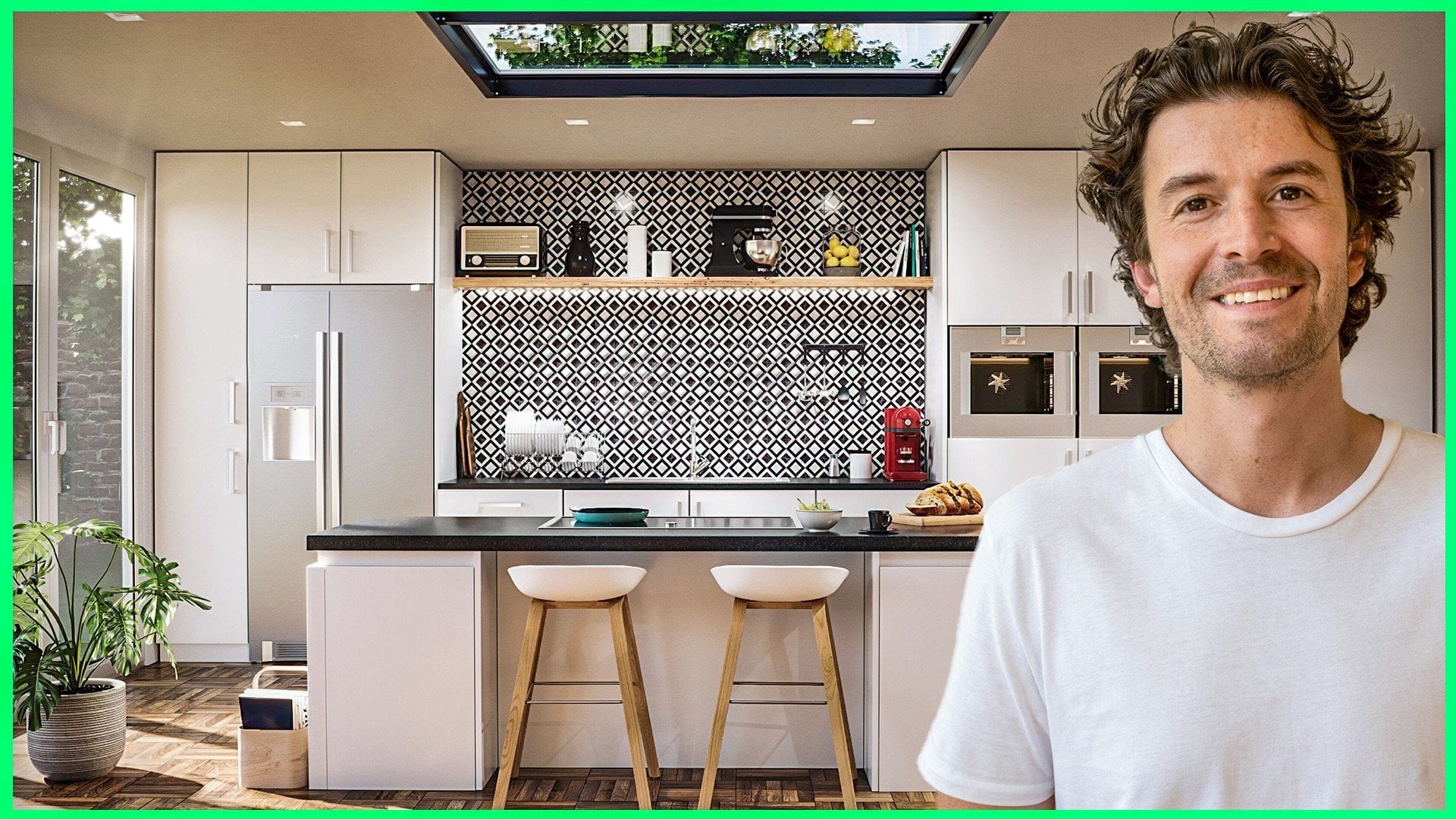
1. Introduction to Photoshop for CGI Artists: Welcome to define a shop for CGIAR East Coast, where you're going to learn how to use fairly sharp to push your renders to the next level. My name is Jake and I'll be leading you through the course. And I am a CGI artist. My career started working in the world of your visualization, and I've expanded to all types of work for the other textual industry. Beyond that includes automotive, travel, illustration, advertising, and really any kind of project that uses computer-generated images. Over the last decade, I have been lucky enough to use these skills with some of the world's most exciting designers and brands. I designed this course for anyone wanting to master the tools they need to do professional post-production on their renders or photographs. And by the end of the course, you'll be able to work confidently. We've render elements, composite people and life into your existing images. Apply lookup tables. Take advantage of camera Roar to add the finishing touches to your images and all of this alongside an understanding of the tools regular used in CGI studios. I will be teaching the workflow I use when working in studios or for clients. And this will give you that finished quality look to your images. This workflow is great for improving your images you may already have. Or even for projects you're currently working on. Not only will we cover the essentials of Photoshop, but we will also work through a project together and walk through the entire process step-by-step. The ideal student for this course is an aspiring or existing CGIAR that wants to expand on their current skills. You will need Photoshop on your computer and a willingness to learn. So feel free to take a look through the course description and I look forward to seeing you inside.
2. Installing Photoshop: If you don't have Photoshop installed yet, then you can head over to the Adobe sigh and download the trial version. And if you honor student, then I think the whole Creative Cloud is good value for money as well. So head over to Adobe and download trial if you haven't yet got very sharp. And I'll see you in the next lesson.
3. How to quickly start with the Photoshop User Interface (UI): Hi guys. To start with, we're going to go over some of the basics in my shop. So when you open up Photoshop, you're going to be great with this grain and hay. You have to open and create new documents and you can find them. I'll be here on the left. And you'll also be able to use File New or file open up here. And you can also see the shortcuts Control N and control up here as well. So if you wanted to open a document, for example, we can go to Open and we can select this bedroom. And we can select whatever image you'd like to open and open. And then you can go inside shops interface. If you wanted to create a new document file, new and facial comes, we will look presets. If you wanted to print and a four, for example, you could select that here. And it's going to have everything set to the correct resolution and high and width. And you can also go in and change that if you want eight here. And you can change the orientation as well. So if we hit Create, we're going to see this creates a new document. And if you did want to write tight that document after you've created in God's image, image rotation and rotate it 90 degrees clockwise. And up here we have the main menu, which is a way of accessing the variety of functions available in Photoshop. We have file with new, Open and Save As, as well as like Expo and love of a useful toes. So feel free to kind of explore this main menu. On the left we have the toes, and this is essentially your toolbox. And you bet find the name of each toe just by hovering over it and a quick description of what I do. And you also see that we have in brackets the keyboard shortcut. So if we want to move to the move tool, I can press B on the keyboard and we are now using that toe. So very handy to learn the shortcuts. And I recommend knowing the shortcuts to some of your most commonly used tools. You also see that some of these tools have small arrows in the bottom right. And if you click and hold on them, you'll see more tools available. So for instance, this is the brush tool. And if we click and hold, we can actually access the pencil tool by holding down on that toe up on the main toolbar. We also have Windows and this allows us to turn on and off palettes. Over on the right. You can see that I've just turned off properties and I can turn it back on there. If you ever want to expand a palette, you can click the arrow is, we'll bring him back in. And same with this. On the right. We can see we've got the colorant swatches over here, and this is where we can select colors. And you can see that it's updating over here. And this is the color of a brush. And I generally use the palette by clicking on the color in tuba and then selecting an IV here. And so I didn't actually use this very much. So it's a safe space. And I do like to unclear. The UI. So what you can do is actually pull these off and glycine down. And I don't really use the property is enough to warn him being there. And we can see that this is now flow in. We can do is hover on the right and we just have our layers. If we need any, have a window is we can add them, but I generally use or tuba. And our layers, Control Z will undo. And Control Shift said, we'll read it. And if you want to zoom in on an image, you can use Control plus and Control minus. You can also hold the Z key and click and drag left and right. And this quite useful, but I don't really use it that much. I find a little bit tough two years. And then Control 0 on the keyboard. We'll fill the screen. So ESA quite a lot. So ready to navigate? I'm using Control plus and minus and control 0. There is a zoom tool, and here you can use and click and drag as well. And you can also type in at the bottom. So this really shows is there's multiple ways of doing things in Photoshop. So don't worry about what every single bond does, you'll find what you're most comfortable with. So when you are zoomed in and you want to pan around, you can hold space bar and you see his hand appear, and then you can pan around the image. So in Photoshop, we will be manipulating images. And it's incredibly useful that we can undo things and you may laugh, but minimise or undo changes to my work was one of the major things that got me into computer graphics. So before Photoshop, I was doing everything by hand and there was very little way to undo a change I made to an image without using an eraser or painting over it. So to demonstrate this, let's take a look. History. I'm going to jump over to the image we are going to area in Windows. I'm going to open up history. And let's talk it. I run the riot. And if I start making some changes, if I paint over this, and you'll see that is listed in history. And I can always jump back in history to Sam points. So we've opened up the image. Are we jumping back to the original? And as I said before, we can use Control Shift said to redo and control set to undo. So this history panel can be really useful if you want to jump back multiple steps. Finally, saving your image. You normally want to save two versions of your image. You start adding layers and making changes to your original image. And you want to save that as a Photoshop file. So if you go to File, Save as the default file format is PSD, which is a Photoshop file. And that's going to contain all the changes and you'll be able to open this up and continue from where you left off. So you'll want to save a PSD version of your image. And you also want to save a JPEG image. And the JPA can be used for web print and you can send it to your clients, and that's just a flat image. So make sure you save a PSD and an image file, normally a JPEG. And I also recommend just taking control S frequently when you're using Photoshop. And that would just save your image regularly. And a quick novel shortcuts. If you turn something over and over, then learn the shortcuts. It's going to save you so much time. And even if it's just a few seconds, that's gonna get compounded over the years ahead. And I remember what chin professional when I was a student and it was decided I would play music on a keyboard. And the way that I would just move in so quickly for 50 show was really impressive. So few shortcuts I use a lot is V. Two, access to move TO and Control T, which is to gain to the free transform tool. So for example, they will go to the move TO be engaged to the brush tool, and j will go to the paint bucket. So, and I'm going to show you examples of shortcuts as we move through this course. And as I said, if you frequently isn't a tool, learn how to get there through the keyboard shortcut.
4. Image Size in Photoshop - Pixels, Resolution, PPI and Print explained: Now let's talk about image sizes. When you're working with a client, you're going to want to make sure you deliver the best quality image you can. And in general, I will render an image at 5000 pixels wide and free 1000 pixels or lower enough for preview images. So when people were referred to images that are 5000 pixels wide, they mean that the widest edge has 5000 pixels in it. So I'm going to use Control plus, and I'm going to zoom in really, really, really far. And we can see now that this image is made up of pixels, and we have 5000 of these pixels in the image. And if I press Control R, That's going to open up our routers. And we can see that each pixel is shown on here. If I right-click, I can change that to pixels if you haven't got pixel selected. But if I go all the way to the left, we're going to say that this is pixel one and that there's 5000 move 5000, 5 thousand of them. That guy, from left to right. So something and 5000 pixels can be good for print. But if you want to upload it to the web, it's going to be too big. It's going to slow down loading times of the website. But if you try to make an image bigger than, you're going to start losing quality. And if you ever make an image smaller, make sure you don't save over the original. So use the Save As function. You can always see image size down here by clicking on this information tab and how it in, and we can see that it's 5000 pixels by 3000. You can also go up to Image and Image Size, and you'll see the pixels here. You can change this to pixels or inches for whoever you use them. So if I want to change this width to one hundred, ten hundred and I can do that here. And this bond means that the proportions are constrained. So if I took them off and I change this to 1000, we're going to see the image has stretched muscle the time I'd say we need to constrain the proportions. So I'm gonna make that 100. And I can click Okay. And it's going to resize our image. And we can see the image size is changed massively. And if I zoom back in, this is now a 100 percent and more is going to be displayed as. So if I wanted to save it, I'd save as a JPEG. And I'm just going to add web on the end. And all of these defaults are fine. So now I'm going to open up our original document again. So I'm going to go File Open, open up the bedroom to this is the 5000 pixel version. And let's talk about images for print. And because we're working on a computer, we work in pixels rather than a size. But if you wanted to send an image to print, you're going to need to start thinking about the image in inches as we don't have pixels in the real world. So again, if we go to Image. And image size. We can change our units to inches. But we can also see down here that our resolution is 72 pixels. So that means that for every inch in real life, there's going to be 72 pixels. So the pixels that we looked at earlier. So if we jump back to pixels and I'm just going to open up a calculator. So if our image is 5000 pixels and the resolution is 72 pixels per inch, if we divide that by 1770, we're going to see that that is going to be 69.4 inches. And we can see that here. Now most print is printed at 300 pixels per inch. So we're going to want to change our pixel resolution to 300. So if I change this to 300, first, I'm going to change this to pixels, and we change our resolution to 300. We're going to say that that's going to Scala image up massively and we don't actually want it to resample. So I'm going to turn off re-sampling. And let's move this back to inches. So now we can see that our image is 16 inches wide. So if I hit Okay, In real life, this is going to print just over 16 inches at 300 pixels per inch. So if I zoom into a 100 percent, this is how big in real life. This is how big in real life this image can print at 300 pixels wide, at 300 pixels rather than 72. So again, we can save this and we can save this as prim. So if you are working for bringing it, then it's good practice to select an option from the print preset in Photoshop so you can go to File New. And if we choose, again a for, say we're going to print on a four and it's going to be landscape. I can actually click and drag with this last selected into here. So we can see that this is easily going to print A4 about this size. So the reason that we can check our images against the defaults is the dihedral cell with the correct resolution and size. And once we've made this 300 DPI, we can see how it's going to look at that size. So you've got no problem printing this image at a four, just on moving documents. If I click and drag and drop this into a new document, you see lands kind of wherever my cursor lands. Whereas if I hold shift and click and drag, it's going to land in the same position. And we also have something called snap. So when snaps on, we'll see that we can actually snap it to the document bounds. You see the pink lines. So that's really useful. And that's just something to be aware of having it on can really help with aligning images.
5. How to use Layers in Photoshop - Free Transform: Now let's talk about layers. Layers are really what make Photoshop so powerful. And they're very much like the modifier stack in a program like for 3ds Max for example. And you can think of them as layering up a collage including images on top of each other. I'm just going to drag in another image on top to demonstrate layers. And we can see that we have two layers in the layer. Stack. Layers are useful because if I wanted to erase something from this layer, for example, I could select the Eraser tool and erase it. And we can see the layer underneath. And if these are one object and I want to erase part of this image, you'll see that we array, we're raised both of them. So you can create a new layer by clicking down here on new layer. Or you can hit Control Shift N on the keyboard. And you can move layers around by just clicking and dragging them up and above the other layers or below, you see that blue line appear. You can make layers visible by turning them on and off with this item. And if you hold Alt and click it, it's going to only show that layer again and click it. It will show all layers again. You can name layers by just double-clicking the word and hit Enter. And you can also change the color of a layer by right-clicking on it. And this can be useful if you're collaborating in a team and just keep layers organized. When you're working in Photoshop, you normally work on just one layer at a time. So if I wanted to move this image, I can have this layer selected. I'm just going to draw on this layer. So layer one has the red dot. So let's call this red dot. And with the move tool, I can now move this independently. And if I wanted to move it underneath the old naming, you can see it's underneath. And if I wanted to move detailed naming layer to select it, I can hold Control and click it in the viewport, and it's selected. The tag name him. And again, I can click right dot. Just be aware if this is on top and I'm trying to select underneath, I need to click somewhere where it doesn't have any overlaying layers. So if I hold Control and I select red dot, I could actually turn off that layer and then Control and select. Now there is another way you can have auto select on by just find it quite hard to know I'm selecting and moving. And so I just generally used the control select layer. We also have a past E up here, so we can change how visible layer is. And you can also duplicate layer by dragging it onto a new layer, or you can press Control J. And another thing to know is by default, whatever images in the background is going to be locked so we can't actually move that around. And if you did want to move it around, you can just double-click on it to unlock it. And then we could actually pull that in front of the other layers. So we have spoke about resizing a document. But how do we resize an image or a layer rather than the whole document? And to do this, we can select our layer. I just held Control and select our detail naming copy to that. And I'm going to press Control T. And what that does is open up the free transform tool. You can also find that under Edit and Free Transform, and that is going to give us some anchor points. So now if I click and drag, we can resize our image. And if I hold shift is currently constrained, if I hold Shift, it's going to unconstrained it. So if you did want to, maybe around, It's going to warp a little bit. And so he should probably keep it constrained. You can also hold control and move that independently if you wanted, it changed the perspective of an image. And that being said, you can right-click in the Free Transform. And you can select perspective, for example. And you'll be able to click and drag like that. And you'll also find some other cool tools such as walk. If you wanted to move that image around as well. And then you just hit Enter to get out of the Free Transform tool. When you bring in image in, you'll see that it has this small firm now on the layer. And what that means is there is a smart object. And this means it's linking to the original file source. But this allows you to perform nondestructive tests on the image. And to enable full edit end, you need to rasterize that image so I can change the size of it. But I can't paint on that layer. You can see there's a smart object and it must be rasterized. So you could hit Okay here, and that would rasterize it. Or you could right-click and rasterize the layer. And now I can paint onto this layer.
6. Why and how to use Adjustment Layers in Photoshop: Now let's take a look at how we can edit our images. And I've rendered demonstrate our V rays. So you'll be able to find this in the resources. And I'm going to encourage you to use adjustment layers where possible. And this is a non-destructive workflow, and this is what makes Photoshop so powerful. The non-destructive workflow means that you can change and update images without changing the original image. So for example, if we wanted to change the brightness and contrast on this image, we could go to Image Adjustments, Brightness and Contrast. And we can bring the brightness down and add some contrast and hit Okay, and we'd save this out, send it to our client. And our client comes back and says, Oh, can you move the bed over? So we re-render our image and we bring, bring in the updated image and we've moved the bed. So now we need to remember what we did. So we did a brightness and contrast. I can't remember exactly what we did, but we did something like this. So what we're doing is updating the original image, which is not efficient. So a good way to approach this is to use adjustment layers, which can be found down here. And if we select brightness and contrast from here, and we make our changes, we can see that it's created his own layout with those adjustments on it. So now if the client wants to make changes and we have to bring in an updated version, or we need to do is move our layer on top. And this is really useful for when you're working on a live project. And another good use of this is moving over adjustment layers to other views in a scene. So what this means is we can move all of the adjustments we made on this view to another view in the same room to keep the consistency across all of the images. So I'm just going to delete some of these layers. Just pressing Delete on the keyboard down. So now let's take a look at some of these adjustment layers. The sender's, I bring an image into Photoshop. My go-to is always a levels adjustment. So I'm going to open up levels here. And you can see on this graph, this shows the range of pixels. So these on the left are the black pixels. And if we turn that up, we can see that we get more blacks and on the right, on the white pixels. So if we jump over into a detail image and it will be more effective, a lot of white here. But what you wanna do is try and keep all of your pixels within the image so you can see we've kinda got empty pixels here, so we can bring the whites to about here. And the more you play with the levels, the more you'll be able to just look at it and know how you want your image to look. We can also move the middle slider to make an image brighter or darker. But the idea here is to have a full range of pixels within our image. And you can consider these sliders as our image edges. So you can close these properties and if you ever need to jump back into time, you can just double-click and it will open up the Properties window. Now vibrance is something that I prefer to the hue and saturation. I'm, I see a lot of people just pumping up saturations of images. But I actually prefer to use vibrance as I just feel it's a more subtle effect. Say if we added like 50 on the saturation there versus 50 on the vibrance. And it's just a more subtle effect. And I just, I prefer using vibrance, so I'd recommend that to saturation. And next up, let's take a look at curves. And this is very similar to levels where we've got the sliders on the left and right. But this time, rather than using the sliders, we can actually use a curve to make the adjustments to the pixels. So again, we can make the image darker on the left here, and we can actually make it brighter on the right. And this S curve is a pretty good go-to to add some contrast to your images. And now finally, let's use a color balance. And we can add or remove colors using this color balance adjustment layer. And if we want to make an image cooler than we can add more blue and cyan. And if we wanted to make it warmer than we could add more yellows and reds. And generally the human eye finds more my images more appealing. And one of the last things I want to show you is that we can actually apply these adjustment layers to only certain layers. So if I bring over our detail image, dropped out on, put it aside, we can see that all these adjustment layers are affecting everything underneath. So by default, the adjustment layers affect all layers below it. And if you only wanted to apply it to a certain layer. So if I want to apply something to this detail shot, Let's add something that we can really see, like a black and white film. We can see that this is applied to the whole image. But if I click this button here, this is going to only affect the layer below it. You can also hold Alt and click in-between the layers to turn that on and off. And you can also stack these on top of each other. So I could pull this curve up holding Alt. And it's only going to affect layer one. They don't have to affect all the layers below it. And if you did want to only affect certain layers, you can use this tool here.
7. Use a Mask: Another great feature of using layers in Photoshop is what we call masks. And this can be for as a more advanced way to erase part of an image or an adjustment layer. So traditionally we would use an eraser to remove a section of an image we didn't want. But this is destructive as you're going to be deleting part of the original image. So if I select our detail image that we have on top, and I go to our eraser and I want to delete this bomb section. We can see I can rub it out and then it's gone for good is completely delete it from our layer. And I'm just going to undo that with Control zed. And a better way to do this would be to use a Layer Mask. So I can apply that down here with that layer selected. And now I've got black and white in our palette. And I'm going to use a brush tool. And I'm going to paint out the error I don't want. And what's powerful about this is now if I select white, so I can switch him here, I can press X on the keyboard to switch between black and white. And I can hit D on the keyboard to make sure that these are black and white. If you ever have color in there. And say if I change that to white and paint it back in, it comes back and black, I can delete it. So with x and the brush tool, I can quickly flick between these two colors and add and remove sections of our image. Another thing to know is if we click on our palette and add a gray, then it's going to add kinda like a 50 percent. I pass a. So you can consider black and white, the opacity, black being 0 and y being 100. So you see if I press D, that's going to go back to black and white. And I can paint this back in with our layer selected. You can also, and you can see that select an image that selecting our layer mask. If I press Control, I actually inverts our selection. So I'll press Control I again, and that's inverting our layer mask. And you can see what that's doing. You can also delete a layer mask by just right-clicking and clicking Delete. So another reason that I like using adjustment layers and mass is that we can use the masks on adjustment layers, just Tomasa in areas. For example, we've got our black and white film on our detail shot. And if I add these already have layer mass on as you can see. So I've selected that and I can paint black. And that means the color is coming back Where we are painting in a back-end. Probably not. The best example is quite a DOT image. So let's go to our vibrance on our main image. I'm just going to turn out so you can really see what's going on. And then if I select our layer mask and start painting black, I can actually paint are areas that I don't want the saturation to be that high. And then I could paint in again where I did want it. So you can start to direct the viewer's eye using different adjustment layers. I'm just going to turn that back down. So it's not just the paintbrush you can use. And we can also. The MAR case lactose up here. So if I select an area and then add an adjustment layer, Let's say we add a brightness and contrast. We can see that that layer mask has been brought in with that adjustment. So I make it brighter. We can see it's only affecting that area. And again, we can make adjustments to this layer. We could select an area here and paint it white, and it's going to be brighter. We can also use this marquee tool to draw around objects. So let's draw around this photo frame. And we want to change the levels on it. So we can start to individually add adjustment layers to sound objects, which is really handy when you're using this market. So you can draw and then holding Shift, you'll be able to add to that selection using our UC out to remove selections. And using this Marketo. You can add and remove sections as well. So get comfortable using the selection tools. But you don't always have to use. I'm just going to delete these two layers. You don't always have to use marquee tools like death. There is also a Quick Selection Tool where you can click and draw and it's going to select as best they can that section, which can be quite handy. But lucky for us if we're using 3D packages, we can actually render out a wire color mask, or it's sometimes called a clown pass. And I'll bring that in now. And this is basically the watercolors are rendered out, so they're really bright and they can really help us with selecting objects. He manna is the I just kinda clicked and dragged to turn off all these layers. So that's quite handy tonight. And then using the magic one tool, I can select all of these blues and then add a, let's say a curves. And we want to add some contrast to that wall. Now we can see that that's only affecting that wall. So this is a really easy way to select only certain items. And I've selected this bed base. Oops, I select the flow because they're the same color. So if we turned on contagious is only going to select the bed and without on, it's going to select the bed and flow. So this is really handy if we want to just make updates to this bag. For example, let's say we want to change the color balance to make this bag brown, for example. We can really quickly do that using a white color selection. So what I'm doing is selecting our wild color layer, selecting color from it. And I'm going to turn it off. And I'm going to add an adjustment layer on top. And I can change the exposure on it or wherever you see fit. But this is a great way to make selections and add masks and adjustment layers.
8. Blending Modes and Color Matching: As well as I pass it over here, we also have blending modes, which you can find here. And you can click on this drop-down and just press up and down on the keyboard and you'll see what each one does. So this is quite good to find the appropriate blending mode that you're looking for. And so, and render elements have certain blending modes which are appropriate. For example, I'll ambient occlusion pass. Normally you'd put that onto a multiply, turn that on and off. You can see what that's doing is adding some depth to some of the detailed areas base a bit too much so we can really pull that opacity down. And it's just going to add a really subtle change with a lot of adjustments. I recommend making them very subtle. You don't want to overdo it. It just starts to become really obvious. Another use of blending modes that I find useful is just selecting some parts and color match in them. So for example, if we get sent a sample by a client and for example, they want to make this headboard, this color. What we can do is turn on a wire color and make the selection. And if you don't have your watercolor, you could always try and use Quick Selection. And if I press Control D to deselect, we can select, sorry, with our layer selected. We can try and select this headboard. So you can see why we kind of want to water color, but it's not impossible if you don't have one. So Control D to de-select and control shift D will actually re-select. So I'm just going to select our headboard using a white color. We don't actually have to have it visible EVA. So it's quite handy just to have it select that layer and magic one day. And then what I'm gonna do is add a solid color adjustment layer. And then using the eye dropper, I can select a color from our sample. And he IK. Now if I change this blend mode to color, is going to change the color of our headboard to this. Now it's not spot on. So I want to add, add another adjustment layer. And I'm going to hold control and select our layer mask. So what it does is select our headboard again. And then I can select Levels. And I'm just going to bring that down to make it a bit brighter. And I'm just looking at the sample and try to match it up. And that looks good. And finally, let's add a vibrance. Maybe pulled a saturation down, a little bit. More vibrance. You could add a color adjustment as well if you wanted. But yeah, you can keep playing with it. And that is a really quick way to match colors up and use the blending modes.
9. Setting Up Render Elements: The first thing I want to talk about is rendered elements. And although they're not essential, they can help us increase the realism of an image. And there are tons of render elements. And compared to a few years ago, I'm using render elements less and less of them. And this is because render engines are doing a better job than ever. A render element or a render pass, a way of breaking down a render and you can extract just the reflections, for example. And then in Photoshop, we can make those reflections more or less prominent. And there are a few key render elements that I would suggest using if you can. And there's also a few nice to haves. And if you can't render out these render elements, don't worry, the techniques will still be useful to know and you can use the example images provided. Just remember your render engine will have rendered out your image physically accurate. So everything we're gonna do here take with a grain is so and don't overdo it. Really. Whatever changes you do make are not actually going to be physically accurate and more to improve the aesthetics. So normally most adjustments I make, I always do what I think looks right and then I pull it back a little bit. So do you render elements we're going to use are the beauty pass, which is this one a extra texture, the VRA lying a V or a reflection, a V or wire color, theory, Z, depth at the noisy. And also if we have glam bloom turned on will get a glare POS as well. And just remember that adding these render elements will add render time. And depending on the software you're using, they may be named slightly differently. I'm going to quickly demonstrate how to set up our enrollments in for the S max, and V Ray. And I understand that this is a little bit out of the scope of a Photoshop course. So don't worry if you don't have access to free the S max or V Ray, I have provided the output file so that you can follow along safe, that is the case. Then feel free to skip this lecture. So our main render 2C9 is our Beauty. Pos is automatically created. So the next render element we want to add is the V Ray extra texture. So let's go over to render elements under our Render Settings. And we're going to hit Add. And in the dialog box that appears we're going to find the right extra texture and he, okay, and then in here there are a few things we wanna do. We wanna go to texture and on No map, we want to go to the right that map and sleep these as defaults. And then going to render out fine. Next up the VRA lighting such as fine, be relying and hit. Okay, and in here let's turn on the noise. We're going to add a v re reflection. So these are all alphabetic Who as well. Again, we'll turn on the noise when out of VRA wire color. And this is going to render the colors of our wireframes. So just make sure you don't have anything close together to a similar. So you can see here, I got floors green, rug is gray. So just make sure you haven't got anything clash him. We're also going to add a Z depth. And in here, the default is 500 centimeters. So that's the distance from the camera to our subject. So this is going to be just about right for this interior scene. But sometimes it may be worth measuring or changing this max depth. And finally, let's add a v, right? The noise to denoise our image and the defaults are fine. And one last thing if we want to have glare on, so some glare coming from this window and from the spotlight, which I know is up here, enable bloom and glare and just have saved glare channel on here. And then finally, over in V Ray, renders end. Just make sure you've got separate random channel is ticked on and select a file output path. And I just named as bedroom elements and hit Save. So you can render this locally, or I set mine up to the chaos Cloud, but hit Render and we'll jump back into Photoshop.
10. Using Render Elements in Photoshop: So now we can say I'll render output if you've downloaded the resources or you have your renders, you'll notice that we have free very similar images here. So I'm just going to open up these free very similar ones so we can take a look at what the difference between them is. So this is our original RGB and this is the primary render output. So it is our main image, also known as the beauty pass. And it has no de-noising on it. And the next one is the V writing noisy. So the same as the original, but this time it has the de-noising on it. And then finally we have affects results. So this is everything combined. This has the denoising and the glare on it. So this one has the glare applied to it. So you've already be tempted to go for this one. But I would actually stop by using the, the noise aversion and we deployed a glare ourselves. So let's go ahead and close. These other two has been not going to use them for now. And we're just going to use the v, right? The noisy and talking to black. Let's drag and drop. I'm glad pass on top of our image and hit Enter to place that. And I'm just going to change that to screen mode. And you can see that now our image is looking very much like affect results pass. And don't worry if you don't know what blending mode to put each channel to straight away, you can always click and press down or up on the keyboard to find what looks right. And the more you practice, the more you're going to know straight away which passes, which blending modes. So the benefit of applying the glare pass ourselves is that if we wanted to mask out the glare on this lamp, for example, we could do that. So if we turn that off, we can see that there's no glare on the lamp. I'm just going to zoom in with control plus, and we can see how glare. So if I put a mask on and use a brush to use a soft brush and just paint that out. We can actually get rid of the glare on the lamp. And if we were trying to do that with the effects results, it would prove very difficult. And we could also add a levels on top of glare pass and holding out, make it only apply to them. And we could actually make a glare brighter. If we zoom in on this line and with the levels on and off, we can see we really pumped up that spotlight. So again, we can control the glare independent of the main image. Finally, we can even change the color of the glare by adding a solid color over the top. And let's make it a womb. Orange. And again, only apply it to below. And we'll change the blending mode to color. And we can see we've added a orange tint to that line and we can bring the opacity down. And all of this would have been much harder to do if we did it on our main image. So next up, let's take a look at the extra texture, and this is one of my favorite render passes. So using the V rain, that map will create an ambient occlusion. And I find it's really helpful to ground the objects and it just brings out tiny details and darkens up the corners and just add some depth to the image. So I'm going to change the blend mode to multiply. And we can see what this is doing is obviously far too intense for what we want. So I'm going to bring that down the opacity to about 20. And if I just switch between now you can see it's added nice depth on our bed and on our curtains. And you can turn this on in render settings in 3ds Max and v array. But you just wouldn't have this control to turn it and turn the opacity up and down. And also, if we want to paint out certain areas, then we can again put a mask on. And let's say that I feel is too much ambient occlusion on the corners of these wars. To shoes in a black brush. I'm just painting out any really bright areas, basically anywhere. We don't want to have ambient occlusion, we can paint it out. And next up, let's take a look at the Bluray lighting. So I'm going to drag and drop that on. And all this is is just the direct lighting. So we can change this to a soft light. And it just adds a bit more contrast. This one is an essential where is nice. It does add some depth to our image. A little bit more pop, reshow some of the shadows. And now if we bring in the wire color, this is also sometimes known as a clown pass. And this is more of a utility element, which means it's used for selection purposes of specific objects rather than making up part of the completed image. So with this, we can use our magic wand to make selections of objects. And we can just select different colors. And if we change, the tolerance will see that we've turned the tolerance upset. So it changes the sensitivity of the magic wand selection based on the similarity of the color you've selected. So again, for example, if a tiny stamp tool and just select the bed is only going to select this area continuous. We'll select any similar colors connected with the selection and we'll be off is going to select over them similar colors in the scene. So I've selected Justice bed head, and it's selected only there. Whereas if I turn it off, and now I select it, it's going to select all the similar colors in our scene. And this is a must for most render outputs, in my opinion. And you can have it actually turned off. And if you still have it selected, you can actually still make those selections. So it's really handy to have in your file. And now reflections. Okay, so that's landed there because we had sang selected. So shave that happens. You can just line it up and you'll see there'll be pink snaps on. If it's not snapping, then just check on the View and Snap and Control 0 on the keyboard, we'll zoom extents. So reflection is a reflection on a surface. And a good use of this is if we want to make a surface more reflective, then we can turn it on to screen mode. If I turn that on and off, you can see reflective surfaces of all become more reflective. And now we can use our wild color. And for example, if we select the glass in this frame and we mask, I need this reflection pass. Now when we turn it on and off, we've just added more reflection to this frame. And finally, let's bring in this Z depth. And this one's a little bit different. And we can use this to add depth of field to our image. And the way we do this is by selecting all of this layer. We're going to select all and then go to edit, copy. And what we're gonna do is copy this into a new channel. So we'll go down here and create a new channel. And we'll paste this into that channel. Now we can jump back to layers and we'll turn off that debt. And what we're gonna do is use a fill. And this fill is called Lens Blur. But this lens blur can only be used on a single layer. So this means this is actually a destructive workflow as become jump back and make changes. So this is generally one of the last things I do. But I'll demonstrate here as we run for it what we can do the render elements. So just quickly jumping back into channels. Just note that it is pasted on a channel called alpha1 that will come in handy in a moment. Now, we're going to use a shortcut to merge all of these layers and create a copy. And the shortcut is Control Shift O, E is quite a mouthful, but essentially that has now created a flat layer of everything underneath it. So if I hold O and click it, or we've got one image now. So now if we go to Filter Lens Blur, we can see the source is set to Alpha 1. So this is set to set that channel that we put in. And now if we click on Set focus and we click any of our objects in the scene, we can see we're making things go in and our focus, if I turn up this radius, a ridiculous amount is going to demonstrate it even more. So I'll select the bag. You can see that that is now the center of our focus. If I select this picture up here, same again. So this is a really nice quick way to add that fulfilled. And you can see the control we have over this compared to if we set it in a camera. So we can change this at any point. So the radius of six was probably good enough for what we want. And let's just focus on the bed for now. Um, but we can change this later on if we wanted to. So we just hit Okay. And now if we compare this to a raw image, we can see we've added some nice effects and we have control over all of this. And that's how to use rent elements in Photoshop.
11. Replace a Picture Under Glass in Photoshop: Color correcting or color matching is something I always do in Photoshop, whilst it is possible and advisable to get materials matching as close as possible in your 3D program. Most of the time you will want to tweak your colors of your materials in facial. And this can range from small brightness adjustments to follow material changes. And sometimes when we are on a tire, that line is bad to make these changes in Photoshop. So here's an example of some time feedback that will work on as an example to see what's possible. And the links to the images we'll use to reference are in the description. And just before we start, I want to jump back to our previous file and just do some organization. So really what I wanna do is turn off some of these elements. So I'm just going to select everything, control J and Control E to flatten everything. And then I'm just going to put all of these into. A group. Can actually put that bottom one intergroup because it's locked as our background. So if we double-click it, it will unlock. Now, we'll put all of the i's in a group called render elements. And we'll call this one flattened render elements. So if we take a look at the client feedback, they have asked to change this picture for this one. And you'll notice that this has gloss over the top. So we need to see how we can get this painting underneath this class. So I've downloaded this image from Pexels.com. There's a link in the description. And I'm just going to drag and drop this onto our image. I'm going to press Enter, place our image. So we've got to image and auto color. And we can see that that changed the tone of our image. And a no eye color identifies the shadows, the mid tones, and the highlights, and then neutralize the mid-teens to a mid gray. And this helps remove any color cast him. And I'm going to use Control T to free transform. And I'm going to make that smaller and lining up with our picture. And then using Control plus and spacebar to move around, I'm going to zoom in on our picture. So let's get those. Right. And top right corner is lined up. And then I'm going to use, I'm going to hold control and select just this anchor point and push it up to line up in. And we want to line up the bottom of our painting with the bottom of the picture. Somehow didn't show and just pull in this edge down. And I'll hit Enter when I'm happy with the positioning. Something else you can do is press left and right on the keyboards. Just nudge an image around. And you could also make the opacity and Leo lava to help with the alignment of this image. Now I can already tell that the color balance is off. So let's add a color balance adjustment layer. And I'm just going to turn up the reds. And we want some more yellow in here as well. And we just want that affecting the layer below. So we're turning on and off. You can see it has come from really blue, more in line with quite warm sing. So now we want our reflection past so we could bring that in and drag and drop in, or we could grab it from Render passes down here. So I'm just going to select reflection pass, press Control J to make a copy. And I'll just drag that above picture. And I'm going to turn off that layer mask. And there's a few ways we could select Picture reflection. And in this case I'm going to hold Control and just click the firm now of our picture and then Moscow, our reflection here. So we will see that this reflection pass is on screen and a 100 percent, I'm going to turn that on and off. You can say that makes a massive difference. And it makes it look like the painting is underneath the glass. And as you can see, this is a non-destructive workflow, so we could replace this picture with something else at anytime as well. So holding Shift, let's select these free layers and then drag and drop them onto this group. And I'm going to call this painting update.
12. Match Wood Floor Samples in Photoshop: And the next thing I'll client wants to change is this would flow and it looks like it's got a bit more contrast and color. So again, you'll be able to find this reference image on Pexels and the link is in the description. So I've downloaded that and I'll drag and drop it into our Photoshop file. So when you're dragging and dropping things in, it's always going to go on top of delay. You've got selected. So I'll just make sure I've selected, I'll top layer. And I'm just going to bring that down in size and hit Enter, press P on the keyboard to go to our move tool and just get that lined up but its width so we can compare it to our current word. So the first thing we're gonna wanna do is make the selection of the wood flow. So we can do that by grabbing our watercolor and relevant. I'm just going to pull that, drag and drop it on top of stack and use the magic one tool. We've contiguous switched off. And what that's gonna do is select not only this wood floor, but also the wood floor over here. As we can see. I'm now going to go back down to the layer underneath our reference image. And I'm going to add a levels. And you'll see that that is now underneath our reference. And the reason for that is if I have that on top, then it's going to change our reference images as well. And it's gonna make it harder to compare the two. So just make sure that's underneath our reference image. And I'm just going to pull our levels around to kind of eyeball a similar tone to what we have in our reference image. Say, saying land that is looking good. And I'm going to control, select a mask and add a color balance. You'll see that we'll apply our mass straight away. And then in the color balance, I'm just going to add a little bit more red and probably a little bit of grain. And then finally, I want to add a hue and saturation is put at saturation back a little bit and change that here a tiny amount. And I think that's pretty close, maybe a little bit too much red. I think that that's looking okay. Maybe a little bit less saturation. Now let's jump back to color balance. And actually in our shadows, we're going to pull back some of that red color just feel is a bit overwhelming. Unless bit better. So let's just right-click on our reference image and I'm just going to turn that to gray. And then I'm going to select all these layers and put them in a new group. And let's just call this would update.
13. Change the Wall Color in Photoshop: And the client has also asked to change this wall color to blue. And that's going to really change the overall look of our image. But let's see what we can do. So in an ideal world, we would changed the material and re-render because this wall color is a massive part of the image and it's going to change the reflections and just the time that the image. But if we type the time, then we can do it in Photoshop. So first thing, let's create a mask of the wall. In fact, let's bring in our sample fast so we can go over to Pexels again. And as before, the link is in the description and you can download this and then bring in to our Photoshop image. And I'm going to make that a lot smaller. And also we don't need to have this whole image on display, so just going to select part of it and mascot, and that's the blue we are aiming for. So let's select our wall using our wildcard law and the magic one tool. And let's add a color balance. And then I'm going to turn off our wild color. So we're going to really want to crank up these blues. And I'm going to select our layer mask. And let's add a levels. And we go remember that our previous rules are quite dark, so we do want to try and lighten them up a little bit. Something like this. Maybe we wanna kind of position this in a bit of a mid area. But that's how we can change the colors. And you may also know is that our mask isn't actually spawn. And we've selected this decimal because watercolor is there. Above and below the windows we are going to want to add. So I'm going to do is turn off our levels and, and assume in over by this window. And I'm going to select a paintbrush and select our layer mask. Make sure that's I'm black and I'm just going to use a soft brush. And what I mean by soft brush is you can see that it's a soft round and the hardness is on 0. So if I paint with white surrounded and de-select or Control D. And if I paint with white, you see that the edges, it kind of gradients out. Whereas if I was to use a hard brush, you can see a hard edge. So really when we paint in, we should be using soft brushes. Just to get a nice natural effect. I'm just going to paint in these wars. And you can see we've overlapped this bed. So using R and the elements, we don't need it turned on, just going to select the bed and holding Shift. Select the bed frame as well. And we're going to want to paint this black so we can switch these two. You can use D on the keyboard to switch him and x as well, sorry, X to switch him. And they were Sam to black and white. And then I'm just going to paint out the bed. And there's also some blue dye and Angelica and I'm not overly first because I think there will be some blade. If you click and hold Shift, it's going to kind of paint in a straight line. So if I hold Shift, you see that it will paint a straight line, which is quite handy to know. And you can always just paint in my brush smaller, paint out some more details and that's looking all right. Main paint out the cotton around, holding Shift there and click in and the lie. And if he can't really see where your mask is, you can always just select it. And we can see up here, we've still got blue. And that's a good way to see when it's quite hard to see the actual color. And now what we can do is control, select our mask and then delete the Levels 1, and then re-add it. And there we go. And again, because this is non-destructive, anything that's too bright, we can always pull it back. And finally, because this frame was predominantly gray, a little hack is to add a full color, fill over the top and change it to color just to add a tint of blue over the top. So if I add a solid color and here I, I'm just going to turn it off. And, and then you can select part the war, something kind of mid. And then turn that back on. And you'll see now I'll the whole image. And if we change this blending mode color and bring this dance like 10 percent, you'll see that it will just overlay. I blew 10 to all of our objects just to help it sit with these new blue walls, which are taken up a good 5450% of our image. And now let's select all of these layers and permanent group and call it a more paint. And again, I'm going to change our reference to gray. And you can see that we have a nice ordered layer stack. And the reason we have grouped and named things as we go is that this is appreciated by colleagues, collaborators, and also your future self. So imagine you have to open up this file without ever working on it before. And you've just got a thing, would I like to open this file? And your colleagues and clients are going to remember that it was a joy to work with you in future rather than thinking, yeah, he was a good eyes, but he was a pretty lazy colleague. So don't be lazy colleague.
14. Using the Cloning and Healing Tools to Remove a Bag: Now let's talk about how we can do some cloning and healing in our image. So there are some great tools such as Content Aware Fill. They're going to work well on small areas, but something as big as this bag is going to take some manual work. So for example, if we want to remove the spotlight, let's select all of our layers, Control J and Control E to flatten everything. And I'm just going to call this content aware. Aware. And this is our flattened image that we're gonna be working on. So I'm just going to select that and go to Edit and Content Aware Fill. And we can see that Photoshop has done a pretty good job of removing this light so I can hit Okay. And our light is gone and that's actually on a new layer so we can make any adjustments we need. And if we do the same for this bag, let's say our client has asked to remove this bag and we haven't got time to re-render. We could probably patch re-rendered S, but let's have a look using some tools in Photoshop. Let's go to Edit and content aware fill. And let's see what it does lesly, Okay. And you can see it's not going to work. I mean, is it could be a good starting place. But let's take a look how we can do it manually. So I'm gonna delete that layer. And the more you work in Photoshop, the more you're going to realize what's possible and what's not by just looking at an image. And a general rule of thumb is you should have the information elsewhere in the image if you're going to plan to rebuild it. So we can see that we've got a good amount of drug that we can put over here. We have bed frame that we can use. And yeah, I think that that should do it. So again, ideally, you would want to re-render, but sometimes you don't have that luxury. And we also want to exercise some of these tools. So what I'm gonna do is create a new layer. And I'm going to select the Clone Stamp tool. And the way this works is I'm just going to use the right bracket key to make our brush bigger. And you can use the left one to make it smaller. If I hold Alt and select a section, and then you'll see that I can now paint this section over back. So we want to put some rung in. And we've also got to be aware that because IT perspective, our rug strands are actually going to get smaller. So we can then scale that down a little bit. You can also move around if needs be, mean that was in a pretty good spot. And let's just keep building up like that. And if you do it on new layers, then you can rescale like I just did. So we want to select the shadow line and line it up. There. It would be. Again as paint that in. And I'm going to scatter it down again a little bit just to compensate for that perspective, you can use the nudge tools while the arrow keys to nudge things around. And you can even control J to duplicate that and put it up here. Make that a bit smaller. And then we can start using layers to paint out certain areas. So let's make that black. So I'm just clicking and dragging tonight is all on enough and we can see how we get enum. So there are some areas that I don't like this. In C, we're getting quite close to remove in this bag from the rug, is get rid of as much as that as possible. And it's looking good. And then let's do another layer. Just get that final bit. That. And I'm just going to scale that down a little bit. I think that's looking pretty good. Obviously, you can spend more time on this, maybe remove that little bit of shadow there as well. Okay, now let's take a look at the side of this bed and displace going to be a little bit tougher. But i'm, I'm going to grab, I'm going to use this this polygon marquee tool and just select a good bit of bedside. And we can do is go to edit, copy merged, and then press Control V to paste it. And there's our new layer. And I'm just going to move that over. And I did this quite a bit. If you want to mask it out, a little bit easier than using the client o. And then we need to do is soften up the transition at the edges. Say, for that, use mask and just paint out them softer edges. And you can control J again. And just be careful not to get any repeats on. I'm just going to paint out this left side is a little bit too dark. And this GAN, novel, one, move it over. And then I'm just going to try and straighten up some of these lines. Okay, so again close. What I'm going to suggest is we actually grab this piece of the bed frame and use it to tighten up these edges along here. So I've selected that I'm gay Copy Merge. And then I'm going to Control V to paste it. I'm going to bring the opacity down just a touch and Control T and holding Shift. I'm just going to drag that the other way. And I'm just going to line this up as best as possible. And this is what I mean about having the information elsewhere in the scene. Now, this isn't ideal. But if you need to, you need to do it. So I've kinda lined that up. So let's turn the opacity back onto full. And I'm going to hold O and add a layer mask. And if I hold O is going to just add the layer mask in black. And now with a white soft brush, I can paint in the areas where I want on new bedside. So that's pretty good. Can scatter out. And now I'm going to use a hard brush and just paint out the areas that I don't want. And I'm just flicking between black and white using the X key. You can see you that we've hardened up that bottom edge. It doesn't need to be a little bit more in line with the color. So add a color balance, apply. I need to that layer. Thin us a bit more like it. All right, we'll certainly get in there. And now it just looks like a case of removing these shadowed areas. And I'm going to use the clone stamp again on a new layer. You can see how quickly these lanes get messy. We're flattening in a minute when we're happy with our results. So obviously this isn't a completely straightforward exercise. In fact, it's actually quite difficult one. But if you can manage this, you'll be able to manage anything someone throws at you. Yeah, This wasn't easy at all to remove that bag, but I think we've done a pretty good job and you can keep on finding it. So just to clean it up a little bit. Let us grab all of these layers that make up the removal of the bag. And I'm just going to move down into a group. And this code is bag removal. And this was the spotlight. And even now, you could grab that whole group and add a mass to it. And using a brush, a soft black brush. And I've seen a little area that we can paint back in and it's always nice just to use as much of the original as possible. So yeah, that looks pretty cool.
15. Removing Artifacts with the Spot Healing Tool in Photoshop: Now sometimes you're going to get artifacts in your renders that you didn't notice or that were hard to see when you are doing test renders and low rates. So let's take a look at how we can fix these types of artifacts. So the first thing I can know is, is the line on this wall. And I believe it was created from some tiling on the material. So all we need to do is select all our layers, Control J and Control a. I'm going to make a flattened copy. And I'm going to make a selection around artifacts. And I'm going to select our spot healing tool. And I'm going to use a soft brush. And I'm just going to paint over that line. And you can see that that has now removed that fat. And you can see also we have some artifacts here and over here, and we've got some pretty hard edges. So I think this was caused by not having a NEF or even iterates move on this headboard. So we can use the spot healing tool here and here, and then leaves the smudge tool just to and up that edge. So let's begin by just painting over this. And I'm going to zoom in and use a really small brush here to remove that. And then this is the smudge tool and does exactly what you think is going to smudge the edges. And we don't want to use it too much. We just want to use it to kind of soften up these corners and pull them out a little bit. And then do the job. And then especially over here, to soften up that edge by just clicking and dragging. And again, let's take a look at using the spot healing tool on these facts. And I think this one's going to require the clone stamp tool. So I'm just going to grab a piece from here on a new layer. Just paint in the Clone and use a mask. Just bring back some of the original. You want to use as much of the original as we can. So that's how we can use the clone content aware and smudge tool to remove small effects in our image.
16. Using 2D People in our Images: Now let's take a look at adding some people to our images. Adding to the people is one of the most popular ways of adding people to our renders. And if it's done right, it can look great, but if it's done wrong, it can look awful. So using freely people is becoming more popular now as the models are becoming more realistic. And what's great about using 3D is you can get the shadows, reflections, and proportions, correct. And then increase the realism in today. And often add in people is an afterthought wants to render is complete. But if you can go into your render knowing who and where you want to place your people, it can significantly improve your images. Today I'm going to show you a hybrid method that I use when working with clients with very specific models. So take a freemium model and use it as a place holder. And this is the method I use when we're shoe in live models in a studio. This was a project where we put in freely place holders and then shut the model and replaced a freemium model with real photographed one. And having the 3D model in a scene help massively with scowl and how the light would hit the model. Again, don't worry if you don't have access to your 3D scene. This is a good to have, but it's not essential. So you can still use these techniques to eyeball your 2D people in. So if you're using just 2D, you can still follow along. First, it's important to know who won in our scene, and I'm gonna use assets we can get for free so everyone can follow along. But honestly, if you want your images to improve, you really need to invest and build yourself a library. And life gets much easier when you have a library and you already have an idea of what assets you want to use in your renders before you even start. So viz, people who have some great 2D people and lucky enough, they have a free section. And we're going to use the sample images. So click here to download them, extract them. And then you'll see that these are the various people that come in the sample pack. And this is the lady I want to use. I want to put her on the bed looking out the window. So let's jump into 3D and see what we can do in there.
17. Adding a 3D Reference Person: Although not directly related to Photoshop, I am going to quickly show you in 3ds Max, you can use any free package you like. It's not essential as this is not freely class and I don't want to go into too much depth here. But when placing a 2D person, you're going to see it's massively helpful to have a freely place holder in our image. So 3ds Max, since the update from VRA five to 5.1, cosmos is a really useful way to add assets to our scene. And it's not only useful, but it's fast and it gives you access to a great amount of assets. So lucky for us, render people have included some people in here. So if we go over to people and we scroll down, we'll see that we have a lady saying which kind of resembles the 2D paths and we want to use. So you can click download. So if you haven't downloaded something that you can click this blue arrow minus downloaded, just click the green one and it's going to bring it into our scene. So the closer you can match your character and the posture, the beta and the four cosmos, I would use a break to character from random people. So his wife hadn't I behave. You have specific poses you want to use. So these characters are rigged so you can download them and bring them into your scene. And then you can manipulate the skeleton into the position that you want. So that can be really helpful too. So you can close cosmos. And let's go into the top view. And as position, our character, we can actually change to multiple views. So I'm going to right-click and show you polis tab, which is opened up off screen. But let's just put it over here on the left. And I'm going to split the screen. So on the screen on the right is perceived on the camera. And I'm going to turn on safe frames. And then I'm going to use the top view to position our model. And I'm also going to turn off the gradation. And that's going to stop things turned into books, wireframes. So let's take a look again, lady. And that isn't too bad. Maybe she wants to rotate, right a little bit more like that. But again, this is just reference, so don't get too into it. Just going to zoom in. I'm actually let's just check that. Have feet on the floor as well. And yeah, she's looking gauge is same like in the bed Kobe. Something also worth noting is that this lady is actually smaller and her posture is different to this one. So almost like she's leaning forward a bit, but we don't want to mess too much with a motto is just something to consider when we are bringing in, into D. So I'm quite happy with the position of this lady. So we don't need a full render as this is just reference. So let's run an interactive render. So I'm going to click and hold on Render and go interactive. And I'm going to let this render out for a little while. And I'll save it. And we'll jump back into Photoshop.
18. Adding 2D People in Photoshop: All right, So back in Photoshop, I've opened up the image we've been working on. And I'm just going to drag and drop in our reference image that we got to have 3ds Max a minute ago. And it's gonna be a lot smaller than rendered out full size. So you can just snap to the document bounds. If that's not working, that's going to be up in view. And just make sure it snaps is on and you go to Document Bounds. And then we should be added. Just click and drag and snap that to the same size. So it's a lot less a, but a is just a reference. And then I'm going to go to Downloads folder and bring in the lady, the 2D lady, and just scale it down a bit. And then not exactly the same, but I'm going to just try and position is. Now know that this lady is going to be a little bit smaller. Now a position somewhere like that. Let's make our Person reference. Let's just make that red so we know not to leave that on. And I'm just going to add a mask and start painting out sections of our TD person that we want. So I'm going to use a black soft brush to begin with. And I don't actually want her writing in her diary. She looks out the window. It's actually using hub brush. She can just have a hands on our lap. And also we're not going to see her feet. And also I'm going to try and keep some of these wrinkles in the cloth. Kind of help us it a bit better in our scene. There we go. So we must out quite a bit of her. And that's looking pretty good. We jump back to our reference, turn that on. And you see that the shadows and the bag, but the light coming in from the window and the top back of the head is a little bit darker. And we're going to be brought her here on the legs. So we're going to be bright here. On the face, back of the head. You can see these kinda, Hey, Laurie, affect, want to get rid of that? Make this back darker, and it's also going to be cast in some shadows. If we take a look at the bed three instance and this Perri, somewhat bad like the pillow. Here, we can see the shadows being cast. So a quick way to add that would be pressed Control J to make a duplicate of our 2D lady. And I'm just going to press Control L to bring up the level of adjustments. And I'm just going to bring that all the way from left to right to make it for black. And then Control T will add a transform. And then how did the control button, I'm going to click this anchor point and just bring it down and back. And we want to keep in mind where the sun is coming through the window. So I think somewhere like that could be good. You can always say, and that's fine. And then let's add a filter blur, and we'll add a glazier number. And we can see what SUN as blurring the pixels. Say somewhere around for a, looks quite nice that. And we're also going to need to come back in. And I'm going to use a soft brush, just paint out any areas that are either on the woman or that we don't want. And in fact, let's bring that underneath our model. I'm just going to click, don't show this again. And all that's saying is that a small objects on that layer. Yeah, I think the position is quite nice on that. And what we can do is control J, make another layer. And I just want to move it across over here to help ground are a little bit more. That's looking pretty good. I'm going to mask out some more of that shadow using a soft brush. We can see it's just adding some shadowing around here. And the cool thing is that we can just bring down the opacity, the touch. And we can also paint out the distance. So if I'm guess soft brush is quite large, it's going to fade out that shadow. So again, belly nice things, but I do make a difference in Schein where she's saying and I think now is probably a good time as well to start naming our layers to the lady. And then these two shadow. So I'm actually going to put them into a group. Who would m 2 D, lady shadow. And now let's add a time or a contrast and a auto color. Now just try and help us fit this into our scene a bit better into, into our image. And I just want to add a levels adjustment and only apply it to her. Oh, it's on the wrong layer. Put it down one. That's quite nice. What we're trying to do is just match these time's up. So another thing we could do is just create a new layer and grab a color from here. So this gray and I'm just going to paint splotch over here, put it onto color, and just grab that mask is in control and selecting that fund now. And we'll bring down the opacity of that. And I'm just going to make that only affect our lady. And then I'm going to select these three layers that make up the TD lady Control J to make a copy Control E to flatten them. So let's call this to the lady flap. And what I wanna do here is just paint in some shadows and some highlights. So we can use a tool here called Dodge and Burn. Now burn will make things darker and DOJ will make him a liar. And a good way I've found to remember that is burning. You're going to burn something. So it's going to turn to ash and make it dark. So if we wanna make some areas dark, we can select the bone tool. And the reason we've made a new layer is this is that it's destructive. So if i pain on is going to make the shadows darker, base directly onto that layer. So that's why I've put it on here. So then we could actually bring down the opacity or mask areas out. So I'm just going to undo that. And let's just change this to Midtones. Now if we go to our Person reference, we can see that we've got more shadow on the back quite obviously and, and in these gaps. So we have a smaller brush. It's changed his exposure to 20. And that's just slowly ease out some of these shadows. You don't wanna go too hard, too quick on these. And you can also do the same with the shadows if you want to make the shadows darker, ground the bottom here. And then we'd wanna make this leg lighter. So let's switch to dodge mid times. Let's make that 20. And again, like make this knee a bit brighter, closer, the shadows think is going to feel that their shadows there just darker. And oh sorry, this face is kind of in the sun. So Brian now up. And then we've got this kind of halo on the back of our head where it's like if we can get rid of that is in the burn and having it on highlights. So we're going to make any highlights darker. So just painting in that edge. Decisive battle against that cone. And we can see what we've done. We've changed the lion almost on them. So you can play for quite awhile with this. Something I'm going to do just to finish it off. You could add color balances. And also, and if we jump back down to where we added the war pain. And if you remember, we put this overlay on all of the sea on the whole scene. I'm just going to create the Dukkha of that using Control J and drag that up or do a to the top. And let's only apply that. What we'll do, we'll group up the 2D lady. So I select all of that including the bottom shadow group and TD lady. And then I'm going to apply this color fill just to that layer, to that group. So what this is doing, if you remember, is add in just like the wall color time to the things in our scene. But because we've put the lady over the top, it's not been included, so just gonna put a 10 percent color On that, tell us it more in the scene. But yeah, feel free to play this quite quick demo. But that is how we can add TD person to our Render.
19. Why to Use 32 Bit Images in Photoshop: In this lesson, I'm going to show you why some people prefer to save their rent output as Fe to be images. So EXL for example. And I've saved our last render as an ESR and as a JPEG. So if we go to image mode, you'll see that this is a fake image. And if I jump into the JPEG version and go to Image Mode, you will see that this is 8-bit. And also, if we compare the file size, you can see that the JPEG example is a lot smaller and then fade to bit has a lot more information in there. So if we go down in the FE 2 bit version down here, we can go to Fe to be exposure and we can pull that up and down and we can see what we can do. And this is an actually enabled in the JPEG version. And he works if a 2 bit. So what I'm gonna do is add a exposure adjustment layer. And let's just pull that down by free. And let's do the same thing in our 32 bit version. And you'll see straight away that the JPEG version is just blown out in this window. And that's because the information isn't there. And if we add a levels, we'll see that audio information ends here. So if we take that, sorry, if we take the exposure off, we can see that it's basically just crushing or this information up here. And if we go into the Fe 2 bit image and add a levels, we've got more information up here. So basically the fade to be image has a lot more information about what is in the really light areas and the really dark areas. So if we adjust this levels, say something like this. And we'll do the same. In our 8-bit version. We can see the difference and we can see that the FE 2 bit image is much more powerful because we can bring back highlighted areas and really dark areas. So if we jump back down and make a copy of our faith to be image and we want to make an adjustment to it. We'll notice that not all of the adjustments are available. Whereas if we go to our eight-bit image and make a copy and we want to make some adjustments to this layout. We can see that everything's available. But the best workflow would be to bring in a B2B image, get your exposure i and make sure if you want to see out there, for example, that that's correct. And then you go to image mode, and then you can bring that down to either 16 or eight bits. So that's the difference between fe to bear and 8-bit images.
20. What are Look-Up Tables (LUTs): Lookup tables or lists are basically presets. They're kind of like adding a filter to an image in Instagram. So Photoshop comes with some lookup tables already installed and the Internet, It's also further presets you can download and you can even make and save your own. I tend to add lookup tables towards the end of an image. So to add a lookup table, we go to our adjustment layers and we add a color lookup. And I'm the 3D LUT file. We can just click. And we can see that there are already a number installed. And much like the blending modes, we can hit up and down on the keyboard to go through these. And you can see that there are some pre, punchy ones that can really drastically changed the mood of an image. I mean, if we can play compared drop blues with crisp, warm, you can really dictate some good motor this. And my preference is always towards so on the real cameras. So this one's a Fuji and then you've got Kodak and another codec. So I mean, this one is quite a nice mood to demonstrate. And if we turn that on and off, we can see what that's doing is quite intense. So we can pull that down to 75. And that is basically what a lookup table is. And they can really make or break your image and they can really change the mood.
21. Camera Raw in Photoshop: Camera is almost always the last thing I do to an image. The benefit of using Camera Raw is non-destructive and it can also be used on other images in the set. And I'll show you how to do that at the end of this lecture. So to use camera on our image as a whole, I'm going to create a duplicate of a rethink and flatten it. So I've got color lookup layer selected and I'm going to hold Control Shift Alt E, and that's going to make a copy of all layers flattened. So this code is camera Roar. And I'm going to convert this to a smart object. And the reason to convert it to a Smart Object is we can always jump back in and make adjustments, and we can even duplicate the adjustments to our images. So let's go to Filter and Camera Raw Filter. And I like to use the camera or fill as it treats our image like FO, and we can do exactly what a photographer would do to their photograph. So the first thing I'll do is drop basics. And you'll see the white balance here. So I shot is as is, and we've also got auto, so photoshop will automatically, I think the white balance should be. And then we've also got custom, and we have this eyedropper here. So if we select something that should be white, It's going to create a white balance based on that. So we select something white and it's going to allow white balance. But I think as shot, I'm quite happy with that. What balance? Anyway? We can change the temperature here. So basically what that white balance is doing is changing the temperature and the tint. So you will see that change here. So I mean, that's two greens. I'd pull that back, maybe make our image a touch warmer. And with the rest of these tools, I normally like stove auto. What Photoshop does is have a guess at what the sentence should be basically. And then I go in and adjust from there so we can pull the highlights down, for example. And we can bring the shadows down to make the darks darker. And clarity is great, but you don't want to overdo that. It's quite easy to overdo. I'm just going to turn up a little bit. And I'm going to bring the contrast back down on this image. But yeah, it's worth just kind of playing with the settings and see what you can come up with. And you can always toggle on what you've done by just clicking here so you can see the difference. I'm going to go down to details and sharpen. And what that's gonna do is, as it says, it's going to show up in our image. So I'm going to make that about a. And optics is a way of adding basically a lens distortion to our image so we can see it's pro out the middle bit like a fisheye. And then you've got vignetting here by actually like to eat, do the vignetting and effects as I feel it's a bit more realistic. Because in this drop-down, well, if we start adding something, yeah, let's just put this full vignette on. And in highlights we can actually turn that up. So what else doing where it's highlighted is nitrogen a vignette, which is a bit more realistic. So then when we do add that vignette, It's not in every corner, it's more over here. And you can use this. I turn it on and off. So if we hit Okay, That's going to apply all of those effects we've just added. So now if we do want to go back, we can always just double-click on this camera raw filter. And it's going to open up the camera roll dialog box again and we can make any changes. So if we wanted to change this 10, for example, we could, we could put around, we could take off the lens optics if we wanted to. And then here I can say is a non-destructive workflow. And another benefit of using smart fuel is, is we can select our camera layer and drag it onto a, another image from the set. And then if I turn off that camera roll, I'm just going to create a duplicate of our original image, convert to smart object. And then holding, Oh, I can click and drag the camera raw filter onto this image so that we keep the consistency throughout the whole set of images.
22. Congratulations: Well done on completing this class. I can't wait to see what you do with your new skills. Next, joined Facebook student community and get help and resources for your future projects. And subscribe to the YouTube channel for more content.
23. Bonus Lecture: An Introduction to Generative Capabilities in Photoshop: This is a big one and if
it's not in Photoshop yet, then you can go to
Creative Cloud and go to beta apps and download the
Beta and then open it up. By the time you're
watching this, it might be in Photoshop. So let's talk about
Generative fill in Photoshop. So let's demonstrate
what this can do. We can extend the
size of the image. And then if we select
this empty area, we need generated feel
and hit Generate. Let Photoshop do its thing. Now that looks
pretty good to me, and it comes up with
different variations. So you can choose
you when you like, or you can always
hit Generate again. And it's going to come up
with three more options. Now let's see what
it can really do. Let's see we can get
rid of this car. So I'm going to hit
Generate again. They have, it's gone and this is incredible
how it's built. The rest of the door there, we've got a few to choose from. We can hit Generate again.
Let's see what happens. Alright, That one looks
pretty cool and you can see that we've now got six
options down here. I quite like this first one, we can always just jump
back down to this layer, maybe choose a different
version we can generate again. So unlike Dolly or mid journey, we're actually interacting
with the images, choosing what parts to change. We haven't even started
with the prompts yet. Obviously, we can continue
to go through and remove any signage or lampposts. And if we zoom in,
check this out. And because this is layered, we need to bring
this layer on top. If I zoom out, you can see that we've
extended this image. Now let's look at
someone to prompt me, select an area, and we'll
go to Generate Fill. And now let's put a man on
a bike with motion blur. And the size of the
area we selected is gonna dictate the
size of what's created. Alright, that's not
looking too hot. That's looking a lot better. And that is perfect. But I don't actually
like this person here. Again, because this is layered. We can just select that layer. Let's grab the brush and
we can just brush them. And let's select a soft brush
and just paint back in. Some of the areas
we want to keep. What we've done is we've gone
from this image to this. Maybe are men on
the bikes too big? Just remember as well,
this is in beta and this is the worst this
is ever going to be. I think this is incredible
and I think that this is going to have massive
impacts on our workflow. Next up, let's take a
look at a portrait. What we can do is
select the subject. And you can see it's
going to select that guy. And what we can do is
invert the selection. Let's hit Generate. And this time I'm
going to put barley. Let's see if we can
transport this guy to Bali. Nice, this ash. Wow. How about that? And it actually keeps the blur and the camera
lens from the background. The lighting looks good. That works for me. That's great. Now let's try a few other bits. Let's try an interior scene. And what we can do here
is let's get rid of this guy and see if it can
rebuild the background there. Wow. Take a look at these
networks perfectly. That works perfect as well. I didn't ask for a chat, but I will take it. And let's see what
else we can add. Maybe we can put a lamp in here. So add a lamp. Let, this is a really FUN way as well of generating images. I can see this having
a massive impact on interior designers,
architects. How about that? Wow. Let's add a mirror on this wall. Just thinking about having
to do this in Photoshop. I love Photoshop. I think I'm pretty
good at Photoshop. But the time this would normally take compared to what
this is incredible. How about that? And even imagines the
rest of the room. Wow, I think that first
one looks pretty good. Let's see if we
can add in a rug. I'll just write rug. That is super impressive. So we've gone from there. It's right, we've gone
from this to this. And that was pretty painless. Alright, let's
take a look at one last big cityscape here. And let's see how it fares
with filling some of this. I'm going to overlap
it a little bit. Let's just hit generate and
will let us do its thing. Now I will be super
impressed if this works. Wow, this looks great. Maybe we can add some something
in the foreground here, like add high-rise buildings. Now that is really impressive. So we start out with this
and ended up with this. This interior scenes
started like this. And then they'd like this. This guy was here and
ended up in Bali. And this image started out like this and came out like this. The impacts of this is
going to be massive. I can see this being used. I mean, you could hook up your microphone and just
start talking to Photoshop, selecting areas,
change this window, put change the door to read. This is definitely a
tool you need to be aware of and start to use
24. Bonus Lecture: Post Production with AI: My already know that
image up scalars and enhancers can change our
images from this to this. But there are plenty of
other things we can do with these image up scalers
to improve our images. So I'm going to show
you that today. I'm going to be using
magnifique today, but there are plenty of
other tools out there, and some of them also
come with free versions. So to begin with,
all you need to do is drag and drop
your image in here. We're going to
scale it up by two. We're going to optimize it
for film and photography. My prompt is a
cabin in the woods. And then our creativity,
we've got to two, and the creativity lets it
add new elements and details. The HDR sharpens these details. Semblance is how close it's going to match to
the original image, and the fracticality is going to add details based on our input. The engine, I like to
use magnifique sharpie. You can see what
they all do here, but this one is for realistic
images like photographs. And you hit upscale and you're going to get
an image like this. And I use the same
sentence on this image, so you can see it
before and after here. And what you can do is if you go in and you check
out what's happening. You can always add a
mask with a brush, and we can get rid of
stuff like this rat, for example, and anything
that you don't like, you just go in and
brush those out. But what I want to do now is actually add some
life to this image. So we're going to use Gen fel, and then we're going
to run it through Magni to upscale it. So first thing, let's
add a man walking away, and we'll hit Gen Peel. And we got a few options here. No, guy looks break.
Let's generate some more and see what we get. So I like this guy. You're not going tonail it first
time with that Genfel, but he does look a bit
big for the scene. He looked a bit small. So I'll just scale him up a bit. And then I want to
select subject. But to do that, I'm just going to flatten that layer and then
select subject, and he has been selected, and then we can mask him out. He's going to need
grounding as well. So on that mask. I'm just going to bring back a little bit
of that ground in. But that looks
pretty good to me, and then at least
we can move him around into position if we want, but he's pretty cool there. And another thing I'm
going to do is add a dog. So let's write a dog
and let that generate. Again, you're not going
to nail that first time. You can see all the iterations
I went through here, but I quite like this guy. I'm just going to mask out. This little bit as well. I want to keep that in. But that is all
looking pretty cool. So I'm going to hide
the background layers and just save this as an image. Then we will add that
and we'll keep the same. We've got a man and a dog, and we'll hit up scale. Whilst we wait for that to
generate these optimized four, I rendered out each one, and you can download
it as a PDF, so you don't have to
test them all out. You can just look
through this PDF, you'll find that download
in the resources. All right, this guy is done, here's our four and
here's our after, and that is a vast improvement. Look at them. Hands. They work. Dog looks great. All right,
let's download this. We'll get it as a PNG, and then we'll bring into Photoshop. Jag and drop hem on. Let's position it. We can
hide these layers now. We'll bring in the background, and if we select subject, we can mask these guys in. Then we'll zoom in a bit. Then all we need to do is just mask out some of these areas and make sure they sit nicely. And that's how we can add
people to our exterior renders. Then using the same setens, I've run through the interiors, so we can see the
difference it's made here, and as usual, you can go in with a
brush and get rid of any discrepancies like here. Another cool thing we can do is this is the magnifique version. You can see that create
a lot of artifacts. Because we've rented out masks, we can actually select the
areas we want to keep. If I select our mask and
then just select our ground, I like the rug, and the floor, so I select that, and the bed looks really nice
in this version, but everything else
I don't really like. So then I can just mask
using a mask layer, and you can see how that's
improved the image and the same on this one.
This is what came back. There's quite a lot of
artifacts all over here. So I want to keep the bed and the rug and I'll mask
that to keep them in, and you can see
what that's done. And then you can always go
in as well with a brush and then just brush in some of the details that you
do want to keep. And then another use for
this is using FD people. For example, people from Cosmos, but they're not
exactly high detailed. So what we can do is run
it through magnifique. And again, using
one of our masks, we can actually just mask
these in straight away, and then you're going to end
up with much better people.
 Jake Denham ⭐, 3D Artist | Official V-Ray Mentor