Transcrições
1. Introdução: Olá a todos! Gostaria de aprender a desenhar retratos realistas usando grafite? Gostaria de aprender todos os segredos que o artista usa para fazer um desenho olhar tão real e detalhado? Bem, nesta aula vou compartilhar com vocês tudo o que sei sobre como
desenhar retratos realistas usando apenas grafite do começo ao fim. Você vai me ver começando um retrato do zero, passando por todos os estágios até terminar. Cada lição é projetada para mostrar todas as dicas e truques para tornar o seu desenho mais realista tomando o tempo para ensinar-lhe um método passo a passo que eu sigo para projetos em preto e branco, eu compartilho em minhas mídias sociais. Todo o processo é dividido em vídeos
curtos com foco em cada recurso de rosto, esclarecendo como superar todos os possíveis problemas que você pode encontrar ao desenhar um retrato realista. Eu também vou mostrar-lhe todos os materiais são usados para desenho de
grafite e como fazer o melhor uso deles. Ao aprender este método, você vai alcançar resultados fantásticos. Então, estou ansioso para te ver na aula!
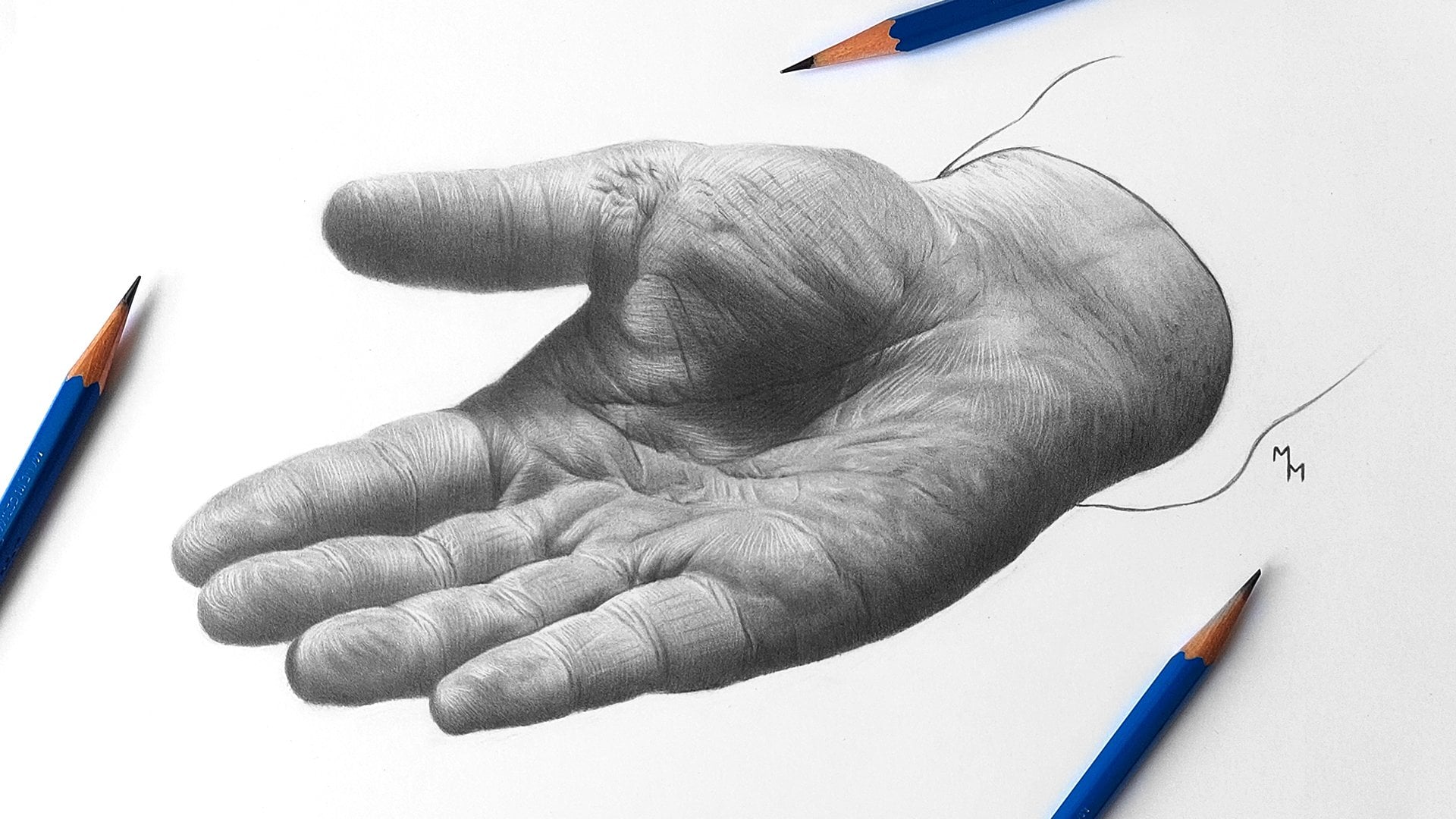
2. Materiais: Pessoal, vou mostrar-vos todas as ferramentas usadas para este retrato. Em primeiro lugar, se você quiser que seu desenho dure muitos anos, o papel deve ser livre de ácido. Isto é essencial. Os papéis podem variar em sua cor. Alguns são realmente brancos, enquanto outros podem ser amarelados. Dá ao seu desenho um aspecto diferente e não há melhor ou pior aqui, é apenas uma questão de gosto pessoal. Quando se trata de superfície para desenhos
realistas eu prefiro trabalhar com papéis lisos, pessoal. Eu recomendarei escolher um papel com espessura média a alta. Seu peso deve ser de pelo menos 150 gramas por metro quadrado. O tamanho em que vou trabalhar é A4, que é 210 por 297 milímetros. Então, para esta aula, escolhi o jornal da Lana Bristol. Não significa que este seja o melhor jornal do mundo, mas estava disponível para ser comprado onde eu moro. Outros papéis realmente bons são Fabriano 4L, Strathmore 300 série Bristol suave, Hahnemülle Nostalgie e Canson XL Bristol. Existem diferentes graus para lápis de
grafite e você não precisa de um conjunto completo para fazer essa aula. Vou usar apenas quatro lápis diferentes: um H, um B, um 3b, e excepcionalmente um 8B. Este é o Staedtler Mars Lumograph, que é a minha opção favorita. Um lápis mecânico normal também é útil com um ponto de cinco milímetros e preenchido com chumbo de grafite 4B. Uma borracha amassada também será usada nesta classe. O Tombow Mano Zero 2,3 mm stick borracha, muito útil. Eventualmente, uma borracha de bastão mais espessa comum pode ser útil também, mas não é necessário tê-lo. Eu uso uma escova de cabelo marta
plana número 4 para misturar grafite, e corto seu cabelo com tesoura para torná-lo mais firme. A mistura de tocos também vai ser usada. Tenho tamanhos diferentes, número um e número três, um pedaço de papel higiênico, acredito que todo mundo tem em casa. Um apontador de lápis, claro. E você pode afiar seus lápis usando uma faca de utilidade também. Esta faca também é usada para afiar a borracha da vara e eu estou mostrando como fazer isso. Então você simplesmente pega a faca e faz um chanfro na ponta. Uma escova maior, macia e de cabelos longos para limpar seus desenhos é útil, e é melhor usá-lo do que soprar a poeira do papel porque você não quer cuspir sobre ele e estragar sua elaboração. E uma máscara ou uma fita adesiva também será usada. E é isso.
3. Método em rastreamento: Neste vídeo, eu quero mostrar um método para
delinear seu desenho com 100% de precisão. Não há problema se você quiser esboçar sua mão livre de desenho. Na verdade, se você se sentir confiante sobre isso, basta fazê-lo! No entanto, se não for seu caso, não se preocupe, porque eu vou explicar como você pode fazer um esboço perfeito de sua referência. O método mais prático, na minha opinião, é o método de transferência. Para colocá-lo em prática, vou usar: a referência impressa no tamanho
que eu quero que o meu desenho seja; uma folha de papel comum; o papel em que vou desenhar; um lápis de grafite escuro, uma caneta esferográfica; um pedaço de tecido; e uma fita adesiva. Com o lápis escuro vamos preencher toda a superfície com grafite, exceto pelas margens. Eu recomendo que você não rastreie as margens, para que você
possa manipular o papel sem manchar a mão. Estou usando um lápis 8B porque é o lápis de grafite mais escuro que tenho aqui. Quanto mais escuro o lápis, melhor. Neste ponto, gire o papel para cruzar os traços. Este é um pedaço de tecido que usamos para misturar grafite e é assim que o dobramos. Será dobrado e triângulos. Esta é a primeira dobra. Então, de
novo e ede novo, três vezes. Finalmente, dobramos sua ponta de modo a ter mais precisão quando nos misturamos. Agora é hora de simplesmente esfregar o tecido no papel, e a grafite preencherá os espaços vazios entre os traços de lápis. Se a sombra não estiver escura o suficiente, repita o processo para adicionar mais camadas de grafite. Quando terminarmos, vamos para a folha onde vamos fazer o desenho. Agora temos que corrigir a referência no papel de desenho. Este é o uso da fita nesta classe. Pegue pelo menos dois pedaços de fita para evitar que a referência se mova quando estiver rastreando. Conserte a fita onde não vamos rastrear, se possível. Mas a folha de grafite com o lado de grafite virada para baixo entre o papel de desenho e a referência. Agora estamos prontos para rastrear e usarei aqui uma caneta esferográfica. Eu escolhi uma caneta vermelha porque ela me permite saber onde eu já rastreei. Então não vou refazer o trabalho desnecessariamente. Precisamos colocar alguma pressão sobre esses traços, mas não muito, de modo a transferir a grafite para a superfície do desenho. Você vai notar que o contorno não é muito escuro e isso realmente é bom porque nós não queremos ver essas linhas na peça final. Você não precisa transferir todos os detalhes da foto para o jornal. mas é uma boa idéia transferir informações suficientes para evitar se perder quando você vai estar trabalhando nas sombras e texturas. Esses cabelos finos, embora eu não os rastreie porque são muito delicados. Então prefiro fazê-las à mão livre. Algumas áreas são muito escuras na referência, que pode tornar o traçado mais difícil, mas seu desenho vai ficar tão escuro também, então não se preocupe se você não pode ver tudo o que está acontecendo aqui. A propósito, quando estou desenhando, prefiro olhar para a referência em uma tela digital, seja um computador, um tablet ou um telefone, porque uma versão impressa sempre perde um pouco da qualidade do arquivo original. Então eu imprimi a referência apenas para rastreá-la. Nas sobrancelhas e pálpebras siga a direção do cabelo para rastreá-los. O nariz não mostra exatamente uma linha que separa uma área da outra. O que dá volume ao nariz são os diferentes valores de luz e sombra. Então, mais tarde, vamos usar uma borracha para aliviar as linhas que estamos fazendo aqui. O contorno da boca deve ser delicado também, então também usaremos uma borracha para fazer suas bordas parecerem suaves. Aqui, apenas fazendo os últimos traços para traçar a sombra do núcleo. E este é o
resultado esperado no final do processo.
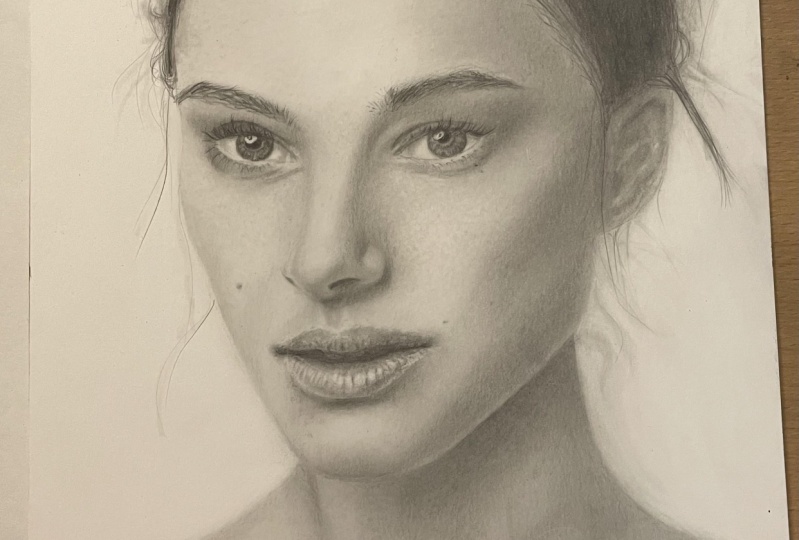
4. Olho: Olá pessoal, bem-vindos a este vídeo e vamos começar com o retrato de Natalie Portman. O primeiro passo é obter a borracha amassada para clarear o contorno para que não fique visível no produto final. É o suficiente para tocar no papel com a borracha. Vou começar usando o lápis mecânico de 0,5 milímetros preenchido com grafite 4B para fazer a pupila e a área superior da íris. Em seguida, o toco de mistura será usado para misturar a grafite na íris. O toco de mistura dá um resultado mais realista. Observe o fato de que a íris não é delimitada por linhas definidas. Suas bordas são borradas em vez disso. O branco do olho é iniciado usando um lápis mais duro e o coto de mistura para fazer a primeira camada. Refaça o contorno onde você achar que é necessário para evitar que ele desapareça. Sempre que usar o toco de mistura em uma área mais leve, certifique-se de que a ponta está limpa. Pode ser limpo esfregando-o em um pedaço de lixa. Se você não tiver, esfregue-o em um pedaço de papel comum para remover o excesso de grafite. De volta à íris,
é hora de adicionar os detalhes. Eu costumo começar com um lápis mais leve e gradualmente me mudo para um mais escuro sempre que me apetece. Já estou trabalhando com a classe B fazendo movimentos circulares. Então eu não estou desenhando linhas aqui, ok? Assim, o trabalho consiste
basicamente em alternar o uso de lápis com coto de mistura. Aqui está o lápis mecânico novamente, depois dos lápis B e 3B. A escova ajuda a misturar o grafite e fazê-lo entrar no dente de papel. A
borracha do stick Mono Zero faz os destaques e o pincel mais tarde suaviza o efeito. Para que esses destaques não pareçam tão intensos. Sua sombra não é um branco puro. Parece mais um tom de cinza. Esta reflexão em particular é afiada, então a borracha ajuda a torná-la branca. E um lápis mais difícil mais tarde será usado para fazer suas bordas. E adicione esses pequenos detalhes sobre trabalhar no branco do olho novamente, usando os lápis H e B e o coto de mistura, começando por um lápis mais leve fornece mais controle sobre o que estamos fazendo. Apenas refazendo aqui alguns dos contornos, incluindo os cílios com o lápis H. Esta área aqui do olho é um pouco mais escura, mas o processo é praticamente o mesmo. Agora vamos preparar a primeira camada de grafite da pele. Sempre que desenho grandes áreas, eu sombreo com um lápis e por sombreamento quero dizer desenhar linhas paralelas e depois pego o tecido e misturo. Parecerá suave no final. Então é assim que faço as primeiras camadas. Ao misturar com o tecido, o contorno pode desaparecer. É por isso que eu refaço isso de vez em quando. E finalmente o tecido. É muito bom para misturar grandes áreas como esta. Esfregue-o em movimentos circulares e perpendicular aos traços de lápis anteriores. Caso contrário, não vai funcionar. Não é necessário pressioná-lo com força. Ele pode até dar resultados manchados se você pressioná-lo muito forte. E agora escurecemos a pele pouco a pouco até alcançarmos os valores que queremos. Sou muito cuidadoso com o lápis, especialmente em áreas mais leves. O pincel duro é usado pela mesma razão que o usamos antes. E depois o toco de mistura. Assim que você trabalha em áreas mais escuras, você precisa obter um lápis mais escuro. Então eu estou usando aqui o 3B e mais tarde as notas 4B. Somente quando você está satisfeito e feito com esses valores de pele, você começa a desenhar os cílios. E por que não fazer os cílios antes? Bem, se você tem que misturar a pele para fora, você também vai arruinar os cílios de qualquer maneira e você pode realmente fazer uma bagunça se você escurecer os cílios muito cedo. Então é melhor fazê-las mais tarde. Os cílios são finalizados
pela grafite 4B e o lápis mecânico dá mais precisão ao desenhá-los. Certifique-se de que as pontas dos cílios parecem finas. Eles não parecerão naturais se suas pontas forem grossas. Agora adicionamos mais detalhes sobre o desenho e escurecemos a pálpebra inferior. Sugiro pegar um lápis B para fazer a textura desenhando em movimentos circulares e combiná-lo com o coto de mistura, o pincel, trabalhando pacientemente. Em seguida, os destaques serão feitos com a borracha da vara, esses pequenos destaques. os cílios
inferiores podem ser feitos primeiro por um lápis H duro e mais tarde usando o 4B para escurecê-los, especialmente suas raízes, onde eles são mais grossos e escuros. Estes cílios são ainda mais delicados. Então desenhe-os com cuidado. Observe a referência para entender como eles se parecem, quanto tempo eles são e qual a direção que cada cabelo segue. E a sobrancelha. O procedimento aqui é muito semelhante ao que fizemos para os cílios, mesmo que os cabelos aqui tendem a ser mais longos. Mantenha seus lápis afiados sempre que desenhar o cabelo, prepare a sobrancelha com um lápis mais duro. E, finalmente, pegue a grafite 4B para escurecê-la tanto quanto parece. Você deve ter notado que quanto mais escuro o grafite, mais áspero ele é. Então o pincel aqui tem um papel importante em fazer essas linhas parecerem suaves. E sim, o pincel não vai arruinar o que você acabou de fazer. Aqui está o fim desta primeira parte e eu espero que você esteja gostando desta aula! Vejo você no próximo vídeo!
5. Forehead e Cheek: Olá pessoal, bem-vindos a este vídeo. Vamos continuar com este retrato. E agora vamos nos concentrar mais na textura da pele. Normalmente, começo usando lápis mais duros e depois me mudo para os mais escuros. Então eu vou trabalhar em camadas de grafite. Aqui, já estou preparando a primeira camada usando um lápis mais duro, o lápis H para o mais específico, sempre fazendo essas linhas paralelas e evitando que elas sejam muito marcadas, muito visíveis. Mais tarde, vamos pegar o problema e vamos misturar este grafite. Assim, dá um resultado uniforme que corresponde à primeira camada aqui. Mesmo que esta seja apenas a primeira camada, eu já estou preocupado em renderizar volume na testa. Preste atenção em onde estão os valores mais claros e mais escuros. Aqui, por exemplo, esta luz está concentrada no meio da testa. Então eu escurecerei a área onde a luz é refletida. Agora é hora de renderizar volume e trabalhar nos valores gerais. E só mais tarde estarei trabalhando em textura e detalhes. Isso se aplica também quando estamos trabalhando com tecido, eu estou misturando a grafite em torno da zona de luz. E com o tecido você pode trazer grafite para as áreas mais leves para fazer uma transição suave do escuro para a luz. Só refazendo aqui alguns rastreamentos para não perder as referências. Você vai notar que eu começar usando lápis mais leves e gradualmente tomar notas mais escuras. Aqui eu ainda estou usando o lápis H porque eu gosto de ter controle sobre o que eu estou fazendo. Mas em breve vou mudar para um B e até mesmo para um 3B onde os valores são realmente escuros. Agora eu estou usando um grafite 4B e estar ciente do fato de que se você
misturá-lo, é mais provável fazer uma bagunça. Então, por exemplo, eu vou ter mais cuidado com o tecido lá à esquerda porque essa área é mais leve. Mas não quero perder o que fiz lá com o lápis de isqueiro. Por outro lado, o tecido será útil no lado direito, onde a sombra é mais intensa. Quando você estiver satisfeito com os valores que você alcançou, então você pode pegar a borracha de vara e começar a fazer esses pequenos pontos de luz. Agora estamos trabalhando em uma escala diferente. Então isso não determinará os valores gerais do retrato. Os valores gerais são determinados pela primeira camada. Isso não significa que você não pode voltar e fazer ajustes. Na verdade, vou fazê-las de qualquer maneira. Não consigo acertar tudo imediatamente. É normal se mover para frente e para trás no processo. É importante
que saiba que estou pulando muitos minutos do vídeo original gravado. Este trabalho é bastante longo e requer alguma paciência. E também não quero aborrecê-lo com um vídeo muito longo mostrando o mesmo processo repetido. Mas de qualquer forma, não pense que vai terminar esta testa em 15 minutos assim que este vídeo terminar. Se não estou enganado, toda
a testa me levou algo entre 1 a 2 horas de trabalho. Também é importante enfatizar o papel do pincel aqui. Ajuda a suavizar o efeito da borracha você vai me ver fazendo isso o tempo todo. Sem essas ferramentas de mistura, a textura ficaria muito dura na minha opinião. E bem, isso não é uma regra. Você não tem que desenhar como eu faço. Esta é apenas a minha abordagem pessoal. estou finalmente adicionando detalhes com o lápis e para isso eu geralmente uso lápis mais duro, como o H. Sempre fazendo movimentos circulares com a mão porque estamos fazendo pequenas manchas, não traços. Em seguida, use o pincel e o coto de mistura para suavizar essas manchas. Uma vez que a sombra aqui é muito escura, eu vou fazer a textura com a grafite 4B. Então mais tarde eu vou usar o tecido, escova e coto de mistura. e essas ferramentas vão desfazer essas manchas escuras, mas vai ficar bonito no final, eu prometo. Aqui estou tomando o tecido novamente para reduzir a rugosidade da textura. E é importante que você pegue um pedaço de tecido limpo, pegue um novo se você estiver indo para trabalhar nas áreas mais leves do seu desenho. A não ser que queiras estragar tudo. E aqui estamos nós na bochecha dela. Começando de novo tirando o grafite do contorno. O processo segue praticamente os mesmos passos, desenhando em linhas paralelas com um lápis mais duro, e misturando-os com tecido, depois fazendo as manchas e manchas
escuras com o mesmo lápis e misturando com o pincel e misturando tocos. Então agora é uma questão de observar o que estou fazendo aqui e não tenho muito mais a acrescentar. Natalie Portman tem algumas toupeiras no rosto. Mas tenha cuidado com isso e não exagere. Na verdade, eles são muito dedicados e você pode fazê-los usando apenas o seu coto de mistura mais fino. Eu usei o lápis lá, no entanto, porque eu pensei que era necessário escurecê-lo um pouco. Você deve manter a referência de qualquer maneira. Pessoal, escusado será dizer, mas eu vou dizer isso de qualquer maneira, que a borracha só
funcionará aqui se houver grafite na superfície em que você está trabalhando, você pode não vê-lo aqui no vídeo. Mas há um pouco de grafite, um tom de cinza aqui. E então a borracha será capaz de fazer os destaques. Vamos nos concentrar no nariz no próximo vídeo. Mas eu quero fazer você notar de antemão como o nariz será desenhado. Não há uma linha separando o escuro da luz. E é assim que renderizaremos volume ao nariz. É por isso que estou usando o toco de mistura aqui. E aqui, observe como o sombreamento e a textura podem ser feitos ao mesmo tempo. Quero dizer, a textura em si é escura aqui. Então, ele também dará valume à bochecha ou o que você está desenhando. Portanto, ambas as coisas podem ser feitas simultaneamente no processo. Toda essa mistura fará com que a grafite seja espalhada para áreas que não queremos estar com grafite. E quero que o fundo seja branco. Então é por isso que eles borrachas estão sendo usados aqui. Esse pincel mais espesso é útil para tirar o pó da borracha. E é isso para este vídeo. E vejo-te no próximo.
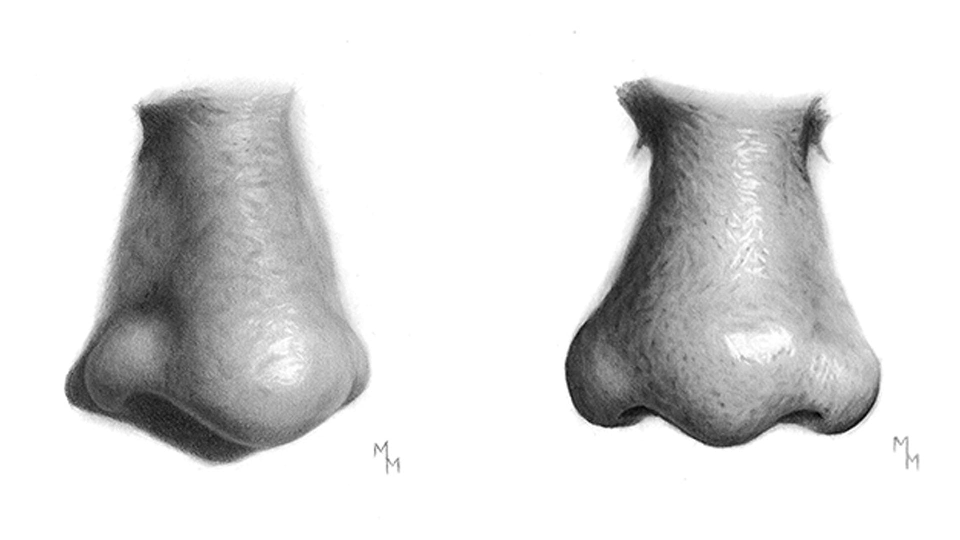
6. Nariz: Olá pessoal, bem-vindos a este vídeo. E agora vamos nos concentrar no nariz. Para o processo é bastante semelhante ao que fizemos na testa. Em primeiro lugar, estamos fazendo alguns dos contornos com um lápis H, especialmente onde é mais escuro. Então vamos preparar a primeira camada, misturando a grafite usando as ferramentas de mistura usuais, tecido, escova e coto de mistura. E gradualmente alcançaremos os tons médios e as sombras. O nariz dá uma grande oportunidade para praticar o controle precisamos sobre grafite para que possamos renderizar volume para ele, alcançando as diferentes tonalidades que vemos na referência dos pontos mais escuros aos mais leves. Os valores diferentes não são os delimitados por linhas reais, mas pelos próprios valores. Então vamos assistir. Mesmo que as transições de áreas mais escuras para áreas
mais claras possam ser feitas usando tocos de mistura e tecido, é importante trabalhar com precisão ao usar o lápis. As ferramentas de mesclagem não são destinadas a corrigir erros cometidos anteriormente. Eles só estão nos ajudando a fazer as transições parecerem mais suaves. Um aspecto crucial para a criação de volume é o contraste. E é por isso que estou usando grafite 4B aqui. O lápis mecânico é mais preciso do que um lápis normal. E a escova ajudará a fazer a aderência de grafite na superfície, o que é útil sempre que se trabalha com lápis mais macios. E aqui estou eu começando a textura usando um lápis duro. E assim, e o processo será suportado por ferramentas de mistura e também por borracha, que fará os destaques. E isso significa que trabalhamos em ambas as direções. Isso é da escuridão para a luz e da luz para a escuridão. Para os tons médios, neste caso, recomendo usar lápis intermediários, como B ou 3b de acordo com suas necessidades. Em seguida, o coto de mistura ajudará a esconder as marcas de lápis. Agora chegamos para desenhar o segundo olho e eu não tenho muito a dizer porque é quase uma repetição do que ele fez no primeiro olho. Uma coisa que eu gostaria de salientar é o fato de que eu escolhi aqui neste retrato para desenhar o primeiro olho, depois mudei para a testa, bochecha
esquerda e nariz, e só então para o segundo olho. Mas você pode desenhar os dois olhos ao mesmo tempo, se quiser. Para ser honesto com você, fazê-los de uma só vez é uma boa idéia, porque ambos os olhos devem estar alinhados uns com os outros, devem ser compatíveis. Ambos olhando na mesma direção, devem estar no mesmo tamanho se for um retrato frontal, então... Você sabe o que quero dizer. Ao fazê-los ao mesmo tempo você não corre o risco de esquecer quais lápis você usou ou como fazê-lo, então você é obrigado a fazer um bom trabalho. Dê um triy para esta dica quando você tiver uma chance. Se você estiver se sentindo inseguro com esse olho, você também pode voltar e assistir novamente ao primeiro vídeo, se quiser. Este é um exemplo de como você pode querer voltar
ao primeiro olho para fazer alguns ajustes ao fazer este segundo. Aqui, eu só queria ajustar os destaques em ambos os lados. Só para lembrar, já que as pálpebras inferiores são mais delicadas, eu escolheria um lápis mais difícil para desenhá-las. As tampas superiores, por outro lado, são mais espessas. Portanto, usar uma nota mais escura é aconselhável. O segundo olho terminou, é hora de trabalhar novamente em sua pele. E este passo é muito importante. É muito importante construir algum contraste aqui. Sempre prestando atenção à foto
de referência para equilibrar os valores gerais do seu retrato. Novamente, antes de mergulhar nos detalhes, certifique-se de que esses valores estão bem estabelecidos e não feche os olhos para a imagem como um todo. Sugiro que não se apresse neste passo. E a grafite 4B é essencial aqui para renderizar volume e fazer seu desenho saltar do papel. Agora vamos trabalhar no lado direito e no queixo e na mandíbula. Ao esfregar o tecido aqui no desenho. Esteja ciente da sujeira, que se acumula no papel. Se você esfregá-lo em uma área mais leve, observe que o grafite pode vir em sua superfície. Então mude para um tecido limpo se quiser, a menos que queira trazer esse efeito de grafite e creater mais escuro com o tecido. Na mandíbula, você notará que há uma luz refletida e sim, podemos fazê-lo, mas não exagere seu brilho. Este é um erro muito comum. A sombra ainda está muito escura, está bem? Então eu escurecerei esse reflexo misturando grafite sobre ele. Aqui, mais uma vez, estamos fazendo textura da pele. Quando estiver satisfeito com os valores definidos na primeira camada, você pode começar com esses pequenos detalhes. Já assistimos ao processo antes. Então fazemos a textura com lápis e ferramentas de mistura. Misturar coto e a questão nos ajudará muito na renderização de um efeito
suave, impedindo que ele pareça áspero. E não se esqueça de manter suas ferramentas limpas. Eu definitivamente vou usar a borracha de pau nesta área. Você também pode usar a borracha amassada. Ambas as borrachas são úteis e produzem efeitos diferentes e funcionam de forma diferente. Este último eu uso em áreas maiores sempre que queria voltar um pouco com a grafite. Quando eu acho que é um pouco escuro demais. Aqui está um pouco mais de trabalho sobre a textura, mas não faltando toda a imagem. Eu queria esvaziar mais uma vez. Então eu acho que esta tomada aqui ajuda você a dar uma olhada em como todo
o retrato está indo enquanto eu estou trabalhando em uma área específica. E aqui estamos terminando este vídeo. Espero que esta aula esteja sendo perspicaz para você. E no próximo vídeo vamos nos concentrar na orelha e na boca. Vejo você lá!
7. Oar e boca: Vamos começar a orelha. Os valores são muito escuros, uma vez que está quase escondido nas sombras. Mas isso não significa que você faça isso descuidadamente. É por isso que estou refazendo o esboço porque é tão direto que essas linhas são susceptíveis de desaparecer enquanto trabalhamos nele. De qualquer forma, em breve usaremos lápis escuros nesta área. Já estou a definir as áreas que são, pelo menos, um pouco iluminadas. Então eu estou fazendo esses traços circulares em torno das áreas mais leves. Os valores mais escuros são renderizados por grafite 4B. Então você pode começar a usá-lo onde você precisar. Em torno das áreas não tão escuras, obtenho um lápis de grau intermediário, como um B, para começar com os tons médios e preparar as transições. Como sempre, o toco de mistura é útil para esta etapa. O tecido vai misturar muito grafite aqui. Então, escurecerá toda a orelha e quase desfará um pouco do trabalho anterior que fizemos. Mas ainda é útil para preparar a primeira camada. Então eu peguei o lápis mecânico para aumentar a escuridão aqui porque parece que há uma articulação entre o rosto e a orelha. E quero que pareça unida como uma coisa única. Observe como estamos avançando pouco a pouco das sombras para as luzes usando o lápis B. É assim que faço as transições. Quando você estiver quase pronto, você pode obter a borracha amassada e tocar na orelha para aumentar o brilho. em alguns pontos específicos, e eles não são tão intensos como aqueles destaques que fazemos com a borracha stick, que vai ser usado. Se você acha que a luz é muito intensa, você pode diminuí-la usando uma mistura ferramentas exatamente como eu estou fazendo. E agora, a boca. A boca neste caso é bastante diferente da orelha, uma vez
que tem uma textura mais áspera e está em uma área bem iluminada. Então vamos ver muito mais coisas aqui. Inicialmente, eu ainda estou trabalhando na pele ao redor da boca porque é importante ter, novamente, um suave entre ambos. Você realmente não quer ver uma linha separando a boca, a boca é apenas um tipo diferente de pele. Mais uma vez, as ferramentas de sangramento são úteis. Depois de retocar e ajustar o nariz, vou reforçar as linhas internas da boca. Então vou começar com o sombreamento. Aqui começamos a trabalhar na textura, mas observamos antes dos diferentes tons dos lábios superior e inferior, o último é definitivamente mais escuro. Depois de perceber que ele irá torná-lo mais seguro sobre como você irá renderizar a textura em ambos os lábios. Sempre fazendo movimentos circulares com o lápis e sendo ajudado pelo pincel e pelo coto de mistura. A borracha tem um papel tão importante aqui e para os destaques, e agora o jogo fica mais interessante. Não se esqueça de chanfrar sua ponta usando a faca para aumentar sua precisão. Observe como esses destaques são delicados, quão afiados eles são, e a ponta precisa ser limpa para. Então o pincel faz com que tudo pareça mais suave. Aqui o pincel, como você deve ter notado, não desfaz ou faz uma bagunça com os traços de lápis. Mistura suavemente a grafite, mantendo o trabalho feito como está. É tão menos agressivo que o coto de mistura, sem mencionar o tecido ou um cotonete, que normalmente não uso. Eu não sei caras, o que você pensa sobre como este tipo de desenho é difícil e eu adoraria ouvir seus comentários. Mas de qualquer maneira, não se sinta frustrado se o seu primeiro desenho não parecer tão fantástico como você esperava, ok? Aqui está também uma questão de perceber os diferentes valores na referência. Então, tome seu tempo também para observar apenas a foto e assistir esses tutoriais com atenção. E não se esqueça que a prática é perfeita. À medida que você continuar desenhando, você vai perceber que existem padrões, alguns passos habituais a seguir sempre que você enfrentar uma nova referência. E à medida que você ficar mais experiente, você saberá intuitivamente qual lápis
escolher , onde você precisa usar a borracha ou o pincel. Sua habilidade de ver também se tornará melhor e melhor. Por isso, não te esforces muito, especialmente se fores um novato. No lábio inferior, quero que você perceba como a luz nem sempre é feita usando a borracha. Aqui, por exemplo, eu trabalho principalmente em torno dos pontos de luz, especialmente porque eles são maiores. Então é assim que você pode criar um contraste intenso onde é necessário, assim como fizemos em sua testa e nariz. A boca terminou, Eu decidi melhorar a sombra abaixo porque esta sombra era mais intensa na referência do que no meu desenho. Então eu tenho um grau de grafite mais escuro complementado pela mistura de coto e o pincel. Eu não vou usar o tecido por causa da escala em que estamos trabalhando, ele precisa de uma abordagem mais precisa. Aqui estão alguns toques finais onde a boca está aberta. Eu tenho o grafite 4B uma vez que é bastante escuro e o coto de mistura e o pincel para tirar proveito da escuridão de grafite. Aqui estamos no final deste vídeo. E no próximo vamos dar uma olhada no pescoço e nos ombros. Te vejo!
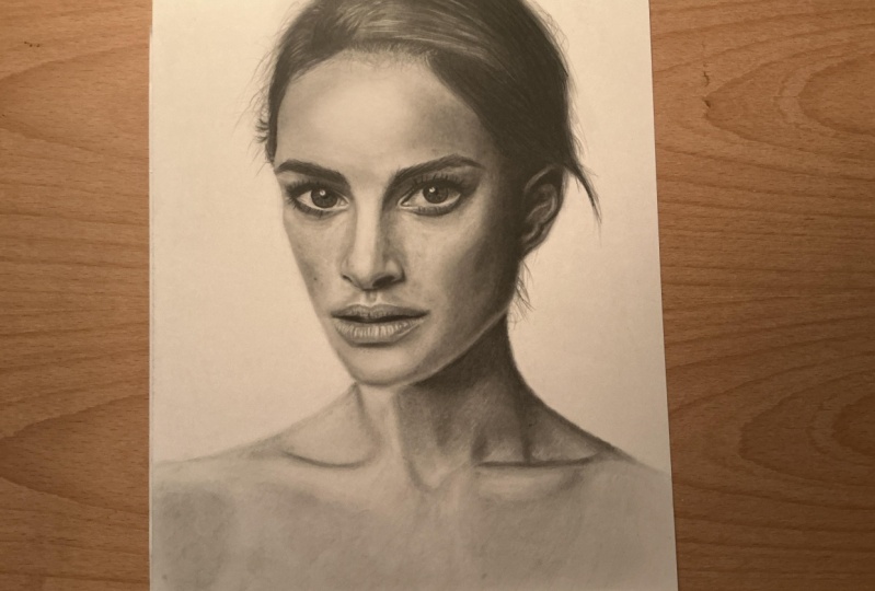
8. Pesos e ombros: Ei, todo mundo. Agora vamos nos concentrar em seu pescoço e ombros, começando removendo um pouco de seu contorno usando a borracha amassada. Observe que não há realmente contornos na realidade. Assim como nós apontamos antes quando estávamos falando sobre seu rosto, o desenho aparece por causa da diferença de tom entre primeiro plano e fundo. Então vamos começar com a primeira camada de grafite como fizemos no rosto dela. Escolhendo mais uma vez um lápis duro para começar. Então vamos assistir um pouco e eu vou lhe dar novas instruções à medida que seguirmos em frente. Toma, quero mostrar-te um pequeno truque. Para evitar o uso excessivo do lápis e deixar o papel marcado com os traços, você pode tentar uma abordagem mais delicada usando o toco de mistura. Pegue uma folha de papel separada e aplique um pouco de grafite lá. Em seguida, pegue um pouco do grafite usando a ponta do coto de mistura e esfregue-o no desenho. Isso você irá ajudá-lo a criar uma borda suave e fazer com a separação do fundo pareça mais suave e bastante embaçada, assim como vemos na foto. Dê uma olhada na referência novamente e verifique se você concorda comigo. Algumas arestas são ligeiramente desfocadas por estarem fora de foco. Isso tornará seu desenho ainda mais interessante. À medida que
obtemos tons mais escuros, vamos mudar para lápis mais escuros. E eu estou usando um Lápis B aqui e mais tarde uma nota de lápis 3B. Os tons mais escuros exigirão a grafite 4B. Havia um pouco de pó de grafite no fundo e estava me irritando um pouco. É por isso que eu tenho a borracha. Mas você só pode fazer isso quando terminar. Você não tem que fazer isso agora. É hora de adicionar um pouco de textura. E não é nada diferente do que fizemos antes. Fazemos essas pequenas manchas com o lápis. E usando as ferramentas de mistura para obviamente misturar e diminuir a dureza de grafite na superfície. Eu recomendo usar lápis H e B na maioria das áreas 3B e 4B para a área abaixo de sua cabeça para a sombra elencada ali. Aqui está uma foto de perto do processo. Então você pode ver de um ângulo
diferente, como ele está indo até agora. Estou iniciando a camada base para esta área, repetindo o processo de desenho da pele. Não fazemos isso aleatoriamente. Preste atenção aos pequenos tons
diferentes abaixo de sua clavícula. É uma variação muito sutil de tons. Então, estou sendo um pouco mais cuidadoso em usar o lápis. Não quero exagerar no trabalho aqui. By the way, um pouco de uma isenção de responsabilidade, dependendo do papel que você está desenhando, Mesmo se você repetir exatamente o mesmo número de traços de lápis e colocando a mesma pressão sobre, você terá resultados diferentes, porque cada absorve grafite de forma diferente. Estou, por exemplo, usando o papel da Lana Bristol, este papel leva mais tempo para ficar mais escuro. Por esta razão, algumas pessoas simplesmente não gostam. Eles podem achar que é muito suave. Mas também é verdade que papéis lisos lhe dão a possibilidade de trabalhar em detalhes com mais precisão porque seu dente é mais regular. Então, todos os papéis têm seus prós e contras e você deve
testá-los para descobrir qual papel melhor se adapta às suas necessidades e ao seu gosto. Agora, adicionando um pouco de textura aqui. E é tão delicado que usaremos o tecido
com mais frequência como se eu quisesse fazer a textura desaparecer. No entanto, algum grafite permanecerá e isso é o que um desejo. Você deve notar como este trabalho leva algum tempo. Você adiciona uma primeira camada de grafte que provavelmente não será suficiente. Pode faltar um pouco de profundidade. Então você pega o lápis e escurece alguns pontos específicos mais uma vez. E, em seguida, passo a passo, pouco a pouco você alcança os tons que você queria desde o início. Então este vídeo termina aqui. E no próximo vídeo vamos ver como desenhar o cabelo dela. E eu estou esperando por você lá para o nosso último passo.
9. Cabelo: O que se passa, pessoal, aqui estamos nós no último vídeo. E eu espero que você esteja tão animado quanto um foi quando desenhou este retrato. Vamos fazer esse efeito desfocado mais uma vez. Então pegue seu coto de mistura e esfregue sua ponta em algum grafite para trazê-lo para o seu desenho. Então você vê que é bastante simples de criar tais como efeito surpreendente. Logo após a mistura vem o lápis mecânico, que proporcionará mais definição e escuridão ao mesmo tempo. Já que é um cabelo muito escuro. O pincel aqui vai ser muito útil também, porque combina grafite mais suave muito bem. Para estes fios de cabelo soltos, eu faço a primeira camada com o coto de mistura. E mais tarde eu uso um lápis duro para desenhar cada cabelo. Você pode usar lápis mais escuros mais tarde também. Uma vez que algumas peças variam em escuridão e espessura. Ao sombrear o cabelo, Eu gosto de mudar e usar diferentes graus de grafite porque as toneladas também variam ao longo do cabelo. Então você pode mudar para outro lápis para melhor renderizar as transições e fazer os diferentes valores que podemos ver lá. Mesmo que tudo pareça ser muito escuro, mudar seus lápis fornece mais controle e permitir que você acumule mais complexidade para a massa capilar. Mais tarde, eu vou usar o Borracha Mano Zero stick para os destaques e eu recomendo que você não escureça muito as áreas que vamos usar a borracha porque se houver muito grafite em uma área específica, o não será capaz de removê-lo e renderizar brilho para esse ponto. Então observe de antemão foram os valores mais leves estão
no cabelo e não use 4B ou lápis gráficos mais escuros nessas áreas. Você pode desenhar pedaços de cabelo em torno dos destaques e misturar o grafite sobre eles com pincel. E, finalmente, use a borracha para fazer esses traços brancos finos que vemos na referência. Aqui está a borracha. Observe que o cabelo ainda não está tão escuro, então a borracha será capaz de remover o grafite com bastante facilidade. Após a borracha, podemos escurecer as áreas
ao redor dos destaques e isso fará com que eles pareçam mais nítidos. Agora estou trabalhando novamente, com o lápis para escurecer o cabelo um pouco mais. E você vê novamente a borracha para refazer alguns destaques e fazê-la parecer do jeito que eu quero, agora estamos de volta para a testa, para seus limites para ser mais específico. Há alguma sombra lançada pelo cabelo. Definitivamente há alguma textura, alguns cabelos saindo da pele. A área é um pouco complexa e um pouco confusa. Mas lembre-se de trabalhar primeiro no que está mais para trás e que é a pele. O cabelo vem mais tarde. Adicione alguma variação ao seu trabalho alterando o lápis que você está usando. Eu uso todas as diferentes notas que temos sido usadas para este desenho. Porque alguns cabelos são mais
escuros, outros são mais claros, alguns cabelos são mais grossos, outros são mais finos. É assim que eu produzo efeitos diferentes através do processo. O melhor lápis para os cabelos mais delicados é o H. Esta é uma repetição do processo que vimos anteriormente. E eu quero enfatizar o fato de que este é o processo para esse cabelo específico. Isso não significa que sempre que você desenha o cabelo, você seguirá os mesmos passos para fazê-lo. Na verdade, cada referência pode exigir um procedimento ligeiramente diferente. A propósito, ainda não terminei a porção de cabelo à esquerda. Voltaremos a essa área mais tarde. Aqui estou eu fazendo os últimos toques para melhorar a transição entre cabelo e pele. E talvez você perceba algumas diferenças do que você vê no vídeo e no meu produto final. E isso acontece porque eu faço e refazer alguns pontos eu não estou satisfeito o suficiente. Sim, vocês não vão acreditar que eu sou um pouco perfeccionista.:) Sempre que desenhar cabelo, pessoal, nunca se esqueçam de manter o lápis afiado. Isto é muito importante. Apesar do fato de eu continuar avisando você para manter a referência, sempre que você está desenhando padrões complexos como pedaços de cabelo como estes, eu não me esforço tanto para fazer exatamente a mesma coisa que estou vendo no modelo. Porque não somos impressoras, não
somos máquinas. A idéia é descobrir os padrões e tentar reproduzi-los, mas não há necessidade de enlouquecer por se juntar a cada átomo se você sabe o que quero dizer, não vai arruinar seu desenho se você der alguma liberdade, é claro. Agora estamos de volta a esta área, apenas adicionando alguns pedaços de cabelo aqui também. Estamos em nosso trecho final e é hora de fazer os últimos ajustes. Então você me vê fazendo os últimos toques em muitas partes diferentes do desenho. Quando pensei que tinha acabado, notei que tinha que fazer o cabelo avançar um pouco mais sobre a pele. Decidi também aumentar a escuridão aqui no lado direito de seu rosto, já que esta área é realmente escura. E ao fazê-lo, eu também aumentar o contraste e a ilusão de valume também parecia melhor na minha opinião. Então você pode escurecer as sombras se você acha que é necessário. Finalmente pessoal, acabamos com este desenho. Espero que tenha gostado muito deste tutorial. Espero que a explicação tenha sido muito clara e adoraria ouvir o seu feedback. Não se esqueça de compartilhar seus pensamentos. E espero que nos vejamos em outras aulas. Tchau-tchau!
10. Conclusão: Espero que esta aula tenha ajudado você em sua melhoria como artista e, por favor, não
se sinta frustrado se seu desenho não parecer tão incrível quanto você esperava. É improvável que tudo fique perfeito imediatamente. Agora, eu quero que você continue praticando, já que agora você tem todas as ferramentas e conhecimento que precisa para se tornar um artista melhor. Compartilhe na Galeria da Comunidade seu projeto finalizado para participar da discussão com seus colegas e obter insights mais personalizados. Espero que você esteja disposto a continuar esta jornada e eu adoraria vê-lo em futuras aulas. Tchau!
 Matheus Macedo, Realistic Drawing Artist