Transcripts
1. Welcome!: their care. And if you ever thought it would be fun to design your own holiday cards and Photoshopped, you were right. I've been teaching Photoshopped and Design for almost 20 years, and this course is part of a beginner friendly Siri's that I created help walking step by step. Four different holiday thin. This particular course will be creating this design right here. You'll find links for free downloads of all the related to mine elements and fun in the included course, along with a link for a free trial of Photoshopped. In case you don't already happened, way go. You'll learn how to build a new document from scratch, how to work with type and what the layers handle is all about. And when we're finished, you'll have a completed design that you can be proud of and a set of files that are ready to send to your favorite lab for printing. And if you don't have a favorite lab, all even walk you through the upload and ordering process at one of my favorite. So gather up your favorite photos, put on some holiday tunes or grab a cup of hot chocolate and let Dio
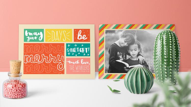
2. Before You Start: So as I showed you just a moment ago. This is what will be creating. It's a five by seven flat card with both of front and a back design. Everything you need is included, so take a moment right now to download the course files, click on all the links and download those files and install the fonts. If you need help installing fonts, you'll also find a link with instructions. How to do that in the course. PdF. You'll find the course files by clicking the Your Project link just below this video and then to the right hand side, you'll see the download link in the next video, we'll get started with photo shop, and mistakes are part of the fun. So when you make one, don't panic. If you need to undo something you've done, just press command or control Z. That's all there is to it. So let's get started
3. Document Setup: Hey there. We are ready to create our new document. We're going to be creating it from scratch. So we're gonna want to come up to the file menu and choose file new. Now we're gonna be setting this up in inches. So from the drop down right here, whatever yours says, if it's not inches, you want to click and then select inches. The width of this document is going to be precisely 7.252 inches with a height of 5.252 We'll talk about why that is in a minute for the resolution. We're gonna set it to 250 pixels per inch. We want RGB color and we will leave the background white. Everything else can just stay as it is for now. So go ahead and click create. So here's our document. Another reason that this document, which will ultimately be just five by seven the reason that we built it with dimensions of precisely 5.252 and 7.252 is because we need to accommodate the trim area or what's called the bleed. So there's a portion of this document that will be cut off and in order to know where that's gonna fall so we can avoid putting any important pieces of our design in that area, we need to add guides. So we're gonna add two sets of guides. We're gonna add an inner margin, and then we'll add the trim guide. So to do that, come up to the view menu and shoes, New guide layout, and you can turn off any checks that might be next, two columns or rows. And we do want to check down here next to margin. So first, let's add the interior guide. That's gonna be our quarter inch margin. So we'll type 0.25 space I end. So that's 1/4 inch. It'll just tab over and do that all the way across. We want that margin to be the same on all four sides. You can see a little preview in the document area. We'll go ahead and click. OK, so this is our margin. Now we want to have some guides toe. Let us know precisely where that trimming is gonna happen, and that's going to be at an eighth of an inch. So we're gonna come back to the window menu And this time, excuse me, view menu, and we'll choose new guide layout a second time and this time will type 0.1 to 5 space. I n we'll just do that all the way across and click. OK, so now you can see we have two sets of guides the innermost margin and the outer trim guide . Next, we're gonna load the color swatches that I've created for this project. First, we'll need to open the swatches panel from the window menu. Choose swatches. Now, these are the presets that come with photo shop. You can obviously use any of these. If you would rather toe load the swatches collection that I've prepared for this project, you're going to come up to the Swatch panel menu right here in the top right corner, give it a click and choose load swatches. Then just navigate to wherever you downloaded the file and the one that you want is called merry and bright dot a S E. That's adobe swatch exchange and then click open and you'll see those six colors added right here to the bottom of your swatches panel. And that's it for documents set up in the next video. We're going to start building the design
4. Build the Design: So we're gonna start with the front side of this project, and it consists of six different colorful block areas, and then there's type on each of them. So first we're going to fill in the background color. Then we'll create the different blocks, the color blocks, and then lastly, will add the type and some of the hand drawn elements. So for the background color, we're gonna use this almond color here. So if we hover, are mouse over on top of our swatches, you'll see that your cursor turns into an eyedropper and you can just click to load that that color. You'll know that it's loaded. If you look over here in the bottom left of your toolbar, you'll see whatever color you clicked on. In this case, this almond color will be on this top square right here. This is the foreground color. So now all we need to do to fill our entire background with that color is a quick, handy keyboard shortcut. So on your keyboard you're gonna press and hold, alter or option, and then press delete. That's it. Next, just so I can see what we're doing. I'm going to select a different color in this case, all select the red, so a mouse, my cursor over and click to select the red. And then I'm gonna collapse this panel out of the way so I have more room to work on my scream. So to do that, I'm just gonna tap Theo Icon for the swatches panel. Or you can click this little double arrow right here. Either one will collapse that out of the way. All right, so we're going to be drawing six blocks, and ultimately they'll end up different colors. But just for the sake of getting them out onto the document, we're going to just make them all one color, and it it doesn't really matter what you choose at this point. We're going to be using the rectangle shape tool so you can access the shape tool family by pressing the letter you on your keyboard or you can find it down here on your toolbar. If I click and hold. There are a number of different shaped tools in this family. So you want to make sure that you are using the rectangle tool, so I'll release my mouse on that to make sure I've got the right one up in the options bar . We want to make sure that we've got shape chosen for this option right here. And here's where If you wanted to change the color quickly, you could do that. You could just click the fill and then select whatever color you want. And if you scroll to the bottom here, you'll see our our colors. For this project, we don't want a stroke, so we want to make sure that set to none. So that's a white rectangle with a red line through it. All right, so now we're ready to go. And don't worry if your blocks are not perfect, you can always tweak them, reshape them, move them around when we're done. So the main thing right now is to just get them out into the world. So I'm just going to put my cursor about here and click and drag something about maybe like this. So there is one block, and now I'm going to switch to my move tool by pressing the to get the move of of ah, tool. And I'm going to duplicate this block by holding down the altar option key, and you'll see your cursor changed when you do that from the standard move tool cursor, it will change into this black and white arrow that lets you know that you're about to duplicate something. So while I'm holding alter option, I'm also gonna hold down shift. And then if I position my cursor here on top of this block and I click and drag to the right, I get a copy of the block. And that just makes it really easy to keep everything in alignment as we are designing. So now I'm going to repeat that again. I'll hold alter, option and shift and drag 1/3 black. You may also notice that when you are doing this, these magenta guides are popping up and letting you know that you've got the spacing equal . These air called your smart guides, and they help facilitate the design process. Okay, so we're gonna do some reshaping of those in a little bit. But now we're going to draw two more blocks down here, and then one big block over here. So let's keep going. Hold down again. All option or alter, along with the shift key. We'll drag another block right here. I'm going to use my arrow keys to just nudge that up. I don't think that spacing was good. All right, on then, Alter option again and the shift key again. And there's one more down there, and then we just need one more big block in this area. So again, I'll hold all tor option and shift shift keeps it in alignment. An option makes the copy. And then to scale this one up, I'm gonna press command or control t to bring up free transform. And then I'll just grab this corner and drag it over until it's aligned. Something like this that looks pretty good. So when we're ready to commit that, we'll click this check Mark gonna close this properties panel that has opened because I'm not going to use that. And here we have in our layers panel. Each of the blocks has its own layer. So now we're ready to tweak this, and what I want to do is kind of just offset these blocks a little bit. This is very beautiful and mathematically very well organized, and everything's spaced nicely. But what I want to do is actually mess it up a little bit. So, for example, I'm gonna I'm gonna squish this block. I want it to not be so wide, So I need to find it in my layers panel. And I could tell by looking at the little thumbnails. I think it's this one. So I'm gonna click to target it, and I can check to see if I've picked the right layer by toggle ing this visibility on and off by clicking over here. So I did get the right the right layer. So that's good. Another way that you condone target your layers is when you have the move tool active. If you hold down the command key or control key and then click your mouth on an object, you were temporarily enabling auto detection. So if I If I hold down commander Control and I click this top left layer, you can see that Photoshopped grabs the correct layer in the layers panel. So that's another little trick. So I'm gonna hold down command or control and click right here, and I'm gonna transform it by pressing commander controlled teeth. And I want this to be a little bit more squarish, so I'm gonna dio dragon inwards a little bit. And since there is nothing in here except a fill color, we don't have to worry about being proportional or anything like that. So what? I'm happy with it. I'll go ahead and you could press, enter or click this check mark to commit that. Then I think I'm gonna take this one and stretch it longer to fill in the gap here. So I'll press commander Control and click to target this layer and commander controlled t to bring up transform. And then I can just drag it over about, like so what I want to do next to just sort of rearrange this whole thing because for right now, for example, I can tell it's not centered in the document at all. So I want to select all of these blocks. So to do that, I'm gonna come over to the layers panel and I'm going to click to select the top block layer, and I'll hold the shift key down and then click the bottom block layer. So now they're all selected, not the background, though we leave the background alone for this, and now I can just move them all as a unit and you can see that when I get it in the center , the guides are turning on so I can see that it's now centered and I can let go if I want to transform this whole thing at once. For example, I want the margins on the left and right to be equal to the margins on the top and bottom. So I'm gonna press commander Control T. And because all the layers are selected, I now can transform them all as one unit. So I'm going to click and drag from the bottom. But I'm also gonna hold down all tor option, and that is gonna drag equally from the top at the same time. So once you're happy with the policeman and the layout of everything, go ahead and press enter or click the check mark to commit the transformation, you always have to commit the transformation before you can move on. So for the last part of this step in the process, we are going to colorize the different blocks. I'm going to start with this top left box. So that's the very bottom one here in the layers panel there still all selected. So I need to just click away and then click back to De select all of those and end up with just this single block right here. So this block I want it to be, I want it to be a different color. So I'm going to go back to my swatches panel and I'm going to select this watch right here by just mousing over it until I see that I drop her and I'll just click, and then we can do that same keyboard shortcut that we used to fill in the background color . We can use that to fill in the block because the block is the only thing on this layer. It's the only thing that will change color. So that again was Ault or option and delete. Next, I'm gonna choose this top middle block, so I'll target that in the layers panel, and I'm gonna fill it with this yellow color. So I mean, it's click to sample the yellow color and then all Ault or option delete. I think I'll leave this one red on this next one. Here, I'll select the proper layer. I said this one. Yeah, select the right layer and I think I'll make that this color. So I'm going to select it. And again with the keyboard shortcut, cult or option delete. And finally, this bottom one here, I'm gonna use this rose color and use the keyboard shortcut to fill it in. If you're done with your swatches, you can close it so you can get a good look at your piece at this point, and I think it's looking great. In the next video, we will add the type.
5. Add Type: all right type lovers. Now comes the fun part of playing around with typography, especially hand drawn typography. It creates a really fun and playful look for our holiday card. We're gonna be adding the type in several different separate layers. On top of all these blocks is these blocks. So in the layers panel, the first thing when we want to do is target the top layer. Because that way, any type that we add to this file will appear on top of this. To add the type, we're gonna switch to the type tool by pressing the letter T. Normally, when I teach people about working with type in photo shop, I I say you should always just get the type out first and then style it later and I stick to that. I think that is a very great approach. But in this case, because I've planned this design ahead of time, I already know what fonts are gonna work well, and so it's just a Z Z in this case to go ahead and choose them as we move through the project. So with that in mind, the first type players that we're going to create are going to be an a font called Justin Road. So you can put your cursor up here inthe eop shins bar for the type tool and start typing Justin Road and you'll see that if you've actually gone ahead and installed, the font photo shop will find it for you right here. And you can just click to select it over here in the options bar further down the line, we're gonna choose thesis entered setting, and here we're gonna select white for the color. So I'm gonna click that swatch up there. And then if you click and drag to this outer top left area, you will get white. You'll know that it's actual white white By looking down here in the hex code, you should see six efs, or you should see a value of 2 55 for RGB right here. Then you know you've got pure wait. You can also just type those numbers or letters into these boxes as well. All right, then we'll go ahead and click, OK, and we're ready to enter some type. So I'm gonna put my cursor over here, and I'm just going to click. And don't worry about the size right now Just click and get it out. So we're gonna type the word may in all lower case, and then I'm actually gonna press command or control return, and that's gonna set that type player. And then I'm gonna make a new type player. So actually, in putting these on separate lines of type so they'll be separate layers on that allows us to manipulate them independently. It's just a little bit easier. So next I'll just move my cursor down here a little bit and click again, and this time, all type your so all lower case, all white. There we go. And then again, command or control, enter to set that type in my layers panel over here. Now we can start styling this a little bit, so I'm gonna click to select the May layer, and I'll press commander Control T to put a transformation box around it. Then I'm gonna hold shift and drag to scale this up. And the nice thing is, because type is vector, we don't have to worry about resolution. This is going to be nice and crisp. No matter what size we make it, so we'll do something like that. So it's basically filling the box, but not quite when I'm happy with it. And when you're happy with yours, you can go ahead and press just entered to set it. Next, we need to adjust the your down here. So in the layers panel, click to select the your layer and again bring up free transform Commander controlled t hold shift and dragged from the corner. Now this one, we won't get quite as big When you're ready to reposition it, you can let go of shift and then move your cursor into the center. And when you see this black arrow, you can move it around. Just make sure whenever you're dragging from a corner to scale it, that you're holding the shift key. So I'm just gonna tuck it up. So it's sort of in this space. I'm using the arrow keys to just nudge it, and I think that's looking pretty good. And so suddenly, when I look at this, I'm feeling like I wish the space between the M and the A was a little bit tighter, and the good news is you can actually control that. So if you want to be persnickety about it. I'm gonna type back on the male heir, are click back on it to make it active. And then I'm gonna just click to insert my cursor in the space between those two letters. And I'm gonna open up my character panel by choosing window character. And that is what's called Kern Ing and that's controlled here where we see a V slash A. So I'm just going to click and then drag to the left a smidge. So I'm setting it to a value of minus 50 and I like that better. So now I'll go ahead and commit that. All right, Now we're ready to move on to the next block so that with our type tools still active, we can just come over here and click to insert our cursor, and we're gonna type out the word days and then go ahead and press command or control enter to set that the reason we have to press command or control enter is because if you just press enter, you're going to get a line break just like you would on a typewriter, so you can use enter to set your transformations. But when you're typing and you want to set your type, you have to do Commander control. Enter. All right, so we've got that out. Now we let's change this font because this type is on its own layer. We don't have to click and highlight it like you would in Microsoft Word. So because we've already committed the type so there's it's not an active type player, meaning the cursor is not in it, but because we have this on its own layer and the layer is selected, we can just come up here in the options bar and change the typeface. So we're gonna type Frankie, and it looks like this. Now I'm going to transform it again, Commander Control T and shift drag from a corner and I'm gonna make it rather large. And when I'm happy with it, I'll just press enter for our next block. We're going to write the word be May your days be so I'm gonna move my car so over here and just click and all type B Anil, press Commander Control, enter and we're gonna change this type again. This time we're going to choose a font called Pacific. Oh, and you guessed it will scale it up by pressing Commander Control T holding shift and dragging. All right. And in this box, we're gonna type marry, so I'll click to insert the cursor and type Mary commit the type. Change the typeface for this. We're going to use something called Clemen Tiene sketch regular and commander Control T on large This so I'm gonna adjust it so that it's basically just going right up to the edge here. I like the way this fun. I like how the letters connect, and so But they look kind of funny when they just hang off like not being up to the edge of something. So we will put that up to the edge, and I'm gonna put that we'll put this up here in the top and let's commit it. And now I'm actually going to duplicate it two times. So I switched to the move tour by pressing the letter V and then I'm going Teoh all tor option and drags straight down, and I can hold shift to there is one, and then repeat to that looks a little bit crazy. It's gonna all be better in a minute. So in the layers panel. We have our Mary type player. That's the one at the top. And then we had Mary Copy and Mary Copy, too. So I'm going to click the Mary copy to Layer and then shift click Mary. So they're all selected, and I can just drag this up a little bit, so everything is centered. So the baseline down here and the X height line up here are touching the top and bottom of the box. Then what we want to dio is reduced the opacity of this top Mary and Mary Copy too. So in the layers panel, I'm gonna choose this top Mary layer and all command or control. Click on Mary Copy too. And then I'm gonna change the opacity to 25% by just typing to five on my keyboard. Alternately, of course, you could come over in the layers panel and with those two layers selected, you could come up here to the opacity settings and you could click to insert your cursor and just type in a value of 25. So that's kind of fun. It adds a little bit of texture and neat stuff, and we need to do one more thing to fix this. We need to clip the text right down here, and then we're actually gonna paint this in so we don't see through it, But we'll take care of those things in a little bit. Let's keep going with the type right now, so we need to switch back to the type tool. So you want to make sure if you did click over and here and the layers panel for the A pass ity setting, you want to make sure you click out of there too unhygienic that. So now you can press t for the type tool, and I'm gonna click over here and in this place, we're going to add an ampersand. So that's the shift seven and the word bright and all set my type. And now we're going to change that typeface to something called Pee Andy. So I'll put my cursor up here in the type options and type P and name. Now you may be seeing this Gonna switch my move tool, Move this over. So we typed an ampersand. And when we changed the typeface, it turned into this weird box. Well, it turns out that free fonts, even ones with commercial usage rights. They just because they're free, they don't contain necessarily all of the characters that you would get with a paid fun. So what we're going to Dio is change the ampersand to a different typeface. So I'm going to switch to my O type tool again, and I'm going to click to insert my cursor and then highlight just the ampersand. And I'm going to change that font to something called Beautify script regular. And I'll come over here toothy the font size in the options bar. And if you click and drag to the right, you can scale that up or down. So I'm going to scale it up so that it looks like it belongs with the other letters here. Speaking of which, I intended for these letters to be all caps so I can either turn on my Catholic and retyped them, or I can click and drag to highlight all of them using my type tool. And then, if we open, that character panel will go back to a window and choose character down here where you see a whole bunch of teas. There's this right here where you see two big capital teas next to each other. This button will turn your existing type into all caps, so I'll just click to do that. So when you're happy with all of that, go ahead and click the check mark to commit it, and you can use the move tool to position it. I may actually going to use Commander Control T and in large that a little bit. And finally, we're bringing it home with the final type in this laxed in this last block. So with my type tool, I will click and type much love. In this case. I'm going to use a capital M much love comma, and it isn't. It's typing in all caps, and we'll fix that in a minute. Ah, let's set this type, command and term and like, switched my move tool. I can show you. So it's typing in all caps and that's OK. We're gonna fix it in a minute. First, let's change the typeface to what we actually want, so I'll switch back to my type tool, and here we're gonna use the same one we started with called Justin Road, and it's all in all caps, so No. What? I want it all. And no matter how you I don't even have my caps lock on. This is happening because photo shops remembering that I turned on the all caps option in the character panel. So to turn it off, we got to go back to the panel so window character and just turn that off. Ah, look how much better that is. Okay, so I will press commander Control T and hold shift to scale this up. Now it looks like I either lost my curse, my comma here or I didn't type it. So I'm gonna insert my cursor and I want a comma after that. But you may notice that this comma doesn't really match this font. And if I click and highlight this comma and we look up here inthe e options bar for the type tool we see that myriad pro is selected. So photo shop is substituting a different character here. Kind of like when we ran into the ampersand ampersand issue over here in this typeface. But this typeface, the Justin Road typeface, does have a comma. It just for whatever reason, it didn't get coated properly. So when I type the comma on the keyboard. I'm not getting the comma, but we can fix that. We just need to go to our glitz panel. So I'm actually gonna delete that comma and now will come up to the window menu. And she was glitz. So the glitz panel allows you access to all the characters of a font beyond what you can just type out actually with your keyboard, which is pretty amazing. And I talk more about this in my other classes. It's It's a really cool thing right now. It's showing us all the characters for myriad pro. But what we want to see are the characters for the Justin Roads thought. So I'm going to click the drop down right here and squirrel up, have a lot of fonts. One of these days, I'll clean them all out right here is my Justin Road. So I'm gonna click to select that. And now we're looking at all The different character is available in the Justin Road front , for example. There's a little heart right here, and you may or may not have known that this typeface, which is free with commercial usage rights, includes this fun little heart doodle. So some funds have some really cool treasures hidden in the cliffs panel, so you'll definitely want to check that out. If you're using an an older version of photo shop before Creative Cloud, then you won't have a glimpse panel so that I think that might be a worth an upgrade right there. This is just pretty awesome. Okay, so what we're looking for is right here. Here is the comma, and I'm just going to drag this out of the way so you can see how it works. So I've got my cursor active and blinking. We deleted the old comma where you're waiting here, the curses patiently awaiting. Now I'm just gonna double click that comma and it will insert it. So I guess that seems like a lot of work for comma. But you run into this a lot, especially if you're not springing money for fonts. So you want to know how you to use your cliffs panel? Okay, let's commit this. You can use the move tool adjusted as desired, and now will finally add the last line here so I'll switch back to the type tool T for type tool and I'm going to click and I'm gonna type the Winkler's and all commit that and will change that back to front a again, and I'll switch to my move tool and move it in place. I dig it and then one final line here, I'm gonna hold down, alter option again and shift drag, and then I'll switch back to my type tool. So we're copying that type player, and I'll click to insert my type tool in a press commander Control eight to highlight all the type. And now we'll just type everybody's name. So we've got Damon comma Candace, Comma Emma in parentheses, who is six and Ari parentheses, who is four. All right, so we'll commit it and then we'll scale this down. Commander Control T. It's obviously too big for the box, so we'll just scale it like that when you switch to my move tool and use my arrow keys to just nudge that Now if we want it, for example, I'm looking at this, and I think I want some more space between Like, these two lines look good, but this top line is encroaching, so I'm gonna close all my panels everywhere and I'm gonna find that layer with much love targeted. And then I'm just gonna use my arrow keys to nudge that a little bit. So there's some separation between this and who it's from that is looking so often we're not done yet, though. We have a little bit of cleanup work to Dio and some details toe add. So join me in the next video and we will take care of it.
6. It's All In the Details: All right, This is the final stretch of the design for the front. We're gonna add some fun, little hand doodily details to this. Now, the joy of it is that this is a fun, hand drawn, playful look. So even if you are not a gifted, fine art east, that is quite fine. This you you can do this, and I can give you some work arounds. If you who are not trusting yourself, I can give you some alternatives, but I really I believe in you. You can totally pull this off. So the first thing that we're going to do is find the, um, top of our layers here in our layers panel. So I'm gonna click the top most layer, and then I'm going to come to the bottom of the layers panel and click to add a new layer. Whenever you click the new layer button, it adds a new layer on top of your currently selected lier. So that's why we did that. It just saved us from having to drag it up here manually. So now we have this on the top, the top of the stack. We're gonna be doing some painting So you want to grab our brush tool, you compress the letter B on your keyboard for brush. Or you can come over here in the layers in the toolbar and just make sure that there's four members of the brush family. You want to make sure that you're using just the plain old brush tool. None of this funny business k just brush toe than up here in the options bar. You have a little dot or some sort of stroke preview with a number underneath it. That's the diameter of your current brush, and it may be different than mine. That's okay. We'll change it in a minute. We're going to click this down arrow, which lets us select a lot of different brushes, and the one that we want is going to be called Hard Round. And yours may display differently than this. Yours may look like it might not have names, for example. It might just be this, or it might even just have a tip. It's all different things, but I think in most people's panels the default is I think it's the second brush, so basically you want to brush that's round that the dot Not a funny shape, just a dot and that has a hard edge. Okay, so if you can find that, then that's what you need. Now we can change the size of our brush using the left and right bracket keys on your keyboard. So if you take a peek down at your keyboard and you will find the letter p like Picasso to the right of that, our bracket keys and the left bracket key is going to make your brush smaller and the right Recchi's going to make it bigger. Now. If your cursor does not appear is a round circle like this, it might be because you have your caps lock on. If your caps lock is on, then you'll see this plus target thing and you won't see it change at all when you change the the brush size. So turn off your caps lock and then you can use your left or right bracket keys to change the size, and we want it pretty small in this case. So like, I think the 20 pixels is good, so you can just hit your bracket keys around until you see something about this size. We're just gonna paint Now. You can do this however you want. You can just click little lines like this coming out of your type. I'm gonna undo that and actually make my brush a little bit smaller. You see how 10 pixels? Okay, so, toe, undo it. You're gonna do Commander control Z toe undo More than that, more steps backwards. You're gonna add salt or option and then hit zzz so you can You can experiment a little bit here if you get lost, open your history panel window history. And here you can just go back in time and start undoing all the the things you've done. So you can always back up, OK, so you can just click through here and undo your brush strokes. If you don't like them, it will say brush tool, a brush tool brush tool. So that's another option that you have for undoing. So feel free to experiment. You could just draw like I was planning, like little raise like this just kind of coming out. Or you could, um, you could make him like, little pedal kind of shapes. Sometimes that's a fun thing like that. But I'm just going to go for the simple little three per side. There you go. Really Not perfect at all. In fact, the more in perfect. I think the better that it looks as you'll notice. Look at this typeface. I mean, it's hand drawn, so the lines of the letters themselves are actually a little bit wobbly. All right, next, over here, I was just gonna add some little dots, so just literally dotting around the letters and you could use if you don't like dots or don't feel like you can draw dots. I'm just stamping. Basically, you could always, I guess, use your type, tool and use like Asterix or something. But I feel like you can handle dots. Anybody can handle dots. All right, that looks good. If you color outside of the lines, like, oops, I got some on the background. Maybe you want to keep it there. If you don't just press e to get your eraser and then painted away, erase it away. All right. Make sure you continue with your brush tool. We're going to come down here to the layer where it says and bright, and I thought it be fun to just draw some little stars here. So you can draw like ass trick type stars. Or you could draw. I don't know the starters, like I used to doodle in elementary school. There is no right or wrong answer. You can make some big You can make some. Ma. If you don't like any of that, you could grab your racer and just make your eraser bigger. Erase it all. And maybe you want finer lines. Kind of. I'm looking. And I think you know what? Those stars are a little bit thick, so I'm gonna erase them, and then I'll switch back to my brush tool and I'm going to make it smaller. Oh, yeah, that's better. So now I'm using a five pixel brush and just Oh, my goodness, don't get too obsessed with it Doodles. Something fun. I'm adding some twinkle stars in here. There we go. I like it. And that's it, I think, for the doodling. So congratulations to you. Well done. If we want to keep track of this in our layers panel, let's just rename it because it's really hard to see what's on this layer. So instead of layer one or whatever yours is called just double click it and we can just call it doodle Doodles and then press enter to set that. Okay, let's turn our attention to our Mary's. Over here, we have two things we need to fix. The Lower Mary is escaping from the block, so we want to fix Fix that. What we're gonna dio That's Mary Copy to down there. So? So once we target the Mary copy to Layer in the Layers panel, we can add a layer mask to it with the Mary type player active. We can still come move our cursor down to the big rectangle layer, and I'm gonna command or control click the thumbnail. Then you'll notice that puts marching. Ants are round the whole rectangle, but we still have Mary Copy, too. So that's that bottom type player that's still active. So now what we want to do is just mask it. So the only part of Mary Copy to that we see is the part that's within the selection to do that is very simple. Down at the bottom of the Layers panel, we're just going to click this button right here. This is the layer mask. It's an icon of a rectangle with a circle inside. And when you click on that and we have that selection active, it's gonna add this funny looking icon to our layer. And now we see that the part that was overhanging has disappeared. Technically, it's still there, but now it's just mass, so we don't see it perfect. We are getting closer. The last thing bringing at home is that we are going to fill in this area because I just feel like it's a little busy to look through these letters like here. You might think that there's there's a red fill inside these letters, but then over here, where we can see the other letters behind them, we realize it's not a Phil and it's empty and it just kind of looks busy. I think so. If you like it, you can leave it. But I'd like to fix that. So I am gonna open my swatches panel, so if you have it on your screen, you can pop it open or find it from the window menu, windows watches and I'm gonna click to select that red color. So to pull this off, we need to do a little bit of rearranging in the layers panel. First of all, the Mary that's bright here is Mary Copy. So in the stacking order of things here, let's we've got this one's actually in the middle, So let's drag it on top so that the faded Mary's are actually behind it time. So let's we can even rename Mary Copy. I'm gonna double click and call it just Mary Bright. So now we're gonna add a blank layer, and we want the blank layer to appear directly below Merry Bright. That way, when we paint on it, it will cover up the other Mary's but not cover up Mary Bright. Okay, so in the Layers panel, if we just click the new layer button, it will make a new layer right on top of Mary Bright. That's the default. But if we command or control, click on the new layer button, it will go underneath, and that's what we want in this case. So we can rename this fix. I guess so. We know what that is. Now I'm going to go back to my swatches panel and select the red color that we've been using, and then I'll make sure I have my brush and I'm gonna zoom in by pressing command or control space bar. And when you hold that down, you'll see your cursor changes into a magnifying glass, that zoom tool and now to zoom. And I'm just going to click and drag to the right and it will zoom in and I can let go of my keyboard and I'm back to my paintbrush Now we're just gonna paint in the letters here. We don't have to be too careful because the type layers on top that's keeping us looking like we are coloring inside the lines. So that's helpful to scroll down in your image, you can press and hold the space bar that gives you the hand tool. Then you can just drag down and then let go. And guess what? You're back to your brush and you can keep painting. So you just want to paint the inside to hide the the type from appearing. So it looks like our type has a red fill, and now it is oum back out. I'm gonna press commander Control zero and that looks great. So now you've added all the type, the doodles and we did a little bit of cleanup. So in the next video, we're gonna save. This will make the J peg that will be ready for printing, and then we'll set up the document for the backside of the card.
7. File Prep: all right. So we definitely don't want to lose. The incredible work that we've done here is we want to save this with all of the layers. We want to save this as a PSD. So that's the first thing we're gonna come up to the file menu and choose save. We're going to navigate to wherever you want to put this. So I'm gonna call it Mary and Bright, So give it a name, find where you want to save it, and down here under format, you want to make sure that you choose photo shop and then click safe. So now we've created thief Photoshopped document. If you ever want to change this leader or make edits to this later, this is the document you come back to. But it's not the document that you print for that. We need to make a J. Peck. So we'll come up to the file menu and choose save as, and we can leave everything the same. But this time under format will choose JPEG and then hits safe. The next thing will see will be the options for that Jay Peg and we definitely want the highest quality J peg possible. So for here next, equality. It should say 12. And the slider here should be all the way to the right and then click. Ok, excellent. So we are done with the front side of the card to set up the document for the backside. We're going to just save ourselves some time and clear out our layers panel, and then we'll re save the file as the back. So I'm gonna click the top most layer and I'll squirrel all the way down, and then I'm going to shift, Click the very bottom layer, but not the background. We're gonna keep the background. So in this case, have rectangle one down here. So I have selected all those layers, and then I'm just gonna click the trash can and delete them. Now, we're ready to save this as the backside by choosing file save as because we're saving it as something different. And this time I'll just differentiate it by adding a Suffolk's here. So it'll say merry and bright dash back and we'll choose photo shop for the format and hit safe. All right, so we're almost done joined me in the next video where we will finish it up and add a photo and a background pattern to the backside of our card.
8. Add a Photo to the Back Side: All right, Now we are ready to add your image to of the design. Let's open it up by choosing file open, navigate to your image and open it up. Now, I prefer for the image to be black and white for this design. So if you agree and you want to convert yours too black and white to you certainly can. But obviously you don't have to. So you can do what you want in this case to do a quick and dirty black and white conversion . I'm gonna, um, press down, commander control shift and the letter you that's going to just do de saturate, er unsaturated the image. I'm gonna add a little bit of contrast here by bringing up levels, Commander Control l and we have three sliders here. A shadow slider, mid tone slider and highlight slider. I'm gonna grab the shadows letter. Just drag it inwards a little bit, too. Just make a little more punch here and I'll drag the mid tone slighter. No, that's about fine where it is and I'll drag my highlights in just a little. Make it a little punchier. All right, click. OK, and now we're ready to copy and paste this. So first we have to select it. Commander, control A to select it all that puts marching ants around the whole thing. Command or control. See to copy it. And now we need to switch back to our design. Weaken. Do that over here. If we click this tab, these air the tabs for the different open images that we have so we can switch between our images by clicking on them. So now, before we paste this in, we want Teoh define the area that we wanted to appear. So we're gonna use the marquee tool up here at the top of the toolbar. If you click and hold, you'll see it's a family with multiple members. Make sure you've got the rectangular marquee tool. Now, I'm just gonna eyeball this. We can always adjust and correct this later. If we need Teoh. I'm just gonna put my cursor about here ish and click and drag to make a marquee that's about like that. Now we're ready to paste in our image. But we're not just gonna regular paste. We're going to paste Special. To do that, we come up to the edit menu and choose Edit Paste Special. You thought I was kidding, don't you? But if it's actually called pay special on, then we're going to choose paste into, and that takes our image and paste it into the rectangle that we drew. And let's talk about what's happening in our layers panel because we had a selection active when we pasted this image in photo shop applied what's called a layer mask. So we have the image here, and then we have this mask around it so that we're only seeing the image in this area just like a mask hides part of your face. This mask hides part of the image. Anything that's outside the window that we've drawn here so you can think of it like a window, and then this is the view outside the window, and then this is the view in the window. So right now, our view is much too large for the window. So we're gonna resize that we're gonna transform it by pressing Commander Control T for transform. And this image is so large we can't even see all of the corners to be able to drag in words from, so to scooch out real quick. I'm gonna press commander Control in the numbers zero and then we can see. Look how big this is. Here's our document. And here's this massive image. So to scale that down, I'll hold shift and drag inwards. Repositioning this and I'll zoom back in or scoop back in by pressing Commander Control Plus plus plus plus. Plus, there we go. So we can just position this where we want it. Something like that I think is nice. And then we'll set the transformation by pressing enter. Excellent. If we decide that we need to move this or rearrange the window itself, then in the layers panel, we'd want to actually click to target the window itself. And then we can grab the move tool with the letter V, and then you can move actually the window around. So that is an option. You can also transform it by President Commander controlled T. Oh, my gosh. Look at that. I nailed it right in the center. It was in the exact center, man, I got lucky. That does not usually happen, but if you wanted to, you know, squish it or make it taller or whatever. That's how you would do that. So you just would want to target the window itself versus targeting the actual photo. So it does matter which one you have selected here, so keep an eye on that. All right. Next, we're gonna add a pattern that I've created for you. We're gonna add it to the background layer. So click the background layer to make that active, and then click this lock over here. We have toe unlock it before we can add any fancy nous to it. If you have an older version of photo shop, it won't let you click. I mean, like a really pretty older, like, several years older version. It won't let you click this toe. Unlock it. But instead, it's really easy. You just double click this empty area right here. Double click, and then click. OK to dismiss this window and welcome to the party. Same thing. All right, now we're ready to add the pattern. So from the bottom of the layers panel, we're going to click this effects icon, and this shows us all the different effects that we can add to our piece here. So in this case, we're gonna choose pattern overlay, and we're going to load a pattern that I created for you. So to do that, we'll click this little drop down arrow next to the pattern swatch sample. So click the drop down arrow and you can see here some patterns that come with Photoshopped . Yours may look different. That's fine. What we're going to do is click the Gear icon right here, these air like settings and stuff. So we're gonna dig into the settings and choose load patterns, then just navigate to wherever you saved the the assets for this course. So the file that we're looking for is called merry and bright Candy stripes dot pat for patterns, so select that and then click open and photo shop will just add it to the bottom here. So if we want apply it now, we'll just click to select it. We want to make sure that these other settings are as follows. We want the blend mode to be normal, the capacity to be 100% now. Here you can play with the scale. If you want to make the stripes itty bitty er, you could do that. You can do whatever you want with the scale, but I wouldn't put it above 100% because then it's enlarging the pixel data, and it's not gonna print nicely. So anywhere between one and 100% you can explore. When you're happy with how things look, go ahead and click. OK, that's looking pretty awesome. The last thing we're going to do is just add a stroke or an outline around the edge of the photo to just help it pop and separate it from the background a little bit. So we'll return back to that effect icon click. And this time, instead of pattern overlay, we're going to come up here and choose stroke for the size. We could use the slider right here and drag to make the stroke bigger or may get smaller, and I forget exactly what size I made the stripes. But I think a good aim is to have the with of the stroke be about the same as the with of the stripes. So I don't remember exactly what that was. Maybe 35 or 40 pixels for position. We wanna have it set to inside blend mode, normal capacity 100% and down here, where it says color. If we click in the swatch, we can actually hover. Are cursor here in our image And we can click to sample any color that we'd want Teoh ad So choose whatever you like. I'm gonna go with e almond color and then I'm gonna click, OK, that will dismiss the color picker box. And if you're okay with all the other stroke settings, then you can click. Okay, right here, and that's it. Now you've created the design for the backside of the card, and in the next video, we're gonna save it, create the final J peg and get this puppy ready to pray.
9. Final File Prep: be sure to save your work by coming up to file and choosing safe. Since we've already created and saved the initial version of this backside of the design, we can just hit Save now to update that file. So now we've got our PSD, but we still need R J Peg to send for printing. So now we'll go back file this time will choose Save as and we can leave the name the same and down here under format. We want to choose JPEG. Don't worry that you see these warnings here about layers. That's just letting us know that J pegs can't support layers. And this document has layers. But photo shop will just flatten it down into a flat layer. And that's what it will put into the J peg that we send to the lap. So that's exactly what we want. To go ahead and click save for the J Pack options, make sure we set the quality to 12 and then click. OK, so that's it. Now you have a great design with the front and a back side. You've got to files for each. The front has a PSD and a J. Peg and the back has a PSD and a J peg. So the PSD zehr your file. That's where you return to. If you want toe remix these for next year, you could do that. And the Jay Pek file That's the final design. That's the one you send to the lab. So round of applause, Give yourself a pat on the back. You did it.
10. Lab Recommendation & How To: Congratulations. You did it. Now you have a finished design and you're ready. Toe, upload your files to your favorite lab. If you don't have a favorite lab, I always recommend em. Picks dot com to get started with them. Just goto m picks dot com and create your free account. Once you're logged in, look for the D. I Y. Cards link under the Cards menu. There, you'll find a variety of different options, including standards like square, vertical and horizontal. Choose the appropriate option. Select the corresponding size and click toe. Upload your finished design file. Congratulations. You did it. Thank you so much for watching. And please be sure to check out my other holiday design courses right here on skill share and hopefully, I'll see you back here again soon.
 Khara Plicanic, Photographer, Designer, Adobe Educator