Transcripts
1. Intro: Hello, I'm Manuel, a
Swiss UI and UX designer and also brand and to just two series, my
branding course. And you're going to
learn four main things. First, we're going to
develop your brand car, which consists out
of your values, your purpose statement,
and your characteristics. Then you're going to learn how to find out your uniqueness. Also, you will learn
how to talk about yourself and your
business and forth. You will create your
own brand style guide. This class is for beginners who just want to
get started online. Maybe you, for You Tube
channel or Instagram, and just start building
their personal brand. You will need no
prior knowledge, and you also don't need
to know about any tools. We're going to use
Figma in this course to create your identity. But technically you could also use Canvas or anything else. My goals with the course
were to break down branding, which is a big subject and
make it really simple for you. And I also want to
get your acting. Here in this little diagram, you see most people get
nothing done because they consume a lot of
content and they don't produce any contents
themselves and they wanted to, you can make a transition
from consuming content to actually
producing content yourself. Which in the end, we'll mainly help building
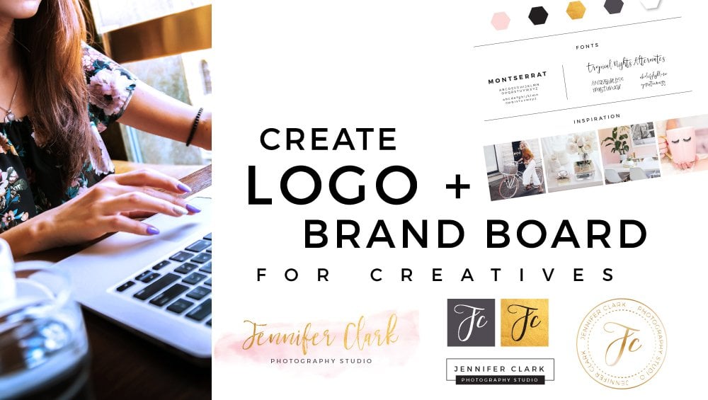
your personal brand. Then in the class project, you will receive a
branding worksheets that covers all the exercises we
will discuss in this course. Also, you will get access to pre-done color,
color palettes, like those here, which I
created that are about, I think fairly of those
inside the course. Here are just a few to show you, and also topography
templates that show very nice type pairings. You can just then pick your preferred choices and
create your own identity. From that, your own brand identity might look something like this here, which I created for myself. It is nothing big, but it will do the job
to get you started. So like we will have a little
logo, a color palette, and also your typefaces. Then the last thing I can say is it's going
to be a simple course, but most things
are simple and you still have to do them if
you want to get anywhere. So that was my introduction and see you in the first lesson.
2. Internal & External Brand: Welcome to Lesson 2,
internal branding. The main thing I want you
to understand here is that branding consists
out of two parts. One part is here, the peak of the iceberg. What people see, it's
your visual identity, your logo, colors, and
typography, right? And then the other
part which is even bigger and more
important in My Eyes, is your internal brand, okay? Your internal brand is
what people don't see, like for example, your values. Okay? You should think
about it this way. Every body or everyone
can copy what you do. They can copy your
service, your product, they can even copy
or visual brand. I see that all the time. But most people will not be
able to copy who you are, what you stand for, like your spirit in a way. I mean, so this is what you need to be aware of,
internal, external brand. We're going to start working on the internal brand like
directly in the next exercise. But we, before we jumped there, I would like that you are
clear on your goals, okay? Because if we do a
Branding workshop, I want that this is
aligned with your goals. So please take your time. Ask yourself, where
do you want to be in one year or three years? And maybe you can even tell where you want
to be in 10 years. Maybe you want to launch
like a smaller company, small team, maybe
your own agency, branding agency or whatever. Or probably we want to release
a course or a product, write this down here, and then jump to
lesson number three.
3. Define your Values: Okay, welcome to Lesson
3 about your values. This is where everything
really gets started. The first thing I want
you to understand this, that your personal brand is a combination of how
you see yourself, how other people see you. And as you might understand
this circle here, how other people see you. You cannot fully control, like you can not go in other people's brains
and kinda program what they should
think about you or how they should see you, okay? So your reputation, which is basically as synonym to
your personal brand, you can not a 100
percent control it. The only thing you can
do is you can influence your reputation or you can influence what people
think about you. And the best tool to influence
that is your values, okay? So that's why we do it,
influence perception. And also, I want that you align your actions like what
you do with your values, because then you have like
an aligned brands, okay? And this will build
trust because people build trust
to companies or other people that behave and act the same vase
consistently, okay? Then another reason why you
should define your values is that this is your
number one differentiator. Because as we already
covered in the last lesson, people can cover what you do, but they cannot cover
who you are and your values are one
of the biggest. How could they say like one of the biggest parts of who
you are basically account. So how do you
define your values? How normal exercises
work is like this. They give you a list of
values like this year. Nice cute list where you have nice sounding words like Respect, Innovation,
Diversity, quality. I don't know. Well, speeds, whatever, like
this lists are really cool. You can also screenshotted
like this is the lower part. The upper part. So you
have like a vert bank, this is great for inspiration. But still, I think you need some more guidance
defining your values. Okay? So what they
came up with is this set of guiding
questions, okay? So ask yourself which
of the words on the list they just show you
feel most authentic to you. Ok? And now you might feel
like are there are many, I don't really know,
because what I wanted to do is I want you to
select three to five, okay, We should not
have 10 values, you should have maximum five, even better, free, because then you can really
live up to it. You can memorize them,
you know your values, okay, so less is
even better here. Then. If you, if you
really don't know, then ask yourself,
who do you admire? Like, what do they stand for? Maybe you'd buy air, certain celebrity who really
stands for integrity. Integrity. Okay? Are you can maybe think
about a situation menu took a stand for someone or
something in a debate, okay? For me, for example, when I have a debate
with other people, mostly I say nothing
because I don't want to participate
in waste my time. But when it's about
sustainability, like when they really talk
trash about sustainability, like I have to tell them
how it really is that I like take a stand in
sustainability, right? Or when do you feel
most like yourself? What are you then? Are, how are you then like okay. Like when you feel
it when you're at home and you
feel comfortable, how do you behave like? What is your true
essence basically, okay. What is something you care
about more than other people? For example, for me
it's health like a particularly care about
health more than other people. Like I like whenever I have the decision between healthy
folder or unhealthy food, I take the healthy one or
two exercises, I move. Okay? Here you can also
see your values are Like defining
how you act, okay? Then what is important to you when you deal
with other people? Do you value being fed or loyal? Okay, maybe you have
like a certain way you treat people which is
really special to you, then this should be
part of your values. Okay? So screenshotted those
questions, saved them. Like if, if you're, if you have
difficulties defining value stake and really
help you a lot, okay? Then another thing you
need to pay attention is. Values like quality
and reliability, they sound nice, but
they are overused. They are overused and
they became meaningless. Okay? Quality and reliability should be a standard for everybody. Don't put it as values, then good values should be
unique and authentic to you. And they should also be aligned with your
target audience. And this is important
because for our example, think about Harley Davidson, like the motorcycle company. Imagine the CEO or
the founder like one of his values,
what Waltz law. And I don't know like
law of and care. But this doesn't
align with his brand. Like it doesn't align
with motorcycles. So he can say, okay, my, my, my values are love and care, but they also care about
excitement and adventure in. And then you better
take this values, excitement and adventure because they align with your
target audience better. Okay, so on the
last thing to pay attention is to cultivate values you already
have within you. Because it's hard to
be somebody else, like just be yourself
and be more of it. Comb. Then I have some instructions
for selecting your values. Because normal value exercises, they tell you to just
pick three to five words. And this I agree on like
pick three to five words, not more, like five
should be the maximum. And then you're
good in our amine. And this is weird
because what do you do with five beautiful
sounding words? Like it doesn't help you a lot. And I want that you
make your values actionable sentences like there
should not be nice words, they should be
actionable sentences which you actually do. For example,
innovation, innovation. I don't know this
information like how do you live innovation? As an example, there
would be look at things from a
different angle, okay? This is what you can do. Or honesty, like,
how do you live? Honesty, this is
not a value like but telling people the
truth, this is a value, are actually honesty
is also a value that is a bit like the
ones we had up here. Quality and reliability. It should be a standard. Okay. Like if you have
honesty has a value, maybe you have a problem, okay? But really, I want
you to understand, make the noun into a verb or an actionable
sentence, okay? Like freedom, express yourself
freely and openly, okay? Or respect. How do you live? Respect, treat people the way you want to be
treated, for example. And you can write also
something different here. It doesn't have to be
the same for everybody. A value can MY, can mean different
things for everybody. Okay? So the simplest and most
efficient value exercise looks like this. You select your value, which is most certainly a
noun which you got from this list here,
like freedom, okay? And then, right, your
actionable sentence below it, like, how do you
lift this value? What do you do? Okay, like art can be a verb. Okay. Most certainly I will put in the attachment a worksheet
called exercises, where I will summarize all
those exercises for you. But you don't even have
to use the worksheet. You can basically just take your Google Docs,
writes down value1, and then write down
actionable sentence to value one and
you're good, okay? If you're still
having difficulties. I do have an example from
myself here because one of my values is minimalism, okay? And they did come up with
several actionable sentences. How I live up to this value. For, for example, I
do less but better. Or I put focus on the
important things and leave everything else out a k because I want to
stay minimum, right? Or I stick to the fundamentals and don't do more
than necessary. Our do fewer things, but do them better, right? So this is how a good
value should look like. I hope this helps you
and see you in Lesson 4.
4. Write a Purpose Statement: Welcome to lesson 4, which is the purpose
statement, also called device. This is still part of
your internal brand. And the most important
thing when it comes to the purpose statement
is to ask yourself, why are you doing what you're
doing besides making money? Because, I mean,
if you're honest, every brand's purpose in
some way is to make money. Like then we would write all the same because we all
need to survive. You all need to
make our own living and VI all on to
thrive and grow, and money is needed to do that. So it would be really boring
if every company would say our purposes
to make a lot of money and grow and become
really big and stuff. That's why we don't say that this is something
you need to be aware of. We want to go one layer
deeper and ask ourself, why are we doing what we are
doing besides making money? Because we could also do
something else to make money. But we're doing this
activity which we're doing. And I have some
guiding questions that will help you find
your own purpose statement. The first one we
already covered, the second one, why? Or what is the great
purpose behind what you do? Maybe you have a great purpose behind what you do, the norm. Why do you exist? I do exist. And why should anybody care about you like
That's a good one. Like, why should
anybody care like? And then what cause
can you contribute to that also relates
to your audience. There are some great courses on this planet which brands
can contribute to. Their audiences care about. And they have some
examples of causes here. For example, unemployment is something your brand
could help solve. Global warming is something
grants can help solve. Education, government
accountability, poverty or inequality, or safety are all hot topics
that brands nowadays start to work on star to help
support and solve Our. Now, you might ask
yourself like, why, why do I have to do the
purpose statement even like, it's cool, like to have reasons why to
do is I'm saying but why, what does it bring you? And the purpose statement
brings you a lot because it helps you differentiate
yourself from your competition. Okay, let me make an example. Let's say you're
producing clothing. Clothing is a completely
oversaturated market. There are thousands of brands competing on producing clothes. If you produce clothes, I literally will ask you,
why should they care? Like, why should they
care about your clothes? Okay? And I know as we as a company that is
really well branded, they sell clothing
and whenever you pay, whenever you buy a piece
of clothing from them, they will plant a tree. Okay, that's why I should care, because they will
solve the cause of global warming,
for example, okay? Or also just generally
environment because trees are good against global warming and
the environment, and that's via eBay,
stuff from them. There is another Swiss
brands that donates one piece of clothing for
every purchase you do. So if I buy a t-shirt, they will donate a pisa T-Shirt
that to somebody in need. They are for the
year for poverty. They solve the
problem of poverty because they give
poor people clothing. And this helps them differentiate themselves
from normal clothing brands. Like their purpose statement
is the main differentiator. And both of them
are doing great. I both brands are doing great in a completely
oversaturated market. Okay, that's fine. You should do it. Write down
your purpose statement here. It can be one sentence, it should be one sentence. It should be very
simple and easy. You don't have to use
lawyer language here. And to help you a little
bit, they have examples. For example, ikea is here to create a better everyday
life for many people, Lego is here to inspire and develop and develop the
builders of tomorrow. But the cornea also played
a great clothing brand, is in business to
save our home planet. Okay, so normally you start
your purpose statement. Refer who help or to save, like us to safeguard like
public cornea, right? To life. Like you make
it a little sentence. Like I do whatever I do
to help, blah, blah, blah, or to safe public law or to contribute to blubber law. Okay. I think you can do that. It has to be about
80 percent good. You don't have to
kill yourself on coming up with a
perfect sentence. If it's 80 percent good, leave it on, vomited with it.
5. Define your caracteristics: Okay, welcome to lesson 5 about your unique
characteristics. The characteristics
are important for your brand because they tell the people how they
perceive you, okay? There is a big difference between characteristics
and values. Many people start to confuse them or even mixed
them together. To recap, values are your guiding principles that will help you make decisions. Value, tell people how
you act consistently. Basically how you tick. Whereas characteristics are more about how people
should perceive you. You want to control how
people perceive you. That's why you should care
about your characteristics. Some are samples could be that you're realistic,
structured, or practical. I do have some guiding
questions that will help you find your
own characteristics. Then, first one would be, what qualities do you have that have brought you
to where you are today? Like maybe you're
working in an office, maybe you are self-taught. So what qualities
did bring you there? Reo, very structured,
organized person. Are you and did you learn stuff by yourself or
you're very persistent or, you know, then this will
all be characteristics. How do you want
your customers to experience you on a daily basis? Like do you want
your customers to experience you as motivating, funny, inspiring, like this could also
be characteristics. What qualities do your
products or services have? Maybe you have a product
that is really like a special characteristics
you want to point out. For example, it's like very
streamlined, very actionable, very applicable like
this, for example, something I want to
have with my products. What are the qualities
that you find in your favorite role models
that you also have. For example, maybes your
own role models are having really inspiring people
in order to having really structured processes
and you find is really cool. Okay? Then what kind of person do you want to be in
other people's life? You can ask yourself, how would a leader
in your niche act? That's really important
basically because all of you will one day become a leader if you really
are persistent. And decisions already
taken mind or keep in mind now because
I see many people on Instagram being weird, like videos pointing
adverts or dancing. And this is crawling, all told either would act
in Aneesh like a leader, acts mainly like
fought full authority is very grounded, like
straight forward. And you can be
entertaining and funny. This is definitely like, this is definitely allowed. But do not become Sealy. You know, like how many people do then except if it's
part of your rental. If you are silly, that you
need to be smart silly. Then what have other people
stated about you in the past? Meaning maybe you're working
office and people come into you into the office
and they're like, Man, your work is so great. Like you work so fast. Like we'd like you're a fast worker or it could
be lake yesterday in the meeting or so motivating or inspiring
or great ideas you had. And this can all be
characteristics that other people already see in U. And this is great if you
nurture them in your brand to then how do people react to
your actions or presence? Meaning, when you're in a
room with other people, do they feel inspired by you? They feel entertained by
you or maybe intimidated. In my case, sometimes
people feel intimidated because I'm a bit direct
and that's how I am. That's my, that's my
brands right? Then. I hope this helps you
kind of brainstorm about your own characteristics. You could write a small answer
to all of those questions. And then I also
have examples here. Like one of my characteristics
is structured. Like I structured the course
a structure many things. And the, the description
to it is that they organize information
in logical groups to have an overview. Or I want to understand first the big picture before I start working on something small. Or when I do something, I do it for Ollie and they just generally love
to create clarity. Okay? I hope you perceive me
as structured because as you already had in
the previous lesson, I can never control how
will we will perceive me, but I can act in
a structured way. I can give you a
structured course and maybe at the end of the day
you will think that about me. So what I wanted
to do in the end, this lesson is this
exercise where you basically write down
different characteristics. I made three examples here. For example, entertaining or your characteristic could
be positive or inspiring. And then you write a
small description to it. Like what it means to you. Hey, because it can mean
something else for everybody. I know somebody he, his characteristic is
entertaining and he loves to entertain people, make them feel relaxed
and enjoying mentor Jose, like they just enjoy
him being around him. Okay. That's it.
6. Find your Uniqueness: Okay, and I swear
at lesson number 6, what makes you unique? If you are not unique, you don't stand out from
your competitors and deal. We'll have to compete on price. And this is really not the
situation I want you to be in. That's why we have to
watch our competition. Now this is an exception because normally I
want you to watch inside you and leverage
what you have inside you, like your values and your y. But now you must watch your
competition to find out what they are offering
and what their messages. Okay, those two things
I wanted to find out and then don't
create a similar offer. They have like makes something different and don't
have a similar message because most certainly your competitor is
more established, a new or bigger than you are. And if you offer exactly the same thing and have executed the same message, you will be left behind. Okay? Then while you create your own offer area
or your own service, keep in mind that everybody can copy your offer or service. Meaning if you try to stand out with what you're offering, you're in a dangerous position
because it can be copied. What you rather should do is you should try to stand
out with living up to your values and also
communicating your why. People can copy your values. Yes, but for most people
it will not be authentic. You can really live
your values and be authentic how you are as a person and people
will want to work, you work with you
because of who you are, not really, because of
what you're offering, because they are aligned
with who you are, what your values are,
your characteristics are, and like also, they probably
want to be part of your y or they find it purposeful to support you
because they like your y. That's why you should
communicate that. And here I have a little
exercise for you. It's the competitor exercise
where you analyze them. You basically take the
three main competitors. It doesn't have to
be the biggest one, it has to be the closest one. Then analyze their offering
and their message. So you can do something that's different and also have a look
at what you like about it, what you hate about it, and what you could do better than something
more I want you to consider is you should not be doing everything for everybody. If you do everything
for everybody, you are well, first of all, not in a niche. So it's hard to stand out. And if you do it for everybody
you're and not having like a target customer
and it's again, harder to send out you will
not be distinctive enough. And I want you to
be distinctive. I want you to do one thing
for one group of persons, for one group of people. And you should also stand
for one thing like 1.5, clear message about what you
do and for whom you do it. And that's why we write this transformation
statement here. Where you basically say, I help your ideal customer, whoever it is, like your
groups of customers. To achieve the transformation, let's say to lose
weight together website to communicate better, to learn how to do sales like the transformation
you want to give them. Like you help your
ideal customer to the transformation to give them so they can achieve
their goals, okay, like so they can sell if fees are so they can
look confident on line, are so they can get in shape. They always wanted
to be in or feel confident in your body or whatever you want
to put in there. And if this statement is not very applicable
for your solution, offering, there is another
one where you say, I help ideal client
or your ideal client, whoever it is, our column or get past a big problem, okay. Through the
methodology or through the offer you're offering so
they can reach their goal. Also, it's very similar, but a bit different. Watch yourself
which one is better applicable for your situation. And then that's it for the
finding your uniqueness.
7. Tell your Story: Okay, Next one is
telling your story. You must be able to
communicate who you are about, what you're offering, what
you're doing to your audience. And this here is a big thing. If you don't get online. If you don't go in your
reels, in your stories, and if you don't start
talking about yourself, your brand will never grow. Okay? Like you can spend decades in your basement coming up with
all the branding statements, creating the best logo, the best color palette,
everything best. But if you don't show up online, if you don't get acting,
nothing will happen. Okay? So I really want you
to tell your story. And it's not about having
the perfect story. It's more about going
online and just talking like basically
you can skip this lesson, go online and just
talk about yourself, talked about what you
value, your mission, like, what do you want to do or how we want
to help people, your transformation
statement, whom you help, we fought and you're good. But if you feel like
you would like to have a little bit of a framework
to feel more confident. This I can give you here. First of all, what I want
you to consider is that you always have a similar tone
and voice. What does it mean? I want you to talk
a bit consistently. Like I don't want it to show up one day being like very lovely, tolerant voice,
like really like, oh yeah, hello everybody. Nice to see you today. And then the other
day you show up like swearing like this got them
people just blah, blah, blah. Like I wanted to have a consistent tone
and voice every day. Either you're happy or
your direct or your, I don't know, like a bit
more introvert or extrovert. However, you want to talk, talk the way you are
and be consistent. Then the framework,
I would like to give you this story framework. If you share your story, people will connect
to a few more. This is already known and
humans corrected humans logic. Okay? So normally, when
you tell a story, I would start with the goal. For example, you wanted to
achieve something, okay, maybe three years ago you wanted to become a video editor. Let's take the
video editor as a, as a, as an example, you wanted to become
a video editor. But there was a conflict. Okay. Like the conflict was that
you were not confident selling video editing editing
services, for example. You had no sales skills. You're always say yes to
all the projects you got. And you basically didn't
manage to become an editor because it didn't manage to
run your business properly, okay, like that
was the conflict. And at 1, there is a
decision you take. And the decision is
like the turning point. For example, you
might get helped with a mentor or remade
sign up to a course. Or you might just decide that site for yourself
that you will never, again under charged that you will say no to projects and only take the ones that are
good for you, you know. And following this decision, there is a Czerny happening. Like you're growing,
you'll learn more skills or you get
more clients or whatever. Like you talk about the
journey and in the end, you talk about the
transformation. Like what happened, like what happened if you live
basically like now, you can sell with ease and your video editing
businesses running well. And that you're now curvatures to say no to projects that
are not good for you. And I can quickly
unfolds those points. Recap. The goal. What was the goal you're
trying to achieve? Whatever it was,
then the conflict, what was the conflict
or problem that held you back from
achieving the goal? Like, why are you not able
to do it in the beginning? Then the decision,
what decision did you make that allowed you
to reach the goal? Finally? And what does that journey
look like after the decision? And then the transformation, biotransformation did
you achieve as a result of your decision and journey? Okay. And now you need to
think of it like this. If you have a client, like if somebody comes to you, who you are coaching,
for example, you can tell him, man, you have the
same problem like me. You have the same goal like
i-hat or like like this. You have the same
goal like I have had, and you have the same
problem like me. I can show you which
decision you have to take. And I can show you the
Czerny you have to go through in order to get through
to this transformation. I am here now. I mean, so basically
you can help people making the same
decision and making are going and going through the same Charney to get the same transformation
you achieved. And this could, for example, be an offer you have,
or you can say like, I helped video editors make
the decision to become a good editor and going through the journey of
learning the sales skills, learning how to say no. And you will have the
transformation. I have. Okay, That's basically
a good story to tell. Tell your story, but make it
relevant to your audience. I've made it relevant to them. Like say, like if you
take the same decision, like IT I took, you will go for this journey. I can help you go through this journey and
you will achieve this transformation which I
received, which I achieved. And that's going
to be a story that people will relate to because
they see themselves inside. And then I want
you to help them.
8. Brand Identity Overview: Okay, Lesson 8, brand identity. Now we're transitioning from your internal branding to
the peak of the iceberg, which is the external branding. What people see, which
is your brand identity. A minimum of a brand
identity in my eyes, should be a logo, like your personal logo, a color palette that may
consist of a primary, secondary, and even
tertiary color, and also a neutral
color and a typeface, or also some people
call it font, but actually it's a typeface, which is a brand that typeface
which you will use on your Instagram posts on
your YouTube thumbnails, just a typeface that is
reserved for your brand.
9. Logo Creation Theory: Okay, We're here
at less than nine, which is local creation. And they want to give you
some basic principles. First of all, good
local designers modify simple fonts, a clay. This is what we are
also going to do. And please, I ask you to resist
or decorating your logo. Many people think
that logo must be very nicely decorated
so that it is special. This is a wrong
thinking because it will weaken the
impact of your logo and it will also make it
hard to see when it's in a small size because it
has too much detail. So please resist our
decorating your logo, if any kind of
flowers or anything. I really don't think
it's necessary. Okay. A basic simple logo
will do more for you. We're going to take
a type face, okay? And we're going to modify
a typeface or font, whatever you wanna call it. And I want you to be a vampire, that different typefaces can convey different feelings. Okay? So if you, for example, want to have a very
elegant and ceremony IQ brand recommended to go with a typeface that has
serifs like this one, okay, this is an elegant logo. If you're more like
of the friendly type, I recommend you to take one
that has like rounded shapes, you know, which is a bit
softer and the bit friendlier. If you're more on
the reliable site, a slab serif typeface
could be great, which has this thick and okay. Or if you're more of a tech
person and Mono typeface, like this one where all
the characters have the same widths like in
the coding programs, could be cool because it's kinda conveying these
technical feel. If you're for children or
mothers or something like this. Maybe a very childish
also soft like the friendly one typeface
could work well for you. Or if you're really creative. One of those modern
sans serif typefaces, creative typefaces could
work for you, okay? I just want you to be
aware that when you take a typeface will have a
feeling which it conveys. These are probably the main or like something to
watch out for. Okay. And we are going to create
a verge mark together. So I want you to give some
examples of avert marks, like simple verb marks, which I once did as a template, which I find look good. Or for example, the
royal beauty like this is again a sans serif typeface. If, well, little
serifs in a way, special typeface,
I like it a lot. Then I have Brandon's dark. This is more of a male
brand, very solid. I used capital letters
and you can see it's sans serif modern typeface. Okay, Then on the other
hand, we have Olivia, Which is like like lettering, like calligraphic,
like very female soft. This could be like
for wedding stuff, kind of stuff for summer brand. I would say like I'll leave
you to find your passion. This should be like an
inspiration for you that you can imagine where you
could fit in a crime. Then I have Maria medullary, which is a weightless coach. Also nice serif typeface. It has these little
serifs at the end. Then Marlin, a writer, and spiritual rituals, your
daily meditation practice. Yep, our examples from me, I hope they can inspire you. One thing I want to mention
is it's great to take your own name as a logo
because then people, when they see the local de directly know what it is about. Because alternatively,
you could use a symbol that though Pfaff a symbol here
somewhere. No, I don't. But if you use a symbol, people first have to learn
the meaning of the symbol. For example, the
swoosh from like, they have to learn
that this is actually NYC because the tape just see the swoosh and the like
is this, what is that? Is that NYC? And for Nike it
works because it's a worldwide, very non-brand. But for you, nobody knows, you're probably not too famous. World big print. So taking the name is really smart choice
because like this, people don't have to learn it. Okay, So next up, I show you how you can find the typeface and modify the typeface and
export your own logo.
10. Create your Lettermark: Okay. As you might see, it's getting a bit darker. I don't know if you noticed, but it's already evening, so it took me some time
to record his course. Now that you've had a bit of
theory about logo design, we're going to
design our own logo. And I already pulled up Google Fonts because as
you're doing a letter mark, we need a typeface. And Google Fonts or
fonts.google.com, which is the real URL, is in my eyes the
best source to get free typefaces because they are high-quality, Most of them. And also you will not have
a license problem, okay? So you need to deselect a typeface that you think
that fits to your brand, whether it is a San Serif
or a serif typeface, whether it is like more
modern or a classic typeface, you need to do the
decision by yourself. Because there are so many
typefaces you can see it's 1358 families which
they have here. I made a list for you
of the best ones. You find it in the attachment. Here are the best
sans serif typefaces, the best serif typefaces, and also the best slab
serif or moral typefaces, which I find really good so that you don't have to
scroll through all 1000. I would recommend that
you just choose one from this list quickly google
them how they look like. I will now create a logo
for a digital person. Like it could be a
coder or it could be somebody who is just like a
bit digitally interested. So my choice will be
more futuristic or more, well, just cyber
typeface kind of thing. So what I'm gonna
do is I'm going to search for a Mono typeface. So what I do is say, use the sort function here, monospace, because monospace always reminds
me on a digital feeling. And I scroll through. In my case, I will take,
see what they have. I will take JetBrains, mono. I find this one cool. I already know this typeface. Then you can click on it and you can download
the whole family. So it's asking me if I
want to save it as a yes. And after you download it, it will show up in
your downloads here. When you double-click
it, it will unpack. And when you open the
folder you see JetBrains has two font files
that are variable, and it also has a bunch of static font files I
recommend you to. If you also have it like this, I recommend you to install all the static ones
on your machine, either by right-clicking
into and installing it if you're on Windows
or if you're on Mac, just drag them in the
fonts library folder. Assume I actually, I'm not sure if it's
already installed. So I open up my fonts tool. Exactly. So it looks like this. In determining
shrift in some lung. Here are all your fonts inside. Just search it on
your, on your machine, and then you can drag
all of those inside. It's going to take few seconds and then they should
be installed. I think it's already good. It has a small error because I think it
works if it works. So next thing, after you have installed the
font we want to use, we need a design tool. In my eyes, you can take any
design tool you're like, if your confidence with convolved Photoshop
or Illustrator, you can use those. I recommend to use a vector based design tool
if you know what this is. If you don't know what
cells are not that bad. I recommend you to use Figma. If you have no idea which
one you want to go for. Figma is free and
it's easy to use. So you can just download it
for free and get started. I already downloaded it. I don't need to show
you how this works. I think you can
figure out yourself. And when you start Figma, you can press on plus 2, desire to create the
new design file. That's what I do know. It takes a bit of time because my computer is now
really working. Because it also has
three quarters video. I hope it doesn't take
too long. Okay, great. Once Figma is opened like this, once you have your
new file opened, you press the keyboard key a. And then here on the side, you can choose
different art parts. That's why it's called a. And I always choose the A4 for logo design because
A4 is a paper format, you can also use the
latter format if you. More confident with that. But I take the A4 and now I use the text tool
and they just type out, Well, my own name, this is the easiest
monorail, Huisman. And I said I want to use JetBrains more nor
as a typeface, so I quickly search it here. Shut rains, mono, very nice. It's directly showing up. So this is basically my
name in tech brains mono. If I didn't want to
over-complicate anything, I would just take
this here as a logo, export it and done. But I want to show you
a few tricks how we can make your logo
more interesting. So I make this smaller by
double-clicking the edge, and I duplicate it by holding
Alt and dragging it down. So trick number 1, which always works
very well for logos, is to make the first part of your name in a thicker weight. So instead of when we can
choose semi bold or bolt, I choose semi bolt first. I think that's not bad. Now I make another version
which is a bit more extreme, one with which I use bold. Let me check. Okay, I almost see no
difference to be honest, than another trick, like
designer is already cool. And other trick
which you can use is to make everything
capital letters. So you can go here
on the three dots and then say this
here, uppercase. Then you have L, the characters in uppercase. And if you decide to do that, I really recommend you to space them a little
bit about because uppercase characters neither bit more spacing in between them. For example, like this, okay? And another option which
we would have that sometimes also looks cool, is to stack the name on each other because I
quite have a long name. So what I do is I pull it down. I make actually
two copies of it. In the first day,
delete my last name, and in the secondary
least my first name. And then I stack it like this. Okay? And now I would like to
have both the same length. So I go here in the
scale tool and they just scale the lower part of the
logo a little bit together, are a little bit closer than
it would look like this. You can do it very accurate. Series of bit, a little
bit off. Let me see. Okay, it's kinda difficult to shift it around,
but it's okay. So I leave it like this. I don't want to waste your
time going into the details. So I would say if we
if we number it okay, option one would be just
making one bolt, one fin. Option two would be
making those uppercase, and option 3 would be
stacking them on each other. These are all things which
I recommend you to test out and to see how they
look like, okay? Then another thing which you
can do if you really want, it doesn't have to be is
you can integrate a shape. For example, I could take
this option here and drag it aside and try to make or
something if a shape. So I take for
example, an ellipse. An ellipse are
currently trending. I don't know why, but people somehow loved them. I give it a bit of a stroke here and they remove the fill. And actually, let me see
if I can do 0.25 stroke. I can do that. And some people like to use those ellipses and
put them somewhere. Let me see how it would look like to do like
experimental like this. We could say this is the
universe or something. We can give it some meaning. Or now that, that I
see it like this, maybe it would work better if I also touched those
two from each other. So it take the last name away. And I put it a bit lower, for example, like this. Okay. And just the ellipse again
with the arrow keys of it. I guess it's just a question of trying around and trying
out or to like a claim. I would recommend
you to not do more, like try these four versions. Try making one Baldwin thin, try making them uppercase. Try stacking them on each other, and try the ellipsis. Here. Of course,
you can also say you want to have both
the same weight again. So I make this one
also semi bold. For example, I think this
was Al-Qaeda's is Paltz, I make it semi bold as well. So that could be a aversion. And then you just pick the one which you feel
most comfortable with. All are good because they
show your name clearly. I think in my case. I take the last one here. I like I like you to
have this shape, okay. I'll take this one, number 5. So what you do is you, you mark off like you mark it
like this with your mouse. Then you make a
right-click and group it. Because then it
becomes one, okay? And then you want to export it to just go here
in the corner. You press on Export. You want to export
the PNG file format because this has a
transparent background. And you choose, I would
say for x because then you offer high resolution
and you just export the group,
the whole group. I just throw it in the
downloads quickly. I name it, logo, some pool by animal. Climb. And quickly have a look
at it if it worked fine. Let's see. So
that's my logo now, I like it, That's perfect. So in next lesson, we are going to cover colors.
11. Select your Colors: Okay, Now it comes to
selecting your brand colors. And in order to make it
really easy for you, I created some templates like this is like
a gift I give to you because took me
hours to come up with those color templates. You can find them in the
course material folder. You just open it and
navigate to color templates. Here we will find 36
pre-made color pallets, which you can just
use for yourself. I already opened them here. And what I recommend
you to do is to start with the first one
with the autumn palette. Just go through all of them and feel for yourself which
one fits you the best. I recommend you to take
different colors than your competitors so that
you stand out a little. And I always find it cool when
people have unique colors. Regarding color psychology, That's really a big
thing I would say, because some people
select colors according to the psychological
meaning, color has. I personally don't like
to do that because the psychological meanings
change from area to area. So a color that means
peace in Europe, can me something else in Asia or in America or Russia
or I don't know what, it really depends
on the culture. So I wouldn't care too much
about color psychology. I would mainly care about not having the same colors
like the competition, having colors that look
nice and that you like. I think if you decide like this, you're better off and going
hours into psychology. And then in the end, taking an ugly color palette or taking the same color like
your competitor. So just go through
those palettes here. One palette that you like and also drag it in your Figma file. I personally, because I'm
growing digital brand, I'm kind of looking for
a bit more cyber color. Let me quickly go through it. Tear all the summer don't fit. Nice. I have on this red one here. This one I like this looks
for me a bit more digital, a bit more like modern came. So what I do is I
remember the name, it's neutral to where is it? Let me quickly check here. Neutral to write. I direct this side. Then I open Figma again. I zoom out a little bit. Okay, What I do is
I make a copy from this art part by holding Alt
and dragging it to the side. Then I delete all the
local drafts I made here. And also this one, I only keep the
one I really want. Okay. So just to clean
up my Figma of it. So that's the logo. Okay? And then I drag in the color palette and
give me a second. I need to find it again. Course Materials,
color templates, and neutral to license. So I drag it in here. Okay, It's kinda huge, so I make it a bit smaller by adjusting it here
on the corners. Okay, Now it's nice. And what I want to
do now is I want to sample the colors
from this palette. There are only three colors, so it's going to be
easy to sample them. In order to sample them, I create a rectangle. So I just create a small
rectangle here by holding shift. So it has even sizes
or even length, okay? Then we've all, I
duplicate it three times. Okay? And then the first rectangle, I go to the color,
heuristic color. I press on it. And I go on the
eyedropper tool and they sample the first color. Then with the second
one, I do the same. I press here on the color and a sample with the
eyedropper tool, the red. Then I go here on color and I sampled the light gray occur. Then this year I
keep because it's kinda nice example how the color would look
like on a website. All palettes that
I created are also kinda proved to work
well on websites because I always made
a small layout to show with the colors work for buttons and backgrounds
at anything. So you're going to say if, if you choose one
of my templates, here, I now have my logo and the three colors
from the template. If you now want to use the
colors in your app side, let's say in Squarespace
or on Canva, you can just press on it and Figma will give you all
the information you need. So when you go here, use for example,
see the hex code. You can also have the RGB code, or you can have the HSB, which I sometimes use. So what I recommend you doing is copying the hex code.
Okay, I like it. Quickly copy it and
write it to your color. So I take the text tool again and copy the
hex code in here. And I also add a hashtag in
front because hex colors usually half a hashtag or are
annotated with a hashtag. As you can see, my feet,
most of it's struggling. Not the problem. Then I'll also go into
gray color quickly check or tax code this has copied in. And I do the same for the dark background
color, which I have here. Okay, I see. Okay, Nice. So that's my little coral
color palette. It's gone over. Well, I hope you can
follow along on next. We will care about
the typefaces.
12. Select your Typeface: Nice. We're almost
at the last lesson, which is selecting
your typeface. You can go again back to the folder which
I gave you here, the course material
folder, open it up. And for the typefaces, I also created you
different templates. I think it's in total 17
flights, really nice. All of them are very well and carefully down
type pairings. So mostly they use two
typefaces paired together. And they also gave them names in order to kinda tell
you what those are. Faces, expressionists,
so that it makes it easier to you to select one. So for example, for my brand, which is now more a bit
and bit more digital, I want to have more of a realistic or modern look or more of a professional look. Probably I don't go
with elegant, okay. And they can quickly have a
look at those type pairings. All of them have are
if we followed them, I tried to put the
type in action so you can see how it would look like on a website, for example. So here you see one
typeface as a heading, and then the other one
would be the paragraph. And you can also see
I'm like how you could use them as titles and paragraphs and subtitles
and all the weights. In this case, this
is the typeface, Playfair display and fetus and switch I combined together. But I think they're
not working well for my brand which I'm
creating here. So I'm quickly having a look at some others
this year already, like Mars, Source Sans
Pro and source serif. Let's see what they have here. Ibm serif and IBM Plex. That's really cool. I actually think and
going with this one, because I know it's
IBM's typeface and IBM is like take enterprise. So I'm going to take IBM
Plex and IBM Plex Sans. What you can do is
you track these aside again and choose the color, the typeface palette, or typeface combination rather
at which you want to use. I drag it in here. Okay, Make it gets
smaller in like this. Put it aside of the color palette which
I already created. And then I know I want to use IBM Plex Sans and
IBM Plex serif. 50k mal das already have most of the typefaces
pre-installed. Okay, So you can kinda go and check here quickly
if it's available. So I do IBM, mourn old I have, I'm not sure if I want this, but they have IBM Plex
sons, that's great. It quickly. Gift is
also the correct name. I be pollex sons. And the other typeface would
be the IBM Plex serif. So here again, search it is. Here. You can also
see the difference the sans serif typeface
house know that if the serif typefaces
does have some serifs, in case you wouldn't find the typeface here
pre-installed in Figma. You just open up Google
fonts again, which is here. And then you go back to Google Fonts and to just
quickly search for IBM. Ibm legs more noise only showing because half the
fields that are available. So I want to have the sons
and the sans-serif as well. And you just download them again here under
download the family, I'll install it on your machine. So that was it with selecting
the type face, very easy. Just use my preset templates. This will save you a lot
of time and they are, well, are they worked
well together? So you will also have
a professional look. And in the next post, in the next video, I'm going to show you how I would design an
Instagram post with this brand guide
lines I have created here so that you can
see it in action and kinda understand how
everything works out in the end.
13. Bonus: Insta Post Creation: Okay, now I show you
how I would create an Instagram post with this small brand style
guide we created. It's really small
brand style guide, but it will be enough
to get started. So in order to do
an insert or post, I press a and I drag out a frame and
in-frame for my post. And it must have the
correct size for Instagram, which is a width of 1080 pixel, you can just type it in with
hearing the width field and the height of 1350 pixel. Hi, I'm Hannah. You can also name it like
in post them and play. Okay. Then for my post, I would like to have
a dark background. So what I'm gonna do is I go to my colors and I just
choose the dark color, which I have here. You can actually also
save colors in Figma, so you can press on it. You go here on the dots, you make plus and two
here, the dark one. And then I also quickly
save the red one. Go here, cone the plus
and make Rhett rat. Okay, if you mistype like me, then you can also edit it. It's not a problem. Red. And also the light gray quickly save because
it makes everything easier. Cray, right? I have the background Mao. And what I want to
do is I want to have a title for my post. I will now just write. Watch my new Skillshare
class for example. So I make size of a 100
pixel and apply it. Canceled it. Watch my
new skills, her skill. Share class. Like this. And now I need to
decide which one I am going to use, which typeface. If I'm going to use that
plex serif or the Plex Sans though from
those two for titles, I always want to use
the sun's version. So I quickly switch
here and there you go, two sons, okay? And because this now
looks a bit dull, I make a little arrow. I think the arrows
are here under arrow. And I make an arrow
pointing to the next slide. If you hold Shift, it does lock it in
45 degree angles. So I hold Shift and I
give the arrow color, which I already saved, which is the red. Think that's going to be
good and I make it a bit fat so that you can also see it. Maybe eight pixels
would be nice. Undying, right? This is what you're
going to learn. This is what you
will learn a lot. It's only a subtitle. I put it on 60 pixels and
actually give it now, instead of the sun's typeface, I give it the serif typeface. I find it's a cool combination. The comb. So put it like
that, That's great. Then what is missing in
this post is my logo. So what I do is I just
drag my logo here. I make sure it's aligned. If everything that's important, they make it a bit bigger. And then the colors, I guess I just use white. So I put this on white, woo, as a problem. It isn't scale it properly. So what we have to do is we have to quickly
Ungroup to Logo. And here the typeface I want
to outline as a stroke, as well as this year out, I want to outline as a stroke both because then
they become vectors. And this here also
outline as a stroke. Then I group it again together and this time it
should not be a problem with the scaling theory and make sure it's aligned
and scale it up. Let's see if it works. Make it white eyes
this time it worked. Alternatively, I could also have used the scale
tool to be honest, like, then I would not have
needed to turn it into. Outlines time. Then next what I want
is to have a small, small annotation
here on the bottom saying at Manuel Huisman. And also obvious missing. Underwrite monorail. And I make it really small, only like 30 pixels, that would be enough. And instead of all I use, I use regular, That
should be fine. Then I drag it down
to the corner. Claim. Let's see like this. So this could be a
great title slide. This year in my eyes can get the bit bigger than a 100 pixels. So notch it up a bit. Like it's on Skillshare has double L Also
like the typing. Okay, watch my new
Skillshare class. This is what you will learn. And then I just copy this by holding
Alt and dragging it to the side and create another template this time
with a light background. So I go here and
choose a light gray. Actually, I see with this year it didn't
choose my brand color. It actually chose pure black, a mistake I made. So I want to have here dark. My brand color
does actually also looks way better than
pure black, to be honest. Don't like, didn't
like the pure black. So that's cool now. And here I said this is
what you're going to learn. So I am making a small list. The list has to be dark, so I make it in dark
color under say, well did we learn in the course? Well, we learned create or define your brand
car is add, right? The fine. Your rent are. Also exactly. Find out what makes you unique. I first read it. Tell your story and forth. We did create your
visual identity and the eye then the spelling is not
really my strength. Here. Find your shorten this a
bit, your unique less. And the arrow is
not needed anymore. It delete it, this down here. I also make the dark
color and the logo. I also making the dark color. Okay. And this would then
be a brand that post. Okay. I think that's looking great. Let's say you have chosen
another color palette. I quickly or, or actually
no, I don't do that. I was thinking I show
you another example, but I think this is enough. Otherwise the video
is getting too long. So next stop will be the
last video of this course. Well, I'll give
you a summary and then everything is done.
14. Outro: Okay, Nice. That's the last
video of the course. This is the first
course I ever created. And your feedback would
really mean a lot to me, especially because
it's the first course, as you might understand. Also, if there is anything I
didn't explain that right. Or you didn't understand it, just reach out to me. I would love to create
a better video for you because my goal is just to make the course as good as possible. So if there is anything
you don't like, don't be like unwieldy, the shitty chopped,
they're just reach out to me and I will
make another video. The best way to reach out
to me is my Instagram. I'm most active tear such
as monorail dot Huisman, and just drop me a message. Also, you will find some
more branding posts. If you're like, starting
from next year, I will post more
about UI UX design. So not branding anymore, but still in my history here, you will find a lot of content. Then Savella as that, I would like to have a look
at the PDF I created for you. Because please, please
download the course materials. In the course materials you
find the color palettes and the topography templates
and also these worksheet. Here is just again, a summary of all the exercises I would like you to go through, like the goals you have,
the value exercise, the purpose statement,
the characteristics, the competitor analysis, the transformation statement,
the how to tell your story. And also here in the end, a quick summary of the tools are used and the typefaces I like. I think this is, I think
you can work with that. Then if you don't feel confident with anything
you've created, I think you can
just upload this to this Skillshare course and
they can give you a review. Or you can also just kind of write me on
Instagram and be like, Hey man, well this is my story. Do you like it? Do you think it's interesting? And I like to give you
feedback because in the end, we're all humans
and we kinda need to take care for each other. Yep, that's it. And hopefully see you in
another course from me.
 Manuel Bussmann, Practical & Applicable Knowledge