Transcripts
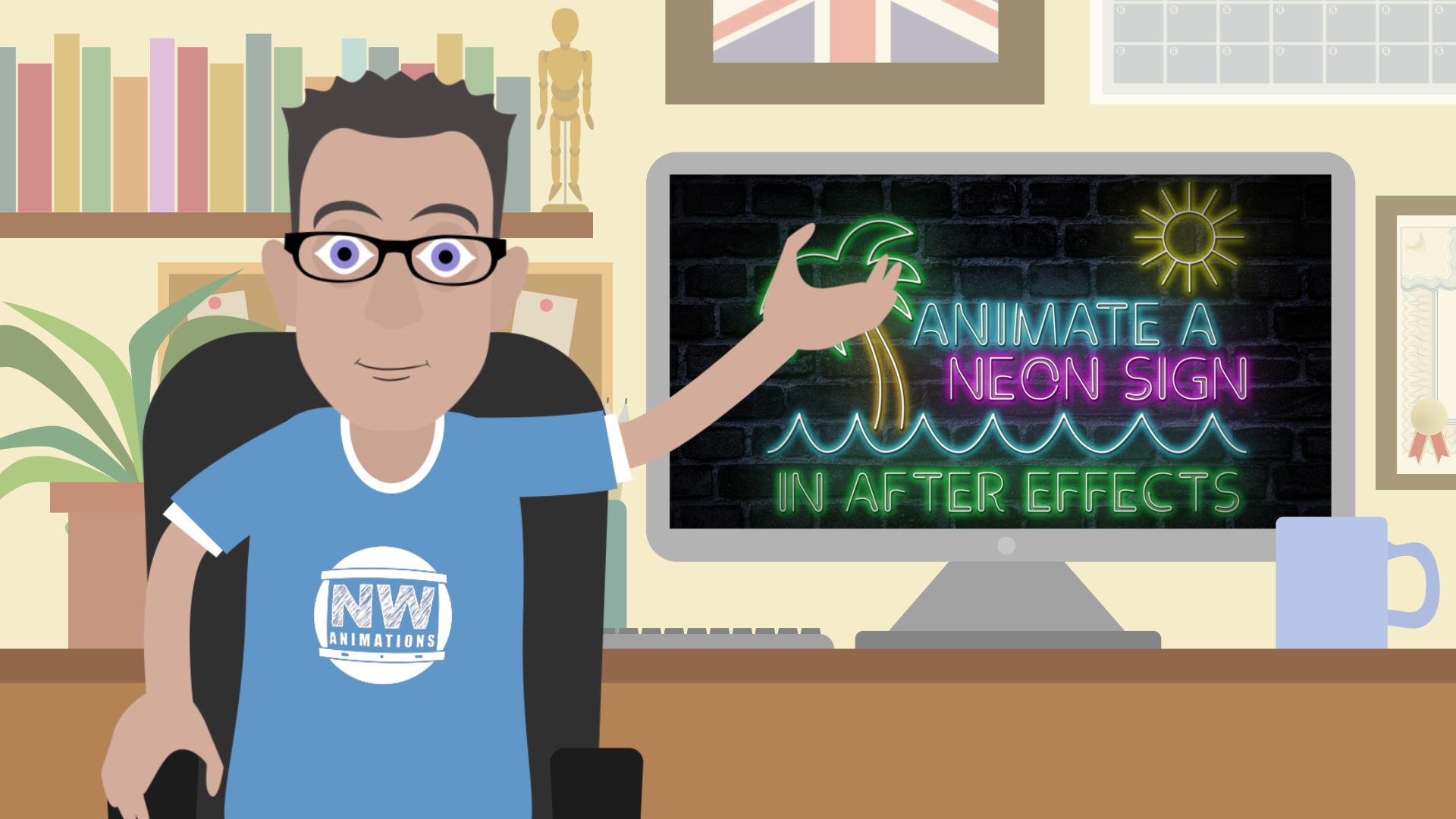
1. Introduction: Oh, hello. I'm Neil Wittmann. I'm an animator in the UK and today I'm going to show you how to animate a neon sign in after effects. We're gonna cover everything from setting up the composition to laying out the typography will be drawing the shapes on adding lighting effects and also touching on expressions. So if you'll need to after effects, we just want to learn to new tips and tricks. This is the class for you.
2. Setting up the composition: Okay. Hello. Welcome along. So here we are in after effects on. We're about to start a new composition. This is how I have my windows laid out. The project been over here? Composition in the middle, obviously. And the effects control. I like to have that over on the right hand side. If you are new to after effects, I'll talk you through it every step of the way. If you know it's already, I'm sure. Lots of tips and tricks. I can show you. Andi, I do love a short cut as well. So I will try and tell you the shortcuts as I go. If I forget, I'll put them down here in the bottom. Right hand corner. Okay, so let's start a new composition. I'm gonna make mine, HD. So that's 1920 by 10. 80 frame rate off 25. Obscuration only needs to be something like 10 seconds. It's not a particularly on animation. On the shorter is easier. We can see what we're doing, So let's go. Okay with that Andi there were over. Turned off. You can see it's just a plain black background for the time being. Right. So we need a background. Let's bring in a image off some bricks. Now, if I double click in the projects window, I have one here. I prepared earlier a J peg off some bricks. But of course, there were loads off stock websites out there that you confined free to use images. Or of course, you could just go out and take a picture yourself with a smartphone. It's up to you. But I'm gonna just drop this image down here onto the timeline, and instantly you can see it here in our composition. I'm just gonna zoom out a little bit using the wheel in the middle of my mouth's there we are on. If I hit s on the keyboard as to scale, I could see this guy. What does fit? Quite nicely, actually. But because I'm gonna put zoom in on it later on, I'm just gonna blow it up a bit. We want have slightly more close up shot of the brick. Syria. Andi, I am going to now make that full screen again or fill up to 100% of it says there, so that's gonna be our main background. But it's far too broad to the moments. We need to add a couple of effects to that because it's all about the lights, the neon lights, the bricks are really just there. Help tell the story. So let's go upto are affects control. I'm gonna run it, click in here. Or actually I need to be selected on the bricks first so that that's where I'm going to apply the effects. I'm going right click in here. I don't go to go to color correction on. There's so many things that you can use in here on a lot of time. A lot of the things can give you the same results, so it's up to you which way you choose it. Er, I think the easiest way to darken this image down is to go into this one here called Curves on. Don't just literally click on the middle, pull it down. And as you can see over here in the commandant's already darkening down the image very nicely because it's gonna be set of night only to be dark. I think it's probably still too full of calories without, so I'm gonna just right click in here. Go back to color correction again and there's hue and saturation, which is could take a bit of color out of the image of as only slide this one down. You'll see the color in the bricks has gone away. It's a little bit more like black and white, not a way to black and white. Still probably quite bright action. If you pull this down, even more area was starting to achieve. We want here and we're gonna add a vignette around here. That's a common trick in motion graphics. Guys. Your eyes to the middle of the screen. This goes back to the data photography, I believe so What we need to do to creative in yet is to go into a time. My right click in here. We're going to create a new solid layer on will hit comp sites will make sure whatever we created with the same on, I just want a black. So I'm gonna go all the way down to hear a pure black solid, so I'm gonna click OK on that automatically puts it down here also puts it up here when you're looking for it later. If you need a black again in a little nice, neat folder called Solid. So here's our black solid. Obviously, that's now over the top off brick, so we can't see them below. So we get to add a mosque onto the black. Solid on up here is almost two. Currently it defaults to rectangle toe. If you hold your left mouse button on there and put it down to the Ellipse tool, that's the one we want on this occasion and then just double click on it. We are, so it creates an ellipse mask off. See, it's the opposite way around to what we want. We want the black to be out here and it to be clear in the middle, so I'm just gonna hit invert. Here. You can see the mosque has come up itself. It's the inverted toe on. We're getting close, but I need to feather it out. So it's not such a harsh line, so I'm gonna hit the F key on keyboard on that brings up mosque feather on day. I'm just going to take this up, really just gonna do it by I until it starts to look good. I think that's about it. If I click off will lose the yellow markings of the mosque, and we can see. There we are. We've got our background. We've got our bricks. We've got the vignette. Were kind of ready to move on to the next stage off this animation, so I'll see you in a part two.
3. Laying out the words: Okay, so we've got our backgrounds are Now let's take a look at adding words to this last we're gonna go upto a text to that's this t here were cook on that on with a click once in the composition and start typing a word. Now I suggest using a favorite lyric. Oh, or some title. I'm gonna go for an eighties classic club draw. Ana, I just think eighties and they all go together very well, so it seemed like a good choice. It's not the right fund yet. Of course, eso I'm gonna double click on this layer here on we're gonna pick out There is a front I know will work very nicely called the clip front that's free to use. I will put the details in the link below in the project description on you can download it to, but there were lots of neon foods outlets and feel free to see what else you confined. But I know for a fact that this one's gonna work quite nicely, So I'm gonna go back to this electoral over here by hitting the wiki. But I was still in edit mode, so I need to just council back once and then go to select all on just moves that over more into the middle. Andi, because you're seeing this sign means caps looking stones are gonna take caps Lock off on, then I'm free to move this about position it wherever I want. So let's double click on here. Let's choose to clip front as we were talking about here we are on Dwight isn't really gonna cut it. So let's pick some nice neon eighties colors to liven this up, I'm gonna go into a kind of a bright pink pinky purple here. It's entirely up to you, of course, What colors you choose to use. But just look at the reference photos off me on See what colors work best what you're trying to recreate. Let's go for if we've got the pink aisle from find a light blue goes well together That's the kind of thing is currently defaulted to view the cup in our paragraph c it ascended text. I wonder if I left a line. It's perhaps on. Maybe we make the whole front of it bigger on you can change the leading here, which is the space between the lines on a very quick way, Teoh put it into the middle of screen. Is a window here called a line. If you haven't got it, go up into Windows here and find a line. It's very useful because you can hit center and you can hit center on very easily imprinted into the middle for you. So that's the start of what we want. Obviously, we're now gonna add some affects around that withdrawal. Some marriages around that to bring this to life, so we'll look at adding shapes in the next tutorial.
4. Drawing with shape layers: Okay, so we've got our text. We need to create some shape players now around the text Teoh to bring it to life. I've got club proper karma. So I decided I'm gonna at some see on a palm tree on the way I'm going to do that is to click here on the pentacle on with the pen tal. It means weakened. Draw freehand directly onto the comp on. Create some strokes. We don't need a fill only Strunk. So if I click off here to make sure we're not selected, Eleni Layer, we look up ahead. Phil has got a question. That means there's not gonna be a field. He did want to feel you'd click on the word Phil and Judy here, but I am happy with as it is, strokes could be blue on its could be about nine in with Let's see how that looks. So I'm going to start by just during, like, a zigzag shape across the bottom here. If you're not much of a drawer, that's fine. You can always find an image of something you want to create, lay underneath and then trace over it, using one of thes shaped. Also this seems to be working anyway. This is about the right colorants about the white whiff. If I wanted to take it up a bit, maybe I'll type in 10. Now she just make it slightly thicker. It's very rough and ready at the moment. It's a bit of a choppy sea, but it's give good idea of what we want. Very zigzag es you can see. So what I will do is go back up to the pen tal and use convert Vertex tool on by clicking and will actually I don't know if a bit of curvature in between each one. I just keep tidying that up. A zai Go along. Obviously spend as much time on this as you want. I noticed this one didn't hurt that if I pulled this little dot here that will do it for us . We're getting there. The beauty of like neon signs we're not looking for detail here is really very basic shape is almost like emojis. You know, you really don't need a lot to tell a story or I see that that's a straight line there. So the only one that I did miss was clicking on putting that down on. There we are. We've got off. See? Okay, let's make sure we're not selected on a layer. We're going to start with the pen tal again and draw a tree this time. So I'm gonna click and hold and pull that out. I'm gonna click and hold their on. This will be at the body of the tree. Now I'm gonna click off, but make sure you still selected or layer to which is the tree and click and hold there and click it a hole there. Now it's at this point, it's very easy to start losing Track off what layers you're working on. So I'd suggest clicking on Layer One hitting return on the keyboard and that's cool. That see on hit return on its named Voted the one above I'm gonna hit Return again Call that tree That's could be our palm tree hit Return on If you want, You can even color coded you go to see as we click on here you have a choice of colors. I find it makes it easy to follow. Blue is set for See, that's great. Let's set the tree to like Green, for example, is green. There's great. You see the different colors in line. It's just sometimes makes it sees easier to stand out what you did. In fact, let's do the same to detects and make that pink wears pink pink just as you build up your timelines that could get so complicated. Anything to make it easier to the eye as you're working, the better really, So I haven't finished the tree yet. Offer. See, we need to add a bit of greenery on there, so I make sure I am selected on the correct layer. And I'm just gonna stop clicking in here and during the a simple little palm tree, simply an amateur. But the thing is, we can go in. Once it's drawn, we can move things about. We definitely need to fix that on. Before you know it, it will start to look a lot more impressive. The color of this layer is still blue, which we set for the sea to Let's set this different colors. Set this a greeny color. Let's change the Baca's when the easiest way I know to do that, it's going to content. Pick the first shape on the second shape. They were the two lines that we drew first and change the color of that. I don't know into something like this hour that's starting to look like it on. I'm gonna probably keep on treating this until I'm happy with how it's looking. One more thing we could do is add some sunshine over here as well. Eso will make sure we're not selected on the layer will go this time up to this shape tool , which is actually part of the master. It's called a Lips on. If we start drawing directly onto the screen without anything selected, that's how it knows. You want it to be a shape rather than a mask, which would have added to say, assaulted like we did earlier. Let's draw a circle now, so I'm gonna hold shift on the keyboard and drag it out on bond. There we are, Perfect circle. Let go. It's orange from the last thing that we did. So let's make this one more yellow on. Um, let's rename this again by heating return typing. Some have returned. We could see what we're doing, and then you could go back to your pen tal on. You could do what you want. You could start just drawing adding knees on bond so on around the sell off to keep clicking off to start a new mosque. But I'm making sure I keep adding it to the right layer. It's so easy to get lost where you are a voice or keep going back to some adding this. I'm gonna keep adding these on, and I'm gonna make this look a bit prettier. And I will see you in next tutorial where we will start. Add the lighting effects.
5. Adding lighting effects: Okay, So after a lot off tweaking shape to moving parts around, I think it's fair to say that's looking much better now we've got a palm tree over here, got the sun up here which put the seat down there. It's not perfect, but then a neon sign isn't perfect because it's all kind of melted glass and bent into shape. So actually, the sea imperfections kind of makes it more realistic if you see what I mean. So we're gonna now get into adding some lighting effects to bring this to life. Now, if I was add an effect to each individual thing, we'd have to do absolutely everything in Duplicate. So what we're gonna do is something called pre composing. So we're going to take 123 of these shapes. Andi the text layer as well. I'm holding shift to select the things together, and we're going to right click on hit pre compose on. Let's give this a name like logo, so it's easy to follow on. We're gonna take a move away on keep those ticks on. That creates a second composition over here on in this composition and turn it on. You can see it's transparent is just a logo part that we've made. Go back to Camp One. We can see. We now have all of those elements in this one layer called logo on We Still brick on the vignette below. Let's rename this compass well, to be tidy as regard. Gonna hit control and K on the keyboard or a Command K. If you're on a Mac on what we need to do here is just give it a simple name. I like to put my final comp in capital, so it's easy to see if there's a dozens and dozens of compositions. It's called It's Dion Final That should do the job. Take off my caps lock so it doesn't confuse things here. Okay, and there we all got Neil and we've got logo I haven't said yet, but do obviously keep saving as you go. There's always, you know, a chance that something might crash. Or you might get a point where you've gone past being happy with how the designs looking doesn't hurt to continue C safe. I like to increment as I go as well, so I've always got points I could go back to along the way. Okay, so we've got our logo layer here. I just turned often on just to show that is everything there on. We're going to duplicate this layer a few times because we're gonna continue to be used this layer to create the neon sign. And a neon sign has the wiring underneath and then on top, it has the lights flashing on. That makes sense is I guess I'm gonna click on logo it command or control de to duplicate that layer. So we've got two versions of it. Andi, I'm gonna do that one more time. So we now have three versions of that layer. Just gonna hide the top two names. And we're just gonna work on layer three here. This logo here and this is the one we're gonna make the wiring behind the sign. So we go over to our effects panel, and I know that I need to add a Phil Connelly to remember where things are. So there is this effects on preset windows. Welsh. Incredibly useful on. I know. The effect I'm looking for is called fields. Just type in, Phil. Sure enough, under generate, there's a filled double click on that, and it's made it red. That's just its default color. We're actually gonna want this to be more of a kind of gray gray, wiry looking. Something like that probably will do the job. Andi. Another trick to make this look more like wiring is toe ad. Another effect, which is called Basil out for. That's the one on. Do I have that on a swell on it as like a white light around it. We can take the light intensity up higher. Can you see? It's just just making it look kind of like a three d wiring thing that's on the wall here. Great. Okay, that is what we are after on the last thing on. I've been thinking this for a long time. It's not standing out from the wall. We need to add a drop shadow. Good old drop shadow. I know where that one is, as I use it on the in times a day that will be under perspective on Drop Shadow. Andi, let's increase your capacity all the way up to 100 on just out of its softness to on now. It fruitfully starting to look like it's actually sitting on the brickwork rather than just floating above and not very legible. So that is our logo. Let's enter and call that logo wires, and that will make more sense. We go through, it will be clear what we're doing. Okay, so now I'm gonna unhygienic Leia. One on this layer needs a glow. So this actually starts to feel like light light bulbs, neon lightbulbs. So let's go back over to effects. On day glow is the effect will look in fort having glow over here on stylized Galo. That's the one on all these affects that I'm using today. These all comers default with after effects, and as you can see, that's adding a nice kind of fake glow toe our texts and images. Now let's call that logo blow for now so we know where we are on this lay. Here we are going to add a blood of the light is blurring onto the wall behind it. There's loads of different types of blurred again. Feel free to play around. I find if I going to blow and shoppers there is this one here called Fast box. Blood used to be called first blood. Either way, it will do the same job. I like to least tick repeat edge pixels so that it filters all the way to the edges. You're not saying anything yet cause it's a zero. But if I start to take this up, are there we are starts to bring to life and it's actually just adding the color. The reason I'm doing is toe. I'd like the color to the wall behind as if it's hitting the wall, that the light is it in the wall. We can keep tweaking visas. We going in 16 seems to be getting is there so far, And that's looking exactly what we want now. So in the next part of the class, we will add a very simple expression that's going to add a flicker to this light and bring it to life.
6. Using expressions to add flicker: Okay, so that's the lighting looking good. Now what we need to do is actually turned the lights on. So there's a few things to do here to make this work. I noticed last lesson. I forgot to rename the sleigh, so let's call this logo blur just so we could remember blood. In fact, that will do nicely. So I am going to take thes two days here, holding the shift key to select them both on I. I'm going to move them along Teoh about half a second in. So that just leaves the logo wires revealed. So as you see as a school through click, it's going to come on. But often when a light bulb comes on you, you get a dip as it comes on. So let's let's try and create that as well. I'm gonna select these top two layers on this time, I'm gonna hit T on the keyboard. I remember that as opacity on that's what it opens up here, and we're gonna hit this stopwatch here. Still, with them both selected Onda that will create a key frame. I'm going to move a long six frame, so I'm gonna use the peach down button. 123456 That moves is along the time line and then I'm gonna click on the 100 just take that back down a bit. Maybe not all the way. Maybe take it to light 17 15. Somewhere around there on I'm gonna hit page down again. 123456 on. I'm going to pull this back up to 100 the way we can watch this back on build a little ramp review is by hitting the zero ke on the numeric keyboard. So I'm gonna hit that Andi, what should go through? It's quite slow, actually. I think we could make that work faster. A good way to do this is highlight or six key frames on holding down a little The option key. You just click on the end one. You can actually pull it back, but it keeps the same distance between the key frames. Let me try again. I'm gonna hit zero. That's what's that one more time. It could be even before something. Actually, that's put them even closer together. So again, holding a little the option key, Let's pull that closer run it through. Yeah, I just want that little kind of flicker. We're just making it look less perfect because the real world is never perfect on Bolds and Lights And various things like that will always just those little imperfections bring things to life. Okay, so that's looking great. What we're gonna do also, it's just add one expression to this. Now, this can scare people. It took me a long time to get my head around. Expressions is very simple coding that you can apply to specific layers on that will do jobs for you. It could make things continuously rotate. It can make things flickers were about to do. It could do so many things on. There are very clever people out there that are happy to offer up these codes online for you to use it can get very involved. But don't worry, we're not going to get that heavily into it today. All we're gonna do is at a very simple wiggle toe our capacity of this top layer glow. So I'm gonna hit t for opacity again. There it is. On this time I need to hold down the alter the option key and click on the stopwatch on this opens up this new box over here and they call that expression opacity. Whatever we type in here, the code that we type in can affect that layer on this is really handy. This could save you hours of work if you're adding key frames here, there and everywhere on a very complicated job. So this is a nice little introduction to that. All we're going to do is type in the word wiggle W g l e. And then we're gonna do open bracket. I want type in 50 coma, 20 Close bracket I went gonna click out so we won't go too deep into this today, But we were simply asking it to wiggle the opacity off the layer. The lower logo glow as recording at 50 times a second at a rate of 20 on. The more you tweak these numbers, the different effects we can get. But it should get us there today. Let's preview against I'm gonna hit the zero on the numeric keyboard on Just let it build around. Preview on already. You can kind of see some liquor and going on the It's very subtle, but you can see it especially around the bees. Andi, Very Artis. Running through again now. Correct speed. But it's little details like this, as I say, that will just make it feel more realistic. We're almost there. The last thing we're gonna do is just take a little introductory look at cameras will add a little move at the start of this animation, and we'll do that in the next lesson.
7. Adding a camera: Okay, so we're nearly done. So the last thing we're gonna do now is add a camera to this composition. Eso that would compare a nice little move at the start of it. Cameras could be very useful. We're just gonna touch on the tip of the iceberg today of what they could do. But let's have a look. Will go up two layers and we're gonna add a new camera. Quick Way to do that is control shift in Ceiba. We could either camera on. I'll just go with the default today on her. Okay, on would say okay to that message. I'll explain why it's saying that in a moment it's basically saying you haven't got any three delays. Cameras only work with three d lens of a layer. It's to Dia's they have seen so far today. Then they aren't going to respond to a camera move. So let's take some of these elements. The best way to do this is to hold down, shift, select the all on. We come to this tool here and we're gonna hit on this. Andi, make ALS. These analysts now, three d. So now we are looking through the camera on whatever the camera does will affect everything below it. The only exception to this is the vignette. I don't actually want to zoom in and out of in yet because you'll see that the edge off the solid layer. So I'm gonna turn that one off and leave that to day on. That will always stay in the exact same position no matter what you were doing. So let's go to eat the camera on, Spin it down on. We're gonna go to position this time. Could have also got there just by hitting Plea on. I'm gonna mark an in point. I just want the move to be very brief for the top. I'm gonna move it to, let's say two seconds conceits. Two seconds over here if I ever need to adjust it. I just used page up page down keys as well to get me exactly where I will be. And I'm gonna hit this stopwatch here on mark the final position because we already know this is where we want it to end up. So it's easier to work backwards. That is our end position on. Then I'm gonna go back to zero here back to the beginning on with the position. Now it's one of thes and I believe it's this one. Here it is. So we've got our X y Z come ordinates. So this is always a I'm gonna pull it out. Andi, there will come a point where the brickwork runs out. This is why, right? Start, We zoomed in on the brickwork so we had extra bricks to play with at the end And I'm gonna hit the zero key on the numeric keyboard. Build around preview. That's just building. You can see the green line along here once that green light is full, it's built the entire preview. I don't need the entire thing. Let me hit zero again and it will run apart. I'm interested in and there we are. Now the only thing with this move you may see it moves in on move stops Very immediate. Normally life thing slow down on soften t it. Now there There are lots of ways we could do this, but what we're going to do is add an easy eastdil. If you right, click on here and go to key frame assistant, you can see different types of easier I find easy, Easy does the job for something simple like this. You just hit F nine, which is what I would normally do but will select easy on its very settled. But if I now hit the zero key on the numeric keyboard, let me see. That's just building a ramp review Now on now. Gonna hit it one more time, right? That's moving in on it gradually gradually stopped on its settle. Things like that that just take a graphic from looking a little bit ordinary toe a little bit more professional, and it's things like that the people won't even realize. But tricks the brain say this is a proper camera move. It is coming in and it's slowing down. And there we are ruled on. We've added our camera, and that brings us to the end of this class.
8. Thanks for watching: So there we go. That's how so Animates a neon sign in after effects on. The possibilities are endless. There are so many different things you could do with this You might not want to make each day. You might want to make it square so you could put up a slogan on social media. You might want Teoh incorporate it into a music video. There were a lot of different things to do. You can pick your own slogan and colors. I'd love to see what you come up with. Please share it in the group below on. Thank you for watching.
 Neil Whitman, Animator