Transcripts
1. 1.1 Class Introduction: Hi. I am Dav Yasma. I'm a treaty artist located
in the Netherlands. Currently, I work full
time at IN DG Grip. Here, we work for big
clients like Coca Cola, Nestle, but also beauty brands like Loyer Paris
and Maybe New York. In this course,
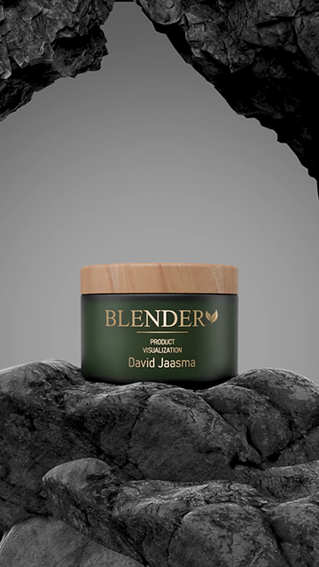
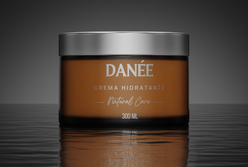
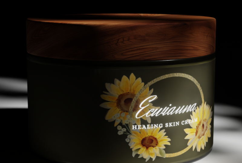
you're going to learn how to create a beauty
product like this. We will start from a
technical drawing and create the jar, cream, and cap. After creating the base meshes, you can choose from two
different types of cream. One use a sculpting to get a more realistic
and organic look. Other one uses traditional
three D modeling techniques for a cleaner and
more stylized result. After that, we'll jump
into the materials. You will learn how to create
photorealistic materials, and we will also cover lighting, where the main focus will be on lighting the label correctly. After that, we'll look at the
animations I have created. From each scene, we'll focus on one key technique you can
learn and apply yourself. This includes trendy
keyframe animations, rigging the cap so it
can rotate easily, viscous liquid simulations,
a meta boss style animation, and creating an ocean of
waves with dynamic paint. This class is perfect
for anyone that wants to learn more about product
rendering in general. But of course, we'll
focus a little bit more on the beauty side
of the product, right? So lipstick, bascara,
those kinds of, products will all fall
into this category. This class is
geared a little bit more towards the
intermediate blender user. So if you already, of
course, have blender, installed on your computer or laptop and maybe already
created some project, know a little bit
how to animate, then I would highly suggest
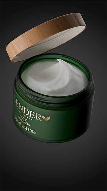
you look into this course. For your class project, you will either create two clean steel shots
of the product, one that has a cap
on and one that has the cap off where we can see
the nicely created cream. And if you have some extra time, I would love to see
a short animation inspired by some of the scenes that we have broken
down together. The end of this class, you have created some amazing renders and maybe even animations ready to be shown in your
new portfolio, or maybe you're
already working on a client project that
is totally fine. So I'm super excited to
get into the first lesson, so let's jump right in.
2. 1.2 Modeling Base: Welcome to the first three D modeling video of this course. In this video, we're
going to take a look at the technical drawing and also start modeling
the base mesh. Before we can do that,
we need to look at a few things and we need
to prepare our scene. So first of all, I am working in Blender 4.3 0.2. It is not very important
in which version you are, but if you are a beginner, it might be handy to have
the exact same version because in older
or newer versions, certain symbols, the UI, everything might have
a different spot, and you don't really want to jump to Google or I don't know, hat TIPT to keep searching what is happening
and where it should be. So if you go toblender.org, you can go to the Download, looking for previous versions, and then download
any blender version. So, in my case, what did I say, 4.3 0.2, right? So you go to the Blender 4.3, and here you will be able
to find our version. Now we should prepare our scene. So first of all, I will delete
just everything in here. Go to the scene
properties and click on Units and put the
unit skill to 0.01. Then let's put the length
from meters to millimeters. I do this because when
we were working with, like, smaller models, let's say, bottles or tampons,
I don't know, you want to work in
those millimeters. A lot of times the technical
drawings will also kind of showcase
millimeter or centimeters. But you're working in a
more realistic environment. We don't want to create I
said a tampon of 2 meters. It will be a bit big. So yeah, that is the main reason
why I create this. And then the unit
skills just handy because then the
units look the same. If we're working with
meters or millimeters, we don't have really a
way different unit size. So this is our
technical drawing. And as you can see,
the technical drawing has some measurements set to it, just to make this course
a little bit more easy going and so that
everyone can get, similar results, I should say. You are working with clients, you often get the possibility to work with these
technical drawings. So I will show you
right now how we can implement this
into our workflow. First, we go to blender and we make sure that we are
in the front view. So if you click on one, you will actually jump
to the front view. Now, I also want you to see that I have my
screen cast keys on. This means that
whatever I am typing, so let's say, one, two, three, four, five,
it doesn't matter. I will show up here. And also, if I use
shift control or Alt, maybe left mouse click, right mouse click, it
will all show here. So if I ever misspeak or if ever you just cannot understand what I'm saying because
of my thick accent, then in most cases,
you can see what I'm doing and you can just
follow right along. So if we are in the front view, we can go to our technical
drawing and just drag it into blender, Pam. So we go to the front
view first because then it actually gets
placed directly there. Because if I add a
technical drawing when I'm not in the view
that I want to be with, it will be added
from there, right? So you can see this is
not really what you want. Also, if you are when
you add a image, so let me redo this. You can go here and
expand this little area. You can turn off
put in background. It's not very, like, necessary, but if you don't want to see this entire grid
over your image, then that could be handy to do. So how do we start
three D modeling? Well, know this is a
cylindrical object. And the technical drawing
doesn't really show this. Sorry for that, but we know this is a cylindrical
object, right? And I like to start
with a circle. So if you click on Shift A, mesh, we can go to circle. Here we can already decide
if we want more vertices. So I like to work with 40, maybe 60, 80, as long
as you can divide it. Let me go to the top view. Horizontally and vertically. So if I delete these, this is just a little
tips and tricks, you can see that
if I do the X and the Y, it perfectly fits, and we have a vertex
on each of these axes. This is just very handy
when you work with models that have to
be mirrored over. And I work a lot of
those kinds of models. So that is just something
that I like to do. So yeah, that was just a
little tips and tricks. This circle here, needs
to be 115 millimeters. So if we expand this, you can click on N, or you can click on
this little arrow. You can see the dimensions. Right now, it is a 2000 by
2000 millimeter circle. If you click and drag, you can change multiple
of these values at once. So this is going to be one, one, five, and then enter. And you can see that they
instantly both change and we have a circle of
115 millimeters. Then we need to extrude
this for 78 millimeters. Because we're just going to
focus on the glass right now, we don't really have
to look at the cap. So if you go to Tap,
which is Edit mode, you can select everything
with A and then extrude Z, and now we can type our numbers. So 78. Am. And here, if you ever want to do a check, you can select one
of these edges. So let's select this edge here. Go to Mesh Edit
mode and click on Edge length underneath
measurements. And here we can see
78 millimeters. It does get a bit busy
with all these numbers, so I like to turn it
off again just so it's a bit more pleasing to the eyes. But those are kind of quick checks that you can always do, which can be quite
handy if you're working with precise
measurements. Now, let me go to
wireframe mode and place our actual technical
drawing right in here. So the bottom is going to touch the bottom, right? So
something like this. And then we just need to scale
it so it fits everywhere, and then it should be
in the middle, right? So it touches every
single corner here. Perfect. So now we
essentially can just match all these
curvatures that we have. This way, we can get
very realistic results. Once you have done this, I would highly recommend
you start saving. So I have a little folder. I am going to save probably
a lot more than you guys do, but please save in between
because if it crashes, you just need to go
all the way back. Like, having crashes while doing a course is just the worst. So please keep saving.
3. 1.3 Modeling Base Part 2: So the next step would be
extruding this part inwards. But we first need to
know how high this is. Well, if you look here, from the bottom to the
top part of this glass, we have 60 millimeters. And also, again, this can
be done at multiple ways. So I personally like to create a edge loop with CtraR
move it all the way down, left click, and then
move it up again. So GZ 60. This way, you just always know
it's perfectly 60. But you can also, of course, put the edge length
on and then click CtR and just move it into
place until we reach 60. So here. The first one. So this one is a little
bit more accurate, but in both cases,
they should work fine. Now, a little caveat. The technical drawing, in
this case, is not perfect. Blender is not really good at creating technical
drawings at all. And I also made sure that
these measurements don't like they are just a
little bit rounded up just for our ease of use. So please don't worry that it doesn't really match up here. If you actually
work with clients that have really good
technical drawings, then it should all
match up, right? Our line should be more
like here, let's say. But in this case, let's not
worry about it too much. We're just going to
have fun with it, and yes so let's select both of these edge loops and
then extrude it inwards. So how do we do this?
Well, if we just extrude, you can see we get this, right? So E is extrusion, and it just wants to
extrude along an axis. But if we now we click, everything kind of
is still extruded, but snaps back to
its original place. Now we can use another command. So let's say I'm
going to scale it, so scale I only want to skilled around the
X and the Y axis. Skill shift set,
which just says like, Hey, don't skill it
around the set axis, and then we can move it inwards. So I hope that makes sense. Let me go over it one more time, for all the beginners here. Normally we have this
here, then extrude, we're going to snap
this extrusion back, but as you can see, it's
still there, then scale it. But we don't really want to it to scale all
around the Z axis. So then we say no Z, so shift ZT, and that
is how we do it. We can delete this
top edge loop, and if we go to the front view, we can see what we have here. Perfect. So let's now
create this bottom part. It is actually quite hard to
see what is happening there. So wireframe mode would be
very handy in this case, and we need to follow
this line here, right? So we have a little
bit of an indentation. Also, this, you can
do in 1,000 ways, but let me just grab an
extra few out of here. Just so we can see this
from another angle. And I'm going to work here. But in this case, you guys can see what is happening if
it doesn't make any sense. So I will select the
entire bottom edge loop, extrude it, and
then scale it down, E and then S, right? And I want to reach
around this point, extrude around the Z axis, scale a bit down,
root, scale it down. Let's focus on here right now. Then extrude, right click, so it all snaps back
into the middle. Click on M and merge at center. So a lot of people are
very scared for triangles. I totally understand. If you don't want
triangles here, what you could do instead of
merging it in the middle, you could delete this vertex, select the entire edge loop, go to phase and do grid fill. When you do a grid film, I personally like that it's
also mirrorable again, so you want to kind of
offset this to hair, right? So if we want to delete
anything of this, which I'm not sure if we're
going to do in this course, I don't think so,
but you always have the possibility
that it gets yeah, mirrored over and over again. So, yeah, I honesty, you can just use triangles here. It will not cause
any weird artifacts, and we don't have to animate it in a weird deformation way. But yeah, I wanted to
show you both ways. Cool. So we kind of
have this shape going on of the entire bottle, and now it is handy to see if this also works with
some extra subdivisions, because at this point, it looks very, very blocky. To do this, we go into
the Modifier panel, click on Add Modifiers and
add a subdivision surface. As you can see, everything
gets smoothing out by a lot, and we kind of lose
our main shape. The main shape is still there. But because we get
extra subdivisions, yeah, we just lose this. So we want to add some
supporting edge loops. What I like to do
is I first like to create already some
edge loops in here, just create a more
dense geometry, and later on, we can also
use this for our artwork, but that is besides the point. So let's just add these here. Let's also adds maybe four here. And let's add one or two here. So as you can see, the more
geometry that I'm creating, the more this model starts to
retain its original shape. It is still a little bit blocky. We could put the level
skew part up to two and then right click on the
model to use a shade smooth, just so everything
is nice and smooth, and this we can also
use for good rendering. Now, this already is
starting to look decent. Probably an extra supporting edge loop would do good here, so we kind of match
a similar kind of rounding here to this object. Just play around with
it a little bit, so it makes sense, and then
we can go on to the bottom. As you can see, this
doesn't make any sense yet. I'll probably create
maybe two edge loops here and then create some extra supporting
edge loops to make sure that the shape fits the
technical drawing underneath. So we'll just call this
video for right now. We have a very nice
outline of our model. Everything makes sense according to the technical drawing. And the only thing that
we want to now take care of in the next video
is some thickness. You can see that we have a certain amount
of thickness here, and also we have a
thread on the top, which is maybe the most difficult modeling
part of this entire course, but I'm sure we all will be
able to make this as well. So I see you guys there.
4. 1.4 Modeling Thread: In this video, we are going to create the thread
on top of this jar. So how do we do this?
And why do we do this? Well, first of all,
we, of course, have a cap that needs to
be tightly screwed on top. And if we look at
some Google images, you can see that there
are multiple ways that we can create thread. These are a little
bit harder to create, but something like this,
we are going to do. First of all, we're going to go into this yeah, base mesh, this jar, and we will select
these inner vertices here. Make sure they are the
ones that are from your front view because that is going to come
in very handy later. Then click on Shift
D to duplicate it, and right click,
so it's now Spec, then click on P to
separate the selection. Now you can see
we have a circle, which in honesty
we can just rename to jar and we have a circle one, which is going to be the thread. Later on, we'll
join them together, but for right now, we're just going to
focus on the thread. We need here or what
we have here is, of course, just this
little part of geometry. We are going to add
a screw modifier. This screw modifier needs to be before the
subdivision surface. And if you remember correctly, the jar had 40 vertices, right? So the circle that we created in the beginning
had 40 vertices. We need to go into the screw modifier of
the thread and also put the steps in the viewboard to 40 so it matches the jar. As you can see, because we created this geometry from the actual geometry of the jar, I already will fit
perfectly on top. So this is a great way in
which you can do this. Now, we need to edit this. And when you edit this, you need to ensure that
you don't really move it around the X axis,
in this case, right? We only want to move it
maybe around the Z axis or the Y axis whenever we want to change anything to
create this profile. So how do we create the profile? Well, I'm just going to add
some extra geometry in here. So I'm going to subdivide this. I'll add two as a
number of cuts. And we're going to move
these new vertices around. And I'm going to do that
around the Y axis, right? And here you can
see that I am going to try to match this shape. GY. And it's okay if it
doesn't totally match, right? We're just doing this to learn. But yeah, you can move
it around the Y axis, and, of course, I can scale them around the Z axis as well. And here I want it
to be a bit sharper. So I think adding an
extra subdivision here and here will do wonders, and this actually
looks really good. These outer vertices
don't really do anything, so I could kind of delete them, and that makes it easier to put two screws next
to each other. I will show you now why. So to actually get
this screw effect, we need to put the
screw millimeters up. Let's just keep it
at 15 for right now, and we can apply this. So apply. And I want to make sure that actually fits inside this area. So I'll probably
delete it until here, and then delete
this entire part. And we want to fix this
up. So how do we do this? We are going to
select these edges, click two times on G, and then we can move
them around the edge. We'll do that again
here, two times on G, and then we just fill
this and fill this. Perfect. Let's do the same here. Then I want to scale
these a bit down. So if I select these ones, if I just skill them now, it's going to look
a little bit weird. So I'm going to skill
them around the cursor, so that is in the middle and
then do skill shift set. Otherwise it's skills
down, but shift set, then I can just make a nice
and smooth transition. Let me also scale
these a bit down. Yeah, this looks way
better, in my opinion. Look at that. Perfect.
Now, we're going to duplicate this, rotate Z 180. So let's join all
of this together. What we need to do is
we go into the jar. We can delete these
inner vertices, then grab both of the threads, and then last jar, then click
a Control J to join them. So how are we going
to join this? Well, these vertices here
are nice and square, and we can just click
on F to fill them up. Here on the bottom,
this sort of part. I'll move the mid up
and then fill this. You can see we have a
weird shading artifact, but we will fix that later. That's filled all the
way up until here. Then we're going to
do the same here. Fill all the way until here. And on the top, same story. Just fill until here. Same here. Until here. Et's quickly fix this
little weird artifact. This is probably because the
normals are a bit weird. So if you select
everything with A, go to mesh normals and then recalculate outside
and everything is fixed. The only thing now
we need to fix is this geometry like we
have a few gaps in here. So how do we join
these together? Well, there are multiple ways, and in all honesty, as long as you do not get
any significant artifacts, loads of techniques
are just correct. But what I like to do here is
I will just fill these up, then this and then these. Now you can see we
have, of course, two triangles, which, I mean, it's not a huge
deal in this case, but you can always create an extra edge loop
here in the middle. Let me scale this a bit. Up here or down. And yeah, I mean, there is literally not really an artifact that you can see. Maybe if you really look good, you can see a little bit here. But in general, it's not
really noticeable, right? So this is a great way to still keep quads around everywhere. And yeah, looks decent. So let's just do it
like that. And here we have a beautiful
thread, right? So in the next part, we'll
create some thickness, and we will create the thread for the cap.
I see you guys there.
5. 1.5 Modeling Glass Jar: In the last video, we
created the thread. And in this video, we're going
to create the thickness. So there's a thickness of three millimeter around
the entire bottle. Maybe we can make
it a bit thicker on the bottom in a lot of jars
and bottles that happens, especially when you go to glass. Like glass bottles
have it a lot. Um, but we'll see later. We can always change
to our needs. So how do we create
this thickness? Well, select the jar and
add a solidify modifier. When you add a solidify
modifier or a lot of modifiers, in all honesty, you need to ensure that you
apply the scale. Why is this? Well,
let me show you. I put the thickness
to 3 millimeters, it should be this, right? But you can see that
it's not even close, and for some reason
here, it is close. It just doesn't make any sense. That is because we have
joined some geometry, we have skilled the geometry. We've just been playing
a lot around with it. So before we apply
any modifiers, make sure you
select your jar and then click on A and
apply the scale. And instantly you saw
something happen, and it actually makes
more sense now. Let's also make sure it
has an even thickness, and then we can apply
the solidify modifier. Cool. So the solidifier
modifier is great. It did create some
issues for us, and that is mostly geometry related that we
can fix right now. So first of all, this
looks a bit weird. That is mainly because this
geometry doesn't really yeah, make this flow really
good, as you can see. So what we can do is we can
go to phase selection mode, select this entire phase
loop with alt selection, and then extrude it
upwards a little bit. Now with contra plus, we can extend our selection
and just move it down. Just make sure you don't
move it down that far. We kind of just want it to
be to its original spot. We don't want to move it down, so some of these edges are
starting to intersect. So you can always check
a little bit around, but none of it is intersecting. So this looks good. Perfect.
We fixed that little issue. Then the next issue
will be the thread. We don't really need the thread. But yeah, for us to be working on
the inside of the bottle, it's a bit annoying
when we can also see the outside the entire time. So what we can do is we can
select this entire edge loop, click on H to hide it. Then with L, we can hide this outer island because
now it's kind of separated, to sees it as islands, and we can hide that as well. So we just have to focus on
the inside of the bottle. And here we can see
all the weird, yeah, kind of annoying mistakes that has been happened since
the solidify modifier. But we can easily fix them. So let's first get rid
of this threaded area. I'm going to select this Edge
loop, all the way around. Delete them. We're gonna
do the same here. Mm hmm. Delete them, click on L to select the
entire threaded area, and then delete that as well. Then we can select
both of these circles, then Control E to bridge
these edge loops and, of course, add some
extra geometry to make it nice and smooth
again. Perfect. Now, we have to fix
this issue here. So you essentially just want to move stuff down, scale it in, scale it out, can always
get your reference image back to see what is happening. A lot of times when
you're working on Kind of these areas
on the inside of glass, they seem to be a
bit more smooth. So yeah, scaling this a bit inwards like this it is
not necessarily bad. It creates everything it makes everything a
little bit more smooth, like in general, it is when
they manufacture them. So it's this fixed, this fixed, then only the bottom
we need to fix. At the bottom, if you look
at our reference image, you can see it
doesn't really have that bump inside anymore. It is just straight. So we can also mimic that. And that also happens
a lot with bottles, especially glass
bottles, I should say. So what we can do is we can
just like move this up, get rid of some of
these edge loops here. Maybe it's easy to see if we do not have our
subdivision serves on. Perfect. And if I want
to flatten this all out, what I can do is select these
edge loops that are lower, then select one phase that is at the correct
height that I want, go to transform pivot point and move the transform pivot
point to active element. Then if I scale it around
Z axis and click on zero, it actually matches everything up with this height, right? So what it essentially
does is you are putting your pivot point
at a certain active element. And this white vertex here
is the active element. I can scale it around it. I can move it around it. I can do whatever
I want around it. But if you do scale Z
and then move to zero, it just flattens it out. And you can do it around
every axis, right? I can also do it, I mean, scale Y, scale X, skill Z. So it's a very handy tool. I use it a lot. Just make sure later on
you put it back to medium point again because
especially in the beginning, it's kind of confusing using it, and then out of nowhere I think it's just out
of whack a little bit because she just keeps skating around that element, right? Okay, so this is essentially it. We might want to move
it a little bit up. So let me se like this, moved a little bit up.
I'm not even sure. Let's do just what the
reference image says. And then put the sub
divisient surface back on, and I think this looks great. We are a little bit more thick here than in our
technical drawing, but I don't think
I mind too much. I mean, we can always select
it and move it up, right? It's totally up to
you what you want, but I don't think it
necessarily looks that bad. Let's just do it. Baum.
And there we are. The only thing I see here is that this part is
a bit too smooth, so we could create an extra
supporting edge loop here, and everything looks awesome. So Inside Edit mode, if you click on Old Age, it unhids everything
that we have hidden, and here we have our
beautiful glass jar all set and done. So here, jar, you can even rename it to glass
jar, whatever you want. Maybe you're going
to make it plastic, maybe you're going
to make it glass. It doesn't matter, but here
we have it all finished. And in the next part, we
can start with the cap. You can see the
cap is quite easy, but of course, the cap also
needs some threaded area. Don't worry about it. I'll
show you in the next part.
6. 1.6 Modeling Cap: In this video, we are
going to create the cap, and the cap actually
consists of two objects. We have the white inner
plastic with the thread, and we have this
wooden outer part. So how are we going
to create this? Well, let's go back
to our scene here. And one of the main things that I want to talk
about is that I do not want to recreate
this threaded area anymore. And we also want to have the exact same
profile of thread. So what we're going to do is we're going to duplicate this. And in this duplicate,
we're going to delete everything that has nothing to do with this threaded area. So delete that delete
inside as well. So we just have this left. Now, I want to rotate this
for about 90 degrees. This seems to be fine. And I want to select
these face loops. Then I will make sure that my pivot point is
set at tre cursor, and that one should be
nice in the middle. And then I'm going
to scale this down. So not just S for scaling, but skill shift set
to not scale around the set axis until this
is nice and straight. So something like this
would work great. Perfect. Then this
selection should be hidden. So H, then A to select
everything here, get this glass jar
back and scale again, skill shift set
everything until we cannot see those
threats anymore. So somewhere like
this. Perfect. Then we can click on Old Age to
unhide our selection. And you can see that
these corners still have some intersections
that we don't want. That is, of course, because
we have been scaling. We just need to scale these
parts a little bit more up. And again, only around
the X and the Y axis, skill shiftset, Soth like this. We're going to do the same here. Skill shiftset. So we have this nice
smooth transition. And here we have a perfect thread that fits
inside of each other. So it's as simple as that, I should say, so we don't have to recreate it,
which is very nice. And now it's just
fixing up a little bit. I will move this a little
bit more up than root. Let's put this back to medium. So the pivot points
back to medium, and then we can
just extrude here. Once more, let's
not go too high. This should be fine. Add
some extra geometry. Here, and I think this
is actually fine. So let's now fill this up, extrude, extrude and merge, and then some extra edge loops. We don't really need to
fill this up as well because there is going to be
wood on top of this, right? So as you can see, very simple. And now we can build from
this the wooden part as well. So I'm going to select
all of these here, shift the P selection. So I have my cap white plastic. And then this is
going to be the cap Wood and for this cap wood, we should get back
our technical drawing here. I will move this up. Uh, somewhere around here
and create this cap of wood. So I'm just going to
extrude around here. I would like it to be very
similar to the glass. So I'm just going to check
if we're actually there. Yeah, that looks good. Perfect. And then the top Next root, merge at center, create
some extra edge loops. Make sure this is as
a good transition. I think it looks quite good. I should maybe move
this a little bit more I think this looks fine. Yes. So if you're happy with
this, then we're finished. So that is the cap wood, cap plastic, and we
have our glass jar. And in the next part,
we are going to create the cream. I
see you guys there.
7. 2.0 Modeling Cream introduction: In the upcoming videos, we are going to
create the cream. And as you can see, you guys can choose out of two versions. We have the realistic version
or the swirl version. The realistic cream is
created by sculpting. And keep in mind that sculpting requires a higher density mesh. So if you want to
follow this video, you need to ensure that you
at least have a computer capable of having some
subdivisions to it, let's say. Our second option, the swirl
cream or more stylist cream, however you want to call it, is also an option that
clients often choose. And the techniques
that we used here will be more kind
of modeling based. They are not as high density. So even if you have a
kind of a worse PC, you can still follow along. So please choose
the cream that you want to recreate and
see you guys there.
8. 2.1 Modeling Cream Realistic: In this video, we are going to create the realistic cream, and the cream is sculpted. I myself like to sculpt
inside Z brush or set brush. I'm not even sure what the
correct pronunciation is. But you can also do
this in blender, okay? So either way is fine, and I'm going to
show you some ways in which you can get started. But most of what is
like what we have to do is work from a
reference image. So if you pick a
reference image, and I think it's really cool if everyone has a
different kind of reference that they
like to recreate, and then we just have lots
of different kind of creams, and I think it
will look awesome. So if you have your
reference image, in a lot of sculpting videos
or tutorials, I see, like, Yeah, grab just loads of reference images and try
to play around with it. In this case, or at least when I created the
cream for clients, but also just in this tutorial, it was really
helpful to just have one good reference
image because you can really try to recreate what
we can see right here. And it is okay if
it's not perfect. It doesn't need to be like
a one on one perfect image, but it just helps to see what
is happening in a cream. If you just start to
combining them, like, in my opinion, or in my way, it just didn't really
look good enough. Um, so yeah, please just look
for a nice reference image, see something that
you want to recreate, and we can, yeah, start creating
from there, right? So all of it doesn't matter which reference
image you're going to use, you are going to be able to do this with just the sculpting. So I'm going to hide
both of the caps, and we can go inside
the glass jar, so just go into Edit mode. Then we're going
to select this and expand our selection
to, let's say, to here, Shift D, and then P selection
to separate this part. And this part is going
to be our cream. Perfect. Now, because we duplicated the
inside of this jar, the normals will
probably be flipped. So if we look here, we can go to geometry and
do face orientation, you can see that
the outside is red. Go to edit mode,
select everything, and then mash normals,
recalculate outside. Now the outside is blue, so the normals are
facing correctly now. And yeah, that's good. So that's the first thing
that you should do. That's cut this inwards
and then do a grid fill. Perfect. So how do
we start sculpting? First of all, once
you have this, you can decide to maybe
export it to another program. I personally like to
work inside sea brush. Like Blender sculpting
just doesn't come anywhere near
close to sea brush, and I think it is mainly because Blender cannot handle very
high geometry meshes. Uh, because the sculpting
is actually decent. It just struggles a lot
when you want to add very, very nice and small details. So yes, if you want to
work inside Sebush, please export it right now. If you want to do
it inside Blender, then stay here and
look with me because Blenders sculpting mode doesn't necessarily work very well
with the subdivision modifier. We actually need to use a
multi resolution modifier. The multi resolution modifier, is quite similar to the
subdivisiont surface modifier. What we can do here is we
can subdify their model, but it also works with the sculpt mode because the normal subdivisiont
surface doesn't do that. Now, we can even go up and down in sculpt
levels while sculpting. So very, very handy. Let's go to the
sculpting section. You can see here, we have lots of different
brushes on the bottom, and we have some
setics on the top. We even can look into our tool, and we have some
brush settings here. But the main settings
as the radius and the strength and the direction will be showcased here anyways, so we're not going
to bother with this at all in this course. So let's go back to modifiers. What are these settings here, radius, strength, and
all of that shebang? Well, first of all, the
radius, as you might think, just increases or decreases the radius of your
brush. So very simple. We have our strength,
which, again, is very simple, increases or decreases the
strength that you have. We also have a little pressure setting next to both of these, and that essentially is an option that you can use if you want to use a
drawing tablet. So let me grab my
drawing tablet. If you have this setting on, it works with the
pressure that you're putting down on your tablet if the tablet has that option. But nowadays I
think they all do. So let's say I have my draw brush with a
strength set to 0.8, and I have this
pressure also on. What I can do is I can draw, and the harder I press, the more strength
it will be using. So you can see that
the strength is dependent on the
pressure put down. The same works for the radius. Let's say, or I press
barely on my tablet, then we get this result
and the harder I press, the bigger my radius gets. So again, quite simple to use. I do highly recommend it. It's really nice to work with. But if you don't
have it, it's not the worst for this
course, at least. And we have a plus and a minus, which adds or subtracts detail of your let's
say this is clay. So if I want to add extra clay, I just click and drag. And if I want to subtract it, I use this minus. Now, we don't really want to keep clicking plus
and minus on this. So holding control will
just switch the setting. So if I now click and
drag, we have the plus, but if I hold control, you can see that it
carves it inwards. And with brushes
like the draw sharp, it actually is opposite, right? Like the main setting
is the minus, which carves it inside. But if I hold control, it yeah, adds that extra on top. So again, very simple to use, and I think also very
simple to understand. So let's just get
to the sculpting. So in the beginning, you want
to move big parts around. You don't want to focus on
all the small details yet. So I often like to use the clay strips or maybe
even a grab brush. And we also want to stay decently low in
our sculpt level. So let's say we put this to two for right now and we
just see what it does. If I use the clay strips, and I'm just going to get
some extra detail here. You can see that Cool. We get some height in here, and we're starting to
get a certain shape. Now, I'm not looking at any reference for it now
because I'm just explaining. But as you can see, this
is a great brush to get some decent big shapes done. Also, what you might
be able to see is that this brush gives like, it is not totally smoothing out, and it might even give you
some extra details for free. So that is also why
I like to use this. And I would highly suggest you do not smooth this out yet. A lot of times with beginners, you can see that they love
to smooth everything, but take use of this free detail
that you get from these brushes
because at the end, it will make your
life way easier, and we can always smooth
it out if it looks weird. You don't have to do that
in the beginning at all. So these are the two brushes that I will probably start with. And yeah, let's now just
start looking at the video. And if anything comes up during this time that
I want to showcase, I will just stop it and I will explain what
I'll be doing there. So as you can see, big
moves are being done here. It is just adding and
subtracting some details. And that is literally
it in the beginning. As you can see here, I am
creating some of those lines, those a little bit
higher placed lines. And let me just
quickly show you how I did it in blender as well. So probably my sculpting level would be a bit higher
at this point, and I'll start to
add those details. You can do it with
the draw brush at a small radius or a
draw sharp brush, and then you use instead
of the subtracting, you do the adding, right? So you use the plus setting. So that is how I created those, maybe even in conjunction
with each other, like you add someone here
and then next to it, you pull it a bit inwards. Of course, I'm doing it like, very extreme at this point, but that is just the
brush that I used, right? So let's go on Now, you can see me creating
that little point. And the point, in this case, I actually was able
to carve a lot of the other clay out and
just move it like that. But what you also can do
is use elastic snake hook. So we can just grab some
piece and then pull it out. And here you can see we
can also create, yeah, that little the little
tip of that cream. And yeah, that is kind of it. It's not that hard to do. And I don't really think anything more special is going
to happen at this point. It is just looking at the reference. Just
have fun of this. I put some music on. Yes, I guess, the more happy I am getting
with my initial shape, I will go higher in
subdivision levels and just try to get some
more details in there, if at least they show
at the reference image. So I'll just keep this playing, but I will see you guys
in the next video. A a
9. 2.2 Modeling Cream Swirl: In this video, we are going
to create the swirl cream. And the swirl cream is not only a bit easier
on your computer. So for whoever is
following this, if you have kind of
a slow computer, the swirl cream is
the best choice, but it is also a
stylistic choice. If you like that kind of perfect swirl, then
this is the way to go. It is quite hard to
do it with sculpting. I personally think
it's easier to get that kind of result
with geometry itself. So let's just get started. We can hide both of these cap parts and then
go into the glass jar. Here, I will select this
entire edge loop and then just expand it up until
something like here, right? We will fill it up until here. Then shift D to duplicate this part and
then separate it with P. And here we have
this glass jar 001, which will become the cream. So now we can just
focus on the swirls. And actually, it is quite
simple to create it. What you have to do is
go to the top view. And select a certain
amount of edges. So the cool thing
about these swirls is that they are it's
very editable. So if you want four or eight or whatever
amount of swirls, you can make it with
this technique as long as you have
enough geometry here. So, in this case, I'm
going to select this edge, then going to skip
one, two, three, four edges, and then select the next one,
one, two, three, four. And here we have
eight edges selected, which means we will
have eight swirls. Now, we want to
expand the selection. So here, select edge loops so that will
expand to edge loops. And from here on, we essentially
just move this up. Keep in mind you want to
move it up, not down. This will create
issues otherwise. And it is very handy to have your proportional
editing tool on because then you can create nice and
smooth swirls, right? So let's say we do
something like this. Keep in mind that this
depth here that you have. So if you go out of Edit
mode, you can kind of see it. This will become the
depth of your swirls. So if they are too extreme, or not extreme enough. Yeah, you can both
edit it at this point. Then if you're happy with that, I would highly
suggest you select this edge loop and then go to the front view and move the inner part here
a little bit up. This creates a bit more volume, and you could choose to do this with maybe a
different fall off. So let's say the sphere, right? That creates a different fall
off and maybe that is more pleasing to you
or any other kind of fall off that
you want to use. So very cool. Now, we want to create
the extra swirls, which is just rotating this. Now, there is one thing that
I need you to understand, and that is, if you rotate
this, in this case, with this sphere fall off, you will see that once
you go out of added mode, we messed everything
up in the cream. And that is because
the sphere is quite extreme even on the
outer edge loops here. So if you want to use
this sphere fall off, make sure you do not move this
outer part like too much. It can move a little bit, but do not move it too much. Otherwise, you could
always use the smooth. I like it a bit better
because it's a bit more less extreme on the
outer ends of it, right? So you have a little
bit more playability. So I would highly
suggest you use yeah, like this smooth fall of here. But again, that's
totally up to you. And the cool thing about
this, I can rotate this, and you can see that, again, I can choose how extreme or non extreme
I want this, right? So let's say I like
a bit more subtle. But yeah, you can do whatever
you or your client wants. Very cool. So these
are the swirls. Then at last, we have this
little dollop on top. And I personally would suggest you flatten this area
first so skill Z zero. If you don't do this, let
me like skip it for now. I didn't do it for now. You could, in some cases,
it's not too bad right now, but in some cases, you will get these lines very defined
also on this area. So if you don't want that, flatten this and then
start to extrude it. And then, of course, rotate
it and scaled a bit as well. So we want that nice
little doll up on top. And then merge this part. Keep in mind, having some extra geometry
here is not that bad. It will create a bit more
of a smooth result as well, especially because
we're merging it here. Sometimes it might give
some weird results. Well, it actually
looks decent here. And yeah, if you want to make this transition from the world to this little dolop on top, a bit more, smooth, you just have to select
these edge loops. So let's say, I'll
select all of these. Click on F three or on Contrav
to smooth in the vertices. And here we can smooth in
the model a little bit out, and I'll do it with a
repeat of four or five. And here you can see
that it will start to kind of blend in
together a bit better. You can do this multiple times. Maybe you don't like it,
maybe you do like it. But you can see that that does help With smoothing it together. Cool. You also could do
this for this outside. So let's say, I do not really
like this extremeness here. You could also select these and then just smoothing
them out a bit, right? And that will yeah, just create a very nice and smooth
effect in the swirls. I hope this all just made sense to you and I
hope you also can see, the amount of different kind of swirls that you can
create with this technique. So that is how you
create the cream swirl.
10. 3.0 Modeling fixes+Label: We are almost done with
the modeling section. And as you can see, we actually
had some decently hard, modeling things to create. We had this threaded area
and, of course, the cream. Now, we just need the label, but we also need to ensure that, for instance, your cream does not intersect
with your cap. And in my case, it
does intersect, right? Because I made it
really, really full. However, I still want to
keep this very full loop. You don't have to have it, but I want to show you that
if you still want this, like, kind of over full, that you can still
make both renders, maybe an open one
and a closed one. So how do we do this? Well, before we do that, I want to show you that
if you have your cream, so I just grabbed one that we created in one of
the sections before, that we created it from the
inside of this glass jar. And because we duplicated
it from the inside, it has the exact same
coordinates, right? So, but this means that
when we are rendering, you might get some
weird flickering or, like, weird results
of the materials. We need to ensure
that we actually scale or cream a little bit up, so it is a bit inside of
the entire glass jar. So make sure it is everywhere. Even at the bottom, I
might move a bit down. You can see that it is
a little bit inside. And it literally has to
just be just 0.01 inside. I'm doing it quite
extreme right here. But that is actually
quite important. So make sure that you do that. Otherwise, the materials
might look quite weird. I am going to continue
with this cream, however, just because I worked hard on it
and I like it a lot. So I'm just going to delete
the other one for now, and this is going to be my cream for the duration of the course. So as I said before, this cream is too big and it will go through
the entire cap. However, I want to
keep that thickness, like this very full loop, but I want to be able to
just quickly turn it on and off for whenever I have
the cap on or off. So what you want to do is you
want to create a lettuce, scale this up to
something around here, and then move it a bit up. To something like
this. It doesn't come, and we can always scale it
a bit down just so we have the entirety of this
cream inside of here. And it's okay if it's a bit
longer or a bit bigger, but yeah, keeping the
general size is the best. This lattice has an actual, different look for the
object data properties. Here we can change
the resolution, and you want to put the
resolution of this W a bit up. I like to go a bit
overboard here, and I will show you later why. But let me do now, let me do just four, and
I will show you what the issue is if we don't
go up to, let's say, 14. Let's select the cream, go to the modifiers and
add a lattice modifier. And we can select this
newly created lattice. And whenever you then
move in added mode, anything of this lattice, you can see that the
cream moves with it. This does not work if
you're just in object mode, it has to be in added mode. You can see that if I
do not have enough of these edge loops that
when I move this down, we get a huge gap here on
the inside of the bottle, and that is something
that I do not want. So that is why I like to create a decent amount of
edge loops here on the top. So whenever I move a few, it is a little bit more yeah. Sharp, let's say. So that is kind of the reason. So how are we able, though, to turn this on or off? Well, we are going
to use shape keys. So when you click on
Plus on a shape key, it essentially creates
an active shape key. Whatever the shape right
now is of this object. So we are looking only at the lattice is the
basis of the shape key. Then if we click on plus, we can create a key, and we can move
certain parts around. So let's say I'll just
move this up here. If I move this up here, you saw that I did it, it will save it to the
safe key instantly. It is not visible
right now because the shape key value set at zero. But if I drag this up, you can see that slowly, we will start to go to the end position of
our shape, right? And at one, we are
at the end position. So you can see that
this shape moved. And I'm just now
just going to delete this shape key one and create a new one because I want to do this with just the top here. So I'm just going
to scale this down. And move it down to here. So now, as you can see, we get this movement, and everything else
is still intact. We still get a decent
render going on. This part will not really be visible because we
have the cap on top. And now with this shape
key to zero or one, we can render both the cap on or the cap off with a click or
a drag of a button, right? So that is a very
handy way to do this. Awesome. So now that
we have that fixed, we can focus on the label. And the label is
actually quite simple. We just need to duplicate
this part here, then click on P and selection. And here we have our
label or artwork. Oh, I wrote that quite well. Artwork. And the artwork
needs to be a bit bigger. So what I just did
with the cream, you also have to do
with the artwork. So that is everything
that you need to know about the modeling section. In the next part, we are going to create some
nice materials. So this label will
have its material, the cream, will have the
cap with a nice material. And yeah, that is essentially everything that
we need before we can start rendering or
even animating this. So I see you guys there.
11. 3.1 Materials Preparing the scene: In this video, we are going to start with the
material section, and materials and lighting really go hand in hand together. Like, in my opinion, the lighting is king above all. Like, your model can look
a little bit bad, I guess. Your materials don't have
to look that perfect. But if your lighting is good, the scene will still look good. If you're lighting
sucks, however, you can have the best
looking material, the best looking model. Maybe you've even
done this before. Like, you have imported models
that just look amazing, have been created by someone, you paid money for it, but
it still will look bad. Well, guess what? The
lighting is the issue. So this is the reason
why we start with a very just basic
studio lighting setup with a black and white HDRI
the strength set good. This way, we can throw our model into any
kind of other scene, and it will still
look realistic. Right? Because let's say, Oh, I'm going to use a jungle HI, and I'm going to start
to create my materials. The reflections from
the trees, the sky, and the floor will all just impact the way that you will
create your material, right? We have all the green coming in. Then you need to adjust your
shader so your colors of your material to
make it look like the reference that you
are trying to recreate. Issue is, if that all looks good and you throw this in
a totally different scene, maybe in a desert, then all the colors will
look very weird. But if we just start with
a nice studio setup, we can throw it anywhere, and it will look realistic. So that is the reason,
and let's get started. So the first thing
that we're going to do is hide this lattice and go to the render
properties and change our render engine
from EV to cycles. I will also use my GPU. Let's go to shading, and I'm also going to hide my lattice because that is not
reported for right now. Can even hide the
artwork because it's, you know, creating some
weird intersections. We don't really need to
focus on them right now. So let's start with creating
a decent light setup. So let's go to the
world to do this. Going to be zooming
a little bit out, and then click on Shift A to create an environment texture. Make sure it is an
environment texture and not an image texture. We can combine this
to the background, and we now, of course, need to ensure that our
studio small 03 is imported. And in general, when you
use an environment node, it automatically starts working. So if you go to the
ended view pot shading, you can see it's already
quite well set up. But in some cases, you might
want to rotate your HGRI. So now, with this
environment map selected, I'm going to click
on Control T. Let me also turn on my
screen guest keys. So here, control and you can see that the texture
coordinate and the mapping node both appeared. You can add them
manually as well, but if you want them to
appear automatically as well, you need to go to
dit preferences, go into add ons and ensure your node wrangular
add on is activated. So if you have that, click on Control then these
will be automatically added. Now, let's go to the front view. And here we can rotate
it around the axis. And what I'm looking
for is one kind of key light so that is the brightest
light in your scene. And also, I think a darker area is quite
nice to also see. So something like this is actually quite fine.
So let's do this. So I have it at 9815. We can do 100 to keep it easy, 100 degrees rotate it. Perfect. Now, let's also get
a simple material on these. So go back here into object, click on, the glass jar
and then click on New. I do not really want
to change anything. This is a fine setup, and let's just rename
this to the fault. Let's go to the cap Vot and
select the same material. And this is just
kind of a nice base to set up the materials later. But then at least the
lighting will look the same for everyone that is
following this course. What do we do now? Well, I need to ensure that what
kind of material I am creating right
now will not be under or over exposed because
then we just lose colors. And it is more of
a visual thing. Like, you will not lose colors in the material
section itself, per se, but visually, I want to ensure that we're not underexposing what we
can see right now. So again, in the
render properties, go to color
management and change a few transform from
AGX to false color. And here it looks like we've eaten some magic
mushrooms, right? So it looks a bit weird, but what does this all mean? Well, let's go from object, back to world and play around with the
strength of our lighting. Let's put it very high. You can see the color
starts to change to dark red and even white. This means that we are
over exposing our image. And that is bad because
all of this white here is literally
just a loss of color. Even if you rent this
out and then, you know, if Vote Shop put the
brightness lower, it will just be one block of one singular color because
all this color is lost. And that is something important that you
are trying to avoid. But you can also
underexpose an object. If I go to very low,
let's say, 0.001, you can see that we have a very, very dark blue color here. So also this will just
be all loss of color, and we do not want that. But what do we want? Well, let's just go
up in color here. And what you can see is that
we have a nice gray color. So gray is the middle ground. And I think if you have at
least some gray on your image, then you are heading towards
the right kind of setup. And you can see that it is almost impossible to
get everything gray, but at least a line of
gray is, in general, fine. However, if I now go
still here to AGX, it looks all a little
bit dark, right? So personally like to go a little bit higher,
pushed a little bit. So 0.2, let's say, we still have gray
in at least an area, and the like the brighter
parts of our image will reach, like the warmer
yellow almost towards the orange and maybe even in the highlights a little
bit of darker orange. I wouldn't go all the way. Like this is still
fine, I think. 0.3 is also still fine. We are reaching the orange, but I don't want to reach red. Like, red is bad. Red is bad. Sometimes when you work with different
kinds of materials. So let's say you have
a Wooden material and then on top of
there's some metal. This will happen a lot because metal just reflects
a lot of light. Sometimes I have red
in my images as well. It is not the worst, but you're trying to
avoid loss of color. So in this case, I think this
looks probably very good. Yes. And once we have
this decent setup, we can start with our
material creation. Like, the material that we're
going to create right now, we know how it's
going to look in kind of a decent setup.
The lining is good. We don't have any over
or under exposure. So whenever we are going to use this material in other setups, it will probably
work quite decent.
12. 3.2 Materials green Glass: So let's start with
our first material. We're going to start
with the glass jar. So just select your
glass jar and click on Shift H to hide
everything else. Let's go back here into
the object edited type, shaded type, I should say. And here we have just
a default material. So click on the two to
duplicate it and rename this to green glass or
whatever other color you might want to create. And creating glass is actually quite simple.
As you might know. We can normally kind of
see through glass, right? So the transmission can be
all the way set at one, and it is a bit hard to see
what is happening here. That is mostly because the
way that our HDRI is turned. But I'm just going to
move my entire scene just with the middle
mouse button just so I have some kind
of backlight in here. And here we can
easily see kind of what is happening
with this a glass. So the weight of the transmission can just
be set all the way at one, and now one important
thing is their roughness. So do you want to see just
totally through your object, then having a lower
roughness like 0.5 is yeah, decently realistic, I would say, totally zero is in general, not realistic, but for product renders that could
still be a choice, right? We don't have to go
for full realism. We also want to make
it look beautiful. But yeah, somewhere, I
think a little bit of a higher value than just
zero is probably good. But in this case, I wanted
more of a frosted look. So 0.5, yeah, matched
my reference. So that is why I chose 0.5. Now, the color, you might think, like, Okay, let's just
put the color up. Well, while this might work, it's not really realistic. So what I am going to do
is, let me put this back. What I want to do is I want to do this with a volume
absorption node. So let's drag this
principled shader a bit to the left and add a
volume absorption. Now, this volume can go
into the volume here, and here we can choose a color. So here, let's say we
want a darker green, and you want to do this
at the color, right? So we want to kind of match this already with
your reference. It is going to look a little bit different,
as you can see, it's kind of barely
visible the color, and it is almost a
bit more grayish. That is because the density
has to be set higher. And in combination with
the color and density, you want to start to get
the results that you want. So really look at the reference and play
around with these. And I would highly
suggest you try to get the color decently close to the color that you want and then start playing around with
the density and after that, play around with
the color again. Because you don't want to
put the density too high. That is essentially
what I'm trying to say, because what I
could do here is I could put a very light green, as you can see here, and then put the density extremely high. That also works.
But as you can see, this little area
which is thinner and lit up has a way different kind of green than if I put
my density decently low, and my color a bit darker. This is way more realistic. So keep the density
to a lower end, I would say 3-10. I mean, you can always
play a bit around with it. But don't like, I think going up to the 20s
is a bit extreme, especially for, like, a
smaller glass jar like this. And, yeah, that's kind of it. So the cool thing here is your thinner parts
of your model, have, you can just see that they allow more light
to shine through. And it just gives such
a beautiful effect. And that is essentially the
entire green glass material.
13. 3.3 Materials Cream: In this video, we are going
to create the cream material. So let's hide the glass jar and go to the cream and lettuce. Select the lattice
and make sure we put the shape key all the way to
zero so we can actually see, yeah, the final
result of our cream. I'm going to hide
it for right now and just select the cream, create a new material,
and rename this to cream. Let's go to the rendered
viewpd shading, and here we can start
to create our material. Now, there is not just
one cream material that will work for every
single cream out there. There are lots of variables
that you can change, but I will just show you which
variables we can change, so you can always
create your own cream. We start with the base color. In the base color, you can, of course, change your color. And in my reference, it's kind of a creamy
color, but there are, of course, creams that might be green or blue,
totally red, right? Pink, I've seen. So yeah, just change towards
what you have. But in my case, it will
be a nice, creamy color, little bit towards the orange, maybe even reddish,
right? Somewhere here. Then the next step
would be the roughness. Again, the roughness can be totally different across creams. You have some that are
very shiny, right, or very reflective and
some that are quite rough. In my case, I chose 0.2. Seems like a nice middle ground. Then, the index of refraction, it is a little bit hard to
see or to know the index of refraction for every kind of material, I guess, out there. There are libraries of
index of refraction, but I doubt that that library has the exact cream
that you have. What you could do in some cases is look at the ingredient list, and maybe the top
one might be oil. Then you can always think
like, Oh, you know what? Let's just take the index
of refraction of oil. In this case, oil is
quite close to 1.5. But I think if you're a bit off the index of refraction,
you're totally fine. No one is going to look at
your image and be like, hold on a second, there's something wrong
with this image, right? So it doesn't matter as
much as you might think, but you could still look
a little bit up of, yeah, what it could be made out
of and pick that value. The next step is
way more important, and that is subsurface
scattering. So what is subsurface
scattering? Well, one nice way
to actually see it. I mean, you probably already
have done this before. But if you grab your hand, put it in front of your face, and put a flashlight from your phone or maybe
even the sun behind it, you can see that we
get all this yeah, extra color that you
might have not seen before in your hand, right? So these are I mean, it's your skin, it is the blood. It is all that color is being bounced around, and
that is what we can see. So that is subsurface
scattering. It is essentially just the light scattering
into the material, which could be skin, wax, maybe even marble, milk, and probably also cream, right? So it happens with a
lot of organic objects, but also in certain stones, as you can see
here, maybe a jade, something like that could also have subsurface scattering. So this with creams, this is very obvious
depending on the lining, of course, but it's
often very obvious. Well, you have a little
tip somewhere, right? The thinnest area is most
of the time the most visible once it comes to
subsurface scattering, and that will also make it
look the most realistic. So how do we edit this? Well, when you want
subsurface scattering, you turn the weight
all the way up to one. If you don't use it, it is zero. Very seldom, it is used somewhere in between
here, so one or zero. Then we have a radius. The radius is a little bit confusing or it looks
maybe confusing, but it is very easy. It is just RGB. If I put this one all the
way up to, yeah, the max, which is 100,000,
you can see that we have a red subsurface
scattering. Second one will be green, and the third one will be blue. So RGB. Now, I don't really like to mess around with
these values and try to get to the
result that I want. What we can actually do
here is grab an RGB note, drop the color into the radius. I know it is a little
bit weird going from yellow to purple, but it works. So if I now choose any color, we will get that, that color
will be scattered around. Now, I cannot see it, but if I put the scale way up, you can see that
any color that we choose here will
be, yeah, chosen. So quite easy. And what I like to do
here is I like to grab this color choose
the base color, and in this case, I will go a little bit towards the yellow and
also towards the white. So I will make it a little
bit of a different color, but it should be very close. Now, with skin, it is a little bit different, right,
because there are, like, veins inside, and then you might want to go
more towards the red. But in this case, or
at least my reference shows that going more towards the lighter
colors like white, maybe even a bit yellowish, is a more obvious choice
and looks more realistic. The skill is the
global skill factor. So yeah, you literally just have to look a little bit of what
looks realistic. Try to move a bit
around like you're scene because if you
make it too big, it can start to look
a little bit weird. It depends, of course,
which cream it is, but I like that my tip
has a little bit of yeah, that subsurface scattering
happening and then have a nice bleed into the thicker areas and maybe even have it
some on these corners, but I don't want to go
too high because this just starts to look a little
bit weird, in my opinion. So yeah, just choose
a nice value. Maybe, I don't know, 41 seems to look quite
nice in my case. We can always change
it, of course, but I do like that we have a certain set kind
of default set, so we don't have to go back and forth in all of our
animations, right? So that is essentially
how we finish or how we create
our cream material.
14. 3.4 Materials Cap: This video, we are going to
create the CAP materials. So there are two materials, the cap white plastic
and the CAP vood. Let's start with
the white plastic, so we can select it, go to New, and here cap or
just white plastic. The white plastic is, I mean, a very simple material. We just have a base
color of white. You might want to
go a little bit darker so it doesn't really compete with
the cream too much. Then the roughness
0.15 should be fine, and then the IR is okay. So as you can see, just
a very simple material, mostly because the cap
wood is on top anyways. We're not really going to see this cap white plastic
a lot anyways. So that is, I guess, the reason. Plus, I mean, white plastic, the plastic material is
not that intricate, right? So let's go to the cap Vood. Here, we can create a new
material and rename it to Ood. When you have the
principal shader selected, you can click on Control Shift N and now we can import the
textures that we want. So in this case, I
want the roughness, the diffuse, and the normal. I don't really need
the displacement of the AEO or the amid occlusion. Then import them,
and you can see that they are automatically
connected, which is very handy. Now, yes, they are
connected nicely, but we have quite of
a boring result here. That is because the texture
coordinate is set at UV, and I am totally fine with that, but we didn't create any UVs. So let's start to
create some UVs. I will go here into
the UV editor and change this to the
oak veneer diffuse. So let's create these seams, and you want to select an entire loop here on
top here on the bottom, Contra E, mark Sam. Then I'll go to the back view, Contra one and select or create an extra entire seam from
the top to the bottom. Then select
everything with A, U, unwrap, and I'll do unwrap
conformal. It's fine. I mean, it's not
perfectly straight here. It's a bit hard to see as well. Like this is not
perfectly straight, but I don't care too much. You could straighten
them out if you want. But if you look at the result, it actually looks quite good. The only thing that I don't
really like is that it looks a little bit weird that all of these lines
are kind of just straight. So what I'm going
to do is I'm going to select this part here, move the bit to the right, and rotate it and scaled
a little bit down. So we have, so it's not as
straight as it was before. We have a little bit of
curve or a rotation in here. Perfect. So if we look
at this material, the first thing that
we might see is that, yes, it looks good. But if we think about the cap, does a cap have so many small little lines
from a tree, right? In a lot of cases, a
cap is very small. So all of these thin, small little details, it makes
this cap look way too big. So probably we want to put
scale a bit down by 0.5, and this gives a more
realistic result. Then we have our base color. So even if the wood that we chose does not necessarily have the color
that we're trying to mimic, you could still add maybe a hue and saturation note or a brightness
and contrast note. Like, there are a lot of
notes that you can add here extra to change these
colors a little bit, right? So, let's say, I want
this color, right? So again, with those kind of
notes, you can change a lot. Then let's look
at the roughness. So this roughness looks
very, very realistic, right? If you think about Wood, this is probably what it looks like. You should look
at your reference and see what kind of
roughness is shown there. In my case, the entire cap has the same kind of roughness, and that makes sense
because they probably send this whole cap
down in the factory. And this is why you
don't really get a huge difference between
roughnesses on the caps, right? Because it all has
been sanded down, so they all look
quite identical. So probably what
you want to do here is or just turn the roughness, like, delete this roughness map and play around with
this roughness. Or for a little
bit more realism, you can use a color ramp
in between these two here. And with this color ramp, we can change a lot, actually. But let's say we are
previewing this roughness map, you can see it is
black and white. And the black details are
the very shiny details, and the white details are
the very rough details. So if we go to our
color ramp, we can, first of all, make them more sharp or more of them if
we drag these around. But if we keep them at the same place and
just change the color, we automatically also
change the roughness. So here, if you go back
to the principal shader, you can see that the
roughness has been changed from this to this. Right? So that already
looks way better. Now, the cool thing about
using a color ramp is that there is still a little bit of
difference between this. And so that kind of extra
detail that you get, yeah, we still get that,
which is very cool. And I think this is, I
will keep it at this, but if you want it a little bit less rough, you can, of course, also move this more up towards the black or
the brown, right? So we get a bit more of
a shiny situation here, which also looks
very cool, right? So, make sure that when you want to create
this kind of effect, both of these are quite
similar to each other. Maybe have a little
bit of a difference. So yeah, just for
some extra realism. Then as last, we
have our normal map. Again, this looks very cool. However, when this is all sanded down and especially like a beauty product like this, are they going to have
so many bombs in here? Probably not. Maybe or there's a high chance that the cap
is not even wood, right? It might just be some
kind of plastic. So the normal map, we should probably put it down. It is okay if you want a little
bit of a depth in there, but 0.05, I think, is more than enough. It gives some small details, but that is essentially it. And I think this looks
quite realistic. So those are the
two cap materials
15. 3.5 Materials Label: In this video, we are going to create the artwork or label. So we can just select the label, create a new material, and rename this to
artwork, label. I like to use this
little artwork and then underscore something because if you have multiple artworks, then you can easily find them. And yeah, you cannot
really confuse them with any of the
other materials. So we first of all, need to create an
actual label, right? And if you look at
my final scene, you can see that I
just created a very, very simple one.
It's just some text. I think I did it in Photoshop, but I used this as a mask. And this mask is used
for a gold material, which, like the black parts
are going to be gold, and the white parts
are just transparent. So if I put the random
fuel portading on, you can see here looks a bit bad because I don't
have my label light on. But here we have it, right? Just a very simple gold label. So when you are working with clients, they
will, of course, send you the label
because they have spent lots of resources to
create a nice label. The label needs to be printed. That is kind of the thing
that they might be known for. So it is quite important for them to get the label looking correctly and shown
correctly on your product. Now, if you're working
on personal projects, I do think Canva is a very nice way to just
get a quick template. And yeah, this way, you can edit the
template, as well. And using this in combination
with Google and Pinterest, maybe even Photoshop really makes this label creation a bit more effortless because
I don't really like to create labels yeah, so it's just a bit easier. So if we go to templates, you can look for label, and here you can
just grab a label, just select it and
start to edit it. I will go here and look
for a square label. I'm just going to look for
a black and white one. I mean, this one should be fine. So here we can customize
this template, and we can just I don't know, delete some text, move some text around made with blender. It's not a candle.
It is I don't know, soy cream, whatever, right? So you can see that you
can just easily edit it. We can make this a bit smaller, and then we can all move
this to the middle. Well, we just select everything and move
it in the middle, and then we can save it. So if you click on Share, you can go into
Download and save it. No. There is a caveat, as
you might already know, we are limited to a
certain file size, size, which is 600 by 600. That is not big at all.
It is really annoying, and that is why I
also, you know, used this as a
template and then went into Photoshop and
created it, actually. But you can also I mean,
if you use this a lot, you can try the pro version
for sure. It's not that bad. But I mean, I use this once every two months maybe
or maybe half a year, just for these projects. So yeah, it's totally up to you if you
think it's worth it. NFA is getting better and
it's actually quite nice. But yeah, that's just
a little caveat. What you can also do is
you can download this and then put it in a
AI upscaler, right? So that is also
thing you could do. So if you have your file, you can go back to
your blend file and go into the
principal Shader. We can click on Control T to
get our texture coordinate, mapping node, and
our image texture. And here we're
just going to open our newest downloaded image. And this image is going to
be used as a set as a mask. But first of all, we need
to UV unwrap our label. So if we select
the artwork model, go to control one
into Edit mode, select this Sam on
the back and then do Mark Sam then A unwrap. And that's to angle based.
Here we have unwrapped it. You could go to the
UV editing part here, then we can easily see it. A rotate 90 degrees. But we cannot see
it. So let's move this and change it to
the material preview. And here, I want to
go to the front view, which is one and just
move it in the middle. I think something
like this looks fine. Now, the issue is
that first of all, the front view, we
have this label, but it starts to repeat. So if you go back
to the shading, this repeating pattern
can be changed by putting this repeat in the
image texture node to extend. So we only have it in the front. We can also see that this, especially in the
randed viewport, that we are getting
a little bit of an intersection between the
artwork and a glass jar. So you want to scale
up the artwork just a tiny little bit, okay? By them, and there it
is. So that is fixed. Now, we have to ensure that
this can be used as a mask. And well, the only
thing for that is change the color
space to non color. So we're just using
black and white values. Then I'll move this up. Delete to the principal shader, and we're going to use a
metallic BSDF which is new for me and a
transparent BSDF. Let's mix them with a mixed shader transparent goes in the bottom,
metallic top, Shader goes into the
material output, and this here is going
to be used as the FAC, which means we can use it as
the mask, is just a mask. So now, white values and black
values will be separated, and that is why the
white values are transparent and the black
values have this metallic BSDF. Metallic BSDF is actually
also new for me. But if you look on Blenders website about
this metallic BSDF, you can see that we
can change here to the F 82 tint or the
physical conductor, which is done here. And then we can just use these exact values and
we get a gold material, which is actually
really nice, right? It gives a little bit less of guesswork for us. So I'm
just going to do that. I so this is gold, and we can, of course, change
the roughness to maybe 0.2. It is a little bit hard to see the actual golden
label right now, but that is mostly
lighting, right? So we need to kind
of trick blender into showing us this lighting. And I will show that
in the next video. But for right now, this is
just the label material, and it is very easy and simple
to create, as you can see. And that is essentially
it. So in the next part, we'll go over the lighting and rendering. See
you guys there.
16. 3.6 Rendering introduction: In this video, we
are going to do the last little step that is needed to create some
nice looking renders. So I wouldn't really say it is a material part or it's kind
of more of a lighting issue, but let me just
try to explain to you visually what is going
on and what is the issue. So if we look at
our object here, you can see that it
will act differently in multiple kind of light setups. So if I rotate this entire HRI, you can see that in every kind of rotation
that we create, we have a difference
in lighting, which makes a lot of sense. However, one thing that is very, very important for the client
is also impacted by this. So you might already
know what I mean. But it is essentially the label, right, the artwork
on your product. You have to think that your client spends loads
of money and time, and it also takes a lot of
kind of decision making into creating or
outsourcing a label. This label is very important. And from my experience,
loads of oh, high quality clients are very, very anal about having
their colors, right? The colors of the
label look correct. But also, of course, make sure that the label is readable. So, in our case here, I cannot even read what
is here, a err right? So from a perspective
of a client, this just doesn't
make any sense. We can think like,
Oh, but it looks cool. We have some dark spots. Yes, in some cases,
you can do this, especially when you have
animations and you want to kind of make a
product appear. But if you just have
a singular shot of a product from the front, you want to be able
to read everything. And this can be
done with lighting. But as soon as you start
to animate your product, the lighting gets a
little bit iffy, right? Because if your product or the background moves
in any kind of way, you can see how big of
an impact this has. So how can we ensure that
the label is being lit up, in any kind of
possible way, right? So if we rotate
it, if we move it, we still want to be able to
read some of this label. And, of course, now it is extra hard because the
label is very thin, and we also have a
metallic kind of material. And that just, you know,
depending on the background, if I have a black
background and then have a metallic
kind of material, it will, of course,
reflect the black. So how do we do this?
Let's just start there. Well, first of all, let's
select this lattice and go to here inside the
object data properties and put the key all
the way to one, just so we do not have
any visibility on that. And the second thing is
we need a light, right? We need it to light up. So we can use these lights. But I want a little
bit more control over this actual light. I would love a little bit of a gradient in
the light itself. It just looks very
beautiful, in my opinion. So with Shift A, we can add a cylinder. And when you add a cylinder, you can also choose to have
a nothing on the cap fill. So essentially, the top
and the bottom are open. Great. And we're
going to make it a little bit bigger
than our object, but not necessarily
around the z axis, right? So can be yeah, the same height, can
be a bit bigger, that's fine, but we don't
want such a huge light. Then our labels
only in the front. So I'm actually going to
delete this back part here. Yeah, this should be fine.
And then work from here. So let's give this
a shade smooth. So right click and Shade Smooth, and then we can start to
add some materials to this. So this is now
named as cylinder. I'm going to rename it to
Light underscore label. Oh, of course. And right now, the label is actually
called artwork. Yeah, that's fine. Let's do
artwork on the square label. I don't think we will
have more artworks, but whenever you can
kind of separate them, yeah, based on the name. So here, let's go back to Object and select
the Light label. We can create a new material. This does not need
a principal BSDF, so I'm going to delete that, but we do want an emission. So the emission note essentially just a
mid slight, right? So now object, our
light label object starts to emit light. And yeah, that is
essentially it. Now, I told you that I want
some nice gradient in here. So if Shift A, we can add a gradient texture node and this color goes into
the color of the emission. And here we can see
instantly a gradient appear. Very cool. With Shift A again, we can add a color ramp, and putting a color ramp in between the
gradient texture and emission node will give
us loads of flexibility. So if you look at this
black little stop here and look at this black
part on the left here, you can see that
whenever I move this, it essentially moves, also
in a three D view, right? So you can kind of see
all if the stops that you have or want to add T D, mimic the color ramp here. If yours is kind of
flipped weirdly, you can select the gradient
note and use the control T, and here you can
play around with the rotation and all
that stuff, right? So, probably it is fine, but I remember in
all the versions, it was kind of
sometimes weird how the gradient texture got
applied to your object. So this is very nice, very nice. But the issue is, it is in the way of the label. We cannot see what it
is actually doing. So if we go to the
object properties and go down into visibility, we can turn the ray
visibility off, but just in the camera
section, right? So now, essentially,
when I turn this off, this object is, yeah, invisible to the
camera. So, very nice. And we can move our stops
around wherever we want. So maybe I want a nice
let's do an ease, so it's a little bit more of a smooth kind of fall off here, nice and white in the middle. So maybe 0.5. We can
always move this. And a darker black
or darker gray, I should say, here on the right. So from the front view, if you go entirely black
like this left stop is, you can see that the
entire label falls away. Right now, I don't
really want that. In a lot of cases, probably there will be some
lighting in the back. But just to be safe, I'm
going to put it a bit up and just see whenever we
have a little bit of color. It doesn't need to
be fully visible, but we want to be
able to read it. So here we have, what
is it, 0.02 yeah. So I'm going to do the same
here on the other stop 0.02. It is both visible and we can move them around
to whatever we want. Maybe I'll move
my lighter, like, the white stop a little bit to the right so it's not
perfectly straight up front and just something
like this, right? So wherever I will
move my object now, even if I turn off the
entire lighting everywhere, we still have a beautiful
yeah visibility on our label. No, another little
issue that we have is that this label
or this light, I should say, lights up
every single object, and I just wanted to
impact the label. So what we need to
do here is yeah, select the light label. Go into shading, which
is still underneath the object inside the
object properties section. So what did I say? Shading. Then go to
light inking and create a new light
linking collection. And what we can
do here is we can drag and drop any
kind of object. In this case, it's going to
be the artwork label in here. And now this yeah, object will be
linked to the light. So they are both
linked to each other. So now it will only impact this actual
label, which is perfect. And depending on
kind of the scene, we need to play around with our emission strength
as well, right? It still needs to make
some kind of sense. But here you can
see that we have, yeah, lots of ways to
play around with this, and we can make our actual label visible in any kind of light setup because right now, I mean, it
doesn't make sense. I have a very dark background. We will probably fix it
in some kind of way, but it is still visible. So please play a bit around
with the color ramp and the emission let me look at my other scene how bright I did my emission here, label lights. Actually, I had it
decently bright. So it might have changed in different
scene setups, right? You can still play
around with this. But, yeah, we still have to
kind of figure that out. It is not, like, a
perfect science, but it's just a great
way to brighten this label up a little bit more so we have some
more visibility.
17. 4.0 Rigging: In this video, we
are going to prepare our model to be yeah,
rendered animated. And to do that, we
need to create a rig. We need to be able to actually move this object
wherever we want. So, I mean, most of you
guys probably already know how to animate something but if you do
it with multiple objects, it is just very annoying because you need to
ensure that you select all the same objects the
entire time and keep track of all of those keyframes. We are going to create two
different controllers, one for the cap, so
we can turn, like, rotate or pull off our cap
at any time that we want, and one for the entire jar, so we can move it with ease. So let's go to the bottom view. I want to select
this middle vertex, Shift S and curse to select it. Then with a nice, let's just do a plain axis. Empty. We can put it here. Control A and skill. And that will be our controller. Sotroller for the jar. Then as cap, we also want
to create something, and I like to be visually
a bit different. So I will just create
a empty and a cube. So that skill is a bit Yeah, something like this
is actually not bad. So this is going to be
our Controller cap. So let's first
start with the cap. The cap white plastic
and the cap wood will both go inside of
the controller cap. So you can actually
not drag it in. I'm used to three dS Max
there you can do it. What you have to do
is you have to select both of these cap objects, and then as last, the empty.
So the controller cap. Then click on Control P
to set parent to object. So now, whenever I will move
this controller cap, yeah, as you can see, both
of these objects are parented and there are
children of this controller. So you can just move it
around wherever you want. And now, as you might
have already guessed, we just have to animate the
cap like this one object, and everything will follow. Now, we're going to do
the same for this object, however, we're going to select everything and
also the controller cap. Then as last, the controller
jar so selected as last. So it is nice and light orange, I guess, instead of a
bit of more dark orange. Then click achondrop and
set parent to object. So now we have all of these objects parented
to this empty, and of course, we can still
move our cap if needed. They are kind of in a hierarchy. So those objects inside of this parent will still adhere to that position or
rotation or skill. So, very good. We can hide both the label light and the what is it called again? The lattice here, and
that is essentially it. So this is how we can rig and animate later on this
entire object. Very cool. And I highly suggest you start to save this
right now, so save as. Let's do rendering jar final.
18. 4.1 Rendering Scene A Trendy animation: So we can finally
start rendering. Now, I think it is a
bit boring if I just show you a very yeah, basic studio setup and we
just render from there. So what I'm going
to ask from you is that if you can provide me with one render that is a front view where
we can see the label very nicely and the
entire product, and one that showcases the cream that you
have created, as well. So kind of an open variant. And it doesn't need the
cap here on the side. Like, please be a bit, how would you say inventive? Like creative. Try stuff out yourself. I really think if you spend this much time already
putting into this course, you should also look at
it as a portfolio piece. So your entire product, your cream, everything
is already created. You have your materials on here, put some extra time into making
maybe a nice background, whatever you want, and think about it as
a portfolio piece. It would be a shame
to just waste of this time for nothing, right? So what are the next
videos going to look like? Well, as I already said, I don't want to just
very boringly show you, Oh, here, we're going to
create kind of a floor, and then I'm going to
put my camera down. That stuff is overdone. You can find that
information everywhere. I will quickly go over it. But what I am very, like, way more interested about
is I want to showcase to you guys how I created
these scenes, right? We have multiple scenes here. All of them have kind
of an interesting kind of way to showcase the product. And especially with a product this I want to I don't
really want to say boring, but a very simplistic product, we need to play around with
maybe the background or yeah, specific animations
for the product itself to make it look a bit more interesting
in an animation, kind of an animation fashion. So please take some of these ideas if you cannot
think about anything. Otherwise, look at
Pinterest, Google, whatever you might want, like Instagram and think a bit about the creation
of your renders. So let's just start
with the first scene. So here we have our scene. And as you can see, we
have our product with our label and everything else that we also
have here, right? But there are some extra
things in the scene as well. We have some props. So we have these rocks here. And you can easily grab some
free stuff from Poly haven. So Poly Haven has free
HRI textures and models. And here you can just
download any kind of yeah, cool looking nature
stuff as well. I think I grabbed the tree trunk for another scene, the boulder. Yeah, not sure if I grab
this one, but yeah, just some rocks,
some tree trunks, and from there on, we can just put them in
our scene for free. So adding them to our scene already creates more of
an interesting look. Now, I still want my product
to be the main focus here, and that is, of course, done with yeah,
having in this case, rocks that are not
that colorful, but also the lighting
is very important. So the way that my
light is set up is, of course, we have our little
label light here, right. Without that, you can see
that it's very readable, so it's very handy for this
particular scene as well. And we have some
lights here on top. Now, the lights, I didn't
really name them correctly. Sorry for that, but all of you have access to
any of these scenes, and you can just click Look
at the material settings, look whatever I've done
and learn from it, right? So let's just hide all of these
and see why I chose them. I'm also going to
hide the label light. And let's just activate
the first light. This light creates some
highlights here on the right, and it doesn't
seem very special, but let's say our only light would be just a light
from the front. It just makes everything
look very flat. Having an extra light here
from the right already creates some beautiful shadows and some highlights
as well, right? We have some nice highlights
in this wood here. Even the label, and
it also brightens up even the rocks and the side of the it gives kind of a nice gradient lighting
on the jar itself as well. So we could see this maybe
as the keelte, right? This is the main
light in our scene. Then we have a fill light. What the fill light does, it fills up the
shadows that you have created with your key light. So you can see that we have
some huge shadows here, and I also want to
showcase those, and that is done
with this light. Then I personally did not really like that the
rocks were this dark. It is cool, but it still
didn't work that well. So that is why I also created a light in the front, right? We have some more visibility
now over the rocks, as well. Now that I look back
at it, I think, like, maybe it's
a bit too strong. But yeah, that is what Dad did. And as last, we have a huge
light here in the back. This is a rim light. It creates a rim around our product and also around some of the
props that we have. Rim light can create a nice separation between the background and your product. That, of course, is also dependent on the color
of your background. In our case, I actually have quite of a
bright background, so it kind of works opposite. It kind of blends our
product a bit more in. But there is so much
focus on the product anyways that I still
like this look a lot. So that is why I kept it in. But that is kind of, I guess,
the science behind it. Then of course, we
have the label light to pop up that label as well. So very simple light setup. It's just a light from
literally every angle. Yeah, and just play
around with it and see which kind of
highlights you like. It is a bit harder
when you also have props because you need to
take care of them as well, and make sure that
they work with the specific lighting
that you're using. Yeah, that is just one
little extra challenge. Then I guess the
most important thing that I thought about
this particular scene, and that is the animation. This very cool just pop off floating effect
here that we have. I really, really like that. I've seen it a few times, I think on Instagram,
but also on Pinterest, and I just wanted to
recreate something like this because I never
created anything like it. So it was actually not too hard, but you have to play a
little bit around inside of the graph editor with yeah, your animations,
your key frames. So what does it look like? Well, let's just very slowly start with the first 20 frames. From frame, well, zero to 20, the only thing that
moves is the camera. We create a little bit of a suspense because there's
not a lot happening, but there is a focus on
the actual product, right? We're zooming in on the product. And the zoom in is
done with a camera. And as you can see, the camera will always
follow this product. So let me show you
how that is done. If we add a camera here, let me zoom this camera
a little bit out. I'll just call camera to view, Zoom it bit out. Um, Oh. Something like this, what
we can do here is we can select our camera and go
here into the constraints. And as object constraint, we can choose as a damp track, maybe the label or in this case, maybe even the lattice, right? So that will also work. And you can see that it kind
of snaps weirdly. You have to put it to
minus Z in this case. And wherever I will move my jar, my camera will follow. You can see it's always
nice in the middle, at least the lattice
object right now, but that just works quite well. So very, very cool. That is essentially
how the camera, even when it zooms in, or even when the jar
starts to move away, it will always start to follow. So that is essentially
what the camera here does. Now, for the jar, we have some animation as well. So if a select is empty, you can see that this
Again, looks quite simple. We just have three
kind of keyframes set. So, very simple. However, let
me zoom out a little bit. What you can see here
is that the keyframes, yes, they are very simplified, but we are working here with some different interpolations
for all of these keyframes. So the main important one for
this kind of poppy effect, the pop effect that it pops
up is the Ze location, right? So this Baum, is all in
this kind of effect. So we go from nothing, stand still, and then
jump up instantly. That just creates
that effect, right? So if you think about it, it's quite obvious
that it does that, but sometimes you are playing around with your interpolations, and sometimes it just doesn't make sense what
you think it does. But the more you play
around with this, the more you start
to understand it. Another way to like
that I accentuated this effect is to also
move this rock a bit down. So we have a little Z location
here on the rock as well. This had a multi purpose effect. First of all, it moved down, so it made the pop
effect even bigger. But it also did a second thing, and that is around frame
40, if I hide this, so Z location, you would see that normally it
would stay yeah, until here in frame. I thought it was a little
bit too much in front. It just caught a little
bit too much attention. So that is why I
also placed it down. So it is still in view,
but it's way lower. So yeah, multipurpose effect. And then as last, of course, we have the rotation
of the jar, as well. And that is also quite
important because now, first of all, we get a very
cool three D effect, right? We are three D artist and
creating that effect, sometimes we kind of are not
using it. I'm not sure why. Maybe it's just
me, but I'm like, Oh, it's a beautiful front view, but there are so many ways in which you can
showcase your T D model, which actually is
very hard to do as photographers or especially
like these animations, what kind of setups
they have to do and which we can just do this easily is a superpower
that for sure we should showcase in
our portfolios as well. So of course, the product, it rotates, it looks cool, and we can also see the label
maybe a bit from the side. And I thought it was a very nice entrance,
kind of a start, a beginning of the animation because whatever you
click to right now, it would work anyways, right? Am. So that is essentially kind of the
thought behind this animation. It just looked cool,
a little pop effect. I saw it come back
more and more often. It's kind of trendy anyways. The focus is always
on the product. So I really liked it about this. And, yes. So if you want to do this very I can do it very
simplified here. Let's say we have our
rock as a cube. Bit down. Here we have our
camera and we have, of course, our
controller for the jar. So in the first 20 frames, our camera just moves
a little bit closer. So let's say we
start a bit further away than from frame one, we can click on I, which
creates a keyframe. Now, with the newer
versions of Blender, when you go to
their preferences, you can see that
the keyframes are now set at location
and rotation. Some cases, it might be only
location, only rotation. With holding Shift,
you can select multiple, and in this case, I chose location and rotation because skill I'm
not going to use anyways, but these two I will use. So that is why I keep them on. And every little diamond here, as you probably
already know, has those location and
rotations applied to them. So then at frame 20, I want to be a bit closer. So I'm going to zoom a little
bit in and I at frame 20. Then our entire animation
stops at frame 60. But we can look later if we
want to zoom in even more. But you can see that if
you play this with space, you can see that from
frame zero to 20, we start to zoom
in a little bit. Now, at frame 20, we want to move our jar up. So I will be the first keyframe. And then at 60, we have our second one where
it is actually moved up. Now, so let's move it up. Let's do something like this. And then I and then
here you can see from frame 20 to 60,
it starts to move up. So first, the camera goes
and then our jar goes. Now, it looks very
weird right now because the camera kind
of stops abruptly, and then the jar just goes. So that is why you have to start playing around with
these graph editors. You have to start
playing and start to understand how these work. No, I'm not going to go too much into depth with this
in this course, but there are loads of
cool videos online, and maybe in the future,
I'll make one as well. But just starting to
understand how these work. So, for instance,
we are now working with this Z location, right? So Z location, we know that this is kind of the issue here. It is way too smooth. It just smooths in too much, and that is why we
get such a yeah, non pop but more boring
effect. I can rotate this. And make this effect
more immediate. So, bam, I just jumps up. Bam. And here we have that
effect instantly happening. Very cool, huh? And again, here you could try to do
the same with the rock, move the rock a little bit down. So from frame 20 to
whatever frame 40, it just goes a bit
down, and then we accentuate it
even more. Phew. Very cool. And then as last, of course, we can
select this one again. A frame 60, I want it to have been rotated a
little bit like this. Maybe something like
this. I and then play here. Very cool. And again, here, there are so
many things that you can do to edit kind of this
rotation effect as well. Is it going to slow in the
beginning to slow at the end. Like, you can play around
with these however much you want and try to get the
effect that you desire. So I would really like,
if you're starting to animate and you haven't
heard about this yet, please play around with this
as it will make everything look so much
smoother and so much more professional
than just a very, if we go back again
what I had before, it just looks so amateuristic, I would say, very beginner like, and this already is starting
to look way better. So that is everything
that I wanted to showcase about this first scene. There is not a lot that is
very special about this, but I think it's very
cool for you guys to see the kind of light
setup that I used, the simplenss of the props, but still it's kind of effective
here because it really draws your eyes into
or onto the product. And, of course, that cool
little animation. As well. So in the next video, we're going to talk
a bit more about this animation and make sure that our cream
also stands out. So I see you guys there.
19. 4.2 Rendering Scene B Cap rotation: In this video, we are going to take a look at our second scene. So I personally think
this is such, yeah, a cool kind of render from it, but, of course, it's
an entire animation. So we first have our
entire jar rotating. Also, the top screws off, and then we can see our cream. So now that I look
back, it's like, Mm, I could have animated the
top a little bit better, the cap. But I mean, whatever. So here we have, yeah, the beautiful cream
also showing. And when you have a little
bit of a back light, and you can see some
of the subserve scattering in here,
I just love it. Looks really good. So
how do we create this? Like, what is kind of what
were my challenges here? All honesty, this was not way harder than the
scene number one, right? Like this. It's just a
very simple animation. But I do think it's
very necessary because I really wanted
to showcase that cream. We spend a lot of time on it. I'm also just really curious how you guys created your creams. So yeah, it's quite a
hard model to create. And once you kind of
start to nail it, let's say, it starts to look
a little bit realistic. It just makes it look
so cool and tridy. So again, here, lighting
was a big thing. I didn't really care too much about the lighting in
the beginning because, I mean, some of the main lights are
essentially all ready. I wouldn't say baked
in, but that is kind of the label light that we created to make this
already look good, right? So we could skip
a lighting step. The most of the
lining that I focused upon here was the cream. I just wanted this last
shot to look really good. And we can, of course,
also just take a look at our light setup. I used what is it? Te lights here, and of
course, our label light. If we go into the rando
fuel por shading, turn them off, we can kind of see what they're
doing as well. So the label light we know, then light number one, in this case, is
actually our fill light. It just brightens the
scene up a little bit. It's not very visible. It's more about the
front light here. So the area 002 creates an extra little
light in the front. And the back light
here is the most important is rim light
that created some very cool subsurface
scattering in the tip of the cream and also some very beautiful shadows here
as well in the cream. It is a little bit hard to
see just in the viewport. So I did have to do
some just renders in between just to see
what it is looking like. But yeah, that is just what
you have to deal with. So here we have our product. And again, here, the animation consists
of a lot of things. We have our camera
that is moving. That is because I
started kind of from a, I guess, a side view mode, right? Here, a side view. I wanted to see the rotation
of this can happening, plus the rotation
of the cap as well. Right? And then slowly we start to look at
the cream itself. So the can or the jar rotation, I mean, it's very simple, right? You just let's put
this to 100 frames. We start at frame one or zero. I, then around frame 100, we're just going to
rotate this a little bit. Oh, let's not overdo
it, actually. And here we have
this slow rotation. Now, the same thing kind
of goes for the cap. So the cap rotates as well, and it actually
rotates a little bit quicker than the jar does, just so you still have the
effect of it rotating. So this one again,
from frame zero, I to frame 100 and it
will go a bit quicker. So maybe something like this. And here you can see
that the K rotation and the cap rotation
are both working. And then around, I
guess, actually, let's move this to frame when does it start
to open? Let's look. Around frame 50 is it
starts to open up, right? So we could maybe move this
a bit closer here to 50. And then from frame 50, so here it rotates, very cool. It rotates off. So you also need
to keep in mind, it just doesn't rotate
in place, right? When you rotate a
cap that has all of like this thread inside, it will also move up, right? So that location also
have to be implemented. So it moves down or it rotates
and moves up, very cool. And from then on, it
starts to kind of open up like this. Aye. So here, rotates, and then
it starts to open up. Very cool. Make sure the cap white plastic is also
visible. Don't like this. Very cool. Now, the issue here is that our cream is
all the way collapsed. It's all the ways squashed and it's actually not showing
the way that we want. That is because of
our lattice object. So if you put the key to zero, we kind of have
that full effect. However, it will still
penetrate through this. So we need to animate
this key one shape key. So our or sorry, our cap starts to
open up around here. So maybe around frame 45, we can start our animation. So right click on the shape
key one on this value here, and then it should open up all the way over here and then
insert keyframe again. So now if I hide the
cap for right now, you can see that in
this animation, Sorry, from 1260, it will start
to open up, right? It starts to expand
like it's normal. And because we place it right here where
it starts to open up, it will never penetrate or have any intersection with the cap materials
or objects at all. And here we have
it in its glory, it's beautiful, beautiful glory. So then, again, the camera
setup is actually very similar to what we had
before. We have our camera. This camera, we can
just Zoom at out here. Our focus, again,
we can do the same. We can select our camera, go to the constraints and use
a damped track again. Let's try the lattice. Sometimes I create
a specific object for my camera to look at,
right? Another empty. But in a lot of cases,
it actually works quite well if you use existing
objects as well. So here, yeah, we might want to animate
the camera as well. I'm not sure how
I did that here. Let's take a quick peek. So from frame 30, we start to zoom
out a little bit, to frame 100 and then we have the entire product
plus gap in view. So frame 50, no, 30. I, and then frame 100, we want to look for a beautiful shot, something like this. I, and then you can
see that we have this beautiful shot where
we can see the yeah, the cream and
everything as well. So this is essentially
how we created the scene. It is very simple. It's more about lighting. But the animation, I hope you
kind of start to understand what we have to think about when we animate something simple. It is just making the
camera movements look cool. And, of course, in this case, we have to think a little
bit about the cap opening. It is not just rotating. It also moves, of
course, a bit up, and then we have an open effect and we want to see the cream. Yeah, that's just everything. Let me just stop
rambling about this. I hope you guys learn from this, and I will see you guys
in the next video.
20. 4.3 Rendering Scene C Liquid simulation: In this video, we are going
to take a look at this scene. So as you can see, kind of the most
important thing here is this blob of cream that
is being spreaded around. So let's take a
look at our scene. Our scene is quite simple. We have some props, and our product is standing
on top of those props, and we have, yeah, a light setup here with
a camera. Quite easy. Now, this part is a
little bit harder, and that is why we're
just going to focus on this so all of
you can create it. I have another file, which also kind of showcases, like, how we are
going to build this. I build it with flip fluids. So that is, yeah, a paid app, but I'm going to show you how to do it in
the free version. And there's not really a
lot of difference there. Just flip fluids works
a little bit easier. So if you ever want
to do a lot of fluids and you still want
to stay inside blender, then I would highly recommend
you look at flip fluids. What essentially
is happening here, we have a liquid domain. We have a liquid, which I need to hide this so we can actually see the liquid. This is the liquid,
and this liquid is being pushed around
by a certain object. In this case, I chose an object that already has some
displacement in it, and that creates those lines. If I now think back about
this particular scene, I probably wouldn't have
done that because it would make way more sense if you actually push it around
with your finger, right, instead of a
brush or something. So these, yeah, they
look very cool. Now you know, at least
that you can create also some brush strokes or any other kind of application that might give this detail. But of course, you
can also create a more smooth object instead of this one and create more
of a finger press, right? So let's just get started. We can kind of delete
everything from our scene and just
first add our liquid. So that is going
to be a UV sphere. Now, this UV sphere
will become our liquid. So if we click on F three, we can add a quick liquid. And what this does, it
creates a liquid domain, but also our sphere
automatically, if we go to physics, has a fluid modifier
applied to this. And the fluid modifier, it automatically has some
settings as well, type flow. Of course, it's a liquid, and then flow behavior geometry, which all is good. We want that. Then we have a liquid domain. Now, this domain right
now in frame one already kind of cached kind of rendered this
sphere as a liquid. But if you go to frame zero, you can see what it
actually looks like. It is just a cube, and inside of this cube, the entire simulation will
be simulated in there. One important thing thinking about this inside
blender is that blender is very size dependent. Whenever we make
the liquid like, very, very small, even
if you think like, Oh, yeah, but it's
just a little blob that shouldn't be more
than a few centimeters. We do not want to
scale this down to a very small value because blender just does not
work with small dimensions. So you might think, like,
Yeah, but, you know, our cream is for sure
not two by two by 2 meters. Very true. That is true, but we
just need to keep in mind kind of how blender
works with liquids, and that is why we're going
to keep it big, and later on, we can export it and then import it into a scene
and just scale it down. So we're going to
do it like that. But yeah, something
very important to know. Also, don't make it too big
because then everything starts to act kind of like
an ocean because it's huge. But yeah, this should be good. So what do we want to do here?
How do we want to start? We first are going to
look at this axis here, and I want this axis to
be our ground plane. So I'm going to move
my liquid domain up so the bottom here matches
with this ground plane. Then the top can
be a bit smaller, and I'm going to move my
liquid somewhere around here. Then, of course, when
we think about it, this cream, this liquid, needs to be pushed
a certain way. So I am going to scale this up or just move like this
phase here to the left, so we have some space here. We do not want to
make this too big, not only because of the
reasons I stated before, but also because it needs to, like, render everything
inside of here, right? Unless you use some kind
of adaptive method, it will just take
a very long time to cache all of that inside. So keep it as small as you can, and then you will speed
up the process also. So now, from the front you we have our sphere
and our liquid domain, and everything actually
looks quite good. So if I start to play this, whenever you just click on
the play animation or space, your liquid simulation
will start to simulate, I guess, and we can kind of see what is
happening here to the liquid. Now, it looks good. However, it is very
water like, right? It is not as viscous
as we might want it. So what we're going
to do is we're going to select
our liquid domain, and we're going to
change some settings in the fluid modifier. First of all, resolution
is always very important. I'm going to put it to 64, just so I have a little
bit more resolution, but you don't want to
crank this up too much in the beginning because you want to see what your liquid does. And once you start to get a
result that you would like, then you can always
crank it up a bit. Keep in mind, though it will make this
simulation take a very, very long time to catch. That is also why
liquid simulations are kind of annoying
to do sometimes, but that's just
something we cannot really avoid. Oh,
let's go down here. Simulation method. Flip is
great at creating splashes, but APIC is a little bit
more of a stable behavior. So in this case, we don't really need
any splashy effects. So we're going to select API
for this simulation method. And then, very
important diffusion. Diffusion has, as
we said before, it creates our viscosity, and we have some surface tension in here that we can choose. And again, here, we can
choose some presets, water, oil or honey. Oil is the thickest one
out of all those three. But even with the oil setting, we do not really get a very viscous liquid
that we might want. So in those cases that you wanted to stick
even more together, you want to use the
high viscosity sulfur. And this does a lot. And as you can see, if
I start to play this, our sphere will stick together way more than
just with these settings. Even if I crank the base
up to an insane amount, just use the high viscosity
sulfur because then you get effects like
this. Very cool. Now. I think the kind of setting that we have right
now is not even too bad. We could put it a bit
higher if you want it to take or keep a bit more of a rounder shape,
that's totally fine. But just to make this
tutorial not too long, we're just going
to keep it here. And what you want
to look for now is that your liquid at one point, should kind of take shape. And what do I mean with this? If we look at our
animation here, you can see that
this little bulb, this little bulb of
cream has a shape to it. And it is not first that
circular sphere that falls down. So we actually want to start animating from
this point, right? So let's say, in this case, it is frame 100. So from frame 100, we want to start animating this, and then we can press something in here to
create this cool effect. So what we're going to do is we're going to create
another UV sphere. We're going to move it
here, and from frame 100, once the cream has taken shape, we're going to start
animating this. So I. And then let's say the
animation takes 50 frames, then it will move
somewhere around here, A. So this animation mop moves from here to
here, and that's great. Now, the issue is, first of all, it doesn't intersect or do
anything with this liquid yet, but also it is kind
of high, right? It will just scrape it barely. So I want to edit this
animation a little bit, and I'm going to do this
with the graph editor. So the Zt location here, we can select the last handle of the set location
and scale it a bit up. And you can see that now, it will start moving around
the Zt axis a bit quicker. So let's say around frame 120, I want it to be actually
quite deep in here. So somewhere around this, and that is what it does. Perfect. Now, as last thing, we want this, of course, to be affecting the
liquid as well. So select this little sphere, then click on fluid inside
of the physics properties. And here we want
a type affector. And the effector type
collision is perfect. And when you work with
these collisions, you kind of want to put the sampling substep a bit higher. Does take way longer
to cache this, but it is totally worth
it because otherwise, stuff is going to
start to intersect, and you need to re cache
everything anyways. So just put the
sampling a bit higher and everything will start
looking way better. So again, now it will start to intersect with this liquid, and we can start to cache
this. So what does this mean? If we select the liquid domain, we can see here that
we can save our cache, so we can save the simulation. And this way, we don't really need to re render everything when we start playing or
when I move anything around. It will just save
whatever we have here, and we can always, yeah,
grab it from there. So first of all, we
need to save this file. And we are in Scene
C. This is going to be the liquid simulation And then we can just go
here into let's do type A, and I can bake all and everything will
just be baked here. You can also, if you want, bake it inside of this one. So here we can rename
another folder bake, except and then bake all, and it will start baking
the entire simulation. So once this has been baked, we can see our animation here. Looks quite cool. So we're
just going to keep this. And I mean, of course, every setting that
you do differently, this will interact, right? So probably what I would do now, I would put the
viscosity a bit higher, so it keeps it shape
a little bit more. I would maybe make this
finger a little bit bigger and also put the
resolutions a bit higher. But you just have to
play a bit around with that because for everyone, this will look
different anyways. It is just a bit how
simulations work. Even versions might affect it. So even if you copy every
single thing that I do will still look
a bit different. So let's say this is lovely.
This is what we want. Then we can select
this liquid domain, file, export, and we can
export it as an Alembic file. And here we have the
liquid simulation. So selection only,
scale is fine, and then we have to
think about the frames. So where did our frame stop? I think we were actually fine. It's for sure not
longer than 250, right? So we can keep the
250 right now, but lamic files are quite heavy. So what you could do is
you could say, like, Hey, around frame 100, our animation kind of
block has taken shape, and then we go to frame 70
as our last frame here. So file export, Alembic,
selection only 100-170. And we do not want to export
hair or export particles. So this is our liquid
simulation exported, goes quite quick in this case. Then I'm going to save
this just to be sure. And I'm going to open
a scene where we have our beautiful jar. So here we can import
file import Alembic. And here we can go to our
liquid simulation Alembic, and here the beauty is. So place it on top of here. And once you start playing it, it just acts like a hoot. Give it some cool materials. Oh, in this way, actually,
it is the cream, so just give it the same
material as the cream. And you can see that there is so much fun stuff that
you can do with this. So please play around with
this. It's really cool. And the Alembic files are also awesome because I can
just scale this up, scale this down. The
animation will work. I can rotate it. I can even place it on top of this
and then, you know, animate this together, it
will still just stay in place and just do the animation as
we have seen. Uh, it too. Perfect. So that is
how you can create the effect that we
can see right here. I see you guys in
the next video.
21. 4.4 Rendering Scene D Metaball liquid: In this video, you are going
to learn how to create this very cool liquid
effect here in the back. And the nice thing about this, it looks like a
cream or a liquid, something like that, but it is not using any
liquid simulations. So let's just look at the final scene here and look
what is kind of happening. First of all, you
can, of course, check out the camera settings like I have it
animated, of course. We have a product here and we
have some lighting set up. Now, the next thing
is our product. Our product has, I mean, it has moved up a little
bit and it is opened, but surrounding the product
is this liquid object. And whenever I play
this animation, you can see that this liquid
looks like it's moving. It's maybe even
kind of a melting or whatever it is, it
just looks very cool. So this is just done
with some modifiers. So let's go here and
create it from scratch. So here we have our jar, and I don't really want to do anything very special with this. But in your case,
you can, of course, put it in a more
interesting spot, look at your camera
already a little bit, see what you want to create. And from then on, you can start to
create the liquid. And the liquid creation is very simple. So
let's get started. Shift A, and we can
add a meta ball. And here we have a meta ball. You can scale this
metabll up and down. And if you go to the metabola
object data properties, we have some settings here. There are not too many what you essentially just
need to look at is here, the resolution viewport,
because later on, we want to convert
this to a mesh. So if you now already
see these, yeah, kind of sharper edges, we do not really want that later on once we start
to convert this. Probably, well, if
we put it to 0.2, it is already way better. But you will see that some of these edges are still visible, and they will be even more, I guess, noticeable once you put a very glossy material on here. So I would go a bit more
extreme and maybe to 0.1 that RA looks better. What you can do
right now is you can just select this metabll, move it into place,
click on Shift D to duplicate it and grab
another metabll. And the cool thing about this is that they will start to join together as soon as they get decently close
to each other, right? So this way, we can just shift, duplicate, move it around. It will attach to any
other metabol here, and we want to create kind of an interesting looking shape. So what I probably would do
is grab another screen here. From one, you look
from your camera view, and the other one, you're
just building this liquid. So shift, building
it, building it, and making something
interesting, and trying not to create
too many intersections as we have here, moving
this a bit back. So let's say this is something
that we want, right? You can always play around
with it as much as you want. But this is kind of the result that we are looking
for in this video. Then you want to select
all of the metabos, go to object, and
then convert to mesh. So now this has become
a mesh. Very cool. And as you can see,
because we put the resolution quite, I guess, low, we create a very nice
and smooth object. Cool. So how do we create that flowy, watery effect?
Well, very simple. Go to the modifiers here and
add a displacement modifier. Now, we need to create
a new texture for this, and you can see that a
lot of stars move around. Fair enough, we just let that be for right now because we also need to set the coordinates
at something else than local. We want to use object. The reason why we use object
is so we can animate it. I am going to add extra empty. So let's do empty cube. And I'll just move it here so we can see what is happening, but it's totally fine if you want to keep it
there in the middle. But I'm just going to
yeah move it here. So what we want to do
is we want to go to the displacement
modifier and select this as our object
for the coordinate. So whenever I start
to move this object, you will see later
on, this displacement actually will move with it. Okay? So let's first look at the displacement texture because there is something totally
wrong going on with it, as you can see with
all these artifacts. So let's go to the texture. Instead of the type
being image or movie, we want to change
this to clouds. And here we can
already see something, and we can start moving
this around, right? So the clouds I mean, it makes a very spiky. It looks cool, but it is not really what
we're looking for. So we want to put the scale up. Let's do a scale of eight. We'll see later on if
we actually like that. Depth of two is
fine in this case, and we can go back
to the modifiers. So here, we want to play around with the
strength as well. So we have strength here. Um and while moving this, we can see exactly
what is happening. Now, there is an
annoying bit here, and that is all of
these artifacts. To get rid of some of
these artifacts here, they're actually being caused
by the actual geometry. That is because
the displacement, of course, doesn't really help, plus the actual geometry that we have already is
very messy, right? We have some weird triangles, and they're not always bad, but especially when you have kind of rounder
organic objects, you don't really want that, and these artifacts are
the sign of that. So you want to remash this, so remash let's put the remash above the
displacement modifier, and we can keep it at
Fox so that is fine, ensure that you put
the smooth shading on. So this already looks
so much better. And now if I start to move this, you will see that we might sometimes have very
small little artifact. This can be resolved
with playing around with the Foxel size as well
and the adaptivity. But I think for right now, this is fine art we have, and
we have a very cool effect. The last thing that you
need to do here, well, you could add another
subdivision surface if needed, but in this case, it totally is not needed, so that is fine. And otherwise, we can just
start animating this. So we can select empty, click on I frame one, and then let's say
this animation goes to frame 50,
so it will also. At frame 50 here, and then we go down. I. So as you can see, it starts to play and we get this animation. Very, very cool. Now, this animation right now, it kind of has a slow start. It speeds up and then
slows down again. I liked it more when it
was continuous, right? Like the whole moving of the liquid doesn't really seem like it stops or slows down, so that you can do also
with the graph editor, you can just select,
in this case, it's only the z
axis of this cube, right click, interpa mode
and put it to linear. So now the movement
is always linear, so it will always yeah, go at the same speed, right? So here, it will always be
at the same speed. Cool. So that is essentially everything that you
need to know to create this cool effect. It just takes a
little bit of time to understand what the
metablls do and how you can maybe go create something that looks appealing in a certain camera
position as well. So I would highly suggest
first, grab your object, place it somewhere
interesting with your camera positioned
in an interesting spot, and then start to build
the liquid around it. And as you can see,
the animation of the liquid is very
easy to create. And that is everything
that you need to know to create this animation.
22. 4.5 Rendering Scene E Dynamic paint waves: In this video, we are
going to take a look at our last scene of the
entire animation. And I wanted to see
this scene kind of as a kind of a closure
in multiple ways. First of all, when we zoom in, the cap closes, right? So a closure in
that kind of way. Also, we end up in a
beautiful front shot, which also makes me
think a little bit of the beginning
where we started at. So I just, yeah, like this kind of idea. Those animations,
right, the zooming of the camera and just the
closing of the cap, you already learned all
of this in scene A and B. So we're not really
going to go for that. But this entire beautiful ocean
of white cream or liquid, that is something
more interesting. Another interesting thing
that happens with this is that the further our
animation kind of progresses, the smaller the waves go, right? So you can see that
they are quite big in the beginning and they suck in while the camera also
moves towards the jar. This has kind of yeah, created a very cool effect that might
not be very noticeable, but, yeah, it looks
very, very cool. So let me just
quickly show you how we can create this
ocean of waves. So let's go to our
final scene here, and there are a few
things to notice here. First of all, we have
an entire big plane. This plane is, in this
case, called floor, and this floor has a
dynamic paint set to it, and that is how we
create the liquid. It is not some kind of
yeah, liquid simulation. It is actually being done
with a dynamic paint. Now we also have a
special object here, which is kind of hidden, and this object controls
the waves as well. So what we can see
if I play this, this object moves up and down, creating the waves on this, yeah, big floor plane. Now, this is hidden
because I, of course, just wanted to
have a static rock for our object to stand upon. But that is all happening
kind of behind the scenes. And you're going to
learn how to do this. But that is how we create this. Then as last, you can see
that the animation actually 100-200 goes opposite than
we see in our final video. If I play this, you can see that we actually are zooming out. That is because,
like, in Blender, it's not that easy to make sure that the waves go inwards. So just creating an animation and then reversing
it later on is some of the techniques that
you can use a lot with liquid simulations,
waves like this. But there are lots
of other ways to implement this in your
workflow. It's really handy. Let's say you have an explosion, but then you just reverse it. So it makes it look like
the objects being created. Like, stuff like
that is really cool. So let's just start
from a fresh scene. Here we are, and let's
create this from scratch. So the first thing
that we need is some kind of object for
our product to stand upon. So I chose a rock, but in this kind of tutorial, I would just use a
cube that's scaled a bit and I'm going to skirt a bit down around the set
axis and put my object, so my jar right on top. Something like this. Perfect. So this is
our let's say rock. I'm going to rename it rock, whatever kind of prop you have. And we need to duplicate
this to create our controller and
as last object, we need to create a plane. This is going to be our ocean. I'm going to skill
dig this times 100. Keep in mind that
this wavy kind of dynamic paint does cost a decent amount of
density on your object. So if you have a
very slow computer, maybe don't make this
entire area too big. We need to give it some decent subdivisions for it to work. So now let's add
some subdivisions, otherwise it will not
work. Um, let's look. I'm going to do
somewhere around this, and we can always add an extra subdivision modifier to create some very
smooth details if needed. Now, very cool. Then this object to
the plane right now, I'm going to rename it to ocean. And we can go to physics. In physics, we can add
the dynamic paint. And this ocean, this ground floor is
going to be the canvas. So you can just add canvas
and change surface type from paint to waves because we want to
create the wavy pattern. Now, here there are some options that we
can play around with, but before we can do that, we need to see what our
waves look like first. So let's select our
controller wave and also add a dynamic paint. But this is going to
be a brush, right? You have a canvas and you have a brush that brushes upon it. In this case, we're
going to brush some beautiful waves on it. So add brush. And here we can just use it as a mesh
volume, that's totally fine. So in my case, you can instantly see it starts to intersect
with each other. And if you play this and move around your controller
wave and just splash it down, you can see that both of these objects we'll
interact with each other. So how can we automate
this so I don't need to move up and down with my mouse? Well, we just have to
animate the controller wave. So let me hide the rock, so we can just focus
on these two objects. We can actually hide
everything else. So let's do that. Go to the front view.
And the first thing that I want to do is I
want to go to frame one and move my controller wave
above the ocean, right? So right above it.
Click on I or go here and insert a keyframe
around the location. We only need to animate
this Z location. So here, let's add
a graph editor, and we just want to focus
on the Zet location. And with the set location, let me go up, select it. Go to modifiers, add modifier, and add a noise modifier. And instantly we start to see, some noise in this graph. Now, if I play this, you can see that our cube
here starts to move around. Can change some of these values. So this noise pattern
with the skill, which makes it go a little
bit slower and the strength, which makes it go a bit more, yeah, up and down, I guess. Like, it makes it go higher
around the z axis and lower. Now, you can see that the beginning here
around frame zero, it instantly intersects, and that is something
that I don't want. I want it to be just like
we had without the noise, and that is to be right above so it doesn't
intersect instantly. We can do that with
restrict frame range. And here we can set a certain start and end
position of this animation. So let's say we want to start the frames like
creation at frame ten, and we will stop it
around frame 240. Then we can see that,
Okay, this is cool. However, as you might notice, it will instantly
jump here from zero, into the inside,
like, way too rapid. I want it to be a
bit more smooth. That we can do with the
blend in and blend out. So we can blend this animation
slowly. If I move this up. You can see that it slowly
starts to blend and we don't get such a rapid movement. This can be done for let's do 20 frames for the
in and out, right? So it looks way better. Cool. So what does it
look like right now? This already looks
quite interesting. We actually need to see the
waves as well. Very cool. Now, you can change any of this, so the scale that makes it go a bit like
slower up and down, and the strength,
which will make it go higher up and down. Those we can always
play around with. You can even offset it
a little bit, right? Also, that is
available. Very cool. Now, that is very nice, but the waves might
not really look like something interesting yet. And that actually has to do with some of the
settings that you might want to add at the ocean plane. So here, as I said,
with the surface, we can also change
some settings. We can change the
speed and time scale, which are both kind
of time related. And if I want the waves to be
a bit more in slow motion, you might want to play
around with this. So maybe we'll put this to 0.2. And here you can see
that these waves are way slower, which
looks really cool. Also keep in mind that my
waves look very regular, and that is mostly because I'm
using a very simple shape. If you use a rock
like I have here, for instance, it will act
way differently, okay? That is mainly shape like that this kind of these
kind of waves as well. But that is the time scale. Very cool. You can
make it a bit slower. You have some damping.
Damping essentially ensures that the waves at one
point was get less high, less high, less high, so that the waves are not always the same height and just reach
all the way until the end. Because if you have zero
damping, is it even possible. Yes. You will see
that the waves just will keep continuing
without stopping. And yeah, that's kind of what
the damping does, right? You can see that they will never flatten out and they will Well, if animation would have kept
going another, let's say, 500 frames, they will just have reached all the
ends without stopping. So that is why some damping
is actually quite nice. It will make the waves kind of dim down like
they normally shoot. And we also have some spring. With the spring,
you can make the waves reach a little bit higher. This also depends a bit on how deep this
controller wave pushes inside or how quick it
does it as well, right? So the spring, putting
it high and low definitely creates
some different kind of effects, as you can see here. So high effects, once you
go more towards the one, you can see that it's
a little bit more erratic and creates
those kind of bigger waves and lower values will keep it kind
of more flattened. And we also have a
smoothness, which, in general, you can
keep it quite smooth. But let's say you
have a bout to zero, then you can see what happens. You can see that, um yeah, it doesn't smooth
them out as much, which kind of creates a
little bit more noise. You can see, like, smaller
little details coming up. So yeah, that is what
that value does. So playing around
with those settings, keeping in mind that
the subdivision levels also plays a huge role. So if you add an extra
subdivision before this, we will get even more
intricate kind of waves. Those three settings
in combination, then height your controller wave And then your animation
will just play. And once you're totally
happy with your waves, make sure you bake
your animation. First, save your file,
then bake your animation. And yeah, then you
can start rendering. So I hope you learned from this, and I want to thank you for
watching all of these videos.
 David Jaasma, 3D enthousiast and ofcourse teacher.