Transcripts
1. Trailer: Do you want to learn how to draw and paint 10 super cutie woodland critters? Well, I've got just the class for you. Hi, my name is Yasmina. I am a self-taught watercolor and other mixed media artist. My style is loose and dreamy, and a lot of the time, cute. I love to draw and paint cuties so much, and I want to share that joy with you. I don't know about you, but some of my favorite animals happen to live in a forest. Let's go there and say hello to some super extra adorable cuties that are totally doable by you no matter what your skill level is. I'm going to take you through each illustration step by step, starting with the sketch, which I will not only break down into super simple shapes and steps but also show many variations and ideas. Then we'll illustrate together using colored pencils, alcohol markers, and watercolors, but you can use any supplies you have on hand. There will even be a lesson showing you many ideas for what you can use, and maybe ideas that you can use to find your favorite medium. I made this class super easy and fun to jump into. Whether you want to draw just one of the cuties or all of them, I welcome you to pick up your pencil and start. We are going to have so much fun together. What are you waiting for? Let's draw some woodland cuties.
2. Rules of Cuteness: Before we dive into making cuties, I want you to know all the rules of cuteness. This way you can play with how you illustrate your cuties and make up your own as well. Have you noticed that baby animals and baby people are a lot cuter than adults, that's because we are programmed to think so. Their characteristics are what we study to make our own cuties cute, we just exaggerate them and stylize and simplify. Let's look at a baby and see what those characteristics are. They have a big head and a smaller body. The forehead tends to be pretty large as well, so the eyes are naturally lower on the face and the eyes are quite large. There's also very little detail like babies don't have wrinkles, pores, or even hair sometimes, so simple is better. Notice how they look more plump and rounded as well, sharper edges tend to look more threatening and scary, but rounded edges are more cute and vulnerable. These are my main observations, but none of these rules are written in stone, you can break any of them to find your signature style. Here is how I use the rules in my style. I usually make a big and wide rounded head with low set eyes that are large and far apart, with a tiny nose with maybe no mouth, and sometimes a mouth. The body is small and with little detail, and I like to add little characteristics to add character. Tiny details can really make your character look different. You can also add a hat, bow, glasses, or any other accessory. I always finish off my cuties with pink cheeks and sometimes a simple background. As for color, we'll talk about it more in the next lesson but I think pastel colors tend to look much cuter than bolder colors. As you can see, I just like to keep it simple. I dare you to play with your style and imagination. Just because I do things this way, it doesn't mean you should too. Play with it and come up with your own cuties and your own signature style. Just have fun with it and don't worry about the results too much because you will learn a lot from every failed drawing. Don't ever feel bad if you make something you don't like, just keep drawing. If you want to learn how I draw cute animals from references, you can do the same thing if you take my you can draw cute animals class. I'll show you in detail how I take any reference and make it into a cutie pie. It's all done with three simple steps anybody can do. Now that we know what makes things cute, let's quickly talk about color.
3. Playing With Color: In this class, I picked out color palettes for each animal before starting the illustrations to make it easier for me to record. I don't usually do this, I usually just play and wing it as I go on. Sometimes the results aren't that great. Initially they are because I have a lot of experience, but especially in the beginning I made a lot of mistakes. If you want your process to be easier, I recommend you pick out color palettes before you start an animal. You will be guaranteed to have good colors and good results, but at the same time you don't have to. You can just copy what I do. But if you do want to challenge yourself and grow, just take a piece of scrap paper and play with different color combos until you find one that you like. It's just a play, just have fun with it and just see what we can come up with. You can also do a small thumbnail sketch of your kid before you start just to make sure everything works together. I highly recommend thumbnail sketches to help plan out your composition and color choices if you're the type that loves to plan. You can always try again if you make something and you don't like it. The reason I'm talking about this because I want you guys to know that you can pick your own color combos and pick nice ones. I want you guys to know how to do it yourselves so that you can do with any artwork that you create. If you do want to copy me exactly, that's okay too. You can do whatever you want. But chances are you have different supplies from me and you have different colors available to you. I want you to know that you can play with those as well and come up with something better than mine. Who knows? If you use a medium like watercolor washer, currently you can mix any color imaginable, and that's a really good skill to practice as well. I challenge you to make up interesting color combinations and to play. This is the only way you will learn and grow in your skills of choosing colors. I have a class on using color and watercolors. If you want learn how to mix colors and just basics of color theory. I recommend that you learn the basics of color theory, even if you just have in your subconscious mind, but you really don't have to. You can set the images that you find on Pinterest and magazines, the colors in your favorite flowers, or even art from other artists to see what color combinations are your favorites. Whatever you do, I encourage you to play and mix it up. If you want to see some inspiration that I gathered, you can head over to my Pinterest boards and check out this color inspiration board full with fun combinations. Maybe you love using rainbow colors, or maybe you'll only use black and white and maybe just add like little tricks or something. Maybe you want to use bolder colors for your animals. Even though I said pastel colors tend to be cuter because you like bolder colors. It's all up to you. Have fun and enjoy the ride of color play. Experimenting is the best way to find what you enjoy to illustrate the most, is the ticket to finding your own unique voice in your art. Now, let's talk about supplies.
4. Other Supply Ideas: Just like with color, I want you guys to play with your supplies. Playing with what you have is the best way to find what you like to use the most. I will personally be using alcohol markers, colored pencils, and watercolors throughout the class. These are my current favorite supplies to play with. In my older work, I used to use ink and watercolor exclusively. If I didn't continue experimenting, I wouldn't have found more supply combinations that I love. That's why it's so important to get out of the box and just play. In the next lesson, I'll go over my specific supplies. But first, let's talk about some other ideas if you don't want to use what I'm using. You can use just colored pencils with watercolor, I love this combination. In fact, I was thinking of making this class with just colored pencils and watercolors. This was the first recording I did of the bear, and it turned out super cute. But in the end, I wanted to play with markers as well. Here are a couple more examples of just pencil with watercolor. As you can see, it's one of my favorite ways to illustrate. I've been doing this a lot because I just love the contrast of the texture from the colored pencil and the smoothness of the watercolors. Okay, back to more ideas. How about just colored pencils? You can create very smooth transitions if you use it thickly and layer it. But I recommend high-quality pencils like Prismacolors if you want to achieve this look. You can also use pastels for a more messy and loose look, it almost looks like finger-painting because of how thick the strokes are. Another favorite is using alcohol markers with watercolor, I do this from time to time by themselves and it's just really cute, but you can't get as fine of a line as you would with pencil. It's just a different look in a different style. As long as the markers you're using are alcohol-based, they're waterproof, so you can layer them with watercolors as long as your watercolor layers are dry. Or you can use just alcohol markers on their own, they can blend so smoothly that it looks like very neat watercolors. Sometimes, I just can't tell the difference. If you like the look of watercolor blending but you don't like all the textures and how hard it is to use, maybe alcohol markers are for you. Some of my favorite artists use it and it's just the cutest. Ink and watercolor are also a great combination, I love to do this. I'm always careful to use waterproof ink so that I can do the outlines first. I like to do that and then just have a coloring book page, kind of like we'll do in this class with the colored pencil. Most of my older work is like this and they're just so much fun to work with. It's really easy to get your hands on waterproof ink and you just have so many options for supplies. They all make different kinds of lines, so you can have really fun textures and strokes, and maybe sometimes, thin lines are thick ones. If you're interested in using ink in your work, even just ink by itself, you can check out my Pen and Ink illustration class. It's a really quick one and it shows all the techniques you need to know and all the different kinds of supplies that you can play it with. Another thing you can use on its own is watercolor. If you want to learn the basics, I also have a class on that one. It's really quick as well, and I also show you everything you need to get started and even some advanced tips and tricks. As you can tell, it is my personal favorite medium because almost everything I do has watercolor in it, I just love it so much because it's magical. You can get such beautiful textures and color combos. Really, it does all the work for you, you just got to let it do its own thing. If you want to work with just watercolor, a fun thing to do is to work backwards. Usually, I do the outline first in a waterproof medium, and then I do the watercolor, like a coloring book page. But you can also do the background first, like you can fill in and coloring everything first with just a sketch, and then do the outline second with the watercolor as well. I've seen people work like this and it just makes your work more loose and fun. Also, keep in mind, you don't have to do outlines. Your spot can be with no outlines at all or it can be just outlines, whatever you want. It is your style, after all, you can do anything you like. One more medium that I enjoy playing with from time to time is Gouache. The cool thing about it is you can layer it lighter or darker unlike watercolor, which can only go from light to dark because it's transparent. Gouache is opaque and acts a lot like acrylic paints, so to me they're really similar. You can use acrylic or gouache just to make really simple if ladder pieces or you can blend it and make more 3D ones, whatever you want to do. It's a really versatile medium like watercolor. If you want to learn the basics of gouache, I also have a class on that. These are the supplies that I have experienced with and the ones I've enjoyed mixing, but they just scratched the surface. I encourage you to just go to your favorite art supply store and just play with things. You could even use pencils, gel pens, just normal pens that you have around the house, just anything you have, and just experiment and see how the supplies interact with one another. Also, don't forget about digital illustration. It's really popular nowadays with Procreate and the iPad. I really enjoy doing little doodles on there. It's one of my favorite for finished pieces because I just really enjoy the natural look and I enjoy making little imperfections, not being able to undo, and textures. It's harder to achieve on the iPad, but some people, may and they can make the most beautiful artwork digitally. If that's your thing, go ahead and do everything digitally. You can definitely mimic everything I do easily. There's digital brushes that mimic every kind of supply you can imagine, so that's always a fun idea. Whether you work in Photoshop or Procreate, you will find a brush for anything with just a simple Google search. Find what works best for you and just have fun with it. Your style is yours and the choices are yours. If you don't know what you like to use, I recommend trying different supply combinations in every lesson. The only thing I would keep in mind is knowing how your supplies interact with one another. For example, if you use watercolor on top of water-soluble markers, they will bleed because they're water-soluble. This can also make a cool look, but it's important that you're aware of it. If you only have water-based markers and don't want it to bleed, be sure to use them after you're done water coloring. Same thing with ink, you have to check if your ink is waterproof before using watercolors on top. This is simple to do with the line test, just make a line with all your supplies and wet them all at once, and you'll see what bleeds and what doesn't. Just make sure everything's fully dry before you add the water. Also, don't worry too much about price, you can use cheap watercolors to make beautiful art like I did here with these $3 Crayola paints. Same thing with something simple like a big pen. It can be used to make waterproof and cute outlines, they're very sketchy looking, but still a pen, I actually love doing this. Just get creative with what you have. You don't have to have fancy supplies or a lot of them, you can just use what you have right now and play. If you're interested in doing what I do, you can watch the next lesson to see what I will be using. If not, you can skip the next lesson and start making cuties. But if you decide to skip, the only advice I have for everyone is to use a very light sketching pencil so that it's easy to erase your sketch lines when you move on to different mediums, unless you like the messy look, which can be pretty fun. Okay, that's it for this lesson. Now let's go over what I'll be using.
5. What I'll be Using: Even though I want you guys to play with your supplies, I'm sure many of you will want to use exactly what I'm using for the same look, and that's okay too. But before I show you what brands I use, I want to point out that there are many wonderful brands out there and I'm just sharing my experiences. First off, you will need a normal sketching pencil. If you want a cleaner look with completely erased pencil lines, use a very light one. I personally use blue erasable lead that makes a super light look even if I don't erase it. But you can use any color you want. I just think blue shows up less on scans and in photos. If you prefer traditional pencils, any of the harder pencils like 4H or 6H, will be lighter. I'm also using a kneaded eraser. You don't have to use the same eraser. Just be sure to have a high-quality one that will not ruin your paper, so test it out on a scrap piece of paper before starting. As for the outlines, I'll personally be using Prismacolor pencils. I have a variety of them from a couple of kits that I got over the years, and their quality is just amazing. I love how creamy they are, but you can always use cheaper pencils, especially since we're just using them for outlines. I love the fun texture that they add to my work. They will all be waterproof unless they are watercolor pencils, which will not be waterproof. I'll also be using alcohol markers, but these are not at all necessary. I love mixing them with my paintings because they are waterproof and can make such soft and clean outlines. But you can get the same look with other supplies. Just remember, there are two types of markers. Water-based ones are not waterproof, but alcohol ones are. I have a couple of markers I picked up at my local art store, but I have two main sets I got from Amazon to play with. These are cheap sets, unlike copic markers, which can be so expensive. I have many bright colors in this Caliart brush marker set. I recommend this set if you like bolder colors, but a lot of these colors are a little too dark for my styles, so it's not my favorite kit. My favorite set has to be the pastel color set from Ohuhu. Pastel colors work so well with my style of illustrating that I tend to use them the most. But like I said before, you really don't need markers at all. If these are too expensive for you, but you still want that look, consider going to your local art store and buying just a couple of colors that you would use the most. You really don't need that many, especially if you're not using them to make illustrations on their own. Now, if you're going to paint with me and use watercolors, you really should have no problem if you have any experience because I left all the water coloring super easy in these lessons. But if you've never used watercolors and you're confused about something, I have a really short class on the basics that you can take to see how to use all the supplies. As for pain brands, I have many favorites, but my preferred is Mijello Mission Gold. It's very high-quality. But so is Winsor and Newton or Daniel Smith, but they tend to be a little bit pricier. I also really love this pastel dreams palette by Prima Marketing, and it's the one I'll be mostly using in this class. But the paint is lower quality than the others mentioned, and you can't get darker colors. But it was just so cute, I couldn't resist getting it, and all the colors work so well together. It's been my favorite go-to paint set for cuties. I also added in some Mission Gold colors, and one of these is the Lukas color, which is also a good brand. But remember, any color in watercolor can turn into a pastel color if you just dilute it with water, so there's no reason to get anything new if you have any watercolors already. As for brushes, I recommend the high-quality round brush. If you're working small, like I am, a size 2, 4, 6, or 8 is good, depending on how big your paper is. I'm going to be using smaller paper and a size 6 silver black velvet brush. I like to work with a bigger brush because it is easy for me to control it. But if it's hard for you to control a bigger brush, just use a smaller one. But any brush you have is fine. Some essentials for watercolors are also some paper towels or reusable cloth, and a cup or jar filled with water. As for paper, I love to use a super affordable Canson XL watercolor pad. I get the 9 by 12 pad and cut it into smaller pieces using a cheap paper cutter. I usually use this paper for everything. You can use whatever you want to, but if you're using watercolor, just make sure it's at least 140 pound paper. If you're not using any wet mediums, you can use thinner paper. I can get sketching pads pretty cheap. If you also want to get a paper cutter, you should be able to find them pretty cheap at a local craft store. But if you don't have one, just go ahead and draw a line with a ruler and use scissors. While we're on the subject of paper, I also want to talk about scrap paper, I always get it from cutting my paper. But you can also get it from failed art and just cut it up and use the backs of it, whatever you can do. Scrap paper is so important to have to just test out your colors and just to see what things look like before you put them on your page, you'll see me using it in every lesson. The last thing I love to use is a white gel pen to add highlights on top of my drawings. This is the Signo Broad point white gel pen, and it's the best in my opinion. But you can completely skip this step. It's really not necessary to make cuties. You can always paint around what you want white and just plan it out beforehand or even use masking fluid. Also a good alternative is white ink or gouache with a fine brush. Now that we have our supplies, let's start making cuties. Are you excited? Let's do it. Oh, and by the way, the lessons are meant to be watched in order, but you can always skip ahead or back, whatever you want to do. There will be just some things I'll mention that I have shown in other lessons, but it's really not a big deal. You can watch them in any order you like. With that, let's start.
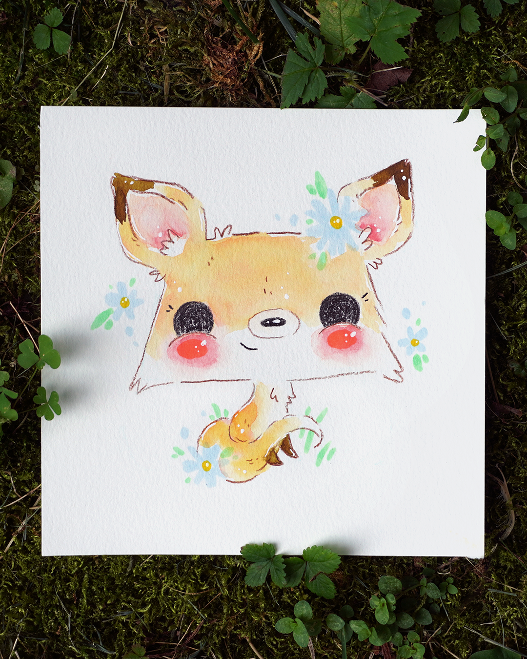
6. Hedgehog: Let's draw a super easy and super cutie little baby hedgehog. You have two options while doing the hedgehog. Both of them start with the same shape. You can start with a little square and then you can just round it out. Let me do a second one to show you the variation. This one we don't get a circle, we just get a rounded-out square, which is more of the look we're going for. This first option is one I will be doing. We're going to just do a little mouth and eyes and then he's going to have a little face, but it goes all the way down, almost to the bottom. This can be his body. In here we can fit in little feet and little hands and then we have little ears at the top where the curvy line meets the straight line. His little paws look like this, two curved lines facing each other and three little fingers. So little fingers are like this. Then his little feet look like this and then three little toes. Same way, we can just add little detail in them and little claws. That's it. The same way on the other side. The second variation is a little simpler. It's almost the same but instead of going all the way down, we're going to can take this little face and just edit right here. It's just going to be his little eyes are in here and stuff. We put the little eyes in, little nose, and the little hands but no feet this time so he's curled up in a ball more. Because hedgehogs when they get scared, they curl up into ball you can't see anything, when they're more relaxed are like this, that's one I'll be doing. But you can also make it more simple like this. Now when you play with scale of this, you can make it anything you want. You can make the hands bigger, the eye smaller, the ears bigger. You can make this more of a circle, whatever you want to do for playing. For example here's some eye shapes, maybe it's a girl and she's a little shy. Maybe just two long dots like this instead. Maybe he's tired and it's two Xs for eyes and the nose is like this. Whatever you want to do, you can just change things up and play with them and that' s the fun of sketching, that you can see how things look like and you can change it around and make it your own. As for the background for this little guy, I was thinking of doing little graphs like this. I'm going to make it a little bit more symmetrical, you'll see how I do with the marker. Little flower shapes like this and this. Very simple, very easy to do, and maybe you'll have some stems and leaves. Very easy background, very easy hedgehog, and just go ahead and sketch this out. I'm going to do this with my light blue pencil so you all really be able to see it on the camera, but this is pretty much what I'm sketching right here. When sketching, it doesn't have to be perfect. Make sure you're centered on your page. If you have to erase and try again, that's fine. I'm just trying to eyeball where the center is. You notice how I messily sketch. I just try to get the proportions right of where I want things and the placement and then I can do detail with my chosen medium. This is just how I do it. You can also do detail sketching, it's up to you. Very loose and I don't mind any mistakes right now I can raise erase anything I do. Sketching is so important to help you visualize what you're doing and to make sure that you're doing it on the right side of the paper and that everything looks good together. Because if I just started drawing with my final medium and it wasn't centered, I would go off the page and it look little off, so it's really important to always sketch first. I decided to leave more space at the top than the bottom, just to make it look a little more spacious at the top of his head because bigger heads are cuter. It's a very small detail but it'll make him cuter. You get stuck trying to make it symmetrical like here I've made it asymmetrical. You can just go from the middle of the first line that you draw and just pretend you're drawing a straight line, put a little dot down, that means my eye's a little too high, just put a little bit lower. But little imperfections and little quirks do tend to make your pieces cuter so don't worry too much about it. Now, I've land to a problem. I put this hand a little too far to the right because I'm thinking where am I going to put the legs and I need space for the legs. So maybe it's a good idea to sketch the legs first so I can see where I have space for the hands. Here's other leg, they're just like triangles, like little ice cream cones. Now I can see where I can put the hands. You can do a lot of problem-solving in your art-making, that's completely normal. No one knows what they're doing straight off and you have to do a lot of erasing sometimes also completely normal. But notice I'm not drawing in all the details, I'm just going to add that in with my finished medium. Look how loose my sketch is. Not perfect at all, extremely loose. I've noticed that this side is a little thinner, this side will thin this one out a little bit. Then this is when you just step away and you look at it and you're like, does anything look off? This is all too close to this body, but that's a small imperfection and quirk that might make it cuter so it's okay. It's up to you how perfect you want it to be. You can spend more time sketching if you want to be more perfect. The marker part that I will do, I'm not going to sketch it out because it's so simple. I'm just going to erase my pencil marks where it's going to overlap a little so that way they don't show through, but I can still see them. I picked out a few colors for this, I'm going to have this green color, this peach color for the markers, and it's pinkish peach. I'm going to take those colors and I'm just going to draw in the grass. We're just going to do simple lines like this. Be playful with it, it doesn't have to be just like mine. You can make it as symmetrical as mine is or less symmetrical. I could try make mine a little bit symmetrical, but also a little bit playful. Something like this and then maybe around him, there's little bit of green as well. This one's a little longer than this one. I can make this a little longer, I can add some dots here. Just add a little more dots on this side just to even it out a little bit, to make it really cute and playful. Whenever I have a little imperfection or quirk, I just try to go with it and just make it unique and special and usually it works out like Bob Ross. Here's my pink. I'm going to go in and add some flowers as well. I'll do a circle here, maybe a circle here, and that made my pink flower that looks like this. Very simple. I mean, this one has one more petal. I'm just going to fill them in except the middle part. Very cute. I just really like this look, it's very simple. You can also fill it in with water colors instead, it's up to you. Then I'm going to do a symmetrical look, a cute one like this and then just fill that in. I really love how uniform markers look when you fill things in with them, it's one of the reasons I chose this medium to play with. But look how adorable these little flowers are. One more thing I want to add is a little bit pink in his ears and pink in his cheeks. Just going to eyeball where there will be. Very simple. I think a little bit of pink cheeks makes anything ten times cuter, so don't be shy in adding pink cheeks. I want to add a few little dots here and there, just to represent more flowers in the background. There we go. Background is done, none of this can be intimidating to do it without sketching, but just play with it and win it. The more you do it, the easier it will become to do things like this. For colored pencil, I'm also only using two colors. We got a peach color and dark brown. Here's what the peach color looks like, it's very similar to this color right here and the dark brown looks like this. I like it because when you do an outline, it's always good to have a really dark one because it makes everything pop and contrast. I'm going to outline my hedgehog. Remember you can use anything you want. You can use ink or even marker for the whole thing. Whatever you want to do. I'm doing this little motion like this just to make it look a little spikier because he is spiky. Hedgehogs are a fun place to play. I draw a straight line, 1,2,3, straight line and that gives them a little spike at the top like character. Same thing on either side. I'm not going to do the ears because those will look cuter as a fleshy color. I'm just going to keep going maybe one's longer line and then again spikes. Now don't overlap with the green because it look better that way it look like the green's in front of him and that just gives a dimension. Notice right now how this side looks different from this side, it could be the quirk imperfection and that's okay, I like it. I'm going to add few more lines here. Maybe one here. I'm outlining the ears. Boom, extra cuteness. The fleshy color will be the ears, the paws, his feet. So let's just do those. Just because you skipped something here doesn't mean it have to be perfect to the sketch. You're now glued to your sketch it's just a guideline of where to put things. Now, I did sketch this out dark and this is a very light color, when they overlap, the blue will be trapped so I'm going to just lighten it up a little bit with my eraser. This is why it's so important to use a light pencil. It's one of my number 1 rules, just important. I can go in a little bit and give him a little soul by just going like this instead of just a straight line. It'll just be an extra add a touch of cuteness, you don't have to do this, you can make it simple if you want, it doesn't matter. The fun thing about mixing these three mediums is I can go in and out and just add things whenever I want to. This foot's bigger than this foot, I'm not going to panic and say, "Oh, my God. I messed up." No, because it's cute. Look how cute, that is. It just gives it that quirk, the personality. I'm going to do his eyes and his nose, and his mouth and the inner part so I'm going to continue on. Where the cheek is I'm not going to put a line just because I'm going to paint this area and it's going to be more pink coming out, so I'm leaving a little space around the cheek. I'm just not touching my lines all the way, just for more personality and more quirkiness. There we go. Cute. Now the nose, just going to do this, I'm going to fill it in. With color pencils, if you just draw on the same a bunch of times it'll make a really nice, dark color, really saturated. It still has that little touch of texture, I love that about it. Now the eyes, this is the hard part because you're like, "I'll make it uneven. " But if anything can make this one too big or this one too big, just make the other one bigger so start smaller. Could be so cute if this was just like his eye and then he could use a circle here and just be looking at you with big eyes, a little shocked or something. Eyes are a great way to play so don't be scared of playing with it and doing your own thing. I'm just filling it in slowly and I keep expanding my circle or you could draw the circle first and then do that. It's up to you, which way you want to do it, either way is fine. Be careful when you get a lot of pencil shavings that they don't stain your paper like it did here a little bit. Usually, I just blow on it and it goes away, but then you can just erase it lightly. Let me start the other one, so we do that thing where I go like this, put a dot, make sure the side distance is good too. For the second one I like to draw. I always do this. I always draw the right eye first and then I'm like why did I draw the right eye first? I can't see it now when I try the other one. Something to keep in mind depends on what hand is your dominant hand. But if you draw the eye that you're covering first, so I can draw this one first then I could see this one and compare them as I'm drawing this one. Mistake I always make and I always forget, so don't make the same mistakes as me. It's okay, I can just keep looking. I don't care how long I've been drawing, it is so hard to make things symmetrical, it just is. Like I said before, I embrace that and it just makes things cuter. This eye is a little bigger. I may make this one bigger. Now this eye bigger and make this one bigger. It's okay because bigger eyes are cuter, so don't be scared in doing this. They don't have to be perfect, just keep doing this until it feels right. Also, notice how this is not a perfect circle anymore, it's coming out a little bit here. That's okay, it's a small quirk and it makes it cuter. One more thing I want to add with the marker is little dot here, little dot here, and 1, 2, 3, 1, 2, 3. One more thing I also want to add with the pencil is 1, 2, 3, little claws, 1, 2, 3. This is unnecessary. I just thought it gives it a sweet, little look because this little sweetie pie has claws. All right. The last thing is the mouth. Now, you can make it fleshy or you can make it brown, that's up to you. I think I will do brown, but I think I'll make it a little smaller. I sketched it a little big. I'm just going make it a teensy bit smaller. I did a little bit lighter than the other parts as well. He is just adorable. Look at him, he's just so cute. You can add eyelashes right now just by doing three dots around the eye like this and it'll look like a girl hedgehog. One more thing I want to do is add a little bit of texture. I'm just going to do little dots and lines in just a couple of places. You don't want to do too much detail. Perfect, or you can add a bit more, it's up to you. Maybe I'll just add like 1, 2, 1, 2, something like that. One more thing I want to add now that I'm looking at it is some stems and leaves like that, cute. I touched him here, so it looks a little bit off but I can easily fix that with a little bit of white because it doesn't match the other side because it's not touching, but it's okay little imperfections are cute. Here you go, just a bit of white gel pen. I could do that and it'll just look a little more separate. But anyway, I think I'm done with the markers and the polar pencil now getting erased. If you're not going to do watercolor, this is when you can pick something else to color with. All you really have to do is color his body and he'll look really cute. But you can skip forward to the end of the lesson where I will show him completed and you can copy the colors I used just to get that same look using watercolor. If you are using watercolor, time to get your paints out and erase the sketch. The reason I like working like this is it's like we're working on a coloring book page. Sometimes after you erase everything you notice something's missing. Right right his body has a line and right here, and maybe a little right here. There we go, now he looks more complete. Now, it's time to paint. Now remember, keep it light. I'm going to use brown and I'm going to mix with some purple. I have some right here actually. I can test it out right here. That's a little too bright. I want more of a dark purple but more brown, maybe this brown. I just keep doing that until I get the color I want and so at some point have a good piece of scrap paper. I'm just blending the colors until it feels right. I can already tell that's what I want right here, perfect. It's just like a little bit of a warm brown. It's also a little dark and look how light it actually is. I'm not picking up too much paint so that we can keep our color light. Hedgehogs tend to be dark, so it's okay that there's a little darker than you'll see my other paintings be. I just want him to look hedgehogy, and I'll make a lot of contrast because you'll see I'm not going to paint in here as much. You have to finish your layer as it's still wet. So I work quickly to cover this large area and boom we are done. Look how simple this was. Just fill it in. Now, if I don't like this color, if I want to be more gray or something, I can add more paint, I can do a second layer. There's nothing stopping me from doing that. Let's not forget this little area right here. I need to mix a bit more paint. He would also look really cute as gray colored or even pink. You can get playful with it and do whatever you want. That's it for that. Now, I'm going to take this fleshy color and you can get the same color if you just dilute your paint, but this forces me to always have a light color. I'm going to just do his nose, his paws, and his feet. Then I'm going to take some water and just blend it out into his body where his paws are and maybe even around his nose, just a little bit of blending. Now, this is the fun part. We're going to wet his cheeks with the area all around his cheeks, and I'm going to take some pink. I think I'll use this one because this looks like the color we use with the marker here, see it matches. You can always use a dark one, just make sure to dilute it so that it's not too dark. Then I'm going to just drop it in here. It's going to layer with the marker underneath it and it's just going to look really cute like blended out. Cheeks make everything 10 times cuter. I mean, look at him, it's like he woke up and he's like, "Hello, I'm adorable. Good morning." Look at that. I love that blended look, really easy. You just wet the area and add in the paint it's wet on wet. I can add a tiny bit of pink to his little nose as well if I want to because some of these people have pink on their noses when they're really cold or embarrassed, just a cute little look. Then I can pick up anything excess by just using my paper towel, dry my brush, and just picking anything up. That's how you erase. We're going to let this dry. Now that it's fully dry, I can go in with my white gel pen. You can also add a second layer of watercolor if you want to around his body and make some parts dark, whatever you want to do. Also, I did not paint in this green part. I like the contrast of it just being blank and just keeping it simple. This is the style I'm going for in this class, but you're welcome to color it and you're welcome to play with your colors and see what you can come up with. I encourage you to just use whatever supplies you have and play with it as much as you can. I'm adding little dots to his cheeks, his little feet, and I like to just add it inside a little bit just to add the contrast up. Don't worry about light sources or what looks right or what doesn't we're just being playful and cute. I just like to add it everywhere, add little highlights here and there and there. Just makes everything cuter. Look at that, his nose, so cute. You can also add this in his eye if you want. It'll look like this. This is the look you're going for, it's really simple, you just do one dot, second dot, and you mirror exactly this on the other side. You still do the top right will be the bigger dot, the bottom left will be the smaller dot. You just do the exact same thing not symmetrical but exactly the same on each eye. I'm going to add little sparkles in his body just some random parts. This is completely optional, you don't have to use a white gel pen, I just really loved doing it. My little sparkles to the flowers. I don't know. She just wants eyelashes. I'm going to add them right now. That's the fun part about being able to play with these mediums is you can just add things whenever you want with whatever medium you want as long as your watercolor layer is dry. Look at that, that looks even cuter. There's one more thing that I want to add. Now I can either use my peach or my paint and I could just add a little bit of a halo around the cheek. Just want to blend a little bit more. I think I'm just going to use the pencil. Then it just makes it have a more of a layer to it, more dimension. I can also add little scribbles in the body if I wanted to just to add more texture. But I think I'm done. I think little hedgehogy is done, look how adorable. I hope you guys have fun in this lesson and now let's do our next animal.
7. Owl: Let's draw the cuttiest little owl. To start, we're going to start with the same shape as the last time. Just a rectangle that's more squarish, or you could do a square again, it's up to you, but just try to make a little bit longer. This time it can be a little bit more advanced. We're going to do a line towards the left more, that's little circular line. I'm going to show you guys what I'm doing with this. Where he's looking, is the middle of his face, so if he's looking straight at us, here's the eyes of the owl and here's the nose. Then it's right in the middle, and these crisscross were in the middle. If he's looking to the right, we just make it curved, and then we show where the eyes are, it's the same thing. But now the nose is here and the eyes are here. It's easier to visualize it, if you place this line. You can always cross it. Then what I do is, I'm just going to draw in the face, with this as a guide. One thing to keep in mind is, let's say this side is closer to us. Everything will be a little bit bigger on this side and everything will be a little bit smaller on this side. Try to make it too complicated just a little bit. This is a more advanced way of drawing, and I'll do this a lot in the next few lessons. But just try to do what I do and don't take it too seriously. Then I'm going to round this out a little. I'm going to tuck this in, round this out, round out the edges, and the outside here, the tail will be out here because he's facing sideways. Then the wing will be right here. I'm sketching it like this, just for the general shape of it, but the actual wing will be looking like this. You can make it anything you want, but this is what I'll be doing mine as. Just simple lines, and you can make this part bigger if you want, it's just the top of it, and here's the inside. We're also going to add little legs. Just two little things also on the other side of each line. See this one's further out, this one's closer in because this part of the body, it's a little bit skewed, we're seeing less of its, everything's a little smaller. It's easy to visualize if you just have simple lines, but just do your best with it. Don't worry too much about it being perfect. They're a little bit sideways, so I'm going to show you guys this zoomed in, in a second. But really it's just two line, and then we're going to have a tree branch. Remember, you can draw this any way you want. You don't have to make it exactly like mine. These little toes, I'm going to show you exactly what they look like close up. They have the little leg part. This is the fur and then we're going to have this part be yellow, this is the actual legs. What you do is you just do one, two up, one, two, up. Then we'll have this line right here, and underneath this will be the tree branch. Very simple. You can also add little claws to it if you want or not, and make the tree branch smaller or bigger, it's up to you. One more thing to add to the branch, we will have this little line here and line here, and little line here and line here. We're going to have little flowers all through here. I was inspired by sakura blossoms, but you can do your own thing. I'm also going to add very lightly, just some clouds around my owl. The sketching face, it's a great time to just play with placement and where you're going to put them. It's going to be my owl sketch. It's not too fancy, it's very simple and add some detail inside of him like this, like little feather shapes. Hope this wasn't too confusing for you guys. But it's definitely something you can play with the placement of the face. For example, if it's looking up here, maybe this line is this high, maybe towards the middle and then you can just see. It's looking up, and if it's, let's say looking down here, let's say, the face is tilted this way, and this way, so like this. Just something really simple that you can practice. Just put a dot anywhere and pretend that it's looking at that dot. How would the face look? Where would the eyes be? Very easily you can add the mouth in the same spot for all of them. This is something actually talked about in my drawing cute people class, and it's really simple to incorporate, and it's a nice way to add dimension to your art. I'm going to sketch on my owl, in the same way that I showed you guys. Sketching is so important because you know exactly where things are supposed to be, and instead of guessing where to starting and look and say, "Okay, this looks good or doesn't, have to move over to the left a little bit, just to make it more centered." Notice how loose I am. It doesn't have to be perfect, you're just sketching. The way I'm doing the tree branches, you don't have to do it this way, I just thought it looks a little bit balanced like this. I'm looking at what I've sketched out and I do think that I made that legs way too big, so I'm just going to redo that. Don't be scared to erase and redo anything that you do because you can make it any way you want. You make them a little bit smaller. That's much better. I don't have to sketch out the cloud shapes or anything. I can always just draw those in, but you can sketch them out if you want to. I just like to win those kinds of things. Everyone has their own way of doing things and personal preferences that are different. You just do you and have fun with it. Here's my initial sketch, very simple, very easy. If you notice, I'm a little bit off centered. This should be a little bit more to this side. But the cool thing about having paper cutters, I can just cut around it, make you look centered. But don't worry if you're doing this as well and you're a little off, it's not a big deal. This time since nothing is ahead of my owl with the markers, I'm just going to do the colored pencils first. I'm just going to go in and add in all the little details. I tend to go slower for outlines because this is your time to make everything with perfect. If you sketched a little too much in certain areas, you can always erase it before you add in some color. Now you can get a more dull look with your pencil and just get thicker lines or you can sharpen it and get thinner lines, which I prefer. I prefer to go over line a few times if I want a thicker one. Here I am, just going to add in some outlines. The color I chose this time for the outline is a blueish, a dark blue, and I'm just going to do it like I always do it. They're not always completely touching, and they're tiny bit sketchy. This is just a little detail on top of the head. This will make him look like he's fury. I really liked that look. It works with fur or feathers. Now for the wing, like I showed you guys, I'm going to just do one line and then loop it. Then another line and then close it off. Look how quirky this is. I absolutely love that. I just make a little tail. Now, the tail you can make it just a triangle, or you can do like little loops as well, like this. Here's the initial outline. I'm going to just choose a little face. When the cheeks are, I tend to not draw pencil, I forgot here and there'll be a little line. No big deal, I'll just continue from underneath. The little mistakes that you make, like I said before, make things cuter. Just do you and be playful. I left a little bit space here. You don't want the lines to touch because it'll just look weird. You want to have a little bit of space in between. The last thing is the eyes. This time I'll be smart about it. I'll do this one first and then I can look at it while I do the other one. I'm just going to do it a little differently this time. I'm just going to draw it in like that. I didn't sketch in the line here, but you can always sketch a line here just to guide yourself how it could just go like this, and at the center point, I can see the match. Sometimes it helps fill it in first. The eyes are the trickiest for me just because they're too symmetrical circles. But the more you do it, the better you get at it like any other skill. Like I said before, little quirks with the eyes not being perfect circles makes it cuter. I also feel like darkening some of these lines a little bit, just in some parts, which is going to go in and just a little bit more pencil. Sometimes I do this and sometimes I don't. It just depends on how I feel. But it increases the contrast as well and just makes it look like there's more variety to the lines. It gives it a fake sense of line variation. Notice how the eyes are a little wonky. This one's a little higher than this one. I think it gives it a really cute look. It's just really subtle. Here I'm adding a little bit texture, which can add it in some parts. Maybe just one piece. Very cute, very simple. Now I can add the marker. As you can see, my two colored pencil colors were the yellow, orange, and then a peacock blue. I'd like to use this light brown color, it's called ash rose and this one called hollyhock, which is a really cute little pink magenta. This light blue color, which is called frost blue. All the markers are from Ohuhu, I'm not good with names. But you can make your own color palettes up and do your own thing. Just remember to just watch it out like this, to pick out what you like. You can make sure that the colors look good together. For the marker part, I'm going to draw in a little tree branch right here. Doesn't have to be perfectly neat. I'm just trying to draw as if it's under the foot. You don't want it to end right above the little toes and start right below the little top toe. I want it to be like a thicker branch. That doesn't have to be perfect, cute. I can make it a little longer on this side, I feel like he needs it, and just play with it until it feels right. That looks about right to me. I'm going to add in the little details. I got one line going like this, and one line going like this. Maybe make it a little longer. Just play with it until it feels right to you. I'm going to add in some cheeks. These are always optional, but I think they really up the cuteness factor a lot. You can make them bigger or smaller if you want to, you could just do something like this. That's always really cute too, or you could just do an outline of a cheek and then color in with something else. I'm going to have a little cherry blossom effect down here. I'm just going to do a little petals, 1, 2, 3, 4, and then dot dot, dot, dot, and maybe one more, like a little smaller one. Whatever you guys decide to do, just keep a consistent and it'll look good. See that just makes it feel like a little cherry blossom branch. Same thing on this side, which is 1, 2, 3, 4. Because I already started that look, I'll just continue it. There's all kinds of ways to draw flowers. You can find your favorite way by studying real flowers and just finding what you like. I'm trying to just keep it sparse and make it just look like it's going off in the distance a little bit. I can add a little bit around him as well if I want to. This is completely optional. I just like to do this. Now the light blue is going to be clouds. I'm going to add clouds around him. They're not to be perfect clouds, just little happy clouds. One here, maybe one here. Now perfect, just cute. The lighter the color you use, the more subtle it is. It just gives you that feeling, like he's on a tree in the sky. I'm just going to erase all my little pencil marks. Okay, now time to paint. This is the finishing step. You can use markers to fill him in instead if you want, or colored pencil, whatever you want to do, just play with it. But I like to use just a little bit of watercolor. I'm going to have this really light icy blue. I'm just going to lightly paint him in. I like to mix more than one color on the page, so I'm going to pick something else up. I think this one right next to it. We're just going to have his face stay white. I think all of him pretty much the same color. I like to work quickly and I like to be loose. I'm not perfect with the neatness here. You can see there's little white specks. I love that look, I love the look of something being imperfect on purpose or it looks like by accident, it just gives it a fun look. There's a darker line right here, just gives them a subtle shadow. If you want to do that, you don't have to, but you can always drop in more paint while it's still wet and do wet and wet shadow. I like just to make his whole area just have little subtle variations. Maybe add some water, so that it dries quirky. Then I'm going to wet this cheek area right here. Just add some plain water, add as far as you want to spread and pick up the colors you want to use. I'm going to have this pink with a little bit of this red. I'm just going to paint it right on top. Look at that beautiful spread. I really think the cheeks make the cuteness. If you have a little too much paint like I do right here, it's bleeding. I can just pick up with an empty brush. You just clean your brush and you dry it and you can pick up any paint you want. I'm going to add a little bit of yellow to his beak and his feet. I could use orange instead that also look cute. I can be done here for the painting portion or I can add in more color. I actually want to maybe try different like greenish, blue. Just add it in for a little variation. Just gives it that pop. Okay, I think I'm done with the painting portion. Now, all I have to do is let it dry and add highlights. Now onto the highlights, I like to actually make sure that it's flowing well on this scrap piece and then I just go in and add them like always. Keep it simple, keep it fun, keep playful. You can add dots anywhere you want. Just try not to overdo it. It can be really easy to overdo things like this. I'm going to add some little dots in the middle of each flower just to make it look like it has a center. Maybe just some on the branches as well. Why not? Maybe right here. I don't like this touching this and a little bit of white to just make it look like it's not. There we go. Here's my cute little owl. Remember you can play with anything you want. You can change what he's sitting on. You can change the background or the colors, or the shape or anything you want at all. Just be playful with yours and I can't wait to see what you make. I do want to show you guys something before I make each illustration, I do a little mini sketch. This is what the mini sketch look like. As you can see, it's very similar, but this one's more sketchy. Actually I like how this one turned out more. The shapes is a little different as well as you can see, I put the legs a little forward here, but little subtle variations make things look very different. If you just play with it and make it your own, it'll look different from what you're making. I think they're both cute and have a lot of character. But the point is, subtle differences really show. Just play with it. Okay, now, let's move on to the next cutie patootie.
8. Frog: Now let's draw the cutest little frog. To start, we're going to do a little square. Very simple. Now, I'm going to go from this edge and just round it out to the four. Then I'm going to just round out this a little bit as well. See I'm just changing the shape to the way I want it to be. Over here, I'm just going to also round in and make the lines to get a little, and you'll see what will be in a second. We're going to do a little half circle here, and a little half circle here. We can put our little line that I just showed you guys, right right. This will be the eye. This will be the other eye, and we're going to do a little smiley face right here. We're going to do a cheek right here and right here, and the tummy is going to be right down this line. Just can be a different color. This line right here, now we're going to add in a little wavy line like this and just connect it and that will be the back leg. Then this right here where the chest is, we're going to make the line go out and make a little arm and one on the other side as well, and connect it to the body. Everything flows and connects here naturally and just looks nice. Notice I made this eye bigger. I can always make this one bigger. Like I said before when you're sketching, you can match the sizes of things to match. I want to add a little sprout its head break where the line is. We're going to add little lips. This is optional. I just thought it would be cute. You can do a bow, you could do whatever you want, a top hat. It's all up to you. Then I'm going to have these two curved lines at the ends here. He's sitting on a mushroom. We're going to have a little mushroom just by putting a line through it. Everything's a little curved because mushrooms are curved. When you sketch, you can see what size you want to be. I can make it smaller or bigger. I can make the bottom part of a bigger for one to be taller picture, or I can make it short, which I'm going to do because I like to do little squares for my photos. Then I can add in some details. I thought maybe some leaves here would be nice and a little circle. Maybe just some detail like always just little pops of color here and there. Now, I can tell from my sketch that this is a little off-center, doesn't look good. I'm just going to move my frog to the right, my final sketch. I can just raise the mushroom or redraw it if you want to. But that's the point of sketching just to see how things look and you can always change it around. But as you can see, this little frog is very simple. We're just using a lot of curved lines and you could do your own thing. You could also add details here like little circles, because a little mold on frogs. We can also add little circles to the mushroom itself. But this is all optional. You can add little detail here. You can make it like a bunch of lines to add texture, whatever you want to do, add some shadow here add some grass. Everything is up to you, just have fun with it. But here's the initial sketch. To not make the same mistake as I did last time with the placement, I'm going to just draw a circle in the middle, fair, very lightly. Then I'm just going to mark where everything is and make sure it's all centered. I do this sometimes, but it really helps if you want to make something look perfectly centered. That looks about right. I have very lightly just put the mushroom and the frog shaped as a circle for it. Now I can start sketching in the actual shapes. I'm doing the same exact sketch that I just showed you guys. If it's hard to visualize a line going through the frog, just draw it in, draw in the whole mushroom. It doesn't matter because you can erase it. I decide to make the stump even chunkier and shorter just adds the cuteness factor. I could even put a little smiley face right here if I want to make little face on it. You can play with it as much as you want and put faces on anything. I love putting faces on things. If you look through my cutie class library, you'll see I always put a face on everything. My sketch is done, very simple, the same one I already showed you guys. Now again, we don't have any marker in front of him, so I can start with the pencil. Make sure it's sharp. Be sure to draw around the cheeks if you want to have cheeks. I'm just going to do my outline like I always do it, very simple. If you want to have little frog legs or arms that are different, you could do like two lines and then 1, 2, 3 for three fingers. Same with the back leg, just 1, 2, 3, just a little bit bigger. You can do this instead, it's up to you. I tend to go pretty slow with my outlines and I can make them darker in some parts if I want to. Draw in the eyes. The eye is barely showing here because the body is covering some of it. This one could be little bigger than this one because this one's more out of the way and a little mouth. Cute. Now for the mouth, you can do anything you want. You could do it like this, which is really popular, or like an open mouth with teeth. You could do a smile with like little cheeks. Anything you want to do at all, just be playful with it. I think I'm going to make the frog a girl frog. I'm going to put the eyelashes outside of this so that they don't overlap with this line, because when things overlap, they tend to look a little bit hard on the eyes. It's just cuter like this. Very simple, just two eyelashes this time. I'm going to add some detail right here, just little dots. Our frog is done. Now let's add in the mushroom. I'm going to use markers again. That's the medium I chose, but you can do anything you want. The color I have is this cute pink for the mushroom itself, but the fleshy part of the mushroom I got this beige-pink-orange. Then for the details around the frog, I got this cute little green, and I can make a watercolor match that green. For the mushroom, I think what I'll do is just kind of outline it loosely. Remember imperfections are cute so I don't have to be perfect. Because the lines and complete with little dots, we look at it and just completed in our heads. I'm going to add little white circles of different sizes. This is really random. Just don't overdo it. That's it. I can even just add little dots. I'm not going to color this in with marker. You can, if you want to it look cute either way. The green is going to be used to add a little leaf on top of his head. Look how cute, so simple. You can make it more like this. Now fill it in if you want, or make it a flower like make it and come into a daisy, whatever you want to do. Then I'm going to have this little detail right here, just two leaves. Little dot. I want to be a little folky and symmetrical. That's just how I visualize it. You can do anything you want. Then I'm going to add little dots all around him or her. That's it, very cute and simple and you can always add more if you want. Now I'm going to use this beige color. Just get this part. Again, not outlining all the way. You can do whatever you want. I'm going to add a little face. Cute. If it looks too busy to could just fill this area in whatever you want to do with that. That's it for my outlining. Now I'm going to erase my pencil marks. This is turning out to be a real cutie. Now once you guys have been inspired to do whatever you want, you can make it sit on like a tree stump or just in the grass, on a piece of a puddle or a lake or a lily leaf, anything you want, just look up a picture of it and simplify it and make a cartoony. There's no wrong way of doing it, it's just about having fun. One thing I forgot is cheeks, so let me just add those in. One here and one here. I can add them to the mushroom as well, but that might be a little distracting, so I'll just leave it. As you can see, it's already so cute and I'm just going to add in my color with watercolor. You can use any medium you want like always. We're going to get a green that kind of matches the green already used. This one's a little warmer, and I like that. But I can add a little bit of blue to make it more like exactly the green that I used. Just a little bit. I love mixing on the page like this. I'm going to wet the area around the cheeks as well. I'm going to go out of the shape a little bit. I like to do that to make it bleed out of the froggie. We're going to use this pink. I'm going to just check if it's too bright and it is. I'm going to maybe mix it with this one right here. I can just mix on the page and you can see that looks much better and more like that one. Always have a piece of scrap paper just to check your colors because then you won't make a mistake on your page. I have little too much pink, dry my brush off with a thirsty brush. That just means there's no water in it. I'm just going pick up this pink right here. The rest of all let it spread. I like it when it mixes and just mingles and has fun. Now this could be the end of it, or I can copy my mushroom with the same color and just dilute it more just to give it that cuteness. Now it's up to you what you fill in with what or if you just use one medium. I want you guys to be really playful. This is just my favorite way of painting recently, but it's always changing. I can make it a little darker if it just seems a little too light. If you want to add shadows to things, go ahead. You can do it in the same layer by just adding more paint in certain parts while it's almost dry, or just by adding a second layer. It's up to you. I'm eyeballing this and I think I want to change the spread of this a little bit. I'm just going to problem-solve as I go. It's not the look I want exactly. I also think now that I see the marker on the page, it's a little bit too light for the leaves so I can take a darker color and just go over it. That's the fun about markers. You can go over it as many times as you want. Maybe I'll leave these little highlights as a lighter color. The fun of mixing these mediums is they all work together and you can do as much as you want whenever you want. In fact, I think I'll change these as well so they all match. Maybe add some more. Now this still feels a little light to me. There's not enough contrast. What I can do is either fill this in with marker that pink right here, or I can paint it darker and that's what I will do. I'll paint it a little darker. I'm just going to get more paint this time. I'm going to make it darker. Then it'll be light, dark, light. I like that contrast. I'll give more attention to the mushroom as well. I'm okay with that because now it has a face and everything so they can both be in the limelight. Maybe add a little bit more around the cheeks just to make it look like it blends out more. I can also paint in some cheeks if I wanted just a little bit. I couldn't resist adding cheeks. I tried not to, but I couldn't do it. Just smooth it out a little and make it really light. I think that looks better. I like the contrast a lot more. I'm going to let this dry and add highlights, and that's it. This piece actually has more cute accidental things. I want to point them out. Right here you have one layer watercolor second one and the overlap funny. Same thing here with the markers where they overlap, it makes darker color. It just gives it a fun and loose look. Same thing with the frog here, the pink goes into the body and then there's a second layer added on, and it just makes it look more quirky. I love that. I'm just going to add highlights the same way I always do. Maybe just some around the body as well. I can also take that green that I had, the darker green and fill in this little circle here. Just add a little bit of a texture. One more thing I feel like doing is making the eyes a little bit more defined and bigger. Bigger eyes tend to be cuter, but you can do whatever you want, sometimes smaller eyes are cute too. It's just a personal preference thing and maybe one more eyelash. I usually do this. I just keep adding things until it feels done. But it's easy to overdo. So don't overdo like I always do. I think it's done. Look at this little cutie pie. I love cute frogs. Now let's move on to the next cutie.
9. Snail: Let's illustrate a snail. It's very simple. All you have to is start with a circle. Now, we're going to do his little neck. We're going to have a line that comes out like this. Another one that goes towards that one until they meet. Now, we're going to take a line right above that and just do a half circle type thing and just round it out and have it connect to where it ends. This is going to be the shell. You can make it smaller if you like. You can make like a really small shell and a really big head. That could be pretty cute. It's up to you. I do think I want to make the head a little bigger, so I'm just going to draw it in. Here's my new circle up here. For the eyes, you just do two parallel lines on each side and then a circle. Then we're going to put the eye right inside of it. I'm going to do eyelashes this time because it just looks so cute and quirky, and a little smiley right here. It's already super cute. Now, to make the shell, all we do is do one circle. Looks more like an oval, and then a second one right underneath it. To keep so quirky, you're just rounding it out and just making it look like one circle and another one. We're just going to make this line either the same or you could do this shape, whatever you want to do for the shell touches the body. Another option is also to do the shell like this, and peak out the whole body. Here's the shell, and it's above the body this time. The body comes out and you can see all of it. Up to you, which you like more, I thought it was cuter when it was hiding in the shell, but it's just a personal preference. You can also make the tail stick out the back if you want, up to you like I said. I'm going to put him on a leaf. To do the leaf, you just do one line, a simple line and then we're going to pretend that's the middle of the leaf, and we're just going to do a little leaf shape. You can make it bigger or smaller, whatever you want, and that little stem at the end. Very simple, very easy. You could also make it funny by just making a little bite in here if you want. Just by doing three lines like this. In that way, it looks like it was already bitten into by, maybe the snail, maybe he had a snack. Just to make it look like it's really under him, you can also take this line and just draw it out as if you're drawing up the whole leaf, just to make sure that you got it right and you can always erase that. Very easy. I'm going to leave a little bit of white around the eye because I thought that'll look cute, but you can also make the eye completely filled in. This is our snail, we can do whatever we want to him. We can play with it as much as we want. Just have fun with it. I'm going to add little cheeks and he's going to have a little pattern around him, maybe like this. It looks like a little flower, like I always do. Now, if you want to instead, you could put a little crown on him or a hat or anything you like, just be playful but if you do like something like this, it looks cuter when it's floating for some reason. Just because we have so much stuff going on here, it looks better if it's not touching. That's it for our sketching portion of this snail. Now, let's actually illustrate it. I'm going to sketch it out exactly the way I showed you guys. If you have a problem centering him on the page, we can do what we did last lesson and just plan out where the shape is in the middle. Just draw a circle in the middle or an oval in this case, and just make sure it so centered on the page. That looks pretty good to me. The shell could go here and the leaf could go here. Just very loosely, make sure proportions are right and it looks like it's good placement. This is a little bit too hoarse. Let me try again, and just put the head a little lower. This is especially important if you plan on framing your illustration because you want it to look centered and just right, especially if you're doing a specific sized paper. Here's a really rough sketch and that looks about right. I think I'll make this shell a little bit smaller than my initial sketch, and you can make the eyes even bigger if you want. Like I said before, bigger eyes can be cuter and they just give a lot of character. Now, I'm done sketching. Here are the colors that I chose. This is going to be the snail outline. This is going to be his eyes and his mouth, and this is going to be the shell outline. This will be the cheeks and flowers, and this will be the leaf. I'm going to start with the snail itself. Now he's smooth, he doesn't have fur or anything. I'm just going to keep it simple. I'm going around the cheeks so that they look like they're in front of him. It doesn't mean your line has to touch all the way. You can still keep it not touching in certain parts. You can thicken it in certain parts, whatever you normally do. I just keep the frailness and texture out. I decide to make the eyes even a little bit bigger. Look how cute they are. You can make a little line between the eye and the body even bigger if you want. I messed up a tiny bit here. You can see the circle here is not very circular, it's more of an oval and that's okay. No big deal. Like I said before, cool trick is just to thicken your line on the inside here and on the outside here, just to make it look more even. It can work. Then we're going to do the dark, just the little smile. I decided to just go with this, but you can do anything you want, like always, and the eye. The cool thing behind the other circle is you can just eyeball it and try to make sure that it's right in the middle. Before we fill in the eyes, I want to show you guys other options. Instead of making a perfect circle, you can just do this, and this, and then fill it in. If you don't have any whites to fill in afterwards, this could be a great way to add highlights. You just plan it out beforehand. It's as if there is a highlight here. Make sure just to copy both eyes as if you copy and pasted it, not as if you're mirroring them for them to look right. I'm going to fill in mine normally because I do have white and I'd like to add that at the end and plan it out at the end. I'm not sure if I want to add white to the eyes yet, but I think I will, we'll see. I'm just filling in the eyes, like always. I gave him such absurdly big eyes, they're almost as big as his shell. But I think it looks so cute. I love big eyes on cuties recently. I used to do tiny eyes. I used to do dots like this, which was really cute and is still cute, but I'm just loving the big eye movement. It's the cutest. That looks pretty good, not perfectly symmetrical but like I said before, quirks make things cuter. Now, we're going to do the pink. It's not really pink, it's mulberry. Snails don't really have mulberry shells, but I thought it'd look cute. Now, because it didn't sharpen my pencil, the lines are a little thicker. Sometimes I do that and sometimes I don't. I guess I'm going to leave some of the body to be seen since I gave him a tail. I think that does look better. You can do a little squiggle like this under him. That's what real snails look like as they walk. There's the outline for my little baby. I'm going to just add the little pink of cheeks because I don't ever want to forget these. Look at that, so cute already. One more thing I'm thinking of adding is a little detail on the shell itself. Little lines that accentuate it. There we go. If you want to add some texture to the actual snail, you can do little circles, but very lightly. I guess it'll show the texture because they do have a texture to them. It's just very subtle. Now, we're going to the leaf. I'm not sure if I want to leave it as an outline or fill it in. We'll see. Here's the stem of the leaf. Oh, I forgot to make it look bitten, but that's okay. That would make a cute addition though. Very cute. I like it as an outline because then you can notice the middle part ends here. But if you want to fill it in, you can also leave this part white. Just draw around it. For the details around the snail itself, let's see, maybe something like this. Very cute. Then with the pink to some little flowers. I can stop here, but I wanted to add little flowers that I planned. Very simple, they're just like little lines that touch. The little dots like always because it's my signature style. You can find what works best for you or you can do this and let me add some rounded leaf as well. Very cute. I'm so happy with this. I also want to add a little bit of this marker in this shell itself, where I added the little lines and maybe just add a little texture on its own. He's already adorable without any watercolor. I love this little guy. I'm so happy with how he turned out. He's just the cutest. He's so cute, look at him. I think it's the eyes, I'm telling you guys, bigger eyes just make everything cute. If you want to add eyelashes, very simple, you just do it right outside. Don't let them touch the line because a look better if they're just floating on the outside. I was going to add eyelashes, but now, I'm looking it looks cute without it. I'm just going to leave it. Now, let's paint the little guy. I'm going to with this literally subtle beige-y color. Make sure to test your colors for the body, very subtle. I'm not going to go into the eye area because I think it looks better with more contrast. It almost looks like people eyes in how we have white and then the pupil on the inside. I'm not good with words but I think that looks really nice with the contrast. It's really not noticeable because of how subtle we're actually making the body color. Then I could just add a little bit right down here, to make it a little bit darker and a little bit variation. Now, the shell itself, I'm going to make it purple. I have this color which goes really well with the color we chose, it's almost same color. I'm going do the cheeks and the shell. For the cheeks, always wet the area first. I want to go outside a little so I wet it outside. Then add in the color and let it subtly do its thing. Don't pick up too much paint, and if you do like I did here, simple, clean your brush, dry it off. It's called a thirsty brush. We're going to pick up excess paint. Boom, perfect. I like it when it blends and mixes and has that dreamy look where it comes off the page. That's what I'm going for here. Now, for this shell itself, I'm going to make sure I have a good consistency. I like to have a lot of water on my brush, so it's lighter and we're just going to paint it in. It's going to look really nice with the marker as contrast. Oh my god. I love this little guy, he is adorable. Now, I can fill in the leaf or I can leave it as is. I think it looks really cute as is, but maybe I'll add a tiny bit of color. Just a little touch. I could put it right next to this one. Make sure it's a good color. I'm going to make it very light and leave lot of white. It still have that fresh feeling and it's so cute. Because my markers are waterproof, I don't have to worry about anything bleeding. I always recommend to use something waterproof if you use it before the water color. I'm going to dry him. Now that is fully dry, I'm looking at it I'm like, I do want eyelashes. I'm going to just add them in. I always say I don't want them, then I do want them. Oh, my gosh, so cute guys, I can't. Highlights time. Now, I'm going to add highlights to the eyes this time. I usually don't, for this whole class I haven't, but I want to. Sometimes I have to hit my gel pen a couple times just to get it to work, there we go. I'm just going to do something really cute. Maybe little hearts in the eyes even, you could do that. I'm just going to do really simple. Just one long line and two little dots around it. Very simple, very cute. Look at that, just came to life. Then little pink dots and the cheeks like always. Then I'm going to make the shell pop a little bit with some simple lines. Just make it look like it's shiny and add some dots in there as well. Maybe a line here, maybe a line here. I do this until it looks right. You can fill in the eyes if you want. I just thought it'd be cuter as being white, but it would look cute as beige as well, it's up to you. Once I'm done highlighting, he is finished. This is the cutest little cutie ever. I just want to squeeze his little cheek. So cute. Look at him. I'm done. Let's do the next one.
10. Bear: Let's do the bear. The bear is a really fun one for me. I really love bears. They have just these really simple features that you can really play with. Like usually a rectangular shape, all rounded out. We're going to have a little body like this. You can do one-to-one, or you could do half of this is what I'm doing. It's going to have the head shape. A little bit more than half. You can make him stand up, just by going like this. But I want to make him sit on a rock. But to put them in a sitting position, I'm going to do side feet, which is just two lines and two lines. Very easy. Then you just put one line up, one line up. [inaudible] claws. He's going to be sitting and you can make him sit on a log if you want, just by going like this, oval, line, line, and then just goes out a little and maybe here, some details, and maybe some grass, a little texture, whatever you want to do. But you can make him sit on a log, you can make him sit on a bench, on a picnic blanket, whatever you want. I'm going to do a rock. It's like the mushroom we did earlier with the frog. You can draw the same. Then we're going to do one rock here and one right here just to balance it out. At this time I want to have more of a story. This isn't something you have to do with your illustrations. But I wanted to have a little cutie pie be more like maybe naturalists. Maybe have like a hobby of looking at other creatures. We have to think. We are going to make a story, who is this character, what they represent, what did they like. I was thinking maybe he has a leaf on his head because he just really loves nature. I'm going to make this a leaf shape like a heart. You can just do a heart if you want and make it sideways and then put a little line through it. You can make any shape you want. You can make it bigger or smaller. You don't have to do this. You could do anything else instead or make a tiny leaf, whatever you want to do. Tiny ears here and then we're going to have the nose like always and the eyes like always. But this time maybe he's looking down. Remember what I talked about? If you want something to look like it's looking somewhere, just draw lines. Let's say he's looking down. We're going to make the eyes lower. He's holding something. What is he holding? I was thinking he is holding a ladybug. Here I am just drawing a simple ladybug. Now, this looks very easy, just a hand. Then we're going to draw a ladybug. It's going to have little spots. Then the other hand is underneath it so you don't really see it, like that. You could also make them both underneath the ladybug. Whatever you want to do, it's all good. You can also make it like, hold it like this at the top. It's just very simple hands, you could do anything you want with them. Just imagine that they're moving around simply, if you want to make him really cute, like a little nerdy, you can add little glasses, just big ones that are huge. Make more reflective later on and then just big nose thing and it can just go out to the edges, not all the way to his ears because it's not possible, right here. We're just trying to think about our character and what he likes, and he likes to look at nature. Maybe we could just add one more little detail. Maybe the snail that we drew earlier. Maybe he's just sitting on this rock. To draw the snail, we're just doing a squiggly line like this and we're just closing it off. You could do it in either direction. Then you just add the body and the little antennas. Then I also thought it would look cute with some foliage in the background. Maybe we have actual leaves poking out. Maybe some are going over the rock. You can just be playful with it and just do whatever you want. Just be careful not to overdo it, but it's fun to think about your little babies as characters and just see what you come up with and being playful with it. I do think it looks a little boring on the sides here. What I'll do is maybe I'll do this pattern and make him like a fuzzy bear and make him more rounded in the body may be. That's the point of sketching. Just be playful with it and have fun and see what you come up with. Now, let's illustrate this cutie. If you guys remember this from the previous lesson where I was sharing how you could use different mediums and I just use pencil and watercolor. This is actually how I first illustrated this bear, but I decided to do something a little different this time. But you can do this kind if you like as well, it is more simple, and it's just a cutie pie with a bow just sitting on a rock, enjoying nature. I'm going to start my sketch, and I decided to also make it more rectangular instead of a square for the head. I just think the more spaced apart the eyes are, the cuter it is. You could do the rectangular or square or circle, whatever you want to do. This small baby body, the little legs. I'm just sketching out everything I showed you guys. Remember this isn't the part where we add in detail. This is just the part where you place things and then we can add the detail in with our finished medium. I'm trying to decide how I want the leaf to look. I like the heart shape. Measure for making it too big. Or do I wanted to go on his face more? I think I like that more where it points towards his snout. This shows you that I'm not always complete when I sketch it. I just play with ideas and then I finish it off by really looking at it, in the final piece. Don't ever be glued to your sketch. You can change things whenever you want. I want to add more background elements that I usually do as well. I think he's ready. I'm going to have this be the outline of the bear. It's a mulberry color. Then we've got this one for his eyes and nose, indigo blue. I want to use hot pink for something, I think I was going to outline the cheeks and pencil it this time and marker in watercolor. I like to do that usually. I've also got this pinkish color for marker, this greenish color for the stones, and then this really light green for the actual leaves. I was debating whether to make the bear himself brown or yellow or purple or pink. I'm not sure yet. We'll see how it goes. Maybe even teal. I wanted to play with color more than being realistic. I'm going to start with the markers because we have some overlapping, like we have the leaf here in the front. Just so I don't forget. I'm going to erase my sketch a little bit because the pencil marks do show through the marker, I can still see it, but maybe the camera can't. But that's the point of using light pencil. It really helps to do that. I'm going to just go in and just sketch out my little leaf and also a little background elements. You can always do this later, but I just decided to do it right now. This is a little bit more detail than I usually have been doing, but I just wanted to play with it and see what I come up with. Next up we have the rocks. Notice how I'm not touching the lines all the way. I enjoy that look a lot. The snail, I decided to make it in colored pencil. I'm going to use the same colors as I'm using on the bear just to make it easier. Then the pink, we're going to have for the cheeks and the ears. I'm going to start the outline of the bear. I decided to use this mulberry color. I know it's not conventional, I just want to be a little more playful this time. I'm going to make him feel fuzzy and furry by just adding in a simple detail like this. I can always do this instead, whatever you want to do, or even mix it up. It doesn't have to be symmetrical on both sides. It makes it feel more organic and alive if it's not. Bears usually aren't that fuzzy but I just thought it would look cuter. For the feet, you can just do one line out. That will look like a little claw or you can put two lines and it'll look like really a lot of claws. It's just two little lines sticking out. You just connect that then you do the other part, and that's it. Now we're going to do the arms. I decided to make them look like they're just barely touching and just keeps it simple. He's holding a ladybug and to make a contrast of the arms, I'm going to use the indigo color to just draw that in and make her a little bit bigger than I wanted to. Just so you can see her and add little dots in a ladybug fashion so that we know what it is. See it's already recognizable as a ladybug, even though it's not finished. I did get this pink color and I think I'm going to use it for the snout and for some little texture here and there, just tiny bits. Then I'm going to use this darker indigo for the nose. I'm going to make the nose more noticeable this time. Sometimes the contrast of being very childish looking and then something being a bit more realistic makes something really cute. There we go. I love that. The eyes, let's do that. This can be a cute look as well. You don't have to fill in the eye, it can just be white, especially if you're making your animal darker. Remember you can always sketch out a line because mine looked uneven. There we go. Also, when an eye is open like this, it looks a little shocked. But since he's looking at our ladybug, we're just going to fill them in. But that face is used in kawaii animals and characters to just show shock or fear or confusion. Just fun to know. You could put little lines underneath to show tiredness as well. If you do this and you go like this, he'll just look like his bags under his eyes. It can be really cute. He is looking mighty cute. I think I will end up making him pink. I'm going to erase all my pencil lines while I have a pink pencil, I want to show you guys, this is what I usually do. I just blur it out very gently, touching the page. And already you can see how cute that is. I'm already in love with this and I haven't even added color. I love this so much. It's so adorable. Let's paint in our cutie. I'm going to start with the bear. I'm going to do maybe this purple color mixed with a little bit of pink, maybe some hot pink. Let's see how that looks, add a little more purple. That looks about right, it matches our pink that we have. In fact, it looks exactly the same. I'm just going make our cute little bear pink. This shows to you that if his honest you have the characteristics that make an animal recognizable. You can make it any color you want and it will still be recognizable. You really have a chance to play with color with each animal, you don't have to do what I do. I encourage you guys to just do what you like. If you make every single animal black and white or turquoise or whatever, or you make them one color of the rainbow each or make them realistic. You can do anything. Here's our cutie, oh my gosh, I love that color. He looks like a stuffed bear. Something that looks really nice, these colors will be like turquoise. I'm going to just mix that in, it's going to make a nice little purple. I'm just going to it into some parts and just let it blend on the page. Just to give a little bit more color variation. I like to do that usually with my art. I like to mix on the page and use more than one color so that things just look more interesting. As you can see, it's very simple, nothing complex going on. That give him a little bit of a blue tint, and now I want to make the cheeks more pink, so I'm going to add some water here. I'm going take this hot pink, mix it with the color I was using and just make them really pink. That is adorable. I'm going to take this it's hot pink color, I'm also going to add it to the ladybug and the snail shell. Cute? Now, you can't leave the background without color if you want, but I decided to just add a little bit here and there. I'm going to do the rock and take this beautiful color, just like a minty color, and it matches so well with the outline. I'm not going to fill in the rock completely, I'm just going to hint at it being a rock, I'm just going around it leaving a bit of white, the top right and just adding a little bit of color, just a little bit. Same thing with leaf on his head. I'm going to mix a nice greenish blue and just fill it in very light colors, very pastel. This looks the cutest for our cuties, they love pastel colors. It's a little too dark because the outline is so light, I'm just going to dry my brush off and just pick off excess paint, it's just going to be a tiny bit of color. The snail we can leave it as is, I'm kind of tiny bit that lavender pink just to give it a slight color. I'm going to let this dry and we'll see what else I want to add. Now let's try looking at it and there just seems to be a lack of contrast, somewhat a little too pale for me, so I'm going to take this marker color. Make sure that your paint is dry because you don't want to do this with wet, it's not going to work. I'm just going to make the leaf on his head a different color from the other one so it stands out more, that looks better already. I'm also got to take this color and just add a little dots here and there because there's a darker than the green. It's just a very pastel green that we picked out for the other parts and just makes it look like he's sitting somewhere in nature. That looks really nice. There's one little thing that's bothering me right above his eye right here. You can see he has a little bit of weird washed drawing. I really like to see all these little effects when the watercolor dries and how funky it looks. But if I don't like something, I can just either add a little bit more of the same color or just use a wet brush, slightly wet to just move it around until it looks better and it'll dry more clean. I'm looking at this, I do think I'll make it a little bit darker, so I'm going to take a little bit of this turquoise that I like so much, mix with the pink, make this color, and just make it a tiny bit darker. Just add one more layer of it and it's going to make it look funny if I don't make it perfect and the previous colors overlap with this color, it's going to be a lot more texture and I really like that look, so we'll see how it goes. You can also just put it around his face and now put it in the middle of his face, it's lighter in the middle of his face and just under the leaf, and then just take a wet brush, dry it, and just smooth out these rough edges. It looks like it blends into lightness instead of having these hard edges. Then make his face just a little bit more pop out at us just because it has a little bit of that contrast of it being darker around it. I'm trying to be very simple with the watercolors and these pieces. You don't have to know how to be a watercolor expert to paint cuties, it's just very simple washes, maybe some times wet and wet, very easy, so he's going to have more texture now. If I want to be even more playful, I can pick up that color that I mixed to make more of it and I can make a little bit of a texture with just the paint instead of the colored pencil. Here it's the wets is being dropped in and I can just pick up any excess paint. Watercolor dries lighter, remember that, but if you add a little too much, you can also come in with an empty brush and just pick it up and you can always dab it with a paper towel to make it even lighter. To increase contrast even more, I'm going to make more pink for the cheeks and just paint it in the middle like this, then dry off my brush and with a slightly wet brush, just make the edges a little bit smoother. We're essentially adding a second layer on top of our watercolor. Anywhere it overlaps it look darker and you can see edges, but I think usually it's pretty cute. The only thing is right here made made a little bit of a light spot, so I can just go back in with more color and just darken that up. You can do as many layers as you need with watercolor, and that's one of the reasons I love it so much. It's such a versatile medium and you can really be playful with it. I'm just smoothing out the paint. Now don't be perfectionist, doesn't have to be perfect, we're just making it cute. I'm going to draw one more time and add highlights and it will be done. Notice how quirky the cheeks are, this one's way bigger than this one, I love that. One more thing I want to add is just a couple of leaves down here, just because it's a little bit empty and now time for highlights. We're going to do the cheeks like always, very simple. One big dot, two little dots, but you can do it any way you want and add some to the snail, the ladybug, to the nose like always and just little dots here and there. If the paint is darker, the dots show up more and they have more contrast, they' re more shiny. I just love to add them to the body of the characters because it just makes them look like they're sparkly and just add so much more cuteness. You can always make the eyes have little dots in them, maybe this time I will. Lets see how that looks. Just copy what you doing one end to the other, I just did one one dot and one tinier one, and he looks so cute. Sometimes I do this, sometimes I don't, it's up to you and which got a little bit here and there. I feel like it's a lot of pink here and a lot of green here, and it's going to be cute, but it's a little too simple for me. Someone take that pink marker, just adding a little bit detail around. I could do flower shapes or could just do little dots or hearts or whatever you want. I'm just going do a little dots here and there, mostly on the stones. I just thought it'll be fun to add a little texture to them. In fact, I don't think I have to add any around him I think he looks cute just being on the stones. One more thing that's bothering me is the neck. I want to make it go out a little bit more, there we go. I hope you guys enjoyed making this cutie as much as I did. I love how this turned out, the background is more complicated in the other pieces, but I think it looks really cute and cohesive because they colors are so light, they don't grab your attention too much. Hope you guys enjoyed this in joining me make a little nature bear, now let's move on to the next lesson.
11. Fox: Okay, now let's illustrate a super giddy fox. We're going to start with a rectangle. This is going to be a little bit more tricky than the other ones just because of the tail, but I know you can do this. It's also tricky for me, so don't worry about if it's a little hard, but that's why we have the sketching face. We're going to do rectangle for the face, and then you could do a rectangle for the body, make it small, so it's really cute. Like maybe a little bigger than this, maybe the same height as the head. Then we're going to do a little bottom like this. I made everything rectangular just to make it more simple. Then we're going to add the ears, which is just two lines like that, little antennas, and then we connect them and make them big. You can make this as big as you want. Big fox ears are so cute and one of the main features you can exaggerate it. Everything here is very linear, so I'm going to round it out, and I'm going to add this like a little side fur, just change the shape around a little. This is going to have some foreign side. This can be a little nose here, little eyes, little cheeks, and now let's round out the body. We're going to make a line like this to connect the two shapes, and here we can just go like this. Just make a little bit rounded and another brown line. This is going to be his main body. Now we're going to imagine a tail going over it. This is hard to do, but I believe in you, so we're going to start with like a half a circle here, and we're going to just take that circle and just expand it out and make it go up and over. This is the tail shape and I have to just make sure the other line matches it. I'm going to do other half a circle like this, gone towards this shape, and just going to extend it out until it comes into the curve. If this is hard for you to do, just try again, to try a couple of times, but I believe in you, and trust me, I've even had difficulty with this. Don't worry about it too much. The feeder little triangles, and you just take them out a little bit like they're going to the right direction. Not a little bit of far-red at the chest area. Little detail here, and a little inside part for the ears, maybe a little far right here. Now foxes have a certain coloring, they have darkness of the tip of their ears and their little feet are dark, and they have white from here to here. Here's what the chest and here is at the tip of the tail. You can sketches this part out or if you want or not, it's up to you. I'm personally not going to sketches this part out, I'm just going to leave it blank, and then watercolor towards it as if I'm watercoloring around it just to make it more subtle, you can subtly outline it with a lighter color. It's up to you, whatever you want to do with that. As for the background around the fox, we're going to have a little daisy at his ear. That's what I want to do, you can do whatever you want, and I'm going to have just some daisies around him. Maybe one right in front of his tail, maybe one here. Just little dots like always, and maybe a little leaves from the bases themselves, and that will be it. Maybe I'll add some grass, I'm not sure yet, I haven't decided. We'll see how it goes if it looks too busy, I won't. Here's my little sketch. Now, let's illustrate this little guy. I'm going to sketch out exactly what I showed you guys for this I'm going to just make sure that it's centered well, I'm going to pick the size of my character. You can make the ear as big as you want. You can make them way bigger than the sketch it's fun to exaggerate ears like that, especially in something as cute as a fox, or the ears are very unique and interesting. Like always, I'm very loose when I sketch, very messy, there's no need to be perfect. I'm just worried about placement, I'm not worried by details, I always just add in details later. That looks about right. I'm usually very quick with a sketch when I take my time with the actual illustration, so the colors I chose this time are sienna brown. This could be the outline and then this is going to be the eyes and stuff which is just a darker brown, and that's it for colored pencils. For actual markers, I have this for the grass in the background, and for the leaves, this for the daisy little details in the middle of each one. This is going to be the cheeks, it's a very bright orange. Then this will be the actual daisies. We're getting a little bit more colorful this time because the paints also going to be like a nice orange, so definitely play with the colors of your animals. I don't usually use the color orange, so it's fun little challenge for me. Notice I'm tribunals symmetrical, but at the same time asymmetrical. I'm going to add little fuzz everywhere, and you can take your time with the outline and just be playful with it. The lines aren't always touching all the way, and sometimes you just hint at something. You don't have to fully draw everything out. I like little fuzz around the ears, that's a really cute touch. Then I'm going to make sure the ears are very well-rounded and just make them symmetrical on both sides. But they don't have to be perfect, so we're going to have a daisy right here. Now I can draw it with the markers first. I'm going to show you guys this time how I can just draw around and just be mindful of where things are. That way you can always use something that's not waterproof all the way at the end of your illustration if you're using watercolor. If you have Crayola markers that are water-based, you can always use them after you sketch out and paint everything. Just be mindful where you want to put things. Have little texture here and there. Little fuzzy on the ear. Now for the tail, so we have one daisy right here. I'm being mindful of that, I'm going to go around it. I'm going to make the tilde but fuzzy. Maybe just make my lines can like this. It just makes it feel like it's fur since foxes are very fluffy, it can be very playful with this and make it as detailed as you want. But remember, just simpler is better. I don't know why, but this little guy is calling to me to make little cheeks. Here's what I mean by that. His eyes are going be behind these little cheeks and it's just going to make him look giddy. You'll see in a second when I add the eyes, sometimes male characters tell me what they want. It's just a feeling, so I'm making the trestle fuzzier, and then the little feet. There we go, very simple. Now one thing I forgot is just the ears, the inner part of them. We can just enter at it in some parts and make it fuzzy. Whatever you want to do, you can add little lines everywhere. There we go. I've added some texture and he's ready for the next part, which is just adding some darker areas, we are going to have the nose. I always do this like a little cylinder, because that's just my style. You can do anything you want that you could do the same shape and then add a little line, and they'll just make like a bear nose or fox nose. Still cute, or you could even do the same shape and add a little mouth right underneath it. Very simple, very cute. I just think leaving out the mouth makes them have this like little innocent look. The eyes are darker color, which can sketch them out. The little cheek in front of the eye just makes him look like he's smirking. You can even add a little smiley face right here, just like a big little smiley or a cricket one where it's just on one side and they'll just give it that little smirk. I want you guys to experiment and find what works for you and just play with ideas and with character styles. Here I didn't fill in the eye all the way, I usually make it really dark and you can always do that to have more texture with your illustrations it's up to you. I might this time just legal but more white, make it too dark, so it has that little bit of fine texture. That's one of the things I love about using colored pencils, you get very thin lines, and you get a lot of fun texture, especially on watercolor paper, because usually, it has a little bit of a tooth to it, depending on what kind of use. This one doesn't have too much of it, but just a tiny bit really adds a lot of fun. Just trying to even up the eyes a bit like I said before, no reason about them being perfectly even. Just have fun with it and just make them cute. This time my pencil is a little too dull, as you can see here, so I'm going to sharpen it up. It's making it hard to get the edges right. Plus side of dull pencils, easier to fill in a bigger area, and you can get thicker lines. But it's hard to make sure you get that right detail. As you can see, this eye is way bigger than this eye, that's okay I can just make this eye bigger. But as you can see, the cheek already added a lot of cuteness. He just looks so giddy. I want to give him a smile right here. I think I will, I'll just give a little tiny side smile. Cute and maybe a little bit of eyelashes. So cute. Now if you're using water-soluble stuff you can do the watercolor first but I'm going to do the markers first just because mine is waterproof. If you do that watercolor first, just be mindful of where you want to put things because my next step is marker, and I'm just going to put it where I want it. Since we have all the cheek area here. You put it right in that cheek area, we will make it more circular this time to match it. As you can see, this color is very bright. An orangey, I thought that would look really cute. Look at that already added a bunch of cuteness. Next, we've got our daisies. We're going to have one here. For the daisy, just do two lines or one line or the sideways of your brush. Just have them all meet in the middle. I have some daisies right here. You can see they have a bunch of straight lines that go out. You can make it more petals or less petals, whatever you want to do. I don't have to put the yellow one it look cute without it as well. You can do anything you want. You don't have to do daisies. I'm going to try and mix it up with each illustration. Do something a little bit different. One thing you can do that's really easy to draw circle. You can just trace around them bottom of your cup and then make that a color, a certain color like green with said that with orange and that would be a nice background as well. It's a very simple background, but it looks cute because I got those two and then I'm going to add one here, maybe a smaller one and one here, maybe a bigger one. Then I also wanted to add a couple of little dots like always. That's just my style. There's all kinds of shapes you can add in the background. It doesn't have to be a dot. For example, you could do something like this. You could do little sparkles. You could do hearts. You could do rainbows, which are just lines that go like this with different colors. You could add all kinds of little background fun, just find what you enjoy to add the most. We're going to add some leaves and I think I'll put one in the body here. Maybe like this and maybe one inside the face. That way there's all but of overlap. Now, I was going to add maybe some grass in the background, but I don't think it needs it. Maybe I'll change my mind later. We'll see. Now for the finishing touch, it would be the daisy middles, just little circles, right in the middle. Boom, so adorable. Okay, now I'm ready to color. I'm using watercolor like always. I'm going to be mindful that this part is going to be white. The chest area and the tip of the tail is white. I'm going to not paint those areas. You can always kitchen into remind yourself, it's up to you. First of all, I'm going to start with this peachy pink color and just get some areas that are more pinkish. The inside of the ear, we're also going to get the cheeks. Usually I blend the cheeks out later as the last layer but just showing guys you can do all kinds of stuff. I'm just going to add it in now and maybe get some pink itself and just blend that in as well. I love mixing more colors. Now that we're in later lessons, I'll show you guys more advanced watercolor techniques. Mostly, I loved using wet and wet and mixing on the page. Just looks cute. The more paint here and let that dry. Now because this area is white, I'm going to just pick up excess paint would just washing my brush, drying it but not too much, a little bit of water on it and just blending out the edges of my cheeks because this area will be white. I wanted to blend into nothingness and not have these sharp lines of the water drawing the edges. All right. Now I'm ready to paint the rest of my cutie. The color I'm going to do it's like this peachy color mixed with a little bit of pink and a little bit of orange. I'm just melanoma out the orange color. I don't want it to be too obnoxious. I'm just going to paint around the white area. The nose I'm going to keep white. I'm just making it very light so that way it stays with our cute theme. I'm going to leave the inside of the ear a little white, so is this little fuzz, I'm going to leave it white. I like the look of it not being completely perfect. I'm not trying to being perfectly neat or anything like that. I'm just go and quickly and just filling it to the best of my ability. This top of the ears will be dark brown and I'll add that in a second. I'm just mindful of what colors I want to use and where. If I add a little too much orange right right I'm want the chest more white. Just dry your brush out, clean it, and just pick it up. They'll just blend out into nothingness more. I need to mix more of the color. I'm just going do that real quick. Make sure it's right, well, too orangey. Gets good, just going to water down and I'm going to make sure that the tip of the tail is white. I can also blend it out. Since I'm using such light colors, it's very easy for it to look good and I can always take some more color and drop it in. I may had dropped a little bit of pink and just blend it out. Is not realistic for the fox not to be like a bright orange, but I think it looks way cuter with more pastel colors. I do what I want to make it cute. This is my artistic expression, I have the freedom to do anything I want. I'm just blending out parts and making some parts more colorful. It's up to me where I want to do what? Take a little bit more orange and just add it in here. Too light. That's looking mighty good I love that. Am going to take a dark brown and then want to go darker. I going to make sure I pick up a lot like you can see here. I'm picking up a lot of paint and less water. I'm just going to paint the tips of the ears. I'm going to paint his little paws. There we go. Cute and precious. Now I can also add a little bit of pink to his nose because little bit pink at the nose is cute. I'm just going to add to the top and just blend it out. I actually want the color around the cheeks be a little bit darker, so I'm going to pick up that pink that I liked and mix it with the orange and just a little bit a reddish color. Make sure I like it and I'm going to just add it to the edges. Like I said before, dry your brush and just blend it out. I'll also make the paws a little bit dark, you can see how dark the ears are. Just want a darker, type it to match it. That kind of blend a little bit here because it was wet. I like that look, if you don't, you can wait for layer strike completely in between. I'm just going to smooth out the edges of the cheeks little bit more with just a wet brush. Then I also want to add a tiny bit of that pink that I just used at the beginning of the ear just to make it look like good blends out. It'll just make it look cuter and more realistic, even though we're very cartoony. You just add a little bit of depth. Now I want to add a little bit more leaves and I think I'm ready to just add highlights. Maybe here, maybe there's little bit of grass behind the tail. Just a little bit of a grass feeling. It's so easy to overdo little details like this. Just try to control yourself. It's hard for me to trust me, that I want to just keep adding. But I learned over the years to just stop. There we go, just a tiny little detail and just makes it look like it's sitting in a field of daisies. Also decide to just define these leaves a little bit as well. Just to make them a little bit bigger. Okay, there we go. All right. I'm going to dry the paint and add highlights. Once your paint is dry, you might look at somewhere like here we have a few layers of watercolor and it looks a little messy. If it does and you don't like that just wet your brush, dry it off a little and just blend it out. Watercolor can be re-wet and that's really easy to fix mistakes like this, I don't think is a mistake. I think it adds a lot of texture. But if you don't like that, just do this. Look how easy that was. Very easy. All right, I'm going to just add some highlights. My favorite parts are the cheeks and then I'm just going to go inside and just add little lines here and there just to increase contrast at the edges. You can add little claws as well if you want. You can just do little lines like this. I'll make them smaller or anything you want. I always add a little dot and a bigger one that's like a line to the nose, even if I don't do it to the eyes. It just makes it look so shiny and cute. We're going to do just a few little dots here and there and maybe a little dot inside the daisy yellow part, just to make them also look a little shiny and in the ear. You can also add a little bit inside the ears here because it's so dark, will just be really contrasty. The darker something is, the more the dots are noticeable. All right. I think I am pretty much done. Look how adorable this baby is. Even though I did the face a different from the sketch, it looks a little bit more like a piggy, I actually really like that look, it just gives it a lot personality. What a cutie pie, so happy, so adorable. I hope you guys enjoyed making this one. Now, let's move on to the next one.
12. Bunny: Now let's do the bunny. It's very easy. We're just going to do a circle, and then we're going to do a little tiny body shape right in the middle. I'm going to make it a little bigger than this. You can change the size as much as you want. Remember, the smaller the body, the bigger the head, the cuter it will be. I'm going to take this and just make a half circle behind it, and then we're going to add some ears with just one oval, second oval. This one's a little bigger because it'll be closer to us, this one's in the back so it's further away, so it's a little smaller. I'm going to refine the shape. I'm going to go from the ear and just take it down and make it like this instead, and then here I'm going to go like this and like this. This is going to be the shape of the head. Then for the little paws, just one little triangle, another little triangle like always we always do this. The back paw is like this, but we're not going to see it because we'll have a little grass in front of it. But if you do see it, you can just draw that in, just very simple. The eye is going to be towards the bottom, so we're going to have to have it be here. Then I'm going to do a cheek again, but a little bit to the side this time. Then the nose will be right here in this little corner. I also wanted to make him have speckles. He's going to have maybe this ear be dark, maybe around his eye, you can change it and make it wherever you want it to be. Maybe little dots right here and a little tail at the end. I think the dots make it more bunny-like, because a lot of bunnies have that, and it's just really cute. For the background, I thought about maybe adding some mushrooms. You can put them anywhere you like, less or more whatever you want. I like this thing we did with the hedgehog. Maybe I'll use that again and I'll just put it around him. It's a very simple background, very simple bunny, very simple colors for this, it's just going to be cute just by being itself. That's it for this sketch. Now you can also be playful with the ear shapes if you want. For example, instead of doing it like this, you can make it longer and maybe floopy, so maybe one goes out and one is floopy. Or maybe they're both floopy or maybe they go forward more like this or maybe it's so floopy that it goes to the side of his head. Here's the face, maybe one of them actually goes down like this and the other one floops up like this. You can be playful with the ears, do whatever you want to do, those are actually something you can really play with. You can add a little bow here or whatever you like, anything you want to do with the bunny, it's up to you. You can make carrots around him instead of the mushrooms, you can just make a little ground like this and put half a carrot in it and little leaves. If you don't know how carrots look like just look it up and you can be playful with what you see. Anything you want to add, just look up in Google images, a picture of what you want to add in and you can cartoonify it by simplifying it. For example, let's say a carrot looks like this. Instead of making it so complex, we could just make a carrot look like this and just make it orange, and then it'll be recognizable. We can put this in his hands even. Whatever you want to do, just play with it, and now let's do the final illustration. Let's sketch it the same way that I showed you guys. Make sure that it's centered on the page just by putting in the general shape of my illustration, which is just like an oval, and then we use it as a guide. I'm going to move this a little bit lower. Think I might make the eye even bigger than I showed you guys, I'm going to make a huge eye. Because bunnies tend to have pretty big eyes and bigger eyes are cuter. We have more space to work with here. Since it's just one eye since it's sideways I thought that would be cute. I think I'm going to do big mushroom behind him with a little one and two mushrooms here as well, and I'm going to do the little thing I talked about all around. A very simple sketch. Now the colors I chose for this are going to be this beautiful blue for the outline of the bunny and we've got this dark one just for his eyes. I'm just going to two marker colors, it's really pretty blue and this orange-ish, beige-pink. It's actually really bright. I just love how these two look together and I just thought I'd make it really simple. But I also want to use this little beige color just for the bottom stems of the mushrooms. Because I could use the blue, but I feel like that will be a little repetitive. Magenta blue first just to put the grass in front of him and just in the places I want to put it, doesn't have to be perfect, I just want to add a little bit of interest. Then I'm going to add the mushrooms, you can fill it in instead if you want. I just think outlines are cute and they're not too busy. I'm going to add the pink. I'm going to add some in the ear and the cheek. The mushrooms, you can fill them in and then add little dots with the white on top later or draw around it to make little white dots or just give him his little outlines like this, whatever you want do, I haven't decided yet, and I'm going to add little dots around the piece as well. I always do this so it's recognizable as my style. I'm trying to keep each illustration consistent, even if I make little tweaks and changes. Now I decided to light my line work and I want to just be more free stylish with this. Sometimes I just leave my lines very light and I just know where things go, but then I can just play with it a little bit more as I draw. I'm just going to hinting at the back leg here and the tail. This is supposed to be behind his head, make sure to include that, and if I want to, I can add like little fur right there. I want to add the little cheek part. I forgot to add the nose, I use that with the lighter blue, I'm going to add some pink paint to it later, and then for the eye itself, since we're just doing one circle, we can make it any shape we want and not have to worry about copying it and I'm just going to do this huge circle and just fill it in. It gives it a lot of character and quirkiness to have the cheek, and I like how the cheek is a little bit sideways this time, it just looks a little bit different. Tiny changes can make a huge effect on your illustration, and that was so easy. Now I'm going to erase everything completely and just add in anything else I want to add in. I want to add a bit more texture, just here and there. I was going to have little spots on him, and what I can do is either paint that in, use colored pencil or marker, but I'm going to just paint that in. I'm going to pick up a color I want to use, and in this case it'll be maybe this blue right here. I didn't even think I have to mix it with anything, see if it looks good, needs a little bit of green to it. I'm going to just pick up some of this and then some of the blue, just want to look good with the color I already chose. I think that looks better, I like it a little bit more green. Then I'm going to make little spots all around the bunny and it's just going to make him look like he has more character. Be playful with this, you can make anything you want, dark or light, you can do different shapes with it, anything you want to do. I'm going to make the tail dark, maybe a little spot on his back and then more right here and you can make both legs dark or just one, anything at all, just be playful. I'm going to just maybe add in some of this turquoise, just drop it in while it's still wet, this is called wet on wet, you can drop in more than one color and let them blend into their own beautiful thing. That's the magic of watercolor. I do think I want to fill in the mushrooms completely. I'm going to fill it in completely and now the finishing touch will be just to add some pink. This pink looks really good with this one, very similar, and I'm going to add it around the cheek area and the nose, and the ear just a tiny bit. I'm going to put that in like this and then have my brush be slightly wet and just smooth out the edges. Maybe just add little bit more in some parts and just make it blend out a little. There we go. See how well that matches this pink? This one is very simple so far, but I thought it'd be fun to just have a loose dirty background. What I do is I just drop in water, just plain water. Just loosely paint in a circular area around our cutie and then I pick up the colors I already used and I just splatter and it will be very loose. You can also pick up the color itself and just drop it in like this. This is wet and wet, and if you have too much of anything, just use your paper towel to pick it up anywhere you want to and it will just make it lighter. If you want to have it be just in the background, you can cover up your animal with the paper towel and then just do it right in the background only. As you can see that adds a lot of life to it and you can always even pick up paint and just paint in little areas of color. Because the water's down, it'll be very loose, and it just adds that dreamy look to your piece. Just a little bit of color here and there. Always use colors you've already used in your piece so that it matches. Make it very light. It's barely noticeable, but it just adds that extra pop of cuteness. If this isn't your thing, don't worry about it, but if it is, go ahead and give it a try. I'm going to let this dry and add highlights. One thing I want to change is actually I'm going to slightly wet my brush and just smooth out around the nose. Maybe pick up some excess paint, it's a little too dark here for my liking. You can always lighten colors as long as it's not too staining with your paint brand. Every paint prints a little different, but most paint prints are not staining. Staining just means it stains the paper so you can't lift it afterwards. I'm just going to smooth out the edges of the cheek a tiny bit and it just makes it more dreamy one, the colors blend out into white. Last step is adding highlights. Just going to take this and add little dots everywhere, always starting with the cheeks. Look at that, just the cheeks make it so cute. Maybe I want this a little bit more pink. I'm going to take some of this pink, just add it right here at the tip. Look at that, adorable and maybe just add a little dot to it. Then I'm going to add little circles in the mushrooms, same thing here, and I forgot to add the little fuzziness, at the bottom of the ear. For there's such a big eye, you can either leave it as is or add highlights to it. I've been playing around with adding it to some things and not others, maybe I'll add it this time. Let me show you guys a different idea. Here's I'm going to do heart, just doing a sideways heart. I do not really like this, it's cute, but it doesn't look like I want it to. What I can do, it's all too shiny for me, is I can just wet my brush using the same gel pen as I am, make sure always test your supplies whatever you're using. Just wet everything and just pick it up because it's some colored pencil. See, I can start over. That's why it's so important to know how your supplies interact and just to test them out and see what they do. I'm going to try doing a heart one more time, but this time a little bit differently, a little bigger, there we go. I think that looks way cuter. You look so cute, oh my goodness. I just want to squeeze him. Now if you don't like this you can erase it like I did before, but I'm just going to leave it and see how I feel about it. Another thing you can do that actually really cute, is to add a little inner part of the eye right here, just like that, and that's more of a realistic look and then you could edit the top as well. It just changes the shape a little bit and makes it look even cuter in my opinion. I'm just going to add some lines here and there, just a little bit of highlights. I can also add little dots in the background if it's dark enough in some parts. Now I'm looking at it, I'm not sure about the heart. I'm like, is it too big? I don't know. The good thing is I can erase. Let me try again. Third time's the charm. I'm just going to erase all of it, just wet it, and then pick it up, let it dry, and then you can try again. You can also always, once it's dry, add more pencil to make it a little bit darker, just in case it lightened it up a little bit, which it does sometimes. I think I'm just making it a little bit too complicated for what it is, I'm just going to make it really simple. I have done hard shapes before and they have worked, but this illustration is a little too simple for that. There we go, that looks so much better. Usually just three little dots or three shapes works perfectly. I'd set it to just add a little thicker lines here and there, just up the contrast a little bit because this is a lighter colored pencil, and there we go. Our cute little bunny is done. He just sitting in a little mushroom field and he's adorable. Hope you guys like him too. Now let's move on to the next illustration.
13. Squirrel: Now let's do a cutie squirrel. We're going to start with a little box shape, like usually I'm going to make it a little bit wider, and then the body will be a tiny little circular shape like usually. Then the tail will be this little box as well. We're going to go towards the middle of the head, and then behind and into the body, and I'll show you guys how I'll refine this. We're going to make the head face a little bit towards this direction as if it's looking here, we're going to have low eyes. It's like I showed before crossing it really helps to visualize. We're going to have a nose and a little mouth, this time I'm doing a cat-like mouth. I just think that is so cute. You can even make it more rounded and add little whiskers by just using little dots and then little lines, whatever you want to do. Now we're going to add ears at the edges here. These ears are a little bit longer than the ones we usually do, we usually do little ones like this, but this time we're just going to take it out a little bit. This one could maybe be like this, and this one's facing away from us, could have fur from this side and this one has fur on the inside. So just imagine it just rotated. It's okay if you don't understand that, it's not a big deal. We're going to make a little line here, and then round this out, and just go outside the shape, round it out more, go in, up and make a little shape like this, and then we're going to just round this out and put it in. That's my top of the tail. Now from where the shape is, we're going to take a line, take it out and bring it in, and just make it go like this, just like a little wave. As for the body, we're going to round up the back, and then we're going to do a little leg like always, very simple, just like this. Then another one on the other side will be peeking out, but you can't really see it past that tummy. I'm going to have my little guy hold a strawberry this time, so I'm just going to draw it in like this. My little strawberry, and then his little paw will be holding it on the other side. Then we're going to make the face rounded out. You can do little cheeks by just making a little cheek like this, and like this if you want to, or you can make it without the cheeks just by keeping it like this, it's rounding out the shape. The top will be flat because real squirrels do have that, and I'm just going to just do a slight cheek, very slight. This will be my head shape, and fill in the eyes just to visualize it better and just to see if anything is missing. I think I'll do eyelashes for this one and maybe some texture like usually and maybe the tail can be a little bit bigger on this side. That's why sketching is so important. I can make it go a little higher. You don't have to erase your line, you can just draw around it, sometimes I do that because it's faster, and man, that is the cutest little squirrel. For the background I thought, I could do a little shadow this time. I like to do this sometimes and just very slight I can do with watercolor, or colored pencil, or marker. Since it's holding a little strawberry, you can do an acorn instead, an acorn shape is like this, or anything you like. Since it's holding a strawberry, I'm going to make a little strawberry patch background, it's going to be little strawberries all around and then maybe little leaves. Maybe some of them will be outlined, and some will be filled in, and just little shapes like I always do, and little dots. Here's our simple squirrel sketch. Be sure to play with whatever you want to do differently. For example, we could easily do a cheek on this one just by hiding behind a cheek like this, and this side and that side, it just goes in the other direction a little bit. Or you could instead do different eyes. This is an opportunity to do huge eyes, maybe you could do really big, cute eyes like this. Whatever you want to do, just have fun with it and I'll list you the final illustration. I'm going to sketch exactly what I showed you guys. First, I'm going to just center it on the page, make sure that I've got the general shape exactly where I want it to be, and then I can add in everything else. That seems about right, and I'm just going to go in and refine. I'm liking just making a wave down here. I just think that looks like a cute shape. If you have trouble with the tail, just keep going and just erase and try again or try it on a scrap piece of paper first to just figure out how the shape should look. It doesn't need to be perfect, we're just playing with what a realistic tail looks like. You can make it more wavy and more curvy, bigger, smaller or whatever you want. I just chose a strawberry because I think it's cute, but you really can do anything you want as well. In fact, I do think it'd be cute if one of the cheeks went over the eye but not the other one. It'll just give him a funny face expression. I also think look how the forehead is, maybe I could add some little eyebrows or something. He's a mischievous looking squirrel. I'm done with sketching. I didn't really sketch out where I'm going to put the strawberries or leaves because I'm going to just wing it, but you're welcome to plan that out ahead of time. I'm just going to lighten my sketch a little bit, it's a little dark in some parts. The colors I chose for this are this really dark brown almost black, and for the strawberries, this cute little salmony pink and this beautiful green. I just thought they look nice together. These are more earthy colors than I usually go for. I'm just going to start outlining like always. I really like this little detail. I just thought I'd add some hair. The ear looks like this for me, pick anything you want, and then I'm going to add some fuzz inside. But that could be a little too much detailed. It's up to you. Then I'm just going to make him a little bit fuzzy all around. If you mess up a little like I did here, made made it a little thicker, just thicken out some other parts and it'll look normal. You wouldn't believe how many times I've had to do that, and it works. I usually thicken my lines anyway, so it's all good. I'm adding a little bit of texture as well, and these eyebrows I'm going to try to do a little bit lighter, I don't want to stand out too much. Oh yeah, that's right, start always on the side, you can see where the eyes. I'm going to just draw a circle, I'm going to draw a circle. This one's a little smaller than this one because this is facing towards us, this is a little further away from us, just like this cheek is a little smaller than this cheek. I'm going to give a cheek on this side, and that looks pretty darn good. Notice I'm just filling in the head first and doing all the detail there. It's random what you do, some people just go straight for the focal point. It doesn't matter, you can do anything you want, but it does help to have the sketch done first. If you just start drawing detail without having the general shapes down, you're going to get lost in your illustration and things will look off. That's why it's always really good to do the general shapes first and proportions so you know where everything is, and then you can do whatever detail you want to start with. It's up to me, I can stop coloring here and have more texture or I can keep coloring and have less texture and more of a dark eye, which I think looks better, so I'm going to just do that. The cheek goes in here and then the head. He's looking mighty cute. I do want to add eyelashes, I think these would look adorable and they do. Then for the nose and the mouth, I think I'll make it a little bit smaller. Maybe instead of doing it all like that, maybe I'll do a little bit marker. Look at that, it's a little heart, it's so cute, and then the mouth can be pencil. I made it a little bit smaller than I sketched it out. Sometimes I don't listen to my sketches and I just do my own thing and it works out. Look how cute. I'm going to continue with the body. My pencil is a little bit dull now. I can keep drawing with it and it will make thicker lines, but it'll be harder to control so I'm going to sharpen it. Now I'm going to add little arms, just keep it very simple, and on the other side. The strawberry, I'm going to do in marker so it matches the background. I accidentally made the second foot a little too big. That's fine. I can just make the other one a little bigger and they match. I'm done with this part. Maybe I can just have a little line here, just to hint at the neck. Now we're going to just do the tail. The tail may seem like the hardest part, but it's really not too bad. We can really play with the curved lines. Since it's fluffy, we don't have to have perfect lines. It's very fluffy in fact, and you can just hint at it and make texture by using this like I always show. Look how cute that looked. It just looks so fuzzy, and then I can add little bits of fluff inside, not too much. You don't want to overdo the detail, just a little on the body. Look at that, just the cutest. You can even just add a little bit on the outside just by adding a little line here and there. The secret to adding detail like this is just to do a little bit, and that way it won't look too busy. There's all kinds of ways to play with your lines. Now I'm ready to erase everything and to add marker. I only use marker because it's just so easy, but I can do all these details in just watercolor or any other medium or just do it all in colored pencil. It's up to you. Since my mark is waterproof, I can just add it now and that'll make it easier for me to see everything and visualize the background. Here's our strawberry, I did big. Now we're going to do the leaf on top. Now, this might not be recognizable as a strawberry, might not have enough detail. You can always just add little tiny dots with the pencil. Now it looks more like a strawberry. Also with the pink, I want to add in cheeks. This time, I'm going to do a circular shape. That is just so cute. Oh, my gosh, I love it. I'm going to add a little bit in the ear, just fill it in actually. There we go. I think I'll do the background first because I can since it's waterproof. I'm just going to add little tiny strawberries everywhere. Not too big because I don't want to take away from the main strawberry, so just tiny ones here and there. This can be so scary. You're like, "What if I mess up and don't do it right?" Well, the secret is just to do less and then you can see if you need more or not. Maybe I'll just do little dots here and there. After many times of overdoing it, I've learned my lesson about doing less. Less is more. Since the squirrel already has so much detail, we really don't need a busy background. I'm just going to try to keep it very simple, just tiny leaves, tiny strawberries. In fact, I think it looks good just like this. I don't have to add anything else. I was going to add some leaves, but I love it the way it is. It looks perfect. Maybe I'll change my mind later, we'll see. Now it's time to paint. We're going to just do a simple brown for the little squirly. Let's just check if it looks good with the other colors. Let's see what this brown looks like. I like the warm one more. I think I'll do this one and maybe I'll mix it with a little bit at this to see how that looks. I like that. It's a little bit yellowish. I'm just going to paint in my little squirrel. The only part of the squirrel that is going to be white will be around his little face and his little tummy. We can make sure to keep those parts white, but the rest will be this color. I'm just doing it like I always do it very loosely. When I get to the cheeks portion, I can really quickly just add in the pink right now and just put them both. I know this pink should look pretty good. I'm just going to let the paint blend with the pink. I usually like to just work with all my colors on one layer like this. If I make a mistake or something, no big deal. I can always easily clean it up by just lifting off the paint. We're going to just keep going. I'm thinking about leaving the eyebrows white, I'm not sure yet. Maybe I'll make them darker. I'm not sure what to do with them, so I'll just leave them for this second. I forgot that this whole area is white. Easy peasy, clean my brush. Pick it up. It's going to make a really soft gradient. I'm just going to leave it white. If it's not enough, take a piece of paper towel and just dab it off. Actually, I like how that looks. It looks really cute. It's a very soft transition. I think I'll leave it like this. But if you don't want to leave it like that, you can just do another layer and just make it a stronger line around it. I'm going to keep going. Put a little bit around the cheek area. I'm just going to hint around the mouth that it is indeed a transition and just going to pick this up. This is what I usually do. I just eyeball it. I do want more pink, I think, put it right here. I wanted to go outside of his face a little, so I'm just going to add some right outside of the face. Just going to add some water, and then all I have to do is just drop the paint in and they'll spread there. I love doing messy, dreamy cheeks like this. Oh, my gosh. This already is so cute. Right here, I also want to just smooth this out. I like the transition, you can really see very well more. I'm going to continue painting the body. He's already looking mighty cute. Let's make sure to keep the belly white this time. That's it for my color. This is very small area around the strawberry, but it makes the strawberry pop more. Paws colored, very simple. A little bit of pink came into the body. I love things like this, but if you don't, you can just add more paint or pick up the pink, whatever you need to do. I wanted to smooth out the transition to the belly because I already made this transition very light. I'm going to just snatch it. Very adorable, my goodness. I'm going to mix more paint. If you're not sure if your colors are the same, you can always test it on your little thing, but if I just add more water to it, it'll match perfectly. It's okay if it's a little different because the tail is behind the squirrel so it can be a little bit darker. How do we keep this from blending into the squirrel? Well, we can just tweak the color a little bit to get a bit more of a brown color, or we could leave a little white line between the squirrel and the tail and that will make it pop more. See, I drew it in and I'm just going to fill it in. But you can also use a white gel pen if you have one to do the same thing. It just makes it look more messy and cute, and just part of my style. It looks like it's an accident, but it's on purpose. It doesn't have to be everywhere, just here and there. Because the cheek is so messy on this side, I'm going to do the same thing on this side. I'm just going to take more pink, just drop it and let it go into the tail. Totally cool with that. In fact, that's what we want. My goodness, I just love these cheeks. I know this might look a little too messy and if it does, you can always pick up excess paint. For example, let's say I don't want it to fall down like it did, I can just take a Thirsty Brush by just cleaning it off with no paint on it and no water and just pick up the excess paint. That looks better. I think might want to do a little splatter this time, just put the pink. I'm just going to do this, and that will also help the strawberry to look good. I got a little bit on the face I I didn't want, and I'm just going to pick it up with a Thirsty Brush. That's it, very simple. It made a little fun effect right here. I love that look. See how here we use a lot of water? It's going to dry in this full texture. I love that look. If you don't, use less water. Now the eyebrows, I think I'll make them a little darker. I'm just going to take this darker brown and just paint them in. He definitely looks like he's up to no good. Wow, this is the cutest little baby. I love this one so much. Now that I've painted him in, I'm seeing that the colors meshed together and there isn't much contrast. It's just all pink and brown. It needs more green, I think. What I'm going to do is actually add the leaves. Also, the contrast in the tail and the body doesn't look perfect yet. What I'm going to do is just make it a darker color. I'm just going to put it at the edges. I'm just going to blend it out a little bit just to make a little contrast between the body and the tail. It's not really a shadow. I don't really want to do shadows in this class because I thought it might be a little too complex for most people. But it's more like just the little trick of the eyes so we can differentiate the tail and the face. I'm just blending it out. The cool thing about watercolor is you can use many layers as you want. You can add as much paint as you want when it's still wet, and you can blend things out. It's just so dreamy, such a beautiful medium to work with. Then we're going to add a little bit maybe white here just to match it. It's like a little shadow, but just to give it that look. The tail is just becoming darker and darker, maybe some right here. That looks a little bit better. It just has a nice little contrast with the face. I'm just leaving it light right in the middle and then make it darker at the edges. That looks really good. Since we did that, I can add a little tiny shadow right here. I added too much paint, just pick it up. No big deal. Just blend it out. It doesn't have to be perfect. That's all I really wanted to add. I think that looks fantastic. Actually, maybe the back ear would look cuter if it was a little contrasted as well. Boom, it's very simple. We're just adding paint on top and just blending it out. That looks fantastic. I'm going to let this dry, add some leaves, and add highlights and we'll be done. Because now that it's fully dry, I'm going to add some more background leaves. I was thinking I'll actually just do little half circles, just hint at them. Strawberry leaves are circular, and I could also do little shapes. It gives it a little funky look. I like it. Maybe just little dots like I always do it. Maybe that's it. Very simple addition, but it gave it that little contrast it needed just to look more interesting, and you can tell that I am hinting at strawberry leaves even though it's very abstract. I'm just going to add highlights and we're done. I think this time, I'll add some in the eye just keeping it simple, just one oval and one dot. Oh, my gosh. Then the cheeks, so cute already. Wow, that just gives it so much life. I'm just going to lighten some parts just to make it more cute, just little lines, little dots here and there. I can up the contrast between the face and the tail by just adding more white to places maybe I forgot to draw it in, and then maybe some little dots on the tail itself. That is just adorable. Maybe I like a little shine on the strawberry and on the nose. He's just so cute. I don't know if this is my favorite one. They're all so cute. I don't know. They're all adorable. I'll make the highlights on the cheeks little bigger just to make it even more shiny. That's it for our squirrel. I hope you enjoyed doing this as much as I did. Look how this cutie pie is so cute. Now let's move on to the next animal.
14. Raccoon: Now let's draw the cutest little raccoon. We're going to start with a square-shaped head like always. This time we're going to take a line and just curve it out like this, and meet it at the bottom. The ears are going to be inside a little bit, and the eyes will be more unique this time. You can always put where you're going to put them, and just keep them white. We're going to just draw them in and then do the raccoon bended eye thing like always, they always have this, and make it dark. Then, for the nose, you have many options, you could do this like we've always been doing. I thought I'd change it up a little bit and just make it like this instead. You can make the nose bigger or smaller, you can make the eyes smaller, it's up to you. I think this will be fuzzy at the edges like this, and also at the top. This is a great opportunity to also add a top hat or anything you like. I'm going to make the ears darker as well. He's already looking mighty cute. Now we're going to just draw one line going like this, and the other one in the same direction, and we're going to connect them. It's like a bean shape. The body's bigger this time because I want to add a tail. It's going to be so much the fox tail, we're going to start with two shapes going like this. We're going to take one shape and the other shape. Let it go over the body and just continue the shapes until it meets at the top like so. Just eyeball it and do your best, it doesn't have to be exactly like mine. We're going to meet the lines, and boom. This is going to be extra cute because we're actually going to make him hold his tail. If you'll make it even bigger you can, you can just make it a little thicker at the top. I think I will do that, and remember the tail is striped. You can do more stripes or less stripes, whatever you want to do. We're going to make his hand go like this and just go right on the tail as if he's holding it. On the other side we're going to put a little circle and that's his other hand. It looks like he's just holding his little tail in his long arms. Then we're going to hint at the back leg with just a line like this. It's going to be just our illustration. The background, I thought maybe something symmetrical like this. Maybe it's a little plant or something that comes out and has some detail, maybe little heart-shaped plants. It's simple and it won't be too noticeable because it won't be dark, and maybe has some leaves on it as well in some parts. I just though something symmetrical and simple would be really cute. I can add some little dots like always, and maybe some other little hearts here and there. This is actually a really good card idea, you can even do just abnormal arch in the background, like this, and you could put inside the card for Valentine's Day or something, "You stole my heart" because raccoons look like they're wearing a robber's mask. Anyway, we're keeping it very simple and fun, and you can really play with the head shape here. Instead of doing it like I did where it goes out, you can instead make it go like this, where it's more like a lemon shape. That would be really fun and cute as well, or even exaggerate it even more and just make it even more like an eye shape almost. Play with the head and play with the shapes you can create, as long as you have these two little outside edges that look like a raccoon, and it's a little bit lower on the face as well. Also, you can make the ears bigger or really, really small. See, they are still adorable. Now let's start the final illustration. I'm going to start by just sketching out exactly what I showed you guys, and I'm going to just think about centering on the page again. We'll go too far to the right, I'm just going to move it over a little bit. This is why I do it so lightly, because I can just continue drawing and just move things over. I think that's pretty good. Raccoon tails do have an end that's like this, instead of like this, like a fox, for the realistic tail. But I like it more like this, so I'm just going to do this anyway, it's still recognizable as a raccoon. I'm leaving quite a bit of background space to do the little floral illustration. Now that I'm happy with my sketch, I'm just going to start penciling it in. The colors that I chose for this are this purple for the outlines, and this hot pink color, and this lavenderish bluish color. I'm going to paint it in purples, blues, a little bit of brown, so match these colors really well. Like always, I'm going to sharpen my pencil so that I have a nice fine point, and I'll just start with the pencil. I'm going to make the outline a little bit different from the other ones, maybe not as fuzzy, but again, the lines won't touch all the way like usually. I want to add little details here and there, that just make it a little bit more unique. See, I did the little lines here, a little bit differently than I usually do them. It's good to mix it up. We can't forget the bended eyes, it doesn't have to be perfectly equal. Little quirks are cute. I circled out the nose this time, and I'm just going to do maybe a smaller nose than I initially sketched, or bigger, it doesn't matter. For the eyes, I'm noticing they're a their unequal in my sketch, so I'm just going to draw one more line where I want them and resketch that. I'm going to outline it a couple of times, just to make it stand out more, and he's adorable. Notice I'll also put a little bit closer to the edges, so that way it's a little more spaced apart, because more spaced apart eyes tend to be cuter. He's going to have a ghostly-look to him but he'll still be cute. I could make this tail come out of the body a little bit or just make it one line like I did here. If you want to make it come out of the body a little bit, you just draw the body, then you draw this, and then you continue onward. Either way it's fine. I'm making it fluffy, because it is fluffy. If you notice it's the only part I'm using these lines here, but it still looks good. You can mix it up. Here's his little paw, and the leg, and the other paw. You can make it just a simple circle, anything you do will look just fine, and there's the body. Last thing is the stripes on the tail, and there we go, our cutie little raccoon. Notice how I didn't leave the cheek area blank, because I wanted to include this little fab texture, but it's okay if I just put it right above the lines, it'll look good either way. You really could leave this little area where the bended eyes are, blank right here, and put the cheek like I usually do. I'm just going to add the cheeks in, just place them, the edges. Maybe a little bigger ones, it's fun to play with size. Then we have little pink inside the ears. I'll do the background after I paint him, because it doesn't matter when I do it. He's already mighty cute. We're going to start painting. It's going to be a little bit unique, this time I'm going to use purple as my dark color. You see see it matches the pencil, but I want to add a tiny bit of brown to it, which might seem like a weird combination, but it just makes it more earthy. I could start painting the dark parts or the light part. The light part, I will do this, which will be turquoise. It's just going to show the gray areas. We're just going to leave the mouth white and the parts of the tail white, but the rest of it we can paint in this little turquoise color. I'm just going to start with that. The ears are going to be dark as well. I'm doing very little paint, a lot of water. I don't want it to be super dark, just a little bit. I'm just doing a simple wash. I could even do a little bit on the bottom of the tail right here, just to add a tiny bit of blue to it as well. If I add too much, just pick up the paint with a thirsty brush. Now, let's do the cheeks, I'm going to wet this area, do them before you do the dark part so you know exactly where not to touch. We're just going to take a pink, maybe I'll use the hot pink that I have, it needs a little bit of this color to it. If I mix those, that looks about right. Let me mix a little bit of that. There we go. Just test it and I'm just going to drop that in. I'm going to let it go outside of his face a little bit. I really like the look of huge cheeks. Just be careful not to get any in the eye, which I did right here. I'm just going to pick it up. Once that looks even, we can start working on the dark parts. We're going to take our purple, mix it with a little bit of brown. You could also mix on the page which is just fine. We're going to start filling this in. I'm very loose when I fill in things, I'm not super detailed and perfect. I think I want to add a little bit at the tip, so I'm just going to draw that in really fast and just make the tip dark as well. I think I want to build it more purple, so I'm going to pick a little bit more purple and just drop it in where I put painting and let it just blend on the page. I love to do this. Now, let's get the eyes as well. Now, be careful around the cheek area, leave space around it. I'll show you guys how to blend that out. I'm just going to paint around them, not touching it. I did touch it right here. It's okay. We can fix that easily, and just to the other side. The important thing is not to get it in the eyes. Clean brush and just pick it up. I want more purple again, going to let it blend on the page, and maybe a little more purple in the tail as well. I like it really dark actually just makes a nice contrast. Look at that, it just blends out really beautifully with the paints blending. I love doing this with most of my paintings. I got a little pink in the eyes still, I'm going to just wet my brush, pick it up. That is looking mighty cute. Now, let's just finish off with the ears. I'll make them a little bit too dark. What I can do is just have a thirsty brush, which just means there's no water in it and no paint, and just pick up any excess paint. I'll just lighten it up a little bit. I've to do this twice. I do think the tail needs spill a bit more blue. I was hoping to increase contrast, but looks a little bit off, so I'm just going to add blue back into it. I can also just pick up any excess paint here. I just want to lighten up this area a little bit, so I picked up some excess paint, added more water to make more texture. I love little textures and parts like this. You can make the eyes and the tail and the ears even darker if you want, I just don't want it to be too dark. Notice, how they bled into the eye again, this is because there was water there and watercolor wants to get rid of the water is then once [inaudible] all the fun is. We just pick that up one more time. Easy peasy. Now, let's do the background and then the highlights, and we're done. The background is a little quirky this time, and I'm just going to wing it, but you can always sketch it beforehand. We're going to draw around him as if it's going through him because it's behind him. Just one line. Same thing on the other side. Just do your best, doesn't have to be perfect. Now, we're going to just draw a little lines from that line. I'm just going to mirror it. I'm just making this up. It's not any real flower I'm just making a bunch of lines. It's a little bit more intricate than were usually been doing it, but that'll be fun. Now, I'm going to take my pink and I'm going to draw these little heart shapes. This will be our flowers. It can be a little bit bigger, a little bit smaller, and just vary it. Just winging it. This looks really cute, but it looks empty right here. I'm going to take some little hearts and just put them around him. The flowers turned into hearts because they are heart-shaped. Why not? I love hearts and maybe we can add some leaves to the stems. This is how I usually make things. I just go with the flow and see what looks good and what doesn't. Just making it symmetrical, but not too symmetrical. It's not perfect and it quirks an imperfections, add that extra touch of cuteness. This isn't looking balanced enough for me so I'm thinking, what can I do? I'm trying to problem-solve. I need to put something right here and underneath him as well. I think I'm going to add a light shadow. A really easy way to do that is actually to use pencil. What you do is you just very lightly with a very light hand, just draw a thin oval right underneath and it's just going to make it look like he's sitting on the ground. He has some substance to him and there's more 3D. Sometimes, that's just all you need to just ground something and make it look more interesting. At the top, I think what I can do is make one heart with the blue. Now, it's risky, but I like it. I'm going to just add my signature dots, and in the pink as well. One more thing that I'm realizing is there's not enough contrast in the background on him, it's getting washed out, and the really easy fix for that is just to thicken the lines of the outline. Sometimes, you won't like what you make at first and you just need to tweak things to solve what you're doing. You don't always have to give up on a piece. I always encourage people to just try again until they get it to good place or if you fail, at least, you try it again and you see what doesn't work for next time. See already it looks so much better. I don't have to think in the lines inside of him. I can just do the outside. This will make a sticker look as well. But I do want to thicken all these lines. You can see that already makes it look better. Now, he's popping out as more than the background. I picked a color that's a little bit too dark here. It's sending out a little too much. It looks better once he stands out more, but before, it was a little too dark, so next time I would pick a lighter color. I learned something from this illustration. Anytime we make a mistake, you learn from it and you can still fix what you're doing. Isn't that relieving? Now, I'm ready to add white. Always the cheeks, maybe some parts that are darker like the tail area. I like to draw a line right inside just to make it look shiny, and looks little white parts, even if it's an illusion. Another fun thing you can do to make him pop out more is to use white bright at the edges where he touches the plant. It will look like he's really in front of it and he'll just pop out more at us than normal. Another thing I can do to problem-solve is maybe add something else. I really like it, but I want to tie the background together with the illustration work as the colors aren't perfect. I'm going to use this hot pink color. What I'm going to do is just smooth out the cheeks. I'm going to incorporate in the illustration a little bit. I'm just lightly sketching it around. I'm just going to use it here and there, and then I'm going to take this and I'm going to go in here and just some of the flowers, I'm going to outline. I think it adds a little bit of quirkiness. One more thing that you can do with this is actually add a little bit of pink to him to just tie the colors together a bit more. It's just adding a little bit of texture. Sometimes, I like to do this, especially if I do a fruit or something. I like to add a lot of texture to it. I'm just adding very light scribbles like this, just to add a tiny bit of color and texture. The last thing we'll do is add some white into the flowers themselves and into his little nose. I think it'd be fun to add a little claws, so cute. Then to tie in the colors together a little bit more, I'm going to take some that pink that I mixed, and I'm just going to take a little bit of it and I'm going to just add it in here and there. Now, this might seem intimidating, but where it overlaps, it will make light purple and it will just match more with the colors we have chosen. Just looked a little bit bland to me on the blue parts. It's very light, it's very little of it, and it just adds that extra oomph that's needed. I think that looks precious. Now, it matches a lot more with the hot pink in the background. I hope this lesson showed you guys that even when you make mistakes, you can fix them and you can play with them and you can make them your own and you can make something better even. Don't throw away every piece you mess up on, just try to fix it first. You never know if you'll fix it or I'll be trash. But even if it's trash, you will learn something so important every single time you create something. Now, let's move on to the next cutey.
15. Deer: Congratulation on making it to the last cutie. It's going to be very simple. We're just going to start with a circle and then we're going to make a little neck and the body. Like I said before, you can make it as big as you want, proportion to the head. I'm going to go out here and make a little triangle with the snout and like we did the fox ears, the same shapes will be the ears. Now this time, I wanted to do a flower crown, so I'm going to just put little circles here to represent the flowers, maybe some leaves. I want to go all out because this is our last illustration. I'm going to just really portray my style. I love to do closed eyes. Maybe I'll have a little mouth this time, a little smiley face. We're going to round this out of course. In here, the chest comes inside and this goes out rounded as well and then this is rounded. Just round everything out. It looks a little jelly bean. You can round this out as much as you want as well and just play with the shapes on your scrap piece of paper and just see what feels right to you. For the legs, we're going to do a little rounded shape like this. Put it in, and then continue that line all the way to the body. We're going to go in here and we're going to make this a leg and make this a leg. This one connects to a thigh, very simple and then this one, there's just a little line here and they both have their hooves, which is just a little bit of black. Then we're going to go in here and make a little tail. You can do it like this, a circle and then two wavy lines. Like we did also with the fox, I'm going to have a white area. It's going to be from here to here. You can change up the shape if you want, and then it's going to go into the chest and like this. I'm going to actually paint around it again. I'm not going to draw it in, unless you want to draw it in, you can. Whatever you want to do with that. There's also going to be a little white area underneath the tail so only this tip part is going to be dark. I'm going to also make the ear part come in like this. It's going to look like this. As for the background, since I'm doing a flower crown, I thought why not a little flower patch? Just play with the shape, you can bury it. This is a fun way to do it. You can just leave it like this, just a little random shape or you can put a line down and connect it and this will be our ground, and then this will be the grass, so it'll be different colors and it'll look really nice. You could do it right here as well. It's up to you how complex you want this to be. You can make it smaller or bigger and you can add little flowers right here in the grass and just leave it as that. Or you can make the background even more intricate and just add little tiny flowers everywhere. I picked pretty light colors for the background, so it's not going to stand out too much. I do want the background to be a little more complex and cute. This is just my style, you can do whatever you guys want to do. I encourage you to get creative with it. In fact, you can just do the ground shape and just leave it brown, just to make it look like dirt and just put little dots at the ends just to look like dirt. If you don't want to do the flower crown, you don't have to. Just leave the head as is without the flower crown and you could just add little bit of fur right here like this. But the flower crown I thought would be a fun little touch to make our final cutie pie. The eye you don't have to make it a closed eye, but if you do, I like to do the shape like this. I do a cute little half circle thing and then I make it thin on one end and then thick on the other end and eyelashes. This is my trademark look, you could do anything you want to do. I'm also going to add a little bit of maybe some grass and more leaves. I don't know; we'll see. I'm going to play with it. Now let's start the final illustration. I'm going to do the exact same sketch I showed you guys. I'm going to make sure it's centered on my page. You can always make the ears bigger if you want. There is always an option. I think I'll make the snout even smaller. Be playful with your shapes. They don't have to be perfect. Just have fun with how they look. You can always change your mind about any part of the sketch, so don't worry too much about it. I decided to round it out more and then go inside the snout more, as you can see here. I made it look more like a baby because the body is a little smaller than my initial sketch. It's so much fun to play with the head to body ratio and it really makes it look different. For the ground around it, I'm just going to be playful. It almost looks like a puddle. I made this fun little shape. I'm going to put some flowers behind here and just plan out where they go. But like always, I'm just going to wing it as I continue. Here's my initial sketch, very simple. I can also sketch in the white part, but you don't have to. You can just be mindful of it and just lighten your sketch anywhere you want to lighten it if it's a little too dark. As long as you can see it, you can make it as light as you need to, especially where the markers are going to go because when they overlap I can't erase underneath so I don't want too much pencil showing through. I'm going to start with the marker because I'm going to actually paint around the marker because it's going to be the flowers and they are going to be very light-colored. You'll see what I mean. The colors I chose are this pink, this lilacy purple. This time I chose more colors than I usually do. This is going to be for the ground area underneath the grass. This is going to be the grass and the leaves, some blue for the flowers. As you can see all these colors look really cute together, but I chose a lot this time. I just wanted to play with it and have a more fun background. For the pencil, it's just going to be this brown, just one color, just a nice dark brown. For this specific piece, I'm going to start with the markers and I'm just going to go in and just start. We have our cheek and I'm just going to throw in some flowers. They don't have to be perfect or make a lot of sense. I'm just going to do one color at a time and just put them in. I'm just using simple, basic shapes to just hint at them. This one looks like a rose, this one looks like a daisy, this one could be anything. I'm just being playful. Same thing down here. I can just start adding them in. I can do the same flowers I already put there. I'll do one of these and maybe here I'll do one of these. Very playful shapes. Moving on to the next color, maybe very simple and very fun and maybe a little lavender feeling. I don't have to make the shapes on the grass. I could just do little circles as well. I chose very light color so that they don't stand out too much. It's not overburdening your eyes because we're going to make the deer a little bit darker. Don't be afraid of overdoing it. Just go slow and just keep switching your colors around until you feel like everything's right. I'm going to do some leaves, I'm not sure about the grass here, so I'll just continue going back and forth with the flowers. I'm just filling it in intuitively. The more you draw and paint, the easier it will get to know what looks good, and the more art you study also helps. That's already looking super cute. I love that. Maybe I'll put a stem on this, and a little leaf. We're going to want to switch over to a color, add some blue flowers to the grass, maybe some pink right here. Maybe I'm ready to start the grass. I'm going to use it to fill in the areas, so it's going to be like paint. I can do is just draw around the legs. It doesn't have to be perfectly neat. When they overlap, it's like Multiply Layer in Photoshop, and just adds a neat effect when it's not perfect. Do your best. But see it, right here overlaps made a darker color. I love that messy look and just-have-fun quickly-done loose style. Just take your time and do this if you're doing this, and if not, do whatever your background is. The sky is the limit with what you want to do. Here I'm going to use this for the ground color. I sketched it up bigger than this, but think I'm going to want it smaller like this. I want to add more flowers behind him, on this side, to balance it out a little bit, maybe one right here, maybe a little lilac right here. I know this can seem really intimidating to do, but the more you do it, the easier it gets and the less scared you are, just like being loose with water color. I think I'm done with the background for now, and I'm just going to go in with pencil. I'm just going to do my outline like always. I'm going to make it a little fluffy on the chest area just by going like this. My pencil is not fully sharpened on some parts, so I can drawn on this side to make it thicker, and this side to make it thinner. As you can see, if I draw like this, it's a thicker line, and like this, it's a thinner line. It just something that comes with experience. One thing we didn't sketch out is dots on his or her back. That's actually really important for the little bambi things. I know they're called dear but I like calling them bambis. But it's one of their trademark characteristics, and it's a really cute one, so there's no reason to leave it out. I'm going to just go in here and just make huge little dots. I'm going to exaggerate them. They're usually smaller, and there's usually more of them. I'm just going to paint around these dots to make sure they stay white. I think I'll make the nose like this, and I'll add a tiny little smile, very small. Maybe add a little bit of fuzz right here, just for a small touch. Maybe just a little bit at the tips of the ears, I love to do that. The reason I did the marker first, as you can see, is so I can draw around it and paint around it. Now the eye, no pressure, just draw a line, and then make it like I showed before, thinner and thicker. Cute, doesn't look perfect. It's more quirky that way. This guy's already looking so adorable. I'm in love. I here's an advanced tip. If you want to, you can add some texture down here on this, just by going like this very lightly. That'll just add a little bit more dimension. I'm not going to do that, but you can if you want to. But I do want to add a little bit of a dirt detail, just tiny touches here and there. It just adds a little texture. I also want to add this texture to the deer. Instead of using pencil to add the fur effect, I'm going to use this very simple, very cute. I'm going to erase all my pencil marks, and I'm ready to finalize with watercolor. Be mindful of where the white is if you didn't sketch yours out like I didn't. If you want to do the [inaudible] differently, look at a reference of a deer and see how it's done. I'm actually exaggerating. It is not really that white in the face, but it looks really cute this way. It has more contrast. I don't know why, but it's looking like a little goat. I think because I made the snout so small and the forehead so big. It looks like a little goat. But the dots make it look more like a deer, and the ears. So really, it's just about playing with features. Animals are actually very similar, all of them. You can make anything you want. Now let's paint our little goat, deer. I'm just going to do a plain brown, and it's a little darker, but I'm going to have more water just to dilute it a little bit. With the paint around the flowers, nothing perfect. Like the marker part, just do your best. I'm just going to paint in the white. I'm just doing one layer, and I'm just doing my best. Doesn't have to be perfect. There we go. I can wet my brush, clean it, make sure there's no paint on it, and just pick up the excess paint at the edges. I'll just lighten it up so it looks more like a lower gradient. If you just want to soften that line a little, you can, just with a simple with wet brush, and you can make a little fur effect by just using the tip of your brush. I'm going to add more. I want to be a little darker around the dots so that they send out a little bit more [inaudible] more paint and less water. But remember to keep it light, to keep a cute. Pastel colors are cuter in cutie pie illustrations. That's just how it is because we like the simpleness of it. I'm just going to fill the rest in. I'm using less paint here, more water. As you can see, there's barely any paint in my brush. I like that look. It just fades in and out. I'm not really liking this line right here. I'm going to just lift up some of this paint with a clean, slightly wet brush, lifting it and moving it over. I don't like how rough this line is. That looks so much better. I'm going to wet the cheek area, like always, add in some pink. This one matches, as you can see. I'm going to drop it in. I like doing the mark with watercolor because the mark gives it a sharp edge and the watercolor makes it look dreamy. Oh, I forgot to do the ears, so I'm just going to get some of that same brown, do the ears, and then I'm going to get some of that pink and do the inside the ears, very gentle. I can maybe add bit more pink right at the bottom of it, just let it blend out. Same thing with the cheek, maybe a little bit more pink, let it blend out. Oh my goodness, what a cutie pie? Am I my right? So cute. I going to try a bit more pink to the nose. I think I'm done painting him. That was simple. I did forget to label bit of white inside of the tail, but I can just lift it off and make it a little lighter. Maybe add a little bit more dark to the top. Added too much paint, I'm just pick some up, and boom. It looks like a goat to meet, but it's a cute little goat-deer. I love it. I do like this color, but I think it would look better blended a little bit with the brown I use. I'm going to take some of this brown, just paint over it. That looks more matching. Also, to make it a little bit more realistic, I'm going to take some brown and just paint the back ear little darker than the front ear, just to make it look like it's behind the front ear. A little too much color here, just going to pick that up. Just slight difference. I'm so happy with this. What a cutie. I'm going to just add a few more little leaves here and there, and now I guess I'm ready to let it dry. Time to add highlights, and we're done. I'm going to add a little more where the dots are, and the cheeks, always the ears, a little bit in his fur. You don't have to do highlights, like I always say. It just adds that little touch of extra cuteness, just like the sparkles. But that's just my style. You guys can do whatever you want. I'm going to add some in the middle of the flower just to make a little middle part, or you can just draw around it. Maybe just some inside that ear. I love just to add little lines. It just increases contrast and just makes it look nice. I guess I'm done. Look how cutie he turned out. I'm just in love. I'm just going to do one more touch. I just want to add a little bit of green on this side just to make it match a little bit better. Just a little bit of some leaves. There we go. Our cutie pie is done. I am in love with this guy. I think he might be my favorite. I hope you guys enjoyed painting cuties with me. Now let's finish up the class.
16. You Finished! :): Yay, good job. You've finished the class. Queue the confetti, whether you did one cutie
or all of them, pat yourself on the back. But remember that you
won't really learn anything unless you get
your hands dirty and do it. Take out your supplies and make some cuties if you haven't yet. We can only truly
learn by doing. My advice is to practice,
practice, and practice. If you'd like to share
what you made with the other students, please do. We'd all love to
see it whether you copied me exactly or
did your own fun thing. I can't wait to see
your cuties now. I hope you enjoyed making
them as much as I did. If for whatever
reason you don't like one or more of your
cuties, remember, you can always try again and you are guaranteed to get better
and better with each try, because there's no such
thing as wasted time in art, because practice
time is what you need to get better with
every illustration. The more time you
put into art-making, the more you'll get out of it. I really mean this. Every time you fail, you learn something new. Just think about
it. It's logical. Keep failing and growing. It just means you're that
much closer to success. But on the other hand,
if you liked everything you made, that's also fantastic. No matter the results, I applaud you for trying
in making cuties. But if you want an
extra challenge, you can learn how to
draw any animal cute in my super short
cute animals class. In it I show you my process
in depth for making cuties and you'll see how you
can make any animal cute from a simple reference. If I left out any of your favorite woodland cuties or just any animal that you like, why don't you make it yourself? You absolutely can. It's really much
easier than you think. I also recently made a
cutie book that you can check out and it's all
about drawing cute animals. Also, if you want to learn
how to draw cutie people, I have a class on that as well. I have one on cutie foods, and I have tons of other classes on tons of other subjects. Remember, there are so many
other talented teachers on this platform as well. Whatever you do, I hope you
never stop learning and growing and just keep
creating and having fun. If you guys want to stay
connected I also have a YouTube, Instagram, or newsletter
that you can check out. It's been a pleasure to
teach you in this class, and I'm so happy if you
enjoyed it as well. I'll see you guys
in the next one. Stay cutie.
 Yasmina Creates, Artist & Creativity Cheerleader