Transcripts
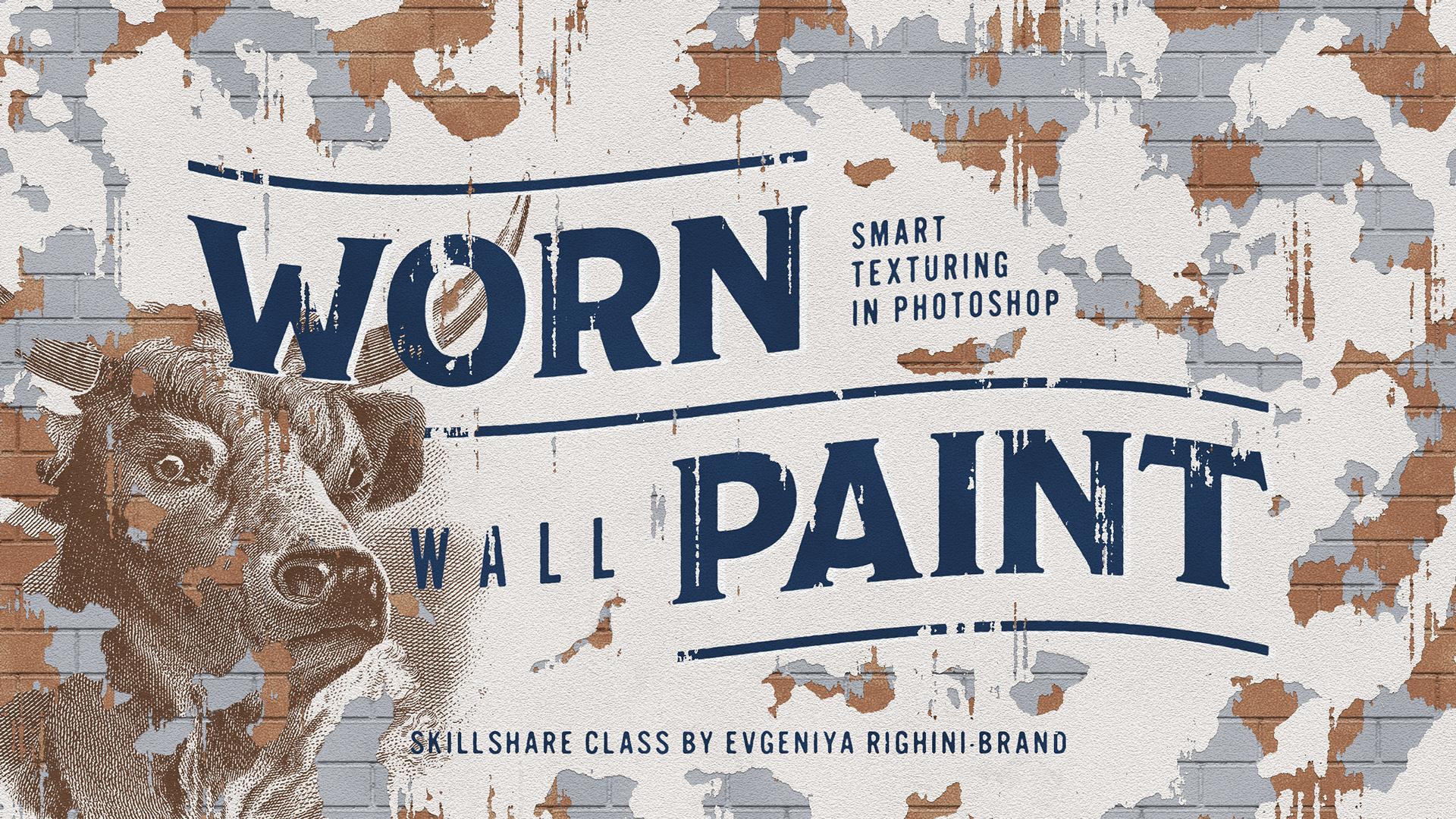
1. Introduction & Overview: Hey guys, this is Jenny from [inaudible] creative. In this class I will share with you a technique for creating awesome textures which imitate wall and paint on clustered and reap walls, uses smart filters in Adobe Photoshop. Without any additional materials, with this technique, you will be able to distress thinking designs or illustrations and give your graphic work and osteological of both sides and vintage Edwards, classical or frescoes or murals for an urban look or street art. In this class, I will show you how to create this textures from scratch. How to apply them to different types of graphics. If you're up for something more complex, I will also share with you how to create exciting multi-layered compositions. Being based solely on non-destructive filters, all these textures are fully customizable. Then I we'll show you how you can adjust them to create different looks. I will be super excited to see how you apply this effects to your work. Join me now and let's make something awesome.
2. Getting Started: Let's begin with setting up a new document. For a better quality results and more realistic application of the effects, I advise you to work at 300 DPI to produce high resolution images, which would work well both on screen and in print. I am going to set the size of my document to 2560 by 1440 pixels, which will turn out to be about A-5 size if printed. This is a good size for trying things out, because it doesn't take ages to render the effects in the size, but it is also sufficiently large, so you can easily share your experiments online. I strongly recommend that you use the same settings the first time you create this effect, to be able to easily follow along and to achieve predictable results, and afterwards, when you understand how this affects work, you'll be able to change the size of the document and easily tweak effect to work in the size of your desired outcome. Use RGB color mode to begin with,even if you're making work for print. As some of the filters will be user, can only be applied in the RGB document. Keep the bit depth to eight-bit. Because you won't be able to apply some of the filters in the document, set to high-in depth. Now let's give this document a descriptive name so it can be easily found later. So everything was ready and I can create a new document. When the document opens up,let's quickly save it. Save the format to PSD, click "Save", and remember to save your document from time to time while still working. Now we're ready to start creating our first texture.
3. Creating a Random Wear Pattern: The first thing which we are going to be creating is a random wear pattern. For the sake of keeping a [inaudible] , let's start by double-clicking on the background layer and renaming it to Worn Paint. We are going to use this layer to create the smart texture and to do this, we need to right click on this layer, on the Layers panel, then convert it to Smart Object. Before we proceed, we need to go to the post panel and set the foreground and background colors to black and white respectively. This is very important. Make sure you don't skip this step. If you haven't modified your shortcuts, just press D on your keyboard, and this will reset this colors to black and white. Now select the smart object layer on the Layers panel and go to the filter menu, go to the render section and select clouds. These clouds are the basis for creating a random worn pains texture. You can see them in a smart filter on the Layers panel. Next, we need to apply a few more filters on top of the clouds to make them look more graphic. While the smart object layer is still selected, again, roll to the filter menu and select filter gallery. Here, we need to have three different effects stacked on top of each other. Let's add a couple more effect by clicking on this button. Now, we need to set the bottom effect to green located in the texture section. Then let's add the middle effect to reticulation from the sketch section. Finally, set the top effect to torn edges also located in the sketch section. Make sure that all three effects are visible, and their order is exactly this. With all of the effects in place. Now, we need to set them all up so that in combination, they would create a look where after. Let's start with the Grain. I find that this works really well when the intensity, Is set to about 30, and the contrast is set to 100. As for the grain type, I like using soft. But you can also experiment with other types to create slightly different textures. Next, let's set up the articulation. Again, you can explore different settings here, but i find the set and density to two. Foreground level to zero and background level to 50, works best when you just want contrast exposed of black and white and not a lot of specs within them. Finally, let's adopt the torn edges effect. To make it work properly. Make sure to set image balance to a value between 20 and 25. I find that 23 works best. Then set smoothness to 14 and the contrast to 15. While there is some room for experimentation with the grain and reticulation settings, torn edges effect works best with these settings. Changing them will drastically change the look and won't really work for the texture we are creating. If you're familiar with this effects, you might think that it will actually be enough just to use the torn edges here. Let's just quickly hide these two effects to see how it would look. It does work, but the edges are not that exciting. When you add grain and reticulation, the edges become rougher and less clean. We get all this additional small details and random flakes which make the look more natural. Also grain in reticulation here, allowed to customize the texture filter. Then we'll have a look at how you can take them to create different variants of the texture by their own. For now, let's start with the settings I'm using. An experiment was adjusting them later on when customizing the effect. Click okay to play this filters when you're ready. Now, you can see the filter gallery effects here on the Layers panel above the Clouds. You can adjust this effect at anytime by launching the filter gallery window by double-clicking on this name here. If you double-click on the Clouds here, they will be rendered and the pattern will change. You can carry on re-rendering Clouds until you get the patent you like most. Everything here is editable and this is the beauty of using smart filters instead of the regular destructive ones. Now, let's add a couple of adjustments to have a further control of this texture.
4. Adjusting the Wear Pattern: A part from randomizing the clouds, one thing you most likely would like to change is the balance between white and black areas. In our pattern here, black areas will soon become holes in the paint surface. The white areas will contain the image, color, or any graphics which you want to distress. You can tweak how much of the paint surface you are keeping and how much you want to appear to have flaked off. My workflow is based around for the show Creative Cloud functionality. But if you have an older version of Photoshop, you still can create the same effects, but with a few workarounds. Please refer to the notes for this video and watch out for the notes, add it to other videos, which will help you out with the workflow differences along the way. To adjust this pattern, make sure you have the smart object still selected. Then go to the Menu, Image, Adjustments, and select Levels. Click Okay to add levels to the stack of smart filters on the Layers panel. Then drug Levels and place them between the clouds, and the Filter Gallery effects. This is very important because filters are applied on top of each other, and we need to adjust clouds using levels before we apply the Filter Gallery effects. Now double-click on the Levels to adjust them. Make sure that the Preview is checked here, and make adjustments using any of the sliders or a combination of them to achieve the desired effect. Moving the highlight slider in will increase the amount of white in your texture. More in the shadows slider in will increase the amount of black areas soon to become gaps in the surface. You can also use the mid-tone slider to adjust the contrast in the texture. Here, you can only see the changes made to the clouds, and not to the graphic texture. To see the updated effect, you need to apply the adjustments first. Adjust levels as much as you want. Remember that you can go back to edit on them at anytime by double-clicking on them here. For now, this amount of wear in the texture looks good to me. I'm ready to move on to the next stage of building the effect.
5. Creating Holes in the Wear Pattern: After we have created and adjusted this black and white texture, let's add another layer below it. Ultimately, we need something which in the end will imitate an under-paint or a whole surface underneath this layer. Let us go to the create new field or adjustment layer button on the layers panel and add a solid color layer, which we will texture later on. Set that to any color for now. I will go for something like this. This color should make sense as an under-paint. But also it will work nicely with whatever graphics you are going to texture. You will need to adjust this color later to make it look realistic. For now, use some gray or beige color like this and click okay. Then go to the layers panel and drag this solid color layer underneath the smart object layer with the texture. At the moment, we cannot see the contents of this layer. Now, we need to make the black areas in the texture transparent to be able to see this layer through the gaps. On the layers panel, right-click on the smart object layer. In this menu, select blending options. In the layer style window, which will open, check preview to be able to see the changes. Now in the main blending options section, go to the blend if settings. Make sure it is set to gray here and on the top slider, move the black toggle to the right. The further, you move the toggle in, the more transparency you create in your texture instead of the black and shadow areas. To better control the level of transparency between different dark shades and to include more details, you can split this toggle by dragging one of its parts sideways while holding down the Alt key. Don't worry, if you still have some black or gray bits showing up. These won't be visible after we use this layer for masking. This will do for now. Let's click okay to apply the blend if settings. This looks good to me. But if you need to change the blend if settings after you have applied them, just double click on this icon with two overlapping squares next to the name of your smart object layer. Now we've got this worn texture and we'll be using this visible areas as a clipping mask for our graphics. In order to use this layer for masking, we need to put it in a group on its own. Select just the smart object layer on the layers panel and press Command G or Control G in Windows. Now, this layer will appear to be in a group. This step is crucial and if you miss it, what we're going to do next will not work. Make sure that your texture with transparent areas is in a group and collapse this group for now, because next will be working outside of it. Make sure that the solid color fill layer is outside of the group and below it. Now it is a good time to rename this group to make it easier to navigate through the document. We'll give it the same name as the smart object inside. Now, let's put something inside this texture.
6. Adding an Image into the Texture: With this effect, you can easily distress any images and I will show you how to get the most out of different types of images, vector graphics type and fill layers later on in this class. But to begin with, let's use the most straight forward thing to texture, which is a roster image. I've got this vintage illustration here which I want to texture can make it look as if it was painted on the side of a building. It has a right aesthetic quality for something which could have been a mural and I have extended its background so it would easily cover the whole canvas with my texture. I won't need to worry about adding extra layers to imitate the color of the wall paint. I suggest you grab any imagery like which would look like an authentic wall painting. Open your image in Photoshop and go to image, image size, and make sure that it is often sufficient size to cover the whole canvas with your texture. If it is larger, then great and if it is slightly smaller, you will probably get away with it too. Now let's go back to the texture document and on the Layers panel, let's add a new empty layer. Make sure it is edit above and outside the group with the texture. Now let's rename this layer so we know that it contains our image. Then right-click on its name and in this menu, select "Convert to Smart Object". Uses smart objects to continue designs or illustrations will make it very easy to solve them out later and to apply these effects to any other images without create a mess in your master file. Double-click on this layers thumbnail to open the Smart Objects contents as a separate document. Now, go to your image file, select the whole image by pressing Command-A or Control-A in Windows, copy it, and go back to the smart object file and paste it into it. Because the smart object file has the same format as our main document, here you can work on the placement of your graphics. Press "Command Z" or "Control D" in Windows towards the free transform mode and resize and rotate your image if necessary. Press "Enter" to apply changes and exit the free transform mode. Using the Move tool, move your image into place and then when you're happy with everything here, press "Command S" or "Control S" in windows to save changes to the Smart Object Document. Close this document and go back and see the changes applied to master file. After we've have edited an image, we need to clip it to this group with a texture inside of it to be able to see the effects applied to the image. To do this, hold down the Alt key and click between the smart object layer with the image and this group when you see this icon appear. This will clip the smart object to the contents of the group and use this texture as a clipping mask. Now I can see how the image works with the warm texture and I'm going to quickly re-render the cloths [inaudible] where in different places. This looks better. This was the first basic step of texture in the image. Next, we need to add a bit more realism to it.
7. Adding Volume to the Worn Texture: At the moment, this texture looks rather flat. To make it look more realistic, we need to add some volume to it. This can be easily achieved by adding subtle shadows to the edges on the inside of this gaps in the paint. Go to the Layers panel, select the group with the texture and the layer you have clicked to it, and group them together by pressing "Command G" or "Control G" in Windows. Rename this group so you understand that it contains your distressed graphics. Make sure that you still have the sorted color layer separately below this group. Now, collapse this group so you don't get distracted with its contents. Then right-click on it and select blended options. In the Blending Options window, go to the drop shadow section, check it and click on its name to access its settings. Set the color to black and blend nude to multiply. This shadow should add a little bit of definition to the worn paint layer so you really should keep it rather small like this. Just think how it looks in real life. Paint layer is quite thin and it cannot cast long or a strong shadows. This just doesn't look right. So set distance to one pixel, spread to zero percent and size to one pixel. If you're working on a larger format or on a larger scale of the texture, you might also get away with slightly higher size value, but probably not more than five pixels. Just check out how it looks and make sure it is still realistic. Capacity allows to adjust how pronounced the shadow will be. Setting it to 50 percent is a safe bet, but you can also explore other options especially if you want the shadow to be subtler. Adjust the light source angle if you want. I like to keep it coming from above, so I will be keeping it to 90 degrees or something around this angle. Also make sure that contour is set to linear because in this case, it produces the more subtle result. When everything is ready, click ''Okay'' to apply the drop shadow. You can see drop shadow hinted as a smart effect to this group. If you cannot see it here, just click on this Arrow icon next to the Effects icon. Make sure that the drop shadow is added to the whole group here and not to any of its contents. If I toggle the shadows visibility off and on on the Layers panel, you can see what difference it already makes. It is quite subtle, but there is already some volume to this texture. Now it is also a good time to adjust the color of the layer, which you can see for the gaps. Double-click on it and set it to a color which works better with the colors in the image. Next, let's work a bit more on the overall surface texture.
8. Creating a Rough Wall Texture: Even though the illustration I'm using here for demonstration already has some texture, because it is a scum of a print, it doesn't look all that nice or realistic. Next, we need to add some subtle or old texture to make the wall surface appear rougher and for this, we'll need to add a few more layers with various effects. Go to the "Layers" panel and add a new solid color layer, set the color to white, and click "OK". Make sure that this layer is above the group with the image and rename it to something like rough surface. Then convert it to smart object, the same way we have done before. Given the layer selected on the "Layers" panel, go to the "Filter" menu and launch filter gallery. By default, Photoshop will open this window with the same effects we've used plus last time. This time, we're going to need only one effect here. So let's delete the other two. There are different effects you can use for texture and a wall surface. One of which is the texturizer, set to sandstone. If you're working on a large scale, something like a three or larger, or generally want to have a very over this rough texture, this effect can be great because here you can control its scale in relief strength. If you're using this effect, make sure to keep the light angle the same as you used for the drop shadow. So for me, it is top. If you want to have a more delicate texture when you start scaling this texture down, you will notice that you get this always repetitive pattern, I'm not too keen on it. So when working on a smaller scale like this document, I like using the node paper effect from this case section instead. In a way, it has got a very similar texture to sandstone, but it is more subtle and there are no obvious repeat patterns going on. Here, I'm going to take the settings a little and set the gradient to 12 and relief to 8. I am going to keep image balance set to default 25 because we have the texture and a solid color here and image balance in this case, doesn't have any effect. As for these two settings, they are quite self-explanatory and you can easily play around with them to twig them to your liking. Just keep in mind that if you decrease the relief amount too much, you will make the texture look flat which defeats the purpose. Consider starting with the same settings I am using and adjust this effect later when you know how it works with your image. When ready, click "OK" to apply this effect. Here it is on the "Layers" panel. Now, let's select this layer and changes in blend mode in the drop down here.to multiply. This already looks so much better, but apart from the orange texture, this wall surface still looks rather clean. The next step is to make it look more uneven.
9. Making the Wall Colouring Uneven: Regardless of whether we're dealing with the painted walls with or without a layer of plaster underneath the paint, it is rare to find an old weathered wall which has an even color in front. This might be due to the way it has been painted, or because of the moisture which gives the wall an uneven mottled texture, or slightly different intensity of colors. Let's make this coloring appear uneven. On the Layers panel, create a new empty layer above all other layers. Rename it to something like uneven patches, and then convert it to Smart Object. Make sure that you still have black and white as foreground and background colors respectively. Then go to the menu Filter, Render, and select Clouds. When the clouds are added, set this layer's blending mode to either Overlay or Soft Light. I will start with Overlay, and then turn down the layers opacity to around 15 percent. This already looks better, but I like to add a couple more effects on top of the clouds. The same way as with the worn texture, I would like to add levels to be able to adjust this texture. Again, levels, draw a lot of control over the clouds contrast. This way, you can tweak this texture a lot. I'll go for something like this for now. Also, I want this texture to be more graphic and less smooth. Let's go to the Filter menu and again, open the Filter Gallery. Here, we're going to use two of the three effects which we used when creating the worn texture. Let's add another effect to the stack, and then set the bottom one to grain, and the top one to Reticulation. These two effects together can create an exciting and uneven grainy texture. Let's set them up. Let's start with Reticulation, and set the density to 14, foreground level to around 35, and background level to around 2. Next, let's go to the Grain settings and set intensity to 100, and contrast to 50. Set the Grain Type to either Regular or Soft. Both work well in this case. I will use Regular this time as it creates rougher edges which I like. If you want to adjust this texture a bit further, play around with the foreground and background levels in Reticulation. These are the main two settings which allow to control the spread of dark and light areas in this texture. When ready, click "Okay" to apply this effect. Now, on the Layers panel, you can toggle the visibility of this effect off and on to see how it affects the texture. If this looks too rough for you, you can hide this effect for now, or you can double-click on this Blending Options icon here on the Layers panel and adjust the intensity of this texture by reducing it's opacity value. I'll go for 50 percent here for this one, at least for now. This will do. This texture affects all the layers below it, and this is fine. But I also want to emphasize the uneven texture of the bottom layer separately. To do this, I will simply hold down the Alt key and drag this layer below this group with the image. Now, I have two layers with the same texture. The bottom one emphasizes it in the gaps. You can keep this layers exactly the same. In this case, bear in mind that if you re-render the clouds, they will be different for both layers. To make them the same again, you will need to delete one of the layers and copy the one with the pattern you prefer. Personally, I'm not too fussed about keeping these two layers the same. I like to weaken the bottom texture even further to make it look harsher. To do this, firstly go to this Filter Gallery effects Blending Options and turn its opacity back up to 100 percent. As it is only visible through the gaps, it makes sense to make it more apparent. Then keeping this layer selected, go to the menu Filter, Render, and select Difference Clouds. This effect will be added on top of other effects in the stack. We will need to drag it just above the clouds effect, because this is what we need it to effect. Difference Clouds effect further randomizes the clouds pattern and allows to have smaller clouds. This is quite useful for this texture. After adding Difference Clouds and putting them above the Clouds effect, you can re-render them until you get the texture in the gaps which you like. Something like this looks good to me. But at the moment, this textures are a bit too much for my liking. I'll turn down the opacity of the bottom texture layer to about 10 percent, and then turn the opacity of the top texture layer a bit more to about 5 percent. It might look very subtle, but the texture is there, and this works for me. But you can keep it more apparent if you like. These two textures are such a subtle touch, but they make all the difference and make the surface look more realistic. This is a plain painted wall done. It could work as it is, especially if you want to imitate the look of a plastered wall or classic frescoes. But to me, I'm not going to stop here. Next, we're going to create a brick wall texture.
10. Creating a Brick Pattern: The first step in creating a brick wall texture, is making a brick pattern. Let's create a new empty layer and rename it to bricks. Convert into smart object and make sure that it is above all other layers in the document. Then double click on the layer thumbnail to open up the smart objects contents as a separate document. This smart object will contain the brick pattern which we're going to create from scratch. Make sure that you document only has a transparent layer in it and the foreground color is set to black. Now, select the rectangle tool and draw a rectangle in a shape of a brick. Something around 400 by 150 pixels, looks about right. But if you want to have a shorter or longer brick, you can definitely do that. If you're working on the larger scale, you might need to create a larger brick to begin with. Bear this in mind. After you have drawn your brick, go to the Options bar on the top of your workspace and adjust the size further if necessary here. Make sure that mode is set to shape, then set fill to none and set stroke to black. Next, set the stroke width. The setting will determine how thick the layer of mortar between the bricks will be. You can play around with this value depending on how delicate you want your wall brick wall to look. I will go for 10 pixels here, which looks about right for this brick size. In the stroke options, set the stroke alignment to center here and that's how our brick done. Now let's make a pattern out of it. To make it easy to learn everything, go to the menu view and make sure that Snap is on. In Snap 2 options, layers are checked. Now using the Move tool and holding down the Alt key, drug this brick down and sideways until it snaps to the middle of the brick above. Make sure that the strokes of both bricks are aligned. They should also snapped to each other like this. Then repeat the process by Alt drag in this shape one more time and snap it into place here. Zoom in to check that everything is aligned perfectly. Now, we need to select a fragment which we'll use as a base for the pattern. Pick the rectangular Marquee tool and carefully create a selection starting from top corner here and go in to the inside of this stroke, and down to the top of this stroke. Make sure that your selection is pixel perfect and it touches all this size exactly this way, and there are no empty pixels around and no overlapping here. When the selection is correct, go to the menu, edit and select define pattern. Give your pattern a name and then click Okay. Now you can either delete these layers or if you want, keep them to quickly create a new pattern with a different stroke weight later. In this case, group them and hide this group. Now let's fill this document with our partner. If you still have a selection active, press Command D or Control D in windows to deselect this area and zoom out to see the whole Canvas. Then go to the layers panel and add a new pattern layer. Pick your brick pattern from the patent searches here and then scale your pattern so it creates an effect here after. I think 50 percent works well for me here as I don't want to have very large bricks or a close up look. Ultimately, you will need to check how it looks in your master file in relation to the images you are texturing into the scale of the texture you are using. But this can be tweaked at anytime later. For now, 50 percent is good. Let's click Okay. There are two great things about using pattern fill layers instead of filling layers in using the Paint Bucket Tool. One, is that you can easily edit the scale of your button at anytime by double-clicking on the layers from now here. Another one, is that you can reposition the pattern easily using the move tool, so you can avoid awkward edges. After we have created, scaled and position our pattern, we need to save this Smart Object in Document, and after saving, it, we will be able to see this pattern in our master file.
11. Adding Realism to the Brick Pattern: Now back in our master file, we need to add a effects to this button to create a more realistic texture. Let's start by selecting this layer and changing this blending mode to "Soft Light." Then right-click on the layer and select "Blending Options." In the layer style window, make sure this preview is checked. Go to "Bevel and Emboss" section. Here, first of all, go to the "Gloss Contour" and set it to "Rolling Slope Descendant." Then set "Style" to "Emboss," "Technique" to "Smooth," "Depth" to 100 percent, and "Direction" to "Up." With this scale of my button setting "Size" to about 10 pixels works great. But you might need to try different settings depending on the size of your brick pattern. Keep "Soften" to zero if you want to have harder edges. Keep the angle of light source the same as you used before for all the document and what you have set the drop shadow to. I keep it at 90 degrees or top position. Make sure that the highlights are set to white and the highlight mode is set to "Soft Light" at about 65 percent opacity and the shadows are black, set to "Multiply" and about 75 percent. If you want to go for a more contrast look, you can increase the opacity of the highlights and shadows, but I generally prefer a more subtle look. When ready, click "Okay" to apply this effect. At the moment, these bricks look very clean and uniform. Next, let's add a few filters to make them appear rougher. Keep this layer selected and go to the menu "Filter," "Noise," and select "Medium." Here, set the radius value to about two to four pixels or a higher value if you are working on a larger scale pattern. Just be sure to check preview and get it looking right. Median noise softens all the corners, which is really useful as bricks don't have super sharp edges. Click "Okay" to apply this filter. Next, go to the menu "Filter," "Distort," and select "Ripple." I will set size to medium and amount to about 20 percent. This will roughen all the edges a little. Depending on the scale of your brick pattern, play around with the settings to get the rough look you like. Then click "Okay" when you are ready. The mortar looks the same and rather dark at the moment. Let's go to the menu "Filter," "Render," and select "Difference Clouds." Now the surface looks more random and there are lighter and darker gaps between the bricks. Remember that you can re-render the "Difference Clouds" pattern at any time if you want to change where darker and lighter areas in the brick pattern are. At this point, you can also add "Levels," "Adjustments" on top of the "Difference Clouds," the same way we have done before if you want to have more control over this pattern. But this is not essential. One last thing I want to add here, is a little bit of texture to the mortar between the bricks. Let's yet again go to the "Filter" menu and launch "Filter Gallery." Here, I only need to keep one effect, which I will set to "Craquelure" from the texture section. As for it's settings, you can play around with them to get as much or as little texture as you want, I like to set the "Crack Spacing" to somewhere between 25 and 50. Set "Crack Depth" and "Crack Brightest" to about five. When this texture looks good to you, click ''Okay" to apply this effect. Now you can see it in your document and adjust as a little more subtle variation to the texture and makes the mortar look a bit more realistic. After you have set up all this effects for the brick pattern, you might also want to revisit the "Bevel and Emboss" settings by double-clicking on the effects name here. Since now you can see the final result, you can tweak the settings to fine tune the look. I am going to slightly increase the size value here to have more pronounced gifts between the bricks, like this. As a quick alternative, you can move the brick layer underneath the group with your textured image to have a different look, which will make this image appear like it has been painted on a thick layer of plaster. If you are creating this look, you can also make the painted plaster layer appear thicker by modifying the drop shadow settings for this group. Increase "Distance" and "Size" values here and see how these gaps become more pronounced. But again, try not to overdo it because if you do, it won't look realistic. Also, if you want to have a little bit more of this mortar texture visible for the plaster you can drag this brick layer while holding down the "Alt" key and put it's copy on top of all other layers. Make sure that you duplicate the layer and not create a new smart object while copying. Because this way you won't be able to adjust the pattern inside of the smart object for both brick layers at the same time. Here's a regular copy. We need to turn it's opacity down to make this texture look fainter. There's just a tiny bit of texture which makes the plaster layer appear a little less thick and flat. If you don't turn the opacity down, it'll just emphasize the mortar texture instead. Keep this brick alternatives in mind to create different looks. For this image, I'll go back to the original look with a brick layer on top. We're done with this effect here and it looks awesome. I like this not too rough look of the bricks. We just add a little bit more of an urban feel to the work. But of course, if you want rougher bricks or a more realistic brick coloring, you can carry on working in this direction. As this class is not specifically about the brick texture, and this is [inaudible] and own toward paint effect, I'm going to stop here with creating bricks. Let's go back to the "Worn Pain" texture and have a look at a few different ways, how we can customize it further.
12. Creating Alternative Textures: Because this texture is based on a number of smart filters, we can now easily modify each of them to create alternative looks. When you start creating alternative effects, make sure to save them as separate files so that you can easily use each of them in the future. Let's start with the Filter Gallery effect for the worn paint texture. The main effect to experiment with here is Grain. Changing its settings can allow you to considerably modify the texture. Even if you keep all other settings the same, changing just the Grain Intensity on its own, creates a different look. This texture can totally work if you want to have smaller flakes in your worn paint texture. You can also experiment with different Grain types, so look for them to see how the older the texture. I really like the look created by Vertical Grain. Now, I need to go to the Reticulation effect and compensate for all these funny edges created by the Vertical Grain. Here, I will increase the Foreground Level value to maximum to have this very contrasting pattern instead. After adjusting the Reticulation settings, let's go back to the Grain settings and play around with its intensity. With the higher intensity values, these vertical lines become more pronounced. You can make them as strong or as subtle as you like. I will stick to something around 50. Here is a totally different worn paint texture. If you like it, click "Okay" to apply changes, and save a file with this effect under a different name from your original file. Now, I will go back to my original effect so I can show you another of my favorite textures which you can make with this filters. Let's go to the Filter Gallery filters for the worn paint texture once again. Let's start with the Grain. Before, we had this combination of these two settings to create solid shapes, but if you start reducing the contrast, you will start creating an alternative look with small flakes instead. Set Contrast to about 50, then move the Intensity to 100, and change the Grain Type to Regular. Next, go to the Reticulation and increase Density to about five, but keep the other two settings the same. Then let's go to the Torn Edges and reduce Image Balance value to about 11. Even this is too little or too much texture for you, you can go through the same settings we have just changed and experiment with them further, for example, reduce the Grain Contrast even further. This looks good to me, so I will apply changes. Here is a very subtle worn texture. Now you can go and adjust the spread of this texture using the Levels adjustment for this layer. If you want to have more air overall, just increase the amount of transparent areas in the clouds by moving black and meet those indicators to the right. Apply changes to see the updated effect. Again, if you like this effect, save this file under a different name and don't overwrite the previous file. Here are all three alternative way it looks, but be sure to explore this effects even further to create other looks.
13. Effects Adjustments: Regardless of what effect you are going for, remember that you can re-render clouds to create different texture patterns. Since we have applied clouds, torn paint, and even patches and bricks, there's a lot of clouds to modify. Also, keep in mind that you can adjust levels to increase or decrease amount of wear in your texture. If you want to make the colors on your wall look more uneven, go to the Uneven Patches layers and turn up the Opacity. If you want, make more of these layers, and randomize the clouds they contain so that the patterns are different every time. For a slightly different look of this effect, you can also change the blend and mode of these layers from overlay to soft light. Remember that you can also revisit your brick pattern file and change the scale of your pattern or change your patterns placement to better work with your image or overall format. If you feel like you need to modify the pattern itself, use these shape layers if you have kept them, or create new shapes using the rectangle tool. In any case, keep this tool selected on the tools panel to be able to change the shapes properties here. For example, change the stroke weight for all these shapes and then create a new pattern. Now, you can turn this group off again, turn on the pattern layer, double-click on it, and change the pattern to the new one you have created, and here is your updated pattern. Make sure to save the smart object to apply changes to the master file. Also, don't feel obliged to create repeatable patterns. You can totally draw and manually arrange the shapes, especially if you're already working in your final desired format, so you can easily create a brick wall made up from different size of bricks or you can create other patterns here. For example, a pattern of a large block of stone or concrete, which would look great with the worn paint effect. If you're working on a large scale and would like this rough surface to be more pronounced, remember to go back to the filter gallery filters, for the rough surface layer. Here instead of Note Paper, set this effect to Texturizer, and select Sandstone here. Increase the scale, and setup the rest of the settings to your liking. Apply changes, and enjoy a rougher texture here. Another thing you can try out is inverting this texture. Select the smart object layer on the layers panel and go to the menu Image, Adjustments, and add the Inverted Adjustment. It will be added on top of the stack here. Now, instead of having a painted wall with bits flaked off, we have this remaining flakes here instead. If you're going for an ultimate worn painted plaster look, this would have worked quite nicely. This look is even more realistic when the brick pattern is underneath this group. Remember that adjusting levels here will allow you to control the amount of paint you have left. If you don't want to have this inverted texture, just hide the invert effect here, but keep it for future experiments. You always have this other option handy. This is as far as the effects adjustments are concerned. Now, let's have a look at how we can distress different types of graphics.
14. Distressing Different Types of Graphics: Once you have built your effects, make sure that you give your master files handy. So that you can easily texture any other images in future without a need to go for the process or building this affects again. To swap out the textured image. Go to the Layers panel, and double-click on the smart object, which contains it. As always, this will open up the Smart Object Contents as a separate file. Now, all we have to do is copy another image you want to texture and place it into this Smart Object Document, resize and position it the way you want it to be. When you ready, save this document. Here is your new image textured. At this point, you will most likely need to adjust this color under any of this group to make it work better with this particular image. You might want to randomize your warm paint texture so that it better suits this image and looks different from your other images. So far, we worked with roster images which fully cover the canvas. But with this effect, you can as easily texture images or shapes without background, including demographic composition or vector graphics copy it from illustrator. For example, I have this type of graphic composition which should go together with this image. I could add it to the same smart object which contains the image and work with it this way. But in this case, I want to give it within a separate smart object and you will see why in a moment. So let's create a new empty layer, above the Smart Object. Rename this layer, and then convert it into a Smart Object. Now let's go and edit its contents. I've got this typographic composition saved in my creative cloud library. But you can create typographic compositions just as well within Photoshop. I will just drag it to make canvas and resize it. I know what size my type composition should be and where it should be placed here. So it is easy. But if you need to align type with image which is not inside of the same smart object, you can either place your image here just for the sake of creating composition and then delete it or you can scale and mold the type composition around in the master file afterwards. Now, I need to quickly change the color of this text. I can easily do it by adding a new solid color fill layer and setting its color to the color I want to use in this case. Now, I need to clip this solid color layer to a typographic composition like this. I am done here. Let's save this document. Now, it is visible in my master file. To distress this layer with the same texture, you need to clip it to the lay below by old clicking between them. Being able to clip multiple layers to the same texture like this, is very handy. Because this way you can create quite complex designs which consists of multiple layers. Just keep an eye on the order of the layers here and make sure there is no other irrelevant unclipped or hidden layers lurking around in between which will stop clipping from working correctly. This is done. Now, this typographic composition looks rather clean even though it is textured. Let's add a couple of effects to this layer to make it look a little less digital. Select the smart object layer and then go to the menu filter, noise and select medium, set it to one or two pixels or maybe more depending on your type size. Just so from the shapes of it but don't destroy the structure. Click okay, to apply this effect. Now, let's go to the Filter menu again and select distort rebel, set size to medium and demand to about 20-30 percent. Or maybe a bit more or a bit less depending on the type size. Let's apply changes and here is my typographic composition, looking more like it has been hand painted. Adding these effects to this type and controlling them in the master file was the reason for keeping it as a separate Smart Object. Now I have another placeholder which will work for any other typographic compositions or web pick illustrations which need to be softened up a little. Again, let's go into this Smart Object. Firstly, hide all the layers you got here because we don't need them at the moment. Now let's put an illustration here instead of the type composition. I want to texture this whale vector illustration. So I will edit to this document. Here it is against transparent background. Now I'm going to save this document and go back to my master file. Here, as you have this image visible below this whale. I don't want it here. So let's hide this image for now. As soon as you hide this image which covers the whole canvas, you get this wide texture here instead, which comes from this layer. This could be okay if you want a white whale. But in all other cases, you would want to be able to change this color. This can be easily done with another solid color layer. It is from this menu. Set the color to any color you like and then it light changes. On the Layers panel, make sure that the solid color layer is above the group with the texture, but below the layer with the whale illustration. Clip this layer for the texture group. If it is already clipped to it, you will see this arrow here. So this is the solid color worn paint. The same way as adding a solid color fill layer, you can add a gradient fill layer from the same menu. In this window, click on gradient here to open the gradient editor window. Here set the gradient to a percent you like or newly defined Galois stops on the gradient slider here. Click Okay to apply changes. Then go back to the gradient seal setup window. Here you can change the gradient style, angle and scale. While this window is open you can also drag the gradient around the canvas to change its position. When ready you apply gradient and enjoy your colorful paint as well. Again, you adjust the color on the background to work with the other colors here. This looks like fun. Another thing that you can use with this texture is a part of the field layer. Let's hide this layers for now and see how it would work. Add a bottom fill layer from this menu. In this window, select the button that which you want to texture. In this case, you will need to make a pattern preset beforehand. I've got this button here which could work as a painting on the wall. So I will use it. The same way as when we were creating the brick pattern, adjust your pattern scale, and move it around to position it nicely within the Canvas. Click Okay to apply pattern. Photoshop automatically clip this pattern layer to the texture. But if you don't have it clipped, then do it yourself. When it comes to all decoration, repetitive patterns are really more about wall papers rather than painting on the walls. So big patterns, which makes sense in this context. Something geometric or abstract. You can distress any number and any type of graphics with this texture. You can build sophisticated compositions by using multiple smart objects with different design elements. But also, you can take this textures a step further and mix them together to create complex surfaces and multiple paint layers.
15. Combining Multiple Textures: To use multiple texture and effects to distress the same image, all you will need to do is to add another one paint texture layer within the same group. You can drive it from another document with a different texture in effect already created, or you can just copy this layer, and adjust it afterwards. That's what I'll do. After I have copied this layer, we cannot see any changes because these layers are exactly the same. We can start randomizing the clouds. The wear pattern has changed. But now there is less wear generally. This is because these two textures add to each other and increase the surface coverage. Before addressing the overall wear amount, let's go to the filter gathering for the top texture and change the texture in effect. Here, I will go for vertical grain, but you can use any texture alternative you want. This is a different texture. Let's click 'OK' to apply it. The texture has changed again, and now it has got more variation to it. Now I can go and adjust levels to create more wear in this texture. Remember, more black, more wear. So this will do. Let's apply the changes to see the updated effect. I quite like this because the texture now is not too rough as it was with the vertical grain effect, and it's not that smooth as it was with the original effect. Another thing I can try here is inverting this top texture. If you don't have an invert adjustment hidden here in the stack of the effects, then go to the menu Image, Adjustments and add invert from here, and this is looking great. So keep in mind, that inverting some of the textures might give you more room for experimentation and could enable you to create more exciting textures. There's the logic of combining different textures to distress the same graphics. In here, you can use as many textures as you want. Just remember that the more you add, the more surface they will cover. You will need to adjust them to get the desired amount of wear. So play around with different textures and render the clouds and see where it takes you.
16. Creating Multiple Worn Paint Layers: You can also create a more complex layering effect, by using multiple textures and multiple paint layers. In this case, you will need to have a number of groups containing distressed graphic layers and textures, used to distress them. Let's say I want to have another paint or plaster layer above this one. I will start by copying the whole group here. Because I have copied this group with all its contents, this smart object is a direct copy of the one in the group below. If I added the contents of either of them, the changes will be applied to both of them. If you want to have different contents, you can either create a new smart object from scratch here, or you can right-click on this one, and in this menu, select new Smart Object via Copy. Here it is, it is not linked to this smart object, or the one in the group below. When you edit it, the changes will be only applied to it. You can now remove this duplicate smart object, and clip the new one to the texture below. This is just so you remember how copies of the smart objects work. I'm actually not going to use a graphic layer here at all, I will delete it altogether. Instead, I will go and add a new solid color fill layer here. Set the color, and then cleave this layer to this texture group. I need to do a little bit of work on the texture, to get it looking right. Here I am going for a look of not too large areas of paint, on top of the layer with graphics. This will surface as more layers and more depth to it. I can quickly check out an alternative layering, by putting this paint layer below the one with distressed graphics. This also looks quite good, but I prefer the previous variant. Also when you have multiple paint layers, if you have a brick pattern texture, you can play around with where it is positioned. I am going to put the bricks below this group. That's a different look already. As you can see, there are a lot of options, and you don't need to stop here, you can add as many paint layers as you want, and order them in different ways. Just think what you're trying to say with your whole texture. For example, by putting this layers in this order, and placing bricks below this texture, it looks like this wall has been painted with a mural first, then it was plastered to cover the mural. Then plaster fell off and revealed worn mural underneath, this wall has a story. Next, let's have a look at how we can make final manual adjustments to our textures.
17. Adding Final Touches: With all this textures being random and computer-generated, you can easily create a lot of variants and try out alternatives. But because it is all random, there might be certain areas in your textures which are not ideal, so here are two approaches which you can take to manually finalize your textures once you have finished with everything else. The first scenario is that you have too much coverage and you want to remove certain areas to reveal what's below. This might be the case when you're compositing two or more textures to destroy the graphics, or to create a layering effect. For example, here, I like the size of these paint fragments, but here, they cover too much of the image, and your rendering clouds or adjusting levels doesn't help, so in this case, I can use a layer mask and remove the fragments which I do not want. Let's go to the Layers panel, and find the group which contains this texture. Here it is. Now I need to select it and then click on this button on the bottom of the layers panel. This will add a layer mask to this group. When it is white, it means no more areas are masked out. There are a couple of different ways you can add a selection to the mask depending on what you are trying to remove. For example, if you just have a separate fragment like this which you want to totally remove, you can use the lasso tool, draw a selection around, and then fill it in with black. When your foreground color is set to black, you can simply press Alt backspace to feel the selection with the foreground color. To make it work, make sure that the mask is selected on the layer spell. If you want to remove a part of the fragment, again, you can use the lasso tool, but in this case, try to draw a rough selection, which will work together with the style of other edges in your texture. Alternatively, you can select the pencil tool on the tools panel, and from the brushes menu here pick rough round bristle brush. It is one of the standards for the show brushes, which can be found in the thick heavy brushes preset library. Keep the size to this brushes standard 104, or reduce it and then go around painting with this brush on the mask with the foreground color set to black to remove the parts of the paint's fragments you don't want. The edges this brush creates are quite rough, so it works well with this texture, and before you ask, I am using the pencil tool here and not the brush tool because it creates harder edges. There is other ways of getting rid of unwanted texture elements. Another scenario is that you are missing some essential details in your graphics even after a rendering the clouds a number of times. You will need to bring the missing bits back in. This is an opposite process to masking, and to make it work, you will need to add another empty layer to the group with the texture which is used to distress your graphics. Here it is. I am going to hide this texture for now so it doesn't distract us, and now I can start adding back areas which I'm missing. I am using the pencil tool set to the same brush I used for masking, but you can use the lasso tool, create selections, and fill them in. This is how you can take control or otherwise random textures. Remember to add masks or additional layers to bring back details only after you have finalized your random textures. Otherwise, what you mask out or paint back in will be irrelevant after you re-render your textures. Next, let's have a look at how you can resize files with all this effects still intact and we're almost done.
18. Scaling & Saving Your Textured Work: Now a few very important points about scaling your textured work. Do not scale up the master files with all this effects, using the image size menu. As all these textures are based upon Photoshop generated graphics, such as clouds and other size dependent effects, scaling your work this way will destroy this look. Instead, use the Canvas size settings. Here, you can define your desired size in percent in relation to the current size, as well as in pixels, centimeters, inches, and view other units. Input your desired size here and click "Okay." If you have entered the size smaller than your previous size, your canvas will be just cropped, but you will still have access to all the layers and their contents which falls outside of the Canvas. You can move them around if you want. Let's undo this and have a look at what will happen if you increase the Canvas size instead. For example, I will add another 20 percent to both width and height. Here you can see that some layers are still filling the whole Canvas, but other are kept in their original size. We will need to deal with those. At this point, refrain from resizing the smart objects in the master file. Instead, go to the first smart object you need to resize, for example, this brick layer. Here, open the Canvas size settings and change it to the new size of your master file. Apply changes and save the document. Here's the patent covering whole canvas yet again. Repeat the process with the rough surface smart object. Because both the smart object and the one with the break button contain failures which covered the whole canvas by default, you only need to resize the smart object documents. On the other hand, when it comes to the smart objects convenient graphics, there is more work to be done. Let's open it up, now service is changing the canvas size. After it is done, you will also need to resize or reposition the graphics. Or if you are dealing with the raster images, replace them with the larger ones to go for the maximum quality. After updating all these layers, you can also go around and adjust all other adjustable things which I've covered in the previous parts. If you are working on large format, be patient as the effects will take time to render. All of this is not too much work, but it is a little bit fiddly. But once you have set everything up in a new size, you can use it as a texture and template for any other word in the same format. Also keep in mind that you can always resize your final flattened images. After you have distressed your graphics using these effects, save your work as a JPEG, or if you want to print it, save it as a flattened TIFF file without layers. Then open the saved file and resize it. If your final objective is to create some really small outcomes like postcards or banners, if you have been working on an enlarged scale to begin with. Now, when you scale it down to the desired size, you will be able to have smaller details in your work. On the other hand, scaling patent images up is not advisable, as you will lose quality. Keep all of this in mind when creating your texture to work. Now it is time to wrap this class up.
19. Final Thoughts & Conclusion: When creating these worn textures, get inspired by how weathered walls look in real life and how different layers show up beneath each other. Have fun experimenting those layers and effects in your work. Remember that even though you can easily go back to any graphics you have left hidden in your smart objects from your experiments, you will never be able to recreate the same textures. So if you like a particular way of pattern in your texture, be sure to save this file separately as a PSD so you can go back to it and apply exactly the same texture of two other images in future. With this effect, you can make your own designs or illustrations, to apply go signs, vintage adverts, classic frescoes, and murals. If you need these textures to contextualize your work, create mockups, or just create awesome textures work for the sake of urban aesthetics. There are plenty of options, and I cannot wait to see how you apply these affects to your work and hear about your experience. Make sure to post your work in the Project Gallery for this class. If you are going to share your work on Instagram, please tag Attitude Skills so that we can see it there too. If you have any questions, leave a comment on the community board for this class, and I will happily answer and provide feedback. I hope you have enjoyed this class and learned something new. If you like this class, please leave a review so more people could discover it. Don't hesitate to follow us here on Skillshare to be the first to know about our new classes. Also, be sure to follow our page on Facebook to see what we're up to, get all the latest updates, send us private messages if you need to get in attach about something, and not to miss if you are featured in our students spotlight gallery. If you love textures and enjoy learning how to create different graphic effects in Photoshop, be sure to check out our other classes on the subject and take your graphic work to the next level. So texture lovers, thanks a lot for watching this class, and I hope to see you in our other classes.
 Evgeniya & Dominic Righini-Brand, Graphic Design & Photography