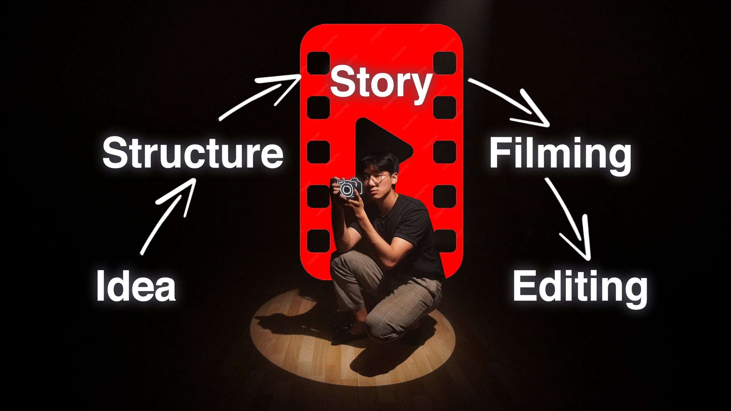
Transcripts
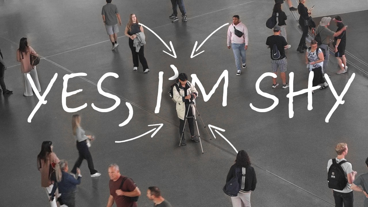
1. Welcome to the Class!: Being completely honest,
between this one and this one, which one would you
actually click? This one really intrigues
me, but this one, subconsciously, I know that maybe it's just
not worth my time, and I just skip it. I notice how I
didn't even show you the video and you already
decided if you watch it or not. How important thumbnails are. Hi, I'm Eddie, and I've been doing YouTube
for multiple years. I've done over 300 thumbnails, and I know exactly what
makes one a good one. And no, it's not
a cliche circle, at popping in my face
with the shocked view. I understand different styles
and their effectiveness. So when we're scrolling
through videos, we just glance at
the thumbnails. We don't really stop and
look and interpret them. So clarity and
curiosity are key. In this course, I'll
teach you step by step, starting from the fundamentals, what you actually
put in a thumbnail, all the way to the
importance of color, composition, focus,
text, how to use text. Everything to make
your thumbnail clear, clean, aesthetic,
and very effective. I personally use
Photoshop to do them, but this course doesn't
focus on the tools. It focuses on the concepts and what makes a thumbnail
a really good one. You can completely follow
this course and make an excellent thumbnail with any photo editing program free
or not, it doesn't matter. But for the class
project, you'll create your very own thumbnail, and you can share it for me or any other students
to give you feedback. With that said,
let's start off with a clear canvas and what to actually include or not in your thumbnail.
I'll see you then.
2. Why Thumbnail Style Matters: Let's start off with a question. Imagine you're the viewer and you're scrolling
through YouTube. What do you actually
pay attention? Have you ever clicked on
a video just because of the thumbnail or is it the
title and the thumbnail? How do they combine
with each other that made you actually
curious about it? So when we're scrolling
through a video, this is what I usually see. We usually see a
thumbnail and a title. And what usually happens
when you're in a sea of other videos with all other thumbnails
and other titles, first, you just
glance through them, and if anyone catures
your attention, you look at the thumbnail first. And then if you're interested, you read the title, and then you might go back
to the thumbnail. Or maybe you read the title
and the title is interesting, and then you go to the
thumbnail and you decide that the thumbnail is good and
the quality is great, so you decide to click on it. But at a glance, when we're
going through so many videos, having a clear thumbnail, clear meaning that you know exactly what the video
is going to be about, or you know what the theme
is going to be about, paired with a good title and a good thumbnail really makes your video very clickable compared to the sea
of other videos. So why are thumbnails
such a big deal? Well, there's two reasons. So first one, you have
the click through rate, CTR, click through rate. And the second one, you
have the watch time, WT. Click through rate means
it's the percentage of people that actually see
your video and click on it. And the watch time is when people first
clicked on the video. So they click on the video, and the watch time is
how long did they watch? Did they watch the video until the end? Then
that's really good. If they watch only the
first 10 seconds of, let's say, a five minute
video, then that's pretty bad. So the watch time and click through rate are two
things that YouTube knows to really know which videos to recommend
to other people. Usually videos that
are bad are not really clickable or the quality
of the video isn't good, which will not really cover, then the watch time
isn't good, that long. It's also relative to
how long your video is. If your video is 2 hours, then having a watch time of a little less watch
time is better, but if your video is short, having longer watch
times is more important. But we're here focusing
mostly on click through rate because that's what really that's when
we really see. So let me delete this one here. Let me take this out. What we're really
looking at is click through rate because when
we scroll on YouTube, we see so many videos being
the one that we choose. Oh, I like this one because it's clear and I like the theme. I like the idea. I see the title
and the thumbnail. The combination of these
two make you want to click, and they affect the
clickthrough rate. So let's look at the spectrum
of thumbnail styles. On one end, you have the flashy, the bright colors,
expressive faces. The ones you really
see that are more geared towards
younger audiences, these ones get high
click through rates, but they might feel a bit
generic or untrustworthy. On the complete opposite of the spectrum, you
have minimalistic, very aesthetic, a
cohesive color palette, elegant colors, elegant,
just aesthetic overall. And this one might have maybe a lower click through rate
because they're less clear, but it builds trust, it builds a brand, but they might not
really stand out through the crowds of
the videos you see. You can personally choose
to do any of these styles. You can go for bold colors or just aesthetics,
minimalistic. You cannot go wrong
with either of them. They just have
different approaches. It just depends on your style. My style you ask, I go more, I would say, here. So a bit further away
from the flashy colors, but not completely minimalistic, I prefer to add some elements. I believe my thumbnails
have a clear focus point. You can immediately tell
what the video is about. And it also sparks and generates a little
bit of curiosity. Everything I'm going
to teach you in this course applies for
the entire spectrum. What makes a good thumbnail
applies equally for the aesthetics to the younger
generation audiences, it really doesn't matter. All the methods apply. If you're a complete beginner, you might feel overwhelmed, but that's completely okay. I used to do thumbnails a
bit more this spectrum, and then I went to
complete with nothing, and then I ended up being
more or less in the middle. Your style shifts just
like your style of videos. You just have to do
it consistently. And throughout the repetitions, you really get to understand
what your style is. It morphs into something very unique that
only you can do. So with that said,
let's start off completely clean,
a blank canvas. The question becomes, what do you even put there
in the first place? There are some good
thought exercises, and I'll see you
in the next one.
3. What Thumbnails Should Show: So we've gone
through the spectrum of the cell of thumbnails, and we noticed that it really doesn't matter
which cell you pick. Good thumbnails are present
in any part of the spectrum. You just have to follow
a few certain rules. So let's start off
completely blank. What should your
thumbnail actually show? I look at my computer and it's completely blank.
Okay, what do I do? And to best answer
this question, I will give off a few examples. So for the first thumbnail, I'll just give you a
few seconds to look. When I glanced at the thumbnail, I immediately got
the impression that the video was about the camera itself and maybe that the camera can print
all of these pictures. And it really just takes
a glance to understand. And it's completely
clear what I mean. And what about this one? Well, when I look at
it, it feels like it's a video about that
very same room, and it has a price. So I would think about, Oh, it's a video about how I stay at that place
for that price. Clear. No doubt about
it. What about this one? This is a more creative
take on the thumbnail. I can see that the main focus
is right on the right here. It's a phone, and the phone is transmitting so much
information into my eyes. So the video should be something about distractions or
something about the phone. And last example,
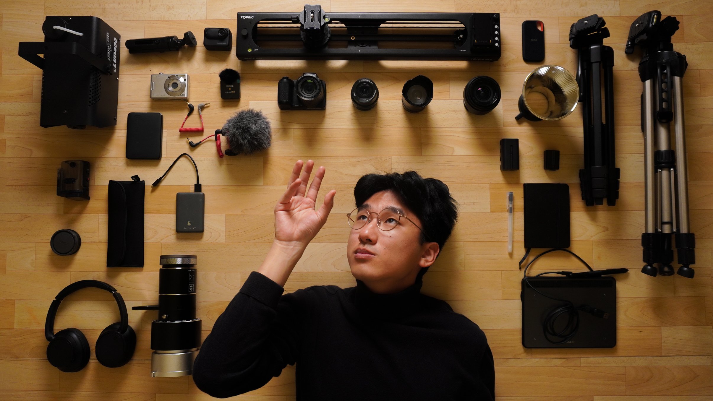
what about this one? I'm surrounded by all this gear, so it should be a video, something to do
with all my gear. As you can see, all of these examples have
something in common, something that makes a
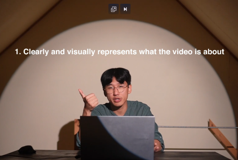
thumbnail a really good one. So at the end of the day, a good thumbnail is first, it represents visually very well and clearly what
the video is about. In all of these, at a glance, I could immediately tell what the video was
going to be about. Two, it should grab the
attention without being misleading or too overly flashy. In all of them, I don't add too many elements to
make it too distracting. I know exactly what I see
is what I'm going to get. And three, it should spark
some sort of curiosity, but that really comes with
the idea of the video. For example, when I
see the camera and I see all of these beautiful
pictures around it, I might get curious to know
what does the camera do? How does it actually perform,
and I might click on it. What makes this camera? So good. For this one, I might be curious to see
how the room actually is. How did I spend time there? Well, what if I told you
there's one level deeper? And this last one, you just
see all the amount of gear, and in itself, I think it's
a very organized picture. And if you're specifically
interested on the gear, then this might be very helpful. So, yeah, these three things make a really good thumbnail, but most importantly, if I had to just give
one global tip, it's that the
thumbnail is clear. It's clear what the
video is about. It really visually tells you in just a glance what
the video is about. That is the most important part. It's clarity. You understand immediately what it's
going to be about. Notice in all of these examples, I didn't even give
you the title. The title wasn't even shown. And you could immediately
tell what the theme was. So the thumbnail paired up with the title really creates
the whole package. The first video is this $30 camera that I bought
that was made for kids, but is really special
because it can print. So the video ended
up being about that. Now, let's flip around and
do the complete opposite. A more realistic approach because when you
first do a video, you first come up with an idea and then a title, and
then a thumbnail. So I'll give you a
title, and in your mind, you'll think about what
would you actually add, and then I'll give you
the actual thumbnail. Renting a friend in Japan, real connection
or just business. So this was the one I took, and it's me pointing
to a person, which was my rented friend. And the most important
part, the thing that gives it
clarity is the text. Without the text, you wouldn't understand that I
would be renting him. So having the price, the exact price that
he costs per hour, made the thumbnail
that much more interesting and more
importantly, much clearer. You really understand that
it has something to do with about renting or paying
someone to do something. And this thumbnail
clearly tells that story. The next one would be to the ones that forget to
celebrate themselves. And the thumbnail,
yeah, it's here. You really see the celebration
part of the story. It's a video about
me graduating from my masters in physics and how important it is to
celebrate these moments. So yeah, the thumbnail really in itself tells
the whole story, me celebrating in the room
that I actually graduated in. And the last one Capsule
Hotel versus Internet cafe. So, yeah, this one
is also clear. Is just an image in the
middle of a capsule hotel and the other half as an Internet cafe and with
a verses in the middle, you can clearly see that this is against this and see
which one is better. That's what the video is about. How were your ideas? Were they similar to how
actually the thumbnail was? I mean, there's no
right or wrong answer. I got to be honest. As long as it's clear and it shows exactly what
you're trying to show, and the story that it conveys, then you're doing a good job. And that's really
the magic of it, because a title can have so many thumbnails that
might adapt really well. It's all up to you and
your ideas what you can do and what
you want to show. There's no right or wrong answer as long as it's clear
what the video is about. So now that you really know
the importance of clarity, this is where we're going to tackle all these different
components, color, composition, text, all of these things that make
the thumbnail clearer. And I will explain
step by step each component for you at the end to combine everything
together and get a clean, aesthetic and
effective thumbnail. So with that said, I'll
see you in the next one, which is about the
quality. See you there.
4. The Power of Visual Quality: The title doesn't really
interest you and the thumbnail is of bad or just
not good quality, then what you usually do is
scroll away, and that's it. You don't really think about it. You subconsciously know that the video was just
not worth your time. Therefore, quality is the
first base of every thumbnail. When I mean, the quality, I mean, two things. So the first one
is the quality of the actual photo because yeah, a thumbnail is a photo. And a lot of beginners do this
mistake and that they use a print screen of one frame of their video after so they first
do the video, and then they uploaded and they see they have
to have a thumbnail. So they just take a print
screen of a frame of the video, and they use that as a
thumbnail or just let YouTube automatically choose a random thumbnail
from the video. And immediately, you can tell that that is not a good thing. Because when you take
a frame from a video, the quality will nowhere be near as good as taking
an actual picture. Taking an actual picture
makes the photo crisp, high definition, and
really nice quality. And the second part
of the quality is that when you let YouTube
choose a thumbnail, you're not really
trying it's not clear, and there is no effort into it. A good thumbnail has
a clear purpose, and just choosing
a random frame of the video doesn't have that
laser focus that you want. Again, how I said it before, clarity is really important. When you scroll through your phone and then
see just the video, you should immediately
know without really thinking about what
the video is going to be. And by having a well
thought organized thumbnail will make your video pop out that much more
because it's much clearer. Let me give you an example.
Imagine you're buying your phone online and
you have the photos of the phone and you don't know through the website which
dimensions the phone has. Maybe you think
that's not important, but maybe for a certain
type of customer, they have maybe a small
purse or small pockets. So maybe the size is
really important for them. Imagine that you really
care about the size, and on the website, they
don't really say it. There's no dimensions. Then it creates this
uncertainty. You don't know. You can ask, but are you
really going to do that? Not really. What you usually do is you go away,
and that's it. You go through another product because that's how
YouTube works in a way. You have thousands of videos, just like thousands of
phones or products. If one creates a bit of
uncertainty and you're not sure, and you just scroll away because you have so
much other choice. The same applies for products. That's why they have all these detailed and detailed photos describing everything you
need to be described, the same should be done for the package that's just a video, that it's your title
and then thumbnail. It has to be clear.
If it creates any bit of just uncertainty or
any sort of doubt of, like, the quality,
I'm not too sure, then people just give up. So that's why I say
the first layer, and it's an important. Of course, not all thumbnails
need to be a photo. I say the example of photos
because that's what I do. I like to take my time and
then frame the photo and take the picture exactly thinking that it's going to
be the thumbnail, because it gives a clear
direction of the video. There are some other YouTubers. I'll give you one
example Tomato anus. Yes, that's the actual name that has impeccable
thumbnails that are Mm. You look at them, and they're
just clean art design, just clean graphic design, and it's incredibly
satisfying to see. And it's effective
because you know, first of all, the
quality, it's there. It's really good. And second
of all, gives the clarity. You immediately know what
it's going to be about. If you're into gaming,
you see the logo, and you know immediately
that the video will be about that certain game. Combine it with the title, and you got a
killer combination. So at the end, that's why I really urge to give a
little extra effort. I know you've done
the whole video, but thumbnails, I would say, are a completely different part. Some people hate it
some people love it. I personally like it because it's like a different
type of creativity. You have to really show well what the video
is really about, and taking the time by
framing the picture or doing this graphic design really shows and gives the package
a really good boost. With that said, I
hope you got to understand the
importance of quality. Next lesson we'll go over
color. I'll see you then.
5. How Color Impacts Clicks: Color is one of the aspects that I tend to think about when
designing a thumbnail. Again, being completely brutally honest when you're just
scrolling through videos, you don't really think about it. So if the thumbnail has a lot of colors and it doesn't
mix up very well, it makes it very confusing, then the use of color
is wrong over there. I'll give you a
few examples where I really thought actively
about the color. So the first one you see here, it's me in Japan with a price. And immediately you see
what pops out is the text, which is the price
because it was a video about a whole an entire day in Tokyo without
spending a single yen and also me that
pops in the middle. What if I were to show you the original picture?
It looks like that. So you see the thing that really pops in
this picture is here, the text on the left
because it's bright red. It's red compared
to anything else. It takes all the focus. So to fix that, I just made it black and
white, only that part. And all of a sudden, the focus goes back to
where it's supposed to be, which is me in the middle and the text that was
added afterwards. So that's one of
the examples where color might take
away the attention. That's why I don't
use a shirt that has the same color as the background because it blends in too much. I wear this darker green shirt because it makes me
pop out of the frame. That's why I think
about these things. The next example here is the color of the camera
was intentional. I could use well, there
was no other choice. These kids' cameras
come in bright colors, but it came out perfectly
because the photos, the prints are only
in black and white. So you see surrounded
by black and white, and the thing in the
middle is colorful. So immediately when
you glance through it, you just look at the thumbnail, you see immediately the camera, it pops up compared to anything else. That's
the thing you see. The things around it tell the story they're
also important. But having a clear
focus point gives the photo clarity and your
thumbnail a good story, a thing to really focus on. And in this case, it's the
center, which is the camera. Going back to the
zero Yen video, you see that what really
pops is the price and me but what's around it
is also important too. Tells the story
of where I am and you clearly see that
I'm somewhere in Asia. But again, if the
text were to be read, it would really
compete the attention between me and the text. So if it were red, it
would really compete between attention and
make it uncertain. Where should I focus? And
this uncertainty is not good. We want clarity. The
next photo here we have is the opposite of
the other camera video. We see this camera now takes
pictures in bright colors. And all around it,
surrounding the camera are just colorful pictures. And that's why I purposely
chose the white camera. These cameras come
in all patterns, all colorful patterns. And if it were also colorful, it would compete the attention
with everything else. So we want some
sort of contrast. The camera is simple, white, and everything
around is colorful. That's why it contrasts
a little bit better. And talking about
contrast because contrast gives that much
more clarity to the picture, we see that me and all the gear. And I chose purposely a floor
that would be a bit lighter because I knew that all my gear is black,
all dark colors. That's also why I wore
the dark turtleneck, because I would contrast with everything that's in the
background, which is the floor. It makes it clear what
the focus should be. So color is very important
in post production. You could remove color to make
everything more cohesive. You can choose the
color of your shirt. Maybe if you're in nature and you choose maybe
a bright yellow jacket, then you'll really pop out
in the middle of the frame. These tips are not
only for thumbnails. They also apply for good
photography because good photography is all about knowing where the
viewer will look at. Surprise, these two things
come in hand together. A clear focus gives a clear explanation which
gives a good photograph, and the save time is
also a good thumbnail. Everything is about clarity. I hope you got to understand
the importance of color and color manipulation
or choices of color. And in the next class, we'll go through the importance
of composition. So how you frame things.
I'll see you there.
6. Composing Thumbnails for Clarity: If you've dabbled in the
hobby of photography, you've probably heard these
rules of compositions like Rule of Thirds,
the golden rule. They are important
to a certain extent. But for thumbnails, we're just
quickly going through it. So they become a
little less important. When we look at a video, the first thing we usually
see is the center. Naturally, it goes
to the center. That's why I'm in the
center right now. If your focus point is here, then it really creates
a bit of confusion. So that's why most of my
thumbnails are centered. Let's go through a few examples. The ones you saw
already were the camera one or me in Japan, also me in that room
or me celebrating. And the reason this works
so well, being centered. It's because it
creates this symmetry. It creates predictability. Predictability
creates clarity, and clarity gives the thumbnail
a overall balanced feeling. So I would say most
of my thumbnails, if there's only one
thing to focus, I would really just
put it in the middle. If there's a product, I will put it in the middle because
that's the focus point. That's the first thing
most people will look at. Now, all the other composition rules like the golden ratio, the rule of thirds
are also useful, but they're more useful for photography because
in photography, you stop and look at the frame. And what is the story it's
trying to tell in the picture? In YouTube thumbnails, you
go like this really quick. That's why in the middle,
it's the best option. Now, if you're focusing on
multiple things, for example, this Internet cafe
versus Capsule Hotel, you can just split up
in the middle and use these two rectangles to tell
each one a different story. You can also use the
rule of thirds to create balance
between the picture if you have multiple things. So if I'm in one
of the thirds and something else is here
that's to be focused on, then yes, you can use
the rule of thirds. For example, in this one where I have this floating
white phone. The first thing you look at is maybe the phone because
it's closer to the frame, and it pulls into my eyes all the information
to the other third. It feels balanced. Nothing feels too tight or
too loose like it should be. There are a lot of rules
that go into composition. I would say for thumbnails, focus mostly on primarily just being centered
and being symmetrical. That makes it really clear. Of course, if you want
to show multiple things, then there are other
ways to do it. You can use the
rule of thirds or just cut in half and then
show two different things. Don't use too much
too complicated. It usually doesn't work out. It becomes fusing
pretty quickly. So sticking to the basics, because what people are
doing is scrolling quick. That's what most important is. I have a course on composition, a full course on all the
rules of composition. Feel free to watch it if
you want to learn more about the photography
side of things, it helps. But if you're just doing
thumbnails and you want to focus on something
really simple and that works, then usually center the subject, the subject, me or the
product or anything. It makes everything
much clearer. That's the main rule, I would say for everyone. I hope you got to understand the importance of positioning
anything you want in focus. And with that said, we'll
go on to the next lesson, which is the use of text.
I'll see you there.
7. When (and Why) to Use Text: You probably seen throughout this course that some
of my thumbnails have text and some just don't have
any text. And why is that? In this lesson, we'll
cover one, two, and one not to use text
in your thumbnails. In the next one, we'll
cover how to use the text. So for this one, let's focus on one or one not to use text. So let me give you
a few examples. So you're seeing this thumbnail. Now imagine seeing the
thumbnail without the text. Do you see the problem,
the one without the text? It doesn't have any clarity. When I look at this picture, me in Tokyo, I have no idea
what's going to happen. Why am I there? And what is the video about?
It's just a picture. It's just a nice picture of
me, and that's about it. But as soon as I had text,
everything becomes clear. Oh, it's about zero. So 0.00 yen. It's about not spending
money. I immediately know. The same applies to this one where I'm with my rental friend. If the text weren't there, it would just be
a normal picture of me and another person. You wouldn't know what
relationship I would have. And me pointing to the person plus having the
price per hour of that person really
makes it clear that it has something to do
something transactional. It gives the
thumbnail a purpose. The text makes a big
difference being there or not. And that's when you know
you should use text. Let me give you an example
where you should not use text. So the camera one is already filled to the brim
with information. It's all with printed
pictures and the camera, the bright blue
camera in the middle. If I were to add
some sort of text, maybe it would be possible but it would just be giving
too much information. Yes, you can make it work, but it's just I feel like, at least, in my opinion, it would be too
much information. It's too much things to
focus without the text, just already without the text. You can already tell
what the video is about, and it gives the complete story. That in itself alone, it's good. Whereas in the other
examples I showed you, it's just a nice
picture of me somewhere and I have no idea
what's going to happen. On the photo of
with all my gear, I tried to add text of the
prices of what each gear cost, but it became too crowded
with information. At the end, it wasn't
clear because the text was too small and
it was just ugly. It didn't make any sense. So just the gear
itself being there already told the
story and I gave up and I scrapped
completely the idea. So I didn't end up
using any text. So these are two very
strong examples. One text isn't really needed. You might try but already the photo itself already
tells the story very well. It's clear enough, so you
don't really need the text. Use the text only when the
photo isn't really clear. Now, there are a few examples I'll give you that's in between. With the text or
without the text, maybe yes, maybe no, and it's really up to you. So the first one
is this projector. You see immediately the focus is a video that's going
to be about a projector, and I felt like it was
lacking something. So that's why I added the
text behind the projector. The photo itself without
a text already gives the clear vision of
the video, the story. But I felt like in a
pool of other videos, this wouldn't really stand out. So I really needed something, a bit of text to put it. I understand that already
in itself, it's good, so I wanted to elevate it a
little bit more with text. That's at least my
thought process. And as I told you, there's 1 million ways you
can do a thumbnail, a good thumbnail for a video. Sometimes there's no
right or wrong answer. There's multiple right answers, and that's what
this art is about. And for the last example I wanted to give you is this one. You see me in this
tiny compact room, and you see the computer screen. You immediately see
that's an Internet cafe. The text itself there isn't really necessary
because if I remove the text, I can still tell what the
video is going to be about. It's clear enough. But to add some extra clarity, I added a text right
in the middle, a bit smaller, so it wouldn't
crowd with anything else, because the main focus was that it would be the cheapest
place I slept in Tokyo. That's why I added the text. It gives a little extra
to the thumbnail. Without it, it would have
worked probably just as well. But with the text, it gives a bit more clarity into the
direction of the video, and that's why I added it. Now, the position of the
text, how big it is, how to add text, that's what we'll really cover
in the next one. I hope you got to understand
one to use and not to use text in your thumbnails because
some people overuse it, and some people
could use it because the picture itself or the thumbnail isn't
really clear enough. So with that said, I'll
see you in the next one.
8. How to Use Text Effectively: Well, you decided to use
text in your thumbnail, and you've come to the
right place because here, I'll focus everything
you need to know about text and thumbnails to
the number of words, the size, and how do you
contrast with the background. So first of all, I'd
like to talk about font because that's the
first thing you choose. It really depends on your brand. I wouldn't mix fonts for
every thumbnail because then your viewers don't know
what to expect from you. And your brand just becomes
a little bit confusing. I would choose a font
that's clear easy to read even from afar because you have to understand that
when we edit thumbnails, they become really small
when you actually see them. So they have to be
really easy to read. Otherwise, if you
cannot read them, what's the point of the text? In my case, I always
use Helvetica bold because I just like the aesthetic of it.
It's easy to read. It's clean. It makes
it really clear what to focus your eyes on when you
put that in the thumbnail. But that's just my
personal choice. You can use any other font. There are probably other fonts
that are more aesthetic. It really is up to
personal preference. Just make sure
it's easy to read. And the second point I want to focus on is the number of words. Some people use too many
words on the thumbnail. It's not supposed to be a paragraph or too
much information. You want to talk
about this. Oh, this is the best thing or
something like that. You really have to
narrow it down. I would say five words, Max, because you give you spark
the attention of the viewer. But if it's just
too many letters, the viewer is not going
to read all of them. It's going to be confusing. And anything that's
uncertain, you just give up. You continue to go on
to the next video. So that's why three, five words are an
optimal amount of words, maybe one, two, if you can. Try and reduce to the maximum. You know, rules are
meant to be broken. You can use more, but it just becomes a little bit too long. For example, all
of these prices, I just put the prices. The price is really
easy to understand. You look at it immediately,
you know what it means. For the rental friend thumbnail,
I could have put, Oh, rental friend and then price, but I thought it
would be too much. Already, the price per hour tells me enough
what I need to know or what the viewer
needs to know about the video, along with the title. Describing anything else would have been too much information. So the key point is
trying to reduce the information to the
maximum what you really need. Because if you give
too much information, it becomes A, redundant
and B a little bit boring. And the last point
that's the most important for a text is actually how much contrast there is between your
text and the background. Because if you have
a bright background and you add a text
that's also white, it becomes really
hard to read or these funky colors
that you have maybe a blue background and add
like a light blue color. You don't want to use that. You usually want something
that really pops out, really contrasts well with
what is in the background. Sometimes the background matches well with where you
position your text. In this case, in
the London video, there was a bit of shade
from the building itself, and it matched really
well where I could put the 0.00 pounds. And the white text and the darker background
really contrasted well, made it really easy to read. Now, the same series,
the 0.00 Money. In Tokyo, it didn't
work as well because the background already
was pretty bright. I tried a black text, but it didn't really
work out very well. It became a bit too confusing. I couldn't read so the trick was to make the background
slightly darker. So do this, at
least in Photoshop. You have a layer of just black, and then you turn the
opacity way down, so it becomes
really transparent, but slightly transparent so that you see this
darkening effect. This effect is enough
to make my text really pop out and make
it easy to really read. A trick I always like to do
when I'm doing my thumbnails, because when you're editing your thumbnails in the computer, you have such a big screen, and you're so used to the big screen that's
when you work on. Sometimes from time to time, it's very useful to zoom
your picture all the way out to make it as big as you
would see the thumbnail. And that's how you really determine the size of the
font you want to use. Sometimes you have
the text that's it seems way too big when
you're working on it, but then when you reduce in
size, it feels just right. And that's what you
have to work on. Most people watch videos
on phones or on laptops. They don't really
see these pictures big up close and personal. So you really have to reduce it from time to time
to give yourself that information and see if it works well at that image size. So when you reduce it, you see if the font is
too small or too big. You see also clear as day if the font is
easy to read or not, if it has enough
contrast or not. And there's one last trick
I'd like to share with you. So the previous
trick was to darken the places you want it to be
dark and make stuff pop out, like the text and
me in this case. But sometimes you
don't want to do that. And in that case, the
other way I would use is a drop shadow. A drop shadow is
something that's really common and it's literally
just the shadow of the text. This shadow is enough to give a clean look while also
making it clear to read. So I could use a white text in a white background
with a drop shadow. It's clean. It looks nice, and you can still read it. That's in the case, if you don't want to manipulate
the picture that much, you just have to
change the text so that it becomes a little
bit more readable. And to really review, the text has to be easy to read. The information has to be
minimal, the things you need. Not too much, I
would say five words max and it has to
be clear in size. Make sure you reduce the image from time to time to see
how it looks, actually, how the viewer will
actually locate your thumbnail and see if
it's readable the size and make sure the contrast between the text and
the background is enough to make it really pop
out and really easy to read. Again, everything
we're trying to do, the quality, the color, the composition, the text, everything we're trying to
manipulate it as much as possible to make the photo and the thumbnail as
clear as possible. When we really just look
at for a millisecond, we understand what it means. That's what's really all about. Text is just one of the things. And with that said,
we'll go on to the next lesson
where we'll cover the importance of
consistency and a bit of branding.
I'll see you there.
9. Consistency, Style & Branding: If you broadly
follow these rules, I feel like you can do a
pretty good thumbnail. So in this lesson, we'll focus on the
consistency part, the part that's actually
very underrated, because the goal in the long
term isn't just clicks. It's also a bit of recognition. The best channels don't
win the algorithm, they win the audience trust. And consistency is how
you get to that trust. So what I mean by consistency is not only consistent uploads, but the consistency
of your thumbnails. Do they have the same style, the same style of
photography, the same font? Do they have usually
the same colors? That's how you sometimes, when you look at
certain creators and they upload a video, you immediately know, Oh, it's a video from X Y and Z. In the beginning, this is
less important because you're still trying to figure
out what your style is. As later as you progress, you really start to grab onto stuff that you
feel familiar with. And this consistency
creates recognition, trust, and also a
bit of identity. Now, how do you create
this recognition? There's a few ways to do the first and most easy
one is to use your face. Your face is undeniably the
most unique thing about you. Humans are so good
at recognizing faces that it creates
an identity in itself. If you put your face,
people know it's you. Obvious. Now, there are other ways to create this consistency without
putting your face. It could be through the
style of photography. If your photography
is really unique, very aesthetic, you already create this brand that you
have on your YouTube channel. A great example I would like
to show is Life of Risa. She barely uses any text
is very minimalistic, but very, very aesthetic.
That's how it works. You see the way she
edits her pictures have about a cohesive
color grading, and they blend in very
much well with each other. If you do not want
to use your face, there's another channel
I would like to show. And you can really see
here the channel byte, not just bikes, that the
color orange is very present. The same orange is always
present in all the thumbnails. And you can immediately
see when there is a new upload and a spontaneous upload
appears on my phone, I immediately know
that this font and this orange I know it's
from not just spikes. Without really thinking
about it, I know it's him, and it creates this trust, and I'll click on the video. So again, if you're a beginner, experiment with
all these things. You don't really have to worry about the recognition
or consistency. This comes naturally with
time as you do more videos, as you do more thumbnails. It really comes with practice. Maybe you'll take a bit of
inspiration from this creator, an element from this creator, an element from this
one, and at the end, you combine it all together, and it creates something
unique that's only to you. That's only by experimenting. Yes, there are several things
you can experiment with the font if you use text
or not, the color grading, the style of photography,
the colors you use, all of that can create the consistency you're looking for throughout your channel. With that said, we'll
go to the next lesson, which is really
important because I combined all the common mistakes from every single component in one lesson. I'll
see you there.
10. Common Thumbnail Mistakes to Avoid: Lesson, I combine all
the common mistakes from all the single categories, everything that we
focused on all in this lesson so that
you don't have to do them as I did in the past. So the first common
one I really see, and I have to repeat it
again is just too much text. If it becomes a
PowerPoint slide, it's not clear and people
are not going to read it. They're just going to go away. It's too much information. It hurts the video because some nails need to be
scannable for a brief second. And if they're not, people
are just going to ignore it. If it creates uncertainty with too much text,
they just ignore it. So the fix is to
really narrow it down, use three to five words max, just the essential information that you need to
add on the text. Again, how we set it, make sure that the picture
itself is clear, and if it's not clear enough, then adding the
text is essential. If the picture itself is clear, then maybe consider not
adding text at all. The second one is not
thinking about colors. Over use of colors
or no color harmony, that becomes really confusing when you look at a
picture in an instant. Remember when we saw the camera, it was bright blue. That's the thing that
really should be on focus. Remember also when we
had the bright red text, and we had to remove it to
make it black and white so that it wouldn't clash with what you really
wanted to focus on. That's all tricks of manipulation and thinking
about the colors, also the colors of your clothes, make sure there's
enough contrast on the thing you
want to focus on. Third one combines
everything we talked about, and there's no visual hierarchy. If you look at a picture and you don't know where
you should focus on, it's usually not a good photo, even for photography,
but also for thumbnails. That's why you really have
to take care of the color, text, and also the positioning, how we talked about composition,
being in the middle. Imagine if I was teaching the
whole class sitting here, it would feel very
unbalanced and create this unbalanced feeling
a bit of uncertainty, and it just doesn't feel right. So rule of thumb, again, just centering it makes
it a bit easier on the eyes because that's the first place you
really go on focus. Make sure the thing in
focus has enough contrast, and the text is easy to read. With all of these tricks that
we learn from the course, I think that's enough to
make this visual hierarchy stand out much more. The thing you want
to be in focus will definitely just pop out. Another mistake I really see is just the quality of the
photos are not great, maybe it's a bit blurry
or sometimes people do these collages of
their face with an object and it just
doesn't look that good. You have to really take into
account the quality because a good thumbnail really
expresses this feeling that, oh, the video is going
to be high quality. You can tell when the thumbnail
isn't as high quality, and you immediately assume that the video itself
isn't worth watching. So make sure the
quality is good. And the font is professional, the colors are easy to read. The other mistake
I really see is people that go for
too much consistency, and all of a sudden, their
thumbnails look all the same. They all have the same photo
of the person smiling, and you cannot really tell
apart which video does what? Maybe the text, but then
it's too much text, and it just doesn't become pretty. You know it's from them. Yes, they have consistency, but you don't know
what the video is about because they
all look the same. They all look copies
of each other. They copy too much things because they don't focus
too much on the thumbnail. Yes, use consistency,
consistency through color, fonts, styles, but don't use it too much because you need also variation. You need to know what
the video is about. If you go through
your channel and they all look basically the same, then then it's really
not a good look for you. So yeah, keep consistent styles, layout colors, don't copy
everything always the same. I think I see now, I think, less and less. It used to be more in 2012, 2015 was the use of clickbait. People used to clickbait people, make them think and mislead them that a video was
to do with something, but in actuality
was not about that. This YouTube has been evolving. This has been something I see less and less, which
is a good thing. But don't mislead people
because when you do that, people that click on your videos and are
expecting something, they realize that that's not
true and they click away, and your watch time
dramatically decreases, which is not very
good for your video. Thankfully, people
have been realizing that if you have a Lamborghini
in your thumbnail, you better make sure you have a Lamborghini
in your video. And the last common
mistake I see is that when you're editing the
photo, it looks great. It looks great on
the computer screen, but it's in full screen. It looks great big. But
when you reduce it, all of a sudden,
you see some flaws. Maybe the text is
really unreadable. It's too small, or maybe you need to make stuff pop
out more through color. That's when you really see
because when people scroll through your videos or they
scroll through their feed, it's all very tiny. On your computer, it's all
a rectangle this size, on the phone, basically
the same thing. So make sure from
time to time you reduce your work and see how it looks at a tiny size from
just a part of your screen, and then make
adjustments towards it. That is something I have to
remind myself even today. Even after doing
hundreds of thumbnails, I have to remind myself
how it looked like. Sometimes I even
forget about it, and I have to go
back and re edit. So I think all of these are the most common mistakes I really have been seeing
throughout the years, and I hope you don't make them. As long as the thumbnail
is clear and you know immediately what it's about or the video what's
going to be about, then you're all good. With that said, I'll see
you in the next one.
11. Thanks for Watching!: Thank you so much for reaching
the end of this course. By now, you should already
know how important clarity and understandability is for your thumbnail and
how to make it clear, how to make it easy to read, how to make it really easy
to understand at a glance. I personally on YouTube create cinematic
storytelling videos. I put a lot of effort into them. So feel free to check those out. But more importantly, if you're interested in doing
better videos, I have a course called Level Up Your video that goes
step by step how to make your best video possible from scripting all the
way to the editing. If you're interested
in composition for photography and video, there's a complete
course about it, too. Feel free to leave a review. It really helps a lot. And don't forget to upload your thumbnail
in the class project. If you have any questions,
you can always ask them in the discussion
tab. I check them. And with that said,
thank you so much again, and best of luck in
your future project.
 Edi Liang, Physicist + YouTuber