Transcripts
1. Introduction: Hi. My name is Sharon Stevens, and I am an artist,
author, and teacher. May know my first book, watercolor for the soul and my more recent book
How to Paint it. I am passionate
about encouraging creativity for relaxation and joy in simple ways that are accessible and
achievable for everyone. In this class, I want
to encourage you to experiment more
with your watercolors, exploring different styles and techniques and ways to
approach a subject. Quite often, we can be so focused on creating
a finished piece, but we tend to want to jump
straight to the finish line. There is so much fun to be
found in experimenting, and it's a great way
to learn more and also discover what styles
and methods you like. We'll be focusing on
painting ice creams in this class because they are
a fun and simple subject, and I will show you
how to paint them in different styles with pen
and wash in a looser style, and also in more
realistic styles. As we go through,
I will encourage you to think about
different ways that you can approach the subject
and experiment with different techniques and
methods as we go along. My ultimate goal for this class is that not only
will you come away with some lovely
paintings by the end of it in a variety of styles, but you will also be
feeling inspired and motivated to experiment more when approaching a new subject. Okay, grab your supplies
and let's get started.
2. Supplies: Okay, let's run
through the supplies that you will need
for this class. Firstly, you will need
some watercolor paper. I'm using cold press paper for all of the paintings
in this class. I recommend 140 pounds
or 300 GSM weight, and I'm using Saunders
Waterford paper, which is a high white color. For my brushes, I'll be using Princeton velvet touch brushes. They're all round brushes, and I'll be using a
size zero and a size two for the finer
details in style three, where we'll be painting
more realistically. And then my larger size is six and eight for
all of the styles. So you just want to
have a larger brush for the more looser painting and to get more coverage and some smaller brushes for
the finer details. For the paints, I'll be using Windsor and Newton
professional watercolors, and I'll be using tube paints. But you can use
pans if you prefer, and that's what you have. I'll be using five colors. I'm using my three
primary colors, which are the three
colors that are best for mixing in the Windsor and
Newton professional range. These vary in the Cotman range, so do check online if you
need to know what they are. Mine are permanent rose, Windsor lemon and
Windsor blue red shade. I'll also be using yellow ochre and bunt umber for the cones. If you don't have these
colors, that's fine. Just try and find a color
suitable for the cone. Ideally, something close to a yellowy gold and a warm brown. Burnt umber has a
lovely orange tint, and then a red
blue and a yellow, which we can mix to
make the other colors. I'll also be using my opaque white for the more
realistic style, and this is my doctor PH
Martin blue proof white. You'll need some clean water, a palette for mixing on, a paper towel to take out
your excess water on. I think I went through at least two or
three in this class. You'll need a pencil and eraser for sketching out any outlines. I recommend a light pencil
that is not too heavy, like a 0.3 mechanical
pencil or a HB pencil. Like to use a needed eraser for softening lines
before painting, and I also use the
eraser on the end of my mechanical pencil or a tombo mono eraser for
erasing smaller areas. For the pen and wash, you'll
need a waterproof pen. I'll be using a Nibal micro pen. For one of the examples, I'll also be using
masking fluid. This isn't necessary, so don't worry if
you don't have it. But if you do grab
that along with a container to
decant a little or the masking fluid into plus an old or cheap brush to paint
the masking fluid on with. You'll also need some
scrap paper like printer paper to cover your
page when adding splatters. Finally, I've
uploaded the outlines for you to trace
for the projects. For the first style
of pen and wash, we'll be sketching and
painting these freehand I have provided outlines just in case you would prefer
to have these. For Style two, we'll be
sketching the first ice cream, as we'll need an outline
to be able to apply the masking fluid in
the appropriate places. But the other two will be
painting freehand again. So again, these
outlines are just here if you would
prefer to have them, but neither are necessary
for styles one and two. They're just there if you're not confident sketching
or painting freehand. For the last style, the
more realistic ice cream, you will need to
trace this outline ready for when we
start painting. It's more detailed, so we'll not be sketching
this in the class, but I will talk you through
this when we get to that part. Okay,
that's everything. So gather all of your supplies
and we can get started.
3. Styles: When I want to paint
something new, regardless of the style, the first thing I usually
do is look for references, whether it be a real
life object or images. This can be helpful for even the simplest and loosest
of styles because you still want some
information about your subject to make it
interesting and identifiable. And once you have
that information, you can then choose how you interpret and represent the
elements of your subject. What level of information you need will be determined
by your style. If you're painting
loosely or very simply, you may just want
a quick look at some photos or an
object to check out the shapes and colors and any fun or prominent details
that you want to include. Then you can basically
ignore the rest. At the other extreme, when
painting more realistically, you may want to find
a particular image or object that will work well as a reference and try to replicate much more
of the detail. I like to find
multiple references and pick and choose
elements that I like and kind of merge them together to create
something unique. So first, let's look
at our subject, find the information
we need to paint it. We'll start at the
most basic level of detail, which
will be the shapes. So we can easily break this ice cream down into two shapes, a circle and a triangle. I find it really helps to
think of subjects in this way, breaking them down
into simple shapes, and then you can gradually add more details from there
as you want or need to. For our simpler styles, we can keep to these basic
shapes or adjust them a little bit to be a bit more reflective of the actual shapes. For the more realistic styles, we can spend a bit
more time sketching out our shapes to get
them more accurate. We can also look
at the proportions for a more realistic painting, we would want to get
these proportions pretty similar to our reference. However, with much
looser styles, we can make them a bit cuter by adjusting or exaggerating
certain elements, and we can play around
with those proportions, perhaps shortening the
cone a little or making the ice cream a bit larger
or a bit more prominent. And you can see in this
pan and wash style that the chocolate chips
are a lot larger than they are in the
more realistic style. For techniques, we will
be using much more of the wet and wet technique for the pen and wash
and looser styles, holding our brush higher up, working with larger brushes
and looser brush strokes. We'll be letting the watercolor
move in the way it wants to more and trying not to
interfere as much as possible. As we move to the more
realistic ice creams, we're going to be
using smaller brushes and working with
many more layers, gradually building
up the details, and working with a
lot more intention, trying to control where
the paint moves much more. I think if you're trying to
figure out your own style, it's really useful to
take a subject like this, a simple subject and paint it in different ways to find out
how you prefer to work, what techniques you enjoy, and what effects
you like the most. Okay, let's get started with our first style,
the pen and wash.
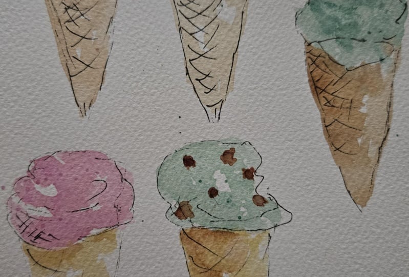
4. Pen & Wash: Part 1 - Intro & Practice: The first style that
we're going to paint the ice cream in
is pen and wash. So let's first run
through the supplies. I'll be using a size
eight round brush. A larger brush like
this is great for washes and a looser
style of painting. We'll be painting a variety
of flavors of the ice cream, so I have a number of paints
set up on my palette. For the cone, I have yellow
ochre and burn umber. For the strawberry ice
cream, you'll need a pink, and I'll be using my permanent rose mixed with a
little Windsor lemon. The Mint choc chip, I'll be
using a mix of windsor blue, red shade, and Windsor lemon
to make that bluey green. For the chocolate chips on
the mint choc chip ice cream, I'll be using a darker
brown by adding a little of the windsor
blue to my burnt umber. For the chocolate ice cream, I'll be using the burnt umber and that darker brown mix again. I all that's five
different colors there with a few
mixes in between. These are the colors that I'm going to be using
throughout the class. For my pen, I'll be using
my UIBOey micro pen Just make sure that whatever
pen you're using is waterproof so that it won't
bleed when we add the paint. You'll also need a page
or two of scrap paper or printer paper so
that we can cover surrounding areas when we add
the splatters at the end. Okay. Before we start painting, let's just talk a little about this style
of pen and wash. So here are some examples, and you can see how loose
and playful this style is. The pen provides the
shape and the detail, and the watercolor just really provides a
splash of color. We're going to be
adding quite quick and power washes
with the watercolor, not worrying about
control or shading. We can play around
with the boundaries and overlap the pen lines. So here you can see
I've gone over most of the pen outline here, and it provides quite
a different effect to when we stay within
those boundaries. You can also see
in each of these, there's plenty of highlights, so there's plenty of
white gaps where I've just let the papers
show through, and I've painted around those. So I feel like that gives it
a really nice effect, too, so we don't want solid
washes of color in these. You can also see that the
paints have bled together. So the pink is bled into the yellow oakum brown
here, and the same here. And the same here,
these two colors for the strawberry ice cream and the chocolate, they
blended together. With the pen lines,
you can see that they're quite sketchy lines. They're not solid lines. Some of them are broken, so
you can see the gaps here. Some of the pen lines are
a bit lighter than others. So on this side, and particularly on this side, it's quite a light pen line. And then on the left
side, it's a bit heavier. You can see with
that sketchy effect, you get kind of multiple
lines showing through. That heaviness just gives a
little bit more definition, a little bit more shadow
on that left side, whereas this right side
looks a bit lighter. So with the pen, we can add in subtle elements of shading
and definition and detail. And we'll practice
these types of lines before we move on
to our ice creams. Now, there are a few ways
to approach this style. My preferred method is to sketch out the subject
first with the pen, and then once that's dry,
you can add the watercolor. Alternatively, you can
lay your pat down first, and then once that's dry,
go over it with the pen. And we'll try both
of these methods so that you can see
which one you prefer. I like the first because
the pen gives you your structure so you know
what you're working with. So then you can be a little more intentional with where you're
leaving your highlights. The second method is
quite playful and you can just lay your paints wherever you want to and then
build on top of that. The third way is to sketch out the outline first in pencil, which is particularly useful if your subject is a bit more complicated or you're not that comfortable diving straight in with the pen or paint. You can then add your
pen over the top. Then once dry erase the pencil lines and
then add the paint. Bear in mind that
if you sketching pencil first and then add paint, you won't be able to remove the pencil lines that
have the paint on top. You may want to do
it in the order of pencil, pen, and then paint. Do want to sketch your
outlines out first, then I have provided a downloadable PDF in the
projects and resources tab, so you can download
those Tracey ice creams out, and
then go from there. Okay, so let's
spend a few minutes practicing the elements
of pen and Wash. So grab your pen, and again, I'm using my UNIBLi micropen
with these pen lines, we don't want solid
smooth lines. We want more of a sketchy line. So practice being a bit lighter with your pen and
having those broken lines. And just like you would if you were sketching
with a pencil, you can just practice
going a bit back and forth, being a bit looser. So here you can see, it's
creating those broken lines. We have some pens overlapping. We can then also go over and press a bit harder and
darken some of those lines. And that's going to provide a contrast with the lighter area. So if we were to
sketch some shape, so let's do a circle. I'm gonna press a bit
harder on the left, and you can see
I'm going back and forth in a bit of
a sketchy motion, working my way around,
leaving some gaps. And then these are
a bit lighter. I've got quite light pressure, especially with
this type of pen, the ink comes out quite easily. So you need to kind of really practice like being
quite light with it. I've got a really loose
grip with this pen. So I've got it securely held. If I was drawing something that I wanted to be really precise, I would be holding it
much closer to the nib. Would be moving with
much more intention. I'd be holding it a lot tighter. But just like we were
with the brush as well, we can loosen that grip, hold it a bit higher up, and just kind of work much looser. So just practice a
few different shapes. Practice going over
some of the lines, adding more pressure,
more shading, and it's going to give you a
darker line and more depth. And you can choose
how sketchy you go. This is quite sketchy. It's got kind of multiple
straggly lines almost. Or you can stick
to kind of more of a controlled broken
line like that, which also has a
really nice effect. These are two quite
different results you'd get if you
vary it like this. Looking back at the examples, you can see on this one, I've actually added some shading in, which is cross hatching. So they're diagonal lines
crossing over each other. So we can practice that as well. So if you use a kind
of flicking motion, press it down, drag your pen away and lift it
up quite quickly. Do this multiple times and you can see they're
kind of different lengths. We don't want this too uniform. And then we can
go the other way. So we're going to go diagonally downwards now instead of up, starting from the same
point and that left, and we're just crossing over. So if this is our edge, that's going to give
more shading and more shape to our
subject from there. If we wanted to add more, we can just go over again. And these are shorter lines, so it's darker at
that very left side. And as it comes
out to the right, there are fewer lines, so it's a nice graduation
from dark to light. And the more you build this up, the darker it's going to get, the more shadow it will have. We can also practice
these lines on the cone, which are going
to represent that grid pattern on the cone. And these are just again, they're longer flicky lines. And again, we cross these over. And you can see,
because I wanted a quite loose style for these, these lines are flicky lines, so they don't even go all
the way to that right side. So they look kind of less
controlled, more flowing. You can also add some
detail into the ice cream. You don't really want to go
overboard here too much. It's quite nice to
keep it really simple, but here are just
a few little lines to help give the ice
cream some texture. Quite light, you can just
practice those squiggly lines, which you can add
into the ice cream. Okay, hopefully
that was helpful. If you want to practice more, then go ahead and just
practice those lines. Otherwise, we can move on
to using our brush now. So again, it's a size
eight round brush, so nice and large,
and we're just going to practice creating
some of these washes. And the way we're
going to be painting, just like I mentioned
with the pen, we're going to be using
our brush quite loosely. We want, obviously,
a secure grip so it doesn't fly
out of our hands, but we are not going to be
holding it near the nib and really kind of controlling
the movement of the brush. We want to hold it a bit
looser, a bit higher up. So when we're laying
down that paint, it's nice, kind of
loose and fluid. We also want quite pale
washes here, not too dark. So I'm going to pick
up some of my pink. I'm moving it into
this well here, and I'm just going to
add some water to it. Plenty of water, and I'm
coating my whole brush. You want to make sure
your brush is coated all over because when we lay
the brush down flat, we want the paint to come
out from all of the brush. If it doesn't, if your brush is dry kind
of in the middle, then it'll be more
patchy effect. So here, like I said, just hold your brush loosely, and then I'm just
moving it around. And I'm leaving, you know, leaving plenty of white space. You can grab some water then and pull some of
that paint out more. So just practice that
kind of looser brushwork. I'm not trying to
control the paint. I'm just laying it down quite quickly and then leaving it. Okay, so just add
a little bit more. Again, nice loose strokes. Adding a bit of water.
We're not worried about, you know, back runs, this water starting to
push that paint away here, which will create a really nice effect because that is going to add texture to the ice cream. So whilst this is still wet, I'm just going to pick up
some of my yellow ochre, and this is going
to be the color we'll start with for the cones. And then we can just
add this next to it. And you can see I actually
torched a little bit too long. And so, oh, no, it is
starting to bleed, and I thought that pink
had dried a bit too much. But you can see that's
kind of pushing upwards. So I just laid it down next to it really quickly,
touched the pink. I didn't go over it, and they're starting to
bleed in together. And that is going to keep moving until the
watercolor paint is dry. So we won't really know how
that's going to settle, but it's a really nice way
to practice letting go and just quickly laying
it down and then leaving it and then just
seeing what it wants to do, especially if you're used to
working with more control. It's a nice way to, you know, practice letting
go a little bit more. Okay, so that's our
practice session done now. Let's start painting
the ice creams.
5. Pen & Wash: Part 2 - Ice Creams: Okay, so I'm going to start with my brush and we're going
to lay down some paint. So let's start
with a strawberry, and I like to start
with the ice cream first at the top and then
do the cone underneath. So I'm going to mix
a little bit of my Winsor lemon in with
my permanent rose. That's just going to you
only need a little bit. We don't want an orange color, but that's just going to
soften that pink a little bit. I'm just going to test
my color at the top. Okay, I'm quite happy with that. Okay, so with these ice creams, I usually like to start
with a rounded top to give it a shape and then
have a bit of a ridge. I'm going to leave some white. So I'm not even creating
that whole shape. I've added in a bit
too much water here, so I'm going to just pick
a little bit of that up. Okay, now I'm going
to my yellow ochre. And again, we're not worried about we're going to do
a rough triangle here. We're not worried about
perfect shapes because we're gonna be drawing in
that shape with the pen. I might just add a little
bit of my burnt umber. You can see these paints are
bleeding in together nicely. I've got that highlighted area. I'm just gonna
leave it like that. Next to this one, I'm
going to do a mitre chip. I'm mixing together my winds are blue red shade and my winds are lemon I'm looking for
a bluy green color. You want this to be quite pale. I'm just going to
test that again. I'm thinking a little
bit more blue in there. Maybe too much. Right. Okay,
I think that will be fine. This is going to be
I'm adding more water. I want this to be
nice and diluted. Okay. So you can see just
quick loose strokes. I'm actually going to
go in and add a bit of a darker drop into
that left side. I'm just touching
it lightly with the tip of my brush and then I'm just going to let it bleed in. Washing my brush off now and I'm going to
my yellow ochre. My yellow ochre has got a
little bit muddy there, so you can see
that's a bit darker, so I'm just going to
move this up here. There was obviously a little
bit more paint on my brush, and my water's got a bit muddy. It's quite a p color, so you can see that's
a bit brighter now. It doesn't matter if
you move too far. Don't worry about
getting the shapes right because these can just overlap those pen lines and
go outside that boundary. And with this method, you
don't have that much control. So if you wanted to stay
in those boundaries, it would be best to
do the pen first. I'm going to touch this up to the green so
that it bleeds in.
6. Pen & Wash: Part 3 - Ice Creams Cont.: Okay, whilst we're
waiting for those to dry, we can grab our pen, and then we can just
sketch out the outline of our ice cream for
the second method, which will be pen
and then watercolor. So for these, we'll start
again with the ice cream. Start with that circular top. Remember, nice sketchy lines. And if you want to adjust, that's fine because that's
part of the sketchiness. I'm going to go in a bit and
then come out for a ridge. And then I'm
darkening this using quite a light line and it's
broken for this right side. I actually want to come
out a bit further. So feel free to
adjust your lines. It doesn't have to be neat, which is part of why
this style is so lovely. It's got a lot more
freedom and less pressure. And then bringing it out a
little bit. Bring this up. Okay, so I've got a rough kind of shape for my ice cream now. I might bring this out
a little bit more. And then you can darken
some of these lines. I'm going to lightly add some kind of ridges
in here for that texture. I'm not going overboard. Okay. Gonna leave it there and just darken
that a little bit up. Now we want to draw in the cone. So kind of find out where the middle of the ice cream is and then work your way down. And we probably want this cone to be just a little bit longer in
length than the ice cream, so you can make a kind of marking point to give
yourself a guide. And because this sle
is a bit looser, a bit more playful,
it's not as realistic. So if you looked at an ice cream or a
picture of an ice cream, the cone will be longer
than the ice cream itself. But we can play around with those proportions when we're doing a more looser,
playful style. And this just kind of
makes it look a bit cuter. Okay, so going in a little bit, going to bring this down. Nice sketchy lines, remember. It can be easy to default back to the normal lines
that we're used to, which are kind of heavier and
solid, keeping them broken, and again this side and
going even lighter with the pencil lines, pen lines, sorry, a bit more broken, a bit lighter, adding some
heaviness on this side. Okay, now we can do those criss cross lines
across the cone. So I'm going to start from the left side,
working downwards. And it's a kind of
flicky line moving up. Trying to get the
same gap in between. And then once you reach the top, you can move over a bit and add them in coming
from the top as well. And then, now we're going
to go upwards to crossover. Again, just using
flicky lines, same gap. They're slightly curved,
and that's going to help give the cone
a bit more shape. And they don't kind of
all reach that side. So if we want to here, we can add a bit of shading, so add in some hatching. In a few places. So kind of doing it in random places just makes
it a bit less uniform. And I'm going to do this
down the cone as well. Okay. So I think I'll
leave that one as it is. And let's do another one. This one we won't
add the shading to, we'll make it a bit simpler. Okay, so again, starting
with that circular shape. I'm going to do quite a
rounded edge on that side. Adding in a bit
more depth there, finding the middle, and then going down to
find that endpoint. I drawing those
lines on the side. Nice and sketchy. And
then you can see, I've made that a lot simpler. I've done kind of less lines. It was a lot quicker. And then adding those crisscrosses
for the grid. Just adding in a couple on that side that would meet
up with these lines, but still leaving that
highlight in between. And I'm just going to
add a little bit here. Okay, I'm going to
leave it as that, so it's a bit simpler so we can see the difference in effects. Okay, we'll do one
more and we'll do that double stack of ice
cream with the flake in. So for this one,
I want to kind of squash down the ice
cream a little bit. So rather than have more
of a circular shape, it's gonna be a bit squashed, a bit more of an oval, perhaps. Okay. And then just coming off
a little bit to the right. Okay. And then add in a bit of a flake coming
off to the left. And then that cone. So finding that middle, working my way down, giving
myself a guidance point. I'm a big fan of making things as easy as possible and
having guides for myself. And then just sketching
in those lines. That does look top heavy, but with this style, it's fine because we're
not going for realism, and I think it just
looks quite cute. I'm going to go back
into this one and add some chocolate
chips with my pen. And again, thinking back
to what we discussed about proportion sizes and in
this more playful style, I'm going to enlarge those
chocolate chips a little bit. So because we're not
going for realistic, we want them to be quite
a big focus for this. So we want we don't want
squares or rectangles. We want more organic shapes. So based on a square, I'm kind of you can see, it's kind of got a bit
of a wobbly line there, and then I'm going to include them in
different directions. And now we want to add some of different
shapes and sizes. So I'm going to add one, and this one's
going to be coming off a little bit. Okay. And then we can add
some smaller ones. And again, we don't
want them too uniform in terms of how
they're spread out either. So we can have some
close together and then have some bigger gaps. Just to add in a
little one here. And I think I might just
add one more there, but I don't really think we
need too much more than that. Right. I think I'm going
to leave it there. Now we can start
adding our paint.
7. Pen & Wash: Part 4 - Ice Creams Cont.: Okay, so now we
finish the pen lines. Our paint, well, I know from
my paint is almost dry, but it's not dry enough
for this type of pen. We want to make sure
it's completely dry before adding this because otherwise the pen
will bleed into it. And it might be worth
whatever pen you have. Just play around with
laying the paint over the top of it and vice versa, laying the paint down first and then the pen and testing out
with a timer how long it takes to dry and to kind of get yourself that clear line
without any bleeding. With the pig the micron pens, I know that I could add
paint to that, you know, within 10 seconds probably, and it would be fine
because it dries so quick. With this, it takes
a little bit longer, but I'm confident that
these would be dry now. I don't think I'd
need to leave it more than a couple of
minutes to be sure. Okay, so we'll paint these ones that we've drawn
in already first, and then we'll go back and add in the outline
to those ones. Okay, so now we're
ready to paint. I've freshened up my water. I've got my size eight
round brush again. We're going to paint this
one in strawberry flavor. So we'll start with
the strawberry and then go in for the cone. So decide kind of if you want to keep
within the boundaries, if you want to go
outside the boundaries, I'm going to go
outside a little bit. I'm going to leave quite
a big chunk, I think, of white here and I'm going to add some pink on that side. And as you can see, I can do that because I know where the boundaries
are, which is nice. I'm going to just mix up a
little bit over darker pink. Add that in a little bit. Okay, so I'm going for
my yellow oak and again, going over that line and
then bringing it down, leaving that nice
drip of white there. Just real quick brush
strokes, and that's it. And then going in,
getting some burnt umber, and I'm just going to add a
bit of burnt umber, as well. And then I'm going to
leave it like that. Okay, so moving on to
the mint chop chip, I wash off my brush really well. I don't want any of that paint
affecting my bluey green. Picking up a diluted mix of that bluey green. And then
I'm just gonna add it in. I'm going over the
chocolate chips. Once this is dry, we can
paint those in over the top. I'm going down a bit as well. Let's see if we can make it look like it's
dripping a little bit. Okay. And then with my yellow oka. Again, pulling that down, going over those lines as much as you want to or
stick to the boundary. It's absolutely up to you. And then I'm just going to
add in a drop of burnt umber. Okay, so that's it. I'm going
to leave that as it is. Now, for this one, I realized we didn't add in the
detail to the cone. So I'll do that quickly now. So I'll just give that
a few seconds to dry. So you can go in after your paint has dried
and add more detail. And it's what I tend to do. I start with the pen,
add the watercolor. And then once the
watercolor is dry, you can have a look at it
and think, you know, Oh, the ice cream might need
a little bit more detail, a little bit more
texture in there. So you can kind of just go back and forth
and play around. It doesn't have to be a rigid
process that you stick to. Okay, so I'm pretty
sure that's fine. So I'll start with
the chocolate. So, making sure my brush is really covered and
then going in. Washing this off, so
I've got some water, then with a kind of wet brush. Not too wet. I'm
taking off some of the excess just pulling
it around a little bit. I'm going to add it in a little
bit of the darker brown. So this is the burnt umber
mixed with the winds of blue. So whatever blue you've got, if you add it to a brown, it's just going to
make it darker, but you need to do it with caution and
add it in gradually. Otherwise it will overpower
it quite quickly. Okay, so I'm just dotting
that in on the left, and then I'll let it bleed in. So I'm gonna wash
off my brush now, and then we're
going to go for the strawberry color at the top. Okay. I'm adding in a
bit more of the pink because I think it had a bit
too much yellow in before. Okay, so I'm going to add this in and then just touch it
to that brown a little bit. See how that reacts. Okay. So moving that around quickly, you can see these white spaces I've left gone over
the line a little bit. I'm not being delicate
or too controlled. I'm gonna add it in a
little bit more pink. Okay. I'm going to do the
cone next because I want to give that pink
a couple of minutes to start to dry so that the brown doesn't
bleed into too much. We want a bleed, but if
there's too much water, it's just going to take
over and be too much. So it's always useful paying attention to how much water
there is on your paper, especially when
you are, you know, painting with a wet
and wet technique or painting with this kiss
technique where you're laying the paints stand
next to each other because the amount
of water is going to determine how much they
bleed in together. And how quickly they spread. Okay, so now just picking up my burnt umber and adding
in a little bit more. Okay, so now I'm going to
go to this dark brown. Sorry, that was the
dark brown that I used. It wasn't the burnt
umber. Which is fine. So I'm going to this dark brown now for the chocolate flake, and I'm going to go a little
bit outside this line, and then I'm going to leave some white on that right side
for a bit of a highlight. I'm just taking off the
excess on my brush. I'm just going to move that
paint down a little bit. You can see that brown is
bled into the strawberry, hopefully that will
have a nice effect. Okay, now we've finished the first stage of
painting for these. We can wait until they're
dry and then we can come back and we'll add
the chocolate chips, and then we can look at anymore
details we want to add. I'm going to add
some more details with the pen to that flake, I think, then we can
add our splatters. For now, we can go to these top two and add
the pen in there. If these are dry, Oh, that is wet. Just
put my finger in there. If they're still
wet, I'd recommend you leave it until they're dry to be working
over the top of them. Otherwise, you risk your
hand smudging them. Once they're dry, you can just get a piece of paper
and lay it over the top so that when
you're drawing, you don't risk kind
of any moisture from your hand ruining that painting. I tend to like to work
top down on my page, but sometimes like this, you kind of have to go back
and forth a little bit. So it's worth just
keeping in mind how the other bits on your page
are and going from there. So I'll give that a few minutes, and once they're
dry, I'm gonna come back and start working on these.
8. Pen & Wash: Part 5 - Ice Creams Cont.: Okay, so once you're ready, you can just lay a bit of scrap paper or printer paper
over the top of those. Grab your pen, and
we're going to sketch in these
outlines in the pen. So we'll start with the top, and we want to use our sloges I say sploges or washes as
kind of a rough guide, but we're not working
to them exactly. So I'm not going to be going
round this as an outline. I am going to be placing the cone where I
think it needs to be regardless of if that is within or outside
of that boundary. So we'll start with the
top of the ice cream. So I'm going to come down. And this has actually created
a really nice ridge itself, so I'm kind of
working with that. And then I'm going to come down. Okay. And add in that texture. Okay, so from here, I'm going to find the middle and then bring this
line down and here. So you can see the paint that's come outside this
line, which is fine. Okay, and now I'm going
to add in my grid lines. So starting with the
downward diagonal lines, adding those in at the top, and then going the other
way and crossing over. Okay, so if you want
to, at this point, you can add any extra
kind of shading in, any little bits of cross hatching or any
little bits of more detail. To give the ice cream
a bit more texture. So I'm going to
leave mine there. So now let's move
on to this one, which is the mint choc chip. Okay, again, just
working my way round, almost knowing where the washes are and then ignoring them. I'm kind of working
regardless of where they are. Oh, that looks like a face. That's quite cute. Okay.
Sorry, that's distracting me. Okay. And then adding
that bottom point and then the cone. So just remember
those broken lines, sketchy broken lines
just in case you're automatically resorting back to the way you'd normally do it. I'm going to add in a few more 'cause you can see it looks like two eyes
and a mouth there. I'm gonna add in
a few more 'cause that's plow me off a little bit. Okay. Add in those grid lines. Okay. I think I'm
going to keep it quite simple there and
leave it as it is. So I wonder you may
have kind of developed a preference for
which method you prefer pen and watercolor
or vice versa. Both fun. I mean, like I said earlier, with the pen and
then watercolor, you do have that option to
stay within the boundaries, although I've gone outside
of these boundaries anyway. But it does give
you that option. Right. Now, let's go in and
paint these chocolate chips. You can see once it's dried, we've got this lovely
blend here with that strawberry coming down to the cone and the same here, which is lovely, and it goes into that brown really nicely. I've got this back run here
into this chocolate chip, where the yellow ochre, the water from the cone
has pushed that up, which has created a really nice textured effect for the
ice cream, as well. Okay, so for these
chocolate chips, I'm going to be using
the dark brown mix, which is the burnt umber and the little bit of the
blue to make it darker. Only a little bit. I
don't want it too dark. You can see the difference
there. That's much warmer. That's probably a
little bit too dark. I'm gonna add a bit of
the burnt umber back in. Okay, yeah, I'm happy with that. And then I'm going to I'm not going to be sticking within
these lines either. Okay, so really quick
filling those in. And I'm going to leave it there. Okay, so now I've
added the paint. We've finished painting now. At this point, we just want
to have a quick look and see if there's anything where we want to add
some more details. So I'm getting my pen and first checking that
the paint is dry. That feels dry.
I'm just going to add some quick lines
down this flake. And that's it. I'm
just going to leave it like that and possibly add some lighter lines into
these ice creams, too. Okay. Um, I'm add a little
bit of shadow down this side, I think, darkening that line. And then Okay, I'm going to
leave it there. And now we can add
our splatters.
9. Pen & Wash: Part 6 - Splatters: Okay, so for our splatters, we just need a couple of pieces of printer
paper or scrap paper. I'm going to fold
one of these in half and rip it in half. Okay, so now what we
can do is just cover up the paper that we don't want
the splatters to be on. I only want these flatters
to be on the ice cream. I don't want them to
actually be on the cone, but you can add them
to the cone, as well. But I am going to
add the splatters the same colour
as the ice cream. I'm going to drop down to a slightly smaller
size six brush here and I'm going
to pick up my pink I'm making sure my
brush is covered. And then I'm just going
to tap it on my finger. You can tap it once and see how it comes out and
then move it around. Just make sure with these flatters though a
bit unpredictable, they can kind of go flying. Make sure you haven't
got anything precious nearby that they could ruin. So I'm just tapping
and moving it around. Okay. I think that's enough. Be very careful when you
lift these papers off. I lifted one off when I was
practicing for the class, and it just smudged some
of these splatters. Some of them will be a lot wetter than you first
think because there will just be little blobs of water and may take a little bit longer to
dry than you think. So just be very careful. Okay. So there's our first one, and I think these platters just finish off these ice
creams really nicely. They just add a bit
of delicateness that the paint doesn't really have because
it is so loose. Okay, so we'll leave
those splatters to dry, and then we can lay the paper over the top to
add splatters to the others. Okay, so I'm just
going to lay my paper over the top and the side, and then also over
the cone and do the splatters for this
other strawberry one. So I find my Sisix brush
buried under my paper. And then pick up
this paint again. And I've got more water
on this brush so you can see those splatters have
come out a bit bigger, which is really nice, actually. I like that. So play around with the splatters on a test piece of
paper and the amount of water you have and the
size of your brush and how hard you tap will also determine the size of the splatters
and how they spread. So because these are quite
wet these splatters, I am moving this
paper very carefully. I do not want to ruin this. Okay, so you can see the comparison. I
only did a few there. I didn't want to go overboard, but they're a lot darker, a bit bigger than those ones. So they look a little
bit different. Okay. I'll leave those to dry, and then we can come
back and do some more. Okay, so now let's
add the splatters to the mint choc chip ice cream. So I'm going to use my larger
piece of paper to just cover up those
strawberry ice creams. And then cover up the rest
with my smaller pieces. With my size six brush, I'm going to I'm gonna
stick for this one. I'm just gonna stick with
the green, the bluy green. Okay, I think that
would be enough. I'm not going too
overboard here. I think for the other
mint choc chip ice cream, because it's got those chips in, I'm going to add the
splatters in brown. I'm just going to
wait for that to dry, and then I can cover it up. Okay, so now those
splatters are dry, let's move on to this other
mint chocip ice cream below. And I'm just covering
up those bits. I'm going to cover up cone. And I just need a
little bit more paper to cover up there. Okay, so I'm going in
for my dark brown. Tapping on my finger. I'm just gonna add more water because I want these
to be a bit bigger. Okay, I don't want too many. I'm gonna leave it
like that, I think. Let's carefully remove these
and then see how it looks. Okay, I'm happy
with that. I think those splatters
are quite subtle, but I think that
looks really nice. So you can also cover up the ice cream and add yellow ochre splatters to
the cone if you want to. But I think just adding
the splatters to the ice cream at
the top draws in the eye and gives the ice
cream that extra focus, which I think is a really
nice effect. Okay. And once those are dry, we can add the final
splatters to this one. Okay, so for this one, I'm
going to add pink splatters to the strawberry ice cream and brown splatters to the
chocolate ice cream. So I want to separate
out those two. So I am going to
cover up the page and everything below
that strawberry ice cream first and add
the pink to the top. Okay. I'm gonna leave that to dry and then we can
do the chocolate splatters. And there is a lot of drying time because we have
five ice creams on a page, and I want to show you how I'd add splatters to each of them. Normally you would
probably only do one, and so it would be really quick. Or the other thing is
you could cut them out if you're going to use
them individually anyway. So this amount of
drying time isn't the norm unless you do want to have a lot on the same page. And remember, you don't even need to add splatters
if you don't want to. Some of these you might
look at and think, Okay, that has everything that
I want it to be on it, and you can leave it as that. For example, I turned one
of these into a bookmark, and I was quite happy with
the way it turned out, so I thought, I would
just leave that, and I'm not going to
add the splatters. I quite like the way
that looks as it is. So you can also turn these
into gift tags as well. If you've watched any of my other classes or
you've seen my books. You know, I'm a massive
fan of making bookmarks, gift tags, greeting cards, anything that can be, you know, used around the
home or gifted to friends and family and
used as part of my life. I like to incorporate watercolor into
anything I can really. So, um, these are really
great ways to do that. And these are so quick, especially because
they're smaller. I dropped down to a size six
brush to paint these ones. And yeah, they literally
took a couple of minutes. And I think I'm going to add
some splatters to this one, but I think I'll leave
the bookmark as it is. But especially if, you know, you've got a friend who's
got a summer birthday, this would make a
really nice gift tag to add to a present. Or, again, in the summer, you can swap your bookmark for, you know, an ice cream or summer related bookmark
to match the season. Okay, so hopefully
they've dried enough now. I'm going to move this
paper up to cover the pink, and I'm just going
to add another bit of paper to cover the cone, and now I'm going to go for
my chocolate splatters. Okay. I think that is enough. Again, I'm gently
carefully taking this off. So now we've got
the nice contrast, and you probably can't
tell on the camera, but I can clearly see that
these are brown and pink, and they just bring out the colors of the
ice cream nicely. Okay, so we're coming to the end of this first
style of painting. I really hope you've enjoyed it, and you've learned a few things, and it's made you think about
how you like to work and shown you some
different ways that you can approach a style like this. So, yeah, I mean, there's not
only one style of painting. There's not only one method. There are so many ways
that we can do things. And through experimentation
and having fun like this, because I really
do find this fun. I hope you do, too. It's
relaxing. There's no pressure. You're playing around.
You're not trying to create a masterpiece
or finished piece, you're just kind
of experimenting, seeing what works, and hopefully creating
something you know, that excites you
and brings you joy. And hopefully you found it
relaxing, too. But, yeah. So that's the end of
the pen and washtr, we'll be moving on to the loose watercolor ice creams next without the pen work. So we'll be using the watercolor to create a bit more definition, but we're still working
in a very loose way.
10. Loose: Part 1 - Intro & Practice: The second style that
we're going to paint the ice cream in
is a loose style. For supplies, I'll be using the round brush
size eight, again, as it's great for that
looser style of painting, and I'll be using a smaller
round six for some of the details like the chocolate chips and
the lines on the cone. I'll be using the same paints as before that are
already on my palette, and they cover all
of the flavors we'll be painting in this class. We'll be experimenting a little
with this type of style. So if you have masking fluid, grab that along with
an old brush and a container to decant a little
of the masking fluid into. If you don't have any
masking fluid, don't worry. You can just watch along in
that section and perhaps get some ideas and see if you want to try
it out in the future. As before, I have provided
some outlines in a PDF for you in the project and
resources tab if you'd like to download
them and trace them. Okay, before we start painting, let's talk a little about
this looser style of painting and go
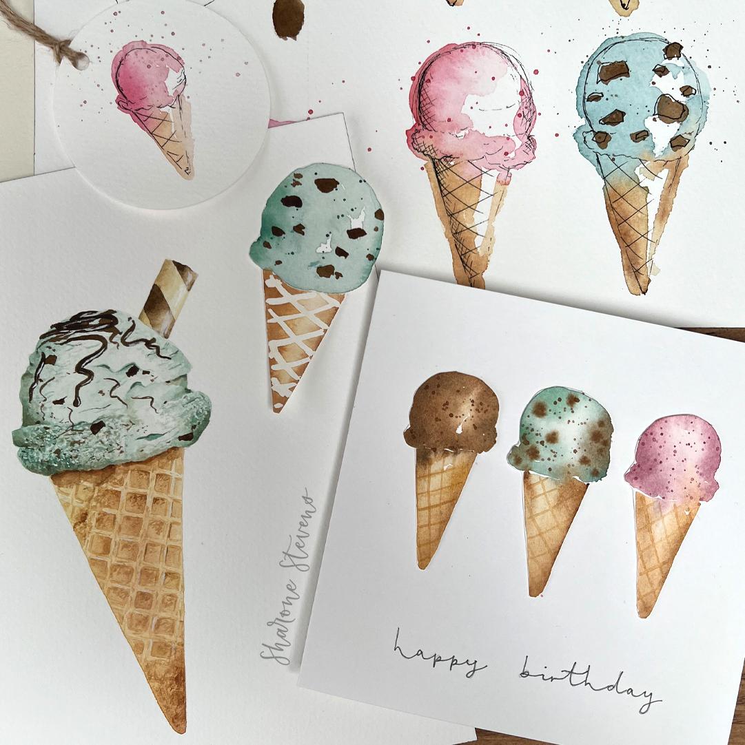
through some examples. In this style, we can interpret the details in a
really simplistic way. And there are so many ways that we can play around with this. Here are some examples of
ones I've turned into cards, as I think they
work really well in this way as they are so cute. The ice cream part is painted wet and wet,
as you can see. Starting with quite
a diluted mix, and then adding a more
concentrated mix of the same color around the edges so that it
bleeds in nicely, leaving that lighter
highlighted area in the middle. So we will be
practicing some wet on wet techniques before we start painting the ice
cream in this video. The cone is then painted whilst that top ice
cream is still wet. So you can see that we have these gentle soft
bleds are coming in, so that pink is coming
down into the cone. And likewise, with
this chocolate one, this brown is coming downwards. So you have the choice for this. You can paint the cone when the ice cream is still wet
and have those bleeds, or like these ones, you can wait until it's dry, and then you have more
of a defined ice cream. It's up to you. You may have a preferred effect or end
result that you like the best. That grid effect on the cone, I've painted these
with simple lines just to keep them really simple. And then the focus is more on
that ice cream at the top, where I've added some splatters, which really helped with
that kind of playfulness. And these I actually cut out
and stuck onto the cards. And going back to that
wet and wet technique, that's how I added in
these chocolate chips, which you can see have
spread a little bit. I then went in and
added some at the top. Wet on dry. So when that ice cream was dry underneath, so
they're more defined. I really love the way it
looks because I feel like it draws your eye in initially to the top of the ice
cream where you've got these chocolate chips in more focus and more
defined with their shape, and then your eye can move down where it becomes
a bit looser. I really like the effect of
that contrast in this one. In this example, I added masking fluid to
the cone for the lines, so it has a much bolder effect. On these two, I
painted the lines with just clear water and then
dropped in some of the brown, particularly in
the corners where the lines crossed over and just kind of let it bleed
in and do its own thing. So you've got some darker areas and some still lighter
areas of those lines. Okay, so we're going to
start with a little practice first with that wet on wet technique and
the kiss technique, and then play around
with some ideas for the lines on the cone before painting three
different versions of ice cream in this loose style. So I'm just going to pick
up my size eight brush, and we'll start with some
wet on wet exercises. So choose one of your paints. It doesn't matter
what color it is. I'm going for my permanent rose, and we want the first
layer to be really light. So we want to dilute it a lot. I'm adding plenty of
water into this well. And then I'm just going
to paint a circle. It doesn't have to be neat. And then we're going to go
straight back in and pick up. I'm going back closer
to the source of this permanent rose and
picking up a darker mix. And I'm just going to
drop this in at the edge. I'm touching it quite
lightly just with the tip of my brush and then just leaving the paint to
flow as it wants to. Your paint is not moving
very far, then it's too dry. And if it's flowing a
lot and taking over, then you're probably
using too much water. If you have a puddle, then it may just be sitting
on the surface. You'll be able to tell by
moving your paper, tilt it. If the water rushes down to the bottom of that circle,
you've got too much. Let's just try this again. So trying to make this as
layer as pale as possible. And for the ice creams, you can even use just
water or tinted water. So here you can see,
I've got a lot of water. It's kind of pulling here. If I tilt the paper,
you can see even more. It's coming to the bottom. So I'm just going to lift a
little bit of that up with my brush and take it
out on my paper towel. So that's still quite wet.
If it looks quite wet, you can just leave it
a couple of minutes before you add
that second layer. And it is really useful to play around with the
wet and wet technique, especially if you're new to it or it's something that
you struggle with. When I first started painting more with the
wet and wet technique, I would just fill pages
of paper playing around with variations in water to see how the
paint would react. And it's not just
that first layer that determines how the paint
will move, how wet it is. It's that second layer as well. If you have a lot of
water on your brush, it's going to move more freely. The consistency of that mix is thicker and you have
less water in the mix, it's not going to flow as much. So I've left this for a
couple of minutes now, so I'm just going
to go in and add. So I've got quite a lot of
water on my brush in this mix. You can see it was flowing, and this is going to keep moving until the
paint has dried. So if we have a look at
what it looks like now, we can compare that to
when it's finally settled, and it's probably going
to look quite different. I imagine it's going
to be a bit paler. Because that water
is diluting it and it's going to move a little
bit more, but we'll see. When you're playing
around like this, it can be useful to just take a quick photo
when you finish the painting and then
compare it to when it's dry and so you can compare the two and see how
different it is. The other thing that
will affect how the paint reacts is what
paint you're using. So paints can be quite explosive
and spread really far. That can definitely
make a difference too. It's worth experimenting
with your palette. Let's paint another circle. And then this time
we're going to practice those chocolate
chips and look at the way the paint spreads at
varying levels of dryness. So now I've just painted, that's going to be quite wet. If we add just a drop in, I'm going to pick
up a darker mix. But I'm going to you can see
that brush is quite full. I don't know if
you can see that. I'm just going to dab
it on my paper towel, take out the excess. And then just with the tip, I'm just going to gently
touch this paint. And you can see how
that's spreading. With these chocolate
chips, we want to leave it until it's a little
bit drier than that, so they don't spread as far. I'm just picking up some
more while we wait, give it a couple of minutes. And just using the
very tip of my brush. I'm not applying pressure. It's just that very tip. That is quite a good
amount of spread. Okay. So if yours is
spreading quite a lot, just give it a few
more minutes for it to dry a little bit more and
then try again and then see. And by doing this, you'll start to get
to know kind of how dry you need it
to be, like, roughly. I mean, it is unpredictable, which is what's quite lovely
about this technique. It's kind of a bit more freeing. But just by practicing, you'll kind of be
able to guess a bit more how it's
likely to react. If you look at your
paper from the side, you might be able to
see how shiny it is, and that will kind of
give you a clue to how wet it is and then how
far these will spread. Okay, so keep playing around
with that if you want to. Now we're going to move
on to the kiss technique. So again, starting with our pink I'm just going to lay
a bit more water than that. I'm just going to lay kind
of a rough rectangle down. And now I'm going to
wash off my brush. I'm washing it quite well. I can just check if it's
got any pink left on it. I'll wash it a little bit more. My water is gonna
look a bit pink now, so there'll be a
little bit of a tint. I want to go to my yellow ochre, so I don't want that pink
affecting the color. Okay. Now I've got my
yellow ochre on my brush. What I'm going to
do is I'm going to run the brush
underneath the pink. I'm not going over the pink. I'm just going to go next to
it and slightly touching it. You can see that yellow ochre has
instantly started to push up into the pink and
then merging together. Try that again.
Perhaps this time varying the amount of water you're using to
see how it reacts. So I'm going a bit quicker
to my yellow ochre now so that that pink is going to be a bit
wetter this time, and then I'm just running it underneath, touching that pink. Generally, with the wet and wet technique and
the kiss technique, I don't like to interfere. I like to let it
do its own thing. But one thing you can do is
just tilt the page slightly, and that will encourage that
pink to run down a bit more. You can see this is coming down. Which works really nicely
for the ice creams because it will kind of look like the ice cream is dripping
almost down the cone. Okay, I'm gonna lay my flat and then we'll come back
and see how those look. Okay. Okay.
11. Loose: Part 2 - Practice Cont.: Okay. Now let's practice
some different ways that we can do those lines on the
cone to represent that grid. So if you grab a pencil, and then we can just
sketch out perhaps I think four triangular
shapes for the cones. Okay, so for this first one, let's just do a little bit of a back ground wash. We
want this quite pale. I'm just going to use my
eraser to just soften these pencil lines a little bit so that we can see
the full effect without that pencil line. I've not softened it
too much because I want you to be able to see
where my pencil lines are. What I'm going to do is I've got this pale diluted yellow ochre. I'm just running this around
the edges of this first. Cone, and then I'm just picking up some water on my brush, taking out that excess, so it's a damp brush, and softening those lines. That's it. That
was just a couple of strokes. Don't
worry too much. It doesn't need to be really
neat or nicely blended. Just picking up a bit
more of my yellow oak, taking out the excess
on my paper towel. I'm just going to add a little
bit more into the edge. Okay, let's leave that
to dry and we can paint some lines over
the top of that. The lines that I
use the most are just simple criss cross lines. And I usually do these in
yellow ochre because I find that the burnt umber
can be a bit too dark, and I like the attention to be more on the ice
cream and the cone, perhaps a little bit
kind of less in focus, a bit more in the background, but you can try with the bone
umbra as well or a brown. I'm going to start
from this left side, just like we drew these in pen. I'm just going upwards,
a slight curve. And if your line is
coming out a bit blobby, just take out the
excess water first, just dabbing it on the paper
towel so that tip comes to a nice point and
you'll get a finer line. I'm going all the way over to that right side.
All the way down. Now I'm going to start
from the left side again. I'm going downwards
with a slight curve. Okay, so that's probably one
of my preferred methods for painting these lines and representing that grid
in a really simple way. We can also do flicky lines like we practiced with the pen. So again, just make sure
your brush is coming to a nice sharp point by taking
out any excess water. I'm starting from
the left again. And instead of going
all the way across, I'm just moving in
a quick motion, dragging the brush
and lifting it. So it comes to a bit
of a tapered point. I'm not going all
the way across. I can make these kind of
different lengths as well. So some shorter, some longer. And now I'm just going to go downwards with the same thing. So these flicky
lines crossing over. And here, I'm just going to
add a little bit up here, so it doesn't look good. So that is a bit looser, a
bit less controlled looking, and it has quite a
different effect. You can also play
around with kind of the gap size
between these lines, making them smaller or larger. The larger you have them, the looser the overall
result will be. Okay, one of the ice creams
that we're going to paint, we're going to be
using masking fluid. We won't practice
the masking fluid. We'll go straight in with that and I'll talk
you through that. Another way that we
can paint these lines, which is quite a fun way is by painting them
with water first. So again, I'm just loading
my brush full of water, taking up that excess, and then I'm going to paint
these lines all the way across picking up some more water and
going the other way. And then I want to work quickly
here so these don't dry. And I'm going to go
from my yellow ochre. And then I'm just going to if you look to the
page from the side, you'll be able to see more where it's wet and then just
drop it into some of these corners where they
crossover or at the edges. So that it starts to bleed in. And you end up with
this really nice effect where some parts are lighter, some parts are darker, and it kind of gives it
a nice textured effect. Once this is dry, we'll go back and do it over
there because see, at the minute, this hasn't got if we left the
background white, this hasn't really
got any shape to it. We could paint the outline. So going over the pencil line, I'm just running it
out with a wet brush. And then I'm going to drop in a little bit in a
couple of places. There are lots of ways
you can do these cones. You can also try working
with a white pen, especially if you don't
have the masking food and you want to create
that white line that we're going
to be doing when we're painting the ice cream, or you can try pencils or you
may have some other ideas. Okay, so this is dry for me now. I'm going to paint those lines. This time, I'm going
to go for a burnt mbus that's going to be a bit bolder. I don't want to go too dark. So I'm adding some
water to this, so it's fairly diluted. But because I added that
water to dilute it, I do need to make
sure that I take off that excess water
on my paper towel. Okay, so just be
careful if the rest of your lines are still wet when we're going
back over these. So I'm just holding my hand up to make sure I
don't touch the paper. So I'm just painting these lines upwards and then going downwards in the same way
that we did them before. You can see because I'm not
resting my hand on the paper, my hand it's not a steady. Okay, so those are just a
few ways of experimenting, a few ideas for how
to create this. So I hope they've kind of
inspired you a little bit and started making you think about how you can do
things in different ways.
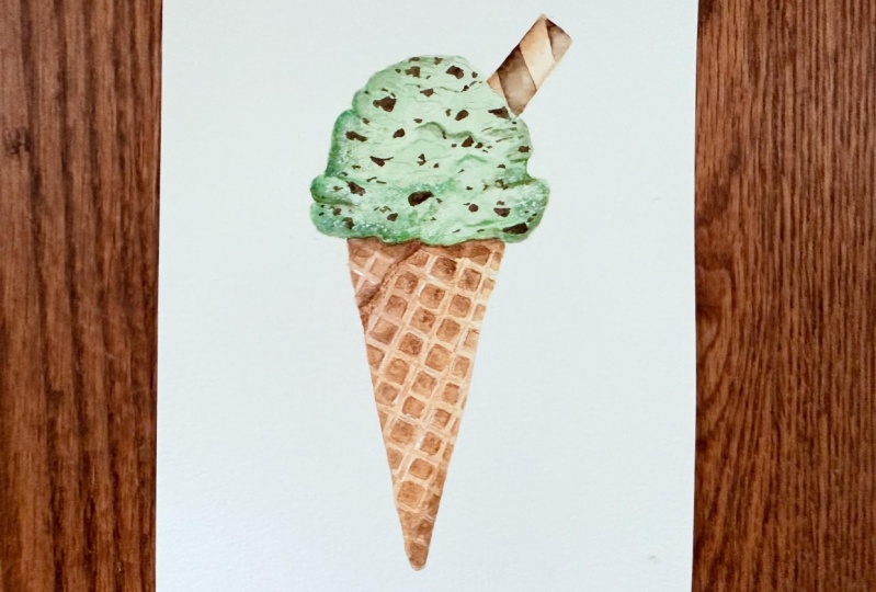
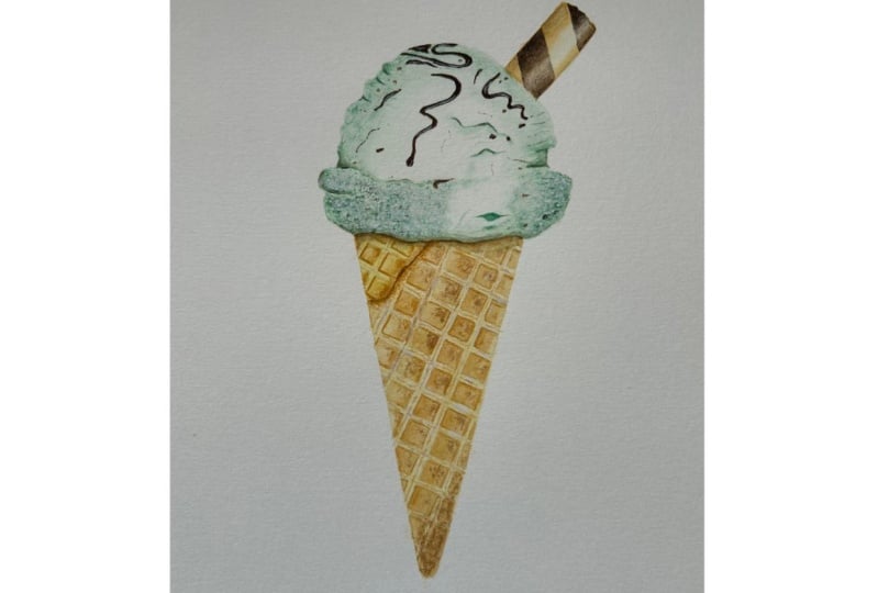
12. Loose: Part 3 - Ice Creams: Okay, so now we're going
to paint three ice creams, and we're going to paint them in slightly different ways so you can Follow along as I
use different techniques, and we create slightly
different effects. So for the first one, I'm going to sketch
it out in pencil, and this is because
we're going to be using masking fluid on the cone, so we want that outline. So just to remind you that the outlines for
all three of them are available to download and trace in the project
and resources tab. We'll only be sketching
out the first one. We'll be painting the
other two freehand. But if you'd prefer to
sketch them all out, then you can go
and get that PDF. So I'm using a
mechanical pencil, and this is a size 0.9. I would normally use a 0.3 when I'm sketching
out on watercolor paper. I'm only using a heavier pencil so that you can
see it on camera. I would recommend something
much lighter than this. Either a 0.3 or just a
normal HB pencil and press very lightly so that the pencil doesn't show
through your paint. So I'm going to be
applying a fair amount of pressure so that you
can see it clearly. Okay, so for this
simple ice cream shape, I'm going to start at the top, and I'm going to start
with a circular shape. It doesn't need to
be a neat circle. So adding in a few dips
or waves is just going to add to that shape of the ice cream and make it
a little bit more natural. Okay? So as I come down, I'm going to go out
and then add a ridge. You can see I've got a few dips in here, so it's not smooth. I'm going to go
downwards a little bit. Again, this is a little
bit of a wavy line, and then I'm going to curve up. So this is a bit of a bigger kind of
ridge than this side, and then go inwards and join
up with that other line. So this is my
preferred shape when I sketch out these ice creams
or even when I paint them, I find it's quite a good shape, a good go to shape
for ice creams. But you can make it more
circular if you wish. Have a look at lots of images
and see what inspires you. So now I'm going to
find the center point down the middle of the ice cream and then
just work my way down, and I'm going to mark a point. So the cone is just a bit
longer than the ice cream. So we're using a similar shape as what we did with
the pen and wash. So going in from the
ridge just a little bit, I'm going to then draw this line downwards to meet that point. And the same on this
other side. Going down. So at this point,
if you want to, you can adjust your shape. But if you're happy
with it, then we can move on to the next step. So I have my masking fluid, and I also have a container which I'm going to
decant a little bit into because I don't
like to leave this pot open or stick my brush directly in there because it
dries very quickly. I'm going to use an old brush. Please do use an old
or very cheap brush because the masking
fluid will damage it. The only reason
I'm using a brush, I normally use a
silicon shape at all, but I find that for
doing these lines, especially if you want
to do the flicky lines, then a brush is going to
be much more effective. But again, please do not use your best brushes or your
favorite brushes to do this. We don't need too much, so I'm just adding
a little bit in. And then you can choose what
style of lines you like, whether you want them to go all the way to each side
and look a bit more controlled or whether you
want to create them a bit more looser and a bit flicky and not meeting
the other side. So I'm going to go
for this style. So I'm going to just take
off that bubble at the end, and then paint
these lines across. You might not be able to
see very well because it is colorless,
this masking fluid. Hopefully you can see a bit
of a glint from the wetness, but I'm basically just
doing the same as this. Now I'm going the other
direction and crossing over. You find if you're looking
for masking fluid and you do find some masking fluid
that has some color to it, it can be really useful. I had to buy this recently
and they didn't have any masking fluid that had
any color in it available. Fortunately, I couldn't get
any. I've done my lines. The other thing we
can do if we want to, this is optional,
it's all optional. Add a bit of a highlight. I'm just going to add it
into this top right corner, a little bit away
from the outline. Then that would just give an extra bit of contrast
to the ice cream. Okay, I'm going to
leave it there, and I'm going to go
and wash my brush off, and I recommend you do the same, and then we can come
back and carry on.
13. Loose: Part 4 - Ice Creams Cont.: Okay, so let's
leave that to dry. It shouldn't take too long. But what we're going to do, we're going to be painting
three ice creams, and we're going to be switching
back and forth between the three of them
when one is drying. So basically, we're not sitting
around waiting too much. Okay, so I'm going for my
size eight round brush now, and we're going to
paint this freehand, but again, sketch out the
outline if you prefer first. I'm going to paint
this first one as a chocolate ice cream. So for my second one, I'm
going for the mint choc chip. So we'll start with
the ice cream. So first, we need to
mix up our mint color. So I'm using my Windsor
blue red shade and my Windsor lemon as before
in the Pena wash video. So it can take a few
kind of little bits of adjustments to
find that color. Okay. That looks
quite good to me, but I'm going to test it out. We want this quite pale, so dilute it and then
check it out as well. Okay, I'm quite happy with that. It's a bit greener
than the one we used before, but
let's go with it. So we've got a bit of
a darker mix here. So I'm going to pull
some of this out. I want to use a really pale
mix for the first layer, and then we can go back and add in a little bit of a darker mix, not too dark with that wet and wet technique that we practiced earlier. Okay. So just like we draw it out, I'm going to start with that
circular shape at the top. So that is it doesn't
look too dark, but we want this even lighter. So I'm just going to add
some water now to my brush, and I'm just going to
take out that excess, and I'm just going to
add that in next to it, and then pull that paint out. So now we can paint
the rest of it, so I'm pulling that round. I keep washing my brush because I want this
to be even paler. And then going outwards
for that ridge. Remember to make your
edges a bit wobbly, a bit jagged, not
making them too smooth. Don't worry about little bits
of back run here and there. It's just going to add to the
texture in your ice cream. But if you do, at this point, have quite a bit of a puddle, then just remember you can use your paper
towel or your brush. Use a dry brush. So just take out
the excess water on your paper towel and then
just lift some of it up. Okay, I'm going to go in with
a bit of a darker mix now. And just for the edges, I'm
just going to drop it in just using the tip of my
brush so that it flows. I'm going to bring
it in a little bit more to that middle. And then I'm just gonna add some in on the
right side as well. And at the bottom, I'm
not going too much. Right. I think I'm
happy with that. I'm happy that it's got a light enough area
in the middle, but we've got enough
color in there as well. Okay, so I'm going to
wash off my brush now. I'm going straight
to my yellow ochre, and I want to work whilst
this is still wet. Taking off that
excess. So again, just how we sketch this out. I'm going to find the center of that ice cream and work my way down roughly about
the same length and make a little mark. And that's just going
to help give me a guide for where I
want that cone to be. So now I'm going to go
up and find my edges. So just a bit in
from this ridge, and then I'm going
to bring that down. Okay, because I want the inside of this cone to
be a bit lighter, I'm washing the paint
off my brush now. And then I'm just going to good. Add that in. Okay.
I'm also going to run it along the bottom of the ice cream so that that
green starts to bleed in. You can see my water
is fairly green. Alright. So then I'm going
to pick up a little bit more of my yellow ochre
and just paint this outside of this cone. And this is starting to
bleed in a little bit. I might add a little
bit more of the green, so that bleeds in downwards
a little bit more. Okay, so you can see
that's gonna come in. And now I just want to build up a little bit more color at
the edges of this cone. So I'm going back
to my yellow ochre and making it a bit darker, taking out some excess and
dropping this in very lightly. If your paint is
wet, it won't need much and it will
kind of bloom out. And then I'm going to
add a little bit of my burnt umber to
darken it even more. So again, taking
out that excess and then dropping that
burnt umber in. More so just using
this to neaten up that edge of the
cone a little bit. Okay. I'm going to
leave it there. I don't want to overwork it, but I'm pretty happy with that. So now, whilst it's still work, we want to have a look at
the ice cream part and see if we think it's ready to add some
chocolate chips in. So let's mix up
our darker brown. So this is the burnt umber with a tiny amount
of the windsor blue. It's not going to take
much to affect that color. So add it in very gradually.
Be careful with it. Okay. I've mixed
up with my eight. I should have mixed it up
with my six, but that's fine. I'm going to switch to my
six now and pick this up. It's a bit of a smaller brush. I'm going to take
out that excess. And then I'm just going to do
one and see how it reacts. Just the very tip of
my brush. That's good. It's not spreading too far.
It's spreading a little bit. That's spreading a bit further. I think that top bit is starting to dry a little bit
more. That's fine. And we want to add these in in a bit of an
inconsistent way, so we can have some clusters. So don't worry if it's diluting too much
because once it's dry, we can add a little
bit more over the top. And then you'll have
that lighter spread underneath with a smaller
darker spread on top. So you can see it's
actually quite nice. These ones at the top are
looking a bit darker. I don't want too many. I'm
gonna add one in here, and I think that's
probably enough. So I'm going to go
back to this one here, see if I can just add the
lightest of touches in the center and see how that
goes in and same here. Okay. I'm going for a more
thicker consistency this time. So I'm going to the source of those paints to
make it quite dark. I'm not using much water here because I'm hoping
this will make it spread even less and keep
that strength of color. Okay, so I'm just going to
dab this into the center. Okay, so you can
see that's darker. It's not spreading as much. So I'll just add these
into the center. Okay, I'm pretty
happy with that, so I'm going to leave it
there. I don't want too many. So we can leave that
one to dry now. And then when it's dry, we can come back and finish off the cone with the stripes.
14. Loose: Part 5 - Ice Creams Cont.: Okay, so heading back
to my size eight brush, we can go back to
ice cream number one and paint the cone in. So I'm just making sure
my brush is clean. And then I'm going
for the yellow oka. A nice diluted mix. So if we add a lighter
mix to the center, then we can darken
it at the edges, and that's just going to
help give it a high light. If you've got a lot
of water in there, you can just pick it
up with your brush. Going for a more concentrated mix of that yellow ochre now. I'm just going to run it
down the edges and then let that bleed in to the
wet area in the middle. And the same on the
left side. Okay. So I'm just going to go for
a little of my burnt umber. Not too dark. Taking
off the excess. And then I'm just going
to add some of that in. Okay. I'm going to
leave that there. And we want this one to have
a nice defined ice cream. We want that boundary
to be crisp. So we're going to wait
until the cone is dried before we
paint our ice cream. So now we can move on
to our third ice cream. And this one I'm going to paint as a strawberry ice cream. Okay. So for this, I'm using the permanent rose
and it's got a touch of the Windsor lemon to
soften that pinkness. No before we continue painting, I'm going to freshen
up my water because it has got quite green and muddy. So do the same if you need to. Okay, I freshened up my water. Just to say, it can be really useful if you
do actually have two glasses and you try and
keep one of them clear water, especially when using
wet and wet like this. Unfortunately, I actually broke my glass last week,
so I only have one. But I also have kind
of a bad habit of just kind of dipping my paint into both of them and
making them both muddy. So it doesn't always
work for me having two. But there's definitely
something you can try. That will save a
little bit of water. Okay, so we want a
really nice diluted pink for the strawberry ice cream. We're not going to
make the darker wet on wet washes
very dark at all. So we want that first layer to be just almost tinted water. So we want that contrast. So I'm actually even going to add some water over the top, so you can see it's very pale. And you can even just use water so that you do
get that contrast. So I've added that kind
of spldge to my paper, and now I'm going to turn it into the shape of the ice cream. So again, I'm just
moving that round, so it goes to the
circular shape up top, and then I can just
bring it round and adjust that shape with my brush. So this is my size
eight larger brush. So it's easy to do this. It's easy to get
this decent amount of coverage and move the
paint around as I want to. Okay, so once you've got a
shape that you're happy with, we can go back and add in
a bit of our darker pink. So this has got
quite a lot of water and I don't want
to be adding lots of water into the second layer because it's just going
to flood the whole thing. So I'm just going to
dab this out and then see what sort of color that. So that's still quite pale. I want a bit of a darker
color, not too dark. Okay, so just taking off that. And then I'm going
to add that in. So that's a little
bit darker now. Dabbing it in a little bit more towards the center as well. Okay, I might just add a
little bit of a darker. Okay, I'm just going
to add a little bit of a darker pink into this edge. Only a couple of dots to kind of give it a
little pop of color. I think that will do. Maybe
a little bit at the bottom. Okay, I don't think
we need too much. That's gonna keep
spreading. So now wash off your brush and then
go to your yellow ochre. So you can see how
much my paper towel is getting nicely
colored and wet. I'm constantly using
this. It's so useful. So again, finding the
middle of the ice cream. I'm working your way down,
hovering over the page, and then just marking that
end point of the cone. And then I'm going to go
down from the left side, work my way across touching
that strawberry ice cream, perhaps leaving a couple of white gaps so that it doesn't
blend in all the way. And then I'm just gonna
wash off my brush now because I want this
lighter area in the middle. And then I'm just going
to blend that out. So if you need to, just like we did with
the mintchop chip, you can add a little
bit more pink if you want that to drop down
a little bit more. So let's just add a little
bit in just to here. Maybe on this side.
We'll see how that goes. It's not bleeding in
too much at the minute, but I'm going to give it
time and see how it goes. So with this cone,
I want to build up the color a little bit more. So I'm going to my bone umber, and I'm going to just add
some of this into this edge. If it's not spreading too much, if it's kind of
looking a bit dry, you can just use a damp
brush, so clean your brush, take it off on your paper towel, and then just move
it a little bit. But generally, I
recommend trying not to interfere too much. And that can be hard depending
on what style of painting you're used to or perhaps just, you know, how you
like to do things. You like to have a little bit
more control over things. So it is a nice kind
of style to practice, letting go and kind of leaving a bit of control to the watercolor to see
what it wants to do. Okay, so let's leave that one there and
wait until that's dry. Now we can go back to
the first ice cream. Just check just gently with your finger or
looking on the side. If it's still shiny,
then it's still wet. You may need to wait
a little bit more. I think mine's fine. So I'm going to paint
the ice cream now. I'm just going to soften
this line a little bit. Well, that mark there is because there's
masking fluid in there, which I forgot
about. That's fine. I'm just softening
it a little bit. Not too much. I'd
soften it more, but I still want you to be
able to see it on the camera. So soften yours as much
as you can until you can just see it so that it
gives you that guide. Okay, so I'm going to add a little bit of water into
the middle of this one. And then I'm going to
pick up my burnt umber. And then I'm just
going to add this in. You can see that's bleeding in. I want to leave that
highlight there, so I'm just gonna go
around the edges now. Just softening that bit. So it looks like
I've got quite a lot of masking food more
than I thought I had, but we'll see when
I take it off. Okay, so I'm just going to fill in the rest of this ice cream. And I generally think the
chocolate is a bit of a darker, more prominent color
than the rest. It can be quite pale if you're
painting it realistically, but I think to
give it that nice, deep chocolate color
looks really nice. So I'm going to mix up
the darker brown now. So this is the burnt umber
with the windsor blue, and then drop this
in to the edges. Okay. So I'm going
to leave that dry.
15. Loose: Part 6 - Ice Creams Cont.: Now we can go back to ice cream number two and
check the cone as dry. And if it has, then I'm
going for my size six brush, and I'm going to
paint the lines. So going back to our practice, Remember that we've got
a number to choose from. So we can paint
them nice and neat. We can do more flicky lines, or we can add that kind of water and then drop in
some color to the shape. I think for this
one, I'm going to stick to this kind of neat look. And then perhaps
for the strawberry, I think I'm going to go
for a more spacious, flicky look, but do choose
whichever one you prefer. So I'm going for
the yellow ochre. So you can decide on how dark you want this
yellow ochre to be, how prominent you want
those lines to be. I don't want mine too dark. So you can test out the line
strength on a bit of paper. I'm just adding a little
bit more water in there. Okay, so just remember, make sure your brush
is a nice sharp tip to get those fine lines. And then I'm going all
the way up slight curve, and that's going to
help give the cone a little bit more dimension than if they were just straight. So the other way now. And for the longer lines, you can see I'm moving my whole arm because if I
started to use just my wrist, I would get about
halfway and then falter because my brush won't
be able to go any further. I find that if you start a longer line and
drag your whole arm, and I'm gently resting my finger on the paper to give it
a little bit of balance. That one's shorter so I can
just use my wrist for that. Play around with how it
feels to move your whole arm and just move your wrist and see how steady a line
you can get with those. Okay, so that's almost finished. We're going to come
back at the end, and we're going to add
some brown splatters to the top of this ice cream. So going back to
the strawberry one, let's just see if it's dry. I think that might need
a couple more minutes. If this is even a
little bit wet, these lines aren't
going to look crisp. They're gonna start bleeding in, and I think they look
best when they are crisp. But again, that's another effect that you could
experiment to see. It might look quite nice if some of them are
bleeding in a little bit. Okay, so I'm gonna get
a couple of minutes, and then we'll come
back and paint the cone for ice cream three. Okay, so I'm back, and I've just switched out my paper towel for a new one because the other
one was getting quite wet and I didn't want it
to ruin the paper. Okay, it's with my
size six brush, and you can go even smaller if you want
your lines to be finer, or if you want a
bit more control, it can be a bit easier
to use a smaller brush. I am going from a
yellow ochre again. Okay, taking out that excess. And then I am going for
this kind of flicky effect, but I'm going to leave a
little bit more space. So this one looks a little bit more kind of
loose and playful. But again, choose
which one you prefer. So I'm just going to start from this left side going
upwards and flicking. And this one's going
to be a bit longer. They're not actually
as I didn't leave as much space as I was intending to actually, but
it's not too bad. I think it's a bit
more space than this. Okay, so if you want
to at this point, turn your paper around, and you might find it a bit easier
to do these downward flicks. I'm gonna keep it like this
just because I'm filming, but normally I'd be turning
my page around at this point. So downwards flick. And again, one more. And then going up to this top of the ice cream and doing a
couple from there as well. Okay. So you can see it's quite a subtle difference in
terms of what you're doing, but I feel like it creates
quite a different effect. I like the way this
gives a gap here, which makes it look almost
like a little bit of a highlight in the cone
to give that shape, even though the lighter
area is in the middle. Okay. So the next thing to do, were nearly at the end is to
remove this masking fluid. So the cone will
definitely be dry. We did that quite a while ago. Just double check
on the ice cream. I don't think mine
is quite dry yet. You don't want to take
off the masking fluid until it's completely dry. Otherwise, you're going
to smudge the paint, and it's just going to ruin it. So I'm going to leave that
for a little bit longer, and whilst we leave that, I'm going to leave
the cone as well, just because I don't
want to be rubbing this too close to the ice
cream and smudging it. Whilst we wait for that to dry, we can add some splatters
to these two ice creams.
16. Loose: Part 7 - Splatters: So grab some paper. So I'm covering up
the whole paper. I've got three sheets. So
I only want the ice cream. I feel like if we
give splatters, just like we do
with pen and wash, we just give splatters
to the ice cream, it gives more attention
to that and more focus, and then the cone kind of
drops a bit in the background. We could do some splatters
onto the cone as well, so we could do yellow
ochre splatters. But when I've done
that in the past, I feel like it just
looks a bit too fussy. But definitely try
that if you want to, and then you can
decide yourself. So I'm going for
my size six brush, and I'm going to go
for the dark brown. So the mix of burnt umber
and winds are blue. I want this to be a
little bit thicker, so I'm just adding a bit more. And then just make sure I'm
going to take off the excess. These can be unpredictable, but if you have a lot
of water in your brush, it's probably just gonna come
out with some big blops. So depending on what you want, um, yeah, it's definitely
worth practicing. Okay. So I think I'm going to add a
little bit more water. I want them to be a
bit bigger than that. Moving my brush around to try and cover some of
those whiter areas. I don't want too many. So I'm
going to leave it as that. I don't want to go overboard. And then carefully take off these papers so that you don't smudge any
of those splatters. I have done that before, and it kind of ruins the effect, so just carefully
lift and then move. Okay, so if we cover those up, you can see that that's our mint choked
chip ice cream done. Okay, I'm quite happy with that. If you want to, you
can go in and add a couple of wet on dry chips. So I'll do this and you can
follow along if you want to. But if you're happy with
how yours is looking, then just leave it as it is. Okay. So this is one of the
cards I showed you earlier. And you'll see, I just
added a few of those wet on dry chips just at the very
top to give it that focus. And then as you move down, it kind of becomes a bit
looser and a bit less defined, which I think looks really nice. So I am going to aim to
do the same thing here. So I'm just going to add a few little chocolate
chips at the top. Not too many. It's quite
small little bits. And they're kind of some of them are in
different directions. They're kind of they're
not the same marks. Some of them are little lines, but then you can do
some bigger ones, which are kind of square
rectangular shapes, but the edges are a
bit kind of uneven. I think I'm tempted to leave it. I don't want to go overboard. I'm gonna add one on
it, and that's it. No, I just a little bit there. Okay, I'm gonna leave it there. I'm pretty happy with that. So I hope you are
happy with yours too. Okay, so we're going
to need to leave the splatters possibly
for a few more minutes. If you look from the side, then you might be
able to see if you get a bit of a glint
on some of those. Splatters, you can
see if there are any globs that are still wet. Sometimes a blob will come out and it can take longer
than you expect to dry. So just be extra careful
with the splatters. I think this masking fluid
is about ready to come off, so I'm just going to use my
finger and I'm just going to rub so just gently. If at any point you start to get a little
bit of a smudge. A the paint just stop and then come back
to it a bit later. You can pull it as
well. Just be careful because it can damage the watercolor paper if
you're too rough with it. Also make sure that
your hands are dry cause if your hands
are a bit moist, that's also going to
smudge the paint. Okay, so I think
that's all the masking for from the cone and then just gonna take
it off this bit. Okay. That's a bit of a bigger
highlight than I expected. I thought I'd left a smaller
one, but that's fine. I'm just going to try and erase some of the pencil
line around this. Okay, so this, you can
see, it's much bolder. It's quite a different
effect, but I really like it. Okay, so hopefully those
flatters are dry now, then we can add some splatters to the
strawberry and chocolate. So I'm just going
to cover this up. So using my round size six, I am going for the pink. I don't want it too dark. Okay. Okay. Just a few taps,
and that one's done. I quite like this strawberry. I think it's really
nice and subtle. It doesn't have
much detail to it, and it's got that looser effect
with the flicky stripes. So there's not much
going on there, but I think the flatters
definitely make it. It gives it a bit more contrast and a bit more interest as well. Okay, I'm just going to give a few minutes to dry, and
then I can cover that up. Do some splatters on the
chocolate ice cream. Of course, if you don't want
to do the splatters and you're happy with how it
looks, that's absolutely fine. These are all just ideas for
you to play around with, and then you can kind
of pick and choose the elements that you
like or experiment with some other ways of doing it that you may hopefully
be inspired to do. Okay, so now those splatters are dry and we are
safe to cover them up and just cover everything apart from
that chocolate ice cream. So again, si six brush, and then I'm going for
the darker brown mix. Okay. And just carefully lifting off. Okay. So we have finished our loose style of
painting these ice creams. So I really hope you've enjoyed this style. I think
it's really fun. And you can paint
these even smaller, like I showed you
earlier for that card. And you can paint
a lot of these. And because of the wet and
wet and that kiss technique, they are going to end
up all differently. You can paint 100 and no two
will look exactly the same. And I do find them really fun to cut out and stick onto cards, or, you know, you can use them
in your journals as well, especially during
the summer months. They make a really
nice addition. Okay, let's move on
to the next style where we're going to be painting a bit more realistically.
17. Realistic: Part 1 - Intro: The third style we're
going to look at now is painting a bit
more realistically. We're not painting super
photo realistically, but instead just practicing focusing more on how we can add more realism by
referring to references more and using techniques to
build up layers and details. We'll be painting one
single ice cream in this style instead of three,
as it will take longer. I've chosen mint choc
chip as it's my favorite, and it also adds an
element of the chips, so I can show you how
I would do those. And we're also going to add in a little bit of sauce and
a wafer just for fun. We are going to want more
control and more detail. So I recommend using some smaller brushes alongside
your larger brushes. I'll be using a size zero and a size two for the
finer details, and again, these
are round brushes. And then my larger sizes of six and eight for the beginning layers where
I need more coverage. We'll be using the same
colors that we have been using so far apart from
the permanent rose, which we don't
need for this one. We'll use the yellow ochre and the burnt umber for the cone, a mix of the winds of blue, and the winds are lemon
for the ice cream, plus a darker brown mix of the burnt umber and windsor
blue for the chocolate chips. We'll also be using
that darker brown mix for the sauce and the wafer. I'll also be using an opaque
white for some highlights. And for this, I'll be using doctor PH Martin's
bleed proof white. You can use a white
pen if you prefer, but it will be easier to get the finer marks with white
paint and a fine brush. If you don't have the white, you can paint around the
highlight for the source and leave the highlights off of the ice cream. So
no worries there. Just work with what you have and focus on practicing
these techniques. I have provided an
outline for you that you can download of the
pencil drawing. After the practice session, we'll dive straight
into the painting, so you will need to have
your outline traced and ready when we get to
that portion of the video. For this style, I
like to look at reference photos a bit more and focus in on
the finer details, which will help give it
more realism and texture. If you want it to
be photorealistic, then I would recommend choosing
one particular image and referring to that throughout your painting, trying
to recreate that. However, I usually
prefer to look at multiple photos and pick
and choose the elements that I want to include
because I'm not worried about making this
really photo realistic. I just want to add those
elements of realism in. For the ice cream, if
we zoom into this, we can see these marks
on the ice cream, which give it its texture. They're quite pale, so we
need to make sure we keep our layers diluted and
build them up gradually. We don't want to go in with
some really dark colors because that's not how
this should be looking. As we move to the bottom
of the ice cream, we can see that the
texture is rougher here. It's a lot less smooth
compared with the upper part, and the dry brush
technique and some of that white paint is going
to really help us here, create that uneven surface. You can see the chocolate chips are dotted around
inconsistently. So really just quite small dots, and then we've got
some larger chips. In terms of shape of ice cream, I really liked the shape of this strawberry ice
cream more than any I could find in the
mint chop chip flavor. So this is what I
mean about using multiple images to
inform my painting. So now I can take
the rough shape from this one for
when I'm sketching my outline and then
use the information I've gathered from the
mint choc chip to paint. So it's all these kind of
details that I like to look at and have in my
mind as I'm painting. Moving on to an
image of the cone, we can see that the lines of the grid are lighter
than the squares. It's all a bit
lighter on that left top side and a bit
darker at the bottom, and this just helps give
that cone its dimension. So we want to make
sure we focus on that. It has this ridge where
the cone curves down. If we look closely, we
can see some tiny marks of brown that give the
cone a more textured look. So we can create those with tiny marks or with a
dry brushing technique, which will give it
a more patchy look. So all of this in this style, it's just about increasing your observation skills
and just looking, spending some time picking out
those details and thinking about what techniques would be useful to recreate
them with watercolor. This is the outline that
I've provided for you. You can see that you've
got the outline of the ice cream at the
top and the sauce. And I've just provided
a few kind of wiggly lines to give
us a bit of a guide for where we'll have
a break between the smoothness and the roughness in that texture
on the ice cream. Then you also have
the grid lines. And when tracing these, I'd recommend tracing
them as a full line. And this way,
you'll get a better alignment for them
running through. And then you can erase the little bits in between
where they cross over. I like to use the erasers on the end of my mechanical pencil, but you can also use
a tombo mono eraser. It's a really nice
small eraser for those fine areas that
you want to get rid of. Okay, let's talk about this style of painting a bit first. There are varying
degrees to which you can make your
painting more realistic. You can keep it quite simple, working in a much more controlled way than
we have before, and adding in some of
those finer details, or you can spend much
more time building up those layers for a more
photorealistic finish. This is a simpler version, and this is probably
my go to style. It's quite simplistic
yet slightly realistic but doesn't
take too much time. We have some fine details
here on the ice cream, and the cone is looking a
bit more realistic as we've painted in those squares
and left the lines lighter, and these were
painted in free hand. In comparison, we can look at these more realistic and
detailed versions that have more layers
and more texture where those details have
been built up gradually. Here you can see the texture on the ice cream created by
the dry brush technique. It's got lots of little details, lots of little marks and using quite a pale color for
this strawberry ice cream, it's also got some little bits of the opaque white in there, which gives it a bit of contrast and a bit
of iciness to it. Likewise, with the mint choc
chip ice cream up here, this texture is created gradually in a much
more controlled way. So you can see this is drier. It's more controlled. We've left some white areas, and then we've got some
darker brown to give that illusion of the kind
of chocolate aspect to it. And again, here, we've
got all these fine lines which are helping to create the texture into the ice cream. And the grid pattern
on these cones, it's all created slightly
differently on these. Here, I used a simple line, but I think it works
for this one because your focus is on the ice cream and on that wafer at the top. You can see here we've got much more detail
and it's darker. Then in these two, we again using a
dryer technique to control that texture and that color and
where it moves to. So we've got some
darker areas in these squares and
some lighter areas. And then just building
up that texture with small marks
of a darker color, which just add that contrast in. And you may find for the style, because we need to
work in finer detail, that it is easier to make
your subject bigger. Although this is kind of on the simplistic
style of realism, you're able to work quite
small with this one. But when you're trying to create these details on the cone
and in the ice cream, it is easier to enlarge
your painting a bit.
18. Realistic: Part 2 - Practice: Okay, so I have my
outline ready over here, and I'm just going to use
the space on the left to practice some of
the techniques that we're going to be using
in this painting. So as we build up those
layers and that texture, we want to use
quite light colors. The ice cream doesn't
have very dark values, so we want to practice
mixing those light colors. I'm going to go for my pink. But for this practice,
you can use any color. So we've been using fairly
light colors all along so far. But we want to practice going as light and
as subtle as we can. So I'm just adding
more water to this. I'm going to bring a paper
towel over here so I can have it handy to
take out that excess. And I'm just going to practice
going as pale as I can. So these look ever so pale, but as you're building
up the layers, using this kind of strength of color is going to be
really effective in creating that realistic level
of detail and contrast. So as we build up those layers, we can use more control
to blend them out. So just add a small swatch
and then wash your brush off, take off that water,
so it's just damp, and then we can just soften
that edge, blending it out. And that's how we'll build
some of the shadows up. There'll be subtle shadows, so we want to keep them
nice and light and pale. We can also use dry brushing
to create the texture. So add some colour
to your brush and then take out a fair
amount of that, paint and water in your brush, and then press this
down and you can see it's creating
this patchy effect. I think this is one of the
more trickier techniques that people have struggled
with in the past. So it is worth spending some
time practicing because it really can help to
create that realism. So this is a bit darker. So just making sure to kind of run your
brush a few times, but try not to run it too
much over the same point. And then it will just
leave these gaps where the texture of the
paper is showing through. There's little
bumps on the paper. The paint won't
be covering them. Okay, so we've got light values, these soft gradients for shadow, and they're
dry brushing. So practice those as
much as you need to. And then now I'm
going to drop down to my small size zero brush. And with this, we can practice creating
some fine details. So whenever we're
creating fine details, we always want to be
using our paper towel and taking off any excess water. So for the details, we can add in squiggly lines. And these are quite dark, so I'm going to just dip
my brush in the water. There's still going to
be some paint on there. But hopefully now it's
going to be a bit lighter. And these are not uniform lines, so they're a bit wobbly
at different lengths. You can angle them differently. So kind of practice trying to make them all look
a little bit different. And then other marks we
can make with our brush. I'm just kind of pressing
down now and then moving the brush to create
different shaped marks. And these will help
to give the illusion of little indents in the ice cream where
there are shadows. So just remember you don't
need much water on your brush. We're working quite slowly. And this will be the same way that we can add some
texture to the cone. We can add some little
marks on there as well. And for the cone, I'm
going to my size two now. We just practice those squares. So I'm going to my yellow ochre. And I'm just going
to paint a square. Okay, I'm going to
wash off my brush. And then I'm just going to
it's looking quite flat now. It's quite a solid color. I'm just going to
pick up some of that to lighten one area. I'm just going to
move that around so I can blend that
in a little bit. And then going to
my burnt umber, which is a little bit darker
than the yellow ochre, taking off that excess again. I'm just going to add it
into this top corner, whilst that's still wet. We can also wait until
it's dry and then blend in with a damp brush
just like we did here. But So I'm just washing
off and brush now. So it's just damp and
it's quite clean, and I'm just moving that
paint around so it blends in. So now we have quite
a nice highlight, and this graduates from the yellow ochre to a slightly darker edge of the burnt umber. We're going to add some bits
of sauce to the ice cream. As you can see, we've
drawn this out in pencil, and we'll add a few more as well so we can practice
those fine lines. Again, pick up any color
you want at this point. So I'm going for
the permanent rose. So it's just practicing
those fine marks. If you're not used to
painting delicately, then just take your time, practice as much as you want to. Okay. Then lastly,
we have this wafer, which is a circular wafer. We can practice a
gradient as well. So again, using whichever color, I'm going to go for the pink. We can start with a pale pink. So I've just added
some paint here. Using a damp brush, I'm
just spreading it out. So you can see that
left side is darker, and we can use that lifting technique to
pick up some of that paint, making that right
side even lighter, and just moving it around
a little to blend it in. And then if we want to, we can make that left side even darker, building
up that color. So I'm going to the
source of my paint, so it's more concentrated. And then I'm just going to
add this into the left. So I'm not using much water
for this technique at all, a lot less than the stars
that we've used before, so that isn't moving much. I'm just using my damp
brush now to pull that out so it transitions more gradually to
the lighter color. You may want to keep
washing your brush, taking that paint off, so that you're just using a damp brush. So it's got a bit
of paint on there now because it's
picked up from there. So again, I'm just
washing it off and then using that damp brush
to soften that line. Now we've got a nice
graduation from this dark pink to
this light pink, and that's really going to
help create that look of that dimensional circular
shape for the wafer. Okay, so you can practice
these a few more times. The main thing is
to practice using only a little amount of water because that's going to
give us the most control. Once you've got your
outline traced and ready, we can start painting
our ice cream.
19. Realistic: Part 3 - Ice Cream: Okay, so the first thing we want to do with our outline is make sure these pencil lines
are really nice and fine, particularly around
this ice cream area and these guide marks
here because this is going to be quite pale and we don't want
them showing through. So using my needed eraser, I'm just softening these lines, making sure that they're
still going to be visible enough so that I
can see them to work with. Okay, so what we can do is
start with the ice cream. And then as that
first layer dries, we can move to the cone
and then just go back and forth to make the most
of that drying time, so we're not waiting
around too much. And because we're not going
to be using too much water, hopefully those layers should
be drying fairly quickly. Okay, so let's first mix up our green for the mint
choc chip ice cream. So I'm just grabbing my size six and we can test
this out first. So again, I'm using
the winds are lemon and the winds are blue. And we can just mix this until we think we've
got our rough color. I think this is
quite a nice green. I'm just going to make
a few variations, and then I can compare them. So this one's got a little
bit more yellow in. I'm just gonna wash out
my brush so I can see what that looks like when
it's really nice and pale. Okay, I think I quite like
that. It's a bit greener. This has got a little
bit more blue in, so I think I'm going
to stick with that. Okay, so for the first layer, we want a very pale wash, but we also want to leave some white areas
because it is so pale. So let's pick up a
very diluted version. You want the most diluted
you can get to start with because we're going to
be building up the color. So really, really quite diluted, a tint, pretty much. Okay. We can actually go over these sauce
dribbles because that highlight is going
to be an opaque white. If you don't have
the opaque white, then you may want to paint
around those dribbles because then you'll be
able to leave the white of the paper for that highlight. Just picking up
some water so I can spread this paint out
a little bit more. I'm using my size six, but you can use your
size eight if you like. And you can already see
compared to the other styles, we're working in a much
slower and controlled way. I'm just spreading this around. I mean, it's fairly even. There are some lighter areas where I've picked up
a bit more water, but I've not got much water, so I'm not worried about the
possibility of back runs. Here, I'm going to try and
leave some areas a bit whiter. So I'm just softening that line, and then I'm just going to paint a little bit
more around this edge, but I'm going to leave some
little bits here white. But because this is so pale,
it's not going to stand out. Okay. So that's a pretty
much a decent coverage of all of it just with a
little white patch here. Okay, so let's just go back to the edges and just
add a little bit more in. Not too much, but I'm just building and these
are a little bit wet, so I'm just dropping this
in or blending it in. If you find it's dry, then just pick up
a little bit of the water and blend it out. So there's not really
going to be any blobs of water or paint brushes
full of water in this video. It's going to be
more controlled and less water moving the paint
around with a damp brush. Okay, so let's leave that
for our first layer. Let's give it a couple
of minutes to dry, and then we can start
focusing on the cone. We don't want this to
bleed into the cone, so we want the ice
cream to be dry when we get to that
boundary there. So for the cone,
as we said before, we want these lines to be
lighter than the squares. So we can paint this whole cone first with our yellow ochre, and then we can build up the squares afterwards,
and then on top of that, we can build up some shadow
and some little bits of texture with tiny marks
and potentially dry brushing. Okay, so because the
cone is quite large, I'm going to switch to my size eight brush so I can get a
decent amount of coverage. I'm going for my yellow ochre. So again, we'll start with
a fairly diluted mix, and I'm actually going to add a little bit of
the Winsor lemon, particularly for
this top left area, which was a bit lighter. So if we have a look at that
reference photo, again, we can just see that the way the light hits the
cone as it curves around, it's just making that a
bit lighter than the rest. So this mix here,
I'm testing it out. It's just a bit brighter, and it's got a little bit
of that winsor lemon, go to make it a
little bit darker. Don't want it too
dark, but we want it to stand out as we
build up those layers. We don't want those
lines to be too pale. Okay. So I'm going to add
this in to this left side. Just washing off my brush
so I can move this around. And carefully run
it under this line. It looks like it's bleeding in, then just stop and try and pick any color that's bled up and then just wait
until it's dry. Okay, so I've got this
brighter corner up here, and now I want to merge
into the yellow ochre. So it's a bit more orangy. So I'm going to add this in. And it's just a subtle
variation which can have quite a big impact on how it
looks at the end. We'll see. Okay, I'm just washing off my brush a bit and
making it a bit paler as we get to this edge. I'm going to drop
a little bit of the yellow ochre in to just make this center a bit
darker because you can see on that cone that it looks a bit darker
in the middle. I'm just using a damp brush now to just blend in any bits. Don't worry too much because
as we build up those layers, it's just gonna
add that texture. If there are some areas
which aren't know, completely smooth, that's okay. So I'm just bringing this down, careful at the edges. I'm gonna make it
a bit darker at the bottom because
this cone seems like it's a little bit
darker towards the bottom, and I'm going to add a little
bit of burn umbren as well. Just to darken that. I might just add a touch of burnt umber running down here, and then I'm just
going to wash off my brush and smooth
that in a little bit. Okay. So I've got this
darker area at the bottom. It's slightly darker in
the middle, not too much. It's not too prominent.
It's a bit lighter on the side and a bit more
yellowy and lighter up there. So I think that's
looking good for now.
20. Realistic: Part 4 - Ice Cream Cont.: Okay, so now I'm going to go
for my size 2:00 A.M. Brush, and we can start
building up some of the layers and the
texture on the ice cream. So I'm going for
the green again. And then just keep
testing this out to make sure it's really pale. And if you're unsure, just
go a little bit paler, add a little bit more water. So I'm going to
start from the edge. I'm just taking off that
excess water because I want this to be a bit patchy. And I'm just pulling it out, just running my brush
back and forth. You can see it's creating that
texture, that patchiness. I'm just going to do this
and build up the edges. Have your paper towel handy. We'll be using it
constantly for this. Just remember to
avoid those bits of sauce if you don't have that opaque white and you want to create
those highlights. So making sure you
leave those white I'm just going to build
it up a bit close. I've got a bit of a
line around this edge, so I want that to blend in. So I'm just building up
that color a little bit more at the edge. So it's a bit more natural. And then drying
off my brush now, because that's a bit wet
there, I'm gonna pull it out. And I'm just laying down
my brush quite flat on the paper because
it's very dry, it's just going to pull
that out and create that textured patchy
effect with the dry brush. So I'll work on this a
bit more at the top, too, and then pulling
this down some. And then I'm going to
work background here. And this is going to
be the rougher area. Between these two pencil
lines that we've got, we can make this quite
a bit more rough. We'll start with building up the shape through that
shadow on the sides first, and then we can work
on the smaller detail. It's always the
bigger areas first, and then just gradually
building it up. I can take a bit of time
this technique, this style. But if you allow yourself to, it can be really relaxing. It's not something you
want to rush through. It's definitely something that
you want to take your time with and make sure
you're, you know, giving yourself that
chance to slow down. Okay. As we're adding in
the color here, we want to leave plenty of this white area because
we want that contrast. And we will be adding
in bits of white, but we want the pale green, too. So don't cover too much of this. Okay, so let's work
along these guidelines, these pencil lines
that we've got, and I'm just going to go
a bit underneath these. And then make sure you've got quite a dry brush to
pull some of that out. Mm. Okay, we can do the same for lower
that lower line as well. We don't want it to
be a strong line. It's really just a guide, so some of it will
be a bit patchia. Okay, that's just going to help give a bit more of
a ridge effect. So I want a bit more
shape to this bottom bit. So that's build the color up
towards this edge as well. And that will just help make it look as though
it's going inward, so it's got a bit more
shadow underneath. Okay. Now I'm just drying off the brush so that
I can pull some of that out using the side of my
brush and pressing down so that it's spreading
any of that wet paint around in a more patchy effect. You may need to go over some of these bits a few times to help
kind of move that around. Okay, so we've got a couple
more guidelines up here, so let's work with
those as well. So again, picking up
some of that color, taking out the excess water, and then just
following those lines around and then pulling it down. If you add too much color, then just clean your brush
and you can pick some of it up with your brush or you can just gently dab your
paper towel onto it, take off any paint. Let's do the same with
this line up here, running some color
underneath it. And then again,
just pulling this out. Add a little bit more. Okay, we've got another
line down here. Mine are really quite faint now. So I'm actually referring
to the outline as well to see where I lay them down. Because that pencil
line is quite faint, especially through the paint.
21. Realistic: Part 5 - Ice Cream Cont.: Okay, so we've got
a few more shadows and highlights in there now and it's helping us give it
a little bit more shape. Let's build some more texture and color up around
this right side now. So this ridge will
probably come in. So let's just add a
bit of color above it, helping to give it that shape. So that ridge will be
kind of underneath. So that's fairly dark. So
I'm washing off my brush and I'm just going to
roughly blend that in. So again, it's not a
really smooth transition. It's a bit rough, but
because it is light, that's fine, and it's going
to create that texture. So that's helped us
shape this ridge now. And now we can add some shadow to this lower portion
of the ridge, and that will help give that
a bit more shape as well. Okay, so I'm just adding
in a little bit there. And you can see
that's a bit darker. So again, I'm pulling
this out with my brush. And that's helping to give that a bit more shape as well there. Okay. Using the dry brush, let's just add a bit
more texture throughout. So you can just always check how wet your brush is
first on the left side. So I'm just going
to run my brush in a few random areas to
create some patches. And you can really see how
different the approaches and the techniques and the method is for
creating this kind of style compared to the
ones we've done before. I find both of them very
relaxing in very different ways. I love seeing the plants
bleed together and, you know, allowing myself to kind of let go and leave some of
the work to the watercolor. But I also find it incredibly
relaxing to work slowly like this and building up
those layers and the texture. Okay, so let's go back
to this left side now. I want this left
corner to be a bit darker than the rest to help
give it a bit of shadow. So I'm running out
of my paint now, so I just need to mix
up a little bit more. So I'm just gonna
compare that to what I've already got to make sure it's the right lines? Okay, so I'm just going to add in some little bits here where we want there to be some shadow to create the shape. So you can see instantly
that has given that ridge here more shape just by adding a bit of shadow. We can do the same
for this dip here. Anywhere there's a dip, we
can kind of add a bit of shadow to one side,
and you can see, again, it's done the same instantly gives it
a bit more shape, and then I'm going
to blend this out. This is still we're still
using very pale colors here. It doesn't take much. So let's have a look and see
where else we can do that. So there's a dip
that comes up here. So I'm going to add a bit of
shading here and again here. And then just blend
those out so they're not so blunt and bold looking. And then I'm just going
to step back and have a little look and see
how that's going. Okay. I think
that's pretty good. I'm going to add a tiny
bit more shadow here in this corner bit where it
dips in and then underneath. And then we've got a few dips
around this edge as well, so we can add a bit of
shadow to these points, too, and then just wash off your brush and blend
those out a little bit. Okay. So I think we've built up quite a good amount
of shape here. It's really good
to keep stopping, pausing, standing back
and having a look. When you're working like
this, it can be really easy to just focus in on
one particular area. So it's good to stand back and look at
the piece as a whole, and then you'll notice any areas that need to be built
up a little bit more. Okay, so on the outline, we
drew this little shape here, which is a bit of an indent. So we're going to color that in So we're going to add
lots of little endens, but this will be
the biggest one. So we want this to
be fairly dark. And we're not going
to blend this around. We want it to be yeah,
quite obvious there. And I'm going to
add a little bit of darkness under this
line up here as well. So it looks like
it's kind of going inwards to the ice cream. It's got a bit of a dip inside. So it's just giving
it that extra shadow. And again, perhaps a little bit of darkness under here as well. You can see it's
these little bits. Again, they're not too dark, but they're really starting to help it pop. Okay. Because we're not
using much water, we can keep just moving around this ice cream and
building up the texture. So I'm switching to my size zero brush now, which is finer. And let's build up some of this rough texture in
this ridge down here. So continuing to
use a pale color, as you can see it's very pale. I'm just going to create
lots of little marks now and just make sure it's pale if you need to dilute
it a little bit more. It won't be too
pale. Don't worry. And we want lots of the paler area showing
through for contrast. So press your brush down. I'll show you with a
bit of a darker mix. You can press it down,
maybe not that hard, but little dots and then
different size marks. And that's going to help create this texture rather than it just looking
like a lot of dots. Okay. Let's do some of them darker and to mix up
a bit more color. Then I'm just gonna
wash off my brush and then add a little
bit of dry brushing. So we've got that
variation between some of these dots and marks and then a bit more
kind of a fuller area. So I'm just going
to build up more of these marks on this
lower corner as well. Okay, I think that's
enough there for now. And then what we can do is add some of these really fine lines in so still using the size zero. You can bring this
out a little bit. And then just add some
of these wavy lines. We can group a few together and then move
around to another place, and they're different lengths. Some may be a bit
darker and thicker. We don't want to do too
many or cover too much. Okay, I think let's leave
the ice cream there for now and then move on to the rest of it
because then we can always come back and add more. I find that at the
minute, we can see. It looks pretty good for now. I think we might want
to add a little bit more shading in there
just to a few places. But I think painting the
rest of it is going to help us get to know where we
want to add more color.
22. Realistic: Part 6 - Ice Cream Cont.: So let's start this wafer. I'm going to my size t now, and I'm starting with
my yellow ochre. Me. Okay, so I'm going
to start at the left, and we want to create a highlight on the
right side of this. So I'm going to wash
off my brush now, just taking off the excess so
that I can blend this out. So just how we practiced
with this gradient earlier. So I'm blending that out,
and then I'm going to add a bit more of the yellow
ochre to the other side. Okay, I've left a little patch of white there for a highlight, so we can go back
in and build up those edges with
our yellow ochre. I'm going to build out
that right side as well. And then just using
a damp brush. I'm just going to
try and control that movement and blend it out. So remember when you're
doing these gradients, as you move it, your paint brush will
be picking up paint, so then you want to keep
washing it off, drying it, so you can just use your
brush as a tool to be moving the existing paint on the page rather than
adding more paint. Okay, let's let that dry, and then we can add in
the darker brown stripes, and then we can adjust the rest of the
wafer if we need to. Okay, so let's go to this cone. And I first want to
define this edge a little bit more
that curves down just so we can see what
we're working with. So I'm using my side zero brush, and I'm going to grab
some of my yellow ochre. We'll start with a nice
power wash just so we can kind of work
with that line first. So I'm going to
start on the left of the ridge on this side where it will be kind
of a bit further back. I'm just going to
build the color up along where that line is, if you can still see
the pencil line. And then I'm just
washing my brush off, and I'm just going to
soften that a little bit. So I'm just going back and forth until that paint
blends out a little bit. Okay, so you can see we've
got a bit of a line now. It's not too dark. Okay, so then again with yellow ochre
and it's still a pale mix. I want to just create
some random kind of texture along this ridge to show that it is a
bit of a broken edge, and it's not really smooth. And then we can just soften
that a little bit, as well. Okay, I'm going to
just leave that there. That's something
that we can kind of start with just to give
us a bit of a guideline.
23. Realistic: Part 7 - Ice Cream Cont.: Now I'm going to my size two, and we're going to start
filling in these squares. We'll start at the top left
and work our way down. We don't want too much contrast. So we'll start with the
yellow ochre, quite diluted, but just gradually
building it up, especially this area,
which is lighter, anyway. So I'm just going to start
filling in these squares. With that yellow ochre. Nice and pale or if you're
adding too much colour, just remember that you
can lift it off with your brush or with
your paper towel. And this is one part
I just find really relaxing these repetitive
elements where you can really just kind of
lose yourself in them and go slow and
focus on your breathing. Make sure you, you know, you're not tense or
you're not rushing. Okay, so that's the left side. Done. So we'll leave that
there for the left side, and then we can move
over to the right side. And I'm going to do
these slightly darker. So I'm going to pick up some
of my yellow ochre and move it to this top part of my palate and then just add a little bit of
the burn Umbrian. I still want it to
be quite diluted. And again, just
test out your mix. And then we can start
building up that color. And for these squares, you don't need to fill
in the whole square, even just part of the
square is going to help build up that texture
as long as you know, have enough to kind
of give that shape. You can add a little bit
of paint like this into the corner and then with your
damp brush, blend it out. So it's not a solid flat wash. And whilst it's still
a little bit wet, you can drop in a little bit of a darker
color ever so slightly. And remember, because
these shapes are small, you don't need
much water at all, because otherwise it will just spread really quite quickly. So you always want to be
working with quite a dry brush. So we're constantly
taking the colour, the water out of our brush with our paper towel
and adjusting. So it's the paper towel and
that lifting technique, which are going to
be really useful. So if you've got your mixes next to each other
on your palette, you can just jump between them. So jump between the yellow ochre and the mix of the yellow
ochre and the burnt umber. And then the burnt
umber, as well. And we'll be building up this
in the next layers as well. So this is just the first layer. So we don't want to go
too dark and we can build up texture in the next layer with some drier marks
and smaller marks, which are a little bit darker. I do love working
with the style. I find I don't tend to do it too much these days because
it does take longer. So I do tend to go for
methods that can give you a shorter painting session
and a quicker result when, you know, potentially,
I only have 20 minutes here or there, or even less to paint. But you can also do this when you have less time
because you can just, you know, just build
up gradually over, you know, multiple days. Just come back to it. You can keep keep some notes with the colors you're
using so you can remember just in case it
is a few days in between. So I'm just adding some
color to the corner now, and I'm just going
to pull it out to cover a bit more
of that square shape. I'll add a little bit
of the yellow ochre in as well just to
blend that out. So I'm getting a little
bit of a variety in here. They're not flat squares. We've got some variation in color between the yellow
ochre and the burnt umber. And then we've got
a little bit of shading with some of the edges being a little
bit darker as well, which, as I said, will build
up as the layers progress.
24. Realistic: Part 8 - Ice Cream Cont.: Okay, so let's continue
painting these squares now. I'll pretty much
do them the same. I'll probably add some darkness in down here as we
get to the bottom. But if you like, you can put on some music and just relax as we paint these. Okay, so let's just leave that a few minutes to dry and
then we'll come back.
25. Realistic: Part 9 - Ice Cream Cont.: And then just washing
my brush off so that I can soften this a little bit. Okay. I'm going to add a little bit where those grid lines
are as well just to help pop this ridge out a little bit more and then
blend that out as well. Okay, so that's popping
it out a little bit more. We can go a little bit darker, so I'm just going for
the burnt umbanll go to add a little bit
in to a few areas. Not everywhere, just to
help give it a bit of depth and then blend
this out as well. Okay. So we want to make this edge on the right side
look a bit rougher. So I'm going to use my
yellow ok I'm just going to add some patches along here. So it looks a bit broken
using a damp brush, I'm going to smooth
some of them, try and leave some
white areas in between. And then we can start
building these squares up. I'm going to switch
to my size zero. And with the burn umber mixed in with that
yellow ochre, I think, I am going to take
off the water from the bush, the brush, and using a tip, I'm just adding little dots and marks to build up the texture, especially around this area. And if you feel confident too and your brush
is dry enough, you can just rub
your brush back and forth for that dry
brushing technique. That patchy effect. And if it starts
to look too bumpy, you can just smooth
it out a little bit. What I want to do now is add some shadows to some
of these grid lines, and then we can build
up the squares. So starting on this left
side with the yellow ochre, again, go pale to start with because you
can always add more. Just on the right side of
where one of these lines are. I'm just going to
add a little bit like a strip there and the same on the lines
kind of flowing down. And you can see that's kind of making it stand up
a little bit more. I'm going to do the same
on these other lines. And then on the bottom
right of these squares, but within the grid line,
I'm going to do the same. So I'm just darkening that
section there. Something. And all of these
ones on the bottom left within that grid
line, building that up. It's quite pale. Don't
make it too dark. And then within the square, we can add a little bit of
color on the opposite side, so it looks like
a bit of shadow. So these are on the left,
and so on the right, I'm just going to
add a little bit to each of these squares
that right corner. And then we can blend that out. Okay, so let's work
down the left side of the cone and do the
same as it curves around, those are the kind of shadow
points that we'll see. So again, inside that
lighter grid line, on the left side of a square, we're just adding
a bit of shadow. And it can be quite subtle, but once we've done
this all over, we'll be able to see the effect. The Okay. So I'm just working down
that left side now. And on the other side,
we're going to flip it so it's the other way around. As it's curving round, we'll be able to see the
shadow on the right side. So again, in that grid line on the right side of the
square or diamond, adding a little line
of kind of shading. We're going to leave
the ones in the middle. So remember to keep
this nice and diluted. You can always go
back and add more. Okay, so hopefully
that's starting to kind of bring
those grid lines out. I'm going to add a
little bit more and two. Some of those ones
closer to the middle. So, have a look and then
see how yours is looking, see if you need to add
any more strength to the color or add it
to any more squares.
26. Realistic: Part 10 - Ice Cream Cont.: Okay, so now we're going to look those grid lines and just add a little bit of dry brushing so they don't look so smooth. We want to get that texture
of the cone in there. So a pale yellow ochre. And I am just running
down with my side zero, leaving little marks. So I'll show you on the paper. So just tiny little
marks like that, little dashes, which wouldn't
necessarily be visible. You wouldn't necessarily notice if you're just looking
at the painting, but it is just going
to help build up that texture and a
little bit of realism. This is a great exercise in values, painting these ice
cream because they do need to be so pale. Okay, so now I'm
going to pick up a little bit my burn umbat
and then do the same, but with a little bit less. Just a fewer marks. So just building that up. Again, really diluted. Now let's just add a little bit of texture
into the squares. With that, I'm going
to use my burnt umber over a dry brush. I'm just pressing it down to
get a bit of that texture. You don't want too much. You don't want these
to go too dark. I'm just really adding
it into one corner or the top If you're not comfortable with the
dry brush technique, then you can just use the very tip of your brush
to create these tiny marks. Just trying to create
different size marks. It is a lot easier with the dry brush technique because you can do it quicker, and then you get a
lot more kind of organic marks from the way
the brush lets the paint out. As we move to the bottom, I'm going to darken
this a little bit more. I feel like it needs
a bit more shadow at the bottom and a
bit more texture. So I'm running the whole
brush over everything there, not just sticking to
the lines or squares. I want it to kind of unite it all and blend in
a little bit more. But hopefully it's still kind of letting a little bit
of that through. I'm going to blend this out a little bit towards the right, so it's not so patchy. Okay. I'm gonna go in with
a bit of a darker burnt mbanal just to see if there's any kind of darker bits of
shadow where I want to add. See, I'm adding a fine line
there just to kind of make that grid line pop
out a little bit. Especially in the corners
and at the edges. It's going to help
make it pop out a little bit more.
Don't want too much. I'm going to add a
little bit more into this ridge to make this
a little bit darker. I'm also going to add some extra shadow underneath
the ice cream. And then with a damp brush, just blend some of this out. Have a look at your
cone now and see if you're happy if there's any areas that you
want to kind of add a bit more definition to. But I think I'm almost there. I think I'm pretty
happy with that. I don't want to go
too far overboard. It's got quite a lot of color in there and a quite
a lot of texture.
27. Realistic: Part 11 - Ice Cream Cont.: Okay, so I am going to
go to this wafer now. I'm switching to
my size two brush, and I'm going to
mix my dark brown, and that's with the burnt
umber and the windsor blue. So remember just a tiny
bit of the winds are blue. It's going to affect the
color quite quickly. So you only need a little bit. And then you can
test this color out. That's a nice dark brown there. I just add a tiny bit
of burnt ambiture. Okay, so let's have a look. I'm going to have the stripe in this one down here and then at that tiny
portion at the top. So I'm just going to
add some to the edge. I'm gonna wash off my brush now, and then I'm
going to blend it out. Can always make it
darker and add more. But we want to have
a highlight as well. So we want that graduation. I got quite a lot
of water on here, so I'm just making sure
my brush is dry so I can move that water around. Okay, so I'm happy that
this side is quite light. I want to darken this edge. So I'm picking up that
darker paint and then taking that excess off because
this is still wet. I don't want it
to flow too much, so I'm just dabbing that in. As this is starting to dry, it's creating a bit
of a harsh line here, so I'm going to lift that up. So just pay attention
to what's happening on your paper and then if you need to lift some of it up or add more
paint to darken it. Okay, so I'm going to add
some to this top bit now. This top edge is a bit
kind of wobbly edge. It's not completely smooth, just to give that wafer a bit of a rougher surface texture. And I'm just
blending it out with a damp brush so it becomes
lighter that side. I want the left side
to be even darker, just to give it a
bit more of a pop, help give it a bit
more shadow and depth. So I'm mixing a little bit
more blue in there now, and then just gonna
add this to the edge. And at the top, as well. I'm going to run I'm just taking out some of
that paint off my brush. I'm also going to add this because it's got a
bit more blue in, it's a bit more of a gray brown, adding it to that left side, and then with a damp brush,
just blending it out. So on top of that yellow ochre, adding that little bit
of a gray brown just to give it a little bit
more shape and shadow. I can do the same in
this little bit here. So I'm just going to run
that down the left side, clean my brush, and then just pull it out
and soften that. Okay, I'm quite happy
with how that's looking. I might just add a little bit of brown to this
right side here. And then blend that out too. Making sure to leave this
highlighted section. Okay, I'm quite happy
with that wafer.
28. Realistic: Part 12 - Ice Cream Cont.: So now we can go back
to the ice cream and we can start kind of looking at that now how it looks in
comparison to the rest of it. So I think I want
some darker areas, but then we can also add
our chocolate chips in. So I want to add a
bit more shadow. I think I want a bit
more of a gray mix. I am going to mix that green
up here on my palette. And then I'm going to add a
little bit the brown to it. And see what color
that gives us. Add a little bit
more green. Okay. So it's kind of a greeny gray, I would say, which will
work quite nicely. So I'm just going
to add this into a few places so we can
darken that shadow. Okay. Let's glen this out
and see how it looks. So I'm just roughly
blending out, not trying to be too smooth. That's going to add a
bit of texture to it. Okay, I think that's
working quite well. So I'm just going
to add a little bit more to darken some of these shadowy areas and make
them pop a little bit more. And then I'm just blending some of them out
of the damp brush. Okay. I really like
how that's looking. I don't want to get
overboard with this, but I just want to add
a few more bits in and potentially some of
those little lines. You add in some of
these darker lines, it's just going to add a bit
of a variation in depth. So the lighter lines look like they're a bit
more surface level, and then these darker
lines look like they're deeper into
the ice cream. Okay. I'm not going to
blend out the lines. I'm happy with that
at the moment. I'm probably going
to add a little bit more shadow
at the bottom and then add some to this
textured area as well. So this shadow here
is just going to help give a bit more shape, make it look like this part of the ice cream is curving under. And then with a
fairly dry brush, just adding in some
marks here did build up that contrast and
texture within this area. So again, remember to
just stand back and have a look and see how yours is progressing and if you want
to add any more texture, any more shadow anywhere,
then you can do that. Okay, I'm quite happy
with how mine has gone, and I think I'm ready to add
my chocolate chips in now. Okay, so I'm switching
to my size zero, and I'm using the
dark brown mix, not as dark as that last
shadow we used on the wafer. So I'm just gonna mix that up again and make sure it's the right kind of brownie.
That looks good to me. Okay, so let's start with some small kind of dots
randomly dotted around. And if you do them
at different angles, it's just gonna look a bit more natural like
they're peeking through. We're going to have
small clusters together. And even tiny marks of brown, which will just make it look like the chocolate's
been mixed in a little bit, and there's just been
a little bit leftover. We don't want to
go too overboard. Once you've got a few dots, we can add some bigger chips in. And again, we're not looking
for specific shapes here. Me organic shapes. And different sizes. So this one looks
like it's peeking out from that
little ridge there. Okay, I don't want you anymore. I don't want you do it, so you just add a couple
more and I think. So one now and I'm gonna have one down at the bottom, I think. Okay, I'm pretty
happy with that. I feel like I need a
little bit more roughness to this bottom area. This bit is a little bit smooth, and we've got some
smooth areas here. So I want to create even
more texture along here. So I'm going back to
not this darker green, but I'm just going back to my minty green to add in some more texture. So I'm going to go over this
with a drybush to try and get some more patchy roughness. I'm going to do the same
with this right side. I feel like it's a bit too
smooth looking over here. Right, I want a bit
of a darker green now to go over some
of the shadow area, cause I think this
is a bit too smooth. I want to build that up with the dry brush. Okay. I think I'm happy
with the ice cream. So we can come back and add
some white paint to it. I do want to add a bit more shadow underneath the ice cream. Feel like this ice cream is hanging quite far
over this cone, but the cone hasn't got enough
shadow at the top here. I think we're getting there. We're almost done, so I'm
going to mix the mint mbnaoca and then just build up this color underneath. Okay. I'm going to blend
that out a little. And then I'm going to
darken it a little bit more with the burnt umber. Actually, I'm going to
use the dark brown mix. Just a little. I
don't want to go too much, but just underneath. Add a little bit of shadow. Not in every area. And then I'm just
going to soften this.
29. Realistic: Part 13 - Ice Creams Cont.: Okay, I think I'm pretty happy
with how that's looking. So I'm going to
grab my white now, which is my doctor PH
Martin's bleed proof white. Pull out a little
bit of this and add it to my palette.
I don't need much. So I'm just gonna use a tiny
area on my palette there. And then just with
the tip of my brush, I'm just going to add some little dots into this rough area to help it
give it some extra texture, some extra kind of
iciness and contrast. The final thing we're going
to do is add our sauce. You can also do some flax
of white on the cone to just give that some highlights, too. Not too much. Just in a few areas just to make it pop a little bit more. Okay. I finish with the white, I think for now until we add the highlight into the sauce. So I'm still going to use
my size zero for the sauce. So I'm going to use
I'm going to use a slightly bigger brush
to mix the color. So we want the dark brown
mix, so the burnt umber. And we want this
really concentrated. So really thick
and opaque color. She, I'm going to use
the size two to start with as I've got
the paint on there, and I think that would be okay. We'll start with, I can't really see too many
of my lines here, so I'm going to go a bit rogue,
make it up a little bit. I'm going to start at the top. Make sure it's nice
and thick and dark, but you can always
build up the color. So I'm going over the top of this chocolate chip
and bringing it round. Then this is going to go
all the way to that edge. So that looks like it's going
over the top, hopefully. Okay, pick up some
more if you need to. And then this is going
to start at a fine. Oh, I just moved
the paper and it's just smudge that so I'm going to bring it
further up to the left. Then as we get to
the end of this, we can add in that
little rounded end so it looks like it's dripping
into a bit of a drop. And then we have some more
sauce on this left side. You can't see the pencil
lines, don't worry. Just kind of add a wavy line, basically, trying to go slightly in the curve of the ice cream. And then we've got another
one on this right side. Curving round and
then wiggling down. Okay. And then I'm gonna
switch to my size zero, and I'm just going to
paint a few little drips of this sauce in freehand. So it kind of look like
they've splattered a little bit down the ice cream. Okay, I don't want
to add too many. I do want to darken this. I want it to be really quite dark, and I'm going
to smooth it out, so I'm just going to build up
that color for this sauce. Okay, check you're
happy with your sauce. I'm just going to add a
little bit more to the top, so it looks a bit more
chaotic and less ordered. Okay, I'm happy with that. I'm going to leave that to dry, and then we can go in and add our highlight
with our white.
30. Realistic: Part 14 - Ice Creams Cont.: So back to my size hera I'm
grabbing a little more of this white paint so that
it is a bright white. Then I'm just going to add it to this sauce at the bottom
side of the sauce, and as it comes down and on
the right side of that drip. It's just going to
help it make it look like it's
shining a little bit. I'm going to add a little bit of this white to this
wafer as well, just to add some more highlight
down that right side. Okay, I just want to add a little bit more chocolate
in this rough bit. I think that's going to be it. Then I'm going to
leave it. I'm just adding some quick
marks. Not too many. Okay. I think I'm finished. I'm pretty happy with that. I hope you're happy with yours and you enjoyed the process. And I really hope you've
enjoyed this class and trying out these
different styles. And I cannot wait to
see your projects. Join me in the final video, which is just a conclusion for the class to run through
what we've learnt.
31. Conclusion: I really hope you've enjoyed experimenting with these
watercolor stars in this class, and I hope you're
feeling inspired to continue experimenting
with techniques and styles going forward. Now is a great time to look over all of
your paintings from the class and take some time to reflect on what
parts you enjoyed, what styles or techniques
you want to work on more, and if there's a particular
style that you want to focus more on going forward. Would really love to see
your work. So whether you have painted just
one style or all three, please do share your work with
me in the project gallery. To share your work, just head to the Projects and Resources tab and click Create a project. You can upload your image and add a project title
and description. If you're on Instagram,
you can tag me in any work kehare at Sharon Stevens Design. Your feedback always
means so much to me, so please do leave me a review. These are so encouraging for
me to see and read and also really helpful for
other students who may be thinking about
taking the class. And if you would like to see
more of my classes and work, I have lots more classes
here on Skillshare. You can check out my
other watercolor classes or take a look at my drawing
and doodling classes. I also have a class
on Mindset for artists and a digitizing
class for Photoshop. I also have two watercolor books that are great for beginners and for learning how
to use watercolor to relax, watercolor for the soul, which has 20 fun and relaxing
step by step projects, and my newest book
How to paint I, which has 100 step
by step projects with lots of paintings to inspire you throughout the year. Okay, once again, thank you so much for watching
and Happy painting.
 Sharone Stevens, Watercolour, Illustration & Lettering