Transcripts
1. Introduction: Hi, I'm Shalika, and I welcome you to this watercolor
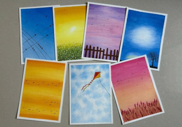
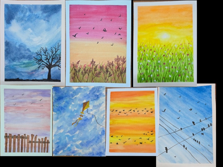
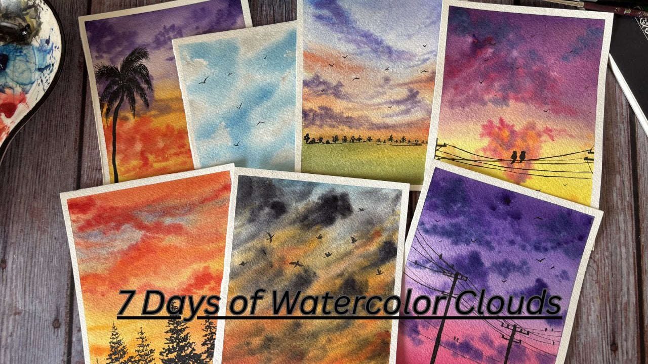
daily challenge class. In this class, we will be painting seven beautiful
skies in seven days, each with its own mood,
colors, and composition. Each day, we will focus
on a different sky and add an element
to it like birds, trees, slots, et cetera, to make the scene more
interesting and complete. These small additions will help you understand composition and storytelling while keeping the process beginner friendly. This challenge is perfect
if you want to build a daily painting habit or if you struggle with skies and want
to paint them confidently. I'll guide you step by step
through each painting, sharing tips on
blending, layering, and adding those little
finished touches to bring this skyle to life. By the end of seven days, you will not only have mini collection of
particular skyles but also confidence to paint your own versions
and experiment further. So gather all the materials discussed in the next section, and let's get
started the day one of Sky painting journey.
2. Materials Required: Let's have a look
at the materials that we require for this class. Starting with the paper. I have used Saunders
watercolor paper, which is in 300 GSM
and 100% cotton. I have this paper block, and this is a big size of paper. What I usually do is I
cut this one big size. Into small papers. I've cut these into
six papers and that's what people use for today's
watercolor painting. Next, are the brushes. I've used mostly
these three brushes, two silo Velvet, and
one from Princeton. You can go ahead with any brand that you have, but basically, we would need one
large size brush, one medium sized brush, and a detailed brush
to add in the details. Next, are the colors. I've used a mix of
artist create colors, be it from Shinhan white knight, anilar or Michelmson
gold as well. You can go ahead again with
any colors that you have. Next, you would
need a tissue paper to clean off our brushes. We'll also need a
glass jar of water. We also need a
masking tape to tape down the paper onto a
board or onto a surface. I would be using this board
to tape down the paper. I'll use this masking flute
in one or two class projects, so if you don't
have it, it's okay. If you have it, you can use
that for the class project. Palette, you can go ahead
and use any palette. I have the ceramic palette
that I generally use. This is just to mix your colors. This is all that we need to
start our class projects. Grab on all the materials
that you have beat, any brand, be a student
gait or an artist create. Grab onto your
materials and let's kick start the class project
from the next section.
3. Project 1: Stillness of Evening Sky: I have my paper he ready
using the masking tape, I'll take down the
paper onto this board. The paper is ready. I'm
just running my fingers across the tape to make sure that there are no gaps between the tape and the paper. Now for this class, we will
be just leveraging one color. I'll be using bright
blue from white knights. This is the base colour
that we will have, and we will also use paints gray or black to
add in the details. There is no sketch for this one. Using my Hake brush, I will just add on layer
of water to the paper. This will just help us lend
the colors seamlessly. I think this should be enough. Taking in my large size
silver velvet brush and bright blue, we'll start with
the gradient wash from the right side corner. I'll just keep my
paper this way. This is the wash that we
are going to go ahead with. You will have the
darkest tone over here. Let me take out
more of the blue. This is the darker tone. And as we come down
towards the bottom, we get the lighter tone. I will just tilt my paper
and paint it this way. So usually your gradient washes happen from top to bottom. But this time, we are
going to have it tigal. Again, picking in more color
and just blending this out. The paper has got a little wet. Let me just quickly
first reapply the water to maintain the
wetness of the paper. Now I'll just move my
brush from this top, which is basically the right top to the left corner bottom. Again, picking in more color, starting from the top right and just blending
all of this out. So whenever you pick your color, start from the top right
and then bring it down. Again, picking in more color, starting from the top right, and just trying to
bring this down. You can see I'm just running
my brush very loosely. I think that's it
one more time moving my brush from top
left to bottom right. Now, we will wait
for this to dry. But meanwhile, I'll just
use this tissue paper and dab off all the excess water that we have outside
our masking tape. This will ensure that the
water that we have here, the puddles that we have here, it does not see back into the paper once the
paper starts to dry. Just taking a new tissue and dabbing off all
the excess water from the corners of the paper. Side as well. Again, tap off from
the top as well. Now, let's just wait
for this to dry, and then we will
add the details. The paper has not dried. Now using black or paints gray, we will add in the
final details. I'll be switching between
my china brush and my small detail brush using the round size
detail brush for now, taking in black, drappic
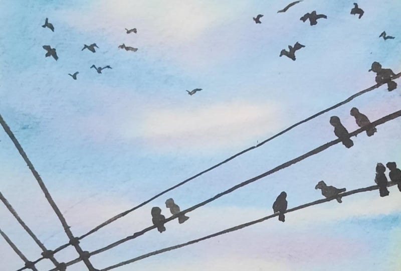
of all the excess water. You're painting electric robes. One goes here. Say the
other one goes from here. We have three coming
from this set. Let me just add those as well. This is the first one. The second one. And then have the third one. Now again, using these
detailed brushes only, we will just paint out
some birds sitting on these wires. This
is the first one. Then we have the second one. Say it is looking this side, you have your slight
beakish over there. The third one being here. We have one which is flying the more sitting the side. You can just paint
how many you want, thin fat looking in whatever
direction you want. I will also add few
flying ones as well. More sitting the side. So there's a group of
56 birds sitting here. You have you sitting
this side as well. So there are two sitting
close to each other. And a little bit more
over here as well. And what I lose I will also add few faraway words
into the scuff. The more nearer the bird is, you see my strokes are thicker and the
farther the bird is, it's more thinner and
just a slide brush. That's it. This is all that we had for this
first class project, simple and serene, building up the activity or
the practice to paint daily. Starting something
very simple which is not too overwhelming
for you all. I think we can just
peel off the masking. This is the final look of the painting. Hope you enjoyed this. We'll be back soon
with another one.
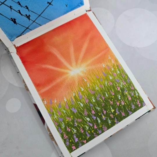
4. Project 2: Golden Hour Meadow: So for the next class project, I have my paper here ready. Using the masking tape again, I'll just tape down the paper. So the paper is ready. Again, for this class as well, we don't need a sketch
using mahakebush, we will just apply
even go to water, and then we will start
with the painting. Spend some time on this step and make sure that your paper is wet thoroughly from
all the corners and there is no puddle of water
or any part of the paper. I think this should be enough. Just take this
tissue that I have and tap off all the excess water from the corners of the paper. No, taking in my large size
brush and starting with the yellow apply that starting from the one
third of the paper. I'm purposefully keeping the
slight white hair to depict the sun now using orange, just add another layer. And the third color is Vermeilion
taking in that as well, dabbing off all
the excess water, add that to the top layer. You don't need a very
dark tone of vermilion, a very lighter tone to have just a tinge of
redness to the sky. Just adding that. You can see my strokes are all horizontal taking in yellow, dabbing off all the excess water and applying the sheet to
blend all the colors out. Towards the bottom side, let me just first clean
up my brush and just try to maintain this
light whiteness that we want onto our paper. It doesn't have to
be a proper circle, like the sun shape, but just a very
light tinge to just, you know, depict that there
is sun at the background. Meanwhile, I'll also remove
green to my other palette, a very light tone of sap
green and using that, we will add that to the
bottom of the paper. We will add in the
details later, but just using the shade, just adding in the tone of green to blend it
with the background. Again, cleaning up
her brush thoroughly, dabbing off all
the excess water, I'll continue to lift the
color from the background. I'll just take in yellow, and again, we'll just
blend all of this out. I'll just take my
tissue and dab off all the excess water from
the corners of the tape. So that, you know, when
the paper starts to dry, these colors do not go
back into the paper and cause cauliflower defect. So just very slowly dabbing off all the excess water from
the corners of the paper. Let's wait for this to dry, and then we will add
in the more details. Okay, so the paper
has not dried. Now using my detail brush
and mixing in yellow and green to get lemon green or a lighter tone of
green, we will add in some. So now we'll paint
the meadow, right. So we will add in
the grass streaks. And what I'll do is we will have because this
is the sun here, you will have the
lightest streaks somewhere coming here
and here we will have the darker one because the sun rays might
not be coming in. So for now, I'm just
adding in at the top only. So you can see I'm
just taking in the color a mix of
yellow and green. It might not be always
visible as well, but I'm just playing around
with the leafy structures. You can see I'm just playing
around with the leaves. It could be in
multiple directions. So could be long, some could
be short, just applying this Now, the same mixture, I'll add more of green and get a slight dagato then
we'll apply that. We will go layer by layer, and we'll build on the
meadow slom bit by bit. Some could be thick, some
could be thin, so that's okay. Again, I'm trying to build
in multiple directions. So no taking in sap cream, we'll add in the next
layer of grease. Again, you can paint this in
any direction that you want. If you want, you can add
this all in one direction, so this could depict a wind is blowing and everything is in one direction or it can be
in multiple directions. There is no wind. It's just
the leaves the way it is. Some of these strokes,
I'll also add in from a little
bit below as well. So we just need to
keep on building on this with multiple tones
and multiple colors, adding in some lighter
tones as well in between, just to give another dimension that mostly light ones would
be at the top because, again, the sun effect. That you can see, I'm just
laying around with the grass. Now to the screen, I'll just add a little bit of
indigo or any blue that you have to give it a
slighter darker tone. You can also add in Pain's gray. Actually, let's add in the
pains gray instead of blue. This will give us a
darker tone of green. Then again, repeating the
strokes, we will build on it. No This is like a therapeutic exercise. There's just no nothing wrong. There's no definite pattern
that needs to be followed. There is no definite technique
that needs to be followed. You can just play around and, you know, and in
these brush strokes. You can have a mix
of dark black, you can have a mix of dark
green, and sap green. Adding a little more of paints gray to get a little
more darker tones. Adding a mix of just
dark green playing around with these
different tones to build in the
depth of the meadow. And now taking a little
more tone of pains gray and just adding
that out in between. With all the shadows coming in, these small grasses would be
a very darker tone because it has all the grasses from the side on the top
blocking the sunlight. These will have a
very dark tone. Just adding those so this is
the meadow that we have now. What I'll do is I've taken
out some white guash here, and I will add in a
tinge of quin rose, taking the mix of
white and quin. So this will give us a
pinkish shade using that. And because I have
used white gouah so ideally if you apply pink or
red on top of the screen, it might not come out well because it is a darker tone and you're adding a lighter
tone or a low tone color. But because gouache
is opaque in nature, you can add those. It will come out very well and it will give
you the textures. These are very little far, so I'm just randomly
dropping in some flowers. A few dots here and there. Just adding in some
places a little more of pink to bring
in some diversity. This will give it a feel
of a flower filled meadow. You can paint the way you want. There is no right
or wrong for this. Just keep in mind that we
will also add one more color. We will also add white flowers as well along with these pink. Just make sure that you have
some plays for that as well. Because these are nearer, I'm just trying to paint like you have petals
and show that out. There might be some
in between as well. Small flowers, some petals seen between
these grass that we have. What I'll also do is
using a diluted tone, let me just cover up a sky area. I'll just add some
splatters as well. Let me take a little bit more
of water and there you go. Got some splatters right. Okay. Now, just taking in
some white directly from my Guash tube and just adding
some of those in between. The same pattern, same way, we will add some white
flowers as well in between. This will give a feel of flower filled meadow and you also will get a
variety of flower, another white color of flowers. Just adding those in Again, it is all very random. You can place it around
the way you want. The shape. You can place it
around the way you want, the shape you want. It
is all very random. Just play around and work on it till you want it until you're happy
with your widow. There is nothing, no right
or wrong on this one. Okay. Again, let me just quickly take
a diluted tone, cover my sky and add some
white spatters as well. This is the end of the painting. Let's just wait for this to try. This is now al right. Let us just peel off the
masking tape now. This is the final
look of the painting. This looks beautiful, right? Thank you for joining
me in this class. We'll see you in the
next class project.
5. Project 3: The Quite of the Dusk: Okay. I have my
paper here handy. Using the masking tape, we'll tape down this
paper onto the board. I'm just running my
fingers across the tape to make sure that there is no gap between the tape and the paper. But this one has a small sketch, using my pencil and eraser, we'll start with the sketching. You'll be having a
fence over here, just sketching it out. It's a wooden fence, so it would be slightly irregular and not
exactly straight lines. We'll also have some gaps
between the wood like this one. So just sketch out
fences the way you want. They could be of any
shape, any length. So these vertical fences are joined together with
horizontal fence. So let me just first add it and see this one ends here and
another one starts here. The vertical fence is what
is visible from our view. The horizontal fence
is basically blocked. I'm just trying to remove these lines data coming through. It would be very clear
once we close this. Say this is the sketch. Okay. Each of these vertical
fencing are joined to the horizontal one with
the help of a nail. We'll just add that. At this one, because there are two planks
coming in one till here, and then the other
one from here, this one has two nails because it's holding
onto both the planks. This is the sketch for today and the color stack we will use is
quincle down rose. I'll just add that onto my palette and boil
it for the sky. I already have that
onto my palette. Now, using my Hake brush, I'll apply even coat of
water throughout the paper. Spend some time onto this
step because we want to work on the sky,
wet-on-wet background. The more time spent on this, the longer your
paper will stay wet and the longer you will have
time to work on your sky. Just make sure that
there are no caps, no puddles onto the paper, and just make sure that there is no corner which is not wet. I'll just leave it for a few
seconds and then I'll add another layer of water. Okay. So now my paper is
thoroughly wet. Using an old tissue, I will just dab off all the excess water
from the cutters. This is just to make sure that once the paper starts to dry, the wetness from the corners does not seep in into the paper. Because if that happens, the paper blooms
and it gives out a cauliflower effect
onto your painting, which is something we don't
want to happen to our sky. Run through my finger and cross again to make sure
there is no gap. This side I feel some
water has seeped in between the Again, just adding in a
very light layer of water to maintain
the wetness. Now, using my large size
brush and quinradon pink, diluted tone of the same
tabbing of excess water, we will start with the sky tattoo from the middle portion. That's where the pinkness
of the sky will be seen so I'm just adding that. I'm starting with
a very light tone, and as we paint, we'll gradually increase
the tone of the pink. I got a slight orange from
my palette, but that's okay. No worries. I just
peel off my brush, dab off all the excess water, and I just lend this out. Okay. So this is the beauty of painting with watercolors and to wet-on-wet, you can easily
rectify your mistake. Just clean in your brush, dab off all the excess water, and run your brush
through your mistake. Okay. Now I'll use violet. Again, starting with
the diluted tool, dabbing of excess water, and we start with the top. This is our violet e. Now violet and pink are complimentary
colors to each other. Hence they blend out perfectly. Let me clean my brush, dab of excess water, and lend this out. You can slowly bit
bit work on your sky. That's the reason
we spent some time in making sure that
the paper is wet. This is the darkest purple. This is the layer of purple that will come, just the purple. I'm just adding
that to the bottom, taking in more
color and just add. It's still not too dark, that the fencing that we will paint would be brownish shade, that will still be seen through the layer of the wallet that we're
adding right now. Cleaning up my brush,
taking a little bit more of wallet and I will just add some darker tones
towards the top. We just blend this out. The strokes that you
see right now is all horizontal because that's the shape of the cloud sky that I wanted to
depict in this scene. Sometimes you see streaks
of purple and pinkish sky. That is what we are trying
to achieve in this painting. Now, let me just take
my medium size brush, Dave off to the pink. Pink, above all
the excess water, and I'll just try to
add those streaks. If you feel that these
streaks are coming a little thicker for you and you
want thinner streaks, use your detail brush. Feel free and play around with
the sky the way you want. Even if you don't want
to add a lot of streaks, then you can just let
the sky be it as is. It's a lighter tone sky, so you can still continue to
have it the way you want. That's the beauty
of painting skies. It's you can just continue the way you want and when you're happy with your sky, you can just stop applying more color and more
streaks and let it dry. I think I am also
done with the sky. I'll just add in some
darker tones here, as well as towards the top and that would be it for
the sky that I have. Some darker purple over here, and this side as well. Running my brush to blend out the colors and not have any harsh edges between
the colors that we have. This will become lighter
when this dries. I want to have a
lighter tone of sky. That's why I'm not
adding more tones to the sky if you want to build
another layer on top of it, you can and if
your paper is wet, only then apply a darker tone of let and quicon
rose to the sky. But I don't want it
to be a darker tone. I want it to be lighter tone, and that's why I'm just in here, do all the excess water
from the corners and we'll just wait for this to dry
before we add in the fences. The paper has now all dried. Now we'll paint the fencing. First, we'll paint the
horizontal one because that's at the back side and the vertical
ones are at the front. When we paint the vertical ones, it will overlap the
horizontal ones and we'll give a look
that's towards the back, whereas your vertical ones
are towards the front. For this, I'll be using
my medium size brush, and the first layer will use white knights Indian gold The sketch has become too light, but because we had
sketched it out, I know which other
places we need to paint the vertical ones
and the horizontal ones. So for now, I'm just going
ahead with the horizontal one. The graphite marks are there, but it's just very light. So I'm just leveraging those
marks and painting it out. Okay, so this is
where this ends, and this is where the
second one starts. Okay? Just adding the shade. So this is the first layer. It's okay if it doesn't
come out to be super well. Now, using my detail
brush and burnt sienna, we will add in the details. I'll just tap off
all the excess water and just in some place, we'll drop this color and lit because the base
color is also wet, so it would just blend it out. Okay, so I'm just
dropping this color at some places and letting
the water do its magic. This is still the base layer, so it's okay if it
doesn't come out to be super proper or
the way you want, because we will be adding in another layer once this dries. I'll just clean my brush
and just try to bring the soft blend on this side
of the horizontal wood. So I'll just smooth
it out the blends. Now, I'll add in a little
bit of pain scrape to burn sienna and basically get the sepia shade and using that dabbing of
all the excess water, we will add in more
depth to this. You see wood in these fences
has these dark brown lines. I'm just trying to
recreate those. Very carefully just
creating these lines. This one, it's
still a little wet, so it's platting out. I just taken a little bit
more of dense colour. Done with this. Let me just
take a little bit more of this darker tone and add a
little more in some places. Some section of your w will be too much darker
versus the others. Hence, I'm just trying
to get that effect. Cleaning up my brush and I'll
just blend out this part. This became too prominent that
we've added another layer, so just blending this out. So this is done. Now let's wait for this to dry and then we will paint on the
vertical streaks. So this is now all tried, and now we'll paint
the vertical ones. Again, I'll use my
medium size brush and Indian gold above
all the excess water and start with this. Similarly, for this one, I'm just adding the
quarters first, and I'm having a flat
wash done for now. And then later, we will add in more
details and more tons. Okay. What I'll do is I use
born Siena tab of excess water and add
some bits of it. This is actually CPA. My born sienna has
got mixed with paint scre We had mixed that
for the horizontal nine. I'll just take up a
little bit more of born sienna and then
we'll continue on this. Now, taking in Indian gold, dabbing off all
the excess water. And now taking in burn CNA, dabbing off all
the excess water. I'll just drop off the sheet. It's all going to
blend out, right? It is not going to be
the exact way it is coming out for my
vertical fence, right? So just play around
with your own fence. Somewhere it will be a little
bit darker with burn Siena, somewhere it with the sepia. So that's the beauty of
it because that's how your natural logs are right?
It's not all the same. Play around with these
three shades for now, and then once this dries, then we will add in
the sepia as well. Again, taking in Indian gold. Indian gold also, as you see, it's not a flat wash, there is a darker
tone over this side, but it's a light tone as I
come down. That's all okay. That's how we will try to build in the tones bit by bit, okay? Now I'm actually playing around with the mix of Indian gold and bon sienna and we'll apply that to all the
fences over here. And then we'll play only
with bon siena and sepia to get the different textures
on the wooden fence. Let me around with this first and then we'll add
in those details as well. I'm going to use
two of my brushes, the thin, the detailed one, and the medium sized one.
So these are still wet. I'll not touch them for now, but we'll start with these ones. So I will first take in sepia, dab off the excess water, so that's when the
people will be here. And I add in the darker shades. So vertical lines like we
did that horizontal lines. Similarly, we'll do
the vertical lines. Now, I use clean water, dab off all the s
from this brush, and I will just blend this out. The harsh edges of the new color that we have
just applied that we see, those gets blended out. If there are any harsh edges, I'll just lend it out. You see the shape of
my brush has changed. It means that it has
almost zero water. Using that is what I'm blending
out all the harsh edges. You will have your darker tones, the area where your
wood is either cracked or broken, right? That's where you can add these
textures and tools. Okay? I feel there is no need
to blend this out. This is bringing out the
natural texture of the wood. I will just add in these vertical tools from the top and then from
the bottom as well. This would be a darker side because it has this this
wooden is broken, right? So it has this cut over here. Thanks. Every wooden pane, if you see, it's painted comes out
in a different way. So it gives out
that natural look, not all of your
wooden paints will be in exactly similar manner. It will have different textures, different colours, some
will have a darker tone, some will have a lighter tone. All of that has to be taken into consideration
when you paint this. Okay? Now, what we'll do is using black, we will add in the fine
very thin details. Those cracks, lines, all of
those we add with these. You can randomly add
these black streaks. Again, it has multiple broken
sections over here, right? So those will have
black coming in. Then you can add that very thin, very light tones towards
the other side as well. It's a very soothing
and calming process. Just don't worry
about the outcome. Don't worry if line is coming
out to be super thick, super thin, just paint around. Just create these lines
and once you are into this into creating these
lines in the textures, it could be such a
peaceful moment for you. You'll feel so seri
working on this. Now, while I'm painting
these black lines, I feel that we can also add some pern sienna lines as
well in a very dense texture. It will also give a good look. Once I'm done with
this black lines, we'll also add not too many, but some of the brown lines as well to just bring
about the texture of the you also have to add. Remember those nails
that we added. Skits add that as well. That is also going to
be of your black color. And now, taking in Gn sienna, tapping of all the excess water. I said very few, so I'm just adding in very
few lines of born sienna and burn sienna and a little bit of pains gray as well Sapia mix. I'm picking up some
time burn Siena, picking up sometime a mix of
burn sienna and pains gray. We don't need to
be too prominent. It's just that it should have that little tinge of
born sienna coming in. So in some parts
of your wood where your base shade is lighter, right, you'll be able to get that burn sienna
tone coming in. So this looks done. I will just add in little birds on the sky
just two, three birds. That's all for
this last project, let us now peel off
the masking tape. This is the final
look of the painting. Hope you enjoyed this class. We'll see you on the next
one till then. Bye bye.
6. Project 4: Luminous Nightfall: Okay, I have my paper here. Using the masking tape, we will tape down the
paper onto the board. I'm just running my
fingers throughout the paper to make sure
that there is no gap between the tape and the paper using my silver
velvet hake brush, I'll just add an even at of
water throughout the paper. Spend some time on this step and make sure that each
and every corner of your paper is wet and make sure that there are no pools
of water on the paper. Using the tissue paper, I'll just dab off
all the excess water from the corners of the paper. This is to make sure that
when the paper starts to dry, the water from the corners does not seep in back into the paper, applying another
even coat of water, and then we will start
with the painting. Using my large size
brush and cobalt blue, you can use either Prussian blue or cobalt blue, any one of them. We will start with the painting. It's a monochrome scene which
majorly painted in blue. The corners will be darker, so I'm just taking in
denser tone of color. And what I'll do is a very
clean brush and yellow. I'll just add some streaks of yellow and pink
at the bottom. Done with yellow,
now using in pink. Adding those as well, cleaning up my brush, dabbing off all
the excess water. And I'm just smoothening
out this blend. We don't want a darker tone. We just wanted a very light tone of the pink and
yellow coming in. So I've just got that. And now, again, we will build
in the blue. Okay? So here is a darker tone
of blue that will come in. So just trying to get that I've added in the
major chunk of color. Now to get in the details, I will switch to my
medium size brush. Use cobalt blue and add in some darker streaks
and cleaner streaks. So here is a darker bunch of clouds which we'll be adding in. Those are coming here, too. So we just need to
add in the blue so that the orange and the
pink that we have applied, that just shines through the darker tones of blue that
we're applying right now. The yellow and the pink
is not very prominent. It's just shining in
through the blue clouds that we have on top of it. Okay. So just trying to get that look. And then again, on the top, we will have more
clouds coming in. So I'm just adding those
with a denser cobalt blue. So your corners are
always the darkest. So just trying to
build that Okay. Middle is where we will
have some cleaned look. So you will have a very lighter
tone of blue coming in, either that or we will maintain the whiteness
of the paper. Okay, let me take in
my large size brush. Let me take in the cobalt blue, dab off all the excess water, and try to build in
the sky streaks. Now, I'll again take a little
bit more of cobalt blue, but I will also add
in indigo to it. Let me just do that. And then we'll try to build in
the darkness of the sky. Switching to my medium
size brush for now, just to make sure we get the
right look and the texture. So I just have just added little bit indigo
to the cobalt blue, and I'm trying to build in the top layer of the
sky using that Takato. Let me also use my
large size brush, dab off all the excess water, and we try to build in the sky. So this is another layer where we will have
the darker tone. So I'm just trying
to build that. You see my strokes. These are those cloud like strokes
that we have, right? I'm just trying to get
that onto the paper. Similarly, those dark strokes
we might have here as well. So just adding onto that. Okay, you see my streaks. It's all horizontal. And now using in cobalt blue, I'll just try to
blend this all out. Okay. Cleaning up my brush, dabbing off all
the excess water, and just trying to get that
darker to lighter tone. Again, dabbing off
all the excess water, cleaning up my brush, dabbing off all
the excess water. And we try to maintain the
whiteness of the paper. Just blend the darker
moreton the corners. I like how this one
has turned out. I'm not touching this section because this is something
which is looking very pretty. This is exactly what
I wanted to achieve. You have your pink and yellow just shining
through the blues. Now let's wait for this to dry, and then we will add in the
black tree at the photograph. While we wait for this to dry, I'll just dab off all
the excess water from the corners to make sure again that whatever
color we have applied, we have also applied
water with it, right? So that does not see
back into the paper, and we do not get
blooms onto the paper. Okay. So just to
avoid that, again, dabbing off all the excess
water from the corners. Now, let's wait for this to dry, and then we'll work
on the other details. Okay, so the paper
has not dried. Now using a medium
size brush and black we will add in a
few details over here. Okay? So it's like a
shadow or say sunset view. So you have the black
silt over here. Okay, so this is the foreground. Let me just take a little
bit more of black. And right in the middle or
towards the three fourth, we will have our tree. So let me see where to get this. I'll get this somewhere over here so that we don't cover out the white the yellow and
the pink that we've got. Say, this is what
the tree looks like. It has a thicker trunk. But then you have multiple
branches out of the tree. And you will add in all the
minor details as well, okay? You can add in as many
branches as you want. So first, right now, I'm just adding the first
layer of branches which can be painted using
the medium size brush. And post that, I will leverage my detailed brush and add
in more smaller branches. They will be intertwined
with each other. Okay. And say for this one, as well, you have another
one branching out from here. This is the soothing part, add in as many
branches as crooked, as straight as much
as you want, okay? Now using my detailed brush, I will add in a lot of
these branches, okay? Se starting from here. So you add in these branches. And then I'm thinking, let's
add the leaves as well. Or we can have it barren. If it's barren,
then we show all of these tiny branches coming out. I see I'm just
playing around with the branches and adding tidy, tiny branches towards
the end of each of these small sub branches
that we have created, okay? Add as much as you want. If you feel that's enough, stop, and then do
not add anymore. Let me actually add
some this side as well. It feels a little
smaller over here. So I'll just extend
these branches little and add slightly more smaller
branches, this side as well. Okay. This looks good, right? Let's just wait for this
slightly to dry more, and then we will peel
off the masking tape. Okay. So this has now all right. Let's peel off the masking tape. This is the final
look of the painting. Hope you enjoyed
working on this.
7. Project 5: Wings in the Fire Sky: I have my paper here ready. Using my masking tape, we'll tape down this
paper onto the bowl. So I'm just running my
fingers across the board to make sure that there is no gap between the tape and the paper. Now, using my hake brush, I'll apply even coat of
water throughout the paper. Take some time on this step
and make sure that no corner of your paper is left from applying an
even coat of water. And also, make sure
that there are no pools or puddles of water
anywhere on the paper. Now, using my large size brush and yellow dabbing
of the excess water, I'll just start
with the painting. We apply yellow coat bright though with some
parts of your paper. Somewhere here as well. Now, cleaning up my brush, taking in orange, add
in another layer. The white stuff do
you have? We will add in the orange color. For now, this is enough
as the first for orange. Now, cleaning up my brush again, taking in vermilion tab
of excess water will add that color to the top and also some of the
darkest points on the paper. Save this one. Okay. And we have another one over here
and at the very bottom. Now, a thin up my brush will take in yellow and
we'll blend this out. Okay. Yellow is a
complimentary color which blends well
with orange and red. I'll just pick that up and run my brush
throughout the paper. Whenever I reach
the yellow section, I'll clean off my brush, take up fresh yellow,
and apply that. Again, this area, I
clean up my brush, take in fresh yellow tab of
excess water, and just apply. So it's easier to apply
yellow on top of red. But when you come to
the yellow region, it's important to maintain or retain the yellowness
of that region. For that, clean up your brush and just then pick up the
yellow that you have. I'll just take in
a little bit of vermilion more and add that to the top of the painting just
to bring that darkness. Now cleaning up my brush, taking in more yellow, dabbing all excess water, I will just clean up the sky. You can see whenever I'm trying to play around
with the yellow, I'm going back to my tissue, cleaning up my brush
and then working on the yellow region. Okay. I'll just take up a little bit more of yellow onto the palette, a little bit of
vermilion as well. I want to bring out that bright vermilion
shade onto the paper. So going again ahead with my large size brush
using in yellow, tabbing of excess water, try to add that color
onto my yellow area. Now, cleaning up a brush, taking in vermilion and working across the
darkest stones again. Okay, as well this side, and then at the very bottom. Now can cleaning up my brush, dabbing of excess water, taking in yellow, and
blending all of this out. We do not want a
very evident split between yellow and the
reds that we have painted, but we want to also maintain
the yellowness of the sky. Hence, I'm just being very careful while playing around
with the yellow area, but it's okay to have
some overlap between yellow and the red to give
you the orange tinge. That is why we had added or orange as well to bring
that toll to the sky as well. The red and yellow,
you get the orange. When you're working
on the final layers, you might not need to apply orange because your yellow
and red when mixed together, will take care of that
color combination. Just blending this out to remove the hair like
strokes that we have and also remove the very
evident demarcation that we had between the
red and the yellows. Cleaning up my brush, taking
a little bit more of yellow, and I think just trying
to clean this up. Okay? I just picked
up a little bit of red to bring that darkness to the top and the bottom area. But I think we
should be now good. Just making sure
everything is okay. Now using my tissue, I will just dab off all the excess water from
the corners of the paper, to make sure that when
your paper dries, the water from here does not
see back into your paper. For this one, just
play around with the shades and try to
get a blend of yellow, orange and reddish skies. Before we'll go for this to dry, just dab off all
the excess water. I see some hairline
streaks over here. So with the damp brush, you know, it does
not have any water. You can see it's changing
the shape, right? Because the paper is still wet, that's why I'm doing this, okay. If your paper has started to
dry, please do not do this, but I'm just running my brush, blur out the hair like
streaks that we're coming in. Let's wait for this to dry, and then you will add
in our flock of bods. The painting has almost dried. You can see there
are some patches on the top and towards
the left corner. This patches means that the
paper has started to get spoiled and you do not get to know if your paper is spoiled before starting the painting. It's only after you paint. That's when you realize that your paper has
started to spoil. Now your paper, just a pro tip, I purposefully had kept this class still on
Skillshare so that this one, everybody can get to know what happens when your
paper gets spoiled. This is what happens.
So this happens because it could be that your paper might be an older one. It might not have been stored in a very optimal situation
away from humidity, from sunlight in
dark covered at all. So even if you do that and still your paper can get
spoiled. That's okay. That's why I'm not I could
have again painted it on a new paper and given you a new class project
without these patches, but I still wanted to give it here and show it here
so that, you know, you still get to
know that it's okay, these things happen
and you're painting, but it still will be beautiful and you can embrace it as is. Now I've taken up my detailed
brush and I'm using black, and we will add in a flock of birds just on the
middle side. Okay? So there's a flock of birds, which is flying back
home. It's a sunset view. That's all we want to show as
another element of the sky. So I'm starting from here. That's a bird.
There's another one. All of these words are
flying in this direction. That's what I'm
trying to build here. There might be some which are flying very
near to each other. Can form any shape
that you want. There could be some
flowing down as well. Okay paint as much as you want, as
many as you want. There's no right or
wrong on this one, even if it doesn't look like a bird, it could be something. There are two birds
flying together, so it's just not coming out
very proper, play around. Don't worry with the way
it is coming out to be. It might not always be
perfect, but that's okay. We are learning to paint here. And sometimes they
might not look like the way we would
have wanted it to come. That's okay. We
learn along the way. I just feel that
it's very empty. What I'll do is I'll also
add few here and there. They could be they could be flock, which
is just entering. I'll just add few birds. Another flock of birds. So could be flowing in the opposite this
direction as well. We can try to build that too. So birds are here. I had
initially thought to just have one set of
birds, one flock of birds. But now I feel I just
love painting birds. Now I feel it's okay. I can add few here
and there as well. So it could be two block
of birds going back home. I think that should be enough. This looks beautiful, right? A very calm and
serene sunset view. Let me just peel off
the masking tape. So this is the final painting. This looks gorgeous, right? A very calm and serene one. That's, that we have for today. We'll meet you again tomorrow
with a new glass project. Thank you for joining
me for this one.
8. Project 6: A Playful Sky: I have my paper here ready. Using the masking tape, we'll tape down this
paper onto the board. I'm just running my
fingers throughout the masking tape
to make sure that there is no gap between
the tape and the paper. Now for the pencil sketch, we will sketch out
a kite in the sky. This is the ribbon that we have. H I just sketched it out a little upside down. So this needs to
be the longer one. And then you have the
shorter one over here. And say, this is the
string that goes. I'll just lighten up
the graphite marks. Again, taking in my brush, taking in the soap, using the masking fluid, I'll just take out
some masking fluid, add a little water, and we'll upright this to
the whole of the guite. If you want, you can apply
just towards the corner, but I prefer applying it to
the whole of the object. Like, for example,
here, the kite, it gives me the freedom
to then just play around with my background
the way I want. Otherwise, even with
the masking fluid, I need to be cautious. Hence, then I prefer to add in the masking fluid
to the whole of the object on my paper versus just the corners
of that object. This is done. Let's just
wait for this to dry, and then we will
start with our sky. So this has not dried off. Now, using my hake brush, I'll just apply even coat of
water throughout the paper. Take time on this step and make sure that your paper
is thoroughly wet. Also make sure that
there is no pool or puddle of water
anywhere on the paper. Using my tissue, I'll just tap off all the excess water from
the corners of the paper. This is to make sure that once
your paper starts to dry, the water from your corners does not see back
into the paper. If that happens, it causes blooms and we do not want that to happen. I
think we should be good. Now, using my medium size
brush and cobalt blue, we'll start with the sky. I'll just apply the
colours in some places. We are going to paint a
clear sky with white clouds. So I'm just trying to get
the first layer done in. Taking in more color, dabbing off all
the excess water, and I'm just working
on with my brush. Is the clear sky, the blue strokes as of now. So places we will
have darker tones. Now, cleaning up my brush, dabbing off all
the excess water. I'm just lifting off
some blues color from some places to get the
whiteness of the paper. Now, using very,
very diluted tone of pain scray I'm going to just drop it off at some places to get
that cloud effect. Okay. You can see it's
very, very light, and I'm just adding it
to some places only, especially the area where
we have some whiteness. We can add in a tone of gray to just bring it out the
shadow of the clouds. Let's wait for this to dry. I'll just tab off the excess color from
the masking fluid. The area where we've
added the gray, right? I'll just with my tissue, bring out little
whiteness onto the paper. That's all. That
should be enough. Now, let's wait for
this to dry. Okay. This has dried now. You can just use your fingers to peel off the masking fluid. Taking in my medium size brush and just taken in vermilion, tabbing off all
the excess water, we'll just paint it out. To this side, we will
paint in the vermilion. It's a half vermilion
and half yellow kite. I'll just take a little
bit of pain scrape, add it to the vermilion, a darker tone, and just
drop that color over here. This bob let this drip post which we will paint
out the yellow, otherwise, the colours will
flow between each other. So I'm just painting
out this ribbon. Again, taking a
little pains grave, adding that to our vermilion and dropping that
dead some places. Meanwhile, taking in the
yellow and adding the ribbons. Now again, taking in
the medium size brush, taking in yellow, dabbing
off all the excess water, and we will just paint this out. This has just started
spilling over. So we'll just make
sure to tap off all the excess water
and blend this out. It's okay, even if it's
getting spilled over. Meanwhile, I'll just keep on running my brush
across this to make sure it doesn't
get spread a lot. While this is still drying, what I'll do is I'll take red. You had in some highlights on some parts to make
it more evident. Similarly in the yellow as well, you will not have the same
color throughout, right? It would have some
shadows and all right, so I'm just trying to add it. Let's wait for this to dry. Once this is dried, then we will add in the details
with the black color. Using in black and
my detail brush, dabbing off all
the excess water. I just add in the thin line,
the thread of the kite. Trying to add in few
details on the guide. These might not be
exactly visible. I'm also trying to if
you see I don't have accounting lines broken
at some places, right? Similar to this side as well. Just trying to get some details. Not very evidently
visible, but just there. Let's wait for this
to completely dry. Okay, let's peel off
the masking tape. This is the final
look of the painting. Hope you enjoyed this.
9. Project 7: Chasing the Sunset: Okay, I have my
paper here ready. Using the masking tape, we will tape down the
paper onto this board. I'm just running my fingers throughout the
paper to make sure that there is no gap between
the tape and the paper. Now, there's no
sketch for this one, so we will directly
start with the painting. Using my hake brush, I'll add in a layer of
water onto the paper. Take some time on
this step and make sure that your paper
is thoroughly wet. The more time you
spend on this step, the more time you will get
to paint your background. Just keep on running your
brush throughout the paper. Make sure there is no
section which is not wet and also make sure that there are no pools or water puddles
anywhere on the paper. You can also apply your water on a slanting wave so that all the extra water
flows down below. I'll just use wet tissue and dab off all the excess
water from the corners. Using my large size brush and Quin Rose will start
with the background. So I'm just applying
a very diluted tone of quinn rose to the top. Using an Indian gold, we'll apply that to
the middle section. And then again, using the quinn. So I'm just applying it from the top and we'll apply
it also onto the bottom. Stabbing of all the
excess water and color from the corners. Again, using in more of pink, adding it to the top. And then just
blending it out with the Indian gold that we have. Towards the bottom, I'll
also take burn Siena and just drop off the color as well. Just something like that. I'll just blend out this
pink a little bit more. And now using my detailed brush and sepia or a mix of bone
sienna and paints gray, dabbing of all the excess water, I'll try to add
in some branches. This one we are painting
out to be wet on wet, which would feel like, you know, there are flowers and there are some branches at the back, which would give
the blurred effect because we are painting
it out all wet on wet. You can also take some
of your burnt sienna as well and add that
to as the branch. So you can see I'm just very random I'm just carving out
some grass like streaks. And now cleaning up my brush, taking in bright opera, dabbing off all
the excess water, just dropping that out to show the flowers all in the background with
the blurred effect. You can add in as
many as you want. You can also take a
little bit more of your quin rose and
add that sad as well. It will just give
a little dimension and more depth to your painting. Using my large size brush, I'll just clean this out. Let me just take a
little bit more of pink and just blend
all of this out. Again, continuing
with the pinks. And now what we'll do
is notice a little bit, cleaning up my brush, taking in the sepia, the burn sienna,
all that mixture, will try to get the
branches again, connecting these
flowers as well. Random streaks, as you can see. The first time when
we built on it, the brown was also wet from the color that
we had applied, and then the streaks were not coming out to be too
prominent, right? So that's why while
we added that, it got blurred out and
merged with the background. So now just Again, added these strokes and mostly these will
not get blood out. We will anyways be painting
more on top of it. This is just to give the effect of some flowers being
far from the eye. So that's why you have this
blurred effect coming in. I think this looks good. Now let's wait for this to dry. And then we will paint in the flowers and the grass again, which would be once
after this dry. So I'll just take my
tissue paper and dab off all the excess water from
the corners to make sure that there is no water or paint that seeps in into the
paper while this dries. So just going around the board and dabbing
off the excess water. Okay. Now let's wait
for this to dry, and then we will continue with the painting. This
has not dried. Now using my detailing
brush and burn Siena, we will just add
some more flowers of the meadow on the front. So starting first
with burn Siena and a darker tone
of burn sienna, so I'll just add a little bit of paints gray or black to it. So for now, I'll just
add in the stems, and then we will add the
flowers a little later. So you can play around and
add it the way you want. It doesn't have to be
exactly the same place or the same way that
I am painting it. Play around with this and add in as many flowers as you want. So shorter. I'll just add some two, three short branches over here. Now, cleaning up my brush, taking in the quin rose, and we'll just add
some flower strokes. So you can see I'm just adding some dotted flower strokes. So it's a group of
flowers together. That's how we also
painted when we painted these flowers or the wet and wet
background, right? So taking in the same pattern, we will just add the flower. Add in a little bit of
oprah pink as well. So places to bring in that
tone and depth as well. So I'm mixing with the colors. I'm adding the queen rose at some places and also adding
in the opera as well. I think that is all that I wanted to add in
the meadow area. Now, you see, I got a
spot over here because I think it was removing a fiber while we were
painting the background. So what we'll do is we'll
add some birds and we'll try to cover this with the birds. Be careful because
this is still wet. So be very careful while
painting your birds. Add in as many
birds as you want. I think I'll just
add a few more here, and then we will wrap this up. That's all for this painting. This is almost dry so we can peel off the
masking tape now. So this is the final look
of the class project. Hope you enjoyed this class.
10. Conclusion: Congratulations. You did it. You have completed the seven day watercolor skies challenge. Over the past week, you have painted skies with
different moods and learned how to enhance them with simple elements like slots, birds, trees,
meadows, et cetera. More importantly, you have developed a habit
of painting daily, even just for a few
minutes in a day. I hope this class showed you how much variety and expression you can bring with
just the skys. Remember, you don't
need to stop here. Skies are endlessly inspiring, and I encourage you to
try painting them in different colors
at different times of the day and in
different seasons. I would love to see
what you have created. Please upload your projects
in the class project section, whether it's all seven skies
or even just a few of them. Share your journey,
your experiments in the discussion forum, and I would be happy to help you out in any guidance
that you need. Seeing your work inspires me
and your fellow students. If you enjoyed this class, don't forget to
review this class. This will help this class
to reach more audience. Do follow me here
on Skillshare so that you will know when my
next class is reviewed. Thank you for painting
along with me. I truly hope you enjoyed this class as much as
I did by creating it. I can't wait to see your skies. Till then, bye bye.
Happy painting.
 Shalika Gupta, Watercolor Artist