Transcripts
1. INTRODUCTION: Hello, and welcome.
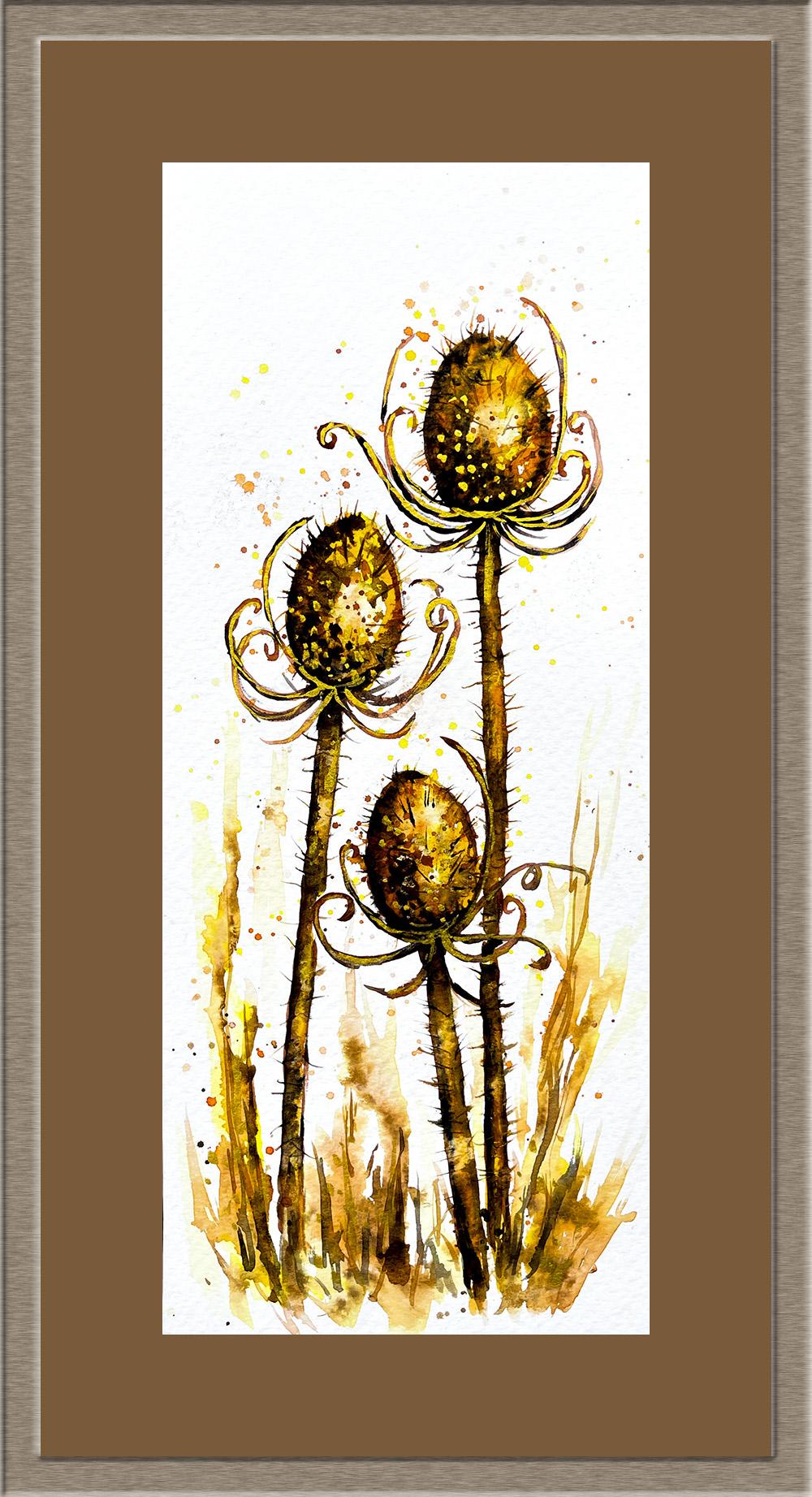
In this class, you'll learn how to paint expressive teasels
in watercolor, focusing on texture,
tonal contrast, and loose confident brushwork. We'll begin by reviewing
the materials, drawing and composition before building the painting in stages. We'll start to develop
the teasel heads and stems using layered color to
create form and structure. I'll show you how to
suggest spines and surface texture
without overworking the painting and how to use tonal values to create depth
and a strong sense of light. We're even going to add some bright gold paint to
add a touch of glamour, and I'll also show
you a natty method of mounting and framing an
unusual size painting. It's jam packed with
watercolor techniques, tips and tricks, and I know you're going to find
it really inspiring. It's suitable for all levels, including beginners, and I'm going to be guiding you
every step of the way. I've included a copy
of the drawing in the project resources section so that you can download
it and trace it, and then not worry
about the drawing because this is a
painting class. I am a professional artist, author, and tutor,
and over the years, I've sold a lot of work
across the world and helped hundreds of people to
learn more about watercolor. You can see examples of
my work on my website. My style leans towards
impressionistic and contemporary rather
than photorealistic. I like to explore loose approaches that bring
out the colour, light, and essence
of my subjects. I've tried to
replicate this across all the many other videos
that I have on Skillshare. I'd love to see your
own finished painting, which you can upload through the project and resources tab. I'll give you some
personal feedback on it, and you'll be able to
see the artwork of other students and
get their support. At the end of the class, you'll have your own beautiful artwork to be very proud of. So let's swizzle our brushes and get on with the painting.
2. Develop teasel heads & stems using layered colour and directional brushwork; add spines and gold.: For this class, these are the colors and materials
that I'm using, but do feel free to use
any that you already have. For lots more, useful information
about brushes, paper, and other art materials, take a look at the
document that I've added to the project
and resources section. You'll find that really helpful. Now you can see that I've
kept the drawing very simple, minimal details so
that we get a nice, loose free flow painting. And I've included a
copy of the drawing in the project resources section so that you can download
it and trace it, and then not worry
about the drawing because this is a
painting class. I've mixed some handsome
yellow light in my palette to about the
consistency of tea, and I'm painting this
straight onto the painting, wet paint on dry paper. And I'm going round the
inside of this top teasel. Now, I do need to give it its
three D rounded appearance, so I'm making the tone of the color darker around the edges and lighter
in the middle. And you can lighten
the color by just lifting some of it off
with a damp brush. To darken the tone a little more and increase the three
D rounded appearance, I'm dropping in
little touches of transparent orange
around the outer edges. Because I'm painting wet on wet, that's wet paint onto
paint that's already wet. I'm getting some
nice soft blends between the orange
and the yellow, but it's not flooding
right into the center. And the yellow wash that I put
on first is still visible. Now, I am going to
darken the tons around the outer edge of that
top teasel in a while. I need to leave it to dry a
little bit before I do that. Otherwise, the dark
tones will just overshadow the light and medium ones that
I've already got on. So while that's drying, I'm repeating exactly
the same process on this second teasel. I've painted the water yellow
straight onto dry paper, lightening the tone
in the middle, and then dropped in a little transparent orange
around the edges. The paint on both
teasels is still wet, so I'm using an
unwound paper clip to just flick out some of the paint to create those little spikes that
are on the teasel heads. If you don't have a
paper clip to hand, you could use a cocktail
stick or even a pencil. But I wouldn't use a brush
at this stage because you want them to be really
fine like short needles. If your two colors
are not blending and softening into each
other like mine are here, it's probably
because you haven't added enough water
to your paint. As I said earlier, mine is about the consistency
of tea or milk, so it's quite runny. If you paint is too thick, it will dry almost
as soon as you put it on the paper or
very quickly after. And then you'll never get these lovely translucent
radiant blends that you do get with watercolor when you add the right
amount of water. And as you can see, I've painted the third little teasel using
exactly the same process, and I'm just flicking up those little spikes with
my unwound paper clip. Return to the top teasel now, and I'm adding a
darker tone of paint. I'm using burnt
sienna, and again, I'm painting that around the outer edges of
the teasel head. Although it's been a few minutes since I first painted it, the paper is still
wet, otherwise, I wouldn't still be getting these nice soft
blending of colors, as you can see here. If the paint was too dry and I was starting
to get hard edges, I would have to
leave it until it's completely dry and then pre wet the area again before
adding the burnt sienna. If you are a slower worker, another option would be to just paint one teasel at a time. And now to add a really
dark color around those edges and emphasize
the dark tones, I'm using burnt tumber and it's slightly thicker mix than
what I've used before, so it won't travel across the seed head quite as much
as the previous colors did. As well as darkening
the outer edges, I'm also darkening the
little indentations that you get in the seed head, so little touches of color just here and there on
the inside of it. And because my
burnt tumber paint is thicker in consistency, I'm going to flick out the little spikes
before the paint dries. And I'm using the tip
of my brush to add a few little dark markings towards the base
of the seed head, where it's further away from the light and more in shadow. And now I'm going to repeat exactly the same process using the Bert sienna and the burn tumber on the second
and third teasels. So by the time you finish
this little exercise, you'll be really good at
painting these teasel heads. But don't worry about trying to get them to look
exactly the same. They've got little
differences just like us, so a little bit of a variety
of appearance will actually help the composition and
overall natural look. The dried heads of
teasels historically were used to comb or tease
wool before spinning, hence the name teasel. They also have
very edible leaves which are not commonly eaten, but the young leaves of
the wild teasel can be cooked or used raw in
salads and smoothies. And the seeds are certainly a very valuable food for birds, especially in the
dark winter months. And because the birds are attracted to the
dried seed heads, the seeds are dispersed quite commonly over
the countryside. And although the common
teasel isn't toxic, because of its spiky nature, it can be quite
harmful to passers by. Well, I did warn about the danger of the paint
drying too quickly, and that's what's happened
with my third little teasel. So I'm just pre wetting
it with some clean water. And now I can carry on and add the burnt sienna and
burnt umber as before. Although I'm not painting the
teasels hyperrealistically, and using exactly the same
colours that they're growing, which would be
quite a dull brown, really, so it wouldn't make for a very interesting painting. But if you wanted
to go a bit wild, you could actually paint them
in any color you wanted. There is an example
of some that I've painted with blue and
turquoise and a bit of yellow. You can probably see the
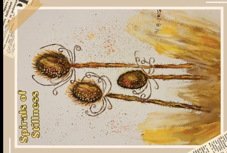
gold that I've added, the gold paint, but we'll come to that later in the video. If you do decide to paint
them in different colors, just remember that it's
the tones that matter. So you can see, even in
these blue teasels I've got the darker colors around the outside of the seed heads, down the sides of the stems, and I've got the light and the medium tones around
the center of each shape. That's the most wonderful
thing about painting, as opposed to a photograph. You can put your
own interpretation on it as well as
your imagination. If you put too much paint on anywhere and you
want to remove it, just dab it lightly
with some paper towel. And then, of course,
if you've lost some of your orange or yellow color and you want to add it back in, just glaze over with the color
that you want to reapply. Having said that, there is always a danger that you
can spend too much time fiddling and overworking
the watercolor so that it ends up
looking muddy and pasty. And I think that's what I'm
in danger of doing now. So I'm going to call
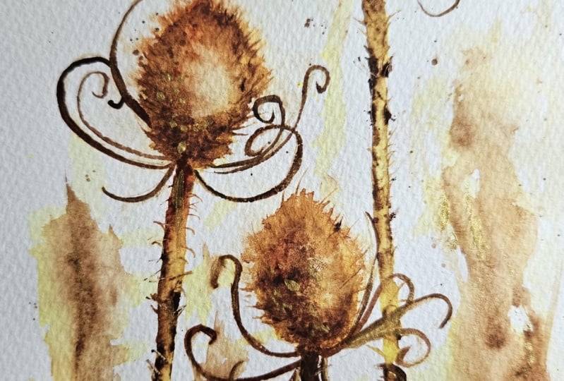
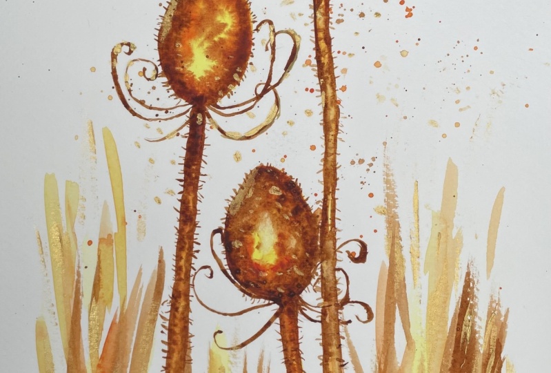
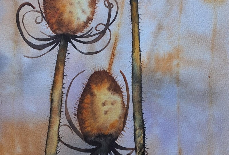
this stage finish and move on to the next section. One of the most recognizable
features of a teasel are these wonderful
bracts that spiral outwards from beneath the
seed head or the flower head. They're typically very stiff and narrow and curve upwards
with hook like tips. They do help to hold up the dense cone
shaped flower head. And they also, because of
the spines and sharp edges, deter animals from
grazing on the plant. And painting straight onto dry paper and using burnt
sienna to start with, and then dropping in
a little burnt umber where the bracts emerge from
the base of the seed head. Notice that I'm using quite a small brush
with a very good point. You don't want thick, wedge shaped bracts growing up. And nor do you want
them all to look the same or grow in the
same direction. You can see from
the reference photo that some of them can be
quite curly and curved, others can be almost poker like. So do make sure that there's lots of variety in the shape of your bracts and that
they don't look exactly the same on
each teasel head. Although these stems are much narrower in width
than the seed heads, they too are rounded shapes. So I'm going to use exactly the same
process to paint these as I did the seed heads. I'm starting with the stem
on the left hand side, and I've painted it with
the handsome yellow light, just a very watery
consistency of tea, wet paint on dry paper. And then I've added a few
little touches of the orange, not all over the stem, just in a few places
to add some variety. And now I'm stroking some burnt sienna down
each side of the stem. Now, it doesn't matter if you
get the stem a little bit wonky because in actual fact,
that's what they are like. They're not an absolutely
straight, smooth stem. There'll be some shadow from the seed head onto
the top of the stem. So I've added a little bit of extra burnt umber where the
stem meets the seed head, and then a little bit
of extra burnt umber down the left hand
side of the stem too. Again, trying to create that three D rounded
effect by having the darker tones at each side of the stem and the lighter and
mid tones in the middle. And these stems also have
lots of little spikes. Some are even thicker and spikier than the ones
on the seed heads. The important thing to note when using the paper
clip to drag the paint out to create these
little spikes is that they don't all grow
in the same direction. So you don't want to
flick them out like a row of soldiers or
a row of matches. You want some cooling upwards, some growing downwards,
very, very random. I'm using exactly
the same process on the stem at the
right hand side, just going carefully behind the bracts of the third
little teasel at the bottom. So painting first, wet on dry, putting the watery
yellow paint on, then the little touches of
orange here and there to break that color up and add
a little variety of tone. And then the burnt
sienna and burnt umber down each
side of the stem. But again, not drawing an absolutely straight
line from top to bottom, a little bit of a
hit and miss effect. I'm just taking a moment
of time out to dab a little bit of paint off this stem at the left hand side. I do often find with stems that just
lifting a bit of paint here and there helps to give
it a more realistic look. And it's the way that the light catches on the stems
in different parts. It is good practice to keep
an eye on some part of the painting that you've already completed or
thought you'd completed, because as the paint
starts to settle into the paper and the water
starts to evaporate, it doesn't look quite the same as when you
first put it on. So I'm always looking to
see whether there might be a little adjustment
needed here and there. And it's often easier to
make that adjustment while the paint is still wet
or not dried completely. A Although I've kept my painting vertical so far, you might find it easier when
painting a particular shape such as these stems to lift up your paper
and turn it sideways. E. I can see that I've made this
stem on the right, a little bit too dark, so I'm dabbing some of the
paint off where I can. If it's started to dry, you can just brush a little
bit of clean water over it, leave it a second,
and then dab it off. And then we're on
to the final stem, this short one on
the third teasel. And hopefully, you've got the
idea now of where to place the different colours
and how to add the different tones to give
this three D rounded effect. And finally, some
of these spikes on these stems are actually quite a bit thicker than
the ones on the seed heads, not all of them, so I'm not going to go over all
the fine spikes, but I am going to add
a few thicker ones with the tip of my
brush here and there. And then I think I'm ready to
go on to the next section. In order to keep the
focus on the teasels, I'm just painting a very loose, abstract background,
and I'm starting off by spattering some of the
colors that I've used on the teasels over that
background area. Spattering is a technique where
paint or masking fluid is flicked onto the
painting surface to produce some interesting
textural effects. Load your brush with some paint, and then you can either
shake the brush with a wrist licking action
to force the paint onto the paper or tap the brush with your forefinger or with a second brush that you're
holding in the opposite hand. You can use a toothbrush
for very fine spatters and just rub your finger over the bristles to spray the
paint onto the paper. And now I'm using some very
watery handsome yellow light and painting this yellow
colour in between the teasels. Doesn't matter if you
go over the spatters, that'll just enhance the
look of the abstraction. And then similarly to how we painted the teasels dropping in some little touches
of orange here and there and letting that color
blend into the yellow. The difference is that I'm not painting into a confined shape. I'm just letting the paint kind of run where
it wants to go, giving it a bit of free reign and sort of playing really
to see what happens. Remember, if you don't
like the way it looks, you can always dab it off
with some paper towel. Because the common teasel
grows wild in the countryside, I'm imagining that
there's lots of grasses and foliage and maybe some
twigs in the background. I'm not trying to paint any
of these realistically. I'm just kind of given the impression that
that's what's going on. And to add some depth and
structure to the background, I'm dropping in a little bit of the dark color burnt umber. So giving even this area some tonal values
like medium and dark. You could, of course, introduce some green into this background, and you're probably
wondering why I'm actually not doing that. Well, I want to create a
harmonious looking painting. I want the overall effect to have a lot of
synchronicity in it. And, of course, as we move from summer into autumn
and then winter, the grasses and the
foliage do change color, and you've got lots of
golds and oranges and browns in the background
area as well. I'm going to let
the background just settle for a minute or two
and see how it looks then. And in the meanwhile,
I'm just adding a little bit more spatter
over this top teasel. I'm dabbing some
of the color off as a spatter because
I don't want the color of the spatter to overwhelm the
color of the teasels. I want to give these teasels a little bit of extra magic and sparkle and also to make the painting a little
bit more contemporary. So I've decided to
use some gold ink. It's entirely optional. If you like the way your
painting looks without the ink, without the gold, then
that's absolutely fine. If you do want to use some gold, then you can use any gold, acrylic paint or ink
that you've got to hand. The one that I'm using
is made by Kotick, and it's water based
pigment called brilliant gold ink gold mica. It's a perfect ink for writing
with a brush or a pen, and the bright color does
stand out quite well, especially over dark colors. Unfortunately, you can't really see the effect too
well on the video, but believe me, it really is adding a lovely
touch of glamour. Now, I'm not covering
the whole of the brac. You can still see
some of the brown and Sienna at either
side of the gold. I've got a very
small pointed brush, so I'm able to keep the
gold lines quite narrow. I'm also going to
add some little dots of gold into the seed
heads themselves, not everywhere, but
particularly around the bottom area where I've
got the darker paint, and the gold will show up more. I don't know if I'm getting
a little bit carried away now with this gold ink, but I've decided to add a little bit of this gold
paint to the background, to the foliage,
leaves and twigs. It's almost as if the wind
has blown the seeds from the teasel and they've landed
and scattered on the land. Then one or two small touches
of the gold over the stems, not everywhere, just a few
little bits here and there. And that will just tie
everything in nicely together. And we've reached a
point now where you need to stand back and assess
your own painting, particularly for
the tonal values that we talked about earlier, being so important to
a finished artwork. So you need to have
a look and see, are your lightest
lights really light? Are your darkest
darks really dark? Have you got that contrast, that umph really
in the painting? And if not, it's
probably because your tonal values need a
little bit of adjustment. Because I've gone a bit heavy with the gold paint
here and there, I've now just add a
little bit more of my dark umber to the base
of the teasel heads, and I'm just adding a few more
details to the background. Now, you can go on and on adding all these little
touches and details, but there comes a time when you know you've got to stop
working because you're in danger of spoiling the painting with too
much overworking. It's definitely time now for
me to put my brush down, grab a cup of tea, and call
the teasel painting finished. But before you go, I've got a little bonus tip for
you on how to frame them. The painting is an unusual size. It's about 11 " by 5 ". So you'd be unlikely to find a ready made frame or
mount off the shelf. And to have one
made specially by a professional framer would probably cost you a bob or two. So here's an alternative
method that I sometimes use. You do need to find a
frame, first of all, that's got similar
proportions to your artwork. Instead of putting a mount
over the top of the painting, you simply stick the
painting to a piece of colored card that's the
size of the frame aperture. And in order to float it or raise it a little
bit above the card, you can use these small,
sticky foam tabs. You can usually find these
in most stationery stores. The stickiness is double sided, so you can adhere a few of them around the back
of your painting first and then stick them
down onto the colored card. Pop everything back
into your chosen frame. And here, Presto, you've got a beautifully
framed artwork. I do hope you've enjoyed this painting and that
you've learned some tips and techniques along the
way that you can incorporate into
your own paintings. I would really love to see the painting that you've
finished for this class, and I'll be sure to give you some personal feedback on it. If you could take a moment
to leave me a short review, that also would be really great. If you've enjoyed this class, it might encourage you to look at some of my other videos. I've got lots of lovely
subjects loaded with more tips and techniques to help you with your own
exciting art journey. In the meantime, thank
you for joining me, and I look forward to seeing you next time Happy Painting.
3. FINAL THOUGHTS: Well done on completing our lovely teasels painting complete with a shimmer of gold. We've covered quite a
few different techniques as you've been following
alongside of me. Instead of just copying
the reference photos, we've used them in a more
loose and imaginative way. We use the wet on dry technique, putting wet paint on dry paper, used the wet on wet technique, putting wet paint on wet paper. And we looked at
the importance of tonal values to create a
three D rounded effect. And we added some
final flourishers of gold paint to really bring a little bit of glamour
to our common tasels. Finally, we looked at
a different way of framing our rather
unusually sized painting. I hope you found it both fun to do and useful in your
own art journey. If you've enjoyed
painting the echinacea, you may also like my watercolor
floral class on painting hellebos where we
explore laying for richness and tonal
values in more detail. Now, don't forget to upload your own painting through the
project and resources tab. After all your hard work,
I'd really love to see it, and I'll be sure to give
you some personal feedback. And if you've
enjoyed this video, do have a look at my other
classes on Skillshare, which are packed
with more tips and techniques to help you
on your own art journey. If you click the follow button, you'll be able to follow me, and then you'll be the first
to know when you upload a new video or any
exciting updates. And if you could
just take a moment to leave me a short review, that also would be really great. In the meantime, thank
you for joining me, and I look forward to seeing you next time Happy Painting.
 Carrie McKenzie, creating painted visions