Transcripts
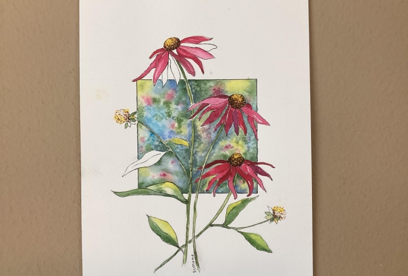
1. INTRODUCTION Echinacea: Hello, and welcome.
In this class, you'll learn how to
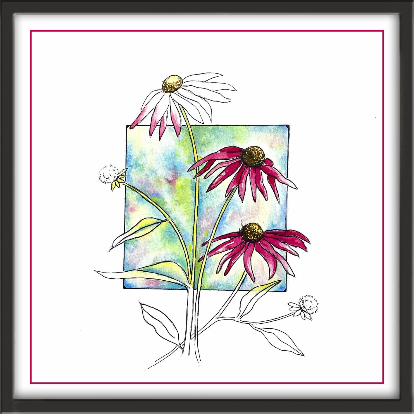
paint Echinacea in watercolor using a loose
yet controlled approach. We'll create a soft
expressive background using wet-on-wet techniques. You'll then build the
painting in stages, adding stems, leaves and petals, and developing the seed
heads in layers to create depth and a convincing
three dimensional form. You'll learn how to let
colors mingle naturally, control tonal
contrast, and develop a floral subject all without
overworking your painting. Instead of painting a very
realistic botanical painting, I'm going to show
you how to create a modern and
contemporary appearance. You don't need to
be advanced for this class because I'm going to guide you
every step of the way. I've included a copy
of the drawing in the project resources section so that you can download
it and trace it, and then not worry
about the drawing because this is a
painting class. I am a professional artist, author, and tutor,
and over the years, I've sold a lot of
work across the world and helped hundreds of people to learn more about watercolor. You can see examples of
my work on my website. My style leans towards
impressionistic and contemporary rather
than photorealistic. I like to explore loose approaches that
bring out the color, light, and essence
of my subjects. I've tried to
replicate this across all the many other videos
that I have on Skillshare. I'd love to see your
own finished painting, which you can upload through the project and resources tab. I'll give you some
personal feedback on it. And you'll be able to
see the artwork of other students and
get their support. At the end of the class, you'll have your own
beautiful artwork to be very proud of. So let's swizzle our brushes and get on with the painting.
2. Composition & Materials: Prepare your Drawing.: For this class, these are the colors and materials
that I'm using, but do feel free to use
any that you already have. For lots more useful information
about brushes, paper, and other art materials, take a look at the
document that I've added to the project
and resources section. You'll find that really helpful. And I've included a
copy of the drawing in the project resources section so that you can download
it and trace it, and then not worry
about the drawing because this is a
painting class. Now you can see that I've
kept the drawing very simple, minimal details so
that we get a nice, loose free flow painting.
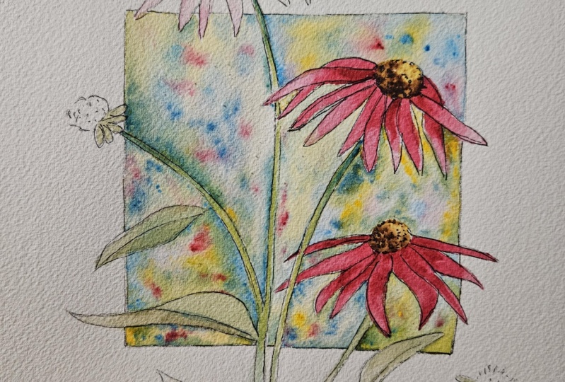
3. Paint background wet-on-wet watercolor, let colours mingle and blend; seed heads 1st layer: I if you think it might be difficult to paint around the straight edges of
the square background, you could always put
some masking tape around the outer edges first. I'm starting with the background using the wet on wet technique. The wet on wet technique is
simply putting wet paint onto wet paper or paint that is still wet and let it spread
into the wet wash. This results in a lovely
diffused effect with soft edges. Because the paint mixes into
the wetness of the paper, the color is diluted
and the tone is paler. Now, as you can see, I'm working this background one
section at a time. So I've pre wet this top left
section with clean water, and I've already pre mixed
my colors, turquoise, cobalt blue, a light yellow, and a little bit of
pink, permanent rose. And I'm just dropping
those colors now into the wet wash and letting them mingle and spread
and blend together. And by dropping these colors
in a little touch at a time, we're getting a kind of mottled, variegated effect
in this background. And of course, where the yellow overlaps with the
blue or the turquoise, I'm also getting a few nice
little touches of green. I'm not using my permanent
rose, the pink yet, because if I do get any pink paint mixed
in with the green, I'll end up with a muddy brown. Now, the other thing
that I've got in mind is where do I need
some darker tones, and where do I need
some lighter tones? Well, the stems of
the flowers and the leaves are going to be
a sort of a pale green, well, pale tones as well. So where the paint is running
alongside of these stems, I'm going to add some darker, stronger paint, same colors, but a bit thicker. And I'm just adding those
in down the side of the stem and letting that paint also blend
in to the wet wash, so I'm not getting
any hard lines. I am getting some contrasting tonal values even within
this small shape. I'm also mindful
that when I come on to paint the petals
of the flowers, they will be in quite a strong
pink, the permanent rose. And so I need to
leave the top part, the top left part
of this section quite light to have that contrast between the
background and the pink petals. I'm quite happy now with that mottled appearance
in the first section. So I'm going to go on and do the next one using
exactly the same process. So I'm pre wetting
this shape above the second flower
with clean water, and then I will drop in my colors again just
as I did before. I've just realized
that I forgot to add a little touch of my pink
colour into the first section. So I'm just popping
over now very quickly. I'm only adding a couple
of little small touches of the pink because
we're going to have the main pink colours
in the flowers, so we don't want too much of
the pink in the background, a few little touches to give the composition
some harmony. I'm also sprinkling in a few
grains of household salt. It's really good for
creating the appearance of snowflakes or texture
in foliage and rocks. The salt absorbs the
paint and leaves behind lovely little
sparkles of light. So quickly pop back over
to the second section. It's still wet, so
it's not a problem. And I'm repeating
exactly the same process for this section as I
did for the first one. You do need a brush that
has a really good point, especially when we come on to the next sections where you've got to get in between
those long thin petals. The challenge now is to get all those sections painted in a way that they
relate to each other. So they all need to have
a similar appearance. What you don't want is one
section to be completely different in its pattern and
appearance to all the rest, because what we're painting
here is a whole background, which is just
separated or divided up between the flowers,
stems, and leaves. I'm going to let you watch
the video along now as I repeat this process throughout the whole of this background. And I'll hop back on when I'm ready to start
painting the flowers. Okay. I've just about finished this background now, and I'm quite pleased
with the appearance. There's consistency
between all the sections, so they hang
together as a whole. My background paint has
dried quite quickly now, so I can go on to paint the yellow seed heads,
the first layer of them. But if your paint hasn't dried, then just give it a
couple of minutes more before you do this. I'm going to paint the
seed heads, wet on dry, wet paint on dry paper, just using my light yellow. The wet on dry
technique is simply painting wet paint
onto dry paper. It allows for more control, stronger color, and crisp hard edges
where the paint ends. The paint will only go
where the brush takes it. I'm lifting off some of the
color with a damp brush and some paper towel
from the top seed head. Any shapes that are outside
of the square are going to be either very pale in tone
or completely unpainted.
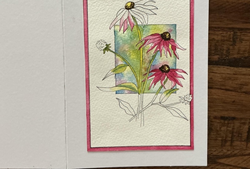
4. Paint the stems, leaves and petals.: I've mixed a very pale green. It's sort of a pale lime color using my light yellow and
a touch of cerulean blue. I'm using a small brush with a very pointed end to stroke the color down
the central stem. But notice that I'm
leaving the stem that's below the square
completely unpainted. And then exactly the same
for the little calixes on this bud at the left and down the stem
that's attaching that. But again, I'm leaving
the stem that's below the square
completely unpainted. And then repeating that for the two stems over on the right. I'm painting the leaf on the far left with my pale
limey green colour, again, not painting the area of the leaf that's
outside the square. And then I'm adding
a little bit of darker green just underneath the middle vein to give it a little bit of
definition but not overdoing it. And then I'm repeating
that same process with this small leaf
over here on the right, again, only painting the
area inside the square. And then finally, over to the last leaf on the
left, the larger one. I won't be painting the two remaining leaves
because they are both outside of the square completely and therefore,
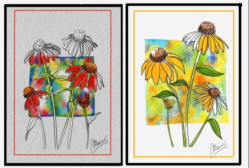
will be unpainted. Now, I am aware that not everybody is absolutely
comfortable with this style of leaving some areas of the
composition unpainted. And in fact, quite a
number of artists who use this style do prefer to fill in all the
shapes with colour. At the end of the day,
it's your painting, so do whatever feels
right for you. I'm using my darker
green now just to darken the area of the stem that is protruding from
underneath of the flower, where they will be in
a little bit of shade. I'm using my permanent
rose color now to paint the long thin petals
of these lovely flowers. You can see from the
reference photograph that there are different tones
of pink in the flowers. So we've got some very
light pale areas, particularly where the petals are towards the
light or on the top, and we've got some darker
ones where they are maybe underneath another
petal or in the shade. So you need several
different mixers of your permanent rose color. Add a little bit
more water to it, so it's about the
consistency of tea, where you want to use it for the pale tones and less water. So it's about the
consistency of single cream, a bit thicker, where you
want the darker tones. And have a good look at all the petals to see
which ones are on top, facing the light, which
ones are underneath, and need to be a little darker as you work around
each flower head. And most of the petals
are a little bit darker where they emerge
from the seed head. So you can always
drop a little bit of extra color in there where the petal meets that seed head. As you can see, I'm working alternate petals one at a time, because if I paint all the
petals next to each other, the color will run, so I won't get that
mix of tonal value. I won't get some lighter
and some darker. All the petals will
look the same. So I'm hopping about from
one flower to the other, as well as in between the
same flower so that some of the petals are able to dry before I paint
those next to them. You don't have to
stick rigidly to this concept of only
painting colour in the shapes that are
inside the square and leaving anything outside
of it unpainted. I've decided that I am going to paint all of this
flower at the bottom. I'm going to paint
all of the petals, even those that go
outside of the box. That's because the
flower at the top is very much outside of
the square altogether, and so will be unpainted. But that means that the
pink echinacea will almost take a backstep to the background, which
is not what I want. So I am going to add the
color on the petals going outside of the box on this lower flower to keep the
impact of the strong pink.
5. 5 Paint the seed heads 2nd layer; use tonal values to create 3D effect: I've got a dark brown mix of burnt umber and a lighter
brown mix of burnt sienna, and I'm going to now use my small pointed brush to use these two colors to
paint the seed heads. I'm using the darker
brown to paint the little seeds around the bottom edge of
each seed head. That's where they will
be darker and in shade. And in fact, at the bottom, they will be very dense, so you'll see very little of
the yellow poking through. But as we move up towards
the top of the seed head, then you do need to leave
little spaces in between your dots so that that yellow shows through
where it's lighter. It's a little bit
of a labor of love getting all these little
dots onto the seed head, but I actually found
it quite meditative. But don't rush it too much
because in the seed heads, we've actually got the
strongest area of contrast. We've got the really
dark darks from that burnt umber against some
really light areas just above. So the viewer's eye will naturally be drawn
to these centers. Because of that, you
might have noticed that I'm keeping
the seat head on the top flower much paler than these two that
are inside the square. So the main focus of visual interest will remain
on these two pink flowers. I hope you can see that
as they're building up the structure of
these seed heads with the different colors. So dark brown being
the darkest tone, the light brown
being the mid tone and yellow being the light tone, it's actually giving
these seed heads the rounded three D effect. It can be easier to assess the tonal value of a subject by converting
it to black and white, as shown in the example
of an apple here. While the dark brown
paint is still wet, I'm just flicking it ever so
slightly into the petals. I'm going to add a little
bit more definition to the seed head at the top, but still nothing like as
much as those below it. I wasn't really sure what
to do with this flower at the top regarding how
much pink to put on. So that's why I've
left it till the end. And I've decided I'm
going to put the darker pink on the petals that
are in the square. But instead of leaving it
completely white above, I'm going to just
fade that pink so it becomes paler as it goes
towards the seed head. So I've got a much
more natural gradation from the dark to the light. Again, as I said before, it's entirely your choice, how much color you
want to apply to these shapes that are
outside of the square. There are absolutely no
definite rules on this. You don't have to follow
exactly what I'm doing. It really is just a
matter of personal taste. Now, some artists like to leave these types of paintings with
just the pencil outlines, and that would be
absolutely fine. However, to give it a
little bit more umph, I've decided to go
over all my pencil outlines with a black
waterproof pen. And I think that's
just helped to pull everything together and give
it an extra bit of zinc. I do hope you've enjoyed this painting and that
you've learned some tips and techniques along the
way that you can incorporate into
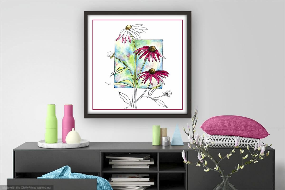
your own paintings. And why not pop it into
a mount and a frame, and you'll be amazed how good
it looks when you do that? If you've enjoyed this class, it might encourage you to look at some of my other videos. I've got lots of lovely
subjects loaded with more tips and techniques to help you with your own
exciting art journey. I'd really love to see your
own finished painting, which you can upload to
the your project section. And if you could
just take a moment to leave me a short review, that also would be really great. In the meantime, thank
you for joining me, and I look forward
to seeing you next time Happy painting. A
6. FINAL THOUGHTS: Well done and completing
our lovely Echinacea painting complete with
the contempor background. We've covered quite a few
different techniques, as you've been following
alongside of me. Instead of just copying
the reference photos, we've used them in a more
loose and imaginative way. Use the wet-on-wet technique, putting wet paint on wet paper. We used the
wet-on-dry technique, putting wet paint on dry paper, and we looked at
the importance of tonal values to create a
three D rounded effect. And, of course, we had
to go at trying out a very different and
contemporary composition where some of the shapes
remain unpainted. I hope you found it both fun to do and useful in your
own art journey. If you've enjoyed
painting the Echinacea, you may also like my watercolor
floral class on painting hellebos where we
explore laying for richness and tonal
values in more detail. Now, don't forget to upload your own painting through the
Project and resources tab. After all your hard work,
I'd really love to see it, and I'll be sure to give
you some personal feedback. And if you've
enjoyed this video, do have a look at my other
classes on Skillshare, which are packed
with more tips and techniques to help you
on your own art journey. If you click the follow button, you'll be able to follow me, and then you'll be the first
to know when you upload a new video or any
exciting updates. And if you could
just take a moment to leave me a short review, that also would be really great. In the meantime, thank
you for joining me, and I look forward to seeing you next time Happy painting.
 Carrie McKenzie, creating painted visions