Watercolored Botanicals with Calligraphy | Anina Rubio | Skillshare

Playback Speed


1.0x


  • 0.5x
  • 0.75x
  • 1x (Normal)
  • 1.25x
  • 1.5x
  • 1.75x
  • 2x

Watercolored Botanicals with Calligraphy

teacher avatar Anina Rubio, Visual Artist

Watch this class and thousands more

Get unlimited access to every class
Taught by industry leaders & working professionals
Topics include illustration, design, photography, and more

Watch this class and thousands more

Get unlimited access to every class
Taught by industry leaders & working professionals
Topics include illustration, design, photography, and more

Lessons in This Class

    • 1.

      Introduction

      0:48

    • 2.

      Materials

      0:55

    • 3.

      Watercolor Mixtures

      1:59

    • 4.

      Watercolor Techniques

      2:25

    • 5.

      Freehand Calligraphy

      0:40

    • 6.

      Illustration and Layout

      2:40

    • 7.

      Painting Process

      1:30

    • 8.

      Final Artwork and Class Project

      0:29

  • --
  • Beginner level
  • Intermediate level
  • Advanced level
  • All levels

Community Generated

The level is determined by a majority opinion of students who have reviewed this class. The teacher's recommendation is shown until at least 5 student responses are collected.

976

Students

18

Projects

About This Class

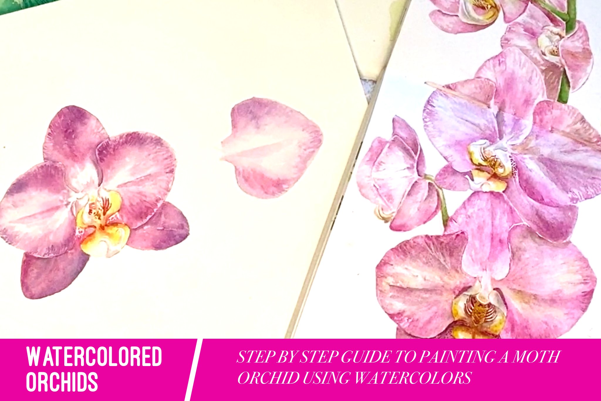
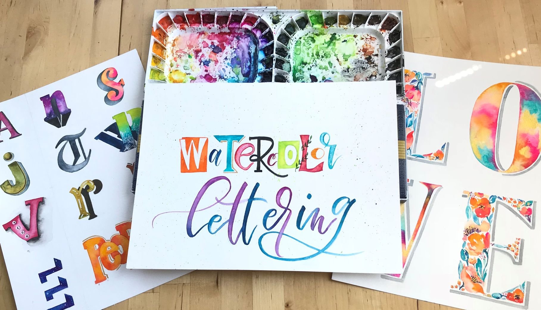
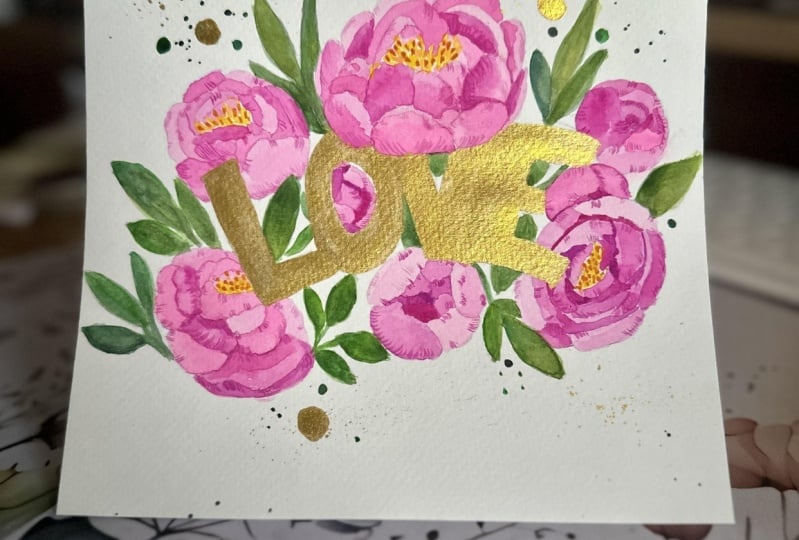
I am combining two things that I love doing:  calligraphy and botanicals! I have freshened up the look of a regular freehand calligraphy writing by adding up blooms and interlacing it with the petals and leaves to give a 3D effect. 

In this class, we will deal with the basics of watercolor (techniques and mixtures) as well as a quick intro on freehand calligraphy. We'll illustrate and paint a simple Anemone flower and create a floral type with an inspirational word! 

The topics we'll cover are:

  • Tools
  • Basic introduction to watercolor
  • Watercolor mixtures
  • Watercolor techniques
  • Freehand calligraphy overview
  • Laying out the text and illustrating flowers
  • Painting and Final artwork

MATERIALS USED:

1. Watercolor Paper: ideally, it should be 300 gsm so it can absorb more water. I use Arches watercolor paper in cold-press. You can use Fabriano or Strathmore (or any of your brand preferences). 

2. Watercolor Paints: I use an artist-grade Mission Gold paint from Mijello. The colors are very vibrant and ideal for botanical paintings. Artist grade paints last longer than student grade ones but feel free to use any watercolor paint that is available to you.

3. Watercolor Brushes: I used round brushes for the class. Can be synthetic or real Sable. I have round brushes of Raphael and Escoda brushes in different sizes. Small round brushes (3/0 to 0) are good for painting smaller details. Bigger round brushes can cover more areas.

4. Pencil and Eraser: Stabilo Othello pencils in 4H to HB are okay for sketching. Note that you should avoid using darker leads because it's harder to remove on paper and you want to sketch as lightly as possible to avoid leaving pencil marks on your artwork. Eraser can be any as long as you lightly erase as well as erasing can destroy the surface of the watercolor paper.

5. Water containers: I prefer using two separate buckets to prevent my paints from getting muddy. One should be for rinsing the brushes when you want to change pigments. The other one is to activate the paint.

6. Paper towel or Reusable rags: Used to clean the brush or to wipe excess pigments/water from the brush.

Meet Your Teacher

Teacher Profile Image

Anina Rubio

Visual Artist

Teacher
Level: Beginner

Class Ratings

Expectations Met?
    Exceeded!
  • 0%
  • Yes
  • 0%
  • Somewhat
  • 0%
  • Not really
  • 0%

Why Join Skillshare?

Take award-winning Skillshare Original Classes

Each class has short lessons, hands-on projects

Your membership supports Skillshare teachers

Learn From Anywhere

Take classes on the go with the Skillshare app. Stream or download to watch on the plane, the subway, or wherever you learn best.

Transcripts

1. Introduction: Hi, everybody. My name is in the interview and I'm a visual artist and mere list based in the Philippines . I've been painting for about four years now, and I'm really, really inspired by nature. So for today's class, I decided to combine three of my favorite things major watercolor painting and freehand calligraphy. Hopefully, at the end, you guys will be able to create your own motivational floral that artworks. You will only be focusing on one type of flower, a decorative element and one word. But of course, if you want to challenge yourself more than you could always come up with the floor type artwork with more botanical elements and more words. I hope you guys are excited as I am. Let's stucked 2. Materials: in this class, you'll need a watercolor paper. My preferences are sh. You also need different sizes of watercolor brushes, two, depending on the detail that you want to paint. And, of course, you need a watercolor paint. You would also be needing pencils for this class, so I normally use an HB, but not anything darker than that, because watercolor is very transparent and you don't want the pencil marks to be visible in the artwork that you will sketch whenever a paint with watercolors, I always make sure to have a paper towel and to water cups. The other one is for rinsing the brushes, and the other one is to activate the paint. In this way, you can avoid your pain from being muddy. To see the full list of materials, please check the class description. 3. Watercolor Mixtures: watercolor is basically painting water based paints. Suspended in water solution is one of my favorite medium thieves because it's easy to use and very portable. It's a good thing with watercolor is that you can prepare the paint you need ahead of time , and even when they dry are you can always reactivate them with water. I normally start painting by creating mixtures of varied saturation levels to prepare the big men's that I will use. I broke them down to five easy saturation levels that you can compare to normal products. You can see around you weak tea T milk cream and stronger cream. Weak tea is like reusing at the back. You can see that there is very, very light pigment, and it's more liquid. T, on the other hand, is very fluid and liquid John's parents, but you can see that there's a pigment. Visible milk has equal amounts of pigment and water. Cream mixture is very thick and rich in pigment and has little amount of water. Far stronger cream. It's very similar to painting directly from the tube. There's little amount of water. You can always adjust the saturation level of your mixture, based on the amount of water are pigment that you put. One tip I will give for you is to prepare the mixture on the palette before painting. From this, you can already identify the tone of your pigment. It's best to start painting with a weak tea or team mixture and build layers have been from that. Watercolors are very transparent when dry, so it's easier to edit. If you start with the lighter mixture than with a very dark, almost a pick mixture. Just a recap. The more you add pigment, the more saturated that your mixture gets. The more you add water, the lighter your mixture becomes. 4. Watercolor Techniques: There are numerous watercolor techniques that you can learn, but you only focus on techniques that you can apply for this class. Wet on wet technique is painting on a wet layer of paint with another wet are very fluid mixture. This enables you to blend colors naturally. When the two layers dry out, you can see a very smooth transition between the two colors that you mixed dry on with. It's useful for adding details to petals or leaps. You paint a relatively dry layer of paint on your Web First layer off bank. In this manner, the second layer that you added softens up on its edges while maintaining its shape or line . Grated wash is a transition from dark delight or light to dark saturation levels. I used this technique when painting petals. I normally start with the dark tone. Remove excess big men from the brush, spread the layer with water, remove excess big men again from the brush and spread the paint with water again until I achieve the lightest she did. I want. The thick ensign technique is useful for calligraphy and is a short cut for painting ferns or leafy plants. I press it brush to get the shape on paper and then it lifted to get a thinner stroke. This technique allows you do have brush control. Dry brush technique is good for adding texture and details the elements like leaves and petals. To achieve this technique. Your brush should be dry but must have little water just to activate the pigment off. Paint pleasing it's layering. Watercolors are transparent when dry, so you can always add more layers to your painting while maintaining apart off the color off the previous layers. Normally, you wait for the first layer to dry before you paint another one. Lifting is a technique I used to lift or remove either excess water or paint from the artwork. You can use any absorbent material to live bait, but I use a dry brush so that I have more control over the areas that I want to lift. We will be using most of these techniques for the final artwork that we will make at the end of the class 5. Freehand Calligraphy: calligraphy is the art of writing beautifully. Traditionally, there are specific persons styles to follow, but for this glass you will focus on your own handwriting. The primary concept to take note is to put contrast in your letters, meaning there should be thick and thin lines down. Strokes are always thicker, while up strokes are thinner. Now try writing hello, using your own handwriting and applied a thick and thin strokes. Don't worry too much about angles and shapes, as our focus here is to use our own handwriting for the artwork, in this way is more personalized in casual. 6. Illustration and Layout: flower illustration and painting can be very intimidating at first, But as soon as you practice, you learn that it's very easy. We'll start with simple flowers with big pedals like animals, and when you have practice enough, you can start illustrating more complex flowers or flowers and more petals. You can draw from an actual reference, which is the best way to learn. But for this one, I just pulled out a reference photo over an animal from the Internet. When illustrating flowers, I start by identifying the center. Flowers normally follow different shapes, and I use a circle or 1/2 circle trick to guide me. So I know up to which extent I can draw the petals. If it's the full circle trick, it means that the flower that I'm going to illustrate is opening up or it has bloom properly. If it's 1/2 circle, it can either be facing sideways or facing downward. Now let's proceed. You're drafting our floor of that artwork. I picked an inspirational word, breathe and wrote it down, using the calligraphy style from the previous lesson. Don't forget to add contrast by making the down strokes thick and the up strokes thin when sketching draws light. Theus possible because once you paint over the pencil marks, you cannot erase them anymore. And you don't want dark pencil marks on your final artwork. I marked small excess around to identify the center parts from which my animals will bloom . I sketched the petals and overlay some on the letters to make the artwork more dimensional . Don't worry about sketching details, because we will paint the details later. I'm making the artwork very simple, but you can adjust it according to your site. 7. Painting Process: After sketching, we're now ready to paint with floral type artworks. I don't paint the letters. This is the negative space technique. I'd lock out the letters, appreciating it lightly with pencil. Eventually, you want to get used to doing this type of artwork. You don't need to shade the letters with pencil anymore. Others use masking fluid, but sometimes it doesn't work well. Uncertain watercolor papers. So to make it simpler, I don't use it anymore for petals. I just start with greeted washes to establish the shading. Already in the first layer, I try not to paint petals beside each other to prevent the paint layer from leading to the other. Battle through glazing method. You can build the details off your artwork way leaves. I used a weapon with technique for details. I use a dry on wet technique or the dry brush technique you can explore in practice on different techniques for disturbed that you are comfortable with. Takes time and patience to make sure the layers are dry before you paint. Maher details on top of it 8. Final Artwork and Class Project: R Florida type artwork is complete. I hope you guys learn from today's glass. You can now start creating your own versions of the artwork. And for that extra challenge, try painting different flowers in one Florida type artwork or add more words. Don't forget to upload York Last project so we can all see and be inspired by your works of art. If you want to see more artworks, please don't forget to check out my social media accounts. Happy painting.