Transcripts
1. Paint anywhere!: My biggest asset is being
able to paint wherever I am. Amaris, My thing is
watercolor and I get to see it on products and teach through my membership, watercolor bold as well as classes right here
on skill share. Now, my biggest asset
is being able to paint wherever I am because I am on the
go chasing my kids. Whether you're on the
go chasing somebody else or chasing after
some fun times, I want to help you have some
more ideas how to get into your sketchbook wherever you are with what I call
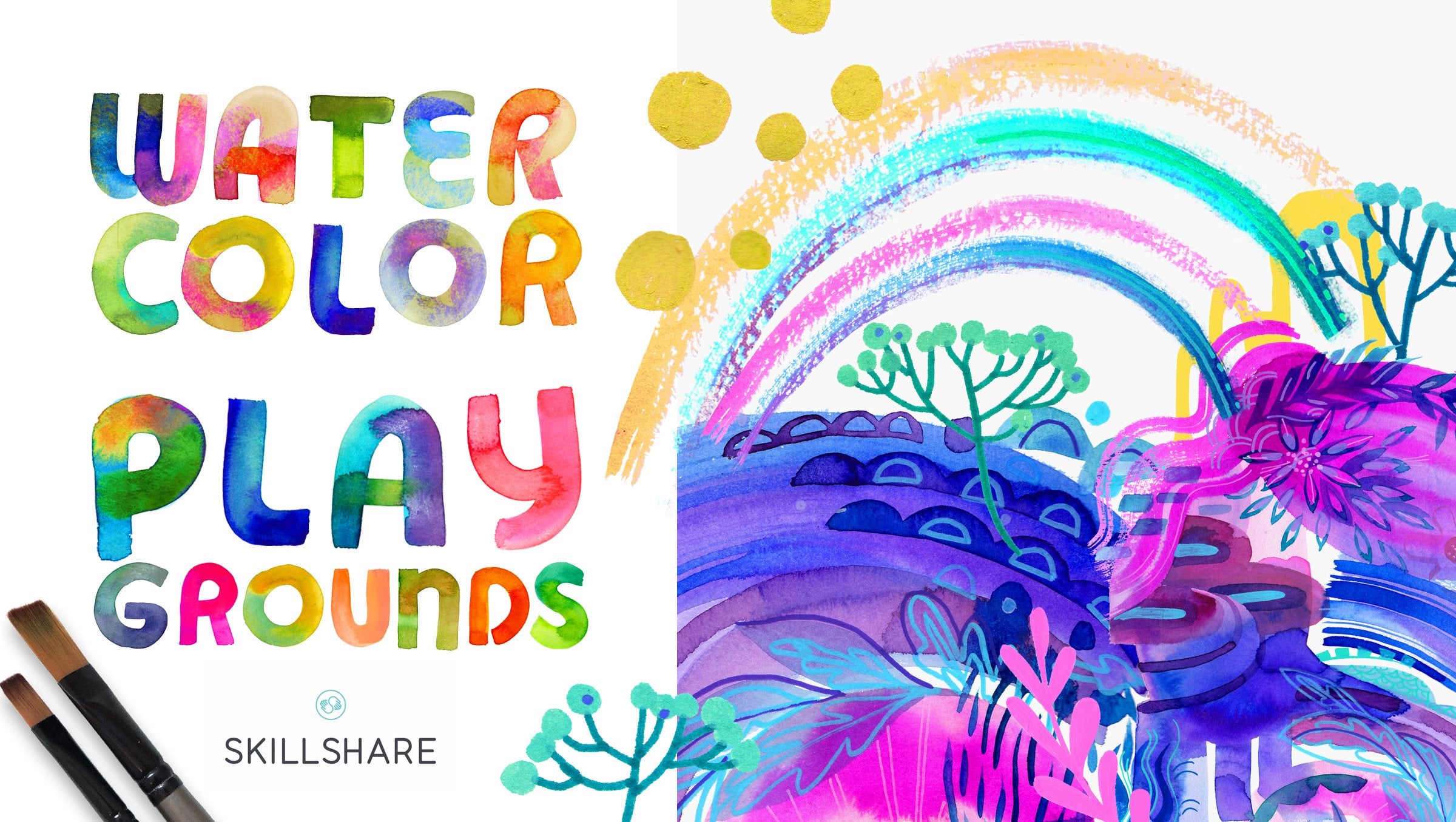
watercolor playgrounds. It's basically trying to create abstract paintings and
not really knowing how. If you have trouble
just opening up your sketchbook and getting after it, you're
going to love this.
2. Supplies that make it easy: I'm going to go right to it. I am going to use one cheat. This is not the type
of paper that I typically use when
I'm on the go. Arches, wonderful paper. It's basically my
14 art gold choice when it comes to painting. But the reason why I'm
going to use it today is because it is in a block. If you've never
seen this before, it's basically a lot
of watercolor papers, scrunched together and
glued on all sides so that it doesn't bow when
you do a lot of wet washes. Which is great. But I will tell you that
the paints that I love to use when I'm
on the go are these. Thereby peerless paints and
they are watercolor sheets. On one side, we have
the watercolor paint. That's slathered on
there very generously. Then on the other side, you'll
see the name of the color. If you do purchase these
paints, keep that in mind. If you see a stamp, don't
paint on that side. You're not going to get
much paint out of it. It's the other side
that has the color. Sometimes that can get a little confusing because
oftentimes when I look at these paints
from their painted side, from the side that has
the paint on them, they will look a lot alike. Typically, a brown or
an orange or brown. Then when you turn them over, you see what colors
they really are. The warm tones do tend
to be brown on the back. Okay. But then when
you look at the stamp, you'll be able to see what
name it is on that color. Obviously, what's great
about these is that they're really flat
and really portable. I just stick a few sheets in my sketchbook and carry a water brush and
I'm ready to go. But since I really like color, I tend to carry all of these pouch because I also really like this
pouch. It's so pretty.
3. Selecting your tools: When it comes to
painting loosely, what we first want to do
is just play with color. This might be a fun break for you to go ahead and
get some paints out. I'm the girl that likes to use
a lot of different colors, so it's very difficult for me to choose a limited color palette, which is why I oftentimes look at a piece that I
really enjoy and realize that it's the color scheme that I'm actually
falling in love with and then bring it into procreate and create a
color palette from it. This, for instance,
is one of them, and I'll have it with
my paint packs so that not all of my paintings
go crazy wild with color. Now, if you know me,
I'm not afraid of it. I'm going to put that away, and I'm just going to play
with whatever colors I find that I feel
like using today. Okay. When I'm looking
at a color palette, I'm considering the
colors themselves, the tension between
warm and cool and the value that I can
get from different colors. I'll often have a yellow
simply because I just need a light color and it's a shortcut to
getting a light color. No matter how dark yellow I get, it tends to be one, if not, the darkest
color in my palette. Okay. I'm going to
go very citric with a violet ermlion yellow
carnation pink and olive green. Why not? Look at how not pretty colors
look on the other side. All right. Let me set
these up so nicely. What's actually,
what's great about painting this way on
the go is I can have my hand holding the
sketchbook and my paints and my right hand free with my
water brush and I am set.
4. First Shapes Warm-Up: When I am working on the go, I tend to just use whatever
water brush I have. But since I'm here in my studio, you will quickly know that I
really love the flat brush, so I'll use a nice big one, and I always need a
versatile round brush for details in
those middle areas that can be hard to get to. No matter what my basic rule is to have a big brush
and a little brush. In watercolor, we
work from light to dark from big shapes
to little shapes from low contrast to high contrast from big
brush to little brush. I'm going to start with my
big brush, and guess what? I'm going to be making
some big shapes. At this point in my process, I'm not really sure about
what I'm going to do, what shapes I'm going to do, but I do know that
right now I am loving on some variations
of geometric shapes. One of my favorites
is a half circle, for which I just paint a
straight line on the bottom, and then curve around to
make a lovely half circle. Okay. I'm going
to do that again. I already have a
little bit of paint on my brush for the
sake of harmony. I'm going to leave it
there because I want my next color to mix with it. Whenever you want to create
harmony in your painting, you can be very meticulous about selecting the color that
you're going to use next, or you can just mix colors with your existing
colors and boom. You got harmony. I'm really liking this gradient
already. You know what? Let's leave that just as it is. Creating just a little
stack of shapes. We don't have to create
a stack obviously. Our shapes can be in any
arrangement we want. But I do find it handy to have a little
bit of order as I begin. I'm nervous when I start out and then as I
gain confidence, then it becomes clear what
should be my next step. Okay. Again, I still have
a little bit of red on my brush trying to consider what kind of funky shape
I am going to make. I love that I can hold this big flat brush
perpendicularly from the page and create some very straight lines
without trying too hard. If you've done that, if
you've tried to create lines before with a round brush, you'll find that the
great thing about a round brush is you can
do just about anything, but it's entirely
reliant on your hand. One little flick of your wrist and there goes your
straight line. I like being able
to rely or share a little responsibility
with my brush. Okay. Rather than trying to
get it all right all the time with my perfect hand strokes
using a round brush. Very much a fan of finding
tools that will not only shortcut what I'm
trying to do but contribute to the
look of it itself. You'll find me doing faces and flowers and all
kinds of things with this big flat brush
because it adds a quality that I just
can't get otherwise. It's like a cut paper. Okay. We've got some big shapes, and I'm going with a really
warm color scheme here. I'm digging it, very
summery. I like it. But although this could be its own piece all on its own and you might
be tempted to stop, we are going to keep going
and see where this leads us.
5. Medium Shapes Build-Up: We're going to go to
slightly smaller shapes. With my round brush,
this is a size four. Honestly, in some brands, I would say that this
would be a size eight. I have a brush just like it
by a no name craft brand, and it is an eight. My work is very much
defined by shape and color. You're going to hear me
talk about that a lot. You probably already know
that because I already have, haven't I can't help myself. To make my brush do its thing. Okay. Without me having
to work too hard. I hold it from a distance perpendicularly perpendicular
from the paper. Let's try a different color. At this point, we're creating
medium sized shapes. You'll notice that I'm also
using a little more paint. You could keep using
lighter colors. It's just going to
be a lot easier. The further along we get to use some darker colors as we go. Let's do an organic shape. I'm thinking something
like a hand or two lip. Look. You know what
I'm talking about. Now, this paper is so absorbent. It's great because it'll take
these really heavy washes, but it also just sucks up
my water so very quickly. If you live in a dry area, you are going to
feel that. I'm sure. This is my first
time in the piece here mixing some color. Not that different. The red
is easily overpowering. Okay. Typically, when I am painting a
watercolor playground, I am not talking and
thinking so hard. I think you'll enjoy this much more the second time around when you're creating just out of fun. Maybe if you're lucky enough, my favorite place to paint
sitting at the beach. I live in Minnesota, that does not happen here. I don't care what you
call a beach here. It's not a beach if
it's not an ocean. I need some real sand. I'm an island girl. I am from Puerto Rico. So I find it insulting
when we call aka Beach. It's just it just does
not feel right to me. Okay. I like to create
circles quite a bit. They're just a really
simple motif that are in design terms really strong and you don't need to do very much before
they are just lovely. I also like to incorporate
a little bit of dry brush. Feel free to experiment with the different shapes
that your brushes. I'm sure you've found
that sometimes you actually enjoy those
mistakes that you make. I'm going to do just
a few more shapes. Something that's holding
up my red berries here. Oh, you know, no one's really worried about
how they are suspended. But I worry about these things. And a motif that I tend
to use a lot in my work. His son I am reaching for some pink because
this is just my favorite. I also want to show
you how fun it is to stipple with the
edge of your brush. That is pink from
Mago Mission gold, and at this point, we are now moving right
into some smaller shapes. Now that I introduce pink, I've got to incorporate it in other spots or else
it's just weird. Let me do that real quick. Okay bring a clean brush because my brushes are
loaded with saturated color. Not a bad place to be. Okay.
6. Pause!: So oftentimes at this point, I start to wonder
if I want to keep this piece, non objective, which means there is
no subject matter, it is what it is, a collection of
shapes and colors, or do I want to
stare at this for a little bit and make
it be something. I'll oftentimes find that I'm painting something or
something emerges from the imagery that I've painted without really knowing
it's really fun. It's fun to discover shapes within your work
that then make you think, maybe that's a bunch of grapes, or maybe I can turn
this into a flower. But since my paint is wet and I'm liking
the shapes so far, I am going to continue
the way it is, but I'm going to shift my page.
7. Problem-Solving: Upside down or sideways, we're going to go
with upside down. So that I am not always
looking at it one way. This is our third
stage where we're going to small motifs. Okay. This is hard. It's hard when you flip it, but it's going to be good,
it's for the better. Because now when I
turn this around, I see I've got a lot of
darkness on the bottom, which isn't a bad thing because
it weighs the piece down. Visually, it's good to have
heavier colors on the bottom. Then I've got some
lighter shades up here. But I also have a lot of
shapes going on up there that I don't see as much
represented down here. I'm going to make
more shapes that echo what I have going on. At the bottom. So we're
all one big happy family, and we're all doing
this together. Like to create motifs that are already
present in my piece, but just a slightly
different take. If I had circles down there, I shall put circles up here, but they're smaller and they're overlapping instead of stacking
up against each other. If I have I don't even
know what shape that is, some polygon down there, then I think I'll put
one up here. Okay. How? What am I thinking? Let's do it. I have some over here. What if I just encapsulate
them a little bit. I like it's like
chicken scratch. And I had some stippling here, but I don't see it elsewhere. Enough shaking things up. I want to go back to normal. Oh, that feels better. And since these
colors are so rich, I can totally overlap. Okay. Fun. Take some risks, you know? Am I 100% happy with
this piece right now? No. But I know that I have within me the potential to make it what I would like. So I'm just going to keep
going until I get there. In my membership in
watercolor bold. I basically teach
this how to get to your sketchbook more often to paint under the guise of
learning watercolor principles, but not making really
boring color charts. But rather just tricking
ourselves into play. I'm using the wet on wet
method where you paint something with water and then
you drop the color in after If you create something
that you don't really like, let's say I'm not really
crazy about that shape. I will either. Well, actually, I will just do more of it, but I'll either put
it down here with it. How about another of the same shape
encapsulating that one or I put it elsewhere. It's a little counterintuitive that the thing that I'm
not that crazy about, I actually do more of. I've learned that what I don't like will grow on
me if I just do it enough, and that's a further look
at that same principle. I feel like the center
really needs something. Okay.
8. Final Touches: And finally, one of my favorites an asterisk
or two or more. We put these little marks on
when something is special, and my piece is no
exception. Let's do it. Okay. The key is really to experiment with some different shapes
that you create. Whether you use your brush to
prompt those shapes or they are things that just pop into
your head as you create. It's really such a
fun and special thing that we have the
ability to do that, that we can look at something and not have to have
it all planned out. I don't know where to go
with this. Sure. Not needing to have all the answers
before I pick up my brush, but rather letting the answers
come to me as I pick up my brush and let my
childish brain take over. If it helps at all, consider
this an experiment in getting to know your art
supplies and what they do. And that'll take the pressure off creating a piece that is perfect and ready for a frame. Isn't that wild? I like it. What's great about these
pieces is that they're really easy to hang because
they're non objective. I don't have to worry
about whether I have giraffes in my decor. Not that there's a giraffe here, but if there were, that would be something I would
need to consider. It's something that I
just need to resonate with the colors of and find
movement and energy in. You enjoyed this process, but still aren't
sure about creating your own watercolor
playgrounds have created a PDF download that
you can take with you and tuck in that sketchbook
for further inspiration. For more from me, subscribe on watercolordevo and find me on Instagram at Watercolor Devo. You can receive tips on
painting, Illustration, and even going P. I'm Amarilla Henderson and I
hope you keep painting. Oh.
 Amarilys Henderson, Watercolor Illustrator, Design Thinker