Transcripts
1. Welcome back!: Hello, everyone, and
welcome to my scelta class. My name is Fati Hegde and I'm a watercolor
artist and a teacher. I have always loved
painting calm landscapes and expressive water scenes using simple
watercolor techniques. Over time, watercolor has become a very peaceful and personal
creative process for me, and through my class, I love sharing that experience
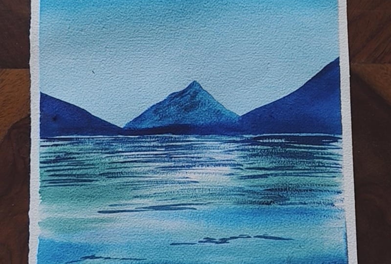
with others. In this class, we'll be painting a serene water landscape while also focusing on important
watercolor fundamentals like wet-on-wet blending, water control, soft textures, reflections, and wave details. This class is designed in a simple and beginner
friendly way. So even if you are
new to watercolor, you'll be able to follow
along comfortably. I'll guide you through each step slowly from understanding
the brush and water consistency to building the final painting
layer by layer. We'll also practice some basic techniques
separately before moving into the final project so that you feel more
confident while painting. By the end of this class, you will not only complete a beautiful
watercolor landscape, but also gain a better
understanding of how watercolor behaves on paper and how to control
it more naturally. So gather your supplies, relax, and let's paint together. I'm really excited
to have you here, and I hope you enjoy the
process as much as I do.
2. All Supplies needed: Let's go through
all the supplies that is required for the class. Starting with the paper, I'm going to be
using a sketchbook, which is made of 100%
cotton, arches paper. It is a cold pressed
one and 300 GSM. That is the thickness of
the paper is 300 GSM. I really like the end result on Archis paper,
how it turns out. You can see most of my
other watercolor works are also done on
this paper itself, and I capture everything in
this sketchbook, mainly. Okay, so next up
is mixing palette. This is a ceramic palette. You can use any mixing
palette that you have. These are some of the
paints that I'll be using. This is, um, Alizarin
Crimson from Schmike. This would be PR 831. Next is Mission
gold Cerleanblue. This is PB 153. Iditrine blew from Seleniu
and this would be PB 60. Next is to green
from Schmiqe again. And this is for the brushes, I'm going to be using all
silver brush brushes. These are really amazing. And these are all
squirrel blend bashes, that is natural squirrel with some synthetic brushes.
All these are. That is the black velvet series. So two of the brushes
are round brush, size eight and size four. With these two main brushes, I can paint literally
anything and everything. These are the must haves
in my any painting, eight and four sizes for B
five or A five size paintings. Next is a liner brush, again, of black velvet series. This is a script
brush of size one. This is mainly used for my lifting and final
detailing purposes. Another brushes I'm
going to be using is silver liars squirrel
blend quill of size 40. This is amazing. It has a very good belly to hold a lot of
water and pigment, and it gives a very smooth and even finish for the paintings. Throughout when I'm teaching, I'll be explaining how you can make the most of
all these brushes. Of course, water
can so that we can water and water can masking tape to tape down
your paper on the sides. Now that we have gone through
all the supplies required, let's go through the
techniques class. Do a small practice painting, and let's get started with
the final class project.
3. Techniques you need to know: Hello, everyone, and welcome to this watercolor
techniques class. In today's class, we'll
focus on understanding some basic wet on wet
watercolor techniques, especially water control,
pigment consistency, gradation, blooms, lifting
and brush pressure. These exercises will help you understand how
watercolor behaves on wet paper and how small changes in water can affect
the final result. So let's get started. I
already have the paper here, and I am beginning by applying a layer of clean water
evenly across the surface. Make sure there are
no large puddles of water sitting on the paper. We only want an even shine
throughout the sheet. While the paper is still wet, picking up some pigment and applying it onto
the dam surface, you can notice how
softly the paint spreads because of the
moisture underneath. At this stage, focus
more on observing how the pigment moves rather than trying to create perfect shapes. The amount of water on paper directly affects how
much paint spreads. Let's start with gradation. I'm starting with a darker
value on the top and gradually pulling the pigment downward using a
clean damp brush. As I move lower, you can see the color becoming
softer and lighter. This is called a gradated wash, where we smoothly
transition from a darker value to
a lighter value. To achieve a smooth gradation, it's important to control
the amount of water in the brush while pulling
the pigment downward. Now, I'm adding
another stroke using slightly thicker pigment
consistency here. You can immediately notice
the difference between diluted paint and thicker
paint on wet paper. The thicker pigment
holds its shape more while the watery
mix spreads further. This balance between
water and pigment is one of the most important things
in watercolor painting. Now I'm going to
demonstrate what happens when the brush
contains excess water. I rinse my brush and
directly touched the painted surface without
removing extra moisture. Can see this creates a bloom or a baron where the water
pushes the pigment outward. This happens when
there is more water in the brush than on
the paper surface. I'll repeat the same step
with better water control. After dnsing the brush, I'm dabbing the
excess water onto a tissue before touching
the paper again. Notice how much softer and more controlled the
lifting looks now. The paint blends gently instead
of creating harsh blooms. This is why controlling brush moisture is extremely
important in watercolor. Let's start with
lifting techniques now. I'm taking a slightly
damp brush and gently dragging it across the painted area to
lift some pigment. You can see how this creates lighter lines and
soft highlights. This technique is
useful for reflections, soft textures, and correcting small areas in
watercolor paintings. Again, if the brush
contains too much water, it creates blooms instead
of lifting cleanly. Let me show you the
brush pressure, how it affects the stroke size. Using just the tip
of the brush creates very thin lines while applying more pressure gives
broader strokes. I'm also varying the
amount of water in the brush so you can observe
how the marks change. More water creates softer
and wider strokes, while less water give
sharp and control lines. These small exercises
are extremely useful for improving brush control and understanding
watercolor behavior. Wow. Do practice these exercises multiple times
because watercolor behaves differently
depending on the paper, pigment consistency,
drying stage, and even the
environment around you. That brings us to the end
of this techniques class. See you in the next lesson.
4. Practice lesson : Hello, everyone, and welcome
to the practice lesson. Before we move on to
the final painting, I want to spend some time
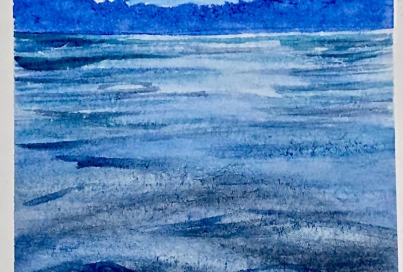
practicing the wave patterns and understanding how these
strokes behave on wet paper. This exercise will
help you feel more confident while painting
the main project later. Using a small practice
sheet for this exercise, you don't need a large paper
here because we are only focusing on understanding
the movement and structure of waves. I've applied a clean layer of water evenly across the surface. As always, make sure
the paper has a soft even sheen without
excess puddles. Now, I'm taking some
cerulean blue on my brush, starting with simple
horizontal strokes. These strokes represent the wave patterns on
the water surface. At this stage, don't focus too much on making
every line perfect. The goal is to understand the rhythm and
repetition of strokes. Notice how I'm leaving small white caps between
some of the lines. These white spaces help create the illusion of reflections
and movement in water. If we completely fill the
surface with pigment, the water can start
looking flat. I'm going to take more pigment into the round brush
and apply the same on the already existing paint here so that within the same
wave which is near to us, we can see more of
variation in the depth. Now I'm repeating the
same wave pattern again and again
across the surface. This repetition is very
important because it helps build muscle memory
and improves brush control. Try practicing these
strokes multiple times without worrying
about the final outcome. The more you repeat them, the more natural the movement will start feeling in your hand. Next, I'm slightly changing
the pressure on the brush while painting the lines using
only the tip of the brush, creates thinner
strokes while pressing the breast down slowly,
creates broadest marks. You can also experiment with the amount of
water in the brush. A brush with more water creates softer and more spread out strokes while a brush
with less water gives sharper and more
controlled wavelnes. At this stage, I mainly
want you to observe how the brush movement
and how the strokes naturally form wave
shapes on wet paper. This small exercise
may seem simple, but it helps a lot before attempting the final
project because you become more comfortable with the brush movement
and water control. Keep practicing these wave
patterns slowly and repeatedly until the strokes start feeling
more natural and relaxed. I hope this exercise
helps you feel more confident with painting water textures and
wave movements. Once you're comfortable
with these strokes, we can move to the final class
project much more easily. I'll see you in the
next lesson. And
5. Final Project part I: I'll also be mentioning
the colors I use throughout the
purses while painting. I have taped down my
paper on all four sides, and I'm beginning by
applying water evenly across the entire sheet
using a mop brush, making sure that the paper has a thin even layer of shine. That's how we will
know that the water has seeped in properly. I'll continue applying
water for a while to ensure the surface
stays evenly wet. You can see me tilting the paper slightly so the
shine is visible. This helps us understand
when to stop applying water. For the sky, I'm taking
Cerlean blue directly on my mop brush and applying it from the top of the
paper downward, creating a soft
gradient and bringing the color down to about
one fourth of the paper. To achieve a smoother gradation, I'm gently moving the
paint from side to side, also slightly
elevating the paper so the paint can flow naturally. With a little extra
water on my brush, I'll pull the
pigment downward to soften any harsh edges and
create a seamless plent. If you would like to understand watercolor basics in more depth, you can also check
out my other classes focused on foundational
techniques. Once the sky is complete, we'll move on to the lake
using the same mop brush. Because the brush has
a slightly jacked tip, it creates natural
broken strokes which work beautifully
for water textures. I'm applying paint here
and there by leaving some white spaces to suggest the movement and
reflection of water. The first layer of these strokes helps reflect the
light from the sky, so I'm continuing with
the same color of blue, which is Cerlean blue. For the next, I'm cleaning my
brush, mixing Iderne blue, Alizarin crimson and a
little Thalo green to create a darker mix for
the deeper areas of water. Since blues tend to dry
lighter in watercolor, make sure to use enough
pigment while painting. Also, more brushes
absorb a lot of paint, so keep that in mind
while loading your brush. These are silver brush brushes. This is the synthetic blend with natural squirrel
hair brushes. These are absolutely
amazing to work with. With this darker mix, I'm adding two bold horizontal strokes to establish the stronger wave
patterns near towards you. Now I'm switching to a
size around brush to add smaller wave strokes
moving towards the horizon. The waves closer
to us will appear thicker while the ones
further away becomes thinner. This change in thickness helps create
perspective and depth. I'm layering these strokes over the earlier cerulean layer while still leaving some
white spaces visible. This prevents the
water from looking flat and gives it a
more dimensional feel. Now, I'm moving towards the horizon line where the
mountains will eventually sit. For the reflections, I'm
adding darker green toned mix, starting from both the
left and right sides, leaving a lighter
area in the center. I'll be blending
these reflections softly into the water below, so the paper has to be
still wet for this. A Once the lower layer becomes
slightly less wet, but the paper is still dn, I'm going back in to add
few more wave details. This step does not need
to be exactly like mine. Feel free to work at
your own pace and add natural variations with
your own tonal values. A now with a liner brush, while the paper is still damp, I'm lifting out a
few thin lines to create reflective highlights
within the waves. Take a little water
on the brush, dab off the excess on a tissue, and gently drag a line
across the surface. Repeat the same process. Make sure that the brush is
not carrying too much water or it may create blooms and disturb the
painting underneath. Since the paper is damp and the pigment
concentration is high, these lifted lines create beautiful transparent
reflections. To enhance it, you can also
use the same liner brush to add a line highlighting
with the darker color. I'm continuing this in a few more places because
I feel the first wave is slightly too dark and want to add a little more drama
and movement to the water. This is also silver brush, black velvet series
brush, liner brush. For this step, particularly, I have found this
series of brushes to be amazing with respect to not
altering anything below, but keeping the breast
stroke to the gentle, um, lift that I'm
trying to give. With the natural hairs, this makes it much easier. Once this stage is complete, we need to let the paper dry completely before
painting the mountains. The next layer will
be wet on dry. So patience here is very important for achieving
the crisp results.
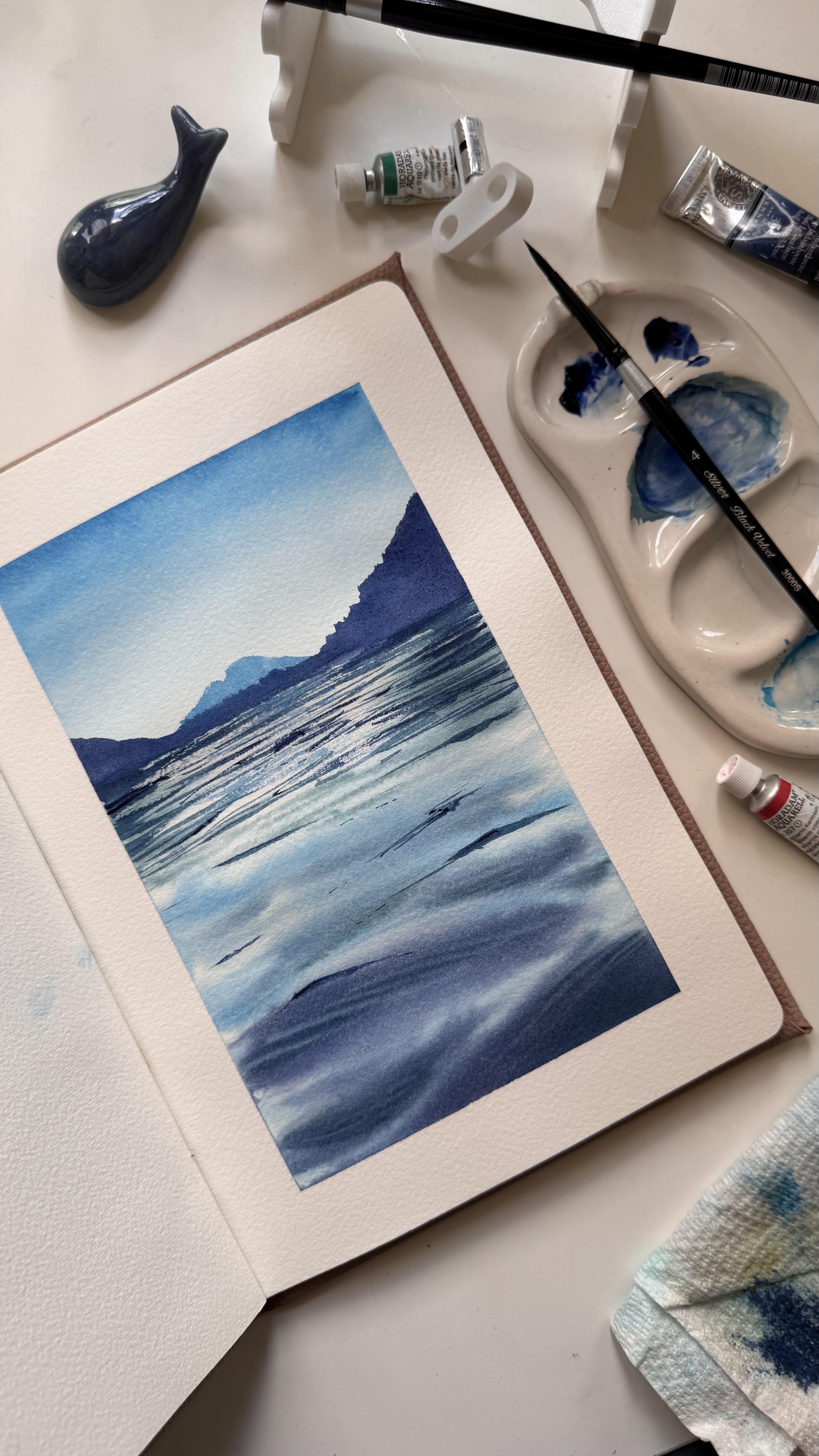
6. Final Project part II: The paper is completely dry. I'll begin painting
the mountains, mixing in the Trane blue, lizarding crimson and the touch of green again for
the mountain shades. I'll keep the shade ready. With the same shade, I'm
defining the horizon line. If you want, you can likely sketch it with a
pencil beforehand, if you prefer, but I'm doing it free hand directly
with the brush. Switching to size
four round brush. In the center, I'm adding a distinct mountain using Cerlean blue in
the lighter value. Since these brushes
have an amazing tip, we can add all the pointy edges and strokes directly with
just one single brush. Um, switching back to size eight round brush, starting from the right
side and painting the closer mountain forms using only the tip of the
brush to create natural rocky texture
along the edges. Repeat the same on the
other side as well. H. Just fixing the horizon
line here a bit. Notice the consistency
of the paint. It's neither too
watery nor too dry. Using the right
consistency gives beautiful natural
variations within the mountains instead
of a flat even tone. Now the mountains are done, we can begin adding
their reflections. I have removed excess water from my brush by dabbing it
on the tissue paper, and I'm using a dry brush
technique for this. You can refer to the
final painting for guidance while placing
these reflections. Wherever the mountains
are present, the reflections and
nearby wave lines will appear thicker
and closer together. In the center,
where we mainly see water movement rather
than direct reflections, I would be leaving
more wide space and using thinner strokes. I'm continuing these reflections down toward the main
foreground waves. In some areas, I'm also
switching back to Cerlean blue, so the water reflects
the sky tone as well, not just the mountains. This is how you can get a
complete dry brush technique, remove complete excess of
water from your brush. If you have a synthetic brush, you can switch to that, too. Switching back to Cerlean hue. Uh, Since this is wet on dry, these strokes are going
to be drying off quickly. If needed, you can
always go back and layer darker lines for
additional layer of texture. If any area becomes too dark, you can later add
small highlights using the white paint
or guash paint, though I usually
prefer preserving the whites of the paper
as much as possible. No, adding with the darkest
shade here, some highlights. Switching back to Cerlene Hue. You can pause and see
how it all is coming together and then make a collective call on where
else to add more paint. I feel these reflections
are good enough. Before removing the tape, make sure your paper is fully dry to avoid tearing the edges. And also, the water
might see back in. So be careful about that. You can also experiment with different shades
for this painting, maybe using indigo
instead of Idithrine blue or tricolar or greener
variations overall. I use Azarin crimson to add warmth throughout
the painting. Since the serlem itself
leans slightly warm, the crimson helps balance the
deeper blues beautifully. You prefer a cooler
toned outcome, you can skip the
warmer additions and stay within cooler blues. After removing the tape, though I was feeling
confident before, now I feel like adding
few more final touches. So I'm switching back to the size four painting and adding the details
within the waterfols. And this is what it happens. You need to be
observing again and again to make a painting perfect according
to your definition. I'm doing this just to make
the painting feel more natural and realistic
with different shades, highlighting
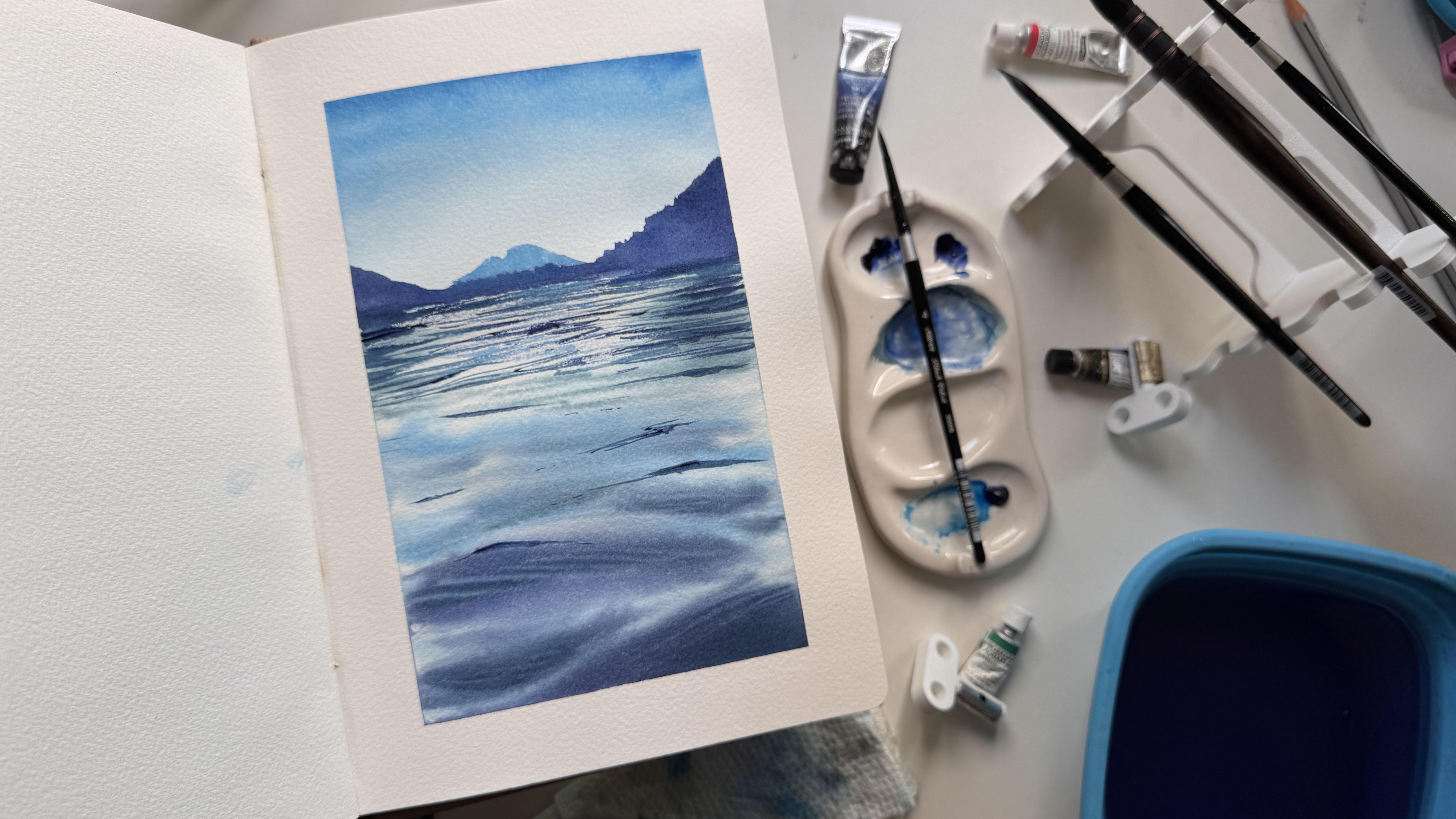
reflections coming with different levels of highlights. And that's the final painting.
7. Final Thoughts!: Thank you so much for
joining the class. Please do share your
final project and your experience in the
project and feedback section. I would love to see
your paintings and how each of you interpreted this
artwork in your own style. Thank you for painting
along with me.
 Swathi Hegde, Watercolor artist | Aqua | Night sky