Transcripts
1. About The Class: Travel journal is not just a series of
drawings on a notebook. It's like a time machine. It takes you back in time. It makes you remember special
memories of your life. [MUSIC] Hello everyone.
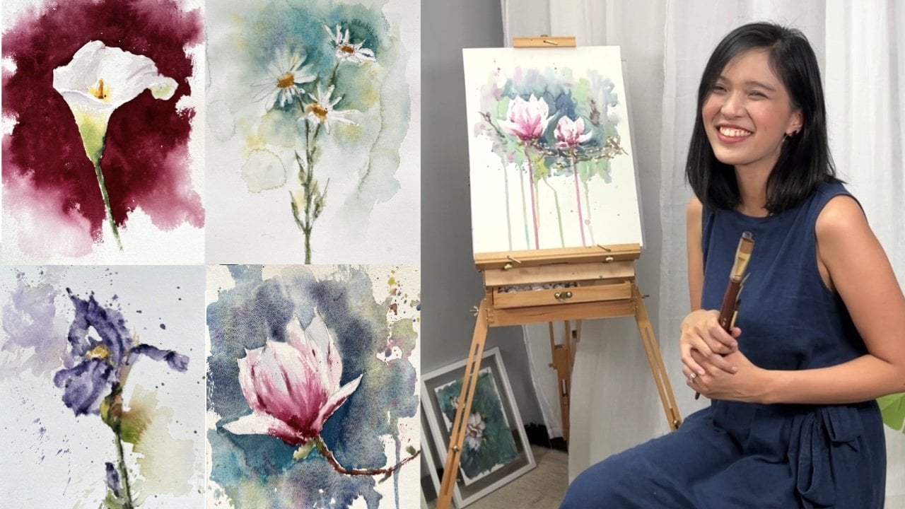
I'm Bianca Rayala, and I specialize in traditional painting with
watercolor and gouache. Besides publishing my
work in social media, I also teach painting
in person and online. I'm a Skillshare top teacher
and Etchr Studio educator. I work with distinguished brands like Schmincke and Silver Brush. I've always loved nature and
I'm passionate about travel. Portraying the world through
my travel journal allows me to depict what's around
me in a very personal way. It has become my place
of happiness where I can document the adventures
and highlights of my life. In these pages, I can
take myself back in time to relieve memories in the
way photos never could. In this Skillshare class, I'll teach you how to use
watercolor and journal to turn your travel adventures to
vibrant and personal paintings. As a final project, I'll take you to an exciting virtual trip to Switzerland, and you'll create a page in your travel journal filled with vibrant landscapes and
fun free hand letterings. First, you'll learn the
concept of travel journaling, which you can apply both when painting while traveling
or back at home. We'll look at the materials from the type of sketch book
to the selection of paints and brushes that
are ideal to get started. I'll show you the basic
watercolor techniques and concepts to create color connection and
depth into your paintings. I'll share with you tricks to simplify free hand
lettering and calligraphy. Then you will learn how
to design your page, how to choose the
subjects to paint, and how to divide the space
by playing with composition. You'll learn the secret
to creating a page with a harmonious and cohesive story. You will start with
pencil sketch, then continue on
to the first wash, and then you'll add
contrast and details and final touches to bring your
travel memories to life. Once the paintings are finished, you'll add other elements in the page to give your
work a personal touch. By the end of the class, you'll learn basic
watercolor techniques and have the first page
of your travel journal. You can surely follow
along even if you're totally new to watercolor, as we will take each
technique from scratch. All you need is your journal, watercolors, brushes, a pencil, and a cup of water. Fill your pages with colorful
memories in watercolor. See you in class. [MUSIC]
2. About Travel Journal: I'm sure you are
so excited to dive into journal making,
but before that, here's some tips
to help you create a travel journal you'll
treasure for a lifetime. We often picture out a
perfectly painted sketch book. Travel journaling is not about
having a perfect painting. It is a raw and
honest documentation of the highlights of your life. You don't have to be a master to create your very own journal. Of course, there are some tips
and guidelines to creating a harmonious and
artistic spread but only basic knowledge on
watercolor techniques and composition are
enough to get started. Don't worry, I'll
share more details about this in the next lessons. Secondly, travel journal is not just a series of
drawings on a notebook, it is a time machine. It takes you back in time. Your travel journal
preserves and relieves memories in the
way photos never could. The act of painting and writing
helps solidify memories so you won't easily forget
them and you know what? It's interesting
to look back and see what felt important
at that time. You realize there are always small precious moments
you've forgotten about a certain trip until
you see your drawings on the page painted in
your own familiar scrawl. Now what should we put
in your travel journal? The exciting thing
about journaling is that there is no boundaries. You can draw whatever experience
that stood out for you. It could be the
highlight of your day, the best meal you had, interesting people you met, place you stayed and
adventure you did. Draw anything that happened that you never want to forget. Another question would be, do you have to paint on
location while traveling, or can you take photos first
and paint them at home? Again, there is no strict
rule in journaling. If you feel that painting
while traveling would make you enjoy the moment even
more then go for it. I've tried it and it was liberating the moment
when you simply pause to appreciate the beauty around
you and paint them right before your eyes
feels so magical. The painting gives you not just visual
memory of the place, but makes you remember
even the smell, the sound, the feeling
while you're painting. The painting may not always
look as you wanted them, but it's full of life and story. However, there are
also some trips where I'd rather paint at home
because time is limited. In that case, I take a
lot of photos during the trip and choose which ones I'd love
to put in my journal. Doing this gives me an
ample time to reflect on my travel memories and design the layout of the
images more creatively. Just a tip when
taking photographs, lighting is very essential. Find the time of the day when the sun casts light and shadows. Light and shadows give
extra drama to your image. I suggest avoid choosing
photos taken at noon where the sun is up high
and there are no shadows. Best to chase morning light or sunsets for
beautiful lightning. Whether you paint on location
or paint when you get home, choose whichever fit
you and your scheduled. Look at it as a fun
and creative outlet, a moment of calm during
or after a busy trip, and of course, as a
form of self care. I hope this tips help you unload unnecessary stress and enjoy
the process of journaling. Now, let's take a look at the materials we'll
need to get started.
3. Materials: Let's take a look at the
materials we need for the class. You can see here very
few items on my table. These are just what
they actually use, both when painting
outdoors and at home. As much as possible, we have to be wise in selecting the right materials
so we don't end up carrying heavy
painting materials that we will not actually need. Of course, we need the
watercolor journal. It's a 300GSM Cold Pressed
paper from Baohong. I always prefer using 100 percent cotton
artist-grade paper since the sketchbook
that they sell in market are quite small for me and only in landscape format. I bought large sheets of paper and have it custom-made
to a journal. This is seven by 10-inch
journal in portrait format. I love the quality
of their paper as it has a very nice
and rough texture. It absorbs water really
well and the paints don't tend to fade
much after drying. If you're still new to
watercolor and would like to try materials
that are budget-friendly, you can try Canson Montval or any watercolor paper
that is at least 300GSM. For the brushes, I mainly use these tree brushes
for all my works. A good-quality brush
has a snap and pointed tip that make
it very versatile. This is silver
brush, renaissance, round brush in size 8. It's made of red sable hair. It loads good amount of pigment and retains
its form very well. I use it for painting
most of my washes. This is silver brush, Silver Silk 88 also
around size 8. It has an extra long bristle
and needle sharp teeth. It's a synthetic brush, so it has a controlled
absorbency of paint. I love using this for painting details and
controlled strokes. Lastly, this is a Chinese brush that I recently got
from Singapore. I like using it for the fine
details and tiny lines. Alternatively this is liner
brush or a small round brush. You can see that you
don't have to bring all sizes of each kind of brush. Size 8 is a good size for both small and medium-size
paper formats. Next on my kit is a
Staedtler technical pen. It has a two millimeter
four B lead. I personally prefer using this because it
has a good weight, and it creates lines in
acceptable thickness. This is Faber Castell
kneadable eraser. This kind of eraser is dust
free and doesn't actually ruin the tooth or the texture
of the watercolor paper. Next is, of course, my
watercolor palette. These paints are
squeezed out from the shrinker holder
watercolor tubes. We save much paint when we
transfer them in the palette rather than using them
straight from the tube. There are some paints that are
more flowy in consistency, which means they take a
bit more time to dry out. Make sure to check your
freshly squeezed paints before packing them through
your bags to avoid spills. For the colors I use, I will share the detailed
list of colors in my palette in the
reference section and also in discussions tab. But you don't actually need to purchase the exact same
colors that I have. I didn't even use all of
these colors in the class. This particular palette
is from Mijello. It is leak proof and has a removable plastic
plate for extra mixing space. Another alternative watercolor
shade that you can use is this 12 color
palette from Schminke. It is a good selection
of primary colors, essential cool and warm shades, and also neutral or red colors, which are the basic colors
you need to get started. The case is very handy and
has a good mixing space. One thing I love most
about Schminke paints, are the fact that most
of their paints are made from pure single pigment color, which makes the
resulting color clean, vibrant and beautiful to
mix with other paints. They less likely
to turn muddy when mixing because of this
primary characteristic. When painting at home, I always prepare
two cups of water, one for cleaning the brush and the other for
wetting the paints. But when painting outdoors this very lightweight Faber
Castell Clic & Go Water Pot comes in very handy. I also bring paper clips to hold my sketch books accurately in a small piece of cloth
for blotting excess paint or water from my brush. When bringing them
outdoors I place them in a small bag to keep them
intact and complete. I provided all the reference
photos and copy of the final artwork in the
resource section of the class. You can download all
images from there too. Now that we know the
necessary materials, let's take a look at the
watercolor techniques and calligraphy basics
in the next lessons.
4. Watercolor Techniques: Now let's take a look at the basic watercolor
techniques such as wet on wet, wet on dry, dry on wet, and dry on dry. Don't worry if you don't
easily get it at first try. It can be a little
tricky at first because it involves the amount of water and paint, the brush
and paper that you use, the timing, and
even the weather. But as you practice and get to know your brush and paints, you will surely get it. So be kind to yourself, be patient, and take
it one step at a time. Let's start with wet on wet. We do this by first wetting the surface of the
paper with water, then applying another wet
color in that surface. We get varying results
depending on how wet your paper is and how wet
the paint in your brush is. If your paper has
a pool of water, the result will mostly look too light because the
heavy amount of water on the surface will dilute the saturation of the
paint you apply into it. So it's helpful to
use more pigment so the resulting color won't
look too faded when it dries. However, when the paper has
somehow absorbed the water, the level of moisture
is just right. You can create soft and natural watercolor
strokes and flows. This technique can be
used to paint skies, radiant in water middle or
to increase intensity on a particular fragment to create a soft wash
or blend of colors. Let's do a quick practice. Let's paint a sample of a
Swiss landscape meadow. I start by wetting the paper with just the
right amount of water. Once the water has
quite settled in I use cobalt blue to paint
the impression of the sky. I leave some small gaps
for impression of clouds. The bigger the patches, the bigger the clouds we create, the smaller the patches, the smaller the clouds. At the bottom part, as we approach the horizon, we transition to
a lighter tone to create depth and perspective. Let's dab some dots
of cobalt blue with burnt sienna to paint the
clouds in the horizon. Here you also see the
paint gently move around the wet surface
creating a soft wash. Next, using yellow with a bit of green, let's
paint the middle. I gently lay the colors in
one direction and press my brush flat on the paper
to create a thick stroke. I'll add a dark green in the foreground to create
a sense of depth in the drawing. There we have it. Remember the way
the colors flow on wet surface depends on
how wet your paper is. So if you see that the color
is burst so uncontrollably, that you lost the white
patches of the clouds, it may mean you need to wait
for a little more time for the paper to absorb the
water before applying paint. On the other hand, if we found some traces of hard edges
around your clouds, that means the paper
is turning too dry already and you need to either increase the amount
of water to apply or you need to work faster
before the paper gets dry. Now let's try the
dry-on-wet technique. It's dry paint on wet surface. So instead of using clean water, on the blank page, we will use a colored base and apply another color on top. This technique is
very useful for painting mountains,
trees, and foliage. Here I get paint in milky consistency of yellow mixed with green
to paint the tree. I vary the pressure
on my brush to create the natural form and
shape of a tree. Next, while this is still wet, I take another color
which is darker in tone and thicker
in consistency. I load my brush with a creamy pigment making
it feel a bit dry. That's why it's
called dry on wet. I dab it on some portions
of the wet-based layer and see how the color mixes and blends with the previous layer. The mixture is quite controlled. It as a soft yet
semi-defined shape because the second layer
is dry, in consistency. In contrary, if you layer a
wet brush on the wet base, the effect will be the
same with a wet-on-wet technique where the colors will expand and move uncontrollably. We can add another
color like indigo, but still in dry consistency to create a full
volume on the tree. Next, let's paint the trunk using a fine-tip brush
and there you have it. Next, let's take a look at
the wet-on-dry technique. This is my favorite technique, especially when doing
quick paintings because I don't have to wait for longer drying
time before I add layers. With this technique, I also
build on the technique that I always share
throughout all my classes, which is called
colored connection. Wet on dry is wet
paint on dry paper. We use this to connect
colors and create a beautiful smooth blend without pre-wetting the base surface. This technique is useful
to increase the tone and contrast of the same
color in one layer. The secret to achieving color
connection is to make sure that the edge of the initial
color is not so wet, but not yet completely dry. This way, we connect two or more colors without
creating a hard edge between colors and avoid
uncontrollable backgrounds of paint to another color. You'll see me use this
technique to paint most parts of our
class projects. So let's do a quick practice. Let's paint the water surface
using wet-on-dry technique. I will start at the top using
light wash of turquoise. My paint is milky
in consistency. While this is still moist, I connect a combination of turquoise and blue
to my initial color, creating that soft blend, despite working on a dry paper. I continue by adding a
different shade of blue to my turquoise to get a different shade of blue
color for the water. Then lastly, I'll add a
bit of indigo to my mix to create a darker tone and
connect it to the previous one. So here we create color continuity and
connection in just one go. Now let's take a look at
dry-on-dry technique, which is dry paint on dry paper. This is best used to using a synthetic brush to
create rough texture. Simply load your brush with a creamy or buttery
consistency of paint. Lay the brush flat on the
paper and glide it quickly. There you'll create this
batch of color on your paper. This technique is also useful
for drawing fine lines, highlights such as wires, tall grass, twigs, and
branches using a liner brush. Now that you know the basic
watercolor techniques, in the next lesson, we'll learn some
easy ways to style your journal with
lettering or calligraphy.
5. Basic Lettering and Calligraphy: Our travel journals
wouldn't be complete without handwritten
personal notes. That's why in this lesson, I'll share some
helpful tips to create beautiful free hand
lettering or calligraphy. To differentiate the two, lettering is a style where you draw each letter individually as opposed to writing them
in cursive or calligraphy. Traditional leaders, a formal way to study
this writing styles. But for this class, we will focus on your
unique handwriting. The primary concept to create a creative style is to put
a contrast in your letters. This means that the
latter is composed of both thick and thin lines. Downstrokes are drawn thick while upstrokes are drawn thin. This applies whether you're
writing cursive or in print. Now let's practice, write travel with
your own handwriting. Again, downstrokes are thicker while upstrokes are thinner. You can either use a round brush to create those thin
and thick strokes by applying pressure
on your brush. Or you can do fox calligraphy, where you'll write the letters
the normal way you do it and then go back
and fill in with where stroke should be bolder. Don't worry about
the angles, spacing, or even the form
of your letters. I'd like you to use
your normal handwriting and just add a little
bit of twist into it. Be creative and free
to play with colors and details or design. This way we keep our
journal very casual, dynamic, and personal.
6. Composition and Layout: Someone once told me, pictures preserve memory, but relationships
make it beautiful. I believe we can apply the same principle
in travel journals. It is a story that we
tell through our journal that make it beautiful
and interesting. As important as learning the fundamentals of
watercolor painting, is developing the general
idea for your page. All elements in your spread
should work together to portray a single-story
and experience. There are unlimited ways to
design or lay out your page, but if there's one thing
you have to keep in mind, that is always have harmony,
balance, and cohesiveness. For sure when you come
back from a trip, you have a lot of great
pictures with you. I know it can feel
overwhelming to choose from a great selection
of pictures, but the tip you can
do is to start by identifying the ultimate
highlight of your trip. Reflect about your trip, and see what are the
three top highlights that impacted you
personally during the trip. After choosing the
top three highlights, select which one is
your most favorite, and then the other
details will be arranged in the way that
supports the main thing. Now, if you're painting at home, you can try doing a
thumbnail sketch to find the best layout to
showcase your experiences. I do this on a scratch paper. Draw shapes in different
shapes and sizes. Of course, allocating larger
spots for the highlights, and then placing the
other details around it. My suggestion is
don't be limited to using square or
rectangle formats. Explore different shapes
like oval, round, or even borderless paintings. But as you divide your page, maintain the rule of thirds, where the main subject
occupies around two-thirds part of the section. For example, in this spread, the ultimate highlight
during my Switzerland trip was to visit this lake landing
platform in Iseltwald, where the K-Drama crash
landing on you was filmed. It was a thrilling
experiences standing before the blue water of the
lake and the mountains, and enjoy the beauty
with my husband. It was fairy tale for me. I dedicated a generous
portion for this memory. Notice that I also observed
the rule of thirds, meaning I divide my spread
in thirds and not halves. Another memorable
experience for me was the cynic view around Lake Thune when we were in the cruise ship. It was so beautiful that
they have to paint it blue. Of course, another thing I like about that
trip was paragliding. I place it here in
the top portion, but didn't paint the
background sky anymore. On the other hand, if you're
painting on location, let intuition guide you. Get lost in the
joy of the moment that golf any fear
or hesitation, and just paint like a child. Next is maintain color diet. Design your lettering or nodes using the same color palette. If you're creating
your journal about your trip in Portugal,
for example, and you'll paint the
yellow tram experience and the nice view by the port. It's best to paint your nodes and let the recent colors
complementing the other colors. This way we maintain the overall feel of
Lisbon in our spread. Now that we've
covered the basics, let's put them all into practice by creating our class
project in the next lesson.
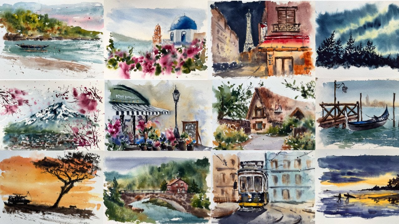
7. Let's Go to Switzerland: As we start our class project, I want it to be experiential
for you as well. So let me take you
to Switzerland through a virtual travel. Our adventure begins on the
Green Train of the Alps, where we'll see
breathtaking panoramas of mountains and lush, green valleys appear
right before our eyes. After two hours of journey
through the Simplon Pass, we travel in Spiez on
the shores of Lake Thun. Here, you'll have a peek
of the shores of the lake and some sailboats
peacefully docked. We start to feel the
cool and gentle breeze and fresh air. It was so nice to see some
lavenders in bloom around too. Then let's take a cruise
to the Interlaken and just enjoy the
entire creation. The lake was so calm and
enchantingly light blue. Looking at the wooden houses and cottages by the valleys, with a picturesque view of snow-capped
Alps in the distance and hang gliders peacefully
soaring the sky, I imagine how dreamy it could be to live in a quiet
village like this. Once in Interlaken, let's take a walk
around the area and go on a quick
trip to Iseltwald, where we can have a front
row view of Lake Brienz. This is also the place which
I'm really dying to visit because of my favorite K-Drama. Switzerland is so beautiful. It gave me so much
beautiful memories, but I can't paint
them all in one page. So let's start drawing the top three
highlights of our trip.
8. Class Project: Pencil Sketch: Now that I've selected my most favorite
parts of the trip, let's start drawing
them on our journal. I started my writing
Switzerland here in the top left portion. I write with my
normal handwriting, and we'll design
it a little bit by just adding some contrast
to each letters. Like what I shared in
the previous lesson, I make the downstrokes bolder
while upstrokes thinner. Next, I draw the main
highlight of my trip, which is the panoramic
view of Lake Brienz, as they sat down at the lake landing platform
with my husband. I start with the horizon line, then draw a rough sketch
of the mountains. Next, I add light strokes to
show reflection in water, and then I draw the
lake landing platform. From the horizon line, I take a vanishing point where
all my lines will lead to. This gives us a
correct perspective as you draw the platform. Next, I draw some
details of the platform and erase unnecessary lines. As a last step, I draw the
general outline of me and my husband seated at the
edge of the platform. Don't worry about copying the
details on the reference, getting the general form is enough to create the impression. Next, I'll draw the view that I love the most during our cruise. I draw an oval outline
here on the left. I start again with
the horizon line, and then the mountains at
a distance and the valley. Notice that my
strokes are leading towards one vanishing point. In the middle ground,
I draw outline for trees here on the right. Then I took note of the
names of the places, and write them
here on this side. Here on the upper right corner, I will place a large paraglide to occupy most of
the empty space. I start with a curved line to get the general
shape of the paraglide. This is basically how
to simplify sketching, observe the general shape, the angle, and the form, and then try to copy
it as you draw. No need to draw the
para glider in detail, we will make use of the
brushstrokes to paint them. Our pencil sketch is complete, let's start painting
in the next video.
9. Painting The Journal: Since the overall theme of
this spread this nature, our color palette
will mostly contain shades of blues and
greens and a bit of orange or red
to create contrast as they are complimentary
colors to one another. Let's start painting our spread starting from the lettering. Using my Silver Silk
88 synthetic brush, I mix different shades
of blues and greens. I'll paint the letters using the fox calligraphy approach, where I draw the thick lines
through series of strokes, rather than bending my brush
to produce quick strokes. I somehow vary tone as I move on to the next letters to create more interiors. I also turned letter I to a pine tree doodle
for extra design. The color set play around
with our cobalt blue, cobalt turquoise, olive
green, and naples yellow. Again, you don't have these
exact colors for your works. You can come up with your own
mix using your own colors. Enjoy color mixing and discover new range of colors as
you mix and match them. As I apply paint, I keep a creamy consistency
to have an opaque finish. Once finished, I let
this dry completely and we'll add some
more details later on. Now, let's paint the
landscape on the left. Using my natural hair brush, I get a mix of cobalt blue, cobalt turquoise, and a
bit of deep-sea violet, plus a lot of water
to paint the sky. I will be doing the
wet on dry technique, and build on color connection as I paint the entire landscape. I started with a saturated wash of blue on the upper
portion of the sky. Then I will gradually
add water to create a fading wash as I
get near the horizon. I added a bit of tone on the upper portion
to create depth. The lower part of the
sky is very light. While the sky fragment
is still moist, I get a creamy mix of deep-sea violet to paint
the cold distant mountains. Notice that there
is no hard edge and the mountains since the sky
fragment is still moist. I mix again a bright turquoise
color with the water. I start from the bottom with
a very saturated color, and then gradually decrease the tone as I go
towards the horizon. Next, I get olive green
to paint the mountain, in the middle ground. Here, the consistency should be thicker than the whole
mountain at the background, so they won't get mixed
and look like one blob. I dab a dark tone by
adding indigo to my mix, to create dimension
on the mountain. I do the same thing with
the mountain on the right. However, I won't be
painting the entire area, as I'll reserve it, for painting the impression
of the tree on the side. I will continue on
painting the value with horizontal and diagonal strokes, which are dry strokes
using olive green. I left some patches of white to show light
in the fragment. Now, I transfer the
synthetic brush and make a greenish blue mix, by simply adding olive green to my initial mix for the water, to paint the reflection of
the trees on the water. I paint the reflection while the water fragment
is still moist. Now, I paint the trees
with dry strokes. I'm still using my
synthetic brush, and I do some dabbing strokes to portray the image of the trees. This being the trunk,
and connect it to the ground by painting
shadows later on. Now, I'll paint a larger tree here on the right side
using dry strokes. I will add another layer
for the reflection, since the first one I
did look too light. Our first image is done. Let's paint the paraglides. Still using my
natural hair brush, I'll paint the paraglide and create dimension in one layer, just like how we painted
the first landscape. I take Naples yellow
and cadmium orange, and start painting the top
portion of the paraglide. See how big the application
is when I transition it, to a lighter tone as I
paint the left portion. Next, I take perylene
dark red with a bit of orange paint
this lower part. Since the consistency is thick, there is not much leads
between red and yellow. I did the transition in tone to show the curve of the paraglide. I darken the right
corner a little bit to increase contrast. I lift the color likely
to create dimension. I paint the tiny human figures
with dots and brush marks. A block of thick color can be done to create the impression. I'll go back to the paraglide, as I left this top
part unpainted. I painted it with a deep dark red and a hint of orange color. To add more contrast, I add a few perylene violet
on the shadowed part. We can pause here and proceed to painting the main landscape, on the next video.
10. Finishing The Journal: Let's begin by painting the sky. I use cobalt turquoise and cobalt blue to get a
cool bright blue color. I paint horizontally
starting from top. A little by little adding water
to create a lighter tone. Next, I paint the mountain
using olive green, deep sea violet in a
bit of cobalt blue. The mixture has to be
thicker and consistency, and the background sky for it
to pop from the background. I felt the need to make this sky fragment larger so
I paint more blue over it. I have white painting over the
human figures and I try to soften the initial edge that I created by going over the
fragment with my brush. Here you can see that
this guy has a flat wash. We need the create
that by making the top part darker in tone. In the lower part near the
horizon, light in tone. I added another mountain
on the left using the same color mix I use
for the one on the right. I complete painting the sky and the mountain fragment
with light strokes. Next, let's paint the water. I use cobalt blue,
cobalt turquoise, and a bit of nipples yellow
for the color of water. I avoid painting over the landing platform
and human figures. Since we're painting
on dry paper, the paint has to be
flowy so it won't dry easily and
create hard edges. We also need to work a
little bit faster to create smooth wash on the
entire water fragment. Again, I made a transition in
tone from dark foreground, to the light wash near the horizon for
aerial perspective. Next, let's paint the platform using burnt
sienna and yellow ocher. As you paint the platform
observe the light and shadows. You can apply proper tones. I mix a bit of icy blue on the color mix to get an
opaque and metered shade. I lighten the areas that appear bright because of sunlight. I carefully spread
the color until I fill in the entire space. Next, I dab in some dark spots of color to
create texture on the wood. To create the dark color, I simply added deep-sea
violet to my brown mix. Here I'm painting with a thick, almost dry stroke the other
side of the platform. Also we create dimension
by creating contrast, on the tone of each side. I painted the walkway with the same color mix and also
the poles on the sides. I switch to my
synthetic brush to paint the green
reflection on water. I use the same mix I did
on the previous landscape. I do multiple light
horizontal strokes to portray the reflection. I suggest to do
this in one go so the strokes look
fluid and organic. I do the same thing on
the left side reflection. Now I get burnt sienna in deep-sea violet to create
a deep dark color. I'll use this to increase contrast on the side
of the platform. This way we reveal
the form even better. Next, I paint the
details on the platform. As I paint the diagonal lines, I refer to my imaginary
vanishing point to ensure correct perspective. I also keep the paint dry in consistency and the
stroke is very thin. After the stroke,
I rub my finger off the blender
stroke on the base. Now I'm using Payne's gray
with a bit of deep-sea violet. I paint the head and
jacket of my husband. The consistency is
still thick and opaque. I use the same color
to paint my hair. I will just leave a small
portion unpainted to show reflected light on my hair. Next, I paint my jacket
with burnt sienna and mix deep-sea violet to burnt sienna to get a
darker brown shade. Now let's paint the shadow using deep sea violet mixed
with a bit of icy blue. You can use opaque, wider
lavender as an alternative. Here I'm just adding
some lines and marks to create shadow and
contrast on the jacket. No need to overdo it since
the figure is so small. I'll put the sling bag as a highlight to break
the dark color feel. Next, let's complete
the paraglide with some fine strokes of strings. I make a line stroke then
dab my finger to flatten it. I use ice blue and a bit of
deep sea violet for this. Our images are
done and complete. But let's finalize
the spread by adding a little pop of yellow color
as highlight on the text. I use Naples yellow for this
since it's a bit opaque. [inaudible] know that
we do this step once the initial layer is dry so we won't mess up with
the initial layer. Feel free to decorate it as you feel to bring more
personal touch. Don't worry if your
normal handwriting look shaky or wobbly. Work around it so it looks like the intended design
of the lettering. Also that unique element makes your work extra
casual and personal. To add some final
personal touches, I'll add a small note on the name of the
location on the side. I choose a muted orange shade to compliment the
blue landscapes. It also supports the single orange paraglide
on the right side. Here we maintain color harmony and balance within our spread. For the small empty space, I choose to use this
to take note of how I felt while I was seated at the platform right
next to my husband. I wrote how amazed I am
to see the beauty of Switzerland right before
my eyes and how great God, the ultimate artist, the
creator of all things, is. This is our final project, a travel journal during
our trip in Switzerland. We've reached the
end of the course. But before we leave, let's look at the
summary of everything we've learned in the next video.
11. Your Turn to Paint: [MUSIC] We've reached the end of our skills for our class. Thank you so much
for coming this far. For the final project, I painted the Swiss landscape, but you can choose what you
want for your travel journal. Once you've decided the theme and composition of your journal, practice the basic
watercolor techniques. Familiarize yourself with
freehand calligraphy or lettering and see which
one you like better. Pick your reference photos, do a thumbnail to study
your page and layout. Play around with the space to make your layout
more interesting. Start with light pencil sketch, followed by the base
layer of watercolor, then decide which
technique you're comfortable using to portray the landscape then complete the details and add
contrast and highlights. Give extra personal
touch to your page with some handwritten notes
about your experience. Lastly, take a photo of
your work and upload it in the project section here in
Skillshare and on Instagram. I'd be so happy to see and comment on your final projects. I encourage you to follow the steps I showed
you step-by-step and go back and rewatch portions of the videos that you want
to understand better. You can ask me any
questions or help through the discussion section
below and feel free to comment on other projects
of students so we can build a culture of encouragement and learn
from one another. I'd be so encouraged to
read your class review. You can rate the class and share your feedback right
after this video. It's time to say goodbye, I hope you enjoyed the entire
class as much as I did. If you'd like to paint more travel destinations
around the world, I invite you to join my
watercolor travel part one, developers style in 14 days of landscape painting
and watercolor travel part two build a habit in 14 days of
landscape painting. See you again in class.
 Bianca Rayala, Top Teacher | Watercolor Artist