Transcripts
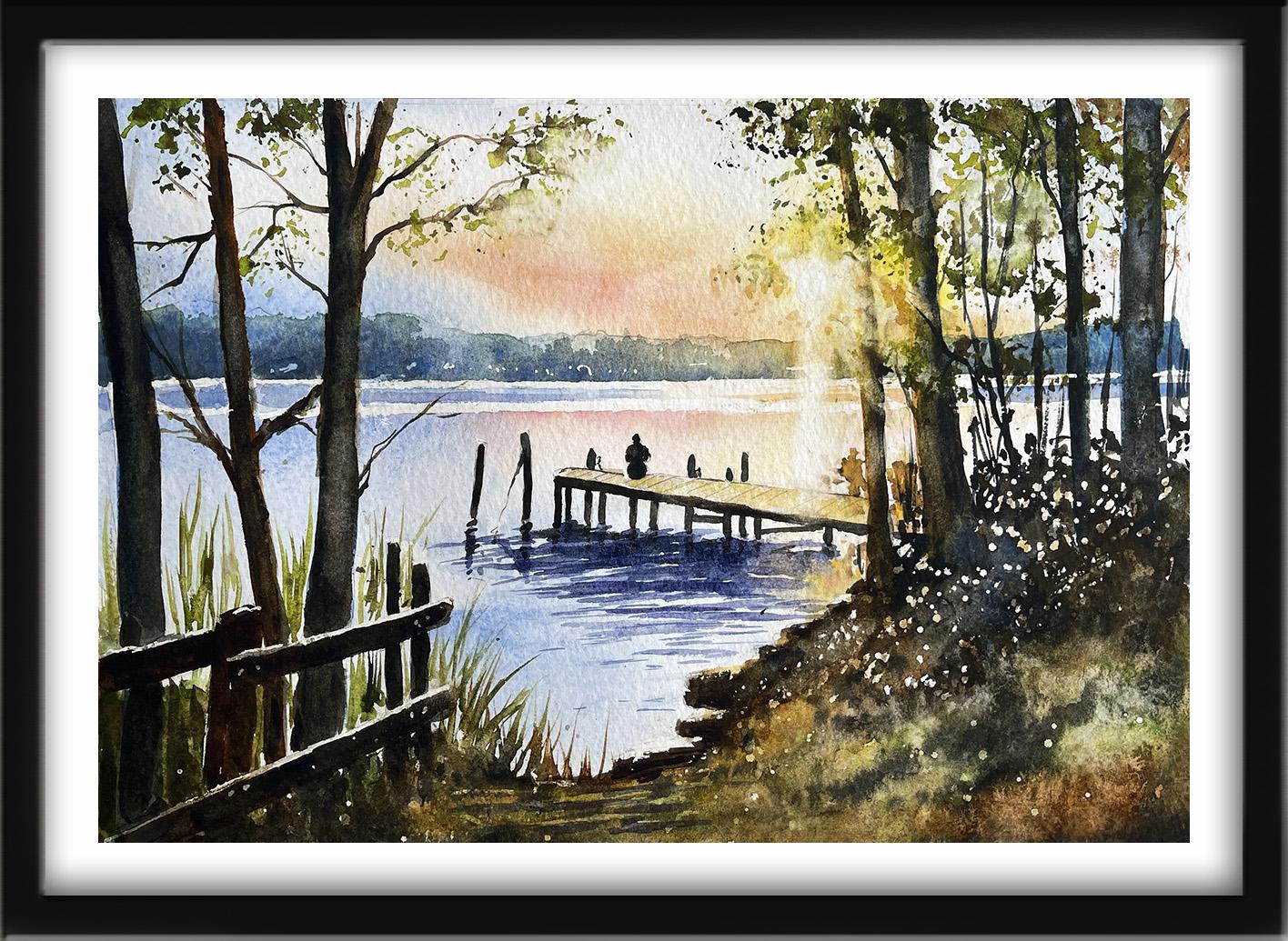
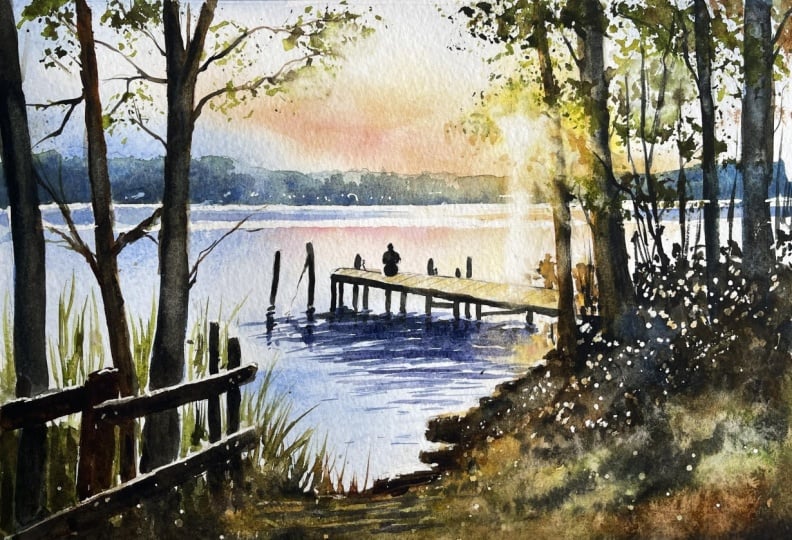
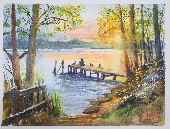
1. Introduction: Let's Paint a Magical Sunset Jetty! : Let's paint a
magical sunset jetty with radiant Watercolor. There's a fabulous contrast
in this painting between the dark expressive trees and the beautiful golden
light beyond them. It's a perfect class for beginners and all artists
who want to paint atmospheric landscapes
and experiment with light reflection
and glowing color. We'll explore some lovely Watercolor techniques
along the way, such as how to create
interesting textures with plastic wrap of foil, how to create three
dimensional tree trunks. And I'll show you how to create shimmering reflections in the water using
expressive brushwork. It's suitable for all levels, including beginners because I'm going to be guiding you
every step of the way. I'll also encourage you
to embrace the loose, slightly unpredictable nature of Watercolor and allow some of those happy little accidents to become part of your painting. We've included a copy
of the drawing in the project resources section so that you can download
it and trace it, and then not worry
about the drawing because this is a
painting class. I am a professional artist, author, and tutor,
and over the years, I've sold a lot of
work across the world and helped hundreds of people to learn more about Watercolor. You can see examples of
my work on my website. My style leans towards
impressionistic and contemporary rather
than photorealistic. I like to explore loose approaches that
bring out the color, light, and essence
of my subjects. I've tried to
replicate this across all the many other videos
that I have on Skillshare. Now, don't forget to upload your own painting through the
project and resources tab. After all your hard work,
I'd really love to see it, and I'll be sure to give
you some personal feedback, and you'll be able to
see the artwork of other students and
get their support. At the end of the class, you'll have your own
beautiful artwork to be very proud of. So let's swizzle our brushes and get on with the painting.
2. Materials, Composition & Masking Highlights. : For this class, these are the colors and materials
that I'm using, but do feel free to use
any that you already have. For information on brushes
and paper, et cetera, do check out the basic
materials document that I've added to the
project resources section. As you can see, I've taken a few liberties with the
reference photograph, and that's the great
thing about creating art. You paint with your
memories, senses, and imagination, as well as
what your eyes literally see. Now you can see that I've
kept the drawing very simple, minimal details so
that we get a nice, loose free flow painting. And I've included a
copy of the drawing in the project resources section so that you can download
it and trace it, and then not worry
about the drawing because this is a
painting class. We're going to start
with some masking fluid, and I've got a
range of different tools that I use for this. Definitely don't use
your good brushes because the gum will
absolutely ruin them. You could use the
handle of a brush, but I also like these
rubber tipped applicators, because the gum washes
very easily off them. These little steel pointed
dabbers are useful, and you can also
get a rolling pin, which has a little wheel
that allows you to open the pincers depending on how thick or thin you
want the line to be. To draw a very thin line, one of the best
little tools I've found is an unwound paper clip. But I also like to use a glass pen because you can get some very
fine lines with that, very detailed work, and again, it washes off very easily. You can apply masking fluid to the shapes where you want to reserve the white of the paper, either for highlights or to
paint over by hand later on. Now, you do need to
wait for the fluid to dry fully before applying
paint over the top of it. When it is properly dry, you can just rub
off the hard gum, either with a clean finger
or with a putty rubber, and you'll see that it leaves behind crisp defined
white shapes. If the white shapes
are a bit too stark, you can soften them
with a damp brush, or you can even paint over it. Using my glass pen, I've just drawn some fine
lines of masking fluid over the top of the fence
posts on the left hand side, where they will be
catching the light. And now I'm just adding
some lines of masking fluid across the horizon line and another line parallel to it, which is about a
centimeter below. If you do get any unwanted blobs of the masking fluid anywhere, it's best to leave it till it's completely dry and
then just rub it off. As I said earlier,
if you don't have a glass pen for these
very fine lines, then the best little tool
is an unwound paper clip. And if you don't
have one of those, how about a cocktail stick
or anything else that's got a tiny point that enables you to draw these very fine lines that we're doing at the moment? I do have a few old brushes
that I use for spattering, because you won't get
very good spatter from the paper clip or the cocktail stick or even the glass pen, but the brush works just fine. And I'm dipping the brush into the masking fluid
and then just using a wrist flicking
action to spatter that masking fluid
onto the paper below. I want it to appear
as though there's some dappled light coming through the bushes
on the far right, and it would be an absolute
nightmare trying to paint around all those
little tiny shapes. So this is where masking fluid really does help an artist out. When I've painted
over that area and then remove the masking fluid
after the paint is dry, you'll be amazed how all
these little light spots illuminate the painting. The drying time can actually vary depending on
how thick you put the masking fluid on and also what the temperature of the room is that
you're working in. Usually, about 15 to
30 minutes is enough, but test yours out before
you start painting on it. Because it's a bigger shape, I've used my old brush to
mask out the sun in the sky. And then I'm just going
to mask out some of the sunlit tops of the rocks
at the side of the water, and then I'm going to leave
it all to dry completely. And
3. Sky, Water & Distant Trees. Paint atmospheric skies & water using wet-on-wet/dry techniques : I'm starting off by pre wetting the sky area
with clean water. You need a big soft
brush for this. I'm using a k, which is
goat hair because you don't want to be fiddling with a lot of little
tiny strokes here. I've already mixed some yellow, cobalt blue and a peachy
color with permanent rose and yellow in my palette because you don't want
to start doing that now, otherwise, the wet that you've
put on will start to dry. All my colors are
about the consistency of tea, so quite watery. And I've started off by painting
some pale yellow around the sun and then
dropping in some of that peachy color that had mixed with the rose and yellow. And I'm just spreading
some of that color out in rays that are emanating
from the sun itself. I'm not using my hat now, of course, but I am still
using quite a big brush. I think it's a size 12 or 14. Because I want to cover this sky as quickly as I possibly can. I do tend to set myself a
bit of a time limit for painting skies roughly
seven to 8 minutes, certainly no longer than ten, because any longer than that, and the sky is going to look
very overworked and muddy. You can see, I've
dragged some of that pale yellow color out
towards the left hand side, and I'm now just dropping
a little bit of permanent rose into that wet wash to
warm it up a little bit. Going back into the sun area, some of the color seems to have sunk into the paper
a bit too much. So just add in a little bit
more of the yellow and peach. It does tend to happen a bit with the wet
and wet technique. Because you are adding
paint to a wet surface, that color is diluted. So you do just need to
keep your eye on it, and as long as it's still wet, you can keep dropping
in some color wherever you think it might have just lost its luminosity a bit. The other thing with the wet in wet technique is
that you don't have as much control as if you were putting the wet
paint on dry paper, because wherever there is
the wetness on the paper, the paint will travel into it. So you do get some
rather unpredictable, unexpected results,
but that is, again, the beauty of this
particular technique. What you do get is these lovely soft diffuse colors blending and mingling
into each other. But I am exerting some
control because I'm not placing the blue over
the top of the orange. If I did that, I'd
just have a brown sky, a brown muddy sky,
not what we want. So I'm being careful to
just place enough blue that it travels only so
far into that wetness. And if it does start going into the peachy yellow or
the orange color, then I can just use a
very clean, damp brush, a thirsty brush to lift some
of that off very quickly. I've added cobalt blue on the right hand side, top corner, and I'm just giving everything a really good shake
because that does help to encourage the colors to mingle and blend together. It gives you a much more
natural and soft appearance than if you tried to
do it with a brush. Remember that watercolor
does tend to dry about 20 to 30% lighter than
when you first put it on. So the sky won't look quite
as dark as it does now. And I've roughly finished that sky in about
four to 5 minutes, so I'm happy with that. That's when you just need to go with whatever you've
got and leave it alone. I'm pretty much repeating the
same process for the water. I've used my large
haatebush to pre wet the whole of the water area
with some clean water, and now I'm dropping
in some cobalt blue. The colors that I use for the water will be a mirror
image of what's already in the sky because we'll get those colors immediately
reflecting down into the water. Don't worry about going over these trees and maybe
the fence posts on this left hand side because they're going to be
much darker later on, and it would be really tricky trying to paint in between them. Water doesn't flow upwards or downwards unless
it's a waterfall, so it's very important to keep your brush strokes horizontal. Going back to the
reflection colors, I've now switched to some pale yellow and
my peachy color, and I'm placing that
immediately below the sun. And I'm adding some
of that same color, the peachy and the yellow
below that streak of color in the sky and around the little
figure on the jetty. I say around the figure, but don't worry if
you paint over it. In fact, do paint
straight over it. Don't try and fiddle your way
around it, because, again, the little figure is going to be a lot darker later on, too. And just like we did with
the trees on the left, I'm taking the color over the top of the trees
on the right, as well. I'm going to take
a little bit of paper towel and just dab out the ray of light that will come from the sun when I remove
the masking fluid. And just like when
I painted the sky, as long as it's all
still very wet, I can add little
touches of color. I'm adding a little
bit of permanent rose now along
that peachy color. And now I want to add
in some paint between those two parallel
lines of masking fluid. So I'll be putting the same color that's
at either side of it, so we've got blue on
the left hand side, and that's moving towards peach and yellow as it
goes over onto the right. So we'll get the blue
on in there first. I'm using a much smaller
pointed brush to do that because although I
put the masking fluid on to retain some
of the white paper, I actually want to retain a little bit more
than I've masked. So as you can see,
I'm actually leaving some white unpainted paper on
either side of my strokes. And then going over
to the far right, we're back to the
blue color again. And it will be a little bit
darker over this side of the paper because
we're going to have those big trees there
acting as shade. I'm adding a little
bit more blue to the top part of the water. Again, the blue that I put on earlier just seemed
to have sunk in a little bit and wasn't quite a mirror image of that stronger blue
in the sky above. And then a little bit
more blue, I think, underneath the jetty
because it will be more in shadow under there from the
wooden structure above it. And it will be adding
some more detail to the water later on. But I want to leave
this first layer dry completely before I do that. And it's a bit like
the sky, really. We don't want to be
fiddling too much, otherwise, it's all going to
look overworked and muddy. I've mixed a bluey
green colour to paint these very distant
trees in the background. Again, the consistency
is quite watery, quite thin, the
consistency of tea. They are in the background, so we don't want them to be
full strength standing out, you know, from what we
put in the foreground. Anything that is further in the distance is
lighter and bluer. I'm applying the painting sort of blobby little
strokes, really, to try and create the
image of foliage, which we won't see
in any detail, as I mentioned before, but we can create the sort of
impression of that. I'm also painting
quite a bobbly line, so not a dead
straight line along the tops of these distant trees. We do want them to look natural and not like an oblong box. And to make them a
little bit more bluer, especially at the
left and right sides, I've added in some
little touches of cobalt blue here and there. That just adds some
variety and interest to what would otherwise be
a long boring shape. And then very importantly, the little trees and bushes
immediately below the sun, of course, are not going to
be that bluey green color. They're going to be bleached out with the strong sunlight. So I've added some pale
yellow and pale peach, and I'm even just dabbing
out some of the color on the immediate trees and
bushes surrounding that. Be sunlight does
have that effect, it kind of bleaches out
the color of things. I've added a little bit of indigo to my blue green colour, and I'm just running that along the bottom of these trees. Now, the paint is still
very wet, as you can see. It's not staying put
where I place the brush. It's moving upwards, blending upwards into the color above. But the trees are more in
shadow at the bottom of them, so that's just helping to
bed them in to the ground. We'll leave it completely dry now before going on
to the next step.
4. Trees & Foreground. Build three-dimensional trees and create a dramatic abstract foreground: We'll make a start
with the tree trunks. Now, if we painted them with
black or a very dark gray, the end result would look
very flat and uninteresting. So I've mixed a big pool of
burnt sienna in my palette. It's a warm orangey brown color, and I've used that to paint the middle tree on the
little cluster at the left. And I'm going to use
the same color to paint the two trees nearest to
the sun on the right. And where the tree is
closest to the sun, about a third of the
way from the top, I'm just dabbing
some of the color off with some paper
towel because the sun rays will have bleached the color from that
particular area. I'm doing exactly the same thing with the tree next to it, painting, first of all, with that burnt sienna color. And then I'm just going
to dab off a little bit of the color where the sun
rays are going across it. For the rest of the trees, I'm using cobalt blue
as their undercoat. And if you've noticed,
I've switched to a flat headed brush rather than a pointed one because it helps me to fill in the
shape much quicker. And as with all things, the less brush strokes
you can make, the better. This tree that I'm
painting now is the nearest of the group
that's facing the sun. I'm also adding a little bit of that burnt sienna color down
the right hand part of it. And then moving over onto
the right hand side, again, using the cobalt
blue and painting that straight down onto
those far right trees. It's important to have mixed all your colors before starting this step because you do need quite big
juicy pulls of color. You don't want to run
out halfway through and then have to start
mixing the color again. Working quite quickly. So this first layer of paint
that I put on hasn't dried. So when I paint in
the black color now that I mixed with burnt
umber and indigo, I'm getting a nice blend on the paper of those two colors. And to give the tree
a rounded color because it is a cylinder shape, I've just lifted some of the color in the
middle of the trunk off with a thirsty brush
that's a clean damp brush. I'm using my black
brown color again now on this middle
tree on the left, and going down the
left hand side. So trying to leave some of
the Bert sienna that we put on first more visible
on the right hand side, where it's catching the
light from the sun. And then same again on the
third tree on the left. I'm going to put in
the black brown color, particularly down that left
hand side of the trunk. And because it is
still wet, as I said, that underlay is still wet, it's not completely dry. The color is traveling over towards the
right of the trunk, but not completely obliterating those lighter colors that
I put on the first layer. What I'm trying to create with this technique is a sort
of silhouette effect. The objects that are furthest
away from the light, which in this case is the trees and will be the fence posts, et cetera, they are going to be much darker and in shadow. Even in shadow, you do get some variation of light and
dark and different tones. So that's why we've used
some different colours and lifted some of the
paint so that we just don't get three very strong
dark black tree trunks slapping the edge of the paper. Over to this right hand side, I've just realized
that I actually didn't fill in the whole
shape of the tree. Did I miss the furthest line so fill that whose shape
in now with Bert Sienna, and then I can go in
and add my dark color. But I'm just leaving that
a moment to just dry a little bit and going on to the blue trees at the far right. So just like I did
with the last one, going over with my
blue black color, black brown color and letting some of that blue
show through here and there. I'm going to add a little
bit more black brown color, dark color to this
tree on the furthest left because the color does seem to have
just sunk in a bit, and it is the furthest
one away from the sun. And then I'm dabbing some of the bird sienna off those
two trees near as the sun, letting the sun rays just
filter through them. And then again, adding some
of my dark black brown color. A small but important
point about the paper towel that you
use to lift paint off with, do make sure each time
you use it to dab the paint off that you use a
clean piece of paper towel. Don't keep using
the same piece over and over again because
what you will, in effect, be doing is reapplying, re dabbing that
paint back on again. I'm fairly happy now with
the structure of the trees and the way that these two nearest the sun are
catching the sun rays. So I'm going to switch
to a Chinese brush, which has got a very long point, but the belly carries a lot of paint to paint the
twigs and branches. Now, if you don't
have a Chinese brush, but you might have
a rigor, again, that's a long pointy brush. And using a brush like this with long bristles helps
you to be a bit more wiggly when you're
painting the branches, because what you don't want is them looking really unrealistic, sticking out like
thick black lines. And also, when you're
painting the branches, think about where they are in shade and where they are
moving into the light. So where they're in shade, they need to be darker. But where they are moving
towards the sunlight, they want to be lighter
and paler in tone. And in fact, I've used the dark black brown color for those that are
furthest away, but I've switched to
some very pale burnt umber and even
pale burnt sienna, where those branches and twigs are moving
towards the sunlight. There's a couple of very
thin young trees just sprouting up in between these
on the right hand side. So I'm just using my Chinese
brush again to paint some quite thin black lines
where they're growing. And again, a few little branches and twigs growing out of them. And I'm adding a few branches and twigs to the main trees, just like I did on
the left hand side, using my pointed brush so
that they're quite wiggly, not too straight and
looking more natural. Adding some leaves later on, but I need to let
these branches dry a bit now and move on
to the foreground. And for the top part
of the foreground, I'm using a very dark
black brown mix and just dabbing that over that foreground area in
between the trees, going over the masking fluid because that's
completely dry now. And although it
looks a bit solid, when we take the masking
fluid off later on, we'll have all these
little dappled lights showing through the foliage, so that will give it a little
bit more energy and light. The foliage is growing in front of the trees as
well as behind it. So I've taken my brush
strokes over those areas, and it's like the
trees are bedded in to the foliage rather than
sitting on top of it. And then I'm changing over to
some of my Br sienna color, my burnt umber color. And I am now
painting what I call very sort of semi
abstract, really. I've also got some green
appetite, genuine mix. And if you haven't
got that color, you can use sap green
with a little bit of tiny touch of red in it
just to dull it down a bit. And I'm using these what
I call earthy colors to paint the foreground in this
very loose and abstract way, letting all the colors just mingle and blend on the paper. Important thing
is to work really quickly for this so
that none of the colors have time to dry before you drop a little bit
more color either into the pre existing color
or into a neighboring area. You want all the
colors to kind of blend and mingle and give this overarching look of soil and earth and
natural foliage. Having got all these
earthy colors down now, I can think about where
there might be some dips and furrows in this area, and I'm using my dark black
brown color to create those. Don't worry at all if yours doesn't look exactly like mine, because it would be
very difficult to replicate this sort of
technique, exactly. As long as it looks
nice and earthy, it'll be absolutely fine. I'm using the point of
my brush to just flick up some of that color
above the water area. So I've got some little grasses. Now, again, just be
careful with these. You don't want them
to look like soldiers all stood on parade in a row. Grasses flow left, right, center they're
blowing in the wind, they're rustling, so
make sure they're little spiky shapes and
alter the direction of them. I'm painting some taller grasses that are growing
behind the fence. Again, just using my pointed
brush to flick them upwards. And don't worry about going over the fence post
because we're going to paint them very
dark later on. And just like these
smaller grasses that we painted earlier, these also need to be going
in some different directions. So you don't want them all
standing to attention. You want them very sort of fluid and much thinner at the top than they
are at the bottom. Hence, using the
very pointy brush. But in between the fence posts, I'm actually filling
in those shapes with full color because
you won't see the individual grasses
at this lower level. They'll be more in clumps. And I also want it
to be much darker in this corner behind
the fence posts. In fact, even with the green, it's not quite
dark enough there. So I think I'm going to drop in some burnt tumber and some of my dark brown black
color as well, and just really darken
that bottom left corner. And as you can see, I'm not being too
precious about this. The whole of this
foreground area is really quite abstract
and much less detail. And that simplification and dark foreground
will make sure that the viewer's eye
goes straight over it to the individual
on the jetty, which is our main focus. Before the paint on the
trunks completely dries, I am just dabbing a little bit of color off here and there, where I think the light is
just catching some areas. This is where you need
to have a look at your own painting and assess whether that
actually needs doing. Maybe you've already
left enough light areas. If you haven't and the
trunks have started to dry, all you need to do is just wet the trunk in a little area
with some clean water, and then that'll help
to lift off the paint, and you can add a little bit
more light color back in. I think I'm also starting
to fiddle a bit too much now and in danger
of overworking it. So I'm just going
to add a couple more little dark furrows into this foreground area, and then I'm going
to leave it all to dry before moving on
to the next step.
5. Sunlight, Fence & Leaves. Emphasise sun rays and create leafy textures with plastic wrap or foil.: I've removed the masking
fluid from the sun, along the horizon, and the right hand side
of the foreground. But not from the fence
posts or the rocks. I want to emphasize
the rays of the sun, and that means lifting off some of the paint
that's already there. Although you can use a brush and some water to lift off paint, I want to introduce you to
magic sponge eraser because this little tool works miraculously to remove
unwanted paint. You can use it to
lighten an area that is too dark or even
strip the color right back to white paper depending
on which colour you've used because some colors do stay the paper more than others. Just tear a small
piece of the sponge, dip it in some clean water, then squeeze it to
just damp and rub over the unwanted paint until
the color is removed. Use a paper towel in between to blot and get the last
bit of paint off, and keep rinsing your sponge
out during to keep it clean or even throw it away
and use a fresh piece. If you accidentally get a
blob of unwanted paint in the middle of your painting or you just want to lighten
the tone of an area, give it some highlights, this little piece of sponge
will become your best friend. Because it's normally sold as an abrasive
household cleaner, it does tend to rough up
the paper a little bit. So take extra care
if you're painting over the area that you've
sponged with another color. And now I've gone back to using my dark brown black color to paint these fence posts
in the foreground. I'm using the same colors
that I use for the trees. So a mix of burnt
umber and indigo for the very dark black
brown color and burnt umber for the
dark brown bert the end of where I want
it a little bit lighter. Although there won't be much
light in these fence posts. For this post here,
the horizontal one that's catching a
little bit more light, I'm starting off
with the burnt umber and then adding my very
dark color into it. Just give it a little
bit more zinc. Although they might look a
little bit flat at the moment, when we remove the
masking fluid later on, we'll get that sliver of
white unpainted paper, so we'll get that
highlight across the top, where they are really
catching the light. And I'm just adding a little
bit of paint off to lighten the areas at the end where
they are nearest the sun. And I'm just adding in some
more dark abstract shapes in and amongst all these
different objects in this left hand corner because I want it to be a lot more dark and less detailed really by sort of smudging
it altogether. I'm not sure that smudging is
a very technical art term, but I think it helps you get the idea of what
I'm trying to do. And then I just need
to add this couple of vertical fence posts
at the end that are holding it all up,
keeping it all together. And again, using my very dark
black brown color for that. We have used quite a lot of
this dark black brown color, so I hope you did
remember to mix a great big juicy pool of
it in the first place, and you haven't had to keep
breaking off to mix it again. If you're watching
the video along first before you
paint it yourself, then that's definitely a
point to make a note of. To paint the leaves, I'm using a small piece of scrunched
up plastic wrap, because I've found that it's much more effective and
natural looking than trying to paint all those tiny little shapes
with a little brush. And as I said, you just scrunch a tiny piece of
plastic wrap up into a little ball and
then dip it into your paint before dabbing
it onto the paper. And keep twisting and turning the plastic wrap
so that you don't get the same shapes everywhere. If you haven't done it before, try it on a bit of
spare paper first. I've started off with
my light green colour, and I'm not putting on a lot of leaves because I'm
imagining that this is late autumn when the
trees have pretty much shed a lot of
their leaves already. And I'm going to be adding some more leaves with two
darker tones of green, so I don't want to
completely obliterate the sky or paint too many
leaves in at this stage. But I think you'll already
be able to see how this simple little
technique does create these lovely little leaf shapes
without too much effort. Where you get any little
leaves over the sun area, just like the trunks that
were painted earlier, the leaf color needs
to be a lot paler, a lot lighter in color. So just use a bit of paper towel again just to lift some
of that paint off, where the leaves are
in front of the sun. And now I'm adding
some of my mid green and my really dark green
because as you know, in Watercolor, we work
from light to dark. And adding these
slightly darker tones helps to give the leaves some
depth in the tree canopy. When you are adding this
darker green colour, it's important not to obliterate all the lovely light green
marks that you made earlier. So you still want to be able to see these different tones. I popped over to the
trees over on the left, and just repeating
that process again, adding some more
of the mid green and then the dark green
to build up the tones. But again, being careful not to completely overshadow
those light green ones. And, of course, to leave plenty of the sky showing through. As with most
techniques like this, the trick is not to
overwork it, overdo it. So satisfying see all
these little leaves appear in an abundance that it's easy to
get carried away. Now, I am using a brush to
paint a few little leaves over the sun because I
want to be very much more careful about
where I'm placing them. And I am using my warm
orange color to paint these leaves because these
are directly over the sun, and so they will have a lot of their green color bleached out. Again, we don't want to overdo it and block out
the sun completely. We just want a few little
leaves in front of it with the sun rays just
filtering through them. And I'm using the same
warm orange brown color to paint a few little
leaves foliage. Doesn't matter
really what it is, some shapes that are hanging
over the top of the jetty. And I'm adding a few
tiny little touches of burnt umber just to give
them a little bit of depth. I'm quite pleased now with
how it's all come together. So I think maybe a few
more little leaves just around the sun area, and then I will leave it all
to dry again and we'll go on to the final section. And
7. Final Thoughts. Step back, enjoy your sunset painting and share your project: Done on completing our lovely
sunset jetty painting. We've covered quite a
few different techniques as we've built up the
painting together. Showed you how we can change parts of a reference photograph, and in this case, we brightened
some of the foreground. We use the wet-on-wet technique to paint a soft luminous sky, and we learned the importance of tonal values to create
three D rounded shapes. And we had a bit of fun with some different
techniques like using some scrunched up plastic wrap to create the little
leaves on the trees. And pricking out some
little small white shapes using an artist's scalpel knife. We achieved a real feeling of depth and atmosphere between the dark expressive trees and the beautiful golden
light beyond them. Now, don't forget to upload your own painting through the
project and resources tab. After all your hard work, I'd really love to see it, and I'll be sure to give
you some personal feedback. And if you've
enjoyed this video, do have a look at my other
classes on Skillshare, which are packed
with more tips and techniques to help you
on your own art journey. If you click the follow button, you'll be able to follow me, and then you'll be the first
to know when you upload a new video or any
exciting updates. And if you could
just take a moment to leave me a short review, that also would be really great. In the meantime, thank
you for joining me, and I look forward to seeing you next time Happy Painting.
 Carrie McKenzie, creating painted visions