Transcripts
1. intro: I used to never
keep a sketchbook, but it is now one of my favorite tools in my art practice. It's a perfect place to try out new ideas, practice techniques, and maybe one of the most
accessible tools for building, strengthening, and
maintaining your skill set. Hey, there, I'm Tanja. I'm
an artist based in Denmark, and this class is going
to be sketchbook themed. Going to go a variety of
projects and exercises. So whether you have
just a few minutes or a bit more time for some
sketchbook practice, I hope you'll enjoy this class. We'll go over a couple of fundamental watercolor
techniques which we'll be using
throughout the class. Practice observation
through sketching, we'll go over some color mixing and because food is
one of my favorite, but also one of the most
approachable subjects, we'll create two
fruit theme projects. So if that sounds fun to you, I hope you'll join
me for this class.
2. Picking the Right Sketchbook: Let's talk sketchbooks. There's
so many different types at all different price points. So which one should you pick? And what if you buy an
expensive one and mess it up. First off, let's get
that one out of the way. There's this common
fear of messing up the first page or messing up
the sketchbook in general. If you don't have that
feeling, awesome, keep that mindset because
this shouldn't be a thing. Whole point of having a sketchbook is to allow
yourself to explore, to play, and to practice, to try new techniques
or test out ideas. And speaking from my own
personal experience, when you allow yourself to let go and not worry
about any of this, sometimes that's actually when you end up having your
best breakthroughs. I do get it, though,
but trust me, the only time you'll
get to ruin or waste a sketchbook or any
other art supply is when you don't use it. It may still be worth taking some time to find the
right sketchbook. So, ask yourself, what do you
want from the sketchbook? What is your main goal and what purpose is
it going to serve? As an example, let's say your goal is to do more
drawing in general. You want to do some
quick sketches, you want to be able to
do some concepts and practice drawing using
either a pen or a pencil. In that case, most sketchbooks will probably do the trick. If your main goal is to do quick watercolor sketches
or loose or rough studies, then you may want a sketchbook where the paper can hold up at least somewhat to
some mixed media or wet media techniques. And if you want to
really practice proper watercolor techniques, or you want to be able to do more detailed studies and
paintings and actually have the paint behave
and look the same way it would on your
usual watercolor paper, then you might want to look into a sketchbook with actual
watercolor paper, whether that would be student
grade or artist grade. Just remember, a
sketchbook doesn't have to look good as long
as it's doing its job. My favorite type of sketchbooks, surprisingly, are not
watercolor sketchbooks. Because I like doing quick
sketches with my pencil, I like to write notes to myself, and I don't really like sketching or writing
on textured paper. And I also want to be able
to swatch my paints without having that feeling of
wasting the watercolor paper. The same time,
sometimes I want to be able to do proper
watercolor studies. So here's the solution
that works for me. I've got two sketchbooks that I've used
quite a few times. The first one is by gum, and I may not be
pronouncing that correctly. Specifically, the new
sketchbook version. The downside to this one is
that it is quite pricey. The paper isn't that
great for watercolor. The feature you may or may not enjoy is that it does
have a lot of pages. So if you're someone who
struggles to fill a sketchbook, this may not be the best option. I've since then come across these ones which are
my new favorites. This is the ensenGradut series, and you can get these in all different types of paper depending on your
preferred medium. My favorite is the one
with the purple band. It's mixed media. The paper is slightly thicker
than with the xum. It handles watercolor
a bit better, has fewer pages, and it also comes at a much more
reasonable price point. These may not be the best
watercolor sketchbooks, and they do have a
watercolor version. But what I do is
that if I want to do a study or painting and I want to use proper
watercolor paper, I'll simply stick, tape or glue a piece
of watercolor paper into the sketchbook as an additional page or even
add it in using a paper clip. The truth is, I love when
a sketchbook looks messy, almost like a scrapbook,
because in many ways, that's exactly what it
is, a creative scrapbook.
3. Supplies: So let's have a look at the
supplies we're going to need. You're going to need a
sketchbook or a block, paper pad, or even
loose sheets of paper. It's completely up to you. I'm going to be using
one of the Kens and graduate mixed
media sketchbooks, as well as some
watercolor paper, which we may want
for the studies, or we're going to be using
proper watercolor techniques. Of course, we're going to
need some watercolor paint, so get out your palettes. For most of the lessons,
I'm going to be using colors within
this palette. And though I encourage you to use whichever paint you have, I will show you
exactly which colors are in this palette at
the end of this lesson. And then for one of
the lessons I will be using this palette just to
have some more color options, though it's not a necessity. The number of colors you
have is not important, but I do recommend having some version of
your primary color, so a red, yellow, and a blue or preferably a warm and a cool
leaning version of each. We're going to
need some brushes. I'm going to be
using these ones by meten in size three and five, but due to the size and shape, these are probably
closer to size ten and 12 in your
average round brush. We want to be able
to do some soft shading and some detailed work. And then I'm going to be
using a separate brush for picking up the paint from
the watercolor pens. Just avoid wearing down the point of my
brushes too quickly. We're going to need a pencil and at least one type of eraser. I'm going to use my
0.2 mechanical pencil, a normal eraser, and
a kneaded eraser. If you're using loose
sheets of watercolor paper and you're going
to be adding them into your sketchbook like I am, you may want some masking tape, some glue or a few paper clips. We're going to need a cloth or some tissue to
wipe our brushes, some tissue to help get rid of excess water from our brush, and to help lift
paint and some water. So if you're ready,
let's get started. But before moving on
to the next lesson, let's have a look at the
colors in my palette. I usually keep at least
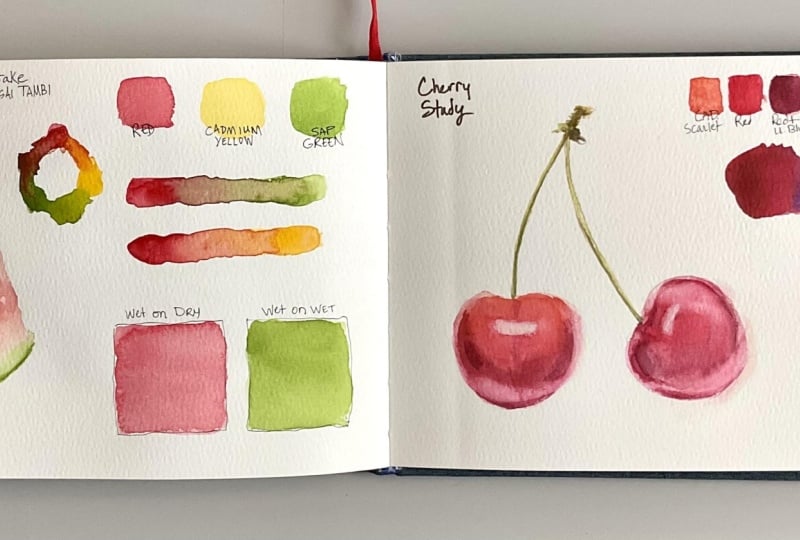
a couple of pages in my sketchbook with swatches
of the palettes I'm using. So let's do exactly that. Set this palette up to work as a really good mixing palette, so it has a few
different versions of each of the primaries, as well as a couple
of the colors. I personally use a lot. Having a couple of each of your primaries and
especially having a warm and cool version
is a great place to start and will enable you to mix pretty much any color. And if you are interested
in more information about how I select colors when
setting up a palette, I highly recommend checking out my new skin
tone mixing class, which does have
some useful tips. So I'm going to link that in the discussions
below this class. You don't have to have
this many versions of red, yellow, and blue in your palette in order for it to be
a good mixing palette. But over time, the
more you paint, you end up finding
some favorites. And you may find that you prefer certain pigments or
colors for one thing, and other colors and pigments
for different things. Happen to be someone who can get really specific about my colors, but lots of people do perfectly fine with a much more
limited selection. I'm not going to tell you to
do one thing or the other, but I do think it's
smart to start small or start with a
small selection of colors and gradually add
more as you see a need for those specific
colors or pigments. When you're ready, let's move on and do
some color mixing.
4. Warm-up: Color Exploration: Now we are going to
go over a couple of color mixing
exercises in this class. For this first one, we're simply going to explore our colors. This is a great way to
get to know your paints, see how they interact
with each other, and potentially find new
favorite combinations and mixes. There are a few ways
you can approach it. The first one is to have
one main color at a time, meaning that we want
to pick one color to focus on and
then mix that with a variety of other colors
to see what kind of mixes we get and how
those pigments interact. In this case, I'm going
to pick quinaquon scarlet from whole
bin as my main color. So I'm going to get
some out on my palette. And then I'm going
to mix that with a few of the other colors. And although you can swatch
it more aesthetically, the goal is not for
it to look pretty. We want the colors to mix
in varying degrees so that some areas of the swatches
have more of one color, and some areas have more
of a different color. And we can use this in a purposeful way before
doing a painting. So if we know we're going to
be painting something red, like in the next lesson where we'll be
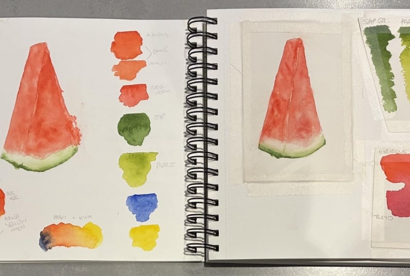
painting watermelon, we can try mixing different
versions of red, pink, orange and yellow to find the colors we want to
use for that painting. The one thing I do
recommend, though, is to keep track of the colors you're using,
because that way, when you go through the
sketchbook at a later time, you'll know exactly
which colors you used to get certain mixes or effects. I really like the swatches
on the right hand side. The Ccton scarlet and brilliant orange is one of
my favorite combinations, and I think it's
going to work really well for the watermelon as well. You could also use the
Connectu magenta mix for some shadow tones, but to keep it simple,
I don't want to add in too many different
colours for the study. The mix on the top left is also very similar to the
one with the orange. And I've said this
in other classes. Don't stress too
much about having the same colours as what
someone else is using. Use whatever colors you
have available to you. As long as you have a
few of your basics, you'll likely be able to create very similar if not
identical results using other pigments. It's not that big of a deal. We can also approach it in
a slightly different way. So instead of having
a main color, we can pick and choose
any colors we want. I sometimes do this
if I'm feeling stuck, or I can't quite decide on which colors to use
for a painting. You can do small swatches with
just two or three colors, or you can create
one giant swatch and allow all the
colors to just blend. For some colors or pigments, it may be worth doing
this on watercolor paper, especially if you're
using granulating colors or colors where the pigments
separate as they dry. And don't worry about
creating muddy colors. Muddy colors are just more
neutral or muted versions of your other mixes, and they're still useful. So you may even discover color combinations
that you can use for creating more interesting grays or browns for your paintings. If you wanted to do a really
thorough mixing chart, you could do this on a
separate piece of paper. But because these
watches do take up more space than on your
average swatch chart, it may be more suited for
if you're curious about certain combinations
or if you've gotten your hands on some new colors and you want to see
what they can do. One of the best
things you can do is getting to know the
paints in your palette, whether you have
just a few calls or a whole rainbow of options. But the better you know the
paints in your palette, the faster you'll become
at call mixing and knowing which calls are
going to give you the best result in
any given situation. So even though this
is a simple exercise, it's also really useful. So before we forget, we
do want to write down the names of the calls
we used either above, below or somewhere on the page. You can do as many or as
few swatches as you want. But once you're ready, let's move on and do our first study.
5. Watermelon Study: Sketch: Let's get started
with the first study. But first, I'm going to
prepare my sketchbook, so I'm going to add in a
piece of watercolor paper. I've got a piece of
masking tape that I've cut down the center lengthwise, and I'm going to add this
to either side of the paper like this and just add
that into the sketchbook. Just like that. I'm going to do the
other side as well. You don't have to do both sides. I just like having it
feel a bit more secure. Perfect. We're going to
start with the sketch. I've got my reference on
my phone, but of course, I'm also going to pop it up
in the corner so you can use either that one or download the one from the Projects
and Resources tab. Okay, so we're going
to sketch it twice, once on the left side to practice observation
and sketching, and then we're going
to do a simple outline or sketch on the right side, which is going to serve as a base for our watercolor study. When sketching, we can
either eyeball it or we can hold our pencil up to our reference to help
get the right angles. We're going to see if we
can get in the basic shape. I'm going to start at the top. It's gonna be
something like this. Sketch that in, and then I'm going to do the
same for the side, starting with left side. Like that and the right side. The good thing
about sketching or painting food is that it
doesn't have to be perfect. It doesn't matter if the shape of this wedge is slightly off. It's still going to look like
a wedge of bottom melon. Now, speaking of, we're going
to try and see if we can get in the height and
the width at the bottom. And again, we can
either eyeball it or try and see if there's anything about the subject
that can help us. In this case, if we take
the width of the bottom, that is going to fit just under two times into
the height of the wedge. So if I put it here, I can tell that leaves
a bit too much space. I'm gonna move it further
down, maybe around here. That seems to match up a bit
better with the reference. We can then add in
this last line, and we want this to be
slightly more narrow at the top and wider
at the bottom. We're going to draw
in that bottom shape. And notice right here where
we have the ana of the wedge, if we look past that
knobbly bit from the stem, due to the angle,
the rind doesn't actually appear to have
a cuna shape right here. So we want to make that
fairly straight and then come down with a
curve on the white aside. Once we've got that,
we can clean that up. This time when
adding in the side, I'm going to use kind
of like a raggedy or squiggly line to give the
impression of some texture. It's not a necessity, but it's one thing
that differentiates this from a wedge of Parmesan, though I guess those can
be a bit raggedy, too. I That looks pretty good, although something
about the bottom doesn't look quite right to me. So in order to check, what we can do is go in
a horizontal line from one corner to the other just to check if
everything lines up. And so if we go in a line from that left corner
straight across, I can tell that my corner on the right should sit
a tiny bit higher up. So I'm quickly going
to get rid of that and add that in
right here instead. B. I'm pretty happy with that. If you want, we can
add in some shading. Just some light hatching. It does not have to be perfect. Although if this is the sketch you're going to
be using for your study, you may want to skip this step. And just to save you some time, I am going to speed up
some of this footage. I'm not going to
worry about getting the details exactly right. It does not matter, but I am drawing inspiration
from the reference in the sense that we
want to see if we can get some of those value changes. So look for the lighter
and darker areas and add in something similar. It does not have to be accurate. Although, by all means, if you want to spend that
extra time trying to get it a bit more precise,
feel free to do so. But the main goal
for this sketch really is just to
practice observation, especially when it
comes to proportions, so we can practice getting our subject onto our paper
ready for being painted. Getting to play with the paint is definitely the most fun part, but practicing the
fundamentals is so important, even when our main
focus is painting. Practicing drawing or sketching is still going to help us become stronger painters because it helps us see more accurately. We're gaining both
eye hand coordination and muscle memory, and it's going to help us build a much stronger foundation, which is useful for any medium, but with a medium
like watercolor, where we're working with
transparent paints, it's extra useful because we can't always go
back and correct mistakes the same way
we could if we were working in acrylics,
oils or gouache. And so even though
we're not painting, we're still going to become
better at seeing shapes, proportions, lines, ankles,
and all that good stuff. All these small things we do in our art practice is kind
of like going to the gym. It helps to build and
maintain our skill set. And that's why sketchbooks
are so useful. Whether you have an hour to spend half an hour or even
just a couple of minutes, all you need is something
as basic as a pencil, and you can do a study of
whatever is in front of you. I didn't actually keep a
sketchbook until 2022. Pretty sure it was during
the COVID lockdown. My partner definitely had COVID, but I set myself the goal of doing daily sketching
because I really wanted to get into the habit of keeping a sketchbook
consistently. And so I would sketch my keys, my dinner or characters from
movies we were watching. Even did a sketch of a paper clip because on one of the days I just didn't have the
energy to do anything else, but I still wanted to
keep up with the habit. And that's one thing I will say. If you set a similar goal, don't be too strict on yourself. Even if you decide to
do daily sketching, if there are days where you just don't have the time or energy, it's fine because sometimes
life just gets in the way. So keeping up with a challenge like that
can be a good thing, but don't force yourself to
do more than you're able to. Now, all we have to do is do a second sketch on
the watercolor paper. You can go about it the same way measuring the angles
or eyeball it using either our reference as a reference or your own
sketch as a reference. And again, even
though we want to try and get the
proportions, the shape, et cetera, somewhat similar
to our reference photo, it does not have to be perfect. I recommend not
sketching too small, because even though
we're not going to be doing lots of crazy
effects for this one, we still want the watercolor
to be able to move, and we want to have that space to practice the techniques. Okay, I think this
looks pretty good. So if you're ready, let's
move on to some basics. M
6. Watermelon Study: Picking Our Colors: Before we start
adding pink to study, we're going to go
over some basics. But first, let's
pick some colours. You don't have to
use the same or even similar colors to
the ones I'm using. Have a look at the colors in your palette and pick
ones that you feel like working with or ones that appear to be a good match
for the watermelon. We're obviously going
to need some red, so let's start with that one. Both of these could work. You could even use a
magenta if you wanted to, but I really like how
the Cacuon scarlet and brilliant orange mixes,
so I'll use those. You don't have to
add in an orange or a second color for that matter, but we'll get back to that. Pick at least one
red. Let's swatch. This is another thing I
use my sketchbooks for. Most of the time when I'm
working on a painting, I'll swatch and write down
the colors I'm using, as well as the title for
the painting itself. That way, you'll be
able to look back at it if you need the
information in the future, or if you're working on a painting for a
prolonged period of time. It's a good way to keep track of the colors you're using
so you don't forget. Okay, we're also going
to need some green. If you have greens in your palette you can definitely
pick one or two of those. I don't have any
in this palette, so I'll go for a fairly basic yellow and
blue combination. I'm going to go with
permanent yellow light. And palo blue, yellow shade. If you're using a pre mixed or pre made green
as the base color, you may still want to add
in a yellow or a blue, so you're able to
adjust the color. To be fair, this study is
mostly about the techniques, so it's really not
that important. If you really wanted
to, you could go ahead and do a
monochrome watermelon. It may just not look as fun. Once we've selected our colors, we can go ahead and
do some test mixes, either in the form of symbols
watches or a color wheel. This is a great way to test
out your color palette and see if you're able to
get all the colors you need for your painting. And though it may not be
an absolute necessity for a study as
simple as this one, I do think it looks quite
aesthetic, so why not? Also, on a quick side note, I do have a second cup of
water off to the side, but that one is too big
to fit in the frame. The smaller class is
mostly so you can see when I'm picking up water
once we start painting. As I mentioned, you
can definitely use just one red for the red
portion of the watermelon and either one green or a yellow and a blue
for the green portion, keeping it super simple. The advantage of
mixing is that if we add in some orange or
some yellow to our red, we are able to bring
in some warmer tones, which is going to add
so much more life and depth to the wedge. And likewise, if we add
something like magenta or blue, we'll be able to create some
really nice shadow tones. Same with our green mix. Whether you're using a pre mixed green or mixing your own, if we add in some yellow, we can put it into
more of a lime green. And by adding in more blue, we can create a deeper, more cool toned mix. We can even add in some red. Mixing all three of our primaries is going
to give us neutrals, so adding in just a touch of red can really help if
you've got something like a really vibrant green
and you want it to look a tad less artificial or make
it look more tone down.
7. Basics: Wet on Dry & Wet on Wet: The two main techniques
you typically use when painting with watercolor is
wet on dry and wet on wet. Wet on dry, meaning
that you go in with a wet paint
mix on dry paper. This can make it easier to control exactly where the paint goes and also make it easier to control the intensity
of the colour. Mastering both of these
techniques mainly comes down to both practice
but also water control. If you've got too little
water present when working wet on dry or you're
not working fast enough, the paint may start
to dry too much, and you'll end up
with hot edges. This tends to especially be a problem on hot pressed paper. So make sure you've got
enough water present in the pink mix and that your
brush is fully saturated. Wet on wet means
that you go in with a wet paint mix on wet paper. This can make it
easier to create those beautiful soft blends without the occasional hot edge. The more water you've
got present either on your paper and on
your paint mix, the more the paint
is going to spread. The drier the paper
or paint mix, the less it's going to
move on the surface. And though you can use
this technique to create those soft layers and
blende a lot more easily, you still don't want
to fuss around with the paint too much or for too long because once
the paint starts to dry or even go from wet to damp, you may end up with a streaky wash. For something like this, cold press paper tends to
be a lot more forgiving. But practicing and fully
understanding the drying stages of your paper is crucial for getting the most
out of this technique. And with both techniques, it's important to understand how much water is present
in your paint mix, your brush, and your paper. Because if you go in
and suddenly introduce more water than what's already
present on the surface, that water is going to push away the paint that's
already on the paper, and you may end up with blooms, which in some cases may be
exactly what you're going for. But if not, it can
be frustrating. In order to increase
your chances of success, we need to first of all, use a brush size that's suitable for the area
we're going to fill in. If you're using a brush
that's too small, you're going to have to
work a lot harder or a lot faster in order to keep
up with the drying time. Whereas a lighter brush may make this process
a lot more smooth. Both of these brushes could work perfectly fine for a
section this size, though. I'm just exaggerating
to prove a point. Secondly, we also want
to make sure we have enough paint mixed up because if we haven't
mixed up enough, we'll have to waste time
mixing up some more, which may result in hard edges forming or the new
mix is going to end up with a different amount of either water or pigment, which may result in a change
in value or color intensity. For wet on dry, we want
to pick up our paint, make sure our brush
is saturated. Then go in, starting at the
top and work our way down. If you've got pooling of water once you get
to the bottom, use a cloth or some tissue
to get rid of the water from your brush and use it as a small vacuum to suck
up any of the excess. It's also important to
note that the type of brush using can
affect how easy or difficult it is to
create an even wash. As much as I love these
brushes from meting, they're not my favorite
when it comes to creating even washes wet on dry. They're able to absorb a lot of water and
paint, which is great, but they also tend
to disperse or release the water at
a much slower rate, which is perfect for
working with details, but may also result in drier looking washes or brush strokes compared
to other brushes. So it's worth playing around
with all the brushes in your stache because some of them may work better for
certain techniques. If you're filling
in a large area, you may not be able to cover the whole thing using
one brush load of paint. In that case, quickly resaturate your brush and continue before the paint starts
to dry too much. Having enough water
in your paint mix, as well as working with a brush that disperses
enough water to allow for some
of that pulling near the bottom can
be really helpful, so your paint mix
doesn't start to dry out on your paper
before you get back to it. For wet and wet, we need to
start by wetting our paper. Sometimes you may have
areas that are starting to dry almost instantly.
This is normal. It just means we
need to go in with more water to properly
saturate the paper, which means you
may need to go in two or even three times. However, we also don't
want pooling of water. If you've got too much water, you can use your
tissue or brush to get rid of some of it,
but most of the time, redistributing it by spreading it onto the whole area using your brush and then
allowing it to soak in for a few seconds before continuing
should do the trick. We want an even sheen. If we want soft blends
and really soft effects, we may want the paper
to be more wet, whereas if we want
to add some details but still get soft edges, we want to allow the
paper to dry a bit longer to get to more
of a damp stage. Definitely do recommend
that you practice both wet on dry and wet on wet, as well as using a variety of brushes in order to
find your favorites. But for now, let's get
some paint onto our study.
8. Watermelon Study: Painting: We're going to work mostly
wet on wet for this study. The goal is to practice
water control by understanding how much water is present both in our
paint mix or brush, as well as on our paper. When painting, you want
all your paint, water, and brushes to be within reach, and preferably on
whichever hand side that matches your dominant hand. So since I'm left handed, my setup should be on the left. But since I'm working on the
right side of my sketchbook, I'm going to switch things
around so we're able to get a bit closer and
still see everything. Much better. Let's
start with the rind. This is the only part of the study where we'll
be working wet on dry. So let's mix up some paint. The exact color
is not important. Looking at the reference,
it appears to be a nice, fresh green, definitely
leaning more towards yellow on
the color wheel. Our focus is going to be on getting soft blends as
well as some texture. So I'm not going to worry about whether or not the
mix looks too bright, but feel free to
add in a touch of red if you want to tone it down. When working wet on dry, if you want to
blend out an edge, what you want to do is pick up the paint apply to the paper. Quickly clean your brush, maybe wipe it off to get rid
of some of the excess water. We don't want too much water
on the brush and then go back in and blend it out before it starts
to settle or dry. If you're not fast enough, you'll quickly start to
see hot edges forming. The paper you're using, as well as the amount of
water that is in the paint you just put down will affect how much
time you've got. And so using a brush
which releases more water than the one I'm
using may help as well. Luckily, food doesn't
have to be perfect. So let's go in and add some to the base of our melon witch. Quickly rinse and wipe off
our brush and blend that out. This is a very hot day, so my paint is drying fast, and I'm already seeing a faint edge right
here, but that's okay. We're not going to
concern ourselves with something as
silly as perfection. Once dry, if you want, we can go in with a second
layer to deepen the color. We know that bringing
in more water or having more water present will
give us more time to blend. But aside from that, it may also be worth looking at the
paint you're using. Halo blue is a very
staining color. Using a colour that's
less staining may allow you to blend it out more
seamlessly with less effort. Gonna do the other side as well. Pick up our paint, add it in, rinse and
wipe off our brush. And blend that out, depending on multiple factors like
the climate you're in, your paper, brushes, and paint. It may be worth going
in wet on wet instead. At least if you're painting something where you want
to have some more time to create these soft blends
and make them look more neat. But it depends on what you're painting and what effect
you're going for. With watercolor, we often
want to think ahead. So plan out what effect you want and how you
want to achieve it. Thinking one or two steps
ahead and making sure you have all your supplies
ready can easy process. Once we've got that, we're
going to allow that to dry and get started with
the flesh of the melon. First, we need to
mix up some paint. And again, we really don't
need to worry about the color. I'm starting with my red, then adding a small amount of orange to a portion of that, so I have some slight
color variation, though it's not going
to be very noticeable. What we want is to
practice creating the texture using the
wet and wet technique. And in order to do this, we need to have the right amount
of water present. If we have too much water on our paper or in our
paint mix and brush, everything is going to
blend into one soft blob. While the paper is most wet, that's when we want
to add in our base, just a thin wash of colour. Then as the paper
starts to dry or by controlling how much water we
have in our mix and brush, we can begin to bring in
and build up some details, starting with the softer
textures or shading, followed by some slightly
more crisp texture where the paint is
barely spreading. Keep an edge on the bottom and either
blend it out and soften any hard edge is forming or push the pigment back into place
if it bleeds too far down. We want at least some
white to remain. The goal is not to make it look exactly like the reference. We just want some similar
shading or texture. If you've got too much
water in your pig mix, you should tissue
to help get rid of some and don't be
afraid to experiment. Make mistakes.
That's how we learn, and that's what
sketchbooks are for. If you add too much water
when the paper dries to more of a damp stage,
you make it blooms. So if your paper gets to a point where fuel is too
dry to continue, but you still want to
add in more detail, just allow it to dry completely
and then go back in, re wet it and continue. You don't have to do
everything in one layer. Don't rush it. One tip is, when doing this, if you're using a new brush or a brush you want to try
and keep looking nice, don't jab the point of the brush directly onto the paper too hot. I'm holding my brush
at a slight angle so that it's mostly the side of the point touching the paper, and I'm also trying
not to be too rough. It's not the stippling motion
that gives us the effect. All we need is for
the brush to touch the paper so it
releases the paint mix. And finally, let's
do the other side. Because there are
so many factors that can affect the result, like your brush, paper, et cetera, the only way to truly know and understand what
works for you is to practice. If I were to change just one factor like switching out this brush
for a different one, I'd have to adjust my techniques accordingly to match how much
water that brush can hold, as well as how much or how
quickly it releases the water. The good thing is
that no matter how much or how little
texture we end up with, this is still going to look
like a wedge of watermelon. So just play around
and have fun with it. I'm gonna push this pigment away from the edge
and back into place. And then I've
apparently gone against my own advice and not
mixed up enough paint. So I'll have to allow this
to dry and go in again. Luckily, it's not a big
problem for this one. This study is very forgiving. If you want, you can go in
with a few final touches. I'm going to add a
bit more texture to the very bottom of the rind, keeping it super simple. I'm just going to go in wet on dry and slightly blend that out. You could definitely add
in even more detail, but I'm going to stop here. Either way, once you're ready, we're going to move on
and do some color mixing.
9. Exercise: Color Mixing: We're going to do another
color mixing exercise. This one is great if
you want to practice, but you don't have the
time to do an entire study or if you want to focus
on just color mixing. But first, let's quickly go on some basics when it
comes to color theory. Okay, so if we have
our color wheel, we have our three
primary colors, red, yellow, and blue. And even though I'd
like to say magenta, yellow and cyan, for
the sake of this, we're just going to
stick with these. When we mix two primaries, we're going to get our
secondary colours. Mixing red and yellow
will give us orange, mixing yellow and blue
will give us green. Blue and red will
give us purple. Tough depending on
the exact color, some combinations won't
give a good result or you're not getting the exact
color you were hoping for. This often happens, especially when mixing the purples,
and that's okay. This has to do with
color temperature. If a red leans more
towards blue or purple, it's considered cool toned and will tend to work better for mixing a purple
compared to a red that leans towards
orange or yellow. A warm red will be ideal
for mixing bright oranges, especially when combined
with a warm yellow. So a yellow that leans towards red or orange in
the color wheel. A cool toned yellow, so one that leans towards blue when combined with
a cool toned blue, so one that leans
towards yellow will create beautifully fresh greens, sometimes almost too bright and clean if you're painting
something more natural looking. Whereas if you mix blue and especially a warm tone blue
with a warm tone yellow, you may get more
of an olive tone. When we mix all three primaries, that's where we
find our neutrals. So our browns and grays. And the same happens when we
mix complementary colors, so colors that are opposite to each other on
the color wheel. And if you manage to mix two
perfectly balanced colors, you'll get a neutral gray. For this exercise,
we're not going to worry too much about
color temperature. Knowing the basics can
help us out a lot, but there is no such thing as a correct and a
wrong combination. It all depends on the
color we want to mix. The great thing
about this exercise is that you don't need
to prepare a reference. Since we're working
in a sketchbook, the whole point is to make it
as accessible as possible. So all you need is to find a few objects in
location you're sitting, and it doesn't
matter what it is. You could even pull out a
random photo on your phone. Anything will work. The
goal is simply to practice color mixing by trying to color match to whichever object
you have in front of you. This helps to strengthen not only our call theory
and ability to mix calls, but also our
observational skills. And I encourage you
to try and find some objects near you
and color match those. But for the sake of this class
to make it a bit easier, I've created a clash with a small selection of references. Let's see if we can
match some of those. There's never just one
way of mixing a color. So try different
combinations and play around with all the colors you have
available to you, whether they're primaries
or secondaries. We're going to do just a
couple of them in this lesson. But if you want,
feel free to do more of them and share
them in the projects. Let's do the croissant. One way we can approach
it is to start with whichever color is closest
to the one we need. In this case, that would be brilliant orange or quinconGld. Let's use the orange. Next, we need to figure
out what we need to do to this color to make it look
more like the color we need. The colors for the croissant
are not this bright. We need them to be more neutral. Since orange contains
red and yellow, the last primary we
need to add is blue. So let's mix those. I'm going to go with little
blue red shade. Let's watch. We may
need a bit more paint. And let's watch. That's pretty close. If we felt this
wasn't close enough, we could still adjust the color. So let's say it was
too yellow toned. In that case, we would
need to increase the ratio of red and blue
compared to the yellow. So if we add in some red and adjust the other
colors accordingly, We'll get a color that's
really close to the first one, but just a tad less yellow. For the second color
for the croissant, we need a color that's
pretty similar. So let's start with
the orange again. This time we need it to be
much more yellow toned. Let's try Imitaselon yellow. Add in some blue.
I'm going to use the same blue. Et's swatch. That looks pretty good, but I definitely want
it to be more yellow. So I'm gonna add in some more. It could maybe do with a
touch more of the orange, but that's pretty close. Before we move on
to the next one, remember to either write down the color names or swatch
the colors you used. How about if we try
a couple of greens? We can do the green from
the Clementine leaf and the green from
the cherry gummy. For the leaf, I'm not gonna
worry too much about it, so I'm just going to
stick with the same blue, fatal blue red shade. We also need a yellow, and it truly doesn't
matter all that much. I'm going to go with
permanent yellow light. That's a pretty nice green, but we need it to
be more neutral. So let's add in a touch of red. Let's do a different
red from before. Pyrol Ruben, add that in. And that looks pretty good.
I would be happy with that. Finally, let's do the
green for the cherry gummy and ignore this
mirror in my sketchbook. I feel like you sing more of
a turquoise for this one. This watch card says Hulu
turquoise by Sminge, but this is currently Daniel
Smith thalo blue turquoise. It's the same pigment. In order to make green, we need a yellow. Let's try Imidazlon lemon. With this, we are able
to get pretty close and honestly almost exactly
where we want it to be. But I would like it to have a
slightly more neutral tone. We could add in some red, just like we did with
the other mixes, but we can also try and switch
out one of the colours. Imidazolon lemon is
considered to be a cool toned lemon and it's closer to blue in
the color wheel. If we use a yellow, that sits closer
to red or orange, so a warm tone yellow, we're going to get a
very similar effect as if we had added a
small amount of red, and this color is already a closer match to the reference. Both yellows would work perfectly fine for
painting this reference. One of them just maybe
needs a bit more help from an additional color if we
wanted it to be an exact match. You can do as many
swatches as you want, but once you're ready, let's move on and do another study.
10. Cherry sketch: I hope you're ready
for another study, but before we can start
playing with color, we need to create the sketch, just like before we can do one sketch on the
normal paper and a simple version for our painting on the
watercolor paper. So let's give it a go. There are always multiple ways
to approach it. It just depends on
personal preference. We could start with the stem
and then go from there. We could also blog
in larger shapes and gradually break it down into smaller and
smaller sections. I'm going to start with
the cherries themselves, starting with the
one on the left, because I do think
this will give us a pretty good starting point to then find the rest of
the information we need. We're going to start
with a circular shape And then just to give us an idea of the shape
of the cherry, we're going to add
this divot on top. We've got a nice
rounded shape up here, and then it goes down slightly tapered in, something like that. Next, we're going to hunt
down some information. If we go in a vertical
line both from the top and the
bottom like this, the bottom of the second
cherry is going to sit almost exactly on this line. The top is going to go
right above this one. Then in order to place it, we could eyeball it. We can look at the
information we already have. So in this case, if we
draw this center line, which is slightly off
center on the first cherry, we then able to measure the distance on our
reference to find the point on this section that matches up with the distance
between the two cherries. A third option is, if we have the cherio here and we're pretty happy
with the size, shape, and proportions, we can find
a point on our reference, let's say, right here where the cherry and shadow intersects. If we then measure the angle
from the top to that point, as well as from the
bottom to that point, we'll be able to find that
exact same spot on our sketch. So in this case, hopefully, it should go somewhere
around here. Doing this for the whole
cherry may be tedious, but you can do this to at
least double check a couple of areas to make sure you've
got the right placement. So let's roughly draw that in. It doesn't have to be perfect. Similarly, for the stem, we know that on the left cherry, it's going to come out
somewhere around here and on the right cherry,
somewhere around here. If we then measure
the angles from those two points
up to maybe here, we basically have
the coordinates or GPS location for that point. Which means it's going to
go somewhere around here. Then for the stem,
we're going to go down, following the angle about
halfway and then a slight turn. And over here,
something like this, once again, it doesn't
have to be perfect. No one will care if it doesn't look exactly
like the reference. Sometimes it's hard to tell just from looking at the line. So another thing we can do to kind of double
check is to look at the negative space
and just see if the shapes we're seeing in here matches up
with our reference. Once we've got that,
let's clean it up a bit. Doing these sketches is
not about perfection. It doesn't have
to be accurate in order for us to gain
something from it. When sketching, even if you
make something that doesn't necessarily end up looking
exactly like you'd hoped, just the act of sketching
itself has already helped strengthen both your observonal skills, your muscle memory, eye hand coordination, and
overall ability to observe your subject and
visually translate it by simplifying it
and breaking it down. It doesn't matter how
quick the sketches. Everything we do
creatively helps to build and strengthen
our skill set. Just like with the watermelon, once we're happy
with our sketch, we're going to do another one. This time, I'm not
gonna make you sit through me
making another one. So let's do some
quick editing magic. Perfect. Once you're ready, let's move on and
pick some colours.
11. Cherry Study: Color Palette: Now, I didn't want us to paint these cherries exactly
as we see them. I do want us to have some fun, but I also want to try
and keep it simple. So we're going to have
a look at kind of exaggerating or
enhancing the colours. Right now, there's
not a whole lot of coloration going on. Even though the one
over here is more of a warm red and the one on the right is more of
a cool toned red, the reds are kind of red. So let's try and breathe
some more life into them. Before we have a look
at our color, though, we're going to use
our initial sketch, so the one that is not on watercolor paper to
do a value study. The goal of which is
simply to familiarize ourselves with the placement
of the different values, starting with the
one on the right. Our lightest value is
definitely the highlight. So we're going to allow
this to remain white. Second lightest value
is going to be up here, maybe slightly down the side, and maybe even a
tiny bit over here. Right here where we have that reflection, this value is lighter than the rest of
the shadow portion, but still darker than over here. So we're going to go
a tiny bit deeper. Next up, we've got what's pretty much the base color
of our cherry. This area is going to be lighter towards the center
and slightly darker, having more shadow
closer to the edges, giving it that nice round shape. This isn't necessarily
your typical value study. Usually, the goal would be
to simplify and break down the subject or reference photo
into anywhere 2-5 values. Most of the time you
do this in order to figure out
compositional aspects. But for this one, we simply
want to understand where the different values are located to help us when
adding the color. We do have some sort of
faint reflection right here. So we want to make sure we have some deeper values
going around this area. While doing this
gray scale study, we don't have to worry
about the difference in value between the left
and right cherry. It's okay if they look similar. The one on the left is supposed
to be slightly lighter, but as long as we're
aware of that, it's fine, and we also
don't have to follow that. If we wanted them to be the same value, we
could do that as well. And the deepest values. Same thing over here. We've got our highlight. We've got the second
lightest values, and some of these
may be slightly darker or slightly lighter. As long as we have a
basic understanding of these values,
it's good enough. It's not like it's set in stone. We can always make adjustments. We've got the base color, and again, slightly
darker towards the edges. And finally, the deepest values. Okay, let's have a
look at some colours. If we were to paint this
cherry as we see it, we would have our base colour. This one is pretty
close to the reference. Then we've got the deeper reds. Don't worry about the colours.
This is just an example. Near at the bottom, we've got a reflection with
more of a cool tone, so slightly more pink. Which leaves us with
something like this, but less flat, we would need to deepen some
of these values. But what we do have is our lights and our darks,
just like with the study. And what we also
have is areas with warmer color and areas
with more cool tone color. If we think about this
in terms of basic color, we have our base color
or our base red. This one leans
slightly more warm. Then we have our
basic shadow color. And to have some more
contrast between the two, I'm going to go with a shadow
color that leans more cool. We're going to fade
that out creating some lighter values within the cool area that have more of a pink undertone, and we're
going to get back to that. We're going to create
the lighter values on the warm end as well, but let's make them
even more warm. We know warm reds lean
toward yellow or orange, so let's bring in some orange. Since we already have
those pink undertones on the cool toned end, we're going to bring
in some proper pink. What we've created is a
simple guide for our colors. We've got our base color, our main shadow color, which is cool toned, we've got light values
for the shadow area, so this could be used
for the reflections. And we've got our light values
within the warmest areas. I'm hoping that makes sense, but if it sounds
confusing, I understand. It should make more sense
as we start painting. So let's have a
look at the colors. Pyl red, which is a really
good basic primary red. Permanent olsuin crimson. If you don't have a
deep cool toned red, what you can do instead
is take your basic red, add in a touch of blue. Or a touch of magenta. Or both. That'll
enable you to mix a color that's pretty much identical quinacridone magenta, so really good cool toned
pink or cool toned magenta. And finally, brilliant orange. You could also use yellow
and mix that into your red. That's completely up to you. Finally, we do
need to be able to mix some green for the stem. So I'm going to go
with little blue, yellow shade again and
permanent yellow light.
12. Basics: Glazing: Before we continue, we're
going to have a look at the next watercolor
technique, glazing. When glazing, you're
applying one or multiple thin layers of paint
on top of previous layers. This allows us to deepen or tint the color because the previous
layers remain visible. And because watercolor is
already a transparent medium, there really is no difference between glazing and layering. You can glaze wet on dry and wet on wet depending on
your personal preference. Ving the layers be
transparent means you're basically mixing color on the
paper, or at least you can. And so one thing
to be aware of is that not all colors
work well together, or they may not give you
the desired results. As an example, Fou cherry, we're dealing with both
warm and cool tones. But we need to understand
when to keep them separate. We're going to use the orange as the light values
within the warm area, but we can't just add a layer of this and then glaze all
the other colors on top because if we were
to do this and we then added a glaze
of magenta on top, we won't be able to get
those clean cool tones we need bottom. But if we take our basic red, this will work well with
both our orange and magenta. This also means that
if we were painting something where we wanted
to go from, let's say, a warm yellow to the cool magenta and still have the colors remain vibrant, although we could create the transition with
just these two colors, it might be worth adding in
one or two transition colors. So since magenta is
very cool toned, we could use something
like quinacuidone red, which has a slightly
warmer pink tone because this color will create a better mix with both the quinacudon magenta
and with the woma tones. So once we've got
this, we can add in maybe some orange and then go
from there into the yellow. This is another
reason why we need to play without colors and
really get to know them. We can learn so much from
practicing color mixing and get a much deeper understanding of which colors
work well together, which is useful not only
for mixing on the palette, but also for glazing. Now, the more
layers you build up or the thicker layers
of paint you're using, the easier colors
may start to lift. So if working wet on wet, use a soft brush when
re wetting the paper to avoid lifting the paint
as much as possible.
13. Cherry Study: First Layer: We're going to stop light
and gradually build it up. For the first layer, we're not going to worry about the values. We're just going to focus on placing the different colors. Aside from the values
which we're not going to worry about
for this first layer, the main thing we want
to keep in mind is we want our warm tones up here, then our base color. As we move towards the bottom, we want our cool tone colors, starting with our basic
shadow color with the pink tones down here where
we have that reflection. Let's give it a go. We're
first going to wet out paper, making sure it has
that nice even sheen. And especially if you're working on hot press
paper like I am, make sure it's fully saturated, giving us as much working
time as possible. You can paint around
the highlight with the water if you want. I'm going to wet
it and just keep an eye on it once we
start adding colour. We're going to start
with the colors for our lighter values, starting with the warm tones. So I'm going to put
the orange up here, making sure it's not too dark. We're going to clean
our brush and go in with the cool tones
down at the bottom. So in this case, the magenta. Aside from our
highlight, these are going to be our lightest values. So wherever we're
supposed to have our lightest values according to our reference or our study, we want those areas
to remain light. We're going to add
in our base color, again, keeping it pretty light. We want to be able to go
in and add places in order to adjust both the
value and the color. While the paint is still moving, we want to keep an
eye on the edges, making sure those light
values stay light. We're going to go in with
our cool tone shadow color, and we don't want this
one to go all the way up. We want to keep it towards the
bottom half or two thirds. The important thing here is not about having those tiny shapes from the reflections or shadows look exactly
as in the reference. Having some red as an
example bleed into our magenta reflection isn't
necessarily a bad thing. As long as we don't go
too dark, we are good. The Tipa value is near the top Wama so we're going to mix our base color with the orange. But doesn't this already look so much more fun
than the reference? Once we have that, we're going to allow that
to dry before continuing. But while it dries, we
can do the other one. Same thing. We're gonna
start by wetting out paper. Because this one has
less of a warm tone, I'm going to skip the
orange and use a thin wash or layer of our basic red as the lightest values
in the warm area, but you can use
orange if you want. Adding in our magenta for the light values in
the cool toned area. Uh, our base color or basic red. If we look really closely
at our reference, we do actually have some
cool tones up here, most likely reflections
from our window. So we're going to add in some of our agenda up here as well, creating a really
nice color play. And finally, I was shadow red, pulling this all the way up and around into the
top portion as well, but keeping it light. Gonna quickly clean
up this edge. Once we're done,
we're going to allow this one to fully dry as well. Once the paint has
mostly stopped moving, we can mark off where we want
that duck value up here. M.
14. Cherry Study: Second & Third Layer: Let's add the next layer. If we were to go in the
order from light to dark, the next value would be down here and maybe over on the side. But for now, we're
going to skip ahead to this section where we have our
main color and main value, as well as some of the shading. So let's wet our paper. We're going to go straight
in with our basic red, starting from the center
and working our way out. This way, we don't have
to worry about keeping an eye on the outer
edges just yet, and we still want
this to be slightly lighter than we want
our end result to be, but we do want to get close
to those final values. Up towards the top,
we're going to mix in some of our
orange because we want to make sure that we have that gradual transition
from warm to cool. Because we're getting
closer to the edges, we want to refer back to our reference and try and
follow the shapes we're seeing, especially where we have
those different reflections. It doesn't have to
be perfect, though. It's just a sketchbook study. Cleaning my brush. We're going to bring in
our main shadow color making sure not to
bring it up too far, and then we're going
to start adding in some of the deeper values. We are going to
deepen the values even more with the next layer. So don't worry if you
don't manage to get in everything you
want in this layer. Down here as well. Gonna clean up the edges. I also have some of
the lyserin crimson coming in over onto my magenta. So I'm gonna allow
that to happen since we need to deepen
this area anyway. Awesome. While that dries, we're going to add paint
to our second cherry. So once again, we're
going to wet out paper. Just like with the
first one, we're going to start
with our main red, and for this one, we can go a bit darker than
with the first one. So don't be afraid to bring
in a proper saturated layer. We want those luscious,
beautiful reds. Since this one is
darker in color, we can start mixing in some of our shadow colour as we move towards the
bottom of the cherry. We're gonna bring
in our magenta. Adding that up here for
those window reflections. And down here as well. Don't worry about perfection
and don't worry if some of the cars bleed further into one area than what
you were planning. Focus on the values. As long as you have your
lights and your docks in approximately the right
places, you're doing great. And if it doesn't pan out,
who cares? It's a sketchbook. It doesn't have to look amazing. Our goal is to
practice and have fun. On a side note, if you followed
any of my other classes, isn't it nice to
have a couple of projects for once with
almost no color mixing? Don't get me wrong.
I love mixing color. But this way, there is
much less prep time, which is perfect if we just want to have some fun
in our sketchbooks. This is a great example of why water control is so important. We want the paint
to flow and blend. But if our paper and paint
contains too much water, we'll have a much
more difficult time controlling where
the colors flow, as well as maintaining
the highlights. Before adding in more pink, I'm going to pre mix
the red and orange, so it's ready to go because we'll need this for the
shading near the top. This layer is going to be much
easier because we're going to pretty much follow what we
did in the previous layer. Go to start with the main
red, although this time, I'm staying away
from the very center and instead going
around it like this. Having those lighter values in the center will help
give the cherry form. Bringing in our shadow color, deepening the shading, and we're definitely getting
closer to the final values, though for the final touches, we are going to go
in one more time. We can then add in our newly
created warm shadow car. And cleaning up the edge. You may have already guessed
what we're going to do now. Exactly. Back over to
the second cherry. With each layer, we
are adding more depth. One of the most common
issues people face with what I call is that paintings
end up looking flat, and most of the time
this comes down to values and a fear
of going too dark. But we want to include
the whole value range. In all of us to look
at something and perceive it as having
light or highlights, we needed to have shadow tones
or deeper tones as well. It's really starting
to come together. Once you're done, we're
going to allow this to dry and then add in the final
touches and adjustments.
15. Cherry final touches: We go to come in
with those final adjustments to the
cherries themselves, let's add some
colour to the stem. We are, of course, going
to need some green, so let's make some
room on our palette, and then we're going
to mix some up, adding more yellow or more
blue to a portion of it. So we have a couple
of different options. You could go in wet on wet, but since we can cover the whole stem with one
swipe from our brush, I'm going to go in wet on dry. I'm not going to worry too
much about the colours. I'm going to start with
the lighter of the greens, the one with the most yellow. I'm going to add
in a small amount of our red to help
neutralize it. This isn't a necessity, but it's going to give
us more color variation. By adding in the different
reds and oranges, we're able to easily create a variety of brown shades
because as we know, red and green are
complimentary colours. So by mixing the two, we're
going to get our neutrals. I'm going to pick up some of our light green without
the red, add that in. Picking up some of the midtones,
if we can call it that. And some of the more
cool all blue tones. Up here, I'm going to
start with the green, followed by those
more brown tones. It really isn't that important. You could use more
of a fresh green, a depo green, or an olive tone. And some cherries, when you see them even have brown stems. So it's completely up to you
whichever option you prefer. Once dry, which should
be pretty quick, we're going to go
in one more time. We want to atom shading
by deepening the values. And so we're going
to try and follow approximately what we
see in the reference. Some areas, we can place a color kind of on the
center of the stem, and for others, we're going to put it down along the side. I'm going to do just a
really quick version, not worrying about perfection. And while doing this, let's
talk about the class project. For the project,
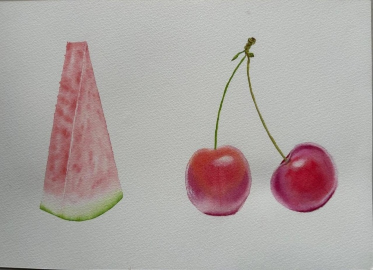
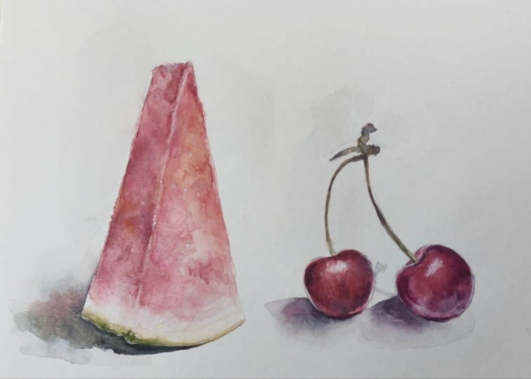
I'd love for you to create the two fruit studies. So the watermelon
and the cherries. The goal is to practice the
basic watercolor techniques, wet on dry, wet on
wet, and glazing. But if you do want to share
your color mixes as well, definitely feel free to do so. I would love to see them. I honestly get such a kick out of seeing which
colors you have in your palette and which ones you choose to
use for your projects. Oh Finally, we're going to have a look
at the cherries themselves. It's up to you how
much more you want to touch up or how many
adjustments you want to make. I'm going to shop or crisp
up a few of the details, as well as deepen a
couple of the values. But for the most part,
I'm pretty happy with it. In order to do this, I'm
going to go in wet on dry, and I'm going to go in
with the same close I already have on my paper. But by going in wet on dry, we're able to really pay
attention to one area at a time rather than having to
focus on everything at once. Ah. The best thing about going in wet on dry at the end is that it's so stress free because we've
already built up quite a lot of paint on
the surface of our paper. Once we add in new paint, it's pretty easy to
blend out the edges. And more than likely,
you'll be able to blend it out even if
you're allowed to dry. And because of this,
we can also play around with leaving some
of the edges crisp. If we don't like it, we
can always soften them. But having a variety of different edges can really help add a lot of
depth to a painting, no matter what the subject is. I Um It may be important to note that cherries in real life
do not have outlines, but I'm still going to add
just a faint outline here to help make those lighter values stand out a bit more
from the background. The final thing we can do since we're not going to
be doing a whole lot of lifting in this class
is to go in and make a couple of adjustments if
needed using white paint. White, when it
comes to watercolor is one of those things a lot of people kind of frown upon because traditionally you're supposed to paint transparently. Granted, white can mess up
a painting very easily, but just a tiny bit to
crisp up a few details, add a couple of highlights, or make a few corrections, and especially for a
sketchbook project, why not? So I'm going to leave it here. I hope you enjoyed this class, and I can't wait to see your projects. U
 Tanja Jensen, Artist - Sculpting, drawing and painting