Transcripts
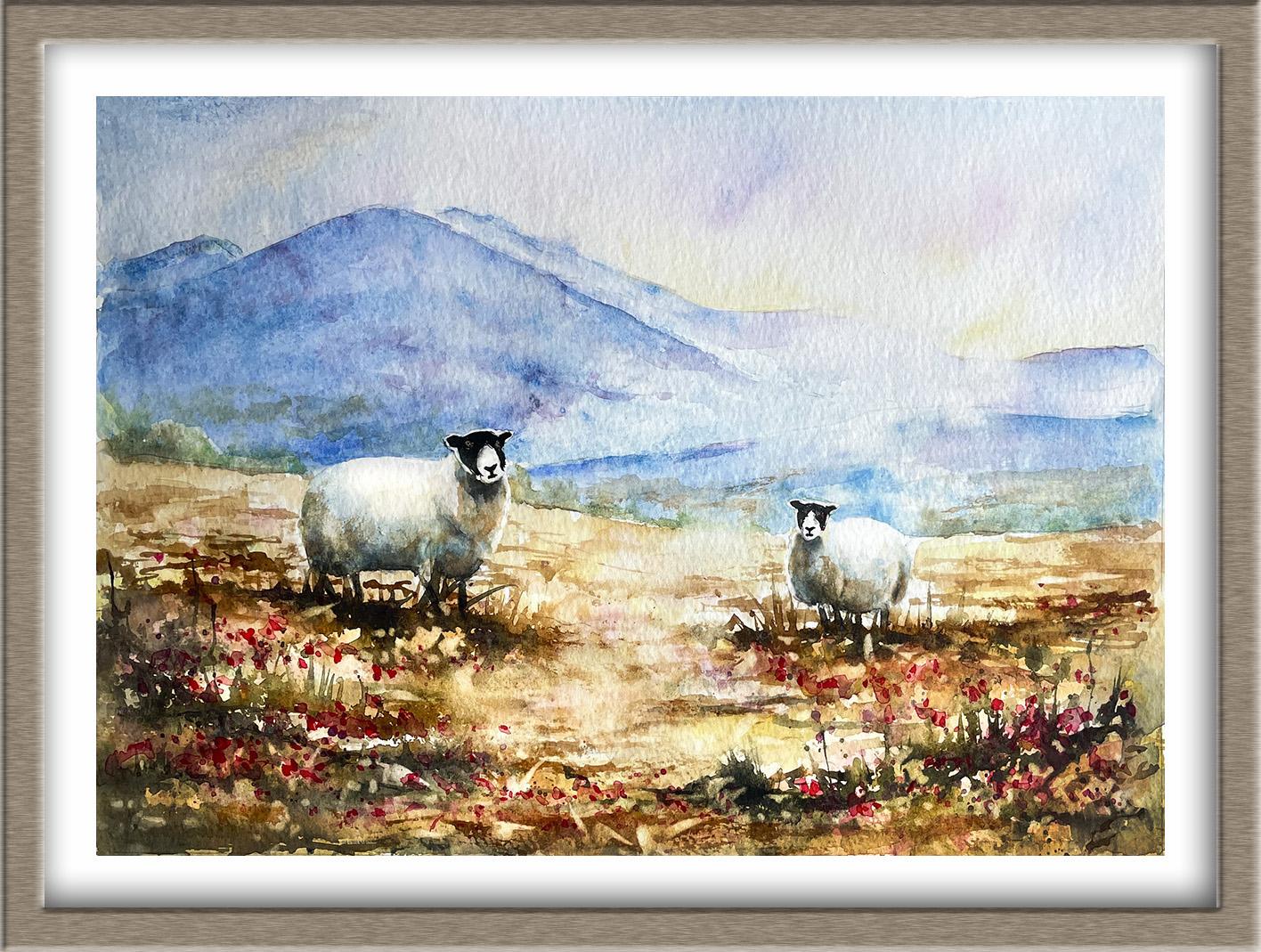
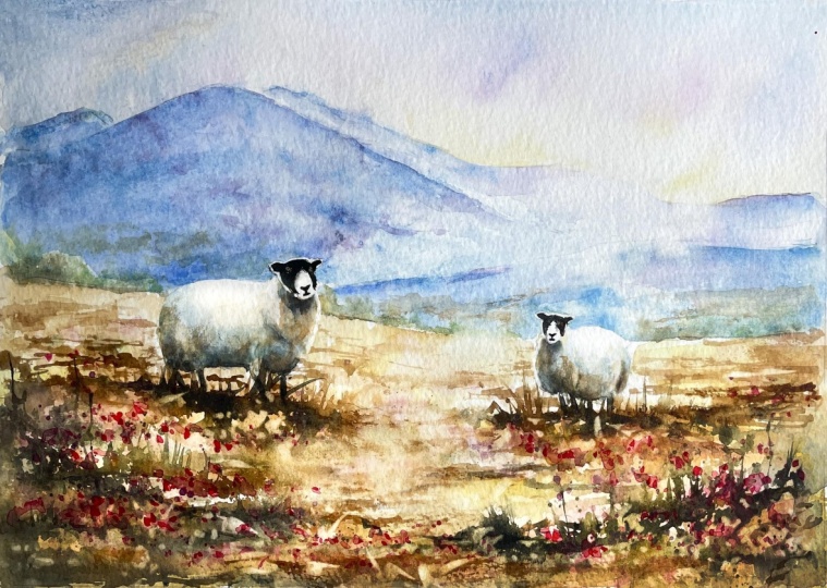
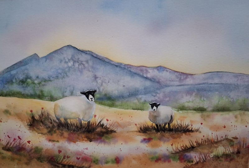
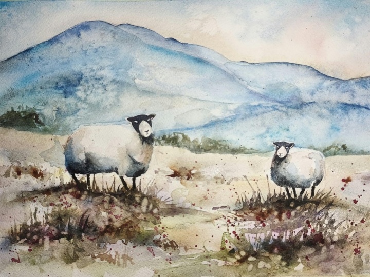
1. Introduction - Let’s paint some sheep!: In this class, we're going to
escape to the countryside. Going to create a charming, colorful landscape where
cool blue violet mountains meet warm golden fields, and two characterful
sheep take center stage. I'll show you how to paint a soft atmospheric sky using
the wet-on-wet technique. We'll create some
interesting textures on the distant mountains with salt and rag-rolling techniques, and we'll introduce
some warm earthy colors to create the sunlit
fields and foreground. You'll learn how to use subtle shading to give
the sheep's bodies a rounded three D appearance while keeping their
wool soft and luminous. And I'll show you how to add some beautiful dappled
light with a stencil. It's suitable for all levels, including beginners because I'm going to be guiding you
every step of the way. And I'll be sharing all
the techniques, tips, and tricks that I use in
my own professional work. I've included a copy
of the drawing in the project resources section so that you can download
it and trace it, and then not worry
about the drawing because this is a
painting class. I am a professional artist, author, and tutor,
and over the years, I've sold a lot of work
across the world and helped hundreds of people to
learn more about Watercolor. You can see examples of
my work on my website. My style leans towards
impressionistic and contemporary rather
than photorealistic. I like to explore loose approaches that bring
out the colour, light, and essence
of my subjects. I've tried to
replicate this across all the many other videos
that I have on Skillshare. Now, don't forget to upload your own painting through the
project and resources tab. After all your hard work,
I'd really love to see it, and I'll be sure to give
you some personal feedback, and you'll be able to
see the artwork of other students and
get their support. At the end of the class, you'll have your own beautiful artwork to be very proud of. So let's swizzle our brushes and get on with the painting.
2. Materials, Composition, Sky & Sheep: Plan the composition, paint the sky and shade rounded sheep.: For this class, these are the colors and materials
that I'm using, but do feel free to use
any that you already have. For information on brushes
and paper, et cetera, do check out the basic
materials document that I've added to the
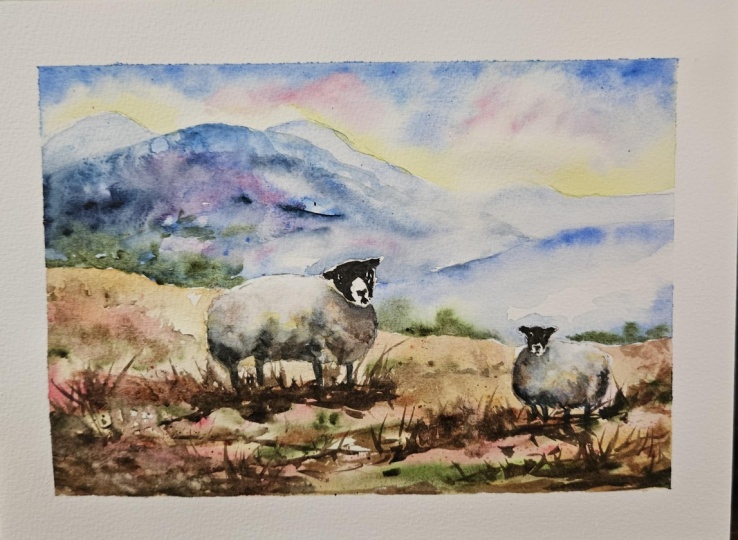
project resources section. As you can see, I've taken a few liberties with the
reference photograph, and that's the great
thing about creating art. You paint with your memories, senses and imagination, as well as what your
eyes literally see. Now you can see that I've
kept the drawing very simple, minimal details so
that we get a nice, loose free flow painting. And I've included a
copy of the drawing in the project resources section so that you can download
it and trace it, and then not worry
about the drawing because this is a
painting class. Let's make a start with the sky. And because skies
are soft and dreamy, we're going to use the
wetting wet technique. First of all, you
wet the paper with clean water and then
apply wet paint on top of the wet
paper and let it spread into the wet wash. Now, this results in a lovely
diffused effect with soft edges. And because the paint mixes into the wetness of the paper, the color is diluted
and the tone is paler. If several different colours
are used in this way, they will intermix and
blend with each other. As you can see, I've pre wet my sky area with a large
brush and some clean water. And then I've dropped in
a little medium yellow just along the top of the mountain range where the
light is peeping over them. And now I'm stroking some cerulean blue in the top
right and left corners and along the top of that
sky area and just using my brush to drizzle it
down diagonally a little. But I'm not taking
that blue color right down into the yellow, because if those two colors
were to mix, we would, of course, get green, and
I don't want a green sky. So I'm leaving plenty of unpainted paper in
between these two colors. To add a bit of
variety to the blue in the sky and also to serve as
a sort of vignette effect, so a little bit darker in those top corners
and along the top, I'm adding a touch
of cobalt blue, and also a little bit of
a violet color that I've mixed with permanent
rose and cobalt blue. I've mixed all these colors to the consistency of tea or milk. They need to be quite water. You don't want thick splodges
of paint in this soft sky. And I'm adding a little touch also of the permanent
rose just by itself. O and then to encourage those colors to mingle and blend into
each other a bit more, I'm lifting up my board and giving it a really good shake. And see now how that's
caused the colors to diffuse and lighten even
more into the wet wash, and I've got a much lighter
and softer appearance. And remember that
watercolor tends to dry about 20 to 30% lighter than
when you first put it on. And it's important to keep
that sky light and airy. We don't want too much
color or detail in it because there's going
to be a lot more of that in the foreground. If you have lots of detail and color in every single
part of the painting, it tends to look a bit
overworked and chaotic. Whilst I've been
talking about the sky, you can see that I've
been adding some paint to where the shadows
will be on the sheep. I'm using quincaronGl for that, but you can use any medium to
dark yellow that you have. And the shadow areas are
predominantly below the chin, under the belly, behind
the legs and at the rear. And I've added that color
using the wet undry technique. That's wet paint on dry paper, which gives you a
lot more control. The paint will only go
where the brush takes it. Well, that first shadow
color is still wet and dropping in some tiny
touches of burnt sienna. Contrary to what
some people think, shadows are not gray. They are actually full
of color, and of course, you've got all the color that's underneath them showing
through as well. And then thinking about where the shadows are even darker, which is the very lowest point of the sheep's belly
and under the chin, I'm adding a little
bit of cobalt blue. Because of the quinacridone
gold that I put on first, the blue is actually going
a little bit too green. So I'm going to switch to my purply color that I've
mixed with the permanent rose and cobalt blue and just add some of that
over the top instead. I know sheep are
supposed to be white, so you might be thinking why is she adding all these colors. But even white objects have different hues and
colors in them, especially where they
are in the shade. And sheep are quite
rounded animals. So it's important to use
tonal values to convey that three D appearance,
that rounded effect. Along with shape
and composition, tonal values is one of the most important
elements of a painting. Tone simply refers to the lightness or
darkness of a color. And despite the simplicity
of the definition, it can often be confused with color and quite
difficult to assess. If you strip out the color of an image by converting
it to black and white, the different shades of gray
would be the range of tones. Now that I put the
purple color on, I can go back in with
my blue color and just cool down those
shadows a little bit more. Actually, if you look closely at the reference photograph, you'll see that I haven't
actually gone quite as dark as the shadows that
are showing on there. But if I put too much color on, it'll all start to go muddy. So I'm going to leave
these shadows to dry, and then I'll come
back later and add a little bit more darker color and definition to these shadows. A little touch of water birtsien
just on the chest areas. And then I think
I'll sit on my hands for a bit before going
on to the next section.
3. Mountains, Texture & Distance: Build distant mountains using tonal values, salt and rag-rolling.: Everything that's
further away from us in the distance becomes less
detailed and a little bluer. So to avoid too many hard edges and brush strokes
in the mountains, I'm using the wet-on-wet
technique again, wet paint on wet paper. And then I'm dropping in some of these cerulean blue
that I use for the sky in a slightly
thicker mix this time. Somewhere between milk
and single cream. You can see that the
paint isn't too thick, because when I'm putting
the paint onto the paper, it's spreading and diffusing
nicely into that wet wash. But just like the sheep, mountains are not
completely flat. They've got dips and valleys
where the color is darker. They've got raised
ridges where the color might be lighter as it
catches the sunlight. So I'm leaving spaces in
between my strokes so that the color can diffuse
down in lighter tones. For a bit more clarification
on tonal values. Instead of mixing
your colors with white to make them lighter, you simply add more water, and you can produce
a wide range of tonal values from
a single color. It can actually be
very useful to make a chart value of all the
colors that you have. It's an example
of a chart that I did of a blue and yellow color. And an interesting
point to note is that the darkest
yellow can never be as dark as that darkest blue because yellow is a light
tone to start with. To darken some of those shadows, I'm using a darker tone of blue, which is cobalt blue, and stroking that over
the top of the cerulean. Again, I'm being mindful
not to completely cover all those light areas
in between the strokes. When you're painting
very loose like this, particularly with wet and wet, you will get some
unpredictable results. Be prepared to go with that, go with the flow, and let the watercolor do its own thing. This is where you often
get these happy accidents. And don't worry if your mountain doesn't look exactly like mine, because we are painting very loose and sort
of semi abstract, if I was painting this again,
it wouldn't look the same. Now, to intensify those
shadows even further, I've gone for a darker
tone, my purple, and I'm stroking some of
that in to the darker areas. Because it's facing
away from the light, the very left hand side of
this mountain will be much darker than the middle and definitely much darker
than the far right. So I'm going to be very bold now and add some very dark blue, very dark toned indigo. It probably looks a bit unnatural and too dark
when you first put it on, but don't worry because it's all going into this wet wash, it will disperse and lighten
and soften in color. But if you do lose some of your light areas,
here's a little tip. Just screw up a piece of paper towel and dab it
onto the wet paint, and it will lift that off. And if you happen to
dab too much off, well, then you can just add
a bit more pin back in. The left side of my mountain
is still a bit too light, so I'm adding a bit more of my darker blue colors over it. And then just to break up
the texture a little bit, I'm just going to spatter it
on with some clean water. That clean water
will just help to break up the uniformity of it. And then I'm going to repeat that process on this mountain
that's nearest to us. I am being careful to add some darker color around
the tops of the two sheep. The light is coming
from behind the sheep. The tops of the head
and the tops of the bodies will be pure white, almost as if they're
a little halo effect. And if we want
that to stand out, we need to make
sure that there's plenty of dark
contrast behind them. Before the paint completely
dries on the large mountain, I want to add a little bit of salt to increase the texture. Applying salt is very useful for creating the
appearance of snowflakes, foliage or rock texture. Just sprinkle some grains
of household salt into the drying paint just as the sheen is going
off the wet paper. Leave it to dry,
then gently brush away any excess salt
with your finger. And you'll find that
the salt has absorbed the paint and left behind some lovely little
sparkles of light. And you can use different
salts for different effects. Try some rock salt or sea salt or even some
dishwasher salt. Having applied the salt now, I'm returning to this
mountain in the far distance. And because it is further
away than the others, it will be even lighter in tone. And there'll hardly be any
detail at all to paint. So just a few brush strokes
of very pale light, cerulean and some
very pale violet in that distant mountain. I'm just adding a little
bit more color to the top of this mountain
that's nearest to us. I want to add some trees along the bottom
of the mountains. Now, I'm not painting
trees as such. Certainly no definition. It's too far away. I've got
some green appetite genuine, which is quite a dark green, and I'm just squiggling that
really along the bottom, letting the color
drift upwards into the blue colors that
I put on earlier. And then because it's diffusing into what is already quite wet, I can go back in
along the bottom, add a little bit
more neater color. If I want it to be a bit darker, I can just add some indigo to the green But notice how random my strokes are. I'm not drawing lots of tree trunks like a
row of soldiers. So nature is very
varied, very random. So keep this little row
of green quite small, because these trees
are far away and also quite random and
ununiform in shape. I'll take that
green colour right up to the front of the
sheep on the left, and then we'll move on
to the next section. I
4. Paint the Foreground: Create warm earth tones with colorful foliage and flowers.: For this first layer
of the foreground, I'm using the wetting
wet technique, so I'm pre wetting all the area of the
foreground before I paint it. You can go right over
the sheep's little legs because we're going
to paint them in a black color later on. And then I'm painting
on some earth colours. So starting off, first of all, with my quinacadon gold,
if you don't have that, you could use any mid yellow I want my different colours to mingle and blend
on the paper, so the consistency is quite thin about the thickness
of milk or tea. At this point in time, I'm not trying to
paint any detail. I just want to cover
this foreground with a wash of color. And just like when we
painted the mountains, I'm leaving some
unpainted spaces in between my brush strokes. And then I'm going in to that wet wash with
some birth sienna. This is another
lovely earthy color. And it's about the
consistency of milk or tea, and you can see that I'm
putting it along the front of the foreground
because this is where the color will be stronger
and more obvious. But I'm also stroking
it underneath the little sheep because that's where it will
be more in shadow. So again, the color and the tone is going to
be a bit darker there. I'm kind of dancing around
with my brush a bit, adding a few more strokes of this prt sienna towards the back of the foreground and at
each left and right side. So I'm not completely obliterating the queen goal
that I put on earlier, and I'm still leaving some
areas lighter than others. I've got a slightly
thicker mix of violet than the one that
I used for the sky, and it is also a bit more
on the pinky red side. So this could be some heather or some other pinky violet foliage that's growing in and
amongst the bracken. We said earlier that things get cooler and more blurred the further in the
distance they are. And the opposite is true when
they're in the foreground. Things become warmer in
color and more detailed. I'll be adding the
detail later on when this has dried and I
paint a second layer of color. But for now, I'm just
concentrating on getting that warm color in this underwh. And then just glancing at
the reference photograph, you can see that there are quite a few dips and
shadows in this foreground. So while everything is
still nice and wet and dropping in some more
purple into the foreground, this time it's got
more blue in it, and it's a little bit thicker, so it's not spreading quite as much as the previous colors. Now I'm adding in some mid
to darkish green colour. It's the same green
appetite genuine that I used earlier with
a little touch of indigo, tiny touch, just to
darken it a little bit. And what I'm doing now
is trying to create the impression of some
grasses and foliage, green foliage growing in amongst the bracken
and the heather. It is all blending
in quite nicely, but I am using a bit of
paper towel as well to blot off anywhere where I
think it's getting too muddy. And then back to my bird sienna, I've added a little bit
more pigment to the mix, so it's slightly thicker
than when I first put it on and streaking that across with my brush in
horizontal strokes again to convey the bracken and
soil part of the moorland. Parts of the paper are
actually starting to dry now. I know this because when
I'm putting the burthenaon, I am getting more hard edges
instead of that soft blend. So this is where I would need to use the blending and
softening technique. And all you need to
do for this is use a clean damp brush
and just gently pull away the paint
from that hard edge, blending it softly into the underlying wash. And now that I've got this first
layer of the foreground on, I can see that there's
too much white or light space on my mountains, particularly at this
left hand side, where they are in shadow. So I'm just quickly going
over with a little bit of my cerulean and cobalt
blue and darkening the left hand side of that
mount that large mountain. And I'm also just going
to add a little touch of that blue color to the front
mountain along the top. You might not need to
do this, of course. Your painting might look
absolutely fine as it is. But you often find
when you're building up a painting that
something that you've already painted doesn't look quite right
when it's dried. And that's because
watercolor tends to dry about 20 to 30% lighter than
when you first put it on. I'm happier with that now, so ready to move on
to the next section.
5. Painting the Sheep: Mix rich darks and add shading for character and depth.: To paint the black
parts of the sheep, I've mixed some burnt
tumba with indigo. That's my darkest brown
and my darkest blue. You can use black straight
out of the tube, of course, but it does tend to give you a rather flat
looking appearance, whereas if you mix your
different colors together, you get a much
more lively black. I'm using a very
small pointed brush because it is a very
small fiddly area. It's actually a beauty brush. It's used for painting decorative patterns
on fingernails, very cheap as chips, but I've found it does the job. By zooming in, I hope that you can see that I'm not painting right up to the outer edge of the sheep's head or
around his ears. I've left a thin sliver of white unpainted paper
all around the edge. I've also left some
little white spaces where his eyes are going to be. I know that looks a little
bit unnatural at the moment, but we'll come back to that. And then also his
little nose and mouth. I've got a little bit of
that black color mixed with a bit more water in
another section of my palette, so it's a very watery black, and I'm just using that to emphasize the shadow
under his chin. And I'm adding little touches
of that watery gray color just around the muzzle where the very dark black color
is meeting the white, just so you don't
get such a very dark transition from
black to white, little bit of gray in between. And then going back to
the black for his legs. I'm always amazed how the sheep's little
spindly legs actually supports their relatively
big bodies, but they do. And I'm using the same watery
gray black to intensify the shadows that
we put on earlier around the bottom of his
body and between his legs. It's really important to use that blending and
softening technique that we talked about
just a little bit earlier because what
you don't want is a very hard edge from the shadow going into
the rest of the body. You need a very
gradual transition. So do use a clean damp
brush to just soften those edges of this extra shadow into that underlying color. So that it doesn't
look too gray, I'm adding a little
bit more birthsienna on the area below his
chin on his chest. And also a little bit above
that right front leg. It's a very thin wash of color
that we're putting on now. So those colors that we put on earlier will still
glow through the gray. And then I'm going to
repeat pretty much the same process on this
little sheep on the right. So I'll just let you watch me do that now for the next
couple of minutes, and then we'll move on
to the next section. I think you'll really
enjoy the lesson that's coming up because
it's very loose, very experimental, unpredictable,
and a whole lot of fun. So I'll just finish
this little chap off and I'll see you there.
6. Foreground Details: Spritz the foreground and create loose, organic shapes.: I want to show you how to create some really interesting texture using a small water sprayer. Just the nozzle so that
it produces a fine, misty spray rather
than a strong stream. Hold the water sprayer a
little way above the paper, about eight or 9 " and give
the trigger a gentle squeeze, allowing tiny droplets of water to settle
across the surface. The aim is to create
small separate beads of water rather than covering the paper with a continuous
layer of moisture. Keep the sprayer moving as you spray and just use a light
touch on the trigger. You should be able to
see individual droplets catching the light on the
surface of the paper. Just want a light scattering
of tiny droplets. If they begin to join
together into puddles, you've sprayed too much, and then you'll have to
leave the paper to dry completely and start
this step again. I've mixed a dark brown with burnt umber and a
little bit of indigo. And when you trickle
dark Watercolor paint into freshly spritz paper, the water immediately begins to pull and disperse the pigment. And as you can see,
this dark paint is kind of blooming
outwards from wherever I've touched the points
of my brush on the paper, and it's traveling through
the damp fibers of the paper. So instead of staying, I say, very controlled
line or shape, you can see it's creating these soft feathery edges and delicate branching patterns. I'm also using the tip of
my brush to just flick some random grasses and foliage shape upwards
around the sheep. You can also see that as the paint moves into the
surrounding moisture, it becomes
progressively lighter. So we're creating
beautiful graduations from quite deep concentrated color
to pale watery washers. And because we've spritz
the paper with water, there are tiny pools or
uneven patches of water, so the paint will travel more strongly through some
areas than others, and that's producing
all these organic, unpredictable textures and
cauliflower like blooms. Where the paper is only slightly damp or even completely dry, the paint spreads much more slowly and retains a
bit more definition. It's this combination
of spritzed water, paint, and a little
bit of letting go that makes this
effect so lovely. The paint almost seems to grow across the paper all by itself. If you haven't used
this technique before and you're a little
bit unsure about it, why not practice
it on a piece of spare paper before committing
to this actual painting? Note that I'm not going over the whole foreground
with this technique. I'm leaving some of
the color that we applied earlier in that
first layer showing through. I don't want to lose all my lovely light and medium tones. But we do want the color and the tone to be darker
at the very front of this foreground so
that the viewers eyes led over that
into the center. So I'm starting to use an
even darker brown now. It's a black brown, really, along this front
part of the foreground. I'm dropping that in on top of the burnt umber paint
that I've just applied, so that's creating
even more depth in these furrows and dips. Although I'm being
careful where I actually place the
paint to start with, I am then letting the
watercolor have free reign and let it produce all these natural organic
shapes and textures. Another little technique
that you can use, though, if you want to encourage
some of this paint to flick upwards
for grass shapes, instead of using the
point of your brush, you can use a straw and just
blow the paint upwards, and you will again get much more organic and natural shapes
coming up from that. It's a great little
technique that you can use in all your
landscapes because it mimics nature much more effectively than trying
to do it with a brush. The danger is it can become
a little bit addictive, so like with all
these techniques, you don't want to overdo them. You've probably noticed that
I have been flicking up some grasses in between
these sheep's legs, and that's because
I want the feet slightly disappear
into the bracken. I don't want it to
look as though they are skating on top of it. I'm going to add
a few washers of color at the very front
of this foreground. So some of my very
watered down burnt umber, and I'm also going to
add a little bit more of the quincadon gold and
some burnt sienna. And that's because we don't want the tone or strength of color of the foreground to be the same at the front as
it is at the back. We need it to be much stronger
the nearer it is to us. And I'm using the blending
and softening technique that we used earlier just to soften some of those edges of this additional color that I'm adding into the underlying wash. It's also important to make
sure that you've got some of these darker furrows and dips joined up from the left
and the right hand side. You don't want the
left and the right to look like a pair of bookings
with something in between. This foreground is connected
all the way across. To add even more texture
to this foreground, I'm going to use the
spattering technique. Spattering is a technique where
paint or masking fluid is slicked onto the
painting surface to produce some interesting
textural effects. Load your brush with some paint, and then you can either
shake the brush with a wrist ling action to
force the paint onto the paper or tap the brush with your forefinger or with a second brush that you're
holding in the opposite hand. I'm going to add a bit
more spatter using the dark pink heather color
that I mixed earlier on. Being said that, it's sinking in a bit to the wet paint
that's already there, so not very visible. So I will leave it to dry and add some more of that dark
pink spatter later on. I've just noticed that my
sheep on the right looks as though he's got white holes in his head rather than eyes, so just handing a little
black.in the center.
7. Dappled Light & Flowers: Add dappled light, then finish with lively pink spatter.: As a little optional extra, I thought I'd show
you how to use a stencil to create
dappled light. These are a couple
that I've bought, but you can easily
create your own. You just need a piece of thick plastic and a
little exacto art knife, which you can use to cut some random shapes
in the plastic. And then just place your stencil over the completely
dry painting. Now, you do need a
stencil that's got irregular organic shapes rather than anything too uniform, as this will give the light a more natural broken
up appearance. And then use a
clean, slightly damp sponge or a soft brush to gently lift or soften small areas of color through the
openings in the stencil. Then use a piece of clean paper towel just to
dab any excess paint off. It's best to work
lightly at first. You can always build
the effect up, but it is much harder to put the darker paint back
once it's been lifted. And as you can see, this
stencil technique creates little patches and flecks of lighter paper amongst
the darker foreground, giving the impression
of dappled light. I suggest that you vary the pressure and
amount of lifting so that some areas are soft and subtle while others are
brighter and more defined. For an especially
natural result, I suggest that you don't cover the whole foreground evenly. Instead, concentrate
the dappled light in just a few areas and allow it to become sparser
towards the edges. This irregular
pattern of light and shadow adds depth and helps the foreground feel
as though it's been illuminated by some real
flickering sunlight. I'm leaving everything now to completely dry
for an hour or so. On my absolute final step, I've spattered on some more of that dark pink color that I
mixed earlier, and I think, together with the dappled light, it's given this whole
scene a bit of extra zinc. I do hope you've enjoyed this painting and that
you've learned some tips and techniques along the
way that you can incorporate into
your own paintings. Now, don't forget to upload your own painting through the
project and resources tab. After all your hard work,
I'd really love to see it, and I'll be sure to give
you some personal feedback. You can follow me on Skillshare to get to hear
about new classes. And if you could leave
me a short review, that would be really great. If you've enjoyed this class, it might encourage you to look at some of my other videos. I've got lots of lovely
subjects loaded with more tips and techniques to help you with your own
exciting art journey. In the meantime, thank
you for joining me, and I look forward to seeing you next time, Happy painting.
8. Final Thoughts: Step back, enjoy your painting and share your project.: Big, well done on completing our sheep in the
landscape painting. We've covered quite a
few different techniques as we've built up the
painting together. I showed you how it's
possible to take a rather dull photograph and inject some creative
color into it. We use the wet-on-wet technique to paint a soft, luminous sky. And we learned the importance of tonal values to create
three D rounded shapes, perfect for creating
the little round bodies of our quirky sheep. And we had some fun with a
few different techniques like using salt to create texture
on the distant mountains, spritzing the foreground with a water sprayer in order to
create some very natural, unexpected and organic
shapes and blooms. And how to use a
stencil to create some beautiful dappled light and a final spattering of dark pink color to
add a bit of zinc. Now, don't forget to upload your own painting through the
project and resources tab. After all your hard work,
I'd really love to see it, and I'll be sure to give
you some personal feedback. And if you've
enjoyed this video, do have a look at my other
classes on Skillshare, which are packed
with more tips and techniques to help you
on your own art journey. If you click the follow button, you'll be able to follow me, and then you'll be the first
to know when you upload a new video or any
exciting updates. And if you could
just take a moment to leave me a short review, that also would be really great. In the meantime, thank
you for joining me, and I look forward to seeing you next time, Happy painting.
 Carrie McKenzie, creating painted visions