Transcripts
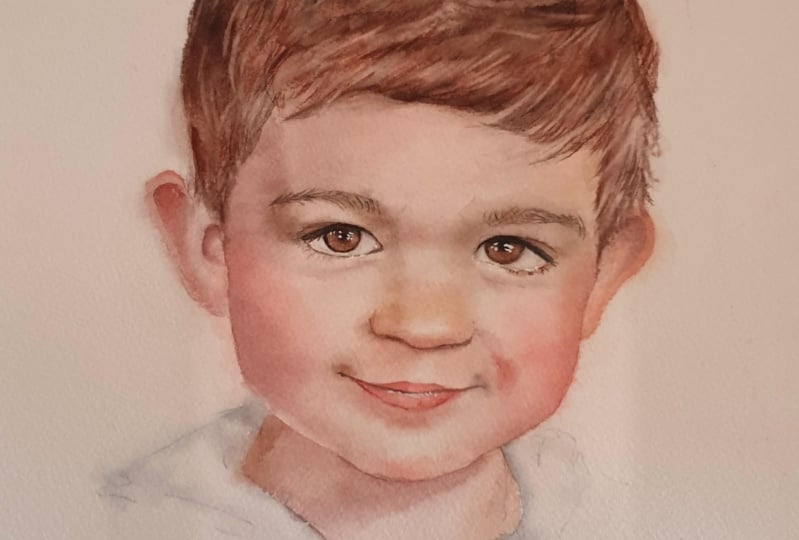
1. Intro: One of the things I see people having trouble
with the most when it comes to what
I call portraits is getting the right values, especially when working on
something like skin tones. The fear of going to
Doc can often lead to paintings that are much lighter value than what we want. Hey, there. I'm Tanya. I'm an artist based in Denmark. And in this class, we're
going to have a look at how to get the right
values in our paintings, as well as practice color
mixing to match our reference. I am of the firm belief that you should paint what you're
inspired to paint, not necessarily what you think you have the
ability to paint, because inspiration
and motivation can often get us so much further than forcing ourselves to do something we
don't feel like doing. So even if you're
new to water clo, although this class
may be better suited for intermediate
level students, I still encourage
you to paint along. One thing I want to say, though, is that I do have a few other
portrait classes where I go a lot of the basic
techniques like flatwhs, working wet and
wet, wet and dry, blending out layers, as well
as brush and water control. So I do recommend that you take a look at a couple
of those or at least go at some
of the exercises we go through in those classes. But with that being said, I hope you will join
me for this class.
2. Materials: Let's have a look at materials
we're going to be using. We are going to need
some watercolor. I recommend some version of your primary colors,
so red, yellow, and blue, but we're
going to get into which specific colors we're going
to be using in the class. For paper, I'm going
to be using Ash, hot press, watercol paper. You can use any watercol
paper you have, hot press, cold press or
whichever one you prefer. But I do generally
recommend cotton paper. For brushes, I'm going to
be using two main brushes, an coda versatile in size ten, and an coda optimal in size six. We want to be able to do both
soft shading and details, so go ahead and grab
your favorite brushes. In order to not wear down my
good brushes too quickly, I like using a one
down brush for color mixing and for picking
paint from watercolor pans. In this class, we're also
going to lift paint. For this, I'm mostly going
to be using a brush. Now, both of these were originally longer flat
brushes that I trimmed down. But this is a great
way to correct mistakes and add in
fine details and lines. Just wet the brush,
wipe away most of the excess water,
and lift the paint. I'm also going to be using
a sponge for lifting. This is a mil mean sponge also sold as magic
erasers, I believe, or for lifting
watercolour specifically, but they're usually cheaper
if you buy them from the cleaning aisle rather
than as an art supply. For these, you want to wet them, squeeze out as much
water as you can, and lift the paint. We're going to need
tape to adhere our watercolor paper
to our work surface. You can use painter's tape. I'm going to be using gum tape, and I'm going to talk
about that in the class. If you're using gum tape, I recommend having some sort
of blade or utility knife. Because I'm using the gum tape, I will also be using a lag of flatbush and this is to
help remove the tape. We're going to need a pencil for sketching and at least
one type of eraser. Something to wipe
our brushes on, as well as some sort of
tissue or paper towel. And, of course, we're
going to be using water.
3. Sketch: We are going to start
with the sketch. We're not going
to be focusing on the sketching portion
in this class, but I still want to show
you how I go about starting the sketch and breaking the face down into
smaller sections, which is basically
all it's about. In this class, our
focus is going to be on painting and getting
the right values. So if you're not confident when it comes to
sketching, that's okay. You can either trace the reference picture
or use my sketch, which I'm going to be
providing below the class. But even if you're not going
to be using your own sketch, I still recommend
that you give it a go because it's an amazing way to familiarize yourself
with the face you're going to be painting.
Let's get started. First, we can just
make a rough circle or oval shape where we
want the head to be to get an idea of
the size and placement. So if you are sketching this on a separate
piece of paper, the placement doesn't
really matter. A quick note regarding the size. You want to try and pick a size that you're
comfortable painting. So if you maybe aren't too
great with tiny details, you may want to paint
or sketch a bit bigger. Likewise, if you find it difficult to manage
very large washes, you may not want
to sketch too big. Next thing we can take a look at is the shape of the face. So we're going to take a
look at the temples up here, as well as the jaw line. This is going to create a
nice kind of square shape. At any point throughout
the sketching process, you can hold your pencil to your reference picture to
help get the right angles. So we're going to start
with the temples. If we have the entire head, they're going to sit somewhere
above the center line or the horizontal center line,
approximately right here. Then we can follow the angle
of the face and try to hit somewhere around
the jaw line point. And then I'm roughly
going to sketch in the shape of
the chin as well. If we then take the face and divide that horizontally
into thirds, going to just try and make
sure you can see the lines. This should approximately
match up with the placement of the
eyebrows and the nose. We want to break
the face down into smaller and more
manageable sections. So to further break it down, let's draw in the vertical
cent line as well, and that's going to sit
somewhere around here. Looking at this, we then know the eyes are going to sit
somewhere around here. The nose is gonna
be around here. And then we're going
to have the mouth somewhere around here, which means I don't have quite
enough space for my chin. So I'm going to have to move
that down, but right now, I'm going to focus
on the features, adding in the eyebrows as well. Then I'm going to add
this swoopy shape of the hairline,
something like that. And then to help
with the chin issue, I'm gonna somewhat
refine the face shape. This does not have
to be perfect. We can always make adjustments, but that already
looks a lot better. Once you're about happy with the proportions of the
face you've got so far, we can start adding
some more shape or definition to the features, starting with the eyes. I'm going to see if I can get
more of the correct shape. I keep looking back and
forth between my sketch and the reference picture and try to follow and copy the
lines and shapes I see. I'm also comparing the
shapes to each other, so I'm comparing the
shape and size of the iris in relation to
the white of the eyes, and I'm comparing the size
and shape of the eye with the brow bone or piece of skin between the eye
and the eyebrow. If you're not sure if you've
got the placement correct, you can always take
your pencil and hold it up to your reference and
then compare the angles. So as an example, you can compare the angle between the
start of the eyebrow with the inner corner or tear
duct of the eye and see if your sketch matches up with the angle you
see in reference. You can also measure the
exact angle of the eyebrow, the angle of the
lower waterline, upper waterline,
the angle between the inner corner of the eye
and the nose, et cetera. I do have a class that goes more into depth with sketching. So definitely check that
out if you're interested. Going to define
the nose as well, and check that it
matches up with the ankle from that nose to
the inner corner of the eyes. Now, his face is at an angle, but one thing you'll find
is that when we're going to join the mouth, the
corners of the mouth, in this case, are
going to match up with the irises and actually
approximately with the pupils. To find the top of the head, if we measure from the
chin up to the eyebrows, we need the distance
from the brows to the top of the head to
be just a bit more. That's going to sit
somewhere around here, and then I'm going
to follow the shape roughly of the hair. For the ears, if we follow the angle of that
slightly slanted face, the ears would sit just above the line that follows the eyebrow, so
somewhere around here. If we then ignore the fact
that the face is at an angle, we can go from the
inner eyebrow corner right here and in a
horizontal line out, which is going to hit just
about the same point, which is going to be the top
of the ear on the right. Same with the
bottom of that ear, if we take approximately
that center point of this line right here on the nose and go in a horizontal line out, it's going to be about
the bottom of the ear. And then for the
ear on the left, I'm going to measure
the angle between the ears so the top
and the bottom. And we can see here that the
top is going to match up approximately with the line
that we measured before. Then what we want to do is
clean up the sketch a bit, get rid of any
unnecessary lines, and define the shapes even more. Every time we take a pass
over the face and features, we want to get closer and
closer to what we see in the reference and add
more and more detail. You can go back
and forth as much as you want and for
as long as you want. And since this is on a
separate piece of paper, something you can do to help if you find it difficult to see if you're on the right track
is to add in some shading. Having just the outline
can feel really empty. So adding in some shading
around the cheeks or below the eye or anywhere else for that matter can really help
see the correct shapes. Even when you look at
my sketch right now, even though the proportions
are technically correct, it still looks off because the boy himself has
some lovely brown eyes, and the sketch does not, which can really throw off the way we perceive
his appearance. So if you feel the need to go in and add a few
values either with a pencil or maybe even a wash of watercolur, feel
free to do so. Another option for creating
your sketch if you're not into freehand sketching like this and you don't
want to trace, you can also use
the grid method. So create a grid
on your reference as well as on your paper, and then fill that in kind
of like paint by numbers. As I mentioned, the focus in this class is going to be
on the painting process. So whatever method you
want to use to get that outline onto your
watercolor paper, go ahead and do that. There is no right or wrong.
We just want to have fun. I sometimes get questions about the pencils I'm
using for sketching, and I'm using the ones by
Pentel called Ons or Ons. So OR ENC or set. This is a 0.2 millimeter mechanical pencil,
so quite thin. And you don't need
a pencil this thin. It's just my
personal preference. Any pencil will work, though. While finishing up this sketch, I'm gonna leave you
with some music, and then I'll get back to you
at the end of the lesson. I'm not going to be
adding too much detail to the neck or clothes. I'm just going to
roughly add it in like this enough to get an idea
of the different shapes. But our focal point is
going to be the face, so there is no need to add
too much detail down here. Once you're ready to move on, you want to transfer this sketch onto your watercolur paper, either by using a window, a light box or something like
that or even tracing paper. And then when you're done, I'll see you in the next lesson.
4. Sketch Prep: Got my basic setup ready. So I've got my water paint cloth to wipe my brushes and
my tissue on the side. And then I'm quickly going
to tape down my sketch. You can use any type of
tape you prefer for this. I'm going to be
using gummed tape, which is often sold in stores that have
watercolor supplies, and it comes like
this in a roll, and it's not sticky, so you
take a sponge and wet it, and then use it to
tape down your paper like you would with
normal painter's tape. Main difference or reason
why I often prefer using this painter's tape for a lot of my paintings is that
it doesn't lift. If you've ever
worked on a painting and you've taped it down
using painter's tape, you may have noticed
that sometimes the painter's tape
start lifting around the edges once the
paper starts to buckle. This doesn't do that, as long as you don't
get it too wet. You can even use
it for stretching your watercolor paper
instead of using staples. The one thing I do want you
to be aware of, though, if you've never used
it before is that it can be quite a pain in
the butt to remove, especially compared
to normal tape, but I'm going to
go how to remove it at the end in
case you're curious. Once we've got that,
I'm going to use my kneaded eraser to lighten
a few of these lines, mostly these ones
around the cheeks, chin, and ears, and then a bit on the nose
and mouth as well. And once you're ready, let's move on and pick some cloths.
5. Setting Up A Portrait Palette: Instead of going over the
same or similar exercises to what I usually do, I thought I would set up a palette specifically
for portraits. I wanted to be able to work for any skin tone, any hair color, et cetera, and I'm
going to be using this for any portrait
class moving forward. So if you have a
hard time narrowing down your selection of colors, hopefully this can help. First off, there are a
couple of types of paint or colors that I usually
avoid for portraits. First one being granulating
colors or pigments. And the reason why is that this can make
your skin tone mixes, especially look very splotchy in ways you maybe don't want. However, this comes down
to personal preference. So if you feel
like it looks good with your style or what
you want, go for it. You can use them to get
some really cool effects. I just don't want these as permanent residents in
my portrait palette. The second type of color is any color that
contains white. That's not to say that these
can't be used for portraits, and it's not to say that I would never use
them for portraits, but they're not colors I
would typically include in a selection of colors that I'm going to be
using for mixing. And I'm by no means
against using white. I love using white, but these colors just
don't tend to work as nice when mixing and don't always work great for
layering, either. They can quickly give your
painting a murky or dull look. Though if used the right way, they can add the perfect
touch to your painting. But I'm going to stay away
from those for this palette. So what do we look for when setting up a
palette like this? I don't like feeling like there are certain colors I cannot mix, so I like going for versatility, having a selection
of paints that will enable you to mix
pretty much any color. So let's start with the
basics, our primaries. I want a really
nice primary red. And I'm going to
go with Pyle red. It's worth noting that when looking at colors
from different brands, it may be worth looking at
the pigments used as well. Although a color like Quinaqudon magenta
is typically pigment PR 122 with certain brands or certain colors that
may not be the case. So Pyrrole red from a different brand could be
using different pigments. You don't have to
have the exact paints or pigments that I'm using. Have a look at the colors
you have available to you and experiment with
mixing with those. We want a good primary yellow, I'm going to go for a permanent yellow light from Holbein. Another thing to note is that the fewer pigments
a color contains, the better it typically
is for mixing. The more pigments you have in a pool of color when mixing, the more easily they can
become murky or dirty looking because all
those different pigments are trying to pull the color
in different directions, and some of the pigments
just don't mix that well. For a good versatile blue, I'm going to go with
one of my favorites. This is peacock blue. It's a cool toned blue, so it works great for mixing
both greens and purples. Let's see if we can mix our secondary colours
orange, green and purple. The orange looks great. It creates some really
fresh and vibrant greens. The purple is
definitely lacking. Every color has a
color temperature. It can be warm or cool. And so the easiest
way to improve on this palette is to create
a split primary palette, meaning that you have a
warm and cool version of each of your primary colors. Since our red creates
a beautiful orange, we can assume that it has a
warmer color temperature. So we need a cool toned red to be able to create better
purples and violets. So let's go super cool toned
and go in with Kronecogenta. With this color, we're
definitely solving the problem of not being able to mix proper purples and violets. So now that we have both a
warm and cool toned rib, let's add in another yellow. So if we look at AA
Pamina yellow light here, it's a very nice
sunshine yellow. And even though it
works great for mixing both nice warm oranges and
more cool toned greens, if we look at the
color on its own, it definitely sits closer to red on the color wheel than it
does to green and blue, which means that this
is a Wama yellow, and we need a more
cool toned one. I'm going to go with
quinatlon yellow. I swear some of
these color names are meant as a trap to bullous. To complete our split
primary palette, we need another blue. And since the one we
have is cool toned, we need one that is warmer. I think one of the
most common choices is ultramarine blue, which is a beautiful blue, but again, it granulates. So I tend to stay away from
that one if I'm planning on using it for something
like skin tone mixes. Instead, I'm going to go
for thalo blue red shade, which is a slightly
warmer version of another one of my favorite
colors from Holbein, which is thetoblue yellow shade. May not be as warm
as ultramarine blue, but it's a good solid
and very versatile blue. With a split primary
palette like this, you should be able to
pretty much mix any color. Although for our
cool tongue blue, if you're only going to go
with a split primary palette, I would exchange this
one for a turquoise. What we typically consider
our primary colors, red, yellow, and blue
is also an RGB palette. But a potentially more
versatile palette would be your CMYK palette, which is magenta,
yellow, and cyan. With red, you can't
necessarily get a good pink. But by mixing some yellow
into your magenta, you can actually create red. At least some version of it. In order to have a really
pure red, as well, I do still recommend having both your typical red
as well as the magenta. I'm not going to
stop at six colors. So for my palette,
I'm just going to add in the turquoise to
what I already have. Now we have all the
colors we need, right? Technically, yes, but there is one more thing I
like to consider. So if we take a look
at our yellows and we take a look just
straight into the tubes, we can see what the
full body color is. So this is the darkest version
of the color we can get. Likewise, with our red, this is the darkest
version of red we can get, at least without doing
any further mixing. So rather than looking
just at the colors, I'm also going to be
looking at the values. So I'm going to add
in another yellow, and this is going to
be quinacroon gold, which is another
super popular choice for skin tone mixes. It's a great golden
sunshine yellow, and it's going to enable us
to create super gly skin, and it has a wider value range. This is a great
palette for mixing. If you want to add
any more colors, you can honestly just pick whichever ones are
your favorite. I'm going to add in
five more colors, and I'm going to explain
why I'm picking each one. I'm going to add
unacrone scarlet. This is one of my
favorite reds or pinks. Cunacrone colours in general, are just beautifully
transparent, vibrant, and they're
super light fast. It's honestly just such a
beautiful, glowy colour. In my mind, you can never
have too many pinks. So I'm adding in unacrne
red by whole bin as well. It's still a really nice pink, but less cool tone
than unacro magenta. And it also happens to be
one of my favorite pinks or reds to use for
portraits and in general. I'm going to add in Pyle Ruben. This is a beautiful, deep red. And though you can
make a deeper red by adding blue into the
Pyl red we already have, it's sometimes nice having a clean version of
a color that uses just one pigment
so that if we need a deep red for something
like deeper skin tone mixes, we're not mixing together
too many different pigments. I wouldn't call it a necessity, though, more like a
convenience color. While on the topic
of deeper colors, one of my favorite
colors to use again for, especially Depo skin tones is transparent orange Bisminke, beautiful, glowy color with a really good value
range as well. The last color I'm going to
be adding is paints gray, and this is purely
for convenience. Sometimes if we need a lot
of unutral gray or black, it's just easier to start with one that is
already pre mixed. Definitely not a necessity. But if I were to
paint very dark here, I would probably
rather start with a base of this and
then add in a bit of my other colors rather
than using up a lot more of my other colors in order to create what this one
can accomplish on its own. For this class and in some of
my other upcoming classes, I will be using white as well. It's just not going to have a permanent place in this palette.
6. Choosing Our Colors: Let's pick some colors. I've got a scrap piece
of watercolor paper here that I'm going to be swatching
on throughout the class. I've also got a printout
of the reference that I'm going to be
looking at while painting. If you prefer, you can
also keep your reference on your phone or a tablet
or something like that. Now, in the next lesson, I am going to be
talking about why I recommend using a printout, but please feel free to
do it however you wish. For this painting, you can use as many or as few
colors as you'd like. I'm going to go for a limited color palette of our primaries, so a red, yellow, and a blue. Looking at the reference,
there's really not a lot of bright or
very obvious color. We've got a lot of
browns and neutrals, but we do have some rosy cheeks, so let's start with the red. We could probably get away with using a proper red
for this painting, but I'm going to go for
something a bit more pink toned, maybe not quite as
cool toned as magenta, so maybe the quinaquidone red. You don't have to
use the same colours or pigments that I'm using. Play around with the colors you have and see which
ones can provide you with color mixes that look similar to the colors
in the reference. His skin has a nice,
subtle golden glow, so I'm thinking for the yellow, we could go with
the quinaqilu gold. And if we mix those,
we've already got a nice base color for skin. We don't see a lot of obvious
blue in our reference, but we do have some shadow
down here near the shirt, which are green
with a bit more of a turquoise feel rather
than a warm hue. So thinking a cool tone
blue may be helourquoise. This is going to
work really well to help neutralize that
skin tone as well. To make sure we've got a
color palette we like, we can do a color wheel. And if you then feel
like you're not quite able to mix all
the colors you need, you can either switch out one of the colors or you can
add in more colors. You don't have to
stick with just three. But this trio seems
to be able to mix pretty much any
color we need from the deep dark neutrals to those rosy cheeks and some
soft golden skin tones. So once you're happy
with the colour choices, we can move on to
the next lesson.
7. Quick Tip: Color Viewer: Something that can be quite
a challenge when painting is to figure out how light or dark you need
your values to be. Like many people, I typically
have my reference on my phone or on a tablet
next to me while painting. If that's the case,
that's perfectly fine. This tip can still be used, but if you are able to get a
printout of your reference, I'd highly recommend it. So what you want to do is take a scrap piece of your
watercolor paper, preferably the same
type of paper that your painting is on and then
cut a small hole like this. This is a color viewer. And you can use this and hold
it up to your reference, whether it's on your
phone or printout. And isolate one
color and value at a time and compare directly to the white of
the watercolor paper. This can make it so
much easier to see if the values on your
painting need to be daga. And while this can be used by holding the paper up to
your phone or tablet, it's important to
note that the way we perceive the colors
on the screen will vary depending on
the amount and type of light that is in the
room and surrounding area. So throughout the day
at different times, what you see on your screen
may look slightly different. Another thing to note is that
the colors on your screen are literally glowing and
your watercolor paper is not. So this can make
it slightly more challenging to accurately
use the color viewer, but it's still going
to give you an idea of whether or not you're
close to the values you need.
8. Skin: Base Layer: First, we want to add a base layer to the skin.
So grab your reference. We're going to be mixing
two mink colours to start, one which is going to be more of our basskin color in this case, and then one that
is more pink toned. We don't want to worry
about the shading just yet, so we're going to find some nice light values on our reference. For the baskin
tone, I'm going to go up here on the forehead. This is a nice light, slightly peachy skin tone. So let's see if we
can match that. I'm going to start
with the codacrone red and Cecroon gold to get that base peachy color. Add in a smitch of helo
turquoise to help neutralize it. And let's see what we've got. That's a bit too yellow, so let's add in some
more of our red. And let's test it. That
looks about right. Close enough at least. Then we can go down and
have a look at the cheek. Starting with KecronRd again. Adding in con gold. And then let's watch that. Even if the color in the
reference appears a bit more neutral or more like a flesh tone than just
straight up pink, I really don't want to
neutralize this one because once we lose that vibrancy,
we can't get it back. So it's better to start with a slightly more vibrant color. Though I do think this
is a close match as is. Gonna add in a bit more water to this one, and then
we're ready to go. Switching to my soft brush. We're going to wet the paper, make sure it has a
nice even sheen. I'm avoiding the ice, but I am wetting the paper
outside of the face. So outside of the lines where the cheeks are around the face
and up into the hairline. This is going to
help us get those soft edges we see
in the reference. The main goal for this wash or layer is just to get started. I like starting light, kind of dip our toes into the water before committing
and going all in. Gonna pick up my bay skin colour starting up here
on the forehead, going a couple of values lighter than what we want the
final result to be. Gonna pull the paint down the face onto the brow
bone and the temples. Then for the nose, I'm
going to make sure that we have that
highlight in the center. And also, right below the eyes, we've got some really pale skin, so we want to make sure we don't add too much pigment here. Then we can pick up some of our rosy color for the cheeks
and add that in as well. If I've got a bit
too much pigment, I'm going to rinse and wipe my brush and then go
back in and spread it. This is going to be
a very pale wash. So if there are some
imperfections once it dries, it's no big deal. Don't stress. We also want to use a
clean brush to help wipe away any excess paint that
flows outside of the lines, and we can even use our tissue to get a much more clean lift. This is also going to
help really dry out the paper so the paint won't flow back into this
area quite as much. But we still want
to keep an eye on the edges to make sure
they dry nice and soft. So paint did get into the eye right here, so
I'm going to lift that. And then we're going to
allow that to fully dry. Once we've got that, we
want to go in again, but I want to make this
as simple as possible, so we're going to do one small section of the face at a time, starting with the forehead, brow bones, and the
small dip right here. Then the nose and the skin in this area. And then the cheeks. Make sure to check your colors, but especially your values
using your color viewer. Even though we do
want to establish some of the shading
in this layer, we still want our
values to be slightly lighter than what we
want in our end result. That way, we've got room
for some glazes at the end, if you want to slightly adjust the colors or
something like that. Let's wet the paper. Then we can go in again placing the main skin collar
on the forehead, making sure to keep most of the collar out
towards the sides, and keeping that slight
highlight in the center, pulling it down onto
the brow bones. Then to get more
of a shadow color, I'm gonna mix in some
more of our blue. And put that right here, which is going to look
kind of like a monobro but it's gonna get better
over time, I promise. Just make sure to
not go too dark, and you can also do this in a separate layer if you prefer. We can add this to the sides of the face or outer portion
of the face as well. As long as your
paper is wet enough, you can continue working
as much as you want. But once the paper
starts drying, you want to be careful and maybe let it dry completely
before continuing. Bend out the edge. On the right side of the face, we've got more of a yellow tone, so I'm going to add in
some more of the cuac and gold and then continue
up onto the temple. And then before my
paper dries too much, I'm going to see if I can get a slightly softer transition
between these two colors. So I'm gonna pick
up some more paint and apply it like that. Lastly, I'm going to
rinse and wipe off my brush and then lift the paint right here on the brow bone to
maintain that highlight. If we quickly take a look with the color and compare
it to our reference, we can see that the
lighter tones here in the center are pretty close
to the values we need, but there's still
lots of room to deepen the values
for the shadows, but we're not going
to do that just yet. So let's continue with the nose. Be careful to not get too close to the forehead
so you don't get any blooms or let that dry
completely before continuing. For the nose, we want more of that yellow hue we had at
the temple on the right. So we can mix in
some of our yellow, and then we're good to
go wetting our paper. I don't want the
paper to be too wet when adding shading
or color to the nose. I'm going to let that
sit for a bit and start with the skin
right below the nose. Going in with the
bay skin col to get a slightly more pink hue and maybe even mixing in
some of the pink mix, avoiding the filtrm right in
the center because we want that highlight and then some
more pink on the left side. For the chin, we want
that slight yellow hue on the right side. We're gonna bring in
some pink as we get closer to the chin itself
or the center of the chin, keeping it close to
the edges because, again, we've got a highlight. For that shadow,
we can take some of the skin tone that
has more blue in it. Add that right here. It
doesn't have to be perfect. We're still working very light and just establishing where we want the different
color and value changes to give the face a more form. Gonna pick up the yellow
toned skin tone for the nose, following the shape and avoiding that highlight
in the center. I'm not worrying
about the details or getting the exact shape. It's just a base layer. We are going to ignore the fact that he's eating
something orange, maybe a cheese puff or cracker. So if we see some orange
here close to the mouth, we may want to ignore that. I mean, it's up to
you, of course. Feel free to add
it in if you want. Once that has had a
chance to drive a bit, we can continue working on the cheeks doing one at a time. So wetting the paper, I'm going to start with
the one on the right. I'm going to take some of the yellow tone
skin tone mix and add that over here on the side. Pulling that down along
the side of the cheek. Then picking up some
of the pink mix, going in and blending
it in like this. And then we just want
to blend that out, making sure the edges are
nice and soft, like this. For now, we're not
going to worry about that pink or purple
tone below his eyes. We're going to add
that in layer, and we're just going to focus
on the cheeks themselves. With the other cheek, we
go again wet the paper. Here I'm going to start
with the pink mix, and then as we move in
to that shadow area, I'm going to mix
in some blue and a tiny bit of our
bay skin tone mix. Still keeping everything
nice and light. Then once we've got
that, we can move on and finish the base layer on
the rest of the head. So
9. Hair: Base Layer: Let's finish the base layer. It may look a bit funny if we
only add color to the hair. So let's just finish off the neck and ears
with a quick wash. Using the color
mixes from before, let's wet the paper on the neck. I'm going to mix in
a bit more yellow. And then go straight
in like this. Mixing in some more blue for the shadow right here and then pull that down
the side of the neck. I may have added a bit too much yellow to my comics,
but that's okay. I'll fix that with
some glazing later. As long as we don't go too
dark, it's not a big deal. For the ears, again, just a quick wash of colour. For the one on the
right, I'm going to take some of the
yellow and mix it into the pink mix to get
more of a glowy orange. Pull that down like that. And for the ear on the left, we're going to do more of a
shadow tone with some pink. No need to worry about
the details just yet. And then let that dry. For the hair, we're going
to need more of a brown. So I'm going to
first mix some of this pink into the skin tone
mix and see what we've got. Mix in some blue as well. Maybe a bit of yellow
and some more blue. Let's watch that and see. That looks pretty good for now. So the thing with
the reference and this printout is that
the hair is pretty dark. I'm not going to be
following this to a T because even on
my final painting, I actually want to lighten the values of the
hair just a bit. I'm not trying to
change his hair color, but one of the things
we can do when painting is to
enhance the photo. And in this case,
I think it would look really good if
we enhance some of the texture and add in
a bit more detail so it doesn't just look
like a big dark blob. So for this layer,
we want to try and find some of these
different shapes and textures we see and figure out in which direction
the hair grows. So we can wet the paper
starting here on the front, and I'm not going to wet too
much of the paper at a time, because it's just going
to dry before we finish. If you're working on
cold press paper, you may be able to work on
a larger area at a time. But I'm going to go in in three or four
different sections. Then we're just going to
go straight in and follow the direction of the tufts
of hair we see here. It doesn't have to
be perfect here. It's notorious for
moving around. So if we don't get it
exactly right, it's okay. As long as we get
the overall shape and values, we should be okay. We can go over a couple
of times if we want, starting with some
of the softer shapes while the paper is still wet. And then as the
paper starts to dry, we can start adding in a
few more defined lines. We can leave that to drive a bit and then go in on
this section up here, starting from the top
of the head and then moving down along the side. Straightaway, I'm going to go
in with a solid color layer of wash on the side where we have one of
the darkest sections. And then the hair appears to kind of sweep in from this side around this point and go in like this gonna try and get
some of that swoopiness. And continue down
here. Like that. Okay, let's do
this small section on the other side,
wetting the paper. Picking up some colour, wipe your brush really well to control the amount of water
present in order to get more detail and adding in small strokes like
this from before. Yeah. And finally, for that last section, wetting the paper again. Picking up our colour. And then it looks like this hair is kind of swooping in
from the other side. Something like this. This section feels like it has a bit more movement with
some more individual shapes, see if you can capture some
of those. But don't stress. We don't have to focus too
much on this right now. To finish off and to
get rid of the white, we can go in with one solid wash to cover all of the hair, but leaving it light enough to still leave the texture visible. For this, I'm going
to go in wet and dry and just go in
with plenty of water. That's going to be
it for the base. Let's move on and get
started on the Ice.
10. Eyes: Okay, let's get
started on the eyes. We're going to be mixing
a few calls for this, so I've cleaned up my palette. Now, if you have room on your palette for
multiple call mixes, feel free to keep the old ones. But I want to keep my set up nice and clean for the
sake of the class, I'm going to start fresh in
each section of the class. Starting with the
white of the eye, we're going to need a pale blue, which has a slight pink or red tint, starting
with my blue. Mixing in a bit of
the quinacridone red. Adding a tiny bit of yellow. Maybe a bit more red.
Let's watch that. Still too blue, so I'm going
to add a bit more red. And I think that is okay. We need a pink flesh tone or peachy color
for the waterline. So let's take the acron
red and acrome gold. And I'm just going to
leave it like this. We can always add in
some blue if needed. We're also going to need
a brown for the iris, and I'm going to go for
the lightest colo see, which is somewhat
of a golden brown. And then we've got more of a red brown towards
the center of the eye. So for that golden brown, I'm going to take my red and
yellow, mix in some blue. So more yellow. More blue, going to go back and forth a bit until I have a
color I'm happy with. That looks like a
pretty good base. I'm going to then add
a bit more red into a small portion of it just
for that center colour. Last color we need for now is
a much more neutral brown, not quite black, but
this is going to be for those upper eyelashes. Just as a base layer,
we're not going to be finishing the eyelashes
in this lesson. I'm also somewhat allowing
the cols to just dry out in the palette because
once we're going to go in and add those
details in the eyes, we don't really want a
lot of water present. And so just being
able to control the water with our
brush and not having water in our mix or at least not a lot of water is going to make
it a lot easier. I'm going to switch
to my smaller brush, starting with the
white of the eyes, I'm going to go in wet on dry. So I'm gonna wet my brush, pick up some of this blue mix. Gonna add that in. Be
careful not to go too dark. This is going to be a
very delicate colour. For the white, once this dries, this is going to be a bit
lighter than in the reference, but I'm going to go in with a second layer once we've got some colour on
the rest of the eye. Going to use the peachy pink
mix for the water line. I'm going to go straight
in with that as well. Maybe a bit too much colours. I'm going to use my tissue
to lift some of it, leaving a sting behind, and then the second eye as well. Gonna add a touch of pink to
the inner corner right here. And a very thin wash over
the white on the side. Let's fill in the iris with
the golden brown colour. If you want to paint
around the highlights, feel free to do so. I'm going to just paint
a white for now and go in at the end and add
those using white paint. I have a decent amount
of water here because I want the paper to
remain wet for a while. Then once we have that, we
want to get rid of some of the water from our brush depending on how wet your
paper is, of course. Then pick up some of
the red brown mix. Add that to the center, and you can go in a couple
of times if you want, waiting a few seconds
for the paper to dry, it's still too wet. And if your paper is still wet, we can go in with some shading. So I'm going to mix
the red brown and the neutral brown going
in at the top right here. And along the outside
of the iris as well. And And we can then repeat that on the
other eye. Take your time. Don't rush. It doesn't
have to be that defined, and you don't need to get
every single tiny detail. We just want some color play or color variation for
a bit of interest. I'm using the tissue
to help get rid of more water from
a brush than what the cloth is able to do because we really don't need a lot of
water present at this time. I love how our perception of the painting can change
throughout the painting process. With just that first layer down on the skin
and nothing else, it almost appeared too
dark in some areas, especially on the forehead, even though we know that we've checked the values
using the color viewer. But now as we're starting to get some more colour
onto other areas, we can see that something
like the white of the eye, which is something that we
usually perceive as being the lightest portion isn't
actually that light. And the forehead is starting to look pretty light in comparison. This is why using something
like the color can be so helpful because it's
going to make sure that we're on the right
track at all times. And it's going to eliminate
a lot of the guessing. We can allow that to dry. For the second layer, I'm
going to go in wet and wet in order to help
get soft shading, starting with the white
of the eye again, doing just one
section at a time, starting with this inner
portion on the left, starting with the blue mix, adding that up here, and just being careful
not to add too much, keeping an eye on
it as it spreads, and lifting any
excess if needed. As the paper dries for a bit, I'm going to add
in some more and then a tiny bit of the pink mix to that
in a corner as well. For the outer corner, I'm just going to go in wet and dry, pick up my color, and
then add it like this. Gonna go in wet and wet on that second eye. Same as before. Gonna go in with the blue. Keep an eye on it and add
a bit more near the top. I'm just going to clean up
the Etch of bit right here. For the outer
portion, I'm going to add some blue right up here. I'm just going to
let that spread, blend that out if needed, and then add a bit of the
pink mix in the outer corner. I'm going to add a second
glare to the iris as well. This time I'm focusing on deepening the values and
also adding in the pupil. I'm not too careful with placing the colors exactly
like in the reference. I'm just trying to get some
of those same color shifts. If you're painting
someone you know, you may decide to be
more cautious when it comes to capturing every
little detail like this or these small
changes because it may be a big part of who they are or
the way they look. But since we don't
know this person, we really don't have to
spend as much time on it. We want to get close to what we want it to look like
in the final painting, but we are going to go in
again at the end of the class, so you can always come back at any time and add a few extra
brushtrobes if needed. Having the highlights
in place can also greatly affect the way
we look at the eyes. So if you find it difficult to judge if you're on
the right track, feel free to add those in because it can really
help with the likeness. Mm. Lastly, before moving on, we're going to take the neutral
brown and add that right here on those apalahsFollowing the shape up and around the eye. And then down here. I'm going to blend that
out a bit to soften it. And we're going to do the
same on the other side. Okay, let's move on and add some shading around the eyes. Oh
11. Brows: Want to add a bit of shading to the eyebrows and the skin
surrounding the eyes, and we're going to
mix up two colors, a purple shade for the
skin blow the eye. And for this, I'm
just going to use the lift or blue from up here, add in some connecton red. That's a bit too bright, so I'm going to add in some of this other color that has
some yellow in it as well. That looks okay.
The second color is going to be kind of a
shadow color for the skin. So I'm going to take the rest of this mix and then add
in the other color, starting with yellow
and adjust accordingly. I think that should work. We can always go
back and add glass. Now, we're not going to finish
the shading necessarily, but we just want to
add some more depth and to find some
of these shadows. So I'm gonna wet the paper. Go in with that shadow
tone starting on the brow. And then pulling the
cut down here near the inaqona And then
the out akona as well. Gonna let that dry
a bit before going in with a second coat
or second layer, and we're just going
to do the other side in the meantime. Following the shape
of the eyebrow. A bit of shading here
near the eyelid. And then the inner cora as well. While waiting that's dry, we're going to go in and with
the paper below the eye. And add some of that purple. We are going to need to go
in with a skin tone as well, but for now, we're just going
to stick with the purple. Blend that out, keep
an eye on the edges, and then as the paper dries, I'm going to go in again and add a bit more defined shading. I know it can feel daunting
to go in with purple under an eye because
we don't want to ruin the painting,
but right here, where the skin is very thin, it's not uncommon for
it to appear green, blue, purple, or
some other color. If you are slightly
uncomfortable doing this, just go in very light to begin with and build up the
layers as you go. For the second layer, I want
to see if we can get more of a flesh tone or a
normal base flesh tone, starting by mixing these
two colors together. Adding in a bit of our yellow and then swatching it. I'm not trying to match a
specific color in this case. I just want a transition between the flesh tone and
the shadow color. Okay, then let's wet
the paper again. And then add this on top,
just like we did before. This gonna bring in some warmth, make everything
look a bit softer, and just add some
overall shape and form. We're not going to add in any
texture or actual hair to the eyebrows just yet because we are going to come back
and adjust the values. As you can see, my
painting is still quite a bit lighter
than my reference. But for now, we're going to
move on and add some shading to the nose. Oh.
12. Nose: Once again cleaned
up my palette. So looking at our reference, the nose is very light and doesn't really have a
lot of shading at all. We don't even really
see the nostrils, and so we're going to
try in this lesson and bring the nose up to
the correct values, or at least very close. We're going to mix
up just one color. And then as we go in
and add the shading, we're going to
adjust that color as we go by adding in either red, blue, or whatever else we need. I'm going to go for
the color we see right here on that small
bit of shading, which is kind of very light
golden brown skin tone, starting with yellow, adding
in some red, some blue, a bit more red. Let's have a look. Gonna add in a bit more yellow to bring back some
of that vibrancy. That looks pretty close to me. Now, we are going
to need a couple of variations of this color, but we're going to
mix those as we go. I'm just going to
get out some red, blue and yellow onto my palette, so I'm ready to go just in case. We're gonna start
with this light almost base colour,
wetting the paper. Then I'm going to
go straight in and add a bit of the
yellow to my mix. Go in and add it here. And then as I get closer to the left side where we
have more actual shadow, I'm going to go in with
just the plain mix. Gonna bring in a touch
of pink or red near the bottom. And blend that out. And then let it dry. Comparing it to the reference, I've got just about the
right value right here. So for the next
layer, I'm going to focus on deepening
the value right here on the lower portion of the tip and around the sides. Before going in
again, I'm going to take my scrubber
brush, and right here, I have some paint
where I don't want it, this is supposed to have
more of a highlight. So I'm going to lightly scrub it and use my tissue
to lift the paint. Generally speaking,
it's better to wait with this sort of
lifting till the end, because once you
go in and do this, you are going to mess up
the fibers of the paper, especially if lifting
with such a rough brush. And so that's going to
make it more difficult to go in with paint on
top if you need to. But I'm doing this very gently. Going in again, I'm going
to go in wet and dry, starting with a base colour, adding that right here
on the right side, quickly blending that out, and then pulling the colour
down towards the tip, adding in a bit of pink, and then blending that out. Taking the base colour again
and going in on left side. Blending it out, pulling
it down towards the tip. Adding in some more red or pink because we still
need to deepen this area. I'm going to mix in
some blue and red to the base colour to create
more of a shadow colour, giving the paper
some time to dry, and then going in again, putting that right here. Gonna go in one more time
this time wet and wet, focusing on the
shadows on the left, and then a tiny bit
on the tip as well. Pulling back, we
can look at it from a distance and more as
an overall feature. We can save the final small
adjustments till the end, but I think this
looks pretty good. The only thing I'm
going to do before moving on is add
some color that's kind of going to unify this top shadow with
the rest of the nose. Starting with the base
color with some red. We can bring in some
glue over here. Making sure to blend
that out so we don't have too much glue coming down the
side of the nose, keeping everything super soft and blending out any hot edges. Everything is slowly
starting to come together. We're going to let
that dry and then move on to working
on the cheeks.
13. Cheeks: Okay, it's starting
to look like a face. We're going to need to
come back to some of these more peachy
warm skin tones. Starting with the
cheek on the right, we're going to need a golden
skin color for up here, which is not too dissimilar to the color we mix for
the previous lesson, but we are going to need to
brighten it up a bit more, so I'm going to
mix in the yellow and add some red as well. Let's watch and see. Maybe a bit more. Close enough. Sometimes it's difficult to see if you've got the exact color you
need because there are multiple colors
coming into play. But one important
thing to note is that color is not as
important as value. You can paint a portrait in completely different
colour scheme. But as long as you've
got the correct values, you still can perceive
it as being correct. Go to mix up a pink
shade as well, starting with yellow and red and adding in a tiny bit
of the blue, not too much. That looks like a good match. I'm gonna go back
to my late brush, but you can use any brush
you're comfortable with. Then starting over here on the right, we're
gonna wet the paper. We're going to start with
the coating colo mix. Adding that right here under
the eye, but not too much. We want this very light. Bringing it on the side and then pulling
it down the cheek. Adding in some of the pink mix and blending that out. Right near the u of the mouth, we just going to go back in and drop in a bit more colour. Gonna give that
some time to dry. Once dry, we're
gonna go in again. This time, I'm going to start
with the pink mix. And bring some of
that in up here. Mix in some blue for
this bottom portion. This should bring us pretty close to what we
need in the end. And then I'm carefully go to
kind of drop in the colour. So I don't want this to look
super smooth because we do have some color variation and very subtle
splotchiness going on. Not a negative thing. It's just a natural way that
cheeks and skin look. So we're going to see
if we can capture some of that same effect. Over here on the left, we've got a slightly more
cool tone color palette. So I'm going to mix in some
more of the connector and red up here to get a
slightly more cool pink, and I'm going to
add some blue to a small portion for some
of the shadow colour. So we're going to
whit the paper. Go in with the first mix
we made for the cheek, a tiny bit under the eye, not too much, pull that out
to the side, add a bit more. Then we're going to pick up
some of our shadow color, and we may need to go
more qualton than this, but we can do that
in upcoming layers. Gonna add some of the cool
pink for the above the cheek. Notice how the red
colour stops right here. There's a small strip
of just pale skin tone. So we're going to leave that and then make sure to
blend out the edges. While waiting for that to dry, mix in some more blue or here
to create more shadow tone. And I'm also gonna mix in a small amount of blue to
a portion of this color. We're gonna be using
this as a shadow colour on the pale skin near the chin. Gonna go in again
with the paper. I'm going to bring in some of this Warma mix up
here near the eye. Make sure it's super soft. Then bring in some
of the WamaRosy mix. Add in some of the shadow color. Some of the cool pink. And the shadow class, making sure to blend
out the edges. And then maybe a touch of our skin colour right here just to get
that smirk started. I feel like I still
want to bring in a bit more shape in this layer. We can do that later, but I'm going to go
in one more time, and I also want to get
just a tiny bit of that red spluhinss we
did on the other cheek. There's really no limit
to how many times you can go back in or how many
layers you can add. Just allow the paper
to dry in between, at least most of
the time because the more you go in on top of wet paper and you keep rubbing that brush
across the surface, the more you're going to mess
up the fibers of the paper. Okay, once you're happy, we can allow that to dry. And then move on to
working on the mouth.
14. Mouth: But we go to begin by mixing two colors
for the mouth or lips, one which is more bright and one which is going to be
more of a shadow color. Gonna take my red,
mix in some yellow. Add in some blue. Let's
see what we have. That's going to be a
pretty good shadow color. For the brighter version, I'm just going to mix
the red and yellow. I think I want to
touch more red. That looks pretty good. We do also need a color for the skin surrounding the
mouth and for the chin. So let's again mix
our red and yellow. And add a touch of blue. That was a bit
more than a touch, so maybe a touch more yellow. Close enough. Any
remaining colo mixes we're gonna need, we
can mix as we go. So, let's wet to paper. I'm going to take
my smaller brush. Then we can pick up
our skin tone mix. Add that along the edge
of the chin like this. Pull that up here in the shadow area and drop
in a bit more color. We also want to get some
colour under the lip. And then I'm going to blend out and lift some of the
color right here. We do have a nice rosy
color on the chin. I'm going to pick up some of our brighter red colo mix and then drop that
in right here. We're going to let that
dry, and in the meantime, we can add some more colour
to right above the mouth, and we're going to need
more of a shadow color. So I'm going to add
in some of the red and blue and mix that into the skin tone mix because we want a slight
purple tint for this. We can wit our paper. Then pick up some
of this colour, at this right here, keeping it slightly
more concentrated towards the left side where
we have more of a shadow. We also want to make
sure to keep an eye on the edges and keep it
away from the highlight on the ltrm as well as right below the
corners of the mouth. Gonna pull some of that pigment down right here below
the mouth as well. Let that dry, and we're
going to come back to that, but let's get some
color onto the lips. Going in wet and dry, we can pick up the bright
of the two colors, and we're just going to follow
along the shape we see. I'm starting with the upper lip, taking it nice and slow. Go to use the wet brush to just see if I can soften
the edge a bit. And then do the same
with the bottom lip. It's up to you whether
or not you want to avoid the highlights
in this layer. I'm going to try and
paint around it, but you can also add them
using white paint later. Now that we have
the basic shape, we can go in with
our shadow color. And we want to add this
near the corners of the mouth and fade it
in towards the center. While blending out the bottom
lip and wetting the paper, we can take this as
an opportunity to add a bit more of a
rosy color right here because if we look past the cheeto dust or
cracker colour, we do have some rosy
skin underneath. Gonna go in with
one more layer of the brighter color mix to
deepen the value a bit. We can also add some
paint here to kind of divide that larger highlight
into smaller sections. Because if we look at
the reference picture, we don't have just
one big highlight. We're starting to approach
the right values and colons, but we still need to add
some more shading here near the corners of the mouth to
really help shape the smile. I'm going to focus on one
small section at a time, starting with the
upper left side, gonna wet the paper, then go in with the skin tone
mix and purple shade. Deepen the value right
here under the nose. Pull that down here and add that dimple of shading right here in the corner of the mouth. This shadow area in the reference is a
bit more cool toned. So if you want to feel
free to add in some more blue to create a
bit of color match. Or you can go in and dry if you find it
easier to control. Gonna wit the paper on
the right side as well. Gonna add some shading
here on the side. And then down here at
the corner of the mouth. And then right here where we
have that timble or dent, we can add some
of our red mixes. Last thing I'm going
to do for now is add more value to the line
between the two lips. So I'm going to add in some more blue to this purple colour. And then carefully
follow along this line. I'm constantly looking
back and forth between my painting and the reference to make sure I get
the right shape. Finally, I'm going to take
my clean brush and just go over the line right here
to a slightly soft kit. We're almost done. Let's move on to the next
lesson and finish up the ears and the neck before adding the
final layers to the
15. Ears & Neck: In our reference picture, the ears are very out of focus, so we're going to
keep it super simple. First, I'm just going
to mix some more yellow into the red mixes to
get a more orange shade. Then we're just going
to go straight in. Starting on the right. We're
going to wet the paper. Pick up some of our color and then follow along the
outer edge of the ear. And gonna allow that to drive a bit and pick up some of our purple shade and add that right here
as a shadow collate. Blend it out if needed. And I can definitely use a second layer
on my paintings. I'm going to go in
again once it's completely dry and
re wet the paper, pick up some more of these red tones and try and
warm up the ear a bit more. Gonna quickly clean
and wipe off my brush and use it to help shape
or push the pigment. It's okay if it's not perfect. We can always come back at the end with any
final adjustments. We just want to try and
get it mostly right. For the second year,
we're going to do pretty much the same thing, so starting by
wedding out paper, and then we can use the
same colors because we already have more of a
shadow color over here. And so any colors we put on top are instantly go
to look more muted. Trying to somewhat
follow the shapes, not perfect but close enough. He And then I'm going to blend out the
edges, something like that. Going in with a second layer and mine can take
some more colours. I'm going to use mostly
just this red shade. Mine could definitely use a third layer with some
final adjustments, but it doesn't look too far off, so let's wait till the end and move on to the neck instead. I'm going to go in
with two layers. For the first one, I really just want to get some more
color onto the paper. I'm going to go in
with my skin tone mix and the purple shade, starting over here on the left, moving up under the
chin and jaw line. We're also going to add some shading over
here on the right. I'm not going to
worry too much about the shape over here
because we do have a black shirt that can kind of help cover some
of that up again. Gonna mix in some of the red mix as well as some blue
into our skin tone mix. Oh. For the second layer, I'm going to switch to the
larger of my two brushes just in order to be able to add the second layer in one
go a lot more easily. But you can use any
brush you prefer. So once dry, I'm going to go
in again, pick up my color, and then just go in wet and dry and follow the shadow shape I see in the reference picture, starting over on left side, moving across and down
and up under the chin. Okay, if you're ready, let's move on and add those final adjustments
to the face.
16. Final Layers: Face: So we're getting close
to the finish line, but we still have a
few adjustments to make that are going to
help increase the ness. And these adjustments
may be very individual depending on what your painting looks like at this moment. So what we want to do
is really just compare our reference and
our painting to see what and where we
need to do something. I'm going to start at the top, so at the forehead
and work my way down. In this lesson, we're
going to be mixing the colors as we go depending
on what our paintings need. And since a lot of
the color mixes are going to be the same
or very similar, I'm just going to use the lifto paint mixes from
the previous lesson. So, starting with the forehead, I definitely need to
increase the value and deepen the shading
around the temples and maybe add a slight rosy tint to the bottom portion of
the center of the forehead. So I'm going to first mix
some blue and some red into this purple mix to get a very cool tone shadow color and then we're just
going to go straight in. You can work wet and wet or wet and dry depending on your
personal preference, and depending on the area
you're going to be working on. So I'm going to
take my paint mix, and looking at my reference, I'm going to see where I
need to increase the values. On the center of the forehead,
we have the most light, so we want to keep
this area brighter and focus on adding
paint towards the sides. Every time you go in and
add another layer of paint. Even if it's super thin
and barely visible, it's still going to help add
more depth to your portrait. So just take your time
and keep looking back at your reference to see
where you need to make changes for your painting. No need to worry too
much about the hairline, because the hair is
can be quite a bit darker than what
we currently have. I'm also going to pull
some of this color down onto the side right here. And while I'm at it,
I'm also going to add some color to the brow bone. Right now, I'm just
going to focus on the shading on the face itself. And then at the end, I'm
going to go back in and add any final adjustments and detail to the
different features. Because especially
around the eyes, we need to make some of these
smaller microadjustments, which on their own
or individually, may not seem like they're
doing much of a difference, but when you have a lot of them, they can greatly affect the
likeness of the portrait. And allow yourself to
really take your time, no matter what your
painting looks like, even if you're not fully
happy with the result, I still encourage
you to try your best at making these little
changes to the face. We don't need a perfect result or a perfect painting in
order to learn something. No matter what we end
up with on our paper, this is going to
be great practice, and it's gonna help you the next time you sit down to
paint a portrait. It's like any other
form of exercise, the more we do something, the better we're gonna become at it. Gonna continue down this cheek using some of our red mixes on the majority and then
bringing in some cooler shade with some more red and
blue down near the bottom. And I also want to add some more pigment to
the dimble right here, which I may need to go a couple of times
throughout this process. We don't want to leave
out the under eyes. I'm going to go in
with more purple, keeping it super light
because I'd rather go in a couple of times
than go too dark. Though, with that being said, it's okay if your values or your calls don't match
your reference exactly. There's absolutely
nothing wrong with increasing or decreasing
the contrast on a portrait, increasing or decreasing
the saturation, et cetera. And in many cases, we
may choose to do this purposefully in order to improve on a reference and
bring more life into it. Having the color viewer and
the reference next to you, we want to see that
more as a guide. It's a fantastic way to practice our techniques as well as our understanding
and perception of how much or how little
pink goes onto the paper. But it's not set in stone. We are allowed to change it. If you like I do on my painting, have these areas that
have kind of blit out maybe more than you want
or in an unflattering way, although I don't actually
think this looks bad, but you may not want it. So what we can do is either take our scrub
up brush and go in like this to kind of help correct the shape or a second option
is to use the sponge, which may work better
for larger areas or areas where you really
want to clean up the background, just like this. And because my scrubber
brush is quite rough, the sponge is actually a lot
more gentle on the paper. Gonna continue down
the second cheek. I'm not being very
accurate with my colmis. I'm just kind of looking
at the reference and seeing what I feel like
the painting needs. So if the painting is too red, you may want to tone it down, or you may want to add more yellow in order to create
a more golden tone. Unfortunately, with
this sort of thing, I can't give you a set solution. There will inevitably be
a few variables in play, which are going to
determine exactly what you need to do with
your specific painting. But don't be afraid to
experiment and try something. It's just a painting. And as you may have heard me say multiple times
throughout my classes, if we make mistakes, it's an opportunity to learn. Even if it doesn't
always feel like the most enjoyable experience in the moment when
we do make mistakes, we need to remember
that everything we do good or bad is going to
make us stronger painters. It's completely up to you
how strict you want to be with checking up on the
colours and the values. It may be a good idea
to every now and again check up on what
we've got so far. But as I said, we don't have
to follow it religiously. It's not set in stone. I am going to be
speeding up some of the footage for this
lesson just a bit because a lot of it is
going to be the same thing over and over and it's going
to be very repetitive. Plus, the adjustments you're going to be making
to your painting may be very different from the ones I need to
make on my painting. So as much as I'd
love to give you a complete step by step on exactly which areas
we need to tackle, it's simply not possible. Take your time and work your way through it at your own pace. Try copying the
different colours, values, and shapes you see. And if you feel a
bit overwhelmed with all the fine details, just squint your eyes
and block them out. And then as you progress
with your painting, you can squint your
eyes less and less and let in more of those details and more of that information. Now that I work my way from
the top to the bottom, I'm going to go in again with more layers to any
area that I see fit. And because I know that we're pretty close to the
correct values already, when comparing our
painting to our reference, I'm not going to focus too
much on checking up to see if I have the exact
values or colors that I need because we
also want to be able to judge the portrait on its own without comparing
it to the reference. In most cases, when you
look at a painting, you're not going to necessarily have access to the
reference photo. And so, rather than being
unnecessarily stressed or whether or not our painting looks identical
to our reference, want to be able to judge
the painting on its own and just focus on making an appealing
looking portrait. Again, having the color
viewer is a great way to get started and see if
you're on the right track, but you don't need to allow
it to bush you around. And for my painting, I am going to be making some
purposeful changes. Right now, the irises of my portrait are definitely
brighter than the reference, but I'm going to keep it like that because I think
it has a nice effect. So that's one of the
instances where I'm not necessarily going
to be listening to what the color
viewer has to say. So looking at what
I've got so far, one of the things that stand
out the most to me when it comes to lack of
likeness are the eyes. In the reference, they
just appear brighter, bigger and more enduring. And one of the reasons why
is because on my painting, I'm still lacking a lot of
the shading around them. So let's mix up a
deeper neutral shade, add some more shading
around the eyes, maybe work on the line that
defines where the eyelid is. And we definitely want to deepen the lash
lines a bit as well. Focus on one area at a time to help make
it less overwhelming. And then as one layer is drying, even if you still need
to add more shading or cut to one specific area, just move on to the rest, let it dry, and then come
back to it at a later time. Even though we're not done
and we are going to come back with more detail at
the end of the class, I feel like that
definitely did help. So I'm going to go
back to the neck, add a bit more paint here. And then I also want
to add some more paint to that shadow on the
left side of the face. So Even though we are going to come
back at the end, I do feel like I want to
deepen the brows a bit, still leaving some room to add those final touches and a few
individual strands of hair. Lastly, for the face,
for now at least, I want to make a few final
tweaks to the nose and mouth. Even though we don't technically see his nostrils in reference, we do know where they are due to the shading
and the shadows. So I'm gonna go in and deepen the shading right
here below the nose. And then I also want to help
bring out that smirk of his a bit more by adding some mob paint to
the corner of the mouth. I don't know about
you, but I'm getting to that point where we're so far along in the process
that I cannot wait to add that final
twinkle to the eyes. Gonna hold off on
that a bit longer, though, but we can smell
the finish line, right? Okay, so finally,
for this lesson, I want to get
started on his shirt because right now we just
got a floating head, and it's starting to
look a bit strange. You can add as much or as
little detail as you want. I'm gonna be working wet and
wet and keep it very soft. For his hoodie, I'm going to use mostly our
blue or turquoise, maybe mix in a bit of yellow in certain areas to get
more of a green hue. And then for the shadow portion, I'm just going to
pick up some of our neutral mixes
on the palette. There is nothing
wrong with adding more detail to the shirt
than what I'm doing. I'm just going to keep it soft to not take away from the face. And it is already very out of focus in the
reference as well. Okay, once you're happy, let's move on and get some
more color onto the hair.
17. Hair pt. 1: Let's get some more
paint onto the hair. First, we're going to be
mixing up some paint. I'm going to be mixing
two brown shades, one that's slightly
deeper and more neutral, and then one that's a
neutral, dirty blonde. I'm just eyeballing the colors, but feel free to color
match it to the reference. My approach is going to be adding some texture
and definition. And then at the end, if I feel like I need to
make some color adjustments, I'm just going to go
in with some glazes. So something like this. To break it down as
much as possible, I'm going to do
this in sections, and I kind of see five sections. So here, here, here,
here, and here. I'm going to start over
here on the right, not only because it's easier
because I'm left handed, but because the top layers of hair seem to be
swooping in from the side. I'm going to begin by wetting
the paper not too much, just enough for the
first few strokes to soften and kind of spread. Then picking up some paint. And again, I don't have that
much water in my brush. I'm going to go straight
in and try and follow the direction of the
hair I see in the photo. I'm not being super careful
or accurate with this. I just want to get
a similar feel or impression of what I'm
seeing in the reference. And you can probably tell that my paper is drying
fairly quickly. It is a hot day and
it's completely fine. So for each kind of layer
of strands of hair matting, they are becoming more
and more defined. And I also have less and
less water in my brush, so it's almost becoming
like a dry brush effect, which is really
good for texture. Though if we get too much of
this dry brushing effect, we may want to start
adding in some more water. Gonna wet the paper again and
go in with one more layer. While doing this, keep an eye on where the
highlights are. Although they are subtle, we do have some lighter
areas like here and here. So even if we're not being
completely accurate, we want to maintain
some of that. I'm also going to add in some of these wispy bits of hair right here using a very light touch. Let's move on and tackle
this section right here, which may be the
most confusing one. It has a lot more
visible texture, but we still don't need
to copy it exactly. We just want to get some
of those similar shapes. So let's wet the paper. For this section, I want to try and simplify it as much as I can in my mind. So first, I'm gonna be
looking for some of the larger shapes or some of the more pronounced
shadow areas. We don't need to get it perfect. We're just going to
try and divide it into those smaller sections
and at the same time, keep an eye on the direction
of which your hair grows. O gonna go in again with a second layer, wetting the paper, and
picking up some more paint. I am going to be posting
a class within too long, which is going to focus on
painting here in more detail. So if you have any specific hair types you'd
like me to include any specific type
of hair colours you think are
particularly difficult, feel free to let me know either here or on my social media. For this one, we are going to be keeping it fairly simple. I don't want to take up
too much more of your time because I know it's already
a fairly long class. But if you're still with me, I really appreciate it. And I can't wait to
see what you create. The color I'm using
at the moment is probably a bit too neutral or a bit too green or too much of this dirty blond color,
but that's okay. I'm just going to continue
with the same color and then see how much I can
warm it up at the end. Gonna just finish up this patch right here
before moving on to, I guess, the banks
front section of hair. Maybe need to brush up
on my hair terminology. Let's do the front section,
wetting the paper, picking up our paint, and then following the direction of the hair we see
in our reference. Let's do the top
section right here. And also, I'm gonna fill in this bit that I
left from before. I'm just gonna quickly
mix up some more paint. I'm running out of
my dagger shade. I'm not too concerned with color matching it to
the previous shade. I just want a deep brown. We've got a lot of
shadow up here, so while the paper is most wet, I'm going to go in with
some general shading just to deepen this area. And then as the
paper starts to dry, I'm going to begin adding in
some more defined strokes. Because there is so much
shadow going on up here, it can be tough seeing exactly where and
how the hair grows. Keeping it fairly soft and
not too defined can help, since everything is gonna
just kind of blend together. And then we don't have to worry as much about the details. Finally, let's move
to the last section, and we really don't see a lot of information and
texture over here. It's mostly just shadow. So we're gonna keep it
super simple and very soft. I'm gonna keep an eye
on the edges, as well. I do have quite a bit more
water present in this section, so I'm gonna be careful
that I don't end up with any unwanted hot
edges as it dries. So let's see where we're at. Okay, so to try and
counteract some of this dirty bland colour and
get it into a woma zone, like a warm of brown,
maybe a bit more red tone. I'm gonna mix up
some more paint, and I'm going to go
for kind of, like, a reddish orange
still fairly deep, but I definitely
don't want it to be neutral, at
least not too much. We don't want it to
be bright orange, but it doesn't look
too bad so far. H,
18. Hair pt. 2: So let's see what
happens if we go in with another layer.
Gonna wet my paper. And then, again,
I'm going to focus first on the shadow
shapes or the daca tones, and then as the paper dries, work on some of the smaller
and more defined areas. But it's mostly just
going to be a glaze, which is going to go
all over the hair. I apologize for the glare. I'm going to tilt my
paper a bit more. Hopefully that's going to help. But we are already bringing
so much warmth into the hair. I know the col looks a bit too red at this stage
and a bit too much, but don't worry as it dries and the pigment seeps
into the layers, and you get to see more of
the previous layers as well, it's gonna lose some
of that vibrancy. Just like that. And then I'm going to mix
up some more paint, again, a somewhat warm brown, but also very deep brown
for those final details. So once completely dry, we can go in again and look for any areas we want to enhance
or add more detail too. We don't need to add
too much detail. We just want to capture some of the areas that stand out
to us in the reference. So I'm going to start
down here and I'm going to go in wet dry. And as I'm doing this,
I'm also going to take one of my lifting brushes and bring back some of the
highlights that may have gotten a bit lost or
that I want to enhance. I'm using my finger to help
smudge some of the strokes, which is going to give
it a more natural, less harsh look, but still a different
effect compared to usual soft edges
in watercolor. You can add in as much or as
little detail as you want, going oh it as many or a
few times as you want. It's completely up to you
if you want to go for a more photorealistic look or a more painterly look more
typical to watercolor. And one thing to note is that the more layers and the more paint you
build up on your paper, the easier it's going to be
to smudge the previous layer. So don't go in with your
fine details too soon as they may smudge
if you're planning to go in with
another glaze later. If you find it challenging to make strokes in a
certain direction, you can either rotate your
hand or your painting. Sometimes rotating your paper just a bit can be a great help. Take your time, spend as
much time on it as you want. I've sped up the footage
because otherwise, for the sake of the
class, it's going to be extremely repetitive. It's just a matter of
going back and forth, making small adjustments,
enhancing some of the shadows, adding back in some
of the highlights, and adding in a few details for some of the more
individual tufts of hair. I know this can be
pre repetitive, and so if you get sick of doing the same thing
over and over again, what I'd recommend is move
on to something else and then come back to
whatever you're doing at this stage
at a later time. Or you could even take
a break from painting and then come back when you
feel motivated to continue. Sometimes all it takes
is a change of scenery. We just don't want to unnecessarily rush
through something, especially not if it's a
painting that means a lot to us. In this case, though, with this specific painting, I'm going to allow some
amount of rushing. Because we don't know
who this boy is, so it's probably not going to be the painting that
means most to us. I'm going to quickly
mix in some more of our bluer turquoise into the brown mix to make
it more neutral. And then I'm going to go in and glaze over most of the hair, especially the
deeper shadow areas. Then allow that to dry and go in with a few
more highlights. Just to bring out some of those individual
tufts of hair we see. To bring out those highlights, I'm just going to
take my larger scrub up brush or lifting brush. I'm using just the edge of the brush in order to
get very fine detail, moving it in a light
scrubbing motion and using a very light touch. You want to re dip it into the water when it comes too
difficult to lift the paint, but you also don't want
to have too much water on the brush because then you're just going to lift more
paint than you want, and it's not going
to be as precise. I'm gonna allow the
remaining footage in this lesson to
be in real time. I know Skillshare
allows you to speed up the lesson if you want,
so feel free to do so. And then I'll see you
in the next lesson. Okay, almost there. Let's move on and add those final touches. A
19. Finishing Touches: So let's see if we can add the final details
to this little guy. I've gotten out some clean
water, and once again, I've left the paint from the previous lesson in my
palette because a lot of the adjustments we're going
to be making are going to be using brown shades anyway. What we want to
do is just really look at our painting
and our reference, focusing on one feature at a time and make any
changes necessary. With portraits, typically, we're immediately drawn to the eyes, so I'm going to start there. Some quickly gonna mix
up some more paint. I want a very deep brown, almost gray or black, just to have some
darker tones as well. I still don't quite have the
depth I want in those eyes, so I'm going to slightly deepen the upper ash lines a bit more and maybe even whiten the top of the pupil just a tiny bit. If you're afraid
of going too dark and having it look
a bit too hash, feel free to go in with a lighter brown
shade to begin with. You can always go
in with another layer to deepen the color. Pulling the paint down here. Maybe you want to soften that we don't want him to look like
he's wearing eyeliner. So we're just going
to blend that out and into the shadow. Gonna add the slight texture
of a few lashes right here. I'm gonna add in a few
bottom lashes as well. And then soften those. Gonna mix in a tiny bit of
blue into this mix to get a cool gray and then add some more shading to the
white of the eye as well. And maybe a touch of
our red or pink here. The eyelid has
gotten a bit lost, so I'm going to draw
in that line again. A and same with the other eye, I'm going to deepen and extend the upper lash line and
whiten the iris slightly. Deepen the bottom water line
and add in a few lashes. Just like with the
previous lesson where we were making changes
and adjustments, the adjustments you may need to make might be very different from the
ones I have to make. I love this part of the
portrait painting process because it's where you
really get to zone in and make those little tweaks that are really going to
help bring out the likeness. This is not the easiest
part of the process. It does take practice, but just have fun with it. Try your best because even
if we don't get it perfect, we still gain experience
and practice. And likeness doesn't
always equal having to look
exactly like a photo. A picture doesn't necessarily capture the true
essence of a person. Especially if you're painting
a friend or family member, you may be able to
bring out something that the photo simply
isn't capable of. I'm also not completely happy
with the mouth just yet, so I'm going to
widen the smile here just a bit, extending the line. And on the other side as well. Lift off any excess pigment. I'm also gonna whiten the
bottom lip right here, making the lip look a bit full. Don't worry about
trying to blend out everything until
it's super smooth. We're not trying to hide the
fact that it's watercolur. I love when you're
able to see some of that natural texture that
you'd expect with this medium. I do think that's better. And then blend that out to
soften some of those lines. Let's try and add in some
more detail to the eyebrows. Gonna go in with
very little paint and very little water on my brush and add a
few hairs like this. We don't need to draw
in every single hair. We just want some texture. If you're having a
hard time figuring out where you need to
make these tweaks, just like when doing the sketch, something you can do is measure the proportions and the
angles using your pencil. You can measure anything
like the distance between features or
angle of the eyebrow, the jaw line,
anything you're not sure of or you feel
looks a bit off. You can also flip
the painting and your reference
upside down to help gain a different
perspective and maybe help spot some of the
areas you want to adjust. Another thing I'm noticing
is the shape up here. I want more of a curve, so I'm going to get out my lifting brush and see
if I can correct that. Maybe a bit here as well, giving this tuft of hair lift. And while we're at
it with the hair, I want to take in the
side a bit, as well. Let's use up some more of that dark comics and
finish up his T shirt. Going in wet and wet. Two. A something like this. Doesn't have to be perfect. Clean up the edges a bit. And add a bit more paint. Gonna just flip my
palette and mix up an orange using our
red and yellow, and then add that
as a final touch to his shirt O Hi or
whichever is what? And I'm gonna allow
this section to flow out a bit
more uncontrolled. Getting my paper
nice and wet and then going in with this
bright orange color. Such a great colour, though. Lastly, before going in with the final highlights
to the eyes, I want to correct the shape
of the hair right here, add in some more of a
deeper shade because this front section is
darker in the reference. I'm just going to
follow these shapes, adding in a bit more texture and deepening the color to help
better frame the face. I If you're ready, let's get out our white and
add a twinkle to those eyes. I'm gonna add a small
amount to my palette. And go in approximately where I see the highlights
in the reference does not have to be accurate. It's amazing the difference such a small amount
of paint can make. Really brings
everything together. And I'm also going to
add a few twinkles to the water lines and the pink fleshy bit in
the corner of the eye. I am gonna leave it like this. Okay, almost one more week. That's the danger. You can keep doing this forever and ever. And actually, if you
think you're done, but you're not completely sure, try walking away from
the painting for a bit and then come
back with fresh eyes. Sometimes that'll help you
spot new things as well. Okay, no, I'm gonna leave it. May not be perfect,
but close enough. Only one thing I left to do, and that is to get
him off this board. So see you in the last lesson.
20. Removing Gummed Tape: Removing gummed tape can
be a pain in the butt, but this is how I do it. We're going to need
our water preferably cleaner than this and
our white flat brush. It doesn't have to
be a flat brush. This is just what
I typically use. So I'm going to start
with the top piece, not at the top of the painting, but the piece of tape that
is overlapping the rest. Go to brush on some water. And I'm going to go over
it a couple of times, allow it to really soak up that water so the glue loosens. Allow that to soak
for a few seconds. And then with any luck, we can peel it off in one piece. Though you can use
your fingers for this. Having the blade or some sort of craft knife or utility
knife can make it a lot easier if you've
soaked the tape a bit too much because then it may
come off in smaller pieces. Gonna use a damp
sponge to get rid of the excess glue, and
that's about it. I really hope you
enjoyed this class. Thank you so much for taking the time to sit down
and paint with me, and I can't wait to
see your portraits.
21. Class Project: For the class project, I'd love for you to
paint a portrait. The focus is not
about the likeness, but about getting the
right values and using the whole range of values
going from light to dark. You can paint the boy in this class or a different
phase of your choosing. It's completely up to you, and I'm so excited to
see what you create.
 Tanja Jensen, Artist - Sculpting, drawing and painting