Transcripts
1. Hair intro: When it comes to
painting portraits, here is one of those
things that can be tricky to know
how to approach, and there are many different
ways you can paint it. Hey there, Tanja Amnaza
is based in Denmark. And in this class,
we're going to take an approachable
look at painting realistic hair in watercolor without stressing
about perfection. We'll explore how to break
hair down into simple shapes, then gradually build up
form, texture, and detail. We'll work through the
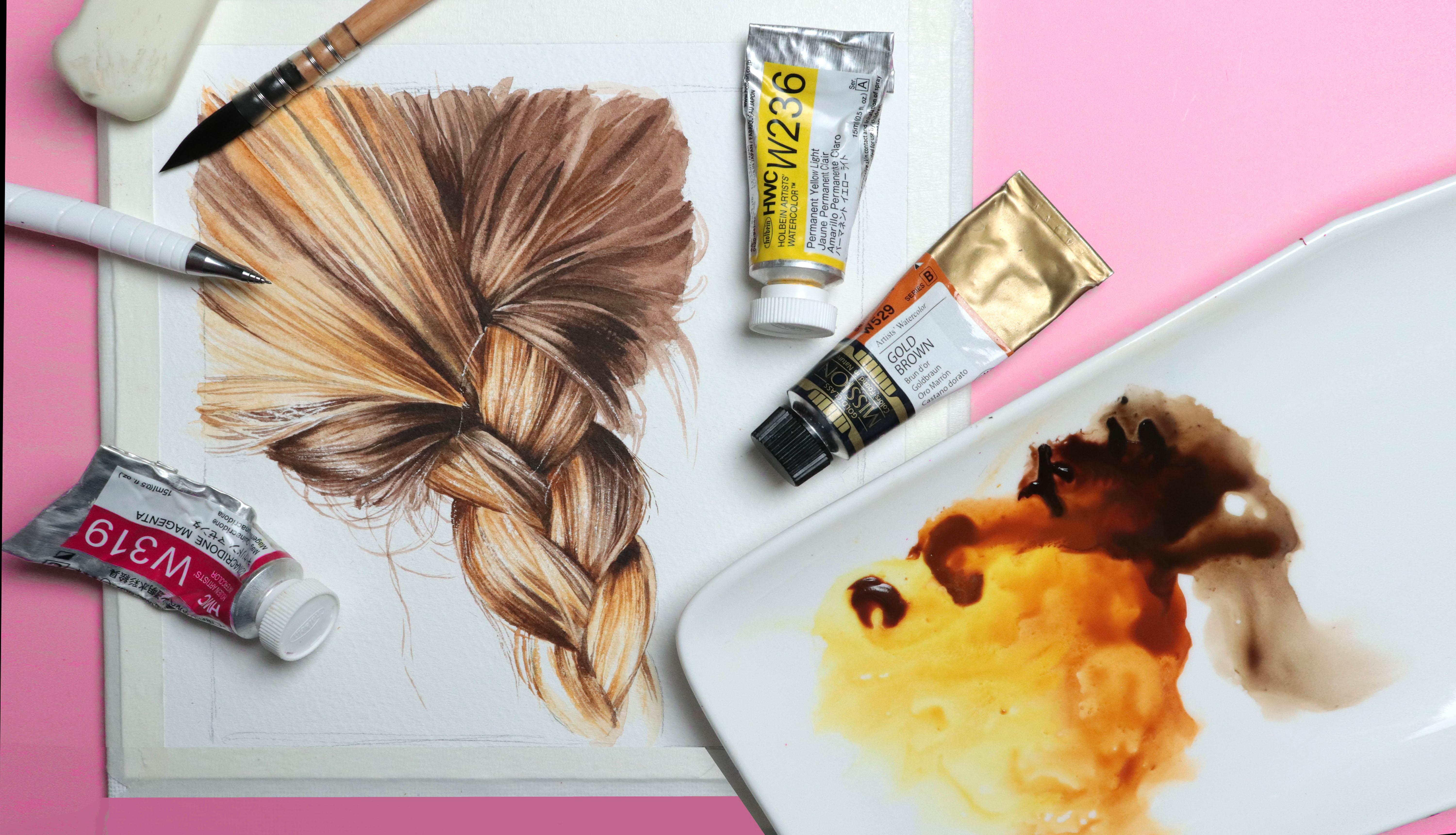
process of painting a braid, starting with the
initial sketch, and take it all the way
through to the final touches. And to finish, we'll do a simple color mixing
exercise to help you feel more confident in
mixing the right colors. So if you're ready,
let's get right into.
2. Supplies: Let's have a look at what
we're going to need. We're going to need
some paint, so grab your watercour palette. You will need at least some
version of your primaries, red, yellow, and blue. But if you have a few
earth tones and neutrals, go ahead and grab those as well. We're going to
need some brushes. I'll be using this one by medium for the
majority of the class, one or two brushes for lifting, and as always, I'll be using a separate brush for
mixing my paints. I always recommend
this so you don't wear down the point of your
good brushes too quickly. We're going to need some paper. I'll be using 100%
cotton cold pressed, but you can use
any type you want. So masking tape a pencil
and one or two erasers, cloth and tissue to
wipe out brushes, and to help lift
paint, and some water. Let's get started.
3. Braid: Sketch: Before we can start painting, we need to breakdown on reference. And so for this first study, we're going to create this
sketch together from scratch. I do encourage you to
do this because it provides us with
such great practice, but I will also be
providing my sketch in the projects and resource tab
for you to use if you want. Just like with any
other subject, and in this case, no
matter the hairstyle, we want to try and simplify our reference by identifying
the different shapes, starting with the larger shapes, and then breaking that down
into smaller sections. So let's give it a go.
I'm going to start by drawing a square or at
least something close to a square because I want
my painting to be just a bit smaller than the
size of this paper. That way, it'll fit a bit better within the frame of
view of the camera. But even if you're not filming, I do recommend that you don't
sketch or paint too small. We do want some room to be
able to add some detail. Going to sketch directly
on my watercolor paper, but you can also
create your sketch on a separate piece of paper and then transfer it
once you're done. There's no right or
wrong way to do this. But if you do tend
to sketch with thicker or heavier
lines or if you don't feel super comfortable with sketching or drawing in general, it may be a good idea to do that first draft on a separate piece. Okay, if we look
at our reference, we've got the head.
And the braid. And off to the side, we've got some sections of hair coming in, which we can use as guidelines. Looking at the height, if we go about halfway down, that is going to be where
those lines come in. So we can mark that off. Doesn't have to
be 100% accurate. Then for the width, if we take the height. This is about three quarters of what we need give or take. So we're going to add in that
last bit right around here. So this is going to be
the very basic shape for the head or the main
portion of the head. And then the braid is going to come down somewhere around here. If you want, feel free to use your pencil to
measure the angle. I'm going to take my
chances and eyeball it. And to be fair, it's okay
if it's slightly off. Hair is not a fixed shape. And we've got that last
bit of hair over here, which kind of curves
down like this, which then gives us the
most basic structure. Next, we need to
break this down into something that actually
looks like a hairstyle. So let's start with
the larger section. We want to try and
look for some of the most obvious
shapes or lines. So first, let's
round off the head. And then as an example, we've got a line
coming down here. And again, you can definitely measure the angle if you want. Getting the angles right
will help with the accuracy. We've got a line up here, starting from maybe 40% of
the way if we go from left to right on this top line and then down in an
angle like this, then another line
that comes down giving us a triangle shape,
which means that here, we can look at not
only the lines, but also the negative
space or the shape itself. And we've got a couple of
lines over here on the left, maybe around here and here. From here, we can
add in as many of these different shapes
and lines as we want. So we've got another one starting not quite in
the corner right here, and ending not quite
in the corner up here. We've also got some curved
lines over here on the right, so we're going to add those in continuously looking
back and forth between our sketch at our reference and following
the angles the best we can. Uh And finally, we can have
a look at the braid itself. You can focus mostly
on the shapes, all the lines depending on
what you find the easiest. I like to focus on one of these shapes or
sections at a time and see where they're
sitting compared to the rest of the
lines we already have. And again, don't worry too much if you don't get
it exactly right. As I said, hair
isn't a solid block. It can move. And so if we do accidentally change the shape or
size of some of these, it's just going to
make it look like the break is slightly thicker, thinner, tighter, more loose, et cetera. Not a big deal. We've got quite a few wispy bits over here in that under section, so we're going to ignore
most of those and try to focus on the more basic shapes,
just like with the rest. One way to check if the
sketch makes sense, even if it's not
an exact match to reference is that
once we're done, we want something where we are able to follow each tuft or a section of hair going from the crown of the head and
down throughout the braid. So we want to be able
to follow each of these sections in kind
of like a ixag motion. Next, we want to get rid of those initial sketching lines. Then we can use our
needed eraser to lighten a sketch and finally go
in over everything again, refining the shapes and adding in a few final
details if needed. So when doing this, we
want to look closer at our reference and try to follow not only
the basic angles, but really look at
how the hair is sitting and how each section
connects to the next one. The lines are not going
to be fully straight. They're going to have some
sort of curve to them, whether that is
going to go through the entire line or mainly
on the end pieces. Try your best. It doesn't
have to be perfect, and it really does not
matter if the braid ends up being slightly thinner,
thicker, et cetera. The goal for this
class is not to do a perfect rendering
of the references. The goal is simply to
practice painting hair, so we don't have to concern ourselves too much
with likeness. We're going to focus
on the technique. Keep a light touch, especially if you're sketching
on your watercolor paper. I am making my line
stronger or more prominent than what I want purely for the sake
of the camera, but I will lighten them
before I start painting. So try not to make
your sketch too dark. Once you're happy
with your sketch, we're going to move
on and pick some cos.
4. Braid: Color Palette: We are going to play around with some proper color mixing
later in the class, but for now, we're going
to keep it simple. So get out your
neutral pink colours. I've got a few different
ones here that I hope will get me somewhere close to what
we need for this painting, but it does not have
to be an exact match. Our main focus is going
to be the values. So if you want to do this
study using only one color, you can do that, as well. Just pick one that can go from the lightest lights all the
way to the deepest ducks, like Pain's Gray indigo,
Sepia, et cetera. The colors I have here
are quinaquidone gold. So a yellow tone, golden color, which isn't technically
a proper neutral, but it's also not a clean
yellow, so close enough. I've got gold brown, which is a beautiful golden, slightly more red tone colour. Im dazzlon brown, which
is a deep, reddish brown. And Sepia, which may vary
depending on the brand. But in this specific case, it's a very deep, neutral,
almost grayish brown. And, I mean, to be
fair, all colors can vary depending on the brand. If you don't have these
exact colors, don't worry. Use whatever you have,
like raw or burnt sienna, burnt umba, Vandyke
brown, and so on. So let's have a look at
mixing our lightest color. Looking at my color
selection at my reference, the gold brown looks
pretty close to some of the more red toned mid
tones within the hair, but it isn't quite yellow
enough for the lighter tones. So if we mix these two together, and then to help tone them down, since we don't need a
particularly vibrant color, we can add in a
touch of the CPA. Let's see what we've got. A tat more red than
what I'd like, so I'm going to add in a
touch more of the connect on gold and a bit
more of the CPI. One tip is that it may be worth allowing
the swatches to dry on the paper before judging because most of the
time with water clo, the claws are going to have a slight color shift
all lose some of the vibrancy once they're dry on the paper compared to when
they're wet on the palette, so it can be tricky to judge
them in their wet state. I'm going to say
that's close enough. For some of the mid tones, we can definitely build
up the lighter col mix, but we may also want a color with more of a red tone to it. I think the gold brown on its own is a pretty
decent match. Close enough, at least. For the deepest tones,
I do like the CPA, but I feel it looks
a bit dead and I'd like to breathe some
more life into the color. If we add in some of
the imidazlon brown, that should create that d tone with a bit more color to it. But again, as long as you're able to create light, medium, and deep tones or values, the exact colors really
aren't that important. No.
5. Exercise: Identifying the Shapes: Before continuing
with the braid, we're going to have a
look at the basics. I've provided my sketch in the
project and resources tab, but you can also create your
own or trace reference, and you don't have
to add in the face. All we need is the main
shape of the hair. When drawing or painting hair, one of the most common
issues is we tend to add in too much information
because we're thinking of it in a
very literal sense. We know it's made up of
lots of thin strands, so we try to add in
as many as we can. But we don't usually see each
individual strand of hair. So let's start by dividing this head of hair
into those larger, more obvious shapes, just
like we did with the braid. We're going to start at the top and work our
way down the side. We've definitely got a very
clear shape right here in the front where the hair kind of folds over from the side pod. So let's start with that one. Then we've got the side pod, which is also fairly
straightforward line. Okay, this is where it may start to look more complicated, but we need to just
really look for those shapes and
how the hair sits. If you imagine the
hair as something that sits and moves the same
way as ribbon or fabric, that might make it easier. We've got this large section
of hair that swoops down, so we want it to be an extension of the line from
the previous shape, and then it's going to come
down, something like this, and then it makes a turn or twists just like a
piece of ribbon. And comes down and
somewhere around here. So just like with the braid, we should be able to
follow each section of here in one coherent
movement or shape. We've got another section
that comes down and touches the ear and curves or curls down into this type
of almost feathery shape. We don't need it to be perfect. There is this smaller section. And we've got a line that splits this larger shape into two smaller ones with
the one on the left, slightly overlapping
the other one.
6. Exercise: Basic Form: The easiest way to paint hair
is to simplify what we see. If we go back to thinking
of hair more like ribbon, before we even get to the
individual strengths, each section will have
both light and shadow. Let's pretend this is
a section of hair. Wherever the light hits, that's where we're going to
have the lighter values. And then as it bends
either towards the root of the hair or
as it curves throughout, we'll have the deeper values, creating the basic shading
for each individual section. With this one right
here, we're going to have the deeper tones
near the roots. The light hits the very top, and then it gradually
becomes dark again as the hair
curves around the face. Similarly, as it comes down into this swoopy or curly shape, we can see how the light interacts with the section
and how it brings out the lighter values
whenever the light hits the hair as it
flips and turns. So for now, let's add some shading to the
basic structure, giving the hair form without
worrying about the texture. You can use any coll you want. I'm going to use Imadezlon
brown and the CPA. You can go in wet and
dry or wet on wet. It's completely up to you. Starting with the first
section from before, we want some very deep values in the back or top portion where
we have the most shadow. And then it's going to
become lighter as it comes out from
underneath that swoop. And down here where the
most light is hitting it. With the swoop, we want some deep values
down at the root. Then we need it to become
lighter up on the very top. And then down again as
it goes down the side. It doesn't have to be neat. With this section, we
also have more light on later values near the
front or near her face, and less light as we move
towards the back of her head. So we can also add in
some shading back here. We've got a dark section here, which is fully in shadow. And we've got the rest of this section where we
have that turn or curl, starting with some shadow. Lighter where light
is hitting it. Daka as the herir curves, another highlight
facing the light, and then Daka going
away from the light. Roughly something like this. That's maybe a bit too
dark in the lighter area. I gonna quickly
clean and wipe off my brush and lift
some of this pigment. No need to stress. Next one, starting with shadow. Lighter in the light. And Dakar turning
away from the light. And we're going to do the same
for the last few sections. And so what we're
starting to see, even though we only
have the basic shading is a sense of form and
dimension to the hair. And we can even
follow how the light is hitting all of it
right here in this area, which makes everything look coherent and thus
more realistic. But we don't want to stop here, so let's have a look at
adding some texture.
7. Exercise: Texture: Right now, what we have is the basic shading on the
larger shapes or planes, and this would be great as
a very simplified version. But let's bring in
some more detail. Each of the larger sections
consists of smaller sections, and each one of those consists
of even smaller sections. And at some point, we get to
the individual strengths. But luckily, we don't have
to break down that far. We take one section and break that up into slightly
smaller ones, we'll start to see some
overlap or some crossing. So some of these
smaller sections will slightly overlap others, which means that some of
them will sit more in the shadow and some will be pushed out further
towards the light. Don't overthink it. We're going to go back to
this shape and follow some of those small sections that
come down through here. We do technically have
three darker sections, but I may struggle to
fit in the last one because I didn't put mine
in the exact right spot. It's okay, though. Who
needs that last one anyway. But we want to just darken these sections that
aren't getting as much light or looking at
it the other way around. Keep the sections that are receiving more of the light
lighter than the rest. In the most simple sense, we want to look for the
changes in light and shadow. B And once we've got that, we're quickly going to
do that to the rest. Don't worry about perfection. It's just an exercise. Look for some of the
main value changes. We don't need to nitpick, and we also don't
need the values to be an exact match to reference. Just try to keep
the areas with the most shadow darker
than the rest. It is worth noting that some
of the smaller value changes aren't always created by overlapping or how
the hair is sitting. Sometimes it simply highlights all low lights within
the hair color, but no matter which one
we're dealing with, we're still looking for
light versus dark values. If you go a bit too dark
in places, it's okay. Don't worry. We are going to come back with
some highlights. Mm. Almost done. Don't want to forget
about this last section at the top. Perfect. Already, that has added
some depth to the hair, but we're going to take
it one step further. Now, typically with watercolor, we're working light to dark, and we could use thinner
lines to go even darker. However, instead,
we're going to use lifting to add in the last bit of detail before moving on. Grab your flat brush or whichever brush you're
using for lifting. We're going to wet it, and then starting where
the highlights are, we're going to lift some
of the pigment like this. Use our tissue to get rid of
some of the excess moisture and then continue
by adding a few of these lines to each section. You can leave
bigger gaps between some of them while keeping
others closer together, make some of them
thinner and some wider, all of which is going to help
add dimension and realism. The main thing to keep
in mind is that we don't want them to
line up perfectly. We want this kind of jaggedy edge because
our brains are going to translate that into this being thinner ptings and tufts. If all of them sit
straight across from each other and they're
all the same length, we're just going to create this cartoony looking
rectangular highlight, and that's not what we want. We can also extend some of them further up or down to bring in more of the lighter strands or sections that we
see in reference. Oh. In the next lesson where we'll start adding
color to the braid, we're going to spend
some more time and be more purposeful with where
we put down our color. Ideally, we would
want to build up the texture purely
by adding paint, though there's nothing
wrong with using lifting as a technique to
build up the texture either. For this one, I
just want to make sure we could have a
play with both adding and subtracting paint because both techniques or both
approaches can be equally useful. It's up to you how much of this you want to add
before moving on. I'm doing this fairly
quickly without worrying too much as to whether or not it looks
like the reference, but you could also take your
time and get a much better, much more accurate result. It's up to you because
this is just an exercise. Our main goal is simply to practice and
familiarize ourselves with using some of these
different techniques before going back to
the actual project. But we can see here how with
not too much difficulty and even though we
haven't focused on adding a bunch of
individual strains of hair, we're able to build up something that looks fairly realistic. And of course, the more
realistic we want it, the more we need
to pay attention to those smaller details. But often in watercolor
and painting in general, it's just as much
about the details we leave out as it is about
the details we add. It's completely okay and
often preferred to have a slightly more simplified or painterly expression
with something like this because it helps pull
even more focus onto the face, which is usually where
we have our focal point. If you wanted to, you could also layer this by going
back over the same area multiple times with
more highlights or even going back
in with more paint, redefining some of
the shadow tones. But once you're
happy with it, let's move on to the next lesson.
8. Braid: Basic Technique - Base: Before we go in with paint, we want to just light
now and sketch a bit. It doesn't have to
be super light, but we don't want really
heavy peniclines either. There are multiple ways
you can approach this. We're going to take
a look at a couple of similar but slightly
different approaches, so you can decide which one you prefer and which one
you want to use. Our goal isn't going to be
to make this hyperrealistic, but we want to capture some of the color variation and value changes.
Let's give it a go. We're going to start with
this section right here and we're going to go in wet and wet with the first layer. Before doing anything, let's just have a look at what
we're going to paint. The first thing we want to
look for is the base color. Do we need to take any bright
highlights into account? In this case, no
to the highlights, but we do want some slightly
lighter values here. Next, do we have any notable variation in the base color or
notable detail? This section is a tad
dagger in the base collar, and we do have a
small separated light tuft or section right here. So we do want to
keep that in mind. But other than
that, we don't have any major variation
in the detail. Doing a quick analysis
like this can really help us prepare before we
go in with any pigment. We're going to start
with a light layer of our golden colmics. Our goal here is to establish
a base color that is close to the lightest
overall values we see in our reference. So just the general base color. Next, we want to loosely
establish some of the details. When doing this, we don't
want the paper to be too wet because then the pigment
is going to spread too much, but we want to look for some of the most obvious value
changes or details like this individual tuft
we talked about before or the darker base color for
the section on the right. So what we're creating
are soft guidelines or a roadmap for the
upcoming layers of paint. Doesn't have to be
super accurate. It's enough with a general sense of what we're seeing in
our reference photo. So don't worry if the
individual sections and tufts are wider or
more narrow, et cetera. It's not like the rest of our facial features.
Hair can move. It's not going to stay the same throughout the whole
day or from day to day. Imagine a nose changing shape
and blowing in the wind. That would be very strange. But with hair, it's okay. For the darker bass
and shadow tones, we can bring in some of
our darkest call mix, but we can also go in with
some of our more red toned mix in the areas where we have
less of a golden mid tone. Working on wet paper, some of the strokes will
soften to the point where they blend together
completely, and that's okay. This is going to
create the look of shading or shadow tones, and it's also just
going to give a more loose or painterly feel. The main thing to consider is
that we don't want to focus on drawing or adding in
every strand of hair. Just like with the exercise, we're looking to break
the larger shapes into smaller and
smaller segments. But by adding the shading and details in long
strokes like this, we're not only
building up shading but also a textured
look at the same time. So we're not targeting
each strand of hair, but rather some of
these smaller segments. Exact color you're
using is not important. Focus on the values. If you see more
of a golden tone, use a golden colmix. If you see very
deep neutral tones, you can use a darker colmix, but it doesn't have to be exact. Value is always far more
important than color. This method where we go in wet and wet with the first
layer may take longer because we have to wait for
the different drying stages of the paper in order
to add the detail. But that's not
necessarily a bad thing. It all comes down to
which techniques you find the most enjoyable or which ones you are the most
comfortable with. So once everything is completely dry, we're
going to go in again. This time, we're going
to go in wet and dry. We're going to further
define the details, still focusing on the
value and color changes. But now we get to use what we've already painted as
a guide or roadmap. As an example, I'm
going to go in on this taco section and define this edge or division between the two segments and
deepen the base color. Take it one step at a time. If you find it difficult to find the shapes within
this larger section, try squinting to block
out the finer details. Okay. For the most part, we do want to keep
adding our color in these long strokes to help
add the look of texture. And once we've got that, we can move on to the next section, deepening the base
color and adding in a few additional
brush strokes to help break the shapes down
into smaller sections. Mine is not an exact match to
the reference by any means, but as long as we keep
the deeper values approximately where we
see them in the photo and we make sure to
somewhat maintain the highlights and lighter
values, it's going to be fine. We don't need perfection. It's one of those things
where rather than trying to follow the exact
brush marks I'm making, it'll be easier to follow
your own intuition. Don't worry about copying
the reference down to a and don't be afraid
to make mistakes. Follow the value and color
shift you're seeing. The great thing about this
braid is that because it's divided into so
many small shapes, with each section, we have a chance to improve
from the last one. If you feel it looks
complicated now, don't worry. We'll have plenty of
time to practice in the next lessons as we work
our way throughout the braid. And if you're experimenting with different techniques on
the different sections, you can even write notes
next to the braid and have an arrow pointing to the section where those notes or
techniques apply. That way, you're able
to look back at it at a later time and use it as a helpful tool the next
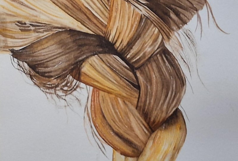
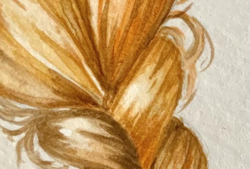
time you're painting here. Uh, Once dry, I'm going to use lifting to
quickly clean this up a bit. There we go. That's better. For the second section, we're going to approach it similarly, but with a small change. Instead of starting
with the OL base color for the entire section, we're going to
write off the bat, start looking for those
more notable changes in color value, and pattings. Additionally, we're going
to start wet on dry. Within this large section, we see a shift in
color and value, especially towards the bottom. In the center, we have
more of a mid tone. On the right, we've
got a tago section, and on the left, we have
the lightest section. So if we fill in the base color for the
middle section first, blend out the edges
where the light is hitting so we get that look
of a slight highlight. Then we can go in with some
of the tagest details. We've got this long shape which tapers to a point in both ends. We've got some taco
values coming in over here. Something like that. We also want to bring
in some deeper tones both at the top and the bottom. So when filling these in, we're looking for
smaller shapes or smaller sections within
the larger shapes, and our goal is to gradually break it down
further and further. As I already said with
the previous section, don't stress about getting the exact colors or the
exact placement perfect. Think of it more as
a gestural thing. We just want the general
or overall look. So don't overthink it. If you see a dager
strip section or shape, add in a dager value. If you feel like you're
seeing more of a red, golden or neutral tone, try and pick the color mix that best matches
what you're seeing, but don't worry
about perfection. The main thing to
keep in mind is that we don't want
to go too dark. It's okay if we get close
to the values we need. That'll just save us time in the end because we don't
have to layer as much. But at the same time,
we want room at the end to add in those final
details and adjustments. When we get to this point and we've got the main
shapes in place, we can add in some
slight texture while adding the shading. We're going to go back with
these long brush strokes, starting from where
the deeper values are, and then we're going to let
them gradually fade out towards the center portion where we have the
main highlight. So even though the brush
strokes aren't softening and blending together like they did when working wet and wet, we can use the width of the brush strokes to help
keeping them wider at the bottom where we
want more shading and narrow as they move
towards a highlight. We will come in with more
detail later in the class, but we can see how these
two different approaches are going to give a
very similar result. So it's just about finding
the techniques you prefer. For me, it depends on the amount of detail not
only in the reference, but also the amount of detail I want my final
painting to have. Wet and wet is great for a
softer, more painterly feel, though you can build
it up in layers to include lots of
defined details. Starting wet on dry will
give you a lot more control, which is perfect for crisp
detail, but at the same time, it can also give us
a very stiff look if we focus too much on the detail and not enough on the overall look of
what we're working on. Once we're happy with the amount of detail we've got for now, we can fill in any
remaining white paper with a pale wash for
the base colour. I'm going to quickly
add some detail on texture to this
last bit on the left, and then once you're
ready, let's move on and add a base to some
more of this braid.
9. Braid: Base Layer Pt. 1: Going to use a combination of the two approaches from before. For the most part,
I'll be going in wet and dry, but for some areas, depending on the color or
the amount of shadow we see, it may be easier to go
in with the base color. In which case, especially
with cold press paper, we will get some of the wet
and wet effects or softening. Don't overthink it. There's no right or
wrong way of doing this. Focus on the values,
colors, and details. It really doesn't matter
which technique you're using. So let's get right into it. We're going to continue down the braid one section at a time. So if you wanted to work on multiple shapes one
step at a time instead, you can definitely
do that as well. This first one, the first
thing I'm noticing is a dark line that goes down
maybe the last third. So let's add that
in. The base call to the right is Dag so I'm
going to fill that in. We've got some deeper values
at the top and bottom, and then a few smaller
or more subtle lines. On the left, we want a lot more of the golden
tones coming through, and we do want to maintain some light values
for the highlights, but we're doing the same thing, slightly deeper values
near the top and bottom, and then some light texture. Oh I'm genuinely not concerned with following the
reference all that close, and you can probably tell the general gist of what
we're seeing is enough. So allow yourself to just
have fun and experiment. And don't worry if
you make mistakes. More than likely,
it's still going to look like hair. Okay. And that's about
it for this shape. So hopefully you'll
agree that even though it's a fairly
loose interpretation, it doesn't look miles apart
onto the next section. Now, we do have a very dark
shadow line coming in here, which continues up into this
pot. So let's fill that in. Go to mix up some more
paint, same as before, mixing CPA and imidazloon brown and don't stress
about the color. It's okay if it doesn't
turn out the exact same. So we're going to go in. Follow along this line. H. Up into this shape
and fill that in. And we do want it to become lighter towards the highlights. I'm going to gradually
blend that out. Add some deeper tones
where we see more shadow. And then just like
with the exercise, we can lift paint to
create some light texture. The add in a few more details. That looks pretty good.
And the next one. Same thing again.
The first thing I'm noticing is a dagger shape. I'm going to start
with that one. Fill in the base and preferably
avoid the highlights. I may need to go back and lift some of that
pain, but that's okay. It's not a big deal. We've got a light tuft coming down here. And some detail to the base. Lifting brush to the rescue. This is why there is
no need to panic. Even though Wacall can
be pretty unforgiving, most of the time
we'll be able to fix or at least minimize
our mistakes. Just like that, almost
as if it never happened. Right now, this line from the shadow looks very
stiff and out of place, but if we look closely
at the reference, we need it to connect
to the shape above it because that's where
the shadow is cast. So if we simply go in with
a few lines like this, following the
direction of the hair, we can make it blend
into that section, and it'll instantly look much more as if it
actually belongs here. Let's do another
one. For this one, we have a fairly dark base with a single light stripe
or tuft coming down, so we're going to
fill in the base. We definitely need
some deeper tones, but I might need to wait for a few seconds to allow
the paper to dry a bit. Same thing over here,
fill in the base, and a few additional details. Once we break it down into these more approachable
unmanageable portions, it's really not that bad. And already it's
starting to look like a pretty decent braid. The next section looks
a bit more complicated, but we're going to take
it one step at a time. We definitely got a duck
line coming down here, so we're going to
start with that one. Then we've got a
couple of dug lines over here, add those in. There are some loose strains coming down in front of this, and you don't have
to add those in, but it's going to come
down something like this. And we can use lifting
to enhance this later. We've got the hair underneath. And we've got a deeper section O here with more of that
red undertone to it. Deeper tones towards the top and especially
towards the bottom. And bring back those highlights. So really not that complicated
once we break it down.
10. Braid: Base Layer Pt. 2: Last two sections are both
very light and colour. I'm going to work on these
simultaneously using the golden mix with a touch of gold brown and then
going straight in, looking for some of the
most noticeable lines. Not going to worry too much, similar to what we see
in our reference photo. Maybe a touch off the Doc Brown. Whoops. That may
be a bit too, Doc. Let's get rid of some of that. And go back in. Adding in a bit more texture, but we also have some
pretty bright highlights, so we're going to leave
some of that paper exposed. Adding in a light base
colour to finish off. Maybe a shadow right here. Perfect. The remaining portion of the hair up here is going
to be pretty much the same, at least to some extent to
what we've already done. So we're going to do that last, and because it's
pretty repetitive, I will speed up some of the
footage to save you time. But let's have a look at the two sections down here where we have a much more loose or messy
look if you are working on a proper portrait or if you want to fill in the
skin tone for this one, I recommend doing that
before doing the hair. But since I'm not
going to do that, let's just start
with the section closest to the
bottom of the paper. We don't have that much
color variation going on, so I'm going to use
the dark as brown, but you can also mix
the duck's brown into our golden mix, which may give you a
more accurate colour. Gonna load up my brush, and we don't want
to go too dark, so make sure your paint mix
isn't too thick or saturated. What we want to do is
follow the direction of the hair coming from
that braid down, and then it's gonna fold. Creating a curve or
loop just like this. Some of them are
going to somewhat follow the shape of
the section above. Some of them are going
to look like they're almost folding back
in on themselves, and some of them may fall
towards the side of the braid. Basically, we want one end of our stroke to come out from our starting point
within the braid, and then the other
end to look like it's attached to the head or, I guess, the underside
of the hair. With the first view,
we can make them slightly thicker to
at the same time, create a base for the shape, but we want most of them
to be nice and thin. It may not look like
much in the beginning, but the more we add, the more convincing
it's going to look. We also want to
make sure to create some variation in the shape
and the way they fold. Although it's realistic
for some of them to move or sit in
the same direction, we don't want it to
look too uniform. Random outliers and flyaways is going to really
add to the realism. And right here, we want
to layer the color to build up a deeper value
for the shadow tones. What's also really cool is
that even though the rest of the hair on the crown and the braid remains
the same for now, the overall look
of the hair still appears more realistic
just by adding these in, and that's because
these loose strands help to loosen everything up, making it look much
more similar to what we'd expect
hair to look like. Oh The section up here is definitely
less messy looking, but it also poses a
different challenge, and that is that we've got blond hair on top
of a dark base. So what we need to fill in rather than the
strains themselves, is the dark spaces from
the hair underneath. One way you could do this
is to use a dip pen or a similar tool and mask off the blond strains
using masking fluid. You can also use a small or fine flat brush
to lift the pigment, but depending on the colors you're using and how
staining they are, it may be difficult to
go as light as you want. Of course you could also mix
in white paint and simply paint the white hairs or blond hairs on top
of the duck base. In this case, we're
going to see if we can get a similar look without spending too much time on it and purely by working
light to dark. So we first want to erase or almost erase
our sketch because we're going to create a few new more clean
looking guidelines. Next, we can add a light base to the top portion of the shape. We want it slightly lighter in the center and darker
towards the sides. And once completely dry, we can use our pencil to
create some guidelines. First, let's sketch
in the main shapes. We've got one clear
shape at the top. Then we've got the
one right below it, and these are the two
most solid shapes. We've got one or two
sections down near the bottom. Something like this. And we do have a few
strands that are bunched together
somewhere around here. The rest, at least
for the most part, just a bunch of strays. Adding in all of them
will take a long time, so we're going to simplify it. Allow me to demonstrate on
this beautiful diagram. So, right here, this is similar to what we
have on our painting. And if we only had
these two spaces, we'd simply fill
them in. Like that. Maybe add in some texture here, and we can pretty
much call it a day. But if we had one stray
hair coming through here and maybe a couple
going in this direction, now we need to fill in
each of these spaces, avoiding each of those strands. Likewise, if we had a bunch
going this way, like that. And then one crossing this way, we'd have to fill it in
something like this. We don't necessarily have
to draw in each hair, and it's up to you how many
guidelines you want to add. What I'm going to
do is have most of the individual strands of
hair follow this direction, and then I'm going to sketch in a couple that are
going to be crossing. We can then fill that in. And again, it doesn't
have to be perfect. Definitely, if you want, feel free to spend some
more time on it. Using a small brush
can make this easier, but if you do go lying on area you weren't
supposed to, so be it. We can always bring back some of the details that get lost
later in the process. Besides, these strays don't need to sit in any
particular spot. It's true that having these and our painting helps to make
things look more realistic, but they don't have to be in a fixed position, so
don't worry about it. This is just a base. If needed, we can use
lifting, white paint, or any other method we want once we go in
with more detail. But for now, once we get
rid of those pencil lines, it looks something like this, which does give off
this more messy look. And then to finish
off, we can add some light texture to
the shapes around it. For the remaining
portion of the hair, we've got two options. You can either go in and add the base the same way we
have been up until now, breaking it down into
those more visible shapes, colors, values, et cetera. Or what I'm going to do is an even more
simplified version. In which case,
we're going to take our dags colmx and
fill in the base, as well as add in brushstrokes that even though they may not technically follow the reference
100% or let's be honest, even 50% are going to still
give off the look of hair. We're going to use our sketch
as the main structure and then add in the texture following the
direction of the hair. Varying our brush
strokes so that some are wider and
some are more narrow. Because we've got more
shadow on the side and because the photo
is out of focus here, it does make it easier to get away with
this sort of thing. And having a portion that
is out of focus helps to push the focus onto
the parts that are crisp. Though if we were painting
a proper portrait, we'd maybe still want to
spend a bit more time making sure the details match up
somewhat to the reference. For now, we're not
going to worry about that. Just
have fun with it. And though you can bring
in the other call mixes, even when there is
this much shadow, the monochrome look
can go a long way. Vary brush strokes and layer multiple on top of each
other to build up depth. I know it may not
look right right now, but trust the process. Keep building up the
texture and the values. I am going to speed up some
more of the footage in a bit because I know this
can be tedious to look at. And, trust me,
you're not going to miss out on any
important details. You can't go wrong. Continue adding in
these brushstrokes, following the structure
of the hair or the shapes and curves we're
seeing in the reference. It really does not
need to be exact. And in fact, I have so much
faith in you that just a once I'm going to speed it up not two times but three
times normal speed. And honestly, there's still a chance it's going
to feel slow. Okay, I know I'm exaggerating, but it's one of those
things that are really nice and
relaxing to paint. It just doesn't make for
the most thrilling video, and seeing the same
step repeated over and over in real time isn't going to bring you
anything useful. The best thing to do
is put brush to paper. Try it out for
yourself and practice. We can also add in a few strays, and you can add as many
or as few as you want. And then finally, we can go in on the entire thing with water. This is going to help
lightly blend our soft net, creating more of this
out of focus look. And honestly, even
though this is far from perfect with a few adjustments
and additional details, it's again, not miles
away from what we'd want. If we polish this up a bit, it could work for what
I call portrait as is. But with the exercise
from earlier, we know what a few details
and highlights can do. Let's move on and
refine some of this.
11. Braid: Detail Pt. 1: Once we've got this, it's really up to you how much
detail you want to add. This could work for finished
watercolor portrait, though the one thing
to take a look at would be to adjust
some of the values, the shadows, and the highlights. But let's have a
play with adding in some more detail as well as
make those value adjustments. This time we're going to start with these smaller sections, and then it's up to you
how far you want to take each one and how much of the painting
you want to go. We're going to both add and
lift paint but mostly add. So before we go in with paint, you can have a look and
see if there's anything we feel like we need to
lighten or erase. This time, I'm going to
use my smaller flat brush in order to be able to go
in with more precision. We're going to wet our brush. I'm not going to lift too much, but I want hand some
of the highlights, and then I also want to lift out a few smaller sections almost more like
individual strengths, which could very well
be all we chose to do. Sometimes less is more. It all depends on your
personal preferences. Use the reference
as inspiration, not as a hot set rule for
what it needs to look like. Look at the values and textures more so
than the exact look. I think that looks
pretty decent. Next, this is what's going to make the
biggest difference. We're going to break
this down into even smaller or
more refined detail by simply adding a
bunch of fine lines. And just like with the rest, I recommend starting
with where we see the most obvious lines because once we've
added some of those, we can then decide if we want
to take it even further. And so all we need
to do is continue adding these in until we're
happy with the way it looks. One thing we're
thinking about is that if you're unsure of
how much detail you want, it could be a good
idea to work on multiple shapes or
even the entire head of hair all at once, because that way you'll get a better and more clear idea of what it's going to look like
in the greater picture, so to speak, and you
might end up liking it with much less detail
than you expected. And I do recommend doing both a more simple
version and one where you go all out with
detail because we won't know which one we
prefer until we try. Keep an eye on the values. You may want to go in
slightly lighter in the lighter areas and
daka in the Daka areas. Or we could choose
to go darker with the more noticeable lines and lighter where we simply
want a subtle texture. The greatest challenge with this is creating the
lines themselves. When adding in fine
detail like this, we don't want too much water
in our brush or pink mix. You can also switch to
using a smaller brush, which usually makes something
like this a bit easier, and definitely feel free to turn your paper
because you might find it easier moving your hand outwards and
away from yourself, or maybe you prefer moving your hand more in a
side to side motion. You might as well make it as
easy on yourself as you can. Et's move on to the next one. I think I'm going
to do two at once. Just like before, we're going
to start with some lifting, bringing back or enhancing a few highlights or
individual strengths, and then back in with paint. I really love when you
get to the part in a painting where you can
kind of run on autopilot. Once you've got the techniques
down, you can zone out, listen to some music
or a podcast and fully submerge yourself
and enjoy the process. Don't worry about
making mistakes. As I've said multiple times
throughout the class, the goal isn't to create an
exact copy of our reference. Just have fun. Play around with the different techniques or different amounts
of detail and find the combination that suits
you and your painting style. When painting a braid this way or any other haircut
for that matter, we are, of course, painting very much just the hair itself. So we're putting a lot of focus onto something that we
wouldn't necessarily put as much focus on if it was part of an
actual portrait, unless, of course, the goal of that portrait was to make it
as realistic as possible, whether that would be
photorealism or hyperrealism. But with watercolur portraits, we usually give
them a more, well, watercolory look, including
some more flowy effects, where we allow the watercolor
to act like watercolur. So does that mean that
adding in this much detail and practicing adding details
like this is useless? No, understanding the basics,
the underlying structure, building up depth and detail
going from the white paper till the finished painting is a really useful
technical skill to have. I think a good
example of this would be something like a
comic book artist. So someone creating all those amazing
superhero illustrations, even though those
illustrations are stylized versions of
the real human figure, and even though they have less detail and
exaggerated shapes, that doesn't mean the artist doesn't understand
the structure. The better they are at anatomy, understanding how
the body moves, how the muscles move, the more freedom that gives them when it comes to deciding their characters or making
them jump around the page. And mastering these
things can help give us more freedom when making
decisions for our own work, and understanding how
something is constructed can oddly enough help us
when subtracting detail. It can help us figure out what is the most
important and what we want to keep if we were to do a more
simplified version. Something else you can do if you feel the texture looks
too define and you want to soften it is to just like we did with the final
section on the crown, go in with clean water. And if you go to dark, you can also wet the area and blot it off
using your tissue. I think I'll go back and do some more lifting
on this one. The highlights got a bit lost, so I want to bring those back. I'm not aiming for perfection, but I do want to maintain
some kind of shine. Lifting will inevitably affect
the surface of the paper, especially if doing it a lot, or if using a brush
that's quite rigid. Trying to not scrub too hard. Use a brush to kind of agitate the pigment
on the surface. Try and be as gentle as you can while still getting
the result you want. And in some cases, that does mean going in with
more elbow grease. I know you won't be able to
do this to your painting, but just for the
fun of it, let's compare it to a few minutes ago. We sometimes forget just how
big of a difference a few more brushstrokes or
a couple more layers of paint can really make. And if you want to be
able to really track and compare the different stages of your own painting process, just snap a few
pictures throughout. It's a great way to
be able to see at which point in the process
you did something to the painting that either had a really positive effect or when you feel like
you overworked it. As much as we can go back in and correct a lot
of different mistakes, there comes a certain
point with watercolor where there's just not
much more we can do, and I think we've
all been there. So sometimes it's helpful
being able to look back. For the last few
sections on the brad, I'm going to speed up a
good chunk of the footage. I know some of you speed
me up on the platform, anyway. Rude? Just kidding. But there's no need for you to sit through this in real time. We're going to go over
the same steps, lifting, adding in texture, and softening or lifting
again if needed. Now, of course, the more precise we are with
the base layer, the less lifting we need to do, but I still like
having both options. Sometimes we just don't want to or don't need to
go everything with surgical precision
and having other ways of getting to the same or
similar result can be useful. It's also a great way
to really learn how to fix mistakes should we need
it for future paintings. Another thing worth
noting when it comes to lifting is that not all
brushes are created equal. You can buy short hair brushes that are made for scrubbing, but I tend to just trim
the ones I already have. I cut down the ones that
are either really cheap or ones that are very worn and need to be
switched out anyway. With both kinds, though, there is a difference
between how well and how cleanly they lift. It's not all about the size of the brush or how
thick or thin it is. The bristles or the fibers
have a lot to say, as well. So if you do have access to
a couple of different ones, just cheap or old brushes
that could do with a haircut, it could be worth
seeing if some of them work better than others. Just a couple, though. Please don't ruin
all your brushes. This isn't the final step. And the next lesson before we
get started with the crown, we're going to add
one more layer of detail if you
want, of course, it's completely optional, but I really want
to take you through as many techniques
as I can that could be helpful for you
when painting hair. So hopefully you're up
for a few more steps. A
12. Braid: Detail Pt. 2 & Class Project: Before we have a look at
that last layer of detail, let's finish up a couple of
the bottom sections up here. Same techniques
as with the rest. Use lifting to enhance, bring back or create
highlights and lighter values, and paint to add texture, deepen values, and create depth. You can go back and forth
as much as you want, or as little as you want. It's completely up to you and there's no right
or wrong answer. Well, I guess if you go back too much with the
lifting or go too hot, the paper is going to call
it quids at some point, but aside from
that, it really is just a matter of personal
taste and preferences. There are so many ways
to approach this subject depending on the
amount of details you want in your paintings, and this braid doesn't
cover everything. But having a basic understanding of how to go from
the blank paper, creating the sketch
and initial shapes, adding form, value, and
texture can help give us the confidence and freedom to experiment with different
styles of painting. But don't get caught
up in trying to make things look exactly like
in your references. Use your understanding and
knowledge of the fundamentals in combination with
your own personal taste to create something new. Speaking up, let's quickly
talk about the class project. For the class project, I'd like you to practice
capturing the values and textures of the hair
by painting this braid. One of the main goals
with the project is to practice building up the
hair layer by layer, finding those initial shapes and then building up the
form and texture. And of course, you're
also more than welcome to post anything else from this
class. I'd love to see it. For this portion, going back to the hair being
slightly out of focus, I'm going to wet
the paper first. I don't want it to be too wet, but I do want any
brushstrokes that I add to this portion
to slightly soften. And if you want it to look even more blurry or out of focus, just go ahead and
add more water to your paper and all
your paint mix. Making this look in
focus or out of focus or rather crisp or blurry isn't really important
for this class. Having it be on this
slightly more blurry side is just going to make it
more forgiving in terms of how many details we need
to add or how many we can skip before it starts looking weird compared to the
rest of the hair. But we're just practicing, so it doesn't matter. Once we've got to this point, that's where this comes in. Now again, this is optional, and I know some of you
are going to be hesitant, but I think it's
worth trying out. Using a knife or blade to scrape off the top layer
of paper is going to reveal the paper
fibers underneath the paint and bring
back that clean white. This technique is useful for so many things like
teeny, tiny highlights, texture on the inside of
something like a piece of fruit or small sparkles that would otherwise be a pain to mask off. And I use this technique
quite a lot in my work. We're just going to take
our blade and scrape it across the surface in
swift movements like this. You may need to adjust
the angle or go over an area a few times
to get the desired effect. But this is going
to give us some fine, bright highlights. When doing this, you may see the blade sometimes skips
across the surface, creating an uneven texture. This may not always be what
you want, but for this, it helps to create
a certain shine or sparkle to the hair that
looks very natural. And we can also use this technique to
create a few strays. I do try not to do this
too much to a painting, and there's a reason for that. We need to address the obvious, the surface of the paper. Doing this no matter how much or how little is going to
mess up the surface. This means that once
you've done this, it's going to be very
difficult to go in with even layers of paint or
clean washes on top. And even adding in small painted detail can
be a challenge. So this is definitely
best suited as the last step once you're
done with everything else. But seeing those
tiny speckles or highlights come to life is
quite satisfying, though. One thing you can do to make the surface look a
tiny bit better, although this is not
a perfect solution is to use something smooth
that isn't going to stain the paper like the
handle of a brush to burnish the surface by rolling or rubbing it
against the paper. Is going to help
smooth out some of that texture and make it
look less destructive. It's not going to
make it any better in terms of adding
more paint on top. So getting those smooth layers
on top after doing this is still going to be very difficult
on next to impossible. And it's not going to make
the surface look perfect. And that's a sacrifice that
comes with this technique. But I still think it's so
worth it for certain effects. And again, for
something like this, even if you only use it to
add a few strays or flyaways, it's still really effective. We can keep going for
as long as we want. I'm going to add
just a few more, and once we're done, let's finish up the remaining
portion of the hair. We're going to use
the same techniques as we have been up until now. And as I've already said, it's up to you how much
detail you want to add. I'm going to focus
most of the detail and my attention down here
where the bright is. And then as we move up
towards the top of the head, I'm going to kind of fade it
out and add less and less. So I'm going to
start by going in with some of the Daco values using the Dak Brown mix to just enhance some of these details, add in a few more. Especially on that right side, where our main focus
is going to be bring those values down into
those deep shadow tones. But at this point,
you've probably got the techniques pretty
much under control, and even in case it didn't turn out quite as you had hoped, you still understood and
know the techniques. So from here, it's just about
practicing and improving, and we do that with repetition, and you can definitely give
this reference another go and then compare your second
version to the first one. But you can also find
a reference of your own and practice
breaking it down into the basic structure with the different larger
shapes and then build up the texture and
the values layer by layer. Make sure to really build
up these deep shadow tones. It's going to help not only
add depth to the hair, but also just general
form to the whole head. Practicing controlling the
value and thickness of the brush strokes is also an excellent exercise in
brush and water control. So if you're running out of
steam on this last stretch, just think of it that way. I'm not too concerned with these highlights within
the shadow area. We can always come back
and do some lifting. And finally, some lifting to bring back a few
of the highlights. I'm not going to do too much, just a tiny bit. I don't think I'm going to do too much more at this point. And I'm sure you're ready
to move on as well. So if you want, let's
go a quick recap of some basic color theory and
do some simple color mixing.
13. Quick Color Theory: I do have some slightly more
in depth color theory and some information
about pink colours and pigments in my skin
tone mixing class, so I definitely recommend that, and I'm going to link it
in the discussions below, but grab your
watercolor palette. We're going to need some
version of our primaries. So a red or a magenta, a yellow, and a blue. And if you want to be a bit
fancy but also not necessary, you can go ahead and use
a split primary palette. So a warm and a cool
leaning version of each. Mixing our red and yellow
is going to give us orange. Yellow and blue is
going to give us green. Blue and red is going to
give us purple sometimes. And mixing together, all of them is going to give
us our neutrals, so our browns, grays and blacks. And that's pretty much
all you need to know. We're not going to worry
about color temperature because once we mix our color, we're going to be able
to see if it's off. If we want to mix a basic brown, a good place to start
would be to mix an orange, so red and yellow. And once we've got that, we can add in some blue to
help neutralize it. If our brown appears too red, we can add in some more yellow, some blue or both. If it's too yellow, we can
add in red or blue or both. And if it's too blue or neutral, we can add in some more
red, yellow, or both. The world has an infinite
amount of brown, so there is no perfect
or correct recipe. But the more you
practice color mixing, the better and the faster you'll become at mixing the
colors you want. So let's mix a few colors.
14. Exercise: Color Mixing: As a final exercise, we're going to see
if we can color match three different
hair colors. So go ahead and grab the
colors you want to use. Although you can do
with just three colors, I do recommend a
split primary palette simply to give you
some more options. These are the colors
I'm going to be using. So let's see if we can get
close to the references. We're going to go
from left to right, so let's have a
look at this guy. We have a beige or sandy color, a brown, and a green, all of which are
pretty tone down. So let's start with the beige. A good way to start
any mix is to start with whichever color
is closest to what you need. For this one, that
would be yellow. I'm going to do the cool toned
or green leaning yellow, but both could work. Even though we're not
necessarily looking to mix up an orange or a brown, we do need a neutral
version of yellow. So we are still going to need
our two other primaries. For our red, since we don't need a particularly
vibrant mix, I'm going to add magenta
to the cool toned red. And finally, some blue. I'm going to pick ultramarine
semi red leaning blue. Maybe something like that. That's pretty close. Maybe a touch more yellow. Next, we're gonna
mix up the brown, and let's use the same
colours for all three mixes. Go to start by mixing an orange. Add in some blue. Definitely need some
more blue and yellow. Let's see. To red. So more. Okay, I should have probably swatched this
next to the first one. This is going to be too dark, but I do think this
is pretty close. I'd be happy with
this color mix. Finally, for the green, gonna start with mixing
yellow and blue. And some red to
help neutralize it. This is not blue enough, so a touch more I'm trying to not
overdo it because this yellow isn't
very strong in mixes, so it's easily overpowered
by the other colors. That looks close. Next one, these colors are going to be much more similar to each other, but let's start
with the top one. I'm going to do the warm
red and warm yellow. Mix up an orange. And blue to help neutralize it. You don't have to clean your palette between
the different colors. You can just mix into what you've already got to
adjust the ratios. So if we add in some more, we can still get close
to that middle value. And if we adjust it again, this time using a lot
more red and blue, we'll get a color that'll work well for the darkest value. Uh, Don't overthink it. If the colors don't look right, adjust the different
ratios or try switching out one or
more of the pink colors. And if you already
started on a painting, only to then realize you're not happy with the
colors you mixed, find out what you
want to change. So in this case, we'd
maybe want it to be more vibrant, red or orange. So we're going to
mix up an orange and use glazing to
help correct it. Colors are not that complicated once we get the
hang of the basics. Finally, let's have a
look at the last one. We've got a really fun
turquoise kind of color, a deep blue and
some black tones. Starting with the turquoise, we're going to pick the blue that's closest to what we need. So we're going to go with
the yellow leaning blue. Add in a tiny bit of yellow. And again, either
one would work. I'll try the warm yellow. A touch of red, the
tiniest amount. Not quite green or
turquoise enough. So a touch more yellow. And that's a pretty good match. The second blue looks to be a deeper version of a
very similar color. So if we add some
more of our blue and yellow, and a bit of red. Let's watch. A bit too blue and not quite
turquoise enough, so I'm going to add
in some more yellow. Close enough. Lastly, in order to mix up black and
those really deep tones, the easiest is
usually to start with a deep purple and add
in a touch of yellow. But no matter how
we start this mix, we want mostly blue and red. Tiny bit of yellow,
just like this. Practicing color mixing
by coal matching to different reference photos
is a great way to practice. And if you're not as strong with col mixing as you'd like to be, I highly recommend it. An amazing way to get to know the colors in your
palette and see just how much you can achieve with a limited
selection of colors. I will be making more
classes in the future, where we'll have a look at
painting different textures of hair with both less
and more detail. But for now, I really hope
you enjoyed this class, and I'm looking forward
to seeing your projects.
 Tanja Jensen, Artist - Sculpting, drawing and painting