Transcripts
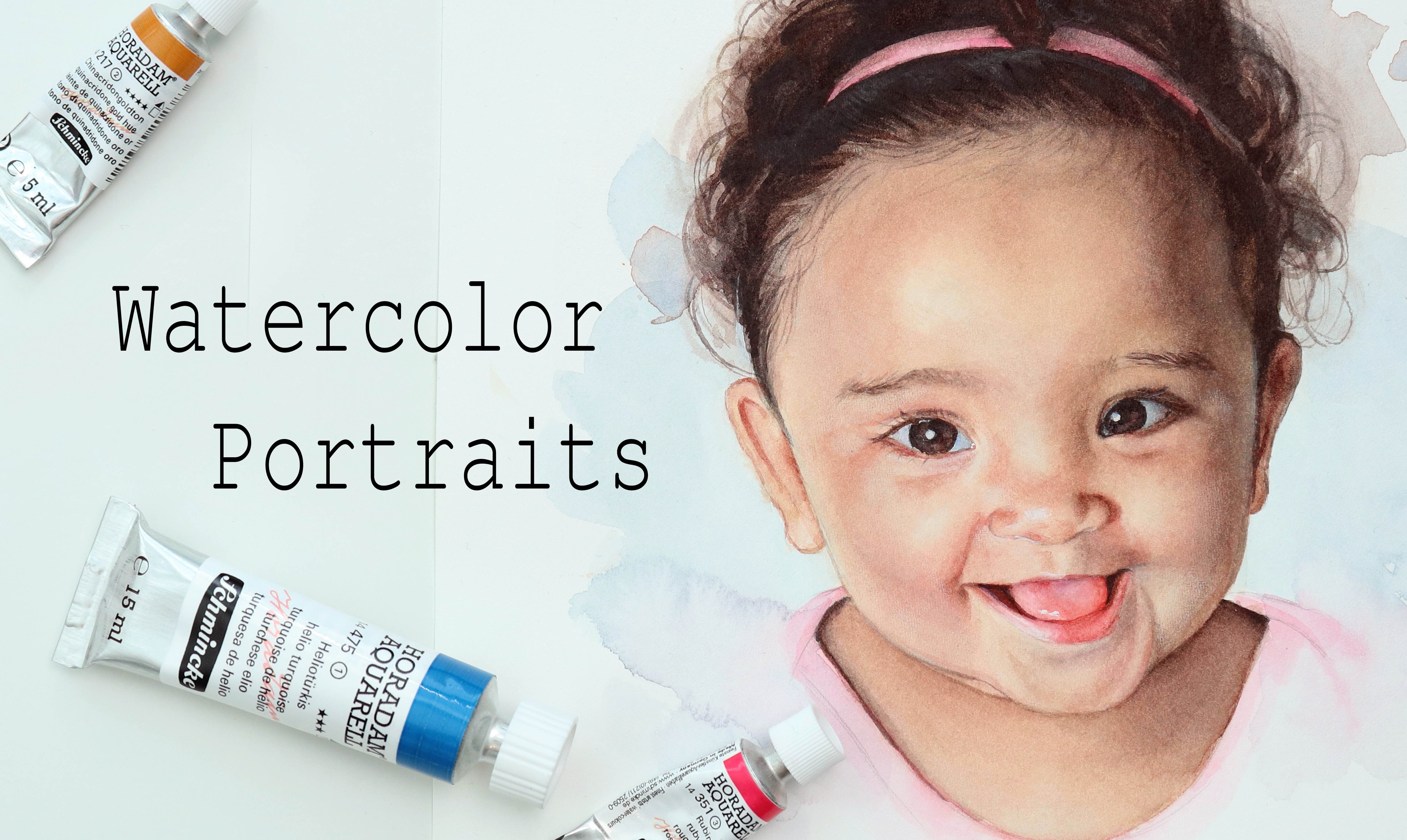
1. Intro: Portraits of one of my
favorite subject to paint and the eyes are always my
favorite feature on any face. They can display so
much emotion and they can tell stories
all on their own. Hey, there on Tanja. I'm an artist based in Denmark. And in this class I wanted
to try and provide you with some techniques for painting
aged skin in watercolor. We will go through
the supplies we need. Go a couple of basic techniques and I'll
show you how you can apply these to painting
lines and wrinkles. And I'll take you through the
process of painting and I, which will kill us a chance
to practice these techniques. I do have a series of other classes for painting,
want to call portraits, covering everything
from sketching to color mixing and rendering. This class will be the first of a few classes covering
senior portraits. And though it will help to have some experience with
watercolor for this, I always encourage you to join in no matter
your skill level. If you're upward, join
me for this class.
2. Supplies: Let's take a look at the
supplies for this class. You're going to
need Watercolors. All you need is your
three primaries. So some version of
red, yellow, and blue. But we'll get back to
this in the next lesson. And in addition to
those primaries, we're going to need
one more white gouache or white watercolor. You will need a
palette for mixing. I'm using this
plate, but you can use any palette you have. You'll of course need some
watercolor paper as well. I'm using hot pressed. I most often tend to
use Fabriano paper, but for this class
I'm using Saunders. The hot pressed
version of this has more texture than my other
hard pressed papers, which in turn will give
us more working time, though not as much working time. Ask with cold press papers. You can use any
watercolor paper you have unfilled comfortable
working with. If you're working on a
loose sheet of paper, you may want to use
masking tape for brushes. I'm going to use
these by clear TMA. I apologize, my Swedish
is a bit rusty. I recently bought these. I'm going to use this as an
opportunity to test them out. They're meant to be sympathetic
or for Kolinsky brushes. But all you want is a couple
of brushes which will allow you to do both
washes and details. You can use any and this menu is few
brushes as you'd like. So grab your favorites. I'm using a number
12 and a number six. I also have this brush. I usually use a separate
brush for picking up paying form the
watercolor pens as well as do a lot of them
mixing just to avoid wearing down the fine
point on my other brushes. But this is optional. You will need a
pencil for sketching. I'm using my point to
mechanical pencil. And then an eraser. If you have a kneaded eraser, that's always useful, but a normal eraser
will work as well. This is not an
absolute necessity, but for small portion
of the class, I'll use this Watercolor
eraser sponge. To be fair, though I haven't
tested out my theory. I suspect that you
could use one of those magic eraser sponges or a similar looking
sponge in step. Either way, it's not
an absolute necessity. Last but not least, we'll need some water, some cloth or tissue to wipe our brushes and tissue
to help lift paint. And if you're wiping
your brushes on a cloth or Iraq like I am. We can also use a tissue to help remove more water
from our brushes. Let's get right into it.
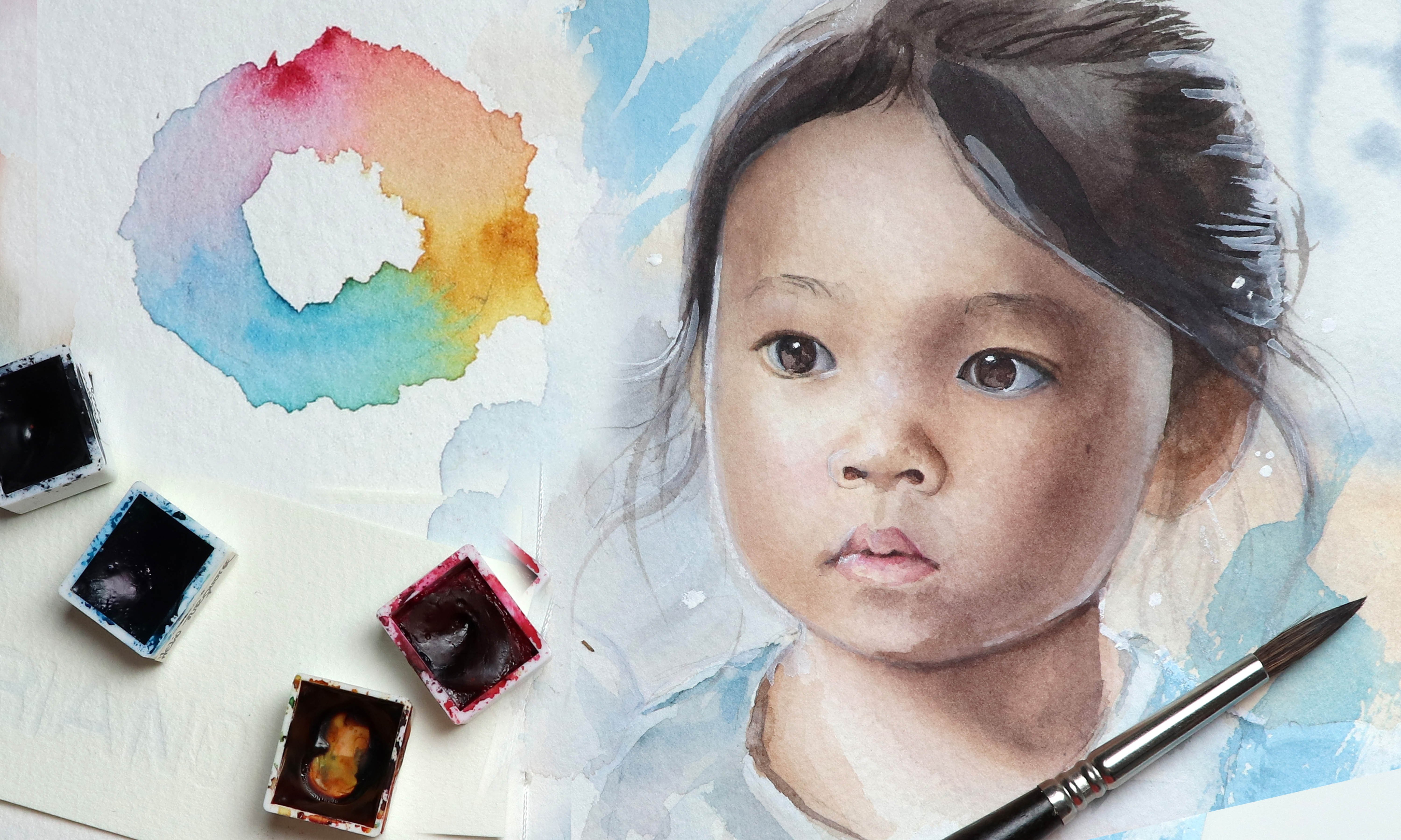
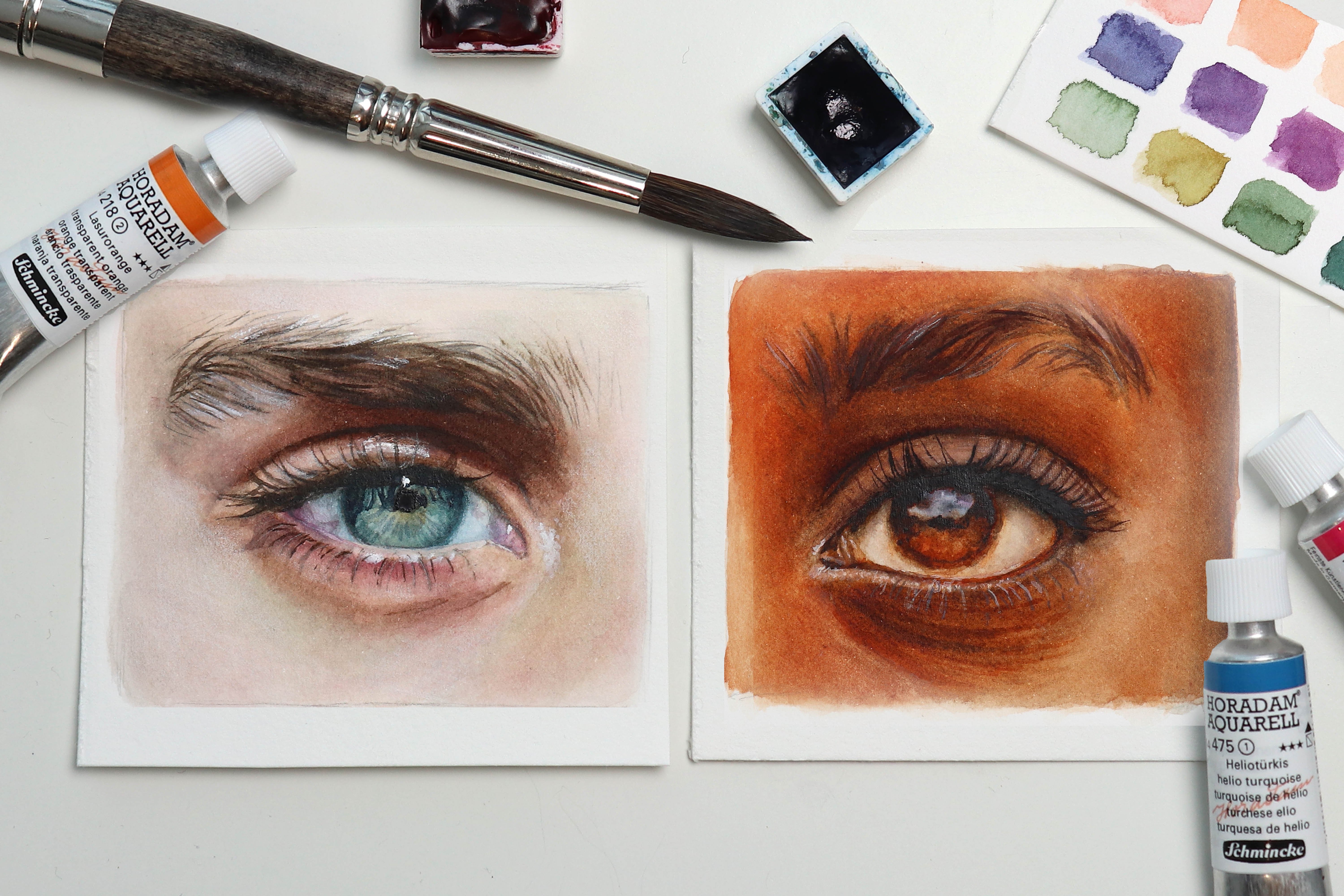
3. Color palette: Let's pick our color palette. In this class, I'm using
Holbein paints be can use any brand you have an
use similar colors. Grab some scrap paper. It doesn't necessarily have
to be watercolor paper. We just wanted to be
able to see the carlos, how they behave on the paper
is not important for this. I also have a class
on mixing skin tones, so I won't take up your
time with color theory. What we're going to
need some version of a red, yellow, and a blue. If you have on the
three primaries, you should theoretically
be able to mix any color. If we take a look,
I'll reference, we're dealing with some
nice warm lighting. And he's definitely got some
pink tones in his skin, which is common with fair skin. So if keeping that in mind, let's begin with the red. We can use a magenta
or something similar, but I want to keep
it nice and warm. So I'm going to choose quinacridone Scarlett
from Holbein. This is an odd but really
beautiful, pure red. And I believe the pigment
used is PR TO nine. If you want to have a look in the brand that you're using, it's a warm red, but it also manages to create
beautiful pink tones. Then for the yellow, I want a golden tone because we've got that warm lighting
and we don't really have any areas on the
reference of look like pure, bright, more clean yellow. For this, I'm going to
use quinacridone, gold, which is one of my favorite
yellows for skin tones. It just has such a nice
sunshine feel to it. If we mix those two
together and what I found, we already have good
base for the skin. We also want a blue,
not only because his eye is reference, but it'll allow us
to mix neutrals, tone down that skin
to unmixed and pull it into a more green hue, which we do have in some
of the shadow areas I'm going to go for at phthalo
blue, this is a cool blue. You don't have to stick with either warm or cool palette as long as you test out
the cause and see if you can mix a cause and
change unique you're good to go with this will definitely be able to get
some beautiful peripherals, even though we don't
really need that for this painting
when maybe this is not the best spot
to demonstrate that since there is
yellow in this mix, we can also create
beautiful greens. So this is overall a really
nice tree you to work with. Definitely a very
versatile palette. I highly recommend that
your tests obviously could cause to see if you're able
to mix a different costs. We can see in our reference, you can of course, always
bring in additional colors. But using a limited palette
like this is a great way to ensure that none of the costs
you mix a going to clash. And the more different cause and pigments you bring into the mix, the more difficult is to
keep the cost clean looking. So let's try. For a
light skin tone mix. We could potentially use
watered-down versions of the red or yellow
or a mix of the two. If we mixing some blue, we can get some nice
neutral skin tones which will be great
for the shadows. And to make the column mixes
less bright or saturated. If we add a small
amount of yellow to the blue and
then add some red, we can make a
beautiful muted blue, which will be perfect
for his eyes. Depending on the
amount of each call, we can create a wider variety of Brown's as well as
grays and blacks. In order to mix gray
or black just makes purple and add in a
small amount of yellow, more red, and maybe even
yellow will give you at Walmart gray or a small blue will
give you a cool gray. More yellow and red and less blue is a good starting
point for browns. Though you can mix browns that are heavier on the blue and yellows to take the time and
just have FUN mixing costs. Being strung a color
mixing will be great skill to have no matter
what you're going to paint. And it's one of the best
ways to get to know your paints and what
they're capable of.
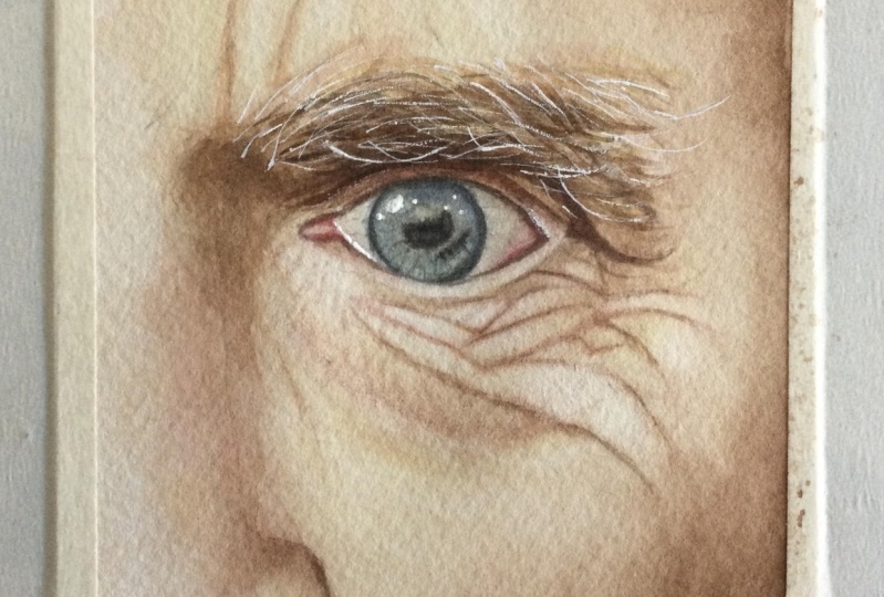
4. Eye; sketch: I don't want to
spend too much time on the sketching in this class, but I still wanted to quickly take you through this pot to show you my thought process
and how I break down subject, I'm going to draw paint. If you'd like more
detail on this, I highly recommend you
to check out one of my sketching classes as I showed different methods of measuring
angles and proportions, as well as working with shapes in order to break
down your subject. So for this one, I'm starting out by
looking at that angle between the inner and
outer corner of the eye. And I'm matching that off to give myself a starting point. We can then take a look
at the basic almond shape of the eye and also
attach that a corner. And you can use your pencil, check as many of the
ankles as you'd like. When placing the iris. I'm not only looking
at the iris itself, but also the shapes of
the white of the eye. Notice how the bottom
waterline has a slight dip. And then where the iris
is relative to that dip. Same for the waterline itself. We can see approximately where on that inner
Cournot stops. And we can then
follow that curve. Before we start
worrying about details, we want to get the main
proportions in place. So the placement of the
eye, eyebrow, etcetera. And can then begin
breaking everything into smaller and
smaller sections. If you're unsure of how
to know how thick to make the eyebrow eyelid or
really anything else. Use something you've already sketch to measure
the proportions. So for that bag under the eye, we can try and figure out
the distance compared to different proportions
within the eye itself. I found that the edge on that top waterline and
down to the bottom edge of the lower waterline is
about the same distance as from that bottom edge
down to that shadow line. I also found that
the distance from the inner corner to decrease
near the outer corner is approximately the
same distance as from the inner corner down to that blind near the bottom
where the gnosis. Once we're happy with
the main proportions, we can go over everything
and to find the shapes. But what I wanted to show
you in this class is mostly how I sketch out
the lines and wrinkles. We know we have this
back of fold on the VI. We still want to break
this down further. So what we can do is look for other prominent
lines or shapes. And if we look at that
line that comes out from the crease right here,
it's very noticeable. So we can sketch that out
looking at the ankle. And we can also place our
pencil horizontally to see where the line ends relative to something
we've sketched out. Now we can look at the line
right below it and we can see not only where it comes out from that
bottom waterline, but also the shape that is
formed within these lines. From there we have a line
very close to the waterline. And looking at the angles, we can bring this down
into a triangular shape. We will also cut
a line that comes down and crosses that main line. And really that's
all there is to it. We want to break it up into
smaller and smaller shapes. Have added my sketch to the Projects and Resources
tab if you want to use mine. And you can also make and use your own sketch if you want. Once you're happy
with your sketch, you can clean up the
lines and whether you've made your own or you're
using my sketch, you can use a kneaded eraser
on a standard eraser to gently lift some of the graphite if your pencil
lines seem to dock. Okay, well, let's move on to the faun pot and get painting
5. Basics; controlled shading: For my basic setup
when painting, I have my paper on a
slightly tilted surface, my pellet, and after
the side right here I have my water because
I'm left-handed. I have my cloth for wiping
my brushes and tissue if I need to live pink or remove
more water from my brushes. And then I of course
have my brushes radius. Well, we're going to go a
couple of basics and I'll show you how you can use
those techniques for painting lines and wrinkles. You can find these sketches in the Projects and Resources tab. You can also sketch your own On creates a reference picture if you want to make sure that your sketches are exactly right. Mine are not
perfect, but they're good enough for what
we're doing here. Let's get some paint
onto our palette. I'm going to mix
up a random brown. You can use any color of
the rainbow for this, but neutrals tend to be good
option when Painting people. If you're new to
want to call out on you to painting portraits, you may want to take
a look at some of my other classes showing
basic techniques. Mixing skin tones are
other portrait classes. But the two main techniques
we'll be using to apply paint in this class is wet
and wet and wet on dry. So really quick for wet and wet, you can either what your
paper using clean water, apply a wash of
paint or pigment, and pick up more paint. In this case, I'm
using a darker, more neutral version of this color and add
that to your paper. This will ensure that the line between the two cars
is going to soften. And depending on how
much water is precedent, the pigment will
spread more or less. In this case, that X is just softening because
they don't have much water in my original
wash nor in the pink mix. And I didn't have much water in my brush to begin with either. What you don't want
to do with a wash like this is introduce more water than what is
already present on the paper. Right now at this
paint is slowly settling and drying of
just rinse my brush. And I'm thinking, actually, I want to just blend this
out a bit more because my brush now contains more water than what was present
on the paper already. It's going to want to spread
because what I social like that water will move to
where there's water. Answer, it's going
to push the pigment away and create blooms, which can be used
as awesome effects, but it's not what we're
after in this case. Instead, once you've
applied to wash, just let it dry completely
before going back in. And if you absolutely have to go back and remove water from your brush so that your
brush and paint mix has less water than
what is on your paper. We can then go back and
carefully do whatever it was we felt was so important
that we couldn't wait. But generally speaking, I
recommend that you wait. And if you're impatient, just use a blow dryer. And if you don't
have one of those won't sit on your
hands. I don't know. Wet on Dry apply a wash. I'm not doing the best
job here, but it's okay. Then leave that to dry. Once dry, you can do back in
and not only are all wash, rinse and wipe off your brush, and then blend out
that edge if you want. This is great. If you want to be able to control the watercolor, especially for fine details. Let's try and use
this technique for adding some quick
shading to this I. Using wet-in-wet, we can apply
all wash more base layer. Then while that is still wet, pick up some more paint or
pigment and drop this onto some of the areas where we see darker values in our reference. You don't have to be neat. Wipe sacked. We just
practicing in this class. Then still, while it's wet. If you feel the pigment
isn't spreading enough or the edges aren't softening
as much as you want. We can clean, wipe our brush and then use a damp
brush to clean up those edges all to lift or shape the pigment where
ever we may want. Then leave that to dry. Then for the mock
controlled shading, Let's go in Wet on Dry. For this step, you
don't want to have much water precedent
because then the paint will continue to move and flow
around on the surface of the paper and it won't stay in place and that's
not what we want. Pick up some paint and add this to each individual shape online. Rinse and wipe off your brush
and blend out the edges. If you're working
with hot press paper, you're going to have
to work faster than if you're working with
cold press paper. You want to go back in and blend those edges before
the paint sets. If you're working on an actual painting and not just a small exercise or study, you might want to be
careful when you've got shapes close to
each other like this, because if some of the
freshwater from one accidentally moves into one of the previous shapes
before they've dried, it could cause blooms to form. Have a go at using this
technique fighting shading. So some of those wrinkles. And once you're done, we can
move onto the next exercise.
6. Basics; soft shading: With wet in wet, it is possible to
use a technique to paint something
with more detail while still taking advantage
of the fact that the pigment is spreading and
our lines I'll softening. The way to do this is
with water control. There are three places
we can have water. We can have water in our paper, in our brush, and
then I'll paint mix. So as an example, if we have Wet paper and I'm just going to make
this nice and wet. And we then go in
and we have a lot of water in our brush
and paint mix. It's difficult to use this for creating
any type of detail. You can also be difficult to control where and how
the pigment moves. At least for small
space like this, it would be great for backgrounds
on large-scale stuff. Now, if we eliminate most of the water from
one of those places, in this case, let's
remove water from our brush and we pick
up that same pink mix. Even though this paint
mix is very watered down, it's already a lot
easier to control it. And if we eliminate some of the water in our
pink mix as well, we'll have an even
easier time getting some more defined lines are details even on that
same Wet paper. If you want, you can
use this pattern to practice what your paper go
in with a wash of color. And then while that
paper is still wet, use paint that contains
more or less water to practice water
control by getting to know how to adjust
the water in order to make the paint behave
the way you want. Practice getting
both more soft and spread out as well
as more fine lines. This is a powerful technique
for painting wrinkles. Another way of creating
texture is by lifting. Again, working wet in wet. Let's apply a wash off paint. This is a fairly she'll wash so it may not have much effect, but take clean wipe off or damp brush and use it to go
in and pick up pigment. You can also use tissue or even a Q-tip for more
controlled lifting. But this is a great way
to help add texture, create highlights,
all correct mistakes. So let's try and add some
shading to this second I, just like in the
previous exercise, we want to begin
by adding a wash of color and then go straight in and deepening some of those more general or larger shadow shapes. While the paper is still wet, start adding some of
those more final lines. You can control the
amount of detail not only by testing the water on
your brush and pink mix, but the more dry the paper gets, the better it'll hold
onto the small details. Just be careful to
not add more water than what is present
within the paper already. If you have areas where the pigment isn't
spreading enough, you can soften it up gently going forward with a damp brush. And when you're ready, we can
move on to our final study.
7. Eye; base: Let's get started. We're going
to start out with the eye. So let's mix up a warm gray. I'm mixing a purple
and then adding a small amount of yellow
to neutralize it. It doesn't have to be perfect. We can glaze over it to do
some color correction later. Just swatching that on a scrap
piece of watercolor paper. It looks okay, so let's wet the paper to help the pigment spread
and then even layer. And I'm also wedding
the outer portion of the iris because I don't want a hot edge between the iris and the
white of the eye. You can wipe your brush
to get rid of Xs, what I've needed, and pick
up and apply the color. Once dry, you can
go in again and add some more paint under
the top eyelid, as well as add some
light shading to the outer portion for the shading and
placing the color and Quickly cleaning
and wiping my brush. I then go back
into blend it out. In terms of value. Ideally, you want this
layer to be slightly lighter than what you want
on your final painting, just so that we have some
room to make adjustments. Let's mix up blue for the iris and we want a
fairly neutral blues. So in my case I'm just
adding blue to lift or gray and using
that as a base. Not quite happy with that. So I'll add some more yellow. What the paper and
apply the paint. My paper is still not completely drying the white
parts of the eyes. So this could go
wrong and I could risk having some
pushback pigment. But I might allowing
that blue to ever so slightly bleed out into that gray color because I want that nice soft edge
around the iris. I do recommend letting the
gray color Dreyfus though, just so you don't risk pushback of pigment on Bloom's forming. While that's still wet, we can make some more, but with less water
precedence so we can get a darker value and it won't
spread as much in the paper. We can then use this
for the outer ring, as well as to mark off some of the shading and details
within the eye. This does not have
to be perfect. We will go back in and
finish the eye near the end. But again, I'm leaving
the iris attack lighter than what I want in the final painting to make sure there's room
for adjustments. I like starting out by adding some paints with the
eyes because it really gives you a sense of how dark we need to go with the
rest of the painting. Especially since we usually
think of the white of the eyes to be lighter than
the value of the skin. But that's not always the case. You can save the rest of
the blue if you want. But because I'm restricted to this small space on my
palate when filming. I'm going to get rid
of this for now. For that inner corner,
we can make some red and a hint of yellow to get a nice flesh tone color and
add that to the Painting. Then mixing in some more red and some blue to
help make it darker, slightly more
neutralized version. We can use this with
deeper tones right here, between the white
and the fleshy bit. Finally, before it dries, I'm going in with a
clean wiped off brush and lifting some of the pigment to get a lighter value here, like in our reference. Let's get started with the skin. Mix red and yellow and add in
blue to help neutralize it We are aiming for
warm flesh tone. You'll probably
hear me say there's a few times throughout
this class, but you don't have to
worry too much if you call it doesn't match the
reference completely. All mine for that matter, we just want an
approximate color later. If you're not quite
happy with the color, you can always glaze or to help push it in the
right direction, trying your best and use it as an opportunity to
practice color mixing. The more we paint,
the better we will becoming not only
mixing the cause, but also at correcting them. Besides cause, I'm not as
important as you may think. If you focus on having
the right values, you can get away with a lot when it comes to the color choices. Who's to say that
we can't change the lighting or the
hue of our reference. It's all painting. There are no rules. Now what your paper
and make sure it has a nice even sheen. We're going to start working on the lines that we
have in our sketch. I'm using tissue to help
get out some more water out of my brush because when
there's less water pressing, the pigment won't
spread as much. And we want to be
able to maintain at least some detail
for this next layer. We can then go in and work
our way through the painting. I like to start in an area. Why no, we have to go darker just to test out the
strength of the color mix. And once we know
it's not too dark, we can add paint to some of the lighter and more
delicate lines. You don't have to be super
accurate with the step, but we do want to
be fairly neat, especially on the
skin below the eye. Usually when painting
with watercolor. If you have a pencil sketch, for every layer of watercolor, you at the pencil sketch usually becomes less
and less visible. But because watercolor
is transparent, and we're making these
lines with Watercolor, they will at least to
some extent remain visible because with every layer of watercolor we add on top, these are going to
darken slightly. You can also darken
that shadow area below the eyebrow
and onto the eyelid. And for this, I'm
cleaning and wiping my brush to blend out that edge. Then using the tissue to get rid of the water again
before continuing. If your paper starts to dry to the point where the
pigment no longer spreads, just let it dry completely and then re-wet it in
order to continue. You don't want to
stress, we want to be able to enjoy the process. So what at your own pace? For the shadow shape
that comes down from the tail end of the
eyebrow and down here, I'm making sure to not have
too much pigment on my brush. The lines haven't
yet fully dried, so I don't want to
use too much water, but I will be going
back in and defining those lines to make sure
they don't get lost. For most of the pink
mixes on my palette. I'm not adding too much water to the paint mix itself
because I want to be able to control the
amount of water present using mostly my brush. And in terms of how I know
when I'm happy with a color, when mixing, a lot of it
comes down to experience, but something that helps
is that when swatching, swatch it approximately in the same value you want
it to be on the painting. You may even need to
glaze a couple of colors on top of
each other to see if you're comics this work together the way you want them to take your time and spend as much
time on mixing as you'd like. Don't rush it. Color mixing is one of the most valuable skills when
it comes to painting, and especially with watercolor, where you can always go back for the shadow up on
the tumble forehead. I did add a bit
too much pigment, so I'm just wiping my
brush and blending it out. Whether you choose to
just wipe your brush or rinse and then wipe your brush
is completely up to you. Whatever method
suits you the best. In my case, it kinda depends on the situation and also on how much pigment is
left in my brush or how much pigment got out of
my brush when wiping it. As long as the paper is wet
and we're working wet on wet, it's usually easier to
lift the pigment if you do end up accidentally
staining it. Whereas if you're
working wet on dry, it's often better to
rinse my brush first Now it's a good time to
start thinking about the eyebrow and you
have a few options. If you want, you can use masking fluid to mask off a lot of the Harris that you want to be highlighted before adding
paint to the base. I'm going to use gouache
for those Harris. So in my case, I'm going to go straight in
and get started on that base. I'm first using some of
our flesh tone mix to add few strokes where
the skin is visible. This does not have to be neat. It's just serving the
purpose of creating some transition between
the skin and the eyebrow. We can then make some brown. I'm making it a bit heavier
on the blue and yellow. I don't want it to be green, but when looking at
can reference it is leaning in that direction. We can use that to cover the rest of the base
for the eyebrow. Then go back in and add a
few additional strokes. Again, we don't have
to be very neat, but we do want to try and follow the direction in
which the hair grows. And we also don't want
to make it too dark. We just don't want an empty
space with whitepaper as that can look quite distracting when the I-bar is so prominent. I'm going to get rid
of that paint as well. But feel free to save it if you have the room on your palette. Now let's get some paint
onto the rest of wallpaper so we can let it dry before
moving onto the next step. We want to mix pretty much the same skin tone we
were working with before. And if it's not quite
at the same, it's okay. Remember, we don't have to worry that much about color mixes. Wet your paper than
going with the pink mix. Wherever the lightest
areas on the skin, we want to apply a
super thin wash. And for some of the shadows we can add a more saturated Watch. You can follow the
curve down along the cheek and up near
the site of the nose. And we can deepen the shadows
under the brow at bitmojis. While this layer is not going
to make a huge difference, but we are picking up on a few more shadows and slowly starting to
build up the mid tones. Once you're done, let
it dry completely. And when you're ready, join
me for the next lesson.
8. Eye; deepening values: Okay, We're going to go
with the skin again to get some more color on the paper
and build up the values. First color, we're going to mix a brown or deep flesh tone
for some of the shadows. And shading. The
shading on his face has a golden hue leaning
a bit to what screen. So from my brown I'm using
a decent amount of yellow. Then adding the blue, not enough to make it green, but enough to turn it down a bit and make it more neutral. Because he's also got a
lot of red in his skin. I'm mixing red into a
portion of the brown mix. Bringing in a lot of
these different colors on cues that we see is going to give the skin
a lot more depth, even if it is subtle. You can then wet the paper, but avoid the eye. You want the paper to
have that even sheen. Make sure to add enough water to allow for more working time, but not so much that you
end up with pools of water. I'm removing a lot of the water from my brush because I want to be able to control
where the pink flows. You may prefer to have a bit more water precedent
that's up to you. Whatever you feel is more
comfortable to work with. We can start with this
deeper shadow area up under the brow to
test the strength of the color and still
keep it a tad lighter than what we want on
our final painting. We can pull the shadow
out onto the side of the nose and down
here into that fold. And then for some of
those lines in this area, we may want a bit more red. For the most part,
I'm not rinsing my brush in-between picking up the different column mixes, I'm just wiping it to get rid of some of the leftover pigment. If you have a lot of
paint in your brush, you may have to rinse
your brush more often. Or you can add paint to all of the more golden
shadows first and then senior brush and go
in with the red tones. Because there's not
a lot of water. My brush now and my pink mix, I do have to go back and pick
up more color more often. So when loading my brush, I'm spending that time
looking at the reference to decide where to place that
next load of pigment. I'm also working my
way up into the brow, just a few strokes, but
nothing that's very precise. I'm allowing a lot of
this class to be in real time so you can see exactly at what
speed I'm working. So feel free to
speeded up if you think I'm too boring, It's okay. I understand. You won't
hurt my feelings. Only a little bit. Of course I am cutting
out parts where my hand is inactive
or bit-score. I'm wetting the paper because I feel we know how to do that, but I'm very curious to know if seeing it at the speed is
something you find helpful. And then I'm starting
to really look at the value changes
in the reference. As an example, at this point, we've got a lot of
very light values. So if we take a look at
the cheek and treat bone on the reference right next to the eye on our right-hand side, the lightest value of
the skin is darker than the lightest value on the cheekbone as we
move down the face. So we want to add some paint
to this area to pull it back into the shadows so it
doesn't stand out too much. Likewise, we want to deepen the skin on the left-hand
side of the cheek as well. But here I'm going to
rinse and wipe off my brush and then pick
up some pure red, making sure it's
not very saturated. I'm going to bring this
onto the skin carefully, placing it in small strokes. The Wet paper is
going to help spread the pigment so it
won't look streaky, but I'm being very cautious
of not overdoing it. I'm also using some
of that red on the water line and using tissue
to keep that edge clean. We can also add some red
to the nose and forehead, really anywhere where we
see more red in the skin. Just be careful to
not add too much. Now that the papers no
longer quite as what I'm going to switch to
my smaller brush to give me more control. I'm going to look for a
few of the smaller shapes, but not the fine
detail just yet. So up on the eyelid, we can add some paint to
show where the lashes go. Because even though we don't
really see the eyelashes, we can see a subtle
change in value. We can also deepen the value off the crease as well as some
of the deepest shadows. And I'm going to deep met
further in the upcoming lesson. This will still help add some
form to the eye of faith, which in turn can
help us see where we need to add more paint
or make adjustments. When adding the
different details and enhancing a lot of these
different shadows with helping divide the phase on this eye area into smaller,
more manageable portions. And I talk about this a lot
in my different classes. But dividing the face
or whatever you're working on into multiple, smaller shapes makes it a lot easier because you can sewn in onto one small section at a time and not worry about
all the surroundings. We can deepen the shadow
on the side of the cheek and don't mind the fact that
I'm using this small brush. It's not the most
logical choice, but it'll still
get the job done. Sometimes you're just
enjoying painting so much that you forget to use
that knock enough yours. I can't be the only one. My paper is too dry for the pigment to spread
at this stage, I'm going to mix up one
final color for this lesson. We want a nice warm flesh tones. I'm adding red and yellow to
some of the existing comics. And if you don't have any other previous column mix left, oh, I've just add a tiny bit of
blue to tone it down a bit Wet the entire painting,
including the, is the color within your eye is more cool tones
than in the reference. We're not going to change
the eye dramatically, but the white of the eye is reflecting some of the
warmth from the skin. So I want to bring in
some of those same tones. I'm going to bring this mix onto almost every part
of our painting. I'm trying to get a more
saturated wash in those shadows and a share wash on the parts of the skin with the
lightest values. But we just want to warm
up the whole thing. I'm not adding much paint to the lightest point
out the cheekbone, a few places on the forehead, down the center of the nose, and the skin under the eye, including the water line. Because we want
to make sure that these areas are still
lighter than the rest. Just work your way
through the painting and app paint where
ever you see fit. Look for the value
changes in the skin. Even though we're
mostly just trying to warm up the skin
tone at this stage, we are still deepening
the value slightly due to the nature of the
Watercolor being transparent. For the lines are wrinkles
as well as some of the skin right under the
I am going in with red. I'm not rinsing my brush. I don't mind if we
still get a trace of that other comics because we don't want that skin
to be pure red. But when looking
at the reference, the skin and Lines
in this area appears more red than a lot of the
skin in the surrounding areas. So we want to try
to capture that. Ready to start adding some
details. Let's move on.
9. Eye; finishing eye & brow: Let's finish the
eye and eyebrow. Going back to the white
of the eye and the iris, I'm going to mix up a
neutral color and I'm not quite sure how to describe
this other than mod, I want that earthy shadow
color almost like a gray, olive green on the color of
dirty water from a lake, which doesn't sound nice, but nonetheless, that's what
it's making me think of. Of course, the call you want may vary slightly depending
on your painting. But don't be afraid to
experiment with just practicing. Then for my second color mix, I'm going to add some
blue to this mix to get a more muted, dirty blue. We can then Wet out paper
and we don't have to add a lot of water
because we don't want the pigment to spread
all over the place. We want to maintain
some sense of control, but still be able
to get soft edges. I'm adding our murky
lake water mix to the white of the eye
on that right side. And then switching to the
dirty blue for the iris. I know I should not be in
charge of naming paint costs. Keep an eye on the edge of the iris and use
a clean wipe off brush to help lift or shape the pigment if it bleeds out
into the white of the eye. Before moving onto
the left side, I'm rinsing and wiping my brush, adding some of our lake
water mix rinsing. I'm wiping my brush
and then blending that out because my paper
was not wet enough, go on the side for the
pigment to spread. While the paper is still wet, I'm going to add in some
pure red to try and capture the slight redness
I see in our reference. Placing it here on that outer
portion of the right side. And then near the inner corner. Then using a tissue
and just taking out most of the
water from my brush. Then going back
in with our dirty blue and deepening some of
the values within the iris, as well as adding a few details. My paper is still wet enough
for the edges to soften. If your paper has
dried too much, you can re-wet it onco in Wet on Dry and blend
it out manually, whichever method you prefer. Those details within the iris, I'm looking at the
value changes. So up near the top we
definitely have some of the target values due to the
shadow from that eyelid. I'm also adding some super
fine strokes because we do have some detail or
texture going on as well. At this point, my paper is
very close to being dry, so this is a perfect
time to add the pupil, mixing up a black
or dark gray and using that for those
Final back details. It's up to you how precise
you want this to be, as long as we'd get the
general look, it's all good. Again, I'm going
to wipe my brush, pick up our lake water mix, and use this for the
darkest values at the top. As I'm moving to what's
the inner corner, I am picking up some red as well to warm up the mix a bit. I'm rinsing and wiping
my brush and using the damp brush to
soften these lines. And for that lower one line, I'm using what tissue
to help lift some of the pigment as it got a bit
calmer than what I'd like. Finally, before adding
the highlights, I want to deepen the
value of parts of the iris and more
just a tiny bit. And I'm using the
dirty blue for this Take your white gouache or white watercolor and add
some to your palette. We can use this to add the highlights for the
brightest highlights, you can go in with fully opaque
gouache and feel free to go in with a second
layer if it's not quite bright enough
the first time round. And then if we allow the gouache to mix with
the moisture in all brush, we can pick up some of the less prominent
highlights as well. Okay, let's tackle the eyebrow. We're going to mix up
a deep brownish color, like the shadow color
we see right here, as well as in the deep
tones of the brow itself. The column mixing is similar
to our murky lake color, but with more yellow and
a hint more of the red. I know I've already said this, but don't stress too much
when it comes to color mixes. Focus on the values
and you can get away with a lot in
terms of color. I'm going to be
using this color to also paint some of the
areas of the eyebrow, which should maybe
be painted with a lighter value or a slightly
different color mix. But I want to show you
that it's okay to have it be close without being the same, even if that means it won't look exactly like the reference. We want to come in and pick up on some of the shapes we see. And again, we don't
have to be too precise. I'm sure this gentleman
can forgive us. And quite frankly, sometimes
life's just too short to worry this much about the details of a
stranger's eyebrows. If some of the hairs or shapes stand up to you tried
to capture those. But for the most
part we just want an approximate gist of
what we're looking at. When it comes to
eyebrows and portraits. The most important thing
is the overall shape. Second will be the values, because how dark or
light someone's, I've always change their
appearance dramatically. Once we have that,
we can go in and add a deeper or more saturated layer and get some of that paint
onto the skin as well. Because seeing as how much
the brow dominates this eye, we really need to get
those shadows in, in all of these to
get the right look. We can work this color right under the brow and into crease. I'm also going to use it to D1, the upper lash line. And then we can go back
into the Froude self and pick up on a few of
those people values. This is where if you want to follow that reference
more closely, you may want to be careful
adding this much of this more muted brown
and use a lighter, more yellow or
golden toned comics. So once we have that
switching to my big brush, we want a slightly
more golden brown. So I'm adding yellow to
the remaining comics. We can then go in and
pick up on some of those Final lighter
values in the brow and pull this color out
onto the skin as well, both near the corner or
on the side of the nose, as well as on the right side where we have that shadow shape moving from the brow and down below the right side
of the eye itself You don't need much water
in your brush with this. But if you do end up
with some hard edges, you can use a clean
brush to blend that out. We can also add this call to
the eyelid and you can see how much getting
these darker values in French form the painting. Remember when we started this painting and how
dark the white of the I looked when there was no other color on the
rest of the paper. I love how putting
costs into contexts can alter the way we
look at them so much. And it's the same with any
painting we need the context. In this case, with this
portrait or this eye. We need those dark shadow tones to make the rest look right? It's amazing how much adding these final shear
washes all layers of paint can change
the whole picture. Well, painting, I guess the
small tweaks at so much. So even though we're not
trying to make it perfect, It's still worth
taking some time to at least get the values
somewhat correct. Watercolor paintings often have a reputation for
being quite light, but don't be afraid to go
in with those dark values. Let's go back and
pick up hogwash. This is optional, but
I'm mixing some of the remaining watercolor into
the wash. And the reason why is just to tone down the
white for this first layer of hair that combined with
the water in my brush, will make the color quite sure. This way we can build up the texture and
practice adding hair almost like a warm-up before we go in with the more
opaque strokes. But again, this is optional. And you really won't see this too much on the final painting, but it is still going
to add some texture. Then we can go in with
the opaque gouache. You don't have to add each
individual highlighted or white hair you see and reference unless you really want to. All we need to do is look at the reference and see if
some of the hair stand out. And for the hairs
that do stand out, just trying to get
the approximate shape and placement in. And then for the
rest of the hairs, we can go for a much more
estimated placement. Instead of necessarily looking
at each individual hair. Try and see where in
the brow you have more highlights and where we have more of the ground-based
showing through. At this point, you'll
probably be able to see what I was talking about with my comics been too dark
for parts of the eyebrow. And we can definitely point
out areas that a backup, I don't quite match
the reference. We can paint more of
these highlighted Harris using quash to
help correct that, or even lift some of the
pigment from that base. But it's not
something we have to worry about if we don't want to, because it brow really
isn't all focus for this. Now, we are painting
these Harris with white, but when looking at the photo, they're not bright white. So what we can do to
turn them down is to glaze over them
with some watercolor. I'm mixing red and yellow
to get elect flesh tone, but you can also create
a more yellow mix. And then once a quash
is completely dry, you can use this and lightly go over the brow with your
brush to tint them. We want to be careful
and barely touch the paper so we don't re-wet
and spread the gouache. Alternatively, you
can, of course, premixed watercolor
into your gouache before painting the Harris. But this way you'll be
able to see exactly which hairs on which areas of the brow you want to tone
down more than others. Feel free to go back-and-forth and make adjustments
if you'd like. And when you're ready, let's finish up the rest
of the Painting.
10. Eye; Final details & class project: We're almost done. Let's finish the skin. The very first thing
we're going to do is just give the side of the cheek or head more shape down here
in the right corner. I'm not going to
worry about the hair. We see further up. And I'm not going
to add a whole lot of detail here either. But without it, The face
is looking a bit too wide, so this will help give
it the right shape. If we mix up a
deed, golden brown, we can use this to go
and mark off where the side of the cheek
and cheek bonus. We can add some
shading to both sides, pulling some of that paint mix onto the lower portion
of the cheek as well. Having this detail down here isn't as super important step, but it is going to help
frame the face on Al-Qaeda, frame the cheekbone, the eye and everything
else a bit better at some blue to
neutralize a call some more and use this for some
of the deeper shading. And we can pull some of this
up onto the temple as well. If working up on or
close to the eyebrow, be mindful of the fact
that the gouache will rewet and smudge if we pick
on too much with a wet brush. So just be careful. But I'm still going to
go in and add some of that shading that
I didn't get to add before adding the Harris. In this lesson, although we
are going to add texture, I don't want to spend ages on
it because having to spend hours to complete
the smallest details can get discouraging. So instead, let's lean into the fact that we are
working with watercolor and then allow for more unpolished
or less rendered look. That way. We get to add some texture
without being very precise at all and without spending
too much time on each area. Let's go in and add our
first bit of texture. So I'm going to take
this color and deepen the value up here
on the brow bone. And then right here for the inner corner
in the reference, we have some skin texture that kinda just looks like
a couple of lines. So let's just add a
couple of strokes. Are lines like this. We're not going to
nitpick on the details. We just using our brush to
almost sketch out a quick, somewhat loose impression
of what we see. Because I have a decent amount
of pigment in my brush. I'm going to drop that
down here on the nose, where we do see some of
those deeper values as well. Quickly rinsing and wiping my brush and blending
out those edges. Let's pick up some more paint, but keep the value light so we don't need much
pigment for this. We can then go back up near
that inner corner of the eye and work our way down that main shadow shape
falling the pattern we see, it kinda looks like
little U-shapes. And rather than worrying about each tiny bit of texture
on each Fine Line, we can work just like we
did with the eyebrows and look for shapes or
lines up, stand out. But it doesn't have to be exact. Remember to just
have FUN with it. If you add too much or
too dark of a stroke, clean your brush and use it to help lift some of
the pigment again. Once we get down to the
bottom of that row, we can continue by adding some swift fine strokes
onto the cheek. And wherever we might feel the need to soften
the lines a bit, we can go in with a clean, damp brush to soften
some of those. It just it's all about finding a balance
between not being too precise about it and
not overdoing it. The only way to learn how much it takes to reach
the right amount? To rub off the Band-Aid. And David ago, we're throwing ourselves into
the deep water here. Now of course, if you want, feel free to do some tests on a scrap piece of
watercolor paper. You don't have to do
everything I tell you to. If you're not ready, you can pick and choose
between the things you agree with and the
things you don't. It's your painting you decide. We can also enhance a few of these lines from our
original sketch. If you take a look
at the reference right under the lower waterline, we have some more texture
which really mostly looks like little lines or even some
more small U-shapes. When working in this era, we may want to add some
more red to alcohol OMICS. When we go over the
texture with a damp brush, some of it may almost
completely disappear. And we can choose to
redo it or treated like a happy accident and just leave it with that much
more subtle texture. The coal is not to capture every Fine Line at
every tiny bump, imperfection or
whatever else it could be allowing yourself
to experiment. I'm going to try
and pick up some more of the red
tones in the skin. So we can add some
more red here. Let's get some more
red onto the nose because we do have quite a
bit of red here as well. Rinsing and wiping off, I'll brush and
blending that out. Same for some of the
texture on the forehead, placing the color and cleaning the brush
and blending it out. Now, if we look at the skin, there are quite a lot of little
contained color changes. So to imitate some of this, I'm going to gently
dab the skin with my brush and short
quick strokes. And yes, if you're
thinking it almost feels wrong to beat
this rough and loose. I understand. But when
adding texture like this, the two options that'll often
give you the best result is to either be fairly precise
and carefully place it. Details aren't be more loose and almost random
in your approach. You can also use the same Technique been
On Wet paper instead, if you want these
details to soften and look less painterly, have a go. And if it's not, you, then feel free to use a
different method. I'll leave it as is. I'm running out of paints on
Quickly mix some more brown, and then go in our some of the texture on the inner
portion of the eyelid. Again, at this stage, I'm mostly adding
red to the skin. And I'm also going to
add a bit more red to the lower waterline and right below the inner
corner of the, I. Consider this
playtime, just enjoy the process and have been experimenting with
adding textures. You can go back and forth
as much as you want. But I'm going to
answer the final step. The last one of the supplies
I mentioned at the start of this class is a
Watercolor eraser. And as I mentioned, I suspect that those dense magic eraser sponges
might do the same. The way this sponge works is that it's scrubs the
surface of the paper, thus scrapping off
some of the paint. And you can actually get down often to the color of
the paper if you want. But please note that you ask rubbing off fibers
from the paper. So it may leave the
surface more rough and the paint may not behave
all look the exact same. If you're going On
top with more paint, definitely something you'll
have to play around with. I don't use these often at all, but I want to show to you as an option what can do with it. So I've depleted my water and squeezed out as
much as I could. We can then take
it and going onto the painting and gently
scrub to lift paint. We can use this not
only for some of the brighter highlights
onto correct mistakes, but we can also use it to
further enhance some of those color changes
we're working on before. This is definitely
not unnecessary step, but it is a lot of PFK-1
to play around with. And it can be a very helpful
tool to have on hand. I'm not lifting
much paint at all. Just enough to slightly
like nephew of the spots. For this class, I'd
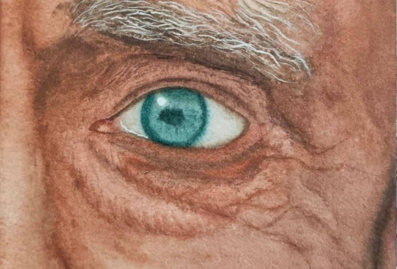
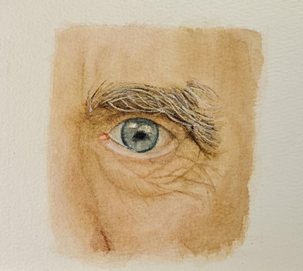
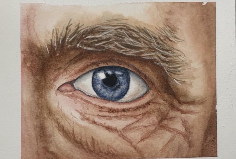
love for you to paint a small Watercolors study that includes the lines and wrinkles. You can use one of
the three images I've provided or use a
reference of your own. But if you share your
project and you're using a different reference from
the ones I've uploaded. Please share it together
with your project
 Tanja Jensen, Artist - Sculpting, drawing and painting