Transcripts
1. Intro: Hi. My name is Kolbie. I'm a self-taught
watercolor artist who loves to paint
wilderness scenes. If you've taken any
of my classes before, you know how much I love to paint wilderness scenes. I have lots of classes on forests and different ways
to create those techniques. Today, instead of doing one
specific landscape scene, I want to talk all about painting different
kinds of trees, and the different uses you
can have for these trees, and how to put
them all together. One of my most common questions
when I post videos to Instagram or when I
post paintings is, can you tell us how to paint all the different
kinds of trees? In this class today, I've condensed all
of my techniques that I have used and
created by learning myself and watching
other people do it and I've put them into one jammed packed class
where we go through lots of different painting
techniques so that you can find the one that
is perfect for you. At the end of the class, we're going to paint
together to create a landscape scene that
looks a little bit like this with lots of different
trees and hopefully, something that sparks joy in
your wanderlusting heart. I hope that you have a
good time in this class. If painting trees is
something that sounds like right up your alley, then stick around and we'll
see what you come up with.
2. Materials: Before we get started, let's do a quick video about what kind of materials you're going to need for this class. Obviously, this is a
watercolor class and I'm going to be using professional
grade watercolor. But I want to note that, you can paint with anything and still create
something beautiful. If the only watercolor
paint you have at home is some $5 palette that you bought from
Michael's, totally cool. But these are the materials
that I like to use. I use a variety of different
brands for watercolor, but the ones I'm
using in this class today are Daniel Smith. I picked some pretty dark jewel
Tony for ST colors today. The first, burnt umber
for when we paint a little bit more
realistic pine trees and I also have Lamp Black, Perylene Green, which is like this really dark forest green, and Payne's Gray, which is basically
like navy blue. These are the colors I'm
going to be using today. This is again Daniel Smith,
extra fine watercolors. They're mostly in this palette. I have other brands
of watercolors in this palette too but the way that I put together this palette is by
squeezing some of this watercolor into one of the wells and then I let it dry for about a week
before I use it. That's paint and I like to have the palette so that I can
have a place to mix things. This is just a plastic palette, but I also have some porcelain
mixing palettes too. Porcelain is a little bit
smoother and it doesn't stain. If I were to wash off the
paint off of this palette, you would still see
some colors stains, porcelain palettes or plates or mixing trays are
also nice to have, [NOISE] though they're a
little more expensive, which is why a lot of people
use these plastic palettes. Next, our paint brushes for this class for
painting pine trees. Mostly, I'm going to be using this round number zero brush. It's a very fine detailer brush, as you can see it's very small. This is a utrecht synthetic
sable hair brush. Synthetic, meaning no animals were harmed in the process of creating this brush or any of the brushes here
for that matter. This is series two to eight. You can recognize it
by the black handle. Utrecht is a brand that often
is carried in Blick Stores. So, if you buy art supplies from Blick Art materials or if
you go online to Blick, you'll be able to find this. It's one of my most favorite budget friendly
watercolor brushes because the whole line is significantly less expensive
than other paint brushes. But there also I
have found to be a very similar quality to well-known brands
like Princeton, which are what these
two brushes are. Princeton is probably my
very favorite brush maker and they can be a little bit more expensive than brushes like this,
but not too bad. I have a round zero, a round three, and a round six. I have all these different brush sizes just to show
you that you can achieve some of
these effects with different sized brushes though normally I will note that
when I paint pine trees, I almost always use
the zero brush. Just real quick then, this is a Princeton round
size three Heritage Series. You can recognize
the Heritage Series by the rich red wood grainy handle and the
gold middle-class peer. Then I also have Princeton
velvet touch series, the handle is a little more soft and more dark maroon red. But both of these are
synthetic sable hair, I would say the velvet
touch is just a little stiffer than the heritage. That covers brushes. Next, let's move on to paper. While we practice, I always like to use
student grade paper, which is a lot cheaper. It's because it's made of wood pulp to get a lot of
more cheaper materials. Today I'm going to
be using some of this Canson XL watercolor paper. Always a 140 pound. If you do less than that
on watercolor paper, It's okay, but it's
going to warp more. That's typically
why I always go for a 140 pound watercolor paper, this Canson watercolor papers, what I'm going to be using
for most of these tutorials. Then when we get to
our final project, I'm going to be using some
professional watercolor paper. This is a Blick Premier
watercolor block, also a 140 pounds you'll see. But instead of
made of wood pulp, professional watercolor paper
is made of 100% cotton. That makes it more absorbent, and helps make the colors more
vibrant in my experience. But it's more expensive to make. Blocks like this are more
expensive to purchase and I only really use these for
final projects that I'm doing. One final note
between these two, this is clearly a
notebook, as you can see. This is a watercolor block, which just means that
all of the sheets of paper are glued or tapes
together on all four sides. Then on one side there's this little
opening where I can use a knife or some scissors to cut the sheet from the block
once I'm done using it. This is particularly helpful because it keeps the paper taut. One question I always get is, how do I paint without
making my paper warp? The answer is, you don't. [LAUGHTER] Mostly it's
always going to warp, honestly in my
experience no matter how heavy of paper that I get, it warps at least a little bit. Getting blocks like
this helps to keep the paper taut and
lessen the warping. But if you don't have a block, then painter's tape
or masking tape or washing tape or any
other tape that is nice to paper works really well to keep your paper
down on the table. While we are
painting pine trees, that won't be as much
of an issue because we're not going to do
tons of broad washes, but that's helpful to know. Paint brushes and paper are the most important
things to have. I always have a paper towel
to wash off my brushes. I also always have
two cups of water, one that I tried to keep clean always so that I can
have some clean water. For this class that is about
it. It's pretty simple. We're just going to go through a whole bunch of different
ways to paint pine trees. Gather all the materials that you have and let's get going.
3. Warm Up: Before we start painting
some pine trees let's warm up our painting
muscles a little bit and go over some techniques that are going to be useful
in this class. One warm up that I like to do before painting pine trees, is I'll take my 0 brush and practice going between
thick and thin lines. I want to see how thin you can get lines and
how thick you can get them. You do that by putting
different amounts of pressure. If I were to put a
lot of pressure on this brush and do a
horizontal stroke, I can get it pretty thick for this teeny-tiny brushstroke. Let's try that
again, very thick. This time notice
it's not as streaky, the difference here is
that I had more water on my palette over here, so then it went a
little bit further. Water control is also
something to pay attention to no matter what your painting, but in this class more
important than water control is going to be the pressure
that you put on your brush. Those are some high
pressure strokes that we get from
this size 0 brush. Now put just a little
bit of pressure, like medium amount to see
how different that is. Now, put very little pressure like barely touching your
paintbrush to the paper. Put as least amount of
pressure as you possibly can to get the thinnest
line that you possibly can. The thin lines are trickier than thicker lines because often
in my experience I have to hold the brush a
little differently when I'm just painting not really caring how
thick my lines are, how much pressure I'm
using then I hold it more at an angle and
higher up on the handle. But when I need to
get tons and tons of pressure I find that I hold
it closer to the brush. See my fingers are closer
to the bristles and almost at this 180-degree angle
perpendicular to the paper. So I can have the
most control over my paintbrush for this
little teeny tiny one. Those are the grips that I've
practiced and I have been comfortable with as
I've painted thousands of these pine trees [LAUGHTER]. But if you warm up, then I'd recommend you
testing out different groups. How much control are
you going to have over the paintbrush if you hold at the very
end of the handle. Say how much pressure
can you use, and how much pressure and what angles is it best
for you to go like this to do more of a perpendicular
or is it best for you to do more of a
45-degree angle here? It really just depends, because I know a lot of people
who feel like they have more control when they hold it up higher like this and that's not always
the way it is for me. Those are some warm up things
that I'd recommend you do not only with this 0 brush, but also with whatever other
size brushes that you have. I'm just going to
quickly demonstrate with my size 3 brush, and then again with my size 6 brush because those are the
ones that I'm using today. I'm using my size 3 brush, and I'm putting a lot of
pressure on my size 3 brush to see how much pressure
how far it will go. Now, I'm going to put just a medium amount
of pressure on here. Then I'm going to try to get as little pressure as possible. Now it's important to note also, when you're trying to get very, very thin lines if you have
too much water on your brush, it doesn't really matter how
much pressure you put on there it's going to
look very thick, or thicker than
maybe you wanted to. If there's so much water on there because if
it's forming into a drop then here I'll demonstrate by putting
tons of water on here. I have paint on here and I dunked my
brush into the water cup. But when I try to do just
a little bit of pressure, it still comes out a little uneven and in
droplets a little bit versus when I take off some of this water and just do some
highly pigmented things, or just pick up a lot of pigment and not tons of water then it's easier for me to maintain
that very thin line. That's something else
that I would pay attention to that's
going to be important as we practice our pine trees. Because some of the
pine trees we want like big blobs of paint strokes, but other times we want very thin wispy kind
of paint strokes with pretty precise
and small strokes, so pressure is important. Just really quick.
Here's my number 6. That just big as I can
go with my number 6. That's like medium
with my number 6. Then I want only the very tip to touch the paper
to see how thin I can go. One amazing thing you'll notice, is that the thin line in
all three of these brushes, I'll point them out to you. Here's a thin line on that one. Thin. This was number 0, this was number 3, and this was number 6. They all look very similar even though we use different
size brushes, and that is the
difference between professional grade
watercolor brushes and student grade
watercolor brushes. Typically professional grade, the breasts brush will maintain its shape a lot longer
than in student grade, which means that this little tip in the round size
it always comes to a point so that you can do some detail work with
whatever brush you use. Those are the warm ups, pressure practice having
different amounts of water on your brush, and when you feel sufficiently
warmed up then let's move on to painting all the
different pine trees that we're going
to in this class. Can't wait to see what
you come up with.
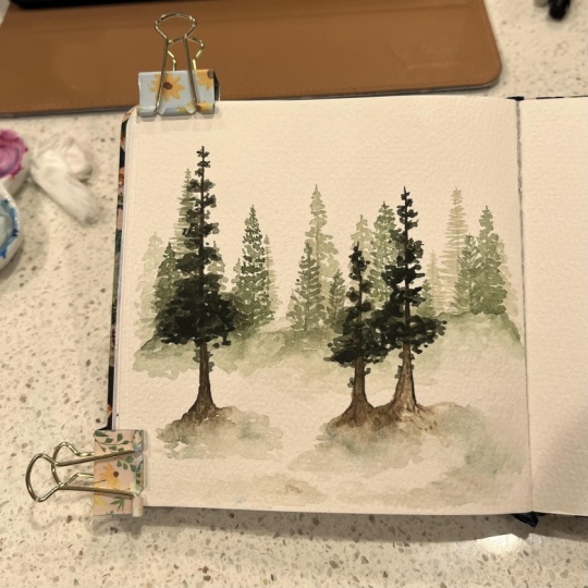
4. Pines: Method 1: Today we're going to
go through mostly all of the different
pine trees that I have come up with
in my repertoire, including some that are
in previous classes. This is just a good refresher in case you've already taken
my misty forest class. But if not, then
this is a deep dive into what I like to call
the lines technique. I'm actually an
excellent word Smiths, so these are names
for the trees, as you can see, are high-quality
and very creative. I'm being very sarcastic
in case you can't tell. But I call this method the lines technique because
in order to paint trees, one way to paint pine trees is by just creating a
lot of different lines. I'm painting the trunk. First step is always
to paint the trunk. By the way, don't worry, I'm going to go through
all these steps a lot more slowly after I
paint the example for you. First I'm painting
my tree trunk, which is always just
a very thin line for my pine trees and then
starting from the top, leaving the tip a
little bit open. I'm just going to
paint a bunch of these little lines
across the trunk. I'm gradually getting bigger and bigger to form the
shape of my pine tree. Notice that I'm not creating a perfect triangle and my lines aren't
perfectly straight. They're not perfectly
straight across from the tree trunk. I'm leaving little
gaps in-between. That's because
nature is imperfect, so your pine trees
should not look perfect. That is a good thing for
you because it means that you don't have to
worry about being perfect. I'm just doing one more
layer because oftentimes, especially with this
lines technique, that the tree trunk
can stand out like a stark line even underneath
all of the needles. Sometimes to alleviate that, I will just do a second
layer and make sure with this layer to do some needles
that are pointing up, or some that are pointing down to make it a
little bit more crazy. That's the lines technique. This is one of obviously
one of those techniques where we want to use
these very thin lines. I've painted many of these trees and so
you can see me going really fast and painting
these lines really fast. I think this is something that trips a lot of people up because they feel like
they can't go fast, but also create these
really thin lines. That is a drill that
you could practice. One mistake, I don't want to say
mistake because honestly, any way that you decide you want to create some pine trees, any watercolor that works
for you is great with me. But for this technique
that my method, I like to have these
very thin lines, not thick lines like this. I don't like that. When I first started
painting pine trees, I used to have thicker lines
and then I would wonder why I thought my pine
trees looked a little off and I realized it was
because I like the thin, wispy ones more than I
like these thick ones. But that said, if you decide that this is
something that you like, you should go for it. Because art is all about you
and how you see the world. But for my version, for my technique, we want
the thin, wispy lines. We also don't want them to be
perfectly straight across. You see how sometimes
when you have these perfectly straight across lines, then it just looks
a little stilted. Or it looks a little more
like geometric, I guess. Which again, if that's something you want,
you should go for it. But I'm trying to create
this wild and crazy look. That's still a little abstract, but not quite as
geometric looking as these lines going
across like this. We don't want this, we don't want this. We do want this. I'm going to paint this lines tree technique
one more time for you. This time notice that
with this version I had a little bit
more full of a tree. This time I'm going to paint
it so it's a little bit more sparse and uneven, just to show you
that trees are not supposed to be perfect looking Christmas
trees all the time. I'm doing a very thin line. I'm again leaving
the tip of the trunk untouched so that it
can maintain that top, that tippy top point. I'm starting my lines
just a little bit down. One thing to note is some people like to start their
lines from the bottom, so that they can more
easily shaped their trees. That's totally up to you, but I usually start
from the top. I'm focusing with
this lines technique, creating a little bit more
sparse needles on this tree. Maybe a little uneven. Now normally I go all the
way across the tree trunk. But because I'm trying to
create a little bit more of an uneven look with
this lines technique, I'm going to alternate
some of these needles. But I don't want to alternate
going straight out. Notice that I'm putting
some of them at an angle. Some of them are straight out. But either way, I'm
maintaining these lines, but I don't want them to look like perfectly
straight lines. That is my lines technique
version of a sparse pine tree. That sums up the
lines technique. There are so many different
ways that you can go with this technique just
using these straight lines. You can paint trace
like I've done or you can use lines
in different ways. It doesn't matter up to you. But this is one technique, especially that I used in
the beginning because for some reason it was a lot
easier for me to grasp, painting the tree shape
using these thin lines. Just as an overview
again, very thin lines, very little pressure,
but a lot of them, and not always straight. Definitely not always straight, definitely not always parallel. We want to have a
little bit of chaos, a little bit of wild
in our nature scenes. There's the lines technique, give it a try, and
let's move on.
5. Pines: Method 2: Next up we have the
swoopy technique. Now, I named this technique based on the shape
of the needles. It's called the swoopy technique because instead of
using lines up here, I'm using very thin like
Nike swoops almost. It looks like a checkmark. Usually I start
from the top and go down in very thin strokes
like this on either side. Or you can start from the
bottom and go up either way. Just so you can see
this in a bigger form. I'm basically making a like
a curved line at the end, like a cane and upside
down shepherds cane crook. But this swooping motion is how I'm shaping
my pine needles. I will quickly demonstrate to you all in one go and
then we'll break it down. First, I start with the
very thin tree trunk. Notice how I had lots of
water in my paint this time. Even when I tried
to do it very thin, it's coming out pretty thick. That's what happens when you have too much water
on your paintbrush, especially if you have
a size 0 paintbrush, it's really easy to get a lot of water on there,
but that's okay. I am just drawing in
the top a little bit. Perfect. I'm leaving
this tip top to be the tip top and [LAUGHTER] starting a little bit down below and starting from the
middle and going out. I am painting just a lot of these little swoops
and fine detail. Notice how I'm going on one
side and then the other side. As the further along
that we go down, I'm not making my
swoops any bigger. They're going to
stay the same size because ultimately these are trying to imitate the
look of pine needles. Pine needles don't get bigger. They are just more of them on branches the bigger that
the tree goes down. The further I go down, the more of them I'm putting
even on top of each other, it's like I'm adding layers
and layers of swoops. These very thin swoops. I want some of the needles to be pointing a little bit
of toward the sky. This is a technique that creates a more realistic pine tree. I went through a period where these were my
favorite kind to paint. They can be therapeutic because you have to
focus on these details. But the details once
you get it down, it's not super tricky. One thing that I'm
noticing as I'm doing this pine tree is once I get to about
two-thirds of the way down to in order to
create the pine tree, to make it look
more full and 3D, as opposed to just
a flat effect. I like to create a skirt around the tree trunk
with the swoops. I'm trying to put perspective basically into this painting. On one side, I'm starting with these traditional style swoops, but then when I get
closer to the middle, they're pointing more
down and almost straight. It's like they're
starting to point at me, the viewer of this pine tree as opposed to on either side. Then once I get to
the other side, I make them go the other way. The direction of those
needles then again, should be to the side. Then a little bit
more angled down, and then a little
bit more angled down the other way once we
cross over this tree trunk, and then to the side again. Using just lots of
these little swoops, sometimes starting from the end of the swoop and
going in the middle, sometimes starting towards
the middle and going to the end of the
swoop either way. That is how you paint a tree
using the swoopy technique. The cautions of this tree are very similar to the
lines technique where, the way to get it very
detailed and swoopy like this is to create these pretty thin swoops as opposed to
like really thick ones. We're not looking for this. Although that can be a cool abstract looking
pine tree up to you. But for this very
specific technique, this swoopy technique I'm
looking for a very thin swoops like this and I'm not making the swoops any bigger
as I go down the tree. That's important to note. I'm just adding more
layers on top of them. Now we're not going
over snow in this class that will be in a different
class down the line. But I will say when you're
doing the swoopy technique, it can be easier to leave in white spaces like
as you can see, these white spaces over here
that can look like snow. But just in general, you should leave white
spaces when you do pine trees because that makes
them look more realistic. Especially with a
swoopy technique it lets you see
the needles more. I let you see more of
the details that you are so painstakingly
trying to put in there as opposed to having
it look like one big blob. Before we move on,
I'm going to paint one more swoopy pine
tree technique. But this time again, I'm
going to do a sparse version. I'm going to paint
my tree trunk, my very thin, especially at the top that needs to
be thin tree trunk. Then I'm going to start
painting my swoops. But I'm going to note
that I want this tree to have a little
more gaps in it, because many pine trees
have gaps in them. In fact, most of them do. Hardly [LAUGHTER] any
of them are really like this Christmas tree
full pine tree shapes. I'm not really starting
out with a plan. I'm just thinking to myself, I'm going to leave some gaps. One thing that is
important to do as well is you can make the gaps
look even on both sides, or you can really make it uneven on one side because that's how
trees are sometimes. Instead of adding
more weight onto this side because I have
tons of weight over here. If I just kept going
the way that I'm going all the way down.
That would work too. Notice how some of these swoops, because I have so much water
are turning into blobs. That's okay, that
can look cool too. We're going to look at this in a different technique later on. But this is like the swoopy technique with a little bit more
sparse pine needles. [NOISE] You might also
say to yourself, well, what about those pine
trees where you can see the trunk of it where the pine needles really stop about two-thirds
of the way down, you can totally paint
those too and it would work and it would look
[NOISE] like a pine tree. Usually when I paint pine
trees and silhouettes, I will all the way
down to the bottom, but that's up to you. This is the swoopy technique. Quick wrap-up. We are practicing
our very thin swoops. We are practicing creating a more full effect
at the bottom where our swoops are not
getting bigger as we go. They are just multiplying. We're creating, more and
more layers of them. Not all swoopy trees
need to look very full, or even they can look
sparse and uneven too, and those trees would
be just as realistic. Practice swoopy technique and then when you're
ready, let's move on.
6. Pines: Method 3: Next step is the
blobby technique. [LAUGHTER] As you
can tell again, my master words smoothing
skills just never fail me. I like to call this technique the blobby technique because
we're going to create pine trees essentially by creating blobs [LAUGHTER] on
either side of your trunk. I'll show you what
I mean right now. Similar to above, I'm
using my zero brush, I'm going to start by painting a very thin tree trunk and
I want to leave the top, the thinnest I can get it. But instead of focusing
on really low pressure, thin strokes like
the swoopy technique and the lines technique, I'm going to lean in
to all the pressure. That also means I want
more water on my paint and I really want to have a lot of room to
have the paint flow. So starting from the top, I'm going to start
in the middle and just push my paintbrush
out a little bit. Notice that when you try to
push your paintbrush out, it's going to come
into a line like that and so instead of just pushing it out for this
specific technique, instead of just pushing
it out in a line, I'm going to push it out and also bring it down
just a little bit or bring it up a
little bit in order to create just different
kinds of shapes. I am starting from the
top and moving down. I don't want it to just be
triangles all the way down. If it looks like you're making the same shape as you're
moving down on this tree, then use your brush to also just add in some
depth to these blobs. I'm going to try to paint this a little
faster because I usually paint these
pretty quick. The less I found, the less stress you
put on yourself to make these blobby trees perfect, the cooler they look. Now, these are supposed
to be abstract trees. For these blobs, I'm mostly pointing them down, but I'm not really paying attention to the direction
that they're going in. That's the biggest difference between the blobby technique and other techniques we're going to learn later in
this class that have a very similar method to the blobby technique but
are slightly different. I'm going to do that tree
one more time for you. I'm going to paint
this pine tree using the trunk first leaving the top open and then starting from the
middle, I'm just painting. You can almost think of
the blobby technique as like this swoopy technique, except you're using lots of pressure and you're
letting up at the ends, if that makes sense. I'm not paying attention
to where I'm going, I'm just blobbing
some paint on here. Something important
to note about this technique also is the
more you practice this, the better that you're
going to get at them. This is one of the
techniques that a lot of my students tell me, you make it look so easy
and it looks like painting pine trees is so
easy and then when I try it, it's so hard. [LAUGHTER] That's true. I think that for your reference, my evolution of pine tree
painting started with the lines technique
and then it went to this swoopy technique and then I landed at the
blobby technique. That's why I'm teaching
it in this order because that is just the way it
made the most sense for me. One more time. The blobby
technique is painting a very thin tree trunk and then painting
blobs on either side. This time I'm going to paint a little bit more sparse
of a blobby tree like we've done in the
other ones and leaving some more spaces and just making it a little bit more sparse
of a tree in general. Honestly, I have no plan. When I go into these trees, I'm not going into
it saying, okay, I'm going to put a tuft right here and some pine
needles right here. I'm just letting my
paintbrush run wild and free and I think that
sometimes that takes practice. This is a good technique to just make your painting
muscles be a little bit loose, let go of the need to analyze every part of the
tree to see exactly where you might need to add
more things and to let your brushstrokes be a little bit more wild
and less controlled. If you're finding you're
trying these and you just cannot get the hang of it, one way to practice
these blobs is to see the difference between
when you paint a line like that from the tree trunk versus like if you try
to make a fan shape like that or just
like how you can move the brush in order to
get different shapes. I think that's probably the way that I learned how
to do this best, is by using in the same stroke, I'm starting from the middle
and pushing my paintbrush out and just moving it to see different kinds
of shapes that I can create and how
those shapes might look like a tuft of a pine tree when I
put them all together. This could be a good warm-up, a good experiment
practice session. It's also why I like to use
student grade paper when I practice things like this because then it doesn't
matter if I create something that's just super gross
and I don't like at all. Before we move on, I want to say I was using the
number zero brush, but you can also
use a bigger brush. I'm going to demonstrate how
to do this with a six brush, which is the biggest of all the brushes that I pulled out today, but you can do it even bigger depending on how
big your tree is. Again, we know that the professional grade
brushes have this tip. I'm going to put very little
pressure so that I can get a thin tree trunk like I want using the tip
of this paintbrush. Then with my number 6, I'm going to do the exact same thing but this time I'm not using all of the pressure like I did on the size zero because
my paintbrush is bigger, so sometimes it allows
for a little bit more. You can get a little bit better
blobs, I guess this way. It's a little bit easier to get the blob shape as opposed
to having to twist your paintbrush in
different manners like we practiced over here. That's the blobby technique. I recommend you
practice it a lot. Don't get discouraged if it doesn't turn out
exactly how you want. Obviously, with a name
like the blobby technique, this is not supposed to
be an exact science. This is supposed to be a
loose representation of a pine tree with loose
blob-like shapes. I'm not looking for
perfection here, I'm not looking for
perfection in any of these. I'm just looking for a
shape that generally looks like a pine tree and I believe that
you can get there. These are the three
main techniques that I teach in my
misty forest class. Now, for the next tutorials, we're going to go over
other different kinds of trees that are not
in that class, just techniques
that I've developed over the years since
I filmed that class. I am so looking forward to
jumping into these new styles and hope that you can get
these ones down. See you soon.
7. Pines: Method 4: Next up, we have the
wispy technique. I went over this briefly, if you took my watercolor
wilderness blizzard class, but we're going to
go over it again. The wispy technique is pretty similar to the
blobby technique. But instead of not paying any attention at all to where the
blobs are going, we want to have the shape of the pine needles move
in an upward motion. This is probably more
accurately described as a combination of the blobby technique and the swoopy technique.
Let me demonstrate. First, we're going to
paint the tree trunk. Almost all of
these, I'm painting the tree trunk as
this very thin line. All of this section of loose, more abstract watercolor pine trees have this very
thin line for the trunk. Then I start a little bit
down from the bottom. Similar to the swoopy technique,
I start in the middle, and I want to have a swoop
that goes in this direction, but what's similar to
the blobby technique, I'm using a lot of pressure. It's like I'm making a blob, and then making sure to flick my paint brush just
up a little bit, so that it creates this wispy
pine needle at the end. Similar to the blobby technique, I don't necessarily want to
pay tons of attention or if I'm paying too much attention or if I'm focusing too
much on making it perfect, I'm not going to get the
effect that I'm looking for. It's important to note that, I can always go in
at the end if it's not quite pointy
or swoopy enough, and add in some detail work. Right now, I just
want to focus on creating these wispy blobs so that I can get this more upward-facing
pine tree the way that I intend it to be. There is the wispy
technique pine tree. Let's break down
this stroke again. The blobby technique
was more like painting different blobs in different directions like this, whereas the wispy
technique is more like, starting from the middle, and using lots of pressure, and then pointing
it up like that. We still want different shapes. We don't necessarily
want it to be like, if I were to paint a
perfect shape like that. We don't necessarily want it to look like that every time. That looks like a little whale. We still want to have some irregularity to
it but ultimately, the thing that makes this
the wispy technique, in my opinion, is
by making sure that most of these blobs have a
point that is pointing upward. I would practice on both sides. I would practice this stroke
starting from the middle, and going on both side. You see, like in
this blobby stroke, the point is more in the middle as opposed to at the
end. That's okay too. The way to get
these strokes down part is to just draw
them into your head. Practice them, so that your
hands have muscle memory. You can experiment to see if
you like different shapes better or worse or whatever. Once you feel like you've
practiced those strokes to your heart's content, then you would put it together. I'll just do this
wispy technique again, and this time we'll
do a little bit sparser like we've
done in the past. I'm going to focus on using
this wispy technique, but I want to create a little
bit sparser of a tree. You can see some of these turned into
more blobby things, so I'm just adding in
some of the points at the end to make this more of this wispy
technique that I'm looking for. Adding in just some of these little points.
Just like that. That is the wispy technique, very similar to the
blobby technique. If you look at it and think,
what's the difference? I don't blame you. Just one more time,
the big difference, in my opinion, between the wispy technique and the
blobby technique, is that, I make sure that I
have some of these, that are always
pointing up when I paint this more abstract
wispy technique. Now, it's also
important to note that, I, in my painting, developed this technique
after the blobby technique, and so in my mind, that's why they're slightly
different because, I went from using
the blobby technique and not really caring where my blobs were to slowly, for some of my pine trees, wanting to make sure that the needles were pointing
up in some direction. Because some pine trees really
do swoop down like this. But other ones point
up, like that. I wanted to find a hybrid
where I could still do this more abstract
pine tree shape, but still maintain
the true nature of having some of the pine
needles be pointing up. That's the evolution of
this wispy technique, and I encourage you
to practice it, and see what you
can come up with, and what version of it
you like the very best. That's the wispy technique, and now let us move on.
8. Pines: Method 5: Next, we have a
technique that leans into the idea that pine trees are made of
multiple different needles. I think the closest one we've
done so far to this idea is the swoopy technique but
instead of painting swoops, we're going to use dots essentially hence the
name dotted technique, to add in those details. I'm going to show you
exactly how right now. First I'm going to
paint the tree trunk, very familiar practice for you, or at least it should
be right now and then starting from a little
bit down from the top, I'm going to paint
a branch using a little bit of pressure
and making it an uneven branch up here
and then I'm going to just dot some texture
around that branch. Now, this branch is a little bit bigger
than I anticipated, so I'm going to extend
the trunk up a little bit and put in a smaller
branch like that. That's a trick that
I have sometimes when I accidentally make
my branches too big, then I just extend the trunk but your branches can
be too big at the top, some trees are like
that, so it's fine. Just once again, I'm going to do this on every
side all the way down; is drawing this little branch using a little bit of pressure and then
using little dots, they can be thin or
blobby or whatever. I'm just creating detail
around this branch. Before I go down the tree, I'm going to show you
a bigger version. Say the trunk is right here, I am using my paintbrush to create this gnarled branch and I don't necessarily want it
to be all one thickness or look like a perfectly
straight line because again, we're
painting nature. But once I've created this
branch, then I'm going to, with paint and my paintbrush just put some dots
on either side, both at the bottom and at
the top of this branch. That is going to
create the effect that this branch
has needles on it. It's still not exactly
realistic, obviously. [LAUGHTER] Most of these trees are in the loose
watercolor category, which means that they are loose representations of what these things look
like in nature, but adding these little dots just makes the detail a
little bit more stark. Important to note
is that you could do it similar to
how I did it here, where you have an even
amount on the top and the bottom or if you painted
on gnarled trunk like this, also notice that when I
paint these branches, I have the most outward part of the branch pretty thin
and the middle pretty thick and the branch that's sticking out of the trunk it's a
little bit thick too. The most important thing
is that this is thinner. The one that's pointing outward
is thinner than the rest. Back to the dots, you can paint dots so that they're
more heavier on the bottom like this
and that would be fine, or on the top. Here's my trunk again, I mean, not my trunk my branch. I'm just going to paint some
of these dots along the top, a few along the bottom, but not many and
I'm going to make sure that I can still see
the tip of this branch. That's what it
looks like bigger. Now I'm going to go back
to this smaller tree and continue painting my branches. I have this branch, and now I'm just dotting it out. It's also important for the integrity of the
[LAUGHTER] wildness of this tree to note that your
branches can be pointing directly outward or they can be pointing slightly up
or slightly down. You can, if you want, make them symmetrical, not all trees look like that. I don't know that I would
recommend doing that, but that's a choice that
you have if you want. I like to, as we've seen, make my trees a little
bit more wild and not quite symmetrical so I'm
going to try to do that. Sometimes when it comes to trees and keeping
them not symmetrical, I have to consciously tell
myself or consciously put in some elements that
will make it not quite as even as my mind
wants to make it. That's what's
happening right now. I'm Just creating these branches and then putting
some dots around it to add in the detail
from the pine needles. Maybe this is one
where I'll show you, you can stop so that
you can still see the trunk because
sometimes trees do that, they don't go all the
way down to the bottom. I'm just going to quickly
repaint this trunk again, make the trunk a
little bit thicker at the bottom but
still going thin. Once I get to the middle, see how it's like those
are roots right there. Usually, if you're
going to paint a tree so that you
can see the trunk, I would also paint just little branches
at the bottom that look like their
roots like that. It's like it domes into
this little mini triangle. I'm just going to do a
couple more smaller branches like that and I'm going
to call that good. That's the dotted technique
where the branches stop about 2/3 down from the trunk so that you
can see the trunk. The biggest difference between any of the other techniques
and this technique is just the amount
of detail you're putting into the dots
around the branches. Practice this technique, see if you like it, see if there are different ways that you
can experiment with it, and let's move on to
the next version.
9. Pines: Method 6: Next up we have what I like
to call the spear technique. I like to call it
that because remember how we talked about how pine needles
sometimes point down, sometimes point up, sometimes
point sideways, well, the spear technique is
leaning into the fact that they are pointing up. But instead of the wispy
technique where we did like a version of the blobby where we had these
spikes at the end, we're just going to lean in to the whole angled
pine needle idea. I'll show you
exactly what I mean. One thing to note, a lot of artists I've seen do
this technique using a pen. Sometimes this is an easier
technique to use if you have like a Micron pen and you're trying to draw in
your painting like that. But I'm going to use
it with a paintbrush because this is a
watercolor class. We start with the
small tree trunk and then starting from the top, we just draw these little
angled lines in bunches. Notice how I'm using
my thin lines. Maybe getting thicker
towards the middle, but I definitely
want to see some of these thin details in my clumps, because that is what makes this look most like a pine tree is when
you can see the needles. But I'm pointing all
of my lines upward. Notice how my lines are not necessarily like straight
lines like that. They're a little bit swooped. In that way, it's like the swoopy technique but
in different direction. But they're not quite as swoopy
as the swoopy technique. It's more like they're
just bent a little bit, angled a little bit
towards the tree trunk. Also important to remember that it's okay to be a
little bit sparse, not always have very full trees. We don't want them
to look super even. Then as you get to the bottom, you can even it
out a little bit. But mostly that is
the spear technique. I'm going to show
it to you one more time and before I do that, just show you that
in bigger version, a bigger scale, the brush
strokes that I'm using. I call it the spear
technique because I feel like they are spikes or spears that are like pointing upward and
pointing outwards. There's the rationale
behind that. I am just in clumps painting lines that are
pointing upward like this. For the most part,
I'm starting out and then going towards
the trunk like this. But you can start in the
middle and go up if you want. That could work too. Whatever feels more
comfortable for you. Ultimately, the most important
thing is that we get the basic shape of the
tree with the needles pointing outward
and upward instead of down and angled down. One more time and this one
we'll do it a little sparser. I'm starting a little
bit towards the top, paying attention to the fact that I want these thin lines, but I also don't want
the tree to have tons and tons of needles because I want this
one to be a little sparse. That is okay, but I'm still getting
bigger towards the bottom. There's my sparse
looking spear technique, pine tree. Practice
this technique. This is one I don't
use very often, but I know that this version is a technique that
a lot of people use and I think it can
look really nice as well. That's the spear technique. It's thin lines that are pointing upward
instead of pointing down or instead of pointing across or like swooped down
like we've had in the past. They're all just pointing upward and coming out of
the pine tree like that. Practice that technique and then let's move on to the next one.
10. Pines: Method 7: This is our last more abstract pine tree
technique for the kinds of pine tree shapes that I
like to use a silhouette or like a big forest of lots
of different pine trees. Then the final technique
that we're going to learn is a little bit more to do with shading and it is
slightly more realistic. But before we get to that, this is called the
spindly technique, and I say it's
categorized in the loose, more abstract pine tree category but a lot of trees
actually look like this. That said, I call it
the spindly technique because it varies from the other pine tree techniques
in that the needles the branches that
we're going to paint are a little bit more spindly. I don't know any other
way to describe it. It look a little more thin,
a little more crooked, but not quite as soon
as the lines technique, and I'm going to show
you what I mean. With the spindly technique, I'm drawing my tree
trunk right here. Similar to the dotted technique, we're going to paint these
lines starting from the trunk and moving out and making sure that the branches
are pointed at the end. So I guess you could say this would be the dotted technique
without all of the dots. It's like a combination of the dotted technique and the
blobby technique actually, instead of painting
dots alongside, I'm just going to leave that
trunk the way that it is. I want my branch
to be pointy right there and I want it to be thicker in the middle as
it gets to the trunk, and we're just going
to keep going down the line doing this
on either side. It's not quite like
this will be technique because I'll show you
in a bigger version, I'm painting branches
that look more like they're thick in the middle
and then thin at the end. The way that I like
to do it is by starting in the middle
and pushing my paintbrush but you could also start at the end with the thin and then push to create some pressure and then end up at the trunk. Either way, both of
those will be fine. But we're creating very
imperfectly shaped branches like that and ending
with a point. This is also different
from the wispy technique because the wispy technique is a little bit more free-flowing, a little bit more just moving your paintbrush in big
blobs wherever it's going. But this one is called the spindly technique
because we do want the branches to maintain a shape that looks
very similar to this. It's on the more realistic
side but still categorized in this loose watercolor
technique in my opinion. So we're just going to
do this on either side, either starting in the middle, from the trunk, or starting at the edge and moving towards the middle
like that; either way. The key here is that if
it's more in the trunk, we want it to be thicker
and then more pointed and thin when we get to the end of the branch
that's pointing upward. I'm just going to
keep moving like this and you can do like
I'm doing right now where it looks like these
two sides are meeting in the middle or we can do one side that doesn't quite meet onto the other side and have them be a little bit
off and that is okay too. In fact, you should
have probably a mix of both but this is what
I'm going to do. Some of my branches I'm going to have jutting out from the trunk, some of them I'm going to
have starting from where my other branch was and
sweeping down a little bit. Then maybe even some
of these branches I'm going to have some
pine leaves that come out from the branch itself as opposed to
just on the trunk. Adding little
variations like this is going to make it the
most realistic of all of the trees that
we're painting today, this is one that
will probably take the most time
because it does take a little bit more detailed work. Although I would still
encourage you not to focus on this being perfect because again nature
is not perfect. It's okay if not all of your branches look exactly the way that you
were hoping them to. Similar to the other trees, the dotted technique especially, some of these branches
should be pointing upward like this and some of them should be pointing
to the side and some of them could even be
pointing down like that, and that's okay too. Adding that variation is what makes it look
like a pine tree. I'm also going to leave this side open a little bit before I
add more weight here. I'm going to go
all the way down, but it's up to you whether you want to
go all the way down or stop two-thirds of
the way in order to maintain that
tree trunk look. That is the spindly technique
where we create these, they almost look like leaves, like this could look
like a stock of leaves. But it's not, it's a pine tree, and it's leaning into the
crooked branch shape but we still want to maintain this loose realistic version of what these branches
would look like. So that is the
spindly technique. Let's do one more that we'll take a little bit
less time because I'm going to make more of an effort to have a be slightly sparser. I am just making sure
that I have a point at the end there and starting from the top and adding some
branches in along the way. Some of these are not quite
as pointed as I was hoping, that's because I have too
much water on my paintbrush. Again, if you find you're
trying to make points very fine tips and
it's just not working, it's likely because you
have too much water, and you need to use less
water and more pigment. Knowing that, that's why
I'm focusing on here. I really don't have
much of a rhyme or reason except that I know I want to create this to be
a little bit more sparse. That means moving further
down on the paper and it means not carrying if I need to add
more weight somewhere. Just going with the flow and making sure that some of
these branches jut outward, some of them jut down, some of them jut upward so that I can maintain
that diversity. That's mostly what I'm doing. For here, I think I'm going
to do another one where it stops like that and
so I'm painting a trunk, remember that's what
I do when I wanted to show the trunk a little bit. I paint the trunk and then I'm going to stop my
branches right there and that's a more sparse version of the spindly technique. So practice that one. Let's move on to our final tree tutorial
which is going to be a more realistic using shading and focusing on the tree trunk and
using different colors. The next one is going
to be the only tutorial that is trying to be a little bit more realistic in the loose watercolor realm. All right, let's move on.
11. Pines: Method 8: This is our final tree tutorial, and then we're going to use these trees in order to
create our final project. But before we get to
our final project, let's talk about the most realistic of the trees
that we're painting today, and that is the
shaded technique. Before I show you, I'm
going to break this down, where before, for
all of these trees, we used basically the
same color and all of the techniques that
we've learned so far are trees that would be really
good for silhouettes, or if you're painting a
big forest full of trees. But this technique, each tree is going to take a
little bit longer and we're going to use different
colors and try to focus on the different
aspects of the tree. First things first, I'm going to draw the
trunk and I'm using my size 0 brush and I'm
going to draw the trunk using my burnt
umber brown color. First, I'm going to
start at the bottom. When we are trying to draw the trunk so
that you can see it, we want to draw the roots. I'm going to start
with some paint, but then also use my water along with the paint to dilute it so
that it's not quite so. I want to create
some shading here. I'm just moving the paint around and leaving some white spots. Now I'm going to,
using my brush, paint this trunk all the way up, knowing that we want the tip of the trunk to still
be like a tip top. This is going to be the tip of the trunk that is going to show. But then we want this trunk
to gradually move down into the trunk we
have with the roots. Your tree is going to look
a little bit like this, where we're drawing the
trunk to be thicker, and then getting
thinner and thinner and thinner until it's just one
line at the top like that. Now, I'm going to paint in
some wood-grain effects, and the way that
I do that really loosely is by putting down some pigment and some paint just in some swatches like this. Then I've washed off all of my pigment and now
using just water, I'm going to paint
the rest of that in, but leaving some white space, leaving some of these dark
spaces in the pigment. It's still a little
bit abstract-looking. There's part of my tree trunk. Next, we're going to draw the branches using
burnt umber still. The trick here is
we're not going to draw the branches
all the way out, we're really just going
to draw them jetting out from the trunk a little bit. Once we've drawn
in the branches, we're going to draw the
pine needles around it, still loose in blobs
but in blobs of green, I'm going to show
you what I mean. But this is how I'm painting. The shaded technique is I draw in the branches
using my zero brush. Some of these branches
are going to jet out and have more branches like that and
they're going to get a little bit bigger as I
move towards the bottom. They can be more
pigmented or not, it doesn't really
matter at this point. But the key is we're going
to stop right here with the pine needles and so we
still want this one to be big. But then as we go
down to the bottom, I'm still going to
leave a little bit of branches that are jutting
out from this trunk. Because oftentimes
with trunks you see little tiny branches
jetting out from them. That's what I'm doing. There's my tree trunk. Basically, we've
created a skeleton of the tree that we're
trying to paint ultimately. Before I move on to the leaves, I'm just going to draw a
little bit of the ground here just so I can get a
little bit more anchored. Again, I've put some brown
pigment and then I put some water down so that I can move the brown pigment
that already exists. I'm leaving some white space. Then I'm just going to put
in a little bit of green at the bottom just to show that there's maybe some moss or some greenery growing
along down here as well. I'm going to leave that
the way that it is. Most of this should have
had a chance to dry mostly, but if it hasn't, that's okay. The brown can run into our green and that
will be just fine. Now, I'm going to paint our tree using a lighter value of green. I'm using perylene green here
to paint all of our tree. But I want to paint our branches in
two layers basically. To do that, I'm creating
a lighter color value of this perylene green
so that I can have the bottom layer be lighter
and the top layer be darker. Because I'm going to use
the top layer that's darker in order to add
some shading elements. But first, the lighter layer is this lighter color
value of green. The way that you get
lighter color values is by adding more water to it. This is very watery
and now I'm just going to basically paint some blobs
on top of these branches. It doesn't have to be
only on the branches, it can be elsewhere
on the tree too. But I'm just filling in
this skeleton that we created for ourselves with this lighter color
value of green. I'm just dotting along
using the blobby technique, using the dotted technique, where I'm just filling
in these leaves here along these branches, leaving some spaces as well. But for the most part, using the skeleton
that I've created to paint some leaves
on top of this. As you can tell, I'm not really paying attention exactly where the
leaves are going. I'm noticing though
that a lot of my leaves have
come out in lines. I don't necessarily want
them to be all lines, so I might just add
some texture up here. But even if it is, that's okay. But I want some of it to
go up and down all around to create a variety. Now we've come to
these big branches. This is where I was
supposed to stop. I'm just going to peter off. Maybe have some of these
branches down here have some pine needles on
them. That's okay. But for the big branches, I'm going to peter
off right here so that we can see still the trunk that that we
left at the very beginning. Now, while this is still wet, I'm just going to look
around here and see if there are any spots
that I want to fill in, knowing that once this is dry, we're going to add in the darker value of that
perylene green that we have. Even before it's dry actually, I think I'm going to add
just a few spots of dark, not all the way around, but we're using the
wet-on-wet technique. Just adding a few dark spots
here and there so that it blends in a little bit better with the light green
that we've put on here. The next step is to
wait for this to dry. Check on the next video
and we will do part 2 of this technique and it's going to be awesome. See you then. This is dry. Now, before
I put down any paint, I'm just going to do a quick
eval of what our result is. I've noticed that the top of our trunk seems to
have disappeared, so I'm just going to add
in a little bit more a very thin line of brown up here so that we can still maintain that tip-top
of our trunk. Now, with a darker color
value of perylene green, I'm going to add
in some shading. Now, the key with adding
and shading part, it's not just to put
it all over the tree. It's to put it in
very specific places. By very specific places, really what I mean is we want
it in chunks over the tree, but we don't want it everywhere. Mostly I'm going to put some of the shaded parts near the trunk. I might put some
of them elsewhere. But near the trunk is
usually a safe bet for parts of the tree or near the branches that have
different shaded pine needles. I'm just going at it and
adding this shading. I'm also going to add
some at the ends. I said mostly near the trunk, but honestly,
towards the bottom, anywhere that you you find
some different shadow or we're really just
adding depth to this tree by adding differently
darker shaded spots. We're showing that it's
not just this one color, that there are lots of
different spots and light plays with these pine
needles in different ways. I'm just adding
some shading here, maybe a little bit on
these pine needles down here where the branches are. Mostly, I'm going
to call that good. I don't want to add too much. Again, because if
I add too much, then it is overpowering and you can't see any of the light underneath, and
that's not the point. I might add just a tiny
thing like right there. There's definitely a point
where you have gone too far, you've done too much. That's okay if you hit that point, because
honestly again, this is loose watercolor, it's not supposed to
look exactly perfect. Nature is not supposed
to look exactly perfect, but I often find that less is more than your painting
nature like this. If you spend too
much time on it, then you could be ended a result that you
don't like as much. With that in mind, I'm going to call that good
for the shaded techniques. To wrap up, to create
this more realistic in the way that we use
different colors and focused on more of the
skeleton of the tree. This more realistic technique, we started with the trunk by
forming the trunk that was thicker at the bottom
and then moves upward and gets very
thin at the top. We still have that
tip-top of the pine tree. Then we painted the skeleton of the tree using
the brown again, just to paint some branches
in different ways, and in a variety random ways, but we didn't use the branches
to create the whole trunk. We didn't use brown to
create the whole branches, just the parts that you can
see coming out of the trunk. Then we put in one
layer of light green. I used perylene green here, which is a dark forest green. I put a lot of
water in to create this light color value
for the first layer. Then once that dried, we put in a darker
value of green, some spots where it looks like they are different
colors and shade it. That's how we created this loose watercolor pine tree that has a little bit
more depth to it, that would be on
the foreground of a painting as opposed
to the background. Remember that because that is exactly the technique that we're going to be using
in our final project. All of the trees that we painted before this one are great
for background trees, and are also great
for silhouette trees. We're going to use a bunch of the trees we've learned how
to paint in the background. Then we're going
to paint a few of these foreground trees in the front for our final project. Let's get started.
12. Depth + Color Value: All right. Before we
start our final project, I quickly want to go over
two really important topics that we're going to utilize
in our final project. The first is talking about how to create depth
with lots of trees, and the second applies to that, which is talking
about color value. I've mentioned color value before in this class
and in other classes. But basically, color value is the lightness or darkness of a color in its purest form. That means you're not
adding white, or black, or gray, or something
else to make a color lighter or darker. Because adding black
or white or gray would actually change the structural
makeup of that color. Instead, you are just essentially drawing
out the pigment so that there is more of
it to go around or, adding in more pigment
so that it's more dense. The way that we change
color value with watercolor is by adding water. If I were to take some
of this perylene green, in a very dense pigment form, it will be very dark. You can already see
it's pretty creamy and not very watery. Doesn't have to add water to make it a little
bit more liquidy. That's a very thick dark
value of this perylene green. In order to make it lighter
on my palette here, I'm just adding
more water to it. That will get me a lighter version of
this perylene green. What does this have
to do with depth? If you've taken my
misty forest class or my wilderness blizzard class, you know that the farther
something away it is, the lighter value it has. In order to create that misty, the forest is really far away and hard to
see kind of effect, we are playing around with
different color values, meaning we are playing
around with how light the paint is that we use
to paint different layers. In order for this to work
with our final project, which is going to be painting
three layers of trees., the first two layers
are going to be the more abstract to loose kind
of styles that we practiced. I believe that there are
seven of those styles. The first two layers are
going to be those and then the third layer of our final project is going to be the more realistic shaded
version of our tree. But just as an overview,
a sneak preview. The way that we utilize
this depth technique, this depth effect in this idea of building
different layers of trees, is by making sure that
the first layer we paint is the lightest because that's the layer that's going
to be the farthest away. If I just paint really quickly a tree in this
really light color, then what would
happen after I paint this layer of light
trees is I'm going to either pick a
darker color for the layer that goes on top
of this or add more paint, more pigment to this place on my palate that
makes a darker value. Normally I'd wait for this
to be completely dry, but for right sake
of showing you. Then the layer on top, the darker layer would be on
top of the lighter layer. That creates the effect
that these layers, these trees in the background, are farther away than the
ones in the foreground. That's the most important
rule to remember as we go forward with
our final project, that the farther
away something is, the lighter it is in value. The closer something is, especially if it's
in silhouette form, the darker it is in value. You would start with light and then move forward with dark. That's it. That's the rule
that I want you to remember. [LAUGHTER] We are going
to remember that. If you feel like you want to
practice your trees a little bit more before we get started, then go ahead and do that. You can also, knowing that we're going to be painting
three layers, and the first two are going to be an assortment of the
seven different kind of abstract trees that we
learned to paint and then the last layer is
going to be a couple of the more realistic
shaded kind of trees, then you can choose which
trees you want right now. You don't have to
paint all seven or all eight of the versions
that we learned, you can decide what
ones you want, and that's totally up to you. But now's a good time to
decide that because in just a minute we're going to get started painting
our first layer. Without further ado,
let's get going.
13. Final Project: Layer 1: Here we are, layer 1
of our final project. Now, as we talked about, we're going to do
three layers of trees on this final project to create a tree
landscape painting, although we're not going to add a ton of other elements
except for these trees. First things first, decide
which trees you want to paint. This is a little
practice scrap paper that I have practiced
some of my trees on, or you can pick up
the scrap paper, the papers that you used to
paint some of these trees, pull them out and decide which ones that you
want to focus on; if you want to focus on only
a few of them or if you want to focus on all of
them, then decide now. The first layer is going to be one of the first
seven that we painted. For my first layer, I'm going to paint a
few of the first three. That would be the
lines technique, the swoopy technique, and the blobby technique. Now, the key here is
that we are going to use a light color value
for this layer, like we talked about,
because we know that it's going to be in the background. For this piece, I'm
not going to utilize, put some of the trees
up here and smaller. I'm also going to put them in the same space just because that's a different
look that I'm going for today, but you decide
what's best for you. I'm pulling out one of
my porcelain mixing palettes just to pull out
the color value that I want. I'm taking some of this green, I want really light
color values here. Taking some of this green, then I'm also going to take
some of my Payne's gray, which it says gray, but it's really dark navy blue, and also some black over here. I'm just putting
these on my palette, and then I'm going to
add water to them, lots of water to
these guys to create just some little mini spots of these lighter
values that I want. I'm adding water, and making sure that
they don't mix together. Now, I'm going to start
painting some trees. I'm going to do a combination
of the swoopy, the lines, and blobby trees in the
background over here. I'm going to paint them
to be about, yeah. I'm just going to go
with the flow here. I'm going to do a lines tree here in this light color value. I know that it
doesn't have to be super filled with needles. It can look pretty sparse, have some holes in the
middle, just like that. Then just to show that there's
a little bit of ground, I'm going to paint again with this light
color value and water. I'm mostly using
water here actually. I'm just going to
paint a little bit of the ground like this. That's where I'll continue to paint some of these other trees. I don't always have to use
the same color in one tree, because this is still
an abstract painting. I've painted these very quickly. I've painted a lot of these, so I can paint them
pretty quickly, but you go at your own pace. For this first layer, I'll do a little
swoopy technique here, then to that ground over there, and maybe another lines right
here, just very little. I'm going to paint some
bigger ones elsewhere. I'm going to paint a sporadic
tree line like this. I'll paint some more
ground over here, I put some pigment down. I'm just putting more water to bring the ground over here. I'm still leaving
some white space, but this is just to create a loose ground effect so that my trees aren't
just floating in space, although that can look fun too. I'm going to go for a
swoopy technique here. Again, you can go
slower than me. You do not have to move as fast. I have painted a lot of these trees so I can move
a little bit faster. But I will say that
when I do move faster, I can't get as much detail. These trees are the ones that maybe don't need as much detail, but when you get
to the other ones, like the dotted technique
or the Swinley technique, you might want to slow down
a little bit for that. I'm also making sure to
do different sizes here, just because trees and forests especially come in all different shapes and sizes. That's important to remember. Different sizes,
different shapes, not super even spacing. I extend the ground
even more over here. It's not exactly in
a straight line, there's some bumps and curves. I'm using a combo of
my paintbrush with paint and water to spread whatever existing pigment
I already have around, to spread out this ground,
and leaving whitespace. I'm not really thinking about where I'm leaving
the whitespace, I just know I'm moving my
brush around and not doing a whole big wash while I'm painting these
different trees. I'll do another lines over here. Start it off in blue, maybe add some gray, because these are abstract
in the background, shadowed trees that
can have some color. But for the most part, when we start painting
our other trees, some of these are going
to get covered up. We mostly just want to create the effect that
there's a shadow over here. That's what these trees are for; to create depth and
just show that there's a shadow of a tree
in the background. If you've taken my
misty forest class, you know that another
way to create that there's a blurry shadowy
tree in the background, is by using the wet-on-wet
technique in order to create a blurry
shadowy effect. That can be really fun too, but this isn't so much like a misty forest that
we're trying to create. It is like a misty forest, but since we're focusing
on trees in this class, then I think it's
more important to focus on the techniques
of the trees than it is to focus on the misty techniques because
I'd have a class for that. If you're interested in
learning more about that, I would recommend you
take that class as well. They'll be some of the same content in that
class as in this one, but I also made them slightly different on purpose
so that they would be interesting for everybody. We're just about done
with this layer, I'm just going to add one
more little clump over here. I'm going to stop it
about right there. Let's just extend the ground out a little bit more
like we've done before. Notice how again, I'm just moving
my brush randomly throughout to create
this ground effect. If that comes
unnaturally to you, if you feel like I
just need to know exactly where everything
is and have control, then it's okay to practice
not having control. It's okay. Again, that's why I like
scraps of paper and practicing these
techniques on paper.
14. Final Project: Layer 2: Our Layer 1 has now dried and so we're
going to do Layer 2. Moving on with the different
trees that we focused on, I'm going to do Layer 2 with the rest of the four different
trees that we learned. The spear technique,
the wispy technique, the dotted technique, and
the spindly technique, I'm going to layer in all
in this second layer. First things first,
I'm going to look at these colors that I've put
into this palette over here. Some of them have mixed
together like the green and the Payne's
gray. That's okay. I'm just going to add a
little bit more color and I want this layer to be darker
than my previous layer, but not the darkest
that it can be. I'm adding a little
more green color here and I'm going to add a little more
blue to my palette, and then a little more black. But I still want them
to be pretty watery, not like super watery, but enough watery that it's not the darkest that these
color values can be, but enough so that
it's definitely darker than a layer that
they're in right now. It's okay if you don't mix enough of the color
value that you want, you can always make more. It doesn't have to be
exactly the same shade as all of the trees
have been before. The first thing I'm going
to do is similar to what we did before, is create a little bit more
ground first, and again, this should be just slightly
darker than it was before. Here's a little bit
of ground with the wet and I'm pushing
it around with water, and now I'm going to
paint some trees just with these darker
values that I have. I'm going to go for maybe
a wispy tree right here, making sure that my
branches are pointing up. I also want to be careful not to completely paint over
all of these trees. It's okay if you paint
over some of them, but not all of them, because we want most of
them to still be showing. Now I'm going to do
a spear, I think. Just a little spear
one right here. As a good rule of thumb, if you're painting these layers of different trees on
top of each other, then try to keep some
diverse sizes as well so you can
see the tall ones behind because it would be a
shame to have gone through all the work to paint all these trees and
then have all of them covered up just by different layers
that you're doing. Let's do maybe another
wispy tree right here. So far I've done the spear and wispy,
and that's pretty good. Now just this little wispy one. Now I'm going to move the
ground a little bit forward. Adding some texture here, leave some white space,
and continue painting. I think this time I'm
going to do like, see how there's a
space right here, I think I'm going to do
a dotted one right here. This one takes a
little bit more, just adding some dots, making sure that these
branches are different sizes. Remember that the
dotted technique takes a little bit
more time than others, and that's okay. I often do hyper-lapse
videos and they go by a lot faster in the videos than they
actually do in real life. That's something that's
really important to remember when you're
painting these. That if you want to paint, it's important not to spend too much time trying to get
the trees all exactly right, but also it's
important to remember that sometimes it
does take some time. I'm going to leave this
trunk a little more open and just leave
that tree like that, and I'm going to call that good. Now, I want some of these
to be just a little darker, so I'm going to add a little
bit more pigment and work on a wispy tree right here, and then move the
ground a little bit. I'm going to move the ground
over here a little bit down because these are
different layers of trees, and maybe I'll do a
spindly one right here. I'm going to make it a
big tall spindly one in the middle of this
layer over here. Not really paying attention much to where the branches are, just making this up as I go because that's my
favorite way to do trees, otherwise, I spend way too
much time focusing on how perfect they look and they end up looking not
like trees in nature. So that's why I do it like this. But notice how cool the
trees look when they're darker and you can see
other trees behind them. I just think this
depth effect is so cool and that's really what
makes wilderness paintings. It really gives them the
depth and the feeling that we're all searching for when we're painting
wilderness styles like that. I'm just going to
extend a few of these branches a little
bit. That's good. We want our ground
to be a little bit wet still if possible just so notice how the colors are blending into it
a little bit better, but it's okay if
it's dried also. That's really what the
second layer is going to be, just continuing to paint with the different versions
of trees that we know, so maybe I'm going to
do another spear here. Maybe this one will be
more like a combination of spear and spindly. [LAUGHTER] I don't know. I think that's fun to do too. That's how I came
up with all these different combinations actually, is by naming the
specific technique that I used and then
experimenting to see how differently I could
make that technique and how I could just alter it in slight ways to make the
trees look slightly different than what they were before, and it's one of my
favorite ways to create diversity when I'm
painting these forests. I'm going to paint another
little wispy one right here and then I'm going to
extend the ground again, and I think do a dotted
one pretty soon over here. I'm just extending the ground. Notice how I'm going
back and forth. Sometimes I'm
picking up pigment, sometimes I'm picking up water, I've said that so many times. But it's important to know and I'm leaving some white
space over here. I'm going to do
another dotted one. I need to add a little
bit more blue over here. I'm going to do, I think, to overlap this tree but I
still want to see this one, so maybe I'll just keep that in mind that
I know that I want to still see this
tree right there. This tree, I think I'm going
to make on purpose with the dotted technique
a little more uneven, unbalanced in terms of weight
and where the branches are just so I can have that difference in
nature that so often exists. Have one branch that's
like jutting out, not nearly as many on this side. I think that looks cool. Just dotting it, maybe add a little
more weight over here. But yeah, that looks cool. This is what I'm
doing for Layer 2; going back and forth between these different techniques
that we practice and doing more full spear
technique here. Notice how on this one, I'm not paying as
much attention to the white space
between the needles, and so it really just looks
like a big blob of tree. But that's okay for
this specific layer. I'm going to re-wet
this ground over here and then maybe
I'm going to leave this spot blank and only
do some trees over here. You don't have to do
trees all the way across. There's no rule that
says that, in fact, sometimes it looks
cool when it's not. I'm spreading the water
just a little bit more. I think I'll add a little
bit more black to this. I think I'll do a
wispy tree right here. Notice how when I leave it wet, then the black just blends
in with the ground. I'm going to add a little
bit more green also, and maybe another
wispy tree right here, but not always exactly the same. Let's do a spindly
tree over here. I love practicing
these different trees , it's pretty therapeutic. It's also interesting for me to just talk and tell
you my thoughts as I'm painting these
trees because it helps me to understand what I'm thinking about painting as well. I hope it's fun for you. I hope you're enjoying this
class and listening to me just ramble on about what I'm thinking
while I'm painting. I'm almost done with
this spindly tree and that would be jutted
down a little bit like that, and maybe just add another little tree right
in the middle, right there. I think I'm going to
call that layer good. That is Layer 2. Now for Layer 3, in the next video
after this is dry, now we're going to paint
just a couple, I think, of our shaded trees and I'm not going to put
them right in the middle. I'm probably going to put them
somewhere off to the side, but they're definitely
going to be darker and they're
going to be a little closer to us and it's
going to be awesome. Let's move on to Layer 3.
15. Final Project: Layer 3: We are on our final layer of our little forest
piece where we are practicing all different kinds of the trees that we
learned in this class. For our last layer, we're going to practice
the shaded technique, which is this still
abstract loose technique, but we have more color and it looks a little
more realistic than a lot of these more
silhouette pine trees that we've been practicing. When I do the foreground trees, especially if I know that
they're going to be bigger, I generally don't put them
smacked up in the middle. They can look pretty
cool if you want just a tree that's
right in the middle, but I like things that are a
little bit more off-kilter, and I also like for
the foreground to have not nearly as many trees as
in the background layers. I'm probably going
to paint three of these shaded technique trees, and I think I'm going to paint a big one right here and maybe
a little one next to it, and then a medium one
somewhere over here. That's what I'm looking at. Whenever I do composition, I hardly ever plan
it ahead of time, which maybe makes
me a poor artist, but that's what I do. But what does
happen is I look to see where might be a good fit. One thing that I might
pay attention to is which trees do I for sure want to be seen once everything
is all said and done. One thing for me, I think I like this tree a lot. I really want this tree to
be seen at least partially, and I think I still want
this gap right here, and maybe this gap right here to be seen at least partially. With that in mind, instead of my size 0 brush, I'm moving to my size 3 brush to begin painting the trunk
just like we practiced. I'm going to do
the big one first. I'm going to do a big and a
small one right over here, and then I'm going to do a
medium-sized one over here. The most important
thing when we're practicing this first
layer to note is that we want to use the
darkest colors that we can when we're painting
on top of this layer so that we cover up so
that the paint doesn't show what trees are behind as much as possible, and I'll
show you what I mean. But first, I'm going to
put this trunk right here. That is going to be
the basis of my trunk. Before I move forward
in finishing the trunk, I'm just going to draw out
the ground a little bit. This time, we're not going to spread the ground
all the way across. We're just going to show
what the ground looks like right by the
base of these trees. I'm making it a little bit
brown, this burnt umber, but I'm also going to add
in some green just to show some of this
more wooded feel. This is just like abstract
playing with colors mostly. It's not anything that I decided in
particular beforehand. There is that trunk. Now, I know that
I want the tip of my tree to be somewhere
like this, right here. I'm just going to draw this trunk so that
it gets up there. We might be covering some
trees that we already created. It's okay if you
cover up some trees, and it's also okay if this is not a straight line as
mine clearly is not. It's a little tilted, but I like that actually. I'm making sure,
here's my trunk. Now, I'm just going
to paint it in. Because I also know
that I want some of the background
trees to still show, that I don't want this tree to be a particularly full tree. I want it to be a little sparse. Knowing that, I can
paint more branches, but I'm not going to paint as many leaves or pine needles on the branches
when I get to that part. But the most important part
about these branches right now is that you're
using a pretty dark brown so that
they definitely cover the trees that are
supposed to be behind them. I'm just moving up
painting these branches. I think I'm going to
stop right there. There's the skeleton of my tree. Now, I'm going to paint
using a lighter color value. But note that my light color
value is actually going to be probably
about the value of the colors that we used in
layer 2 because we want the darkest color value to probably be the darkest
that these colors can be. This time, instead of using both green and blue and black, I'm going to use, I think only green. I'm just going to start painting
in some of these trees, some of these pine needles
that I know I wanted. I'm going to add in
darker in a bit, but I also want to show
still the trees behind it. I'm not going to put
anything right here. Making sure to put stuff
on the trunk though. I'm just dotting,
filling in the space, leaving some things open. Here, I might leave just
that whole thing open wide but then have a
big branch right here. Maybe some just little
tendrils of branches coming down here and there. Make this a little bit less. It comes down just a
little bit more to give it a little bit more shape. That's the first
layer of that tree. I kept this one open
and now I'm going to do the smaller tree. Then the benefit of
doing the first layer of the trees is that this
will probably be dry by the time I've finished
painting all the rest of them. I'm going to paint a
smaller tree right here, and I'm going to
have the tip of that one maybe end right here. Now I'm going to
do the same thing, painting in the trunk, painting the skeleton
of the tree, making it a little more sparse. Just so more of the trees
behind it can be shown, especially this one that
I know I want it to be cool if I had a bigger branch coming
out over here that covers it. That could be cool, so maybe we're going
to go with that. Again this is my thought
process moving like, what do you think would
be cool? I don't know. Let's try. Before
we go on though, I'm going to extend the ground for this tree a little bit more. Not too much. Just add
in a little green. There. We're going
to call that good. Now, time to add in the first layer of pine
leaves on these shaded trees. It's okay if it blends in with this other tree
that's already wet. It's okay if the leaves
blend in with the trunk, because ultimately this is
still loose watercolor. We're not going for
picture perfect here. If you want picture perfect , this is not the class for you. I also recommend you
should take a picture. I like painting a lot
because you can just have fun and not have to worry about making an exact replication. Now one more. I wanted most of this
to stay this middle, but I think I am going
to have my tree jet a little bit in the
middle like that. Let's put the tip. I want it to be medium-size, so not as big as this one, but not as small as this one. I'm going to put that
tip maybe right here. It's just barely
above this tree, but not quite as
tall as that one. Let's paint this trunk down. We're going to have the trunk
be right here, I think. Sure, why not? Maybe this is about
when it starts to get thicker and thinner. Here we go. Sure. Why not?
That looks good to me. Now, we're going to paint
the ground around it and add in some green like
we did with the other one. Using water over here to really dilute it so that it's not
just like pure color, so that it looks a
little mystical. Because that's my favorite thing to do with watercolor and water, just to make them look
a little mystical. I made that ground
a little different, a little bit more
up in your face, but that's okay.
Now the skeleton. I know that I wanted to keep this
space a little bit open. It'll be cool I think to have maybe one branch
that veers into it, so I'm going to pay attention to that as I'm painting
this skeleton. Maybe have some
bigger branches over here when we're up here. But then when we're
in this center, maybe one big branch that I know reaches
out to over here. That would be pretty
cool, I think. Then just a little branches jutting out from the
bottom of the trunk. I think this is
mostly good to go. Here we go. Painting a lot of these
trees too, I think helps. Once you've painted
a lot of them, knowing that eventually they're going to look how
you want them to, or that you can never exactly get them to look
how you want them to, is good practice for
mindfulness and it's good practice for letting loose. I think that's been
a major theme from this class that I've talked
about is just like you have to not care so much about having it be perfect
because it's never, ever going to be perfect, but that's what
makes it beautiful. That's what makes life
beautiful too, I think, is being a human means being
imperfect essentially. If we're going to be the
best humans that we can be, we really need to let go of that tendency toward
perfection and embrace life as the
imperfect wonder that it is, and that's what's going to make our life
more happy I think. That's what's made my life
happy when I can do that. Don't mind my
ramblings as I'm just finishing painting
off this tree. Now it looks like over here, most of this has dried, so I am going to pick up the darkest version of
this purlin green that I can and just add in
some more shading, maybe underneath in the
trunk a little over here. This is the last thing
that I'm going to do on all of these
foreground trees, is just add in some of
this depth to the trees. Again, I'm not really paying too close of
attention to where they are, except that I'm not
putting depth everywhere. I'm making sure to leave
some of these light spaces. It's okay if these
two tree start to blend together if
you're not really sure where one starts and one begins because often trees
are like that. Then this one is
still pretty wet, but I'm just going to go
ahead and add in some of this dark anyway just so we
can finish this up. Ideally, you would
wait for this to dry. But I want to finish
up this video, so that I eye see all of
your beautiful final pieces. There you go. There is
my final project for this pine tree painting fest that we have
embarked upon today. I hope you had a good time. I hope you learned a
lot and I hope that you found at least one
or two versions of these trees that
you really loved and that you would love
to keep practicing. I would love to see all of your final projects and I would love to just connect with you, whether on Skillshare
or on Instagram. If you post your final project
in the project gallery, then that's a great place to comment on other people and to see what other
people came up with, and it also helps
other people see my class in the future. If you really enjoyed
this process, please post your project
to the project gallery and also feel free to post
it to Instagram and tag me. My handle is this writing desk. I'm going to go through all
this again in my recap video. But for now, I just want to say thanks
for painting with me. I hope to see you again soon.
16. Recap: Thank you so much for
taking this class with me. I had such a great time
putting together all of the different tree painting
techniques that I have honed and learned and
developed over the years. I hope that you have come out of this class with
at least three or four that you really love and hope to develop
more in your arsenal. If you painted along
with us today, then you will have something
that looks like this. It might look familiar,
it's in the recap video. This is the final project
that we did today, incorporating all eight of the trees that we
learned about painting. If you decide that any of these techniques
are not for you, that is totally
fine because that's the point of a class like this, to learn how to paint lots of different things so that
you can really find the one that speaks to you and that you
can speak through. Now if you really
enjoyed this class, the best way that you can help
me is by leaving a review. I would encourage you if you had a good time and
you want to let me know, please tell me and
everybody else what you loved about this
class and give it a thumbs up. I would also love
to see your work and a couple of
different ways that you can show me are one, posting it to the
project gallery. Posting your final projects
to the project gallery is another way for more
people to see this class, and it helps you build more
of a community in Skillshare. Because then everybody who
follows you can see what you post and it's just
a really great time. I encourage you to post
your final project to the project gallery, and if you decide
that you want to share a little bit wider spread, feel free to post on
Instagram and tag me. My handle is, this writing desk, and I would love to be
your biggest cheerleader. I'll leave you some
comments and just generally help you feel
supported in this art community. As a bonus, I usually
do features of all of the Skillshare projects
from the past month. I try to do that at least
a couple of times a month, so if you tag me on Instagram, then you might be featured
in my Instagram stories. Last thing, if you
have any questions, please feel free to post them to the community
discussion board, and I will be sure
to take a look and answer any
questions or comment on anything that you might be concerned with in this class. Just once again, thank you
so much for joining me. I had such a great
relaxing time filming this class and going through all the different kinds
of trees that I like. I hope that you had
a great time too, so see you next time.
 Kolbie Blume, Artist