Transcripts
1. Intro: Tuxedo Cat: Hello, and welcome.
My name is Emily, and I am the artist behind
Emily Marie Watercolors. Welcome to my home studio
here in Madison, Wisconsin. Miss Tutorial, you'll
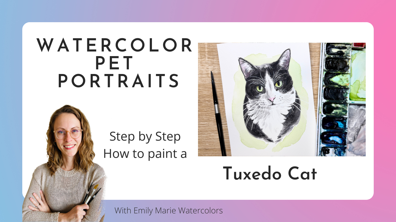
learn how to paint Gus, the Tuxedo Cat,
using watercolors. As a watercolor artist, I have found a passion for
painting pet portraits. If you already know the
basics of watercolor, painting pet portraits can
be a great way to turn your hobby into a part time
or even full time career. My style is characterized by adding details to
the mouth, nose, and eyes, but not
getting caught up in painting every
single hair or curl. You'll have access to a color reference photo
of Gus, the Tuxedo Cat, to use for this tutorial, or you can use your
own reference photo of your own black and white cat. You can also use a
tracing template that's included in the
reference section, as well as some supplies
that I used in the video, as well as the
complete color palette for painting Gus the Cat. I'll guide you through
painting Gus layer by layer. We'll focus in particularly
on keeping the black fur from looking flat by adding multiple layers of
gray under the black. I'll show you a combination
of real time video with time lapses so you can see the whole process
from start to finish. We'll end with adding a
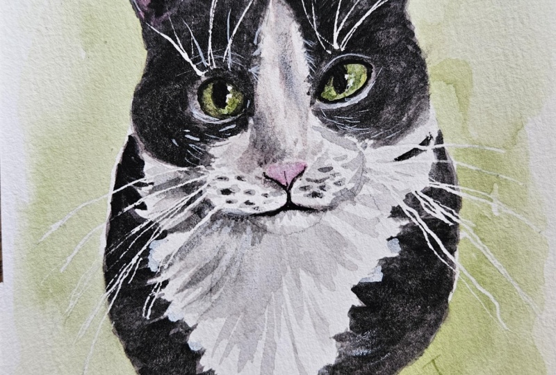
colorful splash behind our cats and finish our piece by using white gouache to
paint the whiskers. As an added bonus, I've even included a quick
guide with step by step pictures so that you have an easy way to see how all
these layers come together. So grab your supplies, and let's get ready to paint. Don't forget to upload any
questions that you have, and I'll try my best to answer them along the way.
Let's get started.
2. Supplies: Alright, so let's talk for
a second about the supplies needed for painting
Gus, the Tuxedo Cat. First, let's talk about
your paper choice. In the video, I am using
arches, hot press paper. So our hot press paper is
a little bit smoother. It doesn't have a texture. I, I buy the ten
by 14 inch blocks, and then I actually
cut them in four, and then I have four, five
by seven sheets of paper. So you'll notice
that I'm painting slightly smaller for
this pet portrait. It was ordered originally
as a five by seven. However, I do think that, for those of you who are just starting out with your
pet portraits or are just starting out with
black cats or black dogs, you should try first on your five by seven
sheet of paper, and then once you feel a
little bit more confident, then you can go to a
slightly larger size. If you do not like
using hot press paper, you can always use
cold pressed for this. The only issue
that you might run into is you might
have a little bit hard of a time using a calligraphy pen for
your masking fluid, and you might also
have a hard time with the bleed-proof white at the
very end for the whiskers, just because you're going
over a slightly rough paper. It might not be that much
of a difference for you, and so you can try it on both, or you can try it on
cold press if you don't have hot press paper
at your house. The next thing that
we'll take a peek at is our watercolor brushes. In the tutorial, you'll
notice that I am using, for the majority
of the tutorial, a round size four brush. It's a black velvet brush
from silver Limited. I would recommend
going somewhere in this slightly smaller range. So either a size
two or size four, you can use size six, although that is going
to be a little bit more challenging for you since
it's a slightly larger brush. And then feel free to
use a size zero or a smaller detail brush for smaller details like
the nose or the eyes. You'll notice I don't really
switch from the size four. I just kind of learn
how much liquid is on my brush so that I can control and still paint
the fine details, even though I have a
slightly larger brush. You will need a paper towel
and a glass of water. Sometimes I work with
two cups of water so I can easily switch
out when I need to. Then let's talk some of our specialty products
that you'll need. In the beginning
of the tutorial, you'll notice that I will mask out the highlights of the eyes, as well as the whiskers
using a masking fluid. I like using Windsor and
Newton brand masking fluid. You can either use
a worn out brush that you don't really care about for the highlights of the eyes, or you can also use a calligraphy pen for the highlights of the
eyes or for the whiskers. You will see how I use the calligraphy
pen for the whiskers and some tips and
tricks for that during that section
of the tutorial. If you do not have
a calligraphy pen, you can always use a regular small brush for the masking fluid
for those whiskers, or you don't have to use the masking fluid
for the whiskers. You can just use a bleed-proof white after you
finished your painting. So in the very end
of the tutorial, you'll see me use doctor PH
Martin's bleed-proof white, which is a very opaque gouache. You'll see me using
this bleed-proof white on the whiskers
over the eyebrows. So I do not mask those whiskers
out over the eyebrows. I'm using this
bleed-proof white, and I use a rigor brush, which is also known
as a script or a liner brush to paint
those tiny whiskers. Now, the reason I
use a rigger brush, which has a much longer
bristles on them versus a small round brush like
this size four times zero, is because the longer
amount of bristles on your brush means the
more liquid capacity your brush can hold. So instead of the small brush, you might be able to paint
a line that's only an inch long with however much
liquid is in your brush. With your rigor or script, also known as a liner brush, you can paint a much longer line because it holds a
lot more liquid. So for things like whiskers, where you need a fine
controlled brush stroke, you might enjoy using
this rigor brush. I'm using a size one. A size zero would also
work for this tutorial. I would not go larger than that, or your line might be
a little bit too long. You might also use
some other types of tools that you might
have lying at home, something like a glass pen can also work when you are painting
your bleed-proof white. One last thing I forgot to mention about the masking fluid. You'll notice on
the supplies guide that's included
with this tutorial. There is an option for
masking fluid that is a fine tipped masking
fluid from senilia. This is the fine tip. So it's a different brand. It's not Windsor and Newton. But you'll notice that it
comes to a fine point. And so this is also very useful for those fine whisker
lines as well. The only thing that
you have to be careful with is that you
do have to really practice a lot with it
because you do tend to get some bubbles in this
as you're making your lines, and you really,
really don't need to press at all when you're
making your lines. If you press the bottle at all, you're going to get big globs
where you don't want them. Um, because I practice a lot
using the calligraphy pen, this is my tool of choice, but you might choose a different tool to
make the whiskers. And hopefully you can find the
tool that you enjoy using. Alright, now let's talk about our water colors and our
colors that we're using. So you'll notice that the
palette that I use in my tutorials is just
this plastic palette. Yes, you probably
should use some sort of ceramic or porcelain
palette to mix your colors. If you purchased a newly
purchased plastic palette, and you're noticing
your colors are bubbling and they're not
expanding very well, take a little bit
of sandpaper and just sand where you are
mixing your colors, and you'll notice a
difference right away. Because I have used this
palette for four plus years, my surface has been kind of
disintegrated a little bit, doesn't have that shiny plastic new plastic
coating anymore. And so my colors will bleed and spread instead of
tighten up and bubble. Alright, so let's
talk color choice. This color guide is found in the resources
tab of this tutorial. On the left hand side, you'll notice the exact color
that I am using. All of them are Daniel
Smith watercolors. And then on the right hand side, it's a little indication of where in the painting
I'm using this color. Now, if you don't
have these specific colors with your home palette, I do list a few
different options for substitutions on
the left hand side, or you can also make your own substitutions according to your own cat that
you'll be painting. The last thing that
we do need to talk about before we start
with the tutorial is transferring your image
onto your watercolor paper. When it comes to PEP portraits, I highly suggest that you
either trace the template onto your watercolor paper or use some sort of tracing app. If you're interested
in an app that I use for my custom portraits, it is in the link
on my supply Guide. It's called DaVinci I Um, and you use your
phone on a stand, and it helps you to
trace the outline. Now, you can sketch
it out on your own and sketch out the
outline, freehand. However, obviously,
that's going to take a lot more times if that's a place that you
want to practice and practice your sketching,
please do so. If you want to save
a little bit of time and focus on the
painting part of it, tracing really is a great
tool for artists so that you can have the
right placement and the right sizing of your eyes, nose and mouth so
that your pet has a very good likeliness to the
picture that you're using. When you are done tracing your template and
you're all ready to go, I like using these little
corrugated plastic boards. I find these at Michael's, and I cut them into
smaller squares so that they can fit either
my five by seven paintings, my eight by ten paintings
or my 11 by 14. And I will place it on the plastic corrugated
board and then tape around it using
either frog tape or a different artists
tape such as Kiwi Hub. Um, for sizes five by
seven or eight by ten, I don't usually stretch
my paper before I paint. If I'm going any larger than an eight by ten, I
will stretch it. We're not gonna cover
that in this video, but for paintings that
are smaller in size, taping them on something like a plastic board will
work just fine. Alright, let's get started
with talking about our masking fluid and how to
mask our whiskers and eyes.
3. Masking Fluid Prep: Alright, so I traced out my photo of our cat that
we're going to be painting, and I used two different photos. So the main reference photo I used is the one with
the paw up front. The second reference photo
I use specifically for the chest area is from the
slightly more blurry photo. So when we take a peek at our first reference
photo, obviously, we can notice that the eyebrow
hairs above the eyebrows, those white ones
are very prominent, as well as the
whiskers and the face. Now, for both of the sets of whiskers on both the
cheeks and on the eyes, you can use a masking fluid
with a calligraphy pen, or you can also use a fine brush and PH
Martin's bleed proof white. Now, the brush that I like
to use when I'm using pH white and painting
really long hairs is going to be a rigor
or a liner brush. So what I'm going to do
is I'm going to actually show you how to do this
painting both ways. The reason I'm deciding that
is because I have painted all black cats before that have really
prominent eyebrows, and I actually
don't like the look of the prominent eyebrows
with a calligraphy pen. I think it almost gets
a little too thick, and it slightly distracts
from the painting itself. And so I'm going to do it this time with the calligraphy
pen for the whiskers. And then above the eyes, I'm going to use my PH Martin. Now I need to test out my masking fluid and
the nib before I start. Now, of course, because I'm making this tutorial, it's
working the first time. If it does not work the first time for
you, try try again. Sometimes what I
do is I will take a paper towel and
clean off the nib. You might need to press slightly to open the
nib a little bit more, or you might have to
add just a few drops of water and just swivel your water or your
maskine fluid gently. Don't shake it or you're going
to get a ton of bubbles. But the water will
just make it slightly more water down so that it'll flow a little bit
better with your pen. Alright, so I've got
my full pen loaded up. It works once. And so
now I'm going to start. I don't need to press very hard. I just need to press hard enough for the masking fluid
actually come out. And then as I'm doing
these whiskers, I can do about three or four before I need a little bit more. I'm always tapping on
the side of my bottle. And then I do like
to cross some of these whiskers as
I'm adding them, even if they're not crossed
in my reference photo, having whiskers
that do not cross, actually, in my brain
seems too perfect. So they might cross
just slightly. I don't need to follow
every single line here. And like I said, my my
pressure is very light. So if I take a peek at the
the harder my pressure, obviously, the thicker the line, the lighter the pressure,
the thinner the line. When it comes to whiskers, you want a very thin line, and so you want just
enough pressure. Now, I don't want to
switch to a brush, so I'm just going to add my little highlights in the eyes using my
calligraphy pen. You also have the option of
doing the bleed proof white for all of your whiskers and
even for the highlights. That's obviously
always an option. If you don't have
either, another option is a Nibal Cigna white gel pen. This works well for the
highlights of the eyes. However, it's gonna be a little bit thicker for the whiskers. And so I would really suggest in purchasing one of these
two to use for the whiskers.
4. Painting the Iris and Pinks of Nose & Ears: Alright, so I have my five by
seven with a masking fluid, and I taped it onto a
plastic corrugated board. I got this from Michael's. And now I'm ready to paint. So I am going to start with
a round size four brush. I want to start with my
lightest colors first. And so I do always like
starting with iris color. So I'll choose the color that's kind of the most prominent in the iris for Um,
this particular cat, it's going to be a green, and I can cover that
entire iris and the pupil, as well, since the
pupil is darker. Now, I do have, of
course, remember, I have those highlights in
the eyes with masking fluid. I am going to drop in some
other color on top of this. And so I do want to be
aware of my drying time. So it's still nice and wet. Now here at this point, I'm going to take
a peek and see, do I have any yellows maybe
that I want to drop in. So I'm noticing there's
a little bit of yellow on this left eye. Now, when I drop in any other
color into the iris color, you notice I'm not
wetting my brush. I'm just dropping in the color directly from my paint brush. Now, when I change colors, I want to grab a
little bit of blue, but I don't want that
much water on my brush. If I have too much
water on my brush, that blue is going to
overpower the green, and it's going to
push that green away. Um, because I'm introducing
too much water. So I don't want that
much water on my brush. Here I'm just kind of dotting
the blue into the iris. Mainly where I'm noticing this green turned to a
little bit more of a teal. Alright, and that's gonna
be the first layer. I'm gonna let that dry. Before I move on to the
first coat of black, now I also want to take
a peek at any pinks. So I'm going to do the
pinks in the nose and then probably add a little
bit of pink in the ears. Now, this pink that I'm
using is an opera pink. Be a little bit cautious about opera pink because it
is not very light fast, which means that over the years, it might start to fade in time. So I'm going to do my first
layer with this opera pink, but then I'm going to add a little bit of
quinocradone magenta, particularly around the edges where it's a little bit darker. And then my second
layer on the nose, I'm going to also use
that quinocrodon pink. Or quinacrodo magenta. Now with the ears, I do want to add a little bit of this quinacrodo
magenta to the ears, so I'm adding it with water. I'm looking particularly at the pinks of the ears
around the outside here. Alright, so with this water
down quinacridone magenta. I'm going to start with
the outside of the ears, and I like to run kind of a line of magenta
down the outer edge. And then from that, I'm going to pull a few strands inward. Making sure that I'm
keeping the white clean. And then I will dry my brush, and on the center here, I might lift where it got
a little bit too dark. I'm not worried about
going all the way to the edge here because my black will go on
top, do the same thing. Line of quinarcdomgenta,
and then from whatever is still left on my brush,
I'm gonna pull it in. Making sure that
I'm leaving some white so that it's that
negative painting there. We're negatively painting the white fluff coming
out of the ears. At this point in the painting, if you wanted to drop
in darker magenta, if you see, especially in
this kind of center area, if it's a little bit darker, you can drop that
in before it dries. Remembering that this
is just a first layer. Now, I also noticed here there's just a little bit of pink coming down on the bottom
of the mouth here, so I might add just a
little bit of pink there. Very watered down,
and I can lift up the edges using a dry
brush afterwards. Now I am remembering that I can always go back and
add more pink later. I do not need to
have all my pinks in where they need to go
at this point. Uh huh.
5. First layer of black fur: Light Gray: Alright. At this
point of my painting, now I am ready to start on the first layer of
the black of my cat. So with tuxedo cats, obviously, you're gonna have
different amounts of black in the face
and on the chest, you might have less white than this particular
tuxedo cat has. There might also be less
white in the face area. So your first layer of
this black is going to vary depending on what your cat looks like and if you're using this reference photo or not. So when I paint black, I like to start with a
layer of gray first. I tend to use shadow violet. However, if you wanted
to use a gray that leans more blue or
a cooler hue to it, you're more than
welcome to do that. I find that this shadow violet, which is a color made
by Daniel Smith, it kind of encompasses a lot
of other colors that you might find in those
black fur tones, and it kind of leans a
little bit more warmer, obviously with the purple there. And so I do like the shadow
violet color because I do feel like it blends well with the other colors
that I use in my palette. Now, we're doing gray
on the base layer, and I want to make sure that my gray color is
not overpowering. So I do want it to be there. It's a little bit more than I
would say, a light opacity. But obviously, if I were to take my shadow violet directly from the pan, that's
how dark it is. So I do need it to be
a little bit lighter. And I am going to paint
wherever I see the black. Now, starting in the
center of the ear here. So I'm going to do a
line down the ear. And then just like I did with
the outside of the ears, I am going to pull
a little bit of this black or a little
bit of the gray, excuse me, into that area here. Now with this first
layer of gray, I am not worried about
particular hairs. I'm just worried about getting this color down where
it needs to go. Now, obviously, when I
come up against white, I do need to be aware of that. So here in the
center of the head, this is where I need to
be aware of this line, this edge between
the black and white. So once I get up to this edge, I'm just going to
start with little hash marks so that I can leave a little bit of that color of
the paper shining through. Another spot you might want to be careful with is
around the eyes, although all those little
tiny hairs around the eyes, those I'm going to use
bleed proof white for. So here I'm being
careful to kind of use the little tally marks. I'm gonna continue
on the forehead here because this edge
is starting to dry, especially with hot press paper. It's a little hard
to get these edges nice and clean when we're
kind of up against time. Now, on my one reference photo, you can see quite a lot of these white hairs
shining through. On the other reference photo, you cannot because it's a
little bit more blurry. It's taken from farther away. So I'm just kind of doing
an in between of both. And I can always adjust and add more white hairs with that
bleed proof white afterwards. It's a little bit more
challenging, of course, with watercolors to
leave that white space. Open to leave that white paper. Same thing. Ear. I'm gonna pull some hairs into the ear there. Try to readjust that edge there. Now, one thing about
the shadow violet is it is a granulating color, and so you will have to
continuously mix it, or it will settle
on your palette. Because I use it so often, I am just used to that fact. However, just know that
if you do not continue to mix it on your palette before grabbing it
onto your paper, you might notice that
certain sections of your gray might be a
little bit more blue, might be a little
bit more purple. Just all depends on how
that color is settling. Once I get to the lower
cheek here, same thing. I'm gonna hash it out, leave
some white of the paper. As you notice, I am using
quite a water down brush here. And I'm also not my edge, my outer edge here. I'm keeping that clean. I'm not adding little hairs. I don't tend to add
little hairs around the outside edge if it is a short haired
breed, cat or dog. I just find that it gets
a little bit too busy for my style to add all these little tiny hairs
coming out of the edge. However, if you are
somebody who likes to make their painting
slightly more detailed, you are more than welcome
to add more heres. Alright, so I notice that this gray kind of just
comes into the cheek here, but it does not follow
below the cheek. It's just kind of
under the cheek here. Checking it with its other
side just to see, make sure. Now, this is a hard edge. I can either use a dry
brush to kind of soften it, or I can just say I'm putting another layer on top,
and it is what it is. Alright, I think I've got all of my blacks here for the
first layer of black. The layer of black
that's on the body here, I can also do now, or if I'm unsure about how
far out I want this black, I can always wait
until I do the white. I think I am going to
do this black here. I'm noticing from both
my reference photos that there is kind of an
edge of black coming in, and then we've got
these, like, big tufts. That are coming into this white fur. So
I'm gonna add that. Now, how far out to make it? That is a little
bit more tricky. I would start a
little conservative. And then as you make
this edge here, coming down, you can kind of see how chunky the cat is looking. If you know the cat
is a little bit more chunky than what it's showing, then I would extend
this edge a little bit. I think this is looking okay. And one of the pictures, he's looking a little chunky, and the other one, he's not. So I'd rather not add on
too much poundage to him. Then I'll do the same
thing on this side. A on this side, it looks like there's a little bit more white on the right side
of the fur here. There's still some
of these big pieces of fur kind of coming
into this white section. All right. So I think that's it for the
first layer of black. Let's work on some white.
6. Painting the White Fur: So while this layer is drying, I'm going to add more water
to this layer of shadow gray. We are going to work on some of the white sections of the face. Yeah. And adding some shadows in the face area and the chest. So the shadow gray
that I'm using, I'm using that for the
white fur as well. Using the same gray
that you're using for the first layer of
your black is going to help to connect your
painting together and make it so you have a
little bit more color harmony. So I have a slightly lighter
or more transparent. I'm going to start on the
bridge of the nose here. I'm noticing that there's quite a predominant shadow here. So you notice that I am using my paper towel to kind of guide how much liquid
I have on my brush. And so when I add the
color onto my paper, if I'm noticing
that it's too dark, I simply tap my paper towel to release some of that liquid, and then it really
helps to lighten it up. Now, on these edges, I'm doing the same
technique that I did for the white to gray, where I'm just adding
a little bit of hash marks here at these
edges just so that it blends into the white a little bit better and it gives
a little bit more of a fur look. I'm gonna grab a
little bit darker and drop in just where I notice that it's a
little bit darker. So on the side of the nose. And now using a dry brush, I'm gonna blend that out since it didn't really
sit very well for me. We'll come around the
edge of the nose here. Alright, now, this is where I also have to be
aware of the fact that the original
reference photo is very much so up close. And so I do want to add
some of these shadows, but I do want to keep some
of the white white, as well. So right now I'm adding
some little dots on these whiskers where
the hair is attaching. And I am dabbing my paper towel, and now I'm going to
just kind of blend, slightly blend those together, lifting up to where it got
a little bit too dark. Can also use my paper towel
if it got too dark anywhere. No, I'm noticing behind
the cheek here is darker. So I'm gonna add some shadow behind the cheek
still on the head here. It's probably where
it's gonna be the darkest of the white. And now let's look
at the lip here. So I do want some darkness along this line of the
lip, this edge of the lip. I don't want it to get too dark, however, so I am going to kind of keep it a
little bit lighter at first. I can always add a little
bit more color if I need to. So I've got that line
coming into the nose. Now, for the chin here, I am going to dab
my paper towel, and I'm going to
add a little bit of shadow on one side here. So I'm going to pull some lines out from the center
of the mouth, and then I'm going
to pull some lines just on one edge here. And I'm gonna leave
this other edge open. So I don't want to pull
these lines on both edges. It looks like in my
reference photo, especially 'cause
there's a window on this right hand side. So this right hand
side is gonna be a little lighter in color. I'm gonna do the same thing with the whiskers
on this right side. However, it is gonna be a
little bit lighter in color. Um I'm gonna lift
up some of that. I just want to get
some color down here. Alright, now I can
use my dry brush, kind of lift up a little bit
from where it got too dark. So I'm just using that
dry brush to soak up or my paper towel or once I
soaked up some of that, if any of those are still looking a little too dark
or a little too perfect, I can use a wet brush, kind of blend the edges
of some of those, make them kind of run
smoothly into each other. A little tiny
shadow there. Okay. So now I'm going to
wait to do the nose. I'm going to look at the chest, so I need to mix a little bit
more of that white color. So I'm using a slightly different reference
photo for the chest, and the chest photo is looking like it doesn't
have a ton of detail. And so I might end up making
up a lot of the chest. Usually, what I tend to do with a triangular chest
like this with tuxedo cats or any other
cat that has a white chest. Is you do want your strokes to go in the
same direction as this curve. So here on this left hand side, my strokes are going
to curve outward, and then as they
come inside into the center where it's a little
bit longer and triangular, it'll kind of lengthen out. And then I come to
the right hand side, and it's going to kind
of curve to the right. So it gives you this
sense of shape. Within that triangle. So obviously, this is
within the triangle here. Now, you want to be careful
that you're not adding too much gray onto the
white or otherwise, it's just going to
look too muddy. And so when I take
a peek at where I think most of the
shadow is going to be, it's mostly going to be
on this left hand side, because, remember, our sun
is coming from the right. So I'm going to start on this
left hand side with kind of a larger shadow under
where the mouth is, and then I'm going to pull using whatever is left on my brush. I'm going to pull
some some lines. No, I'm keeping my
brush really light. I'm gonna pull some
lines down in the front. And now with whatever's
left on my brush, I'm gonna pull some
lines to the edge. Now, I know I did
that really quickly, and you're probably
at home wondering, how the heck can
I do that myself? Well, I would suggest that before you do this
on your final piece, take a scratch sheet of paper. Let me look and see if I can find a scratch sheet
right next to me. And then on your
scratch sheet of paper, you're going to want to try
using the edge of your brush. Not the tip. You want to use the tip where you want
these little finer lines. Load up your brush, start where you're needing
it to be the darkest. Where you need it the darkest, press down with your
brush a little bit more and then come
down to the center. Now, this is different paper, so it's gonna look
slightly different. And then come and
curve around to this right hand side. Okay. So I know I'm going
a little bit faster. You can take your time
a little bit more. However, if this is something
that you're doing more of, and you're really focusing on wanting to do pet portraits, I would suggest that you know, with a few pet portraits
under your belt, really try to do these sorts of movements a little bit
quicker than maybe you normally would because
the quickness of your brush strokes is actually what makes it look believable. So these little tiny brush
strokes of where I'm moving my hand quickly and I'm kind of flicking my
wrist a little bit, that's what gives it
that light airy feel. However, if you're
just starting off, don't feel upset if you're if you need to
take more time as you're doing your little brush
strokes there. Hmm.
7. Second layer of black: Dark Gray, Part 1: Alright, now, from here, I'm going to grab more
of this shadow violet. And now I want to have a
more of an opaque medium. So it's not directly
from my pan. I'm still mixing it with water, but it is quite a bit darker. So I'm doing one more layer of this shadow violet
on my black areas, and then I'm going to
do a layer of black. So at this stage, it's looking a little oh iffy right now because I
don't have a lot of details. This is what we like to
call the ugly phase. So continue to push
through the ugly phase. What I like to do
at this phase is actually start working
on some of the details around the eyes because I
do feel like once you add some details into the
eyes and nose and mouth, then you can start feeling a little bit better
about your portrait. So right now, I'm
going to start by outlining around the eyes at
this darker shadow violet. No, I'm still using my
size four brush here. If you are wanting to switch to a smaller brush for this,
you are more than welcome. And then I will fill in the pupil of the
eye here as well. I do like to fill in
the pupil, of course, with this shadow violet first
because as you can see, it is a lighter color. If I go in right with
a black right away, it's a little bit more
challenging to lift than if I make a
mistake with the shape. Now, I'm going to let
that dry a little bit, and I'm going to go to this
left eye and do the same. Checking my reference
photo just to make sure. Most of the time, this is
you're gonna be outlining. On occasion, there
might be a certain area around the eye here that maybe isn't quite as dark or it's a little bit
thinner of a line. I got a little too thick there, so lift it up and try again. Honestly, I probably should be using a smaller brush here. Part of it comes
out of laziness of just not wanting to
switch brush sizes. Part of it also comes out of
practicing brush control. Now, having these two pupils be the same shape is probably the most challenging part
of the whole painting. Start slightly
smaller, if you will. You can always push out and make it a little
bit bigger in shape. It's much more challenging
to make it smaller. No, I'm gonna go back
and add some shadows. So I'm gonna try to tell myself to stop futzing
with it because I'm gonna add shadows and it'll
help with the shape as well. Alright, so while
I let that dry, I am going to start looking
a little bit at the nose. Now, with our cat noses, when you have a
light colored nose, you are going to
want to just focus on the V here, the bottom V. Because the top
of the nose here, you actually won't really
be outlining at all, so I am working just on that. Bottom V. Still outlining it
with my shadow violet. Potentially you can be grabbing more shadow violet
directly from your pan. If I had my smaller brush, I probably would be
using that here. And then I'm gonna extend that
mouth just slightly here. I don't want to extend
that darkness too far out. I can always add some
darkness coming in, but I don't want those two
lines to connect here. The reason being is the minute you connect
those two lines, you now have a Joker cat, and we don't want to do that. So I can have my lines
almost connecting, but not quite connecting. Okay.
8. Second layer of black: Dark Gray, Part 2: Alright, so now that we've got a little bit more detail
in the face area, now we can work on
our second layer of the black fur here
around the outside. I'm gonna go back
and obviously rework the eyes a little bit,
add some shadows, things like that, but I want to give those outlines
really time to dry. So my next layer
here is where I can start to add a little
bit more brushstrokes. However, it's still going to be quite extensive the area that I'm going to be covering
with this darker gray. So I can pull a little bit of hairs off the ends of the
ears if I'm noticing that. Now, the biggest area here of highlights
because it's kind of hard to see where highlights are happening on our black cats, on the black part
of the tuxedo cat and black cats in general. And so on the top of the head here is where I see
the most highlight. And then I do see a little bit of highlight on this
right hand side because of the sun coming in and
left side is pretty dark. So I'm going to continue to
do this left side pretty large turning the brightness all the way up on my computer so I can see that on
my reference photo. Now around the eyes is
where I'm also going to be cautious about leaving a
little bit of highlight here. So here around the
top of the head, I'm going to try my best to leave a little
bit of highlight. Once I come into this
center of the eye here, now I also want to be careful to start with those
little hash marks. Alright, so we've got
the darkness pretty much coming up to the edge of the
eye here around the top. We have it coming into the
center of the eye here, so it's pretty dark
here in the center. Under the eye, though, is a different story. So there's a little
bit of a light ring under that eye here. And so we're going to keep a little section
under the eye open. And then we're also
going to be cautious about where our dark
is coming here. So it looks like it's coming
quite to 90 degree there. Now, obviously, the eye area is gonna look weird
for a little bit until we add some shadows,
sit with awkwardness. Mix a little bit more. Instead of going
down to the neck, I'm going to go into
this right hand side. Being aware to
leave a little bit of this section at the
top with a highlight. Alright, so what I'm noticing on this right hand
side and what you might notice in your own black cats
is that just above the eye, it's going to be dark, but then there's going
to be a little bit of almost like an
eyebrow on top, where it's a little bit lighter. So sometimes I'll do this
kind of shape above the eye, where I will come directly above the eye
with my dark color. And then I'll leave
a little bit of that under color to come
through to shine through, where it's kind of
arching like this. You can always soften those
edges after you make them. So if you have edges within there that's
not looking great, you can always soften them. Right now, we're just
getting the color down. Once again, we'll
add a little bit of a lighter ring under the eye. It's not as prominent
in this eye because it's in the highlight or, like, where the sun
is, but we're still gonna add it under the eye. I personally don't like how it looks when you're
painting black cats and you have almost an overabundance of fur strokes in the dark area. Um, sometimes that can look
too busy in my opinion. So here I'm just adding
some extra dark hairs, the very light touch coming
from the inside here. Gonna wet my brush, and then I'm going
to add a little bit of that dark shadow on
the inside of the ear. Trying to keep that
white highlight. And then going back and
dropping in a little bit darker of that shadow violet where it's a little bit darker. Same on this other ear. Inside these ears, it's
a little bit darker. I do have that pink undertone
that you can still see. So it's still shining through, but it is quite a bit
darker than what it looks like on the on my
paper right now. So I'm using, once again, my wet brush, trying to keep those whites clean
as much as I can. And then dropping
in a little bit darker if I need it a
little bit darker anywhere. Use a damp brush, just kind of blend this
edge a little bit, not liking how
dark that edge is. Alright, now I'm
gonna move on with the second layer on the chest. So the second layer
of shadow violet. I need to mix a little bit more. And I'm reminding myself that this left hand side is going
to be a little bit darker. So pretty much the whole
section here is gonna be dark. I'm not gonna really
leave any highlights. Now, when I'm going in, we're into these little
grooves that I first made, I don't need to go
into all of them. I can leave some open. I also once I get
towards the bottom here, I don't have to go all
the way to the edge. I can leave some of that
lighter shining through. Maybe just one or two of these. I'll have a little bit more of that black being pulled in. F my reference photo, it kind of shows these
larger tufts on the edge. Now come to this
right hand side, and this is where
if I wanted to, I can leave a little
bit of a highlight in the center here,
only if I'm able to. When it comes to adding adding
fur detail on the chest, I will always attempt to add more detail onto the face
and less on the chest. Because, of course,
we want most of our eyes to be focused on the
face instead of the chest. So I left a little bit
of highlight here. And I'll pull, same thing, trying to get the same curve almost that I got
on the other side. Okay.
9. Details in the eyes: Alright, let's take a
peek at the eyes again. So I am going to use more
shadow violet in the eyes here. Alright, so, first off, I noticed that there's
quite a dark shadow along the inside
of the eye here. So I'm gonna take that
shadow violet and just do an extra line here on
the on top of the iris. And it's kind of almost
coming down around. There's a little bit of this shadow coming
into the center. Um, I'm going to do the same
thing on this right eye, even though I don't
see a huge shadow, but by doing this shadow
just on the top of the eye. And then, of course,
I see a little bit of shadow around where
that highlight is. Yeah, and I also see a
little bit of shadow coming around the inside. Now, what I did is I left
just a little sliver of that color of the
iris poking through, the same on this side. And what this does is it gives the eye a little bit
more of a shape. And so it looks
like it's sunk into the eye instead of sitting
on top of the eye. Now, this is also where I might add a wet on dry layer of color. So just to give a little bit of that iris look to the eye. So here I've got my sap green. I mix it with just
a little hint of, like, a golden yellow. And now I'll come in and
I'll make some little tiny almost like cache marks that are pointing
towards the eye, going around the pupil. All that is going to do is it is adding just this
second layer of color, a little bit of detail, and then I'm going
to let it dry. The last little the black then that I add is going to
help out quite a bit here. All right, I'm going
to take a peek at the nose and add any shadows
around the nose that I see. So using this shadow
violet, actually, I'm gonna water it just
a little bit more. So I see there's a bit of a little line on
top here, a shadow. This left hand side, just a little tiny shadow
on this left side. And then it looks like
I can actually add a slightly darker shadow on
the left side of the nose. Looks like it's not quite dark enough here
on the left side. Same thing, adding just a
little few ash mark lines here in the center of
the nose just to kind of emphasize that
area just because I'm noticing it's
a little bit more prominent than
what I'm painting. And I want this chin, this left side of the chin just to go just a
little bit more, so I'm using that
shadow violet just on this left side of the
chin, just a little bit. Maybe adding another stroke or two on the left hand
side on the white. Alright, I think, too, before I add the layer of black, I do want to fix the
shape of this eye here. So I'm noticing the top of
this eye is a little bit more curved than what I
did this left eye. So all I'm going to
do is wet my brush. I'm gonna try to fix
the angle of this. So I'm using my
wet brush to kind of take away a little
bit of this shape here. And then what I'm
gonna do is I'm going to extend the corner of the eye and have this corner
come up a little bit higher. It looks like it's
not up quite as high. So I think just by upping
that corner a little bit, it gives it a little
bit more symmetry. Now, it's hard with
your reference photos. Um, simply because with
your reference photos, they might be at an angle. So the whole head could
be tilted slightly, and so it might look off. And so when you are painting and you're noticing
that something is off, you have every right as
the artist to try to fix it to make it
look a little bit more symmetrical unless that's kind of a main feature of
the pet, and you know that. Most of the time, making it just slightly more symmetrical um, is helpful and is gonna make the portrait look a little
bit nicer for the client.
10. Black Layer: Alright, so now we're ready
for our layer of black. So here I'm going to grab some. This is lunar black, which is also granulating
color by Daniel Smith. I am mixing it with water. I am going to start with
the darkest areas around the eyes and nose and mouth
and then go into the fur. The reason I'm doing that is because I want
to make sure that the areas of focus have
the darkest of darks. And if I start with
the black of the fur, there is a risk that I
make that fur too dark, and then it competes with
the eyes a little bit. So I'm using the black
pretty much directly from the pan here to fill
in those pupils. And also to outline
around the eye here. I'm going to do that
with the other eye. So using a wet brush directly in that lamp
lunar black, excuse me. I wait, and now I'm going to use that same dark lunar black
outline just this bottom V, mainly just in the
nostrils even. Um, you could do just, like, a touch of black in the center of the mouth just to get that a
little bit deeper. I hesitate to do
the whiskers here. I'm gonna wait and see what it looks like with the
rest of the black. Alright, now that we did
the darkness of black, now I can add just a
little hint of water. And now we're going to use
this water down lunar black. So if I were to add it on top of a different layer of that
gray or add it here, you're gonna notice that it is lighter than what it looks
like directly from the pan. So directly from
the pan, of course, it's a little bit more opaque. The granulating feature happens mainly when you have
larger pools of water. And then once it starts to dry, you'll be able to see
the little grains. So if you look at
the palette here, once it's starting to
dry in the palate, even, you can start to see
the granulating effect. I like that in cut portraits. I think the lunar
black makes it really easy to lift if I made mistakes. It also allows for the color underneath to
kind of shine through. However, some people really
do not like it because it gives a texture
without you trying. And some people really want
that nice smooth surface. So if you're somebody that wants that nice smooth surface, you might want to look for a lamp black or a black
that isn't granulating. So once again, I'm going
to start with the ears. Outlining the ears. At
least on this inside curve, I'm trying to keep
the lightest part. So there's still a light highlight on
this right hand side. Now with our black layer, we're trying to add
this only to where we see our darkest colors,
our darkest shades. I do want to be cautious
about overdoing this black. And here is where I'm going
to try to add a little bit of this same almost eyebrow on top, even though it's not showing it necessarily in my
reference photo, but I know that it's there. Add a little bit
more water here. So once I get to
this section, her. I'm going to do the same as on this right side and kind
of follow that curve. Here leaves some of
that shining through. If I don't like
how it looks or it looks awkward or weird,
I can just go over it. But it does give a little bit more shape
in that area of the face. Now, this lunar black is
it can be, like I said, it can be a little
frustrating to use because the minute that
you add more water to it, it is going to lift very easily. So test it out. Maybe test out if you like using lunar Black in your
pet portraits, test it out before you do a portrait that you're going
to give away as a gift. And then we're doing
the same concept here. Once we get to the edges where we have the edge
of the white to black, we're just doing these
little hash marks. And now with this black
is where I can really add some of these smaller marks in the center to
really give it shape. Almost looks like from the
reference photo that there's a little connecting
black section with this highlight
under the eye. So that's what I did
there. Alright, it looks like this right
side is going well, so I'm going to move along to this or to the left
side is going well, so I'm gonna move along
to the right side. Same thing. I want this little dark
edge around the ear. Maybe a few hairs, a few of those dark
hairs coming in. And now on this right side, we're trying to conserve this
highlight above the eye. Trying our best to kind
of keep that arch shape. I'm just keeping a
very, very light touch. And then on the upper edge of this eye is where
it is the darkest. So there's almost, like,
dark mascara or eyeliner, if you will, not mascara, dark eyeliner at the top. Now, because we're
using this lunar black, it is going to be very
easy to blend edges. Once it's dry, it's going to be a little bit more
frustrating to blend your edges when it's wet because you'll end up
pulling those edges up. So if you're starting to
notice that these black edges are lifting and you're
getting frustrated, lay down your black, let it dry, and then go
back in with a damp brush, and I'll show you how
to do that, as well. Kind of demo it just a
little bit here for you. But go back then
once it's dry and then lift up some color
because it's going to be a little bit
easier to blend those edges that are
looking a little too rough. Wherever I'm seeing
dark sections of black, where it's kind of very dark, I am using the edge of my brush. So in this cheek here,
I might go in and use more of the edge of my brush or up here
above the eye, more of the edge of the brush. So that it gives it a
little bit more uniform. So even this here, I'm noticing
it's a little too light. I'm gonna go back and
adjust that afterwards. If I try to do any adjustment now while the color
is still damp, it's just gonna end up kind of turning it into it'll end
up lifting it a little bit. So I'll come back and make
some adjustments after. Alright, so let's move
into the chest area. So I'm gonna do a little
bit more black color. Same thing for the chest area. Wow. Now, even though in my one reference photo, I'm noticing some white strands here in the black section. I'm not gonna add
that just because I don't want it to take away from the rest of the painting. You can always add that with
your bleed proof white. But that's gonna be
really hard to keep those little tiny white hairs as you're painting
with watercolors. Go back and add some more
little hairs in the ear here. I'm noticing it's
a little darker in the ear than what's showing. Even this is a
little bit darker. So it's much easier to kind of cover up any of those sections. I'm noticing the white tufts are more at the top of the ears, so I just kind of covered
up those are at the bottom. I forgot the little little
tufts out of this ear.
11. Color Corrections: Alright, so at this
point, we're going to do any sort of color
corrections that we see as we are kind of
finishing up here. So I added a little
bit of water. I've got a little
black on my brush. I'm just going to add
a little bit more of a shadow to this
left hand side. And what I'm doing here is I'm connecting the face
with the chest. So I'm incorporating this shadow and bringing the shadow
across those two sections. I'm taking a peek
right now at the nose. I'm taking a peek at the eyes, taking a peek kind of all
over and seeing First are my areas where it's black? Is it black enough? Do I need to add another
layer of black anywhere? Um, do I need to blend
out any sections? So here I'm adding
just a little bit more black in these big areas. Now, here I had talked
about that before. So what I can do if it's too bright is I can just
take a damp brush, go over it very lightly. Same here with the eyes. If any sections of
these highlights in the eyes are the
highlights under the eyes, if they got too bright, just go over it with a
little bit of water, blend it out a little bit. Right, and I'm pretty
happy with that. I'm happy with kind
of the shapes. Obviously, it's not
meant to be like an exact picture,
portrait, um, replica. And I do know that once I take those highlights off the eyes and add the little
eyebrows here, it's gonna look a lot
more like their pet. So now we're ready for
the colorful smash.
12. Colorful Background Splash: Alright, so for the colorful
splash around my pet, I'm gonna switch to a size six. I'm gonna switch out my water,
so I've got a clean water. Now, normally, I ask
my clients, Well, I ask all my clients
if they have a particular color that
they want around their pet. For this tuxedo cat owner, they did not want a
certain color so that I could choose based off
of their pet's coloring. And so, particularly
with a pet that has such light coloring or
well, without color. So just black and white. Sometimes it looks
really nice to use the same color that
you have in the eyes. And then it helps the
eyes to pop a little bit. If you're not somebody who likes this kind of yellow sap green, you can always use a teal, so you can add just a
little bit of blue to it, or you can add a little
bit brown to kind of dirty it up a little bit to
make it not quite as bright. The only thing that
I would suggest with a black cat is if
you are going to do a darker color,
like a purple, that you really water it down quite a bit so that it's not too dark because we don't want
to just have dark upon dark. So for my color full splashes, I mix my color first, and then I'm using water to kind of create these
little blobs around my pet. So I'm going to
start on one side. I don't go all the
way to the edge, but you can kind of play around
with your bob blob shape. So I kind of like to have water going at least over where the whiskers are so
that you can see them. And then I'm going to have a little section of this ear pop out so I don't have that
whole ear with color. I'm going to do a little
section at a time. Once that section is wet, then I'm going to
drop my color in. I like to drop it
closest to the body, and then I can use a dry
brush to kind of help me move that pigment
where it wants to go. I might continue
this little shape. Uh, down a little bit. Kind of doing the shapes here
is probably the hardest, one of the hardest parts, too. We're trying to make a
shape that will work with your painting that won't take
away from your painting, and that won't look weird. So you can either leave
it like this and have it dry however you want, or you can also wash
and dry your brush, and then you can lift and
blend some of those edges with a dry brush so that you
don't have as hard of edges. Then here at the
top of the head, I'm going to do just a little
section of this green. Ears are gonna stick out. I don't do I personally don't
do any sort of background, like, scene in for
my pet portraits. One, because it would
take me much longer, I'd have to charge a lot more. Two, I just don't like it. I think it helps to actually
keep your eye on the pet. And then I do think it actually helps give it more
of a modern vibe, where it looks a little bit more modern when you're
hanging it on your wall. So you notice just how
light that green color is. It's not overpowering. It's just kind of picking up the green highlight
from the eyes, giving it just a
little extra color without overpowering it. And, of course, those edges
are kind of all warped. I personally like that. However, you might find with your style that you might want
it a little bit different. So we'll let this dry, and then we'll come back and we'll look at
the final details, including the masking fluid and the um white the
bleed proof white. Now, I do suggest that you leave this to dry for at
least a few hours. I usually leave it
to dry overnight, and then I come back
with fresh eyes, add whatever details I need. But it all depends
on when you need it done by make sure that you
have it dry for a few hours.
13. Final Details: Alright, so I let
my painting dry, and I am ready for removing
the masking fluid, adding some final details, and then also adding those whiskers on top
of above the eyes. So first, I'm using
a needed eraser to remove the masking fluid. Of course, you want
to make sure that your painting is completely dry, so I've let it dry
for a few hours. Now, using an need eraser
like this is also going to simultaneously take away any of those little fine pencil
marks that you have on, um, on any whiskers that
you did not draw over. Alright. And then I'm
also going to take off the masking
fluid in the eyes. Those were the only two places that I had masculine fluid. J two little dots in the eyes, and then the whiskers. Now, a few things might be happening that you
might need to adjust. The first thing,
being particularly if you're painting a tuxedo cat
that has a white or sorry, that has a black face, where the whiskers are attached, you might notice that where
the white is coming out, it might be a little
bit too intense, where it looks very obvious that it's coming out of, you know, that
it started there. You might just want to
take a damp brush and just kind of soften where those are coming
out of the cheek. It's just gonna help to kind of blend it into the
painting a little bit. It's not gonna be very
obvious when I do it because it's
white on the cheeks. The other thing that you can do, depending on your cat is you can also take
a damp brush and move a damp brush just on top of the white where it's going over the black
fur if it's too dark. So, especially if you
have an all black cat or if you have a tuxedo cat that just has the tiniest
liver of white here, sometimes these
white whiskers get a little too white
and too intense. And so you can just take
a damp brush and go over those white whiskers and
it'll just dull them slightly so that they aren't
sticking out so much. The next thing that I'm going to do is I'm going to look at the eyes and see if I need to adjust the highlights at all. This is going to look
like I might need to grab a little bit more
black and adjust the black. I actually think it
looks pretty good. Sometimes the white of the highlights comes
out really well, and I don't need to
make any adjustments. You can either use a
paintbrush and some black or if you need something
a little bit darker, you can also use a
micron pen around the eye area and around
those highlights of the eye. Like I said, I think
it looks pretty good. So I am ready to
take the tape off, and then I'm going to
use some bled proof white for the whiskers. Alright, now, the doctor
PH Martin bleedproof white is a very opaque substance. It is activated by water, so it is not oil based. We don't have to get any sort of type of cleaner
to clean our brushes. We can use our own
watercolor brushes. And I brought an example here to kind of
show you how fine of linework you can get using this PH Martin bleedproof white. So all of these white furs on the Tiger's mouth I used this
PH Martin bleedproof white, and I used a rigor brush. So, like I said,
you're able to get slightly finer lines than what you can get with
the masking fluid. I showed you two
different ways here. So when you do your painting, you can always choose to use
just the bleedproof white. I am going to take a spare sheet of paper just to practice
this a little bit. I do want clean water. This rigor or liner
brush is a size one. I would suggest getting kind of the smallest rigor
brush you can. Now, the reason I'm
using a rigor brush is because I do want to be
able to make long lines. And if I use just a small round
size zero or double zero, triple zero, I can't get enough liquid on the brush
to get a long enough line. And so these rigor brushes, also known as script or liner
brushes are great for that. It does take a little
bit of practice, though, because you do need
the lightest touch that you can possibly get. You also need quite
a bit of liquid. You do need quite a bit
of water on here to get that nice light line. Now, of course, the harder you press, the thicker the line. I don't want it that thick, so I am resting my
wrist on my paper, and I'm keeping my
hand firm here. I'm barely touching the paper, and I'm just using my wrist. I'm moving my wrist
without moving my hand. I want that continuous arch
so I'm not gonna try to move my fingers at all because I might create a weird arch. I'm moving my wrist here. Alright. I'm gonna open up my reference photo because
I have my computer closed, and let's take a peek at
how these eyebrows are. So I am going to start with kind of the smallest
of the eyebrows. Um, once again, I'm making sure that my brush
is nice and wet here. It's not necessarily so much that I need
really opaque pigment, but I do I do need
quite a bit of liquid on my brush so that
it flows really well. Alright, so with
this tuxedo cat, it's a few coming out of
just above the eyes here. Now, with this of bleedproof
white Ooh. That was close. Um, so it is pretty dark. I'm doing just the
lightest touch. Now, this last one
didn't connect. I'm not worried about that. I actually don't mind. I want these hairs to kind
of blend in a little bit more than what I can get
with the masking fluid. Now, just to kind of
help them blend in, I'm going to see what it looks
like to add just a few of these little white hairs along the edge of where the white
is meeting the black here. Because in my UpClose
reference photo, of course, there's a lot more of these little white hairs
around the eye area. You can also see what
it's like to add some of those little white hairs
in the lower cheek. Now, this is where you can add as much extra
detail as you want. If you wanted a little extra
highlight in the eyes, you can add a little
extra highlight. A little extra white
in the eyes there. Sometimes depending on your pet, if you had little white areas, like in the corners of the eyes, you can also use
bleedproof white for that. Just be aware that although
you can kind of scrub it out, you'll never be able to
lift it up completely. It will stay on that paper, so just be cautious of that. Now, I'm going to twist
and turn this so that it's a little bit easier for
me to do this other side. No, I think I'm gonna do
the biggest one first, 'cause I've got quite a lot
of liquid on this brush. Oh, that came out kind of thick. Little bit thicker than
what I was hoping. So it's kind of always
the risky run when you're doing any sort of
fine detail line work. And then I want one of these
coming in. One more here. One. Try to connect it a little bit more and
make it a little longer. Alright, so I added a few more little tiny
hairs around the eyes here, and I added just a few
around the neck line, and I am all done. Oh, and I also added
just a few in ears here. So really this bleed
proof white you can use wherever you're needing
a few extra white hairs.
14. Follow me!: If you enjoyed this video, I also have a variety of online
tutorials on my website, Emily Marie watercolors.com, as well as SkillShare for
SkillShare members. And I do sell completed
physical watercolor kits where it comes with everything
you need to paint at home. Visit Emily Marie
watercolors.com.
 Emily Marie Watercolors, Watercolor Artist and Dog Lover