Transcripts
1. Intro: Something that can help
transform and make a huge difference to our
paintings are edges. And in this class,
we're going to take a look at some
of the basics. Hey, there. I'm Tanja. I'm an artist based in Denmark, and I'm excited
to have you here. In this class, we'll be
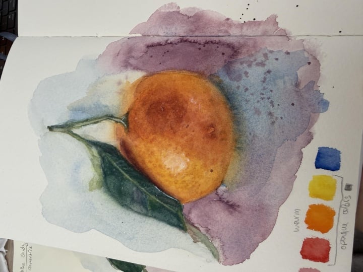
working our way through a Clementine painting
together from the initial sketch to
the final painting. We'll have a look
at the supplies, have a look at
some of the basics when it comes to
different edge types. We'll do an exercise which will help us practice
planning our edges. And together, we'll work our way through
the painting from the initial base
layers to building form and all the way to the
final textures and touches. What I hope you'll
gain from this class is an understanding
of how edges can help us improve our
paintings by creating a focal point and bringing
in atmosphere and interest. So if that sounds fun to you, let's jump right into it.
2. Supplies: Let's have a look
at the supplies. For this class, we're going
to need some waterclos. At the very least,
you're going to need some version of your
primaries, a red, yellow, and a blue, but you
may also want to get out your favorite oranges
or even greens. We'll talk about that in the class. You'll
need some paper. I'm going to be using fabriano artistico extra white
cotton paper, hot pressed. But you can use any
watercolor paper you want. And then you may
also want to have some scrap pieces of
paper or sketching paper, flower sketch and exercise. So tape to tape down your
paper and some brushes. I'll be using two
brushes in the class, this one by meten, which will be my main brush throughout the painting process. And then this one, which
is just a cheap brush I'll be using to help mix
and lift my paints, a pencil and one or two erasers, a cloth and some tissue for wiping our brushes and to help lift paint and some
water. Let's get started.
3. Clementine: Sketch: Going to begin by
creating our sketch. And though I always encourage
you to create your own, I'm also going to be adding
mine to the projects and resources tab for you
to use if you prefer. And, of course, you
can also trace to reference whichever option
you like the sound of. Go ahead and do
that. So let's see. Let's start with the
Clementine itself. We're going to need
something close to a circle. So let's draw that in just to get an idea
of the placement. If we then imagine a
line down the center, the stem is going to
be just off center, maybe somewhere around here. And then we can
have a closer look at the shape of the Clementine. So we want it slightly
more flat here on the top with a couple
of divots or bumps. Then it's going to come out. Down and around something like this. It doesn't have to be perfect. Food is very forgiving. It doesn't matter
if we make it more round or more flat
compared to our reference. It's still going to
look like a Clementine. And once we've got that,
we can look for things or proportions that can help
us get to the next step. There's not a lot we can use, but the stem is going
to be shorter than the height of the fruit,
maybe around here. It's going to come up there's
going to be a small bend. And then it's going to
go up at a slight angle. Feel free to hold your pencil to your reference to help
measure the exact angle. But just like with the shape
of the clementine itself, it doesn't have to be perfect. Then it's going to come down. And again, we can
measure the angle, but we can also look
at the shape of the negative space and try to get a similar
triangular shape. I mean, botanicals can move. You can make your stem
look however you want. For this main leaf, we need it to come down from the stem, and then it's going to come in in front of the Clementine. And there's going to be
a sharp bend or kink. And if we were to cut the Clementine in
half horizontally, this would be just
above that line. We may not have a lot to go on, but it's all about finding
these different shapes and proportions that can help us break down and
simplify our subjects. Et's clean that up a bit, go to lighten the sketch and
go over everything again, trying to really
follow the shapes, curves, and angles we're
seeing in the photo. As I said, it doesn't
have to be accurate. If our fruit is more oval or the stem is
shorter or longer, it'll still look
like a Clementine. And if you want to change some of these proportions on purpose, definitely go ahead and do that. It's your painting. You
can do whatever you want. But trying to follow and copy what we see is
still great practice. Often underestimate the power of sketching because the fun
part is getting to add paint. But practicing sketching helps us improve eye
hand coordination, muscle memory, and
general accuracy, all of which can help
improve our painting skills, especially with medium
like watercolor, where we can always just paint over our mistakes
with more paint. And then once we're
done cleaning it up, we're going to transfer
it to watercolor paper and move on to the next lesson. I have transferred mine onto
a piece that is six by 6 ". You can do whichever
size you want, but I do recommend not
going too small. Oh
4. Basics: Edge Types: Before we start
playing with paint, we're going to have
a look at some basics when it comes to edges. When you hear someone
talking about edges, there are usually
three or four types. Hard, which, as it sounds, are hard or crisp. Firm, still fairly crisp, but a tad softer. M. Soft, which is going to
look an awful lot like firm in this example, but ideally we want
firm to be more crisp and soft to be well, soft. I typically just
take firm out of the equation and simply
say less or more soft. Knowing what to call them
isn't that important, but knowing how they'll
affect our painting is. Finally, we have lost edges. This is where we no longer
have an edge or where it may be difficult to see where one edge stops and
the next one starts. So when do we use hard
versus soft or lost edges? Four of the main ways you might choose to
use them could be, first, focus versus
out of focus. So as an example, when you
have two objects in frame, the one closest to us
will often be more crisp, while the one further in the back may appear
slightly blurry, but we could also have it
be the other way around. In either situation,
using hard or crisp edges will help pull focus
towards or to subject, and soft edges will help put
less focus on a subject. We could also have a
portion of a subject be crisp and the rest
of the subject be soft. Same effect, we've now made a conscious decision that affects where the viewer
is going to look. The second way is
light versus shadow. You may have heard someone say hard edges in light and
soft edges in shadow. That's an old rule of thumb. I think the easiest
way to explain this is if you were to
turn off the light in the room you're sitting
in right now and add a small local light
source somewhere. When something is well lit, in this case, the objects
close to that light. They're usually easier
to see clearly, whereas when something
is in shadow, it may be more difficult to distinguish between different
shapes and objects. It all kind of blurs together. So if we were going to
paint these apples, instead of just painting
them as we see them, we could choose to soften the edges within
the shadow area in order to simply and effectively add more interest
to the painting. The third way is to show form, and this can be used
in different ways, but the most basic
example would be to imagine a cube or some sort of block versus a sphere or something with
a rounded shape. Giving the cube crisp edges and the sphere firm or soft edges can help emphasize
their form and again, make the painting
more interesting. The fourth way is
personal taste. All of these rules or
guidelines can be broken. It's worth being aware of how the choices affect
your painting because some things may simply work better than others
depending on the situation. In the end, art is subjective, and if you prefer to
look a certain way, I'm not going to
tell you to stop. We're going to do an
exercise to see how the different edge types
could affect our painting. But first, let's pick
some colors to work with.
5. Picking our Color Palette: We're going to pick
our color palette, so get out your paints. Looking at our reference, we definitely need some yellow and orange. So
let's start there. For our yellow, if we want
nice and sunny colors, it's usually best to
pick a yellow that leans closer to orange or
red on the color wheel. We could use a col toned or green leaning yellow right
where that highlight is. But for now, let's go
with a warmer yellow. I'm going to try
permanent yellow light, which is a color you've
probably seen me use before. It's a really nice,
strong yellow. Of course we need some orange. We all know that mixing yellow with red is going
to give us orange, so that's definitely an option. And similarly to the yellow, if we want bright sunny colours, we want a red that
leans closer to orange or yellow on the color
wheel, so a warm red. This one is scarlet lake. If we mix those, we'll get
a beautiful, clean orange. And if we add in some
more of our red, we'll be able to get some
of those deeper tones. These could work perfectly
fine for this painting, but if you do have some premixed
oranges in your palette, it may be worth having
a look at those. One of my absolute favorites
is brilliant orange. Now, you don't need
this specific color. It's not a necessity,
and a lot of people will prefer the
look of the other mix. But adding that
premixed orange as a transition color
means that we now have the most clean version of both yellow, orange and red. It is worth noting that different colors will
give different results. Not all reds and yellows are going to create
the same oranges, and not all premixed
oranges will mix well with all
reds and yellows. You may have colors
in your palette that are going to
work even better, so have a play with
the colors you have available to you and pick
the ones you want to use. Next, we're going to need
some green for the leaves. If you have some
pre made greens in your palette that you
love to use, go for it. I don't have any
in this palette, so I'm going to need
at least one blue. We're going to start
with the yellow we've already picked. If we add a blue that is closer to green or yellow
on the color wheel, theoretically, we should get some more clean or
fresh looking mixes. And if we mix with a blue
that leans closer to red, we'll get more of that oliv tone or more dirty looking green. But since we are working
with a warmer yellow, it's also important to note that switching
out the yellow for a more green leaning version will affect the result as well. Both of these two
top ones could work, and we do have some
brighter green showing on those small
leaves in the back. I probably wouldn't use the bottom combination purely because it's more
of a neutral green. When you have an
already neutral color, you can't use mixing
to make it brighter, which means we won't
necessarily be able to get those brighter greens
for the leaves in the back. But you can take an
already bright color and make it more neutral. So using one of the
brighter combinations is going to give us
more color options. I'm going to go with
the second option using permanent yellow
light and peacock blue. We're also going to need
some brown tones for a portion of the leaf and stem. If we mix together
our primary cause, we're going to get our neutrals, but you're also more
than welcome to bring in some earth tones from your
palate. You are the boss. And that's really all we
need for this painting. I'm going to bring
in one more color, though, but this one's optional. If you know me, you
know that I love using pink and magenta
watercolors for my mixes, so I'm going to add
in quinaquidon red. With this, I'll be able to make some decent looking purple
shades because scarlet lake, which I picked for my red, won't be able to produce particularly nice
looking purple shades. And even though we don't need
purple for the painting, because purple and blue is complimentary to
orange and yellow, I think it might add a nice
touch for the background.
6. Exercise: Planning our Edges: We're going to do an exercise that can help us
plan our painting. So let's get some paint
onto our palette. Don't worry about the exact
colours or color mixes. It's not important
for this exercise, but I'm going to get
out some yellow, some orange, some deba orange
tones, and some green. So if we were to paint this
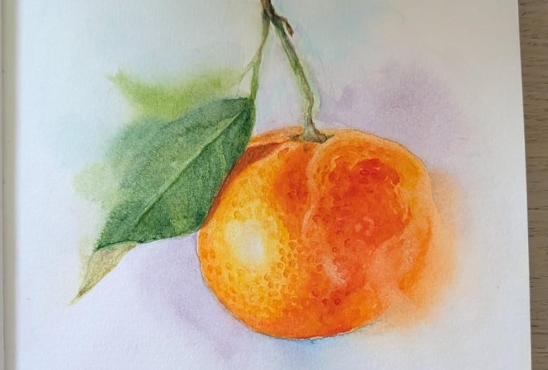
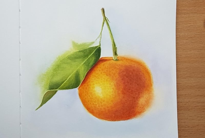
Clementine as we see it, bearing in mind that this is a very rough waterclo sketch. It might look
something like this. Gonna paint the Clementine. Add in a few different
shades of orange and yellow. We can add the stem
and the leaves. This is a perfectly good
Clementine painting, right? Just nod and say yes. Thank you. But what we can then
do by introducing soft or lost edges is create a focal point or multiple
points of interest, and we can make it feel
alive and less stiff. As an example, if we keep
the edges of the Clementine hard and then use very soft or last edges
on the leaf and stem, we're going to end up
with something like this. Now, we've got a lot of focus
on the clementine itself, but not necessarily
in a good way unless this is exactly what
you wanted, of course. And if we did it the
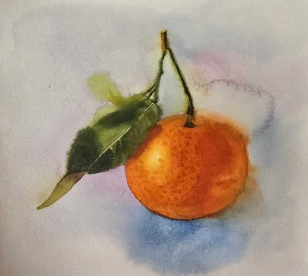
other way around, keeping the stem and leaf crisp. Like this, go to add that in. And then used soft or lost edges for the whole Clementine. And we may be
exaggerating the effect. Now, the entire focus
has shifted to the leaf, and it just looks kind of silly, kind of cool, but mostly silly. The key is figuring out which part you want to
enhance or which parts that are the most important versus which part you can play with without losing
the integrity or readability of the subject. Aside from creating focus, think of hard edges like the most essential building
blocks in your project, the basic structure,
something that allows the viewer to read
or identify the subject. There aren't any set rules
for where they have to be, but we want enough of them
and for them to be in the right places
for us to be able to see and understand
what we're looking at. Let's start with the
Clementine itself. I love the highlight and the
texture around this area. So let's keep this crisp. We've got the shadow
side over here. Even though you
don't have to follow the whole hot edges in light
and soft edges in shadow, that could be a good place to have some soft or lost edges. But we also want to maintain the readability of our subject. So what if we kept
this edge crisp? As well as the
bottom right here, giving it some weight and
making it feel grounded. And then we could simply
lose the edge over here. And if we wanted to
enhance the rounded form, we could soften that edge right above this,
just a tiny bit. It doesn't have to be a lot. I do like this, but I think we can play
with it some more. What if we added some soft
or lost edges up here? That looks kind of fun. This is just an estimate
of visual compass, something that can guide us, make sure we have a
plan before we start. But we can always
make adjustments as we're working
on the painting. Et's have a look at
the stem and leaves. We want to make sure that when looking at
the painting that our eye is going to travel all the way around the subject, or at least that would
be my goal for this one. So I want to keep
this up here crisp, and then I don't think I want to mess too much with
the rest of the stem. Though we could
soften it up a bit, maybe with some firm
or lightly soft edges. With the main leaf, I think it's going to make the
most sense if we keep the inner portion crisp or hard right up against
that highlight, which is going to be
our main focal point. So we really want the
most detail in this area. And then for the rest,
we can play around with a mix of soft
and hard edges. Maybe some lost edges down near the bottom of
the leaf over here. Keep the top portion crisp. And then maybe do
those small leaves using very soft or lost edges. Finally, for those small stems, I'm not completely sure. We could keep them crisp, but we could also play around
with soft or lost edges. How about we just see
when we get there, make those final decisions
as we're painting. I know this might look
confusing or messy, but hopefully it's going to make more sense as we move our
way through the painting. I'm going to add a couple of additional reference photos I've taken to the projects
and resources. This is optional homework. But if you want to have a
play with planning hard, soft and lost edges, just like we've
done with this one, I'd love to see what
you come up with. You don't have to make it look advanced or polished
by any means. The goal is simply to figure out where you want your
focal points or multiple points of
interest versus where you may want to add
in some softer edges. And the best thing is that even though there
are guidelines, there aren't any set rules. You can do whatever you want or whatever you
feel looks good. But for now, let's get
started with our painting. A
7. Clementine: Base Layer: We're going to get started
with the painting, and we'll begin with the
clementine or fruit itself. But first, we're going
to lighten our sketch. I'm going to try and make it so that you can still see mine, but you want to lighten it as much as you feel
comfortable with, especially in the areas where we want those lost or soft edges, which for the sake of
making things easier, I'm probably going
to be referring to those more so as soft, very soft or slightly soft or anything
similar to that nature. We don't have to be
formal about it. According to our plan, we
want to keep the main portion crisp and then have some
soft edges near the top. Maybe some slight
softness as we move down, and then we want to
allow the edge to fully dissolve or blend
over underside, still maintaining enough of
the structure or basic shape. Next, we're going to get
some paint onto our palette. We want yellow, orange, some deeper oranges that we can make by increasing
the amount of red and even mixing in a touch of blue for some
more neutral shades. Don't stress about
getting the exact ratios. We're cooking without
a recipe here. It's gonna be perfectly fine. Whether your painting ends up being more yellow or more red, slightly lighter or darker,
it's not important. We just want to have
fun with this painting. Okay, the keyword for
this lesson is bravery. Be brave. Keep that in mind. For the first wash,
we're going to establish where the
different colors go, as well as get some of
those soft edges in place. We're going to wet our paper, and wherever we want
those soft edges, we're going to wet
the paper outside of our sketch as well. You may need to go it more than once to make sure
it's well saturated, especially if you're working on hot press paper like I am. We want as much working
time as possible. Then we're simply going to start bringing in our
different colors, starting with the yellow
right around that highlight. And if the paint starts to bleed into the
highlight itself, you should tissue and dab the
area to lift the pigment. Then we can transition
into orange, and you can do this
either by layering a thin wash of orange on
top of a yellow base, or we can mix some of our colours to create a
more yellow tone orange. From here, we can bring
in a deeper orange, and we're going to continue
all the way around following the approximate
colors we see in our reference. Don't be afraid to go in with
saturated layers of color. It's a brightly colored
fruit that packs up punch. We can afford to be brave. As you see, I'm not concerned with making it
look perfectly smooth. It's okay to have some
texture for this project. I don't want to go crazy with the edges in the first layer, but I do want to
make sure there's a nice soft edge that
we can then build onto. So for now, I'm going
to place the colour, and then I'm going to keep
an eye on it as it settles. And then if needed, we can push the pigment
back into place. In my watercolor
sketbook class where we painted cherries
and watermelon, I talked about how this
particular type of brush is my favorite for
creating even washes. Though it's not a problem
for this project, it does mean my cloths
aren't flowing as much on the paper compared to if I'd been using
a different brush, simply because there
is less water present. So because of that,
I may want to help this along by
adding some more water. The one thing to be aware of is that when you go back
into a wet wash, you want to avoid having
more water in your brush and paint mix than what is present on the
surface of the paper. Because if you do go
in with more water, it's going to create pushback of pigment and we'll
end up with blooms. We don't have to rush, but we also don't want the
paper to start drying too much because we need it to still be pretty wet for the next stage, or at least very damp. We can always come
in with more layers, so we don't need to
get all the cars and nuances in place
in the first wash. But we do want to
try and get some of the main cars in place. Now, while the
paper is still wet or maybe even just highly damp, we're going to get rid of
most of the water from our brush and go in and
kind of disrupt the paint. This is going to
cause some lifting, which is perfectly fine, but our goal isn't necessarily to lift
a bunch of pigment. We want to start
bringing in some of that texture we're
seeing in our photo. Moving my brush in
small circular motions, mimicking the texture
in the reference, but we're not looking
for perfection, and the paint will blend and move somewhat
back into place. That's fine. We're basically doing all the things we
typically try to avoid, but this time it's allowed. Over here, we've
got a reflection. So let's see if we can bring out some of that texture
by lifting the paint. Something like this, it doesn't have to
be the exact shape. Similar is good enough. That looks pretty good. We don't want to go crazy, but we do want to disrupt the paint and get
some of this texture. So just have fun. And
if you can't tell, I really love painting citrus. I don't want to do too
much more because my paper is starting to dry and this
is just the base layer. But we're starting to
see the vision, right? It's a bit rough, needs
some more adjusting, but we're getting somewhere. So let's allow this
to fully dry so we can get started with
some proper texture.
8. Clementine: Enhancing the Form: Before going in with more paint, I'm going to see if I can get
rid of these pencil lines. Your ability to do
this may depend on a few factors like the type
of paper you're using, as well as how much paint
is already on the surface. Cotton paper is pretty resistant and can
handle some rubbing. And so usually, as long as the paint layer is fairly thin, we should be able to erase or at least lighten the sketch. It's okay to add pressure, but if you haven't
done this before, start with a small test
patch to see how it reacts. That already looks a lot better. We're going to work
on both some of the larger textures and the
shading in this lesson. If we wanted to, we could go in with a wash
on the whole thing, but I often find it easier to focus on small
sections at a time. Let's begin by having a look at the daka
shadow tones over here. We're going to wet the paper. And then starting
from the bottom where we have the least detail, we're going to start with some
of the more neutral tones, add that in, and build up
the shadow and values. As we move our way up and
as the paper starts to dry, we can bring in more of the deep reds and
the deep oranges. We want to try and follow the shapes we're seeing
in the reference, as well as some of the
textures and details from where the shadow
meets the reflected light. I'm not trying to be
super precise at all. I just want a similar look, and I'm focusing most of my attention on the
different color tones. And though we do want to
try and get similar colors, the values are the
most important. These are where the
form really comes out. It's already starting
to take form, and we are going to go in with even more detail
in the next layer. If we want to bring in some of this texture from
the reflected light, we can lift some of the
pigment while it's still wet. Then we want to
allow that to dry, and in the meantime, we can
work on the next section. The only thing is that we
want to make sure to not go in with more water to the section that's
currently drying. So if your paper
is already damp, you may want to
allow that to dry completely before
continuing with the next one or keep an eye on it if you do touch
into those parts. I'm going to see
if I can carefully add some paint on top
of that first section. I'm not going in with
much water at all, just lightly applying
the paint on top to merge some of
these shadow tones. For the sheatnes
right under the leaf, I'm going to go in wet and dry. You can go in wet and wet, but sometimes controlling
the intensity and value is easier when
going in on dry paper. I'm going to go in with
a nice saturated mix. So neutral tones up
here near the top, and then I'm going to clean
and wipe off my brush, allow it to dry
for a few seconds, and blend out the edges. I don't have any
deep ducks mixed up, so I'm going to add the deep
tones in the next layer. I want this to be
really vibrant. And some slightly more
yellow to orange along the edge and blent that out. Finally, we're going to
do some light lifting. So I'm going to grab my other
slightly less soft brush and go in right here where we
see that line coming down. Get rid of some of that. Not too much. So up here as well, enhancing that texture and form from the shape
of the fruit. Refine the shadows
just like that. And still the goal is not to try and copy the
reference exactly. You can if you
want, but it's not necessary in order to
get a good result. Finally, we can have a look at the reflection
OA on the right. And again, we want to
refine this shape a bit. Don't worry if
your reflection is too light in value minus two. We're going to fix that once
we go in with more detail. Tiny bit up here as well. It's really starting
to come together. And honestly, for more of
a typical watercolor look, you could leave it AS. Either way, let's
get a vase layer onto the leaves and the stem.
9. Leaf & Stem: Base Layer: I'm going to flip my
palette because I don't want to get rid of these
paint mixes just yet, but I also don't want my palette to take up too
much of the frame. We're going to mix up
some greens and browns. And same as with the Clementine, don't worry about getting the exact same ratios
or color mixes. I'm going to try and
create some more clean, fresh looking greens
on the right. And then as I move
towards the left, I'm going to add in not only more blue for some deeper tones, but also introduce some
red and orange to the mix, which is going to help
neutralize the green and give us a variety
of brown shades. The exact colours really
are not important. Value is far more
important than colour, but try to create a few mixes
that are more yellow toned, some that are more
blue, some nice dark tones, and a few browns. Once we add to the painting, it's all just going to end
up looking kind of green. Let's have a quick
look at our plan. Okay, so we want crisp
and crisp along here. Slightly soft or maybe
get wild and go softer, and then over here and up
on those small leaves is where we want it to
be the most soft and lose some of those
edges completely. And for those small stems, let's just see what happens. We're going to
light now a sketch, and I'm gonna zoom in, try and get a bit closer to make the sketch
easier to see. We're going to start
with the main stem. So let's wet our paper. Starting with a lighter green, we're going to slowly start
adding in a base color. And then as we move
towards the right side, as well as the top, we want to bring in
some darker greens, as well as a touch of brown. This is not about capturing
a bunch of details. We're looking for more of a washed out or
simplified version, and we can always go in and
add more details on top if we feel it needs a
bit more interest once we get to
those last touches. Add in some brown. My paper is already pretty dry, so that's perfect
for the hard edges. For that top bit of the stem, we can start with a
light brown base. Blend out the edges, bring in some of these darker, more neutral greens o
on the shadow side, and bring that down, making it blend into
the softer parts. Add in a touch of a lighter, less neutral green, and
a tiny bit of texture. That looks pretty
good for first layer. Let's move down onto the leaf. And because this
is a larger shape, I'm going to wet the
paper within leaf first. Since we want the edges
on the right to be hot, this is going to allow
us to add in our paint without getting hot
edges on the left side. We're going to focus on this dark green main
portion of the leaf. I'm going to start with
a green that's a tad lighter and fresher in color than what I'm
seeing in the photo. It's much easier to
tone down a layer, should we end up deciding
that it's too bright rather than trying to brighten a
layer that's too dull or dark. Once we've got
that, we can bring in some of the
deeper shadow tones. And as the papers drying, we can try and get in that line near the center of
the leaf as well. We want to look for some of the main color or value changes. Try and get some
similar textures, but without stressing or
trying to get it perfect, it's just a base layer. We can glaze on top of this
and deepen the values, adjust the color, and
bring in more detail. We can allow that to dry and
go back in, wet the paper. And then this time, we're
going to wet the paper outside of the sketch on
the left side as well. And we want to do it all the way down the length of the leaf. When working on the very
soft or lost edges, we can either allow
the watercol to do its thing or we can use our brush to help it along or help shape it if it's doing
something we don't like. There's no right or wrong. Sometimes, allowing the paint to just flow and settle
where it wants to is going to create the best and most
magical looking results. But other times we may feel
it messes with what we're going for or even messes with the composition
of our painting. Don't be afraid to play around
and try both techniques. To completely okay to deviate
from the original plan. If you end up doing something or the pigment does something
that wasn't planned, but maybe you like, go
with the flow literally. Oftentimes we can
get great results from some of those
unplanned surprises. Having a lost edge
right down there where the leaf twists or flips may in hindsight not
be the best choice, but let's see where it leads us. Gonna add in some shading
and light detail. A lot of this will become much darker once we add the
next layer of paint, so we don't have to
spend a lot of time on details that we won't
see in the end anyway. Keep it simple. Uh Once that has had time to dry, we can wet the paper up
near the smaller leaves. Let's keep this really loose. Bring all the focus down onto the parts that are more
important just like that. And then as a final
touch for now, I'm going to bring in some more dark green
near the bottom, as well as some
brown shadow tones for the underside of the leaf, simply to help us visualize
the forms a bit better. If you're used to mostly staying within the
line, so to speak, I hope you can see
the potential in playing with some of these
different edge types. It brings in something extra, something we can't capture with a photo and something that really brings another level of atmosphere and excitement
to a painting. We're almost done.
Let's move on, make those final adjustments to the values and bring in
the last few details.
10. Background: We're going to add in the
final touches and details. But rather than starting
with the fine details, we're going to work
from the outside in. So first, we're going to
focus on any loose changes. This would be changes to some of the flowy layers and edges, larger value changes to the shading or color
layers for the background. Let's have a look at
the background first. Contrast is one of the best ways of
creating a focal point, and this can be contrast
through level of detail, light, color, et cetera. So if we want to
use color to bring even more focus onto
our Clementine, we can use something like complimentary color
like blue or purple right around our main subject to really draw the viewers
attention to this area. And then for the parts
where we want less focus, we can use a color that's
more similar to that area, which for the leaf could
mean using neutrals, some green or even bluish tones. So basically, something that's not a complimentary
color to green. Let's bring some blue
onto our palette. We can mix up one or
two shades of purple, one with more red or pink, and one with more blue. And to create more of a neutral, we can mix our blue
with our greens. We don't have to make
the background dramatic, and we can also go
in with more layers if we decide the first
layer is too subtle. So for this first wash, I'm going to keep it fairly light and see how
I feel about it. Get that paper nice and wet. I'm going to add
a touch of orange to this edge just
to get started. Then I'm going to bring
some subtle purple tones into and around this area. Some purple over here. And bringing in some more
neutral tones to the rest. It's up to you how
saturated you want to go, but the level of saturation
is another form of contrast. So muted tones for the background versus
strong saturated colors for the subject can also help bring even more focus
to where we want it. And we want to make sure to keep an eye on the edges in case it bleeds into or on top of our clementine where
we don't want it. Some blue tones down
near the bottom. Want you heap you with
it, allow it to dry, and then we can move
on to the next pot.
11. Final Details & Class Project: A next, we're going to adjust and
push some of the values. So anywhere where we needed to be dagger or deeper in value, like the dark tones on
the leaves and stem, we're going to go in with the shadow tones and darken that up. One of the most common issues and something that can
make our paintings look flat or lack dimension is
the fear of going too dark. We want to take advantage
of the whole value range from the lightest
lights to the deepest ducks, which similarly to what we talked about in
the previous lesson, also comes back to contrast. We want to make our subject pop One of my favorite
ways to add shading when working wet
and dry is to only pick up pigment with the tip
of my brush and then lay the brush on the side using the whole belly when
applying the paint. This way, we automatically get that gradient going from the
colour to the clean water. I don't do this
with all paintings, though, but for
something like this, it's a great way to add shading and add in
some texture as well. Gonna go in wet and wet
for those smaller leaves. Still gonna keep it super loose. Like that. So fun. So And then I feel it's a bit too straight and in
control over here, so why not add in some more wet and wet paint
and see what that does? Never be afraid to experiment. If we don't try, we'll never know what it
would look like. We may still want to bring out a few highlights
on the main leaf, but for now, let's go
back to the Clementine. I'm definitely gonna have
to mix up some more paint, including some deep shadow tones for right under the leaf. One way to create
shadow tones for orange is to add
in reds or pinks, and one way to create
shadow tones for red is to simply
bring in some blue. Need some more orange as
well, some with more red, and some with more yellow, but we're still cooking
without a recipe. Don't worry about
the exact colours. Just like with the
leaf and stem, we want to push the
values because now that we've got some more paint and darker tones and
everything else, including the background,
our initial shadow tones don't look dark enough. So we want to go in exactly
like we did in the beginning, but this time we can layer
on top of what we've already got using the
previous layers as a guide. I also feel like I'm lacking
some definition over here, so let's add in a
bit more paint. A few details to the reflection. And even down here where
we have that last edge, I want to bring in
some more orange, make it even stronger. And a touch of green right here where
the stem is attached. I actually kind of like
this unfinished look, so I think I'm going to
leave it kind of like an outline and not
finish coloring it in. I think it adds a fun
touch to the painting, but if you disagree, feel
free to finish up the shape. Almost ready for the final
layer of detail unrind. I don't have enough of
the yellow toned orange, so I'm going to
quickly mix up some more and allow that to dry out on my palette while we add the shadow
tones under the leaf. Let's pick up some
of the shadow tones. Add that in, and I'm just
going in wet on dry. There's enough paint on the paper to where we
don't need to rush. So even if it dries, we'll still be able to
blend out those edges. But look at how much of
a difference that made. Each of these small
adjustments can bring in so much
depth and dimension. Okay, this is my favorite
part of the entire painting. You see how if we look at
our reference up close, the whole rind is covered in
small poka dots or specs. What we're going to do is go in, and we want to use a
color that's similar to the base color but slightly
darker than the base color. And then we're
simply going to add a bunch of these dots or spots. So for the yellow base, we want to use a
yellow tone orange. For the yellow tone orange base, we want to use a less
yellow toned orange. For the proper
orange base layers, we want to use maybe some red toned oranges
and so on and so forth. Is going to be very repetitive, so I hope you'll forgive me, but I am going to speed up
quite a bit of the footage. One thing to note is because specks are sitting
on a rounded shape, as we move closer to the edges, we want them to look
kind of squished, more of an oval shape, and we also don't want
them to be too strong, crisp, or visible,
close to the edge. So it's better to stop before
you get to that point. So before we get to the edge, we want to allow them
to almost fade out. This is going to give us the
same type of effect as if we were using soft edges on a
rounded shape or sphere. It helps enhance the form. Once we get to the reds, that's going to be
the deepest tones. We don't want to go in
with deep brown mixes. So when we get to the shadow
tones on the Clementine, we're going to allow
the specs to kind of disappear into those shadows. Don't be too neat or
precious about it. These are organic shapes. They're not machine made
and they're not perfect, not in shape, nor the pattern. And we can even
allow some of them to intersect or sit
on top of each other. It's all going to add
another layer of dimension. Once you're done, if you want, and if you feel some of
them look too crisp, you can go in with a wet brush and carefully go in on top. One swipe, keeping
a light touch, just enough to soften them. Just be careful. We don't
want to lose them completely. The last thing we can do to clementine is use lifting
to bring out a few more of the highlights
and small textures to clean and wipe off
your brush and use it to lift out or
bring back some of those highlights on the
leaf or on the rind, maybe around the highlight or anywhere else where you feel it may need to
be brightened up. While doing this, let's talk
about the class project. For the project, I love for
you to paint this Clementine. Play around with using
both hard and soft edges. It's not about perfection, but about using some of
these different edge types to not only enhance
our focal point, but also bring in some more
atmosphere to our painting. Edges can be used
as a powerful tool, so it's worth
playing around with. You can use the same type of edges I used for my painting, or you can use a
different edges in different ways on
different areas. It's completely up to you. We are going to be
playing with edges a lot more in future classes. So for now, I hope you
enjoyed this class, and I can't wait to
see what you create.
 Tanja Jensen, Artist - Sculpting, drawing and painting