Transcripts
1. What is this class about ?: [MUSIC] Watercolor is
a fascinating material for painting, but it also dries so quickly. To deal with it, one needs either planning
the process carefully or using the technique
that allows us to keep watercolor wet longer. In this video tutorial, I'll show you how to do both. Hi everyone. I'm Maria, a watercolor artist
and an instructor. I adore painting realistic blots and my special law
is landscapes. The picture I've chosen
for this tutorial incorporates almost everything I loved about painting nature. There is a realism
of representation, different plans and perspective, and the watercolor
abstract flow in the sky combined with the graphic
precision of water flexion. This class may be
interesting for beginners as it doesn't require any strong drawing
skills but allows us to understand basic principles and also to practice brushwork. Amateur artist may also
discover different tips and tricks and also master
their wet-on-wet technique. Starting with a tonal sketch and setting up the composition
and the color palettes, we're going to move to a
step-by-step landscape painting. I'll carefully explain every
detail of the process. It'll be will be easy to follow whatever your
watercolor level is. By the end of this class, you'll not only be able to create this simple
that's spectacular, realistic landscape, but also
we'll learn their approach and technique that
you can use for your future watercolor pictures. Join the class and enjoy
watercolors. [MUSIC]
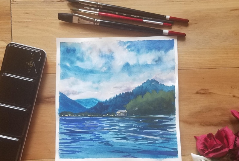
2. Supplies and technique intro: [MUSIC] Let's begin
our landscape. For this piece, I will use
the following materials. I have prepared several brushes, a large brush to wet the paper, a squirrel brush, a small synthetic brush, and also a pencil,
and an eraser. In addition, an
important point is to have a waterproof tablet because this technique implies
that the board on which you paint doesn't absorb water. As for the paper, I use cold press paper of
300 grams density. However, you can try
to do this plot on cellulose paper
from 200-300 grams, if it will be soft enough and if it will be a small piece. Also, you can paint on
thinner cotton paper like 185 grams or
something like that. If you don't have exactly
this kind of plastic tablet, you can use any board neatly
wrapped in plastic film, or plastic folders to work on, or just paint on a glass table. You can always find
some solution, you don't have to have the
same material as mine. The main point is that the
board doesn't absorb water, because today we're going to use a double-sided paper
wetting technique. You're probably
already experienced that the paper
dries very quickly, and it's not always possible
to have time to draw all these smooth transitions and spreads in wet technique. Today, I want to show you a way to extend your work in the wet, letting you have more time. In addition, this technique can be used for
different subjects, especially on large
formats where you need to make large washes. Why is this especially
good for large formats? Because in small
formats you can almost always have time to do everything in
normal wet technique, and this technique
that I'm going to show today is quite
time-consuming. The preparatory stage and
the drying stage take time, but I think it's worth it.
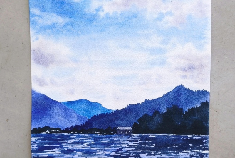
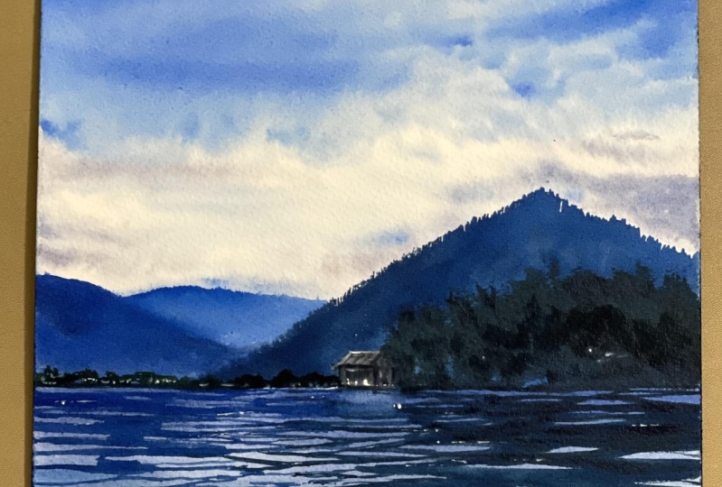
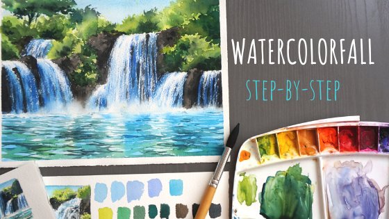
3. Sketch : Composition and tones: [MUSIC] Today we're going
to paint this picture, a landscape with reflections. Of course, here we encounter the phenomenon of
aerial perspective. When the distance mountains
seem smoother, brighter, we don't see as much details as we do on the near mountain. You see there are
already some trees here, plus the trees in
the foreground, and they will be more detailed. In addition, there is another property of
aerial perspective, which we haven't
not yet mentioned, that those objects that
are further away from us, they seem not only brighter
but also cooler in tone. That is, the air that
is between us and these objects absorbs
the warm tones, and objects further away
seemed to be colder. This also applies to
the near mountain, but if we look carefully those mountains that are
in the far background, they are lighter and colder. In addition, we will work with
the sky in wet technique. I think you have
already guessed that all these smooth transitions will be made in this technique, and of course, the
reflections on the water, which we will
definitely talk about. But before you deal with
all these subjects, if they seem particularly
difficult to you, I suggest you to make this preparatory
sketch and understand a little bit about what exactly we are going
to paint today. Of course, the first thing
we have to determine is the tonal ratio
within this picture. I'll take a pencil
and a piece of paper. This is the paper I have left over from cutting
the big sheets, so it's the same material
I'm going to paint on later. However, you can take the simplest cellulose paper for this test and practice on it. What I want to do, first, I want to figure out where the lightest and darkest
parts of the picture are, and where the middle tones are, and figure out the
composition at the same time. Basically, I've already
cropped the photos so that we can work
with it comfortably. But if you choose your own
subject at this stage, you can also decide what kind of composition you want to build. When I talk about composition
in this kind of landscapes, I mean first of all that
if we have a field, water or some surface, and this guy, then we have to decide what is more
important in our picture. That is, what we will give
more space and attention to. There is this rule, the rule of thirds. You may have noticed that on your phone when you
take a picture, there is this grid
on your screen. In our case, the
picture is divided into three parts horizontally
and three parts vertically. What is the purpose of this? Because according to
classic rule of thirds, we pay attention
to these points of intersection of these
lines and these points. They are points of interest. Then we place those things, those elements that we want to attract the viewer's
attention the most. In addition, it can not
only be these points, but also the very lines
on which they line. Usually with this
approach around horizontal lines lie some
horizontal surfaces or objects, and along vertical lines go some vertical objects,
poles, trees. It also can be mountains or
some other vertical elements. All of them lie on
the vertical lines. That is, it's not
necessary to put some objects specifically
at the point of interest. In this case, in this landscape, you've already noticed
that we don't have it divided in half by the horizon, which means we definitely have an emphasis on water
or on the sky. Most of my composition
is given to the air and less to the water. I've already decided for myself that's my horizon
line lies somewhere here in the bottom
third of our sheet and a little bit
below that line, which divides it
into three parts. Everything else we have, of course, is given to the sky. Somewhere in this part here, I will have a mountain, maybe I will raise it a little
higher in the main drawing so that I don't have
too big area of sky, and of course, a background
with a distant mountain. Here we will have trees. You don't need to
draw anything here. We just need to deal
with the spots. Basically we have an area of
the sky and area of water, and we have an area of
hills on the horizon. Next we start figuring out what the tone ratio of all
these elements will be. We understand that
we have some clouds. Let's assume they are whites. Then we have the sky, which will be darker in
tone than the clouds, but it's still lighter
than everything else. [MUSIC] You can shade it
a little for yourself to understand that it's dark
enough, nonetheless. [MUSIC] Next in tone we have water since
it reflects the sky, it would be logical to
assume that it's either slightly lighter or slightly
darker than the sky, but in this case, it's darker. [MUSIC] Also the foreground of our water will be darker too. We also have hills that are
even darker than the water. [MUSIC] I'm not separating
the background and the middle plan from
each other yet, because as long as we
look through this plan, we can see that they can be a taking for
one common spots. Besides we have the same tone
of reflections down here. Then we have the darkest part, the trees and their reflections. The darkest elements
of the picture. Now I have soft paper
and I may not be able to make the trees dark enough
in pencil, but I'll try. That is where we have
almost black trees and such a very dark reflections
on the water. [MUSIC] In this way, we will
create perspective and the central space and
volume in this one. We have the widest
tone of the clouds. Then we have the
sky a little bit darker then we have the water, followed by even
darker fourth tone, and background on the hills. Finally, the darkest one is the black trees in the foreground and the
reflections of them on the water. We've done this sort.
We've looked carefully at the composition and now we understand where the
darkest elements are, where the lightest elements are. Even though we
might want to make maybe the cloud shadows
purple or something, we will remember that clouds are globally much lighter than everything else and the light in the clouds should be very pale. The same goes for the water. We may think that white
clouds are reflected in, but we have already looked
carefully and now we know that the clouds and their reflection are
not really white, but they are
slightly grayish and much darker than our
sky in the picture. Therefore, guided by
this tone sketch, we can already somehow more consciously paint our
future landscape.
4. Sketch : Colors: [MUSIC] Then you make a
similar sketch in color. When you have already
figured out the tone, you can decide for yourself
to make it some kind of a sketch in order to
determine the colors. You don't have to do anything
so extraordinary here, you can just pick the
colors that you will use. I've outlined to
hills the horizon, the waterline and the treeline
on my little sketch now. You can see that nothing is
really drawn here and now I can try to pick out the
colors that I'm going to use. Also you can moist in the
sky a little bit. Let's see. I'll try to use a simple
colors as possible, which are available in
most basic ballots. Now I'll take the blue
one and we'll use it to make the sky without
painting over the clouds. Maybe even mix a
little bit blue with ultramarine now and
get what we need. Yeah, that's how I like it. Notice how the sky above, is darker than the guy below. This is the same phenomenon
of aerial perspective. Because the sky here, it's much further away and
there is more air in it, than in the sky above, where outer space is closer
and there is less air. That's why this sky
seems lighter here. Then we'll have some
clouds down here. Also looking at the
tone of this sky. Somewhere in these clouds will mix a little
wavelet for this, can even be some red plus yellow and get almost
a neutral gray hue. We'll talk about the colors
again in the process. Now I added a little yellow
to my blue and a little red and gather gray
for the cloud shadows. From there I can move
lower to the hills. I've already told you that
the background is more blue. We'll take blue, maybe neutralize it down with
the little brownish. So here you can also try the shaded ones shade
which we will use. I already remember that my hills must be much darker
than the sky. Let's sketch the water first, which should be darker
in tone than the sky, but lighter than the mountains. It will be darker
in the foreground. I will add gray to it. So I now plan in advance
how I will paint water, what colors I will use. Generally, this section will
be darker than the sky, maybe it will have some clouds, but will work on them later. Going back to the hills. The far ones will be more blue, the front ones will
have more ultramarine, and I'll add a little yellow
to it and in this case, I'm using Naples yellow. It's possible to add some brighter blue elements
somewhere around here. I can of course
immediately paint where the trees will be it's okay
if you will get some spots, it doesn't matter at all. Here we have reflections
of light clouds. Next you can immediately
while the paper is still wet, you can think of what
to do with the trees. I'll take gray and some
green to go with it. You can take any
green that you have, but I'll take some warm
and add some blue into it. In fact, it doesn't
matter what shade you took as long as
it's dark enough. Trees can be outlined
with this strokes. The same on the horizon let
there be some small ones, so the darkest tone
we have is trees. You see, we have almost
completely figured out the colors and we have already got
such a little landscape. Then we can think
about what color to take for the reflections. In this part, they
seem more blue to me, but it's not as
blue as in the sky. It's more of a blue similar to the color
for the mountain. But since it lies on
the water so we need to make the reflections darker than the mountains and the sky. You could try by taking an in
the frame blue for example. On the right will darken everything because there
are reflections of trees plus there will be more gray and greenish like trees. Here we are. In fact we've made a mini version
of our landscape. I think you have already
figured out what the sequence of work will be and what colors we will choose. The only thing left
to deal with is the technique for
preparing the paper. Before each of your
new landscapes, you can always do this
sketches by which you will be sure what
colors to pick up, what should be dark and
what should be lighter. On such a small sketch, you can always practice and be more confident and secondly, you will know what
colors to use and how your composition
will look in the end. After that, let's get to work.
5. Drawing: [MUSIC] Now that we have
the preparatory parts done, all we have to do is transfer the drawing to our final sheet. In this case, I see that I have a more square form
than in the photo, but it doesn't really
make much difference. As I told you before
the one I will take the bottom
third of the paper. Even a little less. Somewhere here there
will be the hill. Doesn't even have to
be exactly like that. Here will also be the trees. They're also in principle not necessary to draw immediately, but to make it easier for you, you can outline for yourself their feature
contours if you want. I don't want them to be exactly the same shape
as in the photograph, I'll make them more horizontal. We have a house here
so we can draw it too. There is no need to
draw all the details, we just outline the contours
of our feature objects. The mountain, the trees, the hill in the far background, maybe we'll make another one
for the further backgrounds. I'm not going to change
anything about the water. There will be some more dark
things in the horizon here. Now I'm going to remove
the extra lines. Normally the drawing
will take you no more than two or three minutes. We have a horizon, there was a basic outline of
the hills and that's all. Then you can start to
prepare the paper.
6. Preparing paper: As I said before, today we're going to try to extend the work
in wet technique. For this, I will apply
the following trick. I want to wet it completely
before I start working. I start moistening
it on the backside. I take large natural hair brush, which allows me to do this
as quickly as possible. I choose the best tool for this. You can also just soak a
sheet of paper in the bath or in the basin or under
the shower if you want. Our goal is to moisten the paper so that it is
completely soft inside. This will allow us to work
as long as possible in our wet technique so that
we have time to do our sky, water in clouds, and
deal with the landscape. I start by wetting our paper on the backside after
I've done the drawing. The paper will need
time to soak in. Also depending on the paper
and the manufacturer, it's may have different
degrees of absorption. It may be impregnated with
different compositions. In general, different paper needs different time to soaking and you will have to spend some time to prepare
it well anyway. [MUSIC] I don't recommend you to skip this step. Really be patient
and spend your time, watch the paper how it behaves. It can go in waves
and it's normal, but there shouldn't be
any puddles though. We do everything
as if we were just wetting the paper for the
technique on the wet. I pay special attention
to the edges. They usually dry faster
and I watch what happens. I study its surface and where it's necessary, I add more water. Be sure to give it
time to soak properly. When the glass is
already stable, the water is holding on to the surface and
also going inside, you will feel that the
paper will be quite wet. Now you can see I have
a shiny enough and quite heavy because water
is getting into it. Now I carefully flip
it to the front side. Maybe if you moisten
the paper very well, its edges will stick right away. But I tried to do everything as fast as possible
to show yourself. In my case, the edges
are still a little off. My next action is to
take your brush and wet the paper very delicately
on the front side. I think by now you
have understood what we need a
waterproof board for. It keeps water from going inside and it wouldn't work well
on wood for example. As your paper wouldn't
stay down long enough, plus you would be
soaking the wood tablet, which is not good
for wood either. Gently and delicately I cover
the surface of the paper. I always look closely
at the edges. They dry out faster, but I try not to
soak them too much. Suddenly if you see
bubbles at this stage, then you need to
lift the sheets and gently wet the place
where the bubbles are because they
occur in places where the paper is not very well
adhered to the tablets. Then you need to very carefully smooth the paper
back to the tablets. After that, before
I get to work, I make sure to remove
the drips from the board because they can spoil your work while painting. This water can start moving into the sheet and create
ugly paints spreads. Since our sky is planned
to be drawn on wet, which we have already
understood with this first test landscape, we can already start
working right away. The surface of the
paper is shiny, which means that we can safely work in wet-on-wet technique. We are not interested
in the bottom part yet. It may even dry out. Besides, it's darker
so we can safely begin to paint our
sky, paint water, and we will move on to the more distinct
elements on dry later.
7. Sky: [MUSIC] To deal with this
sky, I can take both, the squirrel brush and the
imitation squirrel brush. Now I will observe which
one will work better. Maybe we won't even
need synthetics. But either way, these
are the main three, like my main working
brushes for these plots. Somewhere nearby, I
always have a tissue that I will use to control
the amount of water. Just a reminder, we have chosen phthalo blue paint for
this sky as a base. [MUSIC] Sometimes we will mix it with ultramarine as well. Let's start right away. I have already prepared
the paints for this sky. Let's maybe also make a
shade for the clouds. I have some blue left here. In fact, the same blue
plus ultramarine. You're going to add
some warm red and a drop of yellow
to them as well. I will check the color
on a test paper. You can even make it
maybe a little warmer. I will add a little
more red to this gray. Yeah, and purpose
to make it warmer. [MUSIC] I mix them on
the basis of the blues, I will work with to make the
picture look harmonious. Great. That's the kind of
gray we're going to have. Basically we can start right
away with cloud shadows. I'll have clouds somewhere here and then I'll paint
the sky around them. Basically, you can go two ways. First, draw all the
blue sky around the white clouds and
then add shadows to them as I did in preliminary
sketch or do as I do now. First, do the shadows and roughly outline where we
will have the clouds, and then add the blue parts. Both methods are good. Choose which one you are
more comfortable with. I'm painting this shadows
on the clouds right now. If you have trouble imagining the shadows on the
clouds and how to do it, you can see the white
clouds and sky first and then add the shadows
depending on the shape you have. But I think you can
handle it that way too. I outlined this shadow
of a cloud here. Maybe some other clouds here. I could even darken the clouds a little bit by mixing
in thicker paint. I can allow myself that because the paper will shine
for a long time, I can pick and choose,
mix the colors. I'm going to make
a darker shade. Drop the excess water
on a napkin and add darker shadows here and there to make the clouds
more contrasting. Or you can do it later when
you have already drawn this sky and it will be clear where there is not
enough contrast. If you have too much paint
blurring at this point, look, just remove the excess
water with the napkin. Don't worry, you're not getting all the paint off that way. [MUSIC] Now, I work with a small
synthetic brush. I made cloud shadows, so I'll leave it
like this for now. I use a small brush so
the paint won't spread too much because synthetic
holds less water. Then I take either a squirrel or imitation squirrel brush. In this case, I have
imitation squirrel, which is synthetic, but it has such a characteristic
close to a squirrel brush. I start from the top down. You can also start from the
bottom up, whatever you like. While the surface of
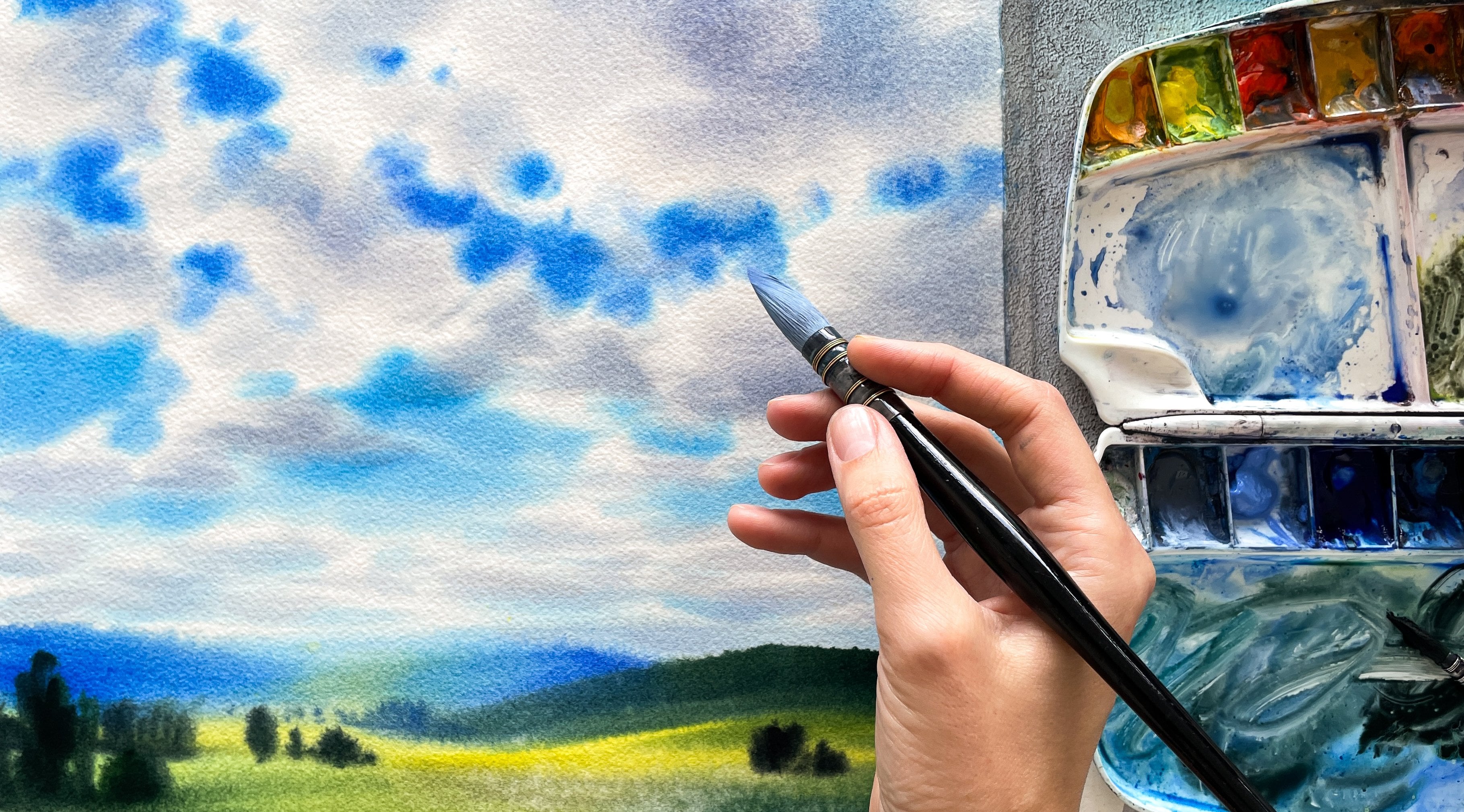
the paper is shiny, I carefully trace the clouds. To make your sky fuse
beautifully into the clouds, take the blue part
lighter, let it flow. I take quite liquid
this mixture. I took a brush close to neutral. You can even take
a squirrel brush. It gives enough of water. The most important
thing here is not to paint over all the clouds. Don't get too much into it. I remind you that
it's darker on top here than on the bottom
so we can add contrast. I keep in mind that the paint will dry out and
will be lighter, especially on paper
moistened on both sides. This is unavoidable
factor of wet technique, so you need to paint thicker. I'm not trying to completely copy the shape of the clouds. You can also wash
off the paints. The principle with clouds, especially single clouds, is that they have first light, then shadow, and sky. Sky, light, shadows,
and sky again. Somewhere here under the shadow, I usually don't
have a white cloud, but a piece of sky first and
then another white cloud. It's not always the
case of course, but if you need some
principle to paint over, you can just usually safely put this sky under the
shadow of the clouds. In fact, even if you paint this surface unevenly somewhere, it still gives a
sense of clouds. I think you can see it. I'm not too worried that the paint isn't evenly
spread somewhere. When I paint this sky, I always try to do it with horizontal movements
because we can imagine this sky in this case as like flat horizontal surface, which is not the case, but
I imagine it like that. It's not some
vertical object that should be painted with
vertical movements. If I draw some objects
like a pole or a wall, I will paint it with
this vertical movements. If I paint anything horizontally
like water, a field, a table, a road, or sky, anything
that it's a flat, I do it with a sort of flowing
horizontal motion because every stroke will
be readable and it will define the impression
that the viewer has. I will blur a little
bit of the paint here. That's it. I think I
will stop at this point. What I did first, I put shadows on the clouds, then I made a blue
sky that's a little darker on top and little
lighter on the bottom. Moving on, generally, I think it looks good. Since I still have shiny paper in the area of the mountains, I can paint over
them a little bit right away with some kind
of a tone. But be careful. If your paper has
already dried up here, it's better not to touch the
mountains at this stage. Just leave it drying and then paint it over with next layer. I want to clean up
a little bit here. Notice that the place
where I was now painting is still shiny and I could
fix something on it, but I'm not going to do this. Let's have this
fuzzy, simple sky.
8. Mountains and water: [MUSIC] Moving down,
we have water next. I take the same paints, which are moraines
that are blue, and this time I'll add a mix
of red and yellow to them again or you could even try
adding a little gray to it. In other words, I want
to make the water darker and less vibrant, less saturated in color than the upper part
of our painting. Again, I work with the
horizontal movements I told you about before. At this stage, you can even take a bigger brush, let's do that. I take ultramarine,
I take phthalo blue, I mix the colors thicker, adding a little bit of yellow or brown or gray or whatever, so it's not so vibrant. I will make the
foreground darker. This is to emphasize the
fact of perspective, just as our mountains end sky, our water follows the rule of aerial perspective and
whatever is closer to us, it will be darker than
what is farther away. So the reflection on
the sky will also be darker somewhere
and lighter somewhere. Horizontal movements will
probably give you a sense of the surface of the water
right away, which is cool. Now look, it's as if the surface of the water
has already made itself up. I just took the pale
blue first and then I darkened it a little
bit closer to the edge. Don't forget to remove the paint from the size because it can flow back into some
unnecessary places. I'm not going to paint the
cloud elements as much here, but I wash and squeeze
the brush well, and maybe take some paints
off in some places to give it reflection effect
of the clouds here. [MUSIC] I squeeze the brush out gently and stick
the paint off. Now, you're already supposed
to know how to do that. I also can do this in
the foreground here. [MUSIC] I work with
a little wet brush, I don't dry it
completely with napkin. I don't want the place where I'm wiping to be much drier than
the rest of the painting. In general, you can leave this place uncovered,
for example, and it would also work and
would leave a white gap. If I look closely now, this area is no longer shiny and this lower area
is still shiny, and that's [LAUGHTER] a little
bit more shiny up here. Meanwhile, I'll see
that the paper is still tied to the tablets, which means that the paper
inside is still wet. Now I have to decide how I'm going to do this
background of my hills. I think given that here the sky is not shiny and
looks basically dried up, I can take a smaller brush and try to paint
the backgrounds. If it spreads out, it's not so bad because
these mountains are in the distance,
so let's try it. For this, I'll take the blue, which is so much cooler. I remember that the tone of these mountains
should be quite dark. I mix the color and can compare it to what
was in our sketch. Maybe I'll even take it darker. I'm going to do the
background here. See, things still
bleeds a little bit, more of this happens because
the brush is too wet. Basically, since
it's the background, it can be a little blurry, but I don't really want it
to be too blurry though. I'll take more ultramarine, maybe add a little gray. Again, my paint is
very densely mixed. The consistency of it
is so thick that it doesn't flow much and it looks like almost a
heavy cream you see. The far hill is
blurring a little bit, but I don't think
that's too bad. Now with this dark color, I'm going to make
this mountain here. It's still quite blue, but already darker
than the further one. It can be gently
blurred as well, somewhere you can add
some darker details. I'm going to add a
little bit of dark color here to separate it
from the background. You see it's dark enough here. Don't be afraid of
such a dark tone. The paint will dry and
then lighten a lot. Here the top edge has spread and if you
don't like it at all, you can very carefully take a
smaller brush, wash it out, give it a good squeeze
and gently pick up the excess color here
if you really wanted. Basically, I still think
it would be nice to have the distant mountains spread out like this so that's okay. As for the front side, we'll do now on the dry paper. What I have done now is the
first layer on the wet; sky, water, and now I
have also made mountains. If at any stage your paper
is dry, that's okay. You just keep working
in the same way. I don't think that
should be any disaster. If you're worried
about the mountains getting very spread out, you'd better dry the
paper out a bit first, which I'm also about to do. I take a hairdryer and
I dry the paper now. I didn't dry it very much. I only dried the right
side where I plan to work, so I dry this area as
well and I went over this part one more time so
it's not shiny at all now. If I look, basically the surface of the paper
has already lost its shine, but it's still holding
on to the tablet, so it's still wet inside. I'd take this brush
again and try to make a darker tone with it, where I can add more blue
and gray, make it darker. [MUSIC] You can even add a little green, but I'll try to do
everything with gray. This is ultramarine plus phthalo
blue plus a little gray. Maybe you can add a drop
of yellow here if you want and to make it look
as it's in the photo. I dropped the excess water
to the napkin and you can safely make an age
from here as if it were trees growing
there or something. [MUSIC] Let's paint around the house for the
sake of interests. Let it be light. We can always paint over
it later or maybe it will turn out beautifully on the
background of the mountain. We will still have dark
trees there anyway so I had the idea to make the house in the foreground
a little lighter maybe. Then you can change the
color a little bit, take more ultramarine
for example. I put the brush like this, look, and I make prints with the tip of the brush
like tac-tac-tac, and it gives me the effect
of top of the trees. You don't have to do it
everywhere on the whole mountain. You don't have to do it
everywhere the same way. Here too, I can adjust
it a little bit. I will add a little yellow here, make it yellowish
edge just for beauty. But it's not necessarily. The main thing is
that this place is darker than the
previous mountain. [MUSIC] Then you can
make the top lighter, as in the photo, we already have
an uneven feeling and it already looks much more interesting than if we
painted it in the same way, just like painted
everything in one color. [MUSIC] We have the top a
little foggy or something. [MUSIC] See, it's different a little
bit from everything else. Here at the bottom, you
can make it darker, although there will be the darkest elements
in the shape of trees. Don't forget to keep the
water lines straight. I think, notice that while I'm painting
this whole piece, this place is still shiny. I can add some effects
or details to it. I can paint something else
that feels like a forest, make the fill uneven so
it looks more natural. Anyway, there might be some dots or something
like that in the forest. Here we have such
an irregular field, which looks very good I think.
9. Reflections: [MUSIC] I'm working
with this color now and I can basically use it to go down and draw reflections
with the same color. To do this, we can either
use the same brush we used before or a smaller brush depending actually
on your needs. In fact, all I have to do is
just few horizontal strips. I put the brush vertically
to make the lines thin. I don't go here yet, I only paint in this place. In the distance they are so much smaller and much more frequent. Look here in the photo
there such small ripples. The closer to us, the wider and longer
these reflections become. To show you exactly like
a smaller brush, again, I take ultramarine, blue blue and a little gray. Yes, you may see slightly
different colors in the photo and that's okay, and you can either try to replicate them or
ignore the difference. Color wheel is what
is important here. You might even be more
comfortable with a small brush, especially in the background. I make a fine repo like this without taking
off the brush. It's like a wave and
you just repeat it. The more you press
down on the brush, the wider the trace and the
wider the wave will be. The only disadvantage of
the small brush is that it quickly runs out of water and paints and has to be refilled, so this is why I prefer to
do it with a bigger brush. Further down here
in the foreground, you can make some of these
big waves with reflections. See, they are like this wide. You can repeat the shape. The main thing that the surface of the paper should be dry here, then the contours will not be blurred in this part
of the reflection, and we'll get the effect
that we intended. Further to the right, the darker or even greenish reflections we will have here. I'm going to leave
a light stripe like this one in the picture, and I'll continue
to paint over here. Here you see we got dry strokes, that's because the
brush was too dry. Again, I take blue,
gray, ultramarine blue, and altogether I mix and I keep doing dark reflections
in this part. The only thing I tried
to avoid is dry strokes. But if you like them, you can use them to do
some additional effects. Somewhere you can add
a little darker here. What do we have here
is one big wet spot of reflection in which small
ones are already intertwined, mixed up, and the effect is as if it were a single
shadow on the water, like a uniform reflection. Paint over here. [MUSIC] As a reminder, the closer you get to here the wider the reflections
will become. I think it's an
interesting effect. I'll add dark details
here and there. That is, I look at
the picture and add these effects approximately. In fact, the most important
thing is to finish everything to the end and
not to stop at some point. Even if it seems that
something goes wrong, it's better just to look at the picture and
continue to do. Here it will be the blue
and the darker parts, maybe even a little greenish. Here you can see that we have already done the darkest
part and in general, our picture is
three-dimensional. We have only to do the trees in the middle ground and
to draw the house. But since everything
here is wet now, we can do this and we'll have to dry the surface
of the paper first. But you still can work out
some details somewhere. In fact, even if you make only light waves here,
dark waves here, small waves in the distance, wide waves in front, it will already be enough to
produce the desired effect. Here we will make the house, it will be light, so you can wipe out a
little bit underneath. We will have the
lighthouse reflected here. Now I'm going to dry the area, and all we have to do left
now is to make trees.
10. Trees, house and details: Now I have completely
dried the surface of the paper and also like
you see it's not shiny. I also see that it's slowly beginning to peel off the edges, which means that the
paper at the edges begins to dry from the inside as well. That's a good time for
us to get everything we want done as fast as possible. So let's probably take a synthetic brush and quickly
finish what we wanted. I'll take some yellow, red, and blue to make some
neutral color for the roof of the
house. Let's try it. You can even use this color
for the house itself as well. [MUSIC] There will be some windows here. [MUSIC] You could
also take gray, for example, if you want. [MUSIC] I make a
deeper shadow here. [MUSIC] In the picture, the house is very dark
and for some reason, I wanted to add
more white to it. [MUSIC] Now, I'll probably darken
the house a little bit more. I'll make it darker
though, I guess. But I'm going to leave
the roof more light, we're going to have this
light element here. Carefully with a
synthetic brush, I finished the details. So why did I do it? It was light, the same color as the background and now I
tinted it a little bit warmer so that it was different from the backgrounds and that is different
from the blue. So it was clear that it
was still another texture. The next thing I did was to paint the
bottom part more gray. So we get such a
layer-by-layer watercolor. Then I take gray, very thick and very
dark, I take green. You can also add
green or yellow. The most important
thing is to get a dark color and tone of paint. [MUSIC] On the draft paper, it will look almost like a completely dry brush, you see. It should get a very
dark stain like this. If you recall, we took almost black on our first sketch and we now
need to get a similar shade. I'll draw some more
elements on the horizon, for now, a town or village. [MUSIC] They go behind the house and light up our house
at the same time. They create this
pretty nice contrast. An important thing also is to keep the edge of
the water straight. Now the trees, I'll
take a thicker green. I have this olive paint. It's quite covering. But you also can mix it
with yellow or blue. I won't really lost
the three lines that I wanted to draw,
but that's okay. I'll draw them now
just like that. I put the brush like
this on the side and I draw with
this part you see, which is probably not
exactly what you'd expect. So we can draw trees in general, in different parts
with different sizes of the brush to get a
more varied result. I tried to make the tree
shape as random as possible. The most important thing
I was interested in was its top crown shape. It's almost completely
dry brush you see. It almost shuffles
on the surface and leaves such torn edges, thereby creating
the shape of trees. I really like the effect. Now you can add a little
more blend to this mix. For example, in my case,
it's Payne's gray. [MUSIC] I can even break up that light
strike that I left somewhere a little bit so
it's not so intrusive. Also, I can add a
little gray here, the same gray we use
to draw the clouds, the same gray we
used on the house. So you see we're
kind of repeating, again and again, the same thing. You can even add some
tiles to the house. I also darkened the
house a little bit. I need to add a couple
of dark lines on top of the dried fill so somewhere here on the water I
still want to make even darker waves a little bit, but they also dry out and become lighter. So I think we can finish now. Now, maybe at this
point you already have enough vapor peeling off, and let's see now
what you need to do to dry the paper and
keep its surface flat. Now what I'm going to do is to drive the surface on the sheets first and while drying, I thought it made sense to add a little light strokes
where we have the town. I will take some gouache
and if you want, you can, of course,
skip this point. Just see we have there on
the horizon some elements. They walk in the
village which is there. So I take the white color, dilute it a little
bit not too liquid, not too thick, and I'll
add some dots here, maybe even add a little
yellow to them, why not? [MUSIC] The house can also be emphasized a little bit. Some little dots that give the feeling of a town
and the horizon, not just the forest, but something else there. You don't need a lot of light, just a little more detail to make it look more interesting. [MUSIC] I'm going to darken the house a little
bit like this. [MUSIC] Now that's it for sure. I have a dry paper surface, so it's not shiny
or dull and next, I need to somehow dry
the paper so it doesn't become wavy and we'll
talk about it next.
11. Last touches and conclusion: [MUSIC] What I do. First, if I had a clipboard
the size of my paper, I could take these clips and carefully attach them to
the edges of the sheet. But you see my clipboard
is bigger than my papers. What I will do in this case, I take a masking tape, make sure that the
paper on top is dry so that when you press it, know what it comes out
from the underneath, which can ruin
everything obviously. I gently stick it to the tablet. If suddenly you're worried about the surface of the picture
and are afraid that the tape will peel your sheet if suddenly you have a
capricious paper and the surface of this
paper risks being torn off along with the tape. What I suggest to you
is to dry the paper naturally and then just
gently press it straightened. But I don't really like to do any manipulations with
the finished piece, so I will just dry it carefully in this
way I demonstrate. Then you just leave it for about a day and it will be flat, dry without any waves
and warm to the touch. That is, when you
realize that the paper is flat without all these waves, it should be as warm to
the touch as the table, then you can safely remove
the tape and be happy. In the end I think I can add a little bit
of darkness here. Well, that's it for sure now. I leave the work to dry
and I hope that you have understood how to work
with this technique, and that you can
already apply it to any landscapes that
require working on wet, and that you will
be able to work through some blurry
elements for a long time, especially on large formats. Anyway, I hope you like
this technique and I wish you success in
practicing such subjects. Feel free to share your
creations with me. Don't forget to
tag me so I could see your paintings
on social media. Of course, I hope you
enjoyed this class, and hope to see you
next time. Bye, bye.
 Maria Smirnova, Watercolor artist and author