Transcripts
1. Intro: Hi, my name is Coldly and I am so excited that you are joining me today to learn all about painting watercolor, night, sky, lightning storms, just like this painting right here. I love painting these moody landscapes, and I can't wait to show you all of the tips and tricks that I have to achieve this really cool effect. If you take some of my other classes, I try to focus on translating these complicated scenes into really simple, easy steps, and I hope that I've achieved that this time. But I will say this painting is probably more of an intermediate level than a beginner's level. Because you have to have a little bit more control over water on your brush and on the paper. I would recommend that you, if you've never painted with watercolor before, I would recommend you take maybe a few other beginner classes that I have, like my misty forests class for my galaxy class. Those breakdown the very basic techniques in a little bit of an easier of setting. That said, I don't think you should ever be afraid to try something new, and I talked about this a lot in the videos that you'll watch an upcoming class. But I practiced these scenes a lot before I finally film them and showing you my final product. I have painted many scenes before I get to one that I actually like. If you're up to the challenge, let's move on to the next video and learn all about painting lightning. See you soon.
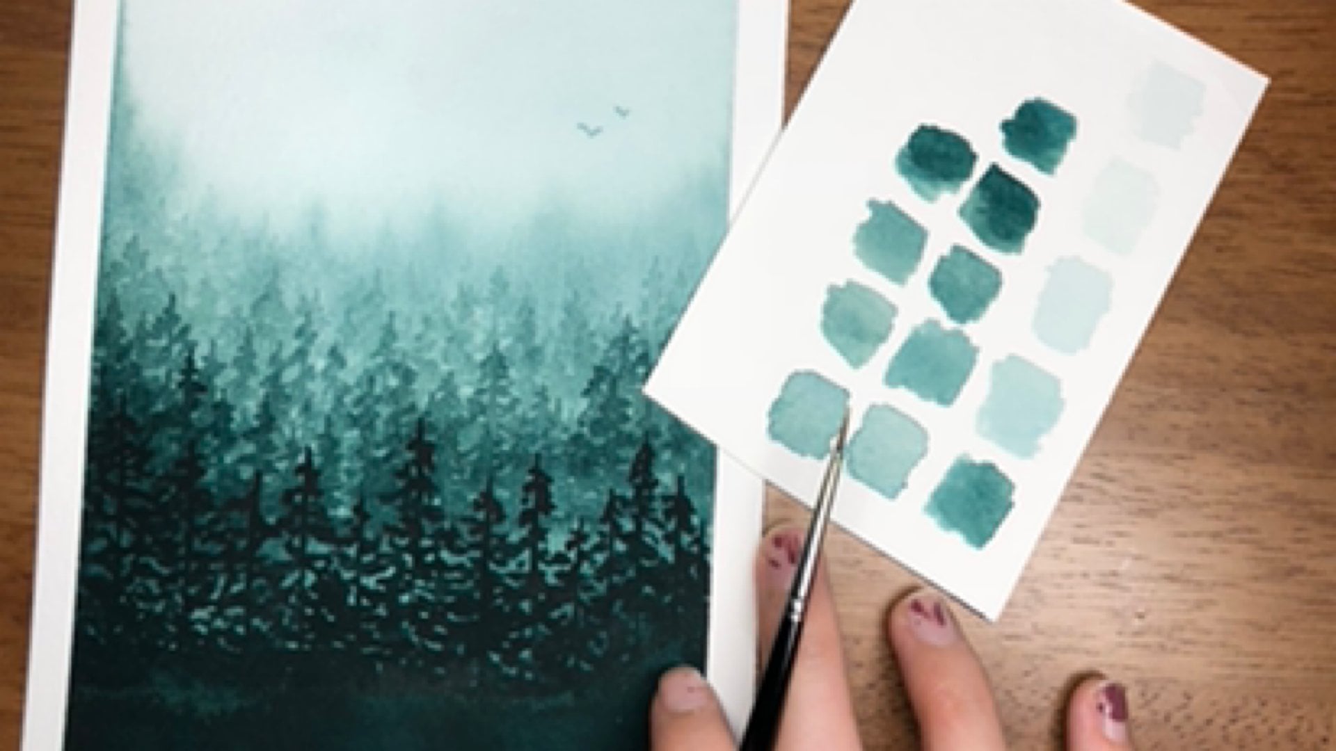
2. Materials: Before we can get started on painting our lightening storm watercolor night skies, I want to talk about briefly the materials that you'll need in order to make this successful. Now bear in mind, I'm mostly talking about professional grade watercolor materials. You don't need professional grade watercolor materials in order to make beautiful paintings. I definitely did not start out with professional grade, I started out with student grade, the cheap stuff that most everybody I know does and that's how I learned. That said, professional grade does make a difference, which is why I mostly use these to teach my classes and I highly recommend them when you do want to take that next step to make your paintings that much more, just take them to the next level. First up, let's talk about paint. These are two different brands that I've talked about a lot if you've taken my classes before. I'm going to be using Daniel Smith extra fine watercolor and Winsor Newton professional watercolor series. I use both of these very frequently, they're some of my very favorites to use in terms of vibrant colors, and smooth pigmentation, and reactivation, and also just how the watercolor feels on paper. You'll see me using those frequently. I would recommend having some red, yellow, and blue. Mostly we'll be using blue if you don't have red and yellow, that's okay. Because I mean, with the simplest form of night sky, you definitely need blue. I'm using indigo from my blue. This is Perlin violet, so it's a perfectly red, a red to violet thing, and this is naples yellow, which is like a light yellow, but you don't necessarily need all of these colors. I'm just using them because for my final project, I'm going to make some colorful lightening storm too. I also use Payne's gray to make my indigo sky darker and black. I will be using various values of black both in the sky, and in the scene below the lightning storm. Those are the paint that I'm going to use, you use whatever you have on hand, and I'm sure your masterpiece will be beautiful. After watercolor, to paint the actual lightening, we're going to need either gouache. That's G-O-U-A-C-H-E, gouache or Dr. ph.Martin's bleed proof white, which I suspect to some very similar makeup to gouache. Both of these are similar to watercolor in that they are activated with water, but they are opaque white. So if you lay them on thicker, then they're not nearly as transparent and that will make for some really cool lightning. Along the same lines with the lightning, I like to have a white gel pen to draw and the more defined lines. That about covers it for paint, I would always recommend having some kind of palette on hand to mix paint with. I typically, if I don't dry paint in little half pounds, I'll dry them in a palette like this and it just makes it easier to use the paints along with the palette to makes everything scalar. So you'll be seeing me using that pretty frequently. Next, let's talk about paint brushes. Again I go through lots of different paint brushes and I have talked about different brands in my classes before. This time, I'm mostly going to be talking about Princeton. So I've talked about the Princeton heritage series lots of times before with the red handle. It's probably one of my very favorite paint brushes. It's all of the paint brushes I use are synthetic siebel hair, which means they are not made from real animal hair, it's all synthetic, which is cruelty favored also I just like the water control better than using real siebel hair in my paint brushes. So I always go for synthetic and when I paint with watercolor, I almost always choose watercolor paint brushes that are round in shape. That just indicates the shape of the brush and I find round is easier to control with watercolor. So I have three different sizes here. I have a round number 12, and that's the Princeton Heritage Series, and then I have a round number 10 and zero and these are pretty new. I've only had them for a couple of weeks, but I thought that I would just share my experience with them. They are Princeton velvet touch. The handle is really soft, which makes it nice to work with and it's again, synthetic sable for the brush and they're a little bit firmer of a brush then the Heritage Series. So I have enjoyed working with these two, so I thought I'd introduce them to you, that's Princeton velvet touch, but I honestly most Princeton synthetic sable hair brushes in my experience I've worked really well. So onto paper, it's really important that you use watercolor paper when doing watercolor because otherwise the paper will warp very significantly, that said, regardless of what paper you use, in my experience, it always warps at least a little bit. So there are ways to avoid that, I typically especially for final projects, I like to use what's called a watercolor block. So if you'll see this is arches, professional-grade watercolor paper 140 pound cold press, and all four of these sides are glued together. So that's what a watercolor block is when the paper is glued together on all four sides and then at the end, so I'll just paint on it right like this, and then at the end I'll cut it out with a knife or something like that. So this is the paper I'm going to use for my final project. Professional grade paper is definitely more expensive than student grades. So usually when I practice, I'll just use student grade paper. Today, I'm going to be using Arteza Student grade paper, also cold press, also a 140 pound just made of slightly different materials that's not quite as high-quality as arches, but still great for practice. That's the paper I'm going to use. Again, just to repeat myself, or regardless, I would recommend having watercolor paper. I would recommend having it be cold press. Cold press just indicates how rough the paper is, what kind of tooth it has, and having it be watercolor paper and at least 140 pound. If you ever wondered about that, 140 pounds just means that when you have a whole ringing which is 500 sheets, that will weigh 140 pounds. It will always indicate where, how much it weighs, the weight of the paper on the pound that you buy. Those are materials and going to be using today. I also recommend having Q tips as one of the bonus lessons today we're going to talk about how to paint like stormy looking clouds, and Q tips are really important for that. But just in general, they're important to mop up excess water or paint. I always like to have them on hand, and then I always have two cups of water, one that always stays clean, which is going to be really important when we use our white paint. And then just to paper towel. Those are the materials that we're going to be using for this class and again, you can use whatever you have on hand. I'm sure it's going to be beautiful, but if you want to paint exactly the way that I'm doing, this is what the materials that I'm going to use. So without further do, let's move on to the next video.
3. Techniques: Before we get started learning how to paint the different elements of this lightening night sky, let's talk about some of the very basic techniques. If you've taken any of my classes before, you have probably seen me talk about these techniques before but that's because every watercolor painting ever really, it can be broken down into using one or both of these techniques. The wet on wet technique and the wet on dry technique. It might be self-explanatory, but I'm going to explain it for those of you who might not know what I'm talking about. The wet on dry technique basically just means that you are painting on dry paper. Watercolor as paint it's always wet because it's activated by water. That's the wet part. But when you paint so that the paper is dry, that's the dry part and you'd get these crisp lines and wet on dry is excellent for detail work. I'm just kind of painting some lines. When you think of painting, this is probably typically what you think of. We will use the wet on dry technique at times but it's far less complicated and easy and less difficult to control I think, than the wet on wet technique is what we are going to focus on practicing in this video. Mostly because in order to get lightning so that it looks like it's crackling in the sky, we want to utilize both the wet on wet and wet on dry techniques to create those effects. Wet on wet, as you might have already understood by my explanation of wet on dry is when you paint so that the paper is still wet, not still, but the paper is wet. That could mean painting while the paper just has water on it or that could mean painting over the top of wet paint. See how I put this violet on here if I put this indigo on top of the violet, that's still wet on wet. Because the paper is now wet with watercolor and instead of just with water. That's what we are going to be using in order to really nail the crackling lightning. One really important thing to remember with wet on wet, and one thing that I really want you to practice in this class and in this course, is how to control how much water you put on the paper, and therefore how to control better which way your paint is going to go when it's wet on wet. The characteristic, quintessential characteristic of watercolor and the wet on wet technique is that it does what it wants to. When you have a lot of water on your paper, like so much so that you can see that it's wet and it's puddling, there's not a whole lot of control you have over the watercolor. It's just like if I tried to draw a line, that wasn't a good example because it drew a pretty good line. But over here is a little better. If I tried to draw a line. It just like goes out in any direction that it wants to. It might stay in the line and actually look now it's spreading a little bit farther. The shape that I initially put the water down when there's a ton of water on the paper or a ton of wetness on the paper isn't necessarily going to stay. That is useful in lots of situations like when I want to blend two colors together or if I want to create a gradient, that is definitely a useful way to use water. You can check out my sunset class to see ways that I've created a sunset gradient. But when we're trying to create, define shapes, but still blend in with the paper, we need to use just the right amount of water so that it's wet enough so that the color that we put on top of the other color blends in together. Because we don't want it super defined like this in order to get that crackling effect. But we also don't want it to go every which way. We're going to talk more about painting lightning in the next video. But I just want you to practice the wet on wet technique and get a feel for how the paint reacts when there's lots of water and how the paint reacts when there's not a lot of water. See if you can just get a better feel for it and practice so that you know what you're working with. Then in the next video, we're going to specifically practice how to make lightning with these techniques that we're learning. Just as a quick wrap-up wet on dry is when the paper is dry, but your paint is wet and then wet on wet is when the paper is wet, either with water or with watercolor and you paint on top of the wet paper so that it blooms out like this and blends together and does its own thing. We're going to be using different forms of both. Like different forms of both. We're going to be using both the wet on wet and the wet on dry techniques. But we're also going to be using different amounts of water on the wet on wet technique when we form clouds and when we make texture in the sky versus when we make our lightning. To get more explanation on that, head on to the next video, I would practice wet on wet before you do if you haven't already and I will see you soon.
4. How-to: Lightning: All right, welcome back. You should have before watching this video practiced or at least thought about the difference between the wet on wet technique and the wet on dry technique and also what the amount of water used during the wet on wet technique has to do with how the paint reacts on the paper. Now, we are going to practice how to make lightning. Before we start off our final project and learn how to put all of these elements together, we're going to practice the most important thing, which is actually creating the lightning. Our first step with creating the lightning is to get the paper wet. First we're going to create the sky. Because the reason we're using white paint or our opaque white paint like goulash or Dr. Ph. Martin bleed proof white is because we are going to paint the sky first and then paint the lightning on top of it while the sky is still wet. I'm just getting portion of this page wet with water. Then I'm going to put some indigo paint on this page. When we do the final project, there's going to be some more texture and there's another video in this class that talks about how to paint like stormy looking clouds that can go along with the lightning. But for now, we're just focusing on the lightning to practice. Whenever I paint final projects, I almost always paint practice versions first, just so I know that I can get it right. That's what I recommend that you do to. I know it's fun to come out of these classes and have your first try, the one that you really love, I love that feeling. But if that doesn't happen for you, honestly, that is so normal, and that's why it's really important for me that you know I practice and I make practice versions almost every single time that I do this. The trick here is once you've painted your sky, you don't want it to be dry. If it's dry, then when you paint the lightening, it's going to be the wet on dry technique, not the wet on wet. We still want to be wet, but not so wet that it completely blooms out. Let's see how I do. This is my round number zero paintbrush, and now I'm picking up some white quash over here. I'm going to start at the top, and I'm going to paint on here and see what happens. If it looks like my paint is staying in one place like it kind of is, that means the sky is not wet enough. It looks like it's blooming out. See how, when I paint this line, it doesn't stay in one place, it looks a little bit fuzzy. We want that fuzzy kind of look because that's what makes it look crackly in the sky, and it's okay if it's not so white. Like if it starts to get a little bit more translucent along the edges, that just means that it's blending in with the sky and we want that to. The more you have that blend between the sky and the white, the more of the crackling electricity effect that we're going to create. I just added a little bit more indigo here. My paper, it looks like got dry really quickly so that by the bottom here you see it's now the wet on dry technique, up here I definitely bloomed out more outward. But then by the bottom it stayed in place, which meant that the paper was dry. It might be because I'm using student grade paper which tries a lot more quickly than professional-grade paper. Keep that in mind as you are practicing and potentially going back and forth between student and professional grade watercolor paper. But what I did here, just to re-explain, was I started at the top and I just moved my paintbrush and a jagged line, the kind of line that lightning usually makes. Because I'm using gouache at this point I was using Winsor Newton gouache. It's opaque and so you can see it on top of the blue. But I really needed the blue to be wet so that it blurred in with the skies to get that electric crackling kind of effect. At this point though, the sky is now dry, and if I want to continue painting lightning, I need to re-wet it. That's what I'm doing. I'm picking up some more pigment, and I'm going to re-wet the sky that I have made. Again, this is just practice, so I don't really care how this sky looks here. Mostly it's to show you how to form the lightning. Okay. I re-wet the sky, and one key to doing this to make sure that you really get that full wet on wet technique is to paint quickly and that's not always possible. That's a little bit better. Sometimes lightning kind of wears off, splits off. When I started painting these lightning scenes, I didn't really have like a rhyme or reason. Sometimes I'll look up a reference photo, I'll like google lightning photograph or something like that, and there are usually some pretty cool ones that people put online. You can use that as a reference to how to frame your lightning, but I honestly just think in general my philosophy is that nature is imperfect and it should look random. That's why I never really have like a rhyme or reason when I paint my lightning, I just go for it. But you see how this it's blooming outward a little bit more than it was in the other one. That's because I got it as wet as I wanted it to be, and we want that for our first layer. Even if you'll notice when you're using the wet on wet technique, it's not quite as like solidly white. That's okay because we're going to paint more white layers on top of it in order for it to be really white in the middle. The most important is that the very middle part of the lightning is really bright white. Then around the edges if it's a little bit lighter and blends and a little bit more with the sky. That just creates like I said, the crackling electric effect. This is going to dry pretty quickly. I just waited a couple of seconds. Now, I'm going to take another layer of like thick gouache paint and just paint in the middle of this layer, this first layer that I did. I want this next layer to be thick with gouache, thick with paint, and so it's really white. I want as much as possible, if it's still wet on wet, that's okay as long as there's less water to move the paint, because I do want this layer to kind of keep its shape. Again, I painted one layer before this, that spread out and got a little bit less white, which is good. That's what I wanted to create, that light effect, that crackling electricity effect in the sky. Now I'm painting a more opaque layer on top of it while it still wet so that it does blend in with the layer that I did in the bottom. Mostly I can get my lightnings to look the way that I want them to with only two layers. But if not, if it still is not as white as I want it to be once this layer is dry, sometimes I'll go in with my white gel pen and just do a final layer on top. Once it's all dry, that will be the widest of the white layer to show the middle of the lightning bolt. An important thing to remember about light, that in nature, when you're painting something that has natural light in it, the thing that is the widest, honestly that looks like it has the least amount of color in it, but it's the brightest, usually is where it's going to be the brightest. Then as it goes outward is when you start to get more color, which is why we painted it like this to show that this lightning bolt is illuminating the sky in that way. That is how you paint lightning, just a single lightning bolts, and as we move on to the different videos and painting our final project, we will incorporate more of a design into it, but that's the basic tenant. One thing I want to show you before we sign off is what it looks like when you have too much water and you try to paint the lightning with too much water. Just to show you what could happen then. If you have so much water on your paper that it's like paddling, like if you look at it looks like It's uneven and there are puddles in different places, that probably means you have too much water. I'm purposefully trying to put too much water on here just to show you what that might look like. If we go in with the gouache and too much water, then it kind of just like floats on top instead of going on the paper. Especially as I try to paint on this pedal right here. You see how it doesn't stay is because the water is blocking my brush from actually painting on the page. It's just the paint at this point is floating on top of the water. While the water is vital to getting the paint to blend the way that we wanted to and with the page, if you have too much water, then this happens where I can't paint on the paper because the water won't let me. That's something to look out for as you are painting. In situations like that, if you find puddles, that's why I use Q tips in every painting I use. Like I said, we'll be using Q tips make clouds as well. But if you just mop up the water like that, so that it's not a pedal anymore, then you should be able to paint on the paper again. With that, let's move on to the next video. Practice your lightning, and to your heart's content, I think it's really fun to paint lightning. I will see you soon.
5. How-to: Clouds: So before we get started on our final project, I want to talk about one more thing that you may or may not choose to include in your final project and that's clouds. In some of the other lightning paintings that I've done, I don't always do clouds. Sometimes I'll start the lightning just at the very top of the painting so that you don't see the clouds on top of it because honestly clouds are tricky, but if you want to give it a shot, I am so happy to show you some basic techniques that I use that are pretty easy to make some realistic looking clouds. Making them with watercolor and especially using the wet on wet technique can be pretty fun. So let's do a quick little tutorial and especially I want to talk about how to paint stormy clouds. So first, similar to the lightning, we're going to start with the sky first. So I'm going to paint a wet sky. You can start with a wet paper or if you are quick, you can put paint on the paper first and then start adding water to it so that it gets the paper wet with the pigment and just push it down. We have to be quick because if it dries first then it doesn't work quite as well. Again, with student-grade paper it usually dries a little bit quicker than with professional-grade paper, so that's something to bear in mind. Also, something to bear in mind is that professional-grade paper is it's easier to pick up paint with it, like pick it up off of the paper with a Q-tip, which is what we're going to be doing very shortly. So I'm using student-grade right now, I'll use professional-grade in my final project, just if you are frustrated, maybe because is the paper you are using, I don't know. So I've painted the sky and before it dries, I'm going to use my clean Q-Tip and just start picking up some of the paint. You can dab or you can roll, whatever, but we're going to start making like a shape of a cloud, like the shape of a cumulus cloud or I don't know. I haven't learned the shapes of clouds in a while, I'm pretty sure it's like cumulus fluffy clouds, as opposed to I think cirrus are the ones that are like thin lines, like wispy fog almost. We're trying to make fluffy clouds that are going to be looking ominous pretty soon. I just want them to be swarmy. So I'm just picking up the pigment while it's still wet with my Q-tip to utilize this negative space. Now if there are still some pigment on here, like if parts of this is still blue, that is okay. Mine definitely is and it might be hard to see. Again with student-grade watercolor paper, it often doesn't pick up as well as professional- grade, but that's okay too. I would start with a Q-tip thing and if that doesn't work, then using water as a way to push away pigment from the cloud that you're trying to form, that is also a very effective technique. If while the sky is still wet around you, if you get this cloud space wet, if you watched my sunset class, this is how I formed the cloud's first. I used water as a way to resist the pigment and push it out of the way so that I can make clouds like that. Both of these techniques have worked well for me in the past so it's just up to you. I'm pushing away some of those pigment and then the next step to make these stormy clouds, it's important that the paper on the clouds are wet anyway. So it might be tricky to see exactly the difference, but you can see some white spots here. It's easier to tell when the sky is darker. So maybe we'll do another one down below after I finish this one. So to make these stormy looking clouds, we want to make some gray paint and the way that I make gray paint is by taking a lighter value of black. So to change the value, which just means how light or dark a pigment in its purest form is, you add water for watercolor. So I've added water to my black and now it's this gray color. Now because this paper's still wet, I'm just going to lightly dab, I'm using this round number 10, I'm just going to lightly dab in the middle of this cloud and add some gray here. Now we don't want all to be one color. We want parts of it to be dark gray, parts of it to be lighter gray, parts of it to look whitish because the shading is really what makes clouds so visible in the sky and the light. So it's best if we're going to start with the lighter color. For clouds and lightning, we want the very edge of the clouds to be the lightest because that's where the lightning pops out from behind the clouds, and then the middle of the clouds to be darker. That's not necessarily always the way that you would paint clouds, but for these storming clouds, that's the way that I think that they look the best. So I added a little bit more pigment to that, that well of black, that well of gray that I had. So now I'm adding that darker pigment in here and we're going to blend them together in just a second. I don't want it necessarily to look like just big blobs of color. I do want it to look like it has some shape. So with a clean brush, I cleaned off my brush here, I'm just going to blend together the white with the gray and the dark in the middle, still trying to make sure that the edge of the cloud is lighter than the center of the cloud, but without some of those harsh lines. It's okay if some of the color gets diluted a little bit, not a big deal. So I'm just going to be the same over here, just blend together this color and then as you blend, you may decide to go back and put more color in. I do that often. It's like a back and forth really between the two. So I'm making these clouds. I'm actually just going to extend this one out this way, it looks a little bit more like a cloud. Then last thing that you don't always have to do this, but just to make the clouds a little bit more so that you can see them. This is second to last thing. I'm going to add a darker blue around the edges. This is something that you have to very careful about if you do what I'm doing. Adding the background around last makes it tricky when you blend it always, but I'll show you how I do it. So I'm adding blue around the edges here because I wanted to see the clouds more clearly. So now I'm taking off blue from my paint brush and I'm just going to dab and blend, move some of this pigment over here where the sky is, dab and blend. I will continue removing the color from my brush with the water so that it's clear when I need it to be because I don't want the blue to completely take over this gray. I want them to blend together as evenly as I can get them and since it's usually easier when you put the blue down first, so if you're wondering about that, but the blue just wasn't quite as dark as I wanted it to be and that's real art for you. I'm a fan of showing you what painting is really like for me. So instead of always just giving you edited versions that whenever I would watch them made me feel like, what am I doing wrong?" Sometimes you're not doing anything wrong. Life just turns out like that. So these are ugly shaped clouds, but this is really how you get the idea of it. In order to make it really look like a cloud with that light effect, you want different shades and to have the lightning come on in the background, we want the outer rims of the clouds to be lighter. So to show you what this will look like, we're going to do this more in depth as we move on to the final project, but I'm just going to see if I can paint one stroke of lightning. My paper might be too wet, but we'll see. Maybe I'll start here. Yeah, it's pretty wet. So I'm going to just dab some of it off first and then we'll start my lightning. So it's like that, just branching off, going down and then where I came in from the cloud, I'm just going to blend in this white along with the bottom of the cloud so that it blends in the cloud like that. On professional-grade paper, this will look a little bit more together, but that's the basic idea. Painting the sky first and then painting the cloud by dabbing away some of the paint or by using water as a resist against the paint so that you start out with a wider edge and then you add gray paint and then darker paint so that the dark is in the middle and it gradually gets lighter so that the edges around the cloud look like they're lighting up like that. Then we'll paint the lightning storm underneath it. So that is how you paint clouds and I recommend if you plan to use clouds in your final project, to practice this a few times. It's pretty tricky and even looking at this, I've used these techniques lots of times and even looking at this version, I'm like, I'm not sure these clouds are really what I want to show them but I think it's important. These are the techniques that you should use and at least these are the ones that I use to make the clouds I like to make. The more you practice them, the more you'll be better at them. So, yeah, let's get to it and I will see you in the next video.
6. Final Project: Step 1: Now it's time to paint our final project and just to give you just a brief overview of what I'm going to do, I'm going to paint some railing clouds on top. First I'm going to paint the sky and then some brailing clouds, thunder-stormy clouds, with some fun colors coming out of them as well with the lightning bolts and then a typical wilderness seen underneath. Now, clouds are hard, so you can not paint the clouds and it will look just fine. You can start your lightening scene at the top of the sky. If you have your lightning start at the top where the sky begins, that looks awesome too. I just want you to know if you think clouds are hard, you are not alone. I also think that they are, but I want to do my best to teach you the techniques that I've used to create them, to see if you could enjoy using them too. Either way works and without further ado, let's get started on that. Start with a wash of water and again, I'm using my Arches professional grade watercolor paper here in a block, which means it's glued on all sides. I'm going to be using so much water and just a lot of washes of paint and water in this piece. So it's really important that you have good paper and if you don't have a block, you can use painter's tape to tape down your paper to the table. Make sure that it's tape that will be nice to your paper, that's why I use painter's tape. If you use scotch tape, it could tear up your paper so I recommend painter's tape, washi tape, masking tape, anything like that. But if not, I'm sure you can do great even if you don't have that kind of paper, that's just my recommendation to preserve your paper so it doesn't wop so much. I'm painting the sky right now and I'm not worrying about creating a smooth gradient because stormy skies have lots of texture in them, I want to preserve as much of that natural texture that watercolor creates in general. But I do want to make sure that as much as possible this paper stays wet. Because as long as it stays wet, then our Q-tips and our p brush, we'll be able to remove the pigment to create the clouds that we want to create. But if it dries, that becomes a lot harder. If you're doing this and you start to see the top of your painting dry a little bit, just take some water and reward it slightly, blend it a little bit in with the rest of the sky and keep moving this down. We want the top to be darker and the bottom to be lighter and the bottom scene, which we'll paint after we paint the lightning and the clouds, will go at the bottom and cover up any of the inconsistencies that you see here that you might not be super happy with. I'm just going to paint down to the bottom here and that looks fine to me. This has started to dry a little bit, so I'm just rewetting it slightly and now I'm going to paint a block of clouds. It's going to be mostly only peaks of the sky are going to come out from here. First, I'm self starting with Q-tips for such a big block of clouds, I'm going to start with water resistance and just push away the pigment using my paintbrush and clean water. As long as this water is clean, as I'm pushing it away, it should push away a lot of the pigment and I want to create an uneven bridge, almost like a wall of clouds at the top. I'm just going to keep dipping my paintbrush in water, pushing this down, pushing some of these clouds downward like that and then the next step after I push this down is I'm going to add black. I'm going to tell you one trick that we didn't talk about in the clouds forming technique that I have found to be useful as well when forming these kinds of clouds. I'm just going to continue pushing. I see over here some of this pigment has petaled, and thus probably a really good place to use your Q-tip tool, as if it started to petal, the pigment that you want to, use the Q-tip to fill detailing. Using the water as a resistance is good for moving massive amounts of pigment over and then Q-tips are good for detailing. I might leave that corner uncovered so it's still sky. For the most part, this looks pretty good. Make sure that you keep the rest of your sky wet though. I'm noticing the bottom over here starting to get dry. Before I move on, I'm just going to really quickly rewet this down here. You're going to be doing this a lot, which is again, why I say paper is so important and how you preserve your paper is really important, especially since when we create our lightning, like we talked about, our paper needs to be wet. Just keep that in mind and you may, as you rewet the paper accidentally, move into your cloud again. That's okay, add more water, push it out like this. We're just pushing this pigment outward and down to create this texture that we want for this big giant cloud that we're creating. We might even want to paint more blue under here, along the shape of the cloud so that it's darker, so that you can see the shape of the cloud more easily. Actually I think up here mostly is where I'm going to go with that and it's going to move out and that's okay. We're going to paint down like that and then we're going to start painting our cloud pretty soon. Blending this end over here, that looks pretty good. Now we have this outline of a cloud, I see a puddle over here, so I'm just going to dab that, like that and there are some places that might be darker in the clouds and you'd like. Take the Q-tip, dab at those darker places to make them light and now we're going to add some of the lighter gray, just all around here. I'm still using my number 12 brush because this cloud is so vague and the lighter gray should go up, right up to the to the edges of this cloud that we've created and if the white part that you've tried to shape and maintain disappears, that's okay. We can go back and add it back in later using that technique that I told you about in just a few minutes. First we want to make sure that we add all of this gray to make this a really stormy clouds. I'm not actually sure the science behind gray clouds, never thought about that. Add a little bit darker pigment here. That's okay, this is the kind of dark, we're going to put more in the middle. To get it lighter all you have to do is add more water on your palette like I was just doing over there. Now adding it down here, I'm just alternating between dabbing and painting, I guess. Now I'm going to add a little bit more pigment, black pigment to this puddle that I have to add dark parts. More dark parts to this cloud. It's okay if some light parts are sneaking through. That's what gives the cloud definition. How clouds look like marshmallows and how you can see is because of the different shading in the cloud so that you can see the shapes. It's definitely okay if it should not be uniform and anyway, there should be lots of inconsistencies and some parts that where the light peek through so that you can see the shape of the dark. I'm just dabbing along, adding more darkness to this cloud. Remembering always that along the edges, we do still want to be light, but if our edges accidentally get overtaken by the dark stuff that we're putting on, it is okay because I'm going to show you a technique that will allow you to make them light again. You might have already thought of it even, it's really not that complicated. I'm gradually getting darker the more paint that I'm adding on to this cloud. Some parts are even just straight black, because I do want it to be defined. I want to be able to see it in the sky. I want this to go to the edge though, and I think I might have overtake this corner. Going to add more of that dark black over here, the dark black I think makes it look really cool. Just adding definition with this dark, and then I'm going to go back and add one more definition with the light momentarily. Actually, I'm going to bring this cloud down like to here. I'm going to bring it up. I do this all the time, I like to make a decision then I think no, the design doesn't look quite how I pictured it. So I'm just going to change some things, but I'll show you how it'll all be okay in the end. Now some of the dark parts I've put in that overtook a lot of the white parts, that's okay, and an easier way to get the white instead of using water. First, you can use water as a way to resist the paint, but I've also found sometimes you just have to give in and use white paint. I like to use a watered-down wash. What we use for the lightning, I use a watered-down version of it to go just along the edges of this cloud. I don't want it super opaque because that's not quite what clouds look like I think, but I do want it light enough so that I'll just add a glimmer of light onto that outline in the clouds that we're looking for, that provide even more definition. Bear in mind, the clouds are going to be lightest where the lightning comes down. We're just adding some definition along the sides and even in the places where the clouds might have a hole in the center and you might see some of the sky peek through. That's okay too. As we do this outline along the bottom though, that's definitely where we want it. It's more important that we have this white outline along the bottom because that's where the lightning is going to, like light up underneath the cloud. We're going to paint the lightning shortly. Almost done outlining this. This one did a pretty good job of keeping its outline. I'm pretty impressed of the bottom. But no, it doesn't hurt to just add a little bit more. It's important, especially if your paper is still wet like it should be too as you go and add the light to wash off your paint before you dip in again, because otherwise, you could dye your white paint blue. That's important to remember, but for the most part, this looks pretty good. I just want to blend in parts of the sky with this white so it doesn't look so spindly, like we don't want to necessarily look like it has tendrils coming out. It almost looks like there are these lines here. We want to get rid of that because this is part of the cloud, right? clouds don't have lines coming out of them unless it's rain, but it doesn't look quite as defined as those lines usually. So, we're just going to blend in like that and then add in more blue and we're gonna blend in more blue like this. This is the paper still wet, that's why I can do this. Because the paper is still wet, we can blend in this paint and still have it look pretty smooth and not have these jagged edges. I'm just going to bring it down all the way to the bottom of the page, so that we don't have to paint lines that we don't want. That looks pretty good. Dark spots and the sky meets cloud, the light spots where the lightning is going to be. This is part 1 of this lightening cloud storm. Move on to the next video where we will add in some color and lightning. This is still wet though. My next video is seconds away from where I painted this just for the record. But if yours is wet anymore, that's okay because we're not needing to need the white space to add clouds anymore. You can re wet after it's dry and the lightning will still work just as well. That's something to keep in mind. But move on to the next video where again, we're going to add in a little bit of colorful Galaxy action just around some edges of the cloud and the lightning bolts. See you soon.
7. Final Project: Step 2: Now that we've created this like large wall of angry thundering clouds just with a thin line, some white around the edges that shows that there's some light coming out of these clouds, we are going to first paint some color to come out of these clouds because sometimes when the stars and everything reflecting exactly the right way, you can see color coming on the clouds. Other times I'm an artist and I like to add things that may or may not exist in nature because I like them. I'm going to add a little bit of this reddish violet like Perlin violet, my pages still wet, remember. I'm going to add just a little in this corner right here. Just so it blends in like a galaxy because I like having a little bit of color in my life popping out of different clouds. After I've added that, I'm going to add just a little bit of whitewash around it so that I still get that lake lights of electric energy. Just some watered-down goulash. You see it's not opaque. Blending this in, bringing it down a little bit. Actually, I'm going to add in that red and just a couple more places like maybe up here, maybe peeking out over here. See it's like the cloud is just oozing this colorful galaxy. I added the red and now I'm going to add a little bit of yellow. The yellow is probably going to come out green because yellow one blooming screen. Just to warn you, but this is a watered-down like lemon yellow that I'm using, naples yellow as well, could be good here. I mentioned that earlier. The materials page, doesn't have to be in the same places that I used thread. Right here. Then over here where this first red is. Now it looks pretty good to me. I added in some of these colors that are coming out of this cloud and I want to make sure to blend them in with the sky and I mostly have done that. If the page is still wet, then I should just do that by itself to make to see if the page is still what I usually crane my head to see like to get to eye level, and if it reflects, then that means it's still wet. Now I'm going to take my squash and paint the first layer of lightning. Remember that we want to keep the page wet enough so that the lightening blends out to create like that crackly electric effect, but not so wet that the water just goes everywhere. Part of that also is the amount of water that you have on your paintbrush so instead of using one of the bigger like the round 10, I'm using my round number 0, so I mostly only have paint on here, not water. I'm going to do my first one right here. Also remember that lightning typically has more like jagged edges, not round, if you want to make it look like it's random, in which you should lightening is super randomize. Don't do it in circles or like rounded edges. I would recommend more jagged. I'm going to paint mine all the way down there. I want this first layer to mostly have the same thickness because this is the layer that shows like the crackling electricity. The next layer is going to be the one that has the white in the middle but I also want to blend in this white up here with the cloud and the colors that we have coming out so that it doesn't look like it's coming out of nowhere. Generally, if you create like a halo with white paint around the top of your lightning bolt, that's what it looks like because this is where it's gotten really light, where it's building up the energy and then bursting down. That's what we're trying to show with this painting. Okay. That's my first lightning bolt. My second lightening bolt, I'm going to do up here and I'm going to have it go off to the side. I'm starting it up here. It's going in the middle of this yellow greenish color coming out. I'm trying to paint jagged sides and I'm painting and off to the side like that. I want my thicknesses to mostly the same. And I want to make sure to blend in this guy on top over here so it doesn't look like the lightning is just coming out of nowhere. Like that. Then I like to go in threes. I'm going to paint one last bolt of lightning, I think I'm going to paint over here and it's going to be a little guy that like stops in the air like that with the still wet cloud. That is layer 1 of the lightning, on the next video, I'm going to wait for this to dry or dry it manually with an unboxing dryer, then we're going to paint layer 2 of the lightning, which is where you add the more thick and more bright opaque white layer on top of this one. Then it's just the bottom forest scene. We will see you very soon.
8. Final Project: Step 3: Okay. This is mostly dry, but parts of it are still a little bit wet so that when I add the really thick layer of really white on top, we don't want it to be quite a defined line necessarily, so, you want to blend in a little if possible, but we don't want it so wet that it completely blooms out like it did before. You see how, you thought it was white before until you put this thick line, opaque line on top, and this just makes the lightning visible for sure, and it helps to maintain that like crackly look. You see how, if the white is blurry surrounding it, it looks like it's moving almost and that's the effect that we're going for. I'm [inaudible]. I'm going to do that for all of my lightning bolts. If honestly this is dry, it's okay. It's okay if you have a stark more defined line. The point here is to make this line very white so that it's bright, because that's how light works. Where it's brightest is where there's no color. [inaudible] Now the last one, and I'm using water to blend the tops of this because in some places, when you put that really stark line, it sometimes looks again like the lightnings coming out of nowhere, and we want it to come out of light. See now my black is blending into the yellow, so I'm going to add a little bit more yellow over here. [inaudible] If you do it, you can't just blend this in so it's not like, if you have defined paint lines, it's not a big deal as long as the paint lines aren't in a perfect line. If you try to blend them in with the cloud, so it looks like it's just part of the cloud, that should be fine. That's what I'm doing. The one thing that I want to do for this last lightning bolt is, I want the tail to just be a little bit thinner. Maybe over here, I want there to be moving off in this direction, like little tendrils. Actually sometimes I do this. I'll be painting them like, no I'm going to just add some things, and sometimes it makes it better and sometimes it makes it worse. We'll see which one this does but I'd like to add little tendrils on bolt of lightning. The next step here, is if it's still not quite wide enough, is then to do wet on dry on top of this lightening. I'm going to in the next video, show you what that looks like and then move on to the forest scene.
9. Final Project: Step 4: This is dry, I dried it using an embossing heat tool, and you can do that or you can wait for this to dry. But now, these still aren't quite as bright as I want them to be, so I'm going to take my white gel pen and very lightly in the same way that I painted this, just draw on top of this white gouache, the way I want the lightning to go while still maintaining this electric look. Remember to paint jagged edges, I'm going to draw a jagged edges because that's how lightning looks, it's kind of jaggedy, sparky. You might have to go back with a paintbrush and some gouache, and again, just blend that in with the white that's happening around here. A good way to blend in stuff like this is to start from the outside with water and then meet it so that you don't keep pushing the paint farther than it should go, it mostly stays where it is. That makes sense, I'm starting from the outside and then meeting it where the white is so that I don't paint over the top of where I want it to be. Just make sure with these paint lines that you brush them out as much as possible, so that you don't get super defined dried paint lines at the end of the day, and that should be fine. That is our lightning, and then at the bottom, I like to do some wilderness scenes always, I'm just going to quickly do a glazed mountain here. I'm using that light value of gray to paint this glazed mountain and I like to do them in layers, so there's one, and then we're going to say that lightning hit that top of the mountain right there, so here's another. Then on top of that mountain, I'll take more black while it's still wet, I'm going to paint little tiny trees. Maybe not quite so black, dark but not black because there's going to be another row of black trees. Just like, if you've taken any of my misty forests classes, I teach the techniques for painting trees like this, but for our purposes it doesn't have to be much, just enough so that there's something down here, at least that's what I like to do. One of my tricks actually is to just push up like that to give us some texture, and it doesn't have to be across the whole mountain either. I'll probably leave that side and then go across the mountain over here. I'm just going to leave that clump of trees right there, that looks fine, and then I'm going to paint some, just in the corner over here. Is it still wet? Yeah, sorry for this, I'm just drying this really quickly so that I can paint some more trees in the corner. With black, I'm going to make these bigger ones, so it's like the mountains are in the distance, and then black trees are more on the foreground where you can see them. I like using my round number zero brush here to create really thin tree trunks, it's what I like to do. You see how the background trees are lighter and the foreground trees are darker, that is a technique to achieve depth. I talked about that in my misty forest class, if you're interested and haven't taken it yet, it's in front one. I use the concepts in that class in so many different paintings as you can see by this class, which is mostly about how to paint these lightning bolts. I'm going to go up all the way to the edge over here, fill in some spaces and then some more trees, like a tall one right here. [inaudible] it's like this lightning is striking behind these trees, which can be a cool effect. I'm going to do one last little tree over here. Yeah, I never know when to stop. If I do just a little thing over here, there. There you have it, there's my final project with the stormy clouds, the lightning bolts, and the foreground and background trees. That looks like a super cool lightning storm to me. I would love to see your final projects and whether or not you use the clouds, I'm sure they look great, and if you have any questions, let me know. Drop me a line in the comments and I will get back to you as soon as I can. I'll say this, I'll repeat a bunch of this and the recap video, but if you loved this class, give me a thumbs up, go ahead and leave a review. If you have any suggestions, I welcome any suggestions and would love to hear an honest review from you, and also feel free to share if you thought that this was a fun class. If you post any of your final projects on Instagram, tag me. My Instagram handle is this writing desk and also please feel free to post to the project galleries so that I can give you some love there as well. Thank you and I'll see you in the recap soon.
10. Recap: Congratulations you did it. You've made it to the end. If you followed along on the painting that I did, you may have something that looks a little bit like this. Now whether or not you did the clouds because as I said before, they can be a little bit tricky. But whether or not you did the clouds, I'm sure your lightening is just dazzling off the page and I cannot wait to see all of your final projects. Please post them in the project gallery because I would love to give you some comments. If you have any questions, feel free to post them on the discussion board. If you decide to post your final project on Instagram, make sure to tag me. My handle is thiswritingdesk, and you may just get featured in my stories sometime soon. Thank you once again for taking this class. If you really liked it, feel free to give the class a thumbs up, tell your friends, share the link that brought you to this class. The more people watch my class, the more flexibility I have to bring even more content that I hope you're going to love. So give me a thumbs up. If you have some thoughts and want to give me a review, I would be so happy to hear any honest feedback. It really does make a big difference when you engage with the class. Because then more people can find it and learn all of these cool watercolor techniques that I've taught that I've practiced with you today. So thanks again and see you next time.
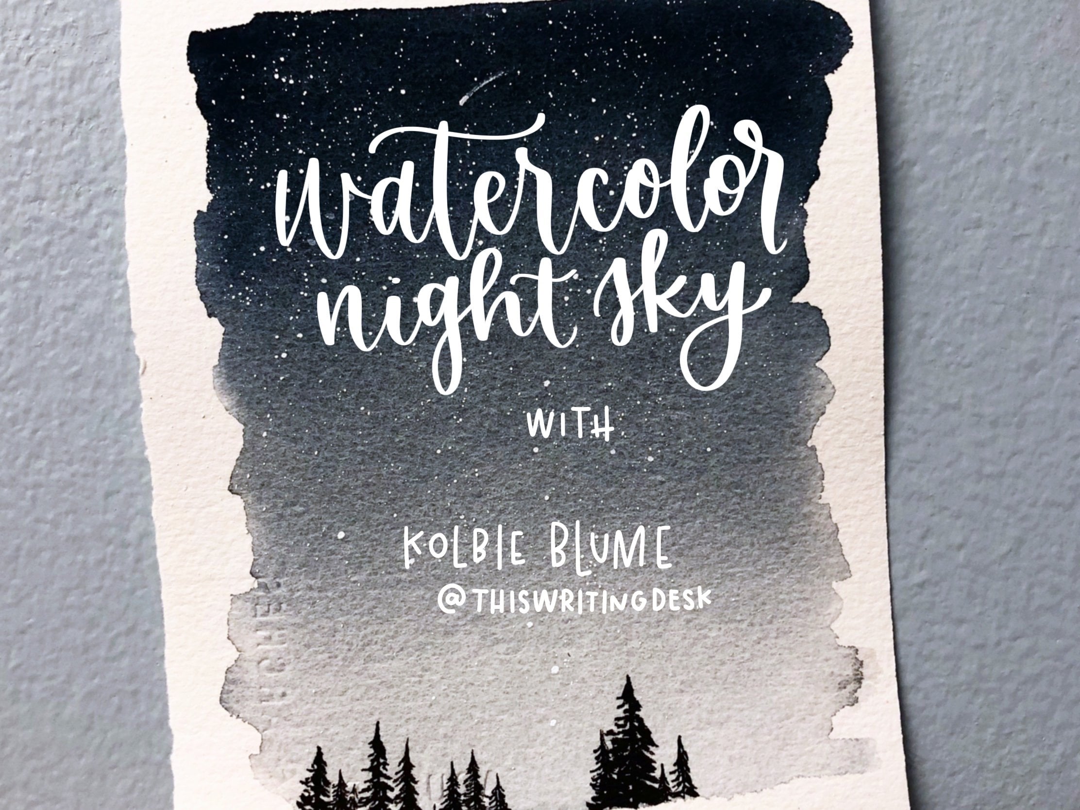
 Kolbie Blume, Artist