Transcripts
1. Intro Trailer: Hey everyone, I'm so happy to see you here. This is my 10th skillshare class and if you have come here from any of my other classes, welcome back. If you're joining me and the rest of the community for the first time however, let me quickly introduce myself. I'm Trupti Karjinni, artist and instructor from India, and I'm the founder of Blue Pine Arts, where we make beautiful handmade art materials like artistry paints, sketchbooks, brush roles, etc. You can find out more about me on my skillshare profile. Painting backlit snowy pine trees is one of my most requested subject since almost two years now, and I am finally sharing my secrets and how to paint this magical landscape. Along with learning some very useful watercolor techniques, and how to paint this light-filled landscape, I'm also going to bring you a little bit closer to my everyday studio practice by sharing unedited scenes of my process, and some naked truths about my philosophy behind making art like this. So this class is so much more than just a technical lesson in creating a watercolor landscape. But wait, I will say that this is a beginner to intermediate class, and I'll strongly suggest you take my Monochrome Misty Pines class first before you take this one, and If you take the dreamy lake reflections and misty mountains classes, it'll be even more beneficial to you. I'm really excited, so without further ado, let's jump in with the supplies.
2. Tools and Supplies: Let's quickly go over all the materials we'll be needing in today's class. I'm going to start off with the brushes. I store all of my brushes in my blue pine arts trash roll. It's a great way to keep my brushes safe and I travel with my brushes in this roll these days. I'm going to be using four brushes. The first one is the princeton neptune, one inch flat brush. I'm going to use this to wet my paper. The next one is the silver black velvet round number 12. I'm going to use this to paint the night sky. The third brush is the silver black velvet round number 8 I'm going to be using this to print the pine trees. The last brush is the tintoretto size 2/0 mop brush to splatter the pine trees towards the end. Don't worry if you don't have the exact same brushes as me, just use whatever brushes you have and that's going to be good enough. Next up, are the colors that I'll be using. I'm going to be using my blue pine art handmade art discrete watercolors and I just love using them in my artworks these days because I mean, of course they're made by me and my team in India but they're just so rich and pigmented. I'm painting half sheet of paintings with these same colors. Now from this range specifically, I'll be using three colors. The first one is [inaudible] which is a very beautiful deep dark, moody, neutral, and it has a bluish undertone to it. The next one is doodle green. This is called taro green, blue shade in other brands and a third color is endos blue. This is called taro blue, red sheet in other brands. I'm going to be using a combination of these three colors in the final landscape. In the next section we will explore how these colors mix with each other and what tones we're going to use, etc. For the paper, I will 100 percent recommend using a 100 percent cotton artist grid, 300gsm watercolor paper because that is going to guarantee. Not guarantee give you a bigger chance of success. For the final painting, I'm going to be using this 5 by 7 inch size of fabriano artistico cold press 300gsm, 100 percent cotton paper. Along with having your final piece of paper, I always like having small bits of paper like this to practice my techniques and to test my colors, swatches, tones, etc. It's great to have these paper by your side when you are practicing something or when you're learning something new. For example, I had this paper of fabriano cold press rough align around and I used it to make a couple of studies before I started filming this class. It's great to have this on your hand. For the palette, I'm going to be using this ceramic dish and as you can see that it's values I have been using it a lot in my latest works. I haven't bothered cleaning it because the colors that I'm going to be using in today's landscape are more or less the same as this. I'm just going to use this one. I'm going to use a masking tape, of course, to tape my paper to the backing board and I get a lot of questions on Instagram about what brand of masking tape I use. There is no specific brand, this is literally the cheapest one I can find in hardware stores or in stationary stores. This is the one that carpenters and wall painters and all in India use. Nothing fancy, just some regular old white one inch or 1.5 inch masking tape. You will of course need a jar of clean water and some paper toggle to dab off excess water or paint from your brush. Lastly, you will need a backing board and the funny thing about this board it, this is my oldest board and it's literally just a piece of plywood that I just salvaged from some place and my husband sanded it down for me. It only goes to show that, you know, I mean, just look at it. It's just so messy. It's not the prettiest and I would never show it on Instagram. But you don't need something that's really perfect and pretty and very Instagram able for your painting practice. Yeah, this is the board that I'm going to be using today. That's not so pretty, but I've used it for more than two years and it's been very handy. That's all for the materials. Let's jump onto the next section where we will explore our colors a little bit more.
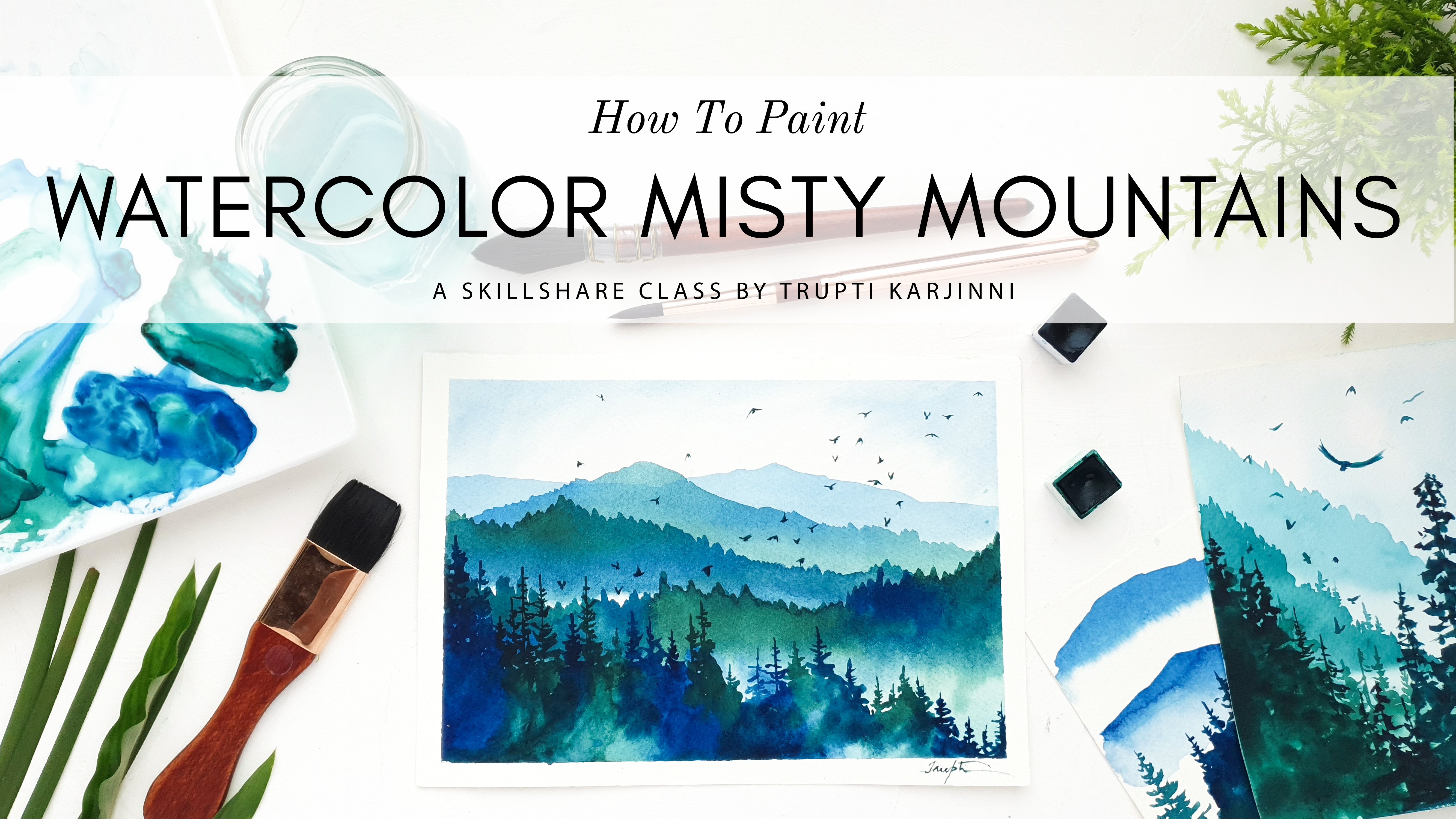
3. Let's Explore Colors and Tones: Let's take a few minutes to explore the colors that we'll be using in to this landscape. As I said before, I'm going to be using a combination of three colors. Treaties gray, due dark green, and indis blue from my range of Doupine arts to watercolors. Observe the landscape that I have made over here. This is a little study that I made before I started filming this class. You can see that I've used a lighter shade of the color for the night sky over here and I've used a slightly darker shade for the trees in front. In keeping with the principles of printing, atmosphere and landscapes. The background or something that's farther away is always lighter and blurrier than the objects that are in the foreground, which are going to be darker and much more. They're going to have a lot more contrast. Let's explore the colors. Here I've already mixed some treaties gray in this blue, and some due dark green and I'm going to use that bit of paper that I had, which is just great for supporting colors out like this. You can see that I have a very moody quartile color, and I'm going to make it slightly more bluish for the night sky. Let's test it out. I'm going to tint it down by adding some clean water. You can see that even though I touched it with this color, this is the color that I want to use for the night sky and I am going to use a lighter value of this color. When I talk about a tone or a value, I simply mean the lightness or darkness of the color. Now, I talk a lot more about tones and values in my other class and it's absolutely essential to master tones and values when you're painting anything in any medium. Check out my monitoring misty paint class, my dreamy lake reflections class, and the misty mountains class here on skill share to get a better understanding of how to use tones, values. How to use a tonal gradient chart to the domain values in your painting. It's all explained in depth over there. For the night sky, I'm going to tell you this a little bit more and I'm going to use this diluted shade for the night sky. As for the pine trees, I've mixed a much stronger concoction of the treaties gray, due dark green and indis blue and you can see that how it's much, much darker. I'm going to use this color for the trees in the foreground. It's great to always have a contrast between this color and this color, which is going to give a balance to my landscape. Now, that we've done exploring our colors, let's move on to the next segment where I am going to show you how to paint a strong light source like this, which is illuminating a night sky.
4. Light Source Technique: Let's explore how to make a strong light source in watercolors, such that it appears that that light source is lighting up the night sky, like how I've done over here. Now it's a simple combination of two major techniques in watercolors. The first one is working wet in wet, and combining it with negative painting technique. We're going to combine these two techniques to paint that strong light force, and to paint the light trees. Now, as you can see, I've already mixed up this pool of color in this shade that I said I was going to use. As you can see, I can use this group of paper to just check it out. I'm using my silver black velvet size 12 brush. This is a piece of paper that I have full disclosure. There's a failed painting behind it. This is what I painted initially yesterday when I was filming this class, but I'm not happy with it. Fail printings are great, especially when you use a 100 percent cotton art discrete paper, you can always use the backside of the failed paintings to test other techniques, experiment with something new, and this is how I work in my studio. You can see that even though I'm an experienced watercolor artists, I sometimes end up making failed paintings, and that's just how it is, the life of an artist. The next time you make something that you're not so happy with yourself, don't be too hard on yourself. Let's practice how to paint the night sky. I'm going to take my flat brush, and I'm going to wet the paper. What am I saying? I'm so sorry you guys. I'm saying that I'm not going to bother taping this paper to the board because this is just a techniques practice. What I'm trying to do in this class today is that I'm trying to show you my actual studio practice. This is not like the best rehearsed, well rehearsed class. All I'm trying to show you is how I am in my natural environment. How I generally work whenever I'm trying something new, or making an artwork. This is how I usually practice my techniques. Real quick, and not fussing too much about it. Wet my paper with a layer of clear water, and I'm going to take my paint, load my brush with it, and then go in and paint negatively on the source of light. What we're going to do is leave the source of this light, the ball of white light over here, white. Because in watercolors we don't use white paint. We used the white of the paper. If I want a white bright source of light, I'm not going to print anything over there. If I want white rays of light exploring from the center point, I'm not going to paint over there. I'm going to paint around it like I've done over here. So let's try and do that. I'm starting off gently, being very rough with how this light is exploding. Imagine the center being right about here. But don't worry if this is looking messy, and it's scary right now, of course it's scary. I'm a little bit scared too to be honest, but we're going to get there, because we still aren't done with this. I'm going to wash off my brush, clean it off, and dump all of the excess water out of it to make it a damp thirsty brush. This is the ball of light here, so I have the freedom to meet this light rays. Even more pronounced, and blend them into the paper. Like I said, not going to paint this central source of light. Just cleaning my brush, lifting some of the paint off. Lifting the paint again. Bear in mind that I am using staining paints. But because these are discreet paints and I'm using a really good paper, you can still see that I'm able to lift the color off. I'm not going to all work this piece, I'm just going to leave it like this right now. Once the paper dries, you'll be able to see how it creates a very diffused effect of the soft light just spreading across with its rays. Here's how it looks when it's dry. You can see that the colors have like really spread beautifully because we used wet in wet technique, and because we also use the negative painting technique, and the lifting technique. I was able to create these streaks of light in all the directions. It just looks so natural and so beautiful. One other thing that we can observe is that the color has dulled a little bit compared to how it was looking when this piece was wet. That's another thing that you can learn when you practice your techniques before you jump into the final piece, you always get to know how the colors dry, how they mix with each other, how they look on paper, things like that. Now, I do realize that for some people, this might be a little difficult to get. Don't despair if you don't get this exact same effect. That's not the point of this class anyway, if you want something like this and if you didn't get it in your first go, try it again a couple of times and see if you can make it happen. But, incase that's not happening, I'll show you another effect that you can go for. Where you don't necessarily need these rays of light for the landscape that we're painting today. Like I've done in the second study over here, you just need a gentle patch of white light. The rest of it can be the dark sky, and your landscape is still going to end up looking beautiful. To make that happen, all you need to do is just paint on with some wet paint. Just spread it around. Decide where you want a source of light, and spread your paint around. Just make that patch of white light using the wet in wet technique. Just leave the patch white, and take your brush and start blending it off. You can also maybe create some light rays over here as well if you want. The point is to not have something really perfect. You can always go with the effect that you have and embrace what you get, when you're learning in this class.
5. Backlit Pines Technique: Now that we understood how to tackle the first technique in our painting, that is to paint this illuminated background, let's go ahead and learn how to paint the pine trees in the foreground. It is one thing to paint pine trees by themselves, and it's another thing to make them look as though they are back-lit. As though they're illuminated from the back where it seems like light is passing through the outer fringes, the outer branches of the pine trees, and to give it that generally very diffused, beautiful, like a Christmassy, snowy night look, if you know what I'm talking about. Let's go ahead and practice how to paint at the pine trees, then we will super impose that technique on this one over here to better understand how we're going to combine those two to make a magical snow-lit night. Is that even a word, snow-lit? No, it's not. Anyway, I'm rambling. Sorry you guys, I'm just in that mood today. I have another piece of paper here over which I have already practiced a few pine trees and I'm going to use the same one. I'm going to start off by painting a regular pine tree. The reason why I do that is because when I'm trying something new, something that I'm inspired by, it can seem very daunting at the beginning, and it can seem like, oh my God, there's so much going on in this piece, I don't know whether I'm going to be able to convert it into a watercolor painting. The best thing is to start off by something that you already know, that way you get warmed up, you build up your confidence, then you can start by experimenting new techniques, by trying different things and seeing if you can get the effect that you want in your landscape. I'm going to start off by painting a regular Joe pine tree, my beloved pine trees. Let's start over here. I'm going to start by the tip. Then using dancing motions, I'm going to gradually widen the tree at the bottom and just paint my pine tree over here. It's as simple as that, and now I warmed up to this. From here, I need to go to this place where it looks like there's a little bit of snow on the tree and it's lit from behind. How are we going to do that? I have a jar of clean water in front of me, and I'm going to show you two ways how you can paint back-lit pine trees. The first one is by taking this concentrated dark color, then starting off by painting the pine tree from the top. What I'm going to do is not paint it entirely, I'm not going to paint the fringed part of this tree here. I'm only going to paint the center part. See how I'm painting a narrower tree here. Then I'm going to clean off my brush. Get some clean water on my brush and dab the excess water from it. Then I'm going to start touching the clean water to the sides, and I'm going to start pulling the pigment that I painted in the previous layers. You see by pulling the pigment out, I'm able to lighten the fringes of the pine tree, and that's going to give me a lovely illuminated look to the tree. I can go back in and punch in some darker color at the center part. This is one way of painting an illuminated pine tree. The other one is, I'm going to premix some of this dark pine tree color right here and then I'm going to wash off my brush. Using clean water on my brush, I'm going to paint my pine tree, with just clean water. Let's start from the top. I don't want this to be sloppy wet. I know you cannot see this part when I'm painting because its water and I don't know if it's going to show up on the camera, but just paint a pine tree with some clear water. Don't make it too sloppy wet though because you don't want the colors to spread too much in this. Fix some of this thicker darker paint and start punching in the color only in the middle part. Because of the beauty of watercolors, they're are going to spread, then we're going to get some clean water and then start pulling some of that color away, making some of these fringes more pronounced, there you have it. We have another snowy back-lit pine tree over here. It's really as simple as that you guys, it's not complicated. It's just, what I did is paint the center part of the tree where the shadow's at their darkest and light would not pass through the dense part of the pine tree. If the pine trees lit from the back, it would pass only through the fringes, the outer edges of the tree. I kept the darkest values near the center, and I used the lighter values towards the edge to give that effect of a back-lit pine tree. This is why understanding values is so important whenever you paint anything, and it can be, it's not important just in watercolors, it can be oils, acrylics, any medium that you choose. Again, I would strongly suggest please watch my other classes that teach the importance of values and how to better understand values in your artworks.
6. Both Techniques Together: Now that we understood how to paint a backlit pine tree, let's superimpose these pine trees on this background and see how we are able to combine both of these together to make a magical backlit snowy pine tree landscape. I've mixed a thicker mixture of this green, the other green, and in this blue over here. I've already got my background painted here. I'm going to use the first technique of painting the pine tree. Well, I'm going to start off at the top here. Well, as you can see that the light is here, so I'm going to keep my darker values of the pine tree where the night sky is dark and as I come into the lighter values, I'm going to dilute my paint more. Like I explained before, I am starting with the pine tree and just painting the center part of it. Now I'm going to wash off my brush. Wash your brush thoroughly, get all that paint out, make it a little bit damp, and start pulling that color off with your index. Keep rinsing your brush repeatedly. As we get closer to the center, I'm going to dilute this even more, dilute it out of fringes of the branches coming down. I'm going to go back, punch some color into the centers right here. As I'm coming down into the bottom part, where it's going to be dark anyway, I'm going to go ahead and finish up my pine tree. You can observe how I am not concerned with making my pine tree look extremely realistic. I just want to make an impression of them. The whole point is to get that Christmassy vibe into my painting. If I'm able to make my viewer feel as though they're looking at a backlit pine tree, my mission is accomplished. I don't have to worry too much about perfection. It's just as simple as that. What we did is as we came towards the center where the light is, I started lightening the fringes of the tree and I kept the dark center. Where there is not a lot of light in the night sky, I kept my values the darkest. It's as simple as that. Let's move on to the next section where we can finally start painting our landscape.
7. Step 1 - Illuminated Background: We're ready to start painting our final landscape. As always, I'm going to say this again, let go of all expectations of getting a perfect painting out of this class. Take a deep breath. This is something that I need to remind myself as well whenever I start a new painting, is that the great thing about watercolors is that it's uncontrollable. That's the beauty of it. Let's decide to just go with the flow and see where we end up today at the end of the class, and if there's something that we're not happy with, it's completely okay. We can always go back and try again. Going to start off now, as you can see, I've already taped my paper to my backing board, and I have my pool of colors ready. Always start off with a clean jar of water, especially because we're going to need the pure white of the paper for the light source. I'm going to use my Princeton Neptune, one inch flat brush to start wetting the paper. One tip I'd like to give over here is that make sure you're running your brush all across the paper, especially the corners to make sure that they're wet, because in my workshops, I see my students get so excited about painting something, especially landscape, that they forget to wet the corners of the papers. You end up getting these patchy corners to your painting. Take some time and make sure that your paper is wet entirely. Now you don't want the paper to be slopy wet, you just want it to have a sheen of nice clean water over it. Using my Size 12 silver black velvet brush, I'm going to go in and start painting the background sky. But before I do that, I'm going to take a moment and decide where I want that patch of sky to be placed, because as you can see, it is one of the highlights of your paintings. You need to decide whether you want it smack down in the center or a little bit to the side. Now, in my paintings, I follow the rule of thirds, which means that I don't want things to be in the center, I want them in either parts, the one-third part of the painting. I think I'm going to go with this composition right over here. While I was practicing it and while I was teaching you guys, I really liked the offset of the highlight source of light in my landscape. I'm going to go ahead with that. It's always great to pause before you begin a landscape and to consider what your next move is going to be. I'm going to start adding the night sky. As you can see, I'm just having a grand old time, watching the colors bleed into this wet paper. To this day, even after painting with watercolors for almost three years, I never fail to enjoy this phase in a watercolor landscape. To this day, I'm still grateful that I found a medium where I'm able to enjoy watching the pigment spread into the water, and the beautiful dance. See, I got a little bit of blue here because I did not clean my brush but no worries, I can just lift it off. I think I want a little bit more color towards the center here. So I'm going to make some more. I can go back in and start adding a few darker areas at the top, taking care to enjoy my process. I don't think I'm going to walk this piece, I don't want to do that. I'm just going to let it be like this. I'm pretty happy with how this has turned out. Now I'm going to dry this layer off. Then we'll go to the next section where we will paint the pine trees in front of this.
8. Step 2 - Backlit Pine Trees: Here's how the sky is looking now that it's dry and I'm just absolutely shelfed at how this has turned out. I think this has turned out really great and now we're ready to start painting the pine trees. As I did with this practice piece over here, I want to place a large pine tree right about here, following the rule of thirds, and that is going to be one of my highlight elements combined with the strong light source here. Then I'm going to paint maybe a couple more pine trees here on the side. I'm not going to create a layer look for the pine trees, I'm not looking for a background layer and then a foreground layer, this is just a very simple landscape where I don't want a lot of complexity and I want the simple beauty of this light source and just a couple of backlit pine trees to shine through. Like I demonstrated in the earlier videos, I'm going to start off by painting the tip of the pine tree here. As you can see, I already have my colors pre-mixed so I don't have to go back and forth a lot and I have my paper go of course. Now that I've painted this much, I know that I'm nearing the light part. I'm not going to take the risk of using a lot of dark color here. I washed off my brush and I'm using some clear water and then starting to pull the pigment from the centers. Be very careful of not using a lot of water in your brush while you're painting the fringe, because when you punch in the darker color towards the center of the pine tree, you don't want it to all wash into the site fringes, and when that happens, you're going to lose the luminosity, and that is what we want the most over here. We want the luminosity of the watercolors. Time to punch it in again. I'm just working very calmly, very slowly, and not forgetting to have fun in painting this beautiful magical landscape. I think more often than not when they're taking classes, when we're learning and when we're experiment with something, you just forget to have fun because all of us are looking for perfect results. We want everything to be perfect, everything to be sellable, and I've fallen into that trap myself where I have forgotten to have fun in my process, and guess what? I have gotten burned out by my own trusses. There was a time in this year where I put so much pressure on myself for creating the perfect watercolor paintings that I frankly got a little sick of watercolors. I had to step away from the medium, and it's just so unfortunate that I let that happen, but it's all been a big learning lesson. I'm happy to share that with you. My first pine tree is done and I'm just going to add a couple more here on the side. I think I'm going to go a little bit faster because now I'm a little comfortable with painting this. Let's paint another one over here. I'm using a slightly diluted paint to start this because already the pine tree is in this area, it's a little shorter than this one. All these moments when I'm filming my sculpture class and I just get so lost in the beauty of this whole process that I become really quiet, and I hope you don't mind me going quiet once in a while. It's just so therapeutic to just slow everything down and to just be in the moment and to enjoy the whole process of this, and you can observe that I have maintained the luminosity of these backlit pine trees, and every now and then I'm just stopping and taking a look at where this is headed. I'm just really happy where I am right now. I'm probably going to paint another one over here and what's happening with this pine tree is that, it's mostly lit from the side here because the light is hitting it from this direction. I'm going to add more luminosity on this side of the pine tree. Maybe a couple more smaller trees over here. Let's see. Some baby pine trees. So much fun to paint. You can observe that I'm painting both the techniques that I showed on how to paint backlit pine trees. What I really love about this landscape is that it's just so simple, you guys, it's just like one of the simplest landscapes I've ever taught before, because it's literally just two layers. It's just the background and the foreground trees. There's not a lot of complexity. I really know how this has turned out. Maybe I'm going to paint one small pine tree over here because this is looking a little too empty for me. But I mean, you can stop anytime that you think it's okay if you want to stop. Because once we add the snow, it's just going to look so beautiful you guys. That's in the next segment, and since this pine trees like right in front of the light over here, I'm just taking a lot of care that I don't ruin the transparency of it. Again, water control is really important. I don't want to punch in too much paint on water over here. Using the very tip of my brush, I'm just pulling some of that pigment out. I think I'm nearly done and just to make sure that I'm really happy with this, I'm going to stand up, and have a look at this from a bit of a height, because when you're too close to your painting and you're just like bending your head down and just like walking and walking away on it, it gets really hard to judge value really hard. So stand up and at this point, just take a look at your painting and see where you're at and see whether you're happy about it. Yes, I am definitely very happy with where I've landed with this technique, with the number of trees and how I have varied the heights of the trees, and I just think it's looking really good, and at this point, I've been working so into the painting. You can see that my hands are all stained. Again, this is not a glamorous Skillshare class where everything is just perfect, I just wanted you to be closer to my studio practice and to see how I work. This is how I usually work and since I'm using staining pigments, it's like it all over my hands, and such is the life of an artistic you guys. There's no shame in it, and I'm absolutely not embarrassed by this at all. Anyway, my whole point is that I'm really happy with how this turned out. I hope you are as well, and let's jump onto the next section where we will splatter some snow onto this landscape and we'll wrap it up.
9. Step 3 - Splattering Snow: It's time to splatter some snow onto this painting and for that I'm going to be using my Holbein artist gouache and permanent white. I'm going to squeeze some of this gouache out in this really cute ceramic palette. Then using my intuitive brush, I'm just going to dilute the gouache down a little bit. Now, bear in mind that you don't want to add too much water to this because adding a lot of water to the gouache will reduce its opacity. We want the snowflakes to be quite visible. Don't diluted it too much. You want it to be a little pasty but also not so thick that the paint won't fall off from your brush. I think I diluted mine a bit more so I'm adding a little bit more of the white gouache, mixing it up. I'm going to load up my brush fully with this. The way I usually splatter is by holding my brush within my three fingers and my thumb and using my index finger to tap the brush, like so. You can see snowflakes on your landscape. Now I love this splattering technique because I use it a lot in my work. I use it in my florals, I use it in my landscapes, whether I want to create the effect of snow or whether I want to splatter some stars in the night sky or if I want to add some nice texture to other landscapes. This is a very important technique to learn but if you're not getting the hang of using this technique, you can always do this. If you move up away from the paper, you're splatters are going to be smaller and they're going to fall farther apart. The closer you move toward, the closer they are going to be. I'm being quite generous with my splatters here because I want this to be a very, very snowy night. I want a lot of snow in these two heightened the effect of this beautiful, very Christmassy looking night. I'm just being really generous with it. But again, I don't want to completely overdo it and I think I'm really happy with how much coverage I've with the splattering of the snow. There you have it, you guys. This landscape was just as simple as that. Only three layers, the background sky, the trees and the snow, and the final layer.
10. BONUS - Satisfying ASMR Masking Tape Peeling: We have arrived at perhaps the most satisfactory part of finishing of painting, peeling of the masking tape. Now I got a lot of questions about how I managed to take my masking tape off without ripping the surface of the paper. The number one tip I can give you is to blast some heat. Use a hairdryer and blast some of the hot air on masking tape before you peel it off. The second step is then you peel off the paper, peel it at an angle like this. Not like this, but like this. As a bonus for you for finishing this lesson, enjoy some view point.
11. Sign Your Artwork With Pride!: It's time to sign our artwork. The reason why this is a different segment in itself is because I always teach my students to sign the artwork that they create in my class with flourish and with pride because you have done something amazing today. If you've created anything from my class, if you've created any painting, it means that you're an artist, and an artist must always sign their artworks. I just used some white gouache and my Princeton Heritage size 2 brush to sign my artwork. Make sure you definitely sign your artwork with a lot of pride and a sense of achievement in your heart.
12. BONUS LESSON - Brush Care: If you've stopped with me till now, I have a great bonus lesson for you on how to care for your brushes, especially when you use them with staining colors. Now the colors that I used from Blue Pine Art's handmade watercolors, were took this green, the other green and in this blue, and all three colors are made with staining pigments. The thing about staining pigments is that the pigment particles size is really fine, and what usually happens is that it goes and settles down in the base of your brush when you use it. Even when you wash it, like I'm doing so in the clear water, you can see that there is no paint coming off from my brush. Let's try with this one. You can see that there is no color coming off of it. But when I actually tap it on this clean paper towel, you can see that it's a little bluish, which means that there is still a lot of staining color inside these two brushes. If you just leave it like that, I always do this. Whenever I finish a painting, I'm just so happy about my result. I go skipping into the sunset, forgetting about my brushes. But what can happen is that these staining pigments can collect in the base of your brush all time, and they can damage the tip of your brush. Brushes are tools that if you take care of them, they can last you for a very long time. Let's see how we can take care of these brushes. I have this, The Masters Brush Cleaner and preserver. It was a gift given to me by a friend. But you don't need this product to clean your brushes. All you need is a gentle soap. Any hand soap or like a gentle shampoo will work. But for this demonstration I'm using this masters brush cleaner, all I'm going to do is load my brush with a lot of water. Go inside this and start swirling my brush around. Look how blue this is turning. I can continue walking the soap into my brush gently using the palm of my left hand. Check out just how much paint and pigment is coming out of this brush. Once you're done using staining pigments, if you just rinse your brush in water and if you think that the water is clean now and there's no more pigment coming from the brush. Most likely you're wrong and you're going to leave all of this pigment hidden inside your brush, which is going to damage your brushes over a long time. I'm going to clean my hand. I'm going to repeat the process. You're going to want to do this a couple of times. Let's wash this off. You're going to want to do this a couple of times until you see no color is coming out of the brush. Even after washing of all of that pigment, there's still so much left in this brush. This can seem harsh, and it can seem that you're like damaging your brush hair, but don't worry about it, brushes are built to handle some rough behavior. Go ahead and clean your brushes like this. You can also see that, once I have managed to draw the fine pigment from the brush using soap, the water has turned blue as well. This is my third run with this brush and it's still releasing so much pigment. You need to walk that pigment out of your brush. Let's look at this brush now, I have a feeling this is going to have a lot of pigment in it because I used a lot of concentrated staining paints. Yes, just as I predicted, you can see that it's releasing so much of this turquoise color because the [inaudible] green, the [inaudible] blue pigments that's the other green and the other blue. They have just settled down so much into this brush. Continue cleaning your brush until you can no longer see a colored froth coming out of it. Once you're done, rinse your brush in some clean non soapy water, and using a cloth rag or paper towel gently, get all the excess water out of your brush like so. You can clearly see that I still have a lot of washing to do, but I'm just going to demonstrate how I clean and dry my brushes once, they are completely free of pigments. Once you're done, just shape the brush in a pointy tip shape using your fingers. Make sure you shape the tips real nice, and place them horizontally on a cloth rag or paper towel to dry like this. Once you clean your brushes, and if they are still wet, never ever put them in a jar and keep them to dry vertically like this because what's going to happen is the water is going to seep inside the ferrule. This part of the brush is called the ferrule of a brush and it's going to go inside and it's going to rot the wood and your brush is going get damaged as well. Just dry them horizontally like this. This way if you care for your brushes, you're going to be able to use them for years and years to come. I really hope you enjoy this bonus lesson and I hope that it helps you in your creative journey.
13. Pep Talks + Epilogue: There you have it, backlit snowy pine trees. This particular landscape makes me just so happy. It fills my heart with joy and with hope. Hopefully that's what you feel when you look at this landscape as well. One of my intentions behind filming this class and sharing this landscape with you was not only to share the techniques that I have discovered to make something like this, but it was also to share my raw studio practice with you. My intention was to bring you a little closer to my true self when I am creating in my environment every day. This was not the most well rehearsed class. I don't have any lines straightened out. I hope that by looking at my studio practice, it has inspired you to not chase perfection when you are painting in your own studio. You can see that I'm a messy artist, I get paint all over my hands, I don't use the most glamorous, the most perfect and the most pretty supplies all of the time and that's completely okay. The whole point was also to show you that even the most experienced artists have days when the mojo is off, like mine was yesterday when I was trying to film this class and I just was not able to create this landscape that I wanted to share with you. It's okay to call it quits that day but it's also important to go back to that landscape and to see if you can look for joy in it again. That's what I did today. I know I'm just sharing some of the behind the scenes stuff with you, but I just want to let you know that it's okay. I have bad days as well. There are days when I just can not make art and that's completely okay. There are days when I do make art and I find that there are some imperfections in it and I tend to run after the perfections and see if, oh my God, just one little piece of that landscape is not right so maybe it's just not worth my effort at all, but that's not true. Every little mistake, every little imperfection is a lesson in itself. Without trying to sound too preachy, I just hope that I'm able to inspire you and that I'm able to make you want to create more. If you've enjoyed this class and if you make your backlit snowy pine trees, please do share them with me in the project section because I love seeing your creations. It always makes me so happy to see my students sit and create something so beautiful and have the confidence to put their work out there into the world. Make sure you upload your class project in the project section. If you share it on social media, please do tag me. My account handle is Truptikarjinni, you can find out more details about me on my Skillshare profile. Last of all, if you really enjoyed this class and if you think that you found a lot of value in this, please do leave a review. It always makes my day to hear what you thought about my class. If you want to support my business in other ways, please do check out the rest of Skillshare classes. I have so much more to share with you guys. You can also check out my website bluepinearts.com for handmade artist create, high-quality watercolors like the ones that I used today, and other watercolors supplies like sketchbooks, brush rules, and a lot of other things. We make all of them by hand in a studio in Belgaum and it's all created with a lot of love, care, and passion. Until we meet in my next class, happy painting.
 Trupti Karjinni, Artist, Paintmaker, Entrepreneur