Transcripts
1. Introduction: Sometimes the hardest
part of creating an illustration is just
coming up with an idea. So I'm going to show you
a really cool way to find inspiration for creating unique and interesting
illustrations. Hi, I'm Taylor. I'm a freelance artist
and illustrator. I work in watercolor,
acrylic, and digitally. No matter what medium,
I love creating fun and whimsical scenes inspired by anything that catches my eye. Whether it's my cat
cleaning himself on the kitchen table or a
tree I spot on a walk. There could be something
out of an enchanted forest. In today's class, we are
going to be creating a magical watercolor
illustration using hidden basis and characters
we find in nature. It's the same concept is looking for figures
in the class. I'll go over how to
turn a hidden face in something like a tree or a mountain into a
creature that will be the source of inspiration
for our painting. We'll talk about how
to create the right setting for the
creatures to exist. In. What kind of story
you should tell him based on the expressions
that we see, I usually like to add
a person in the scene. So we'll talk a little bit
about character design, like what clothes
they're wearing, how they're interacting
with the creature. Finally, we will go over
some watercolor techniques that I'll be using to bring
this illustration to life. This class is for
all skill levels, since it's mostly about
storytelling and getting created. There is a little
bit of a science to find the hidden faces in nature, but mostly it's
about imagination. So it'll be completely
up to you if you want to follow along and create
the scene with me, or come up with your own based on the faces that you can see. By the end of this class, will have created a complete
watercolor illustration that tells a unique story. My hope is that you'll have
fun trying something new and that next time you feeling
stuck on what to create, you'll have a little
trick in your back pocket for finding inspiration. I'm really excited to see
what you come up with it. So let's get started.
2. Class Project : Your class project is to create a complete watercolor
illustration inspired by a hidden
case and leisure. I chose this project because
it's something that I use in my own work when I eat a new
idea for an illustration. I think it's something that is a pretty simple concept that can have really amazing results. I love that it gives me
an excuse to go outside. This class is mostly about
storytelling and how to use the outside world as
a source of inspiration. So while we will go
into some technique, I won't be going
over how to draw or paint every single
element of the piece. It's less about achieving technical perfection and
more about getting created. The first half of
the project will be sketching out our illustration. We'll start by taking a look at our reference image and sketching out what faces
and most importantly, what expressions and see. I'll be demonstrating
using one of my own photos as a reference. If you'd like to
use the same image, you can download it in the
project resources tab. I'm so interested to see what kind of phases
you guys spot. So definitely post those in the class discussion or
along with your final class. Next, we'll build a scene
around our creature. Once we have our scene blocked, and we'll go ahead and add
a person to interact with the creature and create a more interesting and dynamic story. Then after we ever
seen sketched out, all that's left to do is paint. Watercolor is a great
medium for creating mystical and magical
settings because it is so fluid and it sounds
really cheesy saved, but watercolor is kind
of a magical medium. Once your project is complete, definitely go to the
Projects and Resources tab and create a new project
and post your final piece. If you want to post any work in progress and give
you back as you go, you can post in the discussion
section in the next video, I'll go over all the
supplies you need for the class before we get
started. See you there.
3. Materials : Here are all the materials I'll be using for this project. For the first stage
of our project will be sketching out
our illustration. So we'll need a sketchbook or just some loose paper
and a pencil and eraser. I like to use this
kneaded eraser because I feel like
it prevents smudging. You can lift the
pencil marks off the page rather than kind
of smearing them around. And because it's
like silly putty, You can get it small
and kind of form whatever shape you want
if you need to erase out some detailed areas. Since I am starting off
on sketchbook paper and not on watercolor paper,
and he's transferred over. So for that, I use a light box. You are more than welcome
to just do your sketch on watercolor paper first if you are confident in your lines, but I'm not Israeli, I can make a huge mess
on my sketchbook paper. And then when I
transfer it over, I can keep only
the lines I want. And that brings me to
our watercolor paper. I'm fan of this Arches brand, but there's definitely a lot of other really good watercolor
paper brands out there. I will say for me personally, paper is a place where
I don't like to skip too much because I feel
like you have good paper, you have pretty good control
over where the paint goes. So have some masking
tape to secure my paper down onto
my surface because the water causes the paper to
want to warp and wrinkle a little bit so the tape helps
secure that and keep it. Next is our palate. So I've got a couple of
ease and you can put your paints over here on this side and then
mix them over here. And a little tip,
I like to label which paint I'm using
this on the edge here. Just put a little piece of
tape and then I write down if it's a cobalt or
ultramarine blue, just so you can keep
track because when they drive they do sometimes
depending on the bank. Some of them you can
definitely tell. But for me, the blues, when they dry, they
look pretty similar. So it's a good way to keep track of which
one you're using. Then that brings
me to our payment. So painted somewhere
that I actually do feel like it's going to
use pretty much anything. I will use super cheap
like the little dry cakes. I've got some in
here that I don't, I don't even know what
this isn't even a brand, but great, It's cool textures
that you don't get with some of them
are expensive stuff. I will also be using a
little bit of whitewash. Gouache is an
opaque watercolors. So if you have an area
where you've made, made him it a little
bit of a mistake that you can't lift out, which we'll go into
more later on, but it washes good for helping fix some of those mistakes. Next is just a cup or your
water cup for Saturday. Or your towel or tissue. You can use it for flooding
the page when you've got too much water or
washing your brush down for the same reason
as I have this hairdryer for when I inefficient
and there's a lot of water on the page
and I would like it to dry. Then got a Russians, I will be using mostly this dagger brush
and then this little one or some of the bigger areas I'll probably use one of my bigger brushes. But for the most part I stick to this dagger brush because I really like the sharp edge and then the point that
I feel like I can, I can since it's,
you know, it's wise, I only covered a
good amount of time, space, but I can also
get detailed with it. So this is probably
my favorite brush. You are looking to go
grocery shopping. Salt. We'll go over how this
works if you've never used watercolor when we
do our techniques video. This is just from my kitchen, so hopefully you've
got some salts. And then I think lastly is micron pen for when we
do our final touches, I just like to go over some of my details with a little bit of an outline just
to make it pop. And my company is really
good to use with watercolor. And then I've got this little Jelly Roll
White ink pen that I use for things like
whites and someone's eyes. Or if you want to do like stars. Fortunately while
and they come in a couple of different sizes. So that's all the
materials that I'll be using for this project. In the next video, we'll
get started sketching.
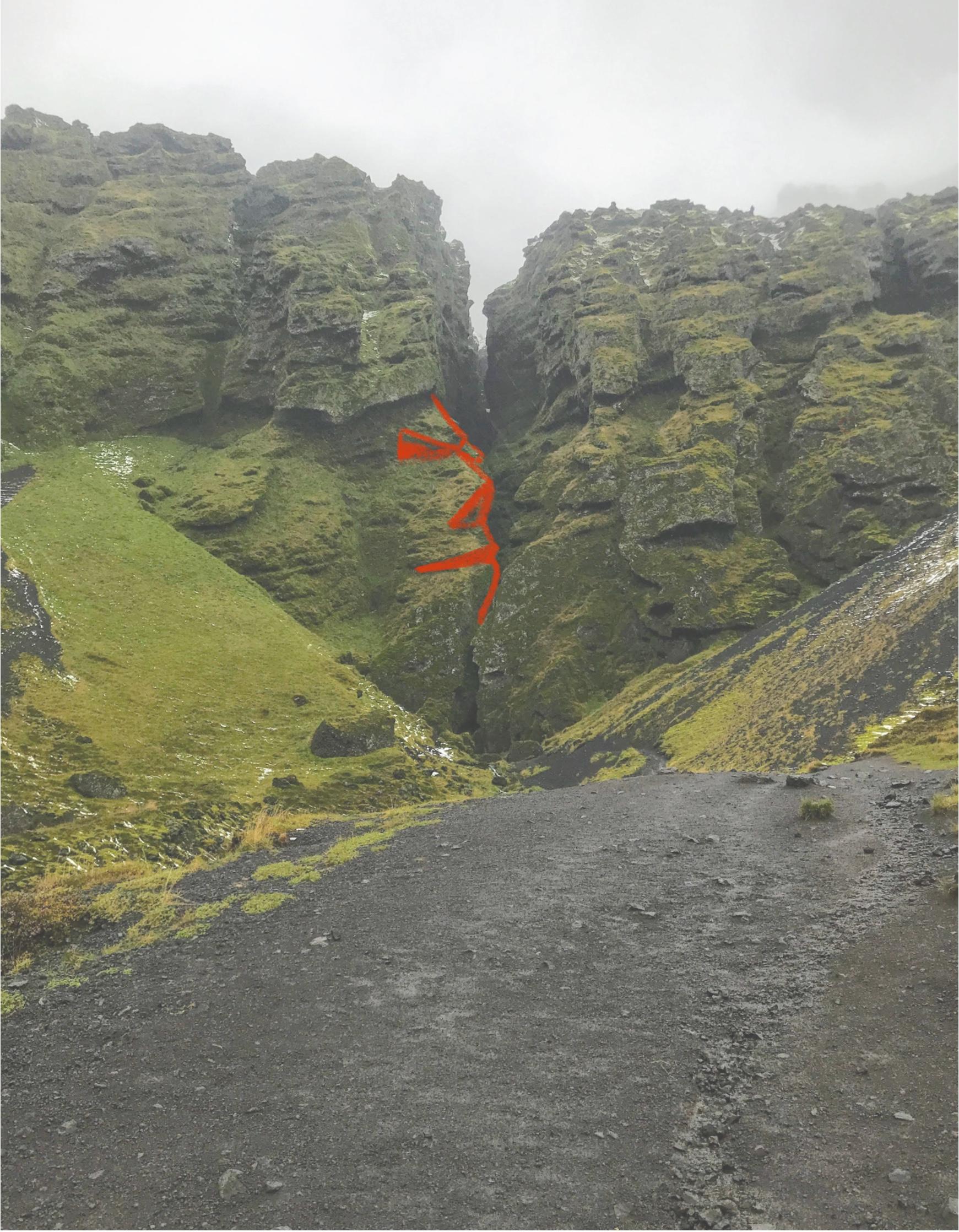
4. Creature Design: Here's the photo
I'll be using as reference for the class project. If you also want
to use this image, you can download it in the
project resources tab. I took this photo
because I immediately saw a bunch of faces
staring at me in the clubs. So hopefully you
see some as well. But if not, don't worry, we'll talk a little
bit about how I'm responding phases here and
what exactly the nodes. The first thing I look
for when trying to spot a phase in nature is triangles. The features of our face can
be simplified by breaking them down into triangles
have all different sizes, whether it's the actual features like different parts of the nose or shadow shapes like under the cheekbones are
under the neck. The whole face can be
made up of triangles. So if you can find a
triangular nature, you can find a fix. A good place to start
is by going through the image and identifying
all the triangles. There's really only
one face I see in this image that actually
has all the features. So I'll go ahead and
show you that one. No. So the forehead comes down and
creates a triangle with the ridge of the eyebrow. This phase actually has a
really great expression in the eye for what I want in my illustration
because the arrow is tilting down
like it's frowning. I see an I here in
this shadow shape. And then another eye on the
other side of this Ridge. The MIS triangle along the ridge here forms
the bridge of the nose. And the shadow underneath forms the shadow under the nose. We have another triangle
as the rich comes out to form the top
lip of the mouth. The mouth itself here is a
tiny sliver of a triangle. Then the bottom lib slash chin is the final triangle at
the bottom of this face. So since that's the most
obvious complete face I really see the next step is going through
the whole image and collecting anything that
can be part of a face. Already. I can see a nose and mouth kind of peeking
out right here, but there isn't an
eye to go with it. So if I wanted to make
this face complete, I would have to pull it from
somewhere else on the cliff. You can just draw
the eye yourself, but using shapes from other
parts of the cliff helped to make the whole thing feel
really cohesive and natural. The second thing I look for
is big changes in color, which in this case is caused by the shadows from the
depressions in the cliff. That's actually kind of
helpful for us because big changes in color on a
face can also be from shadow. So I'm just going in here and shading and a couple of shapes I noticed that could form the eye sockets and eyebrows up a face. And then this phase
can actually continue down here might be a little
hard to see on the screen, but in the image there
is a line that runs down that tiny little triangle
that I'm going to use as a marker for
a nose right now. It's definitely too small
to be a nose on this face, but it's nice to
have a placeholder. It continues down
into his mouth shape. But if you'll notice
this mouth is smiling, that could be fine
depending on your story, but I definitely
want these cliffs to have scary, maybe
threatening energy. So I'm just going to turn
it down into a frog. You can also play
with the size and positioning of the
faces on the page. I'm going to make them
a little bigger and higher so they really feel
like they're looming above. I'm thinking I want to
have five phases across, two on the right and
three on the left, since the face in the
center is on the diagonal. Again, feel free to do as
many or as few faces as one. Also remember this stage is just about finding rough shapes. I'm just looking for
a starting point for when I go to
sketch on paper, I do think it's
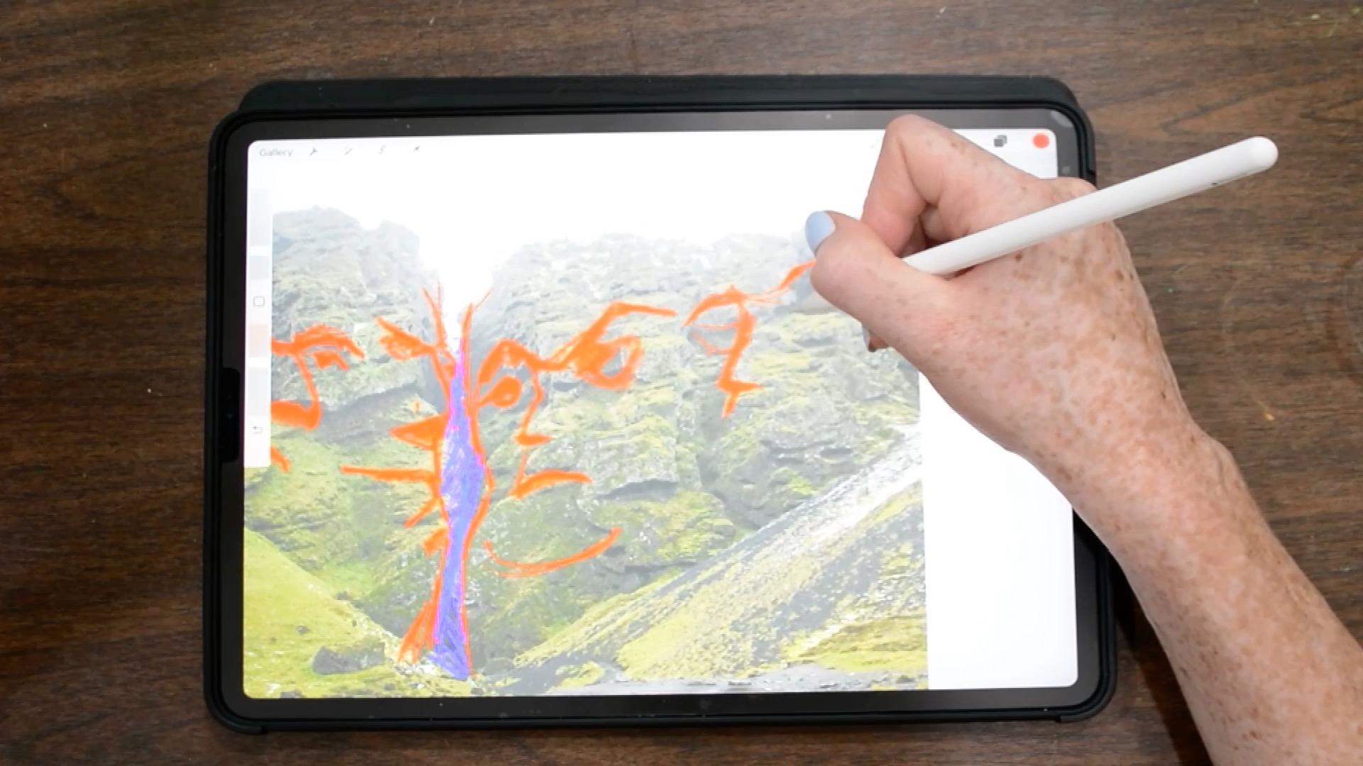
really helpful to be able to draw directly
on the image. So if you have an
iPad or a printer, I would definitely
recommend starting there. Then once you have an idea of the faces and
their placement, you can switch over
to sketch paper. Because the faces are all made up of repeated shapes
and the cliffs, they'll start out
looking really similar, but you can give each face its
own personality by playing with the proportions
and the positioning of the features on the face. So for example, since
these two faces on the right are
looking really similar, I'm playing with
making this nose Angular by using that
diagonal line in the cliff. You want to make sure
to use the shapes and the image as a
guide so that the face really does look
like it's part of the cliff and not just
something plastered on top. But that doesn't mean
you have to stick to the features exactly as
they are in the image. I can give this face
and more dramatic knows by bringing it out even further. But I'm still keeping the integrity of
the original shape. This had on the left
is turned away, but it's looking back to
the center because I'm envisioning a person
standing on this trail. And I want all of the
creatures looking at them. So I have to pay
attention to what that means for each set of eyes, whether it's straight down
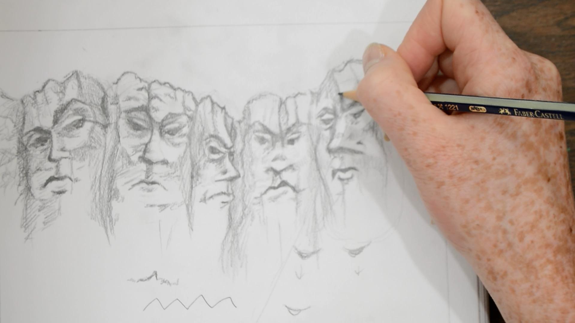
or more of a side eye. Now on paper I'm
starting to fine tune the details and get
things a little crisper. This is still not the paper I'm going to actually
be painting on, but I'm keeping my pencil
marks light because I know I'm going to be erasing
and redrawing a lot. I'm slowly adding in more
defined lines for the features. And I'm starting to do a
bit of shading to help me know what areas
I want in shadow. This includes shadows on the faces as well as
the areas between the faces where I want it to look like the cliff
is receding back in. I'm also starting to figure
out areas on the cliffs where I want to have texture
that's not part of the face. Like with these
cracks running out of the eyebrows to the
top of the cliffs. As I mentioned before,
the shapes we drew over the reference image
for justice starting point. So things are going to
morph and change a bit, but I'm keeping an eye on
that reference image so that it doesn't move too far
from the original goal. It's also up to you how detailed you want to get in this stage. I like to start
painting with a sort of map of what will be in
shadow and what blocked. It's kinda like creating your
own paint by numbers sheet. It helps me stay organized, but you definitely
could just draw more bare-bones outline of a face before you
start painting. We have finished sketching out our magical creature
inspired by nature. If you're interested in a more in-depth lesson on how to find faces in nature so that you can go out and capture
your own images. Definitely let me know
in the class discussion. In the next video, we'll add in the rest of the scene
around our creature.
5. Character Design: Because this class is more about the storytelling aspect
of illustration, I'm not really
going to focus too much on figure
drawing techniques. This video is about creating an interesting
character that fits the scene and helps
tell the story. So when designing the character, the first thing we want to
think about is how they're interacting with the
creature and the scene, literally, what are they doing? As I mentioned in
the previous video, I already have a general idea of what my character
is going to be doing. Since I have this trail
coming right up into the foreground and those
clips are so far away. I see the character is
standing here preparing to approach them. Right now. I'm just sort of
envisioning a power stance, but you could definitely have them doing different things like brandishing some kind of weapon or rolling up their sleeves. So I started sketching out some really basic
shapes to figure out where I wanted
my character to be. And then I realized that
I jumped right into sketching without taking
the time to plan. One thing that really
helps me figure out the position of the
body is starting with a stick figure to
visualize where the weight will be and what direction
there'll be leaning. It helps to create more
dynamic positions, even though the position
is still really simple, the stick figure is already more interesting than my
original sketch. The second thing
we want to think about what their character is, what clothes they're
wearing and how this goes relate to the story. The story I want to tell is
that my character is hiking along this trail and preparing
for an adventure ahead. So I want her to be
dressed like she knows what she's
getting herself into. For me. That means things
like hiking boots. I had a jacket and a backpack. You absolutely can put your character in
different clothes. It just might tell
a different story. For example, if she
were in a dress, it would look more
like she stumbled upon the cliffs rather than
planning to be there. I think that also could make
for a really cool image. It just depends on what
story you want to tell. Whenever I get stuck on how to draw the body in
a certain place, either take a photo of myself
in that position or I go to Google Images or unsplash.com
for reference photo. For the hands I used
a photo of myself facing away with fists
clenched and for the feet, I were really searched feet
from behind on Unsplash. I decided I wanted to
see my character's face, so I needed to figure
out her expression. Actually went back-and-forth
on if she should be smiling and mischievous
or angry and determined. I think either one could work, but at the very end of
the video you'll see I decided on an
angry expression. It helped to think
about the color palette I will be using when
I went to paint it, I knew I'd be using
more moody tones, so I decided to keep
her moody as well. I drew her hair blowing
in the wind to add some movement since
she's in a static pose. I also liked the
idea of this kind of subtle force pushing
her away from us. Lastly, even though this video is about the character
I just wanted to show you that
I went back into the cliffs and
added more details. I decided that
even though I only want the five phases
in the middle, I still want to utilize
the shapes that created their features to be
in the rest of the clips. When I go to paint,
these features won't be quite as
dark and obvious, but they'll make the
ones in the middle feel a bit more natural. Plus I really liked the idea of having hidden faces
in the clubs, since that's what this
whole thing is based on. And now our drawing is complete. In the next video, we'll get out the
paint and talked about the watercolor
techniques I'll be using to bring this
illustration to life.
6. Techniques: I'm going to start
by showing you just a couple of
basic techniques. So if you're completely
new to watercolor or just need a little refresher
you have somewhere to start. This first technique is
wet on dry or glazing, where he let the
first layer of paint completely dry before
adding more paint on top. I'll show you a couple of
different ways this can look. First, I'm using yellow on top of blue to show how you can use glazing to actually blend
your colors on the paper. I went a little light
with the blues, so it's going to come out
more of a yellow green. But you can see that since
the blue was completely dry, the area that I'm not
painting on is staying blue and it's creating a nice crisp line
where they overlap. You want to make
sure that the yellow doesn't have too
much water that you reactivate the blue paint and cause the blue to
bleed into the yellow. The next glazing is using the same color in multiple
layers to get darker. Again, you want to make sure
that the paint underneath is completely dry if you
want those hard edges. Lastly, for glazing, I'm just
showing you how you can get these sharp lines when
you paint on dry paper. Our project, I'll be
using this technique for both grass along the trail
and in the character's hair. I also wanted to show how I'm actually gonna be
paying the grass. So I'm using the same technique but I'm keeping
my strokes short. I'm making little rose
on top of each other, leaving a little bit
of space in-between. And then I go back in with a damp brush to smooth out
the bottom of the rows, being careful not to get water
on the tips of the grass. The next technique
is wet on wet. When we paint it on
top of dry paint, we were able to get
hard controlled edges. Now adding wet paint
into wet paint, the color will blend
immediately and when it's dry, depending on how
much water you use, the edges will be soft or
you'll still have hard edges, but there'll be
jagged and irregular. I'll show you that again. But this time just dropping
water into the wet paint. You can see that the water
I'm adding is immediately pushing the paint out to
the edges of the square, but not going beyond that
border into where it's dry. And now doing the
opposite painting a square of just water
and dropping paint in. Again, you can see how the paint immediately wants to go
wherever there's water. I'd recommend playing
with this and seeing what happens when you add
more water or more paint and playing with
dropping in paint at different stages of dryness to see what kind
of edges you get. Lastly, here, I just wanted to show you what happens if you try to paint the grass without waiting for
the paper to dry? We don't get those
crisp lines this time, but it can be good to
use as a first layer of grass that you then go back over with more detail
once it's dry. Next, I'll show you
the lifting technique. I like to use a
fairly stiff brush for this and then you get it damp and gently scrub the area of dried paint that
you're trying to remove. You want to be
careful not to use too much water and not scrub too hard because you don't want your paper to pill or tear. Watercolor paper is
pretty tough though. So again, I'd experiment and see what your
paper can handle. Lifting can also be
done on wet paint with a dry brush or paper towel. If you keep your
paint pretty light, you can almost lifted
out completely this way. Lifting is great for
removing mistakes, are bringing back
highlight areas that got darker than you wanted. Now we'll look at a couple of
fun techniques for texture. The first is using just
regular table salt. When you sprinkle a little
bit of salt onto wet paint, it creates this really
cool blossom effect. Again, I'd recommend
playing around with different types of salt
and the amount of time you wait for dropping
assault in as it will react differently depending
on how wet the paper is. Wait for the paper to dry completely before
removing the salt, which you can do by scraping with a card or a piece of paper. The last technique is bladder. There are a couple
of different ways that you can splatter paint, but my favorite
method is by loading up my brush with paint
and a good amount of water and then kinda scraping the bristles along the
handle of another brush. I like this method
because I feel like it gives me
the most control. I can change how much
pressure I'm using to affect how big or small
this bladders are. Like everything else. It will look different
if you splatter on dry paper or wet paper. Okay, So those are
the techniques I'll be using for this project. Definitely play
around and see how each technique
changes when you use things like more or less water or different brushes
and different colors. Then in the next video, we'll get started on our painting.
7. Painting Pt l: The Foundation: To transfer my sketch
over to watercolor paper, I used a light box, which is a great tool because
it means I don't have to waste time trying to
redraw my image perfectly. It also means that
if I mess up on the watercolor paper in a way that there's no
coming back from. I still have the
original sketch and I can just start over on
a new piece of paper. If you don't have a light box, you can also use a bright
window to trace your image. Either way, you want
to be sure that the lines in your sketch are fairly clean and
dark so that you don't get confused
while you're tracing. In this video, we're just going to be laying
the foundation. This is where for the most
part we're keeping things loose and allowing
soft edges to form. I'd like to start by painting a thin wash all over
of my lightest color. To do this, you can either
paint with just a clean, wet brush over the area you're about to paint and then go
back in with the pigment. Or you could start
with color and spread it out with a wet brush. For the most part, I
do the second option. For this foundational stage. I'm painting big areas at
once using a lot of water. I'll go through each
area of the painting with the same technique
of starting with a thin wash of the
lightest color for that area and slowly
building up from there. I'm dropping in more pigment in the areas that I know
will be darker like the crevices between faces
and all the areas of shadow on the face like under the eyebrows, nose, and lips. I'm also thinking about
reserving my whitespaces, which means all of the
areas that I know will be a highlight like the bridge of the nose or the cheekbones. I'm either leaving
the page white or I'm painting really like it. This is where that lifting
technique comes in handy, especially if your
entire paper is wet, the color will want to spread
wherever there is water. So if you use a lot of paint, you'll have to be
vigilant that it doesn't spread where
you don't want it to. I tend to work really slowly and then a lot of
really thin layers. The faces on the cliff
have their own lines and shapes and shadows and so
do the rest of the clips. You might notice that
I went in and added more hidden faces along
the bottom as well. With all of this detail
and texture going on, it's important to be
patient with that in color. You don't want to
add too much color too fast and then get confused. And what should be a shadow or a highlight to help me stay organized when I transfer my sketch over to the
watercolor paper, I really lightly shaded in with pencil the areas that I
knew would be in shadow. To help the painting
field cohesive, I use the same colors as a
base throughout the page. So even though the hills
aren't going to be brown, I'm using the same burnt
sienna that I used on the cliffs and on the trail
throughout the hills. Making the graphs along the trail a bit more
detailed by keeping the edges a little
bit sharper and starting to suggest
actual blades of grass. Whereas in the hills,
I'm still using a lot of water and letting the
color flow wherever. Painting the character, I'm concentrating a lot
of the color on her left side
because even though we don't really have a
light source in this image, I'm working as if it's above and a little bit
in front of her. Her face is such a small area, but I'm still trying to go in the same technique that I
use on the cliff faces, dropping pigment where
the shadows would be and then lightly
spreading it out from there.
8. Painting Pt ll: Value & Details: Now that we have our
foundation laid out, we can start getting
more detailed and building up the values, which basically means
making it darker. In the previous video, we
covered a lot of the paper with water and sort of let the
paint go wherever it wanted. Now we're gonna get a
little more precise. For the most part, I still use the same technique
of laying down some paint and
spreading it out by going back in with a damp brush. But now I'm using less water and not letting it
spread quite as far. So when we started, we made a big shadow shapes
the soft edges. As we continue adding
on layers and details, will make the shapes smaller
and the edges sharper. To create texture in the cliffs. I'm painting in the shadow shapes with my
lighter brown color. And then I'm going
back into where I want the deepest part
of the shadow to be and dropping in
my darker browns and even some blues and purples. You can do that both as
a wet on wet technique. So the blues and purples and dark browns will bleed
into the lighter brown. Or you can use the glazing
technique and allow the light brown shape to fully dry before you go in
with a darker shape. When you use both techniques, you get a really nice
combo of textures. I'm still using this
burnt sienna in the hills because as I mentioned
in the Foundation video, using the same colors throughout the painting and helps to
create harmony in your piece. And since I'm not getting super detailed than the
hills adding a bit of warm colors in a cool area
provides an interest. I'm starting to implement the salt technique
and the trail. Salt is a really cool way to add some texture
to your painting, especially in areas
where there's maybe not much else going on. I'll do this technique
on the trail a few times since I'm building
it up in multiple layers. Since her face is
such a small area, I had a hard time
reserving my whites, so I had to go back
in with gouache. If you're not familiar
with gouache, it's a more opaque type
of watercolor paint. It definitely has a different
look to watercolors, so I wouldn't use it on a
large area of the paper, but just as small
amount here and there in my opinion is okay. I'm making the hills in the back darker and bluer since
they're farther away. And even though they
have less detail, I'm still trying to
keep the tops of each individual Hill light so that you can see the
different layers. Each time I go to
paint the grass, I get a little more detailed. I'm using that glazing
technique with my smallest brush and
painting really tiny strokes upwards on dry paper. The next time I go back in, I'll do the same thing
but with a darker green or even a blue and make
the strokes even smaller. So essentially my
entire painting process is working progressively
darker and smaller. I want the clouds
to go in-between those clips in the
middle and two, look like they're farther away. So I'm making them smaller just like I do with
the hills in the back. Then for the rest of the area, it's the same
technique I've been using of dropping and paint, pushing it around with water. The travel is
another place where there isn't too much
detail going on. So I'm using a couple of
different types of texture. The salt which creates
those cool little blossoms. And then these
small lines across which are kind of like
cracks in the ground. I'm also using purple as my shadow color rather
than gray or black. As a general rule, I don't
really like to use black for shadows because it can
end up making these muddy. Purple works really well
here because again, it's a cool color in
a warm color area. Both the clouds in the
hills I let happen organically rather than plan out each shadow shape in detail. I push the color around the page until it forms a
shape that I like. This is definitely
easier to control if you only push the
paint in one direction. So there will be one edge that's hard and the other
side will be soft. Just remember that
the color will want to go wherever
you put water. Going back into the clouds. I added more brown in with the blue to create this
darker gray color. I'm going back over the
shapes I already have, making them darker and concentrating the paint towards
the bottom of the clouds. I'm also going in and
adding the dark paint along the tops of the cliffs so that there's some contrast.
9. Final Touches : As I'm finishing up, I'm
adding a loose outline to my character using a
micron pen and paying attention to the areas on the body that are
in shadow because I'll use a slightly darker line there than in the lighter areas. Usually by the time you
get to the final touches, you wanna be done painting. But I'm definitely someone who struggles with knowing
when a painting is done. So I decided to fix her hair, which I did with some lifting
and a little bit of gouache to cover up the areas
where her hair used to be. I didn't like how her
hair was grouped into so many small sections before. So I made a few bigger sections and then using my
smallest brush, I super lightly painted individual strands
towards the end. Once it's dry, I'll go over those strands with
the pens since the tip of the micron pen I'm using is even smaller
than my brush. I'm working my way around
the character looking for places that feel like they
didn't get enough attention. If they seem flat compared
to the rest of the painting, I'll add a bit of color for either more detail
or darker shadows. After finishing up the shadows
and highlights interface, I went in and added
some freckles. Here. I'm using a Mac, but
I think I went back in again using a brown
colored pencil to look a little more natural. I really loved these
Jelly Roll pens for small details
like the catch lights in her eyes and for making these little birds stand out
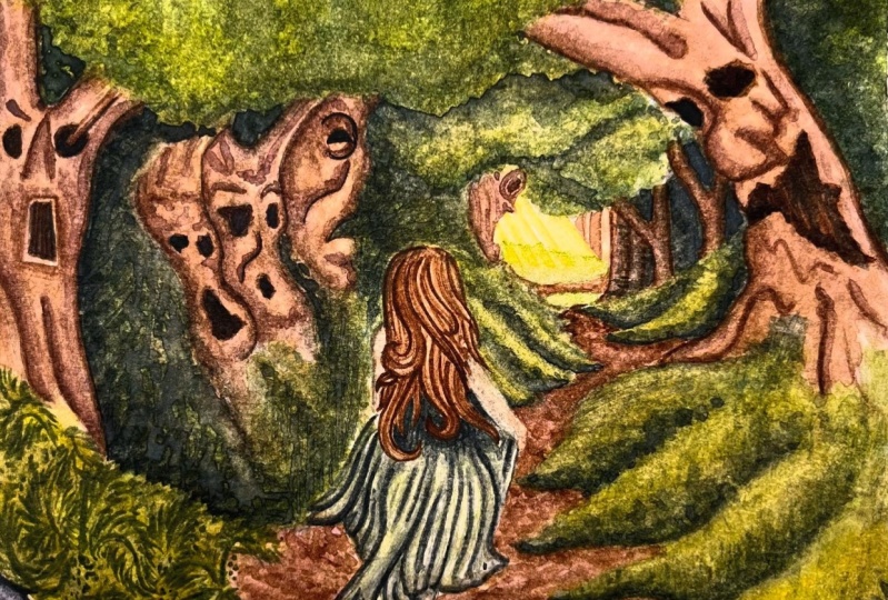
against the dark clouds. And now our illustration
inspired by hidden faces in nature
is finally complete.
10. Final Thoughts: Thank you so much proceeding with me throughout this class, I had so much fun creating this project and I
hope you did as well. We covered a lot of topics in this class, but if anything, I hope it gave you a
new and unique way of coming up with an idea
for a story to tell. And that next time
you're feeling a little bit stuck on what
to draw or paint, you can try going
outside for inspiration. I'm so excited to see how
your projects to read out. So definitely post it in the
projects and resources tab. You have any questions
throughout the class. Feel free to include
those as well. And I'll be happy to help. If you're on Instagram and you want to share it there,
I'd love to see it. So go ahead and tag me
at correctly paired. Thanks again for joining me. I'll see you next time.
 Taylor Stender, Watercolor Artist & Illustrator