Transcripts
1. Introduction + Welcome: You're looking to practice foundational watercolor
techniques such as wet on wet wet on dry, layering and painting
white objects, or you're simply looking for a fun winter themed
project to work on. This course is for you. My name is Erica, and I'm a traditional media artist working with a range of drawing mediums and I enjoy challenging myself with
different kinds of subject matter from still life to landscapes to
animals and more. My day to day life revolves around creating and
selling art locally, as well as creating helpful
content and resources for beginner and
intermediate artists that I share via my website, my YouTube channel, and
my membership site. I have over 15
years of experience working in creative
and artistic fields, first as a graphic designer
at an advertising agency, and then I moved on to work as head art teacher in a
school environment. During that time, I started my own art business on the side, and I've been working on growing that over the last six years. With every class and
tutorial that I share, it is my objective to
be fully transparent. With the techniques that I use, with what it takes
to create great art. I also make it a
point to explain the why behind my
actions so that I can give my students the tools
and the knowledge that they need to succeed with their
own original pieces. It has always been my goal to empower artists to reach
their full potential. This class, I take you through my entire painting
process step by step for this watercolor
ice skates piece. I've broken up my process into phases and each phase
has its own class. Aside from increasing
your skills with foundational watercolor
techniques that you can take to future watercolor
paintings for greater success, I'm also going to be
pulling back the curtains on my favorite techniques
and everything that I made sure to have
in mind to arrive at a great balance between higher levels of realism
and a painterly look. I would consider this
course appropriate for anyone who's been
painting with watercolor consistently for at
least a few months, this process will likely
go a lot more smoothly for you if you already have a certain level of water
and brush control, as well as practice
with essential washes. If you're just getting
started with watercolor, I would highly recommend
checking out my watercolor one on one course here on skill
share because in that course, I share essential
information and helpful exercises that will help you improve your
skills way faster. If you're ready, let's jump in.
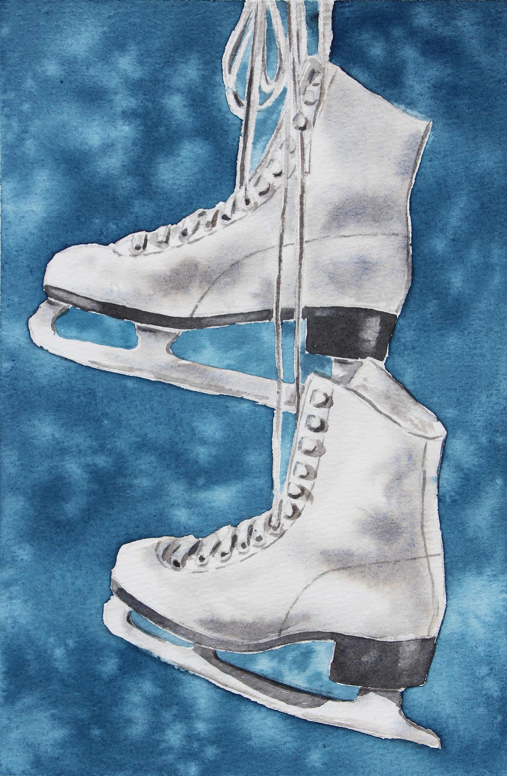
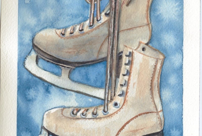
2. Course Project: By the end of this course, you'll have completed
a stunning watercolor still life painting of
a pair of ice skates. Throughout this
process, we'll be practicing foundational
watercolor techniques, such as wet-on-wet,
wet-on-dry, and layering. But aside from this,
we'll also be exploring the splattering
technique to create a beautiful visual texture
in our background. Not to mention, we'll
also be solidifying our understanding of painting white objects with watercolor. Along the way, I'll be sharing my best tips and tricks
on how to develop realism while maintaining
a painterly look and how to avoid overworking
a watercolor painting. Before starting with
the painting process, I swatch out my paint colors for you so that you can see what
they look like on paper. And I also provide a few
alternatives for each color in case you don't have these specific paint colors that
I'm going to be using. To post a photo of your
work here on Skillshare, all you have to do is click on the Projects and Resources tab. Once you're in, you'll see this purple button on the right
that says submit project. When you click on this button, you'll be taken to a
new page where you'll easily be able to both upload
a photo of your piece, as well as share any thoughts, experiences, struggles or questions that you
might have for me. Here, you can create a title for your project and click on that larger content
section underneath. And if you want to add in
that photo at the beginning, you can go ahead and click on that image icon on the bottom. Find the photo that
you're wanting to share on your
computer or device, select that file, click Open, and it will be immediately added into this content section. Then under your image, share anything that you'd
like, whether it's struggles, questions, wins, aha moments that you might have had throughout this course. Anything that you'd
like to share, I always love hearing from you. At the bottom of this
content section, you'll see different icons. One is for formatting your text. The other is to add emojis, the Adimage icon, which
we just talked about, and you can also embed link. Free to add in even more
pictures if you'd like. They can be process pictures, supply pictures over
here to the right, we have this preview area
where we essentially see a thumbnail or cover
image for your project. You can go ahead
and change it to a title image that you have created in a more
horizontal format. Or you can just go
ahead and leave it as is and have it just be a cropped section of one of the images that you have
uploaded into your content area. It's up to you.
Once you're ready, go ahead and scroll back up. Click on the green Publish
button and you'll be all done. If you'd like to share your
work over on Instagram, please do just make
sure to tag me at Erika Underscore
Lancaster Underscore Art. I love seeing your
work over there and giving students
shoutouts in my stories, of course, go ahead and tag
the Skillshare account too. It goes a very long way and inspires other students to
share their work as well. Skillshare is a
safe learning space for all of us to continue
growing together. So make sure that you're
using this gallery, and let's all connect
and help each other out. I can't wait to see your work and to help out with
whatever you might need. Let's move on to our next class.
3. Supplies: I'm going to be
working on a sheet of cold pressed watercolor
paper from Bao Han. This paper is 140 pounds or 300 GSM in thickness
or in weight, and it is 100% cotton. I would highly recommend making sure that you're using
watercolor paper that tolerates layering and bringing in a good amount of water for
your wet on wet techniques. The size that I'm going
to be working in is 7 " in width times
10.2 " in height. I'm going to be making my
outline sketch available for you in exactly the size
that I'm going to be using, as well as in a slightly
larger letter sized format. I'm going to be bringing in a total of four
different colors from my watercolor set that has paint from Windsor Newton's
professional line. And the four colors
that I'm going to be bringing in are Antwerp blue, Panes gray, burnt sienna,
and ultramarine blue. Before getting started
with the painting process, I will be swatching out all of these colors for you
on a scrap piece of watercolor paper so that you can see what they look like
swatched out on paper, and I'll also be providing
alternatives for all of these colors in
that part of the video. This way, if you don't
have one of these colors, you can easily replace it with something
similar that you do. Throughout the painting process, I brought in a total of six
different watercolor brushes. My larger size six mop brush was used to paint
the background. I brought in a size
16 round brush from Princeton's Snapline to do my splattering in
the background, and most of the
painting inside of the actual skates was done with my medium to
smaller round brushes. Those four round brushes are
sizes 148, four, and zero. I have my container with
clean water on hand, which you're free to use two or even three containers
of water as your painting. If you don't want to get up and change your water as often, I have a few of my Blu
Scot absorbent towels, which are my favorite kinds of towels to use when painting with this medium because
they really help me go in and do lifting
with greater control, since they are thin
and untextured. I'm also constantly dabbing
the tip of my brush onto these absorbent towels to stay on top of water
control along the way. I tape my watercolor
sheet down onto my black cutting mat using
regular 1 " masking tape. If you're afraid that you'll rip or damage your
watercolor paper at the end when you remove your masking tape
or whatever kind of tape it is that you're using, you can run those pieces
of masking tape over your clothes a couple of times
to soften that adhesive, and this will make it less
likely that that will happen. I have a few scrap pieces
of watercolor paper on hand to test out colors and
consistencies along the way. Is very important
because we're going to be painting white objects. So we want to go in
very watered down initially and make our way
gradually toward darker tones. I also have a few
sketching supplies on hand, as you can see. I have two different
pencil grades, my HB, and my two B pencil. I have a couple of erasers, a soft irregular
graphite eraser, and a kneadable eraser. And these are all
supplies that I used as I was doing
my transferring and my preparation of my preliminary sketch
on my watercolor sheet. Before getting started
with the painting process. For this one, I did trace over the reference photo using
a sheet of tracing paper. This is tracing paper
from Strathmore. In my watercolor
one oh one course, which is available
here on Skillshare. I've included a bonus class at the end where I
teach you how I use tracing paper to transfer my outline sketch onto
my watercolor sheet. And what I do to refine
my pencil sketch before moving on to the
watercolor painting process. So if you're interested in seeing me work through
that step by step, I would recommend
checking that out. Of course, you're free to use whichever transferring
method you prefer. Finally, I do want to remind you that along
with this course, I've prepared a set of
downloadable files, which you're going to
be able to find in the Projects and Resources
tab here on Skill Share. You'll find the
Projects and Resources tab right below any
of the class videos. Simply scroll down to the
Download resources section. There you'll find all of these files that I
have created for you, which include my outline sketch in two slightly
different sizes. The reference photo that I was observing as I was
creating my painting, a photo of my finished piece, which you're free to use as
reference as you're working, and my supply list. Once you have those downloaded
onto your computer, go ahead and do your transferring
of my outline sketch onto your watercolor sheet
and meet me in class number
4. Swatching Paint Colors: So I'm going to go ahead and swatch out these
four colors that I'm going to be using out for you so that you can see
what they look like, and I'm also going
to be providing some substitutes that you can replace these colors with
if you don't have them. You by no means have to use these exact same paint colors in order to arrive
at great results. Just use something
that is similar. So this first blue
that I'm going to be swatching out is Antwerp blue. Antwerp blue is a cool blue and you can replace it
with any other cool blue, such as Prussian blue or
Palo blue green shade, or you could even
just use indigo. If you do use indigo, you probably don't
even have to bring in the next color that I'm
going to be bringing in, which is Pain's gray. Panes gray is a cool
blue biased gray that I'm going to be adding to my Antwerp blue to create a deeper darker version of that cool blue that I
want for my background. See, since the ice skates
are going to be white, and this is a the lightest
local color that you can have by developing a
darker blue background, the ice skates are really going to pop because of that contrast. So this is why I chose to darken my anthrop blue by adding the
pains gray and really use a deeper darker blue gray in my background so that I can develop that
contrast that I want. If you are going to
be adding a gray to your blue to
darken it like I am, you don't have Paine's gray, you can use something like Jan's gray or even neutral tint or a black to darken your blue. The next color that
I'm going to be bringing in is burnt sienna, which is a reddish,
very warm brown. I'm going to be mixing
this warm brown with this next blue that I'm
going to be swatching out, which is a warm blue this time. This is French ultramarine blue. By mixing together
my burnt sienna and my French ultramarine, I'm going to get a gray and I'm going to be
using this gray to develop all of those gray to black looking values
inside of the skate. Wherever I want
softer, paler grays, I'm just going to be adding more water into my
gray color mixer, and whenever I want a black, darker looking color for
the bottom of the skates, I'm simply going to be using this color mixer in a more
saturated, thicker state. Now, because I'm going to
be combining my sienna with my ultramarine blue
to create those grays, and I'm not going to be
using the colors alone, it doesn't really matter if
the brown that you bring in is a warmer brown
or a cooler brown. Because as long as
it's a brown and you mix it with your
ultramarine blue, you're going to get a gray. If you don't have burnt sienna, you could use something
like red ochre, transparent brown oxide,
quinacridone burnt orange. But even if you don't
have a reddish brown, you could use something like burnt umber or Mars
brown or even sepia, combine that with your
ultramarine blue, and you will get a
gray looking color as long as you combine
approximately a 50, 50 amount of each. The ratio is something that you probably have
to play around with because maybe it will
change a little bit depending on the colors that you're bringing in specifically. If you don't have
French ultramarine, you can use regular ultramarine
blue ultramarine deep. The reason why I like using a combination of colors
to create my grays, especially when I'm
going to be painting white objects or even
white animals instead of just using ready made black for my grays or even something
like a pains gray, which really varies
from brand to brand is because it allows me to arrive at more vibrant, interesting
looking results. You see, by combining
a brown with the blue, you're able to develop
variation in hue and temperature throughout the
object or the subject, as opposed to just having a flat gray with one
single temperature. In some areas, my
mixture is going to have a tiny bit more
brown than blue in it, and others a little bit
more blue than brown in it, and that leads to a little
bit of variation in hue which usually leads
to more realistic, more interesting looking
results at the end. Not to mention, ultramarine
blue is granulating. This color tends to
have a little bit of separation as it is drying, and this leads to interesting texture
and variation as well as the color dries.
5. Background: So now that we have talked about the colors that we're
going to be using, let's go ahead and get started with painting our background. So as I mentioned in the
previous part of this video, I'm going to be combining
Anthrop blue and Pains gray to develop a nice, deep, rich, kind of grayish, dark blue for my background. I'm making sure to
create a large puddle of Anthrop blue plus Pains
gray on my mixing area. And this puddle, I would say, is a coffee to milk consistency. This is important because
since we're going to be pre wedding our entire background
area with clean water, there's already going to
be some amount of water on our paper by the time that we drop in or paint in our color. This means that if our color mixture is very
water down already on our palette and we place it on paper that is already wet that already has some
amount of water on it, that water is going
to be added to the water that is already
in your color mixture, which is going to water
down your pigment even more and lead to very
pale looking results. So if you're going for rich darker color and you
have done pre wedding, then make sure that
you're preparing yourself with a bit of a thicker color consistency
on your mixing area. This is a pretty large area that you're going to
be painting as well, so make sure that you're
preparing yourself with a good amount of
this color mixer. I like using medium
sized brushes to prepare my color
mixers on my palette. Just use a size 14 round brush
for these color mixtures. It allows me to go
into those paint areas on my palette with
greater ease and to bring a good amount of paint into
my puddle and also water from my container
whenever I need to water down my mixture
a little bit more. So once I had that dark
blue color mixture ready on my palette, I changed my water
because it was pretty dark by that
point, pretty blue. And because I'm going to
be doing pre wedding, it's important that I have
clean water in my container. I don't want to be painting
in blue color right now. With clean water
in my container, I switched on over to
my size six mop brush. Mop brushes are very absorbent, so a large one is
going to be perfect for painting large
areas like backgrounds. A nice, large absorbent brush is going to allow
you to load up your paintbrush bristles
with a good amount of water or paint and paint in larger areas faster without having to
constantly reload. So with the size six
mop brush in my hand, I go ahead and start painting in clean water all throughout
my background area, making my way carefully
around the ice skates, and I should say
that I am leaving those negative spaces in between the blades of the skates and also the little negative
spaces created by the laces. I'm going to be painting
that separately wet on dry with a smaller brush. I cannot emphasize
enough how important it is for you to take your time with this pre wedding process. Lot of times when you're
not able to arrive at those soft diffused
effects in large areas, it's because you do your
pre wedding very quickly. But as you can see,
I'm constantly coming back to that place where I
started doing my pre wedding, which for me is
in the upper left because I'm right handed as I continue making my way toward the opposite edge of
my picture plane. Meaning, if I started
on the upper left, I make my way down a
little bit and then come back to where I started
to reweb that area again. I make my way down a
little bit further, and I come back to that area where I started to re
wet that area again. I make my way down
a little bit more or toward the opposite
edge on the right, and I come back to
where I started again and over and
over and over. So I have gently gone over my entire background
multiple times, and this is real time, so you're actually
seeing how long it takes me to wet my
entire background area. It is essential that you go over the entire background gently
multiple times so that you can really feed that paper the amount of water
that it needs so that it doesn't
absorb the paint that we're going to be placing
on it next quickly. You see, by pre
wetting this area with clean water before painting in our color, we're
doing two things. We are extending the
time that we have available for us or the
working time that we have before our paint starts drying on us so that we
can really develop the darkness and the
soft effects that we want in our background
before areas start to dry. Also remember that watercolor is always going to
expand and diffuse and create these
beautiful wet on wet effects when it is
placed on wet paper. Water is going to do half
of the work for us in terms of creating those
soft diffused effects that we want in our background. So this is why pre wedding is so helpful when we're
painting larger areas. I simplifies the process for us. But you need to take your time with that pre wedding process. Otherwise, sections are
going to start drying on you and you will arrive
at splotchy results. And undesired textures. Do not start placing your
color until you see a nice even sheen all throughout
your background area. If you have puddles anywhere, simply go in with
either your paintbrush, use those bristles as a little absorbent sponge to
remove that excess water, or you can even go in with
your absorbent towel and do some lifting and then smooth your bristles over
that area again. Once I arrive at that nice even sheen all throughout
my background area, I loaded up my size
six mop brush with a good amount of this
dark blue color mixer that I had prepared
on my palette, and I started painting in
this color all throughout. Now, my goal here
is not to create a super flat even wash. I do want certain areas to be lighter, others to be darker, and we are going to
be doing plenty of splattering with water
for visual texture, which is also going to help add that tono variety
in the background. But even at this point, I'm not going for a uniform
blue value all throughout. I painted in some
blue all throughout my background area very quickly, while my paint is still wet, I switched on over to my size 14 round brush to clean up some edges a
little bit here and there. Because I've been
painting pretty quickly and with larger brush, oftentimes I have to
come back and push that paint a little
bit more closely to the elements to the subjects so that I can make
sure that I'm not left with slivers of white paper around my
objects or subjects. Once I was done cleaning
up those edges, I added more of my blue
and my paints gray into my dark blue color mixture on my palette because
at this point, I'm looking to deepen and darken the blue in certain
areas of my background. So I wanted to thicken up that color mixture
a little bit more. And going back to my
size six mop brush, I started dropping in more of this paint into
certain areas here and there to increase
that tonal variety in this background area. By this point, my background
is still wet and workable. No section of my background
is starting to dry yet, and this is because I took my time with the pre
wedding process. If I had rushed through
that pre wedding process, certain sections would
already be partially dry, if that were the case, I would not be able to
continue working because if we continue placing paint on paper that is already
partially dry, it is very likely that you'll be creating backgrounds
and splotchiness. I will say that the environment
that you're working in, whether you're working
in a warm environment, a humid environment,
a cold environment, a dry environment, if
you have a fan on, a heating system on air
conditioning unit on, all of those things are going
to have an impact on how quickly or how slowly your
paper starts drying on you. When I am painting large areas
or backgrounds like this, I almost always make sure to turn off any fans or
anything like that that might speed up the
drying process because I know
that that is going to make it easier for me to arrive at the
results that I want. If any section of your background is
already starting to dry, the best thing to do is to allow everything
to dry completely. Then if you want to darken your background in certain
areas, come back in, rewet the entire background gently with clean water again, and you'd be doing the
same exact process just layering more paint over
your initial layer. You would do this until your desired level of
darkness has been achieved. I switched on back to my size 14 round brush again
and I did a little bit more cleaning up of edges. A So once I'm happy with
how that's looking, it is time to work on my splattering before
my paint starts to dry. If my paint starts to dry, I'm not going to
be able to achieve the splattering
effect that is going to help add interest and
personality to the piece. So I move quickly. I take my size 16 round brush, and I use a cross tapping
motion where I have the size 16 round
brush tapping over my larger mop brush that
I was just using before. And in a cross motion, I just gently tap one
brush over the other one. Just take a little bit
of water at a time from my container with my size 16 round brush and tap
that over my mop brush. If your paint is
still very, very wet, it is likely that you'll initially see that
splattering effect. But then because the paint
is still moving so much, the splattering texture
is going to disappear. You can see some areas where my paint is pulling
a little bit. And in those areas, I'm not able to achieve the splattering that I
want because there's still a lot of sopping wet
paper in those areas, too much paint, too much water still settling and still moving. And in just a bit,
you're going to see how I tilt my board
that I am working on and use my absorbent
towel to remove some of that excess water
and paint that is pulling in those areas. But for now, I'm just taking a quick sack to clean
up edges again. So if you do your splattering, but you notice that
it disappears, either allow that paint
and water to settle on your paper for 30 seconds to
a minute and then try again, and you're likely
going to see that splattering stay this time, or you can try doing what I'm going to be doing
in just a bit and actually remove
that excess water before doing your splattering
in those areas again. See, right here, I'm using
gravity to my advantage to make that excess water and paint travel down my watercolor sheet, and I'm running my
absorbent towel right over that edge of my masking tape where the paint and
water are collecting, absorbing that excess
paint and water up. And this can be
incredibly helpful, especially when
you're working on a flat horizontal table or desk. When you're working on a
tilted surface or an easel, that in and of itself will help your larger washes because gravity will pull that
water and paint down, so that pulling won't happen. After I removed that
excess water and paint, I am now doing my
splattering again. Everything is still wet and
workable and you're going to notice how more of this
texture actually stays, especially in those places where I had too much water and paint. Everything all throughout my
background area is still wet and workable at
this point because I took my time with the
pre wedding process. Then I added a good
amount of paint to this area that was
already pre wedded, and I have continued wetting this area throughout this entire first
part of the process. I continue doing a little
bit of splattering at a time until I arrive at a
level of texture that I enjoy. Right here, I'm just doing a
little bit of cleanup work. Some of that water that
got in the skates, I'm lifting up with
my absorbent towel, and I'm going to go in to
clean up my edges with one of my small brushes one last time before allowing
everything to dry. If any of your edges
look a little bit ragged and you want to go
in and smooth them out, or maybe you have some slivers
of white paper that you want to push a little bit of your paint into, you can
go ahead and do that. I allowed everything to dry completely so that I can
go in comfortably and paint in those small
negative spaces created by the blades
of these ice skates and also the shapes in between the little loops and
string sections. These smaller areas, I'm going
to be painting wet on dry. I am not going to be doing
any pre wedding with water because since these
areas are pretty small, I can go in and paint
them pretty quickly. I am confident that
I'm going to be able to paint these areas quick enough that I won't be left with sharp edges and
undesired textures. To paint these areas, I am using my size
for round brush. And the exact same blue
color mixer that I was using to paint the larger
portion of the background, which is my Anthrop blue plus
paints gray color mixer. If you need to make more
of this color mixture, I would recommend testing
your color mixture out on a scrap piece of
watercolor paper to make sure that it is quite similar
to the color that you were just using to paint the larger portion
of the background. Once your dark
blue color mixture is ready on your palett, you may want to add a
little bit of water from your container into your
mixture to water it down because you do want
to make sure that you're initially going in with
a pale translucent, meaning water down
version of this color, because we want to develop a nice range of values
in all of these areas. And what I mean by this is you don't want to
go in and paint a flat blue tone or value
in any of these areas. You want to have
some darker sections and some lighter sections and organic soft diffused effects in every single one
of these areas. To do this, you need
to start light. You need to start water
down with a T consistency, and then you can go in
and drop in some more of this exact same
color mixture now in a thicker consistency
and darken some areas. It can be very helpful to take your paint from the edge of
your puddle or even bring in a few drops of water from your container and
add that water to one of the edges of your
puddle as opposed to watering down the entire puddle. This way, you can just
take a little bit of paint from the edge of
your puddle when you're getting started
with any new section, and then after you've painted
that initial palest layer, then you can take your
thicker color from the center of your puddle or the other side
of your puddle, where the paint is
thicker and drop in that thicker paint into some areas of that
lighter overall shape. But whether you
decide to water down your entire puddle or just a section of it as
you're first going in, it is very, very important
that you start lightly. And that you make your way
toward your darkest darks. Because if you go in too dark, too fast, that can flatten
out that entire area, and you're going
to have to go in and lift some excess color back up to reveal some of the white paper under the
pane and lighten some areas. It's a lot easier
to start light and darken than to start too dark
and go back in and lighten, especially when we're
painting with this medium. But ultimately,
we're trying to make these sections look like
part of the background, right and in the background, we have been working
really hard to develop a nice
variety of values. We don't have a flat
wash in the background, so we shouldn't have a flat wash in these sections either. We want these
sections to look like a continuation of the
background, right? So there has to be
a tonal variety in these areas as well. Now, we're painting
on dry paper, and dry paper is thirsty
paper, remember? So if you're finding that your color is drying
very quickly to the point that when you go in and drop in your thicker
version of this blue, it's not spreading out and creating these
beautiful soft effects, a tip that I can
provide is make sure that as you're
painting that initial palless water down blue layer, you're running your
paintbrush bristles over that entire area two, three times, maybe
even bring out a tiny bit of water from your
container, not too much, smooth that water over
that entire area, which is going to soften
that blue even more, and this will help ensure that that little section is
kept wet for a little bit longer so that you can then get those soft effects
when you drop in a little bit more of
that thicker blue. So I finished painting those sections in between the
blades of the ice skates, and now I am using my
size zero round brush to paint the even
smaller sections in between the strings. These are very,
very small shapes, very narrow shapes and
more complex areas, and I am observing the reference photo closely
just to make sure that I understand which sections
I should be painting in because I don't want to accidentally paint in
one of the strings, especially because the
strings are white. And if I start painting in
blue into my white strings, I'm not going to be
able to take that back. I would highly recommend
making sure that you're continuing to observe your
reference photo along the way. Before painting in
any new section, I try to understand
what I'm looking a I make sure that I know which
area I have to paint in, and then I go ahead
and start with exactly the same process
that I have been following, starting light and making
my way toward my darks. I do my best to develop a little bit of a
range of blue values, even in the smallest areas
that I'm painting in. Small areas can definitely
be hard to paint. So do try to stay on
top of water control. Right here, for example, this is a teeny, tiny section. Initially go in with too much
water, and when I see that, I immediately dab the
tip of my brush onto my absorbent towel to remove that excess water drippage and then I continue
what I was doing. If you're having
trouble with this, it's just a matter of continuing to practice and developing
that water control. I do want to mention
something in relation to the
strings because I know that this thing can be overwhelming to
paint for beginners. You might feel the need to paint everything exactly
as you see it in the reference photo and
you might feel that if you don't get that exactly the same as you see it in that
reference photo, that the outcome is not
going to be realistic, but this isn't the case. These strings are secondary
supportive elements. When it comes to
something like this, there is space for
interpretation. What I mean by this is you as the artist have the
artistic license to change things
if you feel that it will contribute to
the composition overall. If you want to change the
shape of one of these strings, if you want to add a string, take away a string as
long as you are bringing in the main characteristics
for this type of element, and things are looking
consistent in terms of lighting. The overlapping of these
elements makes sense. Gravity makes sense, all of these things that
are key to realism, then you will end up
with believable results. So there is no need to
put too much pressure on yourself to get things exactly as you see
them in the photo. There is no need to
be super literal, as long as you are making choices strategically
depending on the level of realism that you're
trying to create and that you're continuing to
move forward with care. Please keep these things in mind as we move forward with
this painting process. In order to achieve
believable results, while maintaining a painterly expressive it is important to understand what makes
something look realistic, but you can also be a little bit loose with how you are
painting those things. And this is especially important when
you're painting with this medium because
you don't want to overly describe or
overly control. Because if you do, you can very easily start
overworking your piece. So it's definitely a balance. All right, so I'm all done with painting those negative spaces. I am going to allow
everything to dry completely, and then we're going
to be moving on to painting the first layer
inside of the skates.
6. Boots + Blades (Layer 1): We're going to be
painting the skates in a series of layers or glazes. Some of these layers are
going to be wet on wet and we're going to be
doing pre wetting first before painting
in our color. Other layers are going
to be wet on dry. What is very important
is that we keep in mind the effects that we're
going for with each layer, whether we're trying to
create soft diffused effects, or whether we want to create
sharper effects and details, depending on the
effects that we want, we're going to be
choosing between wet on wet or wet
on dry techniques. It is incredibly
important though, to allow each layer to dry completely before working over. I'm going to be using
the same combination of colors to paint the blades, the boot or the
bulk of the skates, and also the strings
or the laces. Everything is going
to be painted with the same combo of colors, which is my French
ultramarine blue, and my burnt sienna. Remember that gray color mixture that I was talking about before? That is what I want you
to prepare right now. Whatever warm blue it
is that you're going with and whatever brown it
is that you're going with, make sure that you are mixing enough of
these colors together until you arrive at a gray
looking color on your palette. I would recommend testing out your color mixture
on a scrap piece of watercolor paper the
way that I did right here so that you can see what your color
looks like on paper. With my gray color mixture
ready on my palette, I start using my size
four round brush to pre wet a section of this blade right here in
the skate at the top. I am working a
section at a time, bringing out a little
bit of water from my container and painting
that water on carefully, just smoothing on
that water until I arrive at a nice even sheen. Once I have that even sheen
in this blade section, I take a little bit of my gray color mixture
and drop it into some areas where I see a very light gray in
that reference photo. I try to keep
lighter value areas completely free of color. And just like with
everything else, I want to make sure
to start lightly and incrementally build
toward darker values. I want to keep a lot of
areas bright and shiny, especially because
this is metal. Metal is very reflective. So I want to make sure that I'm incorporating a lot of that bright paper
into this part of the piece because of those very light
values that I see in the reference photo and
because I want to make sure to arrive at
a metallic look. Now, if you're asking
yourself why I pre wedded this section with water before dropping
in my color, even though it's a pretty
small shape that I could definitely paint in
relatively quickly, well, the reason why I
decided to do this is precisely because the water really helped me develop that very light
gray value because it helped me dilute
that gray even more. And I need very
light values right now in this section because
of what I said before, I see very light values
in the reference photo, and this is metal. So that water would
help me ensure that I would be creating very light
gray values in this area. And by preparing this
section that I would be painting with water before
dropping in my color, I knew that I was going
to be able to create very soft diffused effects. Is exactly what I wanted
for this first layer. I did the exact same thing for the other two sections in
the back of this blade, pre wetting first with water and then dropping
in a tiny bit of color while trying to keep some sections of
paper unpainted. But I made sure to switch to my smaller size
zero round brush in those smaller sections at the back so that I could
have more control. With that first layer painted
in in that first blade, it was time to start developing some shadow shapes
created by the metallic detailing
in the front of the ice skate and also
created by some of the laces. I am going in with my
size zero round brush and painting in these small
shadow shapes on dry paper. I do want to make
sure that I'm going in with relatively
watered down gray. I do not want to go in super
dark and deep right away. I'm going to be building
toward those darker values. And I am simply observing the reference photo
and trying to get in a similar shadow shape to what I am seeing
in the photo. I am trying to capture some darker value areas
that I am seeing on these little metallic
elements and also created by the metallic elements
and the laces as well, but I'll be doing more work exclusively in the laces
a little bit later. What really helps me
is bringing to mind the actual three
dimensional structure of what it is that
I am painting. So those little
metallic sections in the upper part of the boot, those are a type
of flattened hook, if you will, that the
laces kind of wrap around. They're coming out a little bit, and they're blocking
that light from hitting that section of the boot behind
them or underneath them. So there would be
a shadow there. Other metallic elements are a little ring that have
a hole inside of them, which would also be only a
lace is coming through it, covering up the majority of
that hole that you would see. All right? So here I'm getting started with the second blade, and I can do this
one all at once. It's not really divided
into sections by laces or overlapping
taking place, so I can just paint
it all at once. But I'm doing it the exact same way that I did the
previous one in. So first I'm going in and pre wedding this entire
area with water. I am using my size
eight round brush, and once I see that
nice even sheen, I'm going to be dropping in a little bit of my gray paint. Into light gray areas that I
see in that reference photo, keeping other light value
areas completely unpainted. As you continue working on your development of
values and your shading, do remember that everything
has volume, mass. It is made up of planes, the planes that
are facing toward the light are usually
going to be lighter. The planes that are
facing away from the light are usually
going to be darker and wherever there is
overlapping taking place and wherever there
is light being blocked, there is also going to be a
little bit of a shadow shape. So try to observe the
reference photo and understand what is going on
in terms of all of this. And your shadow
shapes don't have to be exactly the way you see
them in the reference photo. As long as they are
similar in shape, similar in size, and the
location makes sense, you're going to end up
with believable results. It's all about
continuing to observe that reference photo and
also bringing to mind how light works and how it hits three D structures
from a certain location, illuminating some
areas and not others. This is why we see
different values or tones, which we're trying to recreate to arrive at believable results. I finished up with the first
layer in that bottom blade, and it was time to move on to painting in those
shadow shapes in the front of this ice skate created by the
metallic elements. I am using my size
zero round brush because these are very small
shapes that I'm painting in, and I'm painting
these on dry paper. You can see how I
haven't painted in any very dark grays yet. All of these grays
stay within the lighter to lighter
mid tone range, and I'll be developing
those darker values later on in subsequent layers. As I am painting in
these shadow shapes, I am really avoiding creating any outlines around
these small elements. These are abstract,
irregular shadow shapes that I'm painting
in, not outlines. Once I was done with
those shadow shapes, it was time to
allow everything to dry once again because it is time to start developing those light gray values
all throughout the boots. I make more of my
gray color mixture, which is a combination of
my French ultramarine and my burnt sienna and using
my size eight round brush, I start pre wedding the entire front part of
this ice skate at the top. I'm going to be approaching this top boot section by section because it is being
sectioned out by those two laces that
are running down it. Be very gentle as you are running your
paintbrush bristles and pre wedding over the shadow shapes that you
just painted in before. Because you don't want
to start accidentally scrubbing those shadow
shapes that you've been working so hard at
because if you start scrubbing over them and you
start reactivating that gray, you can start messing up your shadow shapes and
you don't want that. I do pre wet the black sole and heel portions at the bottom of the boot, because it's okay
if some of my gray goes into those areas as they
will be painted with black, which will cover up
the gray completely. Once you have that entire front
section of the ice skate, evenly pre wetted and you
see that glistening look, Observe that reference photo, notice where you see some grays and drop in your
gray in those areas. Try to allow the paint to
expand and do its thing. And if there are
little textures that you want to get rid of
or you want to help that transition happen
a little bit more smoothly between your
grays and your white, you can go in and do
that work manually. As long as your paint is
still wet, of course, but I would highly
recommend avoiding going in to do unnecessary blending
and moving around of paint. Because the more
moving around you do, the more blending you do, the more likely
it is that you're going to lose that freshness and you can even end up creating splotchiness and
undesired textures. If you are going in to move around that paint after
it's been placed on paper, do it minimally and
only where necessary. Notice how my gray values
are still quite light and also notice how there is a good amount of
paper left unpainted, especially in those
lightest areas that I see in the
reference photo. I do the exact same thing for the other two sections of this white boot area
in this top ice skate, pre wetting with water first and then starting to paint
in my light grays. I continue to remind myself to just develop lighter gray
values in this first layer. And if I ever find that
I go into dark too fast, I immediately remove that paint from my paintbrush bristles, go in with a clean and
only slightly damp brush over that dark area
to soften that color, and I continue with
what I was doing. Doing a little bit of
work here at the top before moving on to
the bottom ice skate. There is a very small section
here at the top that I approached separately
because it's being sectioned out
by laces as well. And I did use a smaller brush
for that very small area. Once I'm done with
that first layer in the ice skate at the top, I go ahead and do the same
thing for the bottom one. I switched on back to my size eight round brush and I am pre wedding the
entire thing at once. This boot is not being sectioned out by laces like the
one at the top is. So I'm pre wedding
the entire thing, just making sure
to be very gentle, especially when I
am wetting over those shadow shapes that
I just created before. You can see how I'm
also wetting over the sole and heel black areas. It's totally fine if I wet those areas because
since those are black, any gray that expands
into these areas will be covered up by the black that I'll be painting
those sections with. I take my time with that
pre wedding process until I see a nice even sheen
all throughout the boot. And once I see that even sheen, it is time to start
painting in my gray. So I observe that
reference photo. I notice where those
light gray values are, and that is where I start
dropping in my color, and I start building up that
depth little by little. If I go in too dark, I immediately stop
what I'm doing. I remove that paint from
my paintbrush bristles, go in with a clean and
slightly damp brush, run my bristles over that area that I'm looking to soften, and you can also always
do some lifting and use the clean and only
slightly damp bristles of your paintbrush as a little absorbent sponge to remove excess paint
that you have placed.
7. Laces (Layer 1), Sole + Heel: All right, it is time
to start developing some gray values in the lass. For something like
this, I find it incredibly helpful to zoom into the reference photo and focus on observing the areas
that I am working on. As I mentioned before, it's
very important to understand how different sections of these laces are overlapping
over each other. By understanding how
things are overlapping, you'll be able to more easily
place your shadow shapes. Observe the reference
and ask yourself, is this lace section in front
of another lace section? If so, the lace section
in front is going to be creating a little
bit of a shadow on the lace section behind it. And as you continue painting
in these shadow shapes, you will notice how
you will be visually separating out the
different lace sections. Do you remember that
these are not lines or outlines around
the lace shapes? These are shadow shapes
that you're painting in. Those shadow shapes will provide structure to whatever it
is that you're painting. As with everything else
that I've painted so far, I am making sure to start
light with my gray. I'm going in pretty
watered down with a T consistency
in the beginning, and I'll be building toward
those darker gray values. So I started at the top,
which is, I would say, more complex because you have more loops and sections of laces overlapping
over each other. When it comes to the longer, more stretched out lace
sections that are hanging down, those are easier to paint. I just paint in some long, very light shadow shapes, taking clues from
that reference photo, trying to notice
where lightest areas are throughout all of these lace sections
so that I can leave those sections
unpainted so that at the end, the laces can end
up looking white. Once I've painted in some light shadow shapes
in the laces, I need to allow
them to dry before going in with my
next darker value. So in the meantime, I decide to paint the soles and
heels of these boots. I'm using the same gray
color mixture that I've been using all throughout
the ice skates so far. Which is my French ultramarine plus burnt sienna color combo, but I really thicken
up that color, adding quite a bit of each color into the mixture
so that this time, my color mixture can
look almost black, and I start painting
in these sections on dry paper using my
size for round brush. Even though the
soles and heels of these ice skates
are indeed black, this is a black section of
these man made objects. Really observe the
reference photo closely and understand that you're seeing somewhat of a
range of values there. Some sections look gray, other sections look black, and it is going to
be important that we develop some highlight
areas as well. If we want to add
dimension and a smooth, shiny finish to these parts, we shouldn't go in and just
paint a flat black value all throughout because
objects are always going to be affected
by light and shadow. And depending on the material that the objects are made of, their surfaces can
be less reflective or more reflective and this
can create extra highlights. Essentially, what I
did was I painted in that almost black looking value all throughout this shape. Then I remove that paint
from my paintbrush bristles. I remove that excess
water by dabbing the tip of my brush onto
my absorbent towel, and then I use my clean and
only slightly damp brush to lift up some paint from some areas while the
paint was still wet. By absorbing up
some of that color, you reveal a little
bit more of that paper under that creating a lighter
value or a highlight, and this helps develop that tonal or value variety throughout this
black soul and heel, which creates more dimension and more of a believable
look at the end. Okay, so here I'm doing
the exact same thing for this section in the
ice skate at the bottom, making sure that I'm
developing a nice range of dark gray and black
values in these areas, sometimes by adding a
little bit of color, sometimes by taking
away some color, and I'm also going to be using that lifting technique again to add some final highlights. Always remember to develop
a nice range of values, even if you're seeing very, very dark looking
objects or areas. Sometimes, even
though I see a very, very dark, flat looking
value in reference photos, I bring in my artistic
license and develop a range of values in
that area because I know that if I just
go in and paint a flat black looking
color that is going to lead to heaviness
and flatness in the piece, especially when working
with this medium. So whenever you feel that
it'll help the composition, don't be afraid to bring in your artistic license
and make some changes. Be creating art, it's
not just about copying the photo or whatever
it is that you have in front of
you exactly as is. It's about making choices, choices that are
going to help make this medium that you're using shine to its fullest
capabilities, which every artistic
medium is different. And also making choices in
terms of techniques and strategies that
are going to help you arrive at the
results that you enjoy. All right, pulling up some final highlights here
and I'm going to be all done.
8. Blades (Layer 2) + Seams: It is time to do a little
bit more work in the metals and also we're going to be painting in the
seams in the boots. The first layer in the metals
was painted wet on wet. We did pre wedding, and then
we painted in our color. So we have those soft
diffused effects. This next layer is going
to be painted on dry paper because we're now
looking to develop darker mid tones
and darkest darks, and we're looking for a
little bit more control and even sharper
edges here and there. I'm observing that
reference photo, noticing where darker
shadow shapes are, and I am using my size
four round brush and this thicker blue and
brown color mixture to paint in darker shadow
shapes wherever I need them. Because I am painting
on dry paper right now, I'm being left with sharp defined edges around these shapes that
I am painting in. So whenever it is that I want to soften an edge of
one of these shapes, I go ahead and remove
that paint from my paintbrush bristles
and I go in to soften that edge by running my clean and only slightly damp paintbrush
bristles over it. I am focusing on doing my
layering of this gray and darkening little sections that actually need to be
pushed a little bit more. I don't want to
darken or do any more layering of color in
lighter value areas. Right here, I'm creating a very sharp looking
shadow shape which is definitely
darker in value. That I see in this bottom
skate in that reference photo. If you observe
this shadow shape, you'll notice that its
edges are actually clean. They're defined. So after
painting this shape wet on dry, I don't go in and
soften any edges because that shadow shape in
the photo looks this way. And it is also quite dark
when I compare it to the other gray values in
this part of the ice skate. There is another smaller
dark defined shadow shape right under the heel
that I go in and paint, and I also leave just like that. It's all about acknowledging
those different values present in the photo and
continuing to ask yourself, is this area lighter or darker than this
other area over here? If you're developing
a lighter value, then you might want to go
in with water down gray, add more water into
your color mixer. And if it's a darker value
that you're developing, then consider going in with a coffee or even
milk consistency. Right here, I'm painting
in some very narrow, very small shadow shapes
and this really helps add thickness to the
blade of this ice skate. This would be the upper
plane of the blade, which is facing upward
toward the boot. Because the boot is
covering the light or blocking the light from hitting this upper plane of this blade, then this section is darker. Because of the perspective
of this bottom ice skate, you can see a bit of this upper plane of the blade
in that reference photo. In the reference photo, the lighting, I would
say is quite stark. And there is some light reaching this upper
plane of the blade, especially in the front
part of the ice skate. But I took some artistic
liberties and decided to darken almost the
entire upper plane of the front portion of the blade so that I could create a more noticeable difference between the values in this upper plane and the
values in the side plane, which get lost a little
bit in the photo. Right here, I'm
developing some soft, very light gray values in
the bottom of the blade. Once I was done with that
second layer in those blades, it was time to do
a little bit more detailing work in the boots. Switched on back to my
size zero round brush, and I am going to be
painting in the seams. So I'm continuing to use
the same gray color mixer, my ultramarine and
my burnt sienna. I'm taking a little bit of that color mixer and
using just the tip of my brush to paint those seams
in a relatively subtle way. Instead of going in and painting a very bold looking dark line that is the same thickness
start to finish, what I am doing is painting more of a segmented line
or little marks. And I do this by just ever so slightly touching the
tip of my brush to my paper and tracing over my line and as I'm moving
my paintbrush along, at some points, I'm ever so slightly lifting up my
paintbrush bristles off my paper so that I can break up that
line into sections. You can also see that I'm
not going in super dark. If I went too dark, these lines and marks would be way too stark looking
and distracting. Can see how I painted in a darker gray mid tone along the upper edge
of this bottom boot. This bottom boot is ever so
slightly turning toward us. We're seeing this
bottom ice skate at a slightly different angle when compared to
the one at the top. We can even see into
it a little bit. What I painted in
at the top there is that very thin upper
plane, if you will, which is going to help
communicate that sense of thickness of the material
that the boot is made of. A little bit later, I'll
be painting in more of a shadow shape in the
interior of the boot.
9. Boots + Laces (Layer 2): We are officially in the very last leg of
this painting process. What we're going
to be doing now is developing darker mid tones and darkest darks throughout
the laces and the boots. We've already created some
lighter shadow shapes, and we've developed
a nice range of values throughout both
the laces and the boots. But at this point, now that everything has dried
and looks lighter, we have to go in and push
some shadow shapes even more, and we're going to be doing this through layering and glazing. Watercolor is always going to dry lighter than how it
looks when it's wet. So when we're going for mid
to higher levels of realism, it's really helpful
to allow everything to dry and then
come back to see if there are any areas
that we need to push a little bit
more so that we can have that wide
range of values needed for realism
and believable depth. And that is exactly
our objective with this last part
of the process, where we're going to
be doing more layering and glazing in the
laces and the boots. I am doing here is I'm using
my size zero round brush and my gray color mixer to paint in some abstract shadow
shapes within that larger, lighter shadow shape that I
had already painted before. I'm continuing to observe
the reference photo, and I'm continuing
to remind myself of the three dimensional structure of what it is that
I am painting. I'm asking myself
questions such as, where is the overlapping
taking place? Where are their little holes? Where is there a little
section that is sticking out, that is creating a shadow
on that section behind it? Where do I see darkest values
in that reference photo? With this information in mind, I'm going in and painting
irregular shadow shapes, really staying away
from stark looking, blocky shapes and outlines. Because I am painting
on dry paper, things are drying
pretty quickly. So if I want to go back to an
area that I just painted in a few minutes ago to
push a little section a tiny bit more with
maybe thicker paint, I can go ahead and do that. And as you can see, I never spend too long in
any single area. I paint in a little
shadow shape, and I continue moving around. For most of these shadow
shapes at this point, I'm not even going in
and softening edges. I'm leaving those edges
sharp and defined. But if you do want to go
in and soften an edge, that's perfectly
fine to do, as well. Just remember that you don't
have to soften everything. In realism, there is always
going to be a combination of soft transitions and
lost edges and sharper, more defined edges among
your different value shapes. You can see how I'm
continuing to jump back and forth between
my two ice skates, allowing one to dry while
I work on the other one, then going back to the other one if I want to push areas
a little bit more. And I'm just
continuing to notice those value relationships
in that reference photo, continuing to
compare my painting with the reference photo
and asking myself, is there anything else that I need to darken a
little bit more? And if I do need to go
in and darken an area, is that area a
lighter gray midtone or is it a darker gray mid tone or very dark shadow shape. And based on that information, I water down my color mixer or I thicken up my color mixer. As you continue working on your shading and
value development, take breaks and come back
to see everything as a whole and ask yourself if you've arrived at that level of realism that you're after. Do you need a wider
range of values? Maybe you need to push areas a little bit more to
develop that contrast. Or if things are looking a
little bit too stark to you, maybe you need to work
on your mid tones, those bridge tones a little
bit more so that there's not this big jump between your lighter values and
your darker values. Right here, I'm going to darken the interior of this bottom
boot a little bit more. And then I'll go ahead
and create some larger, bolder shadow shapes created by these little hooks
that are coming out from the top of the boot. If you want to add a little
bit more definition to any of these little metallic elements in the front of
these ice skates, consider creating a few
subtle shadow shapes around its edges in some
sections here and there. Don't go around it to
create an outline, but create some shadow shapes
along some of its edges. I did that right along
the edges of some of those rings that have the hole in them that
the laces go through, and also along the edges
of some of those hooks in the upper part of the
boot, always starting light. And then if I want to darken some little sections inside
of that a little bit more, I go a little bit darker after that first
layer has dried. It's time to darken some areas in the
bulk of these boots. Right now, I have a
very subtle range of light gray values in these areas and I feel that they are looking
a little bit flat. They're lacking dimension. This tells me that I
need some darker values. But I do want to make sure that these shadow shapes that I
create in the transition between my lighter values
and my darker values are very soft and gradual
and organic looking. So to create these
kinds of effects, I know that I need
to work wet on wet. So what I'm doing
here is I'm using my size eight round
brush to pre wet these areas that I'm
going to be creating darker shadow shapes in with water before painting
in my color. Make sure that you're
doing your pre wetting with clean water. Otherwise, you're going
to be painting on color and this can be a problem, especially because we're
painting white objects. This time, because I
am just focusing on specific areas within that boot that I want to create
darker shadow shapes in, I just pre wet
specific sections. I am not pre wetting
the entire boot. However, I do make
sure to pre wet a large enough area that
goes past that section that I'm going to be developing those shadow shapes
in because I want to give that paint enough space to expand and create those
soft transitions. If I just pre wet
a very small area, and then I drop in my color into that very small
pre wedded shape, what's going to happen is
that color is going to expand and it's going to reach those edges of your
pre wedded shape, and that is going to
create a sharp edge. I don't want a sharp edge. I want a soft transition. Where the gray turns gradually
into the white paper. And in order to do that, you have to make sure that
you're pre wedding way past that area that you're going to be developing
those shadow shapes in. Always pre wet a larger shape than you feel you
need and also make sure that you're pre wedding
gently and that you're not scrubbing over that work
that you've already done. I finished up with the ice
skate at the bottom and I just finished doing my pre wedding in the back portion of
this boot at the top. I am preparing my gray
color mixture here. Remember that you
can always check on your gray color mixture by scratching it on
a scrap piece of watercolor paper to ensure that it is a similar gray to
the gray that you've been using throughout
this entire process before jumping in and
painting in that color. Right here, I'm starting
to paint in this gray. Only in those areas that I see, I should darken a
little bit more. I continue to observe that reference photo to
notice areas that I should darken and areas that
I should keep light and uncovered by this
second layer of paint. I continue sculpting the boot here until I arrive at
a look that I like, you can see how I'm
manually creating softer gradients and
maybe softening areas if I feel the color is a little
bit too dark and making sure that I'm staying away
from overworking things, making sure that I'm
not continuing to work on sections of paper
that are already starting to dry
because that would just lead to splotchiness
and back runs. I finished developing
those darker values in the bulk of these ice
skates in the boots, and I'm just going to
finish up by adding a little bit more
detail definition and even pushing little
teeny tiny shadow areas a tiny bit more before
calling this one done. When I'm almost
done with my piece, I always like coming back to
see everything as a whole, just to make sure
that everything has the finish that
I needed to have. The range of values throughout the piece
looks consistent, and I'm not lacking any
details that I might need to arrive at that level
of realism that I'm after. Jumping around the entire
piece at this point and just finishing up by pushing some little shadow
shapes here and there. At this point in the process, I do allow myself to go
in with darker gray. I would say that
the consistency of my gray color mixer is a milk
consistency at this point, and I'm not afraid
of going in dark because I've already
developed my mid tones. I continue making my
way around the piece, seeing if there's
anything else that I need to darken and I go ahead and create those
final darkest shadow shapes with my
thicker gray mixture. If I ever want to soften an edge of any of these
dark shadow shapes, I simply remove that paint from my paintbrush bristles
and go in with a clean and only slightly
damp brush to run my bristles over that edge
that I'm looking to soften. And once you're happy with
your level of contrast, you can go ahead and
call this one done.
10. Thank you: You made it to this
point, congratulations. I hope you enjoyed this
course and that you learned new things that
you can take with you to future watercolor pieces. Don't forget to
share your work in the Projects and Resources
tab here on Skillshare. I cannot wait to
see your work and help out with any questions
that you might have, as well as provide any
feedback that you might sure to follow me
here on skill share because I have many new
courses coming down the pipeline for you and
make sure to check out everything that I'm
making available over on my YouTube channel, my website, and over on my Instagram because every
single week I share new, helpful and inspiring content for artists that is
completely free. Thank you so very much for
joining me on this one. I wish you a wonderful
rest of your day. Enjoy your art practice and
see you very, very soon.
 Erika Lancaster, Watercolor + Sketching + Artist Mindset