Transcripts
1. Intro: Hello, my lovely
Skillshare community. My name is Inca jun. I'm an artist and
freelance illustrator, and I'm here to show
you that watercolor, digital and traditional
can be a lot of fun, and it can be magical thing, and you can create it
with your own hands. For that, we're going to use traditional watercolor medium, this class, and a little
bit of inspiration. Oh, welcome back to my class, and let's dive into
traditional watercolor, and let's paint all together lovely ice creams and let's turn them into cute characters
in a fast and simple way. In this class, I will
start by telling you how to get ready
for painting process, what tools I'm going to use. You might use the same
tools that I have or your own things or even
procreate, whatever you like. After that, we're going to
jump into sketching process. I will show you reference
pictures and how to start sketching in a
fast and simple way. After that, we're going to jump into painting process
is the most important. And today, we're going
to use three steps that will help us to
reach beautiful results. We're going to apply
first layer of colors. Then we're going to
add second layer and third one tiny details
and the last one, I will show you how to turn your ice creams into characters. We will talk about
shading techniques. We're going to talk about
blending techniques, too, and I will show you how to add more depth and
saturation to your art. By the end of my class, you easily will
be able to create beautiful ice creams in
a fast and simple way. I will show you different painting techniques
for doing that. And also, I prepared for you simple and achievable steps
that can help you to reach very beautiful results
and learn something new and just have fun
during my today's class. During my class, I will slow you walk you throughout my workflow, explaining every steps and
different painting techniques. So by the end of my class, you will be able to paint with traditional
watercolor medium. You will be able to
mix colors to sketch, to sketch from
reference picture, you will be able to pick for you blending techniques
that you like most and also different
painting ways of creating lovely ice creams. And additionally,
I will show you the easy ways how to turn your art into beautiful art into some cute characters, too. And additionally, I
will show you how to create beautiful
background with blooms and blotches and also how
to add shades and color variations and
saturation to your art. So what are you going to
need for my today's class? I will use a traditional
watercolor medium with traditional watercolor paper and just regular pencil and paints. You also can use your own tools that you have at home,
or, like I said, it can be procreate
or some other drawing pads or even gouache
paints or acrylic. Whatever you like.
About class resources, I'm going to share with you
my own art that I created, and I hope it can be very useful for you for
your own painting journey. So who is this class for? It's great for intermediate level artists, all
for beginners, for anyone who is interested in traditional watercolor art, who likes creating
in digital art, but maybe wants
some break from it. And also for those
people who would like to paint cute ice creams
and lovely characters. And one more thing that
I want to mention, your opinion and your feedback
is super important to me. So feel free to leave
it in review section. And also, of course, I would be so happy to see
your own artworks. So feel free to leave it
also in project section. I will be glad to
give my own feedback. My dear R fellas, I cannot wait to
start this class, and definitely I cannot wait to see what you upload
to Project section. If you are ready to create
art that you are proud of, let's not hesitate
and start painting.
2. About Class Project: Now let's talk about
class project. Just follow a few steps. Think about the idea what
you're going to draw. It can be ice creams
or some other things. Just keep in mind, let's
create something cute, cute illustration
in watercolor style with traditional
watercolor medium. Don't forget to use tips that
I shared during the class. And of course, if you feel inspired and you have a desire, you might share your
own illustrations in projects and
discussion section. And I will be glad to
see what you create. Explore different
painting techniques, different blending techniques, sketching techniques
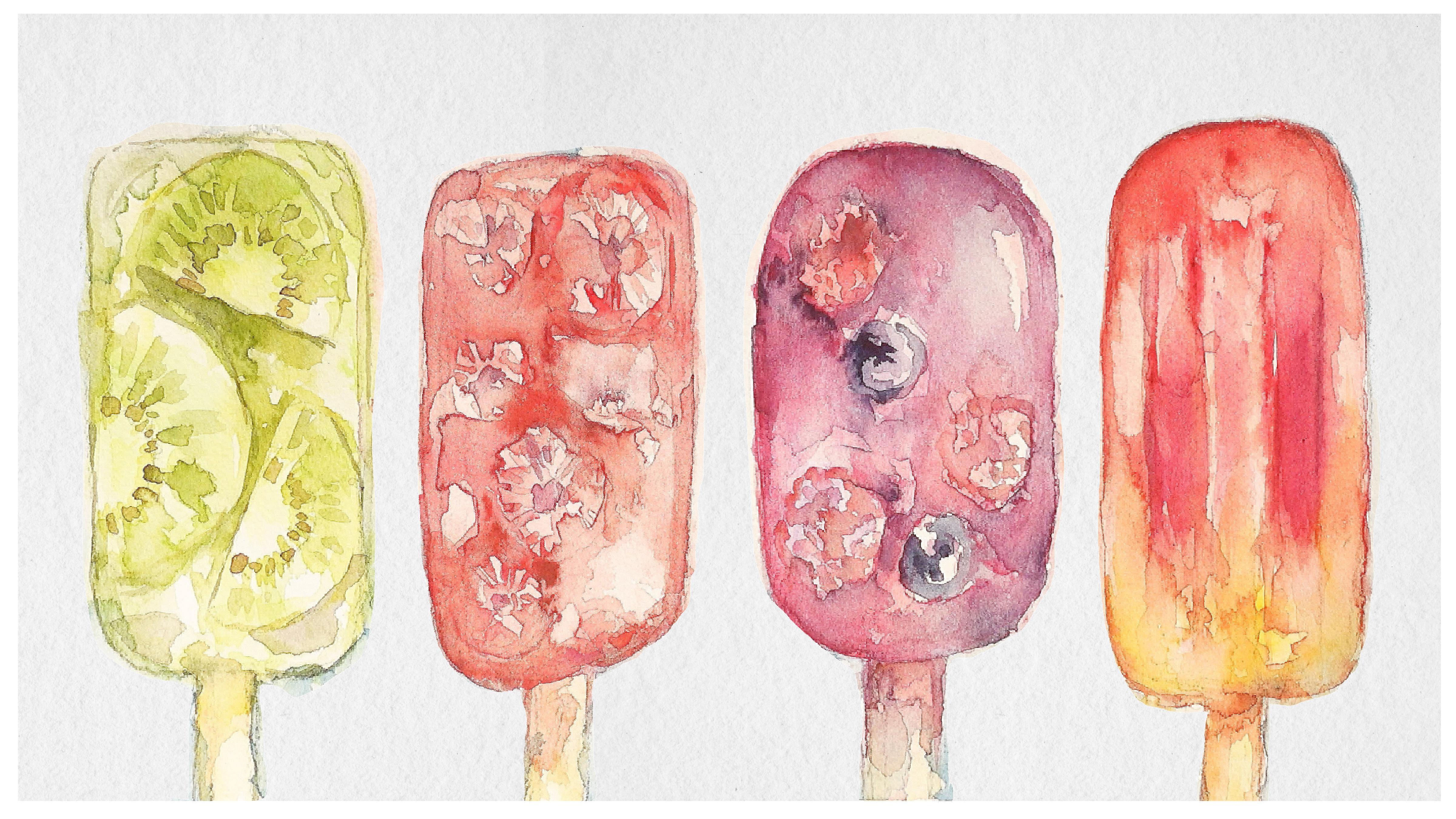
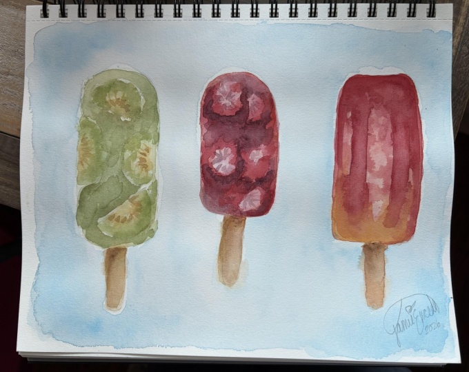
that will help you to gain some inspiration and paint. It can be all four ice creams
or just one ice cream. During out today's class, I will use traditional
watercolor medium. You also can use it. You can use traditional
watercolor medium or Gouache or acrylic or you can use Procreate
or Samzzi drawing pads. It's your choice. Whatever will help
you to feel inspired. During out today's
class going to have three actionable steps. So after creating sketch, we're going to layer
colors one by one. So we will have first step of
layering color where we add some beautiful diluted
colors that can help us to shape our objects and give some understanding what
we're going to draw. The second step, we'll
be adding more shades, of course, and adding a little bit more
depth into our art. And our last final piece
will be adding more shades, adding more tiny details. And lastly, I will
show you how to turn your ice cream into lovely
and cute characters. Oh, I nearly forgot. We're also going to spend one class tiny class on creating background
for our illustration. So I'm ready to learn
some new tricks. Once again, let's
try to experiment, have fun, and enjoy our
painting journey together.
3. Getting Ready: So in this class, let's
start our painting journey. And let's talk about
the tools that we're going to have and use
during today's class. So let's talk about
that in details. Hello, my lovely
Skillshare community. During our today's shirt class, I decided, first of all, to use traditional watercolor
because why don't we get a break from the digital art and just try some simple
watercolor techniques? Because I think
it's very important always to come back
to the old ways. And by using traditional medium, you can find some new ways of
using the new techniques in digital Water Today's
class will be related to summer because
it's getting pretty hot. And I was thinking, What if we paint ice cream? Like different colour, different
ways and make them cute. Let me tell you about the tools that we're going to use today. I have my Sminke
watercolor brush set. You can find the similar one. So again, you don't need to follow exactly the same
colors, the same shades. You can just paint by
yourself using anazic colors, enazy techniques, even nazy
sketches. It's totally fine. About the brushes,
mostly I'm going to use I have Burns brush. I like it for the
softness. Brilliant race. This is another one. So we have pretty thick natural
brushes here. Sorry. Yeah. I have seen synthetic brush for
adding tiny details. That one's number four, Turner and I like those Chinese brushes that we're also going to use today during the painting process. I decided to try different painting techniques
in actual ice creams. So I'm going to paint
four ice creams, and we're going to
implement different slightly different
painting techniques. I explained you all the
things that I have also. Try to use some tape
that is easy to remove, and I pin this paper
to my canvas for oil painting because my wooden
board was eaten by mold. So that's what I have. And also, I took some tissue because we're going to use water and we will need to dry
out brush a little bit. Let's jump into my next part where they're going
to create sketch. Very simple, very easy,
not a lot of pressure. Everyone can
complete this class. Let's just have fun and finally experience this
beautiful summer.
4. Creating Sketch: This part of the class, finally, we are ready to jump
into sketching process. The sketching technique
will be super simple. You don't need to spend
a lot of time on that. You can use regular
pencil or it can be even colored pencil
that can help you to add some playful atmosphere
to our illustration, again, whatever you like. The most important is to get some inspiration
and have fun. Okay, so about the sketch, like I said, let's paint
just four ice creams. You can see from reference
pictures, what do we have? And the first one
will be with kit. So very simple. Don't
press too harsh. I have to be pencil. Remember, let's just paint schematically those ice creams, so I will make sure that they all will look
perfectly on a picture. Be careful with the paper. By the way, I'm using arches
paper, 300 thickness. And now let's go to
another reference picture. Start with the shape. Some of the shapes can be different. Oh, smaller, bigger. And the last one let's peak. Let me think which one maybe the orange one with
mango and a raspberry. And those one will be
tall, pretty tall. Mm hmm. And inside, we're gonna have some shadow because the shape
is super special. And also the gradient will
be something like that. Now let's look with
the raspberry. This one is super
special like this. Here we'll need to show that the raspberry or
blueberry is inside. A strawberry. Those ones are the most special. I think it would be
interesting to paint such type of ice cream and give. Just paint it schematically. And don't be too precise. It's the most important. Have fun. D. So face expression, we're
going to add later. Now the next step, let's
start adding colors.
5. Adding Colors: Kiwi & Strawberry: Well, in this part of the class, we finally can start
painting process. Like I said, the most
important is to follow the three steps that can help us to reach beautiful result. So the first step will be
adding first layer of colors. And we're going to start
with first two ice creams. The first one will
be about kiwi, and the second one will be
about strawberry. Let's do it. I know that accordingly
to the rules, we have to start
with the background, but I don't want to start with background
because I don't want to wait until the color dries after we finish
with background. So let's keep background
till the end. But what I'm going
to do is I will start painting ice
cream one by one. So let's start with Kiwi one, and I'm going to get water and just supply water
throughout whole ice cream. Carefully because it can help us to bleed the color when we apply different
shades altogether. Now let's go with
olive color, tiny bit. It's olive green, yellow
wish. It's called like this. And apply a tiny bit. Make green cutter, it's cold. But I still don't want to
mix it with olive shade. Some greens in this area. Let's go with earth green here. We're going
to have it here. So I apply too much water, that's why we have to wait until the color
dries a little bit. So in this case, let's just add some colour to it's called
popsicle, right? The thin. I'm going to make it burnt
amber, a little bit. Now until this color dries, I'm going to go to the second ice cream,
which is strawberry. And here I will use scarlet red, parle and maroon, and
permanent carmine. Ding ding ding. Not too much. So the first layer will
dry pretty quickly, and it will not be very vibrant. Scarlet red. So here I want to show
some bleeding on edges. That's why, as you see, I added to the corners of ice cream. It's different from
our first ice cream. Mm hmm. Permanent carmine. A little bit of,
like, rosy color. And now red colour again. You see so beautifully
it blends. Now in between of strawberries, we also need to show
some shade between them. And I'm going to add pink
again here and there. And I want to go to the third
one and add one more layer.
6. Adding Colors: Raspberry and Peach: So it's time for another two ice creams that we left till the end
of the first step. It's raspberry and peach. Ice cream. I thought it's
mango. No, it's peach. And what I like about the fourth ice
cream is that we're going to mix two
colors together, so the results and technique also will be
slightly different. What I'm going to add here, we're going to
have potters pink, we're going to have
manganese violet, scarlet red, and
parle and maroon to. Because this popsicle
will be darker. Also go to the edges. I like this pink shade. So we need to make
them different. So in this case, we will avoid repetition
of the colors. So because we have
blueberry here, we can add more violet shade. Manganese violet. You see depending where
you start from the edges or you're gonna start from
the center like here, you will reach
different effects. I like this one. Let's
go with Perlin maroon. Just schematically show,
okay. So raspberries. And blueberry. I mix manganese violet and
ultramarine violet. 'Cause I want to show
blueberry here and there. And same, let's go with some
beach color. Like that. And the last one where we're gonna show very
beautiful blending, like diffusion of one
color into another one, I think it's raspberry and
mango or no, no, it's peach. Same water. As you see, I always apply water first because it helps my
colors to bleed and spread very naturally and softer comparing
to dry technique. So on the top, let's also use magenta or permanent
carmen color. And on the bottom, we're
going to add peachy shade. We have a lot of pink colours. But again, this is like
summertime. Why not? So I have the deepest
colors at the top, and when we go to the bottom, I spread it lightly and diffuse. Now, let's go with let me theme. Chromium orange hue, or
homum yellow hue, deep. Exactly the colors
that we needed. Don't be too Don't take
lemon oil, lemon yellow. It should be more yellowish. Less lemonish L and beach brown beige color,
something like that. I still think it's too much. So now our task is to wait
until everything dries. Make them rounder, less sharp. Even though you will
go beyond your sketch. It's okay. By the way, I didn't use palette, color palette at all. You just don't need to mix colors for now. Okay.
7. Adding More Colors: Kiwi and Strawberry: Now it's time for
the second step. Let's add more depth and more shades and more not
too many details, let's add a little
bit more shades and more color saturation
to our art. Like I said, let's follow the same strategy that we have during the
beginning of the class, and let's spend some time on first two ice creams,
kiwi and strawberry. Now, the second step, I change the water
to the clean one, and I want to change
the brush too. So let's go with brilliant
rays for this one. And now I want to
add a little bit of yellowish color
like lemon yellow, to the center of chive tiny bit. Then I will pick may green. Add more water because now
the paper is not wet anymore. So you need to remember
and define the shape. Now I will grab a burnt
umber or sepia brown. And in between, you see on our reference picture,
you have dark shades. So in this case, let's go with a forest brown
or Earth green. So far, the most important is to separate Kiwi one from another. So you layer the color. Next step, I want to
paint some seeds. And for that, I will go with
olive green, yellowish, and I will mix it with
and I will mix it with a burnt umber and just show
the strokes like this, like ding ding ting ting. So we show the direction. Mm hmm. Grab slightly
darker. And still go. Now let's go with
this wooden part. I'm gonna go with
a yellow ocher. And I still want to add a
little bit of romum yellow dip. And let's mix with
previous yellow color. And here shows a shadow. Like that. Blend. So the shade won't
look very artificial. Then I want to go
with may green, and then I want to show some colors here
and there because I still feel we have some more green color
from this side. But you see it's too artificial, so I'm going to just splend it so it won't look too bright. And once everything
is more or less dry, I want to go with
a second layer, third layer, second layer,
and add some seeds. As a seed color, let me think ivory black or sepia
brown also would be nice. Carefully. Still too wet. Let's go with the third layer. Let's not add it right now. Well, let's turn
to the second one. I'm going to use the
same brush also. And here, we're going
to use the same colors, but just layer them second time. So one more time, let
me tell you what we do. During the first
step, we added water, and then we added the
first layer of color. So thanks to the water, the colors bleed very naturally and very beautifully
in a soft way. During the second step, we
waited until everything dries, and then we added
second layer of color, but the texture, the
surface already was dry. So the color is more
vivid and more obvious. And the third old step
that you're going to have is we will add the
third layer of tiny details, and we will define some of
the lines. And that's it. The three steps
that can help us to paint beautiful ice cream. So I change the water
again. It's clean. And I just want to add I think
scarlet red would be nice. And about scarlet red, I'm going to add it
between our strawberry. So this is actually the shade. I selected more color.
Here we have one more. I just tried to refer to our reference picture
and add more and more. So here's the biggest
sharpest shade will between our strawberries. So I added a little bit of
water, and thanks to that, I helped to spread
it little by little. But, again, the most
important for us was to define the shape of strawberries.
That's what we did. And some redish shade
from this side. Now I will go with
peril and maroon color and add a little bit
of pinkish shade. Not too much because you
have a lot of pink here. Make our ions like
the edge lines not so defined, permanent
carmine colour. Ding ding di di di. And inside of strawberry, I decided to add slightly
bit of pink shade. I took some paper. What what's interesting with traditional watercolor
is that here you have less control of what
you will get in the end. So like, every painting
will turn out differently, and you might reach
totally different results, which is nice because, again, it's expression
of your creativity. Add some Our and maybe
sepia brown here. Mo sepia brown ding
ding dn dn dn. I don't want to
make it too muddy, so less color is better. Now let's jump to the third one where our color
will be slightly darker.
8. Adding more Colors: Raspberry and Peach: So it's time for
another two ice cream. Let's go to raspberry and mango. Here, also, what I like about
ice cream number three, and four is that ice cream
number three is very deep. The color is deep. I like it. And it also has
some blueberries, so the color will be very, very deep and contrast. And like I said, the
fourth ice cream, we're going to mix
two different colors together in one ice
cream that will help us to reach to blend colors in a very special way. Let's do it. Then I will switch brush
to the Chinese one. Brush for calligraphy. Here, I will go
manganese violet, magenta and ultramarine violet. You see this brush gives
you more dry strokes. So I just want to add a little bit more water
because I don't want to make our art like purely
dark and purely dry. Still big raw water will play. But because, as you remember, we don't have any watery base
because the paper is dry. So we constantly have to use water so look at the
arc that we have. The darkest parts also
between the fruits. So what I'm going to do is I will mix, ultramarine violet. I will also go with Delta blue color and don't
forget about magenta color. All of it, I'm gonna
mix together to create this deep,
purplish shade. But I'm not going
to define clearly the shape of berries
because this is watercolor. People should see it
thanks to the shades, and even indiga
color would be nice. Look at the reference and
try to follow the colors. Where we have the darkest one. Here, we need to show the
raspberry and blueberry. Okay, done with this one, too. What if you use this brush? The big one warns number three. Scarlet red, pearled maroon. Magenta, you can mix
many, many shades. But the most important here
is we add a lot of water. 'cause we still want the
color blend naturally. So blend sharpness. And immediately
grab yellow color. So let it diffuse
one in another. You don't need to
clean the brush. You can just go on top
of the color and add one more layer and add a little bit water so the
color will bleed, you see? Now you can mix a little bit of this red color and oyo
I took a lot of pink. Red color and orange. So like I said, we need to
show the diffusion of colors. What would happen if
we mix them together? That's what we have to show. Grab a little bit more of
reddish pinkish shade. You can even grab
some pink colour. Duck and the most important
show gradient somewhere here. Grab slightly darker shade to define the shape
of the ice cream. See, we have the lines inside, so we need to show them
with slightly darker color. So for that, we're going to grab magenta mixed with
manganese violet. So we need a little
bit of violet. Layer more and add darker shade. And whenever you want, you
can just use tissue and show some bright spots because later it would be too late because everything would be dry. Tissue is super important
here in this step. So you see the painting
techniques is slightly different, especially with the
last one. Ocher color. You also can get slightly
purpler shade here. And soften with water the edges. That's it. Now we have to wait.
9. Adding Background Color: And like I promised to you, it's beginning of a class. I also will show
you how to create beautiful background
that will be very harmonious with
our ice creams. So we're going to use
simple techniques that will require you to use a lot
of water, a lot of color. Also, we're going to get
some unexpected results during our painting
process. Let's do it. Now what I was thinking is that let's add background color. I'm going to use this
brush. Why I do it? Because later I'm going
to add more tiny details, and it would be very
easy to blend them with background if you add
color a little bit later. So I just want to add
background color first, and I will go with blue color like Pussinblue or
ultramarine finest. Here, also, first, you apply water because thanks to water, the color will blend very
beautifully in a soft way. Careful with our ice Try to add darkest shade
to the edges of the paper. And then closer to
our ice creams, we're going to have less color. So I'm going to go
here and there. Very beautiful color. Very summary. Wow. Look at this. I like how they blend one
another when I can here. But it's not what I wanted,
but it's super beautiful. Okay, let's keep it. Let color blend into background color. So in this case, what if
you add a little bit of green shade here
and let it blend. It's all thanks to the paper. Let's go with pink shade
and do the same here. Red color. Not even pink. You see, sometimes
you plan one thing, but then you see
how beautiful it might look like if you add some, like, touches that you
didn't plan to do. A little bit more blue
colour to give more volume. Maybe a little bit more drops. They will look nice.
And that's it. Let's wait until
everything dries, and we will move
to our final step with adding some details.
10. Final Touches: Kiwi and Strawberry: And almost the last step. This is step number
three where we're going to add more details, a little bit more shades. We will emphasize some parts of our ice cream with tiny brushes, and that will be the end. So let's jump into first two ice creams,
kiwi and strawberry. Well, the last third step, let's grab our thin brush, this one for adding tiny
details and another one. Also pretty thin
brush, this one. So let's start with adding tiny details, but not too tiny. So this brush would be fine. So let me go to Earth green mix together
with sepia brown. And now slowly add seeds. I want to go with Forrest
Brown, May Green. Me Earth green. Here you don't need
a lot of water. You just need to layer some
parts and mute the color. It should be a little
bit diluted with water. And now between them,
show the shade. Go with let me find Earth green
color mixed together with burnt amber or sepia bro and a little bit
of yellow Ochre. I think this color
combination would be nice. So the most important
is to separate. And here you can adjust the
shape just little by little. Add more color underneath. You can even add
some reddish shade. Some purple shade here. Take small brush. Grab some darker shade or same. You can mix green, purple, and brown together and just show things to the
shadows, some purple shade. Show the outline. So with the first ice cream, we're gonna use outline a lot. Kit is very defined. So why don't we do the same
and add a little bit lines. Okay, first ice cream is ready. Now let's go to the second one. And here it's more
tricky, you see, because I left a lot of white spots
intentionally because I just want to keep it this way. Same colors permanent carmine, paraline maroon, scarlet red. Define the shape for
your strawberries. So the style that I tend to use to paint in is
loose watercolor. So we will have a lot of loose watercolor
elements, but in the end, we're going to take thin brush and define the
most important details. Blend everything before
the color just dries. Now, why don't we add a little bit of manganese
violet and magenta color? Just tiny bit in areas where we will have the
darkest elements. And same about the strawberry. We're going to show
some strawberry parts. Axis. So we need to show the
texture of strawberry. And let's define the outline. You actually can add a
little bit more details later to the strawberry
when the colour dries and a little bit
more depth if you want. Now, let's go to the
third ice cream.
11. Final Touches: Raspberry & Peach: And now time for
another two ice creams. I hope you are ready to
be proud of your art. And let's just
wait a little bit, and soon we're gonna reach the results that
we all will like. Same color, man green
violet, magenta. Okay. The darkest shades will be here. This area, blueberry. Just shape. Don't show too much. Just show the shade. I think I want to add
blueberry here, too. See just tiny detail and bleed color around
blueberry. Just tiny bit. Then go with permanent carmine. So we just show schematically the berry but won't
show it too much. An On the reference picture, we have pretty dark part here, and this part bleeds
into an ice cream. Then make the area around
the berries darker. So what are you going to do?
A little bit violet color? The bloom. L indica color. Now, just water and blend. And we still have
some areas which is pretty bright like here. Mark your shade. If you took too
much of the shade, just put brush into the water then clean it
with a tissue like this, and the brush will become dry. So just spread color to the
nearest surface. Like it. And This one is
definitely my favorite. Okay, blueberry is ready. I actually want to
add a little bit to strawberry to make
it more defined, even though we don't
have that blue colour in our reference art, but I think it
might look better. Just a little bit,
because we don't want to change the color palette. Yes, define the area
between the strawberries. Remember, the strawberries
are the brightest. The last one here, I'm going to use a
permanent carmine and magenta mix together. So I just mix them. And I don't want to do
a lot of changes here because I
think it's already beautiful and it doesn't
need us to add even more. But what I would like to do, now this is magenta color. I want to show the shade here to outline the
shape of the ice cream. Okay. But this area, I like
the bleed in this part, so I won't change it. Just a little bit
more orange color. Show the shape here. No more yish the bleed
a little bit of color. Here, that's it. Now I want to use
thinner brush. This one. I made brown color
for the outline. And I think we to can add some more of the red color here. And this area is lighter, so we won't touch it. Now tiny part. Let's
add some faces. I think first, what you can
do is to use your pencil.
12. Creating Characters: And the last class, this is what we are waiting for. Let's turn our lovely, beautiful ice creams
into cute characters. And we can use the same method, not just with ice creams, with any painting
that you create. It can be like a flower pot. It can be a stone, a mushroom, whatever you draw. But by adding thin strokes, you can turn your art into beautiful characters.
Let's do it. And our final touches, let's just paint
some fake expression to every of these ice creams. Let's start with the first one. I use pencil first. This one will be happy. Now let's take small brush. I have a black color. Because it should be
very, very opaque. This one looks like
a man with mustache. Now, let's try to unwrap it. But on. Congratulations. This is the
end of our today's class, and I hope now you gain some inspiration
and creative idea. And now you know the ways how to create beautiful,
lovely ice creams. And characters in a
fast and simple way. So what you have learned
and why we did it. So first of all,
now you know how to use traditional
watercolor medium. You took some break
from digital medium, and maybe you found
some ways how to apply traditional ways
into digital watercolor. Also, you learn how
to create ice creams. You learn new
blending techniques, new layering techniques,
new ways of adding shapes, blend colors, like I said, and make your art more saturated and how to adapt
to your illustration. And the most important,
now you know how to turn any art into characters. Why this class was useful. So now you can experiment and see what works best for you. And again, sometimes you
need some inspiration or just like break from
our daily routine. So I hope this class
was because it was a little bit different from
what I usually teach. I hope it also was useful
and inspirational for you, too, because I had a lot of
fun during painting process. So I hope you had this fun, too. So, guys, I will be happy to see what you upload in
project section, share your own opinion, your own thoughts
about this class, and let's see each other
in next class. Bye bye.
 Inga Yoon, Digital illustrator and teacher