Transcripts
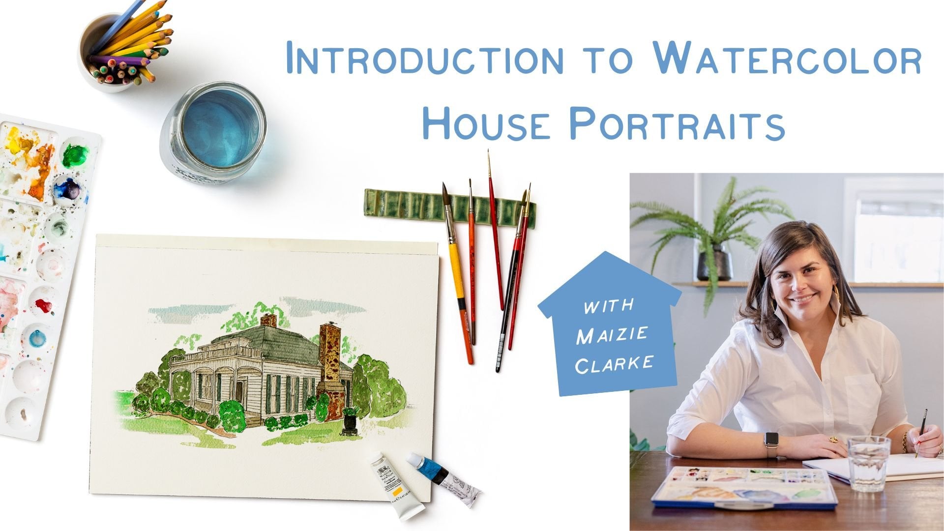
1. Watercolor House Portraits for the Absolute Beginner Introduction: Hi, Clark here. Welcome to my watercolor studio. I am a watercolor illustrator based out of
Louisville, Kentucky. And I started my
watercolor business, creating memorable
watercolor house portraits for friends and family. That really is the
basis of my company. I now do a lot more with clients and
companies and brands. But I always save
time in my schedule for those meaningful
watercolor house portraits. In today's class,
I am going to be walking you through
a very beginner, no experience needed version of my watercolor
house portraits. These make wonderful gifts
for friends and family. And who knows, maybe
you'll even start your own side hustle and watercolor business
with house portraits. Like I said, No
experiences needed. I'm gonna be walking you through each step from beginning to end, as well as all of the supplies needed
for our class project. For you to create your own
watercolor house portrait. I'm so excited you're here and I can't
wait to get started. I hope to see you in class.
2. Watercolor House Portraits for the Absolute Beginner Drawing Supplies and Paper Overview: Alright, Let's talk supplies. I am going to break this
up into two lessons. I want to first present the supplies that we'll
need to create our drawing. And then later on in class
we're gonna go over all of the watercolor
supplies that we'll use. Now the star of the show for this class is our
transfer paper. Transfer paper is a wonderful
tool if you are an artist, no matter what skill
level you are, it's just a really great tool
to have in your toolbox. So what it is is it's sort of a lighter paper and it has charcoal
graphite on one side. And what we're gonna
do is we're going to use this to
essentially create a carbon copy of our house
on our watercolor paper. I've linked my preferred
brand on here. I like this because it comes in a role and it's super easy to get the piece
size to what I need. And also it's erasable, which is really great. I've used brands before
that really create a wonderful carbon copy,
but with watercolors, since our medium is a little bit more transparent
and less opaque, sometimes those lines still show up if they're not erasable. But the brand that I've
linked in the class notes is wonderful and it is erasable. We'll talk more about
transfer paper when we start our I'm outline of
our house portrait, we have our transfer paper. The next thing that we'll
need is our watercolor paper. Now, I've linked my
preferred watercolor paper in the class notes. But I just kinda
wanted to give you an overview of what
to expect when you're looking at watercolor paper or whether it's online
or in the art store. You'll notice that typically it comes in two different
finishes are types, and it's cold press
and hot press. I prefer cold press, cold press. You'll find that more
toothy paper surface. I just prefer it the way that the paint adheres are
absorbed into the paper. And then hot press is a little
bit of a smoother surface. Both are great. It's really just a
personal preference. If what you, how you like
to work with watercolor, then you'll notice it'll usually come in a couple
of different ways. You can actually buy the paper. You can buy it in a role, a pad, a block, or also
just loose sheets. For this class, I've
linked a good kind of entry-level watercolor
pad and then ripped off a sheet
of watercolor paper. You will also notice that watercolor paper comes
in different weights. I'm the one that I have linked, I believe is a £140. You'll, I would encourage
you to really experiment with different types and
different weights of watercolor paper to figure
out what you really like. So we have our transfer paper, we have our watercolor paper. We also need a black
and white print out of our home that
we want to illustrate. Now, you'll notice that this is just a black and
white printer copy, copy paper printer print
out of our house portrait. We are going to be drawing directly on this piece of paper. So I find that the down and dirty copy paper works best in black
and white tube. We don't really need
like a eight by ten glossy of our house. This one I scaled
down a little bit. This one is a five by seven. Just because when you're
starting out with watercolor, it's kinda easier to do
this smaller projects. Then we can build up
to bigger format. We have our watercolor paper, we have our transfer paper. You're going to need a
brightly colored ballpoint pen that's gonna be really helpful. And then also some
artist's tape. This is, you don't
need to go out and buy a whole role of this. If you have something like this, even a little square of blue
painters tape will work too. We'll talk about how we're
going to use this in our next video when we're
setting up our drawing. And then lastly,
we are going to be using Micron ink pens. I love these for two reasons. Well, first of all,
they're super easy to work with and they come in
different weights. I'll show you in our next video. The different sizes and things like that and which
ones I prefer. But the two reasons that
I love working with these is they are
archival quality, so they're never going to
fade with proper display. And I'll say they're waterproof once we put them on our
watercolor paper and we erase all of our graphite
lines from our transfer paper, then we can use watercolor right over it and
they will not bleed. Then the last thing you'll need is a really
good white eraser. You might be asking,
why can't I just use the eraser on my pencil? And you could, but I urge you to go ahead
and get a white eraser. It's a lot easier to work with. And as you'll see, once we create our outline
of our house portrait, we are going to
probably be creating some smudges from
our transfer paper. And it's just easier
to kind of get more coverage with
that white eraser. Also sometimes depending
on the pencil brand. The eraser can sometimes leave little pink streaks on our watercolor paper
and we don't want that. In our next video. We're going to set
up our outline of our watercolor house
portrait of the oven.
3. Watercolor House Portraits for the Absolute Beginner Drawing and Inking: Alright, so what we're gonna do now is we are going to set up our drawing to create the
outlines of our house portrait. Now, we have our
watercolor paper and you, as you can see, this is sized a
little bit bigger than our black and white photo. Now I like to do
this just because it's gonna give us a lot of room to experiment and get the
color right that we need. And it just kinda gives us
a little bit more margin if we were to just do it on the five by seven piece
of watercolor paper. So we have a little bit
more room for error. And again, I have sized this photo at about
five by seven. As like doing that
kind of keeping to traditional frame sizes. It just makes it easier
to find a mat and frame at either a craft store or home goods store or wherever
you find frames. The first thing that I'm
going to do is I am going to line up and figure out where I want my
house portrait to go. You can see I just
kinda trim this down. I left a little bit of white margin above the
house portrait just to Have where the tape is
gonna go to tack it down. It's really important to
tack this down with tape, at least at the very top. If you are using a
bigger print out, once you've kind of practice, it might be better
to tack it down with a couple pieces of tape. The reason is, is
if we were to use the transfer paper and our printout it in
without tacking it. A lot easier for these, for our top sheet
to kind of shift. And if we're tracing or
creating our transfer, we could very easily have a wonky house portrait
by the end of it if this top sheet moves. So I'm just going to put my printout right in the
middle of my piece of paper. And I'm going to take
a little bit of tape. I urge you to use
as little tape as possible when it comes to
touching the watercolor paper. So what I'm gonna do
is I'm going to put a piece of tape up at the top. The majority of the piece
of tape is on my printout. So what I'm gonna do is I'm going to take my transfer paper. And again, I just cut
a piece from my role. And I am going to cut it down
to size. A little bit more. I don't want something that's much bigger than my printout. Just because as this rubs and there's pressure applied
to our transfer paper, on our watercolor paper. It's going to create smudging. I want to make sure that when
I use my transfer paper, it is the dark side down
on the watercolor paper. Also want to point out, you'll notice that my piece of paper has a couple of lines. This is because I
have actually used this for a recent project. Transfer paper is
something you can use again and again and again. If you have like little scraps
of transfer paper because as long as you
aren't using it for the same drawing over and over, you're gonna be able to
get multiple uses out of your transfer paper
because this surface is, um, it's a lot of surface
and the lines that we're creating are pretty
minimal on that surface. So my also to your fingers, they're gonna get
a little dirty. So I have my black
and white photo tacked down to my watercolor. I am just going to flip this up. And I'm going to put
my transfer paper, dark face down, the dark side down on
my watercolor paper. Then I'm just going to flip
it back down over there. Now, if you have
a say you really love using transfer
paper and you're going to use it more and
more in the future. Say, and you only
have a little scrap, you can get by with a
lot because what you'll do is especially if your
photo is tacked down, you can kinda move this
to different areas of your image that you're trying
to create a transverse. So don't, don't throw away
those tiny little scraps. You can. They go they go pretty far. Okay, so now we have our
image in the right place. We have it tacked down. We have our transfer paper, the dark side, towards
our watercolor paper. And the next thing that
we're gonna do is we're gonna take our ballpoint pen. And again, I like using
a black and white image because if we're using a
colorful ballpoint pen, It's a lot easier to
see the lines we have created and the lines we
have not yet created. The way that we do our transfer
is we are going to take our pin and we are going to basically just kinda trace
the outline of our house. I am starting with
the roof line. And you are welcome to use
a ruler at this point. I prefer the sort of
hand-drawn look of this. And if you mess up, if you create an extra line
somewhere, don't worry. This is essentially like drawing with a pencil so we
can erase everything. So I am just going
to create my lines. And I'll show you
what this looks like. I've created a couple of lines
and we want to make sure that our transfer lines are showing up properly
on our watercolor paper. So I'm just going to flip
this up and you can see I have some smudges on my
paper. That's totally fine. We're gonna get
rid of those with our white eraser at the end. But I'm super happy with this. This is gonna be super clear to see and to ink over on
our house portrait. So I am going to flip this
back over and continue on. Now, it's really up to you in terms of the details that
you want to include. As you can see, I have a nice couple in
front of this house. I'm not going to include
them in this house portrait. I'm just focusing on the house, the windows, doors, etcetera. In terms of the details
that you want to capture at this level, it's really up to you. I kind of think of
this as sort of a kind of a helpful tool in creating
your house portrait. If this house was a brick, I am not going to use
my transfer paper and get every single
brick outlined. But in this case, I have
some siding on this house. So it might be helpful
to kind of get at least a couple of those
citing lines in there. And then I can kinda
finish with a ruler or I can do the whole thing. So for this house portrait, I am just going to, for the bushes out front. I am just going to kind of do my squiggly lines for my bushes and the landscaping. And again, a lot
more of this detail and shadowing will really come out when we start
to add watercolor. I'm not really going
to go through and add every single little leaf and
branch on the landscaping. But I kinda want to just know
where the boundaries are. I'm simplifying my
landscaping here. And then on the house. I am just going to continue
using my ballpoint pen and, and kinda even pressure
to create those outlines. And again, if you create extra outlines at this
stage, don't worry, we are going to be able to erase it when we come
to the next step. So you can see I'm
kinda flipping back and forth between drawing on my black and white
print out and kind of seeing what the lines look
like on my watercolor paper. Now I, you are
welcome to tape down your watercolor paper to
your work work table. But I like having it loose
so I can kinda move it and make lines change the direction because
sometimes it's easier to do. Vertical lines versus
horizontal lines. Just the way that I draw. I like to do that. So I'm just going
to go in and I am going to add in my citing lines. Again, I'm not being too
precious with each line. I just want to make sure that I have a little bit of a record of where these lines
up here on the house. This is not a permanent thing. I just want to kinda have
that reference when I start to use my ink pen, I'm going to take a look. I think that that
looks really nice. This is going to give me a really nice outline and kinda start to ink
our house portrait. You'll see, so I got
my whole roof line. I didn't do every shingle. I got all of the molding
areas on the house. I got the area
around the windows, I got the door, I got our
little front porch light. And I also kinda
mapped out the areas where our landscaping
is as well. So it's really up to you about
the details that you want to include or exclude
on your house portrait. Again, my little
black and white photo had a nice couple of standing
in front of the house, but I chose to omit them. Then again, for landscaping, I just kinda draw blobs and I'll show you once we get to
the watercolor stage, how we add a little
bit more dimension in shading with our paint. So for right now,
I'm happy with this. And I'm going to
share with you how I like to ink or watercolor
house portraits. Alright, so now once we had our transfer Done and
we're happy with that, I just like to kinda
do one more check just to make sure
there aren't any lines or any details that I wanted to include from our black
and white picture. And because it's gonna
be really hard to realign this app on our watercolor paper
if we take off our tape and the
transfer paper as well, just do one more
check of your sketch. And then what we're
gonna do is I'm going to remove my black and white photo. I'm going to take my
transfer paper away, but I'm going to
save it because I can use it for future projects. Like I said, I really
like these Micron pens. You'll see when you go to the art supply
store or shop online, that these come in different weights or
thicknesses of lines. I typically like to stay in
the O1, O2, O3 neighborhood. I think they come, I'm not sure how, why Big-O, but I'm just going to show you a example on our piece of paper. Hey, this isn't 01. That's an O2 and O3. So you can see we can kinda
get different line weights on our drawing using
the different ink pens. For this class, I'm going
to use an O2 or O3. You can totally use the heavier weight for
the outline of things. And then when you get into
the interior details, whether it's the molding around a window or it's the casement details
on a window or door. You can scale down
to a O1 and O2. It's really up to you. For this class. I'm just going to use, I'm just going to use an
O2 for all of the lines. So I'm gonna go ahead
and take my ink pen. I like to, just as
a rule of thumb, when I'm creating
house portraits, I like to think about the
whole scene front to back. Now, when we did our transfer, that kind of sort of
solved it for us. If we were drawing
this from scratch, we would really think
about the taller bushes in the front where they are in relation to the
front of the house, what they might obscure of
the front of the house. As you can see, we don't see the front edge of the entryway because it's
blocked by our trees. But what I'm gonna
do is I'm just going to go ahead and ink over my lines that I created
from my transfer paper. And you can see I'm not being very precise about
my landscaping. I like to kinda just have
sort of a wiggly line. Kinda think about how you
drew clouds as a kid. We're going to add a
lot more dimension and things when we add paint. At this stage, if you
are not comfortable with doing a free hand over
our transfer lines. This is a great place to add in a ruler if
you would like, just to get those
straight lines. Or if you just want to go
slow and go over those lines, I'm just going to
trace over my lines. Again are Transfer lines, the ones that we created
with our transfer paper. Those are all erasable, but the ink is going
to be permanent. So anything that you put down on paper, it's
going to be permanent. Not to say that you can't fix things and
hide things with paint. But if you are nervous
about this step, go ahead and grab a ruler. This is a great time to just go slow and get all of those
lines that we want. And again, I like kinda being
a loose watercolor paper on my work surface just so
that I can turn it around. I find drawing
vertical lines is a lot easier rather than just
going straight across. So I have all of that. For Windows. What I like to do is I like to do a double line
in the middle. Then for the dividing lines
of our window panes of glass, I just do a single line. I find that just to be easier, but it's nice to have that
double line so that you can show that there's a
break for the door. I'm gonna do another
double line here. Again. Don't be intimidated
by these lines. If you want to grab a ruler, I think that that
is totally fine. I'm just gonna go over
these lines here. I'm just creating my little
panes of glass in my door. Then I get my
little front light, level, front porch light. You can see on the sighting, I went a little bit quicker. I just kinda like that sort
of hand-drawn Luther, look, but again, grab a ruler if
that is more comfortable. So now I'm looking at
my house portrait and I feel like I'm going to put
a little door knob here. I am happy with
this ink drawing. So what I'm gonna do next is I'm going to wash my hands.
I'm left-handed. So I have a lot of transfer kinda dust on
my hands and fingers. I'm going to wash my hands. And then we are going to
erase our watercolor paper. And we're going to jump right in to adding our watercolor paint.
4. Watercolor House Portraits for the Absolute Beginner Paint Supplies and Watercolor: Alright, I'm back
with clean hands. That's sort of the
only downside of using transfer paper
is sometimes they can kinda get a little smudgy
and kind of get everywhere. So the next thing that
I'm going to do is I am going to take my white eraser and I'm going to go ahead and erase over
my entire house portrait. And also be sure to get all of the little smudges all around. And at this point
as you are erasing, sometimes you will find
places that either you did not ink or maybe you didn't get
with the transfer paper. That is totally fine. You can go ahead and add that ink in before we
get to our watercolor. Alright, so I have my watercolor house portrait or just my house
portrait right now, inked and all of
the lines erase. So let's go ahead and talk
about watercolors supplies. And then we're going to
do some practice with the watercolor to get you comfortable with using
this new medium. If you are new to
watercolor or maybe you are adding more and more tools
to your watercolor toolbox. A couple of things
that I would recommend sort of getting into
the practice of doing is as you are adding more and more colors to
your watercolor palette. What I really like to do, I like to create a
little swatch card. In the way that you do this
is I just took a piece of watercolor paper
and I just created a grid and did a little
swatch of watercolor paint and then added the
name of the paint. This is really nice for
a couple of reasons. You'll see that this is all taped down on a piece of paper. I've, I've done this so that
as I lay out my palette, I know which colors are aware that if I run
out of something, I know what exactly what paint
goes there in its place. Also nice to, especially with watercolor kinda coming
straight out of the tube. It doesn't always
look exactly like the color that you will. You'll get on your
piece of paper. So this is a really
nice way to kinda just get a little
bit more comfortable and familiar with
the watercolors that you have in your set. Now, if you just have a pan
watercolor set or whatever, do not go out and buy a full set of
professional watercolors. You just need to start with
what you have and whether you have a set of pan watercolor
or from the tube or, you know, even, we could
even use watercolor pencils, which are really
great option too. I would just recommend
using a system like this so that you kinda
get more comfortable with the watercolor colors. This is also going to give you a really great idea in terms of mixing colors and achieving the exact color that you want. So I am going to go over a couple of the colors
that I really love to use. Typically on all my
house portraits. For the landscaping. I love I love a
permanent sap green. And again, I'm going
to link all of these, so don't worry about writing
them down right now. My two favorite colors for landscaping are a permanent
sap green and hookers green. I feel like those. I typically don't use
watercolor pigments straight out of the tube. I typically mix them
with something. I find that these two colors are really great right
out of the tube. So that's why I recommend those. And typically if you're
kind of getting into the practice of doing
house portraits, typically, they're going to have some sort of landscaping or grass and knees do really well. So starting with those greens, Let's talk through a couple of watercolor kind of strategies and kind of getting familiar
with using watercolor. So I'm going to link all
of the brushes that I use in my own illustration
practice in the class notes. But Go ahead and grab
whatever brush you have. I'm I'm doing three
different sizes of large, medium, and small. The large is not very large
just because we're working on a pretty small painting. The brush isn't going to be
a huge, large bristle brush, but these are the three
sizes that I'm using. Again, all of these brushes
and the ones that I use are linked in
our classmates. For watercolor, we need are paint and we also need
water and a paper towel. So I have all of my paints
laid out on a metal tray. Again, you could do
this on a paper plate, you could do it on
a ceramic plate. You could do it on a
piece of tin foil. Like you really can get creative and you
don't need to go out and buy brand new things. For watercolor, It's very
approachable and fun. A couple of things
about watercolor, you'll see that all
my pigments here on this tray are all dry, have no water yet. The great thing about
watercolor is that if you're using watercolor that's straight out of the tube or a pan. You just need water
to activate it. It's not like, it's not like acrylic paint where
it's just going to dry and you can't revive
it and work with it. So I'm gonna go ahead and
take the biggest brush. And I think this one is humour. Sizes is going to take the
bigger of the three brushes. Again, they're all linked
in the class notes. This one is just, it's an oldie, but a goodie and all of the
writing has rubbed off. I have a big glass of
water for my paint. And this is really nice if you, if you have a piece of
watercolor paper that's smaller and you only have
your house portrait on it. Go ahead and grab
another strip of watercolor paper just
to kinda practice. So what I'm doing is
I have wet my brush. My brush is wet with
no paint on it. I am going to go over
and activate my paint. And this sort of more
yellowy green paint is that permanent
sap green color. And what I'm doing is I'm just going to add
a little bit of water so that my
paint reactivates. And I'm just going
to paint on a couple of stripes just to kinda get comfortable with
using watercolor. Now, you can see
as these stripes, as I continue to
paint these stripes, you can see that the saturation of the color is lessening. The further down we go. We can really control
that saturation of color with the amount of water
that we add to our pain. If we really want those
dark rich colors, we're going to use a
little bit of water, a lot more paint. Something to keep in
mind with watercolor is that we are never
going to use white paint. White is going to be
the white of our paper. So what that means is we are
going to want to build up that color when we are
adding in our paints. So we don't want to just go dark is first because
it's gonna be a lot harder to get that nuanced, kinda different shades of color. I want to share with you
before we get started in painting or a watercolor is a couple of emergency techniques
in terms of watercolor. Once watercolor is
painted and dried, it's going to be a lot harder to get that pigment up
and save your painting. I always like to kinda
keep a clean paper towel. So what I'm going
to show you is, so say you create a block of color where
that color shouldn't be. So I'm just going to say I painted that green and I
don't want that green. So what I'm gonna
do is I'm going to act as quickly as I can. I am going to wash
out my brush in my water and I am going
to keep that area wet. I'm taking that
clean paper towel and I am kinda soaking
up that pigment. Now, you might have to do
this a couple of times. I will give you a heads-up. You don't want to rub this
paper towel on that paper. You want to just
apply pressure with your paper towel and
kinda try to soak it up if you start to rub
on that piece of paper. Watercolor paper is typically a 100% cotton and we're gonna get that pilling of
the paper surface. We want to re-wet that area, put as much water as we can. Get a clean brush
with just water, paint over it and apply
pressure with your paper towel. So that is something to
keep in mind if you create an area that you put down
some color that shouldn't. Another thing to
keep in mind with watercolor is we want to, we'd never really want to paint side-by-side in areas
that are still wet. For instance, if we're
looking at our painting here, if I go ahead and paint
these two front tall bushes, I am going to let them
dry before I start to paint any in any
enjoining areas. Because if we are painting
next to wet watercolor, there is a very high
chance of it bleeding into those areas and
we don't want that. But if that happens, we'll grab our clean paper towel and try to soak up
as much as we can. So let's go ahead and
get started. Again. We are going to start with
a lighter base of color, and then we are
going to build up. When we build up those areas, we want to build up an
areas that are dry. So first thing I'm gonna do
is I'm going to put down a base of color for
our landscaping. I'm going to let that
dry completely and then we can go back and add in our shading and a little bit
more detail to that area. So if we just kept adding
pigment to wet watercolor, it would kinda just bleed and we wouldn't really get the detail or the sharper, sharper edges. First thing I do is I am
going to take my larger brush and I'm just going to
put down a pretty, pretty light color, green
down for our bushes. Now, why I recommend starting
a little bit smaller for house portraits and kinda just watercolor projects in general, is that if we kind of
left this and let it dry, we would have the
outline of that block of color of green on our bushes. So we want to make sure that
when we're using watercolor, we are making sure that we still have that luxury
of time before it dries. It doesn't dry too quickly
and you do have a little bit of time before it's
kinda set in there. But when we're creating
an area like this, whether it's part
of the landscaping, the roof I kinda typically
experiences with roofs is that there are
big blocks of color. So you kinda have to move
a little bit quicker to kinda get that Even. Kinda coverage of color. So again, I use a lot of water, not a lot of water, but
I used water and paint. And again, this is really nice to have a bigger piece of paper or even a scrap piece of
watercolor paper is just to figure out what the
pigment is gonna look like. And again, I'm just
going to add in a layer of green for these bushes. And then once it's dry and
kinda come back and add a little bit more detail and dimension with
some darker paint. Now, what if you put
down some color and you realize it's either too much
water or too much paint. Again, are clean paper towel. We can go in and dab those areas to kinda pick up some of that extra
water or paint. It's a lot easier
to add layers of paint then to take them
away in watercolor. So we want to start lighter and then we'll work our way darker. So I'm gonna go ahead and
let these front trees dry and then we're
going to work our way through the house portrait. I mentioned those
two greens that I love for landscape colors. Another one that you would necessarily need is a
black or an ivory black. Those are gonna be great for darkening any colors
right out of the tube. It's gonna be great for shadows. It's gonna be great
for, for rooves. It's gonna be great
for a lot of it. Also too. I like to have a brown. A brown typically warms
up some colors that come straight up
the tube as well. Again, I've linked all of
these in the class notes. So don't worry about
grabbing those. And then also too, I really love to use
a Buff Titanium. This is let me show you
what the swatch looks like. It's kind of a tan color. This is really nice just again, to warm up those
bright vibrant colors that come straight
out of the tube. So I'm going to list
all of the neutrals and the great paints to have in your toolbox if
you are looking to invest in grow your
pink collection. We're not gonna get into
sort of full color theory. But again, those blacks, browns, that Buff Titanium, which is sort of like a
tan, yellow, yellow base. That helps not dull, but it's sort of softens
the bright pigment, pigment as it comes
out of the tube for those kind of primaries
or secondary colors. So it's really up to you
in terms of the types of paints that you want
to invest in or by. Again, I've linked all of my favorites in the
class notes along with the colors that I would recommend if you're
just starting out. So my green trees have dried. I'm a go ahead and kinda
clean out my brush. And the way that we
switch colors is we just, we can just wash our
brush in our paint water. And I'm gonna go ahead
and start to lay down my paint for my roof. These colors might
be different for your specific house that
you would like to draw. But again, we're just going to use a pretty transparent
base of color. And again, I'm working quickly. I'm not rushing, but I'm working a little
bit quickly just so that I don't have
any sort of blobs of color that dries before
I'm done with that area. And that's fine. That's why it's
also nice to have different size brushes
in your toolbox. If you are covering a
larger swath of color, it's nicer to have a big brush. You're just gonna get a
lot more coverage quicker. And again, I'm just using black, but your roof might be gray. So you might just use a
little bit more water to create a grey roof. Or maybe it's brown, just depending on the
color that you need. But again, that's why it's
really helpful to create that Swatch Library of
pains is you can look and see what either
paint right out of the tube, two or three paints mixed together could create that
color that you're looking for. So I have put down my base layer of gray or black for my roof. I'm going to go ahead and
start on the body of my house, that dark blue color
for the siding. And I'm gonna do that because
my green bushes are dry. And then also too, we don't really have any areas
of paint that is going to touch right up against
the black of the roof. So I feel pretty confident
that we're not going to have any bleeding with those adjacent areas because
we have that barrier of that white molding
around around the house. So I am going to use I'm
going to mix my blue. And again, I really
recommend creating that swatch card so that you can already start with the
right colors of your house. Again, I'm still using that large brush or the
larger of the three. I like to use this for covering those bigger areas
of my painting. But if you feel a little bit
more comfortable getting those areas around the
doors and windows, go ahead and switch
to the smaller brush. That's totally fine. What you might want
to do is start with those bigger areas
with your larger brush. And then as you kinda get to the more detailed part around
the doors and windows, you can switch to your
smaller brush as well. So I had mentioned, actually I'm gonna
do that later. When you are creating
those not custom colors, but when you're kind of color matching colors in
your house portrait, it's really important
to make sure that you, you mix enough color. So it's kinda hard once you have created that custom
color on your palette or mix that custom
color to match it again to that precise color. I'm experiencing that on the
right side of my house here. So just make sure that you
kind of over mix or you over supply that
amount of paint. And as you get more
experienced with watercolor, you'll be able to
estimate a little bit better in terms of how
much paint you need. But again, it's
kinda easier to have all the paint to cover the area and make
sure it all matches. I am going to go and
use my other green. So I've used my permanent
sap green for the bush, but I'm going to use my hookers green for the other
areas of my landscaping. And again, I'm doing the
same thing that I did with the large bushes out front, is I am just laying down
a base of that color. Then once that's dry, we're going to go in and add in a little bit more detail and dimension to that landscaping. If you have little areas of white peeking out,
that's totally fine. We want that. We don't want everything to
be exactly the same color. We want that variation. The bushes and landscaping
out in front of this house aren't necessarily
a solid color. So we kinda like that variation. I like the variation that
watercolor gives us anyway. And it also helps sort of more natural elements like them. So I've put down my
base of green here. And I like to kinda keep
moving on my watercolor. We don't want to necessarily do anything that's gonna
be touching this green. So what I'm gonna do is I'm
gonna go back to my roof. And I am going to create
some details with my smallest brush
of our shingles. And what I'm gonna do is take the smaller brush,
smaller brush. And I'm going to dip it
into the black paint. And I'm just going to create some horizontal lines and
some little shingles. And again, I'm just using
a little bit of paint. I just wanted to layer over. I don't really want
super super dark lines. I just want it slightly
darker than the roof. And again, I'm doing this
once that roof base is dry, if we were to try to add
these lines in on wet paint, we wouldn't really get that
sharp detail of the shingles. Again, I'm kinda keeping
this pretty loose. If you wanted to for
future projects, create these lines with ink. You could totally do that. I like to kinda just have the hint of shingles on my roof. I don't really need that
really straight hard line. I like to sort of have
this suggestion of it. If you're adding in these lines and you find that they are
too harsh or too dark. Again, grab that paper towel, you can block up that
extra paint on your roof. I like that just because it
adds a little bit of texture. It's not just this block of
gray or black for my roof. So now I'm gonna go
back to my landscaping. And I am going to go back
to that permanent sap green or that green that I used for the front to taller bushes. And I've loaded at my paint
brush with more paint. And you can see that
this is a lot more saturated than my
previous layer. What I'm doing is I'm
taking that tip of the brush and I'm just kinda smashing it
around the green area. And this way we can get the idea of a little
bit more shading, little bit more
dimension of our bush. I like to keep it, keep the paint sort of at the tip of the brush
and smush it in. So I'm kinda getting
that dementia. And what I'm doing that to
add even more dimension, I like to have sort
of one side be a little bit more
solid on that green. And then kind of creates
that spongy effect. On the left-hand side. I'm gonna do the same thing. So you can see that this side of my tree or bush is a little bit more
solid than this side. I want to make sure that
I do the same same way. On the other bush. This is going to help to when we're adding
more dimension. And it's also going
to help when we add in a little bit more shadow. To kinda even create a
little bit more dimension. You can see as I
add more paint to that wet area, it bleeds in. And that's not
necessarily a bad thing. It's just what a,
getting comfortable with how watercolor works. What's going to
happen when you paint on a wet surface
versus a dry surface. How much paint, how much
water do not stress if this is kind of a little bit more
difficult or confusing, this is something
that really and truly takes some practice and there's just a
little bit more. Once you get more
experienced with watercolor, you're just going to ultimately feel more comfortable with them. So I'm gonna go ahead and I'm cleaning out my brush
so I can switch colors. I'm gonna go back to that green, my other green and I'm just
gonna do the same thing is I am just once this
base layer is dry, I am just going
through and adding in a little bit more dimension. We're kind of this
darker color is sort of adding in
that sort of shadow. It's showing a little
bit more depth of the landscaping so that we have a little
bit more dimension, a little bit more shape
on those areas of green. And again, if you're, if you're just starting
out with watercolor, it's totally fine to do this
in like three or four steps. If you wanted to get that light medium and dark paint on there, you can totally start
to build this up. You can totally start
to build this up in terms of adding in your color. I'm happy with that base
of the landscaping. I want to start
talking about shadows. Shadows are really great way
to add dimension our paint. So I show you how I use shadows. I'm going to use
my middle brush. When we think about shadows, we can copy the shadows or the direction of what is
shown in the photograph. But ultimately,
if we're thinking about shadows in
this composition, we've already started to create a little
bit of shadow and shading with the way that
we did our landscaping. So if this is the dark side
of our of our landscaping, sort of the shadows on
the right-hand side. Then we have to assume
that it's sort of the top, top left-hand side is where
our shadow or excuse me, where our light source or the
Sun is, where it's located. So what I want to show you is we have our
windows and doors, and right now they
are just stark white. The molding around them
is very much white. But we want to add a
little bit more shading. Add that idea of A reflection in our windows. I like to remember when
we created these windows, we have that double line to kinda create that
sash in the window. I like to sort of maintain
that whitespace there. And I like to put down a sort of a base layer of black
or gray and gray, we just get it with
water down black paint. So I'm just going to again, if you put down a layer of black and it's a
little too dark, grabbed that paper towel. We can soak up some
of that pigment. So again, in the
door, the door is, the door that I'm drawing
is glass has glass pane. So I'm going to add in kind
of a base layer of gray. And while that is drawing
because excuse me, while that is drying, we are going to move on to our shadows of that molding and the roof line and
things like that. That's just gonna give us
another added dimension. So for this one, the roof line, this white molding under here, that is flush with our citing. So I'm going to pick up that
shadow line right there. And I like to have it spill
over onto the siding as well. So you can see that that already kinda add some more dimension. Then I'm gonna do the
same thing underneath that roof or gutter line
on this side as well. This is just a really
great subtle way to sort of add even
more dimension. Now once that base of gray
is dry on our windows, I like to add even
another layer of shadow. Like we said, if our if our light source is
coming from the top left, then our shadows of
our door or excuse me, of our windows and
doors is going to have a shadow cast in that
top left-hand corner. Because if that, if that light source is
coming down like that, that is going to cast a little
bit of an extra shadow. And I'm going to do that
with my door as well. And then of this window as well. But I am using. So I'm happy with that
and love how that kind of extra shadow line adds even more dimension
to our Windows. I think that that's just a
really, really nice touch. Finally, I am going
to add in my sort of concrete area and the
walkway up to the house. I'm going to use
that buff titanium. I really think it's sort of
a nice neutral concrete. This is perfect. So I kinda didn't wash out my brush and it had
too much green. So I'm using that paper
towel and I'm just grabbing that and making sure that my brush is completely free
of that green pigment. And I'm going to use
that buff titanium. I just think it's a really nice, neutral sort of concrete color. Once this is dry, I'm just putting down a base of that concrete
sort of material. Once that's dry, we're
gonna be able to add some more shadow to
this area as well. So my front path is
dry and I'm going to add in my shadow again, if my light source is coming
from the top left-hand side, then I have to assume that
my landscaping and all of the bushes are going to cast
a shadow on that sidewalk. There.
5. Watercolor House Portraits for the Absolute Beginner Conclusion: So there you have it. This was an introduction and basic watercolor
house portrait. I hope you've enjoyed this. I am currently working on
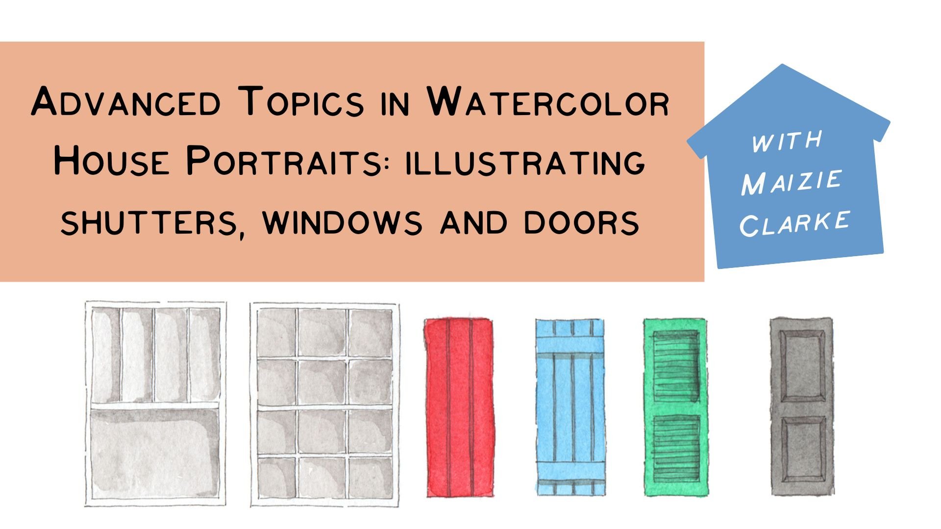
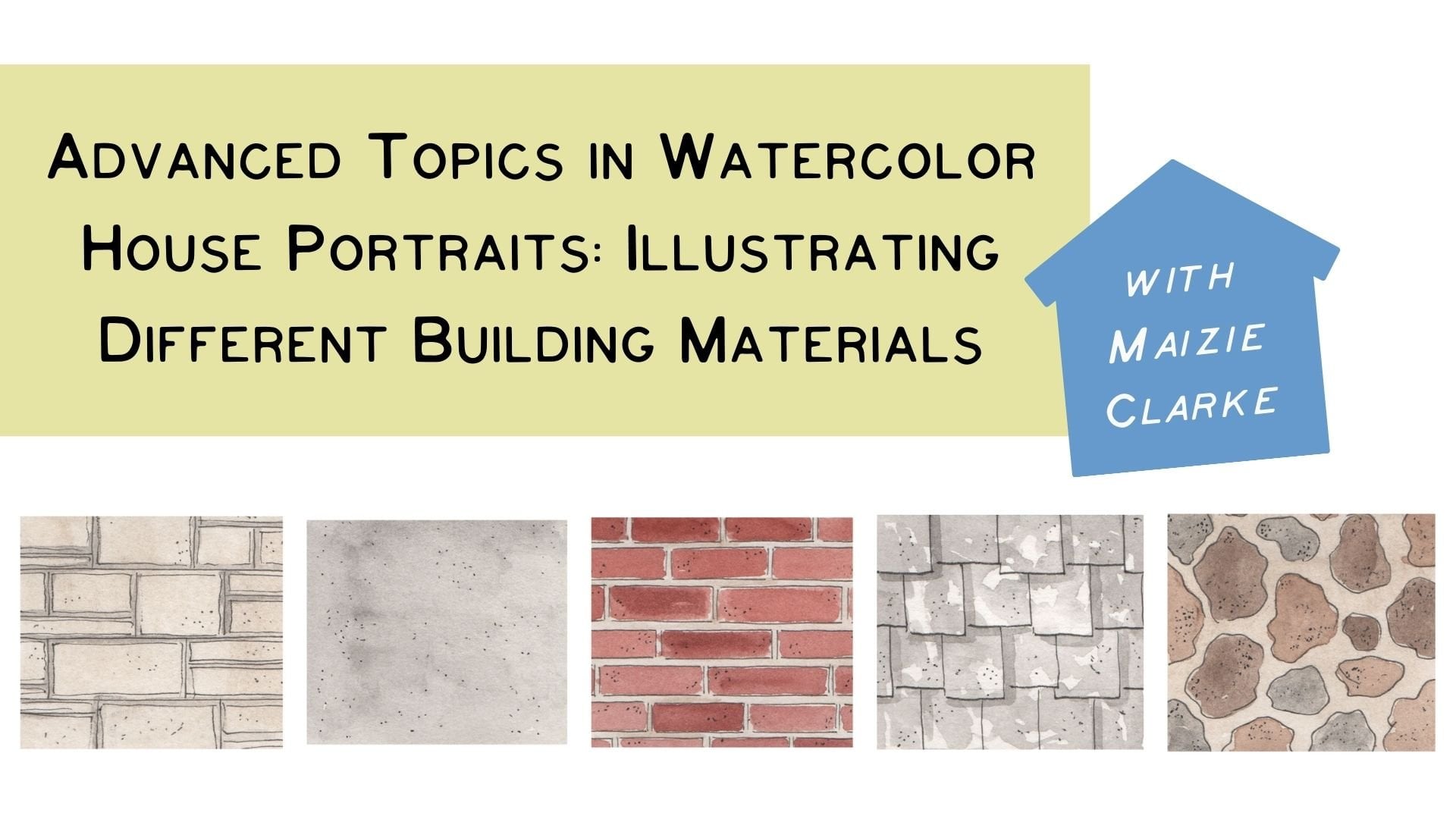
a series for a little bit more advanced techniques with watercolor house portraits
that I hope you'll check out. That is going to cover
different materials and a little bit more detail into drawing different
parts of the house. So I hope you'll join
me for that as well. Be sure to add in your project
into our class discussion. I would love to see
your work and please, please reach out
with any questions. Happy creating.
 Maizie Clarke, Charming watercolor illustrations