Transcripts
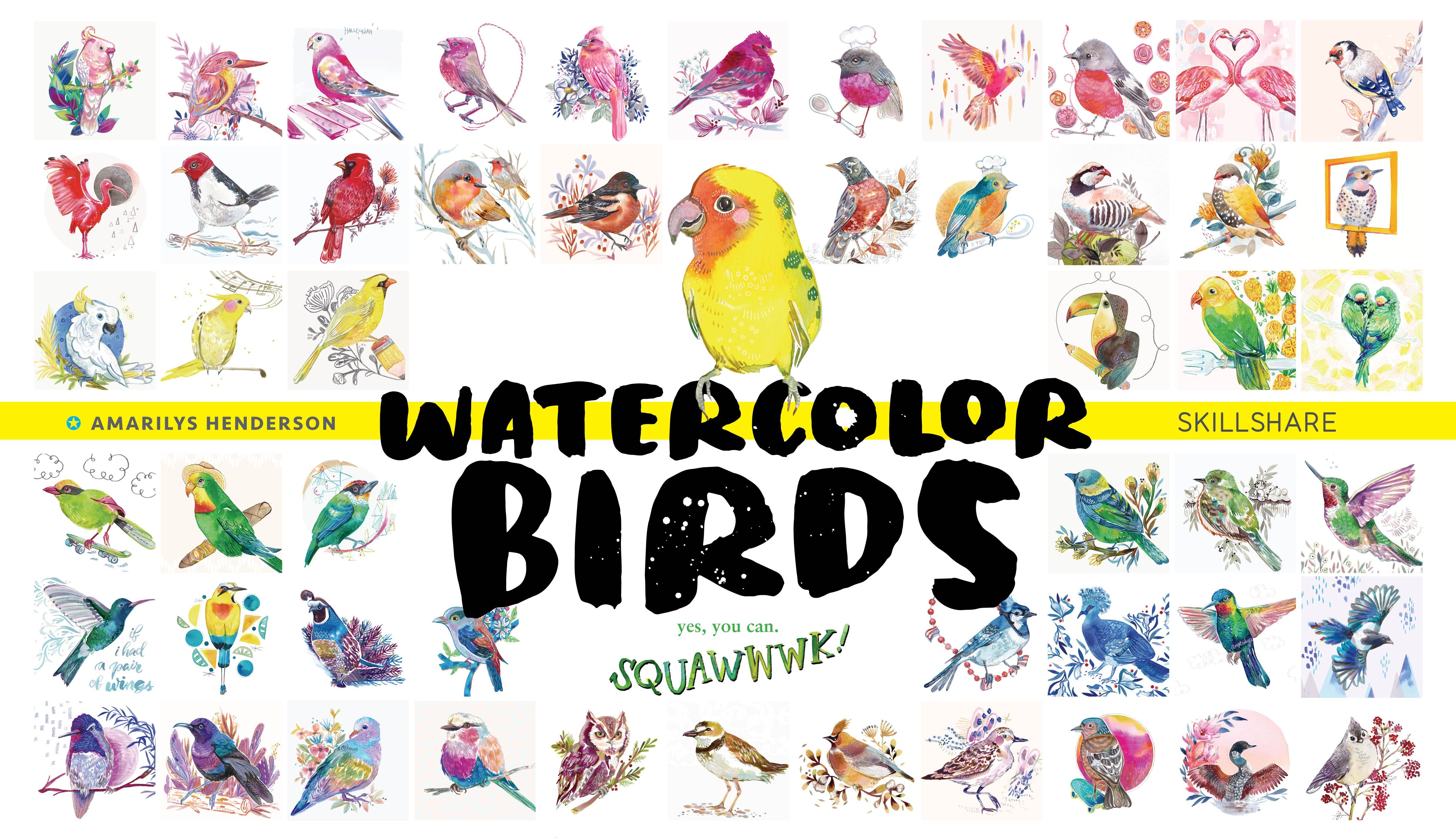
1. Watercolor Holiday Florals: This class is going to be focusing on a couple of classic Christmas favorite florals, the umbrellas and poinsettia flowers. I did not beat up the video very much because I wanted it to feel like we're painting together and you also get to hear what is going on on the paper as it's happening. You learn to fix your so-called mistakes, and [inaudible] and watercolor painter, Illustrator, and I work mostly in surface design, putting my illustrations on products. It's made me really appreciate Christmas as it's such a big deal and our industry. Every year I come out with a Christmas class and what's fun is that you can combine some of them just like I do in my own work. I used these very same florals alongside some birds, for example, for some holiday design. If you want to learn how to paint birds, you can go to this class. A classic Christmas favorite would be a wreath, obvious choice, and emerald flower bring the whole [inaudible] to life or making a whole [inaudible] out of points set as, you decide art let's get this party started.
2. More Florals: If you're new to flowers in general, I do have a very popular florals class called Watercolor Florals. It's a modern take, three styles that are distinct from each other, yet all very trending. It's in depth and it's more to help you find the style that you really like to work in by trying out three different ways. Loose, vintage, illustrative, fill in the blanks for whatever it is that you like to bring to the table when you're painting florals.
3. Red's Challenges: These florals, imbalances, and prints that has come in reds, and whites, among some other variations, some wild pinks, sometimes blue and glitter. But I wanted to focus on red, not just because it's classic, but because red has its own challenges. It can be hard to get, let's say more saturated, with red. Red can be difficult to match. Where you have kind of a cherry red, or you have a tomato red, or you have a classic red, or a vintage red, or a maroon, burgundy. All these very slight variations, we can see them, and how does a red become a Christmassy, holiday red. How does it become something that's more dated, and doesn't seem to go along with the spirit of the holiday. It's not just vibrancy. It can be difficult to get darker with reds, because essentially we are going into browns, and who wants browns in their festive illustrations. Obviously, with it complimented with green, how amazing is that.
4. Supplies Shown: Real quick, let me walk you through the supplies I'm using. You'll see me painting in this sketch book at the 5.5 by eight size, wouldn't mind a 9 by 12, I've had those before too, but I find that this size is less intimidating. This watercolor sketchbook is a really great value for the price. I find that the papers are bright white, it's very thick, at least a 140 pound, it's just a great product and I use it a lot. Now as far as brushes, I don't necessarily go with the best quality. You'll see me use about this size, brush, the size ten, large, round brush for most of those fast easy washes. I did not have a brand to show you. That is how no name-brand I go. But to show you how fancy I go, here's some fancy brushes for all of $5. When it's time to do details, I will typically buy a brush that's between five or $10 because I don't want these hairs to get frayed too quickly. But my philosophy with my brushes is I use them as long as they serve me and I move on. As far as paints, you'll see me use these two watercolor paints that are squirted into a pallet. There, Mijello Mission. In this particular class, I used vermilion and permanent red and greenish, yellow and sap green. Finally, for the liquid water colors, you'll see me use this brand a lot. I really just love my Dr. Ph. Martin's paints. What you'll see in a palette is this hydrous line. I'll draw from that to do some shadows you won't see me do the main body of things very often with the hydrous brand, they tend to be a little more tacky in feeling, but they do last longer than the paints that I'm going to show you now that I use the most. What do I mean by they last longer is that they are archival. These are so vivid and beautiful and yet they work well for me as an illustrator because I scan them and I'm not hanging them in sunshine. So I'm very happy with them, but they will fade with time. I use the 18B Crimson here. This is from set B, there are four sets. Let's just add one to cart. What is great about shopping from docmartins.com is that I can get a discount that is better than anything I can find anywhere and that is 20 percent off everything, anything from the Dr. Ph. Martin's line. I've got two sets of this, I don't think I need two. I will always get this discount with Amarilys 20 and you can too. So these are the supplies I use, let's get rolling.
5. Amaryllis - Fluid Layer: The amarylis flower is a star-shaped. All lilies are. The amarylis flower is a lily and we will basically figure out how to make that star-shaped look strong and then, the things that come out in the middle. I'm going to learn a lot about flowers too, along with you, let's get started. All right I've got my water, I've got a palette, fresh palette for some reds and I've got a very used palette, but not used enough because it still has paint on it. I'm going to use different kinds of paints here, but I don't do that to intimidate you, I do that to show you lots of different paints and what they do. Plus it's just fun for me, let's be honest. These are the hydrous watercolor paints, they're by Dr. Ph. Martins and then here we're going to put this radiant, concentrated watercolor crimson. This is also by Dr. Ph Martins, a different line and a different effect. This is going to be I think our main color. Now I also have some tube paints from Mijello Mission Gold and I think that once you start using any of these it's going to be hard to go back, because the quality of these paints are all fantastic. I have permanent red, vermillion, greenish yellow and sap green, why? Reason being, that for a red flower I want to have a variety of reds, bright red looks steady, but it can also be overwhelming and a little boring and difficult to maneuver when you're trying to get darker and darker or lighter. The way that I work around that is by using different kinds of reds instead of always watering down or making a red more concentrated. I'm going to squeeze some of these paints out. I did the same thing with the greens and having different kinds of greens instead of just a light and a dark. I'm going to use two brushes, a very inexpensive crafts brush and I can already see some of these getting frayed which is not a very good sign. I'm not going to use it very much I'm just going to lay down some water and some paint and move on to something more refined. That's a size six, this is the size four, I really I'm enjoying this brush it's by Master's Touch 2000 Round. You'll notice that in their lines you'll look for the gold or the silver, this is a gold. This is a size four and it's got a nice tip to it, even though I've used it quite a bit. Like I said first, I'm going to use my bigger brush and get it very wet. I'm going to paint with water. Now we're doing amarylis which is star-shaped and it's like doing six tear drop shapes. Right now I'm going to just paint with water, I know it's difficult for you to be able to see what I'm doing. So I'm going to put just a tinsy bit of red there so you can see where the water is going. We're going to do these three shapes kind of as in a triangular pattern. We have to work a little faster, I chose to use wet on wet for the amarylis flower because I want to bring in variety of reds into it. Now my main color is going to be this crimson red. We drop in the color right at the center of each petal. There's kind of a rhythm that I want to create in the flowers and then I want to break it up. So right now I'm laying in the red, right in the middle of these but then when I do the other three petals in these missing spots, I guess I'm going to do the opposite. In the center it's going to get darker, you know what for now, I'm not going to worry about that. I really just want to lay in some color. What's something that's different, but still red, a red orange vermilion and I really like this vermilion color, I use it quite a bit. Because it kind of has that classic New England vintage Christmas feel to me. Tomato red, I'm looking forward to changing my brush after this first step. Now I don't need them to necessarily touch at all, I don't really mind having those little ridges. Now we're going to have to use a little more brush control as we're trying to avoid these web parts. But if they bleed, that is okay. Notice I didn't use a pencil to sketch this out. I am just using a very watery conservative color. It saves me time, it saves me from being obsessed and it teaches me how to use my brush because I'm having to use my brush to sketch with. It's just good training ground instead of going from the precision of a pencil and then trying to make it work with a brush. All right my petals are looking a little different but I'm going to keep going, this bottom one is looking a little big but like I said, I'm going to alternate on the rhythm of my colors and first lay in this vermillion in the middle. Whereas before we started with the darker Ph. Martin's crimson. Trying to rectify this very large bottom amarylis petal. That's what's wonderful about working with a brush, wet on wet. You can't expect it to be perfect and you learn to fix your so-called mistakes. Your mistakes at first blush that you're learning to work with. I'm constantly bettering the shape of my drawing as I look at my reference picture here. I notice that this tip is not pointed, it kind of curves back because it's double jointed so it's curved as it's like. If you look at amarylis from the side, they were many lilies. They protrude out and kind of curl back, they're just so stretched out and they almost look like the shape of a trumpet take flower. Now since that bottom petal is so big and I'm still trying to get back to get on that. I'm going to make this top one big, it will be good then. Now I'm going to the Dr. Ph Martins radiant color that I used in here before and I'm putting that on the tips. Really kind of like how light that is over there, it's like the light is hitting it and it's feeding back. Starting off with a star-shaped flower rather than a radial daisy or mum, is very brave of us. I want you to know that you are doing something. This should feel a little challenging, but I wanted to use some of that first time excitement, to you advantage. All right, I'm going in making things a little darker. It is time now to focus on the center. I'm going to bring in the hydrous colors and stack them right on top, that's okay.
6. Amaryllis- Adding Depth: With the amaryllis, I'm really loving these colors, the pinkish red, the reddish orange. Now, I'm going to go to a little bit more of a violet-red magenta. I'm just going to lightly touch in the center. The next step is to bring in some of these striations. These petals are in different degrees of wetness. Can these flare out or they'll need flare in? Because I don't want them to create little puddles. If it's going into a wet area, it's going to create a little puddle up at the end of everything I'm doing. Not bad. I'm going to put away that size 6 brush over it and I'm onto my size 4. While this is drying, our next step is going to be to create some shadows under these petals so that we know how they overlap, what is going on in this big mess of red. But for now, just to keep myself a little busy, I'm going to work on the stem of the amaryllis. Again, a wet on wet technique. I'm going to the two greens that I chose for myself, starting with the lightest of the two, which is this yellow-green, it is living up to its name and its quite yellow-green, and then dipping into the sap green, letting it blend with the rest of the flower, the rest of the green that I had already laid out, just like we did with the petals. The screen is still really quite bright to me. In the top of an amaryllis flower, there is more flowers coming off. There's one stem and they do this. These flowers, they come off of the top of the stem. I think I've seen up to four. Typically, two can balance each other out. I'm going to add a little bit of more flowers behind this one, and I don't want the attention to be taken off of this starter flower. I want to be able to really honing on it, focus, isolate that flower, so it'll be in a different style, something really sketchy, at the end. We get a fun different take. I'm washing the green well off of my brush because I don't want green in my red flower. I'm going back to that darker red magenta. These two are so very similar, not a huge difference there. In my mind, I need to remember, right now, this looks a little messy, I'm going to look back at my reference picture. I'm going to think back which one did I do first? Because the ones that I did first are the ones that are going to be on top out of all these six. It's okay that the petals on my flower are still a little wet. The way that I paint these shadows is, I have a lot of paint on the tip of my brush, but as I press down, the body of my brush doesn't have very much paint. I will drag it. As the paint wears off the tip of my brush, it's dragging along with the body of the brush, being done the tip of my brush and I just drag it down. If I get a dry brush, I could add a little water and blend it in, or I could just leave that little bit of a rough texture, nothing wrong with that. This is starting to feel a little too violet for our red amaryllis. [inaudible] something crazy. I want a dark red. What I'm going to do is I'll take some of these permanent red and take a little bit of this green. Since they're complimentary colors, it's going to turn it into a brown color or black. It depends how well we muddy. I don't really love this shade, but at times, it's what you need when you want something really dark. I made a lot of this paint because I was mixing from several parts being several colors of paints and putting them together, but am I not going to use very much of it. This is the brown with the permanent red and the sap green, and this, I added even more permanent red too so we've got this wine burgundy color. I'm going to pause for a second and blow dry this paper because I really want it to be dry.
7. Amaryllis - Darks: Now this is red. I'm going to go in with some darker, darks. Where I already put in some of that red violet, I'm going to put in a little bit of this dark burgundy color. Some parts I might find that no, I should put in a little more of this. Now to keep myself sane, to know what the heck is going on with this flower, I'm going to go ahead and put in this sketch. Now I'm sketching as if I was sketching with marker, I'm doing the outlines these guys. Inside this just a lot of shadow that curves out into beautiful petal shapes. A little bit of this light just so it doesn't feel too perfect. Flowers and nature are seldom perfect and we don't want to necessarily do that either. Now wash my brush, and with some water, I'm going to work now on the striations on the flower. Those little lines that show the texture of it. Now, this water is not going to do a ton to repel the color, I'm not going to get a bright white out of this. But what I am doing is creating little channels for this darker burgundy to go into. It's just nice to have not perfectly rendered lines with just a hint of that striation texture. I can also pull from paint that I've already painted here in the center with my brush and dip a little bit of the paint back into those areas I put water down already. Create a transition from the start center to these lovely little line patterns. Oh, I need water first, here we go to those lines. Then with the lines, you can be very precise and almost make too many. Because then with your paint, can just dab in certain areas, and let that be more random. Where we're going to see the most of these lines, these little striations is here in the center as the petal starts to bend back, and at the top if they gather. They gave up working wet on wet here just to speed up this line process. Let me look at my reference picture. It's looking a little bit messy, but it's coming together little by little. That seem to add more and more definition. If you create a shadow that's the spake as we paint layers to a darker and darker color, make that radius go smaller and smaller, you want it to feel deep. If I painted this all in dark, I'm not going to paint it all in dark the second time around, I'm going to be a little more selective. I'm going to create some outlines because some of the parts of this MLS tend to be darker, they don't necessarily all fade rhythmically in the middle where we have a lighter color. With my vermilion, I'm very selectively going through and just creating a little more definition particularly in this light areas where the colors didn't quite meet. Now I'm okay with that, and I just want to add a little touch of that. Now I'm using a permanent red because there are parts where it has a crinkly texture along the edge. Then I just jiggle my brush, I start thin at the tip and then press down when I want my line to be thicker, starting thin going thicker. Almost entirely of paint because I want it to be that true red, and I will just help break up this to perfect those outlining shake. We need it to be near perfect when you're creating that wet on wet look, and then you need break it up a little bit towards the end. It's a little too late.
8. Amaryllis - Light Final Touches: I think I'm ready to add in a little white, and in sheer laziness I use the tip of my paintbrush to disperse the Copic white. I'm really not picky on whites. I'm not looking for a bright white. I just want it to be a little lighter so that I can do the center part right. This Copic white is very bright, I've also used bleed proof white from Dr. Ph. Martin's and Pen white and white watercolor, which will never be white. It'll just be a lighter version. That's already looking pretty good. I'm going to go ahead and mix this a little bit with this burgundy, at this nice light pink. Look for the parts that might need a little, just a touch of white or lighter, It's kind of a dusty rose and let's break it up a little bit. We're always going for something slightly irregular. Now, with this white I can use this yellow green. I mean, it goes pretty darn yellow. My white was wet, so it just kind of blended a moment more than I wanted to, so I'm going to use my other brush to soak up. Better. I'm going on the outside of the white that I already put in to bring in a little touch of yellow. Right. Bouncing back to the green, I'm blending some of the green with this brown we created to create a darker green. So again, that's the Permanent red in the Sap Green, but just this time more green then red. With leaves, what's fun is you can really get creative with what you want to do. I'm just going to create a few stripes just to create a little texture and leave it at that. Last thing I'm going to do is create more amaryllis flowers. For this you might need to pull up another reference picture. All right. There's our A for amaryllis. Spelled in English, not the way I spell it. Spelled in Spanish and it's spelled. There's your final flower.
9. Poinsettia- Fluid Shapes: The poinsettia; a classic Christmas flower, the textures kind of papery. You have little bumps within the petal. They're not soft and fleshy. It's a little advanced in its shape. It is like a star shape. But what's interesting about the poinsettia is the center, the way the petals collapse into the center. We're going to be using a very classic red as we're looking at a color wheel red in the middle, swaying one-way if we swing to another. Those are the two directions. We can go for kind of a harmonious little take on red. We can go a little more to the orange side of red where we have over million. Whereas it's not so much, typically, a violet type. We can also play in that direction. The shape of the leaves, I think is part of its iconic look. Let's get started on the poinsettia. Starting with my trusty round size 10 brush. I'm going to start large because I'm going to do large washes and work on the silhouette of the poinsettia going wet-on-wet. First, I'm painting the water and pulling a little bit of vermilion of the Mijello Mission Gold Paints. What I love about this brush is that it has a good point on it. I really want to be able to create those really pointed edges that are in the poinsettia on its tips. To accentuate that tip, I'm putting paint on the bottom body of the poinsettia and then putting paint on the top tip and letting those join. So there's going to be a little bit of a differentiation of color and it's going to feel a little folded back visually. What's really important to notice about poinsettias is, how they have these gaps between each petal at the center of the flower. That's something that's really not terribly common if you think of a lily or a daisy. When you get towards the center, it gets very full and with poinsettias, you have these hourglass shape petals that join in together and then in those gaps, you're left with something kind of like a diamond shape pulling from the scarlet of the liquid, radiant line. I got to love how that looks. I want them to feel a little foreshortened. We're not going to look at them just like head on. These flowers that I'm painting at least this time, the poinsettias are going to be at an angle. So the bottom few petals are going to be draping down, and you won't see that nice, little gap in between. Now, that I have the main six petals that go out in the top, I'm going to start working on some of the petals that come out from behind on the poinsettia, which is another fun feature. I'm leaving a little bit of space in the middle for the little buds that go in the middle. There's really no number that you have to hit as far as how many petals to put on a poinsettia, how many to layer it with. This time I'm feeling a lot more bold. I'm going dark around the colors here on the bottom, less water, more paint going straight to painting. Pressure that. I use with my brush in its natural shape. Is really important. I let up on the tip when I want the shape that I'm creating to be pointy and I push down when I want the body of that petal to be full. Dry it out, draw out the color. Not like draw like sketch, but I'm drawing out the color that's already exist that comes over these flower petals. I like to combine both two paints and fluid paints because they actually don't like each other that much. When they bleed, they clash a little bit, and I find that really interesting. Now, the top flower is much dryer. I'm going to put in some leaves around it. Another thing that I'm going to want to pull out is the texture of the leaves, of the petals. Are kind of like leaves. It's more of a papery type flower, arranging the leaves around the poinsettia. It just feels like a lot more fun, like a party. Then if I painted the flowers to be super realistic, I find that. I guess that's just my bad as an illustrator. I'm giving it just a hint of green. The green along with the red, obviously instant holiday feel. The green that I'm using is a yellowish green along with an emerald green. I'd like to have a yellowish green and a bluish green. Being careful to not run into that red petal. It did just a little bit and you saw it repelled the two paint. It was fun making them fight a little bit. But in the end, it's fun, it's okay.
10. Poinsettia- Adding White: Then, I'm going to bring in that Copic white. I also like having the flexibility, the opportunity to work on top of the watercolor paint. Something important when you're painting these dots is to differentiate them in size. It's not so much to be realistic with how the art in nature, but more so give a hint of depth, so you have some that are closer, and some that are further.
11. Poinsettia- Tight Touches: I'm mixing with a dark red and mahogany with the Scarlet red, the true red, the Permanent red. Now I'm going to bring in that papery texture that these flowers have. Since that petal was wet, I thought it'd be nice to just do a few dots and let them go from there. A lot of times points and as they seem to with that paper texture, the tissue paper texture that they have. They dip down and they look darker in areas. You do have a lot of liberty there if you want to bring in more dark red. I don't want to be too perfect with my little vein marks with my size for paintbrush. Using the very tip of it. I just want to give little hints. Especially with these lighter petals, it's really easy to go overboard and so going very thin with the brush, just using the very tip of it, goes a long way. Now I'm ready to make those little white blobs makes sense. They're still a little wet, but that's okay that it seeps in a little bit. It's just an artistic take on the transition that you get from going from white to green in the stem. Just little hints of those lines. Don't feel you need to be too literal. Little bit of a darker green in some areas because there is a lot of depth around these darker green. Bring in to the leaves just as we did with the point center. Except these are going to feel more uniform. Make it feel a little different from the flower itself. I think most of the time that I'm painting, I'm painting just to get to this point, because this is my favorite part. Because I love seeing how tiny little strokes can make such a big difference. You feel this needs another petal back here. That gap was just so big. Now that everything's dry, I can feel much more confident putting in a nice bold red. Here in the end I feel we might need some shadows here and there. Just maybe on the bottom parts of some petals. You can feel they're just laying somewhere beautifully for Christmas.
12. Final Fun Thoughts: I hope you enjoyed painting those watercolor flowers. It is a lot of fun. Fun Fact, one birthday, we had an Amaryllis Mist where my husband threw me an Amaryllis Mist party. In September, we had the tree up and a snowman cheese tray. That was a lot of cheese. We went ice skating, Christmas music and watched a Christmas movie. We need to do that again. I guess, I'm a dork and I love Christmas, I'd love to hear from you. I am on Instagram as watercolordevo. D-E-V-O, at the end, no spaces. Follow, share all those beautiful things that show artists like me that you love that we're putting content out there for you to learn from. Thanks for being part of my watercolor happy community, I really appreciate you.
 Amarilys Henderson, Watercolor Illustrator, Design Thinker