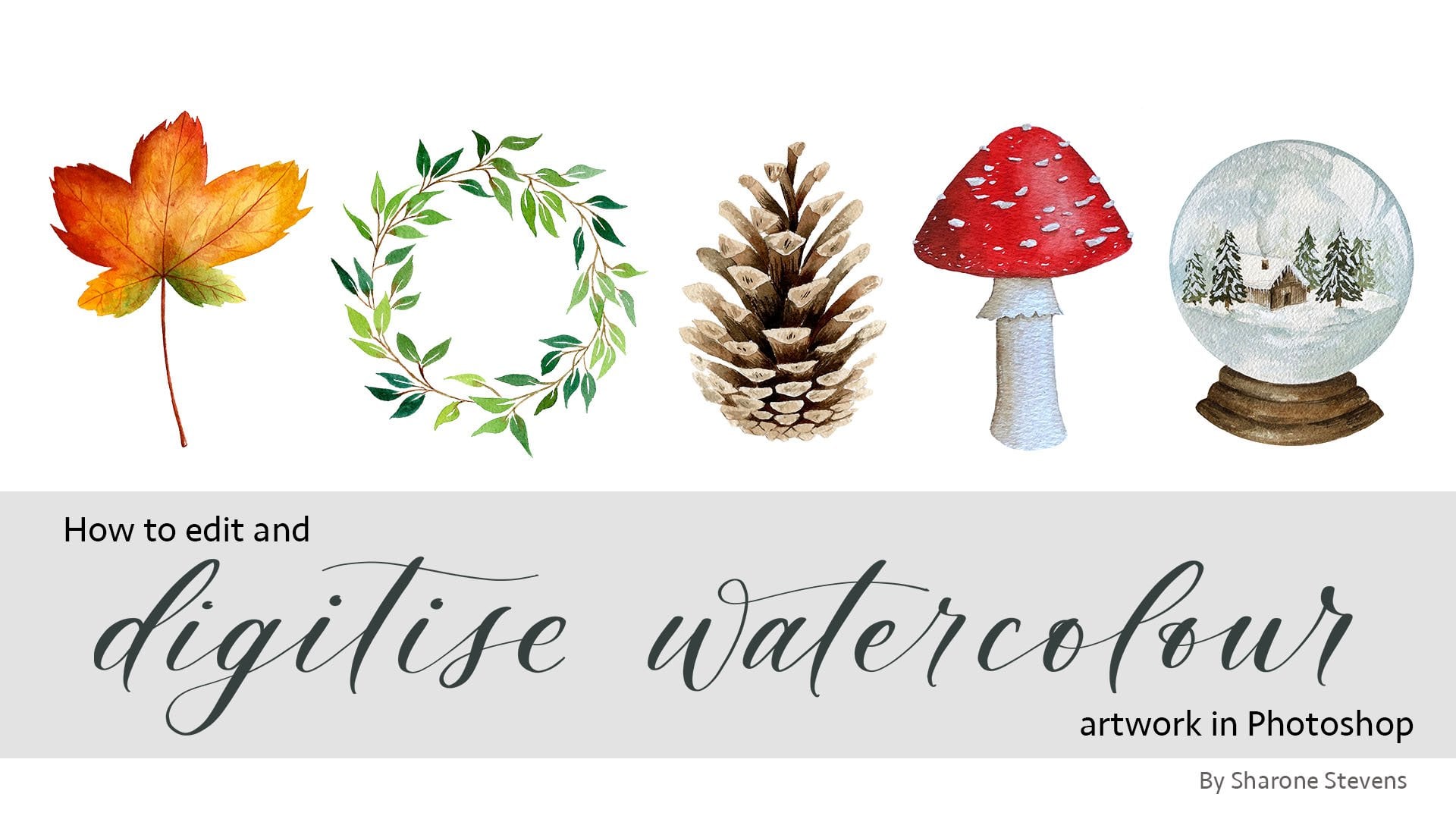
Transcripts
1. Introduction: Welcome to this class.
I'm so glad you're here. This class is a
gentle introduction to painting loose
watercolor florals, a simple, joyful way to
connect with your creativity. My name is Sharon, and I created this class as a peaceful
space to slow down, let go of perfection, and explore the beauty
of watercolor. You may know one of my books, Watercolor for the Soul
or How to Paint it. I also have my third book coming out in October this year, which is Watercolor
for the Soul Workbook, where you can paint
directly inside the book. We'll be covering
three flowers in this class and turning
them into bookmarks. These are beautiful flowers
that are easily simplified, so a great starting point if you're new to
painting flowers. Before we get started on these, we'll cover some basics
like color mixing, some useful techniques like wet on wet and painting
stems and leaves, and also look at some
tips for composition. For each flower, we'll start
with a few techniques, practicing the
elements of the flower before moving on to
painting our bookmarks. This isn't about realism or
getting every petal right. It's about using watercolor
as a way to relax, connect with your creativity, and maybe even
surprise yourself. You'll just need a
few basic supplies, watercolor paints, a brush or
two, some paper and water. There's no pressure
here, just a calm space to experiment, play, and enjoy. So grab a cup of tea, get comfortable, and
let's start painting.
2. Supplies 1: Okay, let's run through the supplies that you
need for this class. Firstly, you'll need
some watercolor paper. I'm using cold press paper for all of the painting
in this class. I recommend 140 pounds
or 300 GSM weight, and I'm using Saunders
Waterford paper, which is a high white color. You'll need paper
to practice on, and then we'll also be
cutting our paper down into the bookmark templates for
which you'll need a pencil, a ruler, and a craft
knife or scissors. I'm using a metal ruler, which I'd recommend if
you're using a craft knife, and obviously, you'll need
a board to cut on as well. My brushes, I will be using Princeton velvet touch brushes. They are round brushes, and
I'll be using a size zero, two and four brush, and also a liner
brush for the stems. I'll also be using a size six brush in the
practice session to show how brush size affects
the wet on wet technique. If you don't have a liner brush, then you can just use
your smaller brush. That's absolutely
fine. The liner brush just helps you paint
consistently thin lines. Paints, I'll be using Windsor and Newton professional
watercolors, and I'll be using pans, but you can use
tubes if you prefer. I'll be using five colors. I'm using my three
primary colors which are permanent
rose, Winsor Blue, red shade, and winds lemon, and also permanent sap
grain and burn Umber. If you don't have these
colors, that's fine. You will just need a yellow, red, blue, green, and brown. You'll also need
some clean water, a palette for mixing on, a paper towel to take out
your excess water on. And you may also find
it useful to have some scrap paper like printer
paper to place underneath your bookmark when we are
adding splatters to finish off our bookmarks. I
3. Techniques: WoW Part 1: In this video, we're going to explore the wet
on wet technique, adding wet paint to wet paper, which we'll be using to
create soft blends and natural variation within
the flower petals. In these examples,
you can see how I've used this technique
in the flowers. I've added a darker
paint to the inner part of these petals, as
you can see here, and it's gently spread
to create depth and to help the petal feel slightly
curved rather than flat. You can see I've
also used it here on these center cones
in this flower. So we've got the darker brown
on this left lower edge, leaving this lighter
area at the top right. And this helps to
give it some form and dimension in a smooth
and gentle way. So it looks like there's a lighter area and
a darker area. And the brown has also bled
into the petals below, which gives it that nice, loose and expressive feel. Wet and wet can be a little unpredictable and look
different every time. So rather than trying to control every movement of the paint, we're going to be learning
how to work with and understand how the paint
and water behave together. Some of the most
important things to be aware of are how
wet the paper is, how much water is in your brush, the size of your brush, the consistency of your paint, and the timing of
when you add color. Small changes in any of these can create very
different effects. So this video is about
experimenting and observing and ultimately building
confidence for using this technique for painting
our flower petals. Okay, so here are some
examples of where I've used different
amounts of water, and we'll try these
out in a moment, but I just first wanted
to talk you through them. So in this first row, I've used a lot of water in the first layer and also a lot of water in the second layer. You can see that we have some hard lines around the edges, and there is not much variation. The second darker paint
mostly flooded the circle. So you can see this first one. It's almost a flat color apart from that hard
line around the edge. And if you find you're getting
these hard lines a lot, then you're using
too much water. The water is just
pushing the paint to the outer edge as it
dries creating that line. On this second row, I've used very little water
for both layers, and the paint has hardly spread because it
was just too dry. Instead of having that
smooth bleed and transition, we've just got these
kind of rough edges, and it doesn't look that great. In this third row, I used a good amount of water
for the first layer. But then for the second layer, I varied the consistency
of the paint. So the consistency means how kind of thick it is
or how watery it is. And this first example, I used a very watery mix just adding it to the lower
edge of the circle. But you can see it
flooded the whole circle, and as it dried, it just became a very
flat color all over. So there's no variation at all. There's no depth
because it just moved too fast within
that small space. In this last one, I used a very thick
consistency of paint, so it had very
little water in it, and it just didn't
spread very much. So as you can see,
we haven't got that soft transition
or that nice bleed. It hasn't moved very far at all, and it doesn't look that great. I think it's useful
to try all of these too much and
too little water. So you can learn how
the paint moves and get to know how much you need for whatever it is you're painting. We're focusing on
these small shapes within this video because we want to apply it directly to these petals which
are going to be small. So when I'm painting my petals, I like to use a size four or
a size two brush, usually. And those are the easiest
ones to work with, I think. If you went for a bigger
brush like a size six, then it's going to be a bit harder to control
the amount of water. I'm going to start with a size six so we can
experiment with how it feels to have too much water on the paper and in our brush. I think it's really useful
to do these experiments. So not just trying
to get it right, but also getting
to know what it's like when you have too much
water or too little water, and so you know what
you can do about it. Okay, so the first
layout we want is we want it to be quite pale. And then we want the
second layer to have more paint in it so we
can see that variation. One thing to keep in
mind is that when you're adding paint
to wet paper, it is going to it is going to dry
lighter because it's adding even more water to
it that's on the paper. So if you want it dark, make sure you're using
quite a dark paint. So make sure there's plenty of water in your
brush for this first layer. I've got quite a lot here. We're painting quite
a small circle. And you'll know you have too
much water when it's kind of forming a pool on the paper. So I'm going to go and grab my second layer
now straightaway. And again, I'm picking up
quite a lot of this paint. It's got quite a lot
of water in it, too. I'm not dabbing it
anywhere, and I'm just going to add it
to the bottom edge. And you can see, I just
touched it gently, but you can see it's not
really spreading because it is just sitting on top of
that water on the paper. So if this is happening and
it's not moving like that, you'll know straightaway you have too much water in there. So one thing that you can do at this point is you
can tilt the page, and you'll know if the water
runs down to the bottom, which it has here, and it pulls at the bottom
edge, you have too much. So you can lift it off then. So what I'm going to do
is I'm just going to wash my brush. I'm going to dry it. And once your brush
is fairly dry. If it's quite damp, then we can use it as a
sponge to pick this up. So I'm just going
to tilt the paper, and I'm just going to pick this up and then take it
out on my paper towel. And now that's got
less water in it, we can then try again. So this time, I'm picking
up that dark paint. I'm just going to dab a little of that excess
water out onto my paper towel and then
add it into the bottom. And then leave it there and
we'll see how that moves. It's probably still quite
wet, so it's spreading. You can see it's
spreading quite far. Let's leave that to dry. And one way to notice if
you've got too much water, it takes a really
long time to dry. It shouldn't be taking that
long with these petals. We won't be using too much water because they're quite small. And you can actually just paint another circle with all
that water we had before. And instead of picking
up, just leave it to see how it does dry, how long it takes to dry, just so you know what it looks like when you
have got too much water. Cool. So I can see already this is
spreading quite far already. I think there was still too
much water in this one. I think it's probably
going to end up fairly flat this color
because this might keep on moving up,
but we'll see. With this really wet
one, you can see again that it's just sitting there on top and it's going to take quite a
long time to dry. I imagine just like these
examples I showed you before, it's going to end up with this
hard line around the edge. So if when you're painting, it looks like this
or when it's dried, it looks like this, then it's your sign that you're
using too much water. So make sure you're
taking out some of that water on your paper
towel, just dabbing it. Or if you've already applied it to the page,
tilt your page up, make sure your brush
is clean and dry, and then just use it as a
sponge to take out some of that water before applying
the second layer. Okay, so we'll wait for
those to dry and we'll move on to using
not enough water. So this time, let's pick up
our paler pink paint again. And I'm just going to dab
a fair amount of that out. And you can see
this is quite pale, but hopefully you
can see it's taking me a bit longer to fill
this in because it is dry. There's not as much water there. I'm then going to Move some of this out because there's quite a lot
of water in here. I don't want too much water in this next layer
because I want to show you what it's like when
you're not using enough. Again, I'm going to
take out this excess, because that was already
drying and I've been taking a few seconds
to move it around, I think, as I add
this to the edge, you can see it's
already mostly dried, and that is hardly
spreading at all now. So another thing to be
aware of is how much time you're taking in between
the first and second layer. If you paint the first layer and it hasn't got much water in, and then you need
that extra time to mix up or paint if it's
not already prepared, then it's going to be
drying in that time. And by the time you
come to add it, it might be too dry,
so it won't spread.
4. Techniques: WoW Part 2: Okay, so let's have a
play around now with the consistencies of the
paint mixes that we're using, so you can see how
they're likely to behave and what you want to be aiming for when you're
mixing your paints. So we'll be using
a very watery mix and some thicker mixes, and we'll see the differences
and how they spread. Okay, so for this first layer, we just want a good amount of water. We don't
want too much. We don't want it
pooling. If it looks like it's that's
quite a good amount. It's got a little
bit of extra there. You can see as it's tilting, but I think as I
paint the next layer, but I think as I now
need to mix my paint, that's going to give it a
few seconds to start drying. I think that's going
to be good. So now we want a very watery mix. We want enough painting
there so it's darker. But you can see, I'm
loading up my brush. This is really
quite watery here. And I'm just going to add this
in to the lower edge now. You can see that's
already bloomed as soon as I lifted
off the brush. And we're just going to leave
that one important thing with wet on wet is
not to overwork it. And if you're not used
to working in that way, it can take some practice. But with these wet
on wet petals, it is just about doing a couple of little dabs into the wet, not trying to control where it goes and not
overworking it either, and also not going back to
it once it started to dry. We just want to add
the painting and then let the watercolor do
its work its magic. And you can already see
that's starting to fill up this circle because that
second layer was so watery, even though the first
layer was pretty good. It's still flooding the paint, and it's making it
move really fast. So let's paint
another circle now. Again, you take out some excess. Making sure that it's not
a puddle on the paper. We want it to be wet enough that if you
look to the side of it, it's shiny, but
it's not pulling. So if you chipped it down,
we don't want to pull. We haven't got a poll here,
so this is quite nice. So now I'm going to
work quite quickly. We want a thick consistency. So I'm just picking up
the paint from the pan. I'm going to mix it
on my palette here. But you can see,
compared to this one, it's the same strength of color. This one has a lot
of water in it, but this one is thick. It's not running
down the palette. So now I'm going to add
this into the edge. And again, I'm using
just gentle dabs. And then we can see
how this spreads. You can already see
the difference in how it spread compared to this one and this one
has filled the circle. This one's moving much slower. And as we wait for that to dry, we can go back to
this first one, which is the one we use
a lot of water for, and you can see it's
already created that hard line around the edge, which we want to
avoid if we can. Okay, so now we've
done a few examples of what we don't want. Let's try and get this nice wet and wet
transition that we do want. So, again, we're going to
start with a pale circle. So make sure your
brush is fully loaded. We want it to be fairly pale, so you can add a decent
amount of water. The paler it is, the more delicate the
petals are going to look. And the more obvious the variation will be once
you add that darker color. Okay, so I've got a fair amount
of water in my brush now. I'm just going to dab
out a little bit. You can see that's kind of
bloomed on the paper towel. And I'm going to paint
my circle. Okay. So now I'm going to
look at that and think, right, is that a good
amount of water? It doesn't look
like it's going to pull or run down too
much if I tip it, but it's nice and wet, it should be wet enough
for it to spread. I'm going to swap to my
size. It's four now. And I'm going to this pink
that we were using here, but I'm going to add a
little bit more water to it because I want it to be a bit of a bit more
watery consistency. It was a bit too thick before. So again, making sure
my brush is loaded, but this has got
too much water in. I know my brush is
falling out of water. So I'm going to just dab
that out and then just add this at the edge and
then watch how that spreads. I might want it to be
a little bit darker, so I'm just going to go
and grab some more pink. Again, just dabbing this out and then just dropping a bit
more in at the edge. And we'll see how that goes. But I'm hopeful that it's
not gonna spread too far. We've still got this nice
light area up there. I think it's still spreading. So let's try that again. I'm using my size
four brush now. And you'll see the difference in using the different
brush sizes. Obviously, a bigger brush
will hold a lot more water. So the smaller your petals are, the smaller the brush
you should be using is. So here this has got a fair
amount of water in here. I can go to tip it up a little bit and maybe just
pick up a little bit of that. And then go and
pick up this paint. So it's not too thick,
not too watery. Just going to dab out that and then add this
in at the bottom, just a few little dabs. Let's see how that spreads. You can see this one above. Now that it's starting to dry, it's not a very smooth
transition between that dark area and the paler area because it was just too thick
to move very far. And this one you can see, it's just a very flat color like we never added that
second layer at all. So another thing
that you can do, especially if your flowers
are a bit smaller. So again, I'm just mixing that paler paint,
taking out the excess. And then I'm just going to
paint my smaller circle, checking to make sure it doesn't look like there's too
much water there, but making sure it's dry enough. I'm switching now to
my size tube brush and I'm going to pick
up that darker paint. And I'm going to use
this to add that in now and see how that spreads. I quite like to switch between using my size
four and my size two, especially when I'm painting delicate flowers and I don't want the paint to
spread too far. I'll know that in
the smaller brush, it won't be holding
as much water. So it will be a bit
more predictable, a bit more easier to control. So these circles, the first
layer is fairly dark. We can make that even
lighter so we can see a bit more of an
obvious transition. So let's just try that. So
this is quite watery now, so hopefully it will
be nice and pale. Okay. Again, I'm switching
to my size two now, picking up that darker
pink and then just adding it at the bottom edge with
a few very gentle touches. I'm not pressing down too hard. I'm not trying to control
where the paint goes, just dabbing it in
along the edge. And you can see that's
created a lovely transition already because we're using a slightly paler first layer and that darker second layer, it creates more of a depthier
effect than this one. I think this first layer
was a bit too dark. Okay, so that's just a
quick introduction really to using wet on wet for these petals. I hope
it's been useful. I have a few more tips for you, which I think would really help, especially if you're
struggling a bit with this because I think it
can take some practice. My first recommendation
is to experiment. There really is no
better way to learn than to just grab a piece
of paper and practice. Experiment with
different maps of water. Try mixing different
consistencies, play around with your paints. Have fun just observing and
seeing what happens without any of the pressure or when you are actually trying
to paint a subject. Make notes, scribble all over your page and see what
works and what doesn't. Tilting and lifting. As we just practiced, if you add too much
water to your paper, you can easily tilt
the paper so it pulls and you can dab it with a paper towel or lift it up. Or just try lifting
when the paper is flat. Remember to always clean and dry your brush before lifting
so that it can absorb the water without adding more water or leaving
any extra paint behind. Switch to a smaller brush. If you're struggling with too
much water in your brush, switch to a smaller brush. For petals, I tend to use
a size four or tube brush, like I said, because
they're quite small. I find using a size four brush for the first layer and
a sized tube brush for the second layer when
I had the darker paint helps me to control
the spread a bit more, but experiment and see
what works for you. Premix your paints. Get your mixes ready
before you start painting. Having the second layer mixed on a separate layer of
your palette so that your first layer doesn't
dry whilst you're mixing it up can be crucial, especially if that first
layer isn't that wet and it's drying in that space between the first
and second layer. Always be mindful of that. A few other variables
that may affect your wet and wet painting is
the paint that you're using. Some paints bloom
and spread more, so try them out and get to know how all of
your paints work. The paper that you're
using will also affect how the
water is absorbed, how it sits, and how the
paint spreads on your paper, and how warm your
environment is. Obviously, if it's
a very hot day or you're in a very hot room, the paint is going
to dry quicker, so you need to be working
quicker and be mindful of that. Okay, I really hope this
has been useful for you. Now let's move on to our second techniques
practice video.
5. Techniques: Stems & Leaves: Okay, now we can just
spend a few minutes practicing the stems and
the leaves for our flowers. So for the stems, these are just fine lines. So you can either use a fine brush like a
size two round brush, or if you have one, you
can use a liner brush. And the benefits of
the liner brush is that the hairs are
long and thin. They're the same
all the way along. So it just helps you achieve
that consistent line. So let me show you the
liner brush first. I'm just going to load it
full of my green paint. And we want a slight
curve to the line. We don't want very
very straight, kind of stiff looking stems. We want there to
be some movement. So I'm just gently resting my
little finger on the page, and I'm just going to
drag the brush upwards, slightly curve it around So it's quite useful to just practice these
over and over again. You can fill up a whole
page of lines like these. It can take some practice if you're not used
to it just getting that steady line with a consistent thickness
all the way along. So just repeating these
over and over again and also changing the direction
of that curve as well. As you'll see from, for example, the lavender, we have them going off in
different directions. So we also have some curving
to the left slightly. And then with some of
the other flowers, you might have a
bit more of a wave. So I'm just I'm using
rather than moving at the wrist to help get that kind of smooth
flow to the line, I'm using my whole arm, so I'm dragging my
whole arm down. So I'm not restricting my range of movement by
just moving at the wrist. So take some time to practice the stems with these different
directions and the waves. And then we can just quickly practice some of
the leaves as well. So now I'm moving to
my size bow brush, picking up some of this green. I've loaded it full of paint, and I'm just going
to dab the tip of the brush onto my paper towel to take out the
excess at that tip. You can see there quite a lot. I just very gently touched it, and it's just flooded
into that paper towel. So now what I'm
going to do is I'm going to touch the
brush to the paper. And as I start to drag it, I'm going to gently
start applying pressure. So because this
is a round brush, the hairs are laying flatter. I'm continuing to drag it
as I lift up that brush slowly until those hairs
come to a fine point. So now we've got this
shape of a leaf, which has started
with a fine point. It's become thicker,
and then it's gradually come back narrower to
that fine point again. So again, just taking
out that excess first. Otherwise, I won't
be able to get that fine point
at the beginning. It will be a bit more of a blob. So I'm just dragging it
and gradually applying pressure and then gradually releasing that pressure until
it comes to a fine point. And what is nice with these leaves is to add
a bit of movement. So as we move around
to the right, so I'm applying the pressure. I'm also curving the
brush around a little bit so that the brush so that the
leaf tapers off and curves. So we can try adding a few
different bits of movement. So maybe a bit more
of an S shape, a quite subtle S shape here. And then we can try this off in the other direction
for leaves that will sit on the other side
of the stem as well. So going off to the left and
curving it around slightly. I'm going up a little bit
more the curving it around. So it's a bit more of an S. So you can see those
subtle differences in the direction can just
really add a nice bit of movement and will change
the look of the painting. So that one's curving
upwards instead. So practice those as much as you need to
before we move on.
6. Colour Mixing Part 1: Before we start
painting our flowers, let's take a little time to look at the colors
that we can use. We'll practice creating some
simple color palettes for our flowers as well as looking at the greens
to go with them. When you're working
in a loose style, the color can do a lot
of the work for you. It can give your flowers a sense of movement and softness, and even really subtle shifts
can make a big difference. In this first example here, I've used one single color, and that's permanent rose, and to create a sense
of variation depth, I have simply varied the
values of the color. So this is the scale of the permanent rose showing the
different values it has. So here at its darkest, it only uses a
little bit of water. And then as these
swatches move on, I've added a little
bit more water to them until the pink
gets really pale. And as you can see
in these flowers, we have these petals. Some of them are really pale. And then you've got
these darker areas. And this is what creates the sense of depth and
movement to these flowers. If they were all an even color, it would look really
flat uninteresting. So that's the
simplest way that you can create some depth and
movement to your flowers, just using a single color
and varying the values. So if you haven't done this
kind of exercise before, I highly recommend it. It's a great way to get
to know your paints. So choose any of
your colors and just start with the darkest swatch you can paint using only just a little
bit of water to activate the paint so
it's at its darkest. And then each time
just add a little bit more until you can get to the lightest color
you can make it. So it's almost just
kind of tinted water. Okay, the second
simplest way to create a color palette for
your flowers is to choose two colors
and mix them together. So for these flowers, I have used permanent
rose and winds of blue. So this scale shows the swatches starting
from pure permanent rose. And then with the swatch, I've just added in a tiny
amount of the winds of blue, so it shifts it more towards purple and then towards
these bluer purples, back to the pure winds of blue. And with these flowers, I've used a range of
the pinks and purples, mainly on kind of this
half of the scale, so they don't shift too
much towards the blue, so they're not too kind of
cool or too bluey purple. You can see, I've got these lovely pinks and
the purples up here. And again, I'm using a range of values to
create even more movement. Some of these flowers
are really quite pale with an added drop
of color into them, and then some of them
are a bit darker. And just using those
subtle shifts of values and also colors creates
a beautiful range, um, for your flowers. This is a much easier way
of creating harmony in your paintings than just choosing multiple
colors in your palette, different pinks and
purples, and using those. Just by mixing, you can create such range in such a simple way. Here's another example of using just two colors to mix
for a range of flowers. And I've got more
of a range here, so you can see we've
got yellows and oranges and pinks
and red oranges. And for these colors, I've used permanent
rose and Winsor Lemon. So again, here's a scale showing you all of the colors that
you can mix in between. So I started with the
permanent rose and added in a little of the yellow each time just so it
starts moving towards these lovely peachy pinks
and these reddy oranges, these oranges, yellow oranges and back to the Windsor lemon. So in comparison to this one where I just use some
subtle shifts in the color. This has more of a range where you've got those pops of color. But because we're using those two colors
that mix together, there's still this lovely
sense of harmony in there, and they work really
well together. So, I like to make these watch
cards of different mixes. They're a great place to go to if you're wondering
what colors to use, for your projects,
for your flowers, whatever it is you're painting. And also, they're a
really fun exercise to see how your
paints work together. So one way you can do them is
you can just paint squares. So for here, this is
just permanent rose, and I've just varied the values. But you can also paint the squares next to each other so they
bleed into each other, which is a really nice
reference for things like these flowers as we'll be using the wet
on wet technique. So you can see the way
the paint flows together. In these two, I've used permanent
rose and winds of blue, like I showed you on this scale. This one stays a bit closer to the pink and
the pinky purples, whereas this one
moves a little bit further towards
the bluey purples, so you can see the
slight difference, and it will create a different feel for your
painting, for your flowers. These will become a lot cooler. So even those subtle
shifts within the two ranges of paints
can make a big difference. Okay, so if you've
got some scrap paper, that's the perfect thing
to use for these swatches. I've just got so I've
just got some paper left over from some other work. And I'm going to just sketch out the outlines
of the swatches, and they are 5 centimeters
by 6 centimeters. So I'm leaving
enough space just to write the colors of the paints
I'm using at the bottom. Okay, so I'm just going
to go along the top and mark 5 centimeters. And then mark 6 centimeters
for the length. And then along this line, I'll mark the 5 centimeters again so I can match up
with those chop marks. Okay, so we'll start
with a single color. I'll do the permanent rose, and we're just going to create different valleys
within one paint. So as I said, this
is a nice exercise to do, especially, you know, I find a lot of the time
I'll only have ten, 20 minutes to paint, and it can often feel like you can't get much
done in that time. But these are kind of the
perfect kind of go to. And you can kind of
still be painting, still be adding to
your collection, and they're really
lovely way to kind of keep that kind of toe in
the water of being creative. So I've painted
the first square. Don't worry about it being neat. And I've just washed
the paint off my brush. I'm just going to add a
little bit more water to the palette so
it's a bit paler, and then I'm just going
to paint this next. So don't overthink. These swatches, they
don't have to be neat. Don't worry about the squares, where they are, if
they're the right shape. Just work on creating
squares of different values. I'm just washing the
paint off my brush now. So I'm just using the water, and I'm just going to touch
that square and let it bleed in and then
pulling the paint down. So it has become a
little bit pink. I'm going back to the
pink on my palette now. Going to paint
another square here. Again, very roughly. I'm not worried
about being neat. I just want to see how the paint looks with
different values. So I have a reference for when I'm choosing
colors in future. I want to leave a bit
of space at the bottom, so I'm just this is going to be a bit more rectangle
than a square. Okay. That's enough. So really quick. And then I'm just going to write the color underneath
so I don't forget. Okay, next, I am going to make a swatch card for the permanent rose and
the winds are blue with some pinks
and pinky purples. So I'm just going to pick
up some of my winds of blue and add it to the
side of my palette, and then I'll
gradually mix it in. So I only want a little bit. I don't want it to shift
too much towards the blue. I don't want it to be too cool. So that's probably the
coolest I want it to be. And again, just touching those squares and letting the
colours bleed in together. I'm just washing the paint up on my brush now so I can get a nice pale color as
that paint bleeds in, so you can see that lovely
blade of that purple. I'm going to add a little
bit more pink now. And again, another pale
one in between these two. So this is quite a cool purple, the one I actually started with. So I might just add another one like that towards the bottom, a bit more cool as it doesn't
look so out of place. To balance it out a little bit. Add a bit more of a pinky one. Here. Okay. So again, don't worry about
these being neat or perfect. You might find that
you don't like the color mixes or you might think this
is a bit too cold, but you can just do it again and they're all kind
of learning experiences. So don't worry too much. Okay, so I just wanted
to show you a couple of examples of the
way I did those. But now you can continue with whatever colors
you have playing around, just using one color and using the different
values to create that variation and
movement and depth, or you can use two colors
and mix them together. So whatever you've
got in your palette, whatever colors kind of
spike your interest, you can play around
with those to see what works well together and what kind of variation
you can create. So with these other boxes, I want to create some
green swatches now, and we can use those later on to match them up to our flowers so we can see rather than guess, we can use them to choose which
greens we want to create.
7. Colour Mixing Part 2: I also want to quickly look at mixing greens as
the green that you use for the stems and leaves can change the look of the
whole painting as well. I like to start with
a base color of permanent sap green and then add another
color into the mix. So here are some examples
of swatches that I've made. This one here is made with a
base of permanent sap green with the yellow
Windsor lemon added in to make it very warm
and fresh and bright, which is great for a
cheerful spring painting, which is great for a
cheerful spring painting and will brighten
up your flowers. This one here starts again
with a permanent sap green, but adds in a blue
indigo this time, which makes it cooler, darker and more wintry, which will add a bit more
depth to your flowers. And this one again starts
with a permanent sap green, but this time adds a little
bit of the permanent rose, which is the complimentary
color to green. And this just takes away a
little of that brightness, makes the green a bit more
neutral and realistic. I find it really helpful to have swatches like these
for the greens. These lines all have slightly different ratios of the mixes, so you can see a variety of what the color
could look like. And then you can just hold them up to your flowers to help you choose which green you want to go for instead of guessing. And I have lots of these. Not all of them start with
the permanent sap green. Some I mix with a
blue and a yellow. So I have experimented with different colors like
indigo, yellow ochre. So you can play around and find some favorite
mixes of your own. So let's just practice
now making a couple of these swatches
that we can use to choose our greens
later on in the class. Okay, so I'm using
my size for brush, and I'm just going to start with this permanent
sap green base. And I want to first
make a swatch card of a nice, bright, warm green. So I'm going to be adding
my Winsor lemon to this. So I'll mix that in, and
then I'm just going to paint a stripe so you can see
that's a nice bright green. I'm gonna try adding a
little bit more in to see how it changes the mix. And just a little bit more. I'm leaving a gap at
the bottom so I can have plenty of space to write the names of the
paints I'm using. So I'm just going to pull in the green leftover from this end. So it's still got some
of that yellow in, but it's a bit darker. It's still brighter than
it would be without it. So sometimes you only need
a touch of a color to make a subtle change that works
for what you want it for. Okay. So now I've got
a nice variety of what these warm greens with that Windsor
lemon could look like. So I'll just add the names
of the paints at the bottom, so I can refer back to it later. Okay, let's do one more. So I want to do the
neutral green now. So again, I'm going
to start with the permanent sap green and add a little bit in of the
complimentary color, which is the permanent rose. So we want plenty
of the green to start with and only a
little bit of the pink. And we just want to add that in gradually because otherwise, it will take over. So I'm just going to pull it in and watch as
the color changes. So I'm just going to add that in So you can see it's
quite a muted green now. It's certainly not as bright as these ones with
the yellow in. Let's pull in a little bit more. We don't want to go too
far because it will start to look a bit
muddy and brown. That's still a nice
neutral green. So just keep going, varying these mixes slightly so you can get a variety of
what it would look like. Okay. And then don't forget to add your paints in
again when you're done. And then we can
cut all these out, and then we can
refer back to them. And this is gonna be really helpful when we're choosing
which colours we want to use.
8. Composition: Let's spend a few minutes
looking at composition, which simply means how we arrange our flowers
on the bookmark. Because bookmarks
are long and narrow, composition helps
create balance movement and a clean finished design. And in watercolor,
simple compositions are often the most effective, especially for floral paintings. Okay, first, let's talk
about white space. White space is the empty paper we intentionally leave
around the flowers. And leaving this space
helps the flowers stand out and gives the painting a
light, elegant feeling. If we tried to fill every
area of the bookmark, it's going to start
looking crowded and will affect how it makes
us feel looking at it. So try to think of the
empty areas as part of the design rather
than unused space. For all three bookmarks that we'll be painting in this class, will leave plenty of breathing
room around the flowers. I like to leave a fairly
big gap at the top, and then small gaps around
the edges for a margin. And this just gives
it space to breeze so the flowers don't
look too crowded. Number of flowers you paint can completely change the
look of the bookmark. Odd numbers usually
feel more organic in floral compositions and help the viewer's eye roam
around more freely. So arrangements of one, three or five or even seven
often work especially well. So here are some examples of the first flower that we'll
be painting with one, three, five and seven flowers. And this single flower
creates a really minimal, simple composition that's
quite striking on its own. And these bookmarks
with more flowers, create a fuller design, but because we still have
all of that white space, the bookmark doesn't
feel crowded. Here are some more examples of the other flowers that we'll
be painting in this class, using either a single
flower or a group of three, which works best for
these stars of flowers as it would be a bit tight to
try and fit anymore in. Okay, next is positioning. So try and avoid
placing everything directly in the middle
of the bookmark. Instead, move the
flowers slightly higher to create a more
interesting arrangement. I like to paint the
groups of flowers about a third of the
way down the bookmark. So that's where the
eye goes to first. And then the rest,
the leaves and the stems and the
white space above, this will be where the
eyes move to next. For the lavender bookmark, the height of the tallest flower reaches a similar height
to where the other flowers sit because bookmarks are vertical compositions that flow upwards, work especially well. So tall stems and
long curved lines and staggered flowers
like these help lead the eye naturally from
the top to the bottom, which is why tall flowers like lavender work
especially well for the bookmark designs or flowers that have
these long stems. Of the easiest way
to create movement is by changing the angle
of the flowers and stems. If every flower points
in the same direction, the composition can
feel stiff or flat. So what you can do is instead try varying the
direction slightly. So some flowers
can tilt outwards. So, for example, we've got some side view flowers
in these bunches here, and some can tilt downwards
or upwards slightly. And as you can see, these ones are pointed at slightly
different angles, and the same with the lavender, these are curving off in
different directions, which just helps gives it that more movement and
creates a gentle flow to it. Another important part of
composition is variety. So not every flower needs to be exactly the same size,
height, or angle. Small differences can help the arrangement feel more
natural and balanced. So with this lavender, you can see the tallest
flower is in the middle, and then the
flowers, either size slightly different heights, but they're both shorter
than the central flower. The goal is balanced rather
than perfect symmetry. Before you start painting, take a moment to plan
your composition. Think about how
many flowers you. Where they will sit, the
direction they'll face, and where you'll
leave white space. If it makes you feel
more comfortable, you can use a light
pencil to mark out where the flowers would be
like the centre cones of the echinacea to check
that you're going to have enough space to
add in the petals. Or you can lightly
sketch out the stems of the lavender if it makes you feel more comfortable doing so. Generally, my biggest tip is to keep the
composition simple as this will often create the most striking
and elegant result. In watercolor, less
is very often more.
9. Making the Bookmark Templates: A So for these bookmarks, I like to measure them out as 6 centimeters wide and
18 centimeters high. That just means they're wide
enough for the flowers. We don't want them
to be too slim. So I like to cut out
quite a few at a time. So I always have
some prepared ready, so I can just grab
them and paint when I want to rather than having
to cut them out each time. So you just need your
pencil and your ruler. And I can fit, I think, five on this page. So five across. So I'm just
going to mark this out, so 6 centimeters across. I'll mark them again
along this bottom. I'm leaving a five millimeter
margin at the sides. Okay. Now I'm just going
to connect those lines. Okay. Now I'm just going
to measure the length of 18 centimeters and
then cut them out. Okay, so now I've got my five bookmarks mapped
out on the page. I'm using my palette knife to take the paper off
of this block, and then I'll use my craft
knife to cut them out. So I've got my metal ruler. You don't want to use
a plastic ruler with a craft knife because it
will just cut right into it. I'm going to do the edges first. Okay. So now I've got my five foot
marks ready for painting.
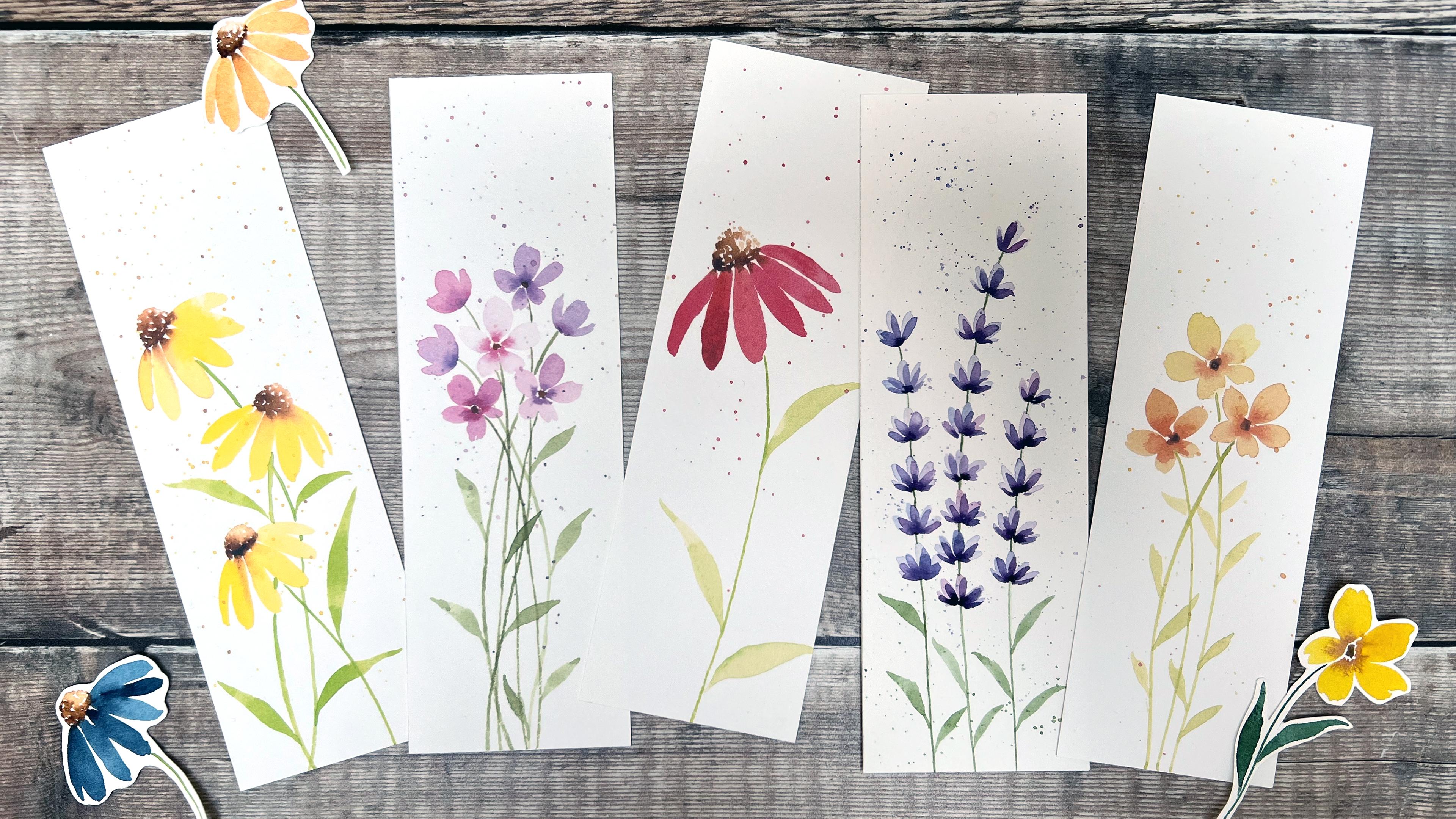
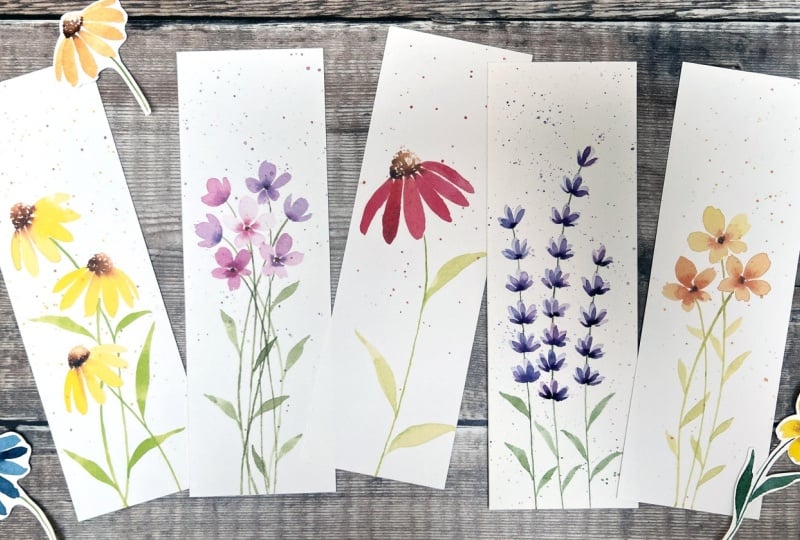
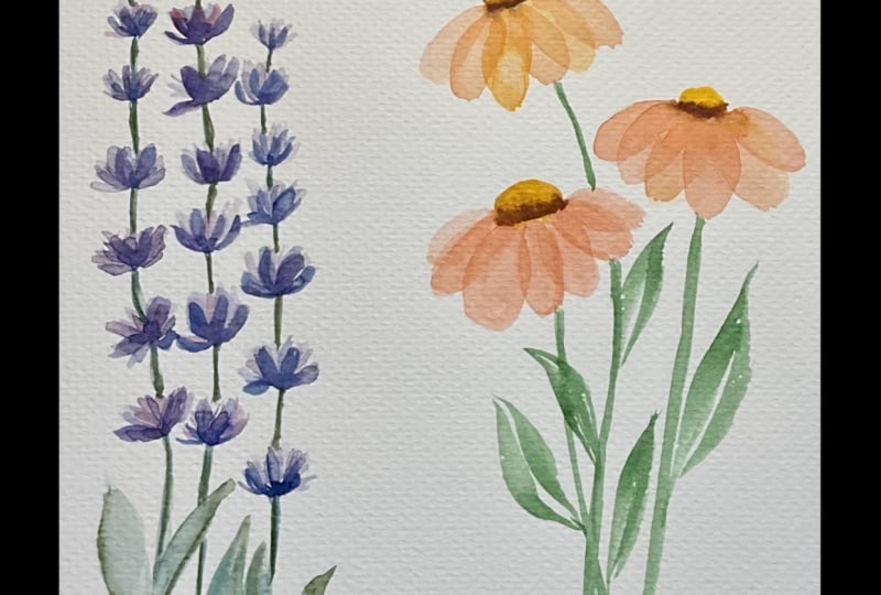
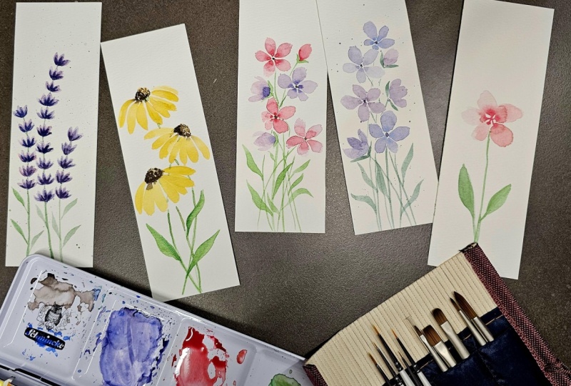
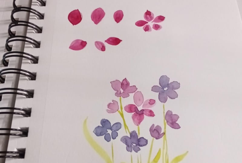
10. Flower 1: Part 1: For the first flower, we will be painting these simple
five petal flowers, which I love to paint. For the petals, I'll be using permanent rose and
Winter blue red shade mixed together in varying ratios to make a variety of
pinks and purples. For the green, for
the stems and leaves, I'll be using
permanent zach green with a little burnt
umber mixed in, but you can choose whatever green mix you would like to use. For the brushes, I'll
be using size four and size zero round brushes
and my liner brush. And for the techniques, we'll be focusing on color mixing, creating subtle varieties
within our mixes, simple brush strokes, wet and wet and adding
splatters at the end. Okay, so I've painted a few of these simple flowers for your reference at
the top of the page. So we have a front
flacing flower where all the petals
are the same size. This is another front
flacing flower, but it's at a slight angle, so you can see those two bottom petals are
slightly shorter, and this just helps to give
it a bit more movement, and so the flowers
don't look as flat. Here, you've got a couple
of flowers at a side angle. So with these ones, you can see there's
a dip at the top, there's two kind of
bigger petals on the left, with a thinner
one on the right, and then a bigger petal
in the middle and two thin ones on the sides. So it's just to show
you that you can create a little bit of variation with the
strokes that you use, and it's just going to
add a lot more kind of interest and movement to a finished composition where
you have multiple flowers. And then finally,
we have a bud here, which is just a
smaller petal shape and then the stem underneath with a V shape
supporting that bud. Okay, so we'll start with
the individual petals, working on that shape. So I'm using my size
four round brush, and I'm just going to use
my permanent rose as well. It doesn't matter at this
point what color you use. We're not going to worry
about mixing just yet, so just pick up an
individual color. So I've loaded my
brush quite well here. I'm going to start
with this top petal. So I want it to come to
a point at the bottom. So I'll start from the bottom
with the tip of my brush. Going to drag my brush
around in a s curve, applying pressure and lifting
it up as it comes around. So this is going
to give the shape of that top curve edge. So now I'm going to
go straight back in, starting from this bottom, again with minimal pressure
with the tip of the brush, and I'm going to run my
brush up the middle, applying pressure until
I get to that top. And on this right
side, we're going to do the opposite of
that first stroke, starting from the bottom
with just the tip, applying pressure,
and I'm going to curve the brush
round to the left. So that's going to
give this nice shape where we've got a
point at the bottom. It doesn't have to
be a sharp point. It's just wants to come inward to come into the
center of the flower. And then we've got a
fairly rounded top. And this doesn't need to be
a really neat rounded top. You'll see if you look
at some of these petals, they have a few little bumps in and this is the way I like to paint them because
it makes them look a lot more natural and
delicate and organic. If you kind of painted the curve first and
then filled it in, it's going to look a
bit more stylized and more like a doodle
if it's too smooth. Petals are naturally
going to be a little bit kind of more jagged
and more delicate. So let's practice this again. Okay, so starting
from that base, applying pressure
and curving round, and then going straight up the middle and then that
right curve, as well. Okay. And you can adjust the
curve if you like, if it's a bit too uneven. So you see here, it's
kind of a bit bumpy. I might just smooth
that off a little bit. But what is nice is if your petals all do look
a little bit different. And by painting with
these three strokes, I find that happens
quite naturally rather than if we were to paint
the outline and fill it in. So keep practicing this as much as you like to start to
feel comfortable with this. And then what we can do is start practicing them from
different directions as well. So let's paint this
one off to the side. And then the lower
one going downwards. You can see that's actually
kind of got a bit of a bump there in that rounded
edge, which is nice. Okay, so now let's
practice creating these shorter
petals which are at the bottom of this
slightly angled flower. So we're going to do
it in the same way. We're just going to
stop a bit sooner. So it's just going
to be a bit shorter. It's gonna be the same width. And that I'm just going to curve that around
a little bit more. Okay, so continue practicing
that as much as you need to. Pause the video if
you want to here. Now we're going to move on to actually creating a
whole flour together. So what we want is a nice
pale mix for this one, because we want to add a
little bit more colour into the middle when
it's still wet. And so we need that first
layer to be really pale. And the second layer is
going to be a bit darker and it's going to help
give it a bit of contrast.
11. Flower 1: Part 2: Okay, so we're going to start
with that top middle petal. So going up about three strokes. And then the side
one coming off, I'm not quite touching
this first petal. You can a little bit
on some of them, but I like to leave a
little bit of a gap for most of them and go
up to this left one now. You can see I'm leaving a bit of space in
the middle as well. Now I'm going to come downwards. And then this last petal here. So you can see
there's some gaps, and some of them are touching. So I'm going to go straight in, pick up my darker pink. I can see this is
drying quite quickly. I'm actually going to drop to my smaller size zero brush
for this wet on wet, so it won't spread as far
because these are small petals. The paint can spread quite far. So I'm just going to drop
this darker pink into the edge just with
the tip of my brush. So I'm just adding
it into the center. I'm picking this up, and
I'm just taking some of the excess out because
the wetter it is, the more it's going
to spread, and I only want it to spread a little way. As it starts to dry, you can add a little bit more if you want it to be darker
or you want to build on that. Okay, so I'm happy with that. That's given a nice bit of
contrast in the middle. Okay, so now let's work
on this second flower, which is slightly more angled with those two shorter
petals at the bottom. So again, I'm going to start
with this top middle flower with top middle petal
with those three strokes, and then go off to the side. So these are all the same size. Leaving that small circular
shape in the middle. And then coming
down to the bottom, and these are going
to be shorter. Switching to my size zero now to pick up that darker pink, making sure it's
got enough water in there that it's going to flow. And then just dabbing
this in to the center. I find that it's a lot easier if you switch to
a smaller brush. You can have more
control over it, especially with these
smaller shapes. If I were to use a size four, it can spread quite far, and then it can take
over the whole petal. That's why I like to drop
down to a smaller brush. But take some time practicing. The wet on wet. As I said, it can
be unpredictable, so each kind of petal will
look a bit different. So try not to get too hung up on that or worry about it looking perfect because part of the
magic of these loose flowers is just kind of giving over some of that control
to the watercolor. Okay, so let's move on to
these side petals now. So I'm going back to
my size four brush. Again, we want a
fairly pale mix. So I'm going to start
with that middle petal, and it's going to be
at an angle slightly. So there's three strokes. And then I'm going
to do this one, so I'm going to curve off to
the left and another one. So it's just got that dip. And then a thinner petal, starting from the
base, curving round. That's just one stroke with a little bit of pressure
that's not too thin. And then I'm going to
go from my size zero, pick up that darker pink, and just drop it into
that base as well. So let's try another one
of these side flowers. So the middle petal, those three strokes, and then the two either side are going
to be a bit thinner. So starting from the base, applying a little bit of pressure and then
coming up to a point. So lifting the brush gradually
and the same on this side. So applying a bit of
pressure as I drag it, curving it round, then
coming to a point. It doesn't need to come to
too much of a sharp point. You can see this is
a bit blunter here, but it's just kind of trying to lift it up a
little bit gradually. Okay, switching to
the size zero again to add this darker
pink in the base, just dabbing in and
then leaving it. And it's going to spread. It's going to keep
spreading until it's dry. So don't try and
control it because it will probably look
quite different in a few minutes once it's dry. Okay, so the final
one is the bud. So again, using the size
four and the pale mix. This is just basically the
shape of one of the petals, maybe a bit smaller. I'm going with a
tip of my brush, I've just dried the brush
off on my paper to, I'm just going to pick
up that little bit of excess water at the top. Okay, coming back to these two, we're just going to add a dot of brown in the
center like this. That's the burnt umber, so
I'm using my size zero. It's a fairly dark
brown I'm using. I'm just going to put it on my palette to make sure
it's mixed in well. I don't want any blobs of paint. Then I'm just going to paint a small circle in the center. I'm leaving some of the
white to show through. And that's it. Just
really, really simple. For this bud, oh, I forgot to add in a little bit of wet and wet to this bud. So we'll do that as the same as the others dropping in a
little bit of the darker. I think that's probably dry now. So perhaps try that again. So, again, just the pale pink. That's got quite a lot of water in it, so
I'm going to wait. I might lift a
little bit of it up. If it's got too much
water on the paper, when you add the drop of pink, it's just going
to spread because it's quite a small shape. It will take over the whole
thing. And when it's dry, it will still look
like a flat color, and it will just
be a bit darker. So sometimes it's worth just waiting a little bit
until it starts to dry. So with the size
zero, I'm just going to drop in that darker
pink to the base, and you can see that's gradually
starting to move upward. Okay, so with the
size zero again, you can use the
bigger size four, if you want, just the
tip of the brush. I'm going to use my
permanent sap green. And I'm just going to paint that little V
shape underneath. I'm not touching that bud
because the buds still wet. You can do it a little
bit. I will bleed in. And then the stem
would come down and we probably if you have
a line of brush, you can do that with them, but I just want to show
you how it would look. And again, with these stems
for these angle flowers, this would come down from
that center and curve round. With the front flacing
flower for the stems, we would find the center and just decide which way
we want that stem to go. It would probably
curve out slightly. So instead of having
it straight down, it's nice to add a
little bit of a curve. So it looks like it's a bit more natural. There's
a bit more movement. So from this one, I'd
start from the center. My brush is not
touching the paper. I'd work my way down until
I get to the white of the paper and then
curve it round. And for this one, again, this looks like it's facing
a little bit to the left, so I think the stem should
come off to the right as well. So again, I'm going to come
down here and curve around. Okay, so now we've practiced all these individual elements
for these simple flowers, we can work on a composition. So if you've got your bookmark
template, grab that now, and we'll start painting a few
of these flowers together.
12. Flower 1: Part 3: Okay, so as we
paint our bookmark, we want to keep in mind
some of those things that we discussed earlier
in the composition video. So firstly, we have positioning. When I'm painting
these bookmarks, I like to keep the flowers
kind of in a cluster, about two thirds of the way up, and then we have the stems
and leaves underneath. And then we have
this nice chunk of white space at the top. That just helps give the flower some breathing
space so it doesn't feel too tight and too crammed. For all three of
these bookmarks, I've used odd numbers
for the flowers, so you can see I've got
three flowers here, five here and seven here. And as we discussed earlier, it just helps your eye roam
around a bit more freely, and it's a bit more pleasing to the eye than even
numbers would be. In these two, we've
got quite a lot of movement with the
angles of the flowers, so we've got some front
facing flowers here. This is slightly angled with those shorter petals underneath, and then we've got some side
angled flowers here as well. Likewise, we've got
some side angles here. This one is facing downwards. And then we've got some nice
movement with the waves of the stems and the leaves coming off in
different directions. We've also got some
variation in color here. So in this middle
bookmark, you can see, I've just used a pink, but there is quite a lot of
variation in the value. We've got some really nice
pale petals on the side here. And then some of these flowers
are a little bit darker, and especially in the center, we've got that contrast
where we've dropped in some much darker pink. This one, I've used
Permanent Rose and Winsor Blue red shade and just varied the
mix ever so slightly, just to get some different
kind of pinks and purples. It doesn't have to be
too much variation, but it can create
such a lovely effect. Okay, so we're going to paint a bookmark similar to this one. We're going to have
seven flowers. We'll start with a
front facing flower in the center and then
work our way around. So as we're doing this, just make sure you leave plenty of white space around the edges
and a chunk at the top. Choose whichever colors
you like for this. I'm going to use
the permanent rose and the winds are
blue red shade, so to create the
more pinky flowers, and then the slightly
more purple ones and bluey purple ones here. So we've got a nice variation. I'm not going to go too
far over to the blue, so it's not going
to be too cool, or I'm not going to go
for the pure pink either. I want to stick in the
middle range where we have those pinky purples
and the bluey purples. Okay, so I've got my
bookmark template. I've also got another
bit of ward color paper, scrap paper that I can do some swatches on for the colors. I'm going to be using my
size for round brush and then my size zero brush as well to drop in
some of that color. I'm also going to be using my
liner brush for the stems. So let's start by
mixing our colors. So I'm using my permanent rose. I'm going to add some of this Windsor blue next
to it up top here. I'm going to keep some of
the darker mixes up the top, so we can use that
for the wet on wet so those are
already prepared. So now I'm just
washing off my brush, and I'm just going to pull
some of this pink downwards and likewise with the blue, and I'm just going to start
mixing that in a little bit. All right. Let's just mix
some of this at the top, as well, so it's ready. Okay, so nice and pale to start with a nice
pale pinky purple. Taking off the excess
from my brush. I want there to be quite a lot of water in this mix to make it nice and a
watery consistency, but I don't want too much water in my brush that's going
to flood the paper. So I'm going to start about
a third of the way down. Just pick up a little
bit more and paint a front facing flower
in the center. So there's three strokes. Okay, quickly switching
to my size zero. And I'm going to get some of this darker mix on the
top and drop that in. Okay, so let's move on to another front facing flower
just to the top right. So this time, I'm going to make it a little
bit more purple. And then going for
that darker mix with a size zero brush, and again, just
dropping that into the center with some little dabs just with the tip of the brush. I'm just going to go back and pick up a little bit
of my permanent rose, mixing that with the purple. So I can just add a little
bit more in here because I just want to make that a
little bit darker, as well. Okay, so let's have another front facing
flower down below. We can do these at a
little bit more angle. So I'm going to add a little
bit more of the blue in. So it's a bit more bluey purple swatch these out if you want to. On these side ones, you
can move it around, or you can actually start at the top end of
the petal instead. So now I'm going to do two
shorter petals underneath. Just quickly mixing up some of this darker bluey
purple to add in. Then we can have
another one here. So I'm going to add a
bit more pink in again. Make it nice and pale this one. And again, those
two bottom petals are going to be a bit shorter. Size zero dropping
in a darker mix. Okay. So we've got four front facing flowers now or slightly angled
flowers so we can do some side ones now
to fill in the gaps. So one here, one here, one here, I think. So I'm going back. I got a nice bluey
purple one here, so I'm going to use that
same color for this side. So starting with that
middle petal and then off to the left and then
a thinner one on the right. And then, again, we
can go in and pick up that darker mix and just
drop that in to the bottom. Okay. This one might go for a bit more of a
pinky one up here. Just mixing that
in a little bit, so it's not pure permanent rose. I want a little bit of
a purple tint to it. So starting with
that middle petal, I'm just going to wash my brush off a little bit as it's very dark and then adding
in the side petals. Got a bit too much
water in there, so I'm just picking
up a little bit. Okay. And now going back, mixing this darker mix and
adding that into the bottom. Okay, let's have one more here, and that will round
that off nicely. I go for a mid purple. Just go to turn my
bookmark around slightly now and then have this
coming off to the right. So side petals, faliTick
side petals. Okay. And then again, with a
size zero picking up that dark mix to
drop into the base, just for that contrast. You can see that one
has spread quite far, and it's kind of flattened
it a little bit. So I'm just going
to add a little bit more in to see if it's
still wet enough to spread a little bit. Okay. So there we have
our seven flowers. So if the front facing ones
are dry now, they should be. I'm going to go with my size zero and pick up
some of my brown, my burnt umber, so we can do those little
dots in the center. Again, remember to
leave some white space. Just that helps give it
some contrast. Okay.
13. Flower 1: Part 4: And now we can mix up a
green that we want to use. So for this, I
think I'm going to using a quite a neutral green. So I'm going to start
with my sap green. Add that to my palate. And then I'm going to add
some of my burnt umber. Test this out. I think that's quite a nice. Nice, neutral green. So I'm going to go for
my liner brush now. So if you don't have
a liner brush and you just have a round brush,
that's absolutely fine. Just remember just to
use the tip of the brush to get that line nice
and consistently thin. Okay, so I'm just coating my brush and then I'm going to take off the excess on the end. And then I'm going to start with this flower down here and I'm going to work from the center and then touch my
brush down as it gets to the white
paper and curve it round and come towards the middle of the
bottom of the bookmark. So it's got a nice bit
of movement in there. And if we overlap
some of these stems, it just makes them all feel a little bit united,
brings a piece together. So this flower is going off
to the left a little bit. So I'm going to
calm this way down. So starting from there. Going to drag my brush all
the way down to the bottom. So I'm dragging my arm. I'm not keeping my wrist
locked and moving it. I'm dragging my whole arm
to keep it nice and smooth. Okay, so I'm working from
this center one now, so I'm going to go down and
come over to this left side. So I have to stop at this petal, and then I'm just taking my brush over the top of
the petal to see where it would meet the white paper again and then bringing it down. Okay. Okay. So with this one, this is going off
to the right, so the stem would be coming
off to the left this way. I'm going to curve it around, I think, over here. Okay, so it comes behind that petal with a little
bit of green there, and then bring it
down and round. Okay, with this top
one, I'm going to bring that and we're
straight down, maybe with a slight wave in it. So it's just going
to cross over. Okay, so we've got
two more to go. So this one, again, it's
facing off to the left, so we want that stem
coming out to the right. So pull that down, and then I'm going
to curve it around. Okay. It's the last one. Can I come down? Okay, so we've got
all our stems in now. And now I'm going
to switch back to my size four brush to
paint in some leaves.
14. Flower 1: Part 5: Okay, so now we can
add the leaves. So I'm using the
size four ram brush and picking up plenty
of that grain, just taking out the excess from the tip on my paper towel. I'm going to start at the
bottom on this right side, and then touching the stem, bringing it down,
applying pressure, and then curving it around a
little and lifting it off. I'm going to pick up
some more green now and do another one on this side coming off
from this right stem. I'm going to curve this
round a little bit more, so it looks a little bit
different to the one underneath. Okay, let's head over
to this left side now. We want to kind of
try and make them position them in
different heights so it doesn't look too uniform. I'm going to bring this up a little bit more and make
it a little bit longer. Okay. And now one down here. Curving that off a little bit. And then we can have some
overlapping the other stems. So I'll start here. You can add a little bit
more color in that if you want to cover up those stems. Make it a little bit darker. And I think I'm just
going to do one more probably in the center area to kind of fill in this
space a little bit. Okay. So I've got six leaves out. I might just add one
more, keep it odd. So they're not fighting
for attention, so I'm just gonna have one in this gap here. Okay. Just take a step back at
this point and have a look, see if you need any more leaves. But I'm quite happy with mine. I'm going to wait for it to dry, and then I am going to
add some splatters. Okay, so I've just got a
bit of printer paper here, which I'm going to
lay on the table. Underneath my bookmark. So just make sure you've
moved anything out of the way that you
don't want to get any accidental splatters on. I'm going to use my
size to brush because I want these splatters
to be fairly fine. So the bigger the brush you use, the bigger the splatters
will probably be. And I'm going to focus
the splatters on the top half of this page over the flowers and in
this white area. I don't want too many, but I'm going to add some pinky
pertible splatters there, and then perhaps
some green splatters over the stems and the leaves. So I'm just going for the pink pinky purple
that's mixed on my palette. I'm going to take
off a little bit of the excess of my brush. And you can either tap this on your finger or you can
tap it on another brush. I'll start with my finger,
see how this comes off. You see, that's quite a
nice, fine spray there. I think I need a
little bit more water. I'm just going to take
off this excess blob, I can see because I don't
want any big blobs of water. And then I'm just gonna go again moving it around as I tap. I don't want too many.
I'm gonna go for a little bit more pink. Okay. And now I'm just
going to rinse off that color and pick up
some of this green. Again, taking off the excess, I can see there little
bit of a blob of water on the silver
part of the brush. And I'm just gonna splatter
this over the stems. Okay. I'm going to leave it
there. I don't want too many. Now, you just need to be quite careful with these flatters. Make sure you give them a
good few minutes to dry, especially if there's
any blobs of water, they can be easily smudged, and we don't want to ruin
our painting at this stage. So sell it to one side and
don't touch it for a while. Okay, so that's our first
bookmark completed. I really hope you've
enjoyed this. I love painting these. They're so relaxing. Not only are the brush strokes calming, but the colour
palettes are as well, and I just love how
they look at the end. And then you can use them whilst you're
reading your books, or you can give them
to friends and family, and it's just a really
nice way to incorporate them into your everyday
life and remind you why you love painting and also that it doesn't actually take long to create something that is not only relaxing but
really pretty, as well. Okay, let's move on
to our next flower.
15. Flower 2: Part 1 : For the second flower, we
will be painting echinacea, one of my favorite flowers. For the petals, I'll
be using Winsor Lemon, and for the central
cone of the flower, I'll be using burnt umber. For the stems and leaves, I'll be using permanent
sap green with a touch of burn umber mixed in to make
it a bit more neutral. I'll be using my size zero and four round brushes with my
liner brush for the stems. For the techniques, we'll be
focusing on fine details, creating the texture in the central cone by painting
lots of dots together, simple brush
strokes, wet on wet, and finally adding some
splatters at the end. Okay, so let's start by practicing the elements
of this flower. So we've got an example up here for a reference
that I've painted for you. So we'll start with the cone, the center part of the flower, and then we'll practice
some of the petals and the wet on wet bleeds
that we've got here. So using a size four brush, the way I painted this is with a pale bone
umber to start with, and then added in some
darker bone umber on the left bottom side along the edge and on that corner
and let it bleed in. So it gives it a
nice contrast and helps give that cone
some dimension. So pick up some burn umber, and then we're going
to water it down. We want a really
nice pale color. So you can test that out. So something like
that, it's almost like just a tint because we're going to build it up
with the wet on wet. And this center is made
up of lots of dots. And that's just using the tip of your brush. So just practice. Just using the tip. And some of these dots can
touch each other. We don't want it to just look like a series
of uniform dots. If some of them
touch each other, it just makes them a little bit bigger. They blend in together. So just practice.
Just a light touch with the tip of your brush. Okay, so to paint this, we're going to
paint a semicircle, so it's got a half
circle for the top, and then the base
is slightly curved. So we'll start again with the pale burnt umber
with a size for brush. Using the dots, paint
this curve, semicircle. And then we can paint a
slight curve for the base. This just helps give its shape. And then once we've got that, we can start filling
it in with these dots. And again, remember some of these dots will
touch each other. I shouldn't just look
like it's lots of dots. What we want to create
is just texture. So some of the white
showing through. Okay, and our why
that's still wet. We're going to pick
up some darker burnt umber taking off this excess and starting at this bottom
left corner, just dab it in. Again, just using the
tip of the brush. Tip dab in this darker
bone umbra dot work your way along the bottom edge a little bit, not
all the way along. So it's just focused in that corner and
it'll bleed upwards, and that's going to
help give it its shape. Okay, so we'll work on the petals individually first and then we'll paint the flower as a whole and work on creating these lovely bleds from the brown of the cone
into the petals. Okay, so again, with the
size full brush, eight. I'm going to pick up my yellow, which is my Winsor Lemon. But as I showed you, you can do this with pretty
much any color, and it will still look lovely. So you can choose which
color you'd like to use. So for these petals,
they're quite long petals. The ones at the side, they curve around a little bit, and they're slightly thinner. So this one on the left
and this one on the right, they are usually just
one stroke petals. And then the rest are
a little bit wider, so I usually do two
strokes for those. So we start with the tip of our brush and then
drag the brush down, curving it slightly and
then lifting it up. So it's not got a pointy edge. I'm lifting it up kind of before it gets to
the tip of the brush, curving it in a little bit. So taking off the exit, starting with the tip of
the brush, laying down, dragging, curving
slightly into itself, and then picking up. So it's got a bit of almost
a blunt kind of curved edge. So for a thicker petal, we can drag it down and then start at the top again and then add a bit more width to it. So just trying that again. So I'm curving it a little bit. And then the other
side, curving it. And if you've got a bit
of excess at the edge, you can just pick that up. And you can see these
petals aren't really neat, just like with the last flower, we want that kind of
realism in there, that delicateness and natural
way that the petals are. They're not going to be
really, really neat. So we're going to practice another thin petal curving
round to the right this time, so again, laying down the
brush and then picking up. And again, if you
get any excess bits of water and paint at the edge, just take off the paint
off your brush so it's pretty dry and then using the tip of the brush to let
it absorb it like a sponge. Okay, so pause the video here if you want to practice
any of those elements again on their own, but now we'll paint
the flower as a whole. So continuing with
my size full brush, I'm going back to
that pale bone umber, taking off the excess, and then starting with that
semicircle with those dots. So working all the way around, and then that slight
curve at the base. And then filling it in. Okay, so lots of little
dots for texture. But again, remember,
we're not trying to paint a semicircle that looks
like it's made up of dots. We want it to be texture. So some of them will
merge in together. If you have a look at the
white space that it's creating rather than
the spots that will help you think about if
you need to add some more. Okay, so I've got
some dark upburn um now and I'm going to
that bottom left corner. If you add some of this
onto the white paper, it will be darker as well. Going to help add a
little bit of contrast. So where the paper
is dry and white. Okay. Okay, so I'm going to wash my brush off
now and pick up my yellow. So if you see, these all come downwards and then
they curve around. So these ones are
slightly longer. So we'll start from the left
corner the tip of the brush, and pull it down
just in one stroke. And you can see that that
brown has bled in really nicely because that cone that
center cone is still wet, so I'm going to
pick up some more. That's actually quite
thick, but that's fine. So I'm going to start
from the edge again, leaving a little gap, and then
pull it down a bit longer. Okay, and again. So just working your way around
with these two strokes, picking up any little
bits that you need to. And then as we get
to the right side, I'm gonna do one more. And I'm gonna have
one more thicker one. Sorry, one more thinner
one on this side. Okay, so that's quite thin. Okay, what you can
do now is pick up your smaller brush size zero, go back to this burnt umber, especially if that color is bled in quite a lot or some
of it hasn't bled. If you just add this
down to the edge, it's going to help build up that contrast on the cone and just add a little
bit more blade. And then once those
petals have dried, you can add in the stem. Okay, so I'm just going
to mix up some of my green for the stem. Add in a little bit
of the burnt umber to that permanent sap green. So I'm mixing with my
larger size four brush, but I'm actually going to
paint with my liner brush. Okay. So figuring out where the center is
working my way down. I don't think my petals
are completely dry, so I'm not going to touch them, leaving a little gap and
then curving it around. Okay, so practice this
again if you want to. If you're ready, then grab
your bookmark template, and we'll start
painting our bookmark.
16. Flower 2: Part 2: Okay, so before we get
started with our bookmark, let's just think about some of those things that we discussed earlier in the
composition video. Okay, so before we start
painting our bookmark, let's just think about some of those composition tips that we discussed in
the earlier video. So with regards to positioning, I focused these flowers about
two thirds of the way up, leaving a nice chunk
of white space at the top to give them
plenty of breathing space. So I've also left some white
space around the edge, so again, they don't
look too crammed in. I've chosen three echinacea. You can choose one
or two as well, but I quite like
the look of three and they're all facing
slightly different angles. This is off to the left,
the right and the left, and it just gives it a
really nice bit of movement. So pick which color you would like to
paint your flowers in. I'm going to stick
with the yellow. This is the permanent rose
mix with a little bit of the Winsor Blue
red shade if you'd like to paint them this
kind of pinky purple. But there's lots of different colours that you
could use for this. So experiment, try out and choose one
of your favorite colors. Okay, so I'm starting
with the size for brush, and we're going for that
pale bone Umber first. So taking off the excess. And I'm going to start
the first flower about leaving a decent chunk and
starting it about here, making sure it's not too close
to the edge because one of these that left petal is going to come out
a little bit further. Okay, so I'm painting the
semicircle with those dots. And this is off to an angle, remember, and then
adding this curved base. And then I'm just going to
fill it in with those dots. Okay, now going to the
darker burnt umber, add this into the
left bottom corner, using just the tip of the
brush and those dots. So it starts to bleed in. I'm gonna pick up
a little bit more. I want it a little bit
darker in that corner. Okay. Okay, so washing off my brush well now because
we're changing colors, I'm going for the yellow. And then starting at
this bottom left corner, I'm going to come out
and curve it round. So I want to touch
it so that paint bleeds in and then
bring it down. And then, again,
touching that brown, bringing it down a
little bit longer, adding a little bit more width. Okay. And then one more
petal curving round from that bottom corner, curving around to the right. Okay, I'm just going
to pick up that. Okay, and now going
to the size zero, I'm just going to pick up a little more of that burnt umber. Just drop it into that bottom, so I get more of a bleed
and more of a contrast. S. Okay, so we can move on
to the second flower now. So this is going to be off to an angle to the right slightly. So I'm going to
paint the cone just probably in line with the
lower edge of these petals. So you can turn the bookmark
slightly if you want to. And again, just with dots,
painting that semicircle, and then that slightly
curved bottom edge, and then filling it in with
lots of dots and dabs. Making sure plenty of them
are touching each other, so you've just got little bits of the white paper
showing through. Okay. Go for the darker brown now into that bottom left edge. Dabbing it along so it
starts to bleed in. And then I'm going to
pick up some more. So it's even darker for
this bottom edge. Okay. So again, rinsing this off well and picking up my petal color. Right. There's quite a lot of brown kind of gathered there. So I'm going to paint my petal, but I'm not going to
touch it just yet, because otherwise, that brown is going to bleed in
a bit too much. So I'm just going to
pull that petal down, and then I'm going
to give it a minute. Oh, you can see that I accidentally touched it
and that's just flooded. That's fine. We're going
for loose flowers here. So we're not looking for too
much control or perfection. Okay, let me just bring
this a little bit up. Okay, again, I'm just gonna
grab my bone umber and just dab that in. Okay. And now we can do
the third flower. So starting with
the pale bone umbra again, size four brush, and then starting on the left side again at the angles that's the same
positioning as this one. Probably around the
bottom of those petals. And then painting
that curve with the dots and the
slight curved bottom, and then filling it in Okay. Grabbing that darker burnt
umber and dropping that in. If it spreads too far, you can always take
off the paint from your brush and your
paper towel and then pick a little bit of it up. Just go to add a
little bit darker, especially I'm gonna
add it underneath. It's on the paper, so it looks a little bit darker to
get more contrast. Okay, now rinsing my brush
and picking up my yellow. Okay, again, switching
to my size zero to get a little bit more
of that burnt umber, just dropping that
in along the bottom. Okay, we're going to give
that a few minutes to dry, and then we can paint
our stems and leaves. But as you can see, we've got quite a few nice
bleeds in here. They vary quite a lot because I'm not trying to
control the way the paint moves as much as I necessarily would when I
paint it in different styles. Even some of these petals, you can see these are
a little bit browner because it dragged
quite a the brown down. But I just think it adds
quite a nice variety to the flowers because
if you look at flowers, the way the light shines on
them or they've got shadows, they're not consistently
the same color. They do have like flickers and variations and shadows in them. So I think it does give
it a really nice effect. So whilst we're
waiting, we can decide which type of green we
want and mix that up. I want to go for a bright green, I think, like a
nice spring color. So I'm going to start with my sap green and I'm going
to add some yellow to it. To make it a bit brighter. This is just going
to make it look quite nice and cheerful. I might actually add a
tiny amount of the brown in just to neutralize
it a little bit. There we go. That's nice. Brown. I'm just going
to test that out. Yeah, I'm happy with that. Okay, so going to
my liner brush, I'm going to pick up my green and I'm going to start
with this top flour. So from the center,
I'm going to bring this stem down till it
reaches this petal. And I want this to
come all the way around and curve round. So I'm going to
fill these bits in. You can see that those petals
are still a little bit wet. So the green has blended
in, which is fine. Okay. Pick up a little bit more green. I'm
going to go for this one now. I want to bring this stem
over a little bit more. I want these stems to
look kind of balanced at the base and not be on one side, so I'm going to bring
this down using my whole arm to drag this down. Okay. And then I think I'm going to have this one come down and overlap this one and
finish in the center. This is only going to be a small part of
it showing there. And then I'm gonna
bring it down there. Just going over some
of these stems. They look a bit pale.
17. Flower 2: Part 3: Okay, so now I'm going to go
back to my size four brush, and we can add in some
leaves, nice, long leaves. So I'm going to start from this stem and bring this
up and curve it round. And on this side, it's gonna be a bit shorter because I haven't got enough
space really. I want to make these leaves
a little bit darker. It's a bit pale at the minute. So I'm just gonna mix a
bit more of my color. Okay, I'm going to
have a leaf here, and it's gonna bend over. Okay. I'm gonna have another one coming
upwards from here. And then maybe just one more coming off of here,
just a small one. Okay. I'm happy with that, so I'm going to give it a couple
of minutes to dry, and then we can add
some splatters. Okay, so I've just removed my watercolor paper and just added my scrap piece
paper underneath. So again, just make sure
that you've moved anything out of the way that
you don't want to get any accidental
splatters on. So I'm using my size two brush, and I'm going to
pick up my yellow. So pick up whatever
color your flowers are. And I'm just going
to focus on this top parfO the flowers and
over the white space. Okay. I'm just going to rinse
that off and pick up a little green and then just add some green splatters just to the bottom where the leaves are. Okay. I'm not going to do too many. I'm going to leave it as that. And again, just pick it
up very carefully and put it to one side until those flatters are
completely dry. Okay, so I hope you've
enjoyed painting this flower. This is one of my favorite
flowers to paint. I love the look of it
and how easy it is to paint and the variety
of brush strokes within there and the
lovely bleds you can get. And you can try this with
lots of different colors. As I showed you earlier
in some of the examples, it works really nicely with those pinks and purples and deep reds and
even blues, as well. Okay, let's move on
to our next flower.
18. Flower 3: Part 1: For the third flower, we'll be painting lavender. For the petals, I'll be using
a mix of Windsor and Newton permanent rose and
Winsor Blue red shade to create the purples, and for the stems and leaves, I'll be using permanent
sap green with a touch of permanent rose to make it
more neutral and realistic. I'll be using my size two and four round brushes with my liner brush
for the stems. For the techniques, we'll
be focusing on mixing colors to create subtle
differences in the purples, layering the petals
and using wet and wet, add a bit of depth
and variation. Okay, so let's start
with practicing the elements within this flower. As you can see from
this breakdown, I have painted the
petals using two layers. So this is the first
layer with a paler color. I've used two different mixes of purple here to
add some variation. So this pinkier purple has slightly more of
the permanent rosin, and I've used a bluer
purple, as well. So this is the second layer. So once that first layer dried, I painted a second
layer of petals over the top using
darker colors, and again, still adding
slight variation. So these are the purples
that I used for this one. And I also use the
wet and wet technique to drop in a little
darker purple at the base of each
of these clusters of petals to add a
little bit of depth. I've also painted an example of a smaller version of this
flower using simpler strokes, and this one's much
quicker to paint. So here is an example of this, and it's more of a quick
doodle of this flower, which I would use for smaller
projects like a gift tag. I'm going to start
with my winds of blue, getting plenty of that
blue on the palette. And then I'm just going to add some of the permanent
rose next to it. Okay, I'm going to add that
in to the blue gradually. Okay, so you can choose what kind of purples
you use for this. It can be nice to go for
quite bluey purples. So that's quite a kind
of mid level purple. So if I added a bit more of the permanent rosin now and
go for a pinker purple, that's quite subtle
difference between the two, but it's a nice variation. I'm going to mix up a
slightly bluer purple. Yeah, I quite like that one. So try a few swatches and decide what colors
you want to go for. Okay. So once you've chosen
a couple of those purples and you've got them on your
palette we can practice painting the shapes
of these petals. So they're kind of upside
down tear drop shapes if you look at the
individual petals. So I would just
start at the top, press my brush down, kind of almost bringing it
to a point at the bottom, and then curving it around at the top and filling that in. So if you can see, it's kind of got a bit of a rounded top, and then it comes to a bit
more of a point at the base, and that's where
they're going to join with the other petals. So again, I'm just pressing down slightly curving
the brush to the left, bringing it to a point,
then bringing it the other way, and then
filling it in. And these don't
need to be exact. They don't need to be the same. They look much
nicer, more organic, more natural if they are
slightly different each time. So practice that shape, and then we can practice actually joining
them into a cluster. So if you look at
this one, I've made these clusters
slightly smaller at the top, so we've
got three here. As you move down, we've
got four and then five, so it gets a bit wider, which just helps make it look a bit more balanced
as you go to the top, so it's not too top heavy. So if we're going to do
a cluster like this, I'd start in the middle, bringing that down quickly, and then do a
couple on the side. So now, if we're going to
think about that in terms of using the different
purples that we've got, we can just move
over slightly onto our palette if you've
got a variation there and use a couple of
those different purples. So let's just try one
of the wider ones. So again, starting
fairly in the middle, bringing it out, roughly
joining in the center, but it doesn't need to be exact. And again, you can see they're kind of different sizes as well. They've got different gaps. So I'm not trying to get it really symmetrical or perfect. We want it to have that nice
organic loose feel to it. So kind of the loose you are
with your brush strokes. And if you get a little bit
kind of quicker with them, which comes with practice, they'll look a bit looser. And you don't need to worry
about joining them up, especially on this first layer. We can join the bottom up on the second layer where we're going to add in that wet on wet. Okay, so once you're
happy with those shapes, grab your liner brush
if you have one, and if you don't, just
use a smaller brush. We are going to use a very
pale green to paint the stem, which is going to be our guide. So we're going to go over it after we've painted the petals, but it's just going to help tell us where the petals need to sit. So I'm just going
to mix up a green first using mit size four again. So that's my
permanent sap green. And then I'm just adding a touch of this permanent rose to it, so I'm adding that
onto the side. I don't want to add in
too much too quickly. Okay, I think that's good. Okay. So with my liner brush now, I'm just going to I've
got a fair amount of water on my brush because I want this to be
really quite pale. I only want to just
be able to see it basically to give
me a bit of a guide. And I'm just going
to draw a line which is going to curve slightly
towards the right. Okay. So you may not be
able to see this very well. I'll go over it a little
bit more for you. Okay. Okay. So going back
to my size four, I'm going to start with the
petals at the top, again, this first layer, so we want
these to be nice and pale. So make sure you've got a couple of variations of
the purple on your palette. So I'm going to start at
the top and just paint three of those petals. I'm going to grab a pinkier
one for this right side. And then leaving a small gap. I'm painting another cluster. Okay. And that's another
cluster of three. So moving down again. Another cluster this time, I'm going to make
this a bit wider, so I'm going to add in four. And again, I'm using a couple of variations of that purple. It's subtle, but I can
see it quite well. It adds a really nice
variation to the color. So keep going, leaving a gap. Now I'm going to add five
petals into this one, making it a bit wider still. So remember, vary the
sizes of those petals. And the shape a little bit. They don't need
to look the same, so I'm probably going to
fit one more on here. Okay, so I'm going to give that a couple of minutes to dry, and then we can paint
the second layer.
19. Flower 3: Part 2: Okay, whilst I'm waiting
for that to dry, I'm going to mix up
a darker purple, more concentrated purple on the edge of my palette
so that we can use it to drop in that darker color at the base of the
cluster of the petals. Okay, so I'm going to leave
that darker mix there. This looks like it's
dried nicely now. So I'm going back
into my purples with going for a
slightly darker mix. I don't want to make
this top one any wider, so I'm not going out
anymore to the sides. I'm just going to kind of go over some of the petals and then even make
them a bit smaller. So with my size two,
I'm going to pick up some of that darker purple. I'm just taking out the excess because it's quite a small area, and I'm just going to
touch that into the base. Okay. Go back to my size four, I am going to paint some more of these
petals over the top. Again, making sure to use
those variations in purples. Switching to the size two, that darker purple to
add it into the base. If it floods it too much,
which has done here. I'm just going to lift some of the color from the
top of these petals. So it doesn't flood it and
end up being a flat color. And this is a quite nice
thing to do anyway, just lifting some of that
color because it's going to give a bit more variation
within the petals. You're going to have the darker
base and the lighter top, which is what I did
in some of these. You can see I've lifted
these areas here. So you've got that
variation in value. Okay, so continuing down. I'm going to mix up a bit
more of this darker purple. So it's really nice
and concentrated. Add that into the base. And just lift. Some of that color from the top
of the petals again. So keep working your way down, remembering to vary
the purples that you're using so you've got a bit of a variety in color in there. Trying not to go over all of
these white gaps as well. So you can see I'm trying
to leave some there. Otherwise, it's going to be
all the same kind of height. We want a bit of
dips in there, too. Switching to the
size two to add in this darker purple at the
base and join them together. So on these und edge ones, they're usually a bit thinner. That will help make
them look like they're a bit more to the side. If you add a bit too much
color like this one, it's a bit dark. I'm just going to lift this
color a little bit before I add my dark purple at the base. Okay, so that's the
second layer done. So I'm gonna wait
for that to dry and then I'm going to
go over the stem. Okay, so with my liner brush, I'm going to pick up more of this green and then
paint over this stem so it's more visible. Okay.
20. Flower 3: Part 3: Okay, so for the bookmark, we're going to start by painting very faint guidelines for where we want our flowers to go. If you feel more
comfortable, you can sketch these out
in pencil first, but do do it very lightly because once
you've painted over them, it'll be hard to erase
that pencil line. And especially through
the very faint petals, the ones at the back
in the first layer, you may be able to see it. I'm going to start
with my liner brush, and I'm just going
to pick up some of this green and adding a
fair amount of water. I want it to be nice and pale. I only just want it to be dark enough just to see
quite faintly. So I'm going to
start in the middle, and I'm going to paint a
line that curves slightly and comes up about an
inch or so from the top. Okay, so I've got my first line, and then I'm going to
paint a stem either side, and that's going to
be a bit shorter. So this one on the
right side is probably going to come up to just over halfway of the
height of the bookmark. So I don't want to get
too close to the edge. You've got to think about
adding the petals in. We still want a
little bit of space, so the flowers don't
look too crammed. So finally, there's
one on the left. I want to make it a bit of a different height to
the one on the right, so either make it a bit
shorter or a bit taller. Try and leave enough space in between each of the stems
to add the petals in. Okay. Now I've got
my three guidelines. I'm going to switch to my
size four brush and make sure I've got my two
purples on my palette. So if you've got
some swatch paper, you can just check that
again if you need to. Check, you've got
the colors you want. And remember, we want
this first layer to be quite nice and pale. So I've got this pinkier
purple this side, and then I've got a more
bluey purple, this side. So I'm going to start on the
left one and work my way across so my hand isn't
sitting over any of the paint. So I'm just doing three petals
to start with at the top. Mixing up those purples
that I'm using, leaving a gap, and then
working your way down. So I'm just going to
do four on this one, so it's starting to get
a little bit wider. If you find you've added a bit too much paint like this one, just dry off your brush a bit and you can
pick a little bit up. I'm going to add a little bit
more of the permanent rose. I want this purple
to be a bit pinker. So as you work down, go for kind of four or five
petals in these clusters. Again, remembering to keep
them quite organic shape, so not trying to make them
look exactly the same. We want a bit of
movement to them. So you can see if
you look at these, the gaps between them are
a little bit different. So these two petals sit closer together. They're
touching a bit more. Then there's a bigger gap here. So that's just going
to make it look a little bit different. So think about that as you're
working your way down, making some of them thicker
or a bit further apart. Okay, so I think that's
as far as I'm going to go down because I want to
add some leaves in here. And for this longer one, I
might add another one below, so that looks a
little bit longer. So for the second one, again, I'm going to start at the
top with those pale petals, keeping the first one quite narrow and then making
them wider as you go down. It's a really lovely
flower to paint. With these repetitive types of strokes and the
variation in color. And I think the color
itself is relaxing, so it feels relaxing when you're looking at it
and painting with it. I'm just going to do one
more so it's slightly below where the flower
sits on the left. Okay. So the final first layer
on this right hand side. And the nice thing about letting your colours run together
on your palette rather than having two distinct areas
for two different purples, is that you're getting a bit
more variation in between. And they'll naturally mix on the palette which will just help it look a
bit more natural. Okay, so I think I'm
going to leave mine here. So I'm not going too low. I'm going to leave them
to dry for a minute, and then we can come back
and paint our second layer.
21. Flower 3: Part 4: So now the first layer is dry. We want to add the
second layer of petals. So we want to make
sure we've got some darker mixes
on our palette and the even more
concentrated purple that we can add in the base of each cluster with
our size two brush using the wet on wet technique. So again, I'm using
the size four for the petals and just making sure these mixes that I've got are a little bit
more concentrated. Just taking out the
excess on my paper towel, which is what I do constantly. So again, starting at the
top of this left one, I am just going to
paint some more petals. I'm trying to leave some
of these white gaps in, so it doesn't look too full. I'm just going to
pick some of that up. There's a fair amount
of water in there. I might just give
that a minute to dry while I paint the
next one and then I'll go back and do the wet
on wet because otherwise, I think it might flood all of those petals as
they're quite small. So again, just going between the colors for that
variation and just switching to my
size tube brush now and picking up this more
concentrated purple, which I'm going to just dab in to the base of
those two clusters. And then I'm just gonna make this purple a little
bit more pink. And then just add
some more petals. Switching to the size
two for that wet on wet and then
just carrying on. Just keep an eye on these. If you feel like
this paint is just going a bit too
moving a bit too far, you can just lift some
of it up at the top of the petals to give it a
bit of that contrast. So make sure you can see some of those lighter petals coming
through in the background. So you're not completely
painting over them. Okay, so that's the
first one done. Just go to pick up a little
bit of this bottom paint. This paint in this
bottom cluster. Okay, so moving on
to this one now. Got my second Second
flower in progress. So if you find it works, you can paint two clusters at a time and then do
the wet on wet. Depends how much
water you're using. And once you get used
to these techniques of lifting and switching brushes, it just becomes really quite easy and feels
quite natural. And just quite a fun way to
do it and paint a bit looser. I'm going to pick
up a bit more of this more concentrated mix because I'm running
out a little bit. I want it to be nice and thick. Okay. Moving on to
this final stem. It So again, just making sure you clean, dry your brush, and lift
whenever you think you need to. So it's just really keeping
an eye on some of the petals you've already painted just to see once you've
added that wet on wet, how it's reacting, if
it's moving too fast, then you can deal with
it while it's still wet. Okay. So now I've finished
painting the petals. I'm just gonna give that a
couple of minutes to dry, and then we can go
over those stems and then finally add
in some splatters.
22. Flower 3: Part 5: Okay, so now the
flowers are dry, either go back to
your liner brush or your smaller size two brush to paint over the stems with
a bit of a darker green. I'm just going to mix up
a little bit more of my green because it's
not much of it left. So it's the permanent sap
green with a little touch of this permanent rose just to neutralize it a bit
so it's not so vibrant. It's a bit more
natural and realistic. Okay. So once you
finish the stems, we can do some leaves. So I'm going to use my size for this and pick up
that same green, make sure my brush is
fully coated because we want to press down and
apply that pressure. We want to ensure
there's enough in there. So I'm just going to
start from the stem, press down, curve
it around slightly, and then bring it up to a point. So fairly short, and we can
do a couple along the stem. I'm going to do another one on the other side.
So in the middle. So going up, pressing down,
curving round slightly. And now I'm just going to
fit in these leaves really wherever they will sit nicely. Trying to do them
slightly different angles just to make them look a
bit more organic as well. Okay, so I'll just give
that a minute to dry. I'll grab a piece
of scrap paper, which we can put underneath, then we can add our
splatters on top. Okay, so just remember to
move anything out the way that you don't want to accidentally hit
with some splatters. It doesn't always go exactly
where you want it to. So I'm going to use my size
two brush and tap it against my size four brush just
so the sized tu brush will give us some nice
fine sprays of color. I'm gonna start with one
of the purple colors. Just dab that out. I can see I've got a bit of
a blob of water on my brush. So I'm just making
sure that's gone. And then I'm going to start
at the top and just tap. I want this to be a little bit more watery and a bit paler. I'm going to go for
the blue as well. So mix up the colors
a little bit. Okay. And as I move to the bottom, I'm going to switch
to the green. So I can add in a few green
splatters over the leaves. Okay, so once the
splatters are finished, just remember, be really careful when you're
touching it and moving it. Some of these splatters may take a little bit longer
than you expect to dry because they might
just be blobs of water. So just be very careful because we don't
want to smudge them, especially at this last stage. But there is our final bookmark. So I really hope you're
happy with yours, and I can't wait to see them.
23. More Inspiration & Conclusion: I really hope you've
enjoyed painting these flowers and making these
bookmarks in this class, and I hope you're
feeling inspired to continue experimenting with colors and flowers and more
compositions going forward. One thing I love
about these flowers are how simple they are, but also how you can
keep painting them and making subtle changes in
colors or composition, which can completely
transform the way they look. Here are some more examples of the first flower
that we painted. You can keep coming back to
this one throughout the year, using different colours,
depending on the season, using bright, fresh colors for
the flowers in spring with the lovely warm greens or using cooler colors
for the colder months. And that way, you can always
have a bookmark or be surrounded by art that reflects the season that you're in, and it's a great way to
keep experimenting and practicing in a really simple
way without any pressure. Here are some more examples
of the second flower, the echinacea in
different colors. And you can see we've
got some lovely kind of burnt oranges here and
blues and purples. So you can really try
out any color you like. You don't have to worry about it being realistic or whether the flowers actually
come in those colors because I'm not sure if they do, but they still look
really beautiful, and that's really
all that matters for my painting
for this purpose. Try different numbers
of flowers and playing around with
movement and positioning as well or simplify
the flowers a bit more and use them for
very simple gift tags, which is one way I love
to incorporate art into my life and
be able to share it with friends and family. They had such a nice, thoughtful and personal touch to a gift. You can also cut
out your flowers and add them as
embellishments to your journal or to
cards or just simply paint them in your sketchbook and fill it up with flowers, a great one to go back to when you only have 10
minutes and want to get some joyful creativity in with something that is going
to feel really good. I know painting flowers
always makes me feel good, so I hope it does
the same for you. I would really love
to see your work. So whether you have painted
just one flower or three, please do share your work with
me in the project gallery. To share your work, just head to the Projects and Resources tab and click Create a Project. You can upload
your image and add a project title and description. This is a great place to
add any comments you have about your paintings or the
class in general, as well. If you're on Instagram,
you can tag me in any work you share at
Sharon Stevens Design. Your feedback always
means so much to me, so please do leave me a review. These are so encouraging for
me to see and read and also really helpful for
other students who may be thinking about
taking the class. And if you would like to see
more of my classes and work, I have lots more classes
here on Skillshare. You can check out my other
watercolor classes or take a look at my drawing
and doodling classes. I also have a class
on Mindset artists and a digitizing
class for Photoshop. I also have three Watercolor
books that are great for beginners and for learning how to use watercolor to relax. Watercolor for the Soul, which has 20 fun and relaxing
step by step projects, Watercolor for the
Soul Workbook with all new exercises and
projects where you can paint inside the book using guides and templates I've provided
and how to paint it, which has 100 step
by step projects with lots of paintings to inspire you
throughout the year. Once again, thanks so much for watching and happy painting.
 Sharone Stevens, Watercolour, Illustration & Lettering