Transcripts
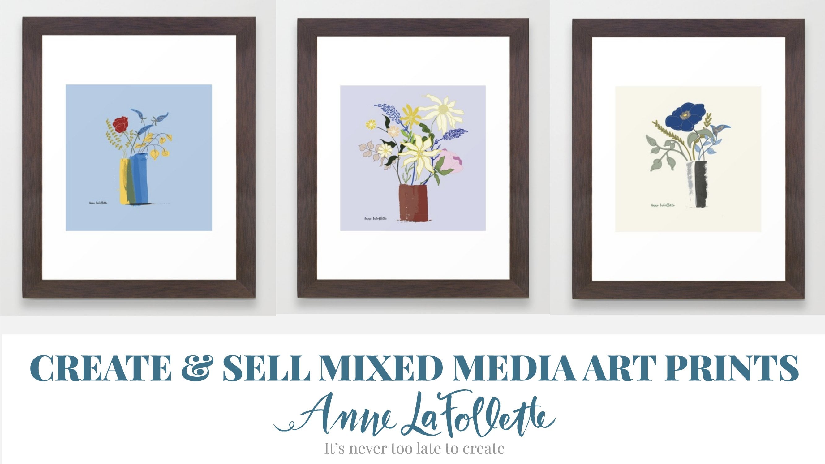
1. Introduction: Hello, everyone. I'm an low folate, a blogger, illustrator, teacher here on school share and watercolor artist. I sell my work both on spoon flour and on society. Six. I am super excited to talk to you today about my newest skills. Your class called watercolor florals. Three ways. In this class, we're going to paint some water color florals as well as leaf elements, were also going to sketch some vases or bottles, whichever you for we're going toe, scan everything into our computer, and then we're going to create three different pieces of artwork. From these. First will be a loose bouquet where we use as many of the elements that you painted as you'd like to create a beautiful lose. Okay, that could turn into a gorgeous mother's Day card. Then we're going toe pick one of the vases that you drew and create a still like arrangement from our motifs. And then finally, we will create a repeat pattern, using either all of the motifs you painted or just a selection of them, depending on what you think will look best. All you need for this class is some watercolor paints, some watercolor brushes. I have a tendency to use rounds, but you can use whatever you prefer. Watercolor paper. Most important thing is that it's £140 bomb. Wait a couple of paper towels and some clean water, and finally, Adobe Illustrator and Photo Shop, and you can get free trials of them at adobe dot com. I highly encourage you to paint in the style that you like best. Here's a different example where I used a much larger brush and did very loose laurels, using all of the same techniques to create this pretty little still life bouquet these air extremely popular as art prints on society. Six. I'm super excited to share these skills with you today in my watercolor florals. Three Ways Class so hit and roll and let's get started.
2. Materials & Class Project: hi there, and thank you so much for signing up for class. All you need in terms of materials are watercolors, and I use a set. A pan set that has 18 colors in it was really inexpensive. I bought it in my local art supply store. It's by a brand called Praying. Then use need several brushes. I like to use the number 12 which is a nice on average size. It's got a nice round tip, and then I sometimes we'll use a couple of smaller size brushes, a six or even a three for my more detailed areas. Then you need watercolor paper. And as I mentioned in the intro, the most important thing is that it's £140 weight. If you haven't used watercolor paper before, hot press is very smooth and cold. Press has a little bit more of a grainy texture to it, so either one will work. Then you just need some paper towels and some clean water. You can have either one or two George handy whatever you prefer. And then, if you don't own the adobe suite of applications, you should get yourself a pretrial because we'll both be using Photoshopped and mostly illustrator, but you need both. And then in terms of your class project, I would love to see your watercolor work So you can just do acute flat lay of some of the florals that you're doing or some of the leaf work that you're doing. I'd also love to see you upload some of the sketches that you do of either vases or bottles that will be using in this still life. And then once you've actually assembled your loose bouquet, I love to see an example of that. Or if you prefer to upload your still life Okay, that would be lovely to. And of course, I would love to see any pattern designs they create on when we get to that section of the class. So it's very straightforward. Upload your work as you go. I love to comment on students work and give you feedback and encouragement. Way are ready to jump into the next lesson. Let's get started and I'll see you there
3. Getting Started: welcome back as we start to get ourselves organized before we start painting. I like to zoom out for a few minutes and get myself organized and think through some key questions that relate specifically to the project at hand. In this case, what type of flowers will I paint? Do I wanna have tall and wispy flowers? Do I wanna have really chunky flowers? What might those look like then? I want to think about the additional elements that I need because in either the loose bouquet or in our still life, we're going to wanna have some leaf elements and potentially some taller, skinnier elements like eucalyptus leaves. When I'm working on this type of a project, I'll also ask myself, Is there a special vase that I'd like to use or a bottle or a particular shape that I think might be really pretty? Then I asked myself about scale when I'm going to be putting together both the loose bouquet and also my still life. Do I want it to be tall and skinny, or is it going to be sort of short and very, very filled in? I like to reflect a little bit about those questions before I get started. And those were important considerations when we do our pattern design as well. And then I also like to make sure I think a little bit about color. Um, I going to want to work in a range of pastels, or do I wanna work in a deeper range of colors? How many colors? Um, I actually going to use? Do I want to keep my palate fairly narrow, or do I want to have it be fairly broad? So again, these questions that you may want to consider before you jump right in our what type of flowers do you want to paint? What additional elements will you need to fill out your bouquet? Is there a special vase or bottle that you really love that you'd like to represent in this work? Have you thought about scale and what the different elements that will come together will look like? And then finally, what is going to be the overall color story that you'll be working with? Okay, enough about zooming out. Let's zoom in and let's start painting. I will see you in the next lesson. Bye. For now,
4. Painting & Sketching: So welcome back. We are going to jump into the painting and sketching part of this class. And what I'm going to start out by doing is just some little blue flowers. They're sort of reminiscent of bluebells. But as you for those of you know me, I whenever I'm doing watercolor work, I am quite loose. And I don't try to replicate what the flower really looks like in nature. It is much more sort of using my imagination and taking advantage of how watercolor works itself to create these little flowers. So I'm going to actually speed through some of my painting on this particular example, and I'll come back in just a minute now. Well, I go to four times speed. You'll see that I'm going to add some leaf elements, and I try to actually keep the particular elements. This is sort of a tip for you, Um, and it will help as we progress through the lessons. I try to actually keep my leaf elements separate so that they're not actually touching so that I'm going to be able to use the tools in both Photoshopped and an illustrator more effectively. So that's one little exercise. Now what I'm going to do is I'm going to do some little pretty to lips and again I'm starting out with just wet on dry and the tool of shapes are going to be reminiscent of tulips. But again, not necessarily completely accurate. I don't generally ah, sketch before I paint. I like the loose nature off on watercolor paints and the effects that I can get from just deciding to use my imagination. So I'm going to stop again here and on move, Teoh, Um, four times speed again and then I will be right back. So as I finish up my two little tulips on this particular painting, I will also add in some stems. And do you use a similar approach that I did for the prior exercise, which is that my stems will not completely touch the tulips so that when I actually move into photo shop and into illustrator, I'll be able to potentially detach them completely if I want Teoh or use them in a variety of different ways that will get into when we're actually doing the work on the computer. So I'm almost finished with this one, and I just want to show you one other sort of example. But the idea here really is for you to paint what you want and paint what you love. Paint the types of flowers that you love. You can absolutely sketch first if you would like to. So now what I'm going to do is several leaf shapes just by themselves, so that I can have some taller whisper your items to add to my loose floral bouquet as well as to my to my still life. And I'm going Teoh speed through the rest of this and show you one more thing before we actually move on to our vases. Something that you can consider when you're actually doing your own motifs is to think about whether you wanna have large flowers and small flowers or large and small and medium flowers, and how many different varieties of foliage that you'd like to have to kind of fill out your bouquet. It's completely up to you. And that's what is so fun about this particular exercise is use your imagination. Paint what you love. It will all come together absolutely beautifully when we're creating our actual artwork on the computer and So this is really a time for you to have toe have fun. So the next short snippet that's coming up here in just a second is actually me doing some so called Posey's with I don't actually know what they are. They're my imaginary flowers, but I'm using a huge brush. And so I just wanted to show you how much fun it is to vary the tools that you use. And in this particular example, this is a gigantic brush. And I'm just very, very loosely kind of creating a sense of a big flower that I showed you actually earlier in a still life that I could think came out really, really, really, really nicely. So I'll speed through the rest of this, and I will see you when we move into sketching are vases. So as I finish up this painting, I want to remind you that we still want toe do some sketches of of some vase shapes before we finish this particular lesson. So what I did was I found some pretty shapes around my house. So some of these are bottles. Some of them are actually vases that are kind of funky and shape. A couple of them are actually coffee cups or tea cups. And then in this series we have a couple of wine decanters that I tried to sketch. And then we also have some really pretty, very tall vases. One of these I actually used in one of the still life illustrations that I showed you in the intro video. And so take some time to sketch a variety of different shapes so that once we get into the still life portion of the class, you have a lot of options to choose from. So bye for now, I'll see you in the next lesson.
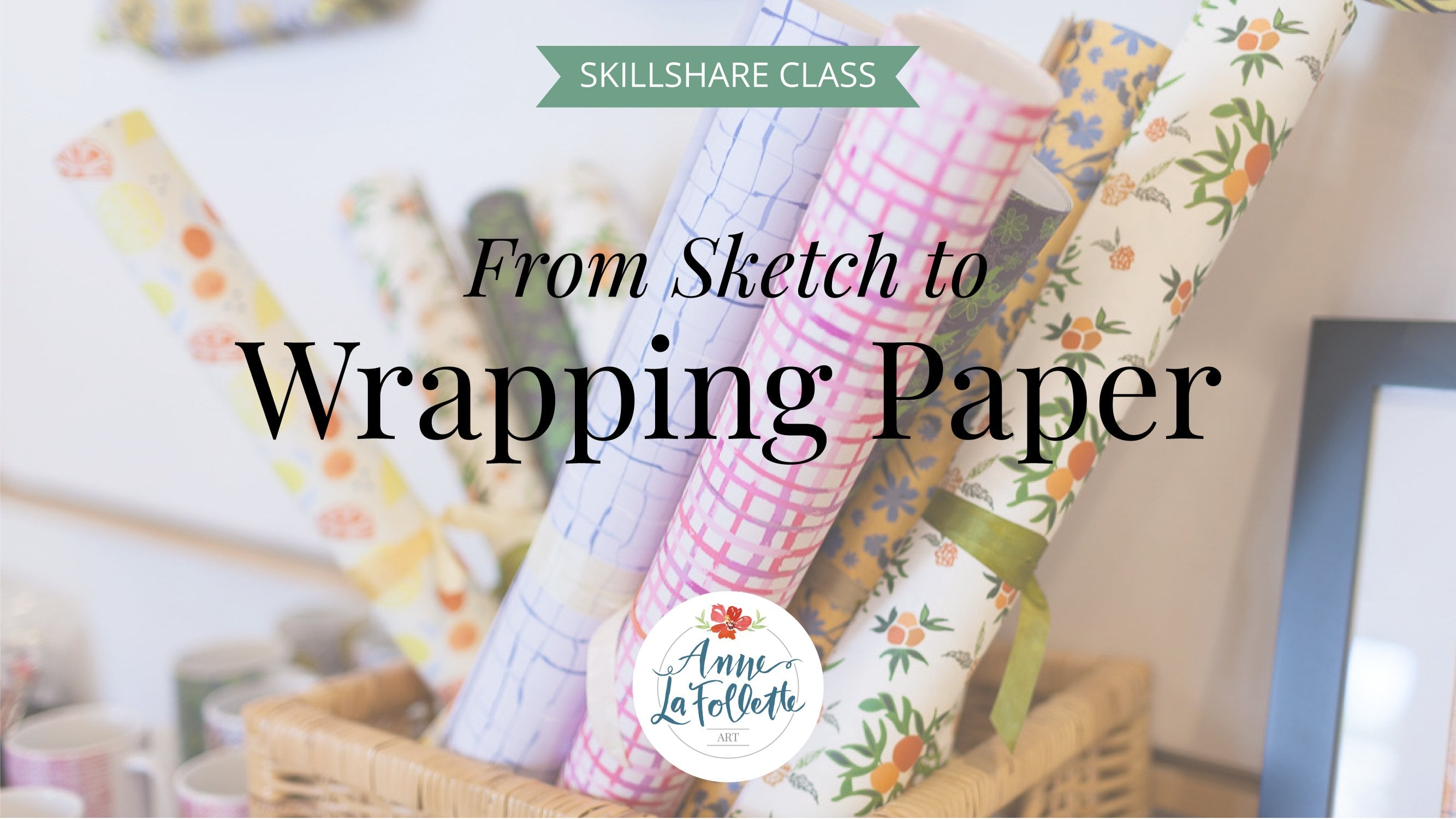
5. Adjustments in Photoshop: All right. So I am now in photo shop, and what I just wanted to say really quickly is I skipped both. I skipped the scanning part of this process because I covered it. I cover it extensively in two other classes that I have on skill share. And so I didn't want to repeat the material here. The fastest way for you to go and learn about scanning if you don't know how to do it or actually, how to bring in watercolor work or other work. Using your phone is to pop over to my class, called from sketch to wrapping paper, and I cover both of those methods in detail there. So you can pause this and pop over there, watch that video really quickly, and then come on back over. So I'm gonna move on, and I've imported one of my war color designs here, which is my two lost my red tulips. And this step in photo shop is not absolutely necessary. So I'm going to do it so that I can show you how to make some contrast and an adjustment, some contrast and brightness adjustments, but it's not really necessary. If you have enough contrast in your work to begin with, you can skip photo shop and go directly into illustrator. But I wanted to just take a couple of minutes to show you how it works. If you do feel like once you scanned your work that maybe some of these leaves are a little bit too light, light, light green and you'd like to give them some more contrast. So basically, you open your document in photo shop, and then what you want to do is you want to go to levels, which is over here in your adjustment panel. You don't want to make you just any adjustments up in your regular menu area, because these that would be you would be making destructive changes if you went and did them appear under image. So you want to do is go over here where you've got your adjustment levels and you want to click on levels, which is that insignia, and then these are we're going to move these nodes. The dark note. If we move to the right, is going to dark in the image and you can see that it's gonna dark in it. And then if we move the one that's on the far right, the white node. If we move that inwards, then it's gonna lighten, Um, are painting quite a bit. So I'm gonna leave the white one pretty much where it was to begin with. I wanted to maybe darken the leaves a little bit, but at the same time, you'll notice that ah, reds in the tulip itself start to get kind of blown out or certainly exaggerated. And I don't really like how that deep Red is becoming and I want to keep them or on this sort of the pinky red. So I'm going to leave that there for now. And then I we can always come back and double click on this layer. This'll level is insignia to make further adjustments. But I'm going to leave that where it is for now. And then what I want to do is now I want to go up to my adjustments level and go to this little son, which is for brightness and contrast, and see whether or not this will help me. If I move my brightness slightly, I might be able toe still maintain the darkness that I like in the leaves and yet maybe not Have the tulips themselves become too dark? It's pretty subtle. And you basically just have to go backwards and forwards using both the brightness and the contrast to see, find a place that you like and we know you're going to have probably several documents that you want to do this for. So one really cool trick is if you actually hold down the shift key and highlight both brightness and contrast and levels, you can actually copy these adjustments into your next document. I only opened one so I don't have another tab. But what you would do is you make sure that these were both highlighted. And then you come onto your document and click and drag into the next tab. And then these adjustments would automatically apply to your next piece of artwork, which is super cool, very, very un very handy. And then again, if you want to, since this is nondestructive changes, if you wanted to come in and make a further adjustment and decided, well, maybe I did make these red tulips a little bit too dark, I could come back into levels I could double click again And then I can play around again to see whether or not I confined happier medium. And then once you're happy with what you have, you basically just want toe merge down all your level layers together. And so you're going Teoh shift click to get all three of them together, and then just do merge layers so that you're down toe one layer and then we're just gonna save the document as a JPEG and bring it on over into illustrator to keep working. Um, I'm just gonna save it is a J peg. You want maximum quality and just hit. Okay. And we're done. So I will see you in the next video. Um, I'll see you there. Thanks so much. Bye for now.
6. Loose Bouquet: Hi there. Welcome back. So I am now in Illustrator of Opened illustrator on my computer, and I have already imported my floral motifs and I've already actually image traced them. And I want to let you know that if you need some refresher or if you haven't done any image tracing work before, please stop the video and pop over to my other class called from sketch to wrapping paper because I do a deep dive into image tracing in that class. And for those of you who have already who are familiar with it, I don't want to spend any time reviewing that here. It's not a very long lesson in my from sketch to wrapping paper class, so you can definitely pop right over there, watch it and then come right back. So now that I have all of my elements here on my desktop, I opened a file and my documents eyes just so that, you know, is 1500 pixels by 1500 pixels. I pick a square, usually because I do a lot of posting to instagram. But you can really pick any size that you want because now that we've finished image traced our floral motifs are watercolors. We can scale them infinitely now that they are actually vectors. So what I'm going to do now is I am going to start pulling these before I actually start pulling my loose bouquet together. I like to do a couple of clean up things on my desktop that I just wanted to show you really quickly. There are a couple of tips that just help me sort of stay organized that I wanted to share with you. When you open a new document in Illustrator, it automatically gives you some default colors here, over in your swatches panel. And if your swatches panel isn't open, you can get it by going to window and then scrolling all the way down to swatches and clicking on swatches. But what I like to do is I like to get rid of those default colors. So just so long as nothing on my art board has been selected, I can go over here and click on the red color, hold my shift key and click on the last caller on this last row and drag and drop these into the trash and then to make the red go away. I just clicked back on white. So what I have also done is I have saved all of these colors that I used when I created these watercolors, and I saved them as actually their own swatch. And I'm gonna go find them now by basically going to open Swatch library user to find. And I'm pretty sure that I call these my loose bouquet colors. And so if I go and find those now and then bring them into you just they come up in this whole pop up box and you just click on the folder itself, and then you can close that, and they're now over here. So that means that I can if I wanted to do any recovering, I have all of the colors available to me here. And frankly, the only reason that I actually put them up here is because with my loose bouquet, I may want to turn it into a Mother's Day card or um, or a card for another occasion. And I will want to definitely use one of these colors for the greeting on the card. So that's just sort of ah fun fact to know in a trick or tip that I wanted to share with you. So at this point, I'm going to start to drag and drop my flora moot motifs kind of randomly in the center of my art board in a manner that I think is going to be really pretty. And this is a lot of fun and is definitely going to look different, depending on what type of flowers you actually created. Um, but it's a lot of fun because now that these each one of these elements has been vector rised and it's in its own group, and I show you how to do all of that in my from sketch to wrapping paper lesson on image tracing the you can move them around and you're not leaving any little bits of watercolor behind. And you can now assemble something that looks really played pretty in the center of your art, bored with all of your different elements. And so I have actually mentioned this in one of my other classes as well. It's very hard for me to I'm going to get a little vulnerable with you here. It's really hard for me to actually design while I'm teaching. And so I am. I never think that what I actually designed while I'm talking turns out very nicely. And I think it's because I just I can't multitask. I kind of need to focus on what it is that I'm doing and I can't talk at the same time. But the idea here is you want to create something that, um that has I'm going to stop right here for the moment. You want to create something that has nice balance to it. You want to have some elements that are more wispy, like these lavender elements. And you also want to, um, to ensure that there's for in my vay from a design perspective and a designer and illustrators perspective, I like to have something that sort of for this loose element I want to or for this loose piece of art. I want it to still have a sense of sort of roundness and and yet it needs to feel like it's cohesive. So I'm going to play around with it a little bit more, and I'm going to stop talking, so I haven't gone anywhere. I'm just going to stop talking so that I can do a better job of actually pulling it together in a way that I think will be pretty. - So I think this is already looking better. And one thing I do want to point out is that if the stems of the flowers air coming above these other floral elements, all you need to do is once when the item that you want to sort of move backwards is highlighted, just go upto object, arrange and then send it to the back so that it will be behind the larger flower that's in the foreground. And so I think this looks nice. It's it's a little it does have a tightness to it that I think is nice. I might even bring one of thes and even a little bit closer and what I was mentioning. Waas if you want to use this actually for a ah floral element on a card, a greeting card, for example, you can group it all together and and then what I normally do is I just create a, um, background square so that I can make sure that I am, um, going to be able to center it. And so, by default, my background square. It is white. I'm gonna go up to object, arrange sent back so that it goes behind my floral illustration. I group this all together so that now what I can do is I can click on my grouped items as well as holding the shift key as well as my square and then click on my square again and then appear Aiken, center it horizontally, and then I can also center it vertically. And then if I click away and do command negative sign to go out a little bit, I can then see that it looks like it's coming together and it's it's very nicely center. And then what I would do is I would just go up to my my text, and I would type in, for example, happy Mother's Day. And I'm going to highlight that. And I am a big fan of Teela Cunningham's, and she's another teacher on skill share and also has free tutorials that she publishes almost every Tuesday should totally check her out. Her name is Taylor Cunningham, and her website and her to tear tutorials come out under every hyphen Tuesday dot com, And so I have purchased a couple of her really, really beautiful, hand drawn fonts. And so this is one that is called Miss Magnolia that I purchased from her. And so I can I think it's really pretty. And so I'm going to make this a really nice big size that might be a little bit too big, but I can also center it by highlighting it and then clicking on holding the shift key, clicking on my square and then clicking again near my square and making sure that that's actually centered. And then, as I was describing before, I want to make sure that this is actually going to be cohesive with my overall design. So I think I'm gonna pick one of these colors, one of these sort of darker purples, and I have the wrong thing highlighted. So I'm gonna do Command Z to go backwards. And then I'd highlighted my square instead of just Mother's Day, and then I can go over there and I can turn it into a color. And then here we have a really, really pretty sort of square card that you could use for Mother's Day. So that's how I go. Go about putting together a loose bouquet without a vase or anything like that. And what we're going to do in the next lesson is we're going to use some of these same elements. And in fact, you know what I will do Just to change things up a little bit. I'm going to use the elements that we actually adjusted in photo shop, my tool up and my bluebells. I'm gonna actually use those elements to create my still life using one of the vases that I sketched. So I will walk you through and show you how to do that step by step in the next lesson, I look forward to seeing you there. Bye for now.
7. Still Life: Hi there. In this lesson, we're going to continue and make a little still life illustration using some of the watercolor elements that we did some a color adjustments to in photo shop. And so what I wanted to start out by doing here is, as I mentioned before, I always like to do a little bit of cleanup on my actual art board before I get started so that I get rid of stuff I know I'm not gonna want. And so I just did the same thing I did in the prior video where I got rid of all of the default colors over here in my swatches panel. And then what I want to do is I want to highlight all of my motifs. Actually, I'm gonna move my cute little this little guy over. Um, I want to highlight all of my motifs, and I want to capture those colors. And so I'm going to call this still life colors. And I've saved them now, or I'm going to save them there, over here. But in order to save them permanently, I'm going to go to these bars and click on them and go to the drop down menu all the way to the bottom, where it's a safe Swatch library as Ai and I'm going to call this on still life, who's still life with tulips that will help me remember that there's some red and them and then I'm just gonna save it. So it's now permanently in my swatches library. So if I open up a new document and I want to capture these colors and reuse them for another project, they're in there for me. So I love doing that. And I do that with almost every project that I work on with my watercolors because I want to capture the on the variation and color that actually have here and the pop of Red, which I think is going to be really pretty. So what I also did on before I turned the camera back on is that I imported my documents with all of my sketches and I image traced it. And then I sort of decided, Well, which one of these is going toe work the best with these kind of tall, skinny flowers? And so I decided that what I would do is actually use the this little sort of. It looks a little bit like a bucket, and it actually is a, um it's actually in my house. It's a little pot that I actually haven't orchid in. But I thought it would be really pretty to sort of use in this context. And what I want to do first is I want to zoom way in on it and decide whether or not I want to make any further sort of adjustments to it based on how I sketched it. Um, I mean, I did not. It's not an exact sketch. And so I think I like the fact that it's kind of wonky, and I think that that is totally gonna work for my purposes. But at this point, you absolutely could do some adjustments to it if you wanted to either reshape it a little bit or change some of the contours. I'm not exactly sure what color I'm going to want Teoh to color it in, and so I'm gonna actually leave that for later so that I don't take up too much of your time playing with color. I do spend quite a bit of time on color on two of my other classes, Um, the class of mentioned before, which is from sketch to wrapping paper. I talk about color quite a bit in that class, and then I also have a mixed media class, and that class is called create beautiful floral bouquets and sell them on society six. And I do have a deep diving color on that one as well. So please feel free to go and watch those components and and then you can come right back, or you can watch them at another time. So for now, I basically want to go zoom all the way out. What I like to do when I have extra assets on my board this is another sort of little tip for you is I like to go into my layers panel and create a new layer, and then I double click on that layer, and I call it unused elements. And then what I do is I grab all of the elements that I don't think I'm gonna use right now , but I don't want to get rid of them because I might change my mind. And I might decide that one of these other shapes is gonna work better, but I click. I grab them all by just clicking and dragging, and then you can see that they're highlighted over here with this little blue box, I just click and drag that up to the unused layer. And then I hide it by clicking on the visibility. And that way I know that they're there in case I want to change my mind. But I'm only gonna work on this first layer and they're now hiding. So that's a trick I love to use and wanted to make sure that I shared it with you. So what I'm going to do now is I'm going to quickly play around with pulling my flowers actually into this bucket. And there are a couple of things on once up, sort of played around with placement that I want to talk to you about to try to make it look a little bit more realistic. And one of those element one of those items is making sure that all of our stems actually go inside this pot as opposed to sort of. We certainly don't want them floating outside. And because the pot is somewhat open, we don't actually want them all the way in the back, either. So let me keep playing a little bit with my arrangement and see if I can find something that I think looks pretty And, um, as I mentioned before, it's really hard for me to actually work and talk at the same time. So I'm, like, so impressed by the other sculpted scare teachers like Dylan Mierzwinski or Peggy Dean, who many of you probably know because they can work and talk at the same time. And I think that that is a really talent. Um, so this is definitely looking like a loose but pretty still life illustration. I think it's really sweet. I like it. I like the fact that the elements air sort of in front and in back of each other. So what I'm going to do now is I'm just going to stop for now. Some of these flowers I might want to re arrange to, because this little this beautiful blue, I might want to have it be more coming towards the front. Um, let's see if I do object, arrange, bring to front. Let's see how much of the tulips it hides. So actually, I think It's really pretty coming in front of the tulip there. But here I might want this tool up to be. I don't want them to be in a line with one another, because I don't think that that is very pretty. But that's kind of nice, because then we have a little bit of the greenery Kermit coming in front of the in front of that pretty tulip. So what I want to dio now is I'm going to group my floral elements for now so that I can kind of manage them as a group. And so I just highlight all of them a Duke Manji to group them. And then what I need to do is I need to do a little bit of manipulation of this, um, of this pot. If we actually zoom in closer so we can see better. What's happening? Um, basically, basically, it's actually not too bad right now because this is the only This is the only small stem that actually is not going inside the inside the pot. I definitely want to have all of these stems in front off the back of the pot, and these ones are supposedly going down into the water. So let's spell figure out how we want to colorize this popped. I've highlighted it. I'm going to go over to my left hand panel and I'm going to click on the sheep builder tool . If you click on the shape builder tool your life bucket. You're live paint bucket tools below it. And then I'm going to pick. Um, I think I want something That's kind of Toby. So I'm gonna click over here to pick one of these colors, and then I now have three different ones to choose from so I could start out with something that looks like this. Maybe I want to have this be a little bit of the of the, um this area over here is a little bit of shading. And so I want to make that actually a little bit darker. Don't want to make that darker. So I'm going to stick with the same color to do the rim up here and in fact, this side And then I think that for now, for purposes of just not spending too much time on this, I'm going to, um, click away from the pot and hit V like Victor on my keyboard, and you can see that I need to expand this because it has thes very detailed squares all the way around it. And so what we've done is by using the life paint bucket, we've created an effect on top of my pot. And I want Teoh. I have to expand that. And so I'm just gonna go toe object, expand and then hit. Okay, so that that is no longer an effect. And, um and now I'm going to zoom back out by doing command zero so I can go all the way back out to my art board to see what that looks like. And I think it's really sweet. I might want to change the colors on this. I might either want to deepen them a little bit, or I might want to do more rearranging. But for now, what I'm going to do is group the entire still life, and I'm going Teoh, add a background color. So I'm going to add a big box all the way in the back. So I clicked on the rectangle tool and then just drag and drop all the way over my art board. I'm gonna go object, transforms, send back. And I definitely don't want to use that kind of money color. I want to use something that's just a very, very slight off off white, and I can play with the different options that I have here. I think that actually something that's very, very, very light is going to be pretty. So it's barely there. But you still feel like you're getting a little bit more dimensionality. And it's not just on a white background, and I think that that's really pretty. Uhm, I'm going to zoom out a little bit more so that I can get another perspective on this piece . I'm going toe, actually lock the background temporarily. So, um, that I can increase the size of my still life and Soto lock the background. You just do command, too. And now I congrats my still life. And by holding down both the option and the shift key and dragging on one of the corners, Aiken size it up. I don't want to make it too big, but I definitely want to make it a little bit bigger. And now what I'm gonna do is go to object, unlock to get my bounding box active again and I'm going to click on Hold the shift key and click on my bouquet My still life I'm gonna click again on the outside box and so I'll be able to now center my still life in the center off my page by clicking up here on the horizontal line and then also on the vertical line to make sure that it's in the right place. And I think that the background color is still a little bit too intense. And so what I'm gonna do is I like the color. Actually, I like that. It's a little bit sort of greeny brown, but I'm gonna go up to opacity and I'm gonna toggle my capacity down to about 50% and that will make it a little bit more subtle. And then what I do because I sell my art prints on Society six and I teach you how to do that in the class, I mentioned the create beautiful Flora bull case and sell them on Society six as our prints . What I do is I like to sign my work because I definitely want people to know that these are my creations. And, um, and as I mentioned before, I love Tina Cunningham, Teela Cunningham, who does every Tuesday dot com. And so I have purchased a couple of her different beautiful fonts. And so I sign it, using her Miss Magnolia found. And then I'm going to want to pick one of the colors that's in here for my signature so that it's not black. I want to definitely have it be working with the overall design. And so I'm probably gonna click on something that's sort of a darkish blue that I think is really pretty. And there we have are still life. I think it came out really, really pretty. It's adorable, and I'm super excited. I can't wait to see yours. So please don't forget to post yours in the project area. I can't wait to see them. Um, and I will see you in the next video where we will build a pattern together. All right. Bye for now. I'll see you in the next lesson.
8. Pattern: all right, we are back for the last piece of artwork that we're gonna create together in this class. This is actually going to be all about pattern design and creating a pretty pattern from some of the floral motifs that we created in watercolor at the beginning of the class. So I am already in Illustrator, and I've opened up a new document and my default sizes 1500 by 1500 pixels. And I have my motifs here from earlier today. And so what I like to do when I'm putting together a pattern is I like to create a smaller box inside my 1500 by 1500 box. So I just did em on my keyboard to get the rectangle tool, and then I click on top of my screen and I'm just gonna make actually this smaller dimension. So I'm gonna do 7 50 by 7 50 and, um and then I'm gonna click V on my keyboard to de select that object. And the reason that I'm doing this is I'm actually going Teoh initially pick just a very, very pale color for the background, um, off our pattern and we can definitely change that later. So I'm just gonna pick something very, very light These air, the colors that again I saved in my swatch library. Um and I called them loose the I think I call them skill share loose flowers lesson so that I could remember. But I'm gonna pick something pretty. This is sort of a peachy color. I might even change the opacity a bit so that for right now it's super super pale. And then what I like to do is I like toe lock this background in place because I don't want it to move around as I'm building my pattern. So all we need to do is we need to make sure that we're remembering the dimensions. And so I picked something that's easy to remember. It's 7 50 by 7 50 Because as we start to creator pattern, we're gonna need to replicate anything that touches across the top. We're gonna need toe copy that to the bottom, so we'll be moving at 750 pixels and then anything that we have that touches the left hand side, we're gonna want to duplicate over on the right. So let me lock it down by doing command to. And then what I do is I just start to place my elements actually on the board. One thing that that you may run into is you want to make sure that this is actually gonna be all the way in the back of your work. And so I'm gonna send us to the back before I lock it so that as I pull elements on top of it, they are now they're actually on top. So the way I like to build my patterns that everybody is different. And another incredible teacher here on skill share, who's just a master at that pattern design is Bonnie Christine. And but one of the tips and tricks that she taught me early on was that she likes to build her patterns. Or actually, I don't know if she does this anymore. So this is now more the way I build patterns. But I like to build. I like to be very cognizant of what I'm putting across the top and what I'm putting across the bottom the side so that I can duplicate those. And once those air duplicated, I can then fill in the middle sort of any way I want and I'm not gonna have any issue in terms of creating the perfect repeat. So what I'm gonna do right now is just bring some of my my motifs over and start to create something that I think might be pretty. What I did when I was off camera is I created these little sprigs of my lavender and I group them together so that I can move them as one object. And in a couple of instances, I actually grouped them with a flower as well, which I think is really pretty and then also makes it look like they're actually a little bit different. So I'm going to continue to place some elements both across the top and across the side. And then what we're going to do together is on, and I'll fill in the mill later, But we're going to want to, um, make sure that we're replicating anything that crosses the top onto the bottom and anything that crosses on one side over to the other. Which is why I'm leaving the bottom and the right hand side blank. So now what I'm going to do is I'm gonna grab these two elements that cross across the top . I'm going to right click and go to transform move. And then, since we're moving them vertically, I'm gonna input zero for horizontal and then 7 50 which was my dimension vertically. And then I'm going to hit copy because I want to keep them on top and I want to duplicate them on the bottom. Then what I'm going to do is the same thing along the left hand edge, right click, transform, move, and now sins removing them horizontally. I'm going to actually enter 7 50 on the horizontal line, changed my vertical to zero and then again copy it so that they move over. And now what I'm going to do is fill in the center with a few more of my elements. And then what we are going to do is test the pattern because we want to make sure that we haven't made any mistakes where things might be overlapping where we don't want them to be . And one of the things that I'm not being super careful about but would be a n'importe tip for you as you're learning more about pattern designer as you're playing with your own pattern is when you're in the fabric industry. It's great to have tossed patterns, meaning that everything is not going in the same direction. And so when someone is actually using it to so something, they don't have to worry about ensuring that the orientation is exactly going in the same direction every time. And, um and so that's important to know. And I thought that you guys would like to know that. So for now, I'm going to actually leave these additional sprigs. I'm off to the side. I may want to fill them in later, but let's test the pattern and see whether or not we're a to least getting it tow line up properly and see where we might feel like the distribution needs to change a little bit. Actually, before I do that, I am going. Teoh show you once you have things that cross the top of the bottom. If you select them together, you can then move them as a piece and re orient them or move them just so long as you're doing both of them together. Um, and so I think that actually has a little bit of a nicer distribution. I'm going to fill in a couple of these little places. What I like to do also is, um is make sure that I am reflecting and reorienting some of my elements to make sure that they don't look like they're exactly the same. So, for example, this this flower in this flower identical. But I've oriented them differently, and so they look a little bit different. Um, these look like there might be in too much of a line, and so I'm actually going to move this one up and I'm going to duplicate this one down here , and then I'm gonna rotate it a little bit, so it looks different. And I think this actually is kind of sweet together, so we'll see if that looks OK once we duplicate. Once we create the first version of the pattern and I think these little flowers or super suites, I'm gonna move some of them and add them and in a couple of different places. And the way that I'm copying them is when they're highlighted. I'm just holding option key down until I see two little arrows and then I can drag and drop it to duplicate it into a new location on my pattern. So, like I did in the lesson before, I'm gonna go to my layers panel and I'm going to create a new layer, and I'm going to double click it and call and call it unused elements. And then I'm going to zoom out again so that I can see these guys I'm going to grab, um, and then I'm gonna hold on to this blue rectangle and or square and move it up, and then I'm gonna hide him, and that's not necessary when we're testing the pattern out. But I just like to do it cause it's distracting. So I want to make sure that I have duplicated everything that crossed the top, just perfect of duplicated everything that crossed along the left hand side. If by chance you added an element and it crossed on the right, you can absolutely move it over, and you could do the same for the bottom. I just find it easier to keep myself organized. If I tried to leave these two sides completely blank until up copied over the elements that crossed along the top and along the left hand side But as you build more patterns, you will find your own ways of doing this, that work best for you. And that's actually part of the fun off the building patterns. You'll get into a groove that you absolutely love. That is different. So I need to unlock my background layers. So I'm going to go upto object and unlock all. And so now, the third important step in the pattern building repertoire is we need to make a copy of this bounding box and send it all the way to the back. So I'm going to do command, see and then command be like boy. So it goes all the way to the back. And then the last incredibly important part of pattern making is you need to ensure that there's no stroke and no Phil over here. Both of these boxes have to have the red X through there, the red mark through them. Now I can click on every click and drag on everything that's on my art board and drag it over into my swatches panel, and then I can move everything over to the side. I might make want to make some adjustments, which is why I'm not deleting this yet. Um, I'm moving it off to the side. It's just faster for me to make adjustments if we find that there's something that we want to adjust. And so I hit em on my keyboard and I just create another big square over here can. Then I select my pattern, the pattern that I dropped in, and we can take a look at it. So one way to test your patterns that's really helpful is to make sure that you scale them so that you can look at them from further away and also smaller, just to see whether or not you're getting any repetition that might not be that pleasing. I actually have to patterns in my swatches panel. I have the original pattern that I made that I showed you guys when we did the introductory video for the class, and I think it's also on the cover image for the class. And then this is the one that I have now just replicated, and it has a different background colors you can tell, but let me show you how to scale it to see whether or not we feel like at first glance, thes three flowers are in a kind of in a row. I might not like that. Not sure. So once your pattern is actually selected so you can tell that on the square is highlighted , right, click and go to transform scale and then make sure that you unclip transform objects and then hit the preview button and then go back up here to uniform and you can enter a value. Or you can just use your mouths and slide to the left to create scale your image to make your pattern smaller. So I'm going to continue, go down maybe to about 50% and then I'm gonna hit okay just so that I can take a look at it and, um, and see if I like what that looks like. And I have I probably would play around with it some or I mean, I think it's very pretty. I think I would play around with it some more because it feels like there's a little bit to sort of a linear sense happening with these elements. My sprigs are creating kind of a little bit of a line here, and then this is also creating a little bit of a horizontal line. And so, um, if I were to come back over here and I want to make some adjustments, what I would probably dio is, I would I would I'm going to delete thes two flowers from the right hand side because I want to move these two flowers down so that they're no longer in a line with those. I want to kind of move. Um, maybe somewhat to the center, um, off because I don't want to create I don't want to get them to be too close to this one either. And one thing that you absolutely can do with your patterns as they can, elements can overlap with one another. That could be really pretty. My initial take on this was that all of the elements did not touch, but it could be very sweet to have some of them actually on top of each other. So because I move those, I clicked on both of them and move them together. I know that they're still spaced appropriately, so I haven't missed anything up in my pattern by doing that. Now what I want to do is I'm going to click, unlike background and lock it again by doing command too. And now I think what I want to do is figure out a way to make sure that this doesn't look like it's too much of, um, having all of these in a row so I can move any of these around inside my box. And I will just have to duplicate them if I cross over anywhere. So I'm gonna move that guy. I think, um, this is actually the really fun part. I totally love playing with these patterns and making a variety of different versions of them, and and I can totally get lost and do this for all of very, very long time. So I want to be cognizant that you guys air, actually, listen to me. I don't want to take too much of your time. This is so much fun. Though I have to say, this is like the most fun part of patent building is playing around with your motifs and figuring out OK, how do I make this look really pleasing? And, um, how do I make sure that that the repeat is somewhat hidden, so it's not super super obvious how the how it was built and all of that takes a lot of practice and a lot of it orations, which I actually, I totally enjoy doing. So what I'm going to do is I'm gonna take a little bit of a flyer here and bring this guy back over here, and then I'm going to transform, move and put in 7 50 cause I'm moving in more Izon Tole zero vertically. And then I'm gonna copy him over and And then what I want to do is pick some of my small flowers and fill them in a little bit more. It might also be fun to have one of these flowers be a little bit smaller and some holding down both the option key and the shift key so that I'm making it smaller and scaling it proportionately. And then I'm just gonna flip him around a little bit so he doesn't look exactly identical to how he was placed prior. And then these guys were really sweet, too, And, um and then I think what I want to do is duplicate one of these flowers, have highlighted it, and I'm holding down the option key until I get those two arrows and then I'm just gonna bring it down here into the center. But I'm gonna make him a lot smaller, and I'm gonna then orient him over like this so that he looks different. And then I'm gonna move him over here, and I'm going to duplicate one and move him over here. And, um, that might create a little bit off different interest. All right, so I'm going to test it again. So I think that I want to check that everything is unlocked. So I go to object, unlock all. And then, since we've already done the copy of this bounding box and put it in the back, we don't have to do that again. We can hopes before I do that. I already noticed that I forgot to do something. I had deleted both of the elements over here because I knew I was going to be playing around with my elements. But I forgot to read duplicate this little flower, and so it's missing over here, and that would show up on my pattern, actually. What? I just show you what that would look like because that's a good thing for you to know to look out for, So I'm going, Teoh, assume that everything is perfect. I'm gonna click and drag on the entire pattern, and I'm going to drag it over into my swatches panel. And now, with this one still in place, I'm going to It's kind of fun to look at the one you had originally, and now click on your new one on and see how everything moves and see, um, see, kind of what happened with all of the different movement that you made, so it might be a little bit hard for you to see, but I want to show you where the error is in the pattern because I didn't duplicate that small flower. And so if you go in right here, you can see that this element got cut off and that's because I forgot to duplicate it. It would be a lot more dramatic if I'd done that with one of the huge flowers. And, um and so So the good news is I didn't make the mistake with a giant flower. Makes it a little bit more difficult for you to see. But that basically is. I can tell right down here that as we look at how this flower is duplicating that half of it or a portion of it is is actually missing. And so what that means is I need to go back to, um I bet you to go back over here, just click on it, go to transform and move, and I want to move it horizontally by 7 50 And this needs to be zero, and then I'll click on distance and hit Copy. And now there it is. And that was the only mistake that I saw in the pattern. So I just click over the entire thing and drag it back over to on my swatches panel. And then now what we should be able to see is on is watch right here when I click on the new updated pattern and you should see that flower isn't cool. So that flower just became whole again. So here it is, were part of it is missing. And then now we fixed it. And so boom, it pops up and you can see it. So what I always do is I get rid of the patterns that I don't like, so that I don't have too many of them. Actually, in my, um I don't want to have the ones that I don't want to keep in life swatches panel, and so I just drive them into the trash. So this is the one that we made together right now and then This is actually the original pattern that I had on the cover image for the class. So there you have it. That is how to make a pattern using some of the elements from your loose bouquet. And I'm gonna, um so much look forward to seeing the versions of these that you dio. Please don't forget to put them into the class project. I'm absolutely in there. I'm happy to answer anyone's questions, and I will do a quick wrap up in the next video. I have a couple of other last minute tips for you as well as, ah, few more pieces of advice which I would love to share with you. So I will see you in that Thank you video in just a second. So bye for now and I'll see you there
9. Final Thoughts & Next Steps: thank you so much for taking this class with me. I hope that you enjoyed it as much as I did. We created pretty loose bouquets and still lives together as well as a pattern. I have several other classes here on skill share that I would love for you to check out. One is called Create Awesome Videos for Social Media and, as you know, videos air everywhere. So this class has become very popular. It's a great way to learn how to do beautiful videos for social media and also to use on your website. My most popular class on skill share is called from sketch to wrapping paper. We start with sketches, create patterns from them and then we send it off to get our own wrapping paper made. The feeling of getting your own wrapping paper delivered to your house is really amazing. I also have a class called create beautiful art prints. It's actually a mixed media class, and this is the class that I mentioned where I teach you how to set yourself up on society six so that you can start selling your own art prints. And then finally, I have a beginning watercolor class. So if anything in today's watercolor lessons felt a little bit advanced, Please check my beginner class out where we go through washes and color and very basic techniques with wet on dry and wet on wet. If you enjoyed this class, I would really appreciate you giving it a thumbs up. And if you would take a minute to leave a couple of comments, it's really, really helpful to get some positive testimonials. Please follow me on Instagram my handle is at and the fallen art. And also I'd love for you to join my email list for weekly art inspiration, free tutorials and access toe workshops and monthly freebies. You can join it by going to my website and low fallen art dot com ford slash join. Also, I'd like to personally invite you to join my private Facebook group and art club. I'm live in the group every Wednesday, and it's an amazing, supportive and encouraging community. I would love to see you there. Thank you again So much for taking this class. And I hope to see you in another one real soon. Bye For now
 Anne LaFollette, Surface Pattern Designer & Coach