Transcripts
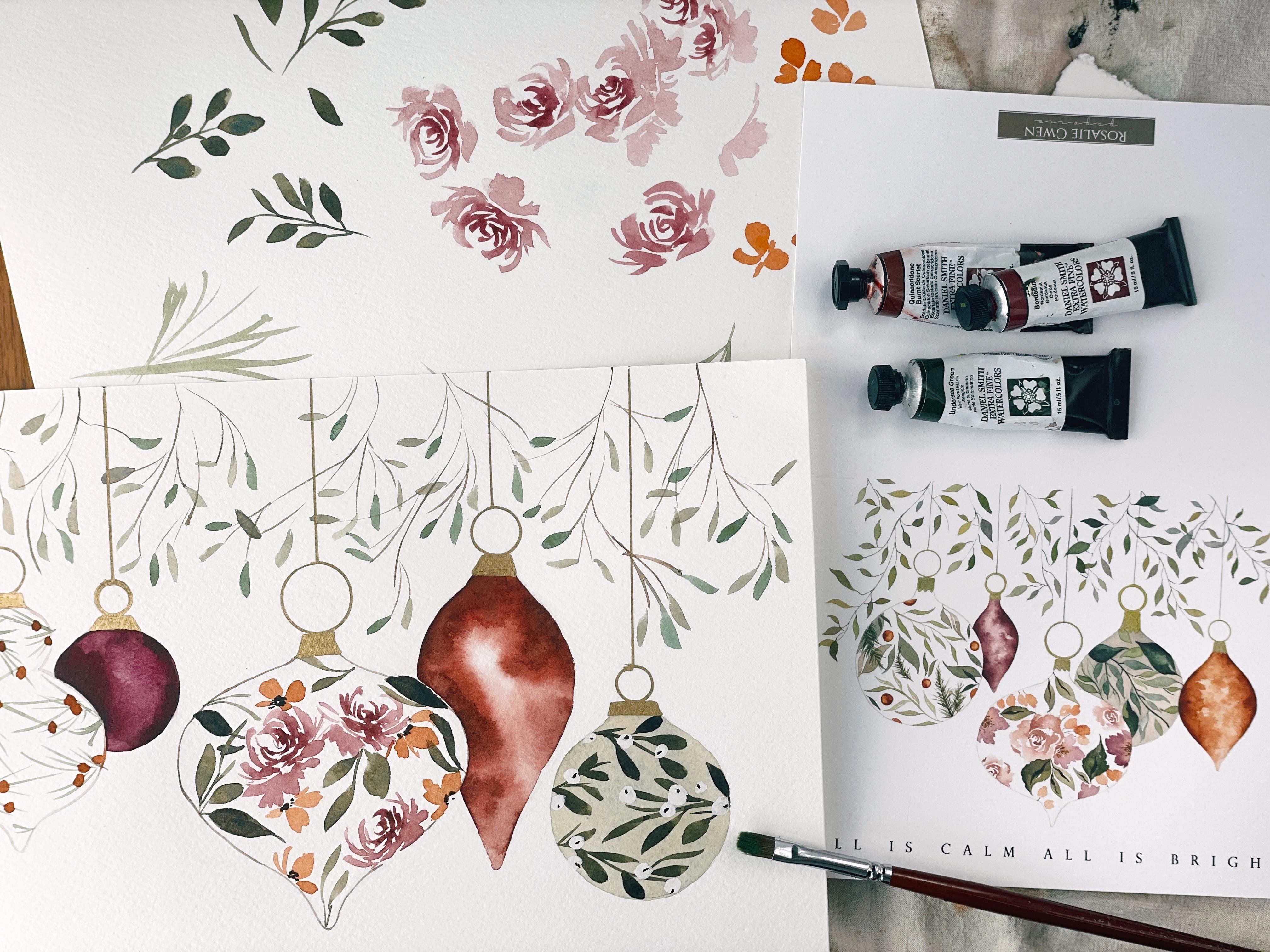
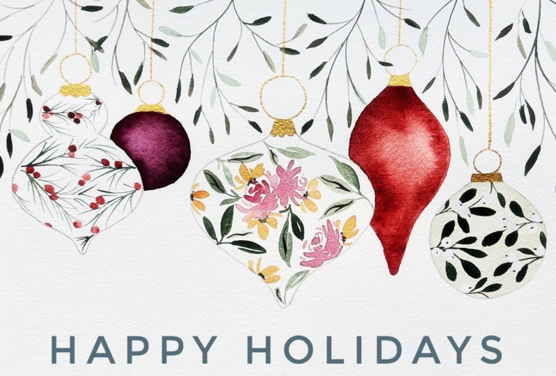
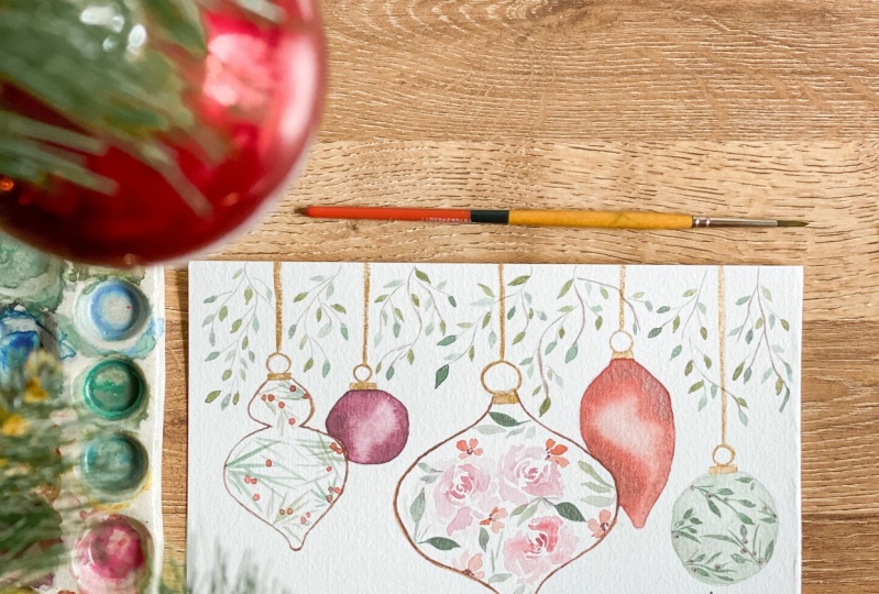
1. Introduction: Well, hello and welcome back to class holiday edition. I am so glad to have you here today. We have an incredibly fun and educational and beautiful class to learn today. So if you've been following me on Instagram, you may have seen these little darlings that I created back in 2017. This was for a Christmas card that I created and then launched for my subscribers and followers and stirred up quite a bit of enthusiasm and excitement and continues to be a favorite even five years after the fact. So I thought it would be super fun to show you how I created some of the elements in these ornaments and just give you the education and tips and techniques to create your own ornaments. Whether you would like to use them for a handmade card or if you want to scan the design once it's finished and, and turn it into something you can reproduce, that's completely up to you. So that's what we're going to be covering today. It's going to be so much fun. We're going to cover all the things that we need to know and all the colors and all that jazz in the following supplies video. So make sure you do watch that because I'm going to cover more details about the sketch that we're going to be using. And just cover that in great detail so that you're all set to, you know, have as much success as possible. All right, Let's get to it.
2. Supplies: So for our supply list, there's nothing new here. We're going to be using the same supplies that we've used in previous classes. I do recommend if you are a new, new beginner painter that you take some of my previous classes before attempting this one, only because we are not going to be necessarily re-learning the elements. We will be practicing them and just sort of refreshing our muscle memory. But we're not going to actually learn the stroke by stroke techniques. So you may want to take like my loose florals elements class would be a great one to get yourself all setup. So as far as our supplies, it's going to be the same materials that we've used before. We're going to be using a variety of Daniel Smith. I'm going to be using a couple of my merry blue, Winsor and Newton and Sennelier. So if you have, as long as you have artist, brand and quality paints, which would cover Winsor and Newton, Daniel Smith's earlier. What other brands? Those are really the only ones that I typically use my merry blew in my work. So I definitely recommend having at least an artist grade paint colors. I'm going to be using a variety of colors. I'll list them in the class so that you know what we're going to be using a head of time. But it's possible you may not have all of these. And so I wanted to give you like some options as far as like mixing. So for example, I'm going to be using my merry blew pyrrole, orange, which is kind of an uncommon color. So as long as you have a red and a yellow could be like a cadmium free red or a ruse, anything along those lines and you mix it with say, a yellow ocher or a new gamboge or even Naples yellow. That's going to produce something of the same quality and color. So don't fret. If you do not have the exact same paints, we will make it work. In addition to that, I'll be using Bordeaux, quinacridone, burnt Scarlett, purple Helios, undersea green, cadmium, red, and rose matter, just to name a few. I do kinda like to mix as I go along and see what other colors might be necessary to the class. And although I've done a little bit of prep work here, I really do love to kind of wing it when it comes to this kind of thing. Embrace that in the moment painting process. So I'll be sure to list the colors and you can make sure that you have something that's going to produce like a similar effect. Pinks, a purple. Definitely want to suburbia in there. Nice brown because we're going to be mixing that with our pinks to get something kind of earthy and moody like we have here and here. Other than that, I'm going to want you to have a gold pen of some sort, does not have to be this exact pen, but this is a Sharpie, oil-based paint pen. And we'll be using that to embellish our ornament caps and possibly the string on which they hang. Please have a variety of brushes. I would prefer you have size sixes or fours just because they are they have smaller tips. Toe at the toe of the brush and the belly of the brush is going to be slimmer and enable us to do the really fine detail work that we see in a lot of these ornaments. I like to have at least three, maybe even five brushes because we're going to be loading them with different consistencies and want to be able to move quickly while the media is wet and not have to stop in. We're in suppression and load it all over again. Obviously a paint palette. I'm using my trusty old salad plate. A water glass, Obviously, I do not use to water glasses, but you could use one for your warm colors, your pinks and yellows and oranges. And one for your cool colors, your blues and greens, and your browns and your purples. But I find that one is sufficient and if it gets saturated in one particular color, just take a little break and runs it out and refresh it. Let's see, paper towel to blot. You are going to need a sketching pencil and a dust free eraser. I will want you to, if you are sketching out these ornaments, to have a pencil that can be later be erased, although we will cover it with paint. They'll definitely be some pencil marks at the end and you'll want to remove those with your dust free eraser and to make sure that you have a pencil lightly in advance. So as for the ornaments, I didn't discuss paper. We're going to be using legion, a 140 pound cold press paper. This has, if you've taken my previous classes, a little bit more tooth, then our ordinary Canson, a 140 pound paper. So that's going to be a smoother paper. This is going to have a bit more grip. Which is going to allow us to get the beautiful texture defects that we see in these two ornaments, which is very important. If you do not have that exact paper, what you have will suffice, you will just receive different results. So I also recommend an Arches paper. However, the grain is really toothy and so you may want to flip the paper over and use the smoother side if you don't know already. Watercolor paper, most brands anyhow have both a smoother side and a rougher side. And you can kind of pick and choose as to what you're going for as far as the effect and choose accordingly. Okay, So that's what I have sketched my ornaments onto the a 140 pound cold press paper. I've used a a B Pencil, which if you have like a pack of drawing pencils, It's one of the lightest ones. And that the brand is favorite pastel. You can look those up if you are looking for drawing pencils. Now, let me just be full. Full transparency. These are not perfectly sketched ornaments. I've done my best, but I wasn't about to sit here for 3.5 hours and make sure everything was linear and equal and all that jazz, Even though the perfectionist in me really would have wanted to. So I've done my best to pull together something that to the eye looks pretty even and we'll do the job. So you have a couple options. You can simply print out my scan onto watercolor paper. And that would definitely be the easiest route. And then you can move along with the class. You can print them out and then trace them. That way. The pencil is erasable at the end because if you scan my drawing watercolor paper or you will not be able to remove the pencil afterwards. So if you do decide to do that, you may trace the ornaments onto paper and then you'll be able to erase it afterwards. The other option for those of you who are brave, you can freehand your ornaments based off what you see here, or completely different shapes. You don't have to do the same shapes as I'm doing. Although I think for success in this class, you might want to stick to them. And then you'll have your own kind of unique little field here. So completely up to you what you decide to do. I just wanted to give you all the options. The easiest way I found was to use a ruler to do a line completely down the page. And so I lined everything up about, about how much distance I wanted it. I wanted things centered in the paper. I wanted some overlapping and some not overlapping, and that took a little bit of time. And then I did a line and then I built might want to get around those lines. So I made sure that I was at least had a structure that was going to set me off as far as having things equal, although I ended up getting a little wobbly in here and things are a little bit thicker on some sides for the most part, it looks pretty good and it's going to do a good job. So ruler is definitely handy for these little circles here, which are the rings on which the ornaments kinda perch. I had this little tracing circled guide. And so you can use like a penny like this one. You could use a corner, this one you could use a dye, and this one you could use a penny. So I'll just circle shapes that are going to be perfectly circle. And then we're going to trace over those with some gold pin at the very end. So that should set you up with a really great place to start. So make sure you have all of those supplies ready to go and then come back in for our first lesson.
3. Lampshade Shaped Ornament Part 1: Okay, jumping into our first ornament, we are going to be working left to right. I am right-handed. So that's just the easiest way for me to avoid smearing as I go. Left handers, You may just have to be a little bit more careful as you're moving along. So we're going to be practicing our elements for this ornament right here. I'm going to set this off to the side. And I forgot to mention in our supply video, you are definitely going to want to have some scratch paper. So make sure you have that on hand before we get going. That's what we're going to be practicing, what we're going to be painting. So let's go ahead and mix up the colors we're going to be using. And go ahead and get out my undersea green, which I already have mixed up right here. I'm just going to add a little bit more to the pallet and then also my pyrrole orange. So as I said previously, if you don't have pyro orange, a red and a yellow will absolutely suffice. All right, so we're going to dip one of our six brushes. I'm going to clean it off because I was kinda practicing earlier. Rinse that off and make sure that it's ready and I'm going to dip into the undersea green and just start mixing it to the consistencies that I'm going to want for this ornament. So we're going to want to consistencies. We're going to be using broth consistency and cough syrup consistency. And these are all things that I have spoken about in great length in previous classes. So if all of this is sounding foreign to you, definitely head back to those classes and familiarize yourself with the key terms that we'll be using. Okay, so I'm going to pull out my pile and I'm going to do one more version, breaking down the color value by adding water to get a lighter green. So you can see I have something that's more cough syrup consistency darker and thicker, versus something that's just a little bit lighter. And it might take you a minute or two to kind of work that and get it where you want it. And then I'm going to set that brush off to the side is already loaded for me. I'm going to pick up in another six brush. I'm using both the Heritage Series and velvet touch. They're both phenomenal. And I'm going to dip into this pyrrole orange. It is like persimmon bright word which I love. I think it's such a great color. To calm it down a little bit. We could pick up a little bit of setup yet, which I have mixed here and just kind of marry the two here to get more of a brownish orange. So this is what I mean like when I'm talking about mixing in the process, I like that other orange, but I like this one too. And I think maybe for a more muted effect, we just calm it down a little bit with some sepia. Okay. So I'm rolling my bristles around thoroughly to make sure that paint is being loaded all over. I don't want half of my brush to be dry, so I take my time and really thoroughly good in here. Okay. We're gonna be doing pine needles for this first ornament and we're going to be trying to do them in the same shape of the ornaments. So we're going to be mindful of the shape that we're working with, which is a, a curvy sort of lamp shade shape here. And so we're going to be forming them so that they feel most naturally and set on the ornament, the way that you might see it. And something that's three-dimensional. So let's go ahead and just do a little bit of practice. That way we're kind of getting a feel. You're gonna come up on the toe of your brush and you're going to draw, excuse me, paint the very fine line, something like that. And then from there you're going to do the same thing all over your branch, altering how much pressure you are. Sued me alternating thick and thin pressure and how that that way you're getting variety on the stem versus like the same the same little pine needle over and over and over again. So you want some short, some thin, some connected to the main stem, some that are coming off of other stems. And really just kind of flick in your brush around to get a very organic pine needle branch. And you can choose how thick or thin you want it. You can choose to do long ones are short ones. It's really up to you. It's a quick flick, alternating. If I'm putting a little bit more pressure versus a little bit lighter pressure. Let's go ahead and do it in the shape that we would for our ornament here, kinda coming across horizontally. So I'm kinda shaping it based off of we're going to be putting it on the ornament. Really nothing too simple or excuse me, complicated about the pineal branch. It's one of those elements that you have to move through fluidly and not overthink each little needle or you'll end up with something that's completely overworked and over thought. So loose, loose form here, using the toe of your brush. Company other way. Really just flicking the brush around for something very loose. If you have a hard time getting that initial thin line, practice that, just practice it, make a drill out of it. Just over and over again. Make that a drill. That really helps to set your, your, your branch off. What end up happening if you're not coming up on the toe is you're getting something like this, which then can look a little bit odd as you're adding the pine branches. Not terrible, but we're going to be doing a small ornaments. We have to be mindful of the shape and the size. Okay, So we have some little pine branches that I think are fantastic. So let's go ahead and pick up our brush that is loaded with the pyrrole, orange and sepia. And go ahead and we're going to place some berries just kind of organically along. Not really being, not really overthinking it. Little tiny circles clustered on the little branch. So there you have it. There is our warm up. And I think this is really going to set us up for a really cute little ornaments. So let's go ahead and move into painting the actual, like I said, we're going to be moving from left to right. So go ahead and get set up for that. I'm going to pause the video here and just get a better angle for you.
4. Lampshade Shaped Ornament Part 2: Okay, We're set up here for a little bit better of a positionings. You can really see how I'm holding the brush and how it's moving across the ornament. I've also placed our little practice varies right here, so you can kinda see them and reference them, but obviously you have them in front of you too. As far as consistency, I'll be using the cough syrup consistency for the needles. And gradually as you paint, you will see that the paint is coming off your brush and moving on to the paydirt papers so the consistency will get lighter. You'll need to reload and that will result in a darker brush stroke. So That's just something that naturally happens. Those of you who are beginner, beginners. So I'm going to tip my number 6 brush into the cough syrup consistency and just start getting ready for laying it down on the paper. Go ahead and start here at the top. With an initial stroke. We want something that's kinda covering it and varying and the size and the shape and the positioning of the needles. And then he will kinda flip my paper around a little bit and do the same. Definitely get a good angle here. And same thing. I went a little bit over the autonomy here, which is not a big deal at the very end, we can clean that up a little bit, but obviously you're trying to stay within the framework here. Okay? We are going to do the same thing once again. Can have your elements overlapping a little bit and come over here and do the same. We like working in this way because it kinda helps to get a nice flow. Again, I'm a little bit over here, not much, but I'll clean that up. I just don't want you to be caught up with having to stay exactly within the lines. A way to get rid of that water color. And it's very simple. Once you to have fun with this loose form, try not to overthink too much about it. Coming back this way. Too tiny little bit down here. Here we go. Maybe one little connector there, just so that it's not empty there in the middle. Thinking about how it's all ln, you want some open space, you want some space that's full. I think we've done a really good job. That little bit of a thicker branch there, which is kinda nice. Little bit of variety. I'll do the same thing here. Just kinda thicken that up, darken that up a little bit, make it equal. And there you have some really cute pine branches. This is definitely our most simple ornament. So I wanted to start there and just give you hopefully something that's going to ease you into the process. Okay, so I'm gonna set that brush off to the side and I'm going to pick up that pyrrole, orange and sub BIA. And now I will begin placing the berries. Now the media is still wet. If you are hoping for a completely dry on dry effect, you'll want to wait till your branches have completely dried if you are okay with the watercolor effect, which means the merging of two colors, then you can go ahead and proceed. I like that look and I think that it fits in nicely. So we just begin placing the berries. Mindful of where your hands being placed, because it is very easy to just come back over and smear everything. Okay? The very last thing we need to do is give to our ornament and outline, because obviously we have, what we have is the pencil right now. And so what I'm gonna do is take a clean brush and I'm going to pick up some sepia, mix that to cough syrup consistency. And then break it down one step further so that it's more broth consistency so that it looks like this just a very pale brown. I don't want to make sure you have a study for this one. And start moving around on ornament. Picked up a little bit of the orange there because it's still wet. Not a big deal. Just continuing to move our way around. Go slow. Slow is best. It's okay if it's thicker in some areas and thinner and others. Pick up a little bit more paint as you run out. Move that paper around to get the very best angle. That's going to help you get really close and stay on track. There you have just a nice little outline. There's thick and thin areas, little blending of the colors which I love and think is fun. Okay? So that's that not too difficult. Hopefully. Like I said, do those drills if you're having trouble with the initial pine branch line and just get yourself warmed up so that you're not having to come to the page overthinking every single maneuver because I want this to be joyful and fun for you. All right, let's go ahead and move on to the next ornament.
5. Small Round Ornament Part 1: So for our next ornament, which is this round shape here, we are going to be doing something very similar to what we did here. And this effect is really beautiful and it's actually a little bit more challenging than it may seem. It involves layers. It involves being patient. It involves allowing watercolors to do what they were born to do and just resisting the urge to fix everything that you might perceive as going wrong or not the way that you wanted to go. And watercolor is definitely a lesson in restraint and pulling back and, and this warm it will help to reinforce that skill that discipline the cell. We're going to be using a similar color. I'm going to be using Daniel Smith bored DO, which is really a beautiful rich color. And then I'm also going to mix it with a little bit of sepia. So let's go ahead and do that together. Making sure your brushes are clean. I have a little bit of orange leftover on mine, the one that I'm going to be using. So I'm going to pick up my API, which is kinda over here in the corner and roll it around a bit. And then come over here and prepare really, really beautiful, rich color. Picking up a little bit more. Going for a something in between like a rose and a burgundy with hints of purple in there. We want it very thick. Make sure you are, you're getting that costs are consistency. I'm actually going to clean off my plate here. I sort of tow the line as far as how close can I get two other colors before they run into each other shelf. And we'll make some room there. That way I have a little bit more room as I'm working. And then I will pull out that color for broth consistency. It's okay if they run into each other as long as I have that initial pile of cough syrup go. I always like to show this process because it is a long process and it's something a lot of people just skip or try and rush and not do it the way that it's supposed to be done. You know, you're getting a little bit of a glare from my light here. There we go. Let me fix that. Apologize for that trying to get you good lighting because we are in the middle of daylight savings and there's like two hours in the entire day where the lighting is decent and it's when my children are awake. So let's pick up a second brush and we're going to load that with the broth consistency. Set that off to the side. And then what we're going to be doing here is working wet into wet. So pick up a another brush and make sure that it is loaded with clean water. And we're gonna go ahead and lay down our first layer. So what I like to do is my brushes off to the side, pick up my brush that has just water on it. And I'm going to very carefully lay down a nice even coating of water and I'm going to take my time and do it right. Starting with a big pool in the middle and then gradually working my way out. Staying mindful that the water does dry as you're moving along, getting enough on the paper so that you can accommodate for that crying. As you move along. Really try and stay within the framework on this one. Just because we really want those edges nice and crisp. You don't have to go all the way up to the line because that's where we're going to be dropping in our darkest color. So just kind of a hair's breadth before that pencil line. All right. I'm going to pick up some of the excess water by taking my dry brush and just moving it along because it was just a little too damped. But mostly exactly where I want things and now my brush is already loaded. I'm going to pick up that broth consistency and lay in the color and it should just swim around. And we're going to do our first layer. And we didn't even need to remove that water color that we got because on the outside because this is just going to kind of blend in with it. So just being careful around the edges. Don't even have to go up to the pencil line. This is our first layer. So we want it light but not too light. Just guiding the paint around until we have a nice even coating. As you can see, I did not go all the way up to the pencil line because we are going to be coming in with a dark version of our color, the cough syrup consistency. And we're going to be adding another layer. So the media is a little bit wet. I would suggest either blowing on it, which I know sounds silly. But just to pick up a little bit of the moisture, sometimes I use a hairdryer, but that has a very rapid effect. And so sometimes just blowing on the media to pick up a little bit of the moisture can kind of prepare it for the next layer. Because like I said, this effect that we see in that ornament there is done by creating layers and buy a softening off technique that we will be learning as we move through the process. Okay? All right, I've blown out and a little bit, this is the driest area, so I'm gonna come up over here. And I'm going to run my brush along the edge very carefully. And then I'm going to do the same thing on the other side. I'm not even breathing. Turn the paper just a little bit. Finish up around here. And just moving nice and slow. I can kinda see I've left a bare spot in the middle there, which is intentional. Men actually going to pull it out just a little bit more by dropping the color in. Now instead of running it along, I'm just going to drop it a little bit. Well, it looks like we lost a little bit of light here.
6. Small Round Ornament Part 2: Okay. My happened was the sun sort of drifted behind a building and just resulted in a loss of light. So I've turned on bunch more lights in here and hopefully we can see everything is removing, picking up where we left off here. You should still be a little bit damp. And so what I'm going to end up doing now is taking that clean brush. And I'm going to How also my brush loaded with the cough syrup version of the color. And I'm going to do a little bit of softening off as I move along. So picking up the cough syrup and running it over one more time for a third layer, dropping the color in. And then using the clean water to push it back a little bit to create some really pretty bleeds. And so again, this is like I said, one of those exercises and patients where you have to just let it happen at the time that it needs to happen. You can't force this process along by blow drying it for it just simply won't result in the same same color, same effect. So give that a minute and we're going to just watch what happens as though clean water pushes back the darkest version of this color to create some really beautiful color gradation. I'm going to pick up my brush with the clean water and just put a little bit more right in here. And then add a little bit more. And I'm going to come in and pick up a little bit more color on my brush that's with clean water and just lift out a little bit of that color. I'm creating some spots where still a little bit lighter. And that's done by taking your brush and just lifting out a little bit of the paint and then wiping the excess on the paper towel. So the idea is that you have some really beautiful rich dark parts, preferably where the ornament overlaps here, and then also some lighter patches. Just sort of watching to see what it's gonna do. Gently lifting out some color. And as you know, if you've used watercolor before, you know that watercolor dries two to three times lighter than what you see so that I know to leave that alone. Because what's going to end up happening is it's going to dry much lighter. And then I'll put in a little bit more color right through, back through here. This is with our cough syrup on it. And just plug in a little bit more color. Dropping it in. This sort of just this game that you play with, letting it do what it wants to do, and then guiding the color along, gently, pulling it out. And then using the tip of your brush to kind of merge the colors together. It's really pretty marbling effect starts to happen. So you're laying in the color and then you're softening it off with your clean brush to sort of moving around the ornament, watching how the paint is flowing. And that's where we're going to leave it for now. We may come in and add one more layer and soften up when things are dry. But for now that's all we can do while it's wet and I'm not going to rush it along. So once you get to a point where you have some dark areas and some light areas, you've reached a good spot. And we'll leave it there and we'll pick up at the very end if we need to add a new layer once we've given everything a chance to drag. So in the meantime, let's go ahead and move on to our third ornament.
7. Onion Shaped Ornament Part 1: So for our third ornament, we're going to be referencing the ornament that I painted here with these really beautiful roses and just loose bloom clusters in sort of a dusty rose pink. Let's go ahead and prepare our palette for that and do a little bit of practice ahead of time. Again, you can take as much practice as you need to do to feel like confident and comfortable as you move forward with the ornaments. Obviously, I'm warmed up and ready to just continue to move along, but you may need five or ten minutes to drill out the elements that were made game. Okay, so right here I have put a little bit of rows matters, Daniel Smith brand. And I'm going to just begin a pile right here. And I'm going to add a touch of separate to that. Give it that dusty quality. And I'm going to mix it to cough syrup and brought consistency because we're going to be using both. So make sure you take the time to prepare that at a time. Go ahead and load one of your brushes with the cough syrup consistency. The other six brush with the brand consistency. And if you don't know already actually have a book coming out completely devoted to botanical watercolors is going to be released this Spring. And it's going to use all of the techniques that we've covered in the last couple of classes like simple stroke and compound stroke. And the different consistency. So the more you watch this material, the more you're going to be prepared for the classes that are going to be taught in that book, which is kind of exciting. So definitely, if you're not already a subscriber on my newsletter, be sure to jump on the newsletter list so that you can stamp to date as to when the book launch is going to be. Okay. So for our roses, you have taken my roses class before. This isn't going to be any new material, but I'll kinda walk you through what I'm going to be doing. So I began with a cluster coming up on the toe of my brush. Just, just take a series of little C-shaped marks. And I try and keep it really loose. And then once I've done the cough syrup consistency strokes, then I'll come in with my other brush and make some bigger, wider strokes. And just begin to shape the rose, alternating some thin and thick Marx. So there you have a little brows, which obviously we want to make sure we keep elements small because it's going to be fitting on this one image. So you have to stay mindful of that. Let's go ahead and do that again. Starting with a cluster, sum C shapes. And then switching to our costs are, excuse me, I'm proud consistency. Feel free to do this as many times as you need until you are producing a rose, but you feel like, Okay, I'm ready. I've had again, I don't want you to approach the ornament until you feel ready. But I also don't want you to feel like it has to be perfect because loose roses are imperfect roses and they are beautiful and they can be as washy as you want them to be. I'm really trying not to overthink it and just go. The only important tip I suggest is leaving whitespace. So roses are so beautiful, doesn't matter really how you go about creating them. So long as you leave some whitespace to make it very clear that there are separate petals. If not, you'll end up with a blob. I like these petals to be very close and clustered. And then a little bit more room. When I move in to the larger petals. So petals like that are created just dragging the brush up and down. Dragging up and down. Again all stuff that we've learned before. And then we can even build our rows backwards if we wanted to. So starting with these petals. And then cough syrup consistency. Hi, Let's do one more. And then we'll head into our argument. There is such a thing as being over-prepared. Okay. I'm feeling pretty good with where I map. That's five or six roses. I feel like I'm comfortable with what my hands need to do and I can let go of needing everything to be perfect and just have fun with it. So put your scratch piece of paper off to the side. Go ahead and pull your ornament in front of you and go ahead if you need to refresh your piles to do that. Now, I've used quite a bit of paint during that time going to re-mix the rose matter and the sepia to cough syrup consistency. And then pull out that pile so that it's also at a broth consistency. And obviously we have a shape here and we want to be mindful of this shape and positioning the elements in such a way that they just don't feel stamped on but have like a core organic natural flow. So I'll talk to you about that as I'm moving through. The first thing I like to do is an anchor fluoro. And that's something that just sort of centers the design. I don't like to do it right in the middle. A little bit deviated to the left or to the right. And it's just sort of anchors the eye as to like this is where I want you to focus and grounds the viewer kinda gives them a sense of peace and calm, security and knowing exactly like okay, I'm comfortable, I see what's happening here. If you throw things all over the place that can tend to just sort of overwhelm the design. So I'm going to have this rows facing this way. So I'm gonna start my cluster just a little bit off to the side and start doing my small lines. And then dipping into my cough syrup consistency. And finishing that rows. So we have our first rose. I'm going to do another one, sort of back to back, a little bit higher app. So I'm going to turn my paper just a bit and habit facing this direction this time. This is sort of like a shaggy rose. Petals are super circular, but more of a flick, flick your brush around kind of rows. So you have these two sort of, excuse me, under the table here. Bumping, bumping, Laying the elements next to each other in a way that feels organic to the shapes. So we have one facing this direction and we have another face in the other direction. It feels very natural as though they're sort of laid against each other and clustering. And then I'm gonna go ahead and create another one down here facing this direction, coming into the ornament. Being careful of where I am, laying it against, wanting it to kinda disappear into the line here. So now we have a really good framework for our roses. We're gonna go ahead and do the second element now, which is a pinwheel flower. So I'm gonna go ahead and pick up a clean brush or you can rinse off one of your other brushes with that pink on it. And we're going to get back into that orange mixture. So the pyrrole orange, for me, pyrrole orange and set yet. Or if you have MIX something else up to achieve that orange, you'll jump into that now. And we'll go ahead and practice the pinwheels in this next video and go ahead and apply them to our ornament.
8. Onion SHaped Ornament Part 2: So eight pin flower, which is what I have named these little blooms, not what they're called. So don't go googling pin flag. Or a pinwheel flower I should say is because it resembles a, I feel like a little pinwheel. So pinwheels for me can either have 34 or five petals. I sort of alter it to give whatever it is I'm designing. Pick a more authentic and natural log rather than just doing the same amount of petals, the same sheep, a flower each time. So we'll kind of operate under that same philosophy. And for our pinwheel, we will go ahead and do a couple of different versions. So taking the brush and I'm just doing one simple stroke which is where I am the toe of the brush in the middle of that pinwheel. And then I'm coming out and gradually increasing the pressure as I move. And this is going to be a very formed pinwheels and going slow to show you, you'll see is the kind of the loosen up as we go about the process a little bit quicker. So that in essence is a pinwheel flower. It's got five little petals about the same shape. And is it really cute? And complimentary, hairy flower for the rows? So let's go ahead and do that again this time with a three pedal. And we would then add some details in the middle to kind of secure it and bring it altogether. Can do a for pinwheel. So now you have 2345. And then if you want to kind of put it together a little more quickly, you can do some thinner strokes and you can change up the the width of each one. So you see I have a thinner one, a smaller one, and then a medium sort of circle one and not really helps to give the flower a more of a loose effect. Excuse me. I don't know where you are out right now in this season, but it is pollen dropping season over here and everything is making me sneeze. Okay. Loosening up my grip and really trying to just kick washy here. Picked up a little bit too much brown, but still a pretty color. And put a little bit more orange back into my mixture. Play here, definitely feel free to play and to not make them so, so structured like this first one, if you like that, look by all means, please use it. You like something that's a little bit more free formed. You can just sort of yo-yo feel yourself does get a little more confident, a little bit less tight on the shaft of the brush. And you'll just gradually open up your, your grip and something looser will come out. So we pick this color because it ties in with that first ornament that we did. And so there's a little bit of space in between them, but at old bring that design altogether. So let's go ahead and put that off to the side. Back to our ornament, refreshing the brush with the mixture. I'm using a broth mixture. I don't want anything too, too dark. I'm going to start adding some pinwheels on the sides of a resist. This was just kinda sort of peeking out. Let's see. I have one coming down here. Can we have one sort of disappearing into the line here, which is really pretty just sort of touching the shapes here, trying to make them look a little bit looser. And then I'm going to stop there and native of adding a couple more pinwheels, but I'd like to add the leaves and now so that we can kinda see how it's all flowing together. So let's go ahead and pick up our six brush and load it with undersea green and sappy. I'm not going to do a practice. For this, this element, just because we've done so much leaf practiced in previous classes. But I'll walk you through it. So I'm going to mix that up off to the side, cough syrup consistency and brought consistency. And we're going to add some compound stroke leaves to our design now. Going to turn the paper around just to get the best angle and start adding in some leaves. So this is done by, you can't make a little stem and then attach your leaf from there. That was a simple stroke. Another simple stroke. We're going to come in the other direction now. Come right up to that edge. And then just a little leaf. Doing my little guideposts here. Turning the paper around to get the best angle. I'm just sort of filling in the gaps. As I see them. These are the same kind of leaves. They're just a little bit then are doing a little bit of overlapping here. Just kind of scanning. How's it looking? Does it mean? And a little bit more full. Wanna make sure we have elements moving in all different directions so that it feels like everything is sort of coming together into a little overlapping here. Give it more of an organic feel, some thinner lines. And I'm feeling pretty good about writing good at him. And again, one more right here. Just to kind of make things feel balanced on the other side. So that's where I feel good about leaving this ornament other than needing a little bit of detail in the center of those pinwheel flowers. So we'll go ahead and we'll do that next. Go ahead and clean off your brush and get into your sepia at coughs or consistency. And we'll go ahead and just put a little middle on some of these flowers. Just kinda dotting things. Not being really to not overthinking. Tiny little dot marks. Media might still be a little bit wet, which is fine. I'll just blend a little bit. And there we go. That kinda pulls it all together, makes it feel very centered. And there's lots going on, but not overwhelming the arm it either. And you can kinda see how the colors are tying back into each other and looking really beautiful. So we're gonna do the same thing we did for the last ornament are the first ornament, excuse me, and give it a outline. So get back into your sepia at Brock consistency and you're going to move real slow all along the perimeter. Go ahead and turn that paper to get the best angle. Startup where the cap begins and just start moving real slowly. Again, it's not going to be perfect and that's okay. Doesn't need to be you don't have to go over the line where the roses or the other flowers meet because that will provide the the boundary for it automatically came off the line just a little bit here. So I'm gonna get back on. And then I will touch that up in just a minute here. A little wobbly. And touch this little area up a little bit. And then I'm going to take some clean water and lift out a little bit of color here. So if you made a boo-boo, you can use the same technique. And I'm just going to lift out a little bit of the color. And then I'm going to cover it with a leaf. Oldest trick in the book, put a leaf on it. I think I even made a video about that on Instagram before. Leaves are so forgiving like that. Okay. Let that dry a little bit. Darken up this leaf just a little, just to kind of give balance for that other dark leaf over there. Very, very pretty ornament. We'll leave that just like that. I don't think anything else needs to be added, but obviously you are the artist so you can decide if it needs more or needs less. And will, you will continue by coming back to this ornament here. So we're going to work a little bit in reverse because this is kind of not where we want it.
9. Removing Watercolor From Paper: Okay, The most important thing, use a clean brush. I've made the mistake so many times if thinking my brush is clean and it still has just a little bit of yellow residue or pink residue or whatever. I at last use that brush born and eventually I got smart. And now this brush is specifically designated toward removing boo-boos from the page. So I make sure that it's clean beforehand. Also making sure you have a clean paper towel and doing a blood test to make sure that there's no color. And also you do not want to inadvertently pick up color and put it back down. So you can see I have google right here. I'm going to very carefully wetting the area, blotting off as I go along. Careful not to touch up against that leaf that I just painted. Or it's going to smear all over the page. And I'm going to remove as much of it as I can. And you'll see that it's going to gradually get lighter and lighter. As though it were never there. Control of water flow is important to you wanna make sure you're not putting too much water back down on the page just enough to wetting the area. There, you have it pretty much completely gone. You would never be able to see that or know it's there unless you knew it happened. And then I made a little marking appear to, but we're going to be making vines and leave some Niven can concern myself with that. I will cover that up with the leaf leader. And as this dry, the fit needs a little bit more. I'll do the same thing and just repeat the steps and pick up a little bit more as I go along. They may even show you my other trick. I use a tiny, tiny piece of sandpaper. I have cut this little sandpaper into a square. I pinch it between my fingers and then I run it gently along the area, erasing or removing, lifting up, scraping the very top layer of the paper. Very careful during this process because you can easily burn a hole through your paper. So there you have it. I'm so glad we had this unfortunate event and I could show you all of my tips and tricks for moving, removing boo-boos. Okay, We're going to stop the video here. That way we can have a fresh new video for our next ornament.
10. Small Round Ornament Part 3: Okay, so what we're going to be doing here to get more of that layered effect is we're going to be adding what media on top of dry media with the darkest version of our colors so that Bordeaux and sepia at the cough syrup consistency and then using a different brush with the broth consistency to sort of soften off those edges. So you'll see what I mean is as we move through. So I'm gonna start here and add a nice chunk of color. And I'm going to take the brush. And I'm just going to soften off that color here so that it's not an, a one giant line. That makes sense. Being mindful of my edges here. I'll do the same thing again. It's basically just a repeat process. So coming along the edge here, a nice chunk of color. Try not to do it in like a perfect straight line. Oops. See, this is why we don't work from right to left. So I'll have to touch that up. Okay. So using that brush to soften off, just cut, dragging it along, lifting out some of the color. And now you can see we're sort of getting more of that marbled effect. It's a process, it really is. It's lots of waiting in between for things to dry and coming back in and maneuvering that pressure around. Just sharpening up those edges while I'm here. And that's where we'll go ahead and leave it for now. Going to very quickly fixed my leaf here. And then I'll show you how we take a boo, boo out of the page with some clean water. My water cup is not clean right now, so I'm going to refrain from using my dirty water because it just won't have the same effect. Okay. So I'll be back with a little tip and trick on how to get stains out of your paper.
11. Raindrop Shaped Ornament Part 1: So with this worth ornament, we are going to be doing the exact same thing we did here, just on a larger scale. So go ahead and pick up your brush that has clean water on it. You may need to take a break and rinse out your water cup of things. We're getting a little bit crazy and come back with some fresh water and also be sure that your brush is clean. Psalm doing that off to the side here, just lifting things, lifting the color out of the bristles. We're going to be covering it up with color. So it's not super, super important that you get every last bit, but it's a good idea to just make sure it's clean. Okay. And you can see I still have a little bit of pink on the brush, which is okay. We'll start here in the middle. And I'm actually not going to touch that leaf because it's still wet. I'm just going to come around it. And again, not going to touch the side here. I'll do that later when we add the next layer. It's kinda nice though, having a faint color because you can see exactly where the water is, whereas when it's just clean water and you're really having to get on down eye level with the paper to make sure It's an even coating. You don't want to eat dry spots or any pools of water. It takes a little bit more focus and concentration. K. So I have this ornament pretty well-prepared. Going to lift a little bit of color out of the center where I laid down that initial pool of water too. So things aren't lobbying. But it's looking pretty good to me. So now I'm going to mix up quinacridone, burnt Scarlett. Am I a little bit of sepia to it to get this nice, pretty burnt orange colors, sort of like our berries, but a little bit darker. And I'm going to lay it into the ornament and establish the boundary. Go slow. Make sure you go slow around the edge here because you want to have that nice crisp shape. And I'm going to use my other brush and just sort of guide the color along. And just kinda coming up against the edges here, guiding the color along, swirling the brush. Leaving some bare spots in towards the middle like we did. And then also a little bit on the side here. And then I can tell that this is ready for new media to be applied. So I'm going ahead in here and go very carefully. And again, this is going to help to distract from that little Ubuntu. Never know it happened. Again. I'm coming in little bit more sepia on the brush this time and darkening up some of the edges. Using my other brush to soften off. And it just sort of guide the color along. Dropping a little bit of color in here. This one's pretty rich and deep in color. So I'm going to Hello, This would be a little bit lighter. You can kinda see, you can go as far as you want, as far as letting the color be darker on the base and then leaving bare spots. Or you can continue to add layers to get a darker and darker effect. So I'm going to add a little bit more color to my darkest areas. But things are pretty wet, so the color is just gonna kinda continue to merge. I'm just dropping it in, sort of letting it just soak in. So I'm pretty happy with that. And now I'm going to be very careful and head back into this ornament so that we can take a little bit of the color out of it. So go ahead with your clean brush. Turn that paper around so my palm is nowhere near. And I'm gonna just kinda pull out a little bit of color here by swirling the brush on the dry media, blotting off the excess, and pulling out a little bit of the color. So I take the color out and I blot it off on my paper towel and then come back in with clean water. And it takes a while because I go slow. I could lift a lot of color out, but I wouldn't adopt lifting out some of the texture as well. And I don't wanna do that. Again if you get a little boo-boo like I did here, not a big problem. You now know how to make it look like it never happened. So now we have areas that are quite a bit lighter and not just one color. So you can see it's a really pretty effect. We're looking back at this one. It was a little bit, it was more like the orange that we're using for the berries here. But I wanted to do something that would be a little bit more contrast, but you can kind of see, you can take it as far as you want. It's going back in and layering one more color or excuse me, one more version of that color at the highest consistency. And then using your brush just sort of soften off those edges to get that sort of ripped marble IIT appearance will come back in to do our final ornament and just a bit.
12. Large Round Ornament Part 1: These ornaments are looking so, so beautiful. I hope you are having so much fun as we're moving along and learning things and letting go and just enjoying the process. I know it can be hard to do when it feels like a meticulous sort of process. And although I do recommend going slow, as I've said already, I don't want you to feel like you can't make stakes as you've seen. I've made several along the way and I am a quote unquote professional artist. So mistakes are part of it. They've taught me so much about how to trust the process and to know that there's a way out of it. I can put something on top of it. I can lift out the color. Mistakes are going to happen, embrace them, and don't try to feel like you have to perfect every little piece of everything. Okay, For this final ornament, we're gonna kinda do something a little similar but also different to this one. So we're going to give this one a bit of background and allow it to dry. So let's go ahead into our Daniel Smith undersea green and create a nice brought the consistency here. And then I'm gonna go ahead. I'm not going to wet in the ornament because I can paint the entire thing before him and he get those hard edges. So the reason we wet the media and have it all prepared for us is so that the color applies at the same rate and dries at the same rate. And we don't get those hard lines, but with smaller elements, you don't always have to Whetten and prepare the paper for whatever effect you're going for. So I'll show you, I'm going to take my brush. And if I was using a bigger brush, you would go even quicker. But I'm going to stick with my sixth year since that's what we've been using. And I'm just going to move along the edge of this ornament. Careful, careful. Head back into my color. Come up against and just sort of move along. And I'm not really going to get those dry edges because I'm moving quickly enough. And now towards the middle you can go much faster because you're not really worrying about those lines. And I'm going to get a nice even coat of water color here. Again, coming up to the edges, slow it down a little bit, and finish off those edges. There you have it, a nice even coat of water and we're going to apply some elements to the background lens. Everything's dry, so let's make sure we give that enough time. It will come back and continue with it.
13. Large Round Ornament Part 2: Okay, So my ornament is fully dry and what I would like us to do just so that we're really comfortable with what we're going to be doing is pull out your practice paper again. And I'm going to show you the kind of leaves that we're going to be using. Go ahead and get into your pile of undersea green. And if you want to add a little bit of sepia to that, you can just to kinda get a darker version of this nginx, we're going to be layering it on top of our ornament. So here I am with my undersea green with just a smidge that step yet in there. And again, we're gonna kinda go with the shape of the ornament like we did with our initial ornament. So we're going to be doing sort of branches like this but with bigger leaves this time. So go ahead and using the tip or the toe of your brush a fine line. And then we're going to pull out the leaves. Like so. Just making sure my pile is ready for me adding a little bit more color. And again, another nice little leaf. Wanting things to be too perfect. Go ahead and do that again. We'll do it this way this time. Pressing down on the brush. Medium pressure. Beliefs do not have to be perfect. Feel free to shape them as you like. It can be rounder. They can be point here at the end. You can do a combination of the two. Really sky's the limit here. Let's go ahead and do that one more time together. So there you can kinda see we have different things going on and all the different leaves. This one's more of a rounded edge. This one has more pointy and combination leaves. And this one has leaves that are kind of coming off center. So I just want to show you there's so many different ways you can approach this. The leaves don't have to be exactly like mine. You can do a pointy leaf. You can do a long slender leaf. You can do a nice round leaf. So many different options. So once you feel comfortable, you may need to do this a couple times. You just really get a feel for it. Come back to your ornament and we'll start laying down the branches. So if you need to pause me here, by all means, do so. But my scrap piece paper off to the side. Now that I'm feeling ready. And I'm going to head in to make and memory to make sure that the color that I've mixed up is nice and coughs or B because if it's not, what'll end up happening. So sort of fade into the background. So we want to make sure that it's nice and rich and ready to go. All right, I'm preparing my palette off to the side. Hopefully you're doing the same thing. So afraid to take your time. Really rolling my brush back and forth. Let's go ahead and start on their sign. I'm gonna do a little bit of kind of combination leaves here. Pushing that leaf up into the corner there. Here. Again, doing some combination leaves. I don't want things to live. So exact. Do want up against the corner edge here. Taking my time. Back over here, making sure that things are Lang naturally against the paper. We'll come back over here. Just continue to move the brush around and come up against this edge here. I feel pretty good about this ornament. It feels filled in, but there's also enough space open for our next step, which is going to be to add some really cute berries too. So this is where we will need to clean up our palette and make little brown. And I'll come back with the next step.
14. Large Round Ornament Part 3: Those of you who have been following along on my journey, I know that I discovered wash about a year and a half ago and it's definitely taken and front and center seat in my art work. And so I'm so excited to continue teaching you more about that and just incorporating more of that into the classes. So although we're only going to be using one color, it's going to add such a cute little rich feel to the whole ornaments. So I have put a dab of whitewash on the corner. And I'm going to dip my brush into my water, blot off in the paper towel and just kinda begin to prepare that wash. And so if you're not already familiar, wash is water-based and so you can use it straight out of the tube for more of an acrylic feel. Or you can add water to it for more of a watercolor effect. I like to use it kinda somewhere in the middle. So I'm going to get a cough syrup consistency and get my brush nice and saturated, making sure the, all the bristles aren't covered. And we're going to go ahead and add some sweet little berries to our branches. And you can kinda see the white pops. It's really pretty. And to so festive. Again, please feel free to place these arbitrarily. There is no right way to apply berries. I'm going to put it right here in the middle of this branch. And others. I'll place it on the edges of the leaves and just really nothing about it. The hasta feel controlled. I like having some up against the edges just to make it feel like it's kind of flowing into the, you know, the element. And we'll do one right over here. And I think we have a nice little collection of sweet berries on our ornaments. Darken that up a little bit. Definitely want the berries to pop. So that's why we did a very light color on the background and a dark leaf on top. And then these white berries should pop in to let those dry for just a minute. And then I'll come back and add the final touch to it.
15. Large Round Ornament Part 4: All right, so for the next little final touch for this, we're going to dip into our sepia and load another six brush with cough syrup consistency. And we're simply point to give our berries a little stem. So nothing too fancy, just something to kind of help pull out. How darling they are. And my recommendation here is to not put the stem in the same spot on all the berries, but that will give the berries and appearances though they're coming at different angles. So put it in the center of some berries, put it off to the side, make it a little bit thicker in some areas and thinner and others. And it's going to make it look as though the berries are coming on their, on their sides or sitting straight up. You'll see C. So a cute little effect. You don't have to add the stems is completely up to you. But I feel like it's just one more different in differentation between like all of the things that we have going on. So we have are very loose and whimsical ornament here are very rich in saturated, our floral, a little bit less saturated, and then really cute layer Barry and leaf ornament. So agree variety. You can use these skills and tips to apply that interchangeably. You know, you could do a light background for a floral ornament to, or you could even do a washy sort of marble background and do the white berries on top of that. There's so many different ways you could spin this to just make it your own. And that is what I highly recommend. Oftentimes a lot of people feel like, if it doesn't look like mine, than the class was not successful and that is not true. You're an artist, which means you are to take this material and then apply it to your own individual unique style and do something that feels like you, that's where you're gonna find us. We're going to find the most gratification and just the most fullness as an artist and being able to make those little minor changes that make a painting feel like yours. So that's that for that little ornament. The next thing we're gonna do is embellish or caps. So we will come back as soon as I add rents, brushes and head into that part.
16. Gold Caps Part 1: Okay, So I'm going to be using two different pink hands. The one that we discussed earlier, there's sharp B and then also this pilot gold marker, extra fine point. So I just wanted you to have a couple of different options. Even if you do not have these exact gold markers, something similar will definitely suffice. The thing to keep in mind is that with paint pens, they have to be shuck and then depressed. So make sure you give it a good shake and then you need to pump it on the paper before the paint and then come out. Same thing with this one. What the fine point? Shake it up a bit and then have a nice fine lines that are really pretty shimmer shine to it that you can't really see with this artificial lighting I have going on right now because of evil daylight saving times, but it's going to look really pretty in the natural light. So go slow. Take your time. Don't feel like you have to rush this process, bring you in so you can see what's going on. I actually think this one might be a little bit too fast running. So I'm going to switch to the extra fine point. I was thinking that I could do it quick enough and it wouldn't wouldn't pool, but not proving to be working like that. So with paint pens, you can't leave them on the paper too long. Are they really do start to spread and lose that effect at the goal. You can see it now is so pretty, so, so Brady. I get very excited about shiny things around here. Definitely an ooh, shiny moment. I keep making this bigger and then having to correct it goes up. All right, let's move on to the next one. I definitely find that doing the outline first helps. I'm glad that the gold is picking up on the camera. It was not really showing up before. Hey, these caps are little enough that the fine point actually does a really good job of it. And just thinking that it would just be a little too tediously long, but doing great. It's amazing how I just pulled it all together and makes it look so complete. You could even use these pins for more embellishments. Like if you wanted to add gold berries to this ornament that just has the white, that would look so, so pretty. It would really show up. So again, so many different options, so many different ways you can apply the knowledge and the things that we've learned. Hey, I'm going to show you what I was talking about before. We have this little circle guide here that I used to to make the rings. So if you have something like this, I got it. I think Michael's arts and crafts store. You can kind of use it as a guide. But again, coins work just as well. Make sure it's all colored in. I can see some some bare spots, so I'm just gonna go over that. Nothing that you'd be able to see with the naked eye, but I'm up close here so I will fix it while I'm here. And then you definitely want to give that P is paint, so you want to give it a minute to dry. That way it's not running against your poem when the time comes. So I'm going to find the circle that was kinda the closest. And I, you will use that as my guide. But thinker, make sure it's nice and flat. Lifting it up carefully. And there we have our ring. For this. Oops, got a little bit of gold paint here. And again, you have to be real careful with these paint pens because if you leave them on the paper for too long, they definitely subtle. So I'll fix that and touch that up a little bit later. Lining that up so that those two lines things really cool because it does help you get an even circle. And shows you where to start. Moving on to the next one. Right about there. Last one. Okay, so there you have it. All the gold rings. I'll touch up that little area soon. And then I'm not going to show where I'm gonna I'm gonna be drawing the lines with it. I'm just going to be using a ruler. So like I suggested before, get your ruler out. And if you are using this to trace, then you already have the lines. You just need to go over them. And then at the very end, we will erase it with pencil. So I'll come back and show you that in just a moment.
17. Gold Caps Part 2: Okay, So I took a ruler and I finished off my lines. You can see everything looks so beautiful, shiny and sparkly is just a gorgeous little creations. So the last little bit, I'm going to take my dust free eraser and I'm just going to go over the rings making sure everything is very dry. I took a hair dryer to it to make sure. And I'm going to just start erasing all of the excess pencil. Again, definitely be sure that your painting is dry. You may need to touch up some areas like if there, if you wanted this to be connected and it wasn't, you could go over it one more time. I don't really think it's a big deal. I kinda like it loose and not completely connected. Just making sure to make just making sure my hand is planted on the table so that I don't end up ripping the paper. Can kinda see how it goes. Taking out all the extra pencil, can see how beautiful it, it starts to look. Once it's finalized. The last one. You don't have to worry about taking off the paint. That's what this dust free eraser is. So magical. And there you go, There you have it. So for our class project, we are going to be adding some really beautiful leaves and binary up here. So make sure you come back for that going to be a lot of fun.
18. Class Project Adding Greenery: Hello again, Welcome to the class project portion of the Skillshare class. So you have learned all of these beautiful elements and how to paint the ornaments. And now you're going to just put a little finishing touch on the design. Whether you like I said, you want to use this to make a handmade card for Christmas or your own larger piece of artwork, or want to scan it and turn it into a design. So somebody options, we are going to reference this picture here from my Christmas card and add some vines and some leaves to the top. Our design here. So, but first we are going to swatch out the colors so that we just know exactly what everything is going to look like. So the first color I'm going to be using is green thermosphere, excuse me, cascade green. And this is Daniel Smith. And I'm also going to mix that with a little bit of sepia just to kind of take some of the punch out a bit. It's a pretty, pretty rich color. And although I loved that, I want it to be a little bit calmer for this design. Always nice to just sort of test drive your colors before you apply them. So this is a really pretty green. Love how that looks. I'm going to load that on one of my six brushes and just kinda put it off to the side. The next color is going to be Daniel Smith, undersea green, which is a bit of suburbia in there as well. And these are going to be the colors of the leaves that we use on our binds. An idea of how dark that is going to be and a little bit more color here, but the top. So I'm gonna leave that loaded on my other brush. And then the very last brush is going to have septicemia and white wash. So kind of like a comb, all of brown color. And this is really going to give variety to our leaves. That way they're not all the same color. So you can see we have three very beautiful greens and we'll just be painting our leaves kinda scattered and then we'll fill in the next patch with the next color, and so on and so forth as we move along through, giving me the point of it, some wins. So go ahead and put that off to the side. If you want, you can always lay down your brushes so that you're not kinda getting confused. Like if this is your brush that's loaded with this color, and this is your brush that's loaded with this color because it does get a little bit confusing unless you're really familiar or have some other system in place. I like to do that off to the side and then just pick up and reload as necessary. So go ahead and put your swatch sheets off to the side. Grab your final painting. And with our fourth brush, we are going to do our vines. Go ahead and dip that brush into the sepia at cough syrup consistency. And we're gonna do some really thin lines and stems and then we'll connect our leaves to that. So go ahead. Easiest way to do it is to turn the paper upside down because we're going to be working. Our minds are going to be going this way. And so it's a lot easier to move this way than it is to try and pull it down. And just creating a few different guideposts later be attaching our leaves to that. Variety is best. So some of your stem should be a little bit shorter than the other. Sum should be going in different directions. You just don't want it all to look exactly the same. And just moving along. So now that we have our stems and I find, I'm ready to put on some smaller stems from which our leaves we'll attach. So again, I like to work with my paper like this. And I'm just going to add some spots where I'm going to want to add the leaves. Kinda keeping it really loose here. I can obviously add more with the colors themselves if it needs it. And to be back into that sepia, making sure the brush is loaded up. I'm just working my way towards the end. So there we have something that's just sort of very loose organic, not a whole lot of I'm structure and thought put into it other than just keeping things nice and loose. Let's start heading in with our brushes and our different mixtures. Make sure your palate is ready with all your colors. We're gonna go ahead and we'll start with the cascade green and the sepia. And we'll just work one color at a time. Preparing my palette over here. You can sure exactly the color I want hunting and a little bit more. I have my little swatch in front of me that I'm not showing it after. So take some time if the colors are running together or if things have dried up to just get it back where you want it. Again. And I turn my paper upside down and start attaching leaves. Maybe easier to move left to right. But as you add more leaves, you're going to have to be mindful of your poem. Also going to just add some leaves in the color of the stem. At a few more guideposts as well along the way. Never really know what you're going to need until you start getting there. And then you see that you need a little bit more simple strokes here. Leaving room for the other colors. Okay, So I'm going to pick up the next color, which is undersea green and Serbia. And do the exact same thing. Just moving along, being mindful of my palm because some of these leaves might be wet, so you just don't want to drag your hand through. As you've seen me do multiple times. You know, you get lost in the process and it's just not what you're thinking about. Okay, last color, we have our sepia and whitewash. It's sort of an all of the brown, olive green brown. There's that little line that I made earlier, covering up that boo-boo, gradually working my way all the way to the end. Now, obviously, you can add more and more stems and more leaves or less leaves. It's completely up to you and how you want to paint it. So please feel free to not feel married to the way that I've created mine. You can do it in a completely different leaf fashion. But this is just to kinda give you an idea, my process and how it works. And I do recommend for sure swatching it out just you can see how all your greens are going to lock together. You could go on, go in and add more details like if you wanted to feign your leaves or darken up the stems, I feel like there's so much going on in this design already that it doesn't necessarily need anymore embellishments or details. But again, you are the artist and you get to decide, this was so much fun. I hope you use this material to do something really beautiful and that inspires you and blesses others. So thank you again for taking this class with me. And I said, look forward to our next time together, have a great day.
 Cara Rosalie Olsen, Floral Designer + Watercolor Instructor