Transcripts
1. Introduction: Hello, and welcome to
my skill share class, painting a rainbow
Starfish in watercolor. My name is Aura Lessonjack, and I am a self taught
artist and have been painting with watercolors
for over 20 years. In this class, we're
going to dive into an exciting and dynamic watercolor technique
called Charging. This is one of my most favorite techniques because it creates such beautiful and
organic mixtures of color that creates a
very dynamic effect. This technique means adding one color into another
while both are still wet, allowing them to blend
naturally on the paper. This is all about
spontaneity and letting the water and
pigment do the work for you, creating soft
transitions, gradients, and unique color mixes that would be difficult to
achieve any other way. This can be used in a
wide range of subjects. From galaxy skies to
plants and flowers, trees, fruit and vegetables, landscape, animals, stones, old buildings. You get the idea. But
painting ocean themed art and marine animals is one of my favorite ways to
use this technique, which is why I am
so happy to share the process with you
for this starfish. In this class, you will have
an introduction to charging, wetting the paper,
managing the wetness of your brush and
paint, and anti color. You will learn how to experiment
on scratch paper using different color
combinations before moving on to the project. In addition to charging, we'll also use
drops of pure water to disrupt the color
while it's still wet, creating an almost
accidental texture that mimics the rough
surface of the starfish, which will add depth and
interest to this subject. Whether you're a beginner
looking to expand your watercolor skills or a more experienced artist who wants to master a new skill. This class is designed to offer something for any
experience level. Don't worry if this is
your first time charging. I'll guide you step by
step through the process. An outline is
provided for you to print and trace onto
your watercolor paper, and a suggested supplies list is also provided for this class. So grab your brushes, squeeze out some paint, and let's dive into the wonderful world of
watercolor charging.
2. Practicing the Charging Technique: The technique I'm going to
talk about today is charging. This is definitely one of
my favorite techniques. I use it in almost
all of my paintings. It's basically just
painting wet into wet, but letting different colors
touch and blend together. You can do this for either
creating a secondary color or when you have two
different colors that are really secondary, but you just want
them to touch and blend and you can even
nudge them around a bit. I'm going to show you a couple of different
demonstrations of this. It's actually pretty
straightforward. What I'm going to do is I'm
going to first wet the paper. This is just some
scratch paper I have. This is one of those
techniques that if you have a good
quality paper, it definitely makes
a difference. When you're testing this out, I do suggest using
some small sheets of your higher quality
paper just to see the full effect
of this technique. Let's take a sea green here. If we mix that with a little
bit of our rose color here. If I wanted a uniform color, I would mix them on the palette and then add it to the paper. That's fine for if you want a consistent color, that's
how you would do that, but if you want to
have it just mi on the paper instead, charging, These are interesting because the pink is not really
mixing with the turquoise, but it's creating stained pink in some areas, but turning into that
color in others. Paper is still here.
Let's do another color. Let's do a little of
our cool thalo blue. And you want to have it enough water so that it wants
to leave your brush? So just making
those really pretty soft little transitions there. L et's do another
pre wet the area. Let's make a peach color. As timely as some of that. And let's use a little
yellow. Nice, cool yellow. I'm just dropping
it wet into wet, charging into that pink. It gives different variations of that prey pay color in contrast with I mix them on the palette. It's a really completely
different look. I mean sometimes you'd
want a uniform color for a depending on what you're painting or the
effect you're going for. But I really like
how charging looks, and that's what
we're going to be focusing on in our
upcoming projects. So, I hope you enjoyed
this demonstration, and I'll see you for
those projects. M.
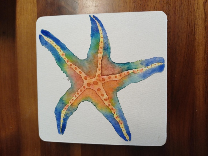
3. Painting the First Layer: Welcome to this project. So to continue with our
under the sea theme, I have a starfish. Now, the really cool
thing about painting a starfish is there's lots
of texture in these animals. So I'm going to actually paint
it in two separate layers, and on the second layer, we'll really emphasize the charging technique
that we're practicing. So first going to create a neutral color with
the burnt sienna, a little bit of our cool red and a little bit of
our warm new gamboge, and we will start with that. And then once that dries, we'll go in and do
the second layer. Leaving the center
the way it is, and we'll just emphasize
some of the darks around the edges at a
little extra texture, make it look more bumpy and y, so let's get started. I paused to do some erasing
of my pencil lines. Under the bright lights, I
could see that I still had some eraser marks that
weren't quite complete. It's surprisingly
surprisingly difficult to draw the C star. You know, it's not uniform like an actual star or the way
that a star is drawn. You know, the legs are, you
know, different orientations, and anyway, I had quite a bit of trouble just getting it the way I wanted it. But anyway, so I did some of that erasing
and don't forget, I do have the The outline attached in the in the playlist. You can download that to
trace onto your paper. Without further ado,
going to mix that neutral color to go along the center and tops of the legs. I'm going to take
some burnt CNA. And I'm going to
take a little bit of my my rose color here. And a little new gamboge. I'm going to wet everything
because I don't want any hard edges in the
middle of the starfish. To take your time,
stay inside the lines. I tilt my paper a little bit, so I can see if I
missed any spots. Okay. I'm going to take some
of that burnt sienna here. I'm just going to tap it along those those tops the legs there. Rinse add a little yellow. The yellow is going to
be primarily the tips. I'm going to be adding
the second layer some turquoises and
purples along the legs, and I don't want the yellow
to be too prominent or that purple won't look
very very purply. Since the yellow
will neutralize it. Now I'm dropping some
yellow right into that middle using a little
bit more concentration, so I can have this be
the most intense here. And very sparingly, a
little bit of that rose. All right. And ale bit more at Siena right
here in the middle. I'm actually going to do a bit of bit of water drops just to disperse that a little bit
more texture there. A bit more yellow. All right. Okay. Just a little
bit mar bless. I don't want to overwork it. Okay. All right. I'm ha with that so. I'm to it completely. Then we will go in with the other colors for
the second layer. J.
4. Final Layer Part 1: The starfish is mostly dry and these are the other
colors I'm going to be using. I mixed purple with
cool blue and cool red, a little French ultramarine
and a of my aqua green. I'm just going to paint
one section at a time. Here I'm going to
add some water here. I want there to be a lot of contrast against
the middle section. So I'm painting just
up to that line. And I want to do a bit of a deeper version of that Princiena, add a little bit of ros to that. I might need to get
you re finer brush for this this section here. I'm going to take
it to just about there. Where's my brush. Let's add a little
of our green here. Charging into that
brownish color a bit right where it meets. Remember, you want to
emphasize the texture of the Starfishs bumpy
bumpiness here. That's that's kind of a
harsh transition there. I'm going to take some yellow. I'm just going to
drop that where those two meet a little
bit more into that green. These arms sections here. And let's do a little blue
df Ferental to Marine here. And a little purple
right to the edge. Fix those edges there. I can tell already, I like the arms. But in the middle,
I think it's just a little too thick and it's not not really liking it as
much as I thought I would. I'm going to take my
clean blotted brush. I' going to lift some
of that pigment up. I'm just using the flat
side of my brush to pick that up because I don't
want to mix it together. I'm already liking
that a lot more. To fill in that space,
I'm just going to use a very light light
application there. Let's tap it on. I'm going to take my sea green. Not too much water here. Tap it into that
purple as I go up. Do a few little water drops. Emphasize texture. I'm going to try to repeat that on the rest of the
four sections. So let's do the same thing. The area up to the outline little less heavy handed
now with the brinciana. Having a touch of that
rose right along the edge. A little yellow. Just
tapping the paper. Got that sea green, it's a
little too intense there. Size my clean brush to
move that around a bit. Now for the French alter Marine. Now the purple. A little more water to that. See we kept the yellow from the first layer Nas and light. So that the purple would
still look fairly purple, when we did that second layer. Few drops of that green few drops of water. All right. Much better
that time. Moving on.
5. Final Layer Part 2: I'm just going to repeat
that for the most part. Little burnt sienna. More rows, I had a
little bit more water so that it'll release
from my brush. I really liking all
these colors together. And feel freebie is
whatever colors you like or in any combination. You can always test them on
a separate piece of paper before you start to make sure they look good,
and they mix well. I think that purple needs
a little bit more of a red added to it. And the water drops. I. This would actually be a lot easier if it was a tricky doing all these
colors in the small area. Charging some yellow
into all that there. Skip to the French
lt Marine for now. I don't want to
crowd these colors. So they don't have to
be exact everywhere. Okay. Yeah, a little bit
of the lt on this side. A little bit there. It seems like I have a
little less area to work with compared to the
other ones that I did. Water drops. In the last section. Is that area right
there. There we go. I'm just trying to get that
a little bit more fluid. Here we go. And even dropping the bit of that aqua green into the
purple and the blue, it helps smooth out that transition where it
wasn't quite blending. That's another great use of g. My water drops That was a lot of fun. One more thing I'd like to
do just for a final touch. I'm going to mix up some more of that rosy burnt Ciena color. I'm going to write on the dry paper here.
I'm going to add some. Try to make them circular. And it's done. I really hope you enjoy
painting this project, and I'll see you for
the next one. To
 Aura Lesnjak, Watercolor & Mixed Media Artist