Transcripts
1. Introduction + Welcome: Whether you'd love to paint
birds with watercolor, but don't know where to start, or perhaps you're farther ahead, but you'd love to
hone your process and your techniques so
that you're able to arrive at better
results more consistently. This course is for
you. Hey, everyone. My name is Erica, and I'm a traditional media
artist working with a range of drawing
and painting mediums. And my day to day
life revolves around creating and selling as well as creating helpful resources
for beginner and intermediate artists that
I share via my website, my YouTube channel, and, of course, my membership site. I have over 15
years of experience working in creative
and artistic fields, first as a graphic designer, then I worked as
head art teacher in a school environment
for many years, and then I started my
online art business, which I've been growing
for the last six years. I'm incredibly passionate about continuing to grow as an artist, but also sharing what
I know with others and encouraging others to continue
on their artistic paths. Taking what I was doing to
the online space so that I can reach more people
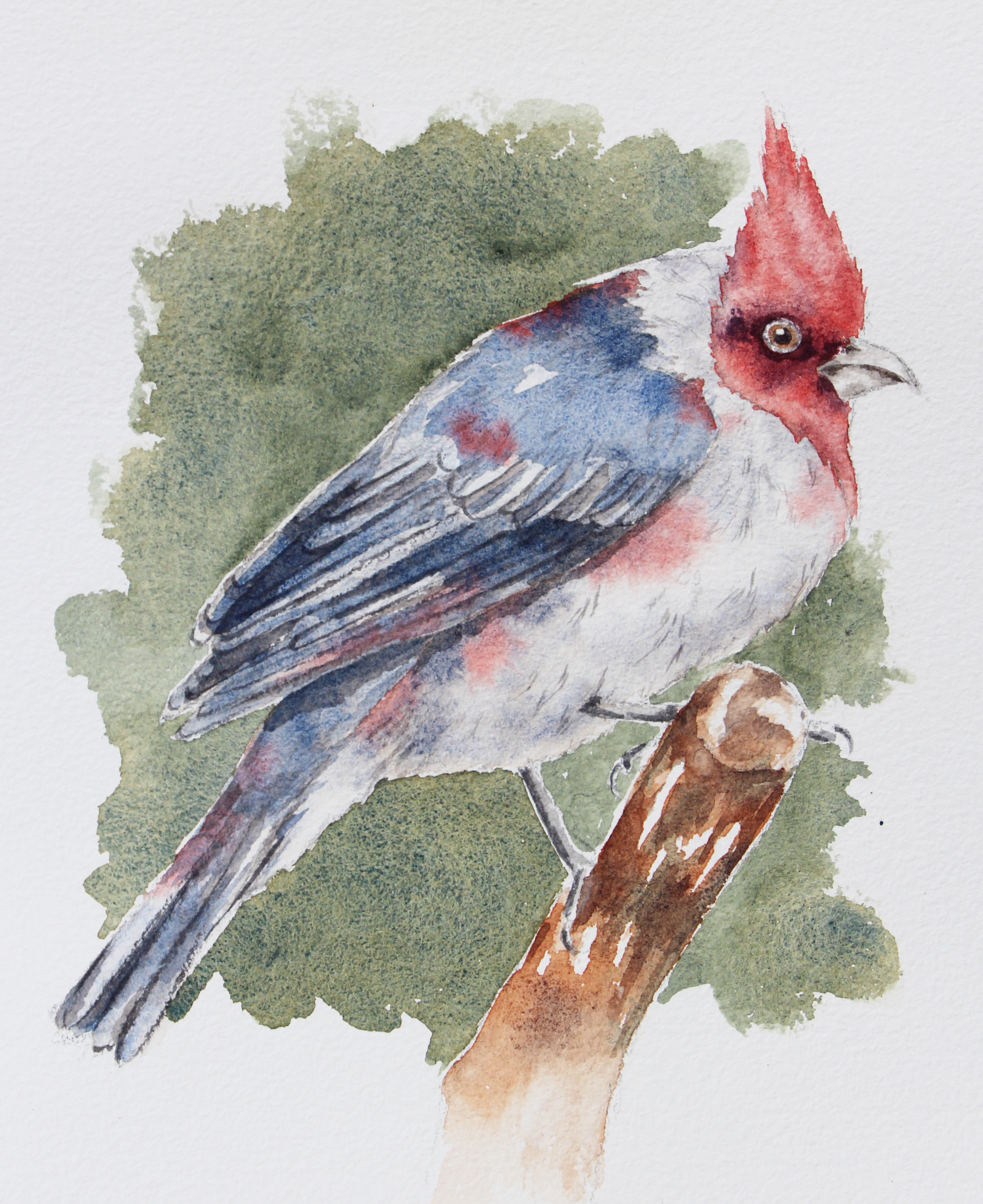
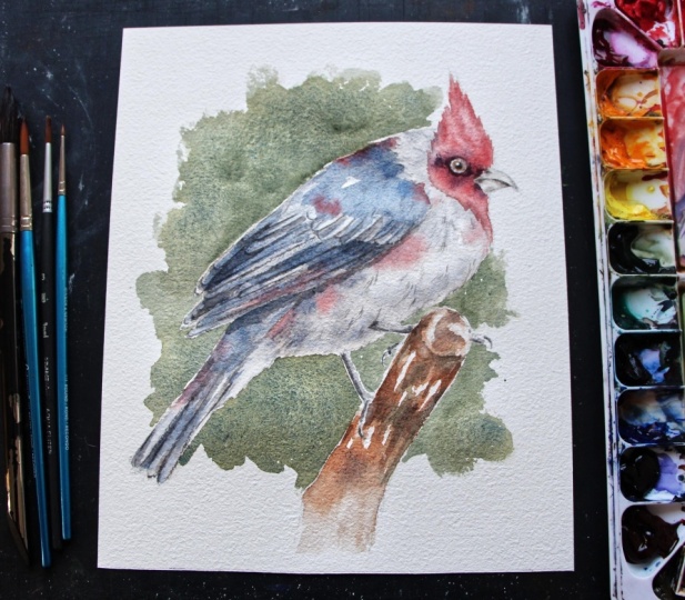
has truly been a joy. In this watercolor course, I take you step by step through my painting process for a vibrant red crested
cardinal piece. I've broken down my
painting process into easy to follow phases, and I share all of
my favorite tips and techniques that
help me arrive at a great level of realism while keeping a fresh
painterly result. In this course, we'll practice foundational watercolor
techniques together, such as wet on wet wet on dry, layering for depth, and also creating a vignette
style background. This course also has a strong focus on painting
believable feathers, which is a common
struggle for beginners getting started with
this kind of subject. I teach you a simple
straightforward method for painting feathers in wings and tails that you can take with you
to future paintings. If you're completely
new to watercolor, I would highly recommend
checking out my watercolor one oh one course here on Skillshare because
in that course, I share essential information
about watercolor and also basic exercises
that will help you gain water and brush
control much faster. Working on this bird
painting is going to be much easier and
more enjoyable for you if you have those
basic skills developed with the three basic washes and
also basic brushstroke drills. With all this said, let's jump into class number one
where I'm going to be explaining about the
course project that we're going to be working
on together. See you there.
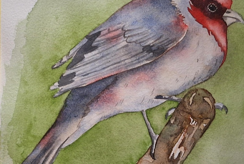
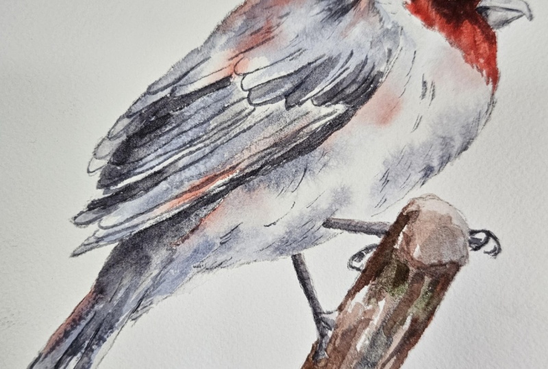
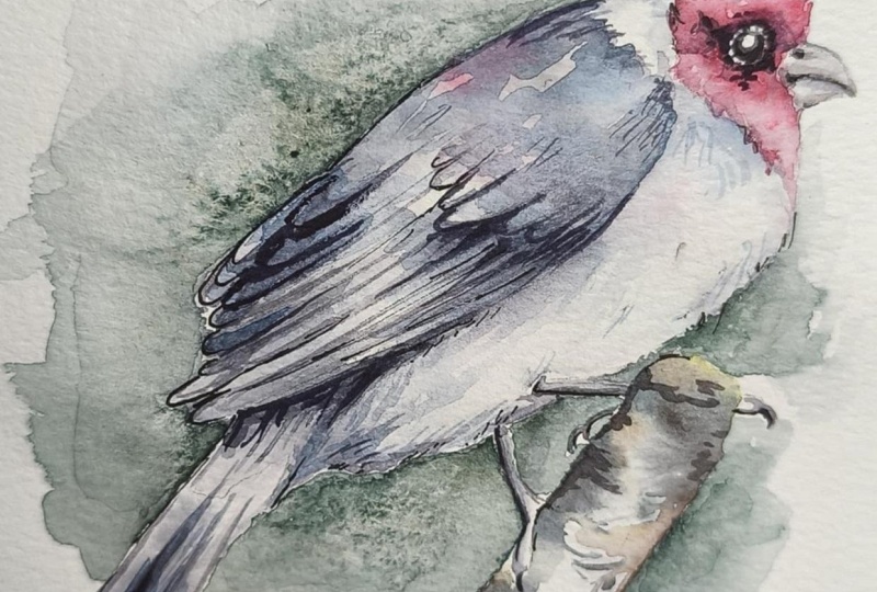
2. Course Project: By the end of this course,
you'll have completed a beautiful and vibrant
watercolor painting featuring a red crested cardinal and a vignette style background. Along the way, you're
going to be gaining so many tools and practicing
essential techniques that you're going to be able
to take with you to succeed with future bird paintings that you may decide to work on. I've broken up my painting
process into ten phases, each of which has its own class, and I want to encourage you
to spend as long as you need to with each class
before moving forward. Stop the video
whenever you need to, go back to different parts of the video whenever
you need to. Sometimes you might
decide to observe how I move on with the new part of the process before
doing it yourself. We're going to be
working in layers, building up that realism
and that depth gradually. So make sure to completely allow the previous layer to dry
before working over it. I've also included a couple of classes before starting with the painting process where I share must know information
and tips for success, things to observe in your reference photo before
moving forward. I also have a class where I swatch out all of my different
colors that I'm going to be using throughout
the painting process and provide a few substitutes so that you can easily replace these paint colors in case you don't have the colors
that I am using. I've prepared a set of
downloadable files, what you're going to be able
to find in the projects and resources tab right below
any of the class video. Simply click on this tab, scroll down a little bit, and you're going to
find a section that is titled Download Resources. Simply click on any
file that you wish to download and it will be saved onto your
computer or device. I have included my outline sketch in two slightly
different sizes, and I would recommend tracing over my outline
sketch and not the reference photo because I have made a few changes
to the composition, and I have simplified the feathers in the wing
and the tail a little bit. I've also included the high
resolution reference photo of this bird and I would recommend
observing the photo as you're moving along in the painting process so
that you can see color changes and value changes as you are developing
your layers. I've also included a photo
of my finished painting, which you're free to use as reference as you're working and your supply checklist
with a list of the different colors that
I'm going to be bringing in. To post a photo of your
work here on Skillshare, all you have to do is click on the Projects and Resources tab. Once you're in, you'll see this purple button on the right
that says submit project. When you click on this button, you'll be taken to a
new page where you'll easily be able to both upload
a photo of your piece, as well as share any thoughts, experiences, struggles or questions that you
might have for me. Here, you can create a title for your project and click on that larger content
section underneath. And if you want to add in
that photo at the beginning, you can go ahead and click on that image icon on the bottom. Find the photo that
you're wanting to share on your
computer or device, select that file, click open, and it will be immediately added into this content section. Then under your image, share anything that you'd
like, whether it's struggles, questions, wins, aha moments that you might have had throughout this course. Anything that you'd
like to share, I always love hearing from you. At the bottom of this
content section, you'll see different icons. One is for formatting your text. The other is to add emojis, the Adimage icon, which
we just talked about, and you can also embed link. Free to add in even more
pictures if you'd like. They can be process
pictures, supply pictures. And over here to the right, we have this preview area
where we essentially see a thumbnail or cover
image for your project. You can go ahead
and change it to a title image that you have created in a more
horizontal format. Or you can just go
ahead and leave it as is and have it just be a cropped section of one of the images that you have
uploaded into your content area. It's up to you.
Once you're ready, go ahead and scroll back up. Click on the green Publish
button and you'll be all done. If you'd like to share your
work over on Instagram, please do just make
sure to tag me at Erica Underscore
Lancaster Underscore Art. I love seeing your
work over there and giving students
shoutouts in my stories. And of course, go ahead and tag the Skillshare account too. It goes a very long way and inspires other students to
share their work as well. Skillshare is a
safe learning space for all of us to continue
growing together. So make sure that you're
using this gallery, and let's all connect
and help each other out. I can't wait to see your work and to help out with
whatever you might need. Let's move on to our next class.
3. Supplies: I'm going to be working on cold pressed watercolor
paper from Bao Hung. This paper is 140 pounds or 300 GSM in thickness
or in weight, and it is 100% cotton. The size of my sheet that you're going to
see me work in is exactly 7.5 " in width
times 9 " in height. It's totally up to you
if you want to work in my same size or
maybe even larger. I'll make two different sizes of my outline sketch
available for one exactly in the size
that I am working in and one slightly larger so that it can fit in a letter size format. I used only four different
colors for this painting, some of which are
from Daniel Smith, and one is from Windsor
Newton's professional line. And these colors were French
ultramarine, Pyl scarlet. Bart Sienna and undersea green. I'm going to swatch out all of these colors for you and offer substitutes so that you can see what they look
like on paper, and you can just
replace whatever you don't have with
something that is similar. You never have to use my same exact colors in order
to arrive at great results. I want to encourage you
to use what you have. I brought in four round brushes
in sizes 14, six, three, and zero. I always have
a few scrap pieces of watercolor paper on
hand in order to test out color mixtures
and consistencies. I have my container
with clean water, which I make sure to
change along the way. You're always free to bring in two or even three
containers if you don't want to have to change
your water as often. I have a couple of my blue
Scot absorbent towels on hand, which are essential to stay
on top of water control throughout the process and do any lifting that I
might have to do. These are my favorite
towels to use because they are
thin and untextured. So whenever I go
in to do lifting, I don't arrive at
texture results. This, I did trace
over the photo, and I use tracing
paper from Strathmore. I would recommend
tracing over my outline sketch that I'm going
to be providing instead of the reference photo, especially because I have simplified the feathers for you. But I would recommend observing the reference photo as
you're moving along in the painting process
so that you can see shadows and lighter
areas and color changes. You're always free to use whichever transferring
method you prefer, whether it's a light box or a carbon paper or
whatever you'd like. I taped my watercolor
sheet down onto my black cutting mat using
regular 1 " masking tape. Do make sure to run my
pieces of tape over my clothes a couple
of times to soften that adhesive and make
it less likely that I'll damage my paper at
the end when I remove it. And I wouldn't recommend
using a flexible cutting mat to tape your watercolor paper down onto because working on something stiffer and sturdier is always going to
be more helpful so that you can
tilt your board as needed and use gravity
to your advantage, especially when you're
painting those larger washes. And you can also rotate
your board clockwise or counterclockwise
as you're painting so that it can be more
comfortable for you. Finally, I did bring in some sketching supplies
which I am sharing here to transfer and prepare
my preliminary sketch before getting started
with the painting process. For this one, I did trace over the photo and I
share exactly step by step what I do to trace over my photo and do my transferring
using tracing paper. In a bonus class
that is included at the end of my watercolor
one oh one course, which you have access
to here on Skillshare. But of course, you're
always free to use whichever transferring
method you prefer, whether it's a light box, carbon paper, or
whatever you like. Go ahead and collect
your supplies, grab your downloadables that I've made available for you in the Projects and Resources tab and see you in
the next class.
4. Swatching Colors: We're only using four different
colors for this process. The first color that I'm
going to be swetching out for you is
French ultramarine. French ultramarine is a warm
blue and it looks like this. If you don't have
French ultramarine, any ultramarine blue will do, whether it's traditional
ultramarine blue, ultramarine deep,
ultramarine finest, or you could even use cobalt blue deep or even
Windsor blue red shade. The next color that
I'm going to be swetching out for
you is burnt sienna, which is a reddish brown
burnt sienna looks like this. If you don't have burnt sienna, you could use something like
quinacridone burnt orange, transparent red oxide,
English red ochre, or red iron oxide. The next color that I'm
going to be swetching out for you is pyrrol scarlet, which is a warm red. Pyl scarlet looks like this. If you don't have pyral scarlet, you can use permanent red light, cadmium red light, scarlet lake, organic vermilion, or
even Mayan orange. Finally, I'm going
to be bringing in undersea green
from Daniel Smith, which is a darker, rich, warm green and it
looks like this. If you don't have this green, you could use sap green, olive green, serpentine
genuine or green appetite.
5. Must-Know Information + Tips for Success: Alright, so I just
finished up with my transferring process and the preparation of my
preliminary sketch. And I just want to go
over a few key things that will help you succeed
with this painting. First and foremost,
before jumping in, it's very important
that we take time to observe that reference
photo and make sure that our pencil sketch is ready
and it has everything that it needs and that we understand
key things before moving. I'm done with my transferring, which I often use tracing
paper for my transferring. Sometimes I use a light box. There's always some finessing, some refinements that I have
to do in my pencil sketch. Sometimes lines and shapes don't get transferred properly, and I do that right on my watercolor sheet
with my HB pencil, sometimes I add in
final details right on my watercolor sheet
that I didn't really transfer with
my tracing paper. It's very important
that the sketch is where we needed to be
before moving forward. I want to provide
a few key tips, especially when it comes
to painting feathers. If you've transfer
my outline sketch, you'll notice that
I have simplified most important feathers into
basic shapes and lines, and in other areas, I have no feathers at all. In areas like the chest, belly, and this upper
portion of the back, we have very, very
small feathers, and there is no need to add in specific shapes or even
little lines in those areas because those are areas where
we're going to be painting those feathers just with little brushstrokes as
we're moving along. We're not really planning where we're going to be adding in
those shapes, those marks. You're going to do that
freely and intuitive. But there are other
cases, for example, in the wing and the tail where
those feathers are larger. They are, I guess you
could even say more important and we want to spend more time on
those feathers. In my outline sketch,
you'll notice how I've simplified the medium
sized feathers, for example, these
ones right here and also what I would consider
the largest feathers. Which are these right here. The tail also has important large
feathers down here that I have simplified
into basic shapes. I'm sure I have
changed some things if you compare these shapes
with the reference photo, but what's most
important is that I have captured the
size of these feathers, the orientation of
these feathers, and more or less the
amount of feathers in each area that I see in
that reference photo. I want you to spend time just
observing and understanding this section here and
this section here and how those shapes are overlapping because that's going to be very, very important as we're
painting those feathers. Now, something that
I would say is these medium sized feathers here and these feathers right here in the wing opposite to
us are going to be the most important shapes to understand when it
comes to that overlapping. These longer
feathers here in the mid to lowest portion of
the wing are not that difficult because we're going
to be describing them just with loose brush
strokes. As long as notice those lines, the
angle of those feathers, you're going to follow
that angle as you do those brushstrokes in
that area loosely. Whereas these feathers here
and these feathers here, we're going to paint in
layers and what's very important to observe as
well are the shadow shapes, shadow shapes created
by overlapping wings, shadows created by overlapping
clusters of feathers, and shadows created by individual feathers just as they are sitting
over each other. Because it's by painting in those shadow shapes that we're going to create a
sense of depth. We're going to create
that sense of overlap. And so we need to know where
to paint those shadows. Also observe the shadows created by the wing on the bird's body. I've also simplified the
feather shapes in the tail, and it's also going to be
important to bring to mind how these feathers are overlapping over each other or
sitting over each other. So that we can create shadows appropriately in
this area as well. And finally, I have also changed other aspects
in this composition. I have simplified and changed the color of the little branch that the bird is sitting on. I'm going to be
painting it brown so that the branch can
contrast more both in color and in value with the green vignette that I'm going to be painting
behind the bird.
6. White Feathers: We're going to start with
the white feather areas, and this means that
we need to create our gray color mixture
that we're going to be using to develop our values
and textures in these areas. And to create my gray, I am mixing together French
ultramarine and burnt sienna. If you mix approximately 50% ultramarine blue and
50% burnt sienna, you're going to get a
gray looking color, which is just perfect for
those white feather areas, especially when you
dilute it with water. We want to make sure that we start light and we make our way gradually into darker values when we're painting white areas. And what's cool about
mixing together ultramarine blue and burnt
sienna to create your gray is that you can shift and change
the ratio of your colors in your mixer to make your grays cooler or
to make them warmer, depending on what you like. If you have more blue than
brown in your mixture, you're going to end up
with a cooler gray. And if you have more brown
than blue in your mixture, you're going to end up
with a warmer gray. Ultramarine blue is
also granulating, so as it dries, we're going to be left
with this beautiful kind of model texture. I also want to prepare a little puddle of
pyrrol scarlet because I want to bring in
a little pop of red into the white
feather areas. And this is just
an artistic choice that I'm making in order to create more color harmony by repeating colors
throughout the piece. I think this will help
integrate things more. All right, with my color
mixers ready to go, I'm going to go ahead and change my water because we're
going to be using pre wetting in order to create soft effects and expand
our working time. All right, I have clean
water in my container, very important for the
pre wetting technique, and I'm going to be using
my size 14 round brush for these initial layers in the largest parts
of the bird's body. So let's take this a section at a time and let's start with the lightest
areas in the bird, which are, of course,
the white feather areas. All I am doing here with
my size 14 round brush is I'm taking a little bit of water at a time
from my container, and I'm smoothing that water on all throughout these
white feather areas in this upper part behind
the bird's head in the chest and down into the
belly and into the tail. I am making my way around the little legs and pre
wetting everything. I'm going over this entire area multiple times in order to really feed the
paper and make it less thirsty so that I can
expand my working time. Otherwise, things are going
to start to dry very quickly. I'm creating a bit of
an irregular edge. We don't want to
leave smooth edges when we have textures like this. Okay. I've arrived
at a nice even sheen all throughout the
white feather areas. I do have the size three
round brush on hand because once I'm done
painting in some color, I'm going to use
this smaller brush to pull a little
bit of wet paint out and create more of an irregular look around those edges, which
is so important. I'm going to take
a little bit of my gray color mixture
and I'm going to start with the
darkest shadow areas that I see in the
reference photo. This is I would say a coffee
consistency on my palette. And I don't want to go
in with too much color because these are white feathers and we don't want to make
these feathers look gray. So I'm always staying mindful of the amount
of color that I'm painting in and the kind of darkness that
I'm arriving at. Here I have enough paint to push and pull and create
softer transitions with. So I remove that color from my paintbrush bristles and I'm just kind of
softening the edges and pulling a little bit
of this pigment into the larger area here to create
very soft looking grays. Everything is still wet and workable because I
did pre wedding. Here I can take a
little bit more color and start adding more in. At any time, you can switch to your smaller brush and pull a little bit of that paint out to create more irregularity
along the edges. Okay. That's enough gray. I remove that color from
my paintbrush bristles and then with a clean and
only slightly damp brush, I can soften transitions, maybe get rid of little
textures that I've created. Oh I'm going to switch to my size
three round brush, just dip it in my water
so that I'm going in with a clean and damp
brush and I'm just pulling a little bit
of that wet paint outward to create more
regularity along those edges. Because I don't want
completely smooth edges. If nothing is moving, you can always take a
little bit more paint, make sure that you
don't go too dark. We do want these
feathers to look white. Do you remember
that watercolor dry is lighter than how it
looks when it's wet? So, this will become lighter. Studying a little
bit more gray here. The paper is still wet and
workable in some areas. So if I want to go in and darken darkest shadow areas a little bit more with the
same color mixture, I definitely can
right below the wing. Finally, I painted in a few red blooms
before the gray dried. I know that this may look a
little bit weird right now, but this is going to become
a lot lighter and we're going to be using this red
throughout the bird's body. So it's all going to come
together as we move forward. By this point, certain sections are already starting to dry, so I need to leave things alone because if I continue
painting in more color, I'm likely going to
arrive at splotchiness, back runs, and
undesired effects. I'm going to leave this
alone, and in the meantime, I'm going to paint the
little branch and the legs.
7. Branch, Legs + Beak First Layer: Okay, so as I said before, I'm going to change the color of the little branch so that it can contrast a little bit more with the green background that I'm
going to be painting later. So what I'm doing here is I'm adding more burnt sienna into the section of my
palette and if it has a little bit of blue mixed
in, it doesn't matter. I'm just going to be
painting this wet on dry. I'm going to go in
with a T consistency first and I'm going to build incrementally toward
darker values. Using my size 14 round brush, loading up my paintbrush
with a good amount of this water down
burnt sienna and I'm going to paint in
this tree branch with linear strokes that are going to help me describe this texture. Eaving little sections
of paper shining through long linear strokes
in the same angle that that cylindrical structure
has using just the tip of your brush is going to help you save little highlight sections, removing that paint from
my paintbrush bristles, removing that excess
water by dabbing the tip of my brush on
my absorbent towel. And then I use the
clean and only slightly damp bristles
of my brush as a little absorbent
sponge to lift up some color from the
bottom edge section of this little branch. This way, this color can look
like it's diffusing into the white paper and I can really create that vignette
like effect at the end. Pushing this paint up
against the little foot. Just quickly painting in
some brown into this branch. You can see how it looks
pretty light right now. I'm going to add more
burnt sienna into the mix, thicken it up a little bit more. While this initial
layer is still wet, I paint in some
more of this brown. I'm going to quickly add in some French ultramarine into the brown to darken
it even more. I'm just going to pop
in some of this darker brown to expand that
range of values. Here I'm using the
lifting technique once again to remove some of
this color off my paper, especially along
the bottom where that brown meets
the masking tape. And this is totally optional, but if you want to add in
a little bit of green, whatever green it is
that you're bringing in, mix some of that into
your brown color mixer, and if the paint is
still wet and workable, you can pop some of that in
there as well for a bit of a variation in hue
in the branch. And that is it for that
first layer in the branch. Let's allow that to dry. Okay, so let's paint
the little bird's legs. I'm creating more of
my gray color mixture that I was using before pushing this green out of the
way and adding more of my French ultramarine
into the burnt sienna. These are really small shapes
that we're painting in, so I made sure to change
to a smaller brush. This is my size three round. I'm going in with a water
down version of this gray, especially because we're
painting wet on dry and I want to make sure not to go
in too dark too quickly. I want to save some highlights. I observe that reference photo, notice where the
darkest planes are in these little kind of cylindrical
structures in the legs. And that is where I
start painting in my gray in the back
of the cylinder. Remember that starting with the shadow areas first is always going to help you be a
little bit more in control. This goes into the
body, this leg here. I start in this lower belly portion,
back of the cylinder. I'm just painting in
a little bit of gray. In this case, the bottom
of the finger would be the bottom planes facing
away from the light. I'm just going to do a
curve for the claws. Really not trying to describe much much more in the
legs and the feet. Softening my shadow shape
in this one just a little, and that is enough for
now in the legs and feet. Let's go ahead and paint in
the first layer in the beak. For this, I'm just going to add a little bit more
burnt sienna into my gray color mixture
so that I can go in with a bit more
of a warmer gray. It has more brown in it. The beak is very, very light, so I want to go in
very water down. Think of a t consistency. I want to go in with a very
small amount of paint, more of a T consistency, starting with the shadow areas. Thinking of what is bottom plane in the beak structure,
what is upper plain. After I've painted
in some color, I remove that paint from
my paintbrush bristles, I remove that excess
water and I soften edges. I'm going to take a
little bit more color, dark in some areas
a little bit more. And that is it. That's all I'm going to do for this initial layer in the beak. Let's allow that to dry.
8. Wing + Tail First Layer: It's time to work on layer number one in
the wing and the tail, and we're going to be using the same pre wedding
technique that we used for this area over here
with the white feathers. For the wings and the tail, we're using the same gray
color mixture that we were using for the
white feather area. However, for these areas, we're going to be going in with a little bit more paint so that those areas can look
a little bit darker. Make sure that you have a
smaller brush on hand so that you can once again
work on those edges, do a little bit of a flicking motion while the paint is still wet to create at
least some amount of irregularity here and there. Taking a little bit of water
at a time from my container, and I'm starting with the wings. Go over everything multiple
times and there is a lot of irregularity right here where the white feathers meet
the dark gray feathers. Don't create a
smooth edge there. Use little flicking motion
so that you can create an irregular edge where those
two feather colors meet. I see a nice even sheen again. I'm using a little bit more blue in my color
mixture this time. I'm starting with those
dark shadow areas. Here, where this wing
in the back opposite to us is overlapping over this
wing. I see some shadows. Notice those larger
shadow shapes where major groupings of feathers are creating a shadow on the
feathers underneath. That's where I start. See some darker areas here, right under the white feathers. I'm going to remove from
my paintbrush pitles, remove that excess water by dabbing the tip of my brush
on my absorbent towel, and I am checking to see if I have any textures
that need to be smoothed out, maybe creating
softer transitions, making sure that I'm
leaving sections of paper shining through
that is going to allow me to create that watercolor glow and the fresh results
that I'm looking for. Going to quickly change
to my smaller brush. This is my size three round and I'm going to do a little bit of flicking here inward, moving some of this water and paint into the white
feather section, taking a little bit
more of my gray, painting that in just a
little bit at a time. I don't want to go
too dark too fast. And I'm just observing that photo and creating
a little bit more of an irregular feathery look right here where the two
feather colors meet. Things are still
wet and workable. I can take a little
bit more of my paint, darken shadow areas,
whatever I need to do. We're not really painting in the individual feathers
at this point. We're going to do that
in the next layer. But if you want to start doing more linear brush
strokes down here, especially, you can do that. Just be careful because
right now things are wet and if you add
too much paint, it's going to start
expanding very easily and you can end up darkening
things way too much. A few more little strokes over here before my paint dries. Maybe a few little
strokes over here. You can see how all of
this is looking very soft. I'm creating these
natural organic gradients where I have some
lighter sections and some darker sections. And this is all because
I am painting in my color on wet paper. Looking to create
somewhat of a range of values without going too dark. And finally, I'm going to pop in tiny bit of red here as well. When I bring in these colorful
blooms into a painting, I never really have a specific place where I'm
going to be adding them in. I just go by what is happening, by what I think will look
best based on the values and the effects that I've
already achieved with my base colors or the
important colors. All right, great. So
that is layer number one in the wing. All right. Let's do the same thing
in the tail area. I need to make more of
my gray color mixture with slightly more ultramarine blue than the burnt sienna. N more blue. That's ready. I have my size three round
brush in my left hand. And first, I'm
going to gently pre wet the entire tail portion. Running my paintbrush bristles
over this entire section, maybe three or four times before starting to
paint in my color. Once I see that even sheen, no puddles, we can go ahead and start
painting in my gray, starting with the darkest
section that I see, which is right up
here up against the wing Then I see some darks right
here where there is some overlapping taking
place in the tail feathers. I can soften transitions or any undesired textures
without over blending. I'm just going to quickly go
in with a thicker version of the same color to
intensify the shadows. Layering on more color
in darker sections, removing that paint from
my paintbrush bristles, removing the excess water. Going to reactivate
this red that I have on my palette and I'm
just going to pop in a little bit of red in
the tail as well so that I can repeat this
color in this area. That's enough. Removing from
my paintbrush bristles, removing that excess water, and if you want to go in
and darken anything else, darkening a few little
sections a little bit more, and I'm all done with this initial layer in
the wing and the tail. As you can see, in this
point of the process, the values that I've
developed in the wings and the tail look very similar to
the chest and belly areas, which are actually
white feathers. The feathers over
here are much darker. However, we're still missing plenty more work in these
sections over here. Whereas the chest
and belly area, they're just going to be painted mostly with that single layer. We will go in with some very
light subtle texture marks in the chest and belly
area a little bit later, but we're no longer
going to be layering on any more color in
large areas down here, whereas over here we are. So these two sections over here are going to appear
much darker at the end.
9. Eye, Red Feathers + Leg Shadow Shapes: Creating a chocolatey
brown by bringing in a little bit of my
French ultramarine into the birds sienna. If you look closely in
that reference photo, you'll notice that we can see a lighter brown iris around
the pupil in this bird's eye. I want to go in initially with a brown color and
then we'll paint the pupil and the darker areas around it
with a darker gray. And the eye is, of course, very, very small, so I will be using my
size zero round brush. I have added in a little teeny, tiny highlight shape
across the eyeball, which we do see a highlight
shape in the reference photo, and I'm going to
do my best to keep that little highlight
protected or unpainted as I paint in all
of these little eye areas. I take a little bit of this
brown that I just created. I would say this is like
a coffee consistency. And I'm going to paint in the entire visible
portion of the eyeball except for that teeny tiny highlight shape that's
somewhere along the top. And that is it. There is this
little ring around the eye, which is skin, and I'm going to leave that unpainted for now. Let's move on to
painting the first layer in the red feathers right
here in the bird's head. In the red feathers
in the bird's head, I'm going to be using
my pyal scarlet, and I'm going to create
a darker version of this pyal scarlet by mixing together this red with a little bit of my
French ultramarine. You can test out these color
mixtures on a scrap piece of watercolor paper
to ensure that you have your two reds that
you're going to be using to develop a nice range of
values in the bird's head. I'm going to be using my size six round brush and I'm going to be using the pre wedding technique once again, wetting this entire red area, making my way around
the bird's eye and around that little ring
that I left around the eye. Going all the way down and
into this chest portion, and there is a lot of
irregularity that we want to leave around the head so that we can
describe those feathers. We don't really want
super smooth edges. You can use tapered strokes going in the direction of that feather growth that we see. This is a much smaller area, but you still want to make
sure that you're going over everything at least two, three times until you
see that even sheen. I'm also going to have the
size three round brush on hand so that I can do that flicking motion around the edges after my paint has been placed. Once you see that
nice even chin, go ahead and get started with your plain red a
coffee consistency. I always start with the
darkest areas that I see, which in this case
are around the eyes. I'm going to remove this paint from my paint brush bristles, remove that excess water, and going in with a clean and only slightly
damp brush to do a little bit of paint
distribution here, pushing and pulling that color, not trying to create flatness or a uniform look to this red. I'm just trying to
pull a little bit of this pigment into lighter
value sections that I see so that I can create a light red
color in those areas. You can start doing
a little bit of pulling along those
edges as well. You can see how that
red looks very light. I'm going to go in with a
thicker consistency now. Once again, starting around the eye and in those
darkest areas that I see, which are many black feathers. Going a little bit darker now. Going back to my size
three round brush and pulling some of this color
up in a way with gentle, short tapered strokes,
always observing the reference photo
and having in mind the length and the direction
of the feathers growth. Going in with a little
bit more color, adding more red into
this upper section, I want to develop a variety
of values everywhere. Removing that paint from
my paintbrush bristles, removing that excess water
and softening edges a little. I'm using my size three
round brush now to place my paint to soften my color. This entire area is still wet, by the way, because I
did that pre wedding. Going in with teeny, tiny flicking motions
around the edges to add in a little bit of that irregularity
for a textured look. It's time to paint in
that darker version of my red that has some
ultramarine blue in it, and it looks like a muted
reddish purple color, and I'm mostly using it
around the eye where I see those darker areas
in the reference photo. If you paint in this color
and it looks too dark to you, add in a little bit more red into your mixture
to lighten it. After painting in some of that
red purple around the eye, I add in more of my red into the mixture to make it
look a little bit lighter. And then I use the
slightly darker version of my red here and there, really carefully applying
it so that I don't overly cover up or eat up
the lighter red sections. It's always my objective
throughout this process to develop a range of values
everywhere throughout the bird, cleaning up the edges
around the eye, making my way around
that white ring. I don't want to get any of this red in that
ring around the eye. Fixing the shape
of the beak here. I'm continuing to add
more ultramarine or more red into my mixture depending on the value
that I'm trying to create. And I'm just continuing to
observe that reference photo, and I'm doing my best to
develop some lighter areas and darker areas in this part of the bird's body so that I can create a sense of dimension. Here I'm using the
lifting technique once again to lift up some color and reveal some of that bright
paper under the paint. You can use this technique whenever you feel
you've gone too dark. You can certainly lighten areas, especially when the
paint is still wet by just absorbing some
of it off the page with either the clean and
slightly damp bristles of your brush or even
your absorbent towel. Going back to my initial
gray color mixture so that I can add some even
darker gray shadow shapes in the legs and feet. This time, I'm going
in with more of a milk consistency and I'm just pushing those
darkest dark areas opposite to the light while leaving plenty of that
initial layer with the lighter gray shining
through to help me develop at least a few gray
values in the legs and feet. I'm bringing to
mind, once again, the cylindrical structure
of the birds legs, the cylindrical structure
of the fingers, considering any overlapping
that might be taking place. And wherever shadows would be, that is where I'm
essentially darkening. Because I'm painting
on dry paper, I am arriving at
sharp edges around these shadow shapes
that I am painting in and whenever I want
to soften anything, I just run the clean and
only slightly damp bristles of my brush over that edge, and that will be
easily softened, especially if the paint
is still partially wet. But you don't have to
soften everything. I want to encourage
you to leave some of these sharp shadow
shapes as they are.
10. Wing + Tail Second Layer: All right let's get started with the second layer in
the wing and the tail. The first thing that we're
going to do is we're going to trace around some
of our pencil lines, especially in the medium size feathers that
I was talking about before and other
important shapes for feathers that we want
to make sure to understand. If you can no longer see your pencil lines
through the paint, you can go ahead and sketch them again over your dry paint, do it carefully and as
lightly as you can. I'm going in with my size, zero round brush and T
consistency because I don't want to create very stark
looking outlines that will take away from
the realism if you do that. Observing how these
feathers are overlapping. I'm using just the tip of my brush to trace
over my pencil work. These look like U
shapes open at the top. I also have these
important feathers in the wing opposite to us
that I want to trace around. Notice they're overlapping. And I have other feathers here. Then aside from those, everything else, I can
just approach as lines. I can't even start incorporating some dry brushing for texture. I am continuing to
observe the reference, even though I'm
approaching these more loosely because if I don't continue observing
the reference photo, I can very easily start forgetting the length
of these feathers and the direction that I should be drawing those lines
or shapes toward. I'm going to do the same
thing for the feathers and the tail zooming into this part of the bird
in the reference photo. Incorporating some
dry brushing by just gently scraping my
brush against the paper. When you have just a
small amount of paint in your brush and you press
down and gently scrape, you're going to create some
dry brushing textures. Especially if you're using cold press or rough
watercolor paper. All right. That's
enough. I don't want to overly draw the feather shapes.
11. Small Feathers, Pupil + Beak Shadow Shapes: So now before doing
anything else, I'm going to add just very
subtle little feather textures in the chest and the belly. I'm using my same
gray color mixture only I'm making sure to go in with a T consistency because I don't want these
feather marks to be very, very stark and distracting. Just a few here and
there will do the trick. Keep the feather length and direction of that
feather growth in mind. Taking just a tiny
bit of paint at a time and barely touching
the tip of my brush to my paper and doing gentle slightly curved
short tapered marks. Less is more when
working with watercolor, a little bit goes a long way. That's enough. I'm also going to add in just a
few little marks here. To finish up the beak, I'm just going to mix
in a little bit more of my burnt sienna into my gray. I'm just going to reinforce those darkness
starks in the beak, seeing these as abstract,
irregular shadow shapes. No stark, blocky looking
shapes or lines. Let's paint the pupil now. I'm going to add a little bit more French ultramarine into the mixture and
make it look more like a middle of the range gray. I'm now going in with
more of a coffee or even milk consistency and my size zero round brush to very carefully
paint just the pupil. I'm going to do my best
to make my way around the highlight blot on
your absorbent towel. This is a very,
very small shape. Painting right over the brown. I'm trying to keep the
highlight protected and leaving a ring of brown around the
pupil as best as I can.
12. Wing + Tail Shadow Shapes Third Layer: All right, so let's do
a little bit more work in the wing and the tail. I still have my size
zero round brush in my hand and I'm still using
my same gray color mixture. What I'm going to do now
is just very subtly create a little line for
the middle vein. In some of these feathers, you can't see it in all of them, but the ones where you can
add that in at this point. Now I'm going to be switching to my size three round brush because I'm going
to be painting in those larger shadow shapes in between the overlapping
sections of feathers. For this, I do
want to go in with a tea or coffee
consistency depending on the values that you've already developed and observe
that reference photo. Notice where those
important clusters of feathers are creating
shadows on each other. For example, I see an
important shadow here, I'm going to paint that in. I see another
important shadow here. And here. And I can even start painting in this important shadow that is making its way from the top of the tail and into the
side of this wing here. See how I brought that
long shadow shape together all the way from the tail and into the
side of the bird's body. Developing more shadow
shapes here in the tail now. Some gentle brush strokes here. Help me convey some
of that texture. There's a smaller shadow
shape around here. I think most of those larger
shadow shapes are in, and now I'm going to notice the individual shadow shapes created by the
individual feathers. So we have covered
the larger shapes created by the
clusters of feathers. Now I'm looking at the
individual feathers and how they create a smaller
shadow shape on each other. So for example, this feather here is on top of
this feather here. So it creates a shadow shape on this one that is beneath it. And this one over here
is on top of this one, so it creates a slight
shadow shape beneath that. And make sure that you're
not going too dark because these are not
large shadow shapes. Use your gray in more of a T consistency as you're creating those shadow
shapes so that you can keep some of that
luminosity at the end. When painting with watercolor, it's just so important to incorporate the bright
paper as part of the piece. If we cover up all of our paper, then we're going to get rid of that luminosity, that glow. And results will be just
less fresh. That's about it. If I do anything else, I can run the risk of just
making everything look too heavy and I will get rid of
that three dimensional look. Same thing over
here with the tail. Check to see if there are any shadow shapes that
you're missing. And finally, I'm going back
to my size zero round brush, and I'm using the same
gray color mixture in a te consistency to
add in some very, very subtle, small feather textures in this
part of the wing. Make sure that you're
clustering those teeny, tiny tapered
brushstrokes together in different ways for
a more natural look. That's too much water.
13. Wing + Tail Glaze Fourth Layer: Alright, so we just have
a few more things to do, and then we'll tackle
the background. I'm going to change my water
because we're going to do a final glaze in the wing and the tail to make them
look even darker. The difference
between layering and glazing is that when
you're applying a glaze, you're using very water down, translucent paint so
that you can still see all of the value work
and the colors underneath. When you apply normal layering, you can pretty much use
whatever consistency you want. For this last glaze in
the wing and the tail, I'm going to make more of
my gray color mixture, but it's going to have way
more ultramarine blue in it. I'm going for more of a muted blue as opposed
to a gray for this layer. Once you have that
on your palette, make sure it's watered down. You're looking for
a T consistency. I'm using my size
14 round brush, loading a good amount of
that darker muted blue, and I'm just going to paint
some of this color in very loosely to darken some
sections in the wing. Making sure that I'm
leaving plenty of those previous layers
shining through and also leaving some little slivers
of white paper unpainted here and there so that they can look like
highlights at the end. It's especially helpful to leave highlights along the
edges of your feathers. After painting in
some of that color, I rinse out my brush. I remove that excess water, and I go in to gently soften
effects, clean up edges. You can do lifting
if you need to. I push and pull my paint
while it's wet if I need to. And then I drop in a little bit more of the
same color mixture, heavier on the ultramarine blue, only into certain sections
that I want to darken a little bit more while
that paint is still wet. And because I'm dropping
it into wet paint, you can see how I still
get those soft effects. Here I'm cleaning
up edges one last time before allowing
this glaze to dry. Alright, it's time to apply the same glazing
technique into the tail. Make sure that you're saving some lighter sections where that previous layer
is left unpainted. Switching to my size three round brush and just creating a little bit more of an irregular edge
here along the tail. And that is it for
those darker areas.
14. Branch + Red Feathers Second Layer: I'm going to finish up the
little tree branch still using my ultramarine blue
and burnt sienna mixer. Only this time, it has
more burnt sienna in it so that it can look like
a darker chocolatey brown. Going back to my size
six round brush, and I'm just going
to loosely develop some darker brown areas in the little branch to help add a little bit more
dimension and detail, especially in this upper
section nearest the bird. I want some lighter brown
areas, some midtone areas, and some darker brown areas, and I'm doing my
best to work around those highlights that I have created in that beginning layer. If you want to make
it even darker, add more ultramarine
blue into it. That's enough contrast. If you feel you've gone
too light in some areas, we're painting wet
on dry once again, so it is normal to have some sharp defined edges
around your shapes. You can certainly go in to
soften some, but again, I want to encourage you
to leave some alone and create a balance between soft effects
and sharper detail. Okay, let's finish up the eye, and then we're going
to be painting the vignette background
and we'll be all done. Back to my gray color mixture, so I need to add
more blue into this. I want to go in very water down. I'm adding more water from my container into the edge
of my puddle and I'm going to use my size zero round brush to just add in a
little bit of color in that white ring around
the eye because this bird does have
darker skin in that area, so I don't want to leave
it completely white. That's a little bit
too light and watery. I can barely see
anything at all, so I'm taking more of my paint this time from
the center of my puddle. Just using a bit of
a stippling motion to create little markings, light gray markings
in this area. To add a little
bit more contrast and drama to the bird's eye, I'm going to go back to
my darker red color mixer with this reddish purple and
my size zero round brush. I'm going to create some
darker shapes around the eye. Really carefully painting around the white ring that we
just painted in before. I can't really see
this very much, so I'm going to add more
ultramarine blue into the red, make it look even darker. Painting that in. Not trying to create an outline
around the eye, just trying to darken some areas with abstract
irregular shadow shapes. Doing some gentle
scrubbing right here around the white ring, just to soften that
effect a little bit.
15. Vignette Background: And it is time to finish up our painting with a
vignette style background. I'm going to be using green, but feel free to use
whichever color you prefer. You can even use a light gray or a blue for your
vignette background. And, of course, if
you want to leave your piece as is
without a background, that's totally okay as well. I'm going to create a juicy
puddle of undersea green right here on my palette I'm going for a
coffee consistency, and I'm going to be using my size 14 round brush
for this vignette. I would recommend having
a smaller brush on hand as you work so that you can push a little
bit of that paint closer to the subject because we're going
to be painting fast. And when we're painting fast, we kind of leave
these jagged edges or too much white paper in between the color
and our subject. So you might want to go in and quickly fix that
with a smaller brush. Load up a good amount
of this juicy color and make sure that
you're going in with a relatively large brush. Start painting in
your color nearest the subject and then pull some of that
color out in a way. Allow that background shape
to take form on its own. Don't be overly controlling
or plan things out too much because then you won't
be able to arrive at an organic looking
vignette shape. And that's it. I'm going to quickly change to
my smaller brush, and go into those edges. Let's do it again. Load up a
good amount of your color. Start in those areas
nearest the bird. Don't paint all the
way to the edges. Just paint in that color,
nearest the subject. Then if you want to
intensify the color, make sure that
you're dropping in your color nearest the subject. Switch on back to
your smaller brush, fix those edges
wherever you need to. My paint is still wet, so I think I can manipulate
this shape a little bit. Start making my way up, wiggle your brush, press down the belly of your
brush, and wiggle. You can feel when the
paint is starting to run out of your paint
brush bristles and when you still have
lots of space to cover up and you
have to do it fast, it can get pretty stressful. So I would recommend before starting each section in
your vignette background, prepare enough of that paint
on your palette Otherwise, you're gonna have to prepare more and things
can start to dry. Dropping in more color
nearest the subject, while the paint is still wet, be very careful
when you paint in more color over
wet or damp paint. If you go in with too much
paint or water in your brush, it'll all come dripping down those bristles and it'll
push the drying paint out. It'll disturb that drying paint. And you can very easily arrive at back runs and splotchiness. There's something there.
I'm going to leave it, and when the paint is
dry, I'll remove that. Whenever I'm painting and something falls
into the wet paint, it's a lot better to allow
things to dry and remove it later or we can smudge everything
and that won't be good. Allow those shapes to
take form on their own. Don't be overly controlling. I have no specific shape
in mind as I'm painting that fixing my edges
a little bit here. Okay. I'm missing a couple of little sections right there, but I need a smaller
brush for that. My size 14 is way too large. I'm going in with my size
three round under sea green, and I'm just filling
these areas in carefully. Wiggling your brush
really helps. Fill in areas faster. Making sure that I'm going in with just a small amount
of water in my brush, especially as I am painting
in these very small areas. At any time, you can dab the tip of your brush
on your absorbent towel and remove any
excess stripage that might make small areas
harder to paint. And with that,
we're all done with this red crusted
cardinal painting.
16. Thank You!: Made it to this point,
congratulations. I really hope that you enjoyed this course and that you learned new things that you
can take with you to future watercolor pieces. Don't forget to
share your work in the Projects and Resources tab. It always makes me so, so happy to see
what you created. I'm also always super happy to help out with
anything you might need, whether you have any questions or need feedback on anything. Just feel free to reach out. Forget to follow me
here on Skillshare because I have many new
courses coming down the pipeline for you and also make sure to
check out all of the free resources that I'm making available via my website, my YouTube channel,
and my Instagram. I share helpful resources and inspiring posts
every single week. Thank you so very much for
joining me on this one. I wish you a wonderful
rest of your day. Enjoy your art practice and
see you very, very soon.
 Erika Lancaster, Watercolor + Sketching + Artist Mindset