Transcripts
1. Introduction + Welcome: Whether you've always wanted to paint birds with water color, but perhaps are
feeling a little bit intimidated and you'd like some guidance flowing
through the process, or maybe you're a little bit
farther ahead and you've already started painting birds with this incredible
painting medium. But you're looking
for new techniques to take your work further. This course is for
you. Hey, everyone. My name is Erica, and I'm a traditional
media artist working with a variety of drawing
and painting mediums. I have over 15 years of experience working in
artistic and creative fields. First as a graphic designer, then I worked as
head art teacher in a school environment, and I started my own
art business in 2018. My day to day life revolves
around creating art mentoring students
online, and I'm also constantly creating
helpful resources and classes for beginner and intermediate artists looking
to level up their skills, and I share these resources
in classes via my website, my YouTube channel, and of
course, my membership site. Painting animals with any medium is
incredibly challenging. This is especially the
case when we're going for mid to higher
levels of realism. A couple of reasons why this
is is because we're bringing in a variety of different
techniques to render detail, texture, three D form, and there's also a lot
of observation involved. We have to make sure
to pay attention to little nuances in that reference photo
or whatever it is that we have in front
of us in real life so that we can make sure
that we're bringing in those important characteristics
and little nuances to really make that animal look like that
particular animal. This said, just because we're
using a reference photo does not mean that we need
to be a slave to the photo. It's so incredibly
important that as artists, we learn how to take the visual information that
we need from the reference in order to develop the level
of realism that we enjoy. But at the same time, we need to be able
to change things, to simplify things, take
things out or bring things in. If we think that it'll
improve the composition or allow us to bring more of
ourselves into our pieces. When it comes to working
with watercolor as well, learning to simplify
is key because We don't want to overly describe things or
overwork the piece, which is so easy to do when we're working
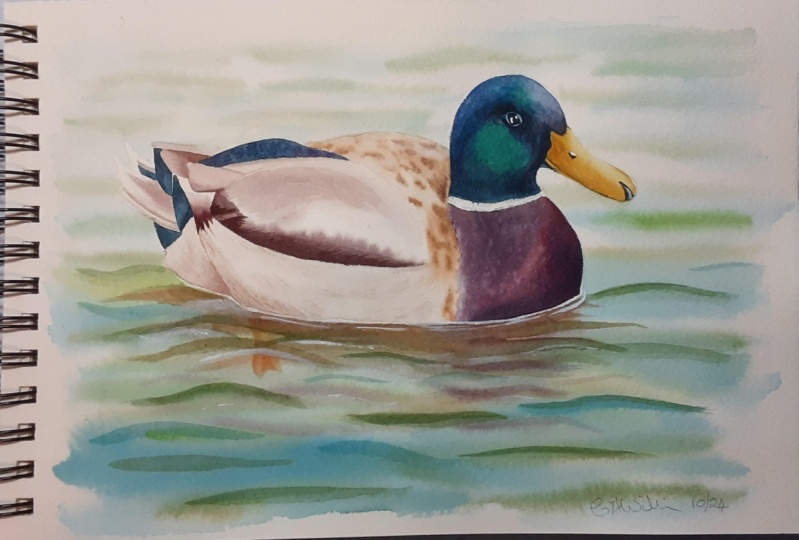
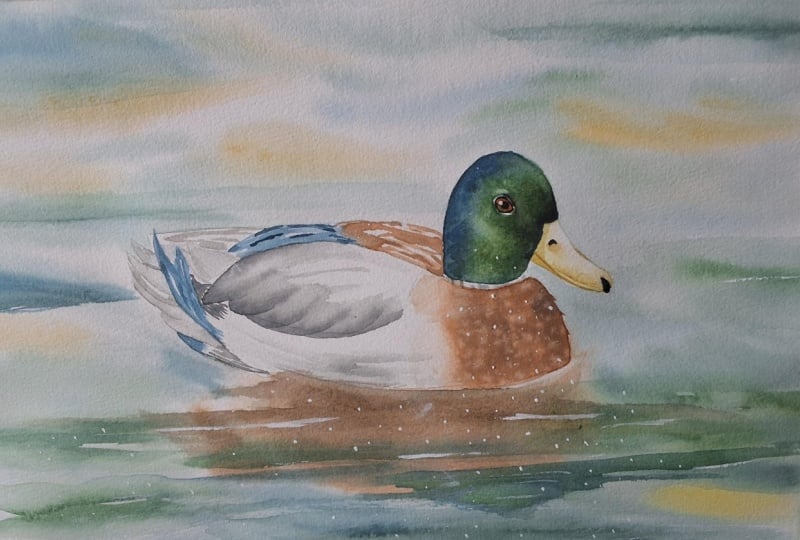
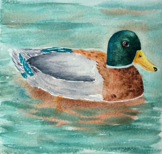
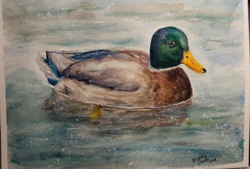
with this medium. In this course, I am
taking you through my entire painting process
for this mallard duck piece. I explain everything
from how I choose my colors for this
painting to how I do my layering to increase
dimension and depth all the way through to how
I add those final details. Along the way, I also share my favorite techniques for
painting believable bird eyes, an easy and effective way to paint water and
reflections on water. Simple and stress free way to render feathers via
simple brush strokes and how to add splattering using white wash at the end
for visual texture. I do want to mention
for those of you just getting started
with watercolor, I have a full watercolor
one one course here on Skillshare in which I explain all of the
must know information, that you should know as a
beginner just getting started, and I provide
essential exercises that will help you progress
your skills faster. So you might want to
check that out first, as well as more beginner
friendly courses that I have made available. In the projects and Resources tab that you're going to be able to find right below any of
the videos in this course, you're going to find
the downloadable files that I have created for you
along with this course. One of these downloadables
is my outline sketch. I would recommend
tracing over it, and transferring that
outline sketch onto your watercolor sheet using whatever transferring
method you prefer. I personally enjoy using tracing paper for
my transferring and the preparation of my preliminary sketch
on my watercolor sheet. And I do have a class in my watercolor one oh
one course in which I take you step by
step through how to use tracing paper for
your transferring. Along with my outline sketch, you're going to be able to
find the reference photo, which I would highly
recommend observing as you're making your way
through the painting process. I'm also going to be making a photo of my finished painting available so that you can use it as a reference as
you're working as well. And your supply list. With all this said,
let's go ahead and jump into the first class
where I'm going to be explaining all about the
project that we're going to be working on together in
this course. See you there.
2. Course Project: Hey, there, and welcome to this first class
where I'm going to be explaining about the
project that we're going to be working on
together in this course. By the end of this course, you'll have completed
a beautiful, realistic painting of a
Mallard Duck in a lake. I've organized my painting
process into six phases, each of which has a
class of its own. As I walk you through
my painting process, I provide must know tips and
techniques that you'll be able to take with you to future watercolor
paintings of animals. To post a photo of your
work here on Skillshare, all you have to do is click on the Projects and Resources tab. Once you're in, you'll see this purple button on the right
that says submit project. When you click on this button, you'll be taken to a
new page where you'll easily be able to both upload
a photo of your piece, as well as share any thoughts, experiences, struggles or questions that you
might have for me. Here, you can create a
title for your project, and click on that larger
content section underneath. And if you want to add in
that photo at the beginning, you can go ahead and click on that image icon on the bottom. Find the photo that
you're wanting to share on your
computer or device, select that file, click Open, and it will be immediately added into this content section. Then under your image, share anything that you'd
like, whether it's struggles, questions, wins, aha moments that you might have had throughout this course. Anything that you'd
like to share, I always love hearing from you. At the bottom of this
content section, you'll see different icons. One is for formatting your text. The other is to add emojis, the Adimage icon, which
we just talked about, and you can also embed link. Free to add in even more
pictures if you'd like. They can be process
pictures, supply pictures. And over here to the right, we have this preview area
where we essentially see a thumbnail or cover
image for your project. You can go ahead
and change it to a title image that you have created in a more
horizontal format, or you can just go
ahead and leave it as is and have it just be a crop section of one
of the images that you have uploaded into your
content area. It's up to you. Once you're ready, go
ahead and scroll back up. Click on the green Publish
button and you'll be all done. If you'd like to share your
work over on Instagram, please do just make
sure to tag me at Erika Underscore
Lancaster Underscore Art. I love seeing your
work over there and giving students
shoutouts in my stories, of course, go ahead and tag
the Skillshare account too. It goes a very long way and inspires other students
to share their work as. Skillshare is a
safe learning space for all of us to continue
growing together. So make sure that you're
using this gallery, and let's all connect
and help each other out. I can't wait to see your work and to help out with
whatever you might need. Let's move on to our next class.
3. Supplies: Hello, and welcome to the second class where I'm
going to be sharing about the supplies that I would
recommend having on hand as you move forward
with this course. You do not have to use
exactly the same paint colors that I'm going to be using in order to arrive
at great results. You can use something
that is similar. You can also use slightly different paint
brush sizes as well. But I would recommend
making sure that you're using appropriate
watercolor paper for the techniques that we're
going to be bringing all watercolor paper is suitable for layering or
scrubbing techniques. And so I would recommend using
watercolor paper that is 100% cotton and make
sure that it is at least 140 pounds in
thickness or in weight. To begin, I'm going
to be working on watercolor paper from arches. This paper is cold pressed. It's 140 pounds in
thickness or in weight. I did cut off a section of this paper to make it a
little bit less long. So the watercolor sheet that
you're going to be seeing me work in is 10.5 " by 9 ". I'm going to be
using my watercolor set that contains a mixture of paint from Daniel Smith and paint from Windsor and
Newton's professional line. I'm only going to be using a total of seven
different colors, and these colors
are Windsor Lemon, Pyl scarlet, Sap
green, Antwerp blue. Paints gray, raw sienna
and burnt sienna. I'm going to be swatching
out these colors on a scrap piece of
watercolor paper before starting with
the painting process so that you can see what
they look like on paper. I'm going to be using
five different brushes, two larger brushes to
paint the water area. One of them is a 1 " flat brush, and the other one is
a size six mop brush, which is essentially a large and very
absorbent round brush. And the other three
are round brushes in sizes 14, ten, and three. I'm going to be
bringing in a couple of other multimedia
cheaper brushes. But these are going to be
brought in until the end for the work that I'm going
to be doing with white guash. And these are also round
brushes in sizes 12 and zero. As long as you're
using brushes that are approximately this size, and you're making sure
that you're using large brushes to paint
the larger areas, especially when we're
painting the water, and that you're using small retailing brushes that arrive at a nice fine tip to
paint areas like the eye and very small
shapes in the feathers, you're going to be just fine. White Gach that I'm going to be using is from
Windsor and Newton. This is a tube from their designers Gach
in permanent white. I also have a separate little
mixing palette for Mach. And this is where I
squeeze out that gah, bring in a tiny bit
of water to change the consistency of my gah depending on what it
is that I'm doing. I'm also sharing a few of my sketching supplies
on screen that I use to create my preliminary sketch
on my watercolor sheet. On screen, I am sharing the
sheet of tracing paper. This is tracing paper
from Strathmore. And what I did was I traced
over that reference photo. I refined my sketch on my watercolor sheet
using my HB pencil. If you don't know how to
use tracing paper for your transferring and to create your preliminary outline sketch
on your watercolor sheet, that you can get
started with the painting process for
something like this, and you'd like to
learn how to do this. I explain this process
step by step in one of the classes that I share in my watercolor one oh one course. And the class where
I explain how to use tracing paper for this is
one of the last classes, so you just have to scroll down. Of course, you can always use whichever transferring
method you prefer. For the refinement of
my preliminary sketch, I also used my soft
graphite eraser. And aside from these supplies, I have the usual on hand. I have my container
with clean water. You're free to use two or even three containers
if you'd like. You do want to make
sure that you're using clean water as
you're moving forward. If you use two containers, it can simplify the
process for you because you can rinse out your paint
brushes in one of them, and the majority of that murkiness stays
within that container, and then you can use water from your other cleaner container to bring into your
color mixtures to change their consistencies
throughout the process. Or to bring in a little
bit of water from your container if you need to
do that for any techniques. I have a couple of my blue
scot absorbent towels on hand in order to stay on top of water control along the way and do any lifting
that I might need to do. I have a couple of
scrap pieces of watercolor paper on hand in
order to test out colors, whenever I need to
throughout the process. Have my role of regular
1 " masking tape, and this is what I'm
currently using to tape down my watercolor sheet onto
my black cutting mat. I wouldn't necessarily
recommend using a cutting mat as a backing board because
they are very flexible. And usually, you want
something sturdier that you can shift and move to different angles as
you're moving along. Because I have to
keep my painting in one single area as
I'm doing my filming, it doesn't really matter. But I would recommend getting
yourself a sturdier board, maybe a wooden board
or acrylic board, something like that, to tape your watercolor
painting down onto. That is going to make things
a lot more comfortable. And whatever kind of tape
it is that you're using, whether it's regular
masking tape, like what I am using or any other artist tape or washi tape or whatever
the case may be. If you think that the
adhesive is strong and you fear that when you pull
off that tape at the end, you can damage your
watercolor sheet. What I like doing is
running those pieces of tape over my clothes
a couple of times to soften that adhesive before actually taping down
my watercolor make sure to download all of
the files that I'm making available for you in the
Projects and Resources tab. Click on the Projects
and Resources tab that you're going to be able to find below any of the videos included
in this course, scroll down just a bit. And right under the
download Resources title, you're going to be
able to find all of these downloadables that
I've created for you. The downloadables
for this course include my outline sketch, which you can trace over
in order to do your transferring onto your
sheet of watercolor paper. The reference photo
of this Mallard Duck, I would highly recommend
observing the photo as I'm also including a photo of my finished piece in case
you'd like to use that as reference as you're working
and my supply list. Simply click on the file
that you'd like to download and it'll be downloaded onto
your computer or device. Go ahead and collect your
supplies and once you're ready, I'll be seeing you
in the next class.
4. Choosing + Swatching Colors: Before sharing about the
specific paint colors that I'm going to
be bringing into this process and
swatching them for you so that you can see what
they look like on paper, I want to explain my
thought process behind how I choose the specific colors that I'm going to be
bringing into a painting. For this kind of piece where I am going for higher
levels of realism, I'm usually stemming off a reference photo or something that I have in front
of me in real life. And at this point in my journey, I know how important
it is to take at the very least five
to 10 minutes to do some planning and prep work before jumping into
the painting process. This is going to ensure
much better results. And one of the most important
things that I do during this planning and prep
phase is I choose the specific colors that I'm going to be bringing
into the piece. This is very important
because if I just go through the process
randomly choosing colors, I can end up with colors that I didn't want and
not only this, but Color is an element of art
that plays a huge role behind making
visual compositions look harmonious and cohesive. And through choosing our
colors mindfully and intentionally and
thinking of how we're going to be repeating
colors throughout the piece, as well as using some of those same colors in
different color mixtures. This is going to lead to more harmony and
integration at the end, and something that I
personally love doing, is limiting the amount of colors that I am going
to be bringing into any painting because this
challenges me to think of how I'm going to be repeating different colors to create the color mixtures that I need. Bringing in more colors is not necessarily going to
lead to better results. Having said all that, this is exactly the process that I go through to choose my colors. I open up that reference photo and sit with it
for a few minutes. I observe it closely and take notes on the main
colors that I see. In this particular case, the most prominent colors
that I see are green, cool blue, several
different browns. I see a darker reddish brown, a lighter, more
golden or tan brown. I also see a very dark brown right along the
edge of that wing. Aside from those, I also see
yellow in the bird's beak. I see an off white in
those white feather areas, and I also see a little bit of a bright reddish orange for the duck's foot that we're
able to see through the water. In terms of the water itself, I see a lot of greenish tones, and I also see some
brownish kind of beige tones which are very similar to that lighter brown that I
see in the bird's back. And we also, of course, see some parts of the bird's
body reflected on the water. To paint those reflections, I'm simply going to be using the same colors that I'm going to be using inside of the bird. I'm already thinking
of how I can repeat the same colors inside
and outside of the duck. Once I have that list
of colors that I see in my reference, I
start connecting those colors with the colors available in my watercolor set. It's very helpful to be able to tell whether a color
that you're seeing in a reference is warm or cool biased or
somewhere in between. Because this is
going to help you pair those colors
that you see in the reference with colors in your watercolor set
a lot more easily. For example, in this
particular case, the greens that I see
throughout the water are warmer than the greens that
I see in the bird's head. This doesn't mean that I have to choose two different
greens for each area. I can simply choose
one base green, which is going to be
Sap green in this case, and I can just make
sure to use it with some blue added in
in the bird's head. I have a full course
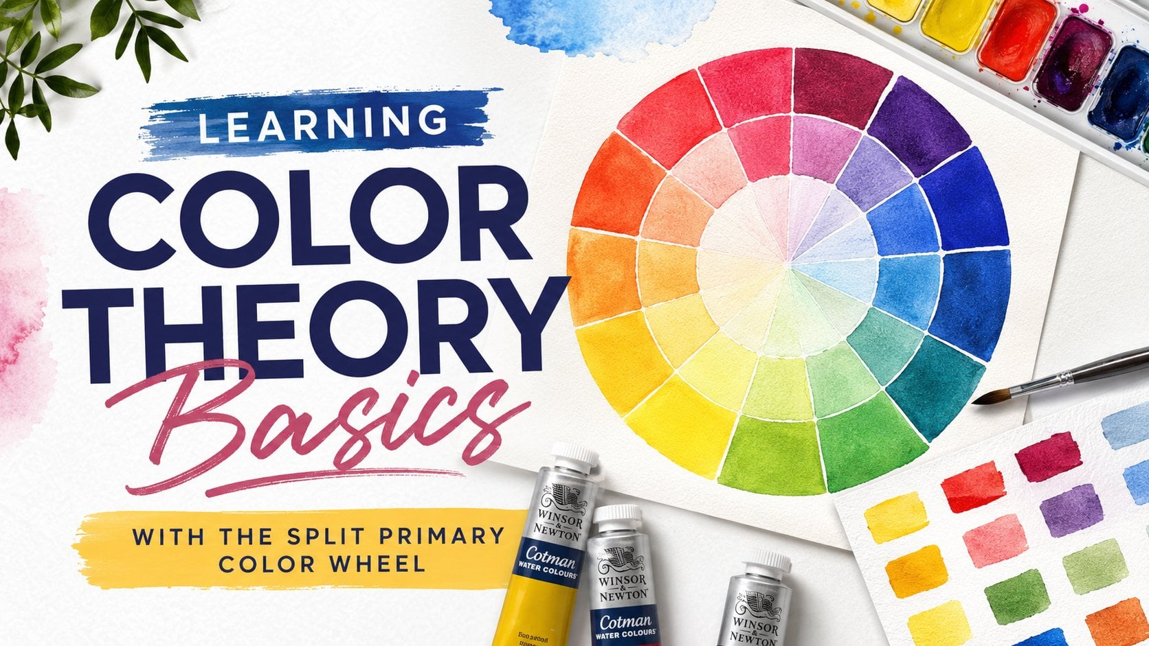
on color theory for beginners here on skill share in case you'd like to
check it out in it, I've included everything
that you should know about color theory as a beginner
just getting started, including a helpful exercise on the split primary
color wheel, how to tell warm
from cool colors, color schemes that you
should know, and much more. I have chosen those
specific paint colors from my watercolor set that most
closely match the hues present in those
different areas in my reference photo or the pairs of colors that I'm going to be mixing to create those
colors that I see. I need to start thinking
of value or tone. Which is incredibly important if we're going for
any level of realism. In art, the terms value or
tone mean the same thing, and they refer to the lightness to darkness of any given color. When we're trying to achieve mid to higher levels of realism, we need to make sure
that each area of our painting has a range of values or tones throughout it, because in real life, there is light and shadow
and there is three D form, and nothing should be a flat color or value
all throughout. Every single part of the duck's body is being
affected by light. There are planes that are
facing toward the light and there are planes that are
facing away from the light, and there are parts of its
body that are covering up other parts of its body and blocking that light
from hitting them. And this results in a range of values or tones that we
see throughout its head, throughout its beak, its eye, all of these
different body parts, Even the water is being
affected by light and shadow. Water is very reflective, and we need to be able to create those lighter
value areas, those mid tones,
and those darks, if we want it to
look believable. When it comes to white objects, white fur, white feathers, et cetera, we also have
to think of how we're going to be developing a
subtle range of light values. Those areas. Otherwise, they
are going to look very flat. In this case, I'm going
to be creating a gray to develop those light gray values throughout the white
feather sections. And now that you have
chosen those base colors, you need to think of
how you're going to be creating lighter and
darker versions of each. It's important to acknowledge that when we're working
with this medium, We lighten or darken colors
in two different ways, either through mixing in a second color to
lighten or darken our color mixture or through watering down or thickening
up our color mixtures. And usually it's going to
be a combination of both. Usually, when we're
painting with water color, we're constantly
shifting the ratios of our colors in
our color mixtures, and we're also shifting the
water to paint ratios in our color mixtures depending on the value or tone that
we're trying to develop. These are all of the
things that I have in mind as I am choosing my colors. These are seven different colors that we're
going to be using. You don't have to use my same exact colors in order
to arrive at great results. I'm going to be
swatching these out for you so that you
can see what they look like on paper and you can
just choose whatever you have that is most
similar to these colors. This first color
is Antwerp blue. From Windsor and Newton removing this color from my
pinfish bristles completely. The next color that
I'm going to be using is Sap green from Windsor
and Newton as well. This is what Sap green looks
like. It's a warm green. I'm also going to be bringing in Windsor lemon from
Windsor and Newton, which is a cool yellow.
This is what it looks like. Moving on from there, I'm going to be bringing in Pyl scarlet from Daniel Smith. This is a warm red. As you can see, I am preparing my colors in a specific
way on my palette. I'm trying to keep
my warm colors separate from my cool
colors on my palette. Because what happens is that complimentary colors
in the color wheel are opposites in
the color wheel, as well as warm and cool colors. When they mix together,
they mute each other down. The saturate each other. And when we're going for a
very bright vivid color, we want to make sure
that we're keeping warms and cools separate
on our palettes and that we're very careful
with complimentary colors or opposites in the color wheel that could be seeping
into each other. There's nothing wrong with using muted down or desaturated
colors, not at all. You just want to make
sure that you are using those desaturated
colors or creating those desaturated
colors intentionally. This is pral scarlet
right there. Then aside from these, I'm going to be bringing
in a few neutrals. I'm going to prepare
the neutrals on the opposite side of my palette. For this piece, we're
going to be bringing in two browns and a gray. The first neutral or brown
brownish, I should say, color that I am bring in, is this rosena which is a
very light golden brown. Color. You could use something
like a yellow ochre. They are actually quite similar. Aside from this, I'm going to be bringing in Burnt Sienna. Burt sienna is a reddish brown and it is darker
than the raw sienna. Then aside from this,
I'm going to be bringing in some pines gray. Pains gray is a cool gray. It has some blue in it. This is pains gray from
Windsor and Newton, which is actually quite a bit bluer than pains gray
from other brands. You can bring in any gray or even black that
you have available. This gray is going to be used to darken other colors and to create subtle gray values or tones throughout the
white feather areas. I'm going to swatch out these neutrals for you right here. This is raw sienna. This is burnt sienna, let me show you
what the panes gray looks like. That's it. That's all we're
going to be using. Of course, we're
going to be creating different color mixtures
with these colors. We're going to be
bringing two or more of them together to create our different hues and values
throughout this stuck. Many times we're going to be
using the same two colors in a color mixture but the ratios of the colors are
going to be different.
5. Head, Chest + Side: Getting started with
the bird's head, I am preparing three different
colors on my palette. I'm preparing a little
puddle of Atwarp blue. This is plain Atwarp blue. I am preparing a little
puddle of sap green. Then over here, I have a mixture of Atrop
blue and sap green. Those are the three
colors that I'm going to be needing
for the head. Will be bringing in
some paints gray as I make my way toward
the darker values, meaning once I have my
initial lighter values developed all throughout
the bird's head to darken certain colors, and I'm just going to be using
that darker color mixer or those darker color mixers
in the darkest areas that I see throughout the bird's head in that
reference photo. We're not going to be
painting the eye yet. I'm going to be avoiding
that area and I'm going to be leaving it just
free of paint for now. I want to make sure
that I am able to go in with more precision and more control later with a smaller paint brush to
paint in the Initially, I want to go in with less
pigment and more water. So you're going to see me
take just a little bit of color from the edges
of my puddles here, and I'm constantly
going to be dipping my paint brush in my water
container and just using a little bit of water
in my paint brush to water down the pigment even
more and make it more pale. When working with water color, we're always making
our way toward darker colors and darker values. Initially, we want to go in
with just a small amount of pigment and we want to build
toward the darker values. Observe that reference photo and notice where the
green is primarily, where the blue green or the blue is in the back
of the bird's head, and what areas are a little bit like almost black looking, then notice how there
are lighter values along the top of the bird's head
where the light is hitting. I have a fresh container
of water by my side. I have the color
mixeres that I need, and I have my absorbent towel
right here with me as well. This is my size ten round brush. I feel it's a good size
of brush for this area. I'm going to go
ahead and jump in. I'm going to start
with the blue. You can see how I'm
taking just a little bit of color from the edge
of my puddle here. I had just dipped my paint brush in my container of water, so this is not going to
be very thick dark color. It's going to be pretty pale. I'm going to start
with the back of the bird's head where
I see that color. Dip my paint brush in my water. Bring this color out and dilute it even more with
just water in my paintbrush. I'm going over the entire head. Up to or down to the
white stripe in its neck. Notice how I'm going
over everything a couple of times
with just water in my brush so that things can stay a little
bit wet for longer. If I just go quickly
over everything once, that's not going to help me because things are going
to start drying very quickly and I want some gradients where the
blue turns into the green, and then the green turns into that darker almost
black looking color. So I went over the entire
bird's head with blue. We know that the blue
is really only going to be visible in the back
of the bird's head, dip my pain brush
in my water again. I'm going to take some
of my bluish green. And I'm going to bring it down into the green area that I see. You can see how
I'm getting nice, so diffused effects
because everything is wet because I took my time
with that first layer. Going in with the
green, dropping in the green in the
middle portion of the bird's head,
avoiding the eye. Okay. Go down bringing the
green all the way down. Everything is still
wet and workable, so I can I can go in and strengthen the
blue in the back of the bird's head with
a little bit more of my anthrop blue to
intensify that blue. And I'm using my paint brush to merge the blue
into the green. To help those colors
transition into each other. I need to work fast here, I'm going to start adding
in a little bit of pines gray into my blue green. Just a little. I don't
want to get super dark. I can still go in
with another layer, but this is sap green, a tiny bit of Arop blue, and some panes gray and
I'm going to drop in this darker color where I see it there in the
photo, around the beak. Where do I see it?
Around the beak. Around this area. Continuing to observe that reference
around the eye. A little here and there. That is enough for that first layer. Everything is
looking pretty dark. I removed all of that paint from my paint brush bristles and
I'm going to do some lifting. Check it out. I'm going
to do some lifting by pressing down the cleanest slightly damp bristles
of my paint brush. Don't go in with too much
water because if your pain is in the middle of the
drying process and you go in with too much
water in your brush. All of that water
is going to travel down the bristles of
your paint brush, and that water is going to disturb all of that paint that is in
the drying process, creating a splotchy
background effect. So I'm just pulling
up paint from little lighter value
areas that I see in that reference photo to give the bird's head a little
bit more dimension. Okay. I'm going to clean up some of these edges quickly
here while this paint is still wet and using a
clean brush, just the tip. I'm going to drop in
a little bit more of my darkest color mixture
around the beak. I go ahead and do this because I notice that the paint is
still wet and workable. If the paint had
already started to dry, I would actually be darkening
this in a next layer. I'm just going to clean up some edges here with the
tip of my paint brush. Because we have to work fast, especially when we're
painting on dry paper if we want to create soft
gradients and effects. We oftentimes need to
leave the cleaning up of edges of our shapes
until the very end. Make sure that you are working quickly to create all of
the wet on wet effects that you want before
that paint starts to dry and don't worry too much about having jagged irregular
edges around your shapes. You can take care of that
after you've created those general effects
that you're looking for. And then after you're
done with that, then go ahead and remove all of that paint from your
pain brush bristles and clean up your edges
if you need to really. I'm going to do a little bit of splattering with water
for texture in the head. Take a little bit of water
from that container and use your index finger to do some flicking on that paint
that is still wet. Okay. That is it for the bird's head. I'm going to go ahead and
change my water because we're going to be using
very different colors next and I don't want my
blues and my greens to affect the way that
those next colors look. Right now, this area right here is a little bit wet still. I I start painting the beak, the yellows and oranges that I use are going to start
seeping into the bird's head, and I'm not really looking
for bleeding right now. What I'm going to do is I'm
going to get started with the chest area and
I'm going to make my way back or the bird's body, I'm going to be using
this size 14 round brush. Look at that reference photo and notice where the browns kind of end and become more kind
of whitish feathers. I've included these
lines or marks in your outline sketch,
so that is helpful. But just know that we're
going to focus on this area, and then we're going
to create a little bit of a subtle transition. By creating irregularity along this edge of this brown shape. We don't want the edge
of this brown shape to be super clean and defined. We want to have irregularity and at least some soft edges so that it seems more like
a gradual transition, not that we're seeing a gradient
in that reference photo, but there has to be a certain
level of softness where the brown feathers turn into the whitish or off
white feathers. Over here, there are
also brown feathers, but the brown is slightly different from
the brown in the front. This brown is a little bit
more reddish and darker, than the brown
that is over here. The first thing that I want to do is I want to make
sure that I have the colors that I'm going to be needing for this
part of the process. Mostly it's going to
be grays and browns. I'm going to go with this area over here on my
palette where I've started preparing my neutrals with my size 14 round brush. I'm going to create more of these and an extra
mixture or two as well. This is my pains gray. This is my burnt sienna. Finally, I have raw sienna. And I'm going to create a
couple of extra colors here. I'm going to create a mixture
of burnt sienna and pains gray right here in
between these two colors. Adding a bit of
pains gray to create a very deep dark
chocolate brown. Okay. So I'm just
noticing in that photo, the level of darkness of that brown in the bird's
chest in front of its body, and I'm trying to get a
level of darkness that is similar to that because
the hue in itself, the color in itself can be
a little bit different. But you want to make sure that you're able to
achieve that value, that level of darkness to
lightness of that color. All right. That's
that very dark brown. I have a gray over here. I have my reddish brown and
I have my lighter brown. Something that I
also feel will be helpful is creating a mixture of raciena and bird sienna
to have an in between color. I have everything that I need. Pains gray, Pains gray
plus burnt sienna, burnt sienna, Burt Siena
plus raciena and raciena. Size 14 round brush. I'm going to start with
some burnt sienna, and I'm going to
start right here. I'm going to try to
avoid that white collar. That is such an important
characteristic in malls. I'm going to leave the whiteness of the paper shining
through there. And I'm going to go over
this entire chest area with my burnt sienna. Notice the irregular edge
I've created right here. It's not a smooth edge. Notice how I'm going
over the entire thing, at least a couple
of times so that things stay wet
for a bit longer. Now I can go in with my
darker color mixture. This is burnt sienna
plus pines gray, and I'm going to pop it in
in a very irregular way to develop a range of values
in the bird's chest and make sure that I'm going dark enough to communicate the
darkness that I see there. But I still want a
nice range of values, a nice vivid color in this area. I don't want to go
in with just gray. I want to make sure that
there is a nice use of color bit darker Okay. All right. Cool. Go to remove all of that color from
my paint brush bristles. Got a little bit of water
splattering on my paper. That's okay. Doing a
tiny bit of lifting to lighten some areas with the
clean tip of my paintbrush, using it as a absorbent
sponge to create a little bit of irregularity
here along this edge. To communicate a little bit
of a sense of feathers. I'm going to do some gentle
scrubbing along some of these edges to soften
that edge here and there and not have such a stark looking edge
all throughout this shape. I just want to keep
it very irregular. You can keep some sections
with sharp edges. I'm just trying to lose some
of that edge here and there. Then the last thing
that I'm going to do is I'm going to do some
splattering again. While that paint is still wet. For this, I'm going
to change onto the size ten round brush because it has a little
bit more of a snap to it and I bring out a little bit of water from my container and use my index finger to flip some drops of water
on that drying paint. Those teeny, tiny drops of water that get splattered
onto that drying paint. Disturb that drying paint
and create little blooms because the water pushes out that paint
that is still wet. Your paint still
needs to be wet in order for that splattering
texture to happen. There you go. There's
that bit of splattering. If you paint dries, you're
not going to be able to have that splattering
effect. All right. So what I'm going to be
working on right now is this entire area with the
white or off white feathers. Everything over here and
this wing over here. Yes, I have a darker brown edge right along the
bottom of this wing. I'm going to take care of that. Once I have developed a subtle hint of gray values
all throughout this area. I'm going to leave
the section with the lighter brown feathers
over here along the bird's back and also the entire tail and
darker father areas. Or later. This is
all about breaking things up into sections so
that it's easier to paint. I'm going to do a little
bit more splattering before this paint completely
dries or some texture. Okay. In order to develop that illusion
of white feathers, we're going to need
some very pale water down color grayish color. I'm going to be using these puddles that
I've already created, you can see how my burnt sienna and a little
bit of raw sienna as well has started
intermixing with my pines gray, that is fine. I'm just going to be using
a tiny bit from here, and it's good because this way, because there is so much of
that burnt sienna in my gray, the gray is going
to look warmer. If I just use the
gray by itself, especially the
pines gray which is already cool bias because
it has blue in it, the grays are going to
have a cooler temperature. But because it has so much of that reddish brown mixed in, going to look like a
bit of a warmer gray, which is more similar to the grayish tones that I'm
observing in that photo. But what's super important if you want something to look white like white feathers or white fur or whatever
the case may be, is that you need to go
in with a very water down color so that it
looks very pale and you have more of that
paper shining through helping you create that white
color, that white effect. Because when painting
with water color, it's the brightness
and the whiteness of the paper that
stands in place for our highlights and that helps us create those very
light value areas. White feathers, white fur, white objects have a
very light local color. Make sure that you're going
in pale and water down. Then if you need
to darken areas, you can go in and add
a little bit more of a more pigmented
color mixture on top of that lighter paint
while it's still wet. I'm taking a tiny bit from
here and I'm going to be using a lot of water dipping constantly in my container
to start right here. Along the bottom edge, dipping my paint
brush in my water, softening this color more. And I'm continuing to observe
that reference photo, making sure that I'm not going past the area that I'm
trying to paint that I'm observing color changes that's already enough. Do you have in mind
that water color is going to dry lighter than
how it looks when it's wet. You can create
little brush ropes to help communicate
that feather texture, but make sure that you're
doing it quickly and while that paint is
still wet so that you can have nice soft
diffused out effects and not star looking
lines and shapes. I'm going to leave
that B and I'm going to start with the wing. I'm noticing the wing
in that reference, making sure that I
understand the shape. Okay. And I start with
the bottom edge, which is the darkest
section that I see, going in with this water
in my paint brush. I'm using strokes to help me communicate
that feather texture. I don't want to cover
up the entire wing. Hopefully, you can
see how I have left sections of paper
shining completely. I'm going to create
more of my burnt sienna and pains gray mixture that very dark brown so that I can darken the bottom edge
and the end of that wing. Softening some of this. I don't want the paint
to expand too much. I just want the darkness
in that bottom edge. You can see how the paint
started seeping down and that's because this
bottom section was still wet. I'm going to go in and do
a little bit of lifting with a clean and slightly
damp brush to fix this bleeding before the
paint completely dries. There you go. When you have something like this happening and you don't want bleeding, just go in with a clean
and slightly damp brush and use your paint brush bristles as a little
absorbance sponge.
6. Beak, Back + Tail: All right, we've managed to do quite a bit of work
throughout the bird's body. I really want this entire
white feather section to dry. Before I start
with the top part, which is a different
color and also the tail. In the meantime, we can start
painting the bird's beak. Just like with everything
that we've been doing, it's important to make sure that our color mixtures
are ready before jumping in so that we can make sure that we're
painting nice and fast. I want to make sure to change my water because as you can see, it's very murky and this
water can definitely mute and also darken the bright yellow that I
want in the bird's beak. What do I see when I see that bird's beak in
the reference photo. I see a bright yellow, and I also see a
little bit of black in that spot right in the
end and also the nostril. I'm not going to be doing
the black right now. I'm going to be painting in those black shapes in the beak after the
yellow has dried. But what I am observing about that yellow
in the beak is that the yellow is warmer than the winsor lemon
that I'm using. To create a slightly warmer
version of this yellow, I'm going to add
in a little bit of my piral scarlet into it, warm it up a little and then I'm going to
use it in that way. Hiding a little bit more
of my Windsor lemon here because it's almost
dry on my palette, and I'm just going to take a little bit of
this piral scarlet and bring it into my
Windsor lemon puddle. This way, I've warmed up the Windsor lemon
and it's more of a similar yellow to
what I see there. I want to create at least a
slight range of values in the bird's beak
because if I just create a flat yellow all
throughout the bird's beak, that is going to
lead to flatness. It's not going to look like
it has a sense of dimension. On top of the bird's beak, there are lighter values.
There are highlights. What I'm going to
do is I'm going to create a second color
mixture where I bring in a little bit of rosena which is darker
than the yellow. And I'm going to mix it
into the yellow there. Those are the colors that I'm going to be using at the beak. I'm going to be using my size ten round brush for the beak, and I'm going to try
to at least leave a little high light section
along the top of the beak. What are the top planes
of the bird's beak? Really think about the
structure of the beak and what section the
light is hitting most. You can even cover up
those black shapes in the nostril and the
front of the bird's beak because we're going
to be painting the black when this dries and these very light colors underneath are not going
to affect the black. Notice how I painted in
that light yellow first. I didn't really go in with
a super thick yellow. It's relatively watered
down initially. And that's it. That's
all I'm going to do. Notice how I left a little
sliver of high light right here where I didn't really
paint in along that edge, and you can always lift
up excess color as well. Go to drop in a tiny bit
more of my raw sienna. And that is it. That's
all I'm going to do. Removing some excess paint here by doing some lifting with my clean and
slightly damp brush. Okay. So it's time to work
on the back and the tail. I'm observing that
reference photo and I'm noticing what colors I'm
able to see in those areas. Right here, I'm able to
see some lighter browns. It's a different brown from
this one here in the chest. Right here, it's a lot redder
and deeper and over here, it's more like a
golden brown color, much lighter than
this over here. Then over here, I see some darker blue feathers
and in the tail, I see some white feathers again. We're going to be approaching
the brown feathers separately from
the blue feathers. The brown feathers in
this area are going to be painted in with raw
sienna and bird sienna. We're not going to
be bringing in pines gray because these feathers
are not really that dark. I do want to make sure that I
have enough of these colors and also a transition
color in between these. And that bridge color really helps create softer transitions. We're not trying to paint every single individual feather. We're simplifying
things and we're using brush ropes in the direction of that feather growth to help us subtly communicate the feather
texture or feathers being there in that area
without really painting in each
individual feather. I'm going to go in with the lighter color of
the bunch first, which is the plain rosena I'm going to start
here in the back. This is my size ten
brush by the way. I'm going to leave
little sections of white paper shining through. I'm going to bring
it down because I also see some light brown
feathers in this area. Going in with the
next darker color, which is the burnt sienna
plus the raw sienna. Then finally, I'm going in with a tiny bit of plain
burnt sienna. Remove that color from my paint brush bristles and you can soften edges of these irregular shapes
that you've created. Or even develop a
little bit more of a feather texture by moving
that wet paint on your paper. If your color has expanded too much or you have darkened
things too much, you can always do a
little bit of lifting with a clean and
slightly damp brush. Okay. Go in just a tiny bit. More to develop
some darker values there with my burnt sienna
while that paint is still wet. Moving onto the blue feathers
over here and over here. I just want to situate myself. I want to observe
that reference photo and notice what's blue. And if you can't see your
pencil lines anymore, or you find it helpful
to redraw things just so that you can get a better understanding
of what's. I would recommend taking
a second to do so. These are white feathers, and then this is blue, and this is blue. I see two distinctive
blue curves there. If these are white feathers, I might have to go back
and paint those white. That's okay. This is blue. This is blue as well, and I see a tiny bit of blue down
here, and then the back. So I'm going to prepare
more of my blue. This is my Atrop blue. I want to make sure that I'm taking the blue
that I have planned and not take some cobalt or ultramarine,
which are beside it. So I'm going to make
sure that I have my antrop blue mixu right here. What I'm going to do is
I'm also going to add a little bit of pins gray right here so that I can have a
slightly darker version of it. If the green mixes
together, that is fine. You can repeat
that color mixture that you were using in the head. I'm going to use my
size three round brush. And I just made sure to dip my paint brush in
my container of water to dampen the paint brush
bristles before starting. It's important to prepare
those paint brush bristles before dipping your
paint brush into the paint. Okay. So Andre blue first, and I always want to start
with just a bit of color in my paint brush so that I can build toward the darker values. Where can I start? I'm going
to start here at the top. And notice my strokes. Notice the type of
stroke that I'm using, always having in mind the direction of
the feather growth. I can soften the edge between the brown and the blue with a clean and slightly damp brush. I'm going to go in with
a slightly darker blue and intensify the
blue in some areas. I start with my bit of
blue over here again, see this bottom little triangle. I want to go in
with too much pain in my paint brush bristles. This is a teeny tiny shape. But I'm always
looking for a variety of values everywhere, even in teeny tiny shapes. It helps things look a little bit more realistic. All right. So going back to the
blue curved shapes that I had pinpointed before. It's this one and this one. Make sure that you
understand what you're going to be painting
in before starting. It's this one here. And I'm trying to
leave little teeny tiny sections of paper shining. And because it's
such a small shape, I don't really have to run
my pain push scles over everything with water
because it's quick to paint. And my next blue shape
is this one here. Changing the strokes in the direction of that
feather going up now. All of these are white feathers. I'm going to have to
recreate the same color that I was using over here to
paint these areas in. We just have to make sure that we swatch out
our color mixture so that it can be a
very similar color to these grays that we
were using over here. While that dries, we
can start painting in the little color
and also the eye. I'm going to continue using
my size three round brush. I'm going to activate this grayish brown color
over here on my palette, a little bit of water and develop subtle hints of gray values so that it's not
a completely flat white. Just little teeny,
tiny abstract shapes in this area is enough. All right. This is what I like doing when I paint animal eyes. I can't do it always
because not all animals have an eye color that
I can do this with. I can't do this with blue
eyes or things like that. But when the animals eyes are yellowish or amber or a
reddish brownish color. I like using this
technique where I initially go in with
a bright yellow and create a tiny
under painting layer to the eye because it
provides glow to the eye. I just added a
little bit more of my Windsor lemon into
this Windsor lemon plus rosy and a mixture
that I was using before to brighten it
a little bit warm. What I'm going to be doing
is I'm going to be using this smaller brush to paint
in this bright yellow all throughout the eyeball except for the
highlight shape and a little bit of
the per line along the bottom and top
of that eyeball. Highlights are so
important when you're painting animal
eyes or human eyes. So if you accidentally
cover them up or you forget to
plan for highlights, you can always bring in a white paint pen at
the end or a tiny bit of guash to repaint that highlight or
intensify that highlight. While I allow that little
under painting to dry, I'm going to take some of my grayish brown color
mixture from my palette, and I'm going to
start painting in the nostril and the black
shape in the bird's beak. The yellow is completely
dry at this point. I'm not going to have any
bleeding happening if I go in, and I'm still going in with
my size three round brush. Notice how this gray that
I'm going in with initially is not super super stark
looking against that yellow. I would always
recommend going in with a slightly water
down gray and then allow that to dry
and then go in with a second layer to only deepen
and darken certain teeny, tiny areas inside of those
gray or black shapes. This way, you can have
at least a tiny bit of a range of gray or black
values in those shapes, and that is going to help things look more realistic so that you don't end up with very
flat solid black shapes. When working with water
color that can really lead to a negative hole
your painting, and that's really something that we're trying to stay away from. I'm going to allow that to
dry and I'm going to paint in the first layer in the white feathers over
here in the bird's tail. For this, I have my size ten and my size
three round brush on hand because some of these shapes are very
narrow, very small. I'm going to make
sure that I have enough of this gray
color mixture that I had created before to paint
in my other white feathers. This is a mixture of burnt
sienna and paints gray. So this is the gray. It is quite close to what
I was using before. So I'm going to go
ahead and start. I can zoom into the photo whenever I feel it
might be helpful. So I'm just observing this back section
of the bird's body. And I have both my
size ten round brush and my size three
round brush on hand. So I start with a small
amount of this paint. You can see me taking
that paint from the edge. And then I'm going in. And I'm going to try
to paint each one of these father
sections separately. But if the paint starts merging or if the shapes start merging
together, that's okay. I want to leave little
sections of paper shining through to help
me convey that texture. This bottom portion here and
this feather is quite dark. Notice how I'm leaving
little irregular edges in between overlapping feathers. I don't want smooth edges. But don't get too bogged
down with detail. And then change to
my smaller brush and move that paint while it's wet or even take a
little bit more paint to help me create those irregular edges that
I'm observing in the photo to separate out the wing from the tail
with a dark gray value. Okay. I had a little bit of a darker gray value along
the edge of this feather here and I'm going to work
on the shapes in the back. Most of the gray is right
along the upper edge. So I'm going to
start in the upper edge using those strokes. Noticing which father is. And then I changed
to my smaller brush, and these are very small shapes. So I'm just going to use the smaller brush
to move that paint. Help me create that texture with those upwards curved
strokes to help me convey the direction of
that feather growth. You can see how
just by me moving that paint while it's
still wet and thinking of the feather texture as I'm doing these brush strokes and the direction of
the feather growth, as I'm doing the brush stroke, I'm already conveying
feather texture. Without me trying to paint
each individual feather. It's a very loose quick
and effective way to develop a feather texture, which really is helpful when
working with watercolor. It's so easy to start
over working a painting, especially when working
with watercolor, when you start fussing too
much over small details.
7. Eye + Leg: Right now, almost the
entire eye shape is yellow, except for a little
bit of the tear line, especially the lower tear line and the tiny highlight shape. What I'm going to do
is I'm going to be using a mixture of
burnt sienna and a tiny bit of paints
gray and my size three round brush to paint
in the eyeball shape, and I'm going to try to avoid
painting in the highlight, as well as the tear lines. I'm going to take a bit
of a darker version of the same color mixture that has a little bit more
paints gray in it, and I'm going to drop it into a little teeny tiny
section to darken that. Now I need to allow
that to dry completely. It is important for me to mention at this point
that I am bringing in my artistic license to
paint in the bird's eye. The bird's eye in the
photo is quite dark and I want to bring in more
life into this bird. So I am opening up the eye more and I am making certain
sections a little bit lighter. I'm going to be painting in the pupil in a more defined way. And I even changed
the location of the highlight as well.
I made it larger. Once everything is dry, I'm going to come back and I'm going to be painting the pupil. I can't paint the pupil right
now because it's going to start bleeding out and I want
the pupil to be defined. The photo, the leg and the back foot is visible
through the water. I'm going to be
painting that in, and this is a very
bright orange. I am using a mixture
of Windsor lemon and Pyl scarlet to paint in
the leg and the foot. I'm only going to be using that orange color mixture to paint the entire leg and foot. We're going to be
painting the water on top and we want to make it look like what we're able to see of that leg and that foot, we're seeing through the water. I'm going in with my
size three brush. Okay. That's enough
color right there. I'm going in with a
slightly damp brush. I'm just softening that
color in some areas. Softening the bottom
edge of this shape as well so that when I
paint the water on top, it can seem like there is a soft transition between
the leg shape and the water. I don't want to defined edge there at the
bottom of the shape. Dropping in a little
bit more right here. Okay. And that's enough. I'm going to paint in the pupil now that everything
is dry in the eye, and for this, I added
more pines gray into my pains gray and burnt sienna mixture to
darken it even more. Feel free to redraw the circle for the
pupil, if you'd like. It's a very teeny tiny shape. I'm trying to keep the
highlight protected. Okay. And another thing that I'm going to do
is I'm going to add a little bit of a light
gray value throughout the tier lines that I still have visible because it's
a lot of white there. I am going to continue
using my size three round brush and a very watered down version
of this brownish gray. And I'm going to add this very pale gray just in some sections along that tier line
so that I don't have a completely white shape. We definitely don't want a
white outline around the eye. That's not going to
look very believable. So that white is not
super stark looking. Okay. I'm going to go back to my blue
green color mixture. And I'm going to
darken a bit around the eye along the tear lines
that I was leaving before. This will help create
a little bit of a raised effect because these are small shadow shapes
beneath and above the eye. I do want to make sure
that I'm not creating a very stark looking outline
with any of my colors, especially because this
is a pretty dark color. So when I am going
in and painting in these narrow shadow shapes, I want to make sure that I'm
keeping them irregular and abstract and that I'm not going
in with a very dark line. You don't even have to feel
like you have to enclose the eyeball in a darker
shape or anything like that. You can just add little shadow
shapes in some sections, and that's likely going to
look a lot more natural. And one more thing
that I want to do before starting to
paint in the water is I'm going to soften
some edges of these shapes that I created in these feathers in the tail. Feel the texture is a
little bit too harsh. I'm just going to
lose some edges by doing gentle scrubbing with a cleaner
slightly damp brush. Everything is completely dry
back here at this point, so the paper has completely
regained its strength. You do want to be very
careful when you're using the scrubbing technique because you can start
damaging your paper. How much reactivating
you're able to do once the paint is dry is going to depend on a few
different things. The paper that you're using may absorb and hold on to that
paint to different degrees, and also the specific
pigment that you're using, maybe more or less
staining than others. Heavier staining pigments are
going to be more difficult to lift and remove than
non staining pigments. But whatever the case may be, always remember that less is more when it comes to
this kind of technique. You're not trying to get rid
of all of those sharp edges. You're just trying to soften some sections here and there. All right, finishing up
here and it's going to be time to move on to the
next part of this process.
8. Water: We're going to be
painting the water. And then after that,
we're going to be doing more detail in the bird. To paint the water, we need
to make sure that we have all of the color mixtures
that we're going to be needing on our palette. You want to make
sure that you have most of your color
mixtures ready. Maybe you can leave
adding in a little bit of paints gray into
your color mixtures as you're moving through this, but at least you
want the majority of them to be ready
on your palette. We're going to be
doing pre wetting with clean water all throughout
the water area. It is very important
that you take your time with this
pre wetting process. Otherwise, certain
sections are going to start drying on you
and you're not going to be able to arrive at those
nice soft diffused out effects that you want in the water. What I'm doing is
I'm creating more of the same color mixtures that
I had in the beginning. Over here in this
area of my palette, I have raw sienna, I have burnt sienna, and I have burnt sienna
plus panes gray. Then down here, I
want to make sure that I have enough
of my antwarp blue. We're going to be starting
with Antwerp Blue. At blue plus sap green. Over here, going to
add some panes gray so that I can quickly use a
darker version of these. I'm also just going to be
creating a little bit of my orange just in case I want to pop in some
extra color in the water. If I run out of any of
these along the way, I'm going to quickly make more, making sure that
I'm working fast so that things don't dry on
me because as I said, if sections of my
paper start drying, I'm not going to
arrive at those soft diffused out wet on wet
effects that I'm looking for. Going to go ahead
and change my water because this is pretty
murky and we're going to be doing
pre wetting with clean water before starting
to paint in our color. These are the two
brushes that I'm going to be using
to paint the water. This is a 1 " flat brush
and a size six mop brush. You want to make sure
that you're using large brushes because
this is a large area. If you try to paint
large shapes or large areas with medium
size or smaller brushes, it's going to be incredibly frustrating for you
because things are going to be drawing very
quickly as you constantly need to
reload that brush. Whereas with larger brushes, they're able to
hold more water and paint in their paint brush bristles because they're larger, so you can load up your paint brush
bristles and you can paint large areas quickly. You want to stay away from
creating too much texture and streakiness in these large areas unless that's what
you're intending to do. This pre wetting technique
is something that I love using whenever I'm going to be painting
large areas because by pre wetting my paper effectively before
starting to paint, I'm providing myself
more time because what you need to remember is that
dry paper is thirsty paper. If I start painting in
this very large area, when my paper is dry. That paint is going to start absorbing into that
paper immediately. Everything is going to
start drying very quickly. Through doing my
pre wetting process effectively before starting, I buy myself more time to be able to do a
little bit more work, more hue development,
more value development throughout the water area before things start
to dry on me. I feed my paper
enough water through pre wetting that things
dry more slowly. You still have to work
relatively quickly, but at least you buy
yourself more time. Second reason why
doing pre wetting is so helpful is
because it helps you create those nice wet on
wet diffused out effects because water color
is always going to expand in paper that is wet. That water content
that you prepare the paper with is going
to do half of the work for you so that you don't
feel that you have to manually create gradients
between your colors. Something I will
say, is I am not going by what I see in that reference photo
super precisely. Yes, I am observing the colors present throughout that water
in the reference photo. I see greens, I see
lots of browns. I see the reflection of the
ducks colors on the water. Water is super reflective, whatever colors are around
the body of water, trees, rocks, whatever it is,
you're probably going to see them throughout
the body of water. It's very helpful
to have the colors that you used already
in your subject so that you can drop them into your
water as you're painting your water and you
can create those reflective But as I said, I'm being very loose about it. I am taking some of that information that I see
in that reference photo, but I'm not trying to recreate the reference photo
exactly as it is. I am just going to be using Marcystic license,
having fun with this, as I am starting to
paint in my color, I'm just going to keep working until I arrive at
something that I enjoy. I'm going to start
with my flat brush. I'm going to do pre wetting
with my flat brush, and then I'm going to change
on over to my mop brush and I'm going to be applying
the color with my mop brush. Taking a little bit of water
at a time from my container. And I'm starting with
horizontal brush strokes, and I'm going to avoid
wetting the duck. You don't want to just
work top to bottom. You want to continue
coming back to where you started and apply more
water in that area because if you just make your
way top to bottom or left to right or whatever
the case may be and you don't continue coming
back to where you started, you can bet that when you get to the bottom or to the
right or whatever it is, that place where you started
is already going to be dry. So keep coming back to that
area where you started. And take your time with
this. Don't rush it. I'm going to pre wet the leg. The leg is completely
dry by this point. Your environment that you're working in has a huge impact on how quickly or how slowly your painting starts
drawing on you, a variable that you
have to account for. Every day is different Bay
it's a little bit more humid, other days it's a bit more dry. And just have that in mind, if you feel you're struggling
a bit more and things are drawing faster or more slowly. When I'm painting in
large areas like this, I make sure to turn off my fan because having a fan on or
even an air conditioning unit on or a heating system
on is also going to have an impact on how quickly or
how slowly things dry on you. I'm almost done. I like sharing these real time
tutorials because you can actually get an idea of how
long each step takes for me. Because none of this is sped up I made sure to go into the nooks and
crannies here around the bird. And when I sink down
into my chair so that I can see the
watercolor paper against the light that is
coming in through my window, I can see a nice even sheen all throughout
the water area. That's what you want.
A nice even sheen. I've been doing all of my
brush strokes gently though. I'm not trying to scrub
or activate that color. Be very gentle when
you're pre wetting over that little leg because you can accidentally start
reactivating that color. All right. Cool.
I have that nice even sheen all throughout,
no puddles anywhere. I'm going to quickly change
on over to my mop brush. I quickly pre wet this paint brush with water because it was completely dry, and I'm going to go ahead
and get started with my antrop blue plus sap
green color mixture. You can see how I'm using horizontal back and
forth lateral strokes. I'm leaving plenty of that white paper shining
through in some sections to help me create the illusion of water reflections and
ripples of water. I'm building my way towards those darker colors and
those darker values, starting out with
pretty pale color and leaving plenty
of that white paper shining through
to help me create those reflections and
movement in the water. I'm also going to
make sure not to add too much darker color
around the bird's head, because if I do, the duck's
head is going to merge into the background and it's not going to pop out too
much to the viewer. I'm going to continue doing
these gentle brush strokes, and I'm trying to
avoid adding too much green and blue in
this area because I'm going to be placing browns
and the colors that I used in the bird in
the reflection areas. Going to start with
those reflections. Going to go in with
the burnt Ciena. I'm going to make sure not to do too much blending here
between my reddish brown and my greenish blue because red and green are complimentary colors
in the color wheel. If I start over blending here, I can start creating brown or just a weird looking
color in that transition. I'm going to use some of my
burnt sienna and panes gray, darker brown, add it here. You can see how I'm
leaving a little sliver of white paper in between the
bird and the water. All right. Little water effect. I'm going to be adding more
brown before it dries. I can use a little bit of this lighter brown as
well here and there. Even a little bit of
Atrop blue especially near the Atrop blue feathers
that I created over here. This is super bright. I'm just going to lighten it
a little by going in with a slightly damp brush and
I'm continuing to work fast I can see all of this
movement taking place. So I can absorb excess paint
and water from my paper. If I feel there's just
too much movement, but I am really avoiding doing unnecessary movement of paint after I've placed
it on my paper. I'm allowing the paint to do
its own thing. So important. Let me do a little bit
more of my dark brown, nice, dark brown color. After dropping in
that dark brown into some areas that I
was looking to push, I removed all of that color from my paint brush bristles
and I went back in with a clean and only
slightly damp brush to soften those dark brown
shapes a little bit. I'm going to add in
some of my green. And I see a bit of
a reflection of yellow as well from the beak. Things are starting to
dry over here at the top. I've done much more work
over here at the bottom, so things are still
workable at the bottom, not so much at the top. But before things dry too
much on me at the top, I just want to add in some
hints of Riana there. Going to bring this paint
closer to the bird's head. I don't want the
bird's head to have a white outline around it. So I'm going to make sure to bring that paint in a little. Getting a back run to fix this. I need to fix this fast. I'm going to take
my absorbent towel and run it along the edges of my masking tape because
if water is sitting there, it can create
little back runs on your on the edges
of your painting. That's all I'm going to do for the first layer in my water. I'm going to allow this to dry.
9. Pushing Darks + Adding Details: Okay. I'm going to start adding
more detail in the bird. I'm going to start with
the beak and the eye. Going back to the colors that I was using in
the bird's beak, I was using Windsor Lemon and Rocana Back to my
Windsor lemon puddle. Adding a little bit of raw
sienna to darken it a bit. I'm going to be using
this mixture to define the beak a little bit more and add a little
bit more detail. I would highly
recommend zooming into sections of that reference
photo that you're working on. Right here, I'm adding
a little bit of a darker yellow shape to give the bird's beak a
little bit more of a believable three D structure. I'm taking ideas from
that reference photo and noticing where slightly
darker values are. I also added a little bit of a darker shadow shape right
under the nostril and separated the top
part of the beak from the bottom part of
the beak with a bit of a darker yellow
value as well. Softening edges a little
and just creating a few more very
subtle shadow shapes to develop a little bit more of that sense of
structure in the beak, using my yellow plus rosy and a color mixture in a
pretty water down state. I don't want to
make these shapes super stark looking
and distracting. Creating some darker shapes here and there
throughout the beak. Just to develop a little
bit more of a range of values to make it look a
little bit more believable. What I am doing right
here is I'm doing a tiny bit of gentle
scrubbing in the eyeball. Now that the brown layer
has dried, I can go in, do gentle reactivating and lifting with my absorbent
towel to reveal a little bit of that
yellow so that it can shine through the brown in certain sections
of the eyeball. And later on, at the
end of this process, I'm going to be going in
with the white guash, and I'm going to be
enhancing the highlight and any little sections of tear line that I might
want to bring out again. I'm going to go back to my green color mixture
with the panes gray. What I'm going to be
doing is I'm going to be darkening some sections
in the bird's head. If you notice in the
reference photo, this area here is pretty dark. So I'm going in and darkening these areas a little bit
more around the beak. And up into the eye. You can see how the edges of these darker green shapes that I'm creating are irregular, especially as I'm making my way into the
head and the face. This is very important
because it helps me communicate that irregular
feather texture. I'm using upward slightly
curved flicking motions as I am creating this
darker shadow shape. It's really not my
intention to cover up too much of the first layer
that we already developed. We don't want to overly
darken a large area. If we darken too much, that is going to lead to
flatness and heaviness. So make sure that you're only darkening areas that really
need to be pushed more and leave plenty of
that first layer shining through in those
lighter value areas. The objective right now is
simply to push the darkest value areas a little bit more to add more structure and form, especially in the bird's head, and also to enhance that texture and detail
a little bit more. Going to go in with
my smaller brush, my size three round brush. I'm just going to add in
some darker sections. But because I have blue greens over here in the back
of the bird's head, I'm making sure to add in more anwarp blue
into my mixture. As I am doing all this, I'm making sure not to
create very stark looking, harsh looking lines,
shapes or marks. If I find that I go in too dark, or I find that things are
looking a little bit too stark, I go in with a clean
and slightly damp brush and soften that shape. Go to soften edges of these
dark green shapes a little. I don't want my shadow shapes
to be super stark looking. I'm going to do a
tiny bit of scrubbing here to reveal more of
that paper in this area. So we're just going
to be moving on to adding a little
bit more detail in the feathers in the bird's
body, the wing, especially. And for this, I need
to create more of the color mixtures that I
was using in these areas. So Burnt Sienna. Raw sienna Sienna
and paynes gray. I have my size 14 round brush and my size three
round brush on hand. Starting with my
size 14 round brush, just going to be adding in a little bit more texture
in detail in these areas with some irregular
shapes that are slightly darker than the ones that
I've already added in. And I'm noticing
the feather shapes in these areas that I'm painting in And just using the same color that I was
previously using in that area, only in a slightly
less water down state or a slightly darker
version of that color. Perhaps I add in a little bit of paints gray to make
it slightly darker, but I never want to
go super dark and create very stark looking
shapes or anything like that. I'm going to go into
this wing right here. I'm just going to create a color mixture that is similar to what I was
already using there. And I'm going to do
some strokes here. Remember to create
those irregular edges in between the feathers where the feathers
are overlapping. Tiny bit of gray,
help me separate out these two parts of
the bird's body with a few strokes there. You can see how it's very easy to enhance the illusion of that feather
texture by just going in with a few more strokes using that same color
mixture that you were using before water down so that you can keep
it nice and subtle. Going to go in and soften that with just a clean
and slightly damp brush. I don't want to do too much. It's easy to start overly
describing things. I think that's enough
detail in the bird. You feel you need to go
in and soften anything. If you find any lines or marks or shapes
are a little bit too. You can go in and soften, but don't overdo it with the
scrubbing and the lifting. I darkening little sections along the eyeball around
the edge of the eyeball. We're going to be adding
some darker values in the water now that it is dry. What I'm going to be
doing is I'm going to be creating more of
the color mixtures that I was using in my water. My green, my blue
green, my blue, my slightly darker version of my blue green that has
the panes gray in it, and also a few neutrals, because we're going
to be enhancing those ripples and adding a little bit more
detail in the water. Essentially, we are expanding that range of values
in the water and creating darker shadowy
shapes throughout the water, and this is going
to help us enhance those ripples and add more realism into this
area of the piece. For this, you want to
make sure that you have the color mixtures that you were previously using for the water. I'm going to be adding this
into this lower portion. I don't want to add too much those darker value shapes around the bird's head.
The bird's head is And I want to make sure that
the values around the head, especially stay pretty light so that there is that
contrast and that pop. I may add a few irregular shapes over there behind the bird
farther away from us, but mostly I want to add
that detail over here. For this, I'm going
to be using my size six mop brush and my
size 14 round brush, and I'm just going to be
shifting between them, depending on the size of the shape that I'm
going to be creating. This part of the lake
is closer to us. And so it makes sense
that the ripples here are going to be slightly larger than the ripples back here. This large brush is
going to help me create those larger
shapes for the ripples. So I'm going to alter between my brushes depending on
what it is that I'm doing. But you don't want
to do too much. Remember that less is more. Use your artistic license, and we're just going
to be adding in a few darker ripple shapes
going in with my blue green. Just using kind of back and
forth motions like this. Go in with a clean and
slightly damp brush after I've placed
that paint and with a clean and only
slightly damp brush, I can push or pull that paint that I've
already placed on my paper, softening the look
of it and sometimes making those ripple shapes
a little bit longer. Add a bit of a darker
color here and there. And I'm just adding a few
ripples here and there. Changing to my smaller
brush size 14 round. And I'm continuing to do this work all throughout
the bottom section first, and just a bit, I'll be
moving toward the top. It's so important to have variety in mind when you're
working on these ripples and also making sure that
you're not going overboard with the amount and covering up the work that
you've already done. Avoid creating patterns with these shapes that
you're creating. Adding a little bit more
antwrop blue into the mix. Maybe adding some of my brown
to some of these ripples. I'm also adding some brown
ripples under the bird, where I've already developed a little bit of a
brown reflection. And behind the bird, I want smaller strokes and lighter strokes to soften with a clean,
slightly damp brush. It's very important that these
ripples that are farther away from us as the viewer of
the scene behind the bird, that they're smaller and also lighter than the ripples
that are closer to us. So as you're painting these farther away ripples
on the water, make sure that they
have a softer look overall when you compare them to the ripples
that are closer to us. If you fill up the entire
water section with a lot of ripple shapes that might end up being too much to the
point that the bird, which is the focal point ends up getting lost among
all of that detail. Coming in with a tiny bit of light brown water
down brown and just a tiny hint here just so that it's not completely
free of ripples. Going to look a little bit too forced if I don't add
anything at all there. And with that, I'm all done.
10. White Gouache: Final part of this process. Right here, I have my
little guash palette. This is permanent white Guash
from Windsor and Newton, and I'm just going to squeeze out a bit of that white
wash onto this palette, and I have two brushes on hand. These are multimedia brushes and not brushes that I actually
use for watercolor painting. I like using separate brushes for my guash because guash is an opaque painting medium and watercolor is more transparent. This larger size 12 round brush is going to be used
for splattering, and this smaller brush
is going to be used to enhance those
white highlights and small highlight shapes. So I am going to take a tiny bit of this guash and just the
tip of my paint brush. And first, I'm going to work on the liven up the highlight. If you completely
lost the tier lines, you can bring them
back up again, but just going over certain
sections with your guash. Wash is straight
out of the tube. Depending on what it
is that you're doing, you might need to modify
that consistency by bringing in a little bit of
water into your paint. Go to intensify the
highlights right here where the bird's body is coming into contact
with the water. Just certain sections
here and there. Adding a bit of a
bright white high light into some of the ripples. Right there, you
can see me create some dry brushing
effects here and there. The way that you do dry
brushing is you go in with just a small amount of paint in your bristles and you drag that paint brush
over a section. You're going to get
little areas where that paint skips over
the tooth of that paper, creating an interesting
broken high light shape. Dry brushing is an
excellent technique for certain textures as well. Less is more, we don't
want to go overboard with a white guash So I'm going to change on over to
my slightly larger brush, and it's going to be time to do our final splattering
with the white guash. You might have to add a little bit more water
into your gushe in order to properly load up your paint brush bristles for
the splattering to happen. You don't want to
add too much water, though, because if you do, that is going to water
down the gushe too much, and you might not even see
the white specs at all. Going to focus on
the lower part of the piece set a little
bit more visual texture. And I'm just using
the index finger of my non dominant hand
to do my flicking. If you're finding that you're not able to do the splattering, make sure that the
consistency of your color mixture is
what you needed to be. Also make sure that
you're using a paintbrush that has bristles that
have a snap to them. If the paint brush
bristles are too soft, then you're not going
to be able to have that snap when you do this
with your index finger. Just finishing up with my last bit of splattering
here and there. And at this point
in the process, it's very important to come back and see everything as a whole. This is going to help
ensure that you don't go overboard with
your splattering or any other technique
that you might be using at this point
to add more detail. And with that, I'm all done. I'm going to gently remove the masking tape from the
edges of my painting, and I'm going to allow
everything to dry completely.
11. Thank you: If you made it to this point. Congratulations, I really hope that you enjoyed this
course and that you learned new tips and
techniques that you can take with you to future
watercolor pieces. Don't forget to share
your work in the projects and resources tab
here on Skill Share. I cannot wait to see it to provide any feedback
that you might need, as well as answer any questions that you
might have for me. Don't forget to follow me
here on Skillshare because I have many new courses coming
down the pipeline for you. And also, don't forget to check out all of the
free resources and tutorials that I'm making available every week over
on my YouTube channel, as well as all of the
tips and inspiration, that I am sharing
over on my Instagram. I would absolutely love to
connect with you over there. Thank you so very much for
checking out my course. It means the world to me. Enjoy your art practice
and see you very soon.
 Erika Lancaster, Watercolor + Sketching + Artist Mindset