Transcripts
1. Intro for Skillshare videos: Hello, and welcome.
My name is Emily, and I'm an artist and instructor based in Madison, Wisconsin. In today's class, we
will look at how to create a realistic
reflection in calm water. We'll look at
layering wet-on-wet layers and how to control your wet-on-wet layers to create a soft tree reflection
in the water. We'll then add wet-on-dry
details on the surface of the lake that will
trick your eye into thinking that
it is a reflection. You'll have access to a tracing template
included in this tutorial, as well as some color
reference photos and printout instructions that will teach this
tutorial step by step. So grab your
watercolor supplies, and let's get started.
2. Supplies: Alright, so for this tutorial, you will need watercolor paper. I am using arches, cold pressed, 100% cotton, 140 pound
paper for this tutorial. I do find that when I'm
doing a lot of wet-on-wet, that I do need
cold pressed paper and something of high quality. You can either buy your paper in a block or you can
buy it in a pad. I like to buy these three
size pads of Arches paper, and then I can cut
them down and have 28 by ten inch pieces of
paper in one piece here. So with this one being 12 pages, I get then 24 pieces of eight by ten inch
watercolor paper. I do like to tape my paper onto a plastic
corrugated board. You can either tape it onto a
desk that you have at home. You can tape it onto an artboard or these corrugated
plastic boards. You can find these at Michael's. And then, same thing.
They're poster board size, but you can cut them down
into whatever size you need. So you will need to
tape it down using either painter's tape or some
sort of watercolor tape. I've been using this brand
called Kiwi Hub lately. And when you do
tape it down onto your watercolor paper
onto your board, you're going to want
to make sure that you have a really nice, even border on all four
edges of your paper. You'll want to
have about half of the tape onto your
paper and about half onto your board so that it doesn't buckle quite as
much as your painting. You will also need a variety
of watercolor brushes. You can use any type of medium sized round brush
for some of our details. I like using a round size four. This is a silver limited
black velvet brush. You can also use a small detail brush for some of the smaller sections
of our painting. I'm using a Si
zero escota brush, and then you also might
need a variety of larger capacity brushes for our washes or for
our larger areas. A few different options for you are a quill brush, a
large quill brush. This is also silver limited, or you can use a large
flat wash brush. So this is a three
quarter inch flat brush also by Escoda. Moving on to our
watercolor paints, I'm using a palette of
Daniel Smith watercolors. Windsor and Newton
is also great. Schminke there's a lot
of different types and brands of professional
watercolor paints. Or if you are wanting to
save some money somewhere, feel free to use your student
grade watercolor brands. The one thing I do
think you should spend a little bit more money on is high quality watercolor paper, being either arches
or Bo hong or some other type of
high quality paper. You'll need two cups of water, and then you'll also need
a paper towel or a rag. Alright, let's get started.
3. Wet on wet blue sky reflection: Alright, so I'm going
to start by wetting the entire upper half
of my lily pad pond. So for this first step, we're going to be
painting wet-on-wet for the blue water and obviously the sky that's
reflected in the water. So to do this, I'm using
a large quill brush. I am making sure that I'm going up close to my
lily pads because, of course, wherever I'm wetting, the pigment is
going to go there. And I'm needing to chunk this into sections
because obviously, if I try to do all of
the water at once, I'm not going to
have enough time before that section dries. Now, when I take a peek
at my reference photo, I'm noticing that there's a blue that's reflected
from the sky. And then there's also a all of my trees and green
trees that are reflected. I'm deciding to do that
in two separate stages. So this first stage is simply
just the blue reflections. And then I'll let
that dry completely, and then I'll go
back and I'll do the tree reflections as
another wet-on-wet layer. So I finished wetting
that top section. Now I'm taking a smaller brush
around size four or six, and I am now wetting around that little
intersection of water lilies. I'll grab some palo blue here, so I'm using my
large quill brush for this so that it's
a little bit faster. And then before I add my thalo
blue onto the paper there, I'm just tapping it onto my palette so that I
don't get any really, really deep dark blue sections. Start with my blue in the
upper left hand corner. You notice that I'm holding up my board so that
gravity can help that blue pigment kind
of bleed downwards. So I want this
really nice gradient of the darkest of blue
in the upper left hand, and then it'll
slowly get a little bit lighter as we get
to the right side. Now, the top section
of the sky still needs to be lighter, excuse me, it needs
to be lighter than the bottom portion. And so I still want this
sky to be fairly light. I don't want it to be
super dark in color. Alright, so we will do
the same exact thing for the lower section
of our painting. So I'll be using clean water
to wet the lower section. And I'm being really
careful again to come up really close
to my water lilies, the lily pads, but
I'm also going to go around the water
lily flower reflection. So that reflection in the water is still
going to be very light, and so I don't want a dark
blue covering that reflection. Before this dries,
I'm gonna go in with my smaller brush to wet right up next to
the water lilies. And now, just like before, I'm going to use thalo
blue on this left side, and then I'm going to bring whatever blue is
left on my brush, I'm going to carry it
over to the right side. So I'm starting with the
most concentrated on this left and then watering it
down as I get to the right. The hardest section for you to paint with
this is going to be where those two wet sections connect on that left side. So be really overly cautious where the two wet sections connect and then
leftmost lily pad. Try to have the least amount of liquid touch
that upper section so you don't have any sort of backwash happening there
or blooms happening there. I am able to add a few
extra colors to this. So I'm not overthinking it.
I'm doing this quickly. I added a little palo turquoise to that middle
section of the blue, and I'm adding some indigo. I'm using kind of a
curved brush stroke here in the lower left
corner of the water, and I want that darks section
to be the lower left. That's going to kind of
give it a little bit more of, like, a silhouette. And that's it. I don't want to overwork it. I can use a few brush strokes
to help blend those layers. But sometimes the best
blending that can happen is by letting
the water blend it, the more that we
work on a section, the drier it gets and then the less likely we're able to blend. I do suggest before this whole
section dries that you use a damp brush to pull the blue right up next to
the water lily pads. Sometimes if we
don't do this step, you might notice that
your blue is going to dry and there might be a little ring of
water there where it's not completely connected
to the water lily. And so I like to bring a
damp brush, not a wet brush. If I have too much
water on my brush, that's going to create a bloom. And so I use a
damp brush to pull that blue close to
the water lily. I forgot a little section of, like, a little cutout there
in the water lily itself. And so I'll add a little blue. And then I'm using a
paper towel to kind of clean up some edges where
it went over my lily pads. Now, sometimes, I need to
remind myself to just stop. And so I'm gonna be stopping and just letting
these sections dry. I don't want to overwork it. I want to let the water
do what it needs to do.
4. Wet on dry flower and Lilipads, first layer: Alright, so as we let
the background dry, we're going to start working on our wet-on-dry
water lily flower. So because our water
lilies are white, we're gonna mix an indigo
with quite a lot of water. You can also add a little
bit of blue or a little bit of purple if you want
your shadow color to lean one way or the other. Then we're going to use this very transparent
shadow color to just paint some shadow edges
of our water lily itself. Now, we need to
be really careful that we're not touching any of these edges where it's budded
up against the blue water, or otherwise, we're going
to create some blooms. So I'm just going to
work slowly here and just add a few little
hints of shadow. Now, while that
water is still wet, that first layer is wet, I can drop in some
darker indigo just in certain places to make those petals just a
little bit darker. I'm taking a little
bit of gamboge and painting the centers
of the water lily. Even if the yellow kind of bleeds into the
petals, that's okay. Right here, I'm actually adding a little bit more
yellow to the petals itself, just to kind of brighten
it up a little bit. So don't worry if your yellow
kind of bleeds through. Alright, so now I have already checked my blue
background to see how wet it is. It seems like it's slightly damp to the tonch but it's
not wet anymore. And so I'm going to start painting my first
layer of water lilies. So I'm wetting the
water lily first, and then I'm grabbing
some sap green, and I'm going to drop
some sap green in. And I'll do this for each
individual water lily. Now, if you can allow
your background to dry mostly before doing this
step, that's preferential. But if you're starting to notice the green bleeding into your blue background
immediately stop. Use your paper towel and soak up that green that's bleeding in and then wait a
little bit longer. Ideally, we don't want any bleeding happening between
the blue and the green. Once I have this
green water lily, now I'm going to take
some deep sap green. This is as dark of a
green as I can get. I'm taking it directly from the well without adding
any water to my brush, and I'm adding a little bit of shadow where the water
lily is overlapping. I'm also adding a slight shadow in the very center
of the water lily, and that's going to give it
a little bit more shape. So I'm going to
continue this with all the rest of the
water lilies on my page. Adding that first layer
of green of sap green. It's gonna be watered down. And then while that's wet, I'll drop in some darker green. And I'm dropping in only
where I'm seeing a shadow. Remember that with watercolors, we have to kind of jump
around because we need our individual shapes to dry before we paint the object
immediately next door. So I'm letting that
first water lily dry. I'm jumping to a
different water lily, and then I'll kind of
hop around and paint all the water lilies to give everything some drying time
so that it doesn't bleed. Once again, I'll drop in that deep sap green where I'm noticing that there
should be a shadow, and I need to do
this, of course, while the first lily pad is wet. Now, if your lily
pad is not staying wet enough for you to drop
in this deep sap green, then continue working on making that first layer wet enough so that you can drop
in that deep sap green. You should be able
to use the wetness of the paper to help
blend those two greens. So I'm gonna keep working
on these water lilies. I'm going to speed up this
video just slightly so that you can still
watch me paint each individual water lily, but so that it doesn't
take forever for you to see where I'm
dropping in shadows. So now that we've practiced
a few of these water lilies, we can also use the white of the paper
to act as highlights. So if you are at a point that you want
to try this as well, what I'm doing is I'm
wetting the upper half. I'm adding some green
to the upper half. And then I'm going
to use my brush and paint some radiating lines from the center of
the water lily. But I'm leaving some
of the white of the paper to shine through. And so the white of the paper is going to act as the
highlight there. And I go back and I kind of mess up those lines so
that it's not perfect. But if you are at a point that you want
to also attempt that, feel free to attempt
adding some of those highlights there using
the white of the paper. If that's too
complicated for you and don't worry about it, leave that as your light green. Now, another way that
you can kind of level up your wet-on-wet
at this layer is by, in addition to dropping in a
dark green for the shadows, you can also drop
in a highlight. So I'm using a little gamboge and dropping that in kind of on the upper edge of my water lilies to act as
just a lighter highlight.
5. Wet on wet Water Reflections, Part 1: Alright, so now we'll start with the shadow of the water lily. So I'm watering
down some indigo, and I'm going to first wet the shadow underneath
using wet-on-dry. So my paper is dry. I'm gonna wet immediately
under the water lily and then pull some of
that shadow downward. And then I'll grab some indigo
directly from my plate, so it's a little bit
more concentrated, and I'm going to drop
that concentrated indigo along the water edge. Now, I don't want
this to blend out. I want it to be really nice and deep and dark right
at that edge. And I don't mind if there's
some little spidering of that color that's spidering and veining
into the water, because that's what
it would look like in real life, with real water. I am going to dry my brush, and then I use a dry
brush to kind of soak up in any spots if it went awry. Alright, so now I am checking on the wetness of my
first layer of color. I want this first
layer to be bone dry, so dry to the touch. And now I'm going to paint my
second layer of wet-on-wet. And this will be the tree
reflection that we see. Now, it does need
to be wet-on-wet because we want those edges
to be really nice and soft. But we can rewet the section that we want to paint on
using water, clean water. So I'm grabbing some clean
water here for this. And as long as we're using
high quality watercolor paper, so this is arches cold pressed. And as long as we're
not using our brush and rubbing our brush in the same section over
and over again, we can do two subsequent
layers of wet-on-wet. So as you notice, I'm wetting the area that I want to work on. And because I'm not rubbing
my brush back and forth, it's not going to lift up
that blue in the background. If you're using a paper
that's not arches, I cannot confirm or deny if this is going
to work for you. It does work really well with
Arch's cold pressed paper. I imagine it won't work
as well with hot pressed, since it seems like hot
pressed the color kind of sits on the surface of the paper instead of soaking
it a little bit more. So be very cautious of the
paper that you're using for this tutorial if you're
gonna try this step out. So same exact steps. I'm going to wet
the whole section, and then I'm going
to drop in my very, very concentrated colors
on top of the wet section. Alright, I switched back
to that quill brush and I'm just re wetting
that whole area, making sure that it
is even wetness. I want to make sure that
whatever color I'm dropping in is going to bloom
and spread evenly. So now I'll grab
some deep sap green directly from my pan. My brush is slightly wet, and so that's why you'll notice that spreading quite intensely. So the less liquid you
have on your brush, the less the color
is going to spread. So I started out
with deep sap green, and then I grabbed a
little bit of green gold, and I'm adding kind of
some dots of green gold. That's going to act as the some of the little algae that's sitting on the surface. Now that I have that green gold, I'm going to go back in with
some more deep sap green. So I just wanted
to kind of place that where I wanted it before adding more
of my darker color. So when I'm adding
my deep sap green, I do want this deep sap
green to be separate, so I'm adding it
in kind of dots, but I'm also connecting some of these dots and making some of these dots larger by using
the edge of my brush. They're going to be connected the closer to the water
lily that you get. And the further away
from the water lilies, the less connected
these dots are. I'm going to add a
little bit of an S curve here underneath the lily pad, and this is going to just look a little bit more
like a reflection. I'm also going to drop in a deep sap green closest
to my water lilies, especially on the underside
of my water lilies. I want to make sure
that it's very apparent that these
water lilies are sitting on the water and
they're not inside the water. And so I need to make
sure that there's a nice dark shadow
underneath them. Now, I also am making
sure that I'm not over blending this dark, deep sap green with the
background in the water. So you're noticing that you can still see some of the
blue shining through. That's because I'm
not over mixing that green onto my paper. Okay. Now, I'm noticing
it's still wet, so I can still work
in this section, and I'm going to be
adding a little bit of indigo to the deepest
darkest shadows. So I am keeping it to this largest shadow here above that right
most water lily. And then I'm adding a
little bit of indigo into this little tiny
section in between. I'm still not overly
mixing the two colors, so you can see that indigo stand out from
the deep sap green. And then other colors that you can add while it's still wet, you can always add some carbazol
violet if you wanted to add a little bit of
a purple undertone. You can also go back in and add a little bit more
of that green gold. I'm kind of babysitting
the color and adding more dark intense color as the color dissipates
in the water. When I'm starting to
notice that my paper is drying and I no longer
can make these soft edges, that's my indicator that
I need to stop working. So I'm adding just a little
hint of violet here, a little bit more green, and then I'm going to
let that section dry.
6. Wet on wet Water Reflections, Part 2: Alright, so I'm gonna now
work on the lower half, and I'm going to do
the same exact ways I did the upper half, where I'll wet the
entire section first, and then I'll drop
in my dark greens, my light green gold, and then I'll accent it all
with some indigo and violet.
7. Wet on dry Details: So while I'm leaving the
reflection of the trees to dry, I'm going to start working on the second layer
of my water lilies. So my first layer
was this wet-on-wet, where I dropped in some dark colors and
allowed that to bleed. My second layer is wet-on-dry. So all my water lilies,
I'm going to keep dry. And I'm adding a light layer
of watered down sap green. And I'm adding a few
little radiating lines coming out of the center
of my water lilies. I might also add a few
lines around the edges. All I'm doing here
is I'm wanting to add some hard edged details. Now, your second layer, the color that you mix
should not be very opaque. If your color that you're mixing is too
opaque or too dark, then the contrast between your first layer and your second layer is
going to be too great, and then it's going
to look weird. So the sap green that I'm
using as the second layer, you'll notice that
it's not that opaque. I still mix it with
quite a bit of water. And then I'm using a dry brush in certain areas just to kind of fix any edges that are looking a little
bit too hard edged. I also might drop in a
little bit of indigo, especially along
that center line where water lilies have that
little cut out in them. That cutout line, I
can always drop in some darker indigo to kind of just accentuate that cutout. Alright, so I'm
checking to see how wet the background is
still because I do want to add a few drop shadows underneath my water lilies. So this is the immediate shadow of the water lily on the
surface of the water. I'm using an indigo directly
from my pan for this. Section under the water
lily seemed just a little wet, which is great. I do want it to be a little wet. I don't need it to
be exactly dry. So I'm adding some
hard edged lines of that indigo around
certain sections of the water lily and my
water pads, my lily pads. I'm trying to keep it
to the lower section of my water lilies and lily pads. Here on this largest one, as I add the indigo, I'm noticing that there's
a little bit of bleeding happening into the water. I actually really like
how that's looking. So I'm going to continue doing these drop shadows
around the water lilies. If yours is too dry and it's just one single
line, that's okay, too. You can keep it like
that. But we're not going to worry if there's gonna be some
bleeding happening. Now we can also add this indigo, this line of indigo in between
two water lily pads where they're one on top of
each other because obviously there
would be some shadow in that location as well. If you're wanting to
level up a little bit here on one of these lily pads, you can try to leave just
a little sliver of space in between the lily pad
shadow and the water. And what that's going to
do is it's going to mimic almost little water bubbles that are showing up
underneath the lily pad. I would only do this in
under one of the lily pads. I would not do this
under all of them, but it just gives a
little extra detail. Another way to add a
little extra detail, showing that there's
water is to have to outline that hard edge
of that little S curve. So we did one of those S curves. I'm going to add a second
smaller one right next to it, and I'm doing this wet-on-dry so that it has a harder edge. Once again, just like with
those little bubbles, I'm not going to add
too many of these. Adding too many kind of
takes away from the piece, but just adding one or
two in certain spots helps to convey water. The last way to kind
of convey water is by adding a
little bit of space in between the water lily and having a parallel line
painted underneath. Now, this line is slightly broken underneath,
if you noticed, and that's going to also help make that reflection
look like it's water. I'm gonna let that
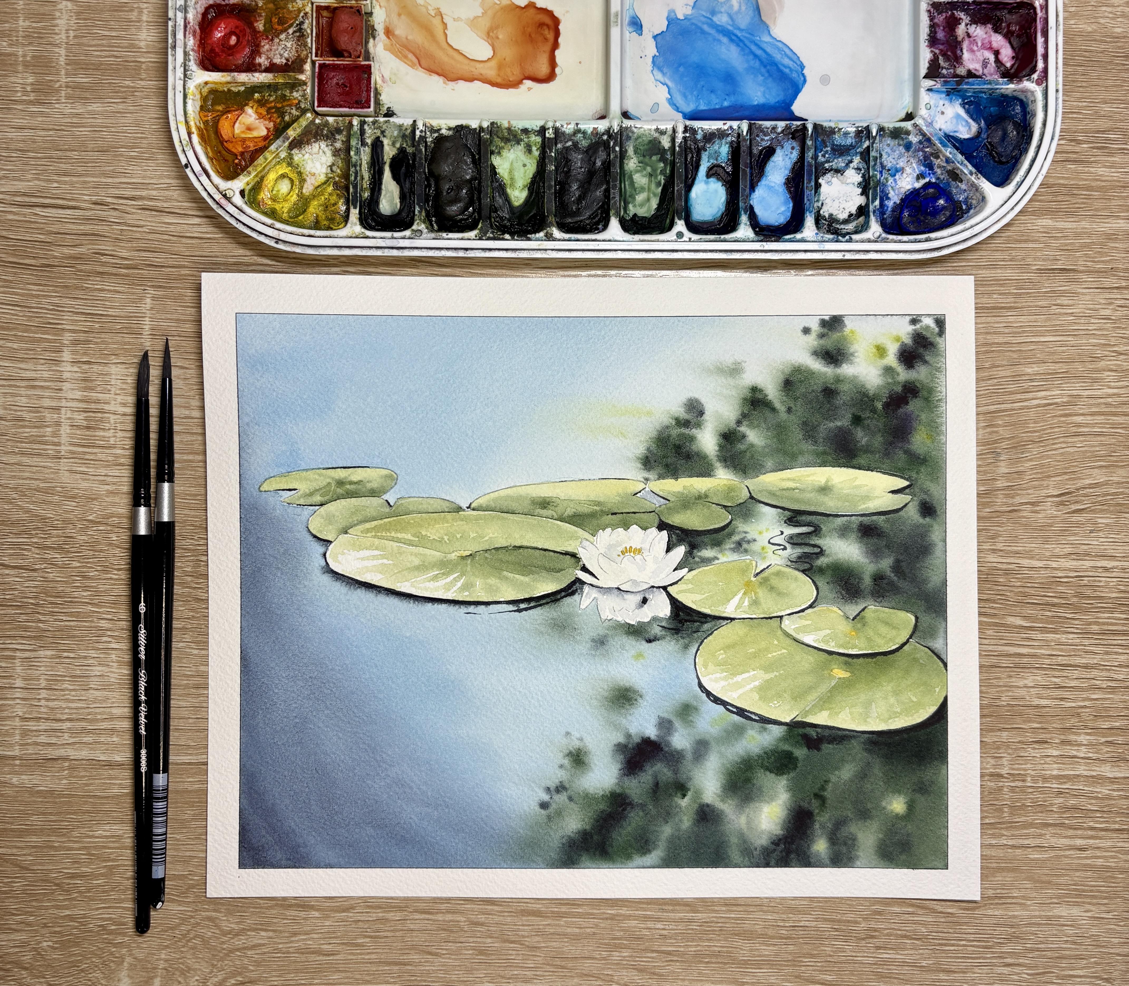
dry completely, and then I'll take the tape off, and I'm left with a beautiful
water lily painting. I hope you enjoyed the tutorial.
 Emily Marie Watercolors, Watercolor Artist and Dog Lover